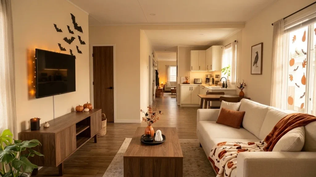
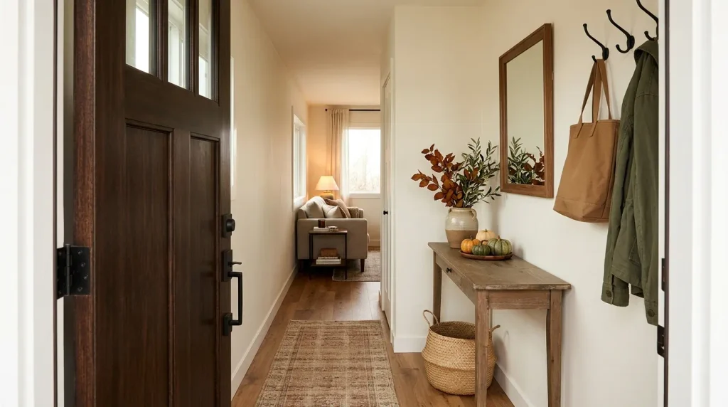
Persimmon sits in a particularly useful place on the fall color spectrum: warmer and livelier than rust, redder than classic pumpkin orange, and bold enough to change the mood of a room with only a few well-placed accents. Pinterest’s 2026 Pinterest Palette includes Persimmon as a part-orange, part-red shade with the reference color #FF5C34. (Pinterest)
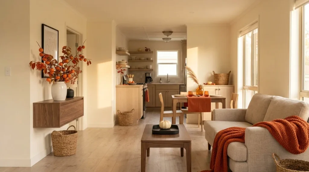
That intensity is exactly what makes persimmon fall decor in a mobile home interesting. Small rooms, shorter furniture runs, open doorways, and long connected sightlines cause saturated color to travel farther visually. Something that looks like a modest accent by itself can become much louder once the living room, hallway, dining area, and kitchen appear together.

So the smartest approach is not covering the home in orange-red décor. It is deciding where Persimmon deserves attention and where the eye needs relief.
These 17 ideas move from dosage and palette-building into entries, shelves, living spaces, kitchens, windows, bedrooms, bathrooms, natural textures, botanicals, and evening lighting—starting with a simple way to decide how much Persimmon your home actually needs.
1. Start With a Persimmon Dose, Not a Pumpkin Count
Before buying another pillow, pumpkin, wreath, or branch, decide how visible you actually want Persimmon to be.
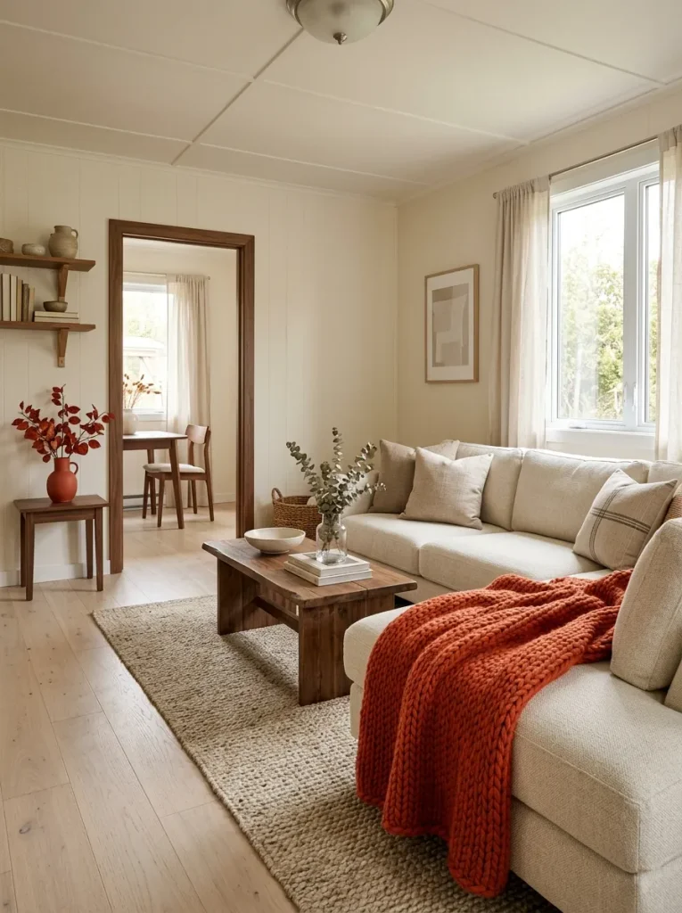
In a compact mobile home, color volume matters more than object count. A single Persimmon throw spread across a sofa may influence the room more strongly than four tiny orange accessories because the textile occupies a much larger visual plane. Homes with cream upholstery and light walls can often carry a stronger hit; interiors already filled with warm wood, brown cabinetry, or reddish flooring may need a quieter dose.
Use the planner below as a starting point. Choose the effect you want, then let that decision control what you add later.
Persimmon Dose Planner
How loudly should Persimmon speak?
Choose the mood you want first. Your selection reveals a different styling strategy for compact mobile-home rooms.
Choose your desired visual intensity
Quiet warmth
Use one controlled Persimmon moment
Ideal when the room already includes warm wood, rust, patterned rugs, or brown cabinetry.
Choose one vase, pillow, hand towel, or compact foliage arrangement.
Leave nearby surfaces and the next visible zone noticeably quieter.
Clear fall accent
Use one medium anchor plus one distant repeat
This is the safest starting point for cream, beige, light gray, or pale-wood mobile-home interiors.
Try a sofa throw plus one smaller Persimmon element farther through the room.
Keep the visual space between both color moments relatively neutral.
Persimmon-led room
Let one large plane carry the color
Choose this only where surrounding furniture, walls, and textiles are restrained enough to support a strong focal point.
Use a substantial throw, dramatic foliage, or one concentrated Persimmon composition.
Remove smaller competing orange-red accents so the primary element keeps its authority.
Choose the dose first, then shop or style to that limit. That prevents a small mobile home from slowly accumulating ten individually attractive Persimmon pieces that compete once they are viewed together.
2. Build a Persimmon, Cream and Walnut Base Palette
Persimmon becomes easier to decorate with once you stop treating it as an isolated orange accent. Give its supporting colors different jobs.
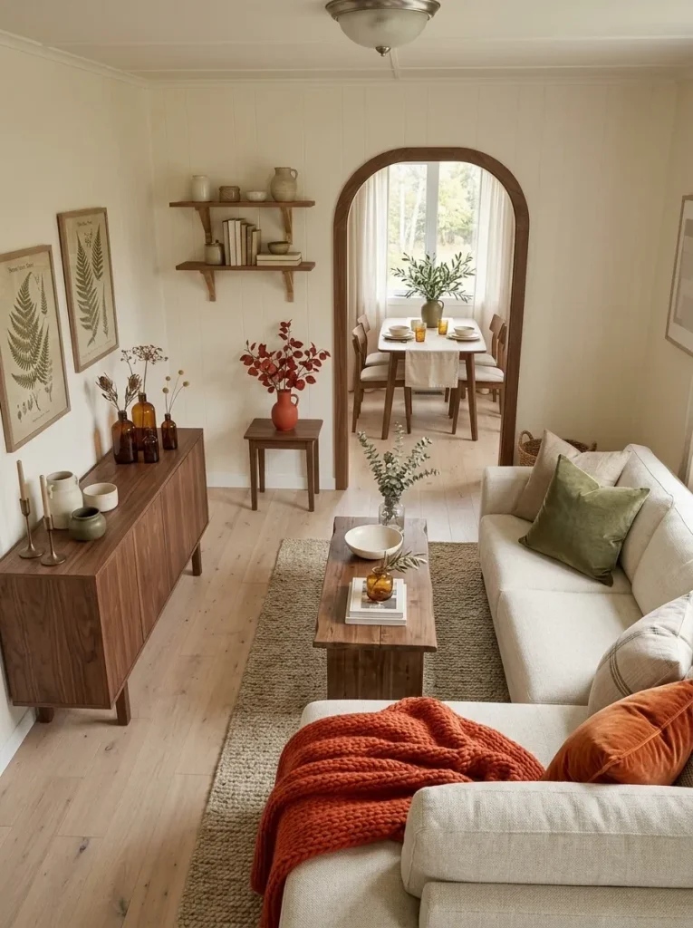
Cream creates breathing room. Walnut or medium brown gives the bright red-orange shade visual weight. A third supporting note can push the room softer, earthier, or more modern. This matters in a mobile home because flooring, cabinetry, doors, and upholstery may all appear simultaneously; the seasonal palette has to coexist with those permanent finishes.
Try the three directions below before deciding which accessories belong in the room.
Persimmon Palette Studio
Choose the atmosphere around Persimmon
The same red-orange accent can feel collected, airy, or architectural depending on the supporting palette.
Collected, earthy warmth
Walnut and muted olive absorb some of Persimmon’s brightness while cream prevents the room from becoming visually dense.
Bright, quiet and spacious
A pale background lets a relatively small amount of Persimmon create enough seasonal contrast for a compact room.
Sharper modern fall contrast
Charcoal edges make Persimmon feel intentional and architectural, so fewer decorative objects are required.
If your permanent finishes already lean heavily yellow or orange, begin with the cream-and-walnut direction before introducing another warm supporting hue. Persimmon should remain identifiable rather than disappearing into several similar autumn colors.
3. Let the Entry Carry the First Clear Persimmon Note
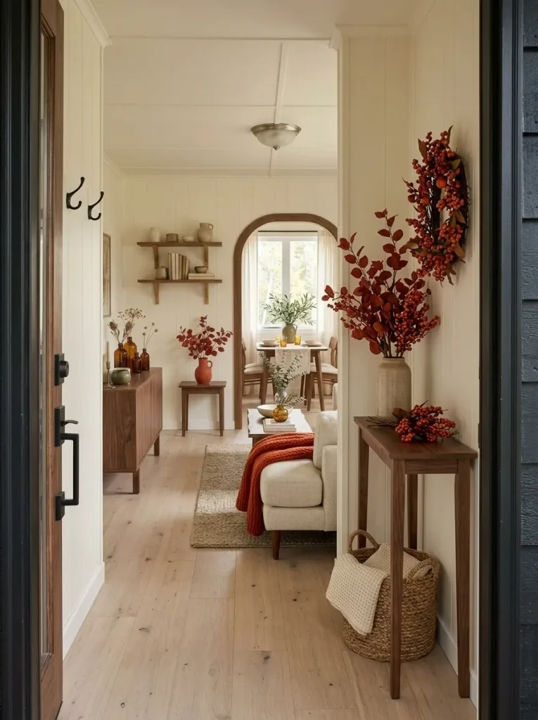
Imagine opening the front door and seeing a pumpkin by the shoe basket, orange leaves on the console, a rust runner, a wreath, a seasonal sign, and another arrangement beyond the doorway. Each piece may be attractive, yet together they leave the entrance without a clear first impression.
A small mobile-home entry usually benefits from one concentrated Persimmon moment. A branch arrangement in a narrow vase, an asymmetrical wreath, or a folded textile on a bench can become the arrival point while practical floor space stays clear.
If your front door opens directly into the living room, place the strongest accent slightly outside the walking route. It should read as a destination, not an obstacle.
For broader seasonal layering beyond this color-specific approach, continue with the cozy fall mobile home decorating guide. (Stylish Galore)
Entry test: stand outside, open the door, and notice what catches your eye first. If three Persimmon or orange-red objects compete for that moment, edit before adding anything else.
4. Pull Persimmon Upward With One Tall Branch Arrangement
A low console crowded with small pumpkins uses valuable surface area but does little to change the proportions of a compact room. Tall Persimmon foliage does something different: it places seasonal color in the upper half of the view, where many small mobile-home interiors have less visual activity.
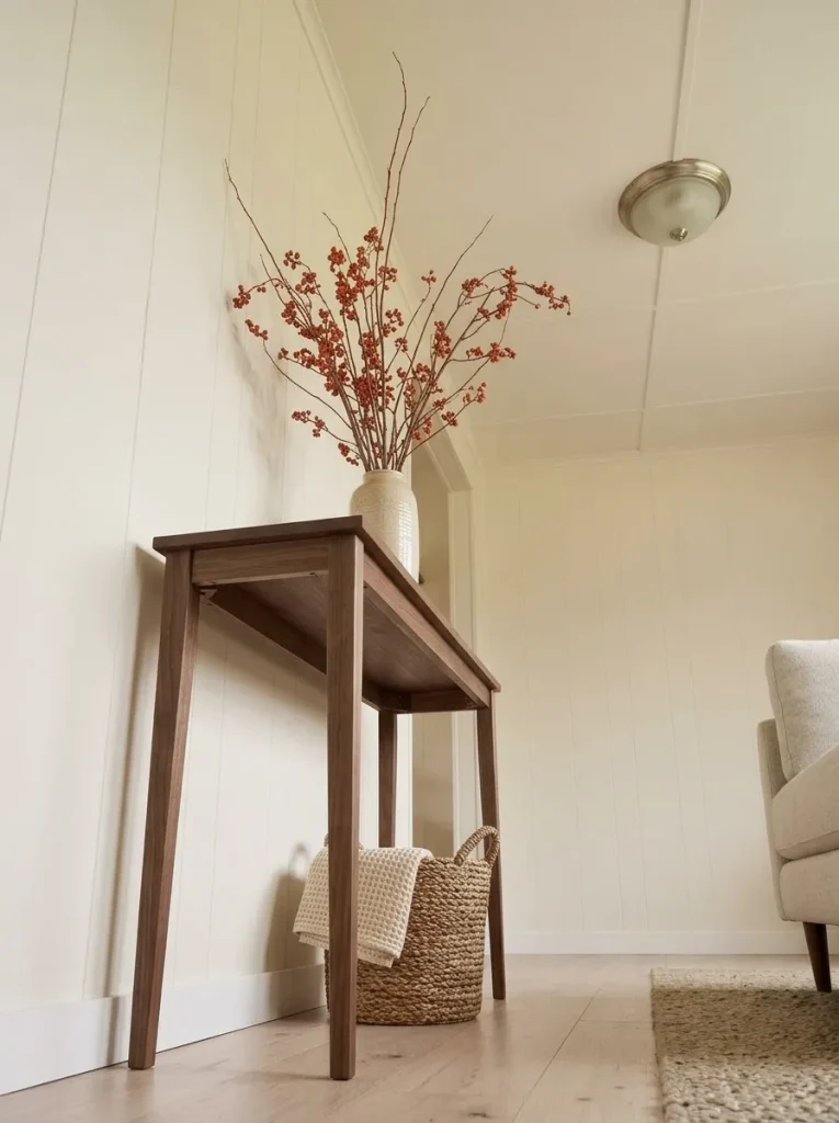
Choose a substantial vase or crock and use long reddish-orange branches with enough space between stems to preserve an airy silhouette. Set it on a console, dining cabinet, sturdy side table, or another position where the branches rise against a relatively calm background.
Use the furniture below as your scale reference. A heavy console can support a fuller arrangement; a narrow table usually benefits from fewer stems and a more vertical profile.
Check the doorway view before finishing. If branches visually tangle with a mirror, television, shelf, or neighboring artwork, trim or rotate the arrangement.
The stopping point arrives when the branches create the vertical fall statement by themselves. Pumpkins clustered around the vase should be optional.
5. Give a Gray or Beige Sofa One Persimmon Textile Anchor
A neutral sofa is an efficient place to introduce Persimmon because fabric can create a substantial color field without consuming another table, shelf, or patch of floor.
The choice depends on what the sofa already carries. With patterned cushions, use a solid Persimmon throw and let its folds create the visual variation. With plain beige or gray upholstery, a Persimmon pillow can sit beside cream, brown, or subtle plaid.
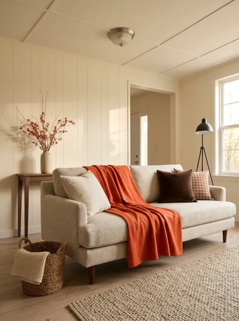
Avoid turning every cushion into another shade of orange. The sofa should still read as furniture first and seasonal styling second.
Choose the textile according to visible area. Use a throw when Persimmon needs to become one of the room’s principal colors. Use a single pillow when foliage, warm timber, patterned rugs, or another reddish focal point already carries significant visual weight.
For deeper living-room decisions around seating, rugs, windows, lighting, and seasonal layers, use the fall mobile home living room guide. (Stylish Galore)
6. Put Persimmon on One Eye-Level Shelf, Not Every Shelf
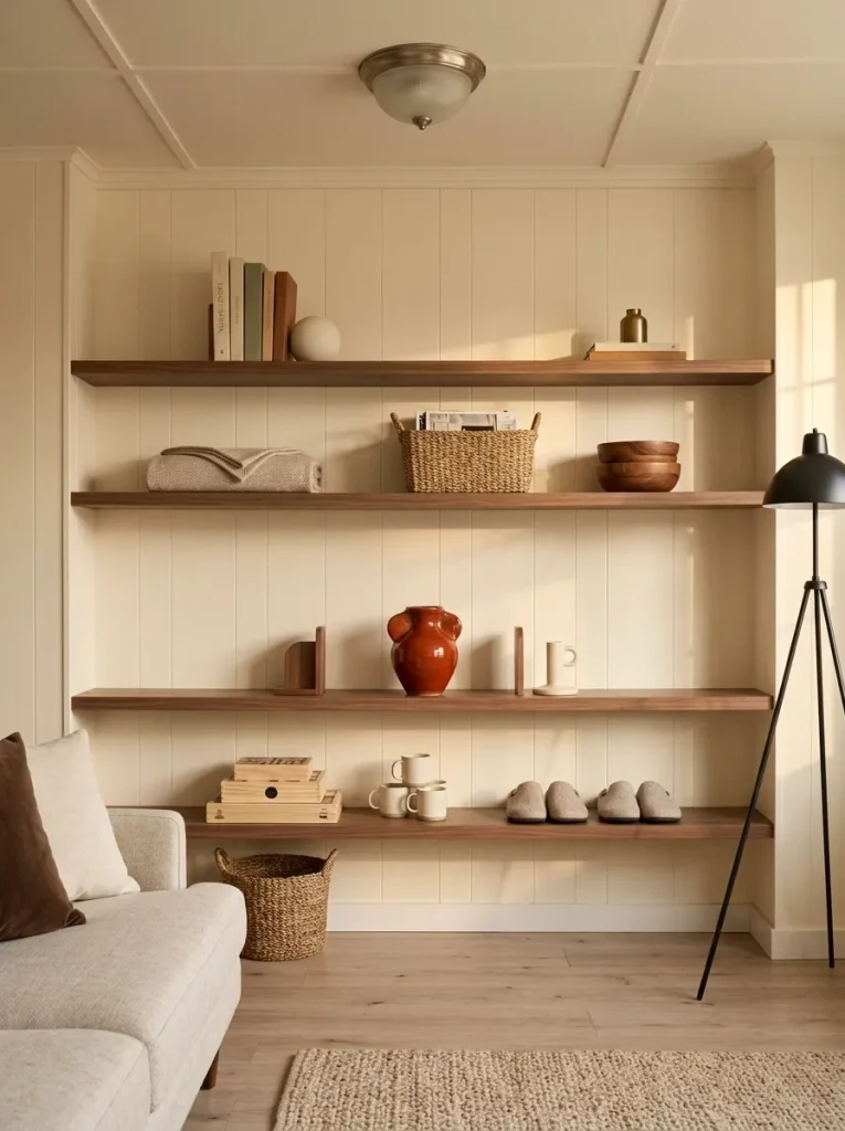
Open shelving can make a small room feel more seasonal very quickly because each shelf is visible at once. That is also why repeating Persimmon on every level can create an orange-red ladder running up the wall.
Choose the shelf closest to normal eye level and give that one the strongest autumn note. A Persimmon vase, folded textile, small artwork, ceramic piece, or compact stem arrangement can establish the color without asking the shelves above and below to repeat it.
Then make the neighboring shelves support the composition through cream, wood, books, baskets, or ordinary household objects.
A useful shelf check is distance: walk to the doorway and look back. If you see Persimmon as several disconnected dots stacked vertically, consolidate them.
This strategy is particularly helpful when shelving also performs real storage duty. You gain a seasonal focal point without sacrificing multiple shelves to decorative displays.
7. Repeat Persimmon Once Across the Long Mobile-Home Sightline
Stand at the entrance or one end of the living space. In many mobile homes, you can see the living room, dining area, and part of the kitchen in one frame.
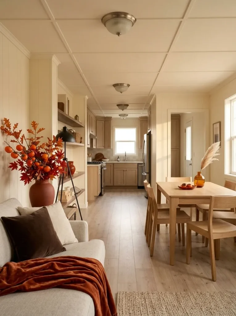
If every zone carries an equally strong Persimmon display, the color becomes a repeated signal competing for attention.
A better connected view has different levels of color authority. One room carries the strongest Persimmon statement, another gives a softer repeat, and the third provides relief.
Use the sightline map below to test where the strongest moment should live.
Connected Sightline Map
Choose where Persimmon should lead the view
Pick the zone that deserves the strongest visual authority. The remaining rooms automatically shift into supporting roles.
Living room
Use the largest Persimmon plane here: a substantial throw, foliage display, or textile grouping.
Dining area
Repeat the hue once through linen, glass, or a smaller centerpiece.
Kitchen
Keep visible counters mostly neutral so the living-room color retains authority.
Living room
Keep the Persimmon presence small—perhaps one pillow, throw edge, or branch.
Dining area
Let a runner, centerpiece, or tall nearby arrangement carry the strongest saturation.
Kitchen
Keep visible surfaces quiet so the dining zone remains the seasonal destination.
Living room
Let neutral upholstery, cream textiles, and wood provide visual breathing room.
Dining area
Use one restrained Persimmon element to bridge the transition.
Kitchen
Concentrate Persimmon in one vertical or contained feature at the visual end of the home.
The distinction is between repetition and rhythm. Repetition gives every visible zone similar volume; rhythm lets the color strengthen, soften, and disappear as your eye moves through the home.
8. Bring Persimmon Into the Kitchen Without Losing Prep Space
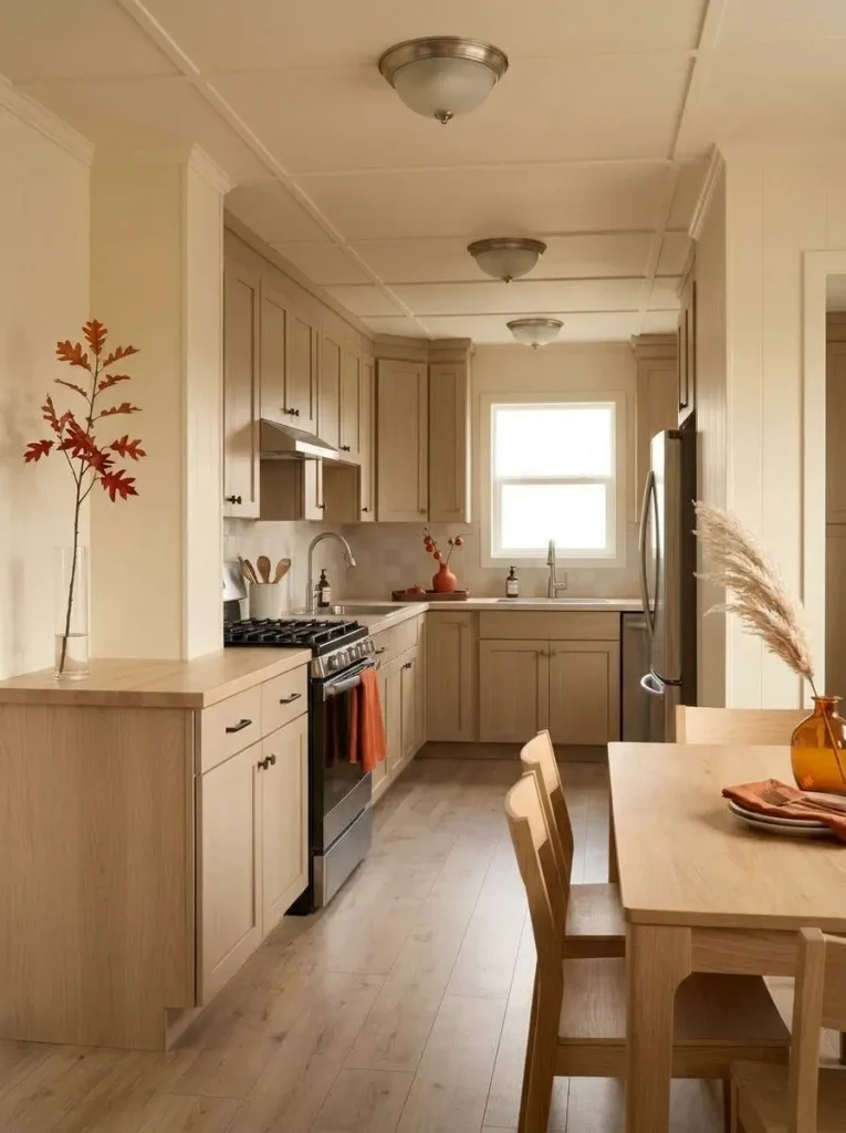
A compact kitchen should not have to surrender a useful counter in order to look seasonal.
Identify which surfaces participate in real cooking first: the space beside the stove, the refrigerator landing zone, the chopping area, or the counter where appliances remain every day. Those surfaces have functional priority.
Persimmon can occupy edges and vertical planes instead. An oven towel, narrow branch arrangement beyond the prep zone, Persimmon-toned utensil crock, small wreath, or contained tray introduces the color without making cooking begin with clearing decorations.
Use the tool below according to how much spare surface your kitchen genuinely has.
Kitchen Surface Budget
Protect useful counter space first
Choose how much truly unused counter space your kitchen has on a normal day. The recommended Persimmon placement changes with your answer.
Keep the seasonal layer off the counter
Decorate locations that already exist above or beside the prep zone so Persimmon never becomes a daily clearing task.
Build one movable Persimmon vignette
Keep the entire seasonal arrangement within one tray-sized footprint so it can move quickly whenever you need the work surface.
Let one Persimmon composition carry the kitchen
A taller botanical display or refined contained vignette can work where the principal chopping, cooking, and landing zones remain completely separate.
For room-wide kitchen styling beyond this Persimmon treatment, continue with the fall mobile home kitchen decor guide. (Stylish Galore)
9. Let the Dining Area Carry Persimmon Through Linen or Glass
Persimmon does not have to arrive at the dining table as another pumpkin centerpiece.
Compare two approaches. One table holds orange pumpkins, orange leaves, orange candles, and an orange runner within the same small rectangle. Another uses a muted Persimmon runner beneath cream dinnerware while translucent amber-red glasses catch the light.
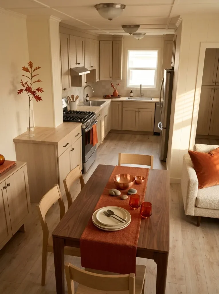
The second table gives the color different levels of intensity.
That is valuable when a dining area sits between the living room and kitchen. The table can act as a color transition rather than another complete display.
For a table used every day, favor something that already has a job: linen napkins, a washable runner, tinted glassware, or a serving bowl. Save a larger centerpiece for a table with enough unused center space to accommodate one comfortably.
If Persimmon is already strong on the nearby sofa, use glass or a narrow textile here. If the living room stays quiet, the table can accept the more saturated fabric.
10. Use a Window as a Backlit Persimmon Accent Zone
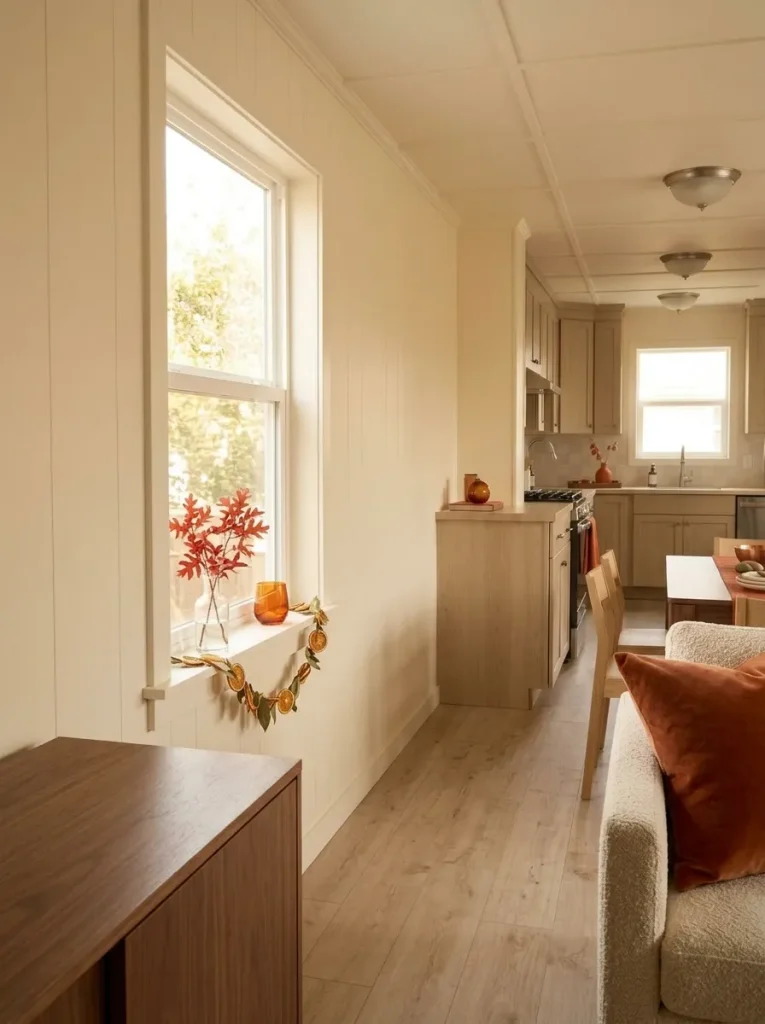
What happens to Persimmon when daylight passes through or around it?
The shade becomes more luminous. A window can therefore make a modest seasonal accent read as a larger decorative event—useful in a compact room where another basket or tabletop arrangement would consume physical space.
Try reddish-orange stems on the sill, translucent warm-toned glass, a lightweight leaf garland, or dried citrus whose color relates to Persimmon. Keep a substantial portion of the glass open so the seasonal layer frames the daylight.
This treatment is particularly effective against pale walls or warm timber trim because the bright window edge separates the red-orange accent from its background.
Look at the window twice: once in full daylight and again as the sun drops. If the decoration turns into a heavy dark silhouette when backlit, reduce its density.
The stronger composition still lets the window behave like a window.
11. Keep Persimmon at the Foot of the Bed
The bed already occupies a large percentage of many mobile-home bedrooms, so its seasonal color deserves careful placement.
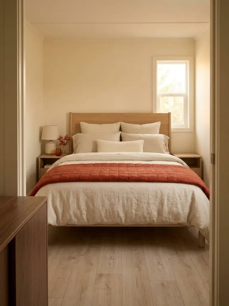
Instead of changing the entire bedding set, concentrate Persimmon across the lower portion of the bed. A folded quilt, substantial throw, or narrow coverlet at the foot gives the room a clear autumn accent while preserving cream, oatmeal, taupe, or soft-gray bedding around the face and headboard area.
That position has another advantage: the Persimmon reads immediately from the doorway without enclosing the sleeper in one saturated color.
A very neutral bedroom can support a wider folded quilt. Where warm wood furniture, patterned rugs, rust curtains, or dark flooring already provide visual weight, use a narrower throw.
For broader room styling, continue with the fall mobile home bedroom decor guide. (Stylish Galore)
12. Give the Bathroom One Functional Persimmon Accent
The bathroom does not need a miniature version of the living-room color scheme.
In a compact mobile-home bathroom, one Persimmon hand towel, washcloth, small soap vessel, or similarly useful object may already be enough to introduce the whole-home palette. Mirrors, pale fixtures, and short viewing distances can give even a modest accent strong visibility.
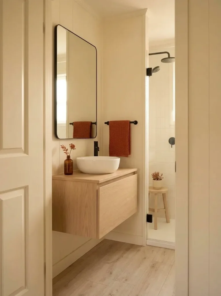
Keep the surrounding vanity largely consistent with the bathroom’s existing materials so the color does not compete with toiletries and daily-use items.
If one Persimmon towel already becomes a clear focal point from the doorway, stop there.
The dedicated neutral fall mobile home bathroom guide goes much deeper into undertones, reflections, fabric planes, texture, and restrained seasonal layering, so those decisions do not need to be rebuilt here. (Stylish Galore)
13. Pair Persimmon With Black for a Sharper Modern Fall Look
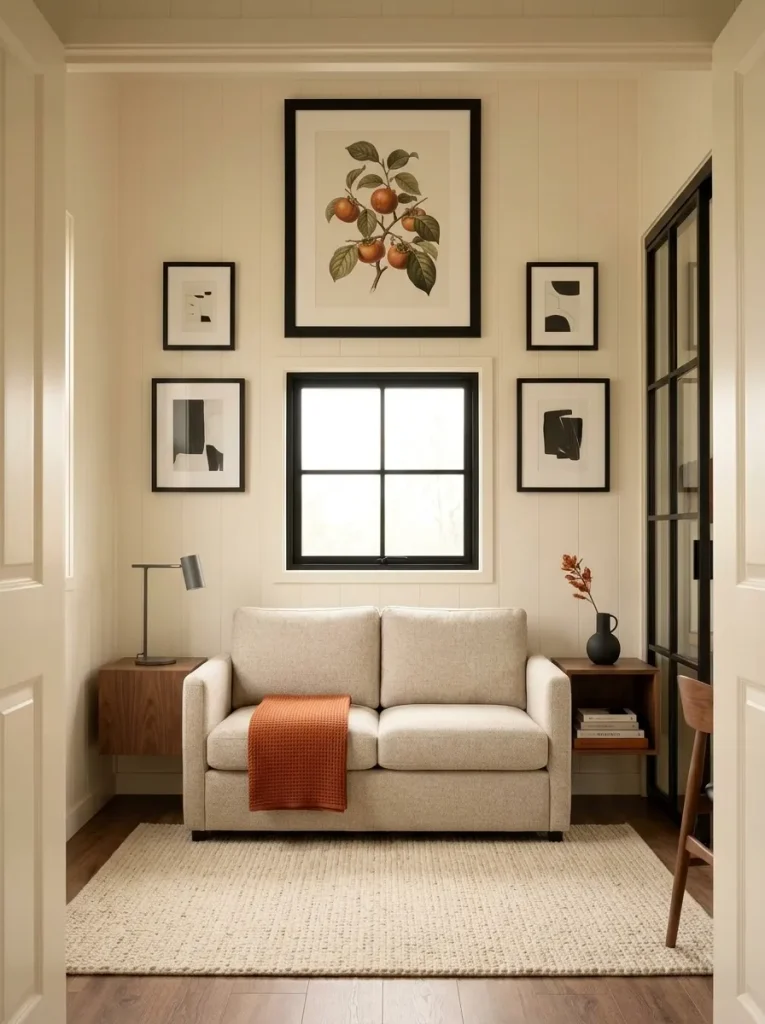
Persimmon does not have to read rustic.
Place the reddish-orange shade beside matte black, charcoal, dark bronze, or very dark timber and its personality changes. Strong dark edges make the warm hue feel cleaner and more graphic.
A small living room might combine a Persimmon throw with black picture frames and a charcoal lamp. An entry can place reddish foliage beside a black lantern and dark-framed mirror. In the kitchen, a single Persimmon towel may provide enough seasonal color when black hardware already supplies contrast.
A reliable visual relationship is:
Persimmon focal color + dark outline + pale breathing space
The pale component matters. Cream walls, light upholstery, white counters, or an oatmeal rug stop the high contrast from becoming visually heavy.
Skip additional black accessories where dark cabinetry, large black appliances, or a charcoal sofa already provide enough structure.
14. Soften Persimmon With Wicker, Aged Wood and Cream
Picture a narrow console against a pale wall. A vivid Persimmon arrangement on its own may appear brighter than anything else nearby. Add a worn timber surface, one woven basket underneath, and a cream textile, and the same color begins to feel more settled.
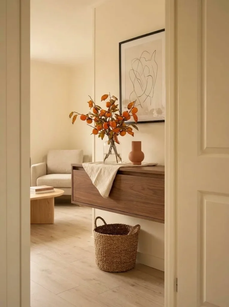
The shift comes from material temperature.
Wicker and aged wood contain irregular brown tones that bridge Persimmon and its neutral surroundings. Cream provides the visual pause. Textured pottery can contribute another earthy surface without introducing a competing hue.
This combination works particularly well when the mobile home already contains oak floors, warm trim, rattan furniture, woven storage, or vintage pieces. Existing materials do part of the palette work.
Do not place every natural texture into one vignette. One woven piece and one timber surface may be enough. Too many baskets, distressed signs, pumpkins, and dried florals can turn a color-led scheme into a broader farmhouse theme.
15. Use Persimmon Botanicals When Pumpkins Start Feeling Too Literal
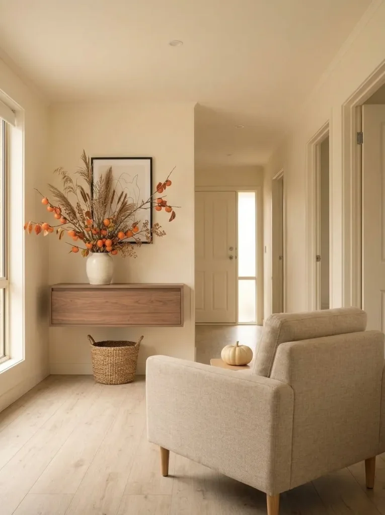
There is no requirement that fall decorating depend on pumpkins.
Persimmon-colored foliage is especially useful in a small mobile home because branches occupy vertical air space while leaving floors and work surfaces relatively clear. They communicate autumn through both color and organic form without repeating the same seasonal symbol in every room.
Try reddish-orange leaf branches, dried grasses with Persimmon notes, berries, or loose florals mixed with muted brown. One arrangement can move between the dining cabinet, entry console, kitchen edge, or bedroom dresser depending on where the home needs height.
If another room already contains pumpkins, botanicals give the next space a different visual language.
When the interior begins to look like a collection of fall objects, remove one object group and replace it with one natural arrangement.
The season remains obvious, but the room becomes less literal.
16. Let Persimmon Change After Dark With Warm Light and Amber Glass
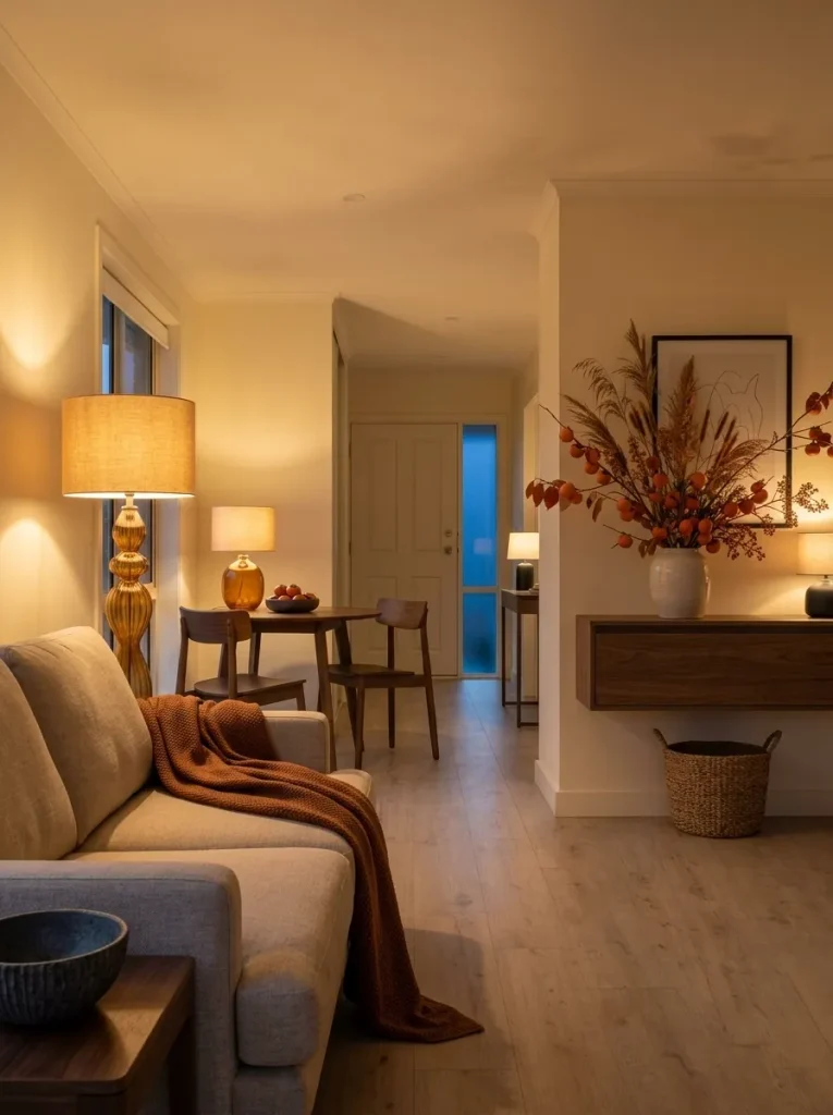
Persimmon does not look exactly the same after sunset.
Clear daylight makes the shade feel vivid and energetic. Warm lamps and amber glass can shift its appearance toward copper, ember, and deeper burnt-orange territory. A daytime accent can therefore become noticeably richer at night without another layer of décor.
Place Persimmon fabric within the pool of a table lamp. Let amber or ribbed glass sit near a warm light source. Position foliage where side lighting catches the edges of its leaves.
One darker nearby element—perhaps walnut, charcoal, or black metal—can make that glow more noticeable.
Before buying another accessory, perform an evening check. Turn off the main overhead light and switch on the lamps you normally use.
A scheme that looks slightly restrained at noon may already feel complete after dark.
17. Finish With a Doorway Photo and Edit What the Eye Compresses
The final check works better through a camera than from three feet away.
Take one ordinary phone photo from the entrance or longest view through the home. A photograph compresses depth, which makes repeated saturated colors easier to notice. Small Persimmon pieces that seemed widely separated in person can suddenly appear as a trail of orange-red dots.
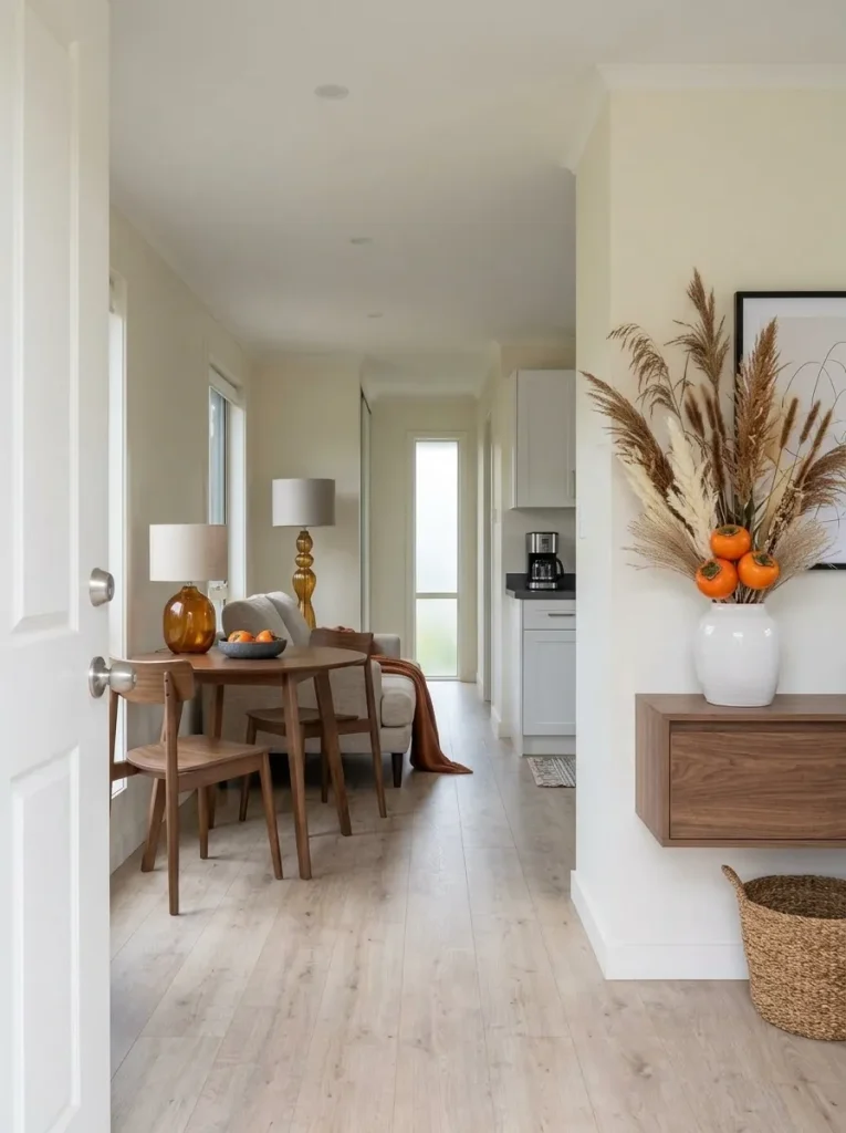
Do not judge whether the photo is pretty. Look at how the Persimmon behaves.
Use the editor below according to what the photograph reveals.
Doorway Photo Editor
What happens when the room becomes one frame?
Take a normal doorway photo and choose the Persimmon pattern you notice first. Each diagnosis reveals a different correction.
Consolidate before removing the season
Move several tiny Persimmon accents toward one stronger location, then clear the isolated pieces that no longer contribute to that composition.
Reduce surface area, not necessarily the color
Fold the throw smaller, remove several stems, or create more neutral space around the strongest Persimmon element.
Change the background around Persimmon
Move the accent away from similar rust and brown tones, or introduce a restrained amount of cream, charcoal, or another pale neutral beside it.
Compare the edited room with the photo again. Persimmon should now read as a deliberate color choice instead of a collection of unrelated autumn objects.
Final Thoughts
Persimmon works especially well in a small mobile home because it needs very little surface area to make itself known. Begin with one location that naturally deserves attention—a neutral sofa, compact entry, dining table, shelf, or tall botanical arrangement—and let that establish the seasonal color.
Then allow permanent finishes to do some of the work. Cream can provide relief, wood and wicker can soften the shade, black can sharpen it, and warm evening light can deepen it.
You do not need all 17 ideas at once. Use the ones that solve different parts of your home, photograph the connected view, and edit until Persimmon feels intentional in the entire interior.
Save this article to Pinterest so your favorite Persimmon fall decor ideas are ready when you start styling your mobile home.