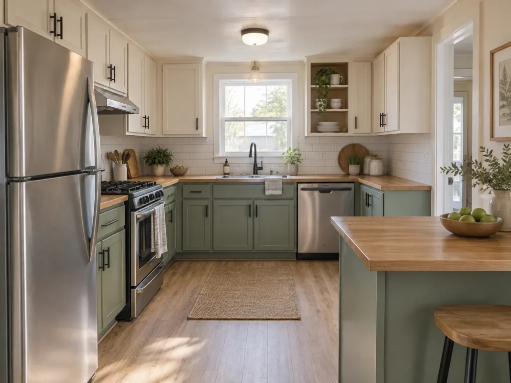
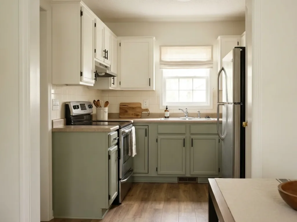
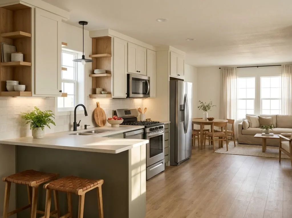
A mobile home kitchen can look beautiful in fall without turning every counter into a pumpkin display. The challenge is that these kitchens often work with tighter aisles, shorter runs of cabinetry, and fewer spare surfaces, so every decorative choice has to earn its place.
That limitation can actually make seasonal decorating more interesting. A few well-chosen changes can shift the entire mood of the room while the sink, stove, coffee maker, and prep areas continue working normally.
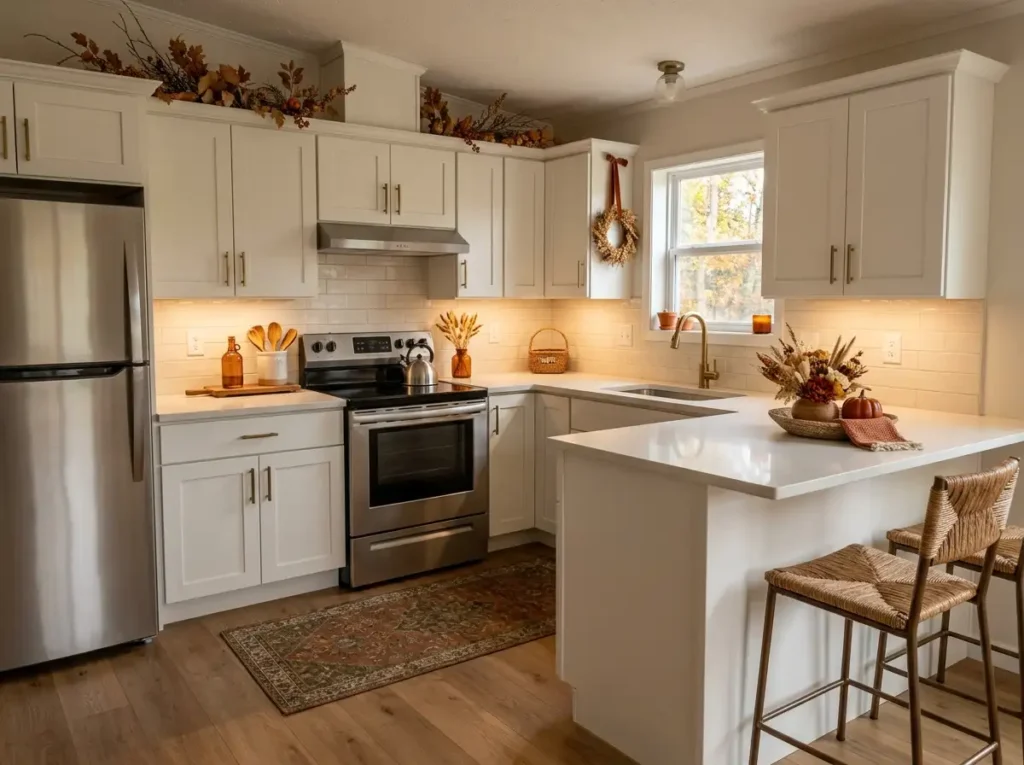
For fall mobile home kitchen decor, think beyond buying a bundle of matching accessories. Color, texture, light, useful storage, vertical surfaces, and the floor all offer opportunities to bring in autumn character.

The ideas below move around the kitchen deliberately, from easy countertop updates to underused cabinet space and functional zones. Some are almost free; others work best as one small seasonal purchase.
The aim is a kitchen that feels warmer, more welcoming, and unmistakably fall—yet still looks like a real room you can cook in every day.
1. Create One Raised Fall Countertop Anchor
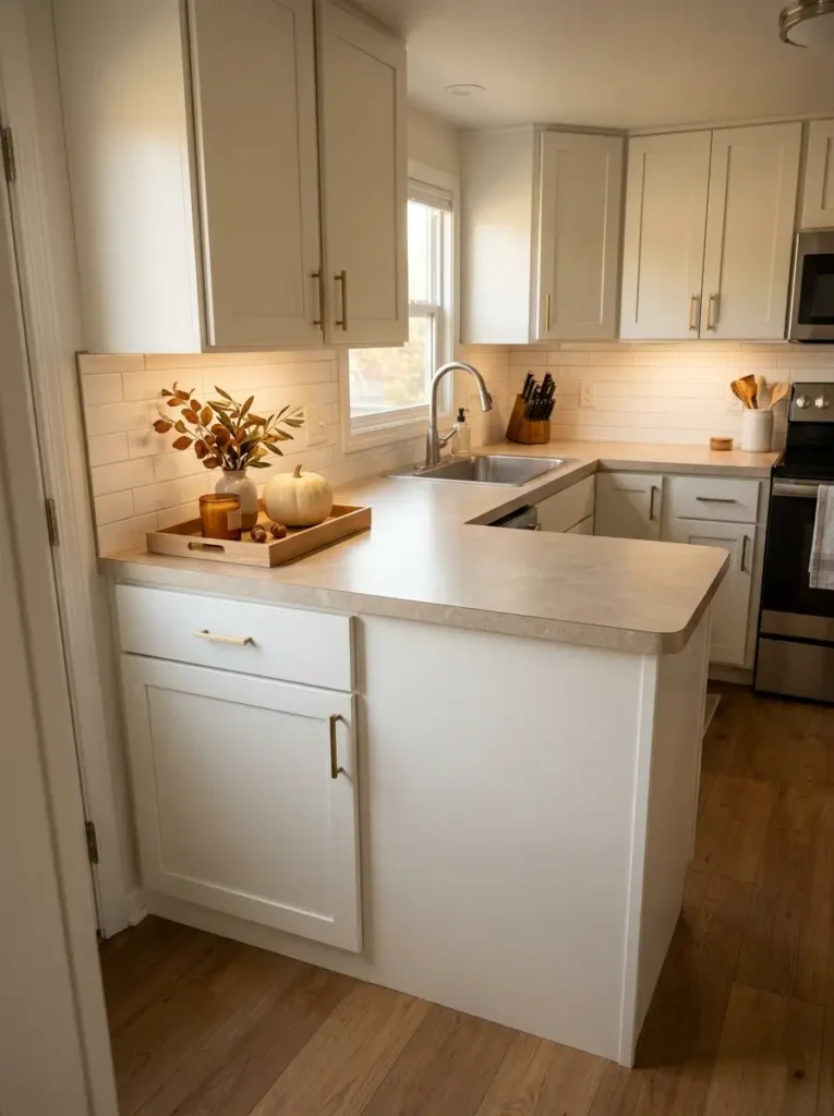
In a compact kitchen, the quickest route to visual clutter is letting seasonal pieces migrate across every available surface. Pick one low-value corner first: the end beside a pantry wall, a stretch beyond the coffee maker, or another spot that rarely handles chopping, draining, or hot pans.
Place the fall arrangement on a shallow wood board, small riser, or tray. The boundary is doing more work than the accessory count. A pumpkin, candle, small vase, and found branch can read as one composition because the eye sees a single footprint.
Height should step up toward the wall, leaving the front edge low. That keeps the arrangement from feeling like a barricade and makes cleaning around it much easier. If you need to move five separate objects every time you wipe the counter, the display is already too fussy.
Choose the corner only after imagining a normal cooking day. The strongest spot is the one you can decorate for several weeks without borrowing space back every evening.
Give Fall Décor One Defined Footprint
Before styling, test whether the corner can stay decorative through an ordinary week of cooking.
Board Test
Your largest everyday cutting board should still fit nearby without touching or shifting the display.
Single-Lift Test
The entire seasonal arrangement should move in one lift when the counter needs a deeper clean.
Access Test
Outlets, appliance plugs, drawers, and frequently opened cabinet doors should remain easy to reach.
When is the corner too decorated?
If the display regularly spreads forward, gets divided into several loose clusters, or has to be dismantled for routine prep, reduce its footprint before adding another accessory.
2. Use the Space Above Cabinets for a Slim Autumn Canopy
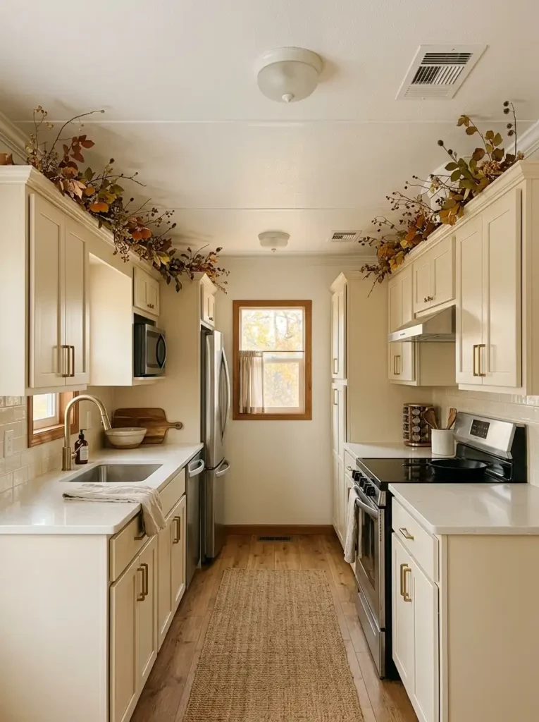
The strip above kitchen cabinets is often treated as awkward leftover space, yet in a mobile home it can become one of the highest-impact fall zones. Because it sits above the work surfaces, it carries seasonal color across the room without crowding the sink, stove, or prep area.
A slim run of autumn leaves, dried-looking stems, or lightweight garland works best when it follows the cabinet line as one continuous gesture. That long band visually connects separate cabinet boxes and gives the upper wall a finished, almost cornice-like edge.
Keep the profile low. Tall pumpkins, oversized lanterns, and dense branches can make a standard or low ceiling feel compressed. Thin foliage with a few spaced accents preserves the air between the cabinets and ceiling.
Pay attention to practical interruptions. Ceiling vents, light fixtures, access panels, and anything that releases heat need clear space. Shorten the display where necessary; the line can pause and still feel intentional.
From the main doorway, you should notice the autumn canopy as a soft frame, not as a shelf of objects balanced above your head.
Keep the Canopy Light Enough to Preserve Ceiling Space
Follow the cabinet line
Use the existing cabinet tops as the visual path. Sudden tall peaks break the horizontal rhythm and can exaggerate a low ceiling.
Pause around interruptions
Leave ceiling vents, lighting, access panels, and heat-producing fixtures fully unobstructed. A deliberate gap looks cleaner than décor squeezed around them.
Preserve visible air
As a visual guideline, foliage should occupy less than roughly half of the open cabinet-to-ceiling gap. The remaining space keeps the upper wall from feeling packed.
3. Turn the Coffee Station Into a Working Fall Vignette
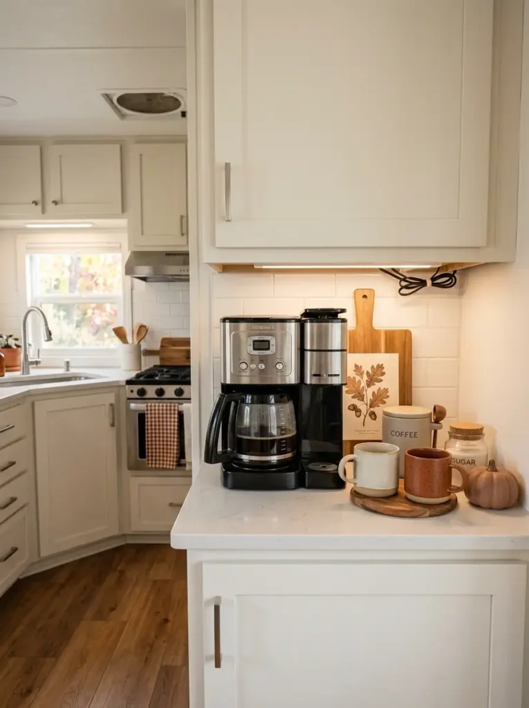
A coffee station already has a clear purpose, which makes it a natural place to carry some of the kitchen’s fall personality. The trick is to decorate the routine you actually use instead of building a display that has to be dismantled before the first cup.
Start with the appliance as the anchor. Leave the water reservoir, lid, pod drawer, cord, and mug path fully accessible. Seasonal pieces belong around those movements, not across them.
A useful mini field guide:
- Daily reach: coffee, filters, sweetener, and favorite mugs stay closest to the appliance.
- Seasonal layer: add one warm-toned jar, compact branch, or small pumpkin where it does not interrupt brewing.
- Background support: a narrow board or print can sit behind the station if it remains easy to wipe around.
This zone can carry a little more personality than a main prep counter because its function is narrower. Still, avoid piling décor in front of the machine or beneath a cabinet door that opens downward.
A successful fall coffee corner should still work half-awake. If every part of the morning routine happens in one smooth sequence, the styling has earned its place.
The Morning-Movement Test
Function FirstKeep the water reservoir or kettle route clear. Nothing seasonal should need moving before refilling.
Leave lid, pod, filter, and steam areas free through their entire range of movement.
Daily ingredients belong within one easy reach. Less-used seasonal mugs can sit slightly farther away.
Leave enough open counter beside the machine to wipe spills and remove the drip tray without unloading the vignette.
Where should decorative pieces go?
Best zone:
Behind or beside the daily movement path, where the décor becomes a backdrop.
Weak zone:
Directly in front of drawers, appliance lids, water access, or the spot where a hot mug naturally lands.
4. Warm a Narrow Kitchen With a Washable Rust-Tone Runner
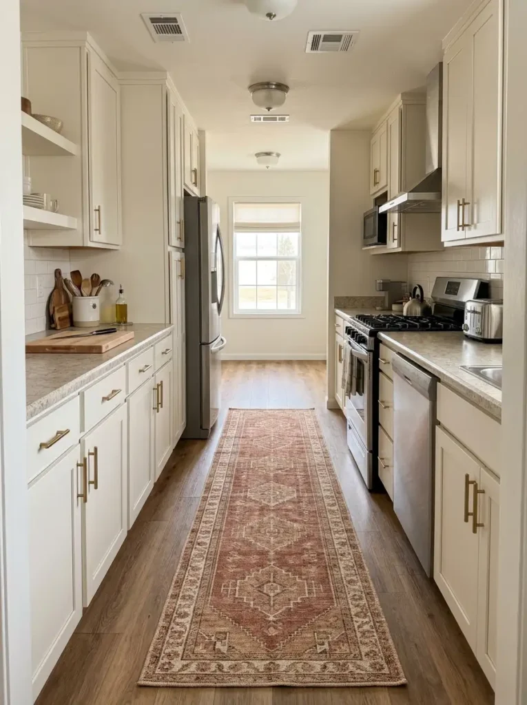
A rust, cinnamon, ochre, or muted terracotta runner can shift the mood of a narrow mobile home kitchen before a single countertop accessory is added. The floor is especially valuable in a galley layout because it occupies a large visual area yet does not compete with prep space.
Runner scale matters more than an elaborate pattern. A very short mat floating in the center can visually divide a long kitchen into disconnected pieces. A longer runner follows the cabinet run and reinforces the room’s natural direction.
Think of the relationship as a simple equation: long cabinetry + long clear aisle = a longer visual line on the floor. Leave visible flooring along both sides so the runner feels intentionally fitted, not squeezed between cabinets.
Choose a low-profile, washable material that lies flat. Thick edges can catch feet, robot vacuums, or door swings, and pale high-pile fibers are difficult to live with near cooking spills.
The right runner should make the whole aisle feel finished while remaining quiet enough for the cabinetry and fall accents above it to stay visually important.
Fit the Runner to the Aisle, Not Just the Color Palette
Keep the runner outside the full swing path of nearby doors.
Choose a low, flat edge that will not become a toe-catching ridge.
Favor washable construction and a backing that stays stable on the existing floor.
5. Hang a Lightweight Fall Wreath Where It Replaces Counter Clutter
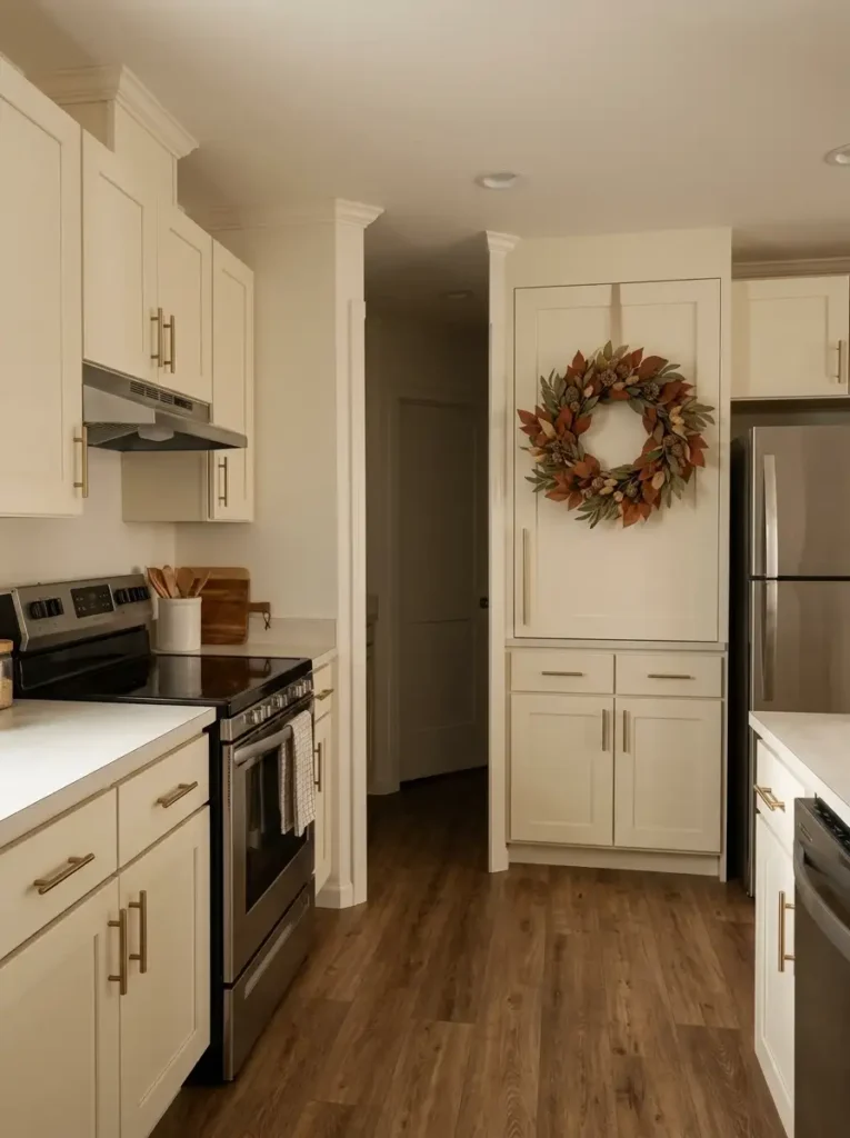
When counter space is scarce, move one strong seasonal cue onto a vertical surface. A lightweight wreath on a cabinet door, pantry door, or blank end panel can announce fall from across the kitchen while leaving the worktop untouched.
Placement matters more than quantity. Look from the kitchen entrance and find the surface your eye meets naturally. Giving that spot one wreath usually creates a clearer focal point than repeating small wreaths on several doors.
Avoid hanging it where the cabinet needs to open constantly during cooking, where the wreath brushes a neighboring handle, or where foliage can catch grease beside the range. A removable hook, ribbon loop, or other surface-appropriate hanger keeps the installation simple, especially in a rental.
The wreath should also fit the door. Oversized foliage can make a narrow cabinet look visually heavy; a smaller ring that leaves generous door area visible feels cleaner.
Best checkpoint: open the door fully, stand back at the main sightline, and check both function and scale. If neither is compromised, the vertical move is doing its job.
One Strong Placement Beats Several Competing Ones
Decoration first
A wreath sits on a frequently used door, bumps nearby hardware, or crowds a hot and greasy cooking area.
Sightline + function
The wreath lands on a surface visible from the room entrance and survives a full door-opening test without touching anything.
Rental-friendly smooth surface
Use a removable hanging method rated for the surface and the wreath’s weight; test removal instructions before leaving it up for the season.
Cabinet door with an accessible top edge
A slim over-door solution or ribbon routed from the top can avoid placing adhesive on the visible face, provided the door still closes freely.
Suitable metal panel
A magnetic hanger can work where the surface truly accepts magnets and the wreath remains light enough to stay secure.
6. Bridge Stainless Appliances With Amber Glass, Wood, and Aged Metal
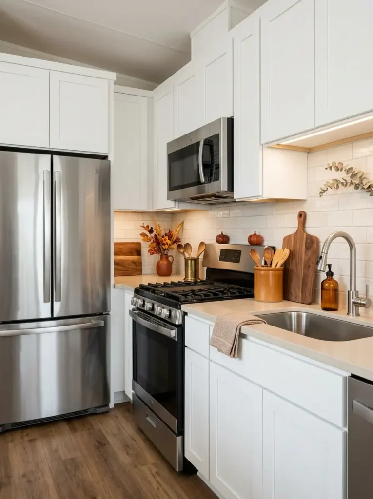
Stainless appliances can feel noticeably cooler once rust, pumpkin, and brown enter a fall palette. The solution is not to hide the metal. Give the eye a few intermediate finishes that connect the silver surfaces to the warmer seasonal colors around them.
Amber glass is especially useful because it reflects light while carrying a brown-orange undertone. Pair it with a medium-tone cutting board, wood utensil holder, or an aged brass or copper accent. Together, those materials form a gradual visual transition from bright metal to deep autumn color.
The finish mix matters as much as the hue. A kitchen filled with shiny stainless steel benefits from matte wood, cloudy glass, woven texture, and softly aged metal. Too many polished autumn accessories can leave the room looking harder, not cozier.
You do not need to repeat every material everywhere. Two or three strategic echoes are enough: perhaps an amber soap bottle near the sink, a wood board behind the range, and a muted brass detail across the room.
The useful test is continuity. Your appliances should still look modern, but no longer feel like they belong to a different color story.
Move Visually From Cool Metal to Warm Fall Color
When appliances are glossy, let at least one bridging material stay matte or softly textured so the entire room does not reflect light at the same intensity.
Place warm materials in two or three separated areas. Close clustering makes them look like one vignette; distance lets them connect the kitchen visually.
7. Add a Second Layer of Warm Evening Light
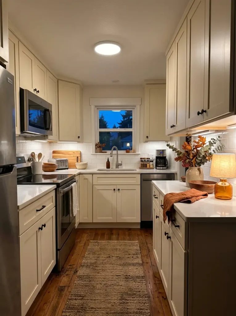
The same kitchen that looks perfectly cozy at 3 p.m. can lose much of its fall character after sunset. A single cool ceiling fixture tends to flatten wood grain, mute rust tones, and make cream surfaces appear slightly gray.
A second lighting layer changes that evening view. Under-cabinet lighting is ideal where you already have long cabinet runs; a small cordless lamp can work on a non-prep counter where installation is not practical. Aim for a warm, comfortable glow while keeping real task areas bright enough to cook safely.
Do not ask decorative lighting to perform every job. Fairy lights and candles may contribute atmosphere, but chopping, washing, and cooking still need clear illumination. Treat ambient warmth as a supporting layer.
Placement also changes how the fall décor reads. Lighting a wood board, amber bottle, or textured arrangement from the side produces shadow and surface depth that overhead light alone cannot provide.
Once evening arrives, switch off nothing essential. Simply compare the room with and without the secondary light. If the autumn colors gain depth while the work zones remain easy to see, the lighting balance is doing exactly what it should.
Three Jobs, Three Different Layers
Illuminates circulation, cabinet fronts, and the whole kitchen.
BaseTargets counters, sink, or prep zones and preserves working visibility.
WorkAdds localized glow beside decorative zones and reveals texture.
Mood8. Style the Sink Window as the Kitchen’s Seasonal Sightline
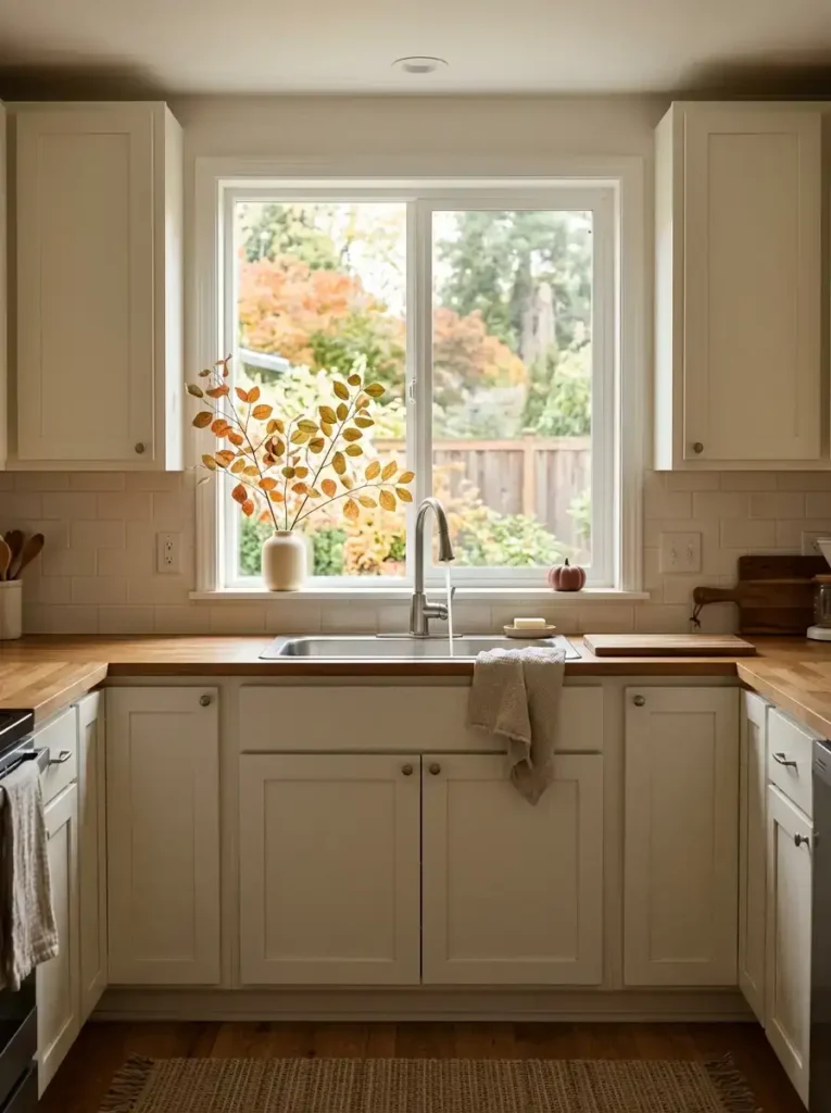
What do you see while standing at the sink?
In many mobile home kitchens, that answer matters more than people realize. A window above the sink often becomes the brightest visual opening in the room, so even a modest fall detail placed there can attract more attention than a larger arrangement elsewhere.
Keep the styling low enough to preserve daylight. A short vessel with clipped branches, one small pumpkin near the sill, or a restrained autumn stem can frame the view without turning the window into a backdrop for a dense floral display.
Backlighting changes scale. A leaf cluster silhouetted against a bright window can look twice as visually important as the same cluster against a painted wall. That means the sink zone usually needs fewer pieces.
Room conditions should guide the decision. A narrow window can handle one compact accent. A wide window may suit two low objects separated by open space. If the window opens inward, its moving path remains completely clear.
Watch the room from several feet away. The seasonal element should draw the eye toward the window while the glass itself still feels like the brightest, most open part of the composition.
Let the Window Stay Brighter Than the Décor
The seasonal layer should frame daylight, not replace it.
Use one compact accent.
Two low accents can work with open space between them.
Keep the complete moving path clear.
9. Build a Vertical Backsplash Moment With Boards and One Fall Print
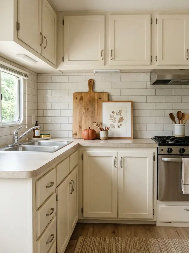
A backsplash does not have to stay visually flat simply because counter depth is limited. A few upright pieces can create a seasonal layer while using only a narrow strip along the back edge.
Start with something useful. A wood cutting board or bread board makes a strong rear layer because its height introduces warmth and its function justifies the counter space it occupies. Place a smaller fall print, framed botanical, or simple autumn illustration partly in front of it.
One low object can finish the composition—a small ceramic pumpkin, compact vessel, or jar of cinnamon sticks is enough. The three levels should read as back, middle, and front, not as three unrelated decorations.
Cleaning determines how elaborate this area can become. Grease-prone backsplash sections near the range need fewer porous objects. A dry counter near a pantry wall can handle more texture.
Leave adjacent backsplash visible. The empty tile or wall around the cluster gives the overlapping pieces their depth.
If every available section receives the same treatment, the effect disappears. One intentionally layered moment is stronger because the surrounding backsplash remains quiet.
Build Backward, Not Outward
Keep porous materials farther from splatter-heavy cooking areas.
Keep the front working edge visually and physically open.
10. Edit Open Shelves Into a Utility-First Fall Display
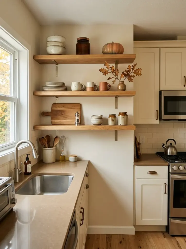
Open shelves often look crowded in fall because seasonal pieces are added on top of everything already there. A better first move is subtraction.
Look at one shelf and identify what you use every week. Plates, bowls, mugs, jars, and serving pieces can stay. Then remove one or two low-use items that add visual noise but contribute little function. That newly created breathing room gives seasonal color somewhere to register.
Next, look for practical objects that already fit the palette. A cream bowl, brown pottery, wood board, amber jar, or dark metal grinder may already carry more autumn character than a decorative sign bought specifically for the season.
Add only after that edit. One branch, tiny pumpkin, or rust-toned piece can sit beside useful dishes without turning the shelf into a display cabinet.
The final shelf should still be easy to live with. Frequently used pieces stay toward the front and within comfortable reach. Fragile seasonal objects belong farther back or higher.
A good shelf edit feels seasonal because the proportions changed—not because every empty inch was filled. If you can remove the fall accent in November and still like the shelf composition underneath it, the foundation is strong.
Find the Shelf’s Useful Density
EDIT BEFORE ADDINGThe shelf lacks enough useful visual mass.
Daily dishes remain easy to reach with clear gaps.
A fall accent joins useful pieces without blocking them.
Objects overlap and useful pieces disappear.
11. Use Seasonal Textiles as the Soft Layer—Not the Main Event
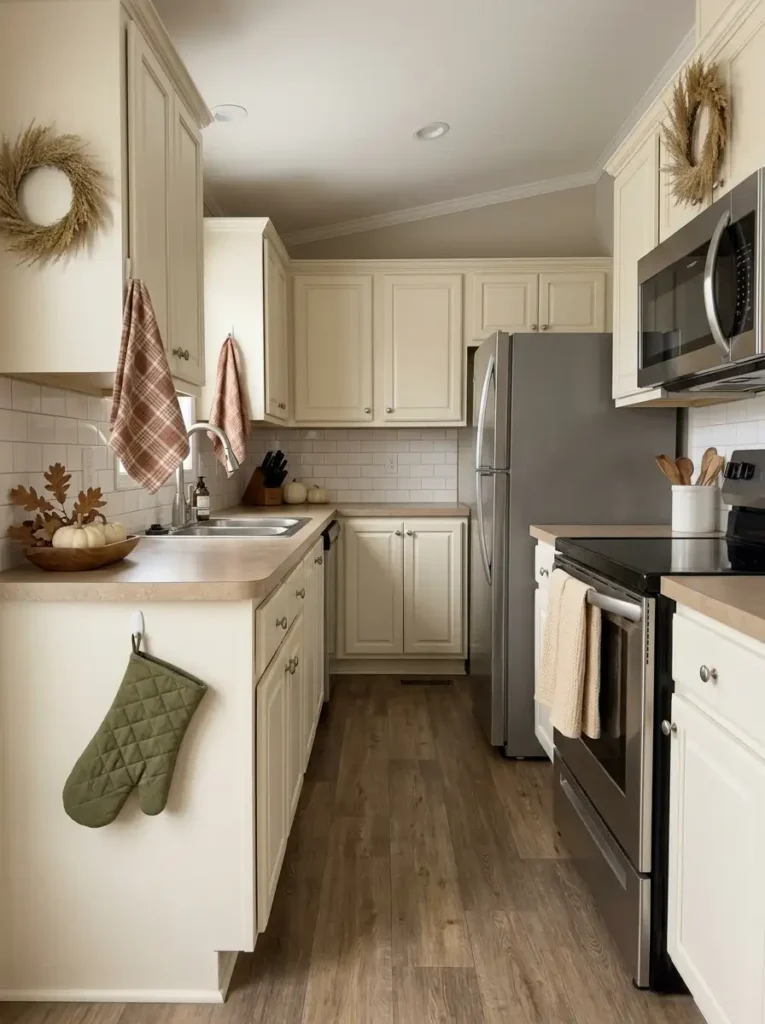
Kitchens are built from hard surfaces: cabinet doors, stone or laminate counters, metal appliances, tile, and flooring. Fall textiles introduce the softness those materials lack, but too many patterned pieces can break a compact kitchen into little visual patches.
A stronger arrangement gives one textile permission to carry the seasonal pattern while the others support it quietly.
- Choose one pattern leader. A rust plaid hand towel, small café curtain, or patterned potholder can become the recognizable fall textile. Pair it with solid cream, camel, olive, or warm brown pieces nearby.
- Let location determine the fabric. Towels near the sink should be washable and absorbent. Oven textiles need to remain practical for heat handling.
Avoid coordinating every towel, mitt, curtain, and mat in the same print. In a small kitchen, repeating one busy motif across several elevations can make the room feel fragmented.
A better finish comes from changing texture while controlling pattern: waffle cotton, linen-look cloth, soft woven fibers, and one autumn print can all belong to the same palette without looking like a matching set.
12. Make Everyday Storage Part of the Fall Palette
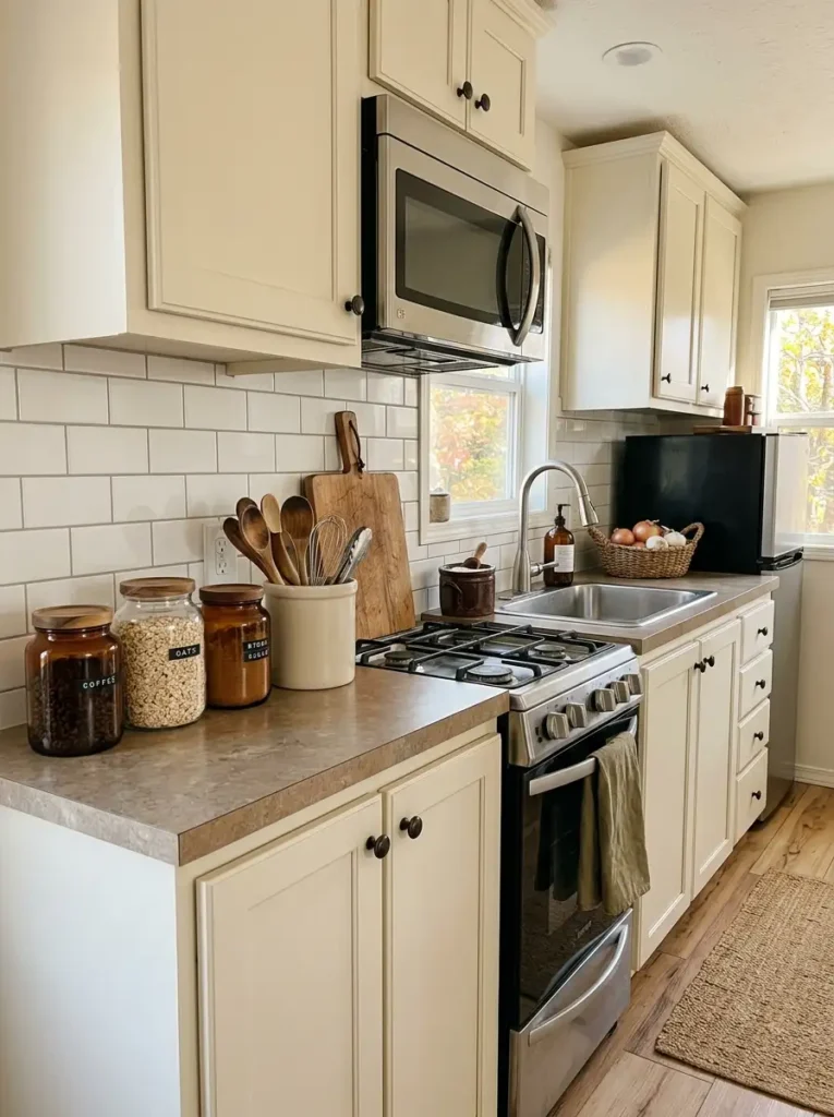
Before shopping for seasonal accessories, look at the objects that already live on your counter. Ingredient jars, utensil crocks, bread storage, oil bottles, and tea containers occupy visual space every day; their materials can contribute to fall just as effectively as decorative pumpkins.
Start with the highest-return moves.
Keep first: useful wood, amber glass, cream stoneware, warm brown pottery, woven containers, and muted metal finishes.
Upgrade selectively: if a frequently used item is already due for replacement, choose a version whose finish works throughout the year.
Skip: buying decorative containers for ingredients you normally keep elsewhere. Extra vessels create extra transferring, cleaning, and counter occupation.
The visual effect comes from repetition. Three useful jars in a similar material read as a controlled block; five unrelated packages create a noisier impression even if every one is practical.
Budget should follow function here. The best purchase is the one you would still want sitting on the counter in January. Fall comes from the color relationship around it, not from a permanent maple leaf printed on the front.
Spend Where Function and Seasonal Color Overlap
| Reuse | Existing wood boards, cream crocks, amber jars | Highest priority |
| Replace when needed | Daily utensil holder or storage jar | Medium priority |
| Buy season-only storage | Novelty pumpkin canister | Lowest priority |
13. Keep Stove-Side Fall Decor Inside a Defined Safe Zone
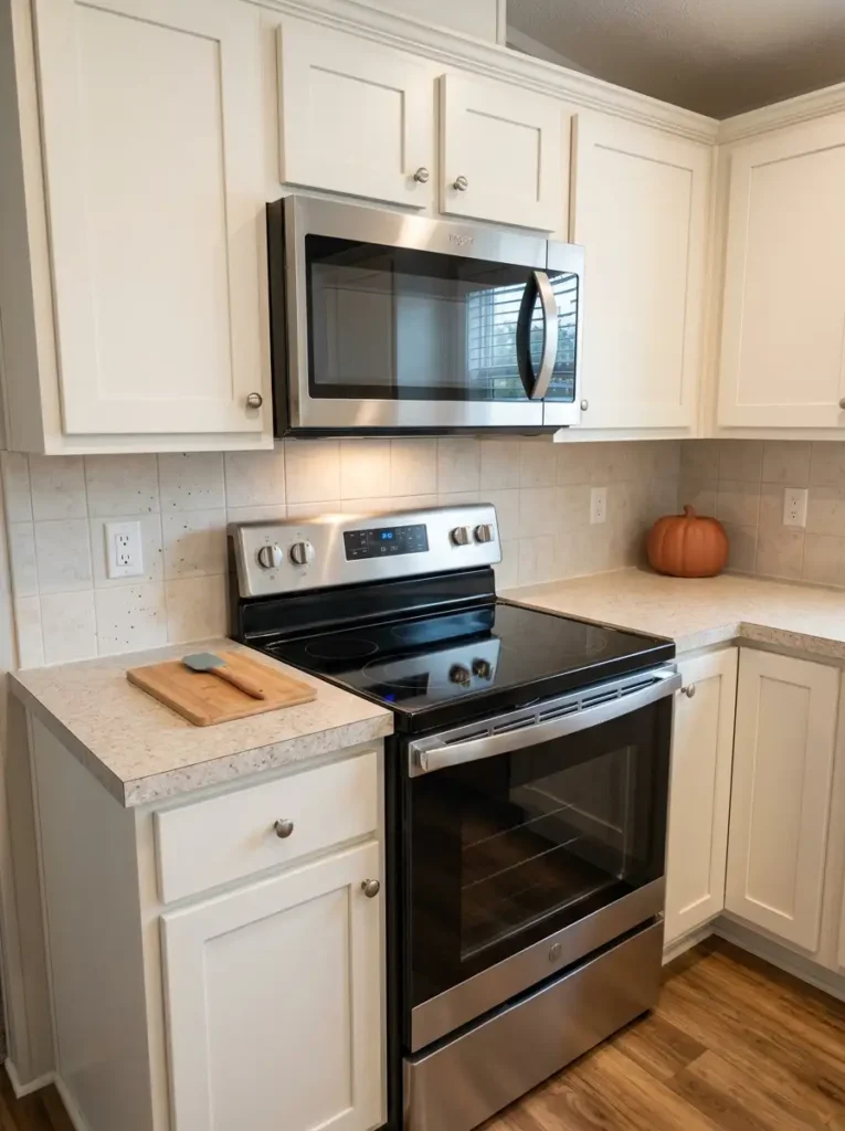
The range is an attractive place to style because it often sits near the visual center of the kitchen. It is also the area where decoration has the least freedom.
Fabric, loose foliage, candles, paper signs, and dangling garlands do not belong where heat, steam, grease, or moving cookware can reach them. A perfectly symmetrical stove wall is never worth creating an awkward or unsafe cooking zone.
Think of the range as having an invisible working envelope. Burner area, handles, nearby landing space, frequently reached controls, and the route used to move hot cookware all stay free. Decorative pieces begin beyond that envelope.
A safer approach uses stable, easy-clean objects on a counter section that does not participate in cooking. One small ceramic pumpkin or nonflammable seasonal object can provide color without introducing loose branches beside a burner.
The correction for an overcrowded range is simple: remove first, then reassess where the eye needs a seasonal accent.
Function decides the boundary. If a pot handle, splatter, hot pan, or your forearm could reasonably reach the object during normal cooking, that location belongs to the work zone.
Decorate Outside the Working Envelope
Use only where it is not needed for hot-pan landing or prep.
Keep burner surroundings, controls, and cookware movement free.
Stable seasonal pieces can live here if function remains unrestricted.
14. Give the Island or Breakfast Bar a Long, Low Centerpiece
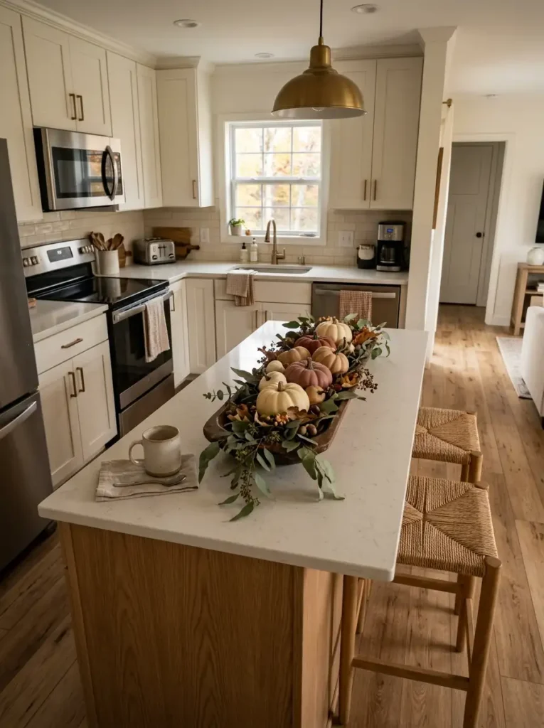
An island or breakfast bar is visually different from a small spare counter. Its length is part of the furniture’s architecture, so the fall arrangement should acknowledge that horizontal shape.
Build the centerpiece in this order:
- Measure the usable middle. Preserve the end used for stools, meals, homework, groceries, or serving.
- Create horizontal mass. A low wood bowl, elongated board, shallow vessel, or linear foliage arrangement echoes the island better than one towering bouquet.
- Vary height modestly. Keep the silhouette low enough that people seated opposite each other can see comfortably across it.
- Check the long view. Walk to the end of the kitchen. The centerpiece should appear connected to the island, not like a small object floating in its center.
Long surfaces need proportion, not necessarily more accessories. A broader arrangement with fewer pieces can feel calmer and more substantial than numerous little decorations.
If the island doubles as dining space, conversation wins. Seasonal styling belongs below the natural sightline between seated people.
Match the Centerpiece to the Furniture’s Long Axis
15. Style a Tiny Breakfast Nook With One Repeating Fall Motif
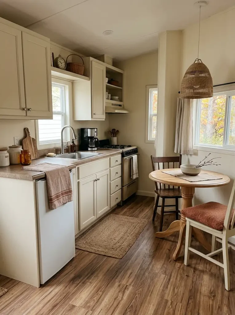
Imagine walking from a compact kitchen into a breakfast nook only a few feet away. The kitchen has rust accents, warm wood, and a small branch arrangement. The nook has pumpkins, plaid, leaf prints, orange cushions, and another large centerpiece. Both spaces say fall, yet they no longer feel like one room.
The connection can be much quieter.
Choose one cue from the kitchen and allow it to travel. It might be the same muted rust, a narrow stripe, woven rattan, dark wood, or the shape of autumn leaves. Repeat that single element in the nook through a seat cushion, small bowl, placemat, or framed piece.
Everything else can change. That difference keeps the dining area from looking like a duplicate of the kitchen.
Distance actually strengthens this technique. When two matching or related cues appear several feet apart, the eye notices the relationship and mentally connects the zones.
A tiny nook does not need a second full decorating scheme. It needs one visual handshake with the kitchen.
Once that link is established, leave some surfaces undecorated. The quieter nook gives the more detailed kitchen room to breathe while still belonging to the same seasonal story.
Repeat One Cue, Not the Whole Decorating Scheme
Kitchen
Rust appears as the main seasonal color while warm wood supports it.
Breakfast Nook
Rust returns once while the remaining colors and objects change.
16. Use Woven Baskets and Crates to Decorate the Lower Half of the Kitchen
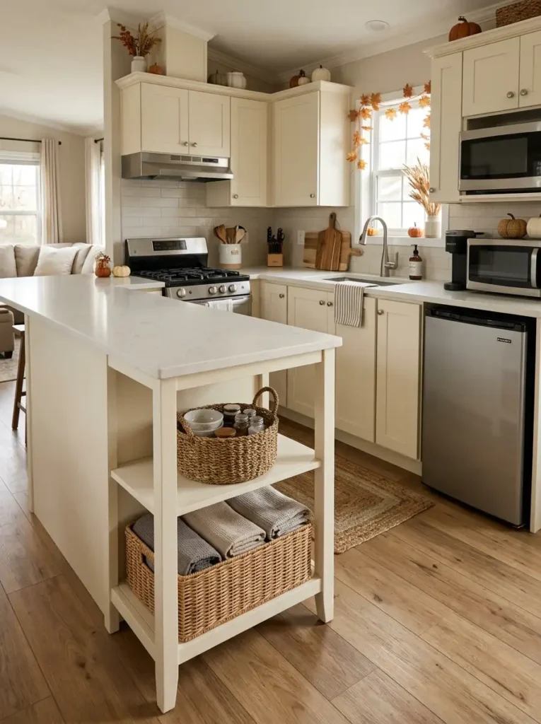
Look around a decorated fall kitchen and most seasonal detail usually sits from counter height upward. In a compact room, that can leave the cabinets, shelves, and foliage visually concentrated near eye level while the lower half feels noticeably heavier and plainer.
Woven baskets offer a useful counterweight because they bring autumn texture closer to the floor while earning their space through storage.
A basket beneath an open island can hold extra kitchen linens. A small crate on an accessible lower shelf may organize potatoes, packaged goods, or less-used serving pieces. Where open cabinetry allows it, warm wicker can soften a long run of painted doors without adding another object to the countertop.
Four consequences make lower-level styling worth considering: it distributes visual weight vertically, introduces natural fiber, hides practical storage, and gives the room seasonal depth from more than one viewing height.
Circulation remains the deciding factor. Nothing should project into an already narrow aisle, obstruct a toe-kick, interfere with cabinet doors, or create a tripping point.
Before buying a new basket, test one you already own. If it fits completely within the furniture footprint and stores something genuinely useful, its fall texture becomes a bonus rather than its only purpose.
Bring Some Seasonal Weight Below Counter Height
Garlands and cabinet décor pull attention upward.
Countertop accents dominate the middle layer.
Woven storage adds texture closer to the floor.
Keep the walking line completely clear.
17. Map Fall Decor Across Three Zones, Then Leave the Rest Quiet
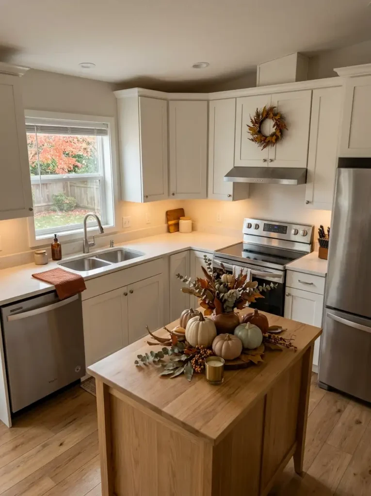
More decorated surfaces do not automatically produce a cozier kitchen. In a mobile home, equal seasonal intensity everywhere can make a limited number of cabinets and counters look even busier.
Try dividing the room into three roles.
The dominant zone gets the clearest fall statement. It might be the island centerpiece, cabinet canopy, sink window, or another feature visible immediately from the entrance.
The supporting zone carries a quieter echo through color, material, or texture. It should reinforce the first area without trying to become another focal point.
The atmospheric zone can be as subtle as warm lighting, a rust towel, or a useful amber container. Its job is to let the season reach another part of the kitchen almost subconsciously.
Now protect the spaces between them. A stretch of clear counter, undecorated cabinet doors, or an untouched backsplash gives each chosen zone a readable boundary.
This is where restraint becomes measurable: if your eye cannot quickly identify which seasonal area matters most, too many zones are competing.
The final room should not look sparsely decorated. It should look selectively decorated—one strong fall moment, one supporting connection, one quiet atmospheric cue, and enough ordinary kitchen left visible to make all three stand out.
Give Each Seasonal Zone a Different Level of Visual Authority
01 · Dominant
The primary fall feature seen first or carrying the strongest seasonal color, scale, or contrast.
02 · Supporting
A quieter area that repeats one relationship from the dominant zone without duplicating its full arrangement.
03 · Atmospheric
A subtle seasonal cue carried by light, texture, color, or one practical object.
Keep ordinary kitchen surfaces between decorated areas so every seasonal zone remains distinguishable.
Conclusion
A cozy fall kitchen does not require decorating every cabinet, counter, and corner. In a mobile home, the most effective changes are usually the ones that respect how the room already works.
Start with the problem you notice first. Limited prep space may call for vertical décor. A cold-looking kitchen may benefit more from warm materials or evening lighting. A long galley can gain seasonal character from the floor, while an island offers room for one stronger centerpiece.
You also do not need all 17 ideas at once. Choose a few that occupy different parts of the room, then let the undecorated areas give them contrast.
Save the ideas that fit your kitchen best, and build your fall look gradually until the room feels warm, functional, and unmistakably yours.