

Fall decorating a double wide can get busy surprisingly fast. A pumpkin on the kitchen island looks charming on its own, and so does a wreath in the living room—but when several decorated areas share the same view, the house can suddenly feel more crowded than seasonal.
The good news is that double wide fall decor does not need dozens of new accessories. A few well-chosen changes can shift the character of the home while leaving everyday surfaces, walkways, storage, and seating comfortable to use.
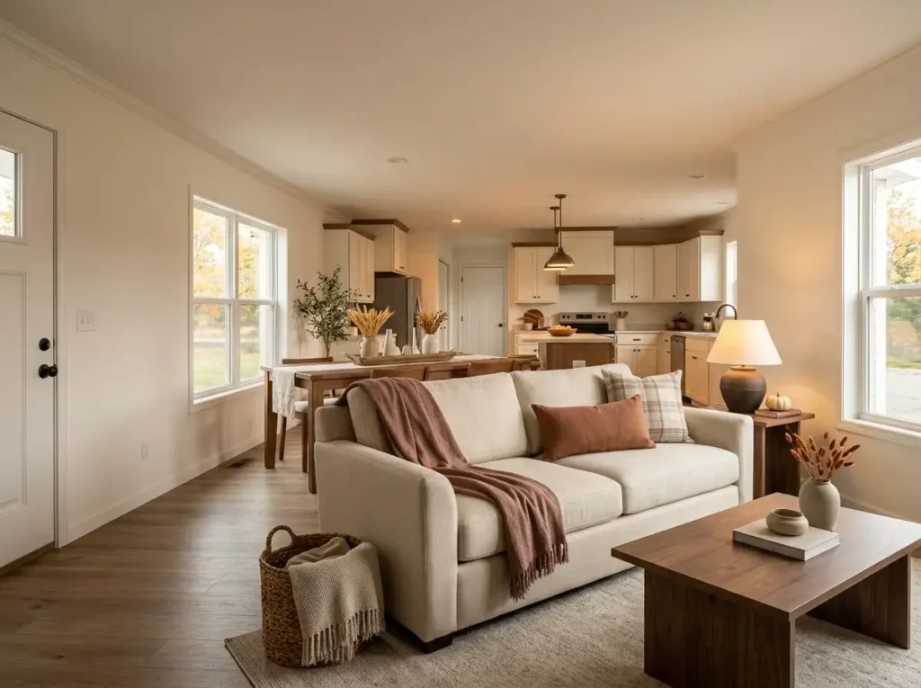
The most convincing autumn rooms also do not all look alike. Some feel rich with rust and amber; others rely on oatmeal fabrics, weathered wood, soft lighting, and only a hint of pumpkin color.
Instead of decorating every available surface, move through the home strategically—from the overall color direction and front door to the main living spaces, kitchen, bedroom, bathroom, and those easily forgotten corners.
The result is a double wide that feels unmistakably ready for fall without losing the relaxed, livable quality that makes it home.
1. Choose a Three-Color Fall Palette Before You Decorate
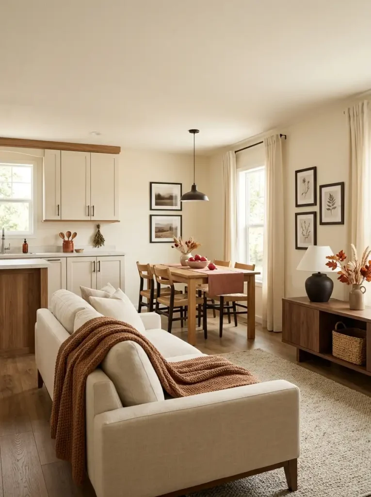
What colors should actually repeat through a double wide once fall arrives? Start with three roles rather than a shopping list: one color that already belongs to the home, one seasonal support color, and one smaller accent.
For example, a cream-and-walnut interior might keep cream as its background, introduce muted rust through textiles and foliage, then use deep espresso or black in tiny doses. Another home could pair warm beige with olive and ochre instead.
- Base: the color already covering the largest visual areas—walls, upholstery, cabinetry, or flooring.
- Support: the autumn shade noticeable from across the room, such as rust, cinnamon, moss, or muted pumpkin.
- Accent: the smallest but sharpest note, perhaps charcoal, aged brass, burgundy, or dark brown.
The useful distinction is visual mass, not object count. Five little orange pumpkins may contribute less color than one rust throw stretched across a sofa. Judge how much space a color occupies in your field of view instead of counting decorations.
This also prevents the common situation where the kitchen becomes orange, the living room burgundy, and the dining area mustard simply because each display looked attractive separately.
A simple decision rule: if a new fall piece introduces a fourth competing color family, it should either replace something or clearly belong to one of the three existing roles.
2. Turn the Front Porch Into a Fall Arrival Moment
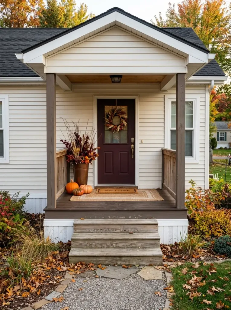
Picture walking toward the house with your hands full. Before you notice an individual pumpkin or wreath, you read the doorway itself: where the entrance begins, how open the path feels, and whether the arrangement seems to welcome you toward the door or force you around it.
That makes the threshold the smartest place to concentrate fall decorating. Instead of spacing little pumpkins along the full porch, build the strongest visual weight beside the door. One tall planter with copper-toned branches can be paired with a lower grouping of weather-resistant gourds, while a wreath or simple hanging element gives the eye something higher to connect with.
A layered outdoor rug can define the foreground, but keep its proportions believable for the actual entrance. If the porch is shallow, one rug and one mat usually work harder than several baskets competing for floor space.
Door operation matters too. Test the arrangement with the door fully open, while carrying a bag, and while someone else is entering. Decorations should sit outside that movement zone rather than turning an ordinary arrival into an obstacle course.
From the walkway, the final porch should read as one framed entrance, not a row of separate seasonal purchases.
3. Make the Entry Drop Zone Do Double Duty for Fall
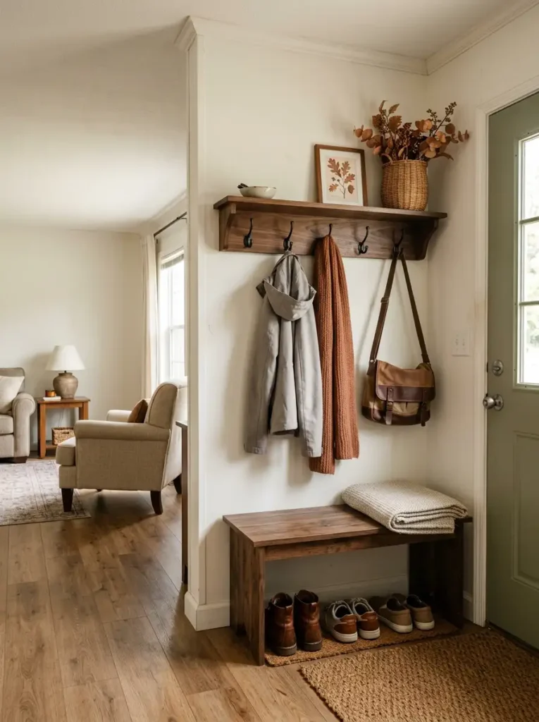
An entry area earns its space by handling real life first. Coats, keys, bags, shoes, and the things that follow you through the door still need somewhere to go after September arrives.
Instead of adding a separate decorative table, let one useful item carry more of the seasonal change. A woven wall basket filled with muted foliage, a rust-colored scarf on an existing hook, or a textured throw folded over a bench can introduce a much larger autumn surface than a collection of tiny ornaments.
This works especially well where the entrance opens directly into the living room. The entry gains its own seasonal identity without requiring another piece of furniture between the door and the main seating area.
Keep the most frequently grabbed items in the easiest reach zone. Decorative branches can sit higher, while bags, jackets, and everyday baskets belong where they can be used without moving the seasonal pieces first.
The test is practical: you should be able to come home, put down what you are carrying, hang something up, and leave again without rearranging the display. If decorating makes that routine harder, the entry has lost the job it was designed to do.
Upper zone — seasonal display
Use the less-accessed area above the working hook line for a small wreath, botanical stem, framed print, or another object that never needs to be moved during the daily routine.
Middle zone — fastest access
Items reached several times a day belong roughly between hip and shoulder height. Let useful seasonal textiles appear here, but avoid decorative pieces that occupy the actual hook or handle you need.
Lower zone — contained bulk
Shoes, pet leads, reusable bags, or an extra throw are easier to manage inside one broad basket or bench compartment than in several narrow decorative containers.
4. Give the Open Floor Plan One Dominant Fall Focal Point
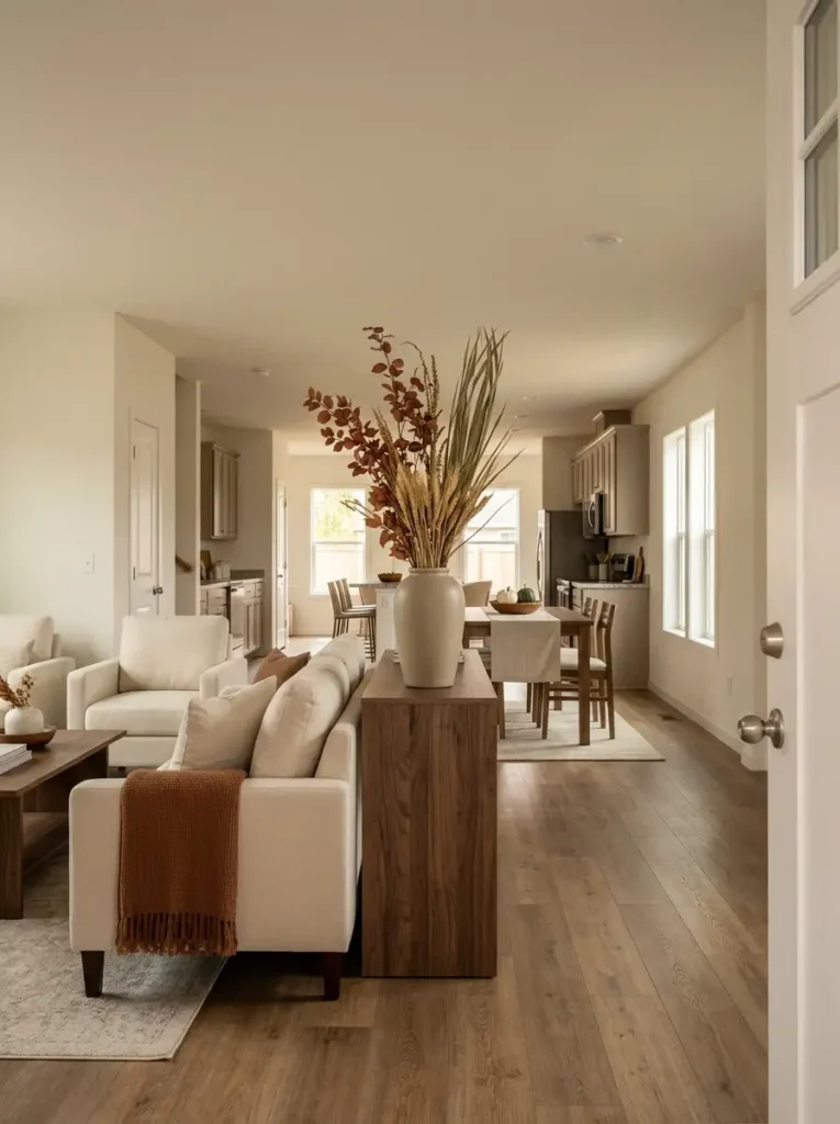
Stand at the main entrance of your double wide and look through the space before decorating anything else. In many layouts, you can see part of the living room, kitchen, and dining area from almost the same position.
That long view creates an opportunity—but also a problem. If the dining table carries a large centerpiece, the kitchen island has an equally strong display, and the living room adds a large wreath plus a heavily decorated media console, the eye has nowhere obvious to settle.
Choose one seasonal feature that deserves to register first from the home’s main arrival view. It might be a substantial arrangement on the dining table, a beautifully styled console, or one large botanical gesture near the living area. Which object you choose matters less than how clearly it outranks the others.
The adjoining zones should then work at lower intensity. A quiet bowl on the island or a small rust textile can acknowledge the season without demanding a second full stop from the eye.
There is a useful spatial reason for this. Decorative competition is not physical clutter, yet it can make an open room feel more compressed because several areas are demanding attention at once.
Check the hierarchy from the front door, the main sofa, and the kitchen. If three different seasonal displays become the “main event” depending on where you stand, reduce at least one of them.
5. Build Fall Warmth Into the Sofa Without Replacing Everything
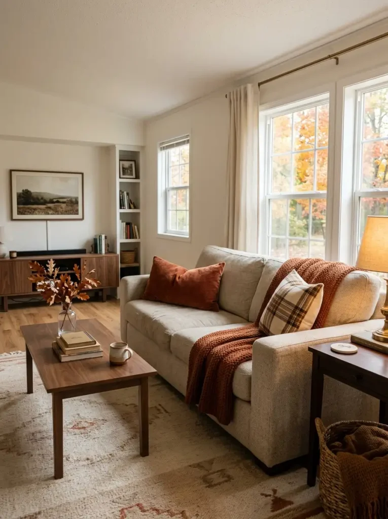
Think in visual weight, not pillow quantity.
A sofa has a large uninterrupted surface, so a relatively small textile change can alter how the whole seating area reads. The mistake is treating every cushion as an opportunity for another fall print.
Start with the piece that occupies the most area. If the sofa is cream, gray, tan, or another quiet neutral, keep most of that background visible. Then add one substantial autumn layer—a rust throw, a cinnamon lumbar pillow, or a larger patterned cushion—before deciding whether anything else is necessary.
A useful equation is:
quiet background + one larger seasonal field + one smaller contrast = enough
Pattern scale matters here. Tiny pumpkins, checks, leaves, and lettering on several similarly sized pillows create lots of edges for the eye to process. A larger check or restrained geometric mixed with solid fabric usually reads more clearly from across the living room.
Texture can do work that pattern does not. Brushed cotton, boucle, wool-look fabric, velvet, and chunky knit each catch light differently, so the sofa can change character even when the palette stays relatively restrained.
Finally, sit on it. If guests must remove a pile of decorative cushions before using the sofa, styling has crossed into storage.
6. Use the Windows as Your Lightest Fall Decorating Zone
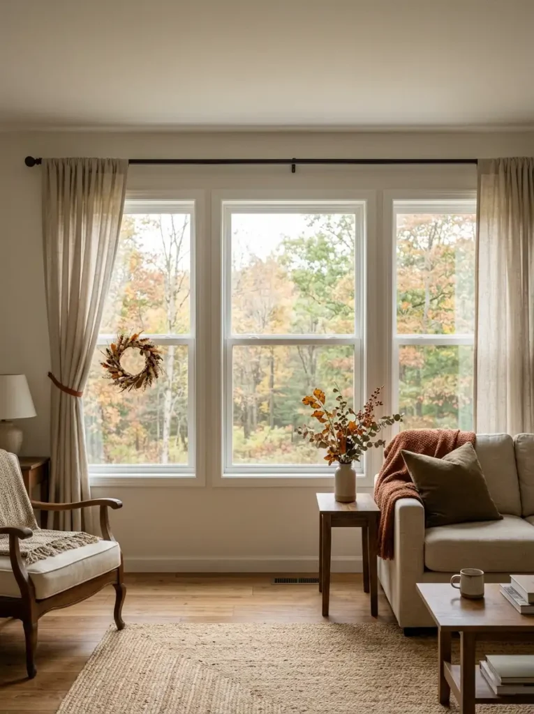
A window already contains one of the strongest contrasts in the room: the comparatively dark interior against bright outdoor light. That means fall decor placed there often appears more prominent than the same piece would against a painted wall.

Use that contrast carefully. Instead of filling the glass with thick garland, large wreaths, or several hanging ornaments, keep most seasonal interest around the edges of the opening. A restrained wreath on one window, a rust-toned curtain tie, or a small branch arrangement beside the sill can be enough.
There is a practical reason for staying light. Dark foliage or dense decorations placed directly across bright glass become silhouettes during the day. The outline may look attractive, but the decoration can also make the window opening appear visually smaller and reduce the amount of unobstructed daylight reaching the room.
For several windows on the same wall, you do not have to decorate every pane identically. One stronger seasonal moment can be followed by quieter neighboring windows.
Visual checkpoint: stand across the room during daylight. You should notice the outdoor view first, the window architecture second, and the fall detail third. If the decoration becomes the darkest, widest shape on the glass, reduce its size or move it toward the frame.
7. Keep the Kitchen Island Centerpiece Low, Wide and Useful
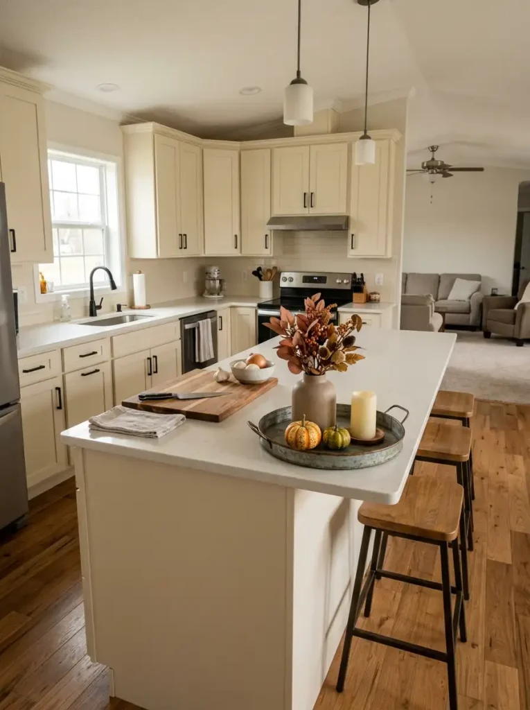
A beautiful kitchen island arrangement can still be the wrong arrangement if it occupies the exact spot where vegetables are chopped, groceries are unpacked, or plates are set down.
Wrong: building the centerpiece first and squeezing daily tasks around it.
Better: identify the island’s most-used work strip before adding anything decorative. If the sink or cooktop occupies one side, the opposite uninterrupted section may be more valuable for food prep than for pumpkins.
Best when: the seasonal display behaves almost like a single movable object. A broad tray can hold a short ceramic vessel, a few small gourds, or a candle-safe accent while letting the entire arrangement relocate in seconds when the island is needed.
Height matters differently here than it does on a console. A tall centerpiece positioned directly between stools and the cooking area can interrupt conversation and make the island feel divided. Keep the primary mass relatively low when people regularly sit across from one another.
Also watch the ends. Leave enough clear surface near the stools for drinks, elbows, homework, or a casual meal rather than treating every unused inch as decorative territory.
The most useful island centerpiece is not necessarily the smallest—it is the one whose footprint and position respect the jobs the island already performs.
8. Edit the Kitchen Shelves Before Adding Fall Decor
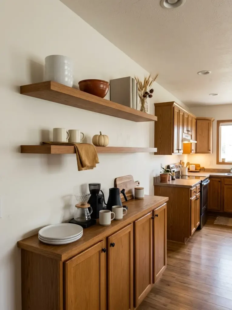
Open shelving rarely needs more objects first. It usually needs space for the seasonal objects to become visible.
Look at each shelf as it already exists. Everyday mugs, bowls, jars, framed art, cookbooks, and small plants may have filled nearly every usable gap over time. Adding pumpkins between them simply creates another layer of information for the eye to process.
Try an edit before you shop:
- Keep: pieces you use regularly or objects large enough to establish the shelf’s structure.
- Move: duplicate colors, extra frames, small plants, or accessories that can live elsewhere until winter.
- Remove temporarily: anything whose only job is filling a gap that no longer needs to be filled.
Then introduce fall selectively. One rust ceramic bowl, a short branch clipping, or a small natural pumpkin may now read clearly because it has empty space beside it.
Shelf depth matters as well. Decorations placed along the very front edge can make shelves appear crowded and interfere with frequently used dishes. Push visual pieces toward the back where appropriate and protect an accessible zone for everyday items.
There is a simple stop signal: when each seasonal object can no longer be identified quickly from several feet away because its outline overlaps another object, the shelf needs subtraction—not one more accessory.
How much empty area should surround a seasonal object?
Instead of chasing a fixed percentage, look for visible separation around the object’s silhouette. If its outline merges with jars, frames, foliage, or stacked dishes on both sides, create at least one clear edge.
Which shelf should stay the quietest?
Often the shelf closest to the primary work surface benefits from lower decorative density because frequently handled objects need quicker visual recognition and easier reach.
9. Let the Dining Table Bring In the Natural Side of Fall
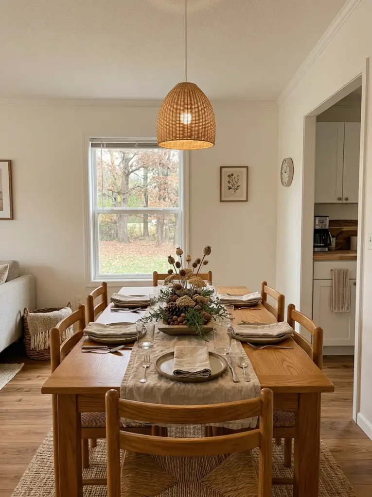
Fall does not have to arrive at the dining table through another group of orange pumpkins. Sometimes the season reads more convincingly through material: wrinkled linen, unfinished wood, dried stems, matte pottery, seed pods, or a weathered bowl.
These finishes interact with light differently from glossy ceramics and polished metal. Rough and fibrous surfaces scatter light softly rather than producing sharp reflections, which can make a dining area feel visually gentler when lamps or pendants are switched on at night.
Keep the centerpiece elongated and relatively low if the table is used for meals. A wooden trough with dried stems, a loose runner with a shallow bowl, or several low pieces arranged along the centerline can occupy enough length to suit the table without creating a wall between people.
The tradeoff is maintenance. Real leaves may curl and shed. Dried grasses can release small fragments. Natural gourds eventually need replacing. Use those materials where that imperfection feels appropriate, and choose washable linen or durable faux botanicals when cleanup matters more.
This is also a good place to let color become quieter. Wheat, mushroom, brown, oatmeal, muted olive, and weathered terracotta can communicate the season through texture and finish rather than obvious motifs.
The table should still be able to become a dining table quickly when dinner begins.
10. Layer Fall Lighting at Three Different Heights
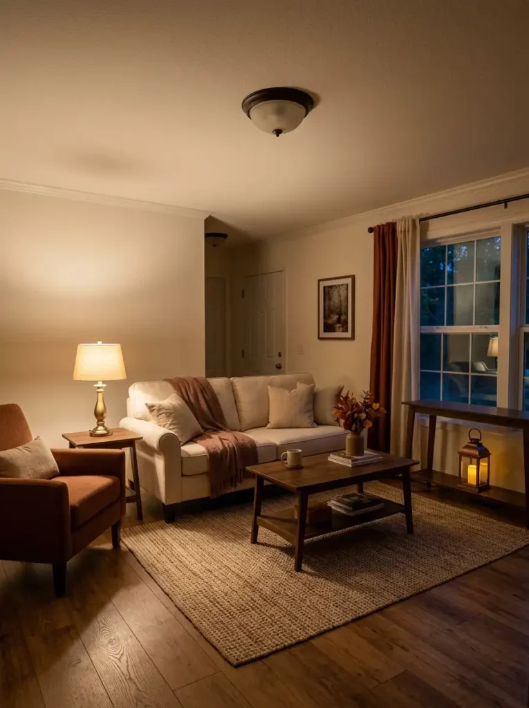
If your double wide feels bright enough but still looks flat after sunset, do not automatically buy brighter bulbs. First look at where the light is coming from.
1. Keep the upper layer for overall visibility
Ceiling fixtures, pendants, and recessed lights handle circulation and general illumination. They are useful, but when they do all the work, furniture can look evenly lit from above with very little shadow variation.
2. Add a middle layer where people actually spend time
A table lamp beside the sofa, a floor lamp behind a reading chair, or a small shaded lamp on a console moves some light closer to eye level. This is usually the layer that makes seating zones feel more separate after dark.
3. Finish with controlled low light
Battery candles inside lanterns, a tiny lamp on a low cabinet, or a safe LED candle arrangement can illuminate the bottom portion of the room. Keep this layer selective; too many small glowing sources turn the room into a dotted pattern.
Bulb temperature matters, but it cannot replace placement. A warm bulb installed only in the ceiling is still upper light.
The useful evening test is to switch the ceiling fixture off temporarily. If the room immediately becomes unusable, your middle layer is probably too weak. If every surface remains equally bright, you may have too many competing sources rather than too little light.
11. Use One Oversized Branch Arrangement Instead of Many Tiny Florals
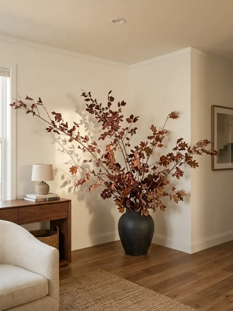
A collection of small fall bouquets can disappear visually in a room with long walls, wide windows, or an open connection to the kitchen. In those places, one larger branch arrangement can behave almost like a piece of temporary architecture.
Choose a floor vase, substantial pottery vessel, or stable jug with enough weight to support long stems. Then let the branches extend outward as well as upward. A narrow bundle that shoots straight toward the ceiling often looks undersized even when it is tall.
The useful scale relationship is the empty area around it. If you are filling a bare corner beside a console, the branch spread should occupy a meaningful portion of that unused wall volume without touching the ceiling, curtains, or nearby artwork.
This is especially effective with burgundy leaves, muted copper stems, dried oak branches, seed heads, or other botanicals whose silhouette can be recognized from across the room.
Avoid repeating smaller floral arrangements nearby. They weaken the effect by turning a strong gesture into a theme.
There is also a safety issue: tall arrangements become surprisingly top-heavy. Use a broad, weighted vessel in traffic-adjacent areas rather than balancing long branches inside a lightweight decorative bottle.
The arrangement is large enough when the empty corner feels occupied but not filled.
12. Create One Cozy Fall Reading Corner
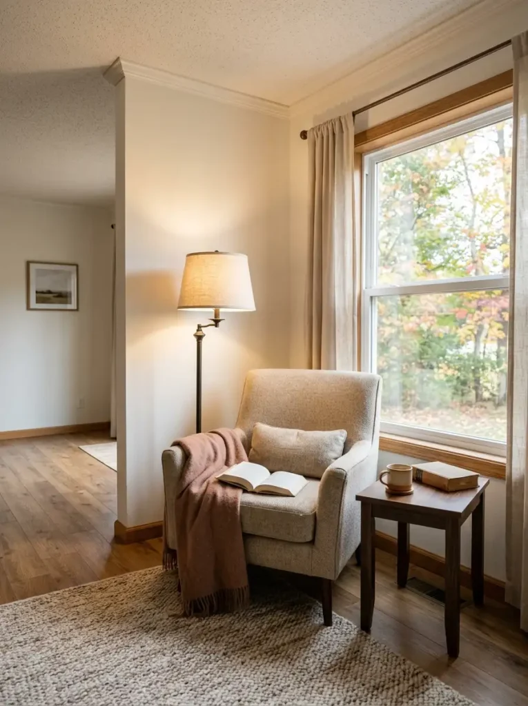
Not every fall decorating idea has to change the appearance of a room first. One of the strongest seasonal upgrades can change what you actually do there.
Take an underused corner and give it a specific job: reading, morning coffee, knitting, journaling, or simply sitting somewhere away from the television. Start with a comfortable chair you already own before shopping for a statement piece.
The chair alone does not create a usable nook. Its support pieces have to fall within a comfortable reach radius. A small table should hold a drink or book without forcing you to lean forward, while the lamp should illuminate the page rather than the top of your head.
Angle the chair slightly toward the room rather than pressing every piece flat against the wall. That small rotation can make the nook feel like a deliberate zone while still letting it belong to the surrounding living room.
Then add one seasonal textile—a wool-look throw, rust lumbar cushion, or soft plaid—and stop there unless another item solves a functional problem.
The often-missed measurement is circulation beside the chair. A cozy corner stops feeling relaxing when its ottoman, basket, or side table pinches the route into another room.
If you can sit down, reach your drink, switch on the lamp, and get back up without shifting anything, the nook works.
13. Shift the Bedroom Into Fall With the Foot of the Bed
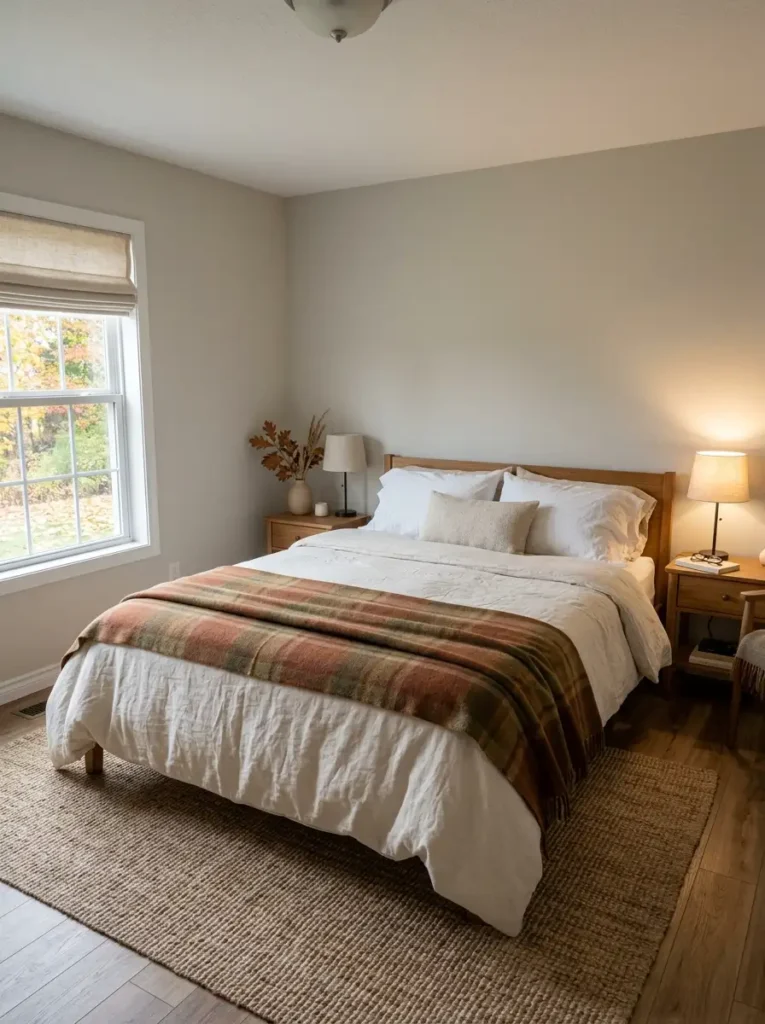
The fastest place to change the seasonal character of a bedroom is often not the pillow arrangement. It is the lower third of the bed, where one substantial textile can alter a large visible surface without interfering with how you sleep.
Keep your everyday duvet or coverlet in place, then introduce a quilt, blanket, or substantial throw across the foot. Rust, camel, muted olive, chocolate, plaid, or a textured neutral can work depending on what already exists in the room.
Width is important. A throw folded into a very narrow strip can visually divide the mattress into two unrelated sections. Let the seasonal layer cover enough of the bed’s width that it reads as part of the bedding rather than a scarf laid across it.
There is no need to stack every possible material. If the bedroom already has a heavier duvet, another chunky knit may become uncomfortable or difficult to store overnight. A lighter cotton quilt can contribute color and pattern without adding unnecessary heat.
The most useful layering should also survive laundry day. Delicate tassels, loose weave, or dry-clean-only blankets become less practical when they are used every evening.
Think of the bed as a seasonal progression: base bedding for sleep, foot layer for temperature, then one optional decorative accent. Stop when the bed still looks easy to turn down at night.
14. Give the Bathroom Just Two Fall Signals
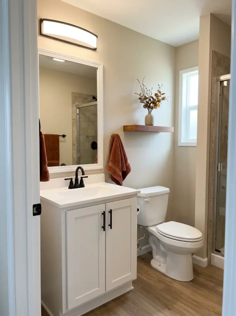
Bathrooms magnify decorations in a way other rooms do not: the mirror can make one object appear twice.
That matters when deciding how much fall decor the room actually needs. A rust hand towel hanging beside the vanity may already be visible both directly and in reflection. Add an orange vase, pumpkins, shelves, seasonal soap, art, and another towel, and the reflected view can become far busier than the physical object count suggests.
A simple approach is to choose two signals with different jobs.
If the bathroom has generous counter space, use one washable textile—perhaps a cinnamon hand towel—and one raised accent such as a small floral stem on a shelf.
If the vanity is narrow, keep the countertop clear. Let a towel provide the color and move the decorative element to an existing wall shelf or another dry surface.
Humidity changes the material choice as well. Paper decorations, unfinished natural materials, and delicate dried botanicals can age quickly near a frequently used shower. Ceramic, glass, washable fabric, and sealed wood are easier to maintain.
The mirror gives you the final check. Stand at the bathroom entrance and look at both the room and its reflection. If the same seasonal color dominates both views simultaneously, one of the two signals is probably already doing enough.
15. Make Fall Blankets Part of the Storage Plan
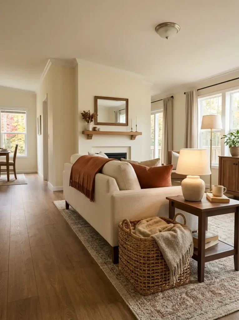
Before buying a decorative blanket ladder or another basket, decide whether you actually need more blankets or a better place for the ones already in use.
A useful storage choice depends on how often the textile moves.
- Daily use: choose a broad open basket or bench cubby that can accept a loosely folded blanket in seconds.
- Occasional use: a rack or deeper storage basket can work because retrieval speed matters less.
- Display only: reconsider whether the textile needs to occupy floor space at all.
One detail is easy to miss when shopping online: opening size matters more than total basket height. A tall basket with a narrow mouth can hold plenty of fabric but still require you to compress and stuff a thick throw every evening.
Placement should follow the person using it. Keep a sofa blanket beside the seating zone rather than across the room simply because an empty corner happens to fit a basket.
Breathability also matters for natural fibers. Do not pack slightly damp or frequently used wool-look throws into sealed containers immediately after use.
Spend money here only when the storage solves an existing problem. If a sturdy basket you already own accepts the blanket easily and stays out of the walking path, it is already doing the job.
The goal is not to display storage. It is to make using seasonal textiles easier than leaving them piled on furniture.
16. Style the TV Wall Instead of Pretending You Have a Mantel
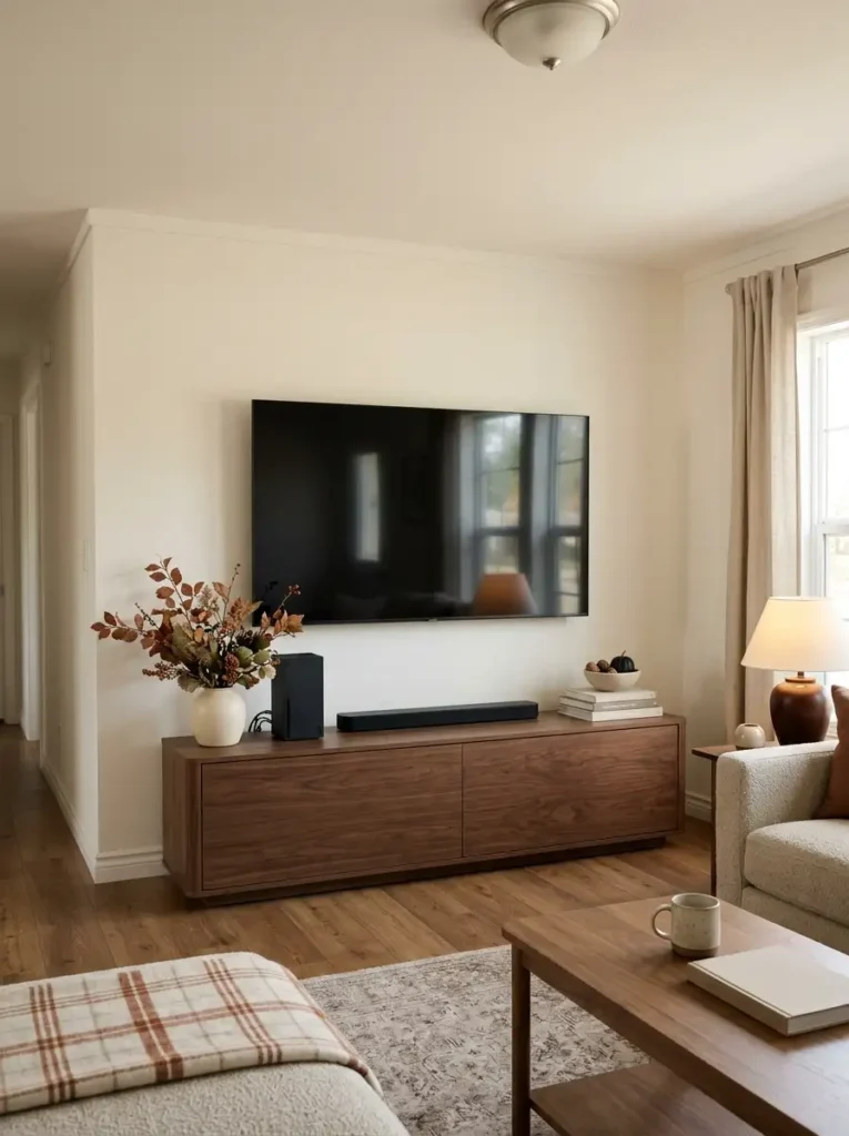
A television is already one of the darkest and visually heaviest rectangles in many living rooms. Trying to disguise it with a thick fall garland, matching signs, pumpkins on both sides, and decorations outlining the screen usually makes the television more noticeable, not less.
Treat the media wall as its own piece of architecture instead.
If the TV sits above a console, keep most seasonal weight below or outside the screen’s perimeter. A low branch arrangement at one end and a smaller object at the other can widen the composition horizontally without creating a decorative frame around the television.
Console width matters. A very narrow media unit under a large screen already creates a top-heavy relationship; piling tall decor onto that same console increases the imbalance. In that situation, wider low objects—books, a shallow bowl, pottery, or a small textile detail—usually work better than more height.
Leave space around vents, gaming systems, soundbars, and other electronics. Seasonal styling should never restrict airflow or block remotes and sensors.
There is no need to manufacture a faux mantel just because fall inspiration often centers on fireplaces. Your actual room has its own focal architecture.
The test: when the screen is off, the wall should still feel composed. When the screen is on, the decorations should recede enough that they do not compete with what you are watching.
17. Do a Seasonal Edit Before You Call the Double Wide Finished
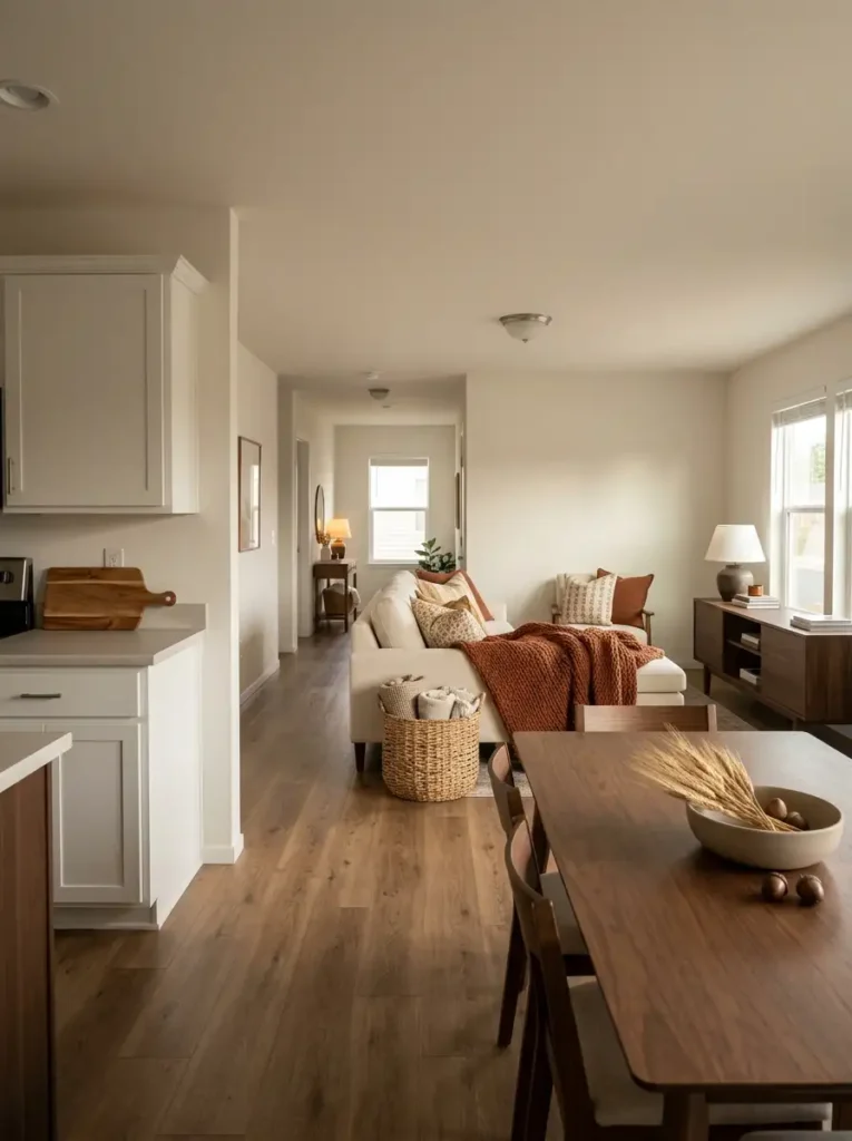
Once every room has some fall character, decorating is not finished yet. Walk through the house one more time—but this time, do not look for empty places to fill.
Look for seasonal ideas that repeat within the same view.
Stand where the living room, dining area, and kitchen can be seen together. Perhaps the island has a large arrangement, the dining table has another, and the media console carries a third display of similar strength. Each may look attractive up close, yet together they can tell essentially the same visual story three times.
Use three labels as you walk:
Keep the display that contributes something distinctive or belongs naturally to its location.
Reduce a nearby arrangement when the room still needs a small seasonal cue but not another complete focal display.
Remove anything whose absence you barely notice after stepping back to the main viewing position.
The important measure is not how many decorations exist throughout the home. It is how many compete simultaneously within one sightline.
Some surfaces should therefore remain almost unchanged. A quiet countertop, bare stretch of console, or undecorated wall gives stronger seasonal areas enough surrounding space to register clearly.
Before purchasing one final pumpkin, wreath, or basket, try moving or removing something first. If the room becomes clearer rather than emptier, the edit was doing more work than another accessory could.
Conclusion
A cozy double wide does not need every one of these ideas implemented at once. The best starting point depends on what currently feels unfinished.
For the biggest whole-home change, begin with the color direction and the main shared sightline. If you want an easier weekend update, focus on the porch, sofa, bedroom, or bathroom. When function is the problem, tackle the island, entry, lighting, or blanket storage first.
What makes double wide fall decor convincing is not the number of pumpkins or wreaths you can fit inside. It is choosing seasonal changes that belong naturally to the way each part of the home is used.
Save the ideas that fit your rooms now, then return to the others when your home actually needs them.