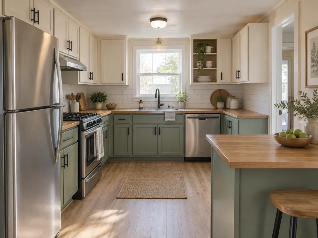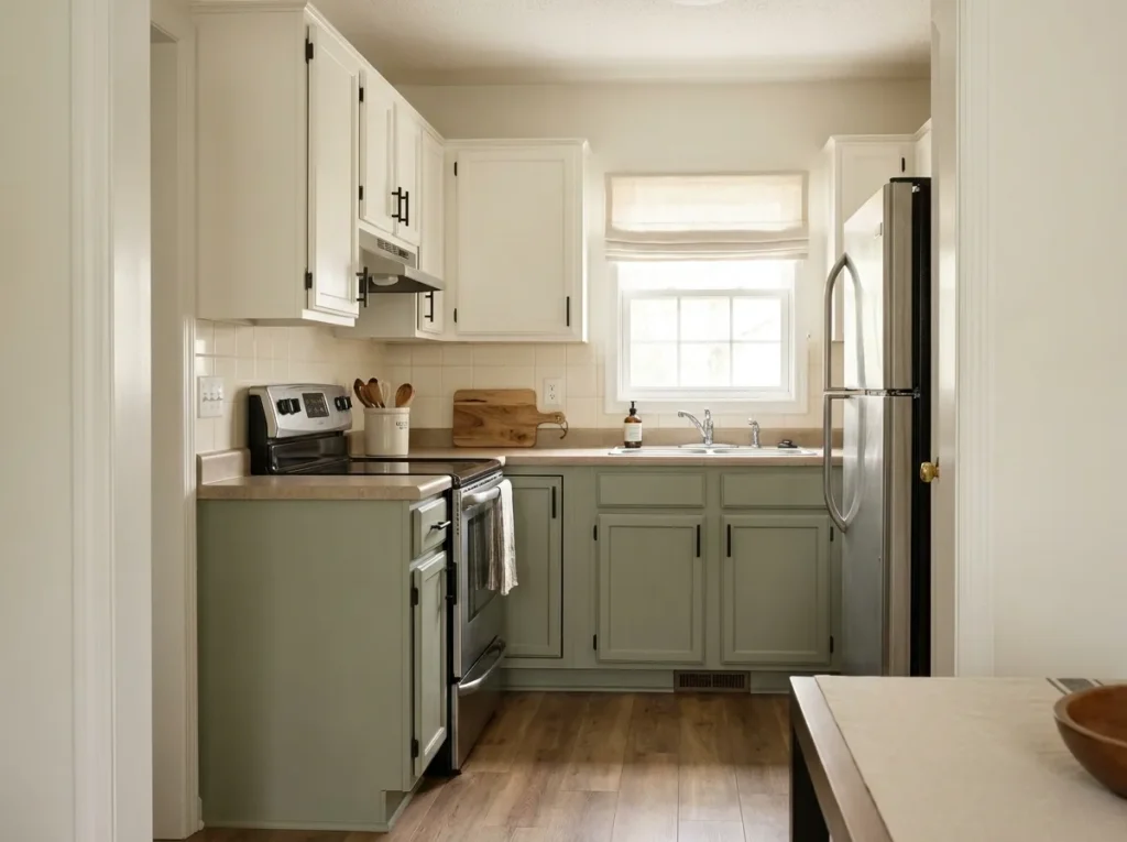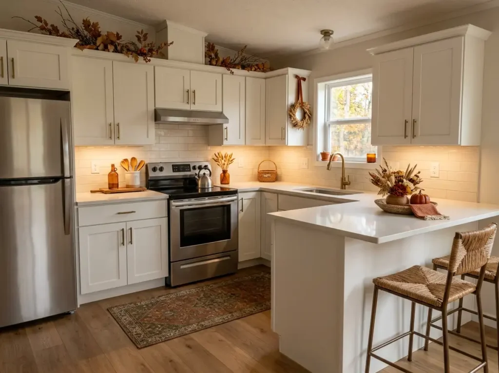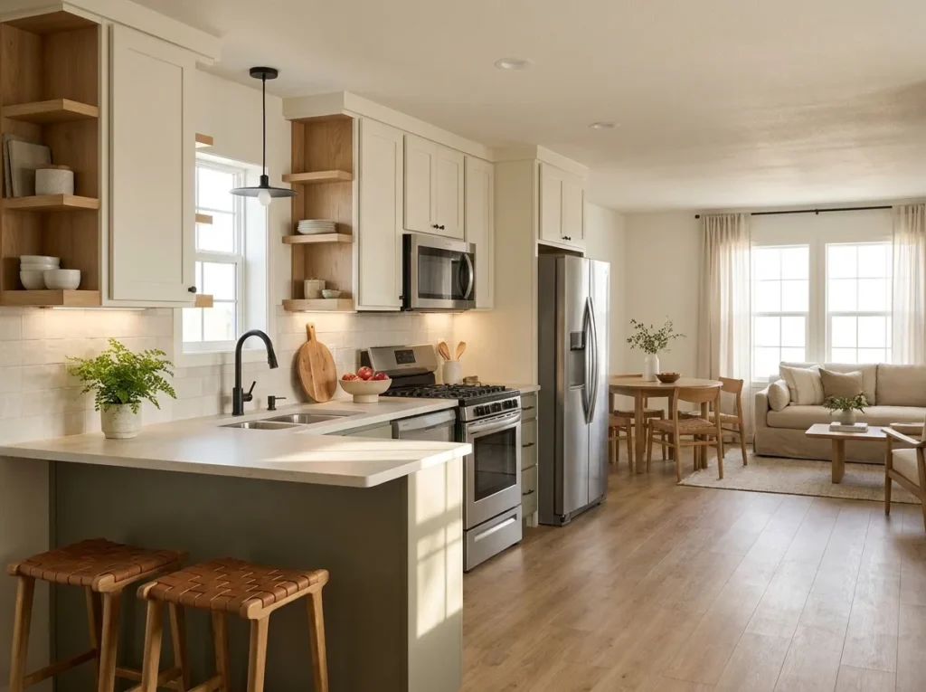
A mobile home kitchen does not need a huge footprint—or a complete demolition—to feel noticeably fresher. Because the kitchen often sits along one of the home’s longest sightlines, cabinet color, counters, lighting, storage, and even a small peninsula can influence how the living and dining areas feel too.
That visibility also makes poor choices harder to hide. A busy backsplash beside a strongly patterned counter, dark upper cabinets in an already compressed galley, or open shelves packed with décor can make a small kitchen feel more crowded than it really is.
The best mobile home kitchen ideas work with those constraints. They make the room easier to use, quieter to look at, and more connected to the surrounding home.
These 25 ideas move from high-impact visual decisions to smarter storage, work zones, lighting, and selective remodeling—so you can recognize what deserves changing, what is worth keeping, and where another renovation may add very little.
1. Judge the Kitchen From the Longest Sightline First
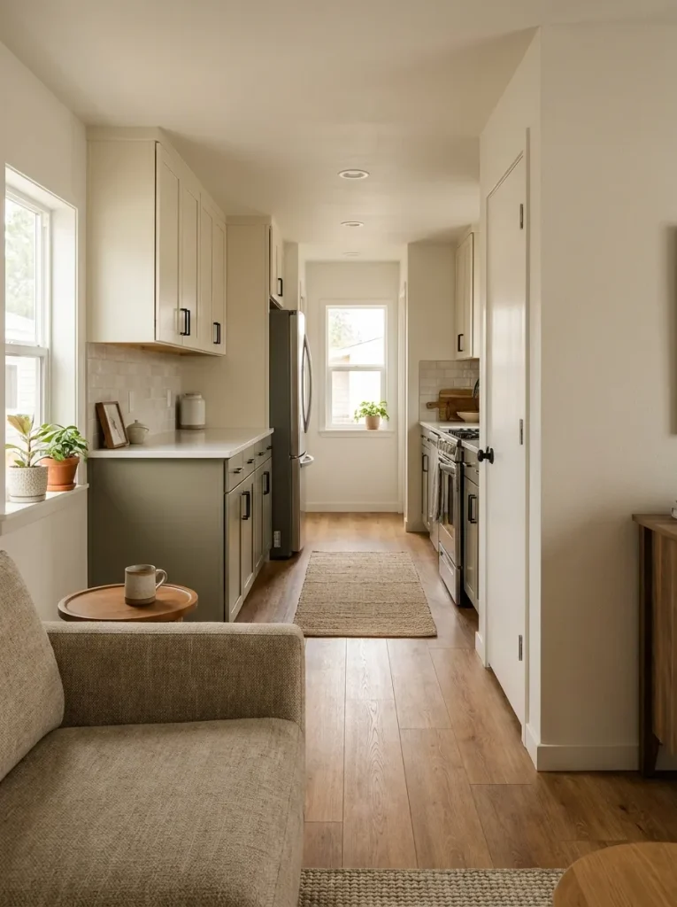
Before looking closely at cabinet pulls or backsplash samples, walk to the point where you normally first see the kitchen from the living room, dining area, or hallway. In many mobile homes, that distant view tells you more than standing directly in front of the cabinets because several kitchen elements enter the frame at once.
Take a quick phone photo from that position and reduce it to a small thumbnail. Then identify the first feature that still demands attention.
- Cabinetry dominates: the color, door style, or upper-cabinet mass may be controlling the room.
- Counters and backsplash dominate: the fixed surfaces may be creating too much visual movement.
- Appliances dominate: strong black, white, or stainless blocks may need better integration with the cabinetry around them.
- Clutter dominates: the kitchen may need storage editing before it needs new finishes.
- The route dominates: a stool, peninsula, or appliance door may be interfering with circulation.
The useful priority is the feature that affects several connected views, not simply the detail that looks oldest from two feet away.
A narrow kitchen with acceptable cabinets can change dramatically after its counters are cleared and one dominant finish is simplified. A larger double-wide kitchen may need a stronger focal wall because everything currently carries equal visual weight.
Sightline rule: fix the element that keeps announcing itself from outside the kitchen first. Smaller updates become much easier to judge once that visual problem settles.
2. Run a Keep–Calm–Change Scan Before You Shop
A kitchen can feel dated even when much of it still works. Treating every visible surface as a replacement project can turn a manageable refresh into an unnecessary remodel.
Before buying anything, divide the kitchen into three mental categories: keep what still works, calm what is visually noisy, and change what is genuinely holding the room back.
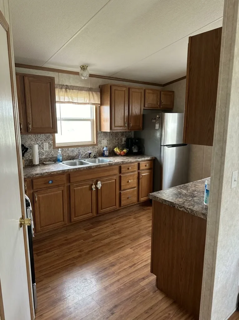
Use the diagnostic below to find the strongest first move.
Kitchen Priority Scan
What is actually making the kitchen feel dated?
Choose the problem that dominates the room from its main entrance. The result below changes the first move, what deserves protection, and the point where you should stop.
Compare paint, refacing or simplified hardware before assuming the boxes themselves need replacing.
Keep a working cabinet layout when the inconvenience is mainly color or door style.
If the cabinet wall no longer dominates the connected view, smaller accents can be judged more accurately.
Decide whether the countertop or backsplash deserves stronger movement, color or texture.
A serviceable neutral finish may become an asset once its visually louder neighbor is simplified.
The pair should read as coordinated surfaces, not two competing focal features touching at the wall.
Assign daily appliances, dishes and pantry items a real storage zone before buying decorative organizers.
Countertop acreage is especially valuable in a compact kitchen; do not turn it into permanent storage by default.
The room has enough storage once routinely used surfaces can be cleared without moving items into another room.
Notice where stools, doors, refrigerator access and walking routes interfere with food prep or passing traffic.
A peninsula or table should organize the room without becoming a visual or physical wall across the home.
Once people can pass, sit and open major appliances without repeated conflicts, cosmetic changes become worthwhile.
The important part of this exercise is the reassessment. A dark cabinet wall may seem like the whole problem until it is lightened; then overcrowded counters become obvious. A beautiful new backsplash cannot compensate for a peninsula that blocks everyday movement.
Work one layer at a time and recheck the same doorway view before committing to the next purchase.
3. Refresh Sound Cabinet Boxes Before Replacing Them
Picture a compact galley where the cabinet layout already places dishes, cookware, and food storage in sensible locations, but the doors have a dated wood finish and mismatched hardware. Replacing every box would solve an appearance problem with a much larger intervention than the room necessarily needs.
Start with the cabinet condition, not its color.
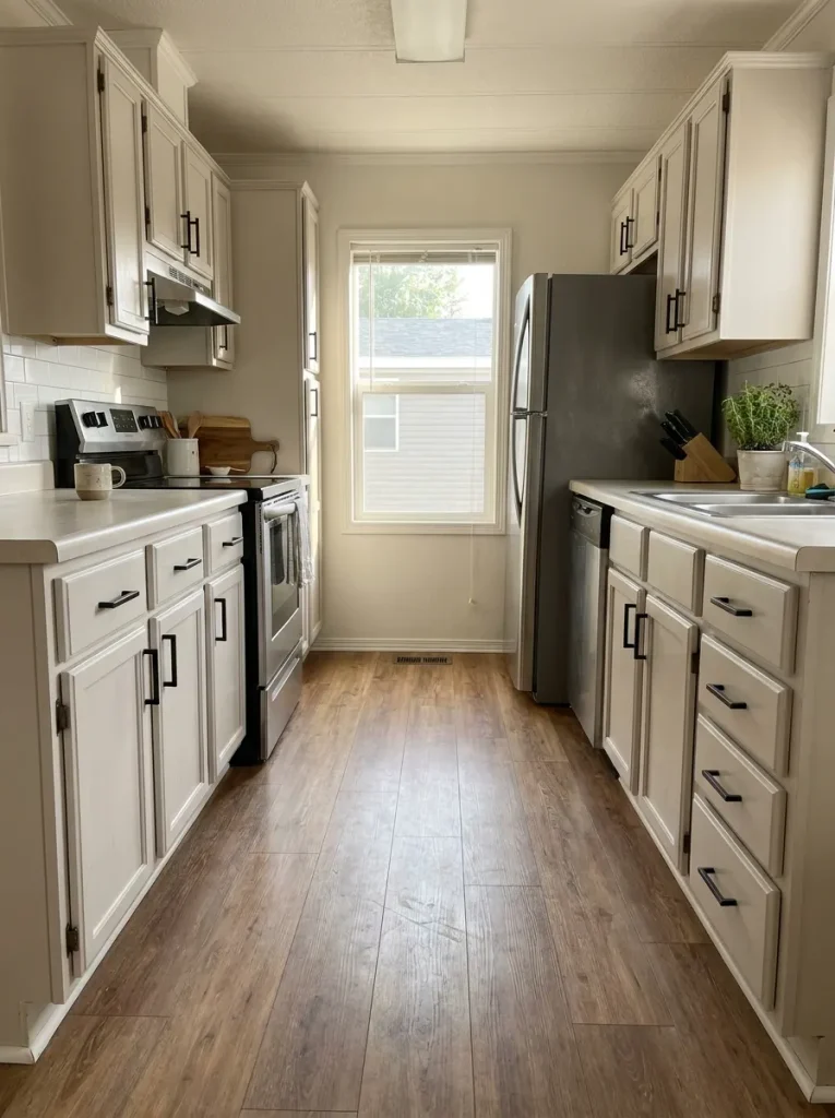
Doors that close properly, drawers that operate normally, and boxes that remain solid are candidates for a cosmetic update. Peeling surfaces, swollen material, damaged boxes, or a layout that repeatedly frustrates daily use deserve a different conversation. Paint cannot correct failed cabinet construction or poor storage planning.
For cabinets that pass the keep test, bring a large color sample directly into the kitchen. View it beside the flooring, countertop, and appliances during daytime and again under the kitchen’s evening lighting. A color that looks sophisticated on a sample board can become too gray, too yellow, or too heavy once surrounded by the room’s existing undertones.
In a mobile home where the kitchen is visible from the adjoining living area, also step several feet away before deciding. The cabinet field has to work with the whole shared interior, not only the backsplash immediately behind it.
For double-wide readers planning a broader transformation, StylishGalore’s Double Wide Makeover Ideas guide goes deeper into cabinet refresh and makeover decisions.
Keep-box threshold: when the cabinet structure, storage pattern, and general layout still serve the household, address the visible finish before pricing an entirely new kitchen.
4. Give Upper and Lower Cabinets Different Visual Weight
Does a modern kitchen automatically need two-tone cabinets? No. The useful question is whether the upper and lower halves of the room currently carry the right amount of visual weight.
Upper cabinets sit close to eye level. In a narrow mobile-home kitchen, a deep color across every upper door can make the walls seem to press inward—especially when the ceiling is low or the cabinet run is long. Keeping uppers light while allowing a deeper color below can preserve brightness near the face while giving the room a grounded base.
The opposite problem also happens. An all-white kitchen with pale flooring, pale counters, and white appliances may lose definition. In that situation, contrast does not have to come from dark upper cabinets. A medium-tone base cabinet, warmer peninsula, black hardware, or a stronger range wall may provide enough structure.
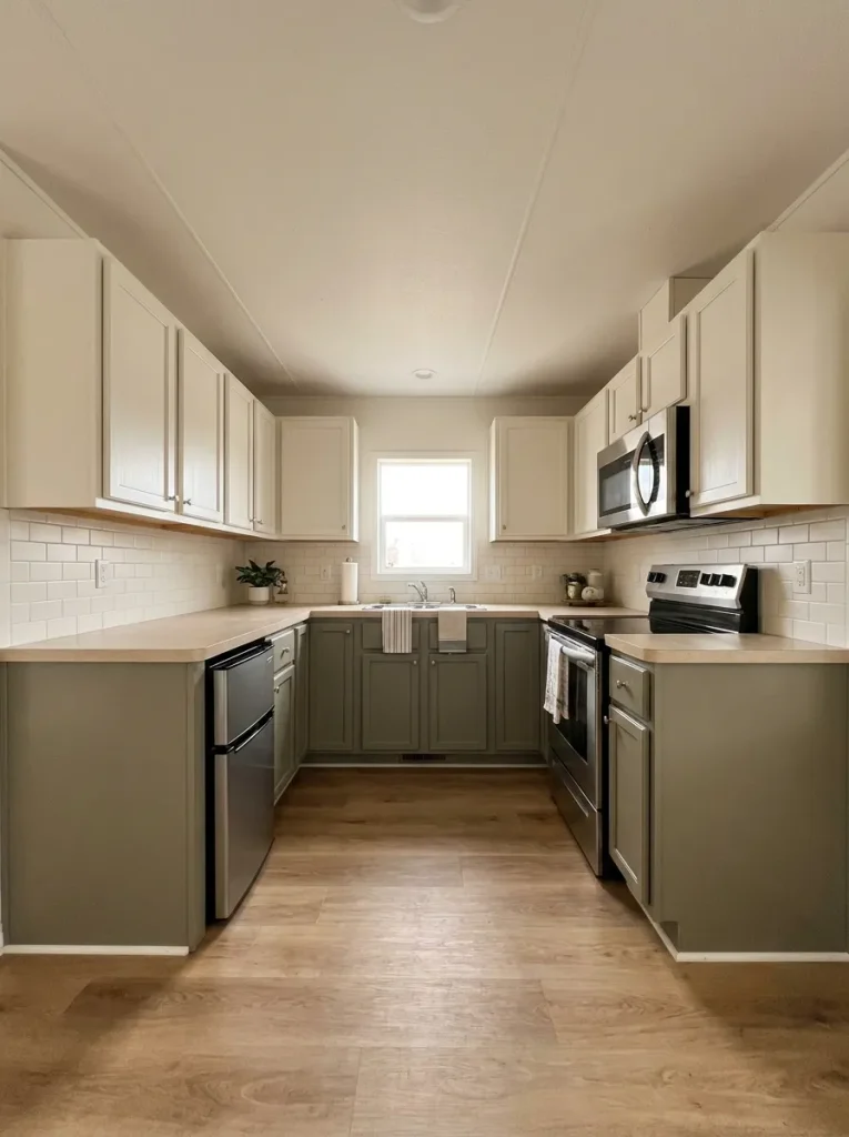
Use the existing room to choose the split:
Narrow galley + limited daylight: keep the upper field quiet and place stronger color lower in the room.
Bright double-wide kitchen: one cabinet color can work beautifully across the full elevation; use the island, peninsula, or work wall for contrast if the room needs hierarchy.
Very dark flooring: test deep lower cabinetry carefully. The base can become one large dark mass when both surfaces carry similar visual weight.
The objective is not to force a trendy two-color scheme. It is to decide where the room can comfortably hold visual depth.
Stand at the entrance again after testing the colors. If your eye moves through the kitchen instead of stopping at a wall of cabinetry, the distribution is doing its job.
5. Let the Counter and Backsplash Share One Lead Material
The countertop and backsplash touch continuously, which makes them function as a visual pair. In a compact kitchen, there often is not enough distance for two strongly patterned surfaces to behave like separate features.
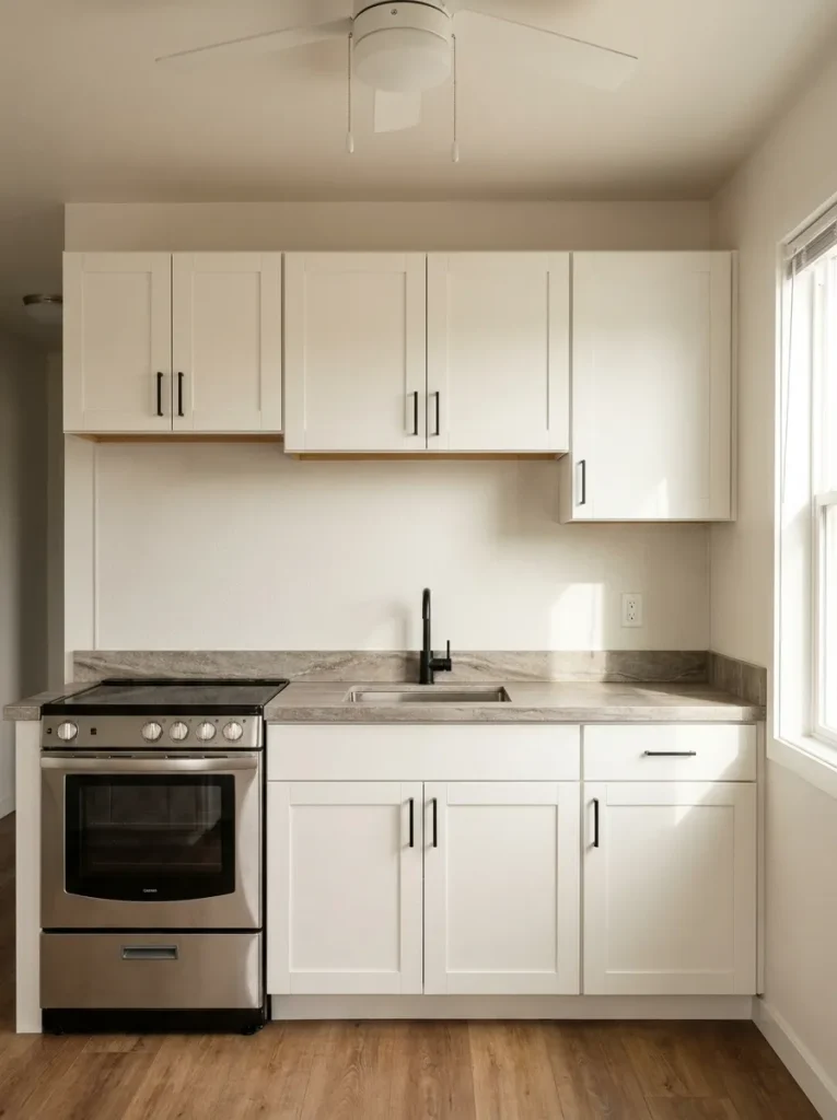
A dramatic stone-look counter paired with busy multicolor tile can make a short cabinet run feel fragmented. A restrained counter beside a richer backsplash can work because the eye understands which plane is supposed to lead.
Use the surface lab below to decide which role each finish should play.
Surface Relationship Lab
Which surface should lead?
Select the condition closest to your existing kitchen. The advice changes the visual hierarchy rather than simply suggesting a new color.
Let veining, aggregate or strong color remain the main material event.
Use lower-contrast color, restrained grout or a simpler pattern.
Two busy adjacent surfaces can fragment a short kitchen run.
Controlled color, texture or tile direction can become the stronger vertical feature.
Reduce competing movement across the horizontal surface.
Highly decorative cabinet fronts can overload the same elevation.
Identify which fixed surface contributes more to the kitchen you want to keep.
Use condition and compatibility with the cabinet direction to choose.
The replacement should support the retained finish.
Two calm surfaces may be exactly what a compact kitchen needs.
Wood, tile relief, lighting or hardware can add richness without busy pattern.
If the surfaces let cabinetry and focal areas read clearly, they may not need replacing.
If you decide the backsplash should become the focal surface, StylishGalore’s Kitchen Backsplash Ideas guide can take that material and pattern exploration further.
The decision here comes first: counter leads, backsplash leads, or both stay quiet.
6. Warm a Sleek Kitchen With One Honest Wood Surface
A freshly painted mobile home kitchen can sometimes swing too far toward “new” and lose the warmth that made the room feel lived-in. White cabinets, black hardware, stainless appliances, and pale walls may all be individually attractive, yet together they can feel flatter than expected.
One substantial wood surface can change that temperature without turning the room back into rustic farmhouse décor.
Think of one primary wood moment:
- a butcher-block counter on the peninsula;
- two thick floating shelves;
- a wood-topped breakfast bar;
- an existing plank ceiling worth preserving;
- or a simple dining table visible beyond the kitchen.
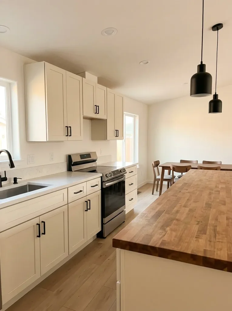
The material works best when you can see enough uninterrupted grain to register it as part of the architecture. Ten tiny wooden accessories scattered around the room do not create the same effect.
This is especially useful in mobile homes because the kitchen often shares a visual field with the dining or living area. A wood counter can repeat the dining table. Shelves can relate to the flooring. A warm peninsula top can visually bridge pale cabinetry with darker furniture beyond it.
There is one restraint worth keeping: do not make every wood tone identical. Exact matching can feel manufactured. Look for compatible warmth while allowing natural variation.
If your kitchen already has substantial wood flooring, ceiling planks, or a strong butcher-block counter, stop there. The room may already have enough warmth.
7. Turn a Short Wall Into Full-Height Pantry Storage
A short end wall can look almost useless in a compact mobile home kitchen. It may be too narrow for a meaningful additional countertop, yet large enough to collect a trash can, stacked boxes, a decorative cart, and whatever else has nowhere permanent to go.
That is often a signal to build up, not outward.
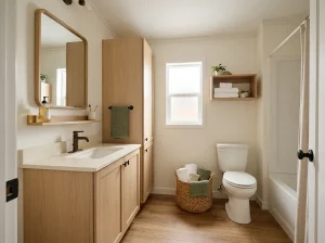
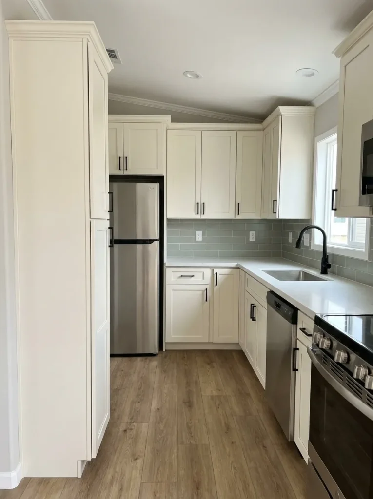
Imagine a narrow wall beside the refrigerator or at the end of a cabinet run. A tall pantry cabinet, shallow floor-to-ceiling cupboard, or coordinated freestanding cabinet can convert that vertical plane into storage without extending the work surface into the walking route.
Prioritize the storage in this order
At comfortable reach: everyday food, dishes, and appliances used several times a week.
Above that: backup ingredients, serving pieces, and lower-frequency items.
Highest zone: lightweight seasonal or rarely used pieces.
Lowest zone: heavier items that are awkward to lift from overhead.
Depth matters as much as height. If a full-depth cabinet would protrude into a narrow passage, a shallower pantry may store less per shelf but work far better with the room’s circulation.
Before adding the unit, tape its projected footprint on the floor. Walk past it, open the refrigerator, and use nearby drawers. If the storage gains create a new traffic problem, reduce the depth or reconsider the location.
Once the vertical storage zone exists, StylishGalore’s Pantry Organization Solutions guide can help with the interior organization.
8. Protect One Clear Prep Run on Every Counter
One of the easiest ways to make a mobile home kitchen feel more functional is also one of the least glamorous: give yourself a piece of countertop that stays genuinely usable.
A toaster, coffee machine, knife block, fruit bowl, paper towels, utensil crock, and decorative tray can each seem harmless. Together they can divide a short counter into several little gaps that are technically empty but practically useless.
Watch yourself prepare one normal meal.
Where do you naturally place:
- ingredients,
- a cutting board,
- mixing bowls or pans,
- and the finished food before it moves to the range or table?
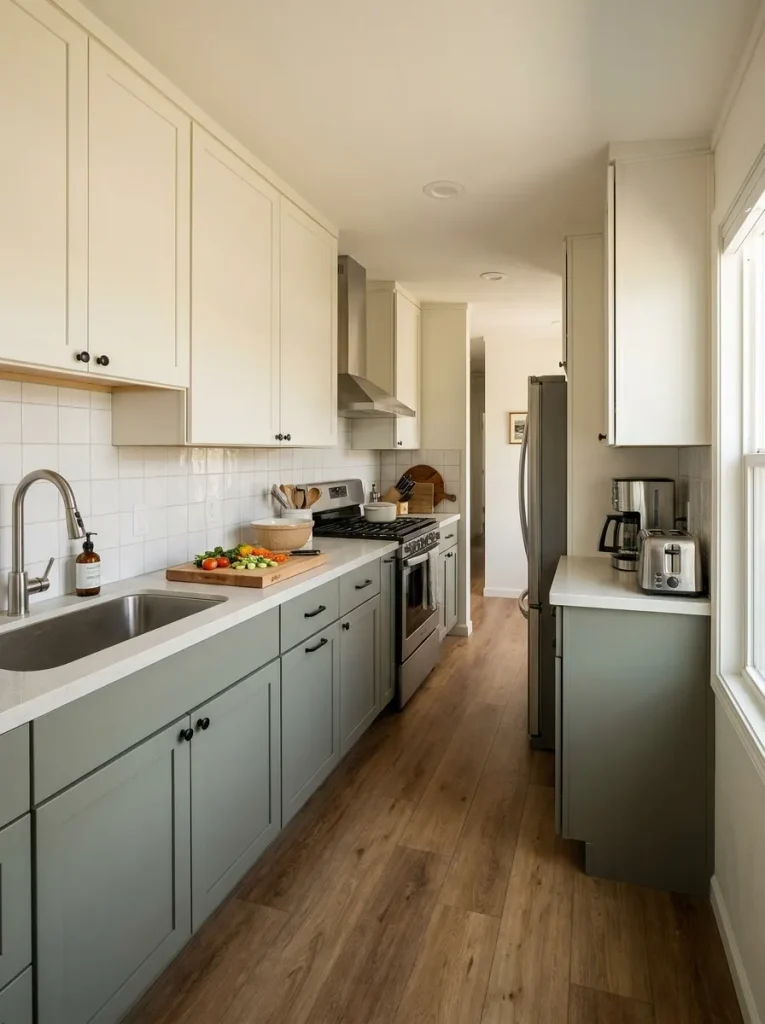
That zone deserves protection.
In a galley kitchen, it may be the stretch between the sink and stove. In a peninsula kitchen, the broad outer counter may be the best uninterrupted work surface. In a double-wide layout with several separate counters, choose the one closest to the activities that happen most often.
Move permanent countertop items away from that run first. Some appliances may fit inside a pantry. A paper towel holder can move beneath a cabinet or to the side of the peninsula. Occasional appliances may not need to remain visible seven days a week.
Then test the kitchen for several days.
If meal preparation feels easier, the problem was not insufficient countertop square footage—it was fragmented countertop use.
9. Add Open Shelves Only Where They Solve a Cabinet Problem
Open shelving can make a kitchen look lighter, but removing perfectly useful closed cabinets simply because open shelves are popular is a poor trade in a room already short on storage.
The stronger question is:
What problem will the shelf solve here?
A shelf earns its place when it:
- opens up a cramped corner;
- keeps frequently used glasses or mugs close to the sink;
- uses an awkward wall too shallow for conventional cabinetry;
- creates breathing space around a window;
- or fills a short section where matching another cabinet would be difficult.
It is much less convincing when the shelf exists mainly to hold signs, artificial plants, and decorative containers while useful kitchen items remain crowded elsewhere.
Consider two compact kitchens.
Kitchen A: four upper cabinets already provide essential storage. Replacing two with shelves would force food and dishes onto counters.
Kitchen B: one bulky cabinet crowds a window, while several lower drawers remain underused. Replacing that single upper with shelves could improve light and still preserve enough closed storage.
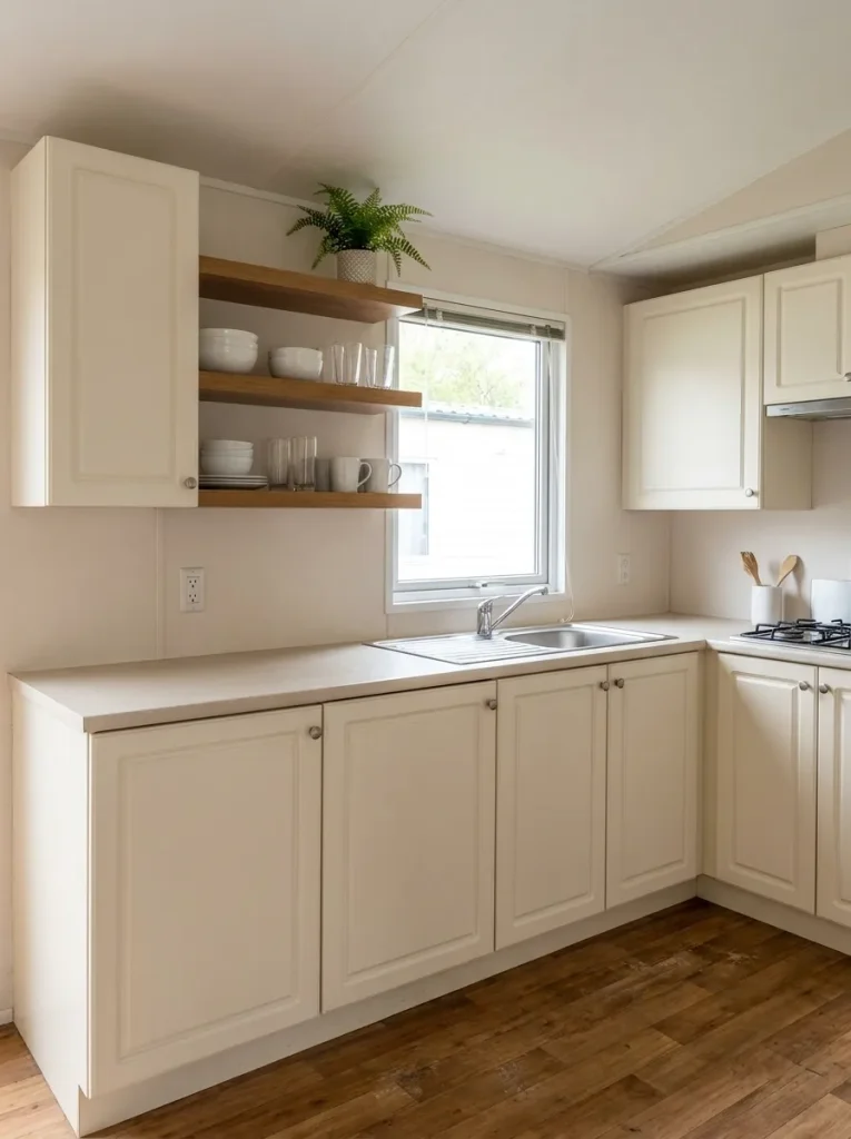
Kitchen B has a functional reason for the change. Kitchen A mainly has an aesthetic temptation.
If you use open shelving, give the lowest shelf to objects that actually support the kitchen—everyday bowls, glasses, mugs, or frequently reached ingredients.
The shelf should make the kitchen easier to use or easier to read visually.
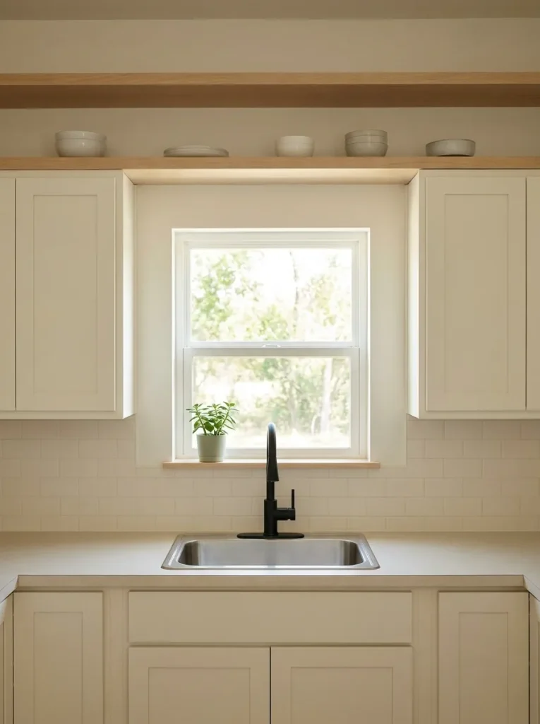
10. Make the Sink Window Earn Its Place
A window above the kitchen sink is already one of the strongest features many compact kitchens have. Yet it is easy to treat the window, faucet, sill, and surrounding cabinets as four separate decorating decisions.
What changes when you treat them as one composition?
Check the view in layers
First: the faucet.
Does its finish coordinate with the cabinet hardware or another important kitchen finish?
Second: the sill.
Can it remain mostly clear? One small plant or useful object often has more impact than a row of containers that blocks daylight.
Third: the cabinet edges.
If upper cabinets sit close to the window, heavy décor around them can make the opening look smaller.
Fourth: nearby shelving.
Shelves beside the window should support the composition, not crowd it.
Now walk across the room.
If your eye still finds the window easily, the zone is doing something valuable: it is creating a visual pause inside the harder surfaces of cabinets, appliances, and countertops.
If the window disappears behind curtains, plants, signs, hanging utensils, and crowded shelves, edit those layers before assuming the wall needs a major remodel.
11. Build One Strong Range-Wall Elevation
A compact kitchen often looks busier than it is because every wall is trying to become important.
The refrigerator has decorative storage above it. The sink wall has open shelves. The peninsula has stools and accessories. The range wall carries tile, cookware, and possibly a microwave.
When all four areas ask for attention at once, there is no visual resting point.
The range wall is often the easiest place to create hierarchy because it already contains a natural center: the stove.
Give that wall one clear order
Center: range or cooktop.
Directly above: hood, microwave, or simple architectural treatment.
Around it: cabinetry that visually supports the center.
Below eye level: functional items kept restrained.
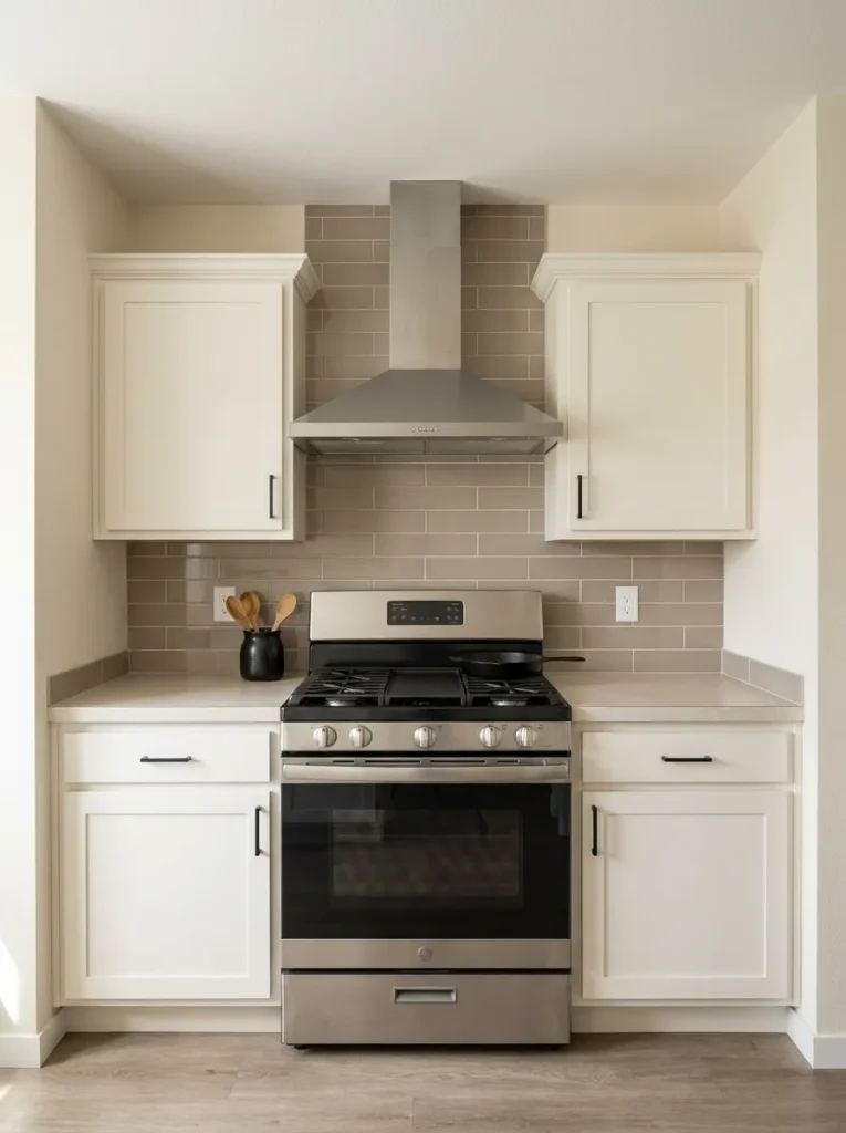
A modern mobile home kitchen does not need an elaborate custom hood to achieve this. Sometimes the improvement is as simple as aligning cabinet hardware, simplifying what sits above the range, and letting the backsplash run cleanly through the central zone.
Stand at the kitchen entrance and cover the range wall with your hand.
If the room suddenly seems to have no center, the wall is already functioning as the focal zone.
If your eye keeps jumping to several unrelated features elsewhere, strengthen the range composition before adding more decorative moments.
12. Store by Reach: Daily Low, Weekly Mid, Rare High
Tall cabinets and ceiling-height storage look impressive in photographs, but vertical storage becomes frustrating when frequently used objects end up in the wrong height zone.
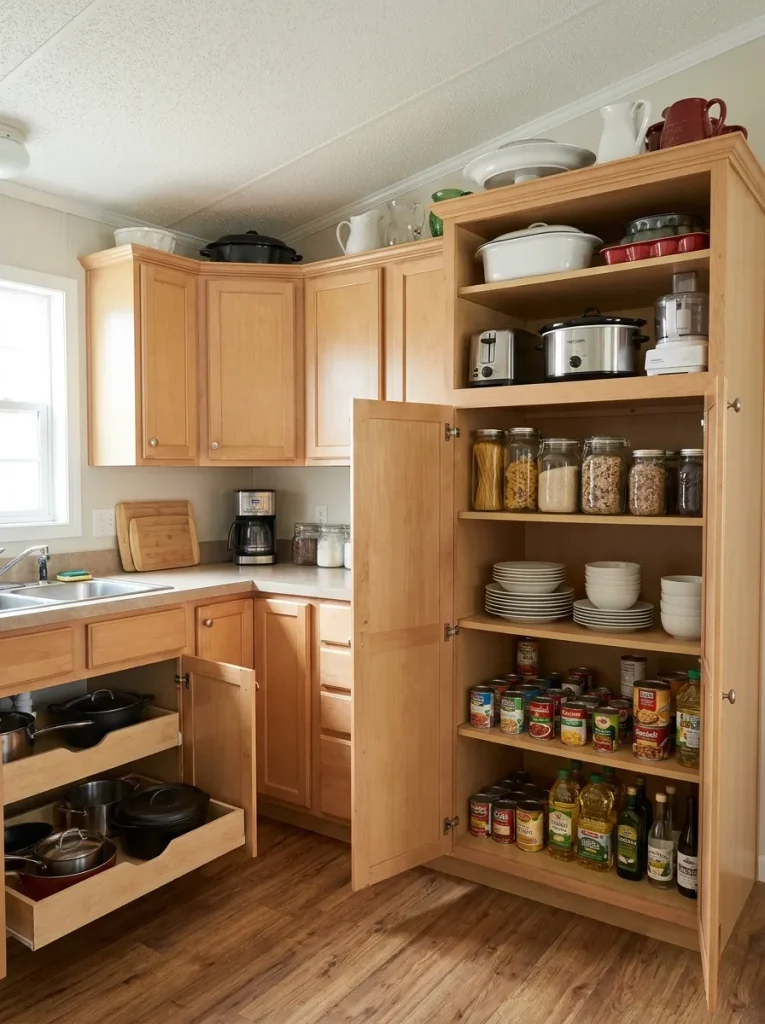
The useful question is not simply, “How much storage can I fit?”
It is, “How often do I need to reach what I am putting there?”
Vertical Storage Ladder
Place items according to frequency—not empty shelf space.
Choose the kind of item you are storing. The recommended zone changes according to use frequency and handling.
Keep everyday items in the easy-reach band.
Plates, glasses, breakfast ingredients and frequently used cookware should not require a stool whenever a more convenient cabinet exists.
Use middle and upper storage that is still comfortable to access.
Mixers, baking pieces and appliances used weekly can sit outside prime daily territory while remaining reasonably accessible.
Let the highest storage carry low-frequency, lightweight pieces.
Holiday platters, occasional servingware and backup items can justify harder-to-reach shelves.
Keep weight low, even when the item is rarely used.
Heavy cookware and bulky appliances usually belong in stable lower storage where handling is more practical.
If upper dead space is one of your specific problems, StylishGalore’s guide to the space above kitchen cabinets can take that narrower issue further.
13. Let the Peninsula Divide Kitchen and Living Without Closing the View
A peninsula can be one of the most useful elements in a mobile home because a single structure may provide prep space, storage, seating, and a boundary between rooms.
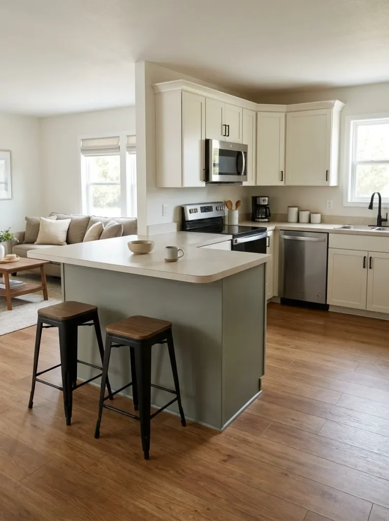
Its success depends on which side does what.
The kitchen-facing side should support work. The living- or dining-facing side should read more like furniture. Between those two functions, the top becomes the shared transition.
The peninsula should organize both rooms without becoming a wall.
Read this as a relationship, not a measured floor plan.
Prep, drawers, cabinets, sink or appliance support belong on the working side.
Seating, finished paneling and a calmer outward face belong on the social side.
Tall décor can turn an open divider into a visual barrier.
Store tools on the working side so the living-room view stays calmer.
The peninsula should frame the kitchen, not hide half of it.
This becomes especially important in a single-wide open plan, where the peninsula can occupy a large percentage of the visible width between the kitchen and living area.
Readers working specifically with long single-wide interiors can continue into StylishGalore’s Single Wide Open Floor Plan Ideas guide.
14. Size Bar Stools for the Parked Position
A bar stool can look perfectly sized while someone is sitting on it and still create a circulation problem for most of the day.
Why?
Because the more important measurement is often the parked footprint.
Push the stool completely beneath the peninsula as it would sit when unused. Then inspect what remains in the walking route.
Three situations matter
The stool disappears beneath the overhang.
Excellent. The seating can exist without visually widening the peninsula during normal kitchen use.
The backrest remains substantially outside the counter edge.
Check whether people regularly pass behind it.
The stool cannot tuck in because cabinetry blocks the knee space.
That edge may function better as a standing counter or storage face than forced seating.
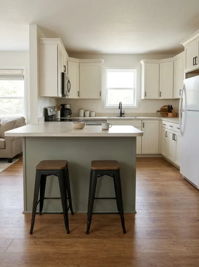
Before buying stools, imitate their footprint with cardboard boxes or dining chairs.
Place them where the stools would sit, then open nearby drawers, open the refrigerator, walk through while someone stands at the counter, and check the view from the living area.
Buying decision: choose the stool that fits the kitchen when nobody is sitting there—not merely the one that photographs best pulled out.
15. Run One Washable Runner Along the Working Axis
Kitchen rugs can either clarify a narrow room or break the floor into several unrelated pieces.
A single runner usually works best when it follows the direction in which the kitchen already moves.
In a galley, that means the long cabinet axis.
In a one-wall kitchen, it usually means the primary work run.
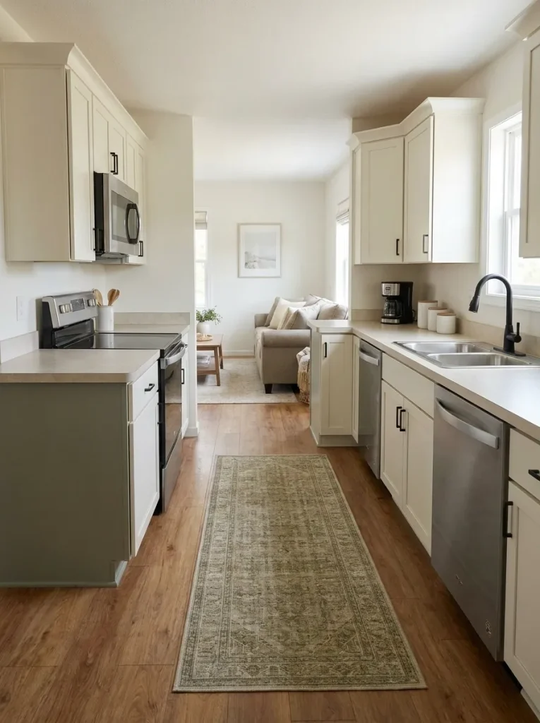
In a larger double-wide kitchen with an island, a runner may fit better along one major working side while the rest of the floor remains visually open.
A rug placed crosswise can visually shorten an already compact space or interrupt the route between work zones.
A long runner reinforces continuity.
If the backsplash, countertop, and cabinet color already carry noticeable movement, choose a quieter rug. If the kitchen finishes are simple, the runner can supply more pattern.
The rug should support the area where you actually stand and move. It should not be positioned only to fill an empty rectangle in a photograph.
Stop signal: if one runner makes the floor feel more continuous, do not automatically add a second rug simply because another empty section remains.
16. Clean Up the Ceiling Plane Before Adding More Decor
When a mobile home kitchen feels dated, the instinct is often to look straight at the cabinets.
Look up once before you decide.
The ceiling may occupy more visible area than any backsplash or countertop, especially in a long galley or open kitchen where your eye follows the room from one end of the home to the other.
Typical visual distractions include:
- several unrelated light-fixture styles;
- ceiling trim that stops and starts abruptly;
- strong texture competing with busy cabinetry;
- decorative beams that do not relate to anything below;
- or too many small ceiling details spread across a compact room.
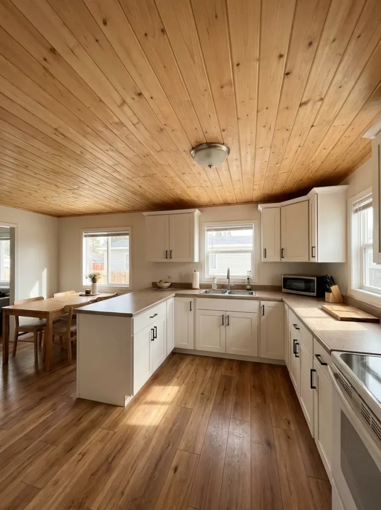
This does not mean every ceiling needs to become perfectly smooth and white.
An existing wood-plank ceiling can be one of the room’s strongest features when it is visually connected to the kitchen below.
Keep it when:
the ceiling treatment contributes warmth, architecture, or continuity.
Simplify it when:
your eye notices ceiling clutter before noticing the actual kitchen.
Repeat it elsewhere when:
one ceiling material can visually connect the kitchen to a dining or living zone.
A useful photo test is to crop the lower half of the room out of a kitchen picture.
If the remaining ceiling image still looks busy or fragmented, additional countertop décor is unlikely to solve the room.
17. Layer Task Light Below Eye Level and Ambient Light Above It
One ceiling fixture is often expected to illuminate the entire kitchen.
That is a difficult job.
Cooking, chopping, and washing dishes happen at counter height, while a kitchen still needs comfortable overall illumination when it is viewed from the adjoining living or dining area.
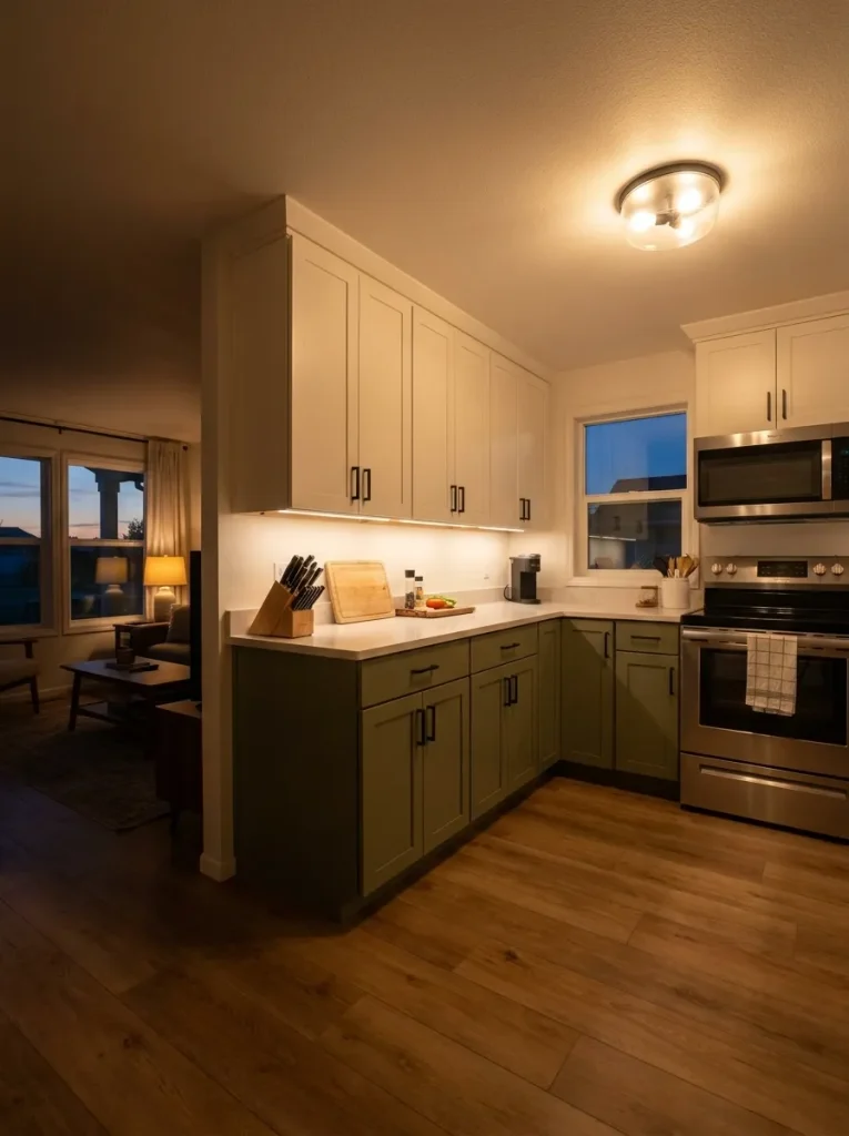
That creates two separate lighting jobs:
Task light: supports work surfaces.
Ambient light: illuminates the room more generally.
Check the kitchen at three different moments.
A plan that feels fine at noon may fail during food prep or feel harsh from the living room at night.
Daylight may already be doing part of the job.
Inspect beneath upper cabinets and corners where daylight drops away before assuming the entire room needs more overhead light.
The counter may need its own useful light layer.
If the main prep area feels shadowed during cooking, prioritize useful task illumination where the work actually happens.
The room may be functional but visually too harsh.
Stand in the living room at night. The kitchen should remain usable without visually overpowering the adjoining space.
Any hardwired electrical alteration should be evaluated and completed according to applicable requirements by someone appropriately qualified.
18. Repeat Black Hardware as a Connector, Not a Theme
Black hardware can make a mobile home kitchen look more current very quickly.
It can also become excessive surprisingly quickly.
The mistake is assuming that once black cabinet pulls look good, the faucet, sink, appliances, stools, light fixtures, shelf brackets, curtain rod, and every decorative object must also become black.
A finish works more effectively when it creates connection, not saturation.
Think in visual checkpoints.
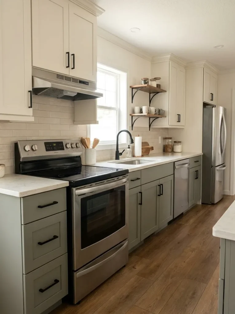
For example:
cabinet pulls → faucet → shelf brackets
Those three elements may already be enough to make the kitchen feel coordinated.
Or:
pendant fixture → stool frames → appliance accents
That can connect a peninsula to the main work wall without forcing every metal surface to match.
Warm wood, cream counters, muted green cabinets, and stainless steel can all coexist with black accents.
The stop rule
When your eye can follow the dark accents through the kitchen without counting them individually, you probably have enough repetition.
If the hardware itself becomes the dominant design feature, the finish has shifted from connector to theme.
19. Choose Cabinet Color From the Floor and Counter Undertones
Picking a cabinet color from an isolated paint chip is one of the easiest ways to create a kitchen that is technically attractive but somehow feels wrong once completed.
The floor and countertop already establish a large part of the kitchen’s color temperature.
A cabinet finish has to enter that existing conversation.
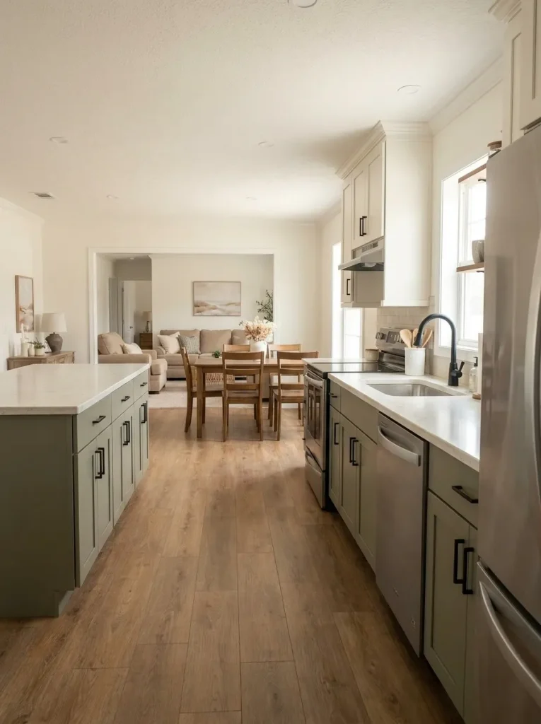
Use the fixed surfaces as your filter
Warm brown or honey-toned flooring
Very icy gray cabinetry can exaggerate the contrast. Warm white, muted olive, mushroom, soft taupe, or balanced greige may connect more naturally.
Cool gray flooring
Yellow-heavy cream can look unexpectedly warm beside it. Cleaner whites, subdued green-gray, or deeper charcoal may fit better.
Busy warm stone-look counters
A quieter cabinet color often lets the countertop settle visually.
Simple pale counters
The cabinetry has more freedom to supply color because the work surface is not already creating much movement.
There is another variable in mobile homes: the connected room.
If the kitchen opens directly into a living area with warm beige upholstery, natural wood furniture, and cream walls, an extremely cool cabinet color may feel detached even if it works with the kitchen floor.
Place the sample beside the flooring, countertop, backsplash, appliance finish, and one major color from the connected room.
Then view it during both daylight and evening lighting.
Do not ask, “What is the most modern cabinet color?”
Ask, “Which modern color makes the materials I am keeping look more intentional?”
20. Hide the Utility Layer on the Living-Room Side of the Kitchen
Walk out of the kitchen.
Sit where you normally sit in the living room.
Now look back.
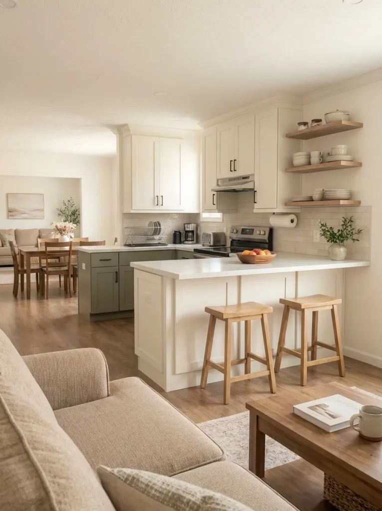
What part of the kitchen is most visible?
From inside the kitchen, a drying rack is useful. A roll of paper towels is convenient. The blender belongs on the counter. The dish soap sits exactly where you need it.
From the living room, however, those objects can merge into one utility layer that makes the kitchen look permanently unfinished.
The solution is not to make the kitchen impractical.
It is to decide which side of the room gets to show the work.
Whenever the layout allows:
- keep the dish rack closer to the interior sink edge;
- place paper towels on the kitchen-facing side of a peninsula;
- move the coffee station away from the outermost visible corner;
- store cleaning products below the sink;
- keep the living-room-facing counter edge relatively open.
A peninsula deserves special attention because its outer face often becomes furniture from the living room’s perspective.
Try a five-minute reset test
Clear only the items visible from the adjoining room.
Do not clean the entire kitchen.
Then return to the sofa and look again.
If the kitchen suddenly appears substantially more modern, you have identified an editing and storage problem—not necessarily a renovation problem.
21. Decide Whether You Need a Surface Refresh or a Layout Fix
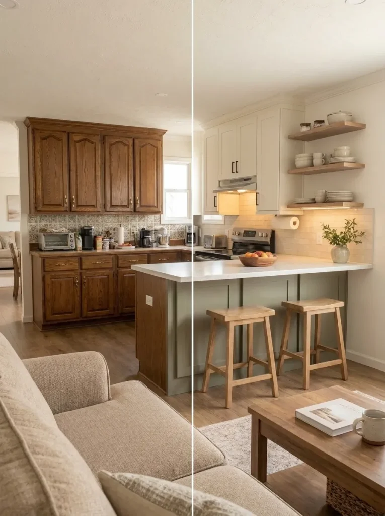
A kitchen can look dated and function perfectly.
Another kitchen can photograph beautifully while making every meal irritating.
Those are two very different problems.
Before replacing cabinets, counters, or appliances, separate appearance dissatisfaction from workflow dissatisfaction.
What problem survives after the kitchen is cleaned and edited?
Select the issue that still bothers you after movable clutter is removed.
Surface refresh
Test paint, door treatment or hardware when the boxes remain useful.
Coordinate counter and backsplash before smaller styling.
If the kitchen now reads clearly and works well, deeper renovation may add little.
Storage redesign
Identify exactly which categories lack a home.
Try pantry height, drawers and wall storage first.
Cabinet changes become more justified when essential storage remains impossible.
Layout diagnosis
Watch appliance doors, prep routes and seating.
Test stools or carts before blaming fixed cabinetry.
Then deeper layout changes may deserve consideration.
Technical planning
Separate an appliance preference from a genuine system change.
Resolve technical requirements before finalizing finishes.
Do not finalize cabinetry around unverified utility changes.
If the result points toward cosmetic changes, StylishGalore’s Quick Kitchen DIY Updates guide is the better continuation.
22. Keep Appliance Swaps Simple Until Service Changes Are Justified
A new range or refrigerator can visually modernize a kitchen, but the appliance itself is only one part of the decision.
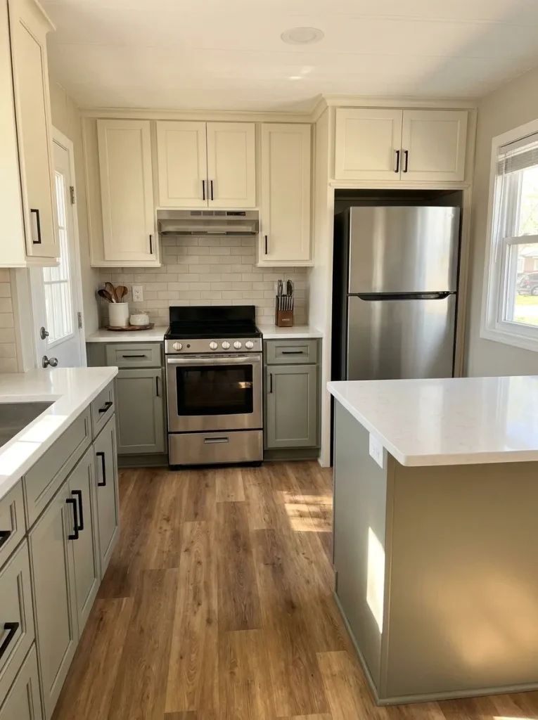
Same-location replacement
You replace an appliance while keeping the existing general location and planning around the current kitchen arrangement.
This is usually the simpler design path because the surrounding cabinetry and work sequence remain largely understandable.
Service-changing replacement
The preferred appliance requires changes to electrical, gas, plumbing, ventilation, cabinetry, or other systems.
At this point, the decision is no longer merely:
“Which appliance looks best?”
It becomes:
“Is the larger kitchen intervention worthwhile?”
For example, if a compact kitchen already has a practical range location, moving it simply to create a more symmetrical appearance may introduce complexity without materially improving daily use.
Use this sequence before escalating
1. Identify the functional complaint.
Is the appliance failing, too small, awkwardly placed, or mainly visually dated?
2. Test whether the same location can solve it.
A better-fitting appliance may improve the kitchen without changing the surrounding plan.
3. Separate cosmetic preference from infrastructure need.
4. Escalate only when the benefit is meaningful.
If a change involves plumbing, electrical work, gas, ventilation, or significant structural alteration, verify the applicable requirements and use appropriately qualified help before finalizing cabinetry or finishes.
23. Add One Furniture-Like Storage Piece Where Built-Ins Fall Short
Suppose the kitchen needs additional storage, but the empty wall is not ideal for another permanent cabinet run.
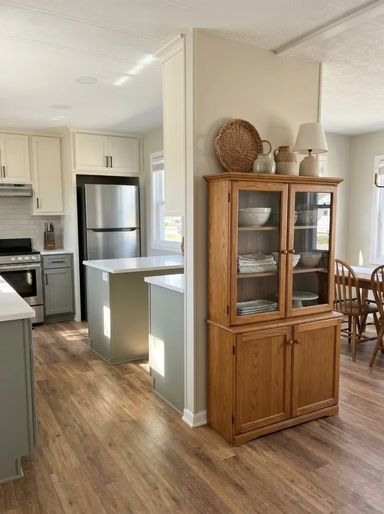
A narrow freestanding hutch, tall pantry cabinet, slim sideboard, or movable storage piece can add capacity while behaving more like furniture than construction.
That is particularly useful when the kitchen borders a dining area.
A built-in kitchen cabinet can make the kitchen visually expand farther into the room. A furniture-like piece can provide storage while helping the transition feel softer.
A strong use case
Imagine a double-wide kitchen with enough main cabinetry for cookware, no comfortable place for serving pieces, a short dining-side wall, and no desire to extend the full kitchen cabinet system.
A shallow cabinet there could hold:
- serving bowls;
- table linens;
- occasional appliances;
- pantry overflow;
- or glassware used mostly for dining.
Give the piece a real job
Avoid buying a decorative hutch first and then searching for objects to fill it.
List what the kitchen cannot currently store.
Then choose the furniture around those categories.
If most of the shelves end up filled with décor while daily kitchen items remain on the counters, the addition has not solved its intended problem.
24. Edit Farmhouse Details Down to Their Modern Best
Many attractive mobile-home kitchens contain farmhouse elements.
The problem is not farmhouse influence.
The problem is when every element announces it.
Warm butcher block, shaker cabinets, an apron-front sink, black hardware, open shelving, rustic signs, barn doors, lantern fixtures, word art, and baskets can each work individually. Put all of them in one compact room and the style starts overpowering the kitchen itself.
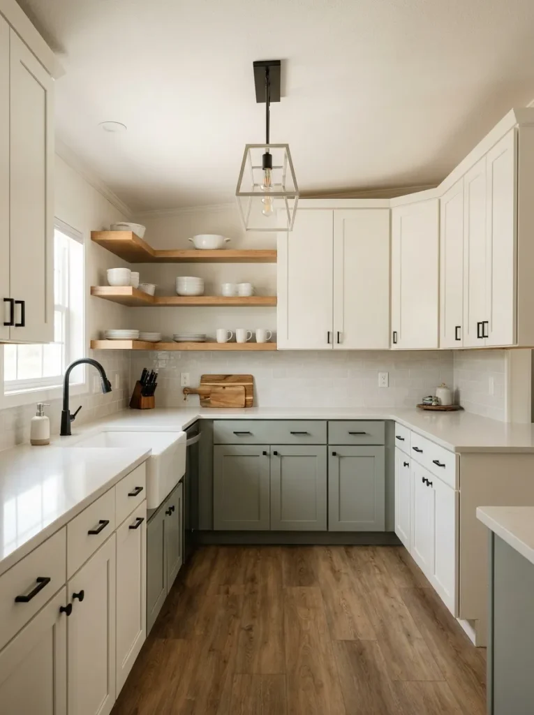
For a fresher modern interpretation, edit the vocabulary.
Keep the warmth. Reduce the costume.
A modern mobile-home kitchen can retain farmhouse materials while removing repeated themed details.
Butcher block, shelves or a good wood ceiling can soften cleaner surfaces.
If it suits the room and works well, it can stay without forcing the rest of the kitchen rustic.
The restrained geometry works across farmhouse and modern styles.
Let it hold useful dishes with breathing room.
Repeat them selectively instead of making every metal surface match.
Choose cleaner silhouettes when the room already has several farmhouse cues.
Several labels and slogans can turn wall space into competing messages.
Signs, jars, towels and ornaments can make the room feel overly themed.
Do not give away valuable prep surface merely to fill an empty spot.
The most transferable farmhouse features are architectural: light cabinetry, warm wood, muted green, black accents, useful shelving, apron sinks, and compact peninsulas.
The less essential layer is the repeated signage and thematic decoration.
25. Finish With a Daylight Stop Test Before Making Another Change
The hardest part of a makeover is sometimes knowing when it is finished.
Once several updates have worked, every remaining empty wall or quiet surface can start looking like another project.
Give the room one full day before deciding.
In the morning, clear the counters to their normal useful state.
Open blinds or curtains.
Do not stage the kitchen.
Then look at it from three places.
From the kitchen entrance
Is there a clear visual hierarchy, or does one unresolved surface still overpower everything?
From the main work position
Can you prep, wash, and reach everyday storage without constantly moving objects?
From the adjoining room
Does the kitchen look connected to the wider home, or does utility clutter still dominate the shared view?
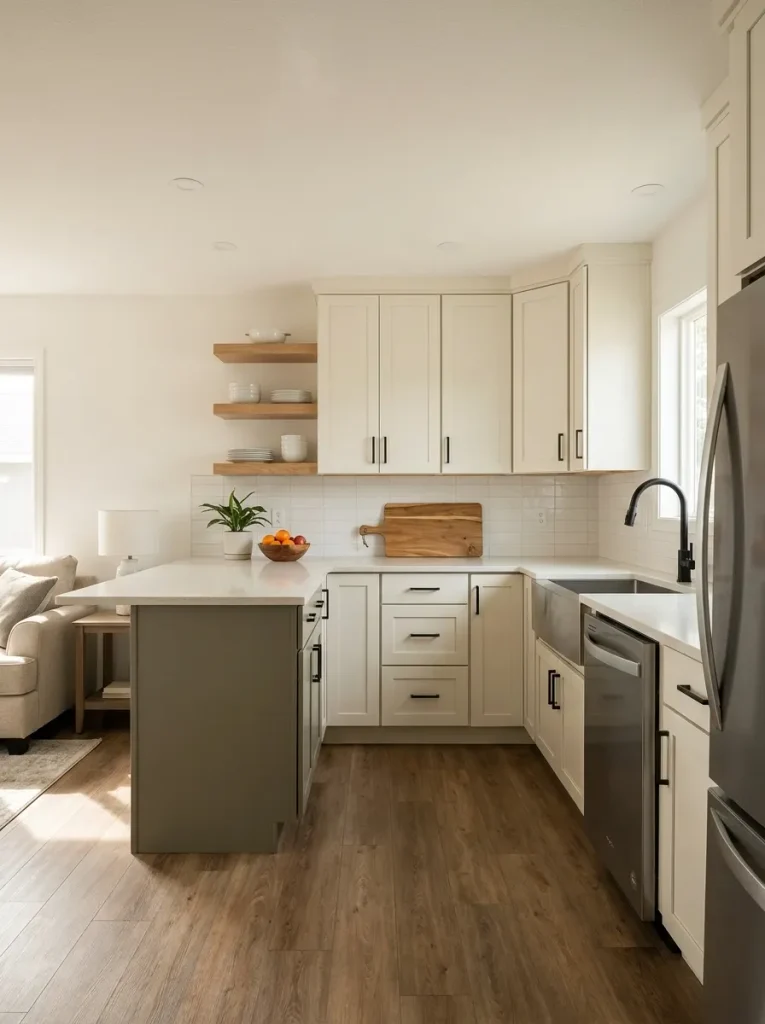
Now ask one final question:
What specific problem would the next change solve?
If the answer is concrete—poor task lighting, missing pantry storage, a stool blocking circulation—the next improvement may be worthwhile.
If the answer is simply, “That wall looks empty,” leave the room alone for a while.
Fresh modern interiors usually contain some visual pause.
A clear counter is not unfinished.
An undecorated wall is not automatically wasted.
A kitchen that functions comfortably and looks coherent from the rest of the home does not need another purchase simply because there is room for one.
Final Thoughts
A fresh mobile home kitchen usually comes from solving the biggest visual or functional problem before layering in more design. Start with the shared sightline, protect useful prep space, use vertical storage intentionally, and let cabinetry, counters, lighting, and hardware support one clear hierarchy.
If the layout already works, cosmetic updates may be enough. If storage, circulation, or utilities repeatedly fail, diagnose those problems before spending heavily on finishes.
Most importantly, reassess after each meaningful change. A kitchen does not become more modern by collecting every current trend. It feels modern when the surfaces relate, the work zones function comfortably, and the room finally looks as though it belongs to the rest of the home.