

Fall decorating gets tricky in a single wide. The rooms are connected, the walkways matter, and adding a pumpkin to every open surface can make a cozy home suddenly feel crowded.
The best single wide fall decorating ideas work differently. Instead of filling the house with more things, they use a few carefully placed changes to shift the color, texture, light, and visual rhythm of the entire space.
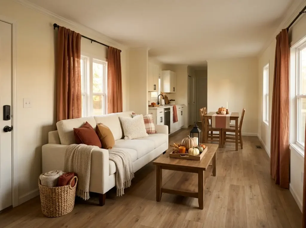
That might mean letting one tall harvest arrangement do the work of five porch accessories, warming a neutral sofa with rust textiles, or using a slim runner to create an entry where there is no real foyer.
The goal is not to make your mobile home look like a fall décor store. It is to make the rooms you already live in feel warmer, softer, and noticeably more seasonal.
Start with the areas you see first, then layer smaller fall moments deeper into the home. The result can feel richly autumnal while still leaving the narrow layout open, comfortable, and easy to move through.
1. Build a Vertical Harvest Moment Beside the Front Door
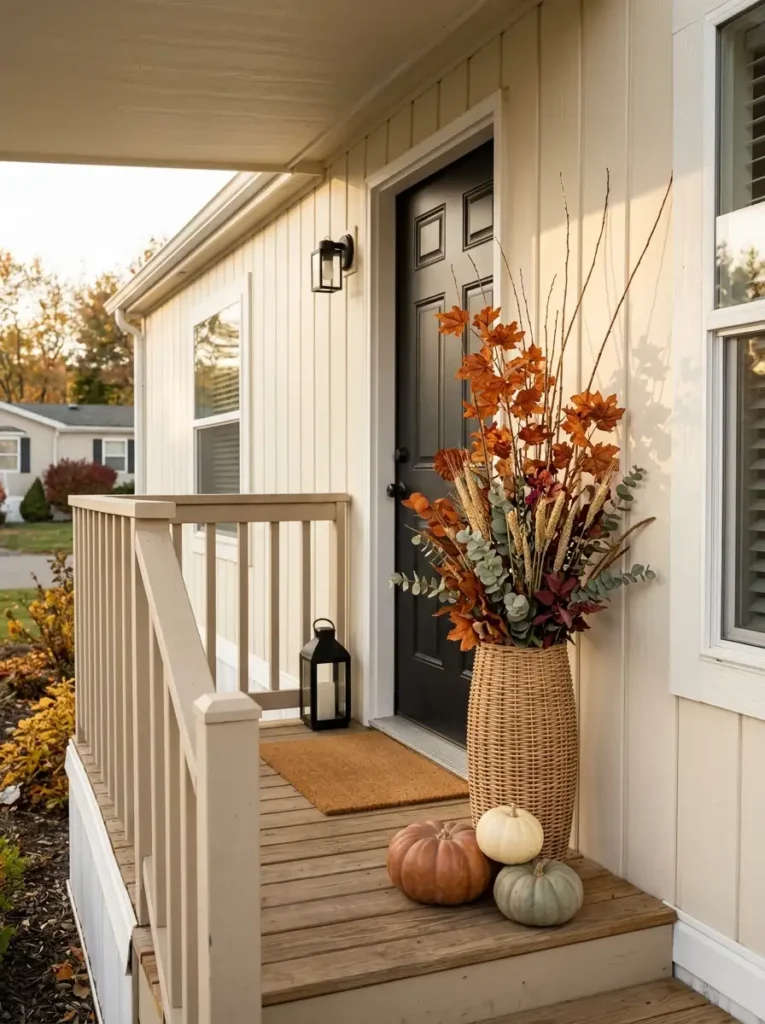
A cozy fall entrance does not need a wide porch. What it really needs is one strong seasonal moment that can be seen before you even reach the door.
In a narrow mobile-home entry, try replacing several separate pumpkin pots and decorative signs with one tall woven basket or slim outdoor planter. Fill it loosely with rust-colored branches, dried grasses, muted eucalyptus, and a few leaves that extend upward rather than outward.
The vertical shape matters. When the arrangement rises above the usual knee-height cluster of pumpkins and doormats, the eye travels upward along the doorway. That gives the entrance more presence without consuming additional walking space.
Keep the lower portion comparatively simple. Two or three pumpkins tucked near the basket are usually enough. If every inch around the planter receives another decoration, the tall arrangement loses its ability to act as the focal point.
Also check the door before calling the setup finished. The arrangement should sit completely outside the door swing and should not narrow the path you naturally take while carrying groceries or packages.
The visual test: from several feet away, the basket should read as one autumn composition—not as a collection of unrelated pieces.
2. Define the Entry With a Slim Autumn Runner
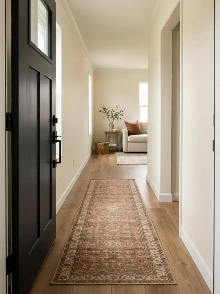
The problem: many single wide mobile homes do not have a traditional foyer. You open the front door and are almost immediately inside the living space, so the entrance can feel more like a passage than an intentional part of the room.
A slim runner fixes that without requiring a console table, bench, or other furniture. It creates a floor boundary that quietly says, this is the entry zone.
Choose a rust, muted plaid, camel, or warm neutral design that relates to colors you plan to repeat elsewhere. The width is more important than many people realize. Allowing a little flooring to remain visible on both sides keeps the runner from visually swallowing the corridor.
That exposed floor works almost like a frame around artwork. It separates the rug from the walls and cabinetry, helping the narrow passage feel defined rather than completely covered.
Avoid thick piles if the front door passes over the rug. A washable, low-profile runner is usually more practical for dirt, leaves, and wet shoes.
Before buying anything, measure the door clearance and the walking line into the living room. The runner should guide movement—not become another obstacle inside an already compact entry.
3. Give the Living Room One Clear Fall Focal Point
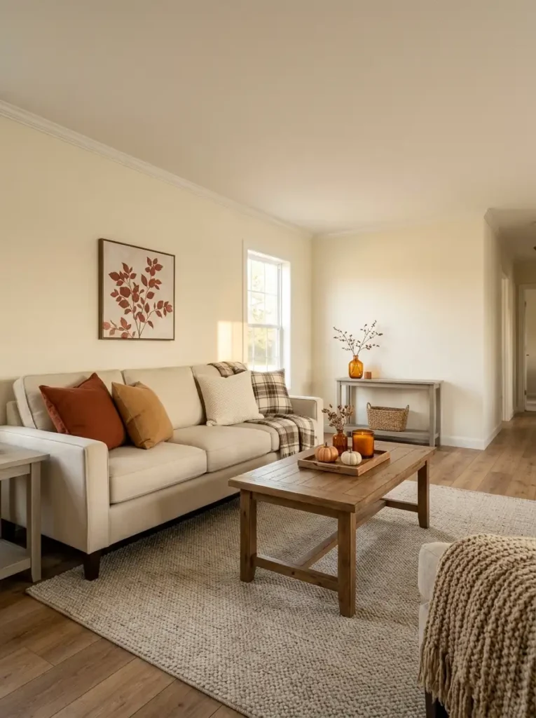
HERO
Pick the first place you want the eye to land when you enter the living room. It might be the sofa wall, the coffee-table zone, a media console, or a large arrangement positioned where the room naturally opens toward you.
That area gets the richest seasonal treatment: the strongest rust tone, the most interesting foliage, the largest pumpkin cluster, or the most atmospheric lighting.
SUPPORT
Now add one quieter autumn echo somewhere nearby.
A rust pillow on the opposite side of the room, a small amber vase, or a folded plaid throw can repeat part of the hero composition without creating another full focal point.
This is where many small rooms go wrong. Every surface is styled beautifully, but because everything asks for equal attention, nothing actually feels special.
QUIET
Leave at least one nearby surface noticeably calmer.
An almost-empty side table, an undecorated section of wall, or a stretch of neutral upholstery gives the stronger fall moment visual room to breathe. Negative space is not wasted space—it is what makes the decorated area look deliberate.
Stand at the entrance when you finish.
If your eyes bounce between three or four equally loud autumn displays, edit again. A single wide often feels larger when seasonal décor has a clear visual order rather than equal intensity everywhere.
4. Let Neutral Furniture Carry Rich Rust Textiles
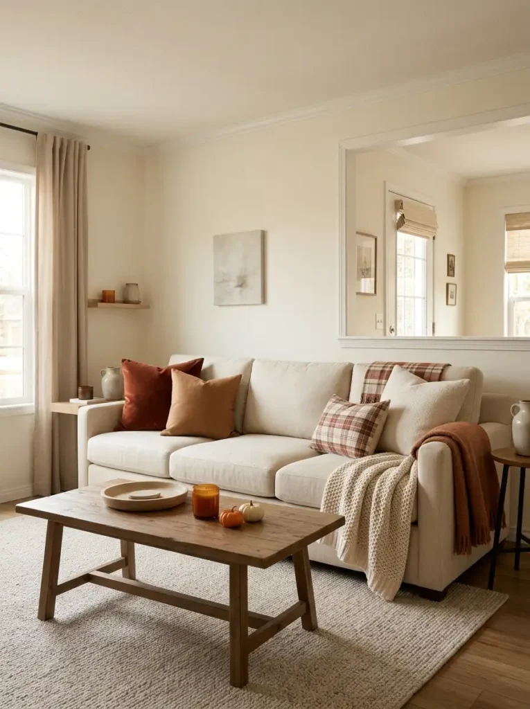
More color is not always more autumn.
One approach is to cover the sofa with orange cushions, a rust throw, a plaid blanket, pumpkin-print pillows, and several more warm-toned accessories nearby.
It certainly looks seasonal—but in a narrow living room, all that similar color can merge into one heavy block.
Better contrast
If your sofa is cream, beige, light gray, or another quiet neutral, let some of it stay visible.
Try one rich rust pillow, one deeper burnt-orange or camel accent, and one cream or lightly patterned textile. The neutral upholstery becomes part of the fall palette because it gives those warmer tones something to stand against.
This is why two strong pillows can sometimes have more impact than five. When small areas of saturated color are separated by neutral fabric, the eye reads each color distinctly.
Texture can carry part of the seasonal feeling too. Velvet, chunky knit, brushed cotton, linen, or soft plaid add warmth even when their color is subtle.
The exception is a very large sectional or an unusually pale room. There, an extra textile layer may be useful simply because the furniture carries so much visual area.
The goal is not to cover the sofa for fall. It is to let the sofa frame the fall color.
20% rust/camel
10% olive or dark accent
27% rust/burnt orange
13% caramel pattern
5. Keep the Coffee Table Low, Warm, and Visually Quiet
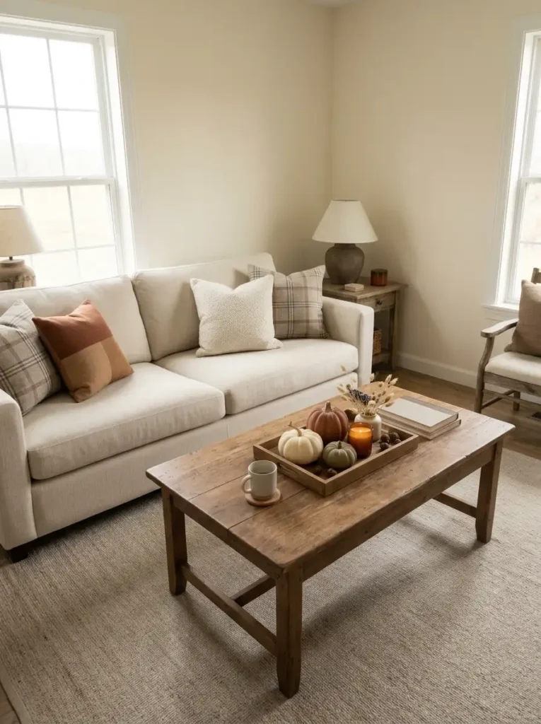
A useful fall coffee-table formula is:
contained width + low height + one warm glow + visible empty surface.
Start with a tray, low wooden board, or long shallow basket. Containment is important because several pumpkins, candles, and stems grouped inside one boundary read as a single composition instead of a scattering of unrelated objects.
Then control height. A tall vase of branches may look beautiful in a photograph, but in a compact seating area it can interrupt the visual line between people, the television, and the opposite side of the room.
Instead, use dried stems in a short vessel, miniature pumpkins at mixed heights, and perhaps one candle or amber glass jar. You can still create variation without sending the arrangement upward.
Width matters too. Avoid stretching the centerpiece across nearly the entire coffee table. You still need somewhere to place a drink, book, remote, or snack.
If the table already has strong wood grain or a beautiful rustic finish, expose some of it. The table itself can provide part of the autumn texture.
Visual checkpoint: sit on the sofa. You should notice the fall arrangement, but your eye should still travel comfortably across the rest of the room.
6. Use Plaid as a Connector, Not a Theme
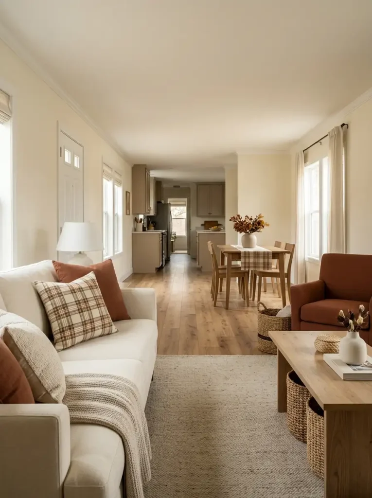
Plaid works beautifully in fall because it carries several autumn colors at once. The problem begins when the same bold check appears on the curtains, pillows, rug, blankets, towels, and table linens.
In a single wide, many of those pieces may be visible from the same position. Instead of reading as repetition, the pattern can merge into a visually busy background.
A better approach is to let plaid connect two or three parts of the home.
You might place one plaid pillow on the sofa and repeat the pattern on a folded dining throw several feet away. Or use a small checked runner near the entry and echo one of its rust tones in the living room without repeating the pattern itself.
The surrounding materials matter just as much. Pair plaid with cream upholstery, plain linen, natural wood, chunky knit, or woven baskets so the eye has quieter textures between patterned moments.
Even the scale of the check changes the effect. Large buffalo checks feel graphic and visually heavier, while smaller muted tartans blend more easily into a narrow room.
When storing your seasonal pieces later, keep the strongest plaid items together. Next fall, you can choose only the pieces visible within the most important sightlines instead of automatically bringing all of them back out.
7. Pull the Eye Up With One Tall Arrangement of Fall Foliage
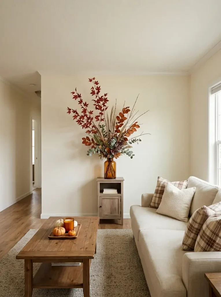
Walk into your living room and notice where most of the decorative weight sits.
In many small rooms, the sofa, side tables, baskets, pumpkins, pillows, and coffee-table décor all occupy roughly the lower half of the space. The upper walls and corners remain almost empty.
That imbalance can make the room feel visually compressed.
A tall vase of airy fall branches changes the route your eye takes. Place it on a console, dining buffet, narrow cabinet, or sturdy table where the branches can rise into the empty wall space without blocking a walkway.
The trick is height without bulk.
Let the stems reach upward, but keep the arrangement relatively narrow as it rises. Loose maple branches, rust eucalyptus, dried grasses, or slender berry stems work better here than a dense bouquet that spreads widely in every direction.
Now look at the ceiling relationship. The branches should pull attention toward the upper third of the room without appearing to touch or crowd the ceiling.
If the arrangement starts competing with nearby artwork, mirrors, or shelves, simplify one of them.
From the doorway, your eye should now move from the lower furniture upward toward the foliage and then back into the room. That gentle vertical movement is what makes the space feel more balanced.
8. Warm the Home With Layered Amber Lighting
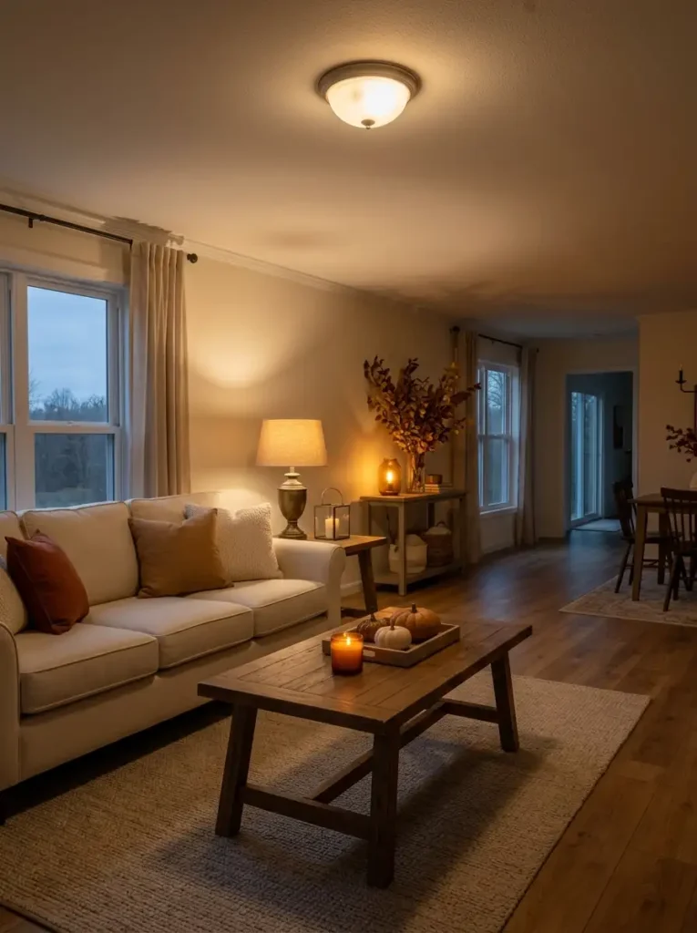
If your single wide gets plenty of daylight
Let natural light do most of the work during the day. Add one warm table lamp near the main seating area and perhaps a small decorative light farther into the room.
You do not need every lamp switched on just because it is fall.
If the interior feels dim even during the afternoon
Spread the lighting instead of making one fixture brighter.
A lamp beside the sofa, another small source near the dining area, and a subtle glow on a console can brighten several depth planes. This often makes a long narrow room feel more dimensional than one powerful ceiling fixture.
If you are decorating mainly for cozy evenings
This is where candles, lanterns, and low lamps earn their place.
Warm light catches the weave of blankets, deepens wood tones, and makes rust foliage appear richer. Keep real flames away from dried stems, curtains, children, and pets; flameless candles can create the same lower-level glow in tighter spaces.
Whatever the room condition, try to keep the light temperature reasonably consistent. One amber lamp beside a cool white ceiling fixture can make both sources look more extreme.
The goal is not simply a darker room. It is several warm pools of light that overlap gently, giving the home depth after daylight disappears.
9. Ground All That Orange With Black or Dark Wood
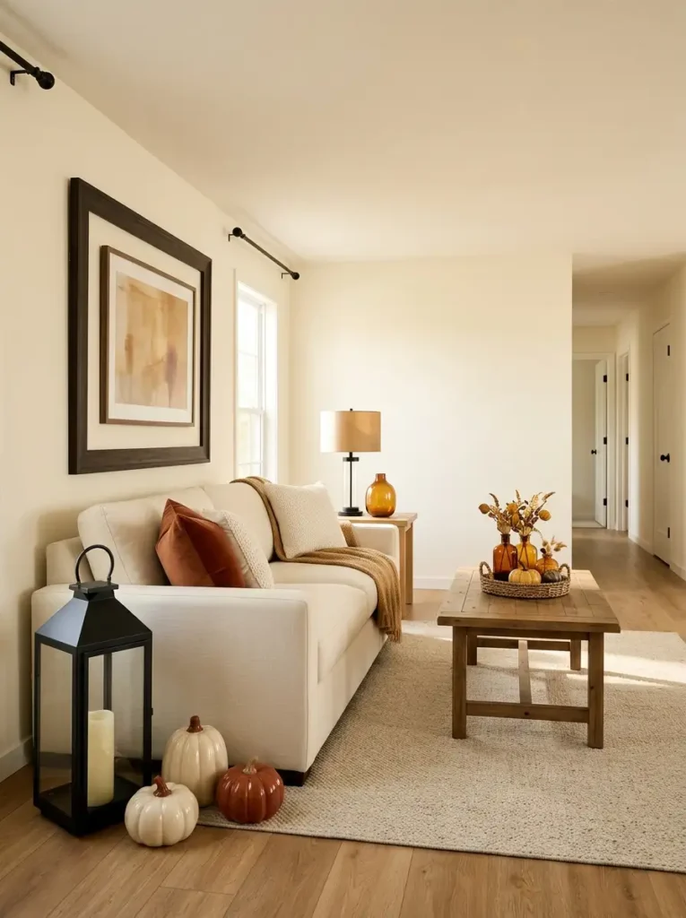
There is a point where rust, pumpkin, cream, and caramel begin to blur together.
When that happens, the room usually does not need another fall color. It needs definition.
My choice would be to introduce one or two dark anchors before adding more seasonal accessories. A black lantern, espresso wood tray, dark picture frame, matte black lamp base, or existing black hardware can give the softer colors a clear visual edge.
Why does that work?
Because dark contrast behaves like punctuation. It separates neighboring warm tones and gives the eye a place to stop. Against cream upholstery and orange textiles, even a relatively small black element can carry noticeable visual weight.
But placement matters more than quantity.
Three tiny black accessories scattered across unrelated surfaces can look spotty. One substantial lantern beside a pumpkin grouping—or one dark frame behind a warm-toned console vignette—often looks calmer.
If the room already contains dark flooring, a black entertainment unit, deep brown cabinetry, or substantial black window hardware, you may not need to add anything at all. Let those existing features perform the grounding role.
Decision rule: before buying another dark accessory, look for dark finishes already built into the room and visually connect your fall styling to them.
10. Turn a Blank Wall Into a Slim Fall Blanket Station
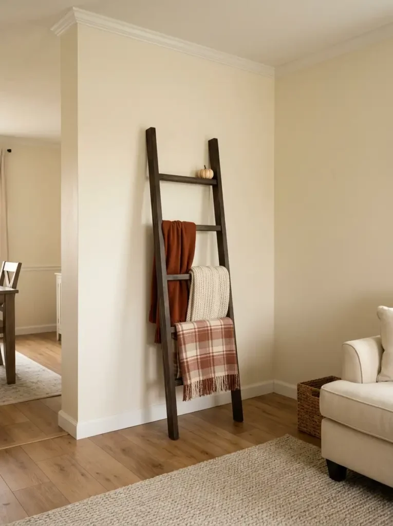
A narrow blanket ladder can solve two problems at once: an empty wall that needs height and throws that otherwise end up piled across the sofa.
Spend here
If you are buying something new, prioritize the blankets themselves.
A soft rust throw, muted plaid, chunky cream knit, or caramel fleece changes both the ladder and the surrounding room. These textiles can move back to the sofa, bed, or reading chair after fall.
Save here
The ladder does not need to be elaborate.
A simple black, dark wood, or medium-stained version works because its job is mostly structural. If you already own one, changing its blankets may be enough to make it feel completely seasonal.
Reuse here
Look through throws you already own before shopping. Even a neutral cream blanket can become part of the autumn palette when it sits beside rust, brown, olive, or plaid.
Then edit the rungs.
Resist the urge to cover every one. Leaving an empty rung creates visual separation between textile layers and keeps the ladder from looking like overflow storage.
You can thread a short strand of faux leaves along one side or rest a lightweight pumpkin at the top if the piece is stable, but those are finishing touches—not the main event.
The wall should gain texture and useful storage without gaining another bulky piece of furniture.
11. Give the Kitchen One Fall Zone—Not Five
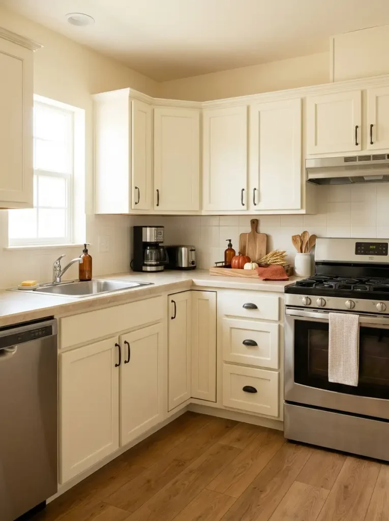
- Pumpkins beside the stove? Move them away from heat and grease.
- Decor covering prep space? Consolidate it onto one tray.
- Seasonal pieces scattered across several counters? Choose one corner and let the rest of the kitchen work.
A single wide kitchen usually has less spare counter space than its larger-house counterpart, so every decorative object has to compete with chopping boards, coffee makers, dishes, and daily food prep.
That makes containment more useful than simply adding fewer objects.
Pick the counter section you naturally use least. A back corner, the end of a peninsula, or a small stretch beside a wall can become the dedicated fall zone. Then place the seasonal pieces on one tray or shallow board: perhaps a small pumpkin, an amber bottle, a practical utensil crock, and one folded autumn towel.
The tray does more than make the arrangement look organized. It turns several separate objects into one movable unit.
If you suddenly need extra prep space, the entire vignette can be lifted away in seconds.
Keep the stove surround, sink edge, and main chopping area comparatively quiet. Fall décor should make the kitchen warmer to look at—not harder to cook in.
Remove first: if the counter already holds several appliances or everyday containers, clear what you can before adding anything seasonal.
12. Add Fall Color to the Window Without Closing In the Room
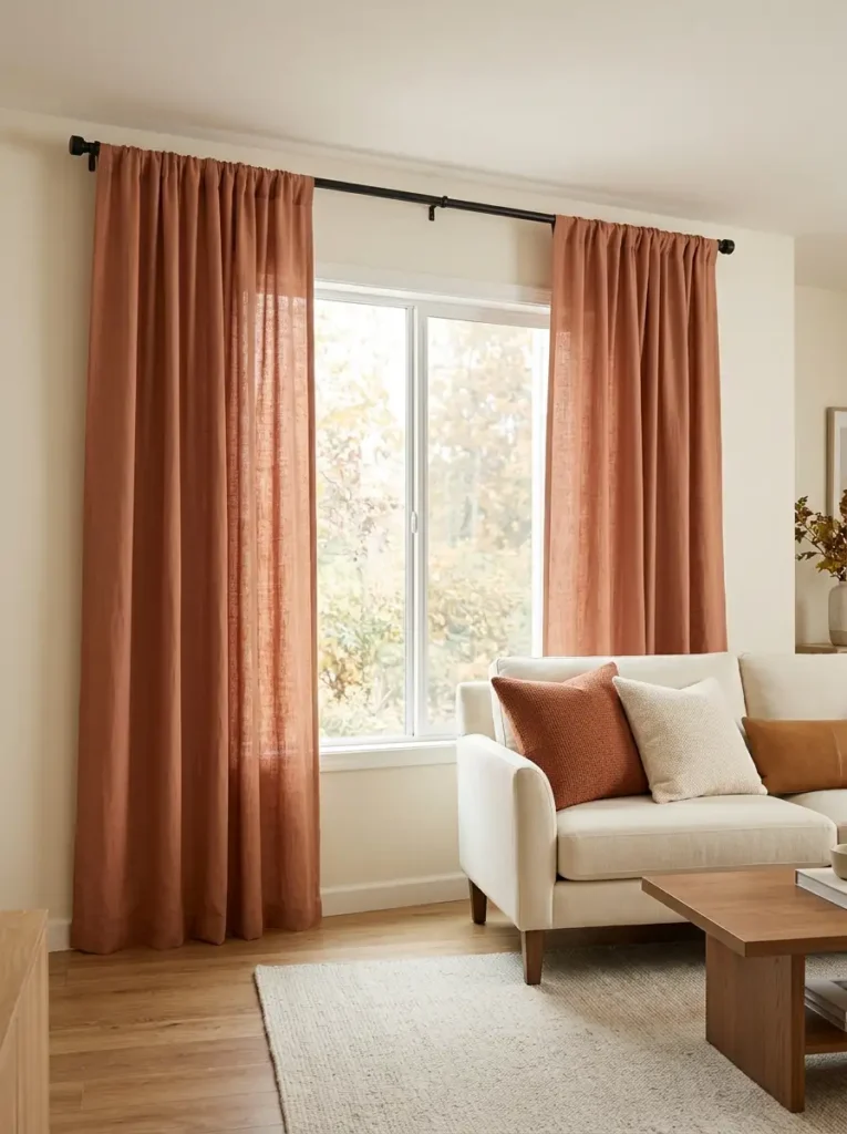
A dark rust curtain is not automatically cozier than a light one.
In a bright single wide with generous windows, saturated terracotta or burnt-orange panels can create a dramatic seasonal color field. Because daylight is already abundant, the stronger fabric has enough light around it to avoid feeling oppressive.
In a dimmer home, the same treatment can behave very differently.
Curtains occupy a surprisingly large percentage of the wall. When the fabric is both dark and visually heavy, the window can stop reading as a source of openness and start reading as another solid wall plane.
That does not mean avoiding fall color.
Instead, move the seasonal warmth into lighter-weight fabric, a restrained stripe, a subtle woven texture, or a warm neutral curtain with rust accents elsewhere nearby.
Mounting curtains higher can also help. The eye begins reading more of the wall as part of the window composition, which can improve vertical proportion.
Keep the panels pulled far enough aside during the day that they do not unnecessarily cover the glass.
Your furniture will respond to that decision too. A neutral sofa looks warmer beside terracotta fabric; dark brown furniture may need a lighter caramel or oatmeal treatment instead.
In the smallest or darkest rooms, let the window stay visually light and bring the stronger autumn color to cushions, throws, and smaller accessories instead.
13. Build a Cozy Dining Nook Without Blocking the Walkway
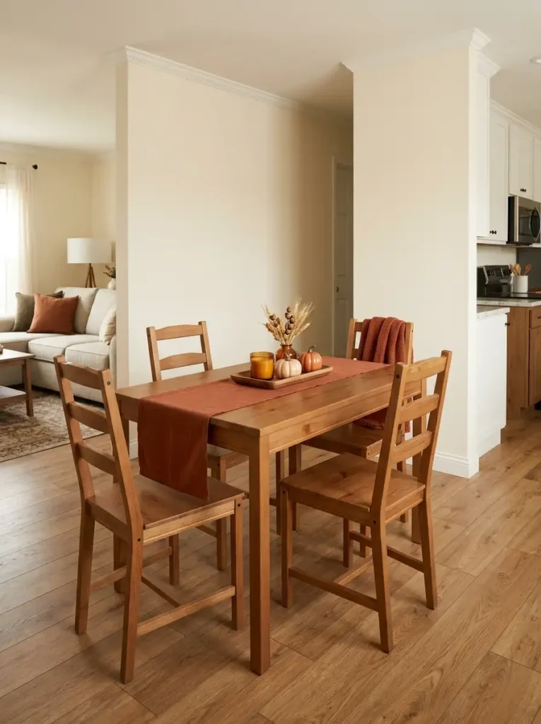
Imagine a small dining table sitting between the kitchen and living room. There is just enough space for the chairs, and everyone regularly walks past one side of it.
The wrong fall decorating move is to start by placing baskets, pumpkins, or tall floor arrangements around the table.
Build the seasonal feeling from the least space-consuming layer upward instead.
1. Start flat
Lay down a narrow table runner or a few warm-toned placemats.
This introduces autumn color without consuming any additional circulation space. In a compact dining zone, the flat layer often creates more visual change than expected because it covers a relatively large surface.
2. Add one low center
Place a contained centerpiece along the table’s middle: perhaps a shallow bowl, wooden tray, small pumpkins, or short foliage.
Keep enough open table surface for plates and serving dishes.
3. Add one supporting accent only if needed
A rust textile over a chair back, a small branch arrangement nearby, or one warm candle may be enough.
Now pull out every chair and walk through the dining area.
If a decorative object forces you to angle your body around it, move it. If the centerpiece must be removed every time you eat, reduce it.
The dining nook should feel more seasonal without changing the way the space naturally works.
14. Bring Fall Into the Bathroom With Color, Not Clutter
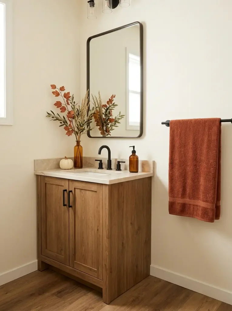
If your vanity is tiny
Let functional items carry most of the autumn color.
Swap everyday towels for rust, terracotta, camel, or warm cinnamon. An amber soap dispenser or one small cream pumpkin can finish the look without occupying the space you need around the sink.
A folded towel often creates more visible fall color than several small accessories combined.
If you have a medium-size vanity
You can add one vertical element as well.
A narrow vase with airy rust branches gives height while towels and amber glass provide the lower color layer. Keep the objects grouped toward one side instead of spreading them across the full counter.
If the bathroom is low-light
Use brighter autumn tones selectively.
Deep brown, burgundy, and dark rust can disappear visually in a dim room. Cream pumpkins, lighter terracotta towels, reflective amber glass, and warm white surfaces will preserve more brightness.
The rule underneath all three versions is the same:
replace before you add.
Change the towels before buying tabletop decorations. Change the soap bottle before filling the vanity with pumpkins. Use the mirror reflection to your advantage; one branch arrangement may appear visually doubled without occupying twice the counter space.
Stop when the bathroom clearly reads as autumnal but the sink still looks easy to use and clean.
15. Use the Wall Above the Toilet Instead of the Floor
- Shelves disappear beneath a row of pumpkins.
- Fall signs compete with flowers, candles, jars, and framed art.
- Both shelves carry the same visual weight.
- Cleaning requires moving a dozen tiny objects.
Those are signs that your bathroom has gained storage space but lost breathing room.
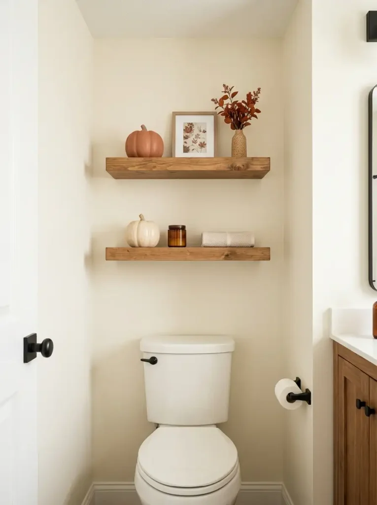
The wall above the toilet can be one of the most useful seasonal areas in a single wide because it lets you decorate vertically without occupying the floor or vanity.
The correction is not to fill every inch.
Let one shelf carry the stronger autumn composition. Perhaps that means one medium pumpkin, a small framed print, and a vase with restrained foliage.
Keep the other shelf quieter—maybe two cream pumpkins and a practical container, or even one object with plenty of empty wood visible around it.
That asymmetry prevents the shelving from becoming a solid block of seasonal objects.
Pay attention to depth as well. Very deep baskets or decorations can feel visually heavy above a toilet in a compact bathroom. Flatter artwork, low pumpkins, and narrow vessels generally work more comfortably.
Finally, think about cleaning. If wiping a shelf requires dismantling an entire miniature harvest display every week, the styling density is too high.
16. Hide Everyday Clutter Inside Fall-Friendly Woven Baskets
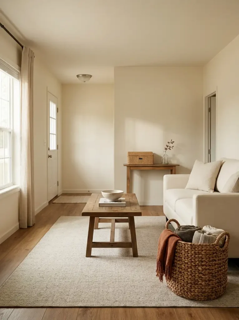
Before adding another pumpkin, look at what is already competing for attention.
Blankets folded unevenly across the sofa, shoes near the door, pet toys beside a chair, magazines under the coffee table, and charging cables can create far more visual noise than most seasonal decorations.
Start by removing the small scattered things from view.
A large woven basket beside the sofa can hold extra throws. A shallow basket near the entry can collect shoes or accessories. A lidded version can hide items you would rather not see at all.
Once those objects disappear, notice what happens to the room. Natural fibers such as seagrass, rattan, water hyacinth, or warm woven rope already introduce the earthy texture we associate with fall.
You may discover that the basket itself is enough.
If the room still needs a seasonal cue, add one folded rust throw over the edge or tuck a small strand of faux foliage near the handle. Do not automatically add pumpkins, bows, signs, and blankets just because the basket is now part of the décor.
The unexpected advantage is visual scale. Ten small objects create ten separate things for the eye to process. One substantial basket turns them into a single calm shape.
Leave the basket simple whenever its texture is already doing the seasonal work.
17. Cluster Pumpkins Instead of Scattering Them Everywhere
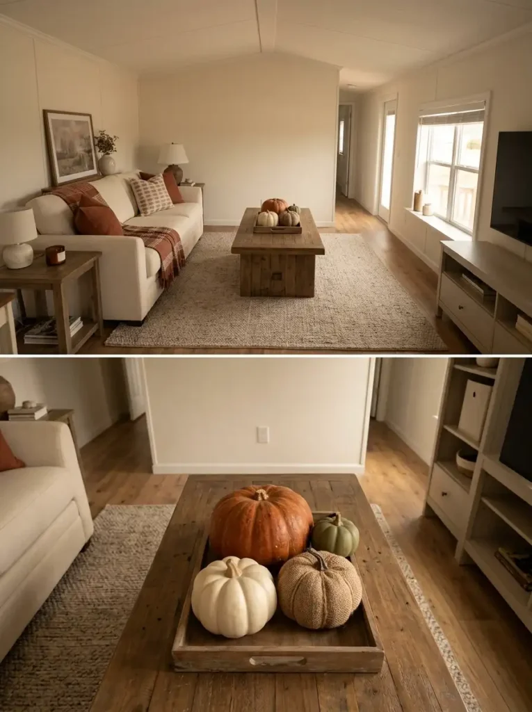
The grouping formula:
one dominant pumpkin + two or three smaller companions + mixed materials + intentional overlap.
The important word is overlap.
When three pumpkins sit several feet apart—one on the coffee table, one on a side table, and another beneath the television—the eye registers three separate decorations. In a compact room, those repeated stops can make the space feel busier than expected.
Bring those same pumpkins together and they become one visual unit.
Try placing a medium natural pumpkin slightly behind two smaller ceramic, velvet, or woven versions. Allow the shapes to touch or overlap from your main viewing angle rather than arranging them in a perfectly spaced row.
Scale variation keeps the cluster interesting. So does material contrast. A matte ceramic pumpkin beside a textured fabric one usually feels more layered than three identical glossy pieces.
Color does not have to match exactly, either. Burnt orange, cream, muted olive, dusty terracotta, and warm brown can live comfortably in the same group when one color remains dominant.
There is one exception: if two rooms are visually separated by a doorway or hall, a small pumpkin moment in each space may work because they are not competing within the same immediate view.
The principle is simple: repeat fall shapes through clusters, not through constant scattering.
18. Repeat One Fall Color Through Connected Rooms
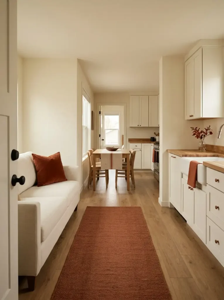
Option A: repeat the object
Orange pumpkin in the entry. Orange pumpkin on the coffee table. Orange pumpkin on the dining table. Orange pumpkin in the kitchen.
The rooms certainly match, but the repetition can start feeling literal.
Option B: repeat the color
Use burnt orange at the entry through a runner.
Let it reappear in the living room as a pillow.
Carry a softer version into the dining area through a textile, then echo it in the kitchen through a towel or ceramic piece.
Now the rooms share a visual language without sharing the exact same decoration.
That distinction matters in a single wide because several areas are often visible at once. The eye can recognize one repeated accent color from room to room and mentally connect the spaces.
You can do the same with muted olive, caramel, deep rust, or warm cream if orange is not your favorite.
Before shopping, walk through the house and gather existing items in your chosen color. A pillow may work better in another room. A vase can move from a bedroom to the dining area. A neutral throw may contain exactly the rust stripe you need.
Only after repositioning those pieces should you look for the gaps.
Best decision: repeat the color through different materials and shapes rather than buying matching seasonal objects for every room.
19. Finish With One Hero Fall Moment Per Sightline
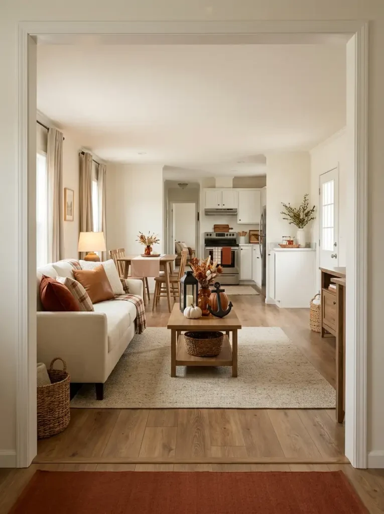
Competing
Stand at your front door and look through the home without moving anything.
What demands attention first?
If the answer is a pumpkin display, plaid sofa, decorated dining table, bright kitchen towels, foliage arrangement, and wall sign all at once, you do not need another decorating idea. You need an edit.
Move
Relocate anything that creates a second focal point directly behind or beside the strongest one.
A dramatic rust sofa arrangement may need a quieter coffee table. A decorated dining table visible behind it may work better with just a runner and low centerpiece.
Then repeat the exercise from your main seating position and from the transition between kitchen and living areas.
Leave Quiet
Every important view should have somewhere for the eye to rest.
That might be an undecorated wall, a mostly clear table, visible neutral upholstery, or simply a stretch of flooring without another basket or pumpkin cluster.
This breathing room is what allows your favorite fall moments to look richer.
Only after the competing pieces have been removed or repositioned should you consider whether anything is missing.
Most of the time, nothing is.
A finished single wide usually feels more sophisticated when each major sightline contains one hero moment, one quieter supporting cue, and enough neutral space around both.
That final edit is what turns individual decorations into a whole-home fall design.
Cozy Fall Decorating in a Single Wide Without the Clutter
The easiest place to start is the area that changes the mood of your home most quickly. For some single wides, that will be the front entrance or living-room focal point. For others, simply changing textiles and lighting will make the biggest difference.
You do not need all 19 ideas at once. Choose a few that solve real problems—an undefined entry, an empty wall, a cluttered counter, or a room that needs warmer color.
Then edit before adding more.
A cozy fall home should still feel easy to walk through, easy to clean, and comfortable to live in. Save these ideas to Pinterest so you can come back to the ones that fit your space when you are ready to decorate.