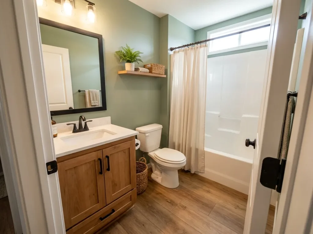
A mobile home bathroom may be one of the smallest rooms in the house, yet it can carry an impressive amount of fall atmosphere. The limited footprint actually makes a few carefully chosen seasonal changes feel more noticeable.
The challenge is avoiding the crowded look that can happen when pumpkins, candles, towels, florals, and signs all compete for attention. A compact bathroom needs stronger editing than a large room.
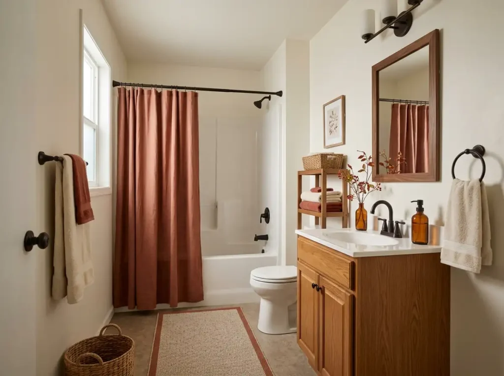
Good fall mobile home bathroom decor starts with the surfaces and features that already occupy visual space: the shower curtain, towels, shelving, vanity, mirror, floor, and lighting. Changing how those elements relate to one another can shift the entire room before decorative extras enter the picture.
You also do not have to commit to one version of autumn. Rust and cream can feel quietly seasonal, darker botanicals can add mood, and a temporary Halloween layer can bring playfulness later in October.
These ideas move from larger room-changing decisions into smaller finishing details, giving you plenty of ways to create a bathroom that feels warmer, calmer, and distinctly ready for fall.
1. Make the Shower Curtain the Main Autumn Color Field
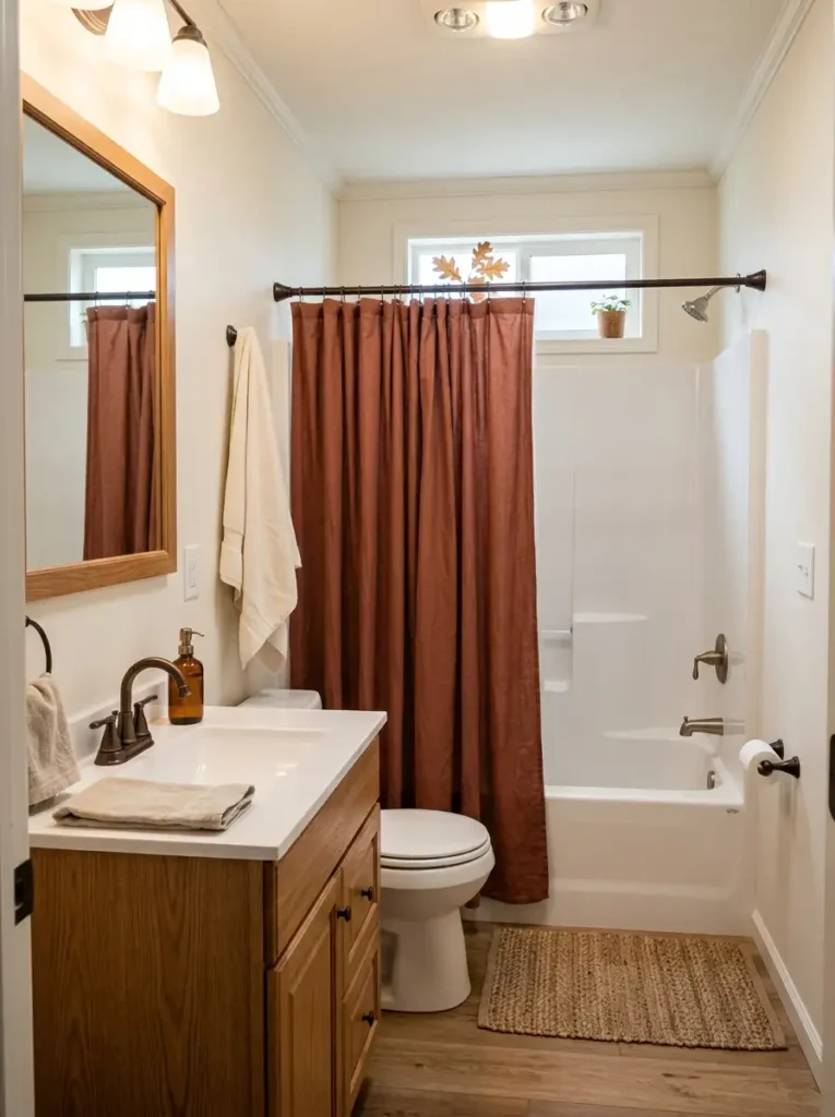
Few affordable changes affect a compact bathroom as quickly as replacing the shower curtain. In many mobile home layouts, it covers one of the largest uninterrupted surfaces in the room, so its color has more influence than several small accessories combined.
A muted terracotta, cinnamon, deep olive, warm clay, or soft rust curtain can establish the autumn palette immediately. Pattern works too, especially when the bathroom is otherwise quiet, but scale matters. Large botanical shapes usually read more clearly in a small room than tiny repeated leaves.
Look at the permanent finishes before choosing the exact shade. Warm beige tile tends to work beautifully with earthy rusts and ochres. Cooler gray surroundings often look more balanced with muted brick, olive, or brown-red tones.
The supporting colors should stay quieter. Cream towels, dark hardware, natural baskets, or medium wood give the curtain enough contrast without turning every surface into another seasonal statement.
A useful checkpoint is the doorway view: the shower curtain should establish the mood first, while the rest of the bathroom still has room to visually breathe.
2. Build a Rust-and-Cream Towel Rhythm Across the Room
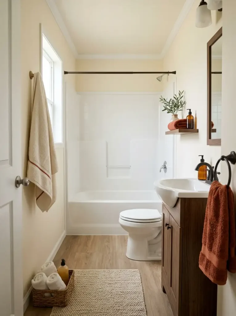
Think in rhythm, not quantity.
Three thoughtfully placed fall-colored towels can have more impact than an entire shelf stacked with orange linens.
The eye notices repetition when a color disappears and then appears again somewhere else. A rust hand towel beside the vanity might form the first point. A cream bath towel with a narrow terracotta stripe can create the second. One folded accent towel on open shelving completes the sequence.
That spacing is especially useful in a narrow mobile home bathroom because it draws attention through the room instead of concentrating all of the visual weight in one corner.
A useful formula is:
warm accent → neutral pause → warm accent
Cream, oatmeal, ivory, or light taupe keeps saturated autumn colors from becoming too dominant. You can also work with two nearby tones—perhaps burnt orange and cinnamon—if the bathroom already has substantial warm wood.
Avoid filling every towel rail with the same strong hue. Functional towels still need enough room to dry properly, and a packed towel bar usually appears visually heavier than expected.
The color rhythm is working when your eye notices the relationship among the towels before it notices the number of towels.
3. Warm Up Storage With Wood Shelves and Woven Baskets
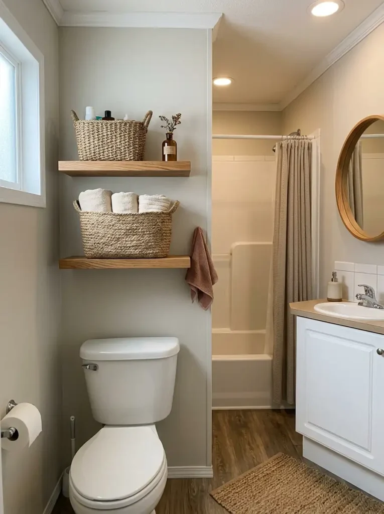
Bathrooms naturally contain a lot of hard surfaces: porcelain, fiberglass, laminate, glass, tile, and metal. That makes texture unusually powerful here. Even a modest woven basket can stand out because its surface behaves so differently from everything surrounding it.
Open wood shelving can reinforce the effect. Medium oak, walnut, or slightly weathered brown works particularly well for fall because the wood grain brings movement into a room filled with flat, smooth finishes.
The useful part of this idea is not filling every shelf with seasonal decorations. Let the storage remain functional. Fold towels in one basket, hide backup toiletries in another, and leave enough open shelf area for the wood itself to remain visible.
Bathrooms also require practical material choices. Natural seagrass can soften the room beautifully, but it should not sit where it is constantly splashed. Tightly woven synthetic or resin-based baskets can provide a similar appearance in damp zones with less maintenance.
Pay attention to shelf thickness as well. Heavy rustic shelves carry considerable visual weight in a very narrow bathroom. Slimmer boards often suit a tiny mobile home better, especially when the baskets already contribute substantial texture.
Here, fall comes through the material story more than through a literal seasonal motif.
4. Give the Vanity One Restrained Fall Focal Cluster
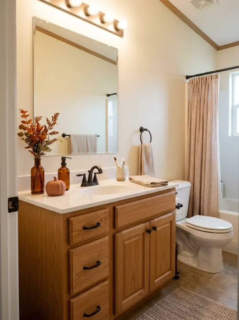
A small bathroom vanity rarely needs decoration across its entire width. Daily-use space is more valuable, and the mirror already magnifies whatever sits beneath it.

Choose one side of the sink as the seasonal focal zone. A narrow vase, an amber soap dispenser, and one small autumn object can be enough. Different heights make the group easier to read, while an empty stretch of counter on the opposite side keeps the arrangement practical.
Before adding anything, check three things:
- Reflection: Can you see the entire arrangement again in the mirror? If so, it will feel visually larger than its physical footprint.
- Reach: Keep the faucet, soap, toothbrush area, and frequently opened drawers easy to use.
- Cleaning: Leave enough open counter that wiping around the sink does not require dismantling the display every day.
Asymmetry works especially well here. A low pumpkin beside the sink on one side and another pumpkin on the opposite side often feels more staged than necessary. One stronger cluster gives the eye a clear destination.
The easiest way to judge it is from the bathroom doorway. Your vanity decor should register as one composed focal moment, not as several unrelated objects scattered along the countertop.
5. Use Amber Glass to Make Neutral Finishes Feel More Autumnal
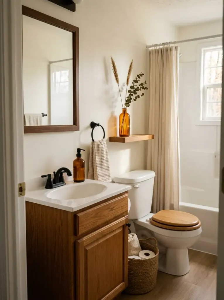
Fall bathroom decor does not have to rely on leaves, plaid, or pumpkin shapes. Amber glass can carry seasonal color in a quieter and more versatile way.
A brown-amber soap dispenser, small bottle, candle vessel, or narrow vase works especially well beside white porcelain and warm wood. The material has enough color to register as autumnal, yet its translucency keeps it from feeling as visually solid as an opaque orange accessory.
Light is part of the effect. Place amber glass where natural window light, a vanity fixture, or soft ambient illumination can pass across it. The glow becomes richer around the edges, giving an ordinary functional object more depth.
One strong piece may be all a compact vanity needs. A matched pair can work on a wider counter or shelf, but an entire collection of brown bottles can quickly turn the surface into another storage display.
Amber also bridges materials beautifully. Against white laminate or ceramic, it supplies warmth. Beside walnut or oak, it picks up the brown undertones. Near black hardware, the contrast becomes sharper and slightly more sophisticated.
That versatility makes amber glass useful even after the obvious fall decorations have been packed away.
6. Let Autumn Branches Add Height Without Eating Counter Space
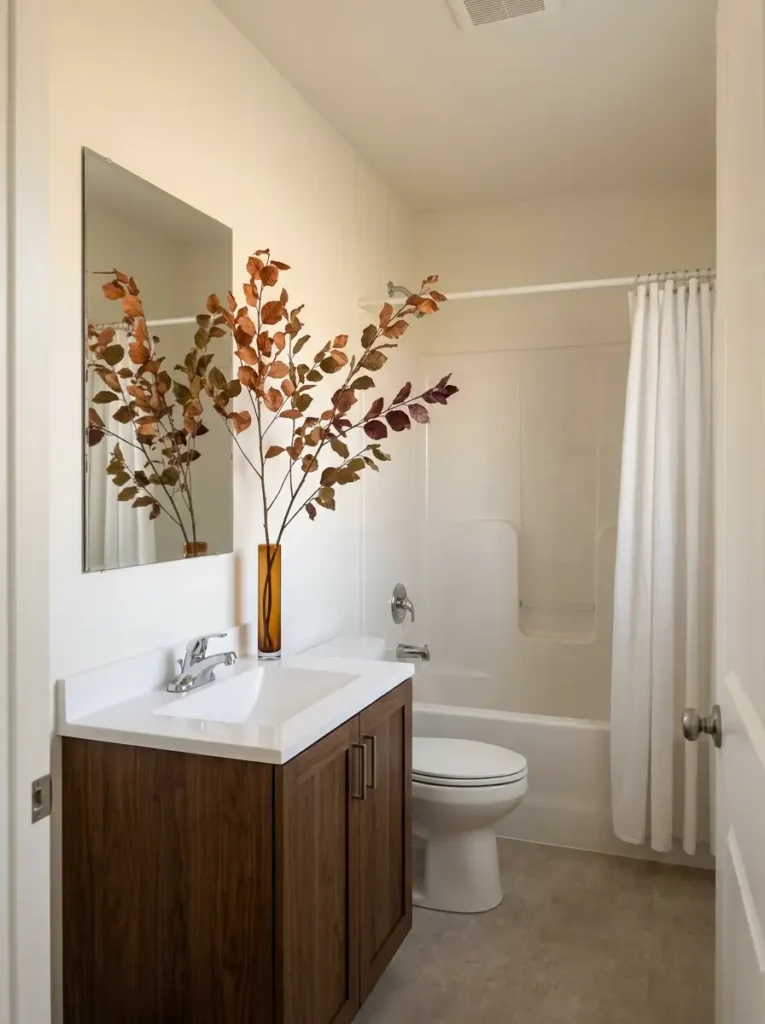
A small mobile home bathroom often has very little horizontal space left once the sink, soap, toiletries, and daily essentials are accounted for. Height is usually easier to borrow than width.
A narrow vase with a few open autumn branches can fill that vertical opportunity beautifully. Look for stems with visible gaps between leaves so the arrangement feels airy. Dense bunches can turn into a solid visual block, especially once the mirror reflects them.
The most useful placement is usually near one outer edge of the vanity. Keep the stems clear of the faucet and away from any cabinet door that swings upward or outward.
Height should relate to the mirror. A branch arrangement that ends somewhere around the upper half of the mirror often feels connected to the vanity. Extremely tall stems can work, but only when the ceiling and mirror leave enough open background around them.
Real foliage is lovely for a short period, while good-quality faux stems are easier to manage in a humid room.
From the doorway, you should still be able to see wall or mirror between the branches. That visible background is what keeps the arrangement graceful.
7. Choose a Fall Runner That Respects the Walking Path
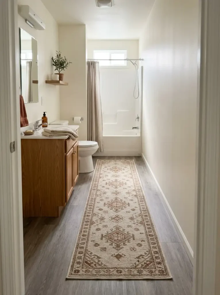
Floor textiles can either make a narrow bathroom feel more connected or divide it into awkward little sections. The difference comes down to scale and placement.
Before buying a fall runner, measure the route you actually walk through the room.
1. Check the door swing.
A thick rug near the entry can catch under the door or bunch as it opens. Low-pile, washable constructions are safer in tight layouts.
2. Protect the usable pathway.
A runner should sit within the circulation zone without forcing your feet around its edges. Leave a visible border of flooring on both sides so the rug feels intentional rather than squeezed into place.
3. Watch the toilet and vanity clearances.
The rug should not disappear halfway under the vanity, wrap around the toilet base, or block cabinet doors.
In a long bathroom, one appropriately scaled runner can visually connect the entrance with the shower or vanity area. Several tiny mats can make the same room feel fragmented.
Pattern also matters. A linear stripe can reinforce length, while scattered leaves create more visual activity. In a bathroom that already has a patterned shower curtain, a quieter runner is usually the stronger partner.
8. Give a Plain Mirror a Warmer Frame
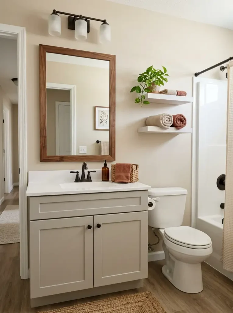
A frameless builder-grade mirror can make a bathroom feel unfinished even after you add seasonal textiles. Framing it changes the wall architecture itself.
The design equation is simple:
mirror size + frame thickness + vanity width = visual proportion
A medium warm wood frame can connect a pale vanity with baskets, woven storage, or fall-toned textiles elsewhere in the room. Walnut gives more contrast. A slim dark bronze or matte black border is useful when the bathroom already has dark faucet or light-fixture finishes.
Scale matters more than decorative detail. A very thick rustic frame around a modest mirror can reduce the apparent reflective area and feel heavy in a narrow bathroom. Slimmer frames usually sit more comfortably above small mobile home vanities.
For example, if the vanity already has substantial wood grain, the mirror does not have to match it perfectly. A neighboring warm tone often looks more natural than an exact furniture-style match.
There is one exception: bathrooms with elaborate tile or a strongly patterned wall may already have enough architectural definition. In that case, a simple thin frame prevents another competing boundary from entering the room.
For renters, removable mirror-frame kits or carefully selected adhesive solutions may offer a lower-commitment version of the same idea.
9. Use One Fall Art Piece to Fix the Empty Wall Above the Toilet
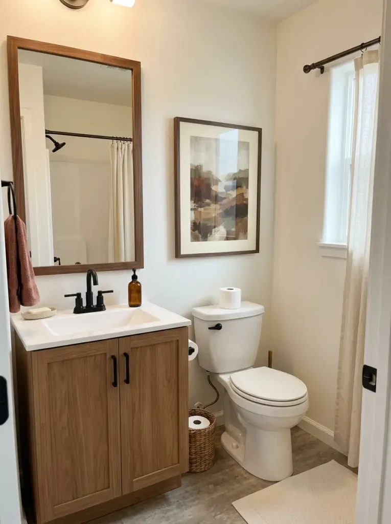
The wall above the toilet is often one of the easiest places to introduce seasonal character, but undersized artwork is a common mistake.
Wrong: a tiny print floating in the middle of a wide blank wall.
It can make the empty area around it feel even larger.
Better: one framed autumn print with enough width to visually relate to the toilet zone below it. Botanical studies, abstract rust landscapes, vintage-inspired leaves, or muted seasonal photography can all work without looking like temporary party decor.
Best when: the art connects to at least one existing finish in the room. A dark frame might pick up matte black hardware. A walnut frame can relate to a wood vanity. Cream matting can echo towels or the shower curtain.
You do not need to fill every inch above the toilet. The purpose is to give the wall a believable visual center.
If shelves already occupy this zone, art may be unnecessary. Competing shelf decor and framed seasonal art can make a narrow bathroom feel top-heavy.
For renters, lightweight frames and removable picture-hanging strips make this one of the easiest fall changes to reverse once the season ends.
The scale is right when the artwork feels connected to the fixture below, yet a comfortable margin of open wall remains around the frame.
10. Shift the Bathroom Toward a Softer, Warmer Glow
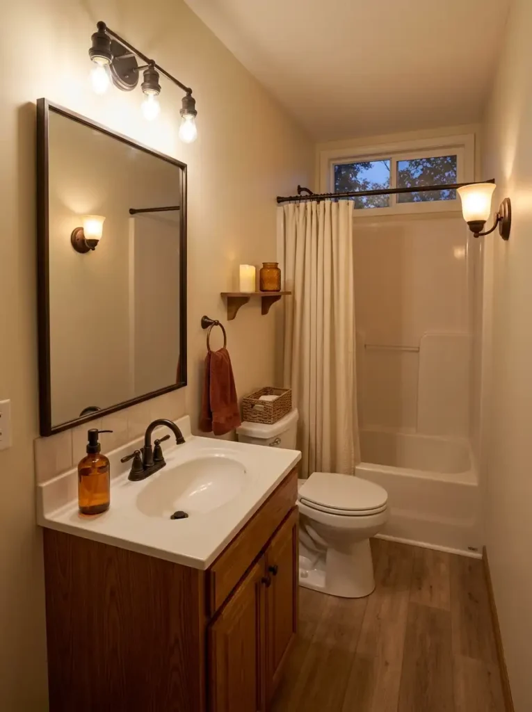
A bathroom can have all the right fall colors and still feel cold under harsh lighting.
The usual cause is not brightness alone. Color temperature matters. Cool-white bulbs can emphasize blue or gray undertones in tile, paint, and laminate, while warm-white light brings beige, wood, rust, and amber finishes forward.
That does not mean the vanity should become dim. Grooming and makeup still need clear task lighting. A useful approach is to keep the mirror area bright enough for daily use and let any secondary light source carry more of the evening atmosphere.
Around 2700K gives a distinctly warm residential glow. 3000K is a useful middle ground for bathrooms that need comfort without becoming overly yellow. 4000K feels cleaner and crisper, though it contributes less to an autumn mood.
Color rendering also matters. A bulb with good color quality keeps skin tones, towels, wood, and seasonal decor from appearing muddy.
Candles may look beautiful in fall photos, but flameless candles or enclosed, bathroom-safe ambient lights are easier to live with around towels, children, pets, and small counters.
At night, the best result still leaves the mirror functional while the rest of the bathroom settles into a softer visual temperature.
11. Add a Removable Warm Backdrop Where the Bathroom Feels Flat
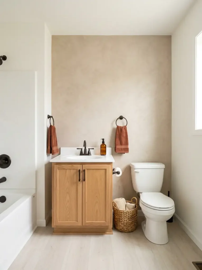
Sometimes the seasonal accessories are not the problem. The wall behind them is.
A bright white or cool gray bathroom can make rust towels, warm wood, and woven storage feel visually disconnected. Changing one carefully selected background plane can alter how those existing colors are perceived.
There is no need to cover the whole bathroom. Focus on a dry wall behind the vanity, above the toilet, or beside open shelving. A removable plaster-look finish, muted clay tone, tiny-scale botanical, or warm linen-effect pattern can provide enough contrast.
The existing room color should determine the direction:
- Cool gray bathroom: explore mushroom, muted clay, or warm taupe.
- Bright white bathroom: a restrained beige, olive-gray, or earthy print can add definition.
- Already warm beige bathroom: choose subtle texture over another brown-orange surface.
Humidity matters. Removable products vary considerably, so confirm that the material is suitable for the intended bathroom zone and follow the manufacturer’s surface-preparation guidance.
A renter also needs to consider removal risk. Testing a discreet area first is more useful than assuming every peel-and-stick product will release cleanly.
The transformation is successful when the wall supports the autumn palette while still reading as part of the bathroom after the seasonal accessories leave.
12. Use Dark Hardware as Small Visual Anchors
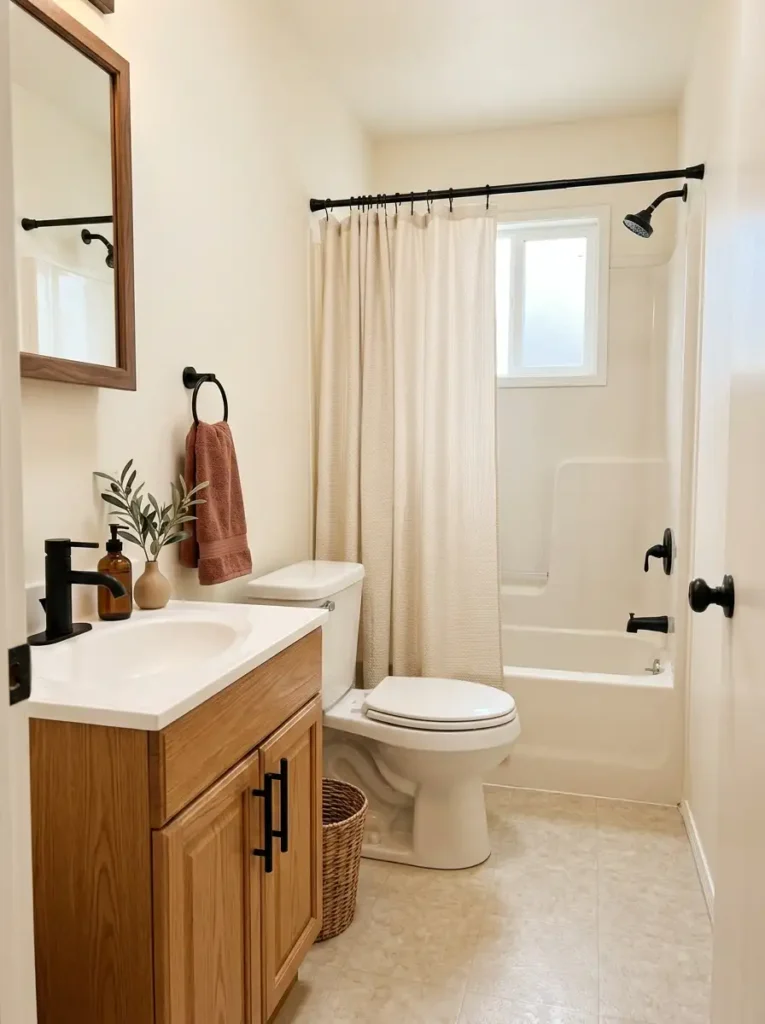
A compact bathroom does not need much dark color to gain definition.
Look at the faucet, shower rod, towel ring, hooks, cabinet pulls, and light fixture as a group. Every dark piece acts like a small punctuation mark against pale walls and white fixtures.
Contrast determines how visually heavy those pieces appear. A matte black towel ring on a cream wall may attract more attention than a much larger beige basket. Physical size alone does not determine visual weight.
That is why replacing every visible fixture at once is unnecessary.
Start by identifying what the room already has. A black faucet and shower rod may provide enough structure. In that case, simply coordinating two inexpensive hooks or cabinet pulls can establish a clearer finish relationship.
For bathrooms with chrome plumbing that will remain, dark accents can still work. Keep them concentrated in one secondary category—such as frames and cabinet hardware—so the finish mix looks deliberate.
Avoid turning seasonal decorating into a hardware renovation project. These pieces should support the fall palette, not become its main attraction.
One quick test: squint at the room from the doorway. Dark points should form a loose visual path through the space, not collect into one heavy patch.
13. Put a Small Fall Wreath on the Entry Plane
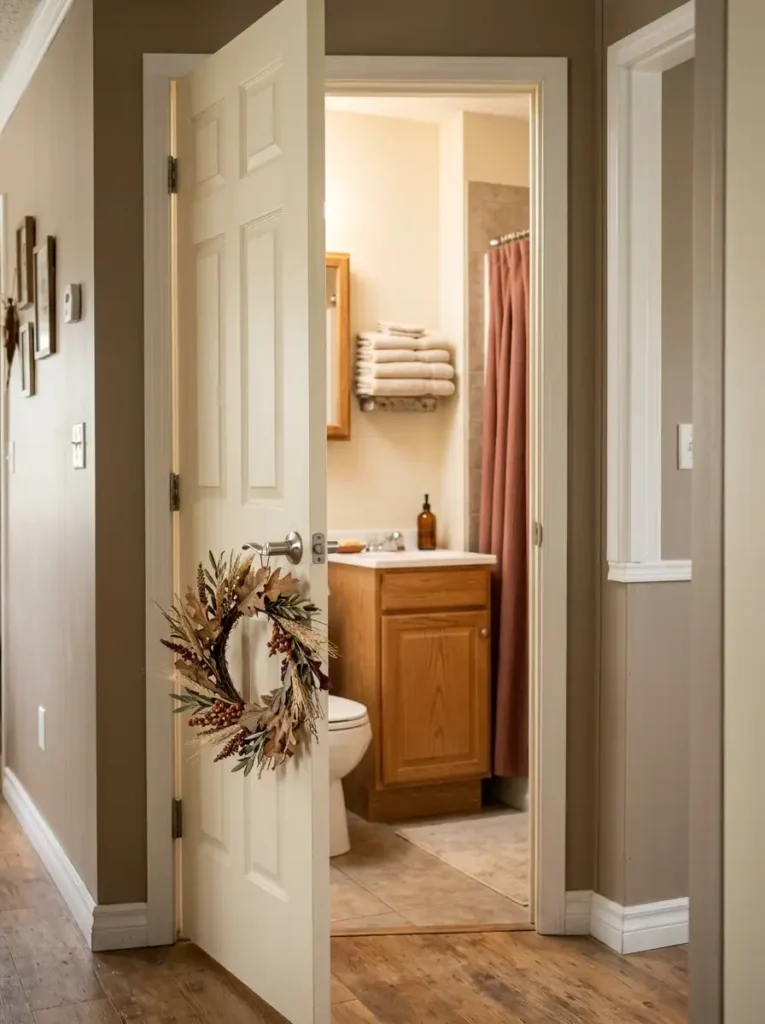
Imagine walking down the hall and seeing the fall mood before you even step into the bathroom.
That first glimpse is valuable in a mobile home, where compact rooms can be experienced almost instantly from nearby spaces. A small wreath on the bathroom door or an adjacent wall introduces the seasonal story before the sink, shower curtain, or towels come into view.
The wreath should respect the door itself. A bulky design can bang against the wall, interfere with a nearby cabinet, or make a narrow passage feel crowded. Flatter rings made from preserved-looking foliage, wheat, small leaves, or muted faux botanicals usually suit the location better.
Scale can stay modest. A wreath around one-third of the door width often has enough presence without making the door feel visually packed.
Door swing determines placement. Where the inside face disappears against a wall when open, the hallway-facing side may deliver greater impact. A nearby entry wall is another option when the door needs to remain completely clear.
Natural-looking burnt orange, burgundy, brown, and olive can connect with the bathroom’s interior palette without duplicating the exact accessories inside.
The wreath has one job: announce the season before the rest of the room takes over.
14. Add a Reversible Halloween Layer Without Redecorating the Whole Bathroom
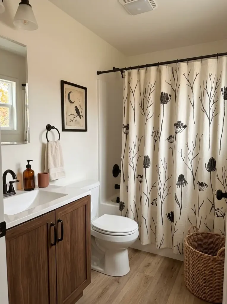
Do you want the bathroom to stay softly autumnal through November, or would a playful October phase be more fun?
You can have both.
Treat Halloween as a temporary high-contrast layer placed over the fall foundation you already built. Black, cream, charcoal, and orange graphics carry much more visual intensity than muted rust towels or wooden baskets, so one substantial Halloween feature can change the room quickly.
For a subtle version, switch a framed print or hand towel. The autumn palette remains dominant while a single spooky detail signals October.
A playful version might use one graphic shower curtain with quieter towels and floor textiles around it.
For the boldest treatment, choose a larger Halloween surface and add one supporting dark accent elsewhere. Stop there. Once bats, ghosts, skulls, pumpkins, themed signs, and novelty towels all appear together, the room shifts from seasonal styling into a fully themed display.
The beauty of this approach is reversibility. Store the Halloween piece after October and the underlying rust, cream, wood, amber, and woven textures immediately return the bathroom to a general fall mood.
That makes one strong temporary change more versatile than rebuilding the room twice during the same season.
15. Finish the Room With One Low Woven Basket
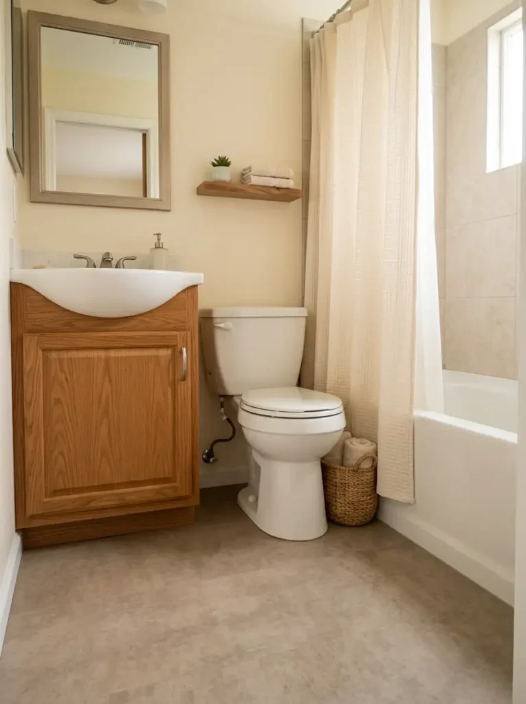
Look around the bathroom at waist height and above. The mirror, shower curtain, towel bars, shelving, artwork, and branches may already carry plenty of visual activity.
Now look at the floor.
A quiet corner beside the vanity or near the toilet can sometimes benefit from one low woven basket. Its purpose is different from the storage baskets on wall shelves. Here, the basket gives visual weight to the lower part of the room and softens the transition between cabinetry and exposed floor.
Possible contents depend on the location. Rolled clean towels work in a dry corner. Laundry suits a ventilated basket placed away from splash zones. A chunky throw-style textile may photograph beautifully, but bathroom humidity and practical use should determine whether it belongs there long term.
The empty corner must be genuinely unused.
A basket that forces you to turn sideways, catches the bathroom door, interferes with a drawer, or narrows the route to the shower is not filling dead space—it is occupying circulation space.
Choose a basket low enough that it does not compete with the vanity or toilet.
The final room should feel grounded at floor level without gaining another obstacle.
Bringing Your Fall Mobile Home Bathroom Together
A cozy bathroom does not require all 15 changes. Start with the intervention that controls the largest part of your room: the shower curtain, lighting, wall backdrop, or floor textile. That usually delivers the most noticeable shift.
Next, choose one smaller layer that supports it—perhaps towels, amber glass, autumn branches, or woven storage. Leave useful counter space and circulation intact.
For October, a reversible Halloween accent can temporarily change the personality without undoing the broader fall scheme.
The strongest fall mobile home bathroom decor feels seasonal and comfortable while still working like a bathroom every day. Save your favorite ideas to Pinterest, then build the room one deliberate layer at a time.