

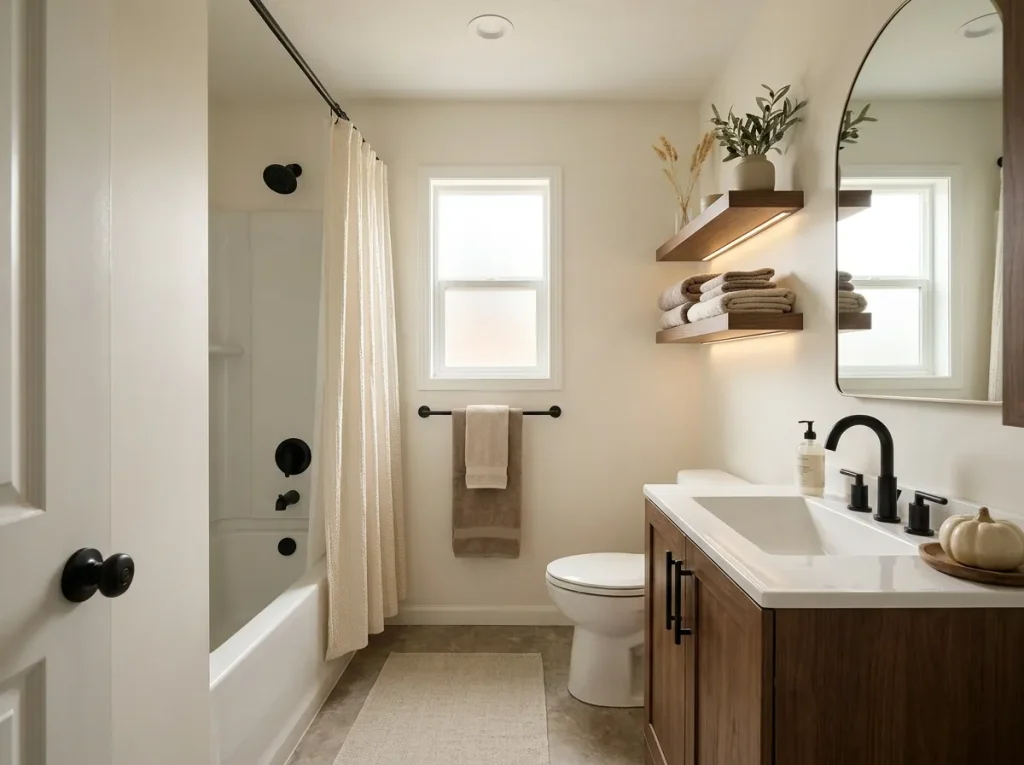
A neutral fall bathroom does not need orange towels, pumpkin-print curtains, and seasonal signs covering every available surface. In a compact mobile home bathroom, autumn can feel much more sophisticated when warmth comes from undertone, texture, natural materials, muted contrast, and a few carefully controlled seasonal details.
The strongest neutral fall mobile home bathroom decor works with the finishes already in the room. White fiberglass, beige tile, gray flooring, wood cabinetry, black hardware, and chrome fixtures all influence whether oatmeal, mushroom, camel, cocoa, or warm ivory will actually look cozy once they are together.
That matters in a small bathroom because one curtain, runner, or vanity arrangement can dominate the entire view. The ideas below focus on making those larger visual decisions first, then layering quieter fall details around them. For a more colorful autumn direction with rust, terracotta, and stronger seasonal accents, you can also explore our broader fall mobile home bathroom decor guide.
1. Read Your Bathroom’s Fixed Undertones Before You Add Fall
Walk to the bathroom doorway before bringing in a single autumn accessory. What color does the room already lean toward?
A bathroom with bright white fiberglass, cool gray flooring, chrome fixtures, and crisp white walls has a very different starting point from one with cream walls, beige counters, honey-toned cabinetry, or warm wood flooring. Those permanent surfaces act like a filter over every neutral color you introduce.
In a cool bathroom, yellow-heavy beige can suddenly look disconnected. Mushroom, greige, weathered taupe, muted cocoa, or softened olive usually provide a gentler bridge between cool architecture and autumn warmth. A naturally warm bathroom has more freedom with flax, camel, oatmeal, warm ivory, and deeper brown.
Try this before shopping: photograph the bathroom from the doorway and temporarily ignore the small objects. Look only at the walls, floor, tub or shower, vanity, countertop, and hardware.
Your first fall color should relate to those surfaces—not fight them.
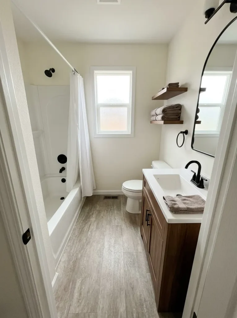
Quick decision:
- Mostly cool white or gray → begin with mushroom or taupe.
- Mostly cream or beige → begin with oatmeal or camel.
- Strong warm wood → let warm ivory or flax provide the quieter counterpoint.
That one decision gives every later layer a clearer direction.
2. Choose One Anchor Neutral Before You Layer the Room
“Neutral” is not one color. An oatmeal bathroom feels airy and soft; mushroom feels grounded and sophisticated; camel gives stronger autumn warmth; cocoa can make pale fixtures feel noticeably richer.
The mistake is choosing all four with equal importance.
Instead, decide which middle-value neutral will carry the seasonal mood. Imagine a bathroom with white fixtures and a light floor. Oatmeal towels, a camel runner, taupe storage, brown bottles, cream pumpkins, wood accessories, and beige textiles may all be attractive separately, yet together they can become a collection of unrelated browns.
Give one shade the lead.
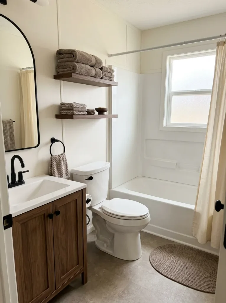
For a compact mobile home bathroom, the anchor might appear on the towels and repeat subtly in a striped curtain. A lighter neutral can then provide breathing room, while one darker tone grounds the composition through wood, a frame, hardware, or a small accessory.
A simple way to choose:
Oatmeal — best when you want the room to stay light.
Mushroom — useful around gray, white, and mixed-temperature finishes.
Camel — stronger seasonal warmth without obvious orange.
Cocoa — effective when a pale bathroom needs visual weight.
Once the anchor is clear, additional décor has a job: support it, lighten it, or ground it.
3. Build a Light–Medium–Deep Neutral Fall Value Ladder
A neutral bathroom can contain beautiful colors and still look surprisingly flat.
The problem is often not the palette itself. It is value—how light or dark those colors appear beside one another. Five pale beige objects against pale walls may technically coordinate, but little separates the foreground from the background. Adding another seasonal object rarely fixes that.
A stronger approach is to give the room three visual roles: a quiet light neutral, a noticeable middle neutral, and one controlled deeper anchor.
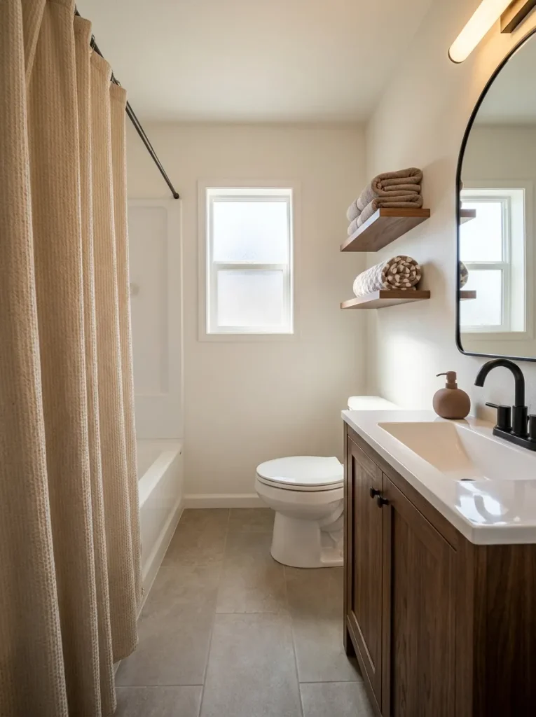
Use the interactive palette below to start from the finishes already dominating your bathroom.
Neutral Fall Value Lab
Start with what your bathroom already has.
Choose the finish family that dominates your room. The palette below shows which light, middle, and deep neutral roles can create autumn depth without turning the bathroom orange.
Read the ladder vertically:
Light gives the room breathing space. Middle carries the seasonal mood. Deep provides the smallest visual anchor.
Warm the middle first.
Cool bathrooms rarely need every surface to become warmer. A mushroom middle tone can connect the existing white or gray architecture to one deeper earthy accent.
Try the middle shade on a towel, runner, or quiet curtain detail before buying darker décor.
Protect the light end.
Warm bathrooms already carry part of the seasonal atmosphere. Keep plenty of ivory visible so camel and walnut feel intentional instead of turning the whole room brown.
Make camel the repeat color, then use walnut only where the room needs grounding.
Do not add darkness everywhere.
Your existing wood or black detail may already supply the deep value. Let cream and flax carry more visual area, then use the darker accent sparingly.
Check whether the existing vanity, frame, or hardware already counts as the deep layer before adding anything new.
Finish test: step back to the doorway. You should notice a clear light background, a readable middle warmth, and a smaller grounding note—not three colors competing at equal strength.
The ladder is successful when the room still feels calm from the doorway. The deepest neutral does not need to appear everywhere; existing black hardware, walnut cabinetry, or a dark frame may already be doing that job.
4. Keep the Largest Fabric Plane Pale and Let Texture Signal Fall
In many compact bathrooms, the shower curtain is one of the largest uninterrupted surfaces. That gives it unusual visual power.
For a neutral fall scheme, letting that entire plane become rust, pumpkin, or a large multicolor botanical can push the room toward a stronger seasonal style than the search intent calls for. A quieter alternative is to keep the curtain ecru, oatmeal, flax, warm ivory, or pale taupe and make its texture do the seasonal work.
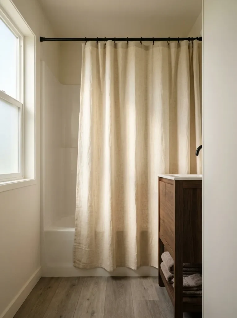
A linen-look weave feels drier and earthier than slick plain polyester. Subtle slub texture, fine woven stripes, restrained waffle detail, or a barely visible tonal pattern can introduce depth while preserving the pale background.
There is one useful exception. A bathroom with white walls, a white tub, white vanity, and very light flooring can become visually washed out with a completely plain ivory curtain. In that situation, a narrow mushroom stripe or slightly deeper flax tone gives the shower plane enough definition.
Think of the curtain as background atmosphere, not the seasonal headline. That leaves room for the smaller wood, botanical, and deeper neutral elements to become visible without competing against a giant color block.
5. Create Autumn Depth With Texture, Not Four More Colors
Imagine removing all the pumpkins and leaves from the room. Would the bathroom still feel warmer than it did in summer?
Texture is one of the easiest ways to make the answer yes.
Bathrooms naturally contain many hard, smooth surfaces—porcelain, glass, mirror, laminate, tile, metal. Against those finishes, an oatmeal woven towel, subtle linen-look curtain, warm wood grain, matte ceramic vessel, or softly irregular basket texture becomes much more noticeable than it would in a heavily upholstered room.
Build contrast between surfaces, not just shades. A useful sequence might be a fine woven curtain, a thicker tactile towel, and one visibly grained wood or speckled ceramic element. Each contributes a different material character, so the room gains depth without needing another beige, brown, rust, or orange accessory.
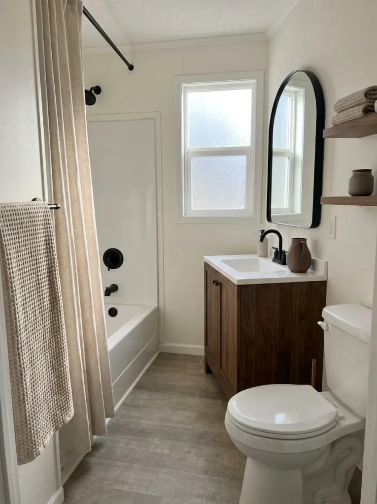
Stop once the textures are readable from normal standing distance. Ten different baskets, ribbed jars, woven containers, fringe details, wood accessories, and knitted pieces can turn tactile variety into clutter.
For anything kept in a damp or frequently splashed area, choose products appropriate for their intended use and follow their care instructions. The visual idea is layering texture—not forcing a decorative material into a location it was never designed to handle.
6. Use One Quiet Pattern So the Neutrals Do Not Go Flat
A room can have the right neutral palette and still feel unfinished when every surface is solid.
That does not mean the bathroom needs a dramatic fall print. In a compact mobile home bathroom, one restrained pattern can supply enough visual movement for the entire room. The best choice depends on how much pattern already exists in the architecture.
A thin taupe-and-cream stripe works especially well with smooth white tubs and simple walls because its repeated lines give the shower zone structure without becoming the focal point. Small gingham can feel warmer and more nostalgic, while a tonal botanical introduces a softer organic direction.
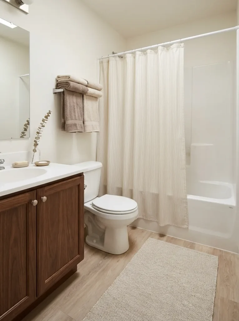
The trouble starts when pattern appears in several places at once: patterned curtain, patterned towels, patterned rug, autumn artwork, decorative leaves. Even if every item uses neutral colors, the room can still feel visually busy.
Use this pressure scale to judge how loudly a pattern will read in a small bathroom.
Pattern Quietness Spectrum
How much pattern can a neutral bathroom carry?
Treat pattern as visual movement. The smaller the bathroom, the more carefully that movement needs to be concentrated.
Fine Stripe
Useful when tile, cabinetry, and flooring are already simple. It adds rhythm while keeping the room visually calm.
Tonal Check
Works when the rest of the bathroom is restrained. Keep the contrast close so the pattern supports rather than dominates.
Large Botanical
Can become the room’s focal point quickly. Use only when other major surfaces are nearly pattern-free.
If your existing tile has strong grout lines, flooring has pronounced variation, or the vanity has visible grain, count those surfaces as part of the pattern load too.
The bathroom may already have more movement than you think.
7. Bridge Bright White Fixtures With One Earthy Middle Tone
White tubs, toilets, sinks, and fiberglass shower surrounds are common visual anchors in many compact bathrooms. They keep the room bright, but next to deep brown wood or black hardware they can also create a sharp white-to-dark jump.
You do not have to hide the white.
Give the eye a middle tone between the two extremes.
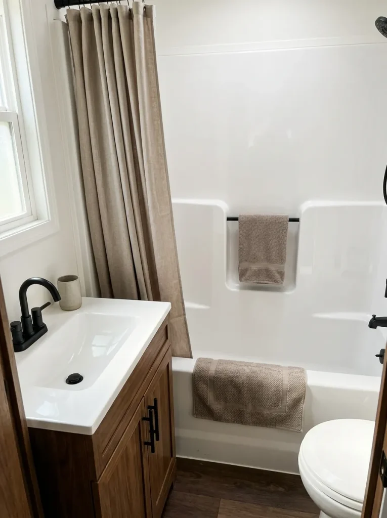
Picture a bright white sink above a medium wood vanity with matte black hardware. Add a mushroom hand towel, flax shower curtain, or stone-colored ceramic vessel nearby. That middle value visually connects the white fixture to the darker material, allowing the room to feel warmer without changing either permanent finish.
Where should that bridge appear?
Look for the places where white directly meets another dominant material:
- white sink against wood cabinetry,
- white shower surround beside dark hardware,
- white toilet beneath dark shelves,
- white tub next to warm flooring.
One medium earthy neutral in those junctions can be more effective than placing several unrelated beige accessories around the room.
If your existing tub, sink, or countertop already leans cream rather than crisp white, it may already provide some of this transition. In that case, repeat its warmth lightly instead of introducing another competing shade.
The decision is simple: before adding a new fall object, check whether the room actually needs a seasonal object—or merely a better transition between the finishes it already has.
8. Add One Cool Organic Note to Keep Brown Neutrals Fresh
A neutral fall bathroom can become too warm.
When camel towels, wood cabinetry, brown glass, woven textures, beige walls, and oatmeal textiles all sit together, the eye may stop distinguishing one layer from the next. The palette is coordinated, yet the whole bathroom begins to read as one continuous brown-beige field.
A small cool organic note can reset it.
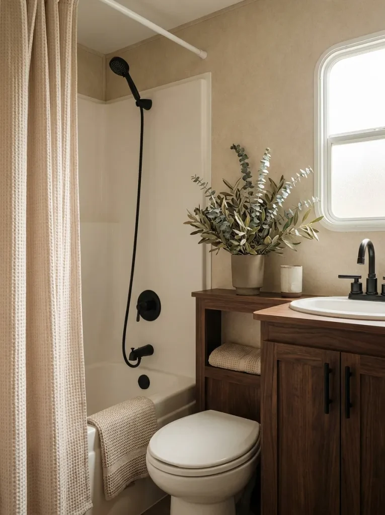
Muted eucalyptus, soft olive, dusty sage, or a deeper forest green introduces a temperature shift without breaking the earthy mood. Because green already belongs naturally beside wood, stone, dried foliage, and warm neutrals, it can make the room feel fresher while preserving the autumn atmosphere.
This does not require turning the bathroom into a green-and-brown scheme.
Try one:
- a trailing plant near a shelf,
- a small olive hand towel,
- muted eucalyptus stems,
- one green ceramic vessel,
- a subtle green thread within an otherwise neutral textile.
Then stop and look from the doorway.
If that single cooler note makes the surrounding camel, flax, cocoa, or mushroom layers easier to distinguish, it is doing its job.
This same principle—letting materials and temperature create fall atmosphere without relying entirely on bright seasonal color—also works beyond the bathroom. You can see a broader mobile-home application in our fall farmhouse mobile home decor guide.
Skip the extra green if the room already contains sage walls, green tile, or a strong outdoor view through a window. In that case, the existing architecture may already provide the cool counterweight.
The choice is not “does green look pretty here?” It is:
Does this bathroom need another warm layer, or does it need one cool pause between them?
9. Let Seasonal Shapes Signal Fall While Their Color Stays Quiet
There is another way to make a bathroom feel autumnal without making the palette louder:
keep the seasonal shape and mute the color.
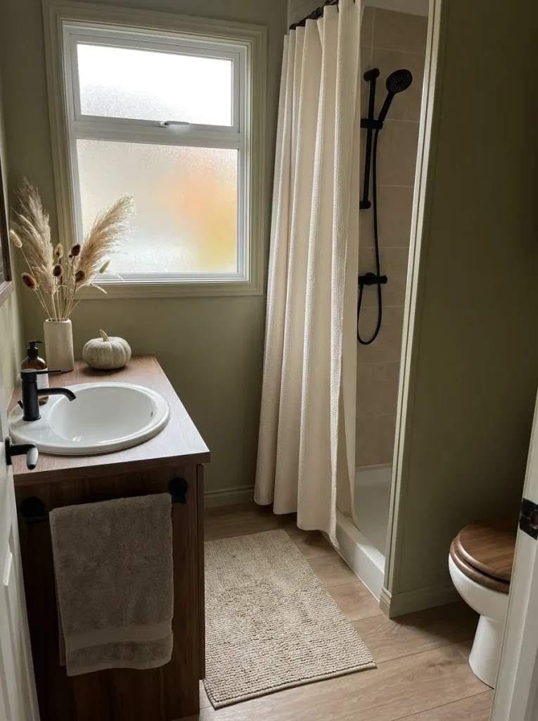
A pumpkin does not have to be orange to read as fall. A small ivory pumpkin, warm stone-colored gourd, dried seed head, bundle of pale grasses, brown oak stem, or wheat-like silhouette still carries seasonal recognition through form.
That makes these objects particularly useful in a neutral mobile home bathroom because the reader gets the emotional cue of fall without introducing a large new color family.
Consider the difference:
A bright orange pumpkin beside rust towels and amber foliage reinforces all three elements at maximum seasonal intensity.
An ivory pumpkin beside a mushroom towel and dried beige grasses lets the shape communicate autumn while the palette stays restrained.
Neither approach is inherently better. The second simply fits this article’s neutral search intent more precisely.
There is also a useful stop rule: if a bathroom already has rustic wood, woven storage, traditional framed art, and warm vintage styling, it may need fewer literal autumn shapes. The room is already carrying much of the seasonal atmosphere through material character.
In that situation, one recognizable seasonal silhouette is enough.
Let the viewer discover it rather than making every surface announce it.
10. Style for the Mirror: One Accent Must Survive Being Seen Twice
A vanity can look perfectly balanced while you stand beside it and unexpectedly cluttered when you step back.
The mirror is often responsible.
In a small bathroom, anything placed on the counter may appear twice: once physically and once in reflection. A vase, candle, pumpkin, soap bottle, towel, or decorative branch can therefore occupy considerably more visual space than its actual footprint suggests.
This is why neutral styling can still become busy even when the number of accessories seems modest.
The useful question is not only:
“How many objects are on my vanity?”
It is:
“How many visual objects do I experience from the main viewing angle?”
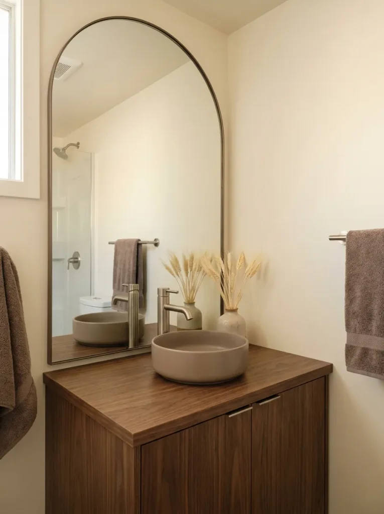
Use the reflection map below to identify which situation you have.
Reflection Pressure Map
Count what the mirror shows—not only what the counter holds.
Select the option closest to your vanity. The same number of physical objects can create very different visual pressure depending on how strongly the mirror repeats them.
Viewing position matters.
Judge the vanity from the bathroom doorway or the angle where you naturally see both the counter and reflection together.
The vanity can tolerate one deliberate seasonal cue.
If the mirror repeats only a single small object, there is enough visual breathing room for one restrained botanical stem, pale pumpkin, or warm vessel.
Add one accent with a different height or silhouette, then reassess before adding anything else.
Let the mirror finish the composition for you.
When two objects already create a readable physical-and-reflected rhythm, additional seasonal pieces can make the vanity feel fuller than expected.
Keep the arrangement and shift any extra fall detail to a zone outside the mirror’s strongest reflection field.
Reduce the repeated silhouettes first.
The problem may not be color at all. Several small objects become a larger visual cluster once their shapes appear again in the mirror.
Remove or relocate the smallest repeated items until one clear seasonal accent and the everyday essentials remain visually distinct.
Reflection rule: the mirror is part of the composition. A decorative object that looks harmless close-up may become the dominant feature when its silhouette, color, and height are repeated.
This is particularly useful in a mobile home bathroom because the mirror often occupies a large portion of the wall above the vanity. A restrained counter can therefore create more visual impact than its physical size suggests.
If one vase looks like two, let those two views count.
You may discover that removing an accessory creates a stronger fall composition than adding another one.
11. Repeat Warmth at Low, Mid, and Eye Level
Stand in the doorway and trace where the autumn warmth actually appears.
If every seasonal element is concentrated on the vanity—a candle, pumpkin, brown bottle, vase, and folded towel—the rest of the bathroom can still feel disconnected. This is especially noticeable in a narrow mobile home bathroom because the eye reads the room vertically as much as horizontally.
A more cohesive approach is to repeat related warmth at different heights.
For example:
- Low level: a muted oatmeal runner or warm woven texture near the floor.
- Mid level: camel or mushroom towels around the vanity or shower.
- Eye level: one restrained dried botanical, warm frame, or small neutral seasonal object.
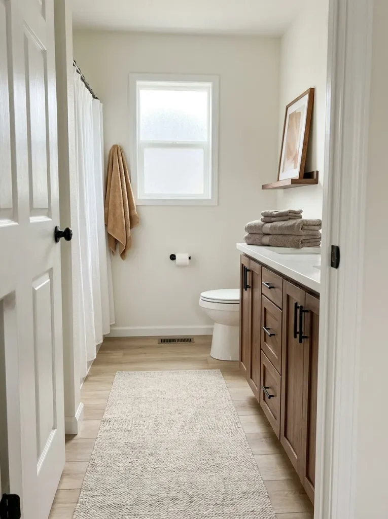
These elements do not need to match exactly. They only need enough shared temperature or material character to feel related.
The useful part of this method is that it often works with things you already own. If the vanity feels overloaded while the upper wall looks empty, moving one object upward may solve the imbalance without adding another purchase.
There is no requirement to force decoration into all three zones. Existing architecture may already provide one layer: dark shelves can serve as the mid-to-high anchor, while a wood vanity may already establish warmth lower in the room.
Look for a visual path, not a decorating quota.
When the eye can move naturally from floor to textile to upper detail, the room feels intentionally seasonal without creating a dense fall display.
12. Keep the Floor Plane Quiet Where the Walking Path Is Narrowest
A bath runner can look small online and surprisingly dominant once it sits between a vanity, toilet, doorway, and tub.
That happens because the floor is not only decoration. It also defines the visible path through the room.
In a compact mobile home bathroom, a strongly contrasting runner may visually divide the floor into separate blocks. Bold checks, saturated autumn stripes, or very dark rugs can make a narrow walking route feel even more segmented—particularly when the flooring already contains visible grout lines, wood grain, or stone variation.
Before choosing the rug, trace the path you actually use:
door → sink → toilet → shower or tub.
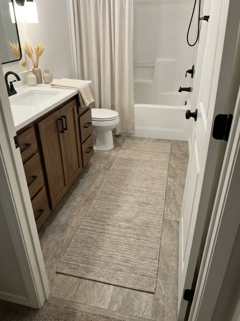
Then compare how much contrast the rug introduces into that path.
Use the floor-path check below as a practical visual guide.
Floor Path Contrast Check
Does the rug support the walking path—or visually cut across it?
Choose the option that looks most like your floor treatment. The recommendation changes according to how strongly the rug competes with the bathroom’s narrow central route.
The floor remains visually continuous.
A quiet rug introduces warmth without becoming a hard visual barrier across the main route.
Your tile or flooring already contains noticeable lines, grain, or variation.
The runner is becoming a separate visual zone.
High contrast can make the narrow central strip feel more segmented, even when physical circulation has not changed.
Try a closer-value stripe, softer border, or quieter pattern before changing the rug size.
Two floor patterns are asking for attention.
When the flooring already has strong variation, another obvious pattern can make the path read as visually fragmented.
Switch to an almost-solid mat or one with texture that is visible mainly at close range.
The aim is not to make the floor boring. It is to let the runner add softness without becoming a second focal zone.
If your flooring is already expressive, texture often does more useful work than pattern.
13. Neutralize Everyday Packaging So the Room Works on Real Mornings
A beautifully styled bathroom can lose its neutral palette the moment normal life returns.
Bright shampoo labels, toothpaste boxes, colorful skincare tubes, cleaning products, razors, and hair products often introduce more visual color than the autumn décor itself. That matters because a mobile home vanity or shelf gives those objects very little background space in which to disappear.
The weakest solution is designing a bathroom that only looks good after every practical item has been removed for a photograph.
A better approach starts with real use.
Keep frequently used products accessible, but ask which ones need to remain openly visible. Less-used toiletries can move into drawers, baskets, or enclosed storage. Everyday bottles can sometimes be grouped inside one neutral tray so their separate colors read as a single functional zone rather than scattered visual noise.
Where an appropriate reusable container is genuinely suitable for a product, it can also reduce packaging clutter. However, do not transfer products when original labeling, identification, instructions, or packaging matter for safe and proper use.
One useful morning test is simple:
Set the bathroom up exactly as it looks after getting ready.
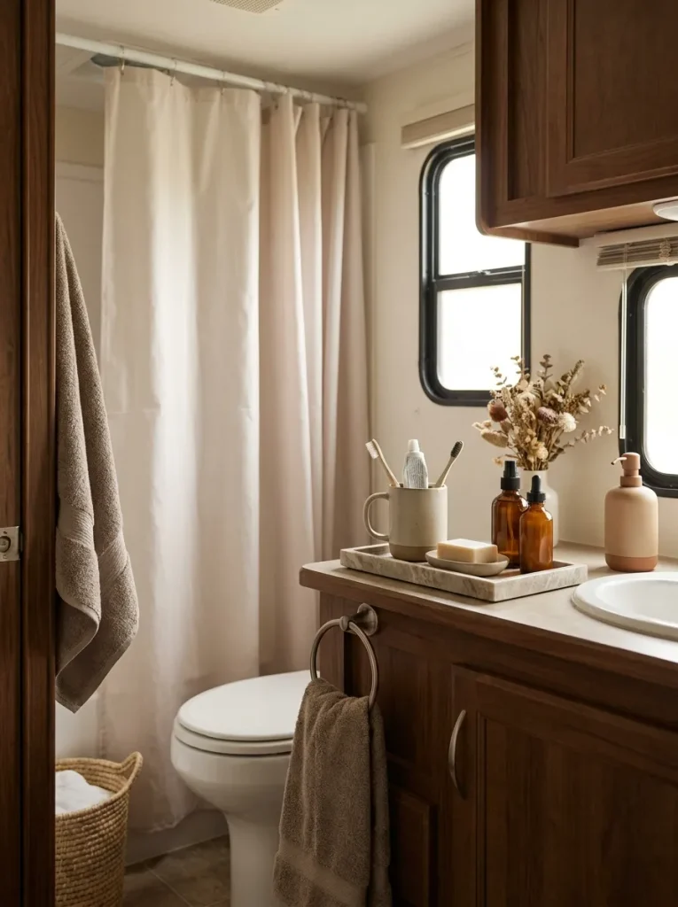
Then step back.
If the neutral fall styling disappears behind product packaging, your next décor purchase is probably not the answer. Storage or visual consolidation is.
The finished room should survive toothpaste, towels, skincare, and daily routines—not only a staged Pinterest photograph.
14. Warm Around Existing Chrome or Black Fixtures Instead of Replacing Them
You do not need antique brass fixtures to create a warm neutral fall bathroom.
Existing chrome, brushed nickel, or matte black hardware can remain exactly where it is.
The surrounding materials influence how those finishes are perceived.
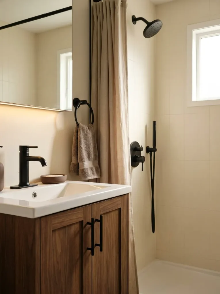
Consider chrome beside stark white, blue-gray, and cool glass. It reads crisp and cool. Place the same chrome near mushroom textiles, warm wood, flax fabric, and a cocoa-framed detail, and it becomes part of a softer material composition without physically changing.
Black works similarly. In an otherwise high-contrast white bathroom, black hardware can feel graphic. Introduce warm ivory, camel, walnut, and one muted organic element, and the black begins functioning as the room’s deep neutral anchor.
That distinction can save unnecessary spending.
Before replacing a faucet, drawer pull, towel bar, or shower fitting purely for seasonal styling, ask whether the finish itself is the problem—or whether it simply lacks a warm material relationship around it.
A mixed-metal bathroom also does not automatically require correction. If one metal clearly dominates and the supporting materials are cohesive, a secondary metal can remain a small existing variation.
For this seasonal refresh, prioritize:
- the surfaces touching or surrounding the fixture,
- the textile color beside it,
- the wood or neutral value repeating nearby.
Only after those relationships are resolved does replacement become an aesthetic decision worth reconsidering.
15. Use the Remove-One-Thing Test Before You Call It Finished
Here is the strongest final test for neutral fall decorating:
remove the most obvious fall object.
Take away the pumpkin. Or the leaf stem. Or the seasonal candle.
Then look again.
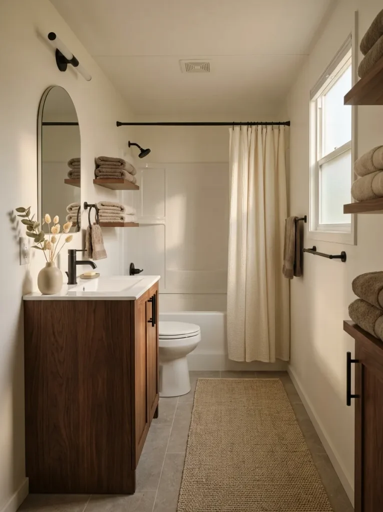
If the bathroom immediately stops feeling autumnal, the seasonal mood may be relying too heavily on symbolism. If the room still feels warm because of oatmeal textiles, mushroom undertones, walnut depth, tactile materials, muted foliage, and softer contrast, the design has reached a more convincing neutral-fall balance.
Use the finishing test below to decide whether to stop, adjust, or simplify.
Neutral Fall Finish Test
Remove the most obvious fall object. What happens?
Choose the answer that best describes the room after the pumpkin, leaf arrangement, or other strongest seasonal symbol is temporarily removed.
The season is built into the room, not sitting on top of it.
Your palette, value contrast, texture, natural materials, and restrained organic notes are already communicating fall. The removed object is optional decoration rather than structural seasonal support.
Put the object back only if you genuinely prefer the extra seasonal cue. You do not need it for the room to work.
The foundation works, but one material or value layer is missing.
The room still feels warm, which means the palette is doing useful work. What may be missing is a deeper anchor, more tactile contrast, or one organic note that carries autumn without becoming another obvious symbol.
Adjust one existing textile, material, or tonal relationship before adding another pumpkin, sign, or leaf arrangement.
The fall feeling is relying on the symbol more than the room.
Revisit the earlier layers: undertone, anchor neutral, light–medium–deep value separation, texture, and natural material character. Strengthening one of those will make the seasonal mood more resilient.
Do not add another literal fall object yet. Strengthen the underlying atmosphere first, then retest.
Stop signal: when the bathroom still reads as autumnal after the obvious seasonal object disappears, further decorating becomes preference—not necessity.
This test is also useful if you prefer a cleaner, more contemporary seasonal style throughout the rest of the home. The same edited approach can carry into a broader modern fall mobile home decor scheme without filling every room with literal seasonal motifs.
A neutral bathroom does not have to hide the fact that it is fall. It simply lets material, temperature, value, and texture do more of the storytelling.
Final Thoughts
The most convincing neutral fall bathroom is not necessarily the one with the most seasonal décor. In a mobile home, where a shower curtain, mirror, rug, or vanity can influence almost the entire room at once, restraint has more visual power.
Start with the permanent finishes. Choose one anchor neutral. Give the room light, middle, and deep values. Then add texture, quiet pattern, organic contrast, and only enough literal fall detail to make the season recognizable.
If removing one pumpkin does not remove autumn from the room, you have reached the stronger result: a bathroom that feels warm, calm, seasonal, and intentionally neutral.