

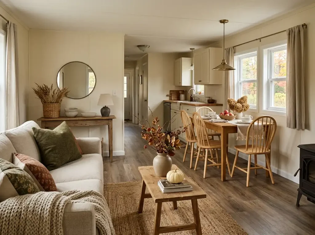
Farmhouse fall decorating can go wrong surprisingly fast in a mobile home. A plaid pillow looks inviting on its own. So does a distressed sign, a basket of pumpkins, a chunky wood tray, and a dried-leaf arrangement. Put all of them within one connected view, though, and the room can start looking busier than the individual pieces suggested.
The strongest fall farmhouse mobile home decor works differently. It builds on materials and useful objects that already belong in the home, then adds autumn in measured layers. Wood, woven fibers, simple pottery, muted harvest colors, tactile fabrics, and a few seasonal shapes can create far more atmosphere than covering every available surface.
Scale matters, too. Mobile homes vary widely, but many have connected living areas, shallower furniture surfaces, or places where several rooms are visible from one standing point. Decorating those spaces successfully means thinking about the whole view—not treating every table, wall, counter, and shelf as its own fall display.
The ideas below build a farmhouse look from the foundation outward, so each layer has a clear purpose and the finished home still feels comfortable to live in.
1. Find the Farmhouse Character Your Mobile Home Already Has
Before bringing in fall décor, look for the farmhouse character that is already doing useful work.
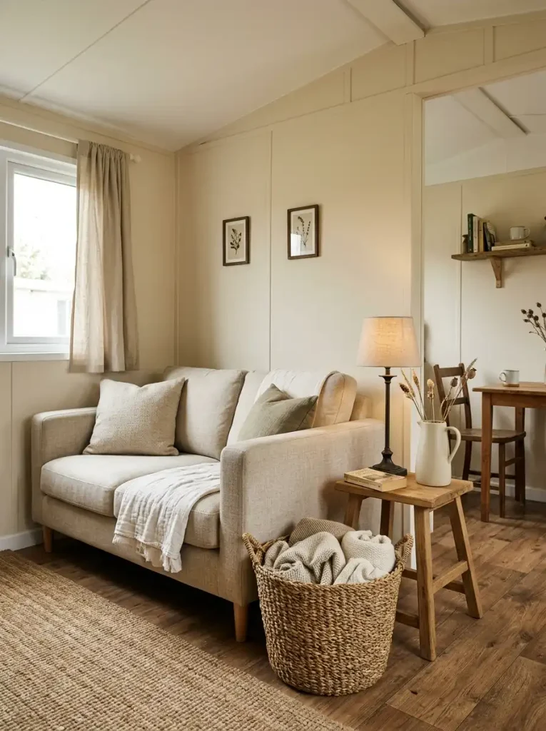
A woven basket near the sofa, an old wood stool, matte ceramic pitchers, simple cotton curtains, a dark metal lamp, or a painted side table may already provide more farmhouse identity than a shelf full of themed accessories. These pieces have an advantage: they belong to the room even when the season changes.
Start with the areas you can see together. Mentally sort the visible objects into three groups: keep, change for fall, and remove for now.
Farmhouse Base Check
- Keep: useful pieces with natural texture, simple shapes, aged character, or a material that already fits the room.
- Change: good foundations that can take a small autumn layer, such as a tray that can hold seasonal stems or a basket that can carry a warmer textile.
- Remove: objects that compete with the new palette, repeat a theme that is already obvious, or occupy useful space without adding much character.
The test is not whether something looks “rustic.” Ask what it contributes. Function, texture, shape, history, and continuity are stronger reasons to keep a piece than a farmhouse slogan printed across it.
A good edit usually makes the seasonal layer easier. Once the permanent character is visible, you need fewer additions to make fall register.
Farmhouse Edit Diagnostic
Quick farmhouse edit
Does this piece deserve space this fall?
Choose a category to see the strongest reason an object belongs there.
A woven basket that stores blankets, a simple crock, an aged wood stool, or a matte ceramic pitcher can stay because it contributes texture, function, or character before any seasonal styling is added.
The full editing rule
- Keep pieces with useful function, natural texture, personal history, or a material that supports the room.
- Change for fall a strong year-round base by adjusting only what it holds, carries, or displays.
- Remove for now repeated novelty signs, redundant motifs, or objects that consume useful space while adding little new character.
2. Choose a Fall Palette That Can Travel Through the Whole Home
A fall palette works best when it grows out of the colors that are difficult or expensive to change.
Look first at the flooring, cabinetry, large upholstery, wall color, and dominant wood tone. Those permanent finishes set the temperature of the room. The seasonal colors then have a job: deepen that existing story without making the adjoining spaces look as though they were decorated from separate fall collections.
A useful hierarchy is simple:
existing base → supporting neutral → main fall accent → small secondary accent
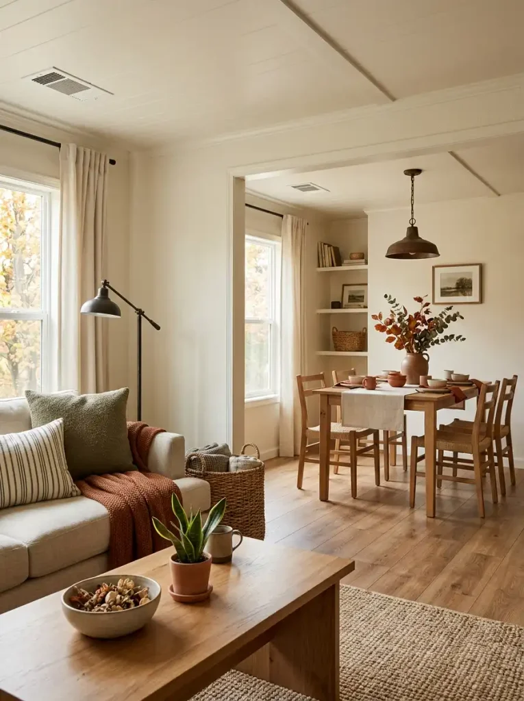
For example, a mobile home with creamy walls and warm medium wood might carry oatmeal, muted olive, and a small amount of clay through the living and dining areas. A cooler white-and-gray interior could gain warmth from mushroom, brown-black, softened rust, and natural fibers. A room with darker finishes may need lighter oat or flax textures before it needs another deep autumn shade.
The important part is repetition with restraint. Your dominant fall accent can appear in different forms—a textile in one area, pottery in another, a botanical detail farther down the sightline—so the rooms relate without becoming matching sets.
Orange is optional. So are burgundy, mustard, and brown. Fall can be recognizable through temperature, texture, and natural material relationships even when the palette stays quiet.
Fall Palette + Material Explorer
Palette decision tool
Start with the finish you see most
Pick the closest base condition. The recommendation changes the accent family, supporting material, and element worth limiting.
Warm + Light: soft harvest, low contrast
Material partner: medium natural wood, woven fiber, matte pottery, and aged dark metal.
Use lightly: highly saturated orange, especially when several rooms are visible together.
Cool + Light
Mushroom, softened rust, warm brown-black, and natural woven fiber can add warmth while keeping the cooler base intact. Limit icy seasonal metallics if the room already reads cool.
Medium Wood
Oatmeal, muted olive, clay, deep brown, and matte pottery work well with visible wood grain. Let the wood remain one of the dominant fall materials instead of covering it with many small decorations.
Dark / High Contrast
Introduce flax, cream, pale woven texture, softened tan, and one restrained harvest accent. Light tactile layers usually add more balance than another dark seasonal color.
3. Let Texture Do More of the Seasonal Work
If the room has the right colors but still feels flat, another decorative object may not be what is missing.
Change the surface quality.
A smooth sofa beside a smooth painted table and glossy accessories can feel visually cool even when the colors are warm. Introduce one element with visible grain, weave, nap, irregularity, or matte depth, and the same arrangement begins to carry more autumn character.
A woven basket against a plain wall has a different presence from a plastic seasonal bin. A rumpled linen-look runner catches light differently from a glossy printed one. A matte ceramic vessel holding dried stems brings both texture and silhouette. Wood grain, knit, cane, jute-like fibers, aged metal, and natural-looking pottery can all contribute, but they do not need to appear at once.
Simple texture formula:
one coarse or tactile layer + one smoother neutral surface + one small seasonal cue
That balance matters. If the basket is chunky, the throw is heavily knitted, the pillows are nubby, the rug is strongly patterned, and the table is rough wood, the textures begin competing. The eye needs calmer material between the tactile moments.
Use texture where it replaces visual emptiness, not where it merely adds another layer.
4. Favor Useful Farmhouse Pieces Over Theme Décor
Farmhouse style becomes easier to live with when the objects contributing to it also have a job.
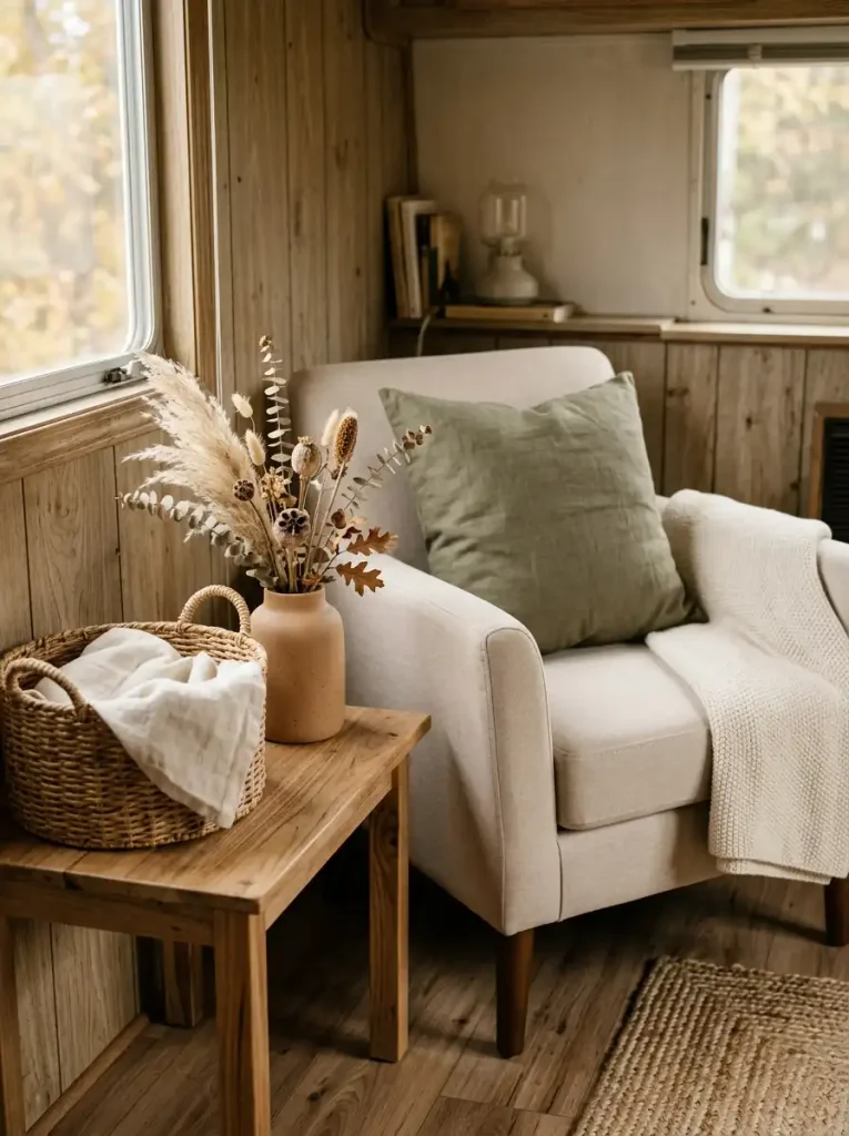
A wood tray can gather remotes and a small seasonal accent. A ceramic crock can hold utensils. A woven basket can store everyday throws. A simple pitcher can spend most of the year as a vessel and carry dried autumn stems for a few weeks. Those pieces remain useful after the leaves and pumpkins are packed away.
That gives them more value than an accessory whose only purpose is declaring “farmhouse” or “fall.”
Decorative Only vs. Decorative + Useful
| Decorative only | Decorative + useful |
|---|---|
| Oversized seasonal word sign | Small wood tray that organizes daily items |
| Empty crate used only as a prop | Crate that stores magazines, shoes, or folded textiles |
| Crock filled permanently with decorative filler | Crock that holds utensils, tools, or seasonal stems when appropriate |
| Basket occupying floor space with no purpose | Basket containing blankets, toys, shoes, or other everyday items |
| Multiple miniature tabletop ornaments | One useful vessel carrying a limited seasonal accent |
This does not mean every beautiful object needs a practical function. A personal antique, handmade piece, or favorite decorative object can earn its place through meaning alone.
The useful-object rule is most valuable when space is already under pressure. If a surface must handle keys, meals, work, storage, or everyday movement, let the farmhouse pieces support that function first. Add the fall layer afterward.
A home arranged this way can look seasonal without behaving like a temporary display.
5. Scale Rustic Accents to the Size of the Space
Farmhouse décor often carries more visual weight than its measurements suggest.
A thick wood frame, deep basket, dark lantern, chunky crate, or oversized sign may physically fit on a wall or surface and still dominate everything around it. That matters in a mobile home because furniture, walkways, windows, and adjoining rooms may sit closer together than they would in a larger detached house.
Judge rustic pieces by mass, not width alone.
A dark framed sign spanning half a wall can feel heavier than a larger pale textile. A deep basket beside a sofa may push farther into the room than expected. Several small wood objects can also accumulate into one dense block when their finishes and shapes are similar.
The solution is not to make every farmhouse accent miniature. One confidently scaled piece usually creates more presence than a collection of undersized accessories.
Try this scale check: stand at the doorway or main approach to the room and notice what you see first. If the farmhouse decoration overpowers the furniture, window, or people using the room, it is probably carrying too much visual weight.
For a tighter living area, a medium woven basket beside one chair might provide enough rustic texture. A shallow wood tray can give a small table farmhouse character without occupying most of its usable top. One framed botanical or vintage-inspired print can anchor a wall more cleanly than a cluster of thick frames.
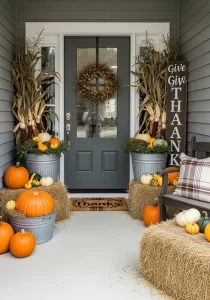
Larger mobile homes can support more substantial pieces, but the same relationship still applies: the décor should belong to the room’s scale rather than becoming its architecture.
6. Decorate the Sightline, Not Every Individual Surface
A shelf can look lovely. So can the console across from it and the dining table beyond that.
The problem appears when all three are visible at once.
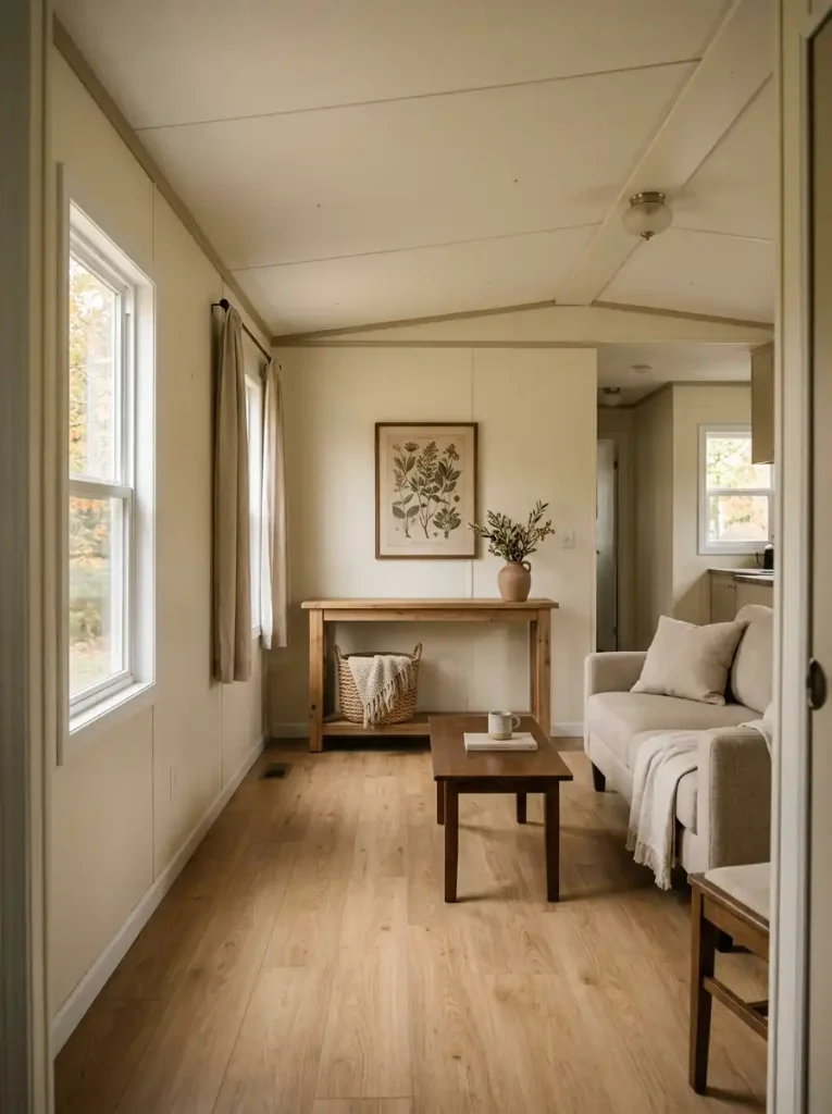
Many mobile-home layouts create long or connected views between living, dining, entry, and kitchen areas. In that situation, separate fall vignettes stop reading separately. From the doorway, they merge into one composition.
That means the first decorating decision is not what goes on each surface. It is which surface deserves to lead.
Stand at the main entry, hallway opening, or point where you see the largest portion of the shared living area. Divide what you see into three roles:
- Lead: the strongest seasonal statement.
- Support: a quieter echo of color, material, or shape.
- Quiet: an area intentionally left mostly unchanged.
The quiet zone matters as much as the decorated ones. It gives the eye somewhere to rest and makes the stronger fall moment easier to notice.
Suppose the main living-room console is visible immediately from the front door. It could carry the dominant farmhouse harvest arrangement. The dining table farther behind it might repeat only one material—a small crock or woven runner. A nearby kitchen counter can remain largely practical.
Three areas still participate in the same fall story, yet only one asks for immediate attention.
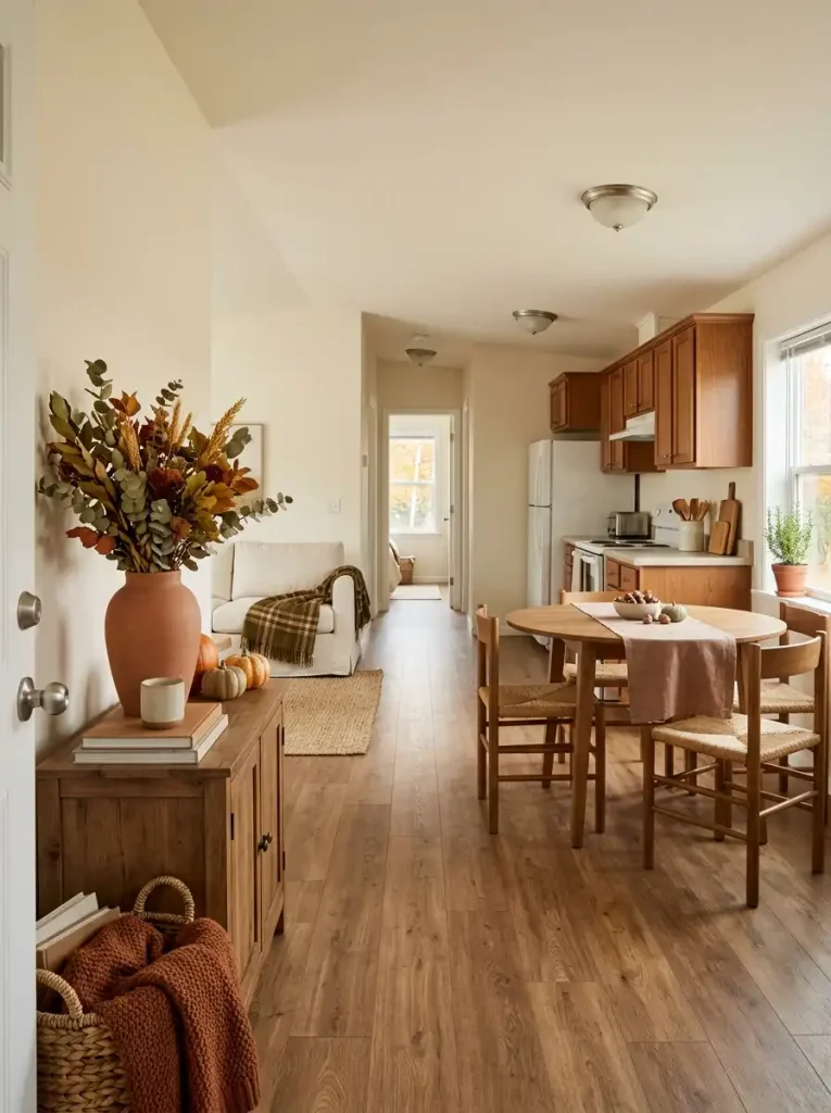
Which Surface Should Become Your Main Fall Focal Point?
Sightline priority tool
Should this surface lead, support, or stay quiet?
Think about one surface you are considering for your main fall arrangement, then choose the closest conditions below.
A highly visible surface with little functional pressure and comfortable depth can carry the clearest farmhouse-fall statement. Let nearby zones support it more quietly.
Three rules that still work without the selector
- High visibility + low functional cost: strong focal-point candidate.
- High visibility + high functional cost: keep the styling shallow and restrained.
- Low visibility + high clutter risk: usually let another area carry the seasonal statement.
Once the lead zone is chosen, decorating the rest of the connected space becomes easier. The secondary areas no longer need to prove that it is fall. They only need to support the main view.
7. Build One Strong Harvest Focal Point
Once you know which zone should lead, give that area a clear seasonal identity.
This is where the most obvious fall elements can live: pumpkins, gourds, branches, dried leaves, wheat-like stems, pears, apples, or another harvest form that fits your palette. Concentrating them here keeps the rest of the home from needing the same symbols.
A simple farmhouse focal point can be built in three parts:
anchor → seasonal form → quiet texture
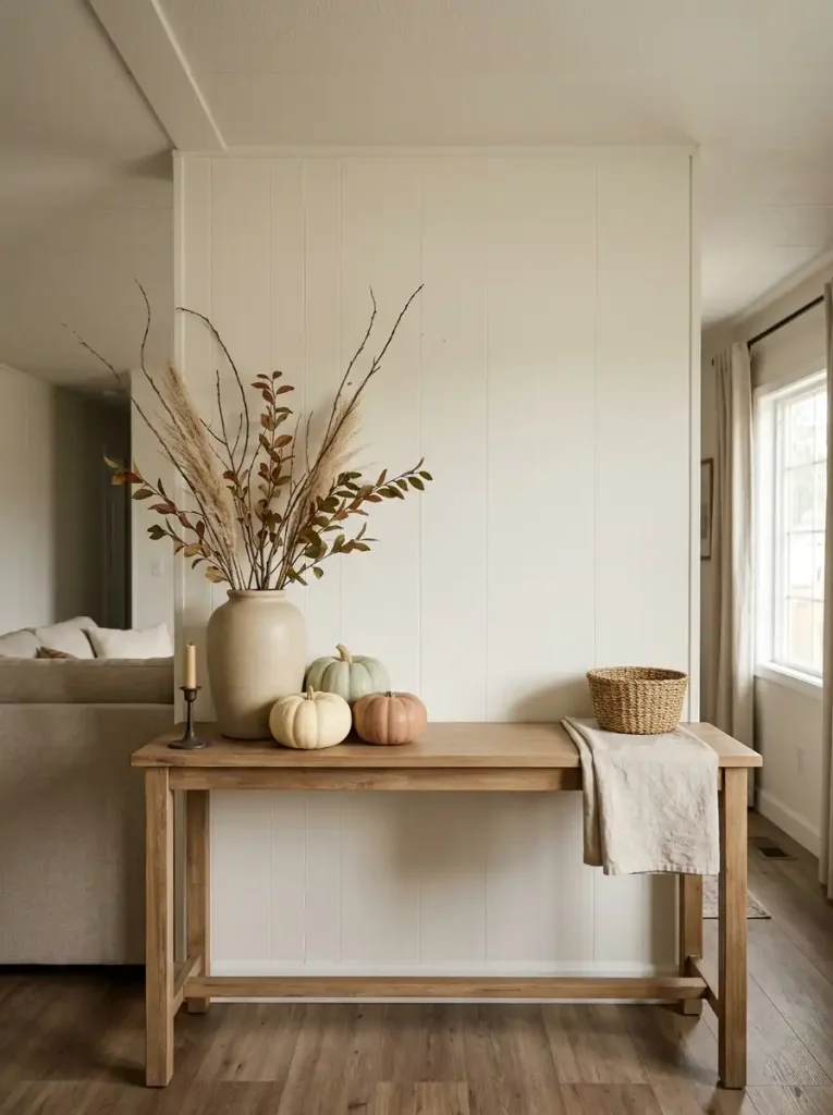
The anchor might be a wood-framed mirror, simple artwork, lamp, large pottery vessel, or useful tray. The seasonal form introduces fall—perhaps a small pumpkin grouping or tall dried stems. The quiet texture might come from folded linen, woven fiber, pottery, or visible wood.
The anchor should remain visually strongest.
If a display contains six tiny pumpkins, two signs, beads, leaves, candlesticks, a lantern, a basket, and several miniature objects, there is no longer a clear hierarchy. The eye moves around the arrangement looking for the point.
Try removing the smallest fillers first.
The change can be surprisingly dramatic. A pottery vessel with tall branches, two muted pumpkins, and a wood surface left partly exposed often communicates fall more clearly than a densely packed collection.
A focal point also gives the article’s earlier restraint a payoff. The quieter areas are not under-decorated; they are creating contrast for this moment.
8. Repeat One Signature Farmhouse Material Across Connected Areas
Matching every decoration is unnecessary. Repeating one material is usually enough to make adjoining areas feel related.
Choose a farmhouse material that already belongs naturally in the home—wood, woven fiber, matte ceramic, dark aged metal, or another finish already visible in furniture and everyday objects.
Then change the object, not the material.
If woven fiber is your recurring cue, the living area might use a practical blanket basket. Farther away, the dining space could carry woven placemats or a small natural-fiber runner. The objects have different functions, yet the eye recognizes the relationship.
Wood can work the same way. A medium wood tray in the living area, a small cutting board visible in the kitchen, and an old stool near the entry can connect the spaces without creating a matched set.
Same material, different form, different job.
That distinction keeps farmhouse décor from looking catalogued. Exact duplicates can make connected spaces feel staged, especially when the same basket, pumpkin, sign, or lantern appears repeatedly.
Material repetition is quieter.
It also gives fall accents more freedom. A clay-colored textile can appear in one area and a muted green branch arrangement in another because the shared wood or woven texture is already holding the rooms together.
Stop once the relationship becomes recognizable. A signature material is a thread, not a requirement for every object in the home.
Same Material → Different Form → Different Function
Natural-fiber styling principle
Same material → different form → different function
Woven natural fiber
LIVING
Same material → different form → different function
Same material → different form → different function
9. Make Baskets, Crocks, Crates, and Trays Earn Their Space
Farmhouse decorating often relies on containers, but containers take up real room.
That makes their purpose important in a mobile home. A basket beside the sofa is more convincing when it stores blankets. A crock on the kitchen counter deserves its footprint when it holds utensils. A shallow tray can gather remotes, keys, or everyday items while still carrying a small fall detail.
The seasonal layer should sit on top of that function, not replace it.
A useful basket might hold folded throws most of the year, then gain one rust-colored textile near the top for fall. A ceramic pitcher can remain a practical vessel and temporarily carry dried stems. A wood tray can continue organizing a table while making room for one small pumpkin or candle-style light.
Keep the Container Working
Keep:
- a basket that stores something you regularly use;
- a tray that gathers loose daily items;
- a crock or pitcher with a real household purpose;
- a crate that helps organize shoes, magazines, or textiles.
Skip the filler:
- baskets filled only with decorative fabric balls;
- crates stacked purely as props;
- crocks packed with objects that must be removed every time the space is used;
- trays so crowded that nothing practical fits anymore.
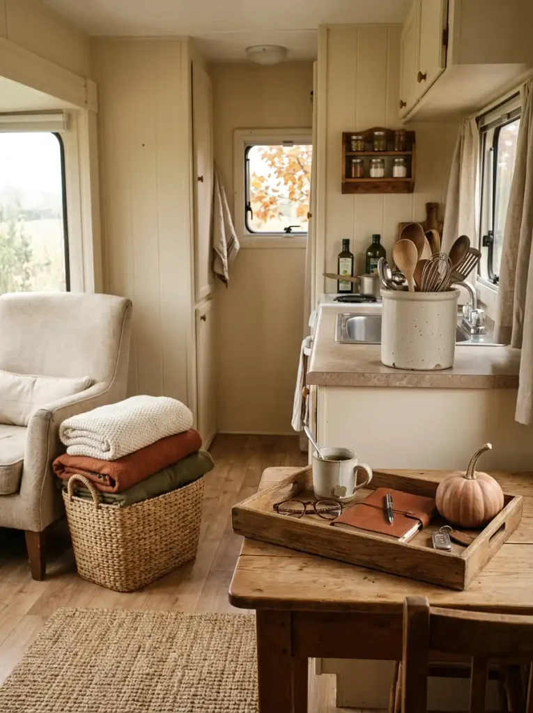
There is room for purely decorative pieces, but larger farmhouse containers are especially valuable when they solve a storage problem at the same time.
That dual role also makes seasonal changes easier. Remove the fall accent later, and the object still belongs in the room.
If you want more detailed counter-specific styling, continue with our fall mobile home kitchen decor ideas for a room-by-room approach.
10. Use Narrow and Vertical Fall Arrangements Where Surfaces Are Tight
A narrow surface does not need a miniature version of a large farmhouse vignette.
It needs a different shape.
On a shallow console, ledge, shelf, or small dining surface, height often creates more presence than depth. Tall branches, a slim framed print, a narrow pottery vessel, or one vertical textile element can give the area seasonal character while leaving most of the surface usable.
Think upward before outward.
A deep arrangement might push into a walkway or consume the space where keys, dishes, or everyday items need to sit. A taller composition uses the wall and air above the surface instead.
Three common conditions call for slightly different solutions:
Very Shallow Console
Use one tall vessel with branches or dried stems, then leave the surrounding surface mostly open.
Small Shelf or Ledge
Choose one slim framed element and one lower object so the arrangement has height variation without becoming layered several objects deep.
Compact Dining Surface
Keep the centerpiece narrow enough that the table still functions easily. A single pitcher, small crock, or elongated low arrangement generally works better than a broad cluster.
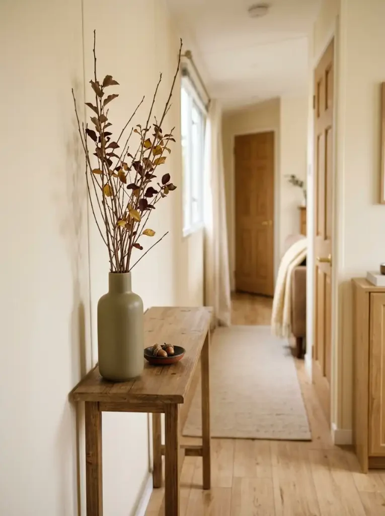
The same rule applies to wall-adjacent spaces. A vertical textile, narrow wreath, or tall botanical shape can create seasonal presence without adding another object to the floor.
Stability still matters. Tall arrangements should sit securely, stay clear of switches and vents, and avoid protruding into paths where they are likely to be bumped.
11. Warm Up Textiles Without Making the Interior Feel Heavy
Fall textiles can change a room quickly, but too many heavy layers can make compact furniture look larger and the whole space feel visually dense.
A thick knit throw, dark plaid pillows, nubby upholstery, patterned rug, and layered blankets may all be cozy on their own. Combined on one sofa, they can blur the furniture’s shape and turn a calm seating area into a block of texture.
Use one textile to carry most of the seasonal weight.
That might be a substantial throw over a simple sofa, two textured pillows against otherwise plain upholstery, or a warmer rug paired with lighter seating. Once one element is doing the tactile work, the supporting fabrics can stay quieter.
A Lighter Farmhouse Textile Formula
One dominant tactile layer
- one simpler supporting fabric
- clear areas of the original furniture still visible
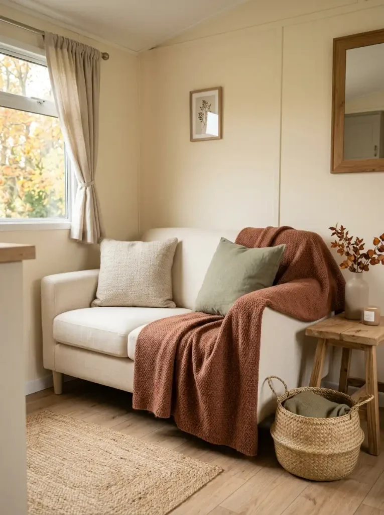
For example, place a rust or olive woven throw over a cream sofa and keep the pillows mostly solid. If the sofa is already dark, reverse the balance with flax, oatmeal, or soft cream textiles so the seasonal layer adds warmth without increasing heaviness.
Pattern deserves the same editing.
A plaid pillow can be enough to establish a traditional fall note. Add plaid curtains, another plaid throw, checked table linens, and multiple patterned cushions, and the pattern starts acting like a theme rather than an accent.
A useful final check is to look at the sofa or bed from across the room. Can you still see its overall shape clearly? If the answer is no, remove one bulky layer or one competing pattern.
The room should feel warmer to use, not merely fuller to look at.
12. Use Evening Light to Bring Out Wood, Weave, and Fall Texture
The same farmhouse room can feel very different after sunset.
During the day, window light reveals wood grain, woven baskets, ceramics, and dried stems naturally. At night, a single bright ceiling fixture can flatten those textures and make the room feel less layered than it did a few hours earlier.
Use localized light to bring the material character back.
A table lamp beside a wood console can emphasize grain and pottery. A shaded lamp near woven storage can create soft contrast across the fibers. Small flameless candle-style lights can add glow to a fall focal point where an open flame would be inappropriate.
The aim is not to make the room darker.
It is to create more than one level of illumination.
A useful evening setup might combine the home’s normal overhead lighting at a lower intensity, where available, with one or two smaller sources near the areas you actually use. This creates pockets of warmth while keeping circulation visible and practical.
Light placement can also prevent unnecessary decorating. If a wood tray, woven basket, and dried branch arrangement already gain depth after dark, the corner may need no additional seasonal objects.
Evening Safety Note
Dried stems, fabrics, woven materials, and paper decorations should stay safely separated from heat and open flames. Where a candle-like glow is wanted inside a dense fall arrangement, a flameless option is generally the simpler styling choice.
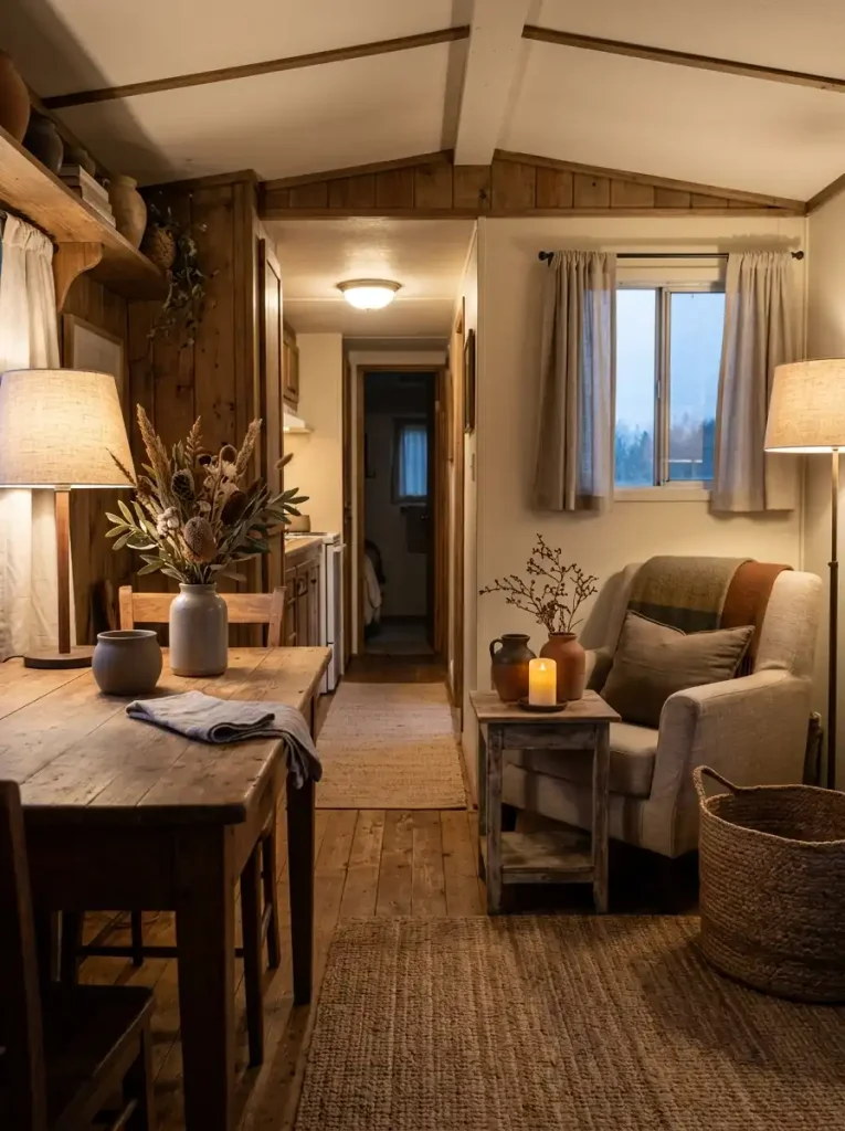
In regions where fall evenings remain warm, the same principle still works. This is less about cold weather than about the change from daylight to evening use.
By night, the farmhouse character should become easier to see—not disappear under one flat source of light.
13. Add Collected Farmhouse Character Without Buying a Matching Set
Farmhouse rooms usually become more convincing when every object does not look as though it arrived in the same delivery box.
A slightly worn wood stool, an old ceramic pitcher, a woven basket with a different weave from the one across the room, or a small piece of inherited kitchenware can introduce the irregularity that gives farmhouse style its collected quality.
Matching is less important than relationship.
A thrifted crock does not need to be the exact color of your pottery. It may belong because its matte finish relates to them. An older wood frame can be darker than the table below it while sharing the same warm undertone. A vintage metal object can work beside newer pieces when its simple shape connects with the rest of the room.
Use three filters when deciding whether a found piece belongs:
- Material: Does it connect with wood, pottery, woven fiber, metal, or another material already established in the home?
- Tone: Does its finish cooperate with the room even if it does not match precisely?
- Purpose or character: Does it perform a useful job, carry personal meaning, or add a quality the room does not already have?
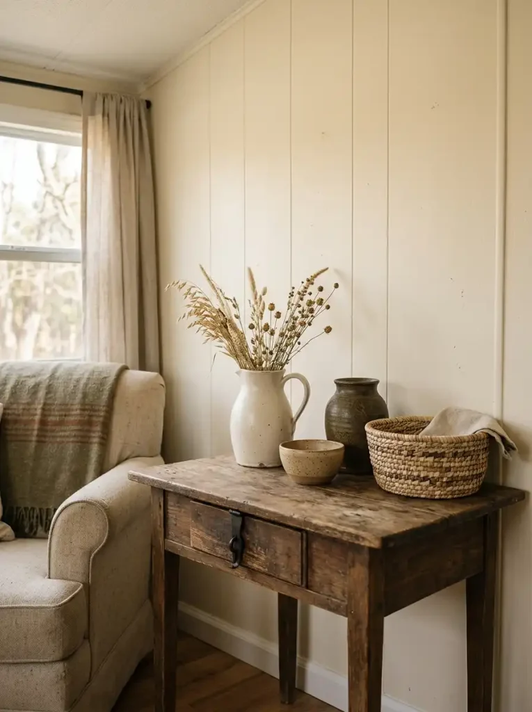
A piece only needs a strong reason to belong.
This matters during fall because seasonal stores often sell complete farmhouse collections built around identical finishes, typography, and motifs. Bringing an entire coordinated collection into a compact interior can make the room look merchandised very quickly.
One older object with character may contribute more than five matching accessories.
There is also no requirement that something be genuinely antique. A reused family piece, a secondhand find, an imperfect handmade bowl, or an everyday object that has aged naturally can provide the same sense of history.
The restraint happens at the selection stage. “Collected” does not mean unrelated.
If a new find connects to nothing in the room through material, tone, shape, function, or personal meaning, its age alone will not make the arrangement coherent.
14. Remove the Farmhouse Clichés That Make Small Spaces Feel Busy
Sometimes the room is already finished, yet something still feels wrong.
At that stage, adding another accessory rarely solves the problem. Look for a farmhouse signal that has been repeated past the point where it adds anything new.
The culprit may be typography. One old-fashioned sign can act as a personal accent; several signs competing across the same view turn words into visual noise.
Pumpkins behave the same way. A deliberate harvest arrangement has presence. Small pumpkins appearing on the coffee table, shelf, counter, dining table, windowsill, and entry surface become background repetition.
Plaid, distressed wood, black metal, baskets, lanterns, faux leaves, and miniature rustic objects can all reach that saturation point.
Farmhouse Signal Saturation Check
Look across the room and ask:
What idea is the room telling me most often?
If the answer is “pumpkin,” “plaid,” “word sign,” “basket,” or “distressed wood,” identify the weakest example of that signal and remove it.
Then look again before touching anything else.
Editing by category works better than randomly clearing objects because it reveals whether repetition was causing the problem. A room with six farmhouse cues does not necessarily need six fewer objects; it may need three copies of the same cue removed.
Remove in This Order
- Redundant miniature fillers that disappear individually but create density as a group.
- Repeated words or slogans that communicate the same style message.
- Duplicate seasonal motifs already represented more strongly elsewhere.
- Pieces blocking useful surfaces or circulation.
- Only then, reconsider a larger anchor piece.
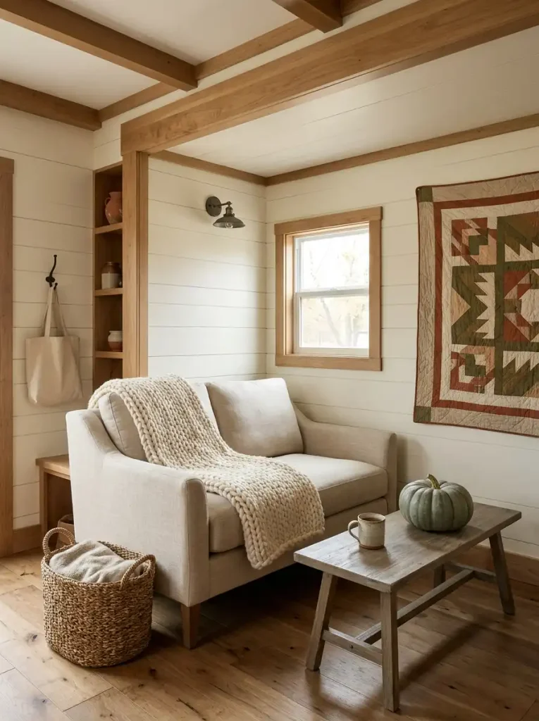
Protect something distinctive while you edit.
An unusual vintage pitcher, handmade bowl, family object, or beautifully aged stool gives the room personality. Removing every imperfect or decorative detail can leave you with a tidy space that no longer feels like farmhouse—or like your home.
The finished room needs enough quiet space for its best pieces to register.
15. Carry the Same Farmhouse Look From Early Fall Into Thanksgiving
A useful fall decorating plan should not require a second whole-home makeover when Thanksgiving approaches.
Keep the farmhouse foundation stable and change the layer that carries the strongest seasonal message.
Early Fall
Let texture and color do most of the work.
Use the wood, woven fibers, pottery, textiles, and palette you established earlier. Seasonal botanicals can stay relatively simple, with only a few obvious harvest forms.
The home reads as autumn without feeling tied to a specific holiday.
Harvest Season
Increase the harvest signal in the main focal area.
This is the stage for a fuller branch arrangement, a few additional gourds, seasonal fruit, wheat-like stems, or deeper clay and rust accents. The supporting areas still stay quieter.
The change happens mainly at the focal point, not across every room.
Thanksgiving
Shift the emphasis toward gathering.
The dining area may become more important for a short period, with a runner, serving pieces, simple natural elements, or a small harvest centerpiece. Existing farmhouse vessels can take on entertaining roles while much of the earlier décor remains untouched.
What Stays and What Changes
| Keep through the season | Change as fall progresses |
|---|---|
| Core wood tones | Explicit harvest objects |
| Woven storage | Botanical material |
| Main neutral palette | Amount of clay/rust accent |
| Everyday pottery | Contents of pitchers, bowls, or crocks |
| Useful trays and vessels | Table or gathering emphasis |
| Main farmhouse furniture and character pieces | Thanksgiving-specific details |
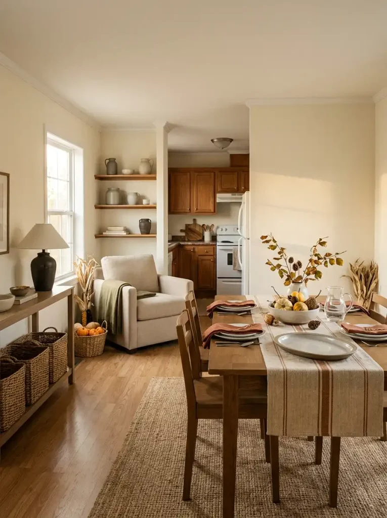
This approach also makes storage easier.
When the season changes again, you are putting away a relatively small group of fall-specific objects rather than dismantling a temporary version of the entire house.
Substitution is more useful than accumulation. If Thanksgiving adds something stronger, an earlier fall accent can leave.
By the end of the season, the home should still look recognizably like the same place you decorated in September—only a little richer, more harvest-focused, and ready for gathering.
A Farmhouse Fall Home That Still Feels Like Home
The best farmhouse fall rooms do not depend on how many seasonal objects can fit inside them. Their character comes from something quieter: useful pieces, tactile materials, a few things with age or personality, and autumn details placed where they can actually be noticed.
That approach suits a mobile home especially well. When every object has more influence on the surrounding view, editing becomes part of decorating.
Build the farmhouse foundation so it can stay. Let fall be the layer that changes.
Then, when the pumpkins and harvest stems eventually leave, the room should still have warmth, character, and a reason for everything that remains.