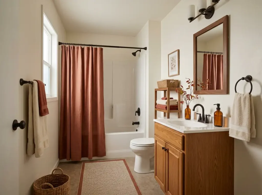
A mobile home bathroom rarely gives you the luxury of wasted inches. The vanity, toilet, tub or shower often sit close enough that one bulky cabinet, crowded counter, or visually heavy wall can make the whole room feel tighter.
That is why the best mobile home bathroom ideas are not simply miniature versions of standard bathroom trends. They work with the compact footprint first, then use color, storage, lighting, texture, and styling to make that footprint feel intentional.
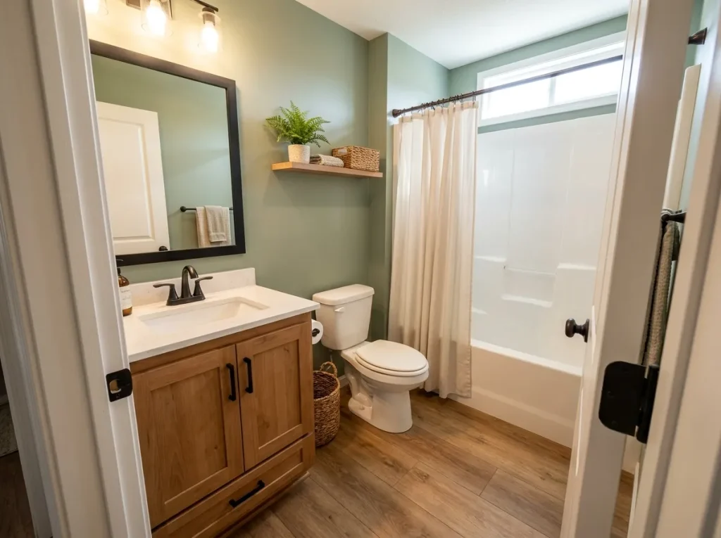
You also do not need to replace every dated surface to create a bathroom that feels finished. A better sightline from the doorway, a calmer wet zone, a vanity that respects the walking path, or a mirror that reflects the right part of the room can change more than another basket of décor.
The 25 ideas below start with those high-impact spatial decisions, then move into storage, finishes, color, everyday function, and selective makeover choices so a small mobile home bathroom can feel both practical and genuinely beautiful.
1. Protect the Doorway Sightline Before You Add Anything Else
Open the bathroom door and notice what your eye hits first. In many compact mobile home bathrooms, nearly the entire floor plan is visible from that one position. If the first view is a projecting vanity corner, overloaded wall shelf, laundry basket, or cluster of products, the room can feel crowded before you even step inside.
Start by treating the entrance as a visual corridor, not leftover storage space. Stand just outside the room and trace the easiest route toward the sink, toilet, and tub. Anything that narrows that first path deserves scrutiny before you buy another organizer.
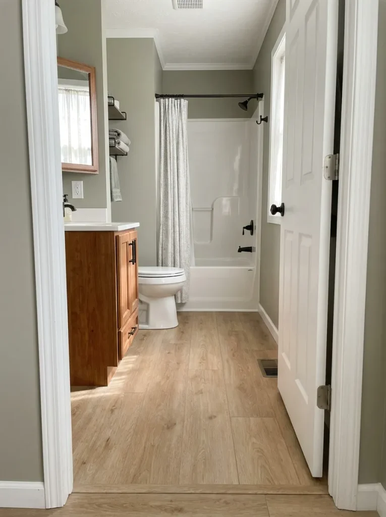
A useful test is simple: remove one movable object from the doorway zone and photograph the room again from the hall. If the bathroom suddenly looks wider, you have found a spatial problem—not a decorating problem.
The first improvement may therefore cost nothing at all: move the obstruction before trying to decorate around it.
Small-space diagnostic
What is crowding your first view?
Pick the element that feels most intrusive from the bathroom doorway. The result points to the first move worth testing.
Choose your strongest pressure point:
2. Keep a Working Tub-Shower Footprint Until the Layout Gives You a Real Reason to Change It
An older tub or shower can look like the obvious thing to replace, especially when the finishes around it feel dated. Appearance and footprint, however, are two separate questions.
First ask what the existing wet zone is actually doing wrong. Is it difficult to enter? Does its shape interfere with another fixture? Would changing it meaningfully improve the way you use the room? Or is the real problem simply a yellowed surround, dated curtain, mismatched hardware, or weak lighting?
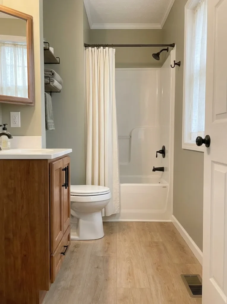
That distinction matters in a mobile home bathroom because the fixed fixtures often already occupy most of the available footprint. A visually dated tub that still suits the room may be a better candidate for a cosmetic refresh than an automatic layout change.
Use a stopping rule: do not disturb a working wet-zone footprint until you can name the functional problem the new layout will solve.
If a proposed change also moves plumbing or alters the wet-area construction, treat that as a separate technical project—not a styling decision.
3. Make the Shower Curtain and Surround Read as One Calm Wet-Zone Plane
A shower curtain can occupy more visible wall area than almost any other soft element in a small bathroom. That gives it unusual influence over how busy the entire room feels.
Look at the tub, surround, and curtain together. If the surround is white, a softer white, oatmeal, muted stripe, or low-contrast pattern can let the whole zone read as one large background plane. If the room already has patterned flooring, open shelving, plants, or strong hardware, adding another loud pattern at the shower can divide the bathroom into too many competing surfaces.
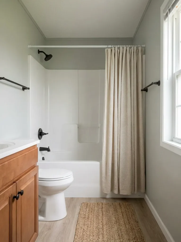
There is no rule saying the curtain must be plain. The useful question is whether it supports or interrupts the room’s main visual story.
Try photographing the bathroom with the curtain fully visible. If your eye lands on the textile before the vanity, mirror, or architectural feature you actually want to emphasize, the curtain may be carrying more contrast than the room needs.
Quick edit: In a small bathroom, give the largest textile one clear role—quiet background or intentional focal point. Do not ask it to do both.
4. Choose Vanity Projection Before Vanity Width
A common shopping mistake is to measure the available wall width and assume any vanity that fits that measurement is appropriately sized.
The front edge matters just as much.
In a narrow mobile home bathroom, a vanity can leave plenty of wall space on either side yet still push too far into the walking route. That affects where you stand at the sink, how comfortably you pass the toilet, and how open the doorway view feels. Before replacing a vanity, stand where you naturally wash your hands and notice whether your body already feels pushed backward into another fixture or circulation path.
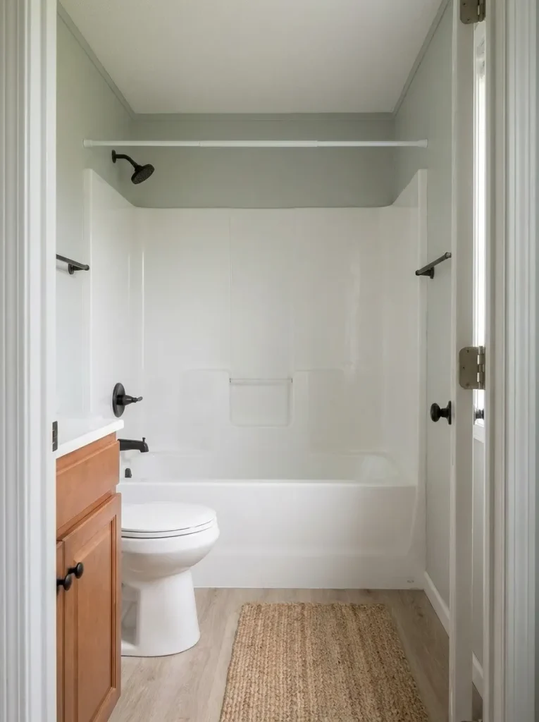
Then compare depth before style. A slightly narrower projection can sometimes improve the room more than reducing the vanity’s width, because it returns usable floor space along the entire front edge.
Keep the existing cabinet if its depth works and the storage is useful. If projection is the real problem, make that your first filter when you eventually compare replacements.
Vanity projection lab
Judge the front edge, not only the wall width.
Imagine the vanity as a block projecting into the route you use every day. Which description best matches your bathroom?
Pick the condition that feels closest:
5. Use One Larger Mirror to Give the Vanity Wall More Visual Reach
A mirror does more than occupy the wall above the sink. In a compact mobile home bathroom, it decides which part of the room gets visually repeated.
Before replacing yours, stand in the doorway and look at what the current mirror reflects. If it mostly captures a blank wall, a cluttered shelf, or the edge of the shower curtain, increasing its size may simply duplicate the least attractive part of the room. A better-positioned mirror can pull light, a calm wall color, greenery, or an open portion of the room back into the vanity view.
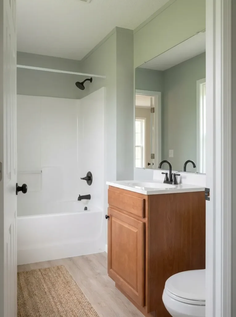
For a single vanity, one confident mirror often feels calmer than several small decorative pieces competing around it. It can also make the vanity wall feel like one complete composition rather than a sink with accessories scattered above it.
Mirror test: choose the mirror by the view it creates—not by frame style alone.
6. Fix the Light Around the Mirror Before Adding More Vanity Decor
A vanity can have attractive hardware, a beautiful counter, and carefully chosen accessories yet still feel disappointing when the mirror area is poorly lit.
Look at the bathroom at the time you actually use it most. If your face is shadowed while the ceiling is bright, or the mirror wall looks dull compared with the rest of the room, another tray or plant will not solve the imbalance. The lighting needs to support the sink zone first.
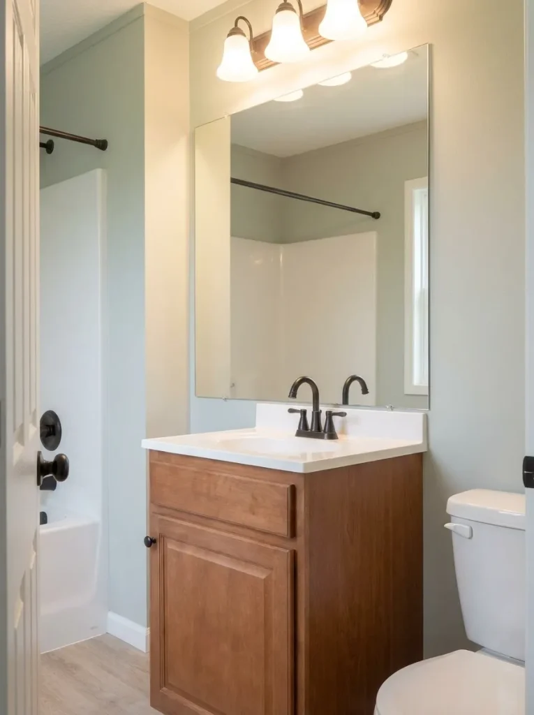
In a small bathroom, the fixture above or beside the mirror also becomes part of the visual composition because there is little distance between the light, mirror, faucet, and cabinet. Coordinating those elements produces a more deliberate result than treating each upgrade separately.
If you want to take that whole-wall approach further, the StylishGalore guide to modern single-wide mobile home design shows how the vanity, mirror, finish, and lighting can work as one composition.
The useful stopping point is when the mirror area feels bright enough to use comfortably and visually connected to the vanity below it. After that, decor becomes optional.
7. Keep Wall Storage Shallower Than the Fixtures Beside It
Wall storage is often recommended for a small bathroom, but “use the walls” is incomplete advice.
A shelf can free the floor and still make the room feel tighter if its front edge projects far into a narrow toilet or vanity zone. This becomes especially noticeable in mobile home bathrooms where fixtures already sit close together. The storage should add capacity without creating another obstacle at shoulder or eye level.
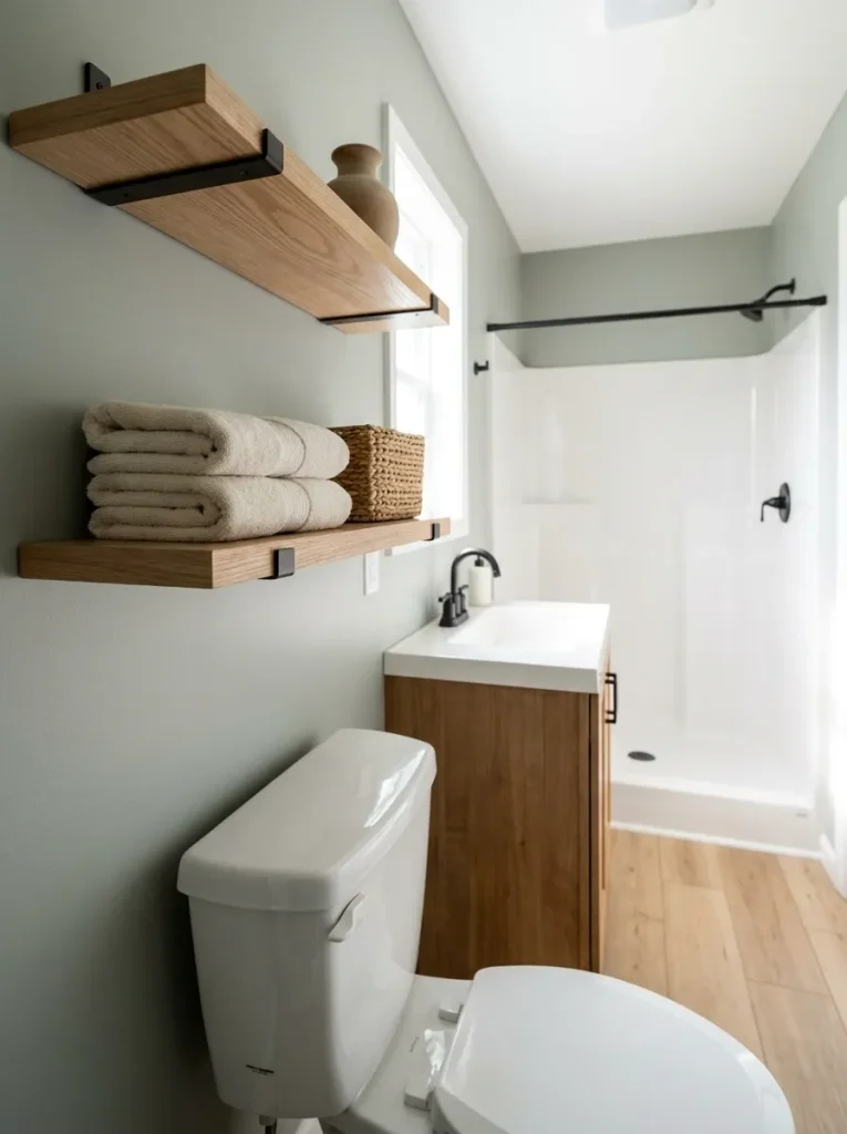
Compare every shelf or cabinet with the fixture directly below or beside it. If the storage visually pushes farther into the room than the toilet tank, vanity edge, or adjacent wall plane, ask whether the extra depth is actually being used. Often, a shallower shelf holding a few daily items works better than a deep unit filled simply because the space exists.
StylishGalore’s broader guide to single-wide mobile home decorating ideas develops this same projection principle across compact rooms.
Projection explorer
How far does your wall storage reach?
Compare the shelf or cabinet edge with the fixture beneath it. The relationship matters more than whether the unit is technically wall mounted.
8. Give the Toilet Wall One Useful Vertical Storage Zone
The wall above a toilet is valuable because it can store items without taking away floor space. It is also easy to overfill.
Choose one storage zone first: a pair of shelves, a slim cabinet, or another contained arrangement. Then assign it a job. Extra toilet paper, folded towels, and one small basket are more useful here than a collection of signs, jars, plants, candles, and products all competing for attention.
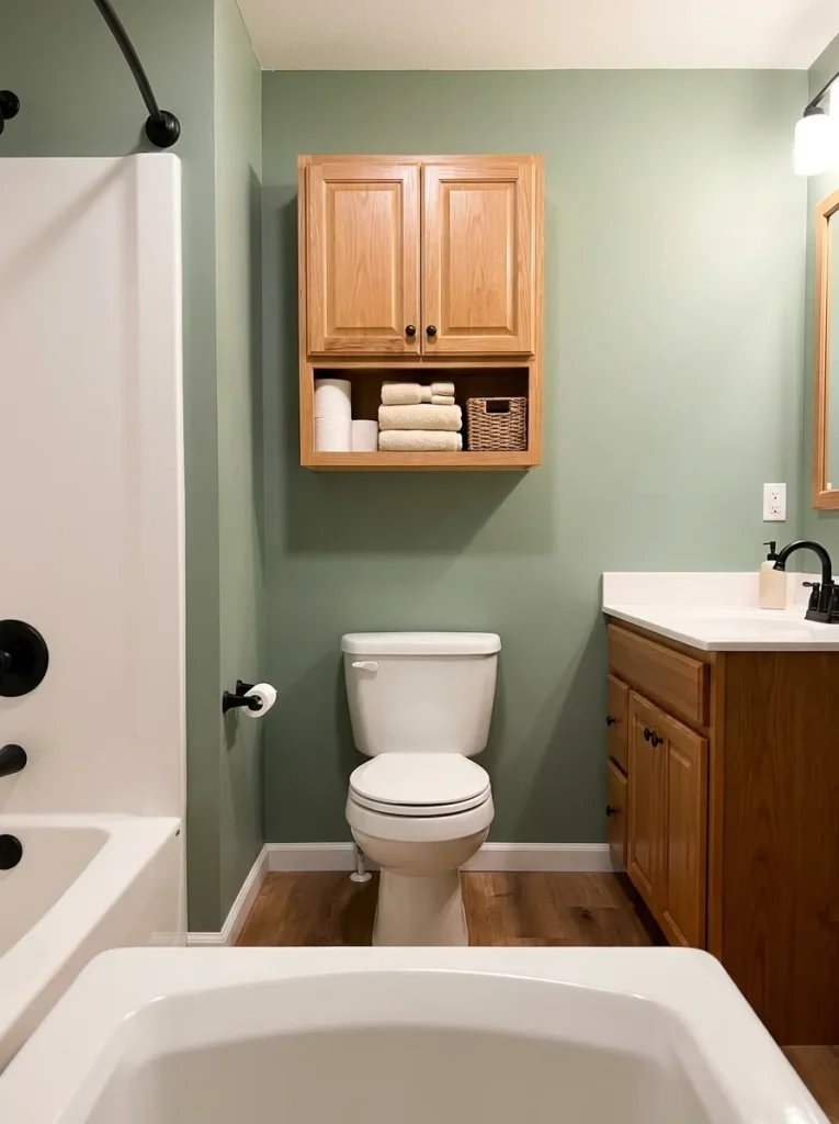
This distinction matters in a compact mobile home bathroom because the toilet wall is often visible from both the doorway and the vanity mirror. Clutter placed there can appear twice.
If you need more capacity than one restrained zone can provide, that is a signal to improve concealed storage elsewhere instead of stacking higher indefinitely.
For more configurations, continue to StylishGalore’s dedicated over-the-toilet storage ideas guide.
Decision rule: let the toilet wall solve one storage problem well; do not turn it into the bathroom’s catch-all wall.
9. Organize Under the Sink Around the Plumbing, Not Around Matching Bins
Under-sink storage often looks promising until the cabinet door opens and the plumbing claims the center.
That is why buying matching rectangular organizers first can waste some of the most useful storage in a compact mobile home bathroom. Begin with the pipe layout. Notice where the trap, supply lines, and shutoff access sit, then use the remaining space around those fixed elements.
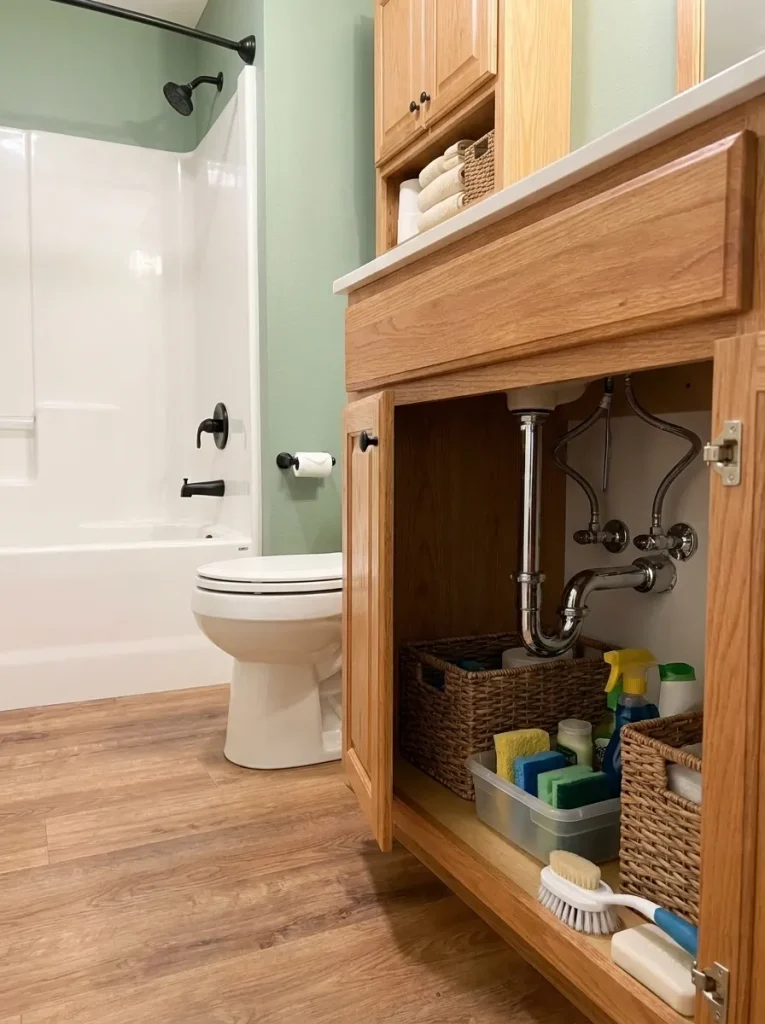
A better arrangement may mean shallow bins at the sides, a low container below the pipes, or frequently used products near the front while backups move elsewhere. The cabinet does not need to look perfectly symmetrical; it needs to stay usable.
StylishGalore’s dedicated guide to under-bathroom-sink organization goes deeper into plumbing-aware configurations.
Before buying anything: open the cabinet fully and identify the unusable plumbing zone first. Organize the space that actually exists—not the rectangle you wish existed.
10. Hide Product Packaging Behind One Closed Storage Plane
A small bathroom can contain the same number of everyday products as a large one. The difference is that almost all of them may be visible at once.
Shampoo bottles, skincare packaging, cleaning sprays, hair products, toilet paper, and spare toiletries each add their own colors, labels, and shapes. When several of those categories sit in the open, the bathroom can feel visually crowded even when the floor itself is clear.
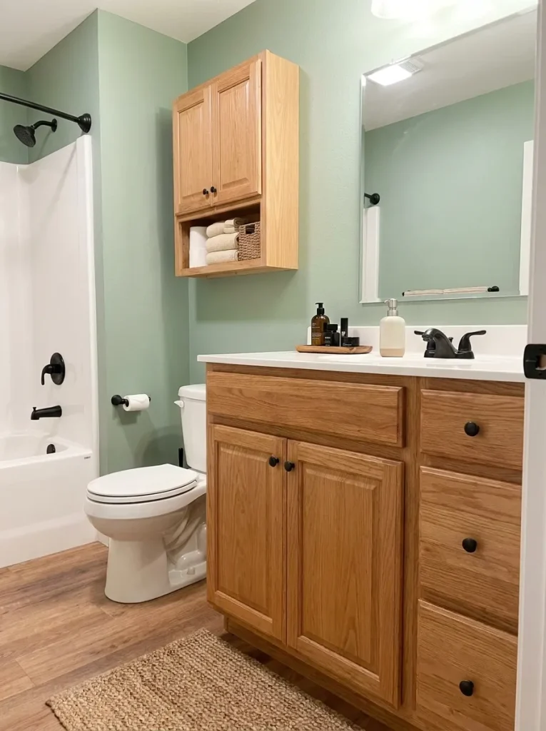
Choose one concealed storage plane for the least attractive essentials. That might be the vanity cabinet, a slim closed wall cabinet, or contained baskets on a shelf. Then allow the visible areas to carry only what earns a place there through daily use or design value.
A Simple Counter Edit
Keep visible:
- hand soap
- one small daily-use tray
- one intentional decorative element, if the counter still has working space
Move out of sight:
- backup toiletries
- cleaning products
- bulk packaging
- rarely used grooming items
- duplicate bottles
This is especially effective in a mobile home bathroom because reducing visual fragments can make existing surfaces look more finished without changing the fixtures.
11. Add One Warm Wood Plane Instead of Scattering Wood Everywhere
Wood works beautifully in many of the bathroom references because it introduces warmth against white fixtures, gray surfaces, black hardware, and other hard finishes.
The strongest rooms, however, usually let one substantial element carry most of that warmth.
It could be a wood vanity, mirror frame, floating shelves, or a deliberately placed dry-wall feature. Once that main plane is established, smaller wood accessories can support it quietly. When every shelf, frame, sign, tray, basket, stool, and decorative object introduces a different wood tone, the effect can shift from warm to visually restless.
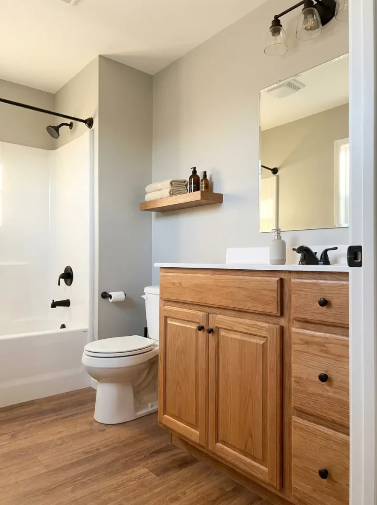
Imagine a compact bathroom with a warm oak-look vanity and white fixtures. That vanity already gives the room a material anchor. Adding a similarly toned mirror frame may strengthen it; five unrelated rustic wood accessories are less necessary.
Use the largest successful wood element as your reference point. Match or complement its temperature first, then stop when the bathroom already feels balanced.
12. Let the Floor Read as One Continuous Walking Path
Look down from the doorway and follow the floor from the entrance to the vanity, toilet, and wet zone.
In a small mobile home bathroom, that visible strip of flooring can strongly influence whether the room feels continuous or chopped into separate pieces. This does not mean one particular flooring style is always best. Dark tile, wood-look flooring, graphic pattern, and terracotta can all work.
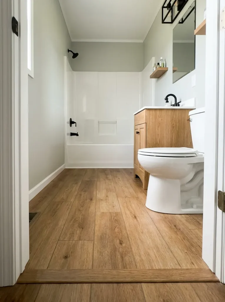
The difference is how the rest of the room responds.
A bold patterned floor becomes easier to read when the walls and major fixtures stay calmer. A dark floor can feel grounded when the upper half remains lighter. Wood-look flooring can visually lengthen the room when its direction supports the main sightline. Even a simple neutral tile can become effective when mats and freestanding objects do not cover every visible section.
Before replacing flooring, test the cheaper question first: is the floor actually the problem, or is too much of it being visually interrupted?
Remove extra mats, baskets, scales, and small floor accessories temporarily. If the room suddenly feels longer, protect that continuous path before planning a flooring change.
13. Use Sage, Greige, or Teal as One Controlled Color Field Against White Fixtures
A small mobile home bathroom does not have to stay completely white to feel open. In fact, the white tub, toilet, sink, and surround that are already common in many bathrooms can become a useful neutral framework for stronger color.
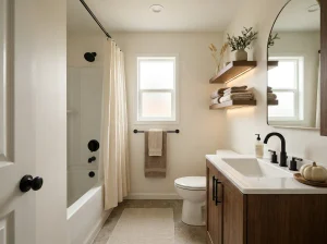
The safest way to introduce that color is through one controlled field. Think of a sage vanity wall, soft greige around the shower, or a deeper teal feature wall beside otherwise quiet white fixtures. One substantial color surface usually reads more deliberately than several unrelated accent shades distributed through towels, signs, plants, baskets, and accessories.
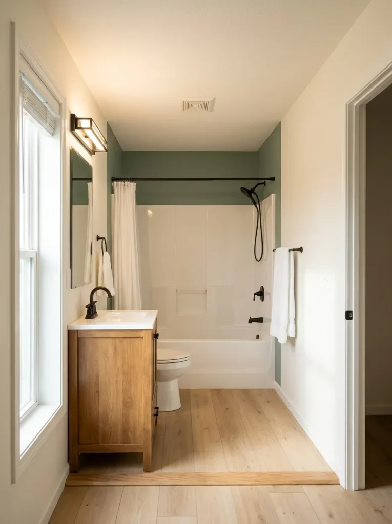
The amount of natural light changes the decision. A bathroom with a good window can often carry a deeper wall color more comfortably. In a dimmer room, a softened or dustier version may preserve contrast without swallowing the fixtures.
If you already have warm wood flooring or cabinetry, compare the paint beside that material before committing. Green-gray and muted teal can look very different under warm artificial light than they do on a screen.
For more combinations beyond the mobile-home-specific approach here, StylishGalore’s broader bathroom color ideas guide can provide additional palette directions.
Color field builder
Let one color plane do the heavy lifting.
Start with the white fixtures you already own, then choose one wall-color direction that coordinates with the light and warm materials around it.
14. Unify the Eye-Level Metal Finish Without Replacing Every Chrome Piece
A coordinated bathroom does not require every piece of metal to match perfectly.
What matters more in a compact room is where the mismatch occurs. The faucet, mirror frame, vanity light, towel hardware, and visible shelf brackets often sit within the same eye-level composition. If each one introduces a different dominant finish, that wall can look busier than the floor-level plumbing or an existing shower component that barely enters the main view.
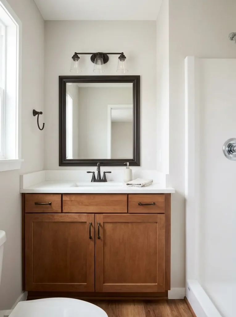
So begin with the pieces your eye reads together.
For example, a black mirror frame, black light fixture, and dark towel bar can establish a clear finish direction even if an existing chrome shower control remains across the room. Replacing a functional component simply to chase perfect uniformity may add cost without changing the overall impression much.
Use this hierarchy:
High priority: mirror frame, faucet, lighting, nearby hardware
Medium priority: shelf brackets, cabinet pulls, towel accessories
Low priority: isolated functional metal that does not interrupt the main composition
That gives you a more useful decision than “make everything matte black.”
15. Put Woven Texture Low in the Room to Soften Hard Bathroom Surfaces
Bathrooms contain a lot of visually hard material: porcelain, fiberglass, tile, laminate, metal, mirrors, and painted cabinetry.
A woven basket or natural-fiber-style mat can soften that mix, but placement changes the effect.
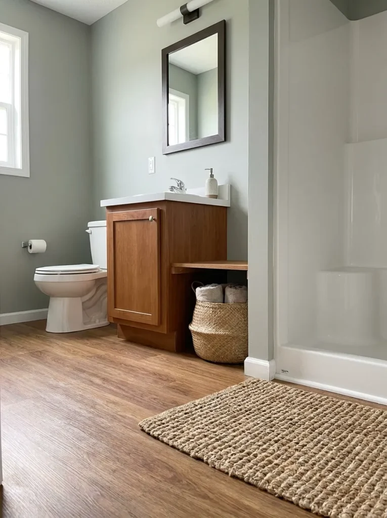
The bathroom references repeatedly use woven texture close to the floor—beside the tub, underneath shelving, near the vanity, or as a contained basket. That works because the texture warms the room without adding another bulky object at eye level.
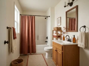
In a small mobile home bathroom, reserve higher wall zones for things that need to be seen or reached. Let texture live lower, where it can visually bridge the floor and fixtures.
One basket beside the vanity may be enough. If another basket, another woven planter, and another textured hamper begin crowding the same floor path, the softening effect has turned into floor clutter.
Use texture as contrast, not inventory.
16. Give Towels a Vertical Home That Still Works After a Shower
A towel arrangement should survive real life, not only the photograph.
Imagine the sequence:
- You step out of the tub or shower.
- You reach for a towel without crossing the room wet.
- The used towel has somewhere to hang open enough to dry.
- A fresh towel can be stored without collapsing the whole arrangement.
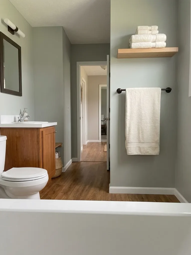
That sequence should determine placement.
In a narrow mobile home bathroom, hooks can be useful when wall width is limited, while a towel bar gives more open hanging area when the layout allows it. Rolled towels on a shelf may look attractive, but they solve fresh-towel storage—not necessarily the problem of where a damp towel goes afterward.
Test the room from the wet zone. If you have to pass the toilet, reach behind the door, or move decorative items to grab a towel, the placement is serving styling more than routine.
A strong setup separates fresh storage from used-towel drying. Once both jobs have a clear home, there is little reason to keep adding racks simply because an empty wall remains.
17. Move Greenery Off the Counter and Into One Light-Sensible Spot
Plants appear throughout the bathroom references, but their strongest contribution is not simply “adding greenery.” They introduce a soft organic shape against the room’s hard lines—mirror edges, cabinetry, tile, fixtures, and shelving.
The mistake is using the vanity counter as the default location.
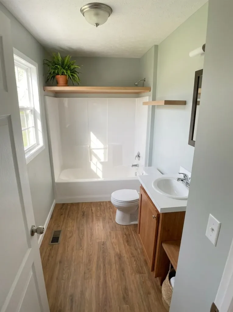
In a compact mobile home bathroom, that surface already has an important job: washing, grooming, setting down daily-use items, and keeping the sink usable. A decorative plant that constantly has to be moved has become another obstacle.
Instead, inspect the bathroom for one location where greenery can contribute without stealing working space. A window-adjacent ledge, the end of a high shelf, or another stable spot may work better. Then consider whether that particular plant actually suits the light available in the room.
If the bathroom receives little natural light, greenery is optional. An empty counter is more valuable than forcing a plant into an unsuitable position simply because the room feels unfinished.
Placement rule: greenery should soften an existing composition—not create a new maintenance or clutter problem.
18. Choose One Bathroom Style Direction and Let It Edit the Room for You
One of the easiest ways to overcrowd a small bathroom is to decorate each surface independently.
A farmhouse shelf may look attractive by itself. So might a graphic black mirror, a coastal basket, a glam light fixture, and a botanical shower curtain. Put all five into the same compact room, though, and the eye has no clear hierarchy.
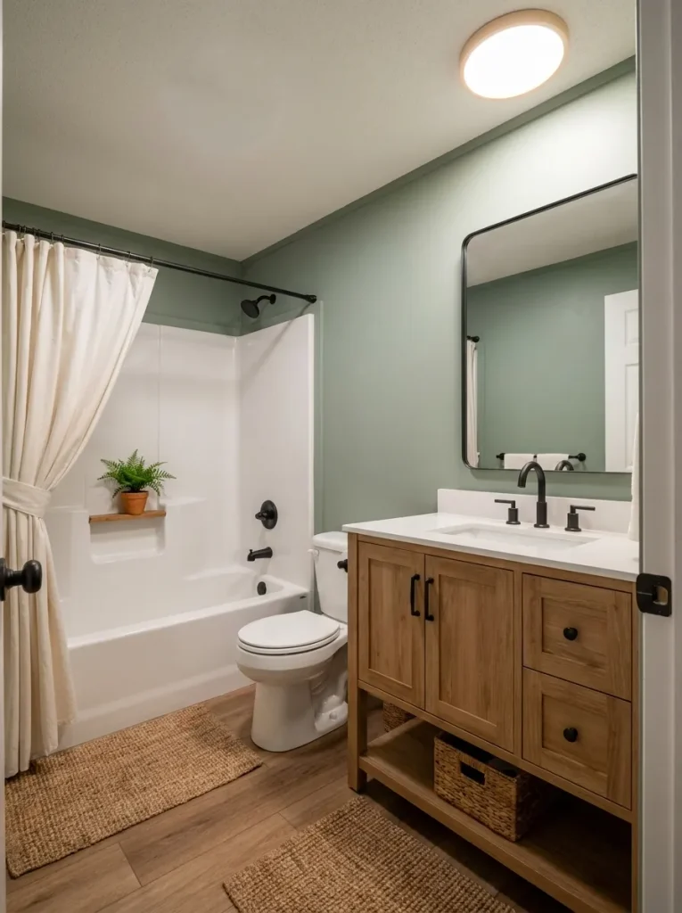
Choose the room’s design direction before choosing its final accessories.
Four coherent routes work especially well:
- Organic sage: muted green, warm wood, white fixtures, woven texture, restrained dark metal.
- Warm rustic: natural wood, cream textiles, earthy flooring, simple black accents.
- Modern graphic: white or neutral walls, black details, one bold patterned plane, minimal accessories.
- Earthy color: teal, terracotta, warm wood, and quieter supporting surfaces.
Once you pick the direction, use it as an editing filter. A new object should reinforce that palette, material story, or visual mood. If it introduces an entirely different design language, the bathroom probably does not need it.
StylishGalore’s guide on making a single wide look more expensive develops the same idea further: a smaller home usually looks more considered when each room follows one clear design direction.
Editing question: If you removed the decorative accessories and looked only at the permanent surfaces, could you still describe the bathroom’s style in a few words? If not, define the direction before buying more decor.
19. Refresh a Sound Vanity Before Replacing the Entire Cabinet
A dated vanity can dominate a small mobile home bathroom because there is rarely enough distance for it to fade into the background. That does not automatically mean the cabinet itself needs to go.
Inspect function before appearance.
Open every door and drawer. Check whether the cabinet stores what you need, whether the sink position works, whether the front edge interferes with circulation, and whether obvious deterioration or another functional problem changes the equation. If the cabinet performs well and its projection suits the room, replacement may solve mostly an aesthetic complaint while introducing a much larger project.
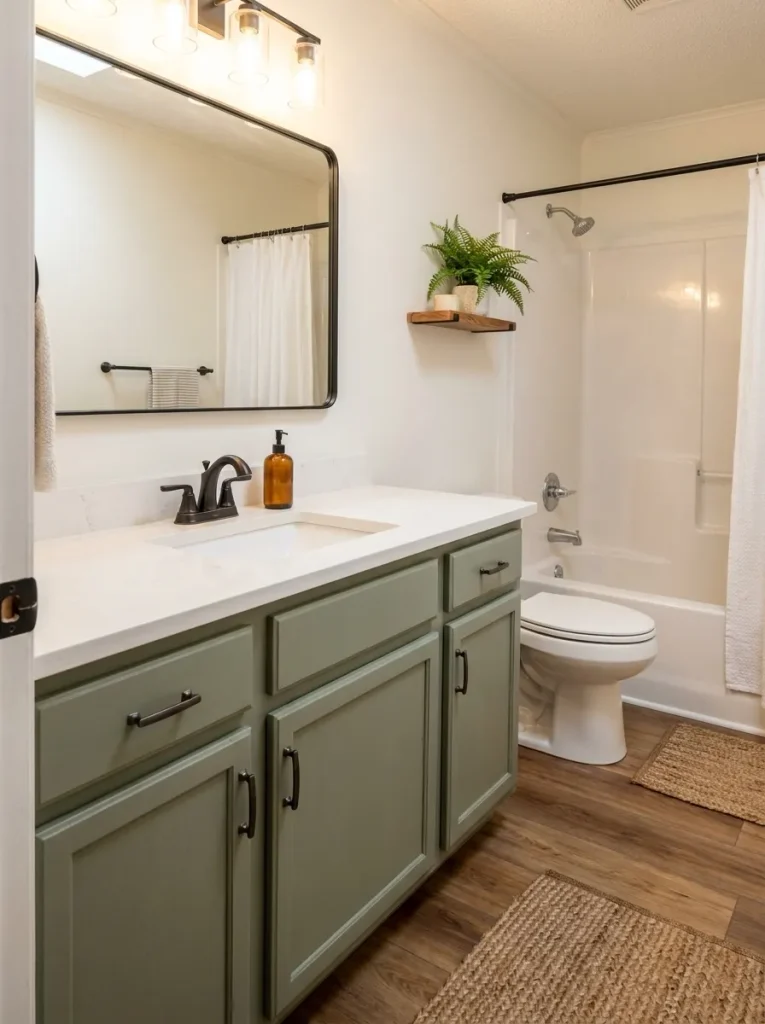
That is where a cosmetic refresh earns consideration.
Depending on the existing material and condition, the visual update might come from a better-coordinated cabinet finish, simpler hardware, a more intentional mirror, improved lighting, or editing what sits on the countertop. You do not need to perform all of those changes simultaneously.
Keep or Replace?
Keep and refresh when:
- the cabinet remains useful
- the sink location works
- the depth does not compromise the walking path
- the main complaint is visual
Investigate replacement when:
- the cabinet itself no longer works for the room
- its projection creates a persistent spatial problem
- storage is fundamentally inadequate
- its physical condition makes a cosmetic update poor value
For a broader library of surface-level improvements, continue to StylishGalore’s DIY bathroom updates guide.
The important order is diagnose → preserve what works → upgrade only what changes the room.
20. Put Slats, Wallpaper, or a Wood Accent on a Deliberately Chosen Dry Plane
Decorative wall treatments can add more personality than a collection of small accessories because one architectural plane carries the visual impact.
They also need more deliberate placement in a bathroom than they would in a bedroom or hallway.
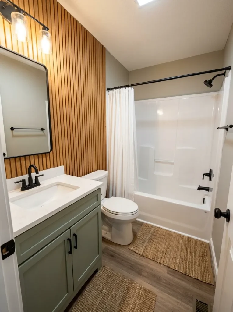
Begin by separating the walls conceptually into different exposure zones. A wall beside a dry vanity area does not experience the same conditions as a surface directly inside a shower or one routinely exposed to splashing. Product suitability also varies, so the manufacturer’s installation and location guidance should control whether a particular wallpaper, panel, adhesive, coating, or wood product belongs in the position you have chosen.
That distinction makes the decorating decision easier.
If you love a slatted-wood look, you do not need to wrap the entire bathroom in it. One carefully chosen dry accent plane behind or beside the vanity can provide warmth and vertical rhythm while the wetter surfaces remain simpler and easier to manage.
Likewise, wallpaper usually has more visual power when one wall owns the pattern and nearby fixtures remain quiet.
The design lesson is not “avoid decorative walls in bathrooms.” It is: choose the visual plane first, then verify that the exact material is appropriate for that location before installation.
Dry-plane placement map
Choose the wall zone before choosing the decorative material.
Different bathroom walls face different levels of direct water and routine splashing. Select the condition closest to your intended accent location.
Where are you planning the accent?
21. Keep the Wet Zone Visually Open With One Continuous Tone or Sightline
A compact tub or shower already occupies a large percentage of the bathroom. The wet zone feels even larger when its curtain, surround, trim, shelving, and accessories each create a separate visual boundary.
Start by asking what happens from the doorway.
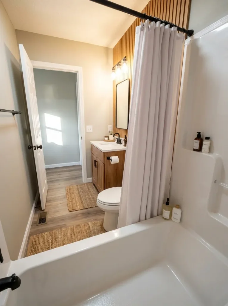
Imagine two versions of the same small bathroom:
Version A: white tub, pale surround, quiet curtain, and only a few necessary items.
Version B: white tub, high-contrast curtain, contrasting surround, multiple hanging organizers, several bottles, and another strong color above it.
The second bathroom has not lost any physical floor space, yet the wet zone can appear heavier because your eye keeps stopping.
You can improve that relationship without converting the tub to a glass shower. A curtain that coordinates more closely with the surrounding wall, a simplified bath-product arrangement, or a more continuous color treatment can preserve the sightline while keeping the existing fixture.
Clear glass can create a similar visual effect where an appropriate enclosure already exists, but visual openness alone is not a reason to rebuild a functional shower.
Use the least disruptive move that lets the eye travel across the wet zone instead of stopping at every layer.
22. Keep One Vanity Counter Plane Deliberately Empty
There is a small luxury signal that costs nothing: unused space.
When every inch of a compact vanity is occupied, the counter communicates that the room has no capacity left. Soap, toothbrushes, skincare, perfume, tissues, a candle, a tray, a plant, and decorative jars may all be attractive individually, yet together they erase the working surface around the sink.
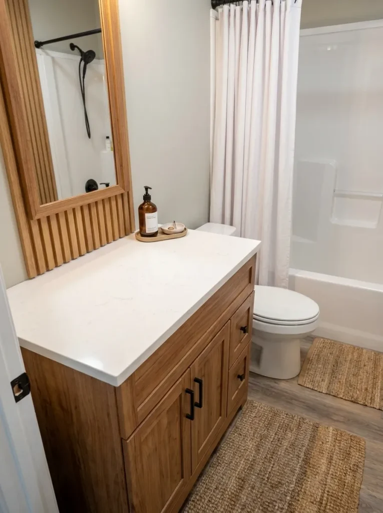
Try a daily-use test.
Tomorrow morning, notice where you naturally put a hair tool, glasses, makeup bag, grooming product, or folded towel while getting ready. That temporary landing area is part of the vanity’s function and deserves protection.
Divide the counter mentally into two zones:
Working plane: leave this genuinely clear.
Permanent plane: reserve it for the smallest useful group of items—perhaps hand soap plus one contained daily-use element.
The arrangement can still look styled. In fact, the negative space often makes the mirror, faucet, countertop, and cabinet finish more noticeable because they are no longer competing with dozens of small objects.
If an item has to be moved every time you use the sink, it has not earned permanent counter space.
23. Put Bold Pattern on One Plane, Then Let the Other Surfaces Calm Down
Bold pattern is not automatically too much for a small mobile home bathroom.
Patterned floors, terracotta tones, and stronger color can work because the visual energy is concentrated. The mistake is assuming that once the room has one statement surface, every other surface also needs personality.
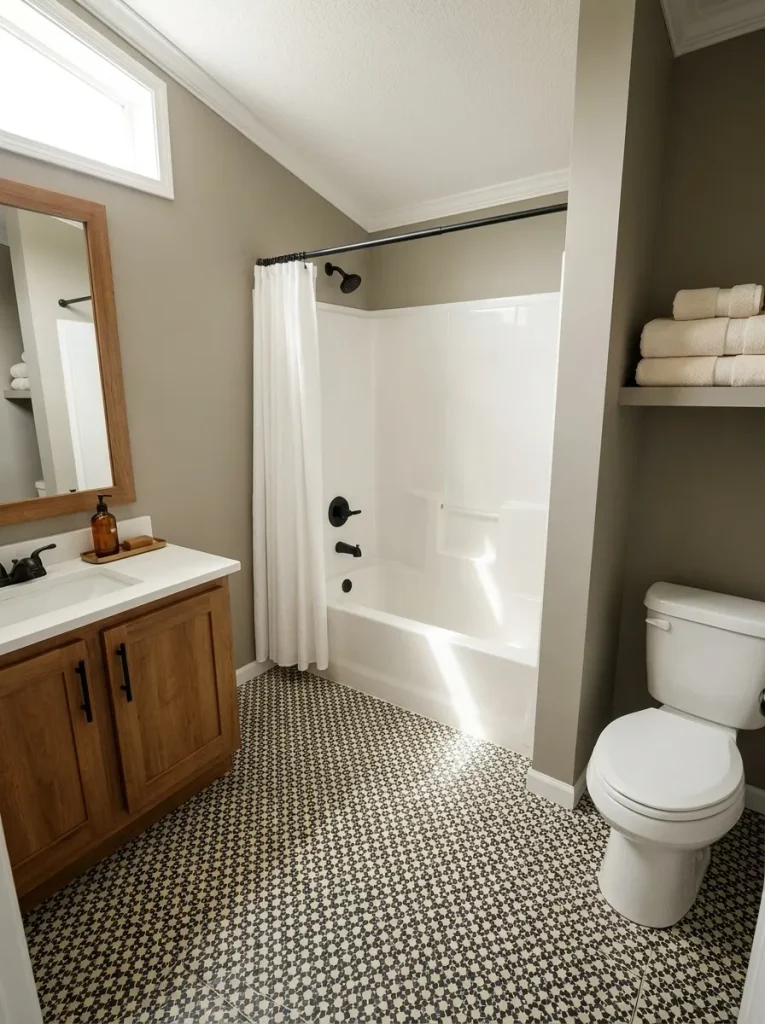
Suppose you choose a graphic black-and-white floor. The floor can become the room’s pattern owner while the shower curtain, walls, vanity styling, and towels become quieter supporting elements.
Choose a terracotta or richly varied floor instead, and warm wood plus creamy walls may be enough to complete the story.
A patterned wallpaper wall can reverse the hierarchy: the wall becomes active while the flooring and textiles settle down.
Pattern Balance Check
Look at the bathroom from the doorway and identify the first patterned plane.
Then ask:
- Is another large pattern competing with it?
- Are several smaller prints appearing in the curtain, rug, towels, and baskets?
- Does your eye know which surface should lead?
- Would removing one pattern make the strongest one look better?
The room does not need less personality. It needs one clear place for that personality to peak.
24. Fix Moisture and Ventilation Before You Layer in the “Spa” Look
A bathroom can look calm in photographs and still have a more important problem hiding behind the styling.
Pay attention to what happens after a shower: lingering condensation, repeated dampness, musty odors, recurring moisture marks, or a fan that makes noise without clearly moving air outside deserve attention before wallpaper, wood accents, extra textiles, or decorative storage are added.
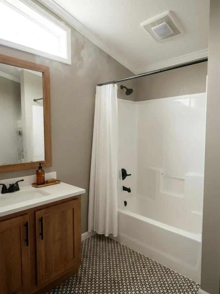
For HUD-code manufactured homes, federal manufactured-home standards require each bathroom and separate toilet compartment to have mechanical ventilation capable of exhausting 50 cfm to the outside, subject to the standard’s stated alternative for certain separate toilet compartments. EPA guidance also emphasizes moisture control and recommends using bathroom exhaust ventilation to move moisture outdoors.
That makes ventilation part of the design foundation, not an optional technical footnote.
If the room repeatedly stays damp, investigate the moisture source and ventilation performance before covering symptoms with a cosmetic finish. Electrical, duct, structural, waterproofing, or hidden-moisture work should be handled at the appropriate technical level rather than improvised as décor DIY.
Moisture priority matrix
What should happen before the next decorative layer?
Choose the condition that most closely matches your bathroom after normal shower use. This is a prioritization tool, not a technical diagnosis.
What are you noticing?
25. Finish With a Three-Zone Bathroom Edit
Before you call the bathroom finished, stop looking at individual products and divide the entire room into three working zones: the sink, the toilet wall, and the wet zone.
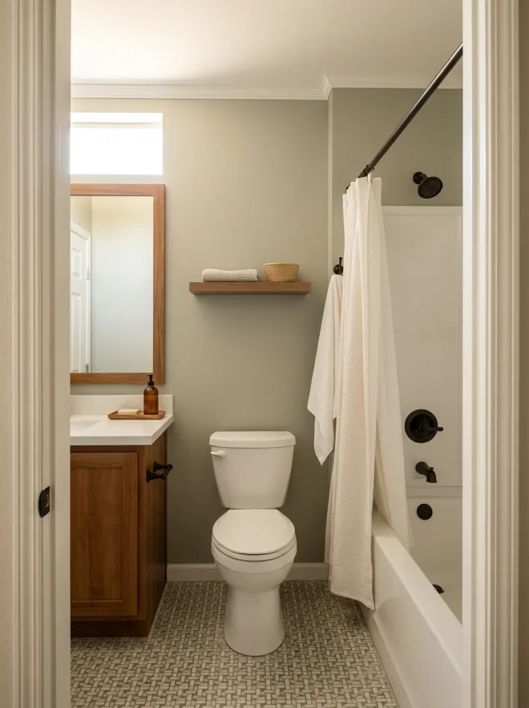
Each zone should answer three questions. Does it perform its everyday job easily? Do the items used there have a sensible home? Is there one clear visual lead rather than several competing accents?
The sink might lead with its mirror and keep the counter mostly open. The toilet wall might provide one contained vertical storage area. The wet zone might stay visually quiet so the room does not end in another wall of clutter.
Then look for duplication between zones. Three decorative plants, three baskets of spare towels, or several separate statement finishes may be solving the same visual job repeatedly.
The final decision is often subtraction: when all three zones function clearly and one or two surfaces already provide personality, stop adding things.
Three-zone finish audit
Is the bathroom actually finished?
Mark a zone complete only when all three statements inside it are true. The point is to discover where editing is still needed—not where another purchase can fit.
Still editing? Find the first zone that fails one of its three tests. Remove, relocate, or simplify one competing element there before shopping for anything new.
All three zones pass. The most useful next move may be to stop. Give the room time to function before deciding it needs another decorative layer.
A Beautiful Mobile Home Bathroom Starts With Better Decisions
The most successful mobile home bathroom ideas do not depend on disguising the size of the room. They make the existing footprint easier to use, calmer to look at, and more deliberate.
Protect circulation first. Keep useful fixtures when they still work. Give storage boundaries, let one color or material lead, and leave enough negative space for the room to function. When moisture, plumbing, electrical work, or wet-area construction enters the project, treat those issues as technical work rather than styling shortcuts.
A small bathroom can feel remarkably complete once every surface has a purpose—and once you know when to stop adding more.