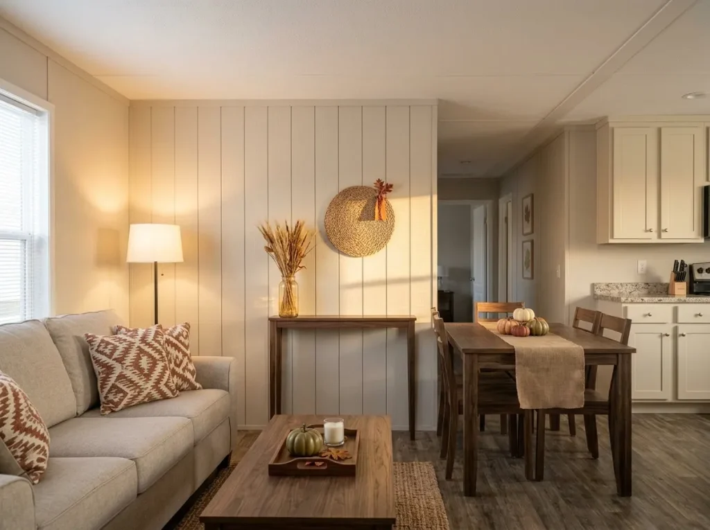
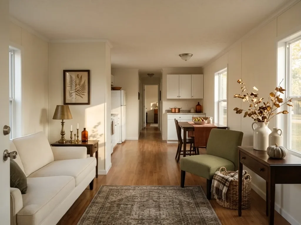
Fall decorating can get expensive surprisingly fast. A few pumpkins, new pillows, a garland, a wreath, and seasonal kitchen accessories can turn a “small refresh” into a much bigger shopping trip.
The good news is that cheap fall mobile home decor works best when you stop measuring impact by how many decorations you own. Mobile homes often have shorter sightlines, connected rooms, compact surfaces, and furniture that fills more of the visual field. That means one well-placed change can influence far more of the room than you might expect.

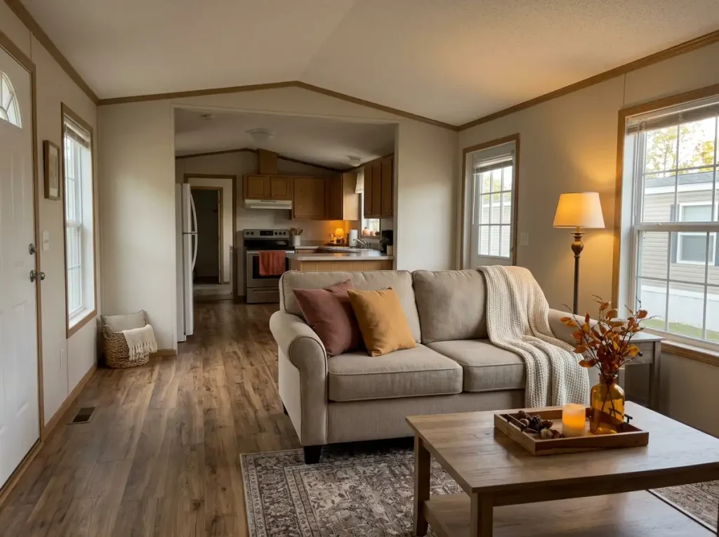
The smartest approach is to work with what already gives your home structure: the sofa, windows, shelves, countertops, doorways, towels, tables, and lighting. Then add fall color or texture where it will actually be noticed.
Some of the ideas ahead cost only a few dollars. Others cost nothing at all.
The aim isn’t to cover your home in autumn decorations. It’s to make a handful of inexpensive changes look intentional enough that the whole space feels ready for fall.
1. Do a $0 Fall Color Edit Before You Buy Anything
Before buying a single pumpkin, walk through the room and look for colors that are already competing with the fall palette you want.
A bright turquoise vase, summery floral pillow, cool blue throw, or colorful stack of accessories may be perfectly attractive on its own. Yet several strong colors in the same sightline can make a small amount of rust, mustard, brown, or amber feel almost invisible.
Temporarily store the strongest competitors. You are not decluttering the room for the sake of minimalism; you are changing which colors get visual priority.
A simple first pass might look like this:
- Keep: cream, beige, wood, black, warm gray, olive, tan.
- Temporarily move: very bright summer colors that dominate the eye.
- Reassess: patterned items containing both warm and cool shades.
- Leave alone: permanent finishes you cannot or do not want to change.
This matters even more in a mobile home because nearby rooms are often visible together. One loud accessory can affect more than one zone.
Once the background quiets down, add only one or two autumn tones. You may discover that the room needs far less seasonal décor than you originally planned.
2. Turn One Coffee-Table Tray Into the Living Room’s Fall Anchor
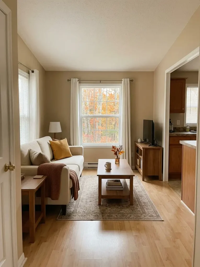
A sectional or large sofa creates a lot of visual mass. Five tiny fall decorations scattered across nearby tables can easily disappear against it.
A tray solves that problem by making several inexpensive items register as one composition.
Choose a tray, shallow basket, wooden board, or platter you already own. Build the arrangement around three different visual levels: something low, something medium, and one taller element. A candle, two mini pumpkins, and dried stems are enough to create that structure.
The useful part is the boundary. Once objects sit inside the same defined footprint, your eye begins to read them as a single decorative unit. That gives cheap accessories more presence without requiring more of them.
Keep the arrangement comfortably below the main seated sightline. A centerpiece that blocks conversation or the television quickly becomes annoying, no matter how pretty it looks.
Also leave part of the tray empty. That negative space separates shapes and makes inexpensive pieces look more deliberate.
From the doorway, the tray should register as one warm fall focal point. Up close, each item can remain simple.
3. Change Pillow Covers, Not the Pillows
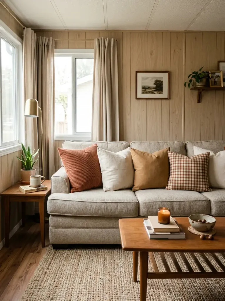
Seasonal pillows are tempting because the transformation is instant. They are also surprisingly inefficient when you buy the entire pillow every season.
Covers give you nearly the same visible change while using less money and far less storage space.
Look at the sofa as one large color field. On a beige, cream, gray, or brown sofa, even two rust or ochre covers can alter the room more than several tiny tabletop decorations. The fabric sits directly against one of the largest surfaces in the living room, so the color gets a generous visual backdrop.
Spend first on covers with texture. Corduroy, brushed cotton, faux linen, boucle-like fabric, or a subtle plaid can communicate fall through material as well as color.
For a small sofa, two changed covers may be plenty. A large sectional can usually handle three seasonal pieces, especially when some neutral pillows remain between them.
Skip buying five matching fall pillows. The sofa will look flatter, and you will create a bulky storage problem when winter arrives.
Keep the inserts. Fold the covers. Your seasonal décor suddenly takes up one drawer instead of half a closet.
4. Build a Fall Reading Corner Around a Chair You Already Own
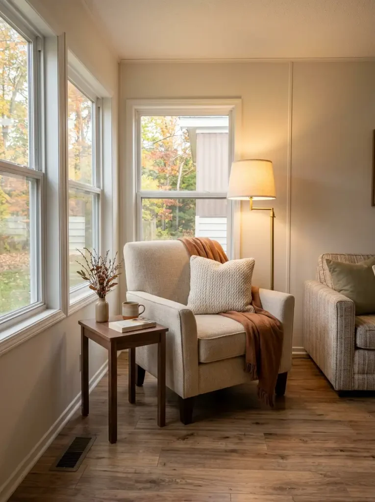
Picture the chair you already use for coffee, scrolling, reading, or relaxing at the end of the day. That chair is already a destination. Fall décor only needs to make the destination feel seasonal.
If the chair sits near a window: use daylight as part of the setup. Add a warm throw, one cushion, and a small basket or branch arrangement beside the chair.
If the chair sits against a blank wall: give the wall one supporting element, such as inexpensive printable art or a simple wreath, then keep the floor area quieter.
If the chair sits close to a walkway: skip floor baskets and large pumpkins. Put the seasonal layer on the chair, wall, or nearby side table so circulation remains comfortable.
The decorating works because every piece supports the same activity zone.
A cozy throw belongs naturally on a reading chair. A lamp improves the spot after sunset. A small table has a reason to hold a mug or candle. The arrangement feels believable because decoration and function overlap.
You do not need an elaborate accent chair or a picture-perfect corner. An ordinary rocker or upholstered chair can carry the same idea when the supporting pieces are chosen around how the space is actually used.
5. Frame One Window With Removable Leaves and Warm Mini Lights
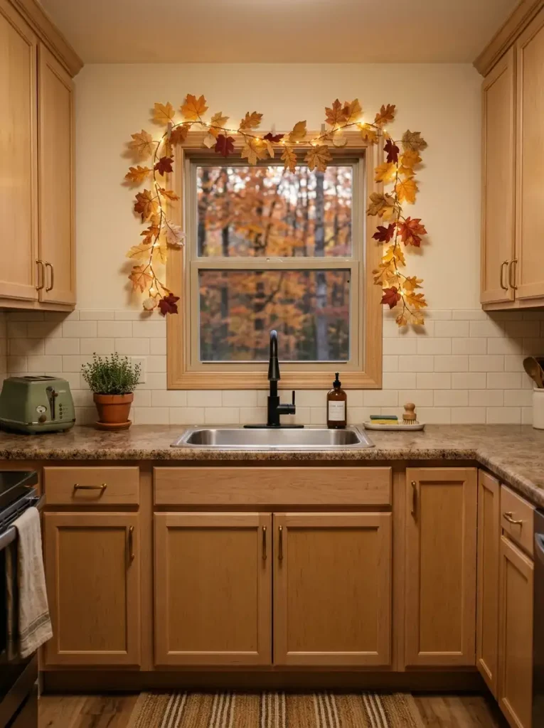
A window already gives you a built-in decorative outline. That makes it one of the cheapest places to create a large fall effect.
Run a lightweight autumn garland across the top and partly down the sides, then weave in a thin strand of warm battery-operated micro lights. Keep the center of the glass mostly open.
The clever part is scale. You may be decorating only the edge, but your eye reads the entire window opening as part of the composition. A relatively small amount of foliage can therefore influence a much larger section of the wall.
In a kitchen, make sure leaves stay clear of the faucet, cooking area, outlets, and any surface that regularly gets wet or greasy. Removable hooks or clear clips make seasonal cleanup easier and are especially useful when you do not want permanent holes.
The lighting becomes more valuable after sunset. During the day, the leaves provide color and silhouette. At night, the tiny points of amber light outline the architecture and give the room another layer of depth.
Keep the strand warm and subtle. The window should glow softly, not compete with the rest of the room like holiday lighting.
6. Give Existing Open Shelves a Fall Story With Height Changes
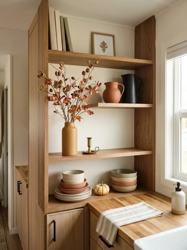
Open shelves can turn seasonal décor into visual clutter quickly because every object competes on the same exposed plane.
The fix is not necessarily fewer shelves or expensive new accessories. Change the height rhythm.
Choose one shelf to carry the tallest fall element—a narrow vase with branches, a framed print, or a taller piece of pottery. Let another shelf stay much lower, perhaps with two mini pumpkins beside an everyday stack of dishes. A third level can hold almost nothing seasonal.
That unevenness matters. When every shelf contains objects of similar size and equal fullness, the eye reads the entire wall as one busy block. Different heights create pauses and give individual pieces clearer roles.
A useful shelf sequence might be:
- Anchor shelf: one tall shape plus one or two lower companions.
- Quiet shelf: mostly everyday items with a single seasonal accent.
- Support shelf: medium-height pieces with visible space between them.
Avoid running the same dense leaf garland across every shelf. Repeating one orange band three times can overwhelm a compact kitchen or bathroom.
Stand several feet away when you finish. The shelves should form an irregular visual rhythm—not three identical fall displays stacked vertically.
7. Swap Printable Fall Art Into Frames You Already Have
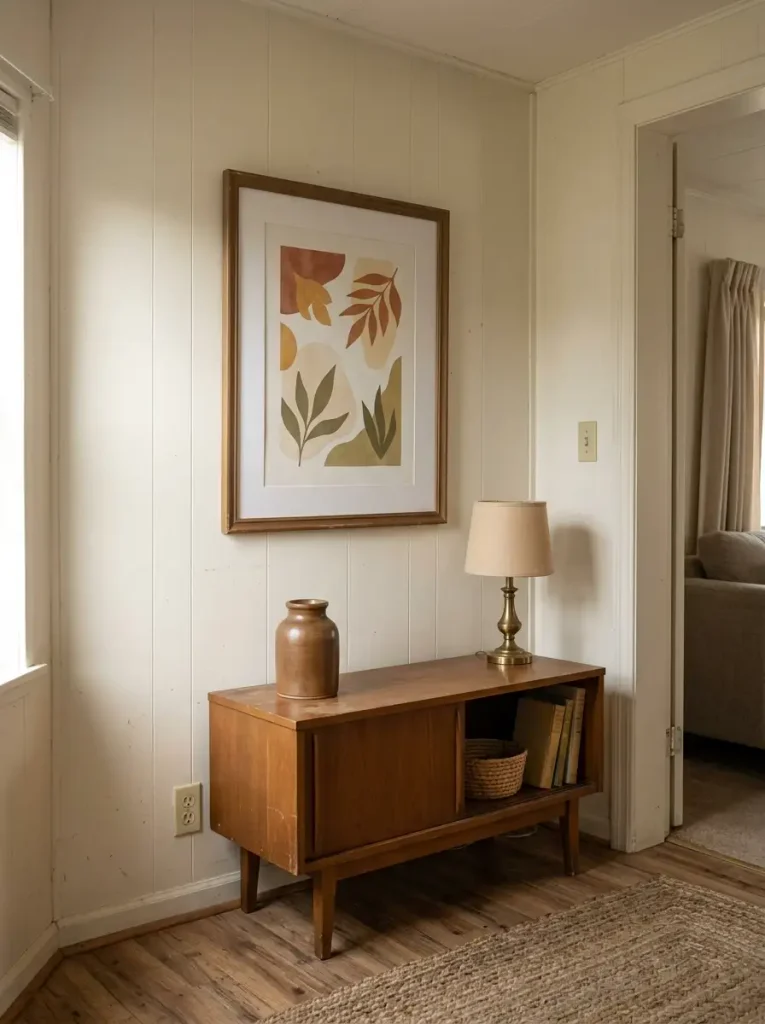
Cheap seasonal signs can add up fast, especially when you buy a different one for the kitchen, hallway, living room, and bathroom.
Existing frames give you a better starting point.
Remove the everyday print temporarily and insert inexpensive printable artwork, a pressed-leaf composition, a vintage-style botanical, or even a piece of patterned scrapbook paper in autumn colors. Because the frame already relates to your furniture and permanent finishes, the new image feels connected to the room immediately.
The biggest decision is scale.
A single 11×14 or 16×20 print can have more wall presence than several tiny seasonal signs. From across a mobile-home living area, larger simple artwork also remains readable while small typography-heavy pieces often disappear into visual noise.
Keep your strongest seasonal artwork where it can be seen from a normal walking path: above a console, beside the dining nook, or on a kitchen wall visible from the living room.
There is no need to change every frame in the house. One noticeable seasonal image can establish the theme; your other décor can support it quietly.
When fall ends, slip the printable behind the everyday artwork and reuse it next year.
8. Build a Tiny Fall Kitchen Capsule on a Cutting Board or Tray
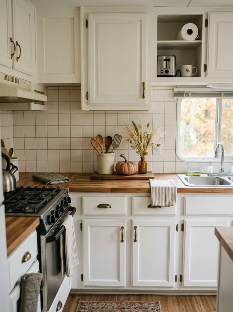
Kitchen counters need to work harder than almost any decorative surface in a mobile home.
That is why a fall vignette should be designed to move, not just look pretty.
Pick a cutting board, shallow tray, or narrow wooden board that fits comfortably against the backsplash. Decide how much counter you are willing to give up before choosing any accessories. On a compact counter, a narrow footprint is usually enough for one small vessel, one seasonal object, and something already useful in the kitchen.
Think of it as a movable capsule:
Base + useful object + seasonal cue = finished vignette.
A coffee jar beside a tiny pumpkin and a few dried stems can do the job. So can a utensil crock paired with one warm-toned mug and a miniature branch arrangement.
The practical test comes at dinner time. You should be able to lift the entire display away in one motion when you need additional prep space.
Keep it clear of the stove, sink splash zone, and frequently used outlets.
A kitchen vignette becomes successful when it improves the seasonal atmosphere without forcing you to work around it every day.
9. Use an Amber Bottle and Free Branches as a Tall Fall Accent
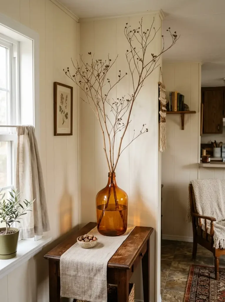
A warm amber bottle can make even bare branches feel seasonal.
Glass works differently from an opaque vase. When sunlight or a nearby lamp passes through brown or amber glass, the vessel develops its own glow. You can get a strong autumn effect without filling it with orange flowers.
Look around before shopping. Old beverage bottles, thrift-store jugs, jars, or inexpensive secondhand vases can all work. Then collect branches with interesting bends, dry seed heads, ornamental grasses, or fallen stems that are safe to bring indoors.
Wash or inspect anything gathered outside and allow damp material to dry completely.
Do not judge the arrangement by stem count. Three large branching stems may fill more visual space than fifteen short ones because the empty gaps between them become part of the silhouette.
For a console, dining area, or kitchen corner, try stems around one-and-a-half to two times the visible height of the vessel. Adjust from there based on ceiling height and furniture scale.
Once the outline feels expressive, stop.
An inexpensive autumn arrangement looks strongest when you can still see the shape of each branch against the wall behind it.
10. Let Fall Tea Towels Carry the Color in Working Rooms
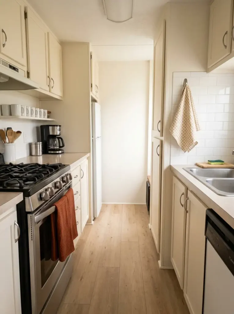
A kitchen does not require pumpkins on every counter to feel like fall.
Sometimes the most effective color is already built into the way the room functions.
Swap one or two everyday towels for burnt orange, cinnamon, ochre, olive, or a warm plaid. Place them where towels naturally belong: an oven handle, rail, hook, or basket. The seasonal color now appears at useful locations without consuming a single inch of work surface.
There is one common mistake: making every textile equally patterned.
A printed towel beside a plaid hand towel, patterned rug, checked curtain, and seasonal mat can turn a small kitchen into a collision of motifs. Give one pattern the lead and let the remaining textiles stay mostly solid.
For example:
- patterned tea towel + solid rust hand towel;
- solid ochre towel + subtle striped rug;
- muted plaid towel + cream or brown supporting textiles.
Choose washable pieces that can survive normal kitchen use. A towel that must stay pristine to look decorative is not earning its place.
The color should appear naturally through the room’s routine. That is what lets an inexpensive textile swap feel integrated with the kitchen instead of added on top of it.
11. Make a No-Sew Fall Table Runner From a Scarf or Fabric Remnant
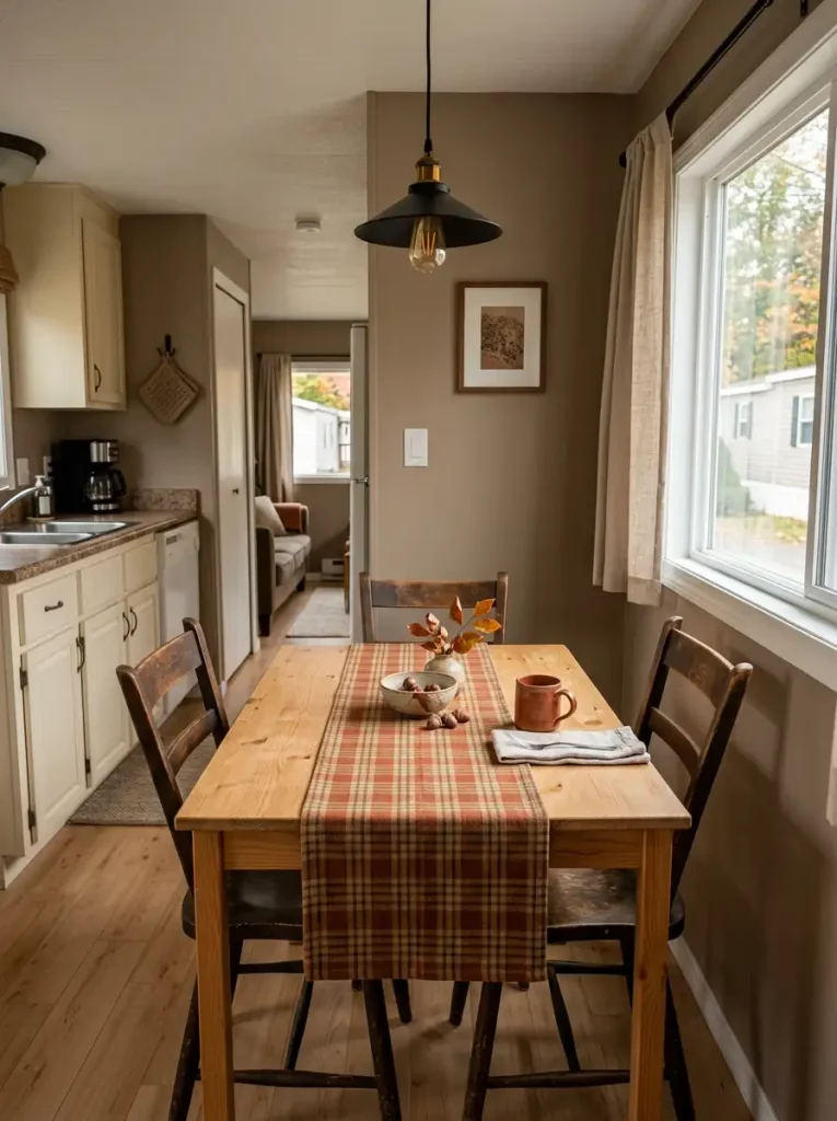
A compact dining table does not always need a centerpiece. Sometimes the table itself needs one strong horizontal line.
A long scarf, leftover fabric panel, thrifted curtain piece, or unused length of plaid material can become a fall runner with almost no work. Fold the raw edges underneath, press the fabric flat, and let enough tabletop remain visible on both sides.
A useful starting proportion is to keep the runner around one-third of the tabletop width. That leaves the table shape readable and prevents patterned fabric from taking over a narrow dining nook.
For example, a 36-inch-wide table often looks comfortable with a runner roughly 10–14 inches wide. Exact measurements matter less than the visual relationship.
Choose fabric according to the room:
Busy dining area: use a mostly solid rust, brown, olive, or ochre cloth.
Simple neutral room: a quiet plaid or small-scale check can supply the pattern.
Very small table: keep the runner short enough that long hanging ends do not brush chair seats or interfere with movement.
Here is the exception: if your tabletop has beautiful wood grain, do not hide too much of it. That exposed wood already contributes one of fall decorating’s strongest natural textures.
12. Wrap the Bathroom Mirror With a Removable Autumn Border
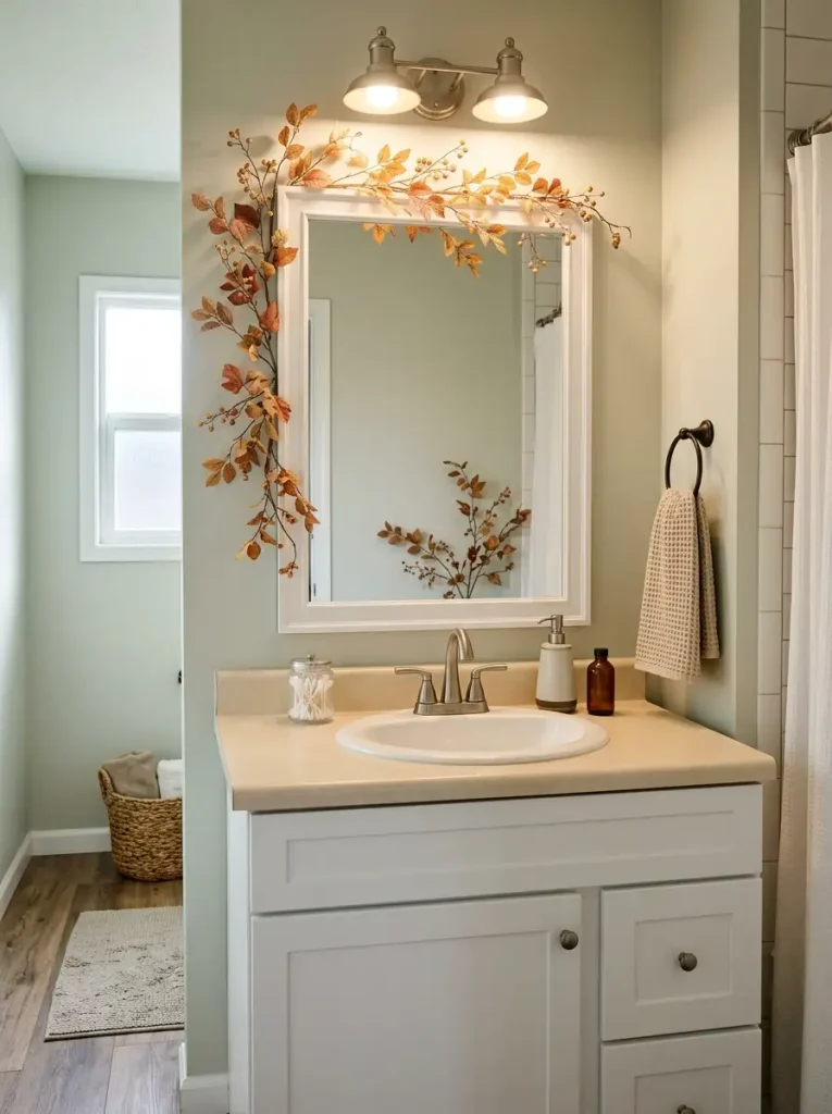
A bathroom vanity often has very little spare counter space, yet the mirror offers a large decorative perimeter that does not compete with toothbrushes, soap, or everyday grooming.
Use a lightweight faux vine, narrow fabric garland, preserved-looking leaves, or a flexible strand of autumn stems. Concentrate most of the material across one upper corner and let it taper as it travels down the side.
That asymmetry keeps the treatment lighter than a thick border around all four edges.
The mirror itself changes how much decoration you need. Leaves placed near the reflective edge appear again inside the glass from certain angles, effectively multiplying part of the arrangement. What looks sparse while you are holding the garland may feel much fuller once it is attached.
Before securing anything, check three practical areas: the light fixtures above, the edge you regularly clean, and any cabinet door that swings near the mirror.
Removable clear hooks or small adhesive clips keep the installation temporary.
Leave the vanity counter mostly open. The strongest benefit of decorating the mirror is that you gain a visible fall transformation without sacrificing the surface you actually use every morning.
13. Give the Bathroom One Fall Towel Color and Only a Few Tiny Accents
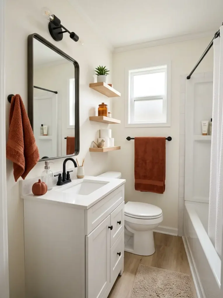
The bathroom is one room where seasonal decorating can become inconvenient faster than it becomes beautiful.
Every extra object placed beside the sink has to be moved when you wipe the counter. Every decorative basket collects dust. Items near the shower also deal with humidity that living-room décor never sees.
Put most of the seasonal effort into washable pieces.
Choose one towel color—burnt orange, cinnamon, deep mustard, muted olive, or warm brown—and repeat it through the hand towel, bath towel, or washcloths you already need. The color becomes part of the room’s function, which means it does not require extra surface space.
Then decide how many decorative objects the bathroom can realistically support.
- High-use family bathroom: one or two wipeable accents.
- Small guest bath: two or three small objects may be comfortable.
- Bathroom with open shelves: keep decorations away from the storage spots used for daily toiletries and spare towels.
Materials matter here as much as appearance. Washable fabric, sealed ceramic, glass, and smooth faux pumpkins are easier to maintain than delicate dried arrangements near moisture.
Spend the small budget on what survives real bathroom use.
If decorating makes cleaning noticeably slower, the room has already crossed its seasonal limit.
14. Stack Old Crates Vertically for a Small Fall Porch
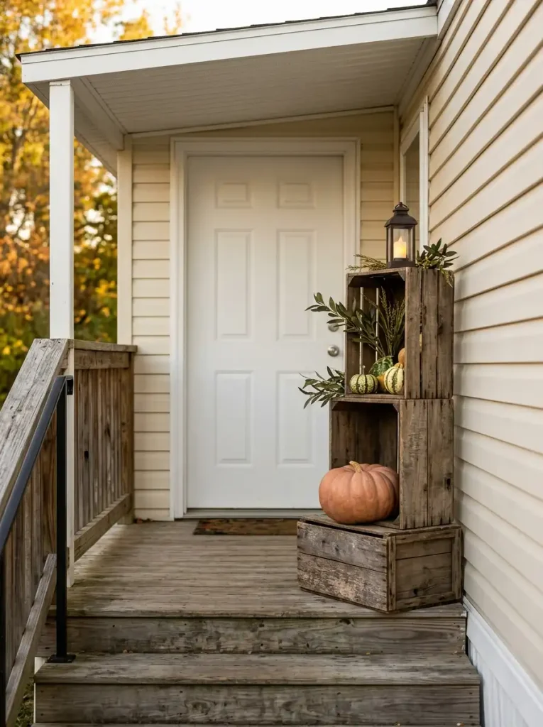
A narrow porch has limited floor area, so spreading pumpkins and baskets outward can leave the entrance looking festive but awkward to use.
Build upward.
Old wooden crates, sturdy boxes with a wood-look finish, or secondhand produce crates can become temporary display levels beside the door. The safest arrangement starts wide at the bottom and becomes shallower as it rises.
Use this order:
- Choose the side of the doorway with the least traffic. Open the door fully before placing anything.
- Set the widest, heaviest crate at the bottom. Its entire base should sit flat and stable.
- Add a second level with less depth. Offset it slightly so the arrangement feels layered but remains balanced.
- Place the largest pumpkin low. Weight close to the floor makes the display feel grounded.
- Finish higher with lighter objects. Small gourds, foliage, pinecones, or a battery lantern work better near the top.
Avoid building close to stair edges, handrails, electrical equipment, or a path where packages are usually placed.
The advantage of height is simple: three vertical feet of decoration can create substantial presence while occupying only a small patch of porch floor.
The entry should still feel easy to walk through with grocery bags in both hands.
15. Layer a Flat Rug Under the Doormat to Make the Entry Look Bigger
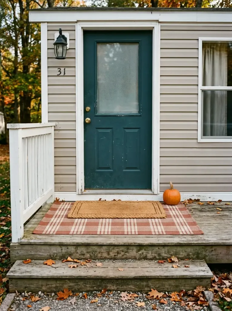
A small doormat floating alone in front of the door can make the entire entrance feel undersized.
Give it a broader foundation.
Place a thin outdoor-safe flatwoven rug beneath the existing mat so the lower layer extends several inches beyond it on the left and right. Plaid, narrow stripes, faded geometric patterns, or a muted rust-and-cream weave can add fall character without another pumpkin or sign.
The larger rectangle changes how the threshold is read. The doorway begins to connect visually with a wider section of the porch floor, which gives a narrow entrance more presence.
Scale the lower layer to the door first, then center the smaller mat on top.
You can test the idea without buying anything. A washable flat rug already used in a laundry room, enclosed porch, or mud area may work if the location stays dry and the backing is appropriate for the surface.
Safety takes priority here. Both layers must sit flat, resist sliding, and remain clear of stairs. Open the door several times to confirm that neither rug catches underneath it.
A good layered entry looks broader from several steps away and nearly disappears from your attention while you walk across it.
16. Bring In Free Fall Florals From the Yard
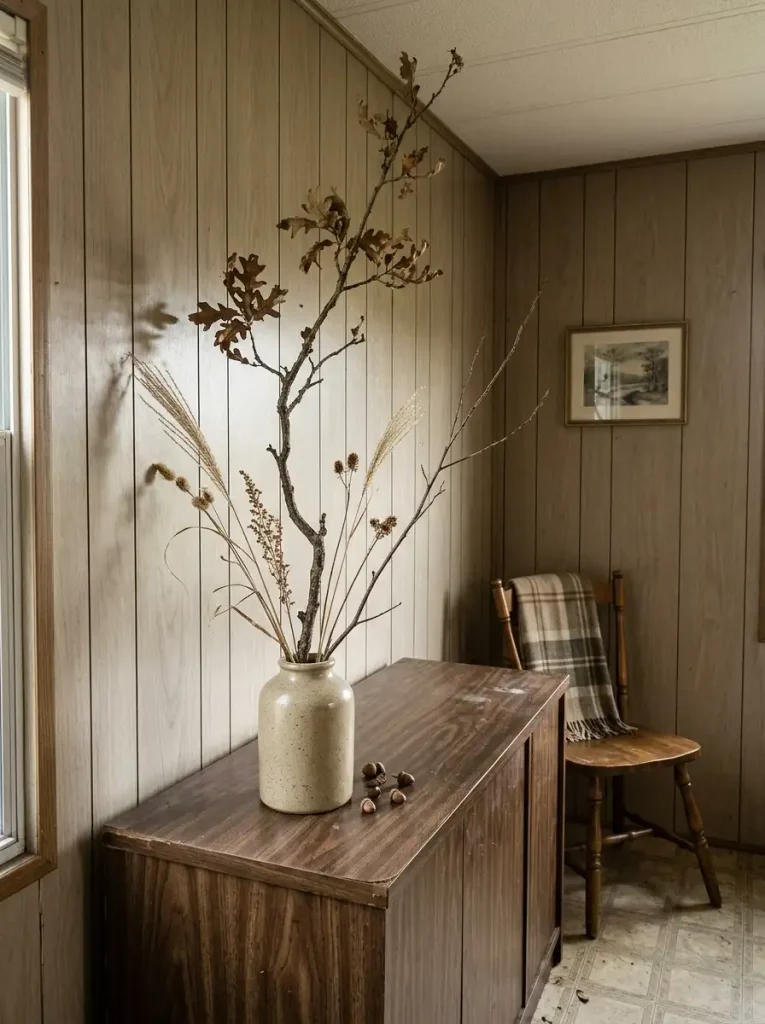
You may already have one of the best fall decorating materials growing outside.
A few branching stems, dried grasses, seed heads, or naturally changing leaves can fill more visual space than a store-bought bouquet—especially when the arrangement keeps its loose, irregular shape.
The trick is to look for silhouette, not quantity.
One crooked branch with several offshoots may contribute more to a room than a dense handful of short stems. The open spaces between those branches let the wall remain visible and make the arrangement feel larger without becoming visually heavy.
Before bringing anything indoors, inspect it carefully for insects, moisture, loose debris, or mold. Shake branches outdoors and allow damp stems to dry completely.
Then match the scale to the furniture beneath it. A tall arrangement works beautifully on a dining buffet or console, but it can overwhelm a tiny bathroom shelf or block a television sightline.
You can also mix free natural materials with one inexpensive faux stem if the real branches need a little color.
The finished arrangement should still look interesting when viewed as a dark outline from across the room. If the individual branch shapes disappear into one solid mass, remove a few stems and let the empty spaces do part of the decorating.
17. Turn Old Fabric Into No-Sew Mini Pumpkins
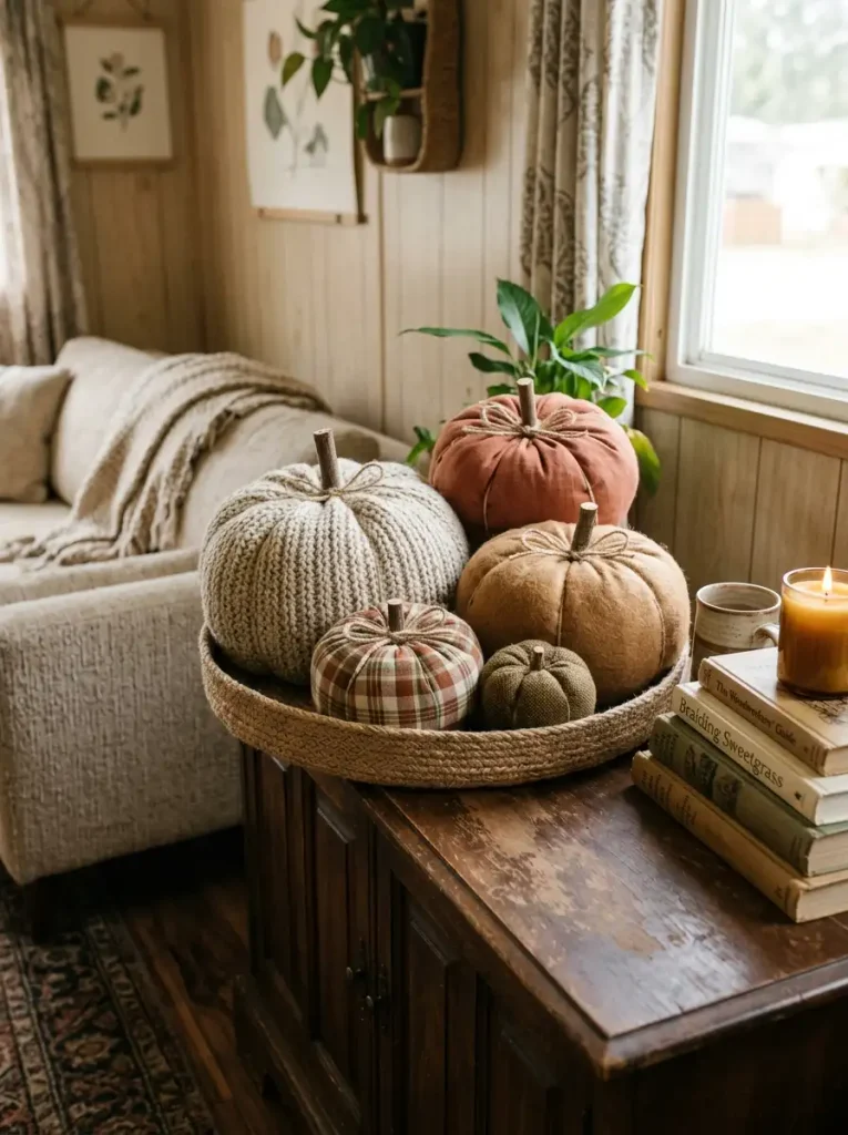
Homemade fabric pumpkins can look charming or strangely repetitive. The difference usually has less to do with sewing skill and more to do with scale.
The common problem is producing six pumpkins that are almost identical.
Same size. Same fabric. Same stem. Same shape.
Once they sit together, the group looks like a batch of craft pieces instead of a collected seasonal accent.
Use old socks, sweater sleeves, fabric scraps, or worn pillow-cover material to create a small family with deliberate variation. Stuff each piece with fiberfill, fabric offcuts, or another soft reusable filling. Tie or shape the sections with string, then add a twig, cinnamon-stick offcut, or rolled fabric stem.
The correction is simple: vary the size, but restrict the fabric family.
Try one larger pumpkin in textured cream, two medium pieces in rust or brown, and one or two tiny versions in a subtle plaid. Their forms relate, yet the arrangement still has movement.
Place them where small objects already make sense: inside a basket, beside books, along a console, or as support pieces around a larger fall focal point.
You do not need twenty.
Three to five well-scaled fabric pumpkins can serve the whole home, store flat enough to be practical, and cost almost nothing when the material comes from your own textile drawer.
18. Put Battery Candles Inside Lanterns and Jars for a Cheap Nighttime Glow
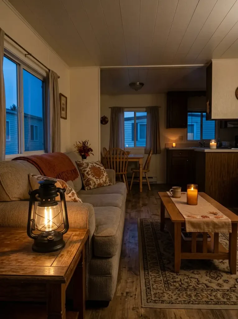
Fall décor that looks attractive at noon can almost disappear after sunset.
Ceiling fixtures solve visibility, but they illuminate the entire room evenly. A battery candle does something very different: it puts a small warm light source close to the floor, table, shelf, or porch surface.
That lower light introduces another depth layer.
Picture two rooms with identical inexpensive décor. In the first, everything relies on the overhead light. In the second, a small lantern glows beside the entry while an amber jar candle sits farther into the living room. The second space develops separate pools of light, so the eye travels through it.
Use warm battery-operated LEDs in existing lanterns, mason jars, amber glasses, or hurricane-style containers. Choose enclosed-looking arrangements if children or pets regularly pass nearby.
Avoid lining identical lights at equal distances. That can make the display look formal or holiday-like. One brighter grouping and one quieter glow farther away usually feels more natural.
Keep lights away from water, unstable ledges, loose fabric, and any container that traps heat contrary to the product instructions.
The real test happens after dark: switch off the ceiling fixture for a moment. Can you still see two or three gentle layers of the room? If so, a few inexpensive lights are doing far more than decorating the objects that hold them.
19. Concentrate Your Fall Decor Into Three Sightlines
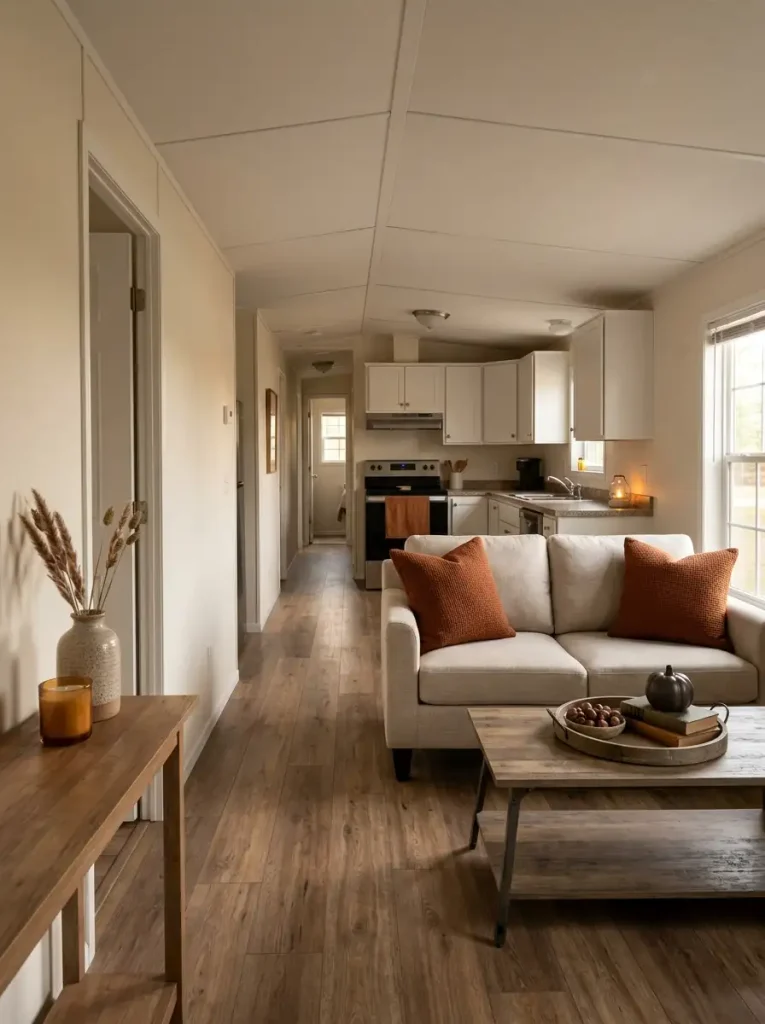
The cheapest whole-home fall makeover is not necessarily the one with the fewest decorations.
It is the one where the decorations you do own are seen often.
Walk through your mobile home along the route you use every day: front door to living room, living room to kitchen, kitchen to bedroom hallway. Notice where your eyes naturally land.
Pick three of those sightlines.
Sightline A — Arrival: something visible shortly after entering, such as the coffee-table vignette, an inexpensive print, or the reading corner.
Sightline B — Everyday center: the area seen most often while sitting or moving through the main room.
Sightline C — Secondary destination: kitchen, dining nook, bathroom doorway, or another frequently viewed zone.
Now distribute your strongest seasonal pieces across those three locations.
This is different from decorating every room equally. A guest bedroom with the door closed most of the week may not deserve the same fall budget as a kitchen visible from the sofa.
Connection also does not require matching objects. The living room might use rust pillows, the kitchen a cinnamon towel, and the entry warm lighting. A repeated color temperature can link those areas even when the décor categories change.
After placing everything, walk the route again.
If one viewpoint reveals five competing fall displays, remove or relocate the weakest one. If a long stretch feels seasonally empty, move an existing accent into that visual gap.
Your budget is working hardest when the home keeps revealing fall as you move through it.
Final Thoughts on Cheap Fall Mobile Home Decor
The best cheap fall mobile home decor does not come from filling every shelf, counter, and corner. It comes from knowing which small changes have the biggest visual reach.
Begin with the free moves: edit competing colors, gather branches, reuse frames, rearrange textiles, or choose the three sightlines you see most often. Then spend only where a small purchase solves a specific decorating problem.
A cozy mobile home can feel completely different with a few warm textiles, one strong focal point, seasonal texture, and thoughtful evening lighting.
Save your favorite ideas to Pinterest now, then start with the one room or sightline that will give you the biggest change for the smallest budget.