

A dated mobile home can make every improvement feel expensive because the eye notices several problems at once: old finishes, mismatched furniture, crowded surfaces, weak lighting, and rooms that do not quite connect. But mobile home decorating on a budget works best when those problems are separated before money is spent.
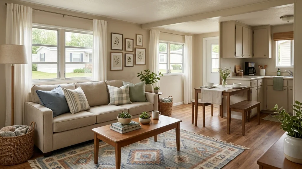
The smartest first moves are often surprisingly small. A sofa may need a better position, not replacing. A room may need fewer accessories, not more. One repeated color can connect the living room and kitchen more effectively than a cart full of unrelated décor.
The 31 ideas below are arranged in roughly the order I would test them: diagnose first, use what already exists, improve the largest visual surfaces, and spend selectively only where a purchase can make a meaningful difference.
You will also find decision tools throughout the guide to help you decide when to keep, move, repurpose, buy—or stop.
1. Start With the View That Makes the Whole Home Feel Dated
Before making a shopping list, stand at the entrance to the main living area and look toward the longest visible sightline.
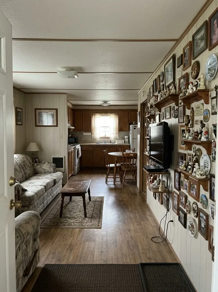
In many mobile homes, that single view can include part of the living room, dining area, hallway, or kitchen. That means several visual problems may appear together even when each room seems acceptable on its own.
Do not diagnose the whole house yet.
Find the one thing interrupting that view most.
It might be:
- a crowded TV wall
- mismatched window treatments
- an oversized furniture piece
- several competing wood tones
- exposed everyday clutter
- one strongly dated wall finish
Take a phone photo from the doorway and view it at a smaller size. Once tiny decorative details become less noticeable, the largest shapes and strongest distractions are easier to identify.
Budget rule: work on the problem visible from the greatest number of positions before spending money on a corner seen from only one seat.
That first diagnosis gives later purchases a job. If an item does not improve the priority view, it can probably wait.
2. Divide the Budget Into Four Jobs Before You Shop
A low price does not automatically make something a smart budget purchase.
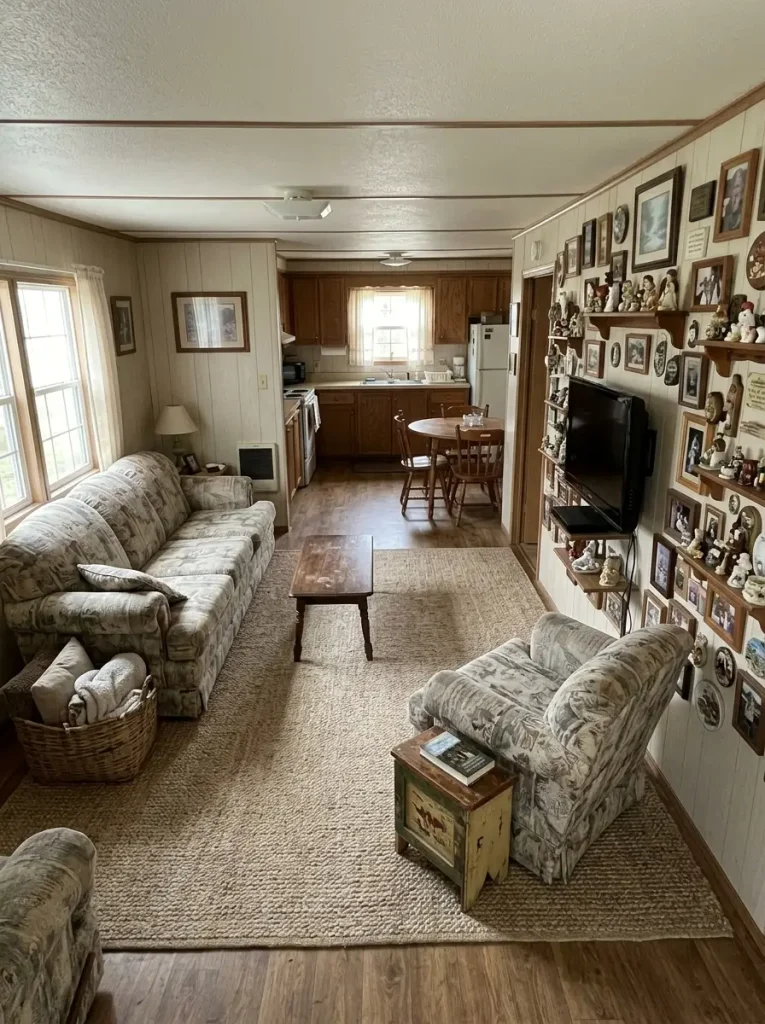
A cheap accessory with nowhere useful to go still consumes money and space, while moving an existing cabinet or editing a crowded surface could solve a bigger problem for free.
Use this decision tool before deciding what deserves the first dollar.
Give every dollar a job.
Select the problem that bothers you most. The sequence shows what to use first, what deserves attention next, and where spending can wait.
What is making the room feel unfinished?
Spend last. Edit first.
Clear one visible surface and remove duplicates from the main sightline.
Move useful items into closed storage, baskets, drawers, or another room.
Buy storage only after you know exactly what still needs a permanent home.
A new decorative object is unlikely to fix a room whose real problem is visual volume.
Find the finish with the widest visual reach.
Photograph the room and identify the dated surface visible in the most angles.
Test a cosmetic update on that surface or visually reduce its dominance.
Delay secondary finish changes until the first update proves they are still necessary.
One strategic surface can change the reading of several smaller features around it.
Coordinate before you replace.
Choose one existing color or material worth repeating across connected rooms.
Move matching textiles, art, pottery, or wood accents into the shared sightline.
Buy one bridging piece only if the rooms still look unrelated afterward.
Connection usually comes from repetition and editing, not from making every room identical.
Add one anchor before several fillers.
Choose the wall, rug, textile, lamp, or artwork that should carry the room’s personality.
Support it with two or three quieter pieces already in the home.
Shop only for the missing size, texture, or function—not generic filler decor.
A room can feel personal with very few objects when one of them has enough visual weight.
This becomes the budget filter for everything that follows: existing possessions get a chance to solve the problem before new décor enters the home.
3. What Can Change for $0? Clear, Move, Group and Rotate
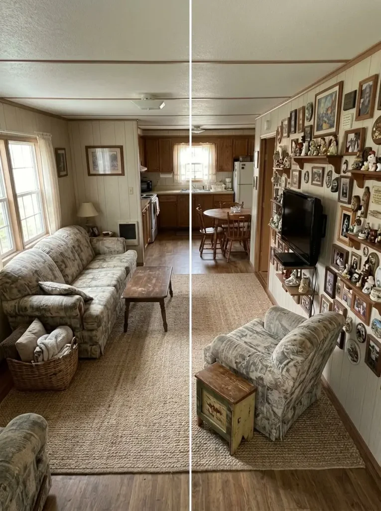
Imagine giving yourself one evening to improve the main living area without ordering anything.
That limitation is useful because it separates a styling problem from a purchasing problem.
Try the work in this order:
- Clear one countertop, side table, or TV console completely.
- Move furniture that interrupts the main walking route or useful window.
- Group small decorative pieces into one intentional arrangement instead of scattering them.
- Rotate art, lamps, baskets, throws, books, and plants between rooms.
Then stop.
Walk away for a few hours and photograph the space again before putting anything back.
If the room already feels calmer, placement and visual density were part of the original problem.
If it now looks cleaner but genuinely bare, the edit has revealed something equally useful: the exact gap a future purchase needs to fill.
4. Move the Largest Piece Before You Replace It
A bulky sofa can feel like the obvious problem in a narrow living room, but scale and placement are different issues.
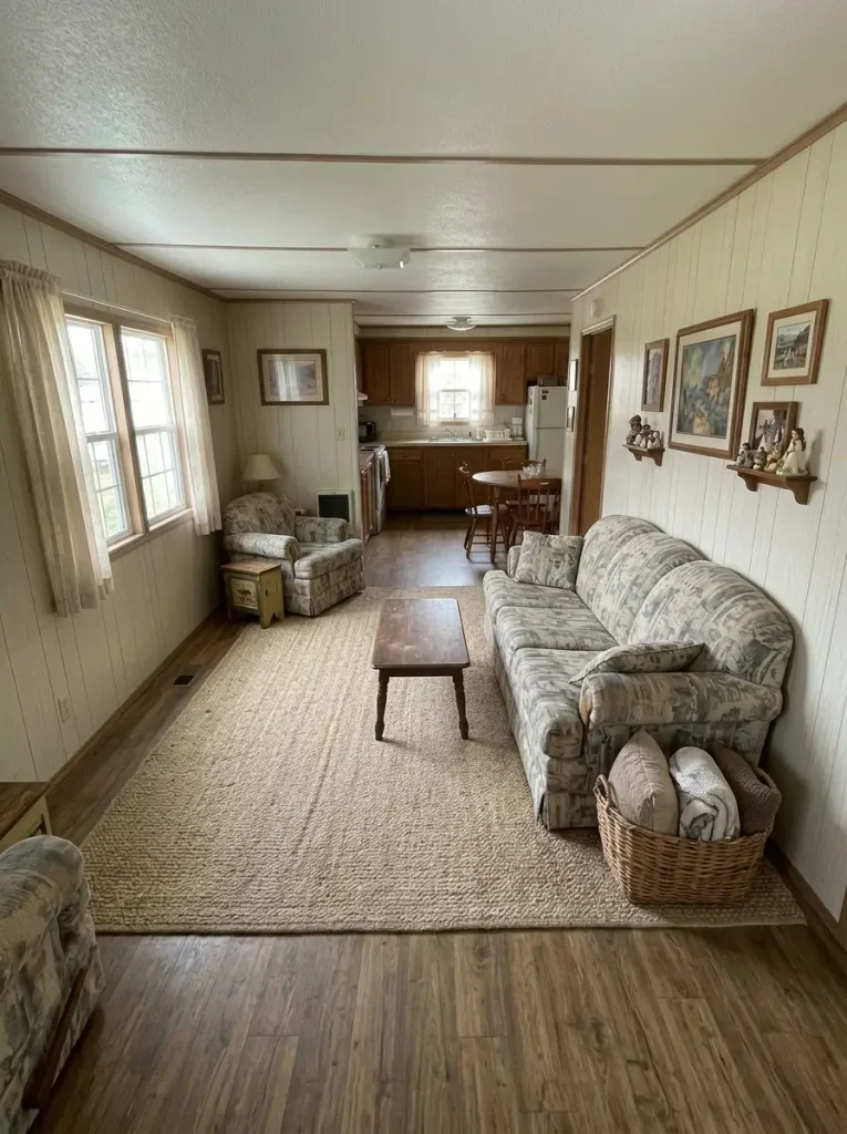
Consider a sofa positioned across the room with a tight passage between its arm and a doorway. Replacing it with something slightly smaller may improve circulation—but rotating the current sofa onto the long wall could produce a similar gain without spending anything.
Before deciding that furniture is too large, test three questions:
Can the main walking route pass beside it without weaving?
Does the piece block a useful window, doorway, or connected-room view?
Does its orientation create a usable zone or divide the room into awkward leftover spaces?
If repositioning solves two of those problems, keep the furniture for now.
For deeper room-specific arrangements, continue with the mobile home living room ideas guide. If the home is specifically a narrow single-wide, the single wide mobile home decorating ideas guide provides a more specialized continuation.
Make the purchase decision after the movement test.
5. Let One Focal Point Win in the Living Area
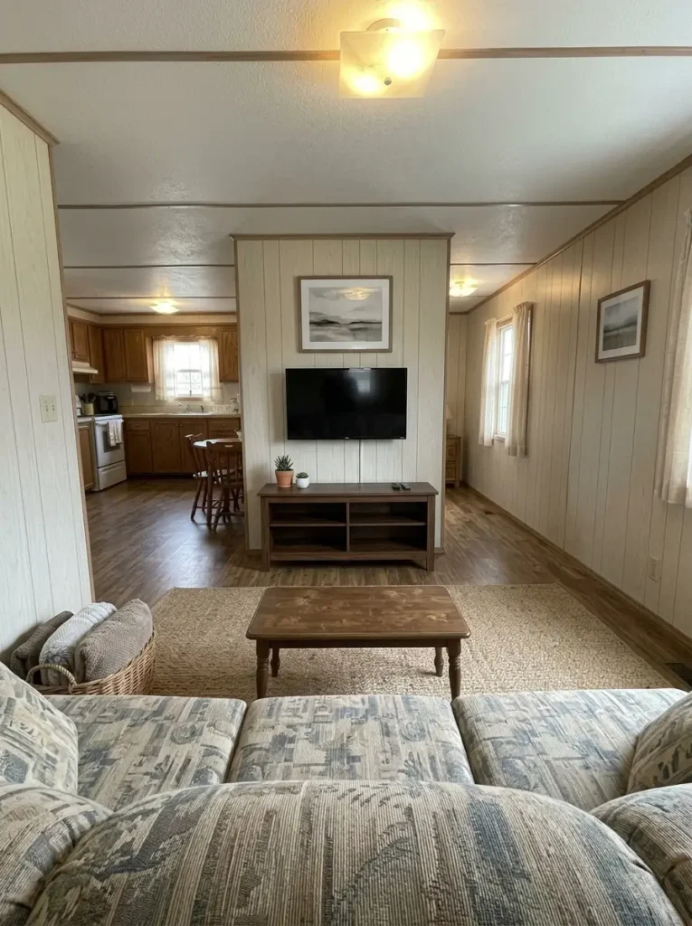
Which feature gets your attention first when you sit down?
In a budget living room, that answer can become unclear because the television, gallery wall, oversized clock, shelving, curtains, decorative signs, and accent colors are all competing at similar intensity.
A stronger room does not need every feature to be impressive.
| Competing room | Clearer room |
|---|---|
| TV + clock + signs + crowded shelves | TV supported by one quieter composition |
| Several equal accent colors | One dominant accent with smaller echoes |
| Every surface decorated | One or two visibly calm surfaces |
| Many tiny focal moments | One obvious visual anchor |
Choose the feature that deserves to lead from the main seating position.
Then remove, relocate, or visually quiet at least one nearby competitor.
This matters in a compact room because objects have less physical distance between them. A clearer hierarchy lets the eye settle.
Decision test: if removing one object makes the focal area noticeably stronger, that object was probably not earning its place.
6. Carry One Color Thread Through Connected Rooms
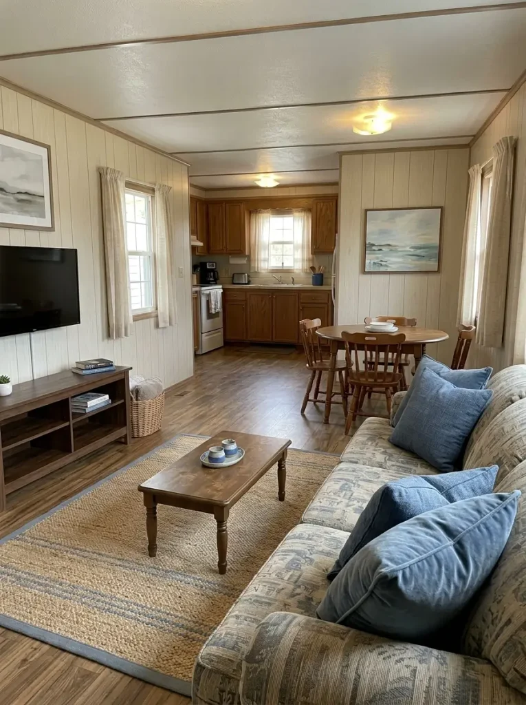
Two inexpensive rooms can look more coordinated than two expensive rooms when their color relationship is deliberate.
Start with something already visible in a major surface—a rug, sofa, curtain, cabinet tone, artwork, countertop, or upholstered chair. Choose one color worth repeating, then give it a different visual role in each connected zone.
One color. Three different jobs.
Choose a color already visible in the home, then repeat it at decreasing intensity as the sightline moves from one zone to the next.
Living room
Let dusty blue appear in the largest textile, such as the rug or two substantial pillows.
Dining area
Repeat it once in artwork, a runner, or seat textile—enough to register from the living room.
Kitchen
Use one smaller object such as a crock, towel, or print so the color connects without taking over.
Kitchen
Use muted sage where an existing cabinet, runner, art print, or larger accessory already gives it weight.
Dining area
Carry the hue into napkins, chair cushions, pottery, or botanical artwork.
Living room
Repeat a smaller sage note through a pillow, plant pot, book spine, or framed print.
Living room
Give warm clay one substantial role through a throw, rug motif, artwork, or upholstered accent.
Dining area
Repeat it in terracotta pottery, a textile detail, or a warm wood-and-clay centerpiece.
Kitchen
Use only a small warm accent so the kitchen remains visually calmer than the main seating area.
The useful distinction is anchor, support, echo.
Repeating the same hue with equal intensity everywhere can feel themed. Changing its visual weight allows adjoining rooms to feel related without making them identical.
7. Paint the Highest-Impact Surface, Not Every Wall
Paint can be relatively affordable, but repainting an entire home is still a considerable project when only one surface is carrying most of the dated feeling.
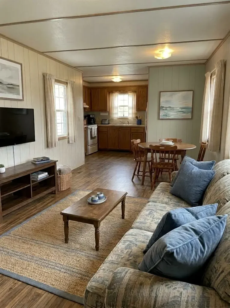
Return to the main sightline from Idea #1.
Which wall occupies the largest uninterrupted area in that photograph?
That is a better place to test change first.
In the living room, it may be the television wall. In an open kitchen, it could be a wall visually connecting the cabinetry and dining area. In a bedroom, the bed wall may carry more weight than three smaller walls combined.
Large surfaces are read before little accessories, which gives a targeted paint change considerable visual leverage.
Sample the most influential wall and observe it through both daylight and evening light.
Stop if the surrounding finishes suddenly look quieter.
There is little value in automatically continuing into every room once the main problem has already been solved.
8. Make Basic Windows Look Finished With Smarter Curtain Placement
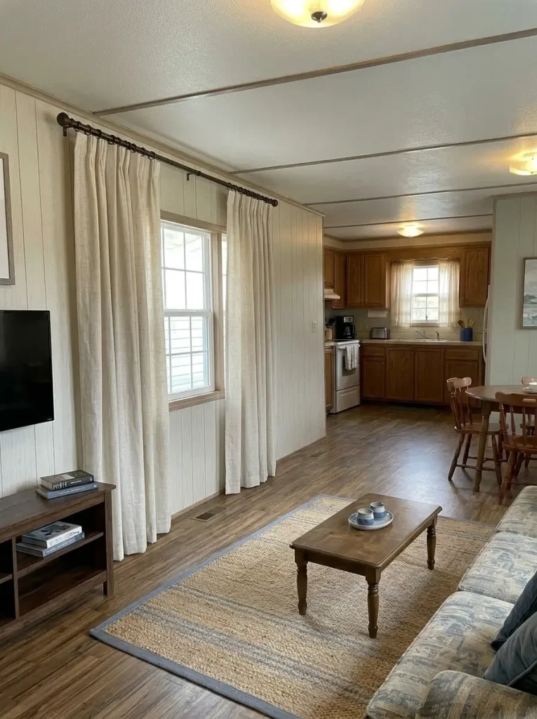
An ordinary window can look smaller when curtains stop tightly at its edges.
The budget correction may be a proportion change, not new fabric.
Visually raising the curtain treatment and allowing it to extend beyond the glass can give the opening more presence while creating stronger vertical lines in the room.
Before buying new panels, experiment with what you already own.
Temporarily hold the existing curtain farther outside the window frame and photograph the room from the doorway.
Compare the two versions.
If the window suddenly reads as a more substantial architectural element, you have discovered a placement problem rather than a fabric problem.
Use quieter fabric when nearby walls already carry pattern or texture. If the room itself is restrained, a subtle woven textile may supply enough softness without requiring another decorative layer.
The purchase becomes easier to judge once the proportion is right.
9. Refresh the Sofa With Washable Textile Layers
An unfashionable sofa color does not automatically mean the sofa should leave.
If the frame remains comfortable, the upholstery is usable, and the scale fits the room, textiles can change how the piece participates in the palette.
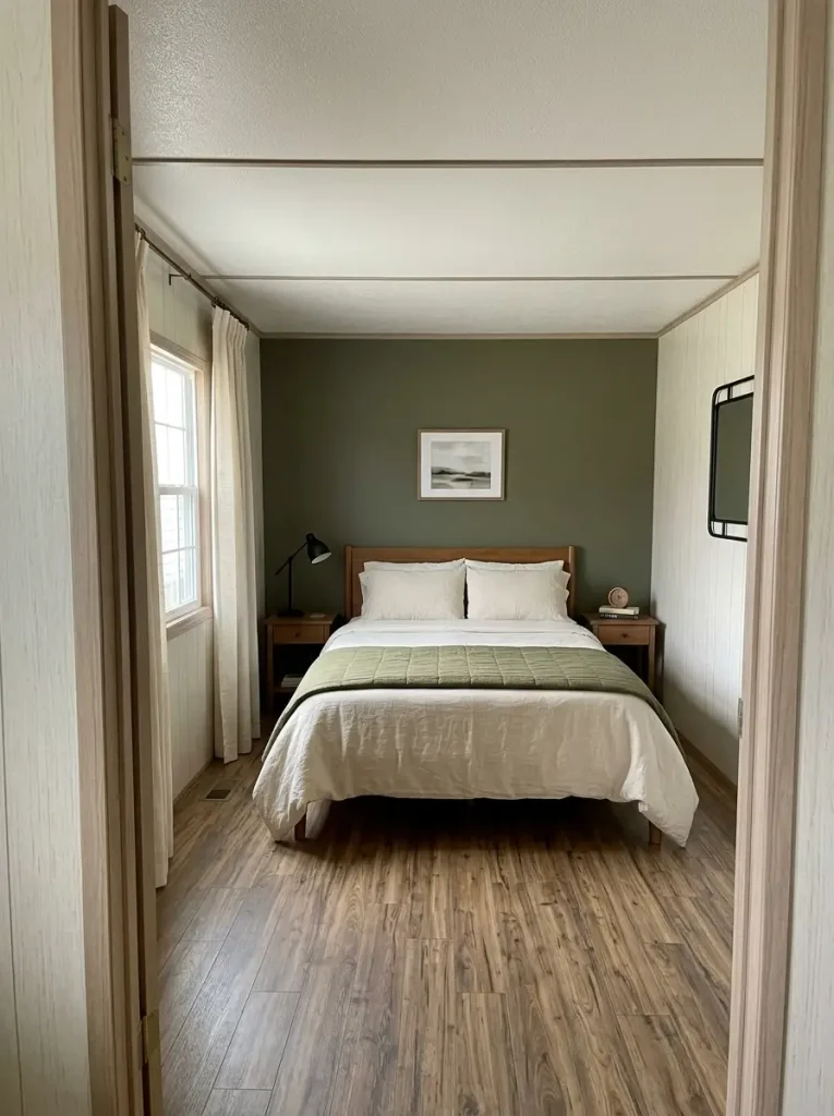
Try a restrained combination:
One larger throw to interrupt a broad expanse of upholstery.
Two substantial pillows to introduce the room’s main accent.
One smaller contrasting texture if the arrangement still needs depth.
Avoid filling the entire sofa with decorative cushions. In a compact living room, that reduces actual seating while increasing visual volume.
Judge the piece again once the surrounding rug, pillows, throw, and wall composition are working together.
When the sofa still functions well, styling deserves a chance before replacement.
When the issue is comfort, condition, or genuinely incompatible scale, decoration is no longer the right solution—and replacement becomes easier to justify.
10. Let One Better Rug Do the Work of Five Small Accessories
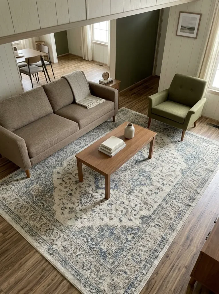
A common budget mistake is dividing the same amount of money across several tiny objects because every individual purchase feels inexpensive.
One correctly scaled rug can influence much more:
- exposed floor area
- furniture grouping
- room color
- softness
- visual zoning
- the transition into adjoining spaces
In a mobile-home living area, the rug should relate to the seating group, not behave like an isolated mat beneath the coffee table.
Before purchasing, mark the proposed footprint with painter’s tape, spare sheets, newspaper, or anything temporary.
Stand in the doorway.
Look at the relationship among the sofa, chairs, walkway, coffee table, and connected room.
If the larger footprint visually pulls the furniture together without squeezing circulation, the rug may be worth prioritizing over several decorative accessories.
If the taped area crowds the route, resize before spending.
11. Replace a Scatter of Small Wall Decor With One Strong Composition
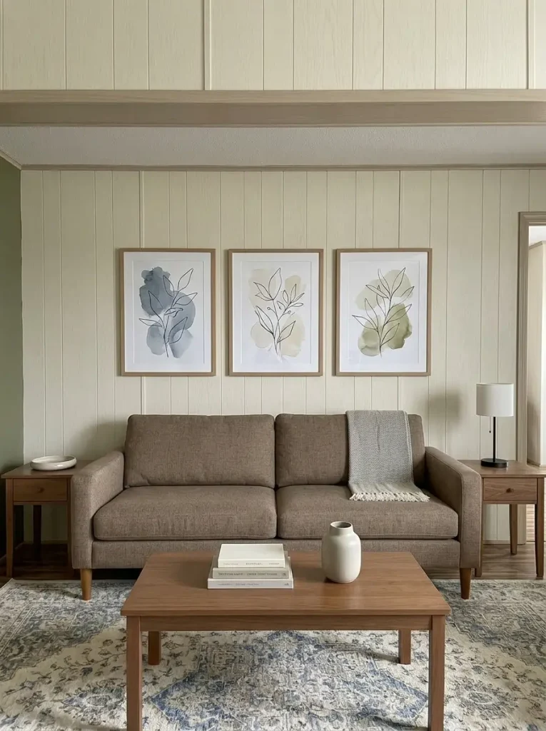
Wall clutter often grows gradually.
A small sign appears above the television. Then a clock. Then several frames. Then another decorative piece fills the remaining gap.
Each item may be fine individually while the full composition becomes difficult to read.
Use the room itself to decide which wall strategy fits.
What does the wall need: less, order, or one stronger anchor?
Give the wall breathing room.
Remove most small pieces and keep one quiet element—or leave the wall temporarily empty. The stronger furniture or media zone below can carry the composition.
Turn the collection into a single shape.
Use consistent spacing and a shared outer boundary so several frames read as one composition. Mismatched frames can still work when their arrangement is controlled.
Use one larger visual statement.
A larger artwork, textile, mirror, or tightly edited pair can carry more visual weight than several small objects floating independently.
You may already own enough wall décor.
The missing ingredient could simply be composition.
12. Build a Collected Gallery Wall From Thrifted Frames
A gallery wall does not require matching frames, but it does need enough structure for the collection to feel deliberate.
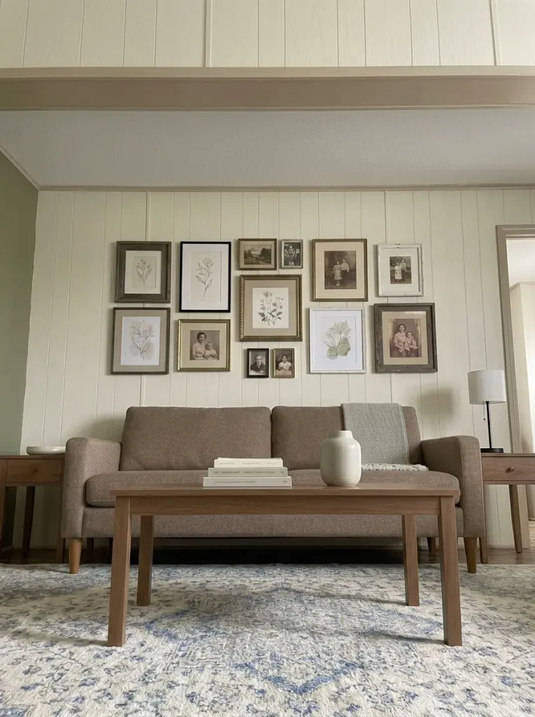
Begin with the images you actually care about—family photographs, botanical prints, travel photos, sketches, postcards, or affordable printable artwork—and search for secondhand frames that suit those pieces.
Use one purchasing rule:
Buy for a known image, not because the frame itself is cheap.
If frame finishes differ, unify the arrangement another way. Repeated mat color, consistent spacing, or an orderly outer boundary may provide enough connection.
Lay the complete grouping on the floor before hanging.
Step back.
Photograph it.
Remove the weakest element.
If the arrangement becomes stronger, leave that frame out.
A collected wall should feel like a story assembled over time. It does not need to occupy every available inch simply because more inexpensive frames were available.
13. Put Mirrors Where They Return Light, Not Clutter
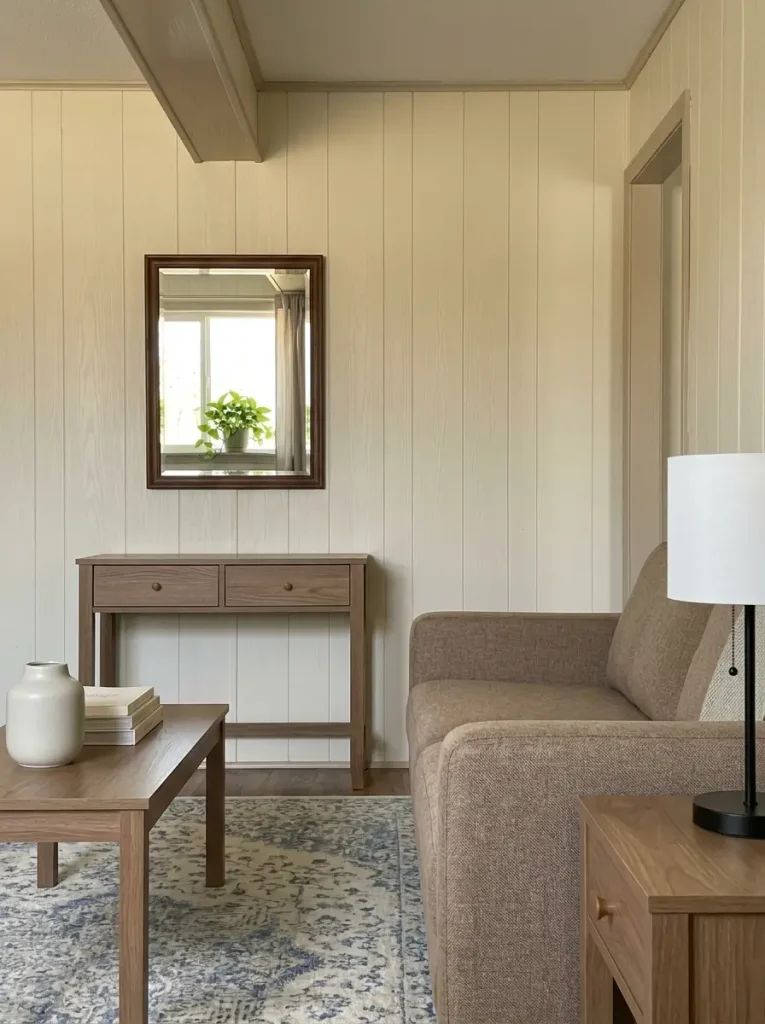
A mirror repeats whatever sits opposite it.
That simple fact should determine placement before appearance does.
A beautiful mirror facing television cables, an overflowing shelf, a utility doorway, or a crowded kitchen counter can effectively duplicate the busiest part of the room.
Before mounting one, hold the mirror temporarily at the intended position and inspect the reflection from the places where you actually sit and walk.
Ask one question:
What is this mirror adding to the view?
A window, greenery, artwork, lamp, or calm adjoining room can be worth repeating.
Clutter usually is not.
That means an inexpensive mirror in the right location can outperform a statement mirror placed where the reflected view works against the room.
If the reflection remains unattractive from the important viewpoints, use artwork or a quieter wall treatment there.
The decorative value comes from the returned scene, not the frame alone.
14. Lower the Evening Light Before Buying More Decor
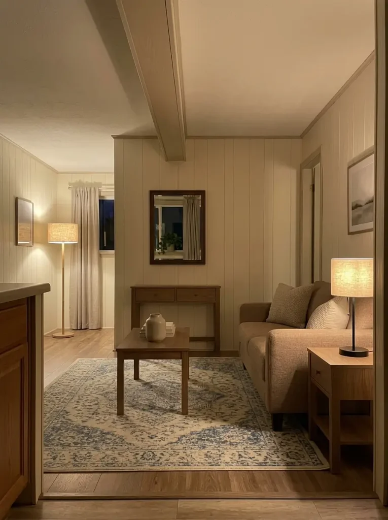
Stand in the living area after dark and turn the overhead light off for a moment.
What disappears?
A room that works reasonably well during daylight can become flat at night when nearly all illumination comes from one ceiling fixture.
The instinct may be to add candles, artwork, pillows, and accessories even though the missing ingredient is actually light at a lower level.
Test lamps you already own first.
Place one close to the sofa or reading chair and another farther into the room so illumination develops depth.
Then reassess the décor.
Textiles, artwork, plants, ceramics, and wood often become more dimensional under softer side lighting. Objects that appeared plain beneath strong overhead illumination may suddenly feel warm enough.
If the room feels finished once the lighting changes, stop decorating.
A nighttime problem should be diagnosed at night.
15. Hide Daily Clutter in Storage That Already Looks Like Decor
Storage is particularly valuable in a compact home when one object can solve both a functional problem and a visual problem.
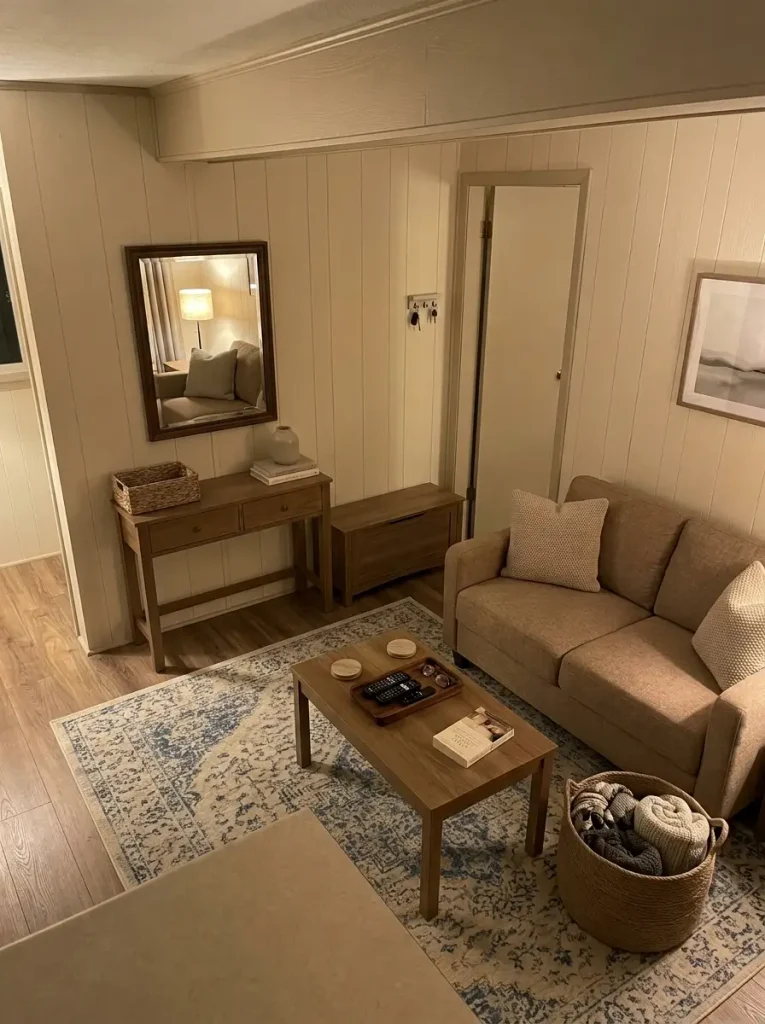
The danger is adding containers everywhere until the storage itself becomes clutter.
Start with the behavior causing the mess.
Store the routine where the mess actually happens.
Select the zone where clutter repeatedly returns. The recommendation changes according to the behavior creating the pressure.
Where does clutter rebuild fastest?
A container earns its place when it supports a real routine.
Buying baskets first and deciding what to put inside them later reverses that logic.
16. Make the Dining Nook Earn Its Footprint
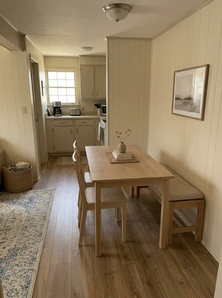
A mobile-home dining area often does more than host formal meals.
It may also work as a homework station, coffee spot, craft table, laptop surface, or overflow kitchen workspace.
Decorating it as if its only purpose were dinner can waste valuable space.
Begin with the routine.
If two people use the table most days, six permanent chairs may not need to occupy the room. Occasional seating can potentially live elsewhere until required.
A bench may keep one side visually quieter, but only where getting in and out remains comfortable. A narrow table may make more sense when the primary walking route passes closely beside it.
Ask:
Does this setup support the activity that happens most often without making the kitchen or living-room route harder?
If the answer is no, adjust the furniture footprint first.
Centerpieces can wait.
17. Style the Table for Daily Life, Then Add One Decorative Layer
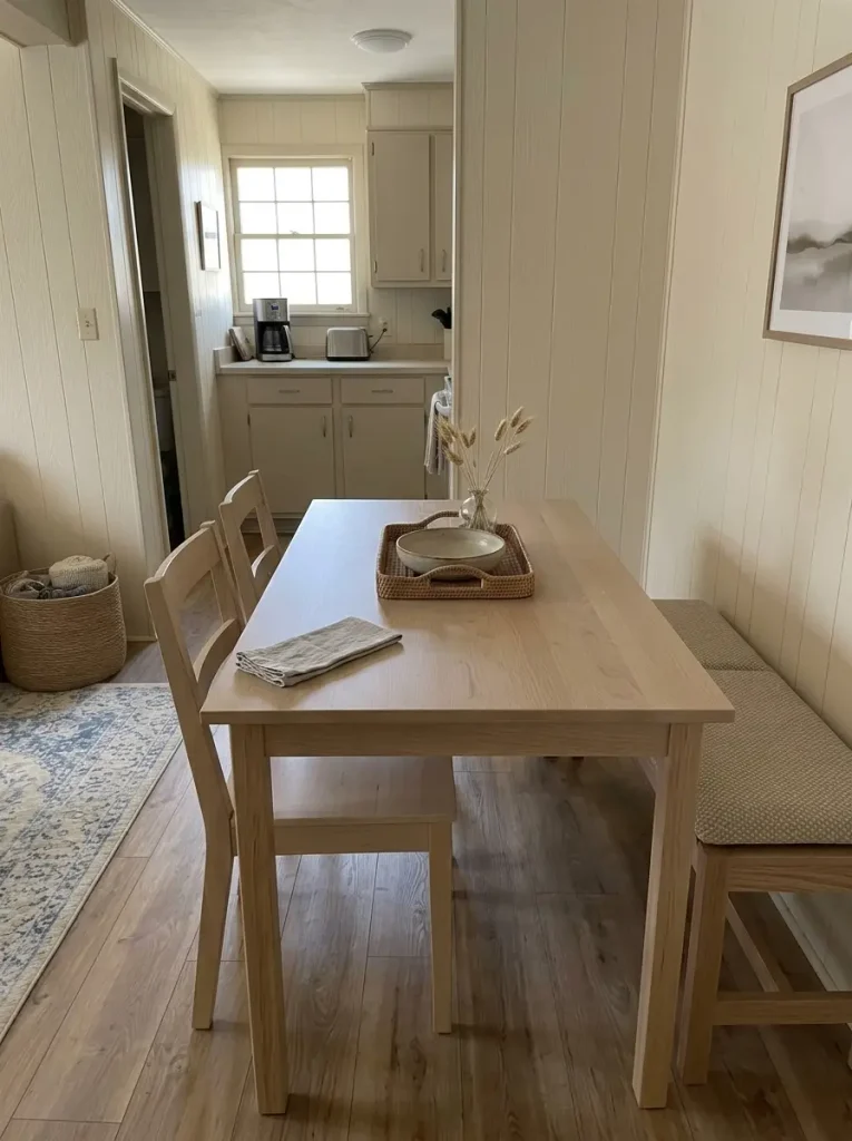
A dining table that looks good only when nobody uses it is not working particularly well.
Leave the center empty for one ordinary day.
Notice what naturally arrives there:
mail, laptop, fruit bowl, water bottle, homework, keys, or serving items.
That tells you how much clear surface daily life genuinely requires.
Once that requirement is visible, add one easy-to-move decorative layer: perhaps a low vase, bowl, tray, small plant, or runner.
Keep the scale low enough that people can see and reach across the table comfortably.
A tray can be especially useful when several small daily objects belong together because it lets them behave like one movable unit.
If the centerpiece needs to be dismantled every time someone eats or works, simplify it.
Budget decorating becomes easier once pretty surfaces remain genuinely usable.
18. Give the Kitchen One Clean Focal Zone Without Remodeling
Kitchen counters accumulate objects because nearly everything on them has a practical justification.
Yet ten individually useful things can still read as clutter when they are distributed across every horizontal surface.
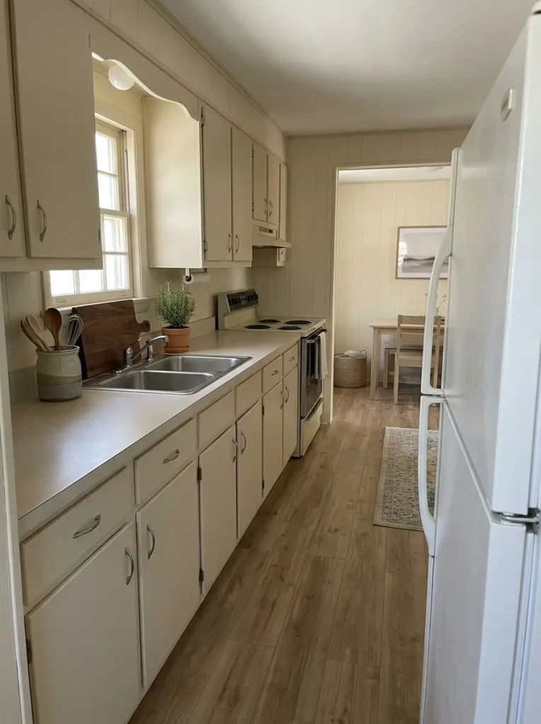
Choose one decorative-functional focal zone—perhaps next to the range, near the sink, or at one end of the counter—and let that area hold the few visible items worth seeing.
For example:
wooden board + utensil crock + one plant
can become a deliberate composition.
Backup canisters, duplicate appliances, unopened packages, and miscellaneous bottles do not all need to participate.
Then leave another section of counter noticeably quieter.
The contrast strengthens the intentional zone.
If you are considering paint, cabinet work, backsplashes, hardware, or larger cosmetic changes, continue with the mobile home kitchen makeover on a budget guide.
For decorating purposes, test styling first and reserve remodeling for problems styling cannot solve.
19. Treat Cabinet Hardware as a Small Accent, Not a Full Makeover
New knobs and pulls can sharpen a kitchen visually, but hardware cannot rescue every cabinet problem.
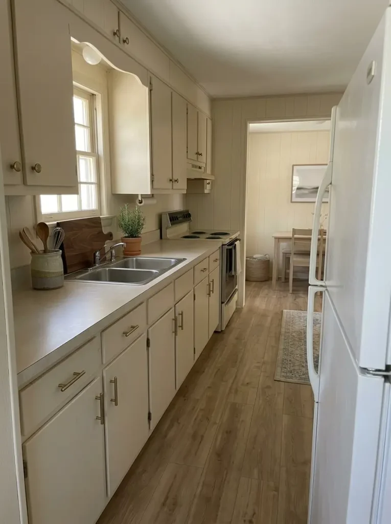
It makes the most sense when the doors are already serviceable and the room mainly needs a consistent finishing detail.
Delay that purchase when the stronger distraction is:
- several competing cabinet finishes
- damaged doors
- heavy countertop clutter
- a dominant wall pattern
- crowded open storage
- an awkward kitchen composition
Hardware works best once the broader cabinet field is quiet enough for a small detail to register.
Photograph the kitchen and mentally remove the existing handles.
Do the cabinets themselves still dominate the image for unrelated reasons?
If yes, changing pulls should not be treated as the entire makeover.
Spend proportionally to the problem.
A small accent deserves a small job.
20. Reset the Bathroom With Textiles Before Touching the Fixtures
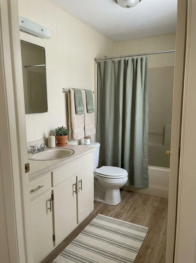
Bathrooms can look dated because several permanent-looking elements sit close together: vanity finish, mirror, flooring, wall treatment, shower curtain, towels, and hardware.
That density can make renovation feel inevitable.
Before reaching that conclusion, change the soft visual layer first.
Remove the existing shower curtain, towels, bath mat, countertop décor, and visible extras.
Then rebuild the room around a simpler palette using a few coordinated textiles and the necessities that genuinely need to remain visible.
Textiles occupy a surprisingly large part of a small bathroom’s visual field. They can amplify dated fixtures or quiet them.
If a cleaner shower curtain, coordinated towels, and less countertop clutter significantly improve the space, you have learned that the fixtures were not carrying the entire problem.
For broader layout, storage, finish, and makeover ideas, continue with the mobile home bathroom ideas guide.
The textile test comes first because it is low-commitment and easily reversible.
21. Let Bedding Set the Bedroom Palette
In a compact bedroom, the bed is often the largest soft surface.
That gives bedding unusual decorative influence.
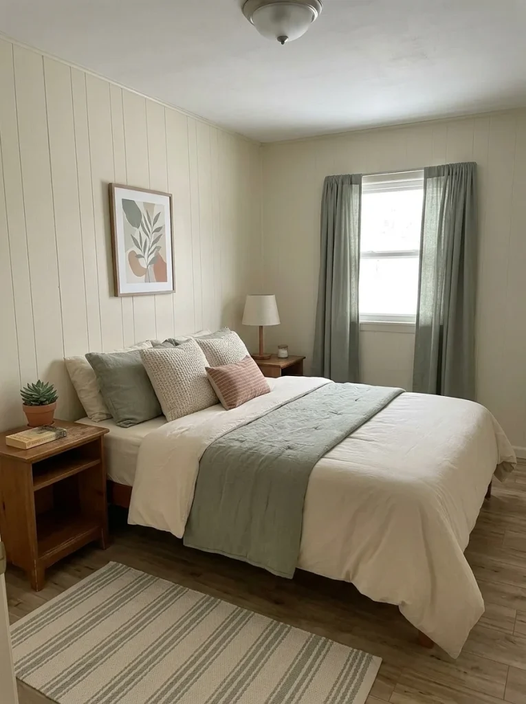
Instead of choosing curtains, artwork, lamps, baskets, and accessories independently, decide what the bed is doing first.
A calm foundation might use:
- one dominant neutral
- one secondary color
- one smaller accent
- two or three textures
Allow the rest of the room to borrow from that palette.
This keeps inexpensive purchases from becoming a collection of unrelated decorative objects.
It can also help older furniture feel more purposeful. A basic wood nightstand looks considerably more intentional when the bedding, lamp, and artwork around it share a coherent visual direction.
For deeper bedroom-specific color, furniture, focal-wall, and layout ideas, continue with the mobile home bedroom ideas guide.
Let the bed establish the visual language before the smaller objects begin speaking.
22. Make the Bed Wall Look Finished Without an Expensive Headboard
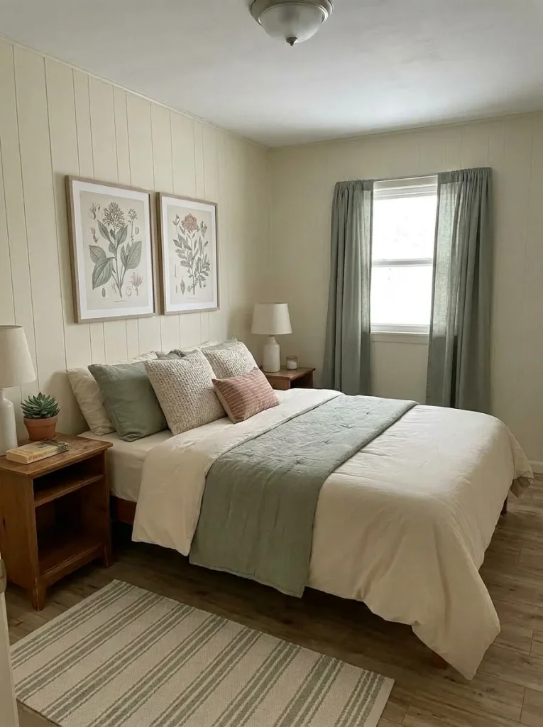
Suppose the bed feels lost against a large blank wall.
A new headboard is one solution, but it is not the only way to create visual structure behind the bed.
Try matching the intervention to what the room lacks.
Use a wide artwork or pair of prints when the bedroom already has enough textile texture.
Try a fabric or textile panel when the room needs softness.
Consider a narrow picture ledge when you own smaller pieces worth grouping.
Test a painted area behind the bed when the wall itself needs to become the visual anchor.
Whatever you choose should relate to the width and position of the bed instead of floating far above it as a separate object.
If one of these approaches gives the bed enough presence, a decorative headboard can remain optional.
If the bed needs one for actual physical support or comfort, that is a functional decision—and a purchase is easier to justify.
23. Give the Entry One Landing Spot for Keys, Shoes and Mail
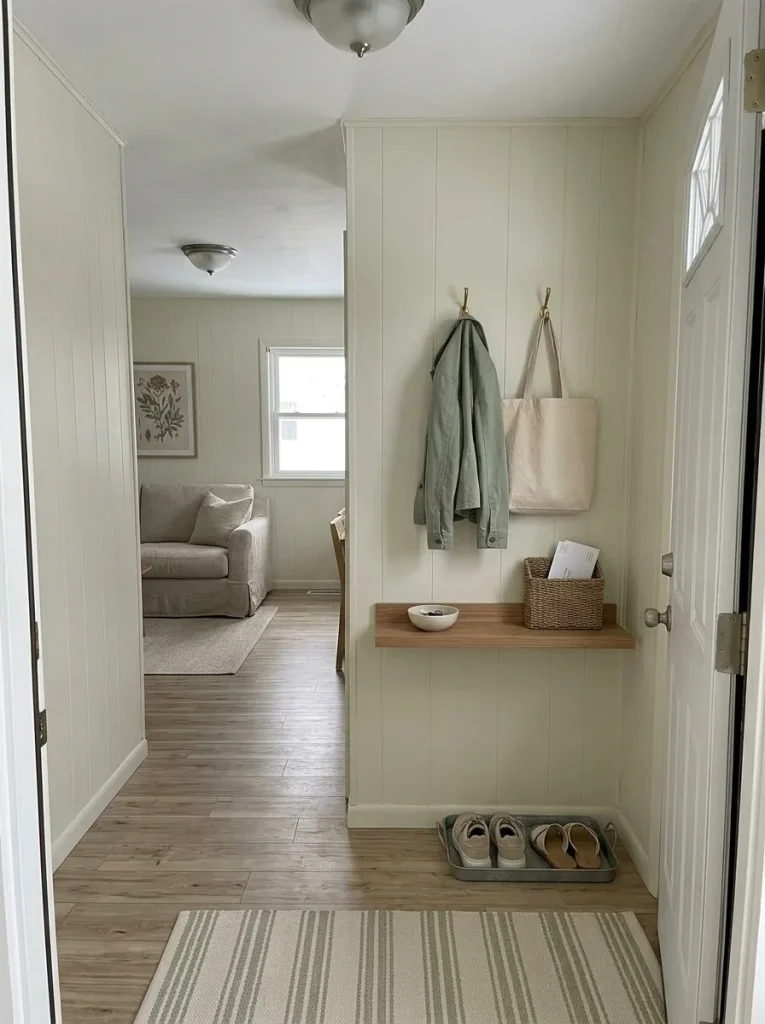
Watch what happens during the first thirty seconds after somebody enters the home.
That routine explains entry clutter better than a styled photograph.
Keys need somewhere to land.
Shoes need a boundary.
Mail needs a temporary destination.
Bags or jackets may need a hook.
Solve those behaviors with the smallest useful landing system.
In a narrow mobile-home entry, a deep console could create more inconvenience than value. A shallow shelf, compact cabinet, hook rail, basket, shoe tray, or small ledge may perform better.
The system is succeeding when objects stop migrating onto the kitchen counter, dining table, and sofa.
Only then add a decorative note—a print, small lamp, mirror, or plant may be plenty.
A well-designed entry does not need to store everything.
It needs to stop the rest of the home from becoming the entry.
24. Use Narrow Hall Walls Vertically, Not as Storage Dumping Grounds
An empty hallway wall can look like unused storage potential.
The danger is solving that problem with furniture deep enough to make circulation worse.
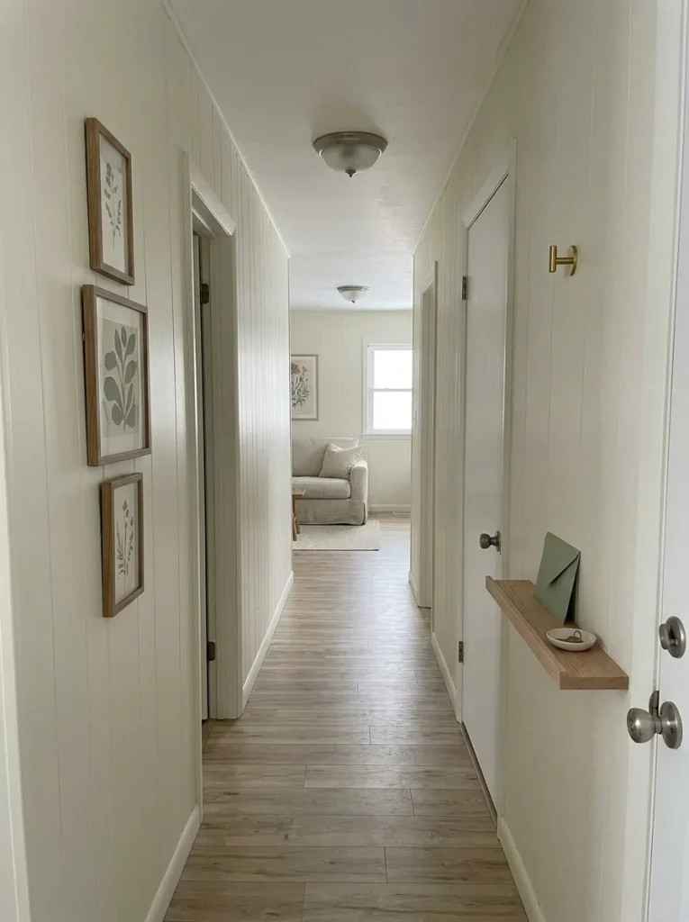
Treat the wall plane as the decorating opportunity.
A slim art arrangement, vertically oriented composition, shallow ledge, or carefully positioned hooks can give the passage identity without taking much floor area.
Hallways are also useful places to repeat a color or material from the rooms they connect. A small visual echo can make the journey through the home feel more coherent.
Stand at both ends of the hall before adding anything.
If a piece projects enough to make the passage visually tighter—or becomes something people must routinely move around—it is probably solving the wrong problem.
A hallway does not need to perform like another room.
Its main decorative job is to make movement between rooms feel considered.
25. Leave Some Shelves Half Empty on Purpose
Here is an exception to the instinct to use every available inch:
sometimes the best use of shelf space is not filling it.
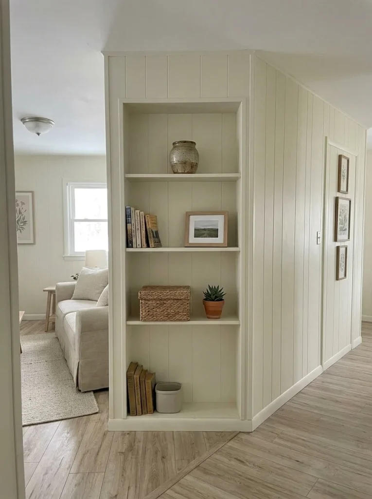
Open shelves, entertainment centers, built-ins, and bookcases tend to collect unrelated objects because empty space looks available.
Edit one shelf to roughly half its present visual density.
Keep pieces that are:
useful, meaningful, or visually strong.
Then create interest with height and spacing instead of more quantity.
One stack of books with a small object above it can read more clearly than six similarly sized accessories in a row.
The open area matters because it separates shapes and gives the remaining objects room to register.
Take a photograph after editing.
If the shelf looks more polished after objects were removed, do not rush to fill the gaps again.
Empty space is part of the composition—and it is free.
26. Shop Secondhand by Material, Scale and Destination—Not Price
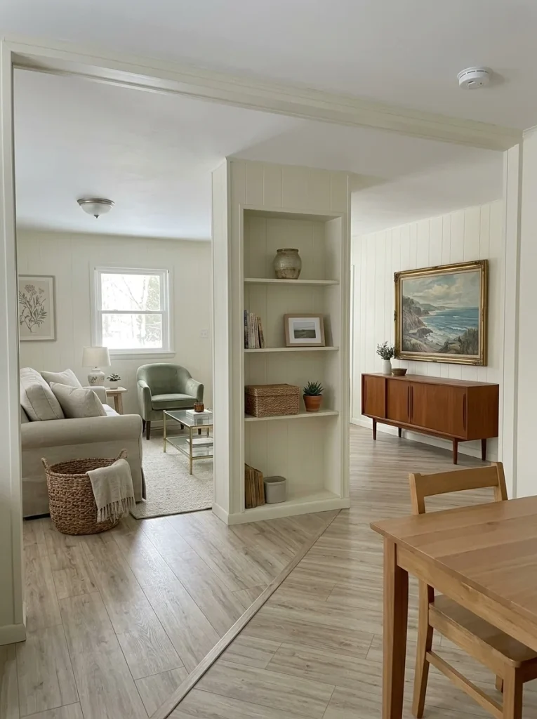
The biggest danger in secondhand decorating is not quality.
It is cheap randomness.
A low price can make almost anything seem justifiable, which is how homes collect side tables that fit nowhere, tiny lamps, empty frames, and future DIY projects that never reach a finish line.
Use a destination-first filter.
Which situation are you in?
Inspect, measure, then consider buying.
A known destination means scale, function and palette can be checked before money changes hands.
Buy only when the change is simple and specific.
A frame needing new art or a table needing a straightforward cosmetic refresh can make sense. A vague future project usually does not.
A bargain without a destination is inventory.
Leave it behind unless you can identify a real role immediately. The saved money and empty space are both part of the budget.
Do not price only the object.
The real cost includes materials, time, storage while unfinished, and the possibility that the project never becomes usable.
A successful thrift-store visit may end without a purchase.
That is not failure.
It is the budget working correctly.
27. Repurpose Fabric Before Buying New Decor
Fabric remnants can contain enough material for a small decorative improvement even when they are nowhere near large enough for full curtains or upholstery.
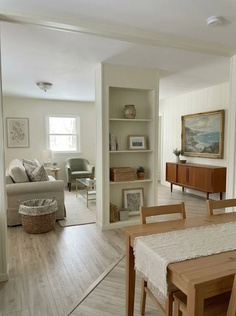
Search what you already own:
an unused curtain panel, tablecloth, throw, old linen, leftover yardage, or a good section of fabric from something no longer used.
Depending on the material and your DIY skill, it might become:
- a simple pillow cover
- narrow table runner
- framed fabric panel
- basket liner
- small café-style textile
- cover for an existing cushion
The benefit goes beyond saving money.
Repurposing can repeat a color or texture already present elsewhere, helping the whole home feel more connected.
Give a strong pattern one clear role, though. Repeating it across cushions, window treatments, wall art, and table textiles can overwhelm a compact space.
Let the material solve one specific gap.
Then stop.
28. Make Existing Shelves and Built-Ins Look Intentional
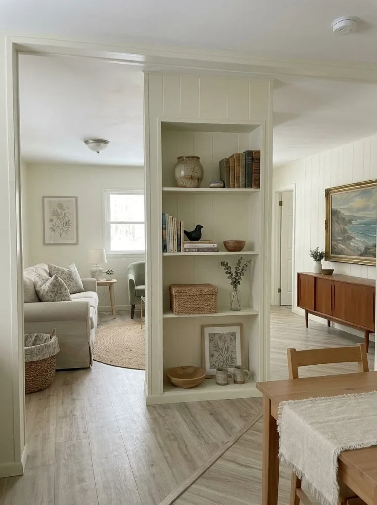
Older built-ins are sometimes blamed for making a room feel dated when the real problem is everything happening inside them.
Before removing or disguising useful storage, empty the visible shelves.
Rebuild with hierarchy.
Place the largest functional or decorative object first.
Add another piece with a different height.
Leave part of the shelf open.
Use closed containers for visually messy necessities.
Repeat one material—wood, woven fiber, glass, ceramic, or a restrained color—across several shelves so the unit reads as one composition.
Books do not need to be arranged so rigidly that everyday use becomes inconvenient. The display still has to work as part of a real home.
Photograph the built-in from across the room.
If its overall shape now appears calmer, the architecture may not have been the problem at all.
Useful existing features deserve a styling test before removal becomes the default solution.
29. Give the Front Steps a Small, Repeatable Welcome Zone
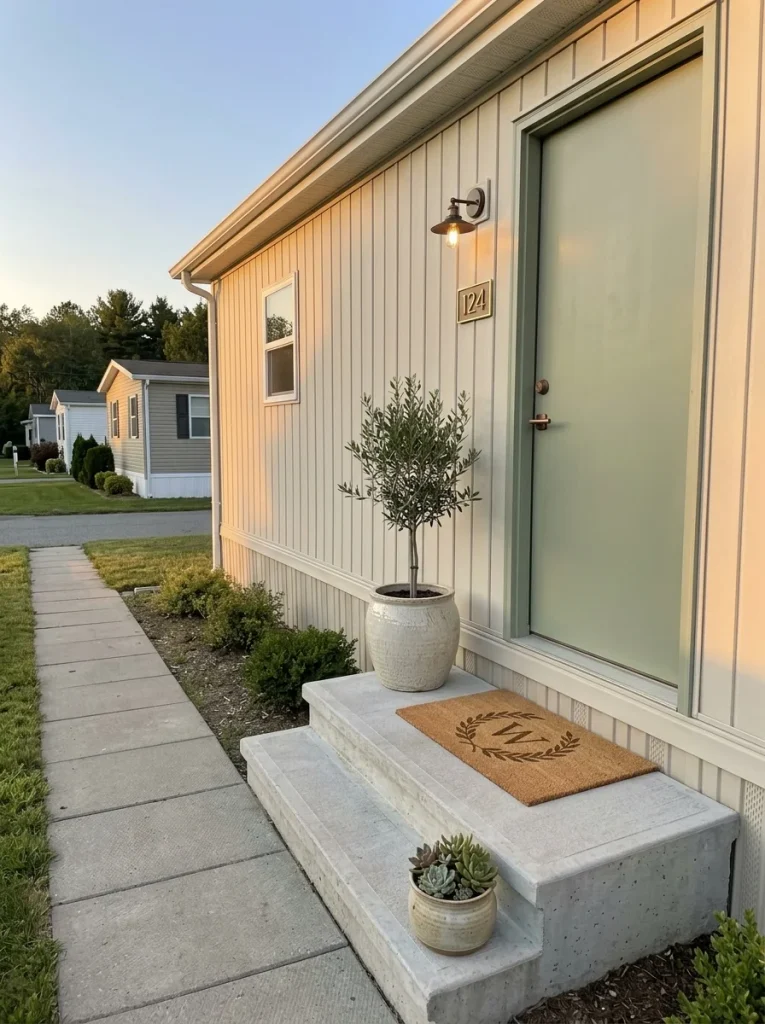
A mobile home’s first impression does not depend on having a large porch.
Even a modest entrance can feel intentional when a few elements establish a clear arrival sequence.
Choose the smallest exterior layer that changes the arrival.
Move through the three configurations from least space to most space. Stop as soon as the entrance feels complete.
Almost no landing area
Use: clean doormat + one substantial planter or seasonal container.
Keep the arrangement close to the door so it reads as one deliberate welcome point instead of scattered exterior decoration.
Small step or shallow landing
Add: a second planter at a different height or one simple door element.
The pair should frame the arrival without narrowing the usable step or becoming something people must dodge.
Usable porch or deeper platform
Add only when space supports it: a compact chair, small side surface, or additional plant grouping.
Preserve an obvious path from the step to the door so decorating does not compete with entering the home.
The useful transformation is the arrival sequence, not the quantity of exterior décor.
30. Spend on One Visible Anchor and Keep the Supporting Pieces Cheap
Budget decorating does not require every object to be inexpensive.
It requires the expensive decisions to be selective.
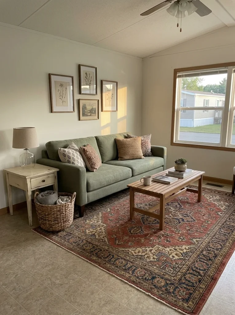
Imagine two rooms with the same total decorating budget.
One divides its money across lamps, baskets, signs, cushions, trays, frames, and novelty accessories.
The other spends a larger portion on one influential anchor—a properly scaled rug, substantial light fixture, artwork, or another item that materially changes the room—then supports it with thrifted, existing, repurposed, or inexpensive pieces.
The second approach often creates clearer hierarchy because the spending concentrated on something with enough scale to matter.
That does not mean buying one expensive object automatically improves a room.
The anchor needs to solve a visible problem smaller purchases cannot.
Single-wide readers pursuing a more elevated overall finish can continue with ways to make a single wide look more expensive.
Spend more only where visibility, scale, durability, or function gives the item enough influence to justify it.
31. Stop Shopping When the Room Passes the 48-Hour Photo Test
Budget decorating needs a finishing rule because stores, social feeds, and Pinterest will always provide another thing you could add.
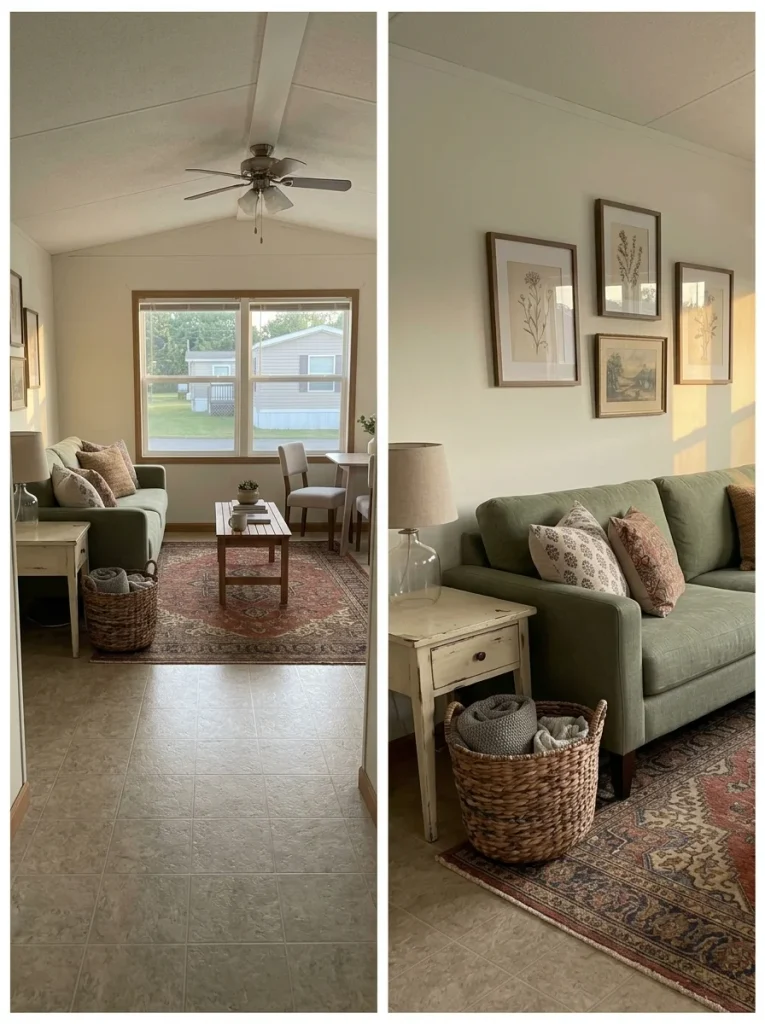
Use the room normally for two days after a decorating change.
Do not add anything during that time.
Then photograph it from the main doorway and from the seating position you use most.
Run one final audit.
Is another purchase actually necessary?
Look at the photos and check:
- Is there one clear focal point?
- Can the main surfaces breathe?
- Do connected rooms share at least one visual thread?
- Does daily clutter have a realistic home?
- Are the walking routes still easy to read?
- Would another object solve a specific gap—or simply fill space?
The room functions, the hierarchy is clear, and you cannot identify a specific missing job. Stop shopping.
One visible problem remains. Name it precisely and make the next purchase solve only that problem.
The room still feels busy, awkward, or disconnected. Return to editing, placement, storage, or color before adding more décor.
That last result matters.
A room can still need work without needing another object.
Sometimes the next improvement is moving the chair, clearing the counter, returning an unnecessary purchase, or simply living with the room long enough to understand what is missing.
Final Thoughts
Decorating a mobile home on a budget works best when every change has a clear job. Start with the view that feels most dated, edit and move what you already own, and coordinate the largest visual surfaces before spending on small accessories.
Once those layers are working, spend selectively on the one anchor that gives a room the scale, function, or character it still lacks.
A finished home does not need to look expensive or follow one decorating style. It needs clear priorities, comfortable routines, and enough breathing room to appreciate what is already there.
Take one room through the 48-hour photo test before starting the next. If it functions better and looks calmer, that is progress worth keeping.