A mobile home can contain perfectly usable furniture, decent flooring, and rooms you already enjoy—and still look less polished than the money you have put into it. The problem is often where the budget landed.
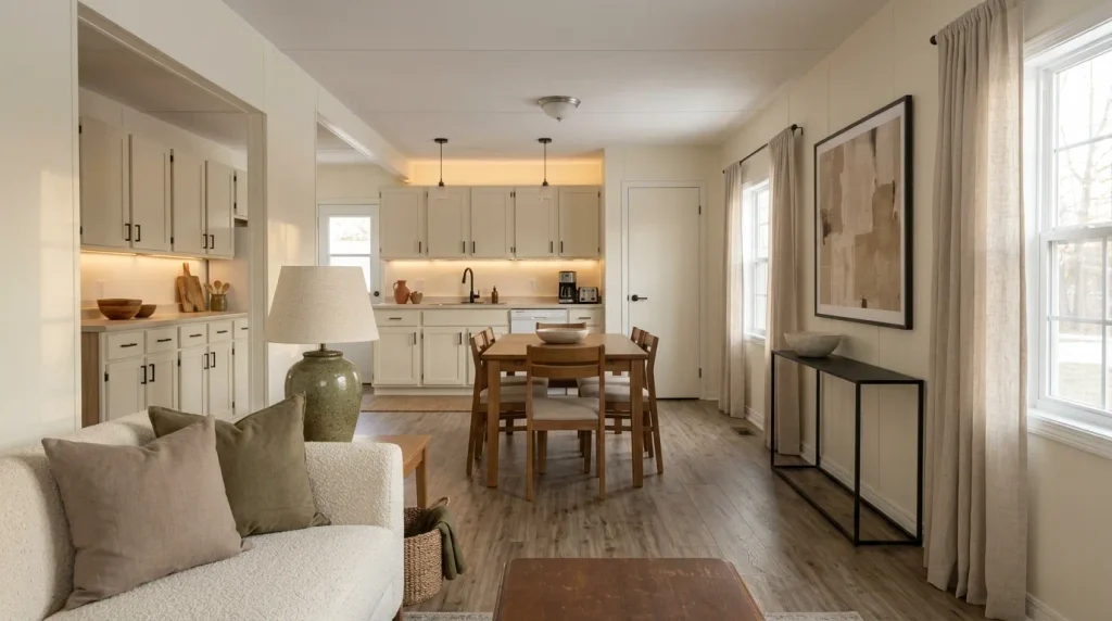
A new side table cannot compensate for three connected rooms casting completely different light. Decorative accessories will not make a long floor view feel settled when every threshold creates another visual break. And replacing something simply because it looks dated can consume money that would have changed a much larger part of the home.
If you want to make a mobile home look expensive on a budget, start by finding the surfaces and details with the greatest visual reach. One carefully chosen improvement can influence the living room, kitchen, hallway, and entry at the same time—especially in mobile homes where several spaces share one long sightline.
The 15 ideas below follow that principle. You will begin with a simple luxury-per-dollar test, then work through lighting, windows, finishes, flooring, paint, individual rooms, materials, scale, daily clutter, and finally the point where spending should stop.
Expensive-looking does not have to mean expensive.
It has to look deliberate.
1. Score the Three Views That Decide Where Your Budget Goes First
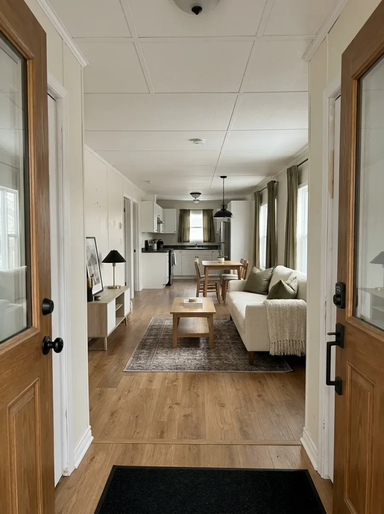
Before opening a shopping app, photograph your mobile home from three positions:
- Just inside the main entrance
- Along the longest uninterrupted interior sightline
- From your usual seating position after the lights are on at night
Do not inspect tiny details yet.
Look for the first thing that makes the home feel temporary, fragmented, unfinished, or visually noisy.
The entrance may expose clutter and unresolved trim. The long view may reveal several competing finishes or flooring that appears to break into pieces. At night, perfectly acceptable rooms can suddenly feel disconnected because their lighting character changes abruptly.
That first failure deserves more attention than whichever new product currently looks most exciting online.
For a single wide, connected views can amplify small inconsistencies, so readers dealing specifically with that layout can continue with ways to make a single wide look more expensive without remodeling. A double wide creates a different scale and open-space challenge, covered in luxury-looking double wide decorating ideas on a realistic budget.
Luxury-Per-Dollar Priority Matrix
Choose the view that bothers you most. Your answer changes where the first dollars—or the first hour of effort—should go.
Priority: first impression
Finish what reads as temporary.
Entry views expose daily clutter, unfinished edges, awkward cords and crowded surfaces. Edit the first visual landing zone before buying decorative upgrades.
Priority: visual reach
Calm the surface seen across several rooms.
A long mobile-home sightline magnifies repeated floor breaks, competing colors and finish changes. Work on the shared visual field before refining an isolated corner.
Priority: evening atmosphere
Correct the light before judging the room.
When connected rooms shift sharply from warm to stark or dim to aggressively bright, even coordinated furnishings can look unrelated.
Fix the problem with the greatest visual reach before improving a smaller view.
That is how a modest decorating budget begins behaving like a much larger one.
2. Fix Mismatched Light Before You Replace Expensive Fixtures
Walk through the home after sunset with every light you normally use switched on.
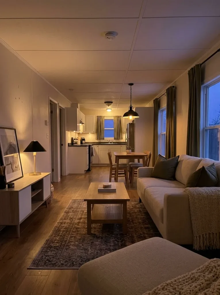
Do the living room and kitchen appear to belong to the same interior? Or does one area look warm and relaxed while the next becomes noticeably whiter, harsher, or brighter?
In a visually connected mobile home, that transition can make two well-decorated spaces feel unrelated.
Test the inexpensive layer first. Compare the appearance of compatible bulbs, overall brightness, lampshades, and where shadows collect. A perfectly acceptable ceiling fixture does not automatically need replacing because the room feels flat after dark.
Try this sequence:
- keep fixtures that are sound, functional, and visually acceptable;
- bring visible light sources into a more compatible overall character;
- use existing or affordable task and ambient lighting where a zone disappears into shadow;
- then judge whether the fixture itself is still the problem.
Fixture compatibility and the lighting needs of the task still come first; there is no reason to force every light source into one identical specification.
If the connected spaces begin to feel calmer once their illumination works together, keep the existing hardware.
Spend on a replacement fixture when its scale, condition, performance, or appearance remains the obvious weak point after the lighting itself has been improved.
3. Make the Largest Window Treatment in Each Zone Look Intentional
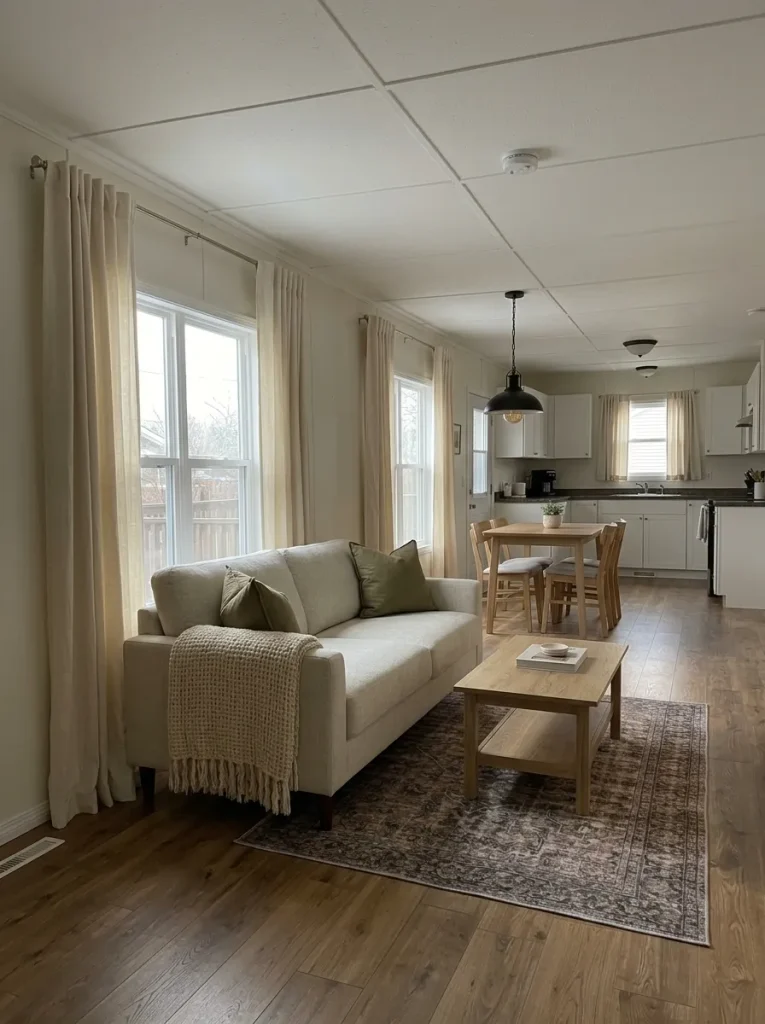
Which occupies more visual area: a new throw pillow or a full window treatment?
In most rooms, it is not even close.
Windows often sit on highly visible exterior walls, and curtain panels can cover a large percentage of that wall. Wrinkled fabric, weak fullness, inconsistent lengths, an awkward rod position, or crowded decorative layers may therefore influence the room more than several smaller purchases.
Before buying new curtains, inspect the ones you own.
Keep them when the material still suits the room and the main problem is grooming or placement. Steam or press the fabric if its care instructions allow it, correct obviously uneven hanging, simplify unnecessary layers, and make the pair read as one composition.
Replace them when they are damaged, too narrow to function or hang convincingly, unsuitable for your privacy needs, or visually incompatible with the direction of the room.
For a narrow space, look at the window when the curtains are open as well. Fabric that stacks heavily across the glass can make the opening appear smaller.
The correct curtain length and placement also depend on heaters, furniture, doors, vents, and other functional conditions. Everyday use should control the final choice.
A tiny decorative object affects one small area.
A resolved window can change the perceived finish of an entire wall.
4. Finish the Visible Edges Before You Buy Another “Luxury” Surface
Imagine a freshly painted wall beside a sloppy transition. Or an attractive floor ending at a threshold that looks improvised. Or a decent cabinet field whose exposed edge never received the same attention as its front.
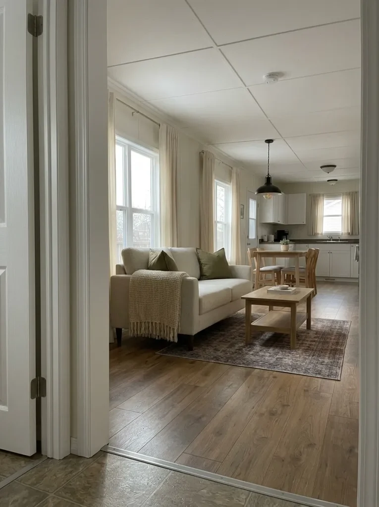
Your eye does not see the expensive-looking surface by itself.
It also sees how that surface finishes.
Walk through the home and inspect dry, cosmetic junctions: paint lines, door trim, furniture backs, removable transition details, curtain edges, visible cable routes, and places where one finish meets another.
These areas are often inexpensive to clean, groom, simplify, touch up, or align, yet they strongly influence whether the surrounding work looks resolved.
Try a photograph test. Frame the area containing the surface and its boundary. If the main material still looks acceptable but the edge makes the composition feel unfinished, replacing the entire surface would solve the wrong problem.
Cosmetic finishing has a clear boundary. Moisture damage, deteriorated materials, electrical concerns, structural alterations, plumbing work, and wet-area construction require appropriate evaluation rather than being covered with décor.
Preserve a sound large surface when improving its visible boundary is enough to make the room read as complete.
5. Give the Longest Floor View One Calm Story Before Replacing the Floor
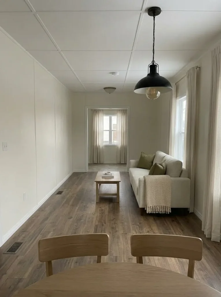
Stand where you can see the greatest distance across the interior and look only at the floor plane.
A mobile home does not need identical flooring everywhere to feel polished.
What weakens the long view is often the number of unrelated interruptions: one small rug, another rug with a competing pattern, an abrupt material change, a visually loud threshold, then a third color further down the hall.
Before assuming the floor itself must go, temporarily remove loose rugs and small floor accessories from the sightline.
What remains?
If the underlying surfaces immediately look calmer, editing what sits on top of the floor may be enough. If two sound floor materials meet at a doorway or logical zone boundary, that change may already make visual sense.
If several unrelated permanent materials remain visible in one uninterrupted view, future flooring money should target the portion producing the strongest break before you assume the entire home needs replacement.
Use this test to separate a styling problem from a larger flooring decision.
Long-view floor test
Judge the floor as one visual journey.
Temporarily remove loose rugs and small floor accessories. Then judge what remains from the longest visible axis.
The floor may already be doing enough.
Do not create a flooring project simply because the material is not your dream finish. Improve nearby color, furniture placement and floor styling first, then photograph the same long view again.
Next decision: spend elsewhere unless damage or function says otherwise.Let the transition read as intentional.
When two sound materials meet at a logical room boundary, the transition can work. Avoid placing another competing rug or furniture boundary immediately beside it.
Next decision: refine the junction before considering replacement.Find the interruption with the greatest visual reach.
If several unrelated permanent surfaces remain visible after removable layers are gone, identify the section seen from the greatest number of positions. Investigate that section before assuming the whole home requires new flooring.
Next decision: target the dominant break, not automatically every floor.A floor that is intact and visually workable does not need to become a renovation simply because something newer exists.
Spend when the long view still has a genuine surface problem after the removable visual noise is gone.
6. Paint the Surface With the Most Visual Reach, Not Every Wall
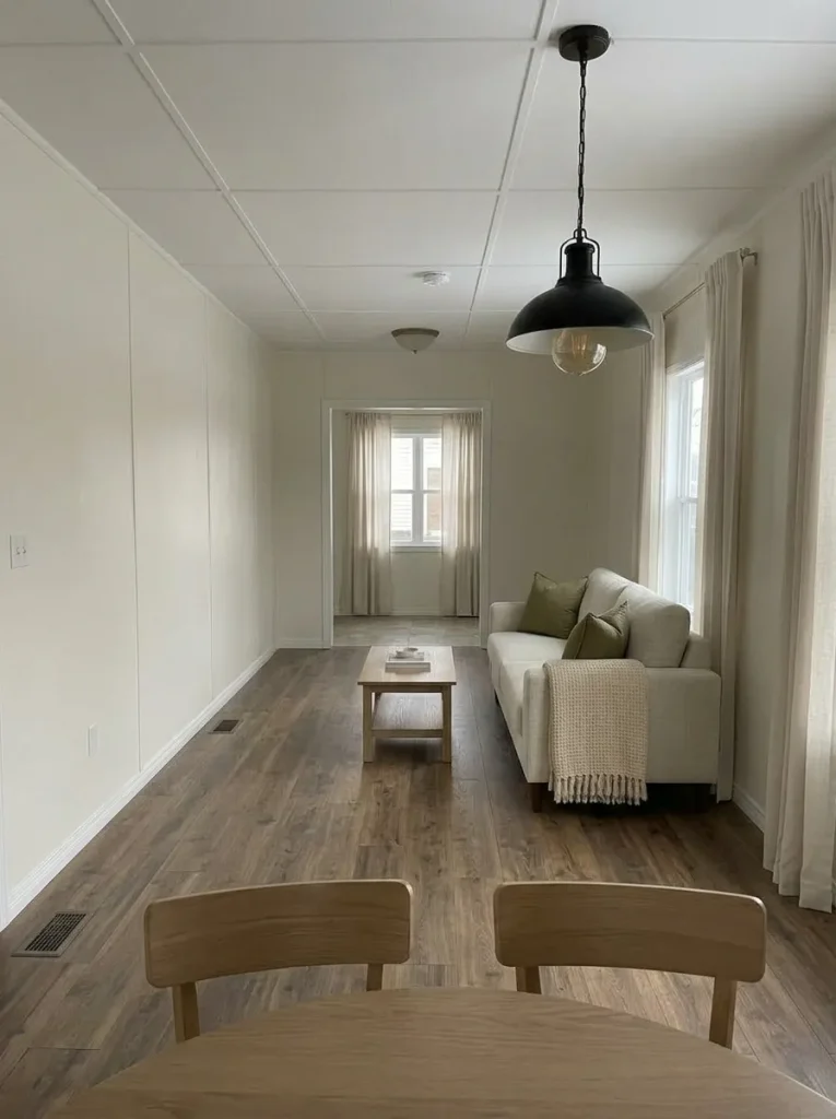
A limited paint budget becomes much more effective when you stop thinking only in terms of rooms and start thinking about what the eye sees repeatedly.
Stand at the entrance, sit in the living room, and look toward the kitchen or hallway.
Which wall, cabinet field, trim run, or connected backdrop appears in more than one of those views?
That surface deserves attention first.
In many mobile homes, repainting every room is unnecessary. One tired wall running through an open living-and-dining area may influence the interior more than three less-visible bedroom walls combined. Likewise, a strong cabinet finish or accent color can dominate several adjoining zones.
Take three phone photographs from your most-used positions and mark the surface that appears in all of them.
If it is sound but visually dated, it is a stronger candidate for paint than a wall seen only when you enter one small room.
Keep the palette controlled. A restrained backdrop makes it easier for floors, cabinets, furniture, and textiles to belong to one visual story. Too many competing paint moments can divide a compact interior into smaller pieces.
Paint the field with the greatest visual reach first, then reassess the home before buying enough paint for every room.
7. Treat Doors, Trim, and Hardware as One Repeating Finish Family
A mobile home can have ordinary doors and basic trim and still look intentional when those repeating elements feel related.
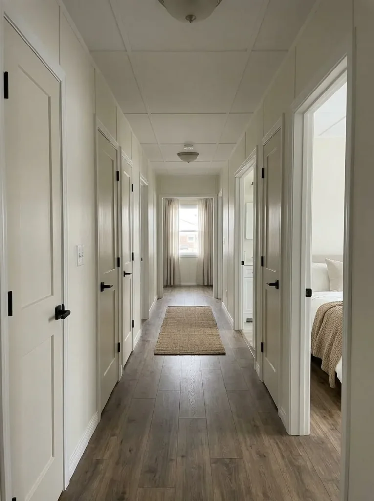
Walk from the entry toward the bedrooms and notice what appears again and again:
- door colors;
- trim tones;
- knobs and pulls;
- hinge finishes;
- switch and outlet covers;
- visible curtain hardware.
None of these pieces needs to look luxurious individually.
Their strength comes from repetition.
If one doorway has bright white trim, another has an aged cream, the next has dark wood, and the hardware changes finish every few feet, each opening becomes another visual interruption.
Do not automatically replace everything.
Start by deciding which existing finish is in the best condition and already appears most often. Let that become the reference.
For example, if most interior doors and trim are already a warm white, correcting a few obvious mismatches can have more impact than introducing a completely new scheme.
Hardware works similarly. Every metal object does not need an identical finish, but repeating pieces within the same view should relate well enough that the variation feels intentional.
Stop once the recurring architectural details feel coordinated from room to room.
The polished effect comes from consistency, not from purchasing the most expensive handles available.
8. Refresh the Kitchen Elevation Everyone Sees Before Reworking the Whole Kitchen
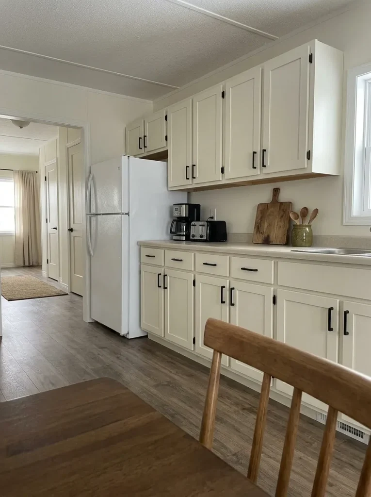
From the living room or dining area, how much of your kitchen is actually visible?
In many open mobile-home layouts, one cabinet run, peninsula, backsplash wall, or refrigerator side becomes the dominant kitchen view.
That single elevation may influence how the entire connected interior feels.
Work on that view before treating the kitchen as a complete renovation project.
Take a photograph from outside the kitchen and ignore anything the camera cannot see. Common distractions include uneven hardware, crowded counters, unrelated small appliances, deteriorated cabinet fronts, a visually busy refrigerator side, or excessive decoration above cabinets.
Correct the simplest issues first.
Clear enough counter space to reveal the cabinet composition. Group the appliances you genuinely use. Remove items that exist only because the surface happened to be empty. Standardize obviously mismatched hardware where practical.
If the cabinets themselves remain the strongest problem, move into the deeper decision process in mobile home kitchen makeover ideas on a budget. If the cabinet boxes are serviceable and their appearance is the main concern, use the more focused mobile home kitchen cabinet makeover guide.
Improve the kitchen elevation the rest of the home actually sees before spending on parts of the kitchen hidden from that view.
9. Make the Bathroom Look Finished Where the Eye Lands First
Open the bathroom door and notice where your eyes go before you deliberately scan the room.
Usually one composition takes control: the vanity and mirror, the shower area, or the wall directly opposite the entrance.
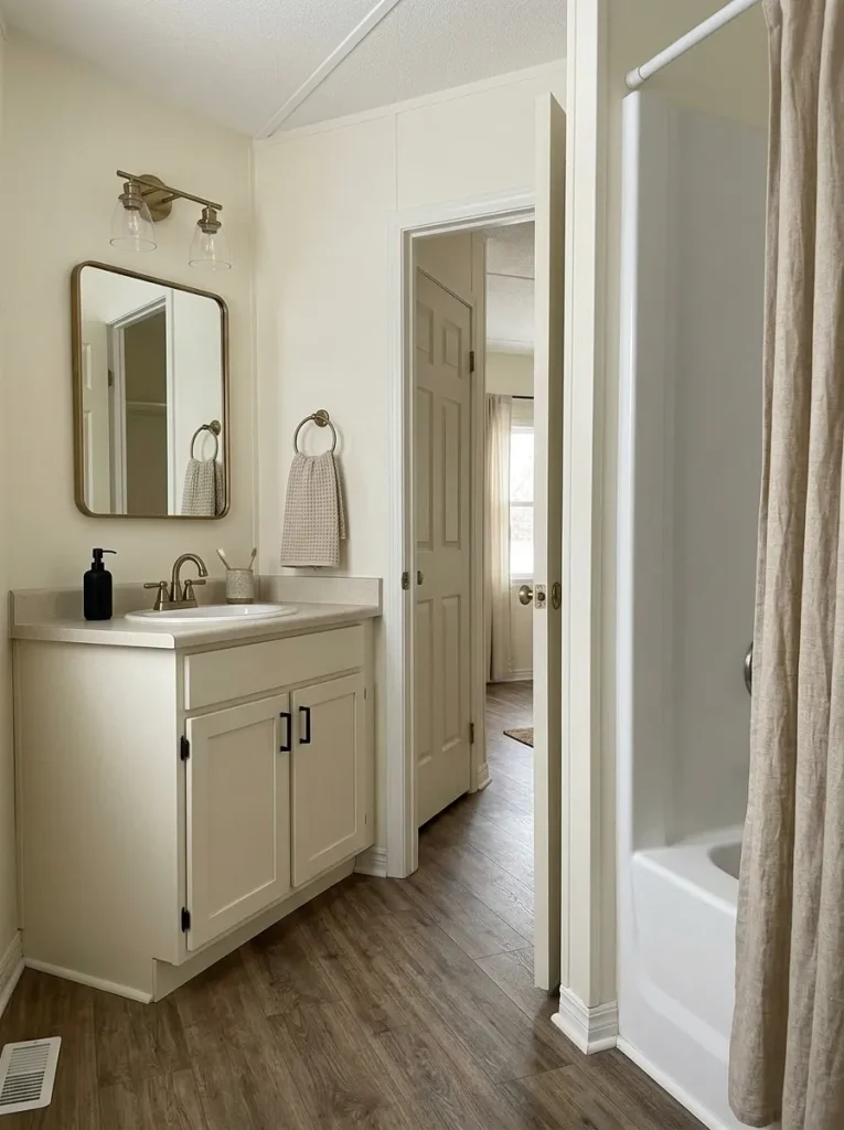
That focal zone deserves more attention than small decorative accessories distributed around the room.
For a vanity wall, check the relationship between the mirror, lighting, faucet, counter, and storage below. A simple vanity can feel much more considered when those elements appear visually resolved and the counter is not fighting through everyday clutter.
If the shower is the first thing visible, bottles, mismatched textiles, deteriorated cosmetic finishes, or a busy curtain may affect the room more than the vanity.
Keep wet-area work within the proper boundary. Styling and cosmetic editing are different from plumbing, waterproofing, ventilation, or repair work.
When the room genuinely needs a larger project, the dedicated guide to mobile home bathroom remodel ideas on a budget can carry that decision further.
Do not begin with “What can I add to this bathroom?”
Begin with:
“What does the doorway see first, and does that zone look resolved?”
Fix that answer before decorating the corners.
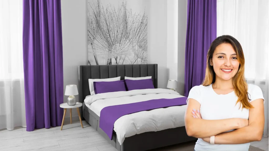
10. Let One Large Textile Composition Make the Bedroom Feel More Luxurious
Bedrooms provide one of the best opportunities to create a higher-end impression without changing the architecture because the bed occupies such a large percentage of the visual field.
Stand at the bedroom doorway.
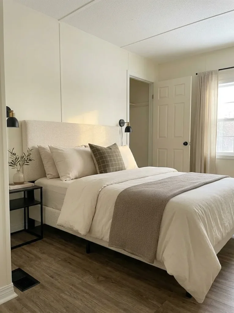
If the bed looks undersized, visually flat, overloaded, or disconnected from the wall behind it, buying smaller décor rarely solves the problem.
Build the room around one coherent textile composition:
headboard or wall backdrop → pillows → bedding → lower bed layer.
The pieces do not need to be costly. They need enough relationship in color, texture, and proportion to read as one designed surface.
If you own many patterned cushions, remove several before purchasing anything. If the duvet carries strong pattern or color, let the supporting pillows become quieter. In a narrow bedroom, avoid adding so many heavy layers that the bed visually spills into the walking space.
The dedicated guide to mobile home primary bedroom ideas that feel more luxurious takes the full room much further.
For this whole-home budget, the bedroom has done its job once the bed becomes a calm, substantial anchor.
One well-composed bed may provide more visible luxury per dollar than several small bedside purchases.
11. Trade Several Small Décor Pieces for One Properly Scaled Anchor
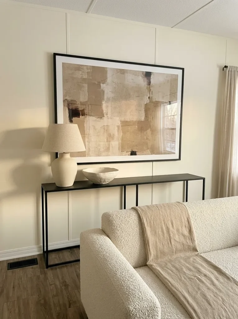
A shelf with eight unrelated objects can cost more than one substantial lamp, framed artwork, vessel, or plant—and still make the room look less finished.
Small mobile-home rooms do not automatically require tiny décor everywhere.
Repeated little objects create more outlines, more spaces between objects, and more visual decisions for the eye to process. One appropriately scaled anchor can produce a calmer composition with fewer purchases.
The question is not whether an object is “large.”
It is whether it is large enough to relate convincingly to the furniture, wall, or surface supporting it.
Above a sofa, one substantial artwork arrangement may work better than several undersized pieces scattered across the wall. On a console, a stronger lamp with one supporting object may feel more intentional than a collection of mini accessories.
Use this scale test before adding anything else.
Visual pressure studio
How fragmented does the surface feel?
Choose the pattern that best resembles one shelf, console, tabletop or wall. The tool shows whether the next move should be editing, consolidating or stopping.
Edit before buying.
Remove several pieces and photograph the surface again. If the composition becomes calmer, your next purchase should be postponed.
Test the relationship.
Keep the arrangement when the objects relate convincingly to the furniture beneath them. If everything still feels undersized, consolidate instead of adding.
The hierarchy is already clear.
The empty space surrounding the anchor gives it visual weight. Stop before filling the remaining gaps.
For living-room-specific composition, continue with mobile home living room ideas that make the space look expensive.
For the whole house, remember the broader budget principle:
when a surface already contains enough objects, editing can produce a larger upgrade than shopping.
12. Use Secondhand Real Materials Where Touch Matters Most
A simple wooden bowl, substantial glass lamp, woven basket, ceramic vase, or solid metal tray can feel convincing even when it came from a thrift store.
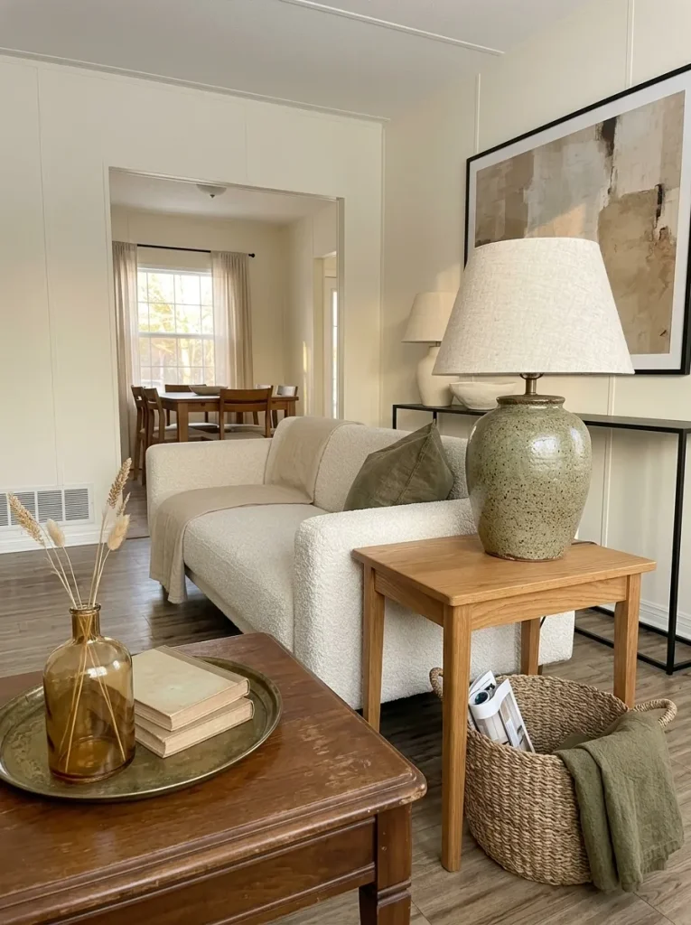
The material is doing part of the visual work.
When money is limited, secondhand shopping becomes most useful when you look for material credibility, not brand recognition.
Prioritize objects that are seen or touched at close range:
- solid wood or good-quality veneer;
- substantial ceramic;
- real glass;
- woven natural fibers;
- metal with believable weight and finish.
Inspect condition carefully.
A bargain stops being useful when it brings strong odor, instability, water damage, difficult-to-clean surfaces, or repairs that exceed what the piece is worth to you.
Scale matters here as well. One substantial secondhand lamp may contribute more to the room than several new lightweight accessories purchased because each one was inexpensive.
Ask yourself:
“Would I still want this object if I did not know which store or brand it came from?”
If the answer is yes because of its shape, material, proportion, condition, and usefulness, it has a stronger chance of surviving your next decorating change.
The high-end move is not pretending something inexpensive is luxury.
It is choosing inexpensive objects whose materials already look convincing.
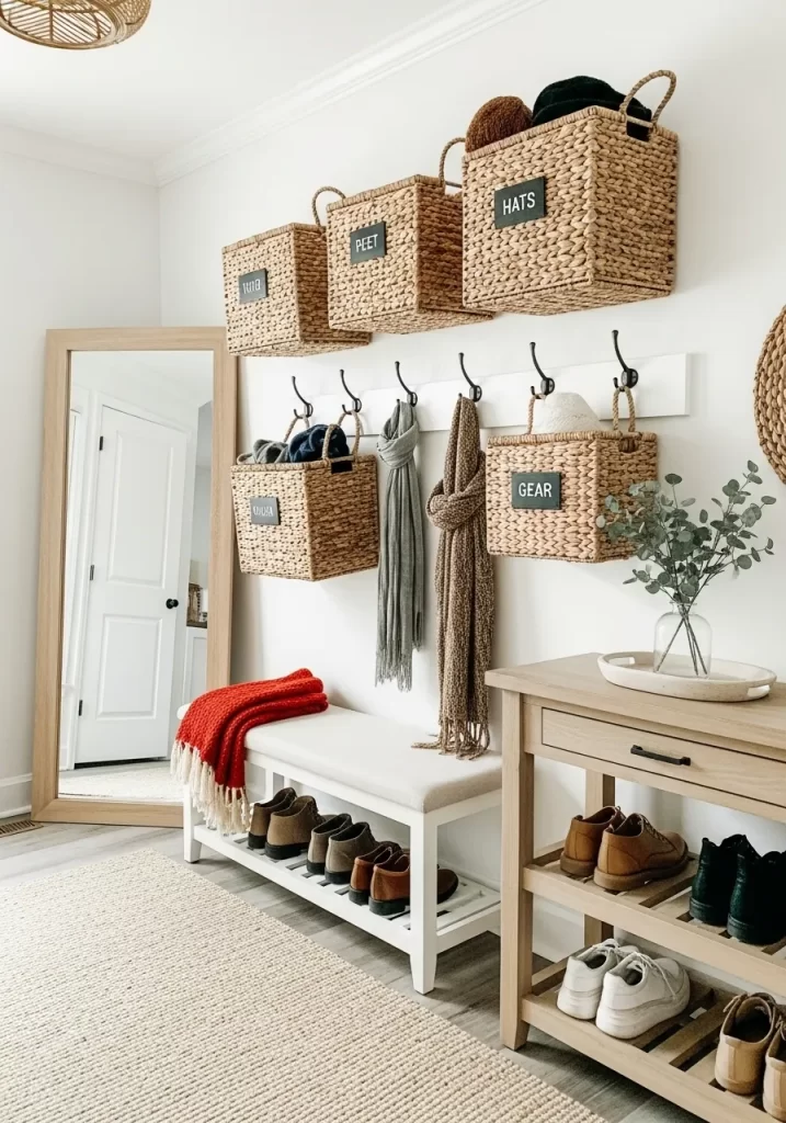
13. Design the Room-to-Room Transition for a Two-Minute Daily Reset
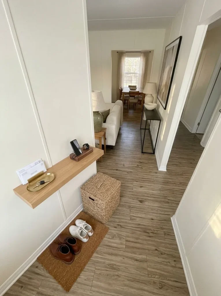
Some homes look polished immediately after decorating and cluttered again by the following evening.
That usually signals a routine problem, not a styling problem.
Look at the places where activities change: entry to living room, kitchen to dining area, hallway to bedroom, or sofa zone to a small work area.
These transitions collect belongings because people naturally put things down while moving between tasks.
Choose one problem transition and observe it for a day.
What repeatedly lands there?
Shoes? Mail? Chargers? Bags? Water bottles? Children’s belongings? Work equipment?
Do not create generic storage for an imaginary lifestyle. Give the actual recurring category a landing place close to where the behavior occurs.
A small tray may solve keys and mail. A basket can contain soft everyday objects. Frequently used charging cables may benefit from one controlled location. Shoes need a workable solution near where they are removed—not across the room where nobody naturally carries them.
Now test the system with a two-minute reset.
If the area can return to order quickly without carrying several objects through the home, the storage location supports the routine. If cleanup still requires multiple trips, the solution is probably too far from the behavior.
High-end-looking interiors often appear calm because everyday activity has somewhere to go.
That calm can cost very little.
14. Repeat One Signature Finish Across Three Distant Points
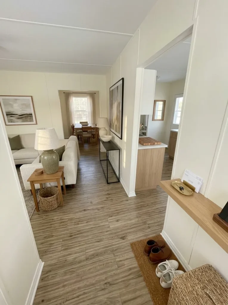
Matching everything can make a home feel staged.
Repeating one finish strategically can make it feel connected.
Choose a material or color that already belongs naturally in your interior. It might be warm wood, matte black, aged brass, cream, muted green, woven cane, dark brown, or another finish that already suits your rooms.
Now find three separated positions where that finish can appear as you move through the home.
For example:
- a wood frame near the entrance;
- a wood-toned stool or board near the kitchen;
- a similar wood note in the bedroom.
The objects do not need to be part of a matching set.
Their shared finish creates a visual memory.
There is an important difference between repetition and saturation. When the chosen finish appears on nearly everything, it stops connecting the rooms quietly and starts becoming a theme.
Use this map to decide whether your finish needs another appearance—or fewer.
Whole-home finish constellation
Repeat the finish with distance, not everywhere.
A signature finish works like a visual thread. It should reappear far enough apart to connect different zones without turning the home into a matching set.
Add a distant echo.
One isolated finish does not yet create continuity. Repeat it once in another zone encountered later in the home. The object itself can be completely different.
The connection may already be enough.
Three separated appearances can establish a recognizable thread. Photograph the connected rooms before deciding another repetition is necessary.
Reduce the saturation.
When the finish appears on almost every accessory, it stops feeling like a subtle connection. Remove several examples and let quieter materials create contrast.
This principle becomes especially useful when replacing major surfaces is outside the budget.
Repetition allows existing rooms to communicate using details you may already own.
15. Run the Budget-Freeze Test Before You Buy the Final Upgrade
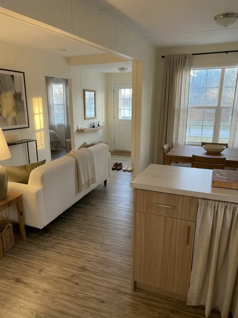
A budget makeover becomes expensive when every successful change immediately creates another shopping task.
After working through the home, return to the same three views used at the beginning:
entrance → longest sightline → evening seating view.
Ask whether any of them still contains a problem strong enough to justify another purchase.
Do not ask whether the home could theoretically be improved further.
Almost every home could.
Ask whether the next expense corrects a visible weakness that appears frequently enough to matter.
Use the final test before adding another project.
Budget-freeze gate
Does the next purchase still solve a visible problem?
Judge the home you actually have now—not the ideal room on your inspiration board. Your final budget decision should depend on whether a meaningful visual weakness still remains.
Name the problem before naming the product.
Spend only when you can explain which visible weakness the purchase corrects, where that weakness appears, and why an edit or no-spend solution cannot fix it.
Live with the room before creating another project.
Take fresh photographs and use the home normally for several days. If no issue repeatedly bothers you during ordinary life, there may be no useful reason to spend yet.
The quiet space is part of the upgrade.
A coherent room does not automatically become more expensive-looking because more finishes, accessories or furniture are added.
A strong budget makeover ends when the visible problems end.
That stopping point protects the calm you worked to create—and protects the budget too.
Conclusion
Making a mobile home look expensive on a budget is less about finding cheap versions of luxury products and more about spending where the eye notices the difference most.
Begin with the entrance, the longest sightline, and the evening view. Correct the issue with the greatest visual reach, then move toward smaller surfaces only when they still matter. Lighting consistency, intentional windows, finished edges, calmer floors, coordinated repeating details, proper scale, believable materials, and practical reset points can change how the whole home reads without turning every room into a renovation.
Most importantly, know when the home is already finished enough.
A limited budget looks much larger when every purchase has a clear job—and when unnecessary purchases never happen.
Love these ideas? Save this guide to Pinterest so you can come back to the budget-friendly changes that make the biggest visual difference.