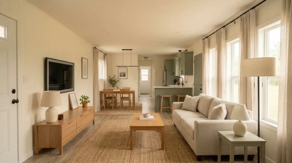
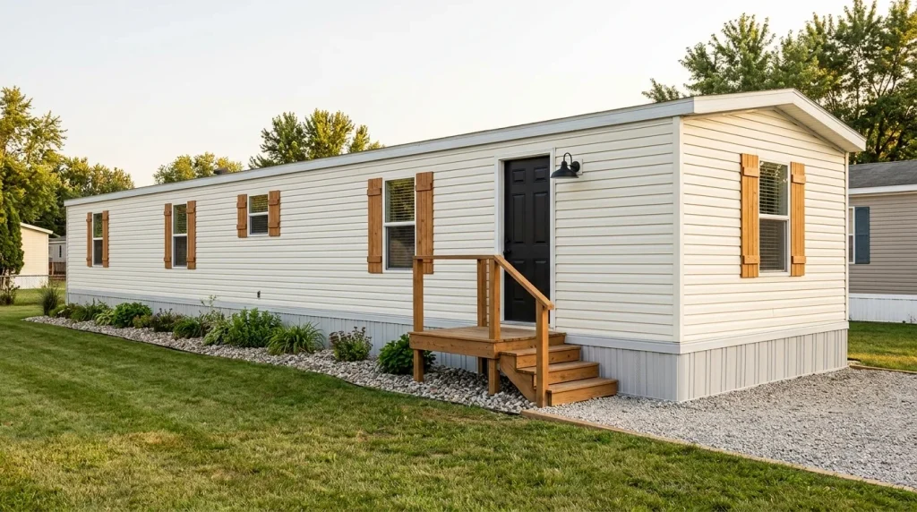
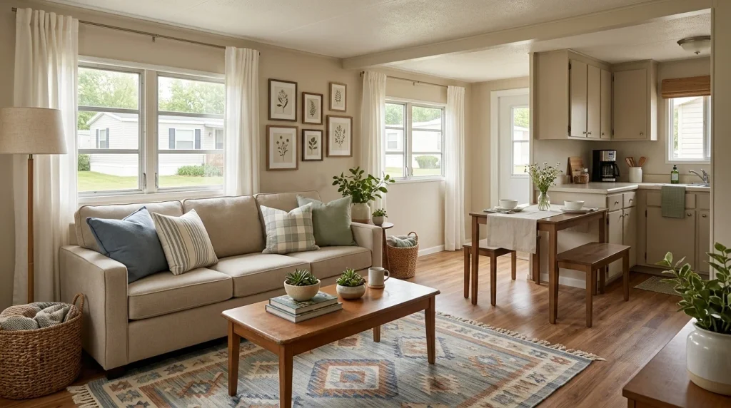
A small decorating budget does not mean your mobile home needs to look unfinished—or that every improvement has to come from a dollar-store aisle. Some of the most effective cheap mobile home decor ideas work because they change what your eye notices first: a crowded long view becomes calmer, two connected spaces begin to relate to each other, or one inexpensive textile suddenly gives an ordinary room more presence.
That matters in a mobile home, where several zones may be visible at once and every object can carry more visual weight.
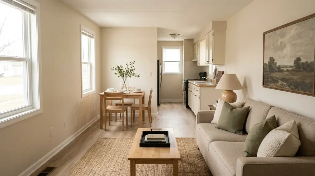
The 17 ideas below stay firmly on the decorating side of the line. You will not need to replace flooring, rebuild a porch, repaint every cabinet, or begin a remodeling project. We will work with editing, textiles, lighting, useful objects, secondhand finds, removable treatments, and deliberately small purchases.
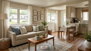
Start with the cheapest question first: what can change before you buy anything at all?
1. Spend $0 on the Long View Before You Buy a Thing
Before opening a shopping app, stand at the doorway that gives you the longest view through your mobile home. In many layouts, the living room, dining area, and part of the kitchen can appear in one frame. One visually loud object can therefore influence several spaces at once.
Take a phone photo and notice what your eye keeps returning to: a crowded table, extra chair, isolated basket, cluster of tiny wall pieces, or décor that seems to belong to no clear zone.
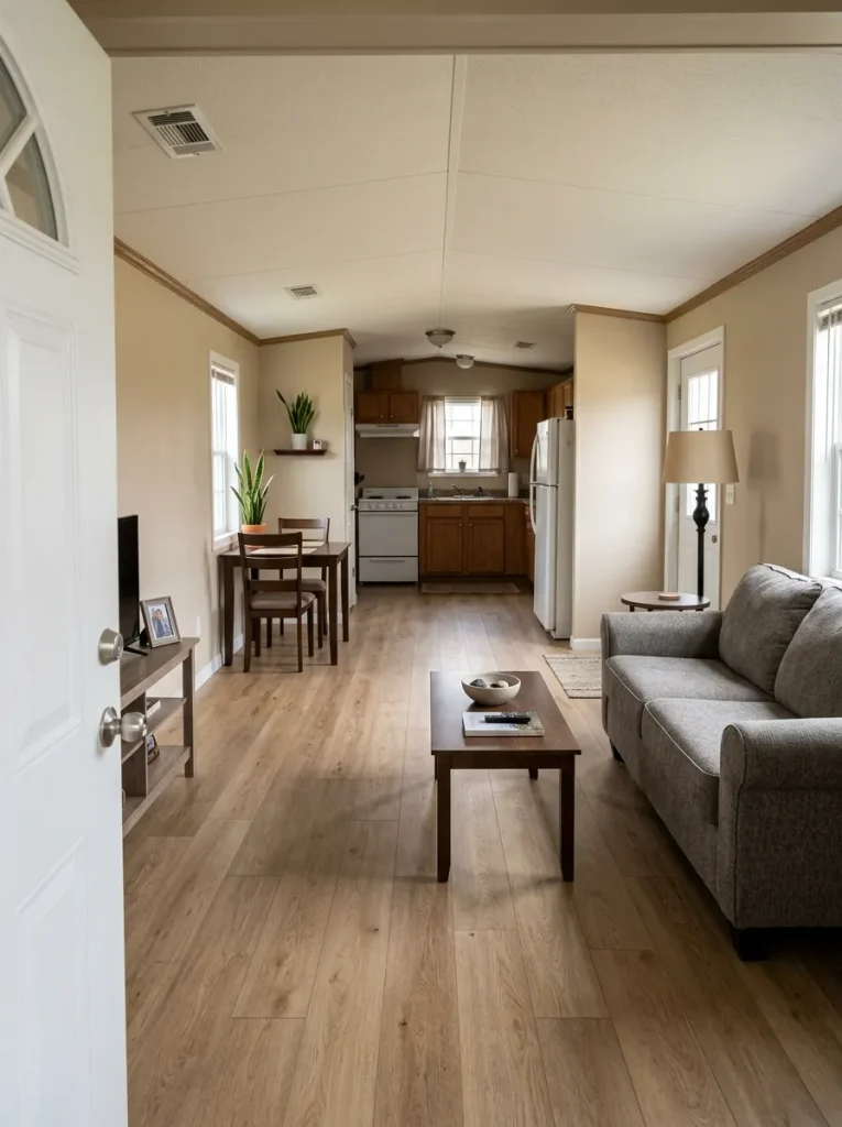
Remove one candidate temporarily and photograph the view again.
If the home immediately feels calmer, your first decorating improvement was free. If nothing meaningful changes, put the item back and test another. The point is not minimalism. It is finding out whether the home needs less visual competition before it needs another purchase.
Dollar-Friendly Impact Route
Choose the most you want to spend and the visual problem bothering you most. These figures are spending ceilings for the exercise—not promises about current retail prices.
Where should your next dollar—or zero dollars—go?
Choose a spending ceiling and the visual problem that bothers you most. A clutter problem should not receive the same first purchase as an empty-room problem.
Edit the longest sightline
Remove one visually dominant extra from the view that crosses the most rooms. If the photograph improves, stop there before shopping.
Strip away the strongest dated layer
Temporarily remove a fussy decorative layer, excess tabletop décor, or competing wall piece. First learn whether the dated feeling comes from the room or what has been layered onto it.
Redistribute something with presence
Move one larger object—art, lamp, basket, plant, or textile—from an overfilled zone into the emptiest one.
Repeat what the home already has
Carry one existing color or material into a second visible zone using objects you already own.
Contain one messy surface
Use the budget only if you lack a useful tray, shallow basket, or simple container. The purchase should remove several loose visual signals at once.
Change one visible layer
Look for a low-cost textile cover, frame refresh, or simple replacement detail in a high-visibility spot.
Add height before quantity
A branch arrangement, thrifted frame, or larger fabric moment can fill visual emptiness with one gesture.
Buy the bridge, not a new theme
Choose one small accent that repeats a color already present in both spaces.
Replace visual noise with one useful anchor
One better tray, basket, shade, or textile can absorb the job currently being done poorly by several small pieces.
Modernize the layer you touch or see most
Prioritize a removable textile, shade, mat, or framed piece before chasing permanent finishes.
Give the emptiest zone one focal weight
Search secondhand or reuse creatively for something with enough scale to register from the doorway.
Repeat one finish across the open view
Choose a material or tone already working in the home and echo it in two visible zones.
Upgrade the organizer only after the edit
Use the larger ceiling for one storage/decor piece only when existing storage cannot solve the visual problem.
Choose one dominant removable change
A larger textile, secondhand mirror, lamp, or framed piece can redirect attention without starting a renovation.
Buy one anchor with enough scale
Use the budget on the object that can establish the zone by itself.
Strengthen the shared material language
Put the money toward a textile, warm wood note, dark accent, or finish already visible across the home.
2. Build One Cheap Color Bridge Across the Rooms You See Together
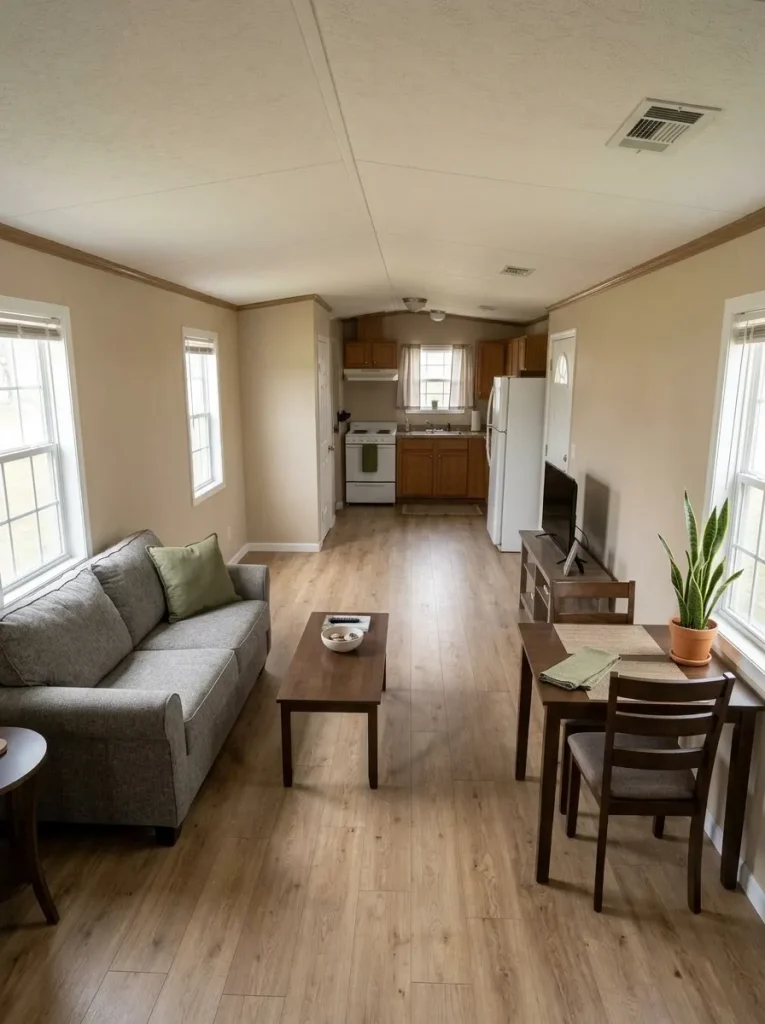
A mobile home can look mismatched even when every individual room has pleasant colors. The problem often appears in the transition between them. From one standing point you may see a gray sofa, warm wood dining table, white kitchen, black appliances, and an unrelated accent color simultaneously.
Do not begin by choosing an entirely new whole-home palette.
Find one color already doing useful work, then repeat a small amount of it in two other visible zones. A muted green cushion might relate to kitchen greenery. A warm neutral from the rug could reappear in the dining area.
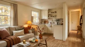
The repetition should be noticeable enough to connect the view without becoming a matching set. If the rooms already share a clear color relationship, save the money; adding another accent may weaken what is already working.
Repeat one existing note across the view.
Its job is to make separate zones acknowledge each other without turning the home into one repeated color scheme.
One bridge is enough. Once the connected rooms stop feeling unrelated, additional matching is unnecessary.
3. Swap Pillow Covers Before You Add Another Pillow
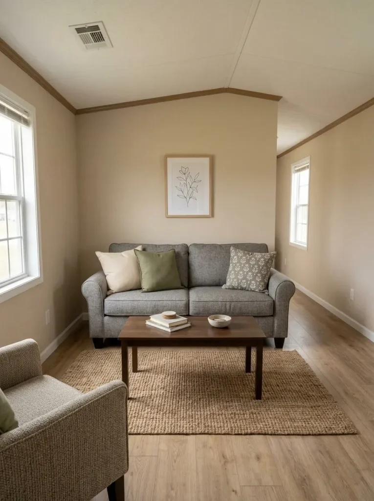
Does the sofa really need more pillows—or does it need a different surface?
In a narrow mobile-home living room, another stuffed cushion can consume usable seat width while introducing one more shape into an already furniture-heavy view. If the inserts you own remain comfortable and supportive, changing the covers gives you new color, texture, or pattern without increasing the physical volume of the seating zone.
Lay the removable pillows on the sofa and take away the covers that fight the palette you decided to keep. Re-cover only enough inserts to relate the sofa to the rug, artwork, or adjacent room.
If the sofa already looks crowded, reduce the pillow count first. If its scale or placement is the deeper issue, decorating will not fix the spatial relationship. Continue with the mobile home living room ideas guide for seating, circulation, rugs, windows, and larger room decisions.
Buying decision: change the visible layer before buying more filling.
4. Hide One Visually Busy Open Shelf With a Removable Fabric Panel
Some inexpensive decorating problems are really visibility problems.
An open storage shelf, laundry niche, craft area, or utility shelf can function perfectly well but still dominate a hallway or connected kitchen view because dozens of small packages, bottles, baskets, and supplies remain exposed.
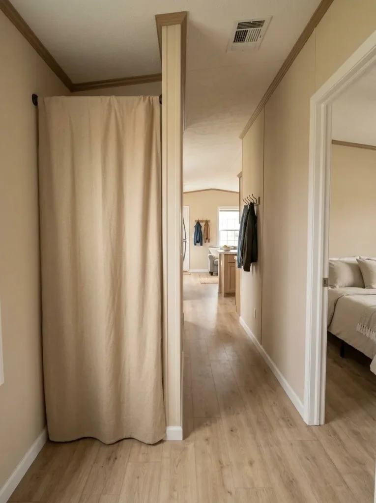
Where the opening is suitable, test a removable fabric panel using a simple non-permanent method such as an appropriate tension rod. A leftover curtain, washable fabric panel, or inexpensive neutral textile can turn many small visual signals into one calm surface.
Choose the fabric after looking at the surrounding wall, floor, and cabinetry. A highly patterned panel may hide the storage but create a new focal point.
Use the idea only for an appropriate open shelf or storage niche. Do not cover appliances, vents, heat-producing equipment, doors, or anything that needs unobstructed access.
Decision test: if the storage already looks orderly from the main sightline, leave it visible and spend nothing.
5. Give a Blank Panel Wall One Large Moment, Not Six Small Ones
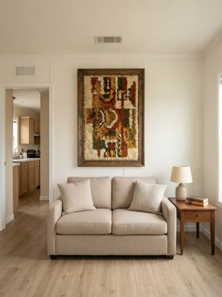
A blank wall can tempt you into filling it piece by piece because small frames and signs seem inexpensive. In a mobile home, that can backfire. Narrow wall sections, panel seams, windows, doors, and nearby furniture already create plenty of lines. Six unrelated little objects may make the wall busier without producing a real focal point.
Test one composition with enough visual weight to be understood from the doorway: a thrifted oversized frame, framed textile, substantial artwork, or tightly controlled grouping that reads as a single shape.
Take a photo from across the room. If you notice the individual objects before you understand the composition, simplify.
A larger visual moment does not require expensive art. It gives a modest purchase enough scale and breathing room to matter.
What kind of blank wall are you actually decorating?
A wall between openings needs a different composition from a long wall over a sofa. Choose by architectural condition, not an arbitrary frame count.
Use one vertical anchor.
A tall thrifted frame, textile, mirror, or single composition respects the narrow architecture.
Skip a scattered mini gallery squeezed between openings.Let furniture set the visual width.
Choose one substantial piece or compact grouping that reads as one unit above the furniture.
Stop when the wall and furniture begin to read together.Create one controlled horizontal composition.
A wide textile, oversized artwork, or related group can organize a long run without turning it into a row of unrelated bargains.
Leave enough wall visible for the composition to have an edge.6. Change the Shade Before You Replace a Sound Lamp
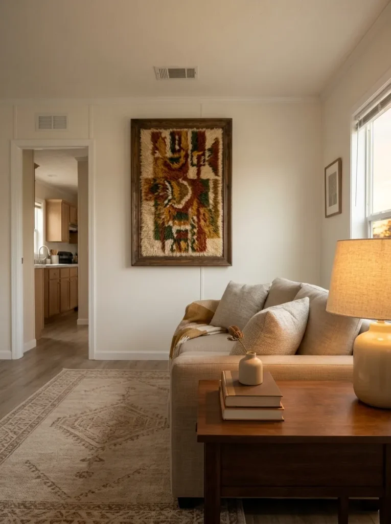
An older lamp base is often blamed for a dated look when the shade is creating most of the visible problem.
Remove the shade temporarily and look at the base by itself. If the material, shape, and scale still work with the room, test a simpler shade before replacing the whole lamp. You may also discover that a compatible shade from another lamp in the house creates a better proportion at no cost.
This is a useful micro-budget move because the shade occupies a surprisingly large part of the lamp’s silhouette.
Judge the change from where you normally sit, not from six inches away. If the shade suddenly looks enormous beside a narrow side table—or too small for the base—you have not solved the proportion.
Use only a shade compatible with the lamp and its fitting. A damaged lamp, cord, socket, or unstable base belongs in the repair-or-replace category, not the decorating category.
7. Put the Coffee Table on a Surface Budget: One Tray, One Useful Object, Open Space
Coffee-table decorating gets expensive when every empty inch feels like permission to buy another object.
Clear the table completely. Decide how much surface you need for drinks, remotes, books, or daily use. Return one useful or meaningful object. Add a shallow tray only when it genuinely contains loose items. Then stop while a visible portion of the tabletop is still open.
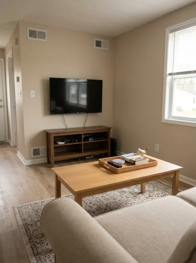
That empty area is doing design work.
In a compact living room, the coffee table often sits close to the sofa, rug, television area, and walking path. Clutter at the center can therefore make the entire seating zone feel visually denser.
A tray is optional. Usable surface is the non-negotiable part.
If the table stays calmer without any décor, that is the cheapest successful version.
8. Lean One Useful Board or Tray Against the Backsplash Instead of Buying Kitchen Décor
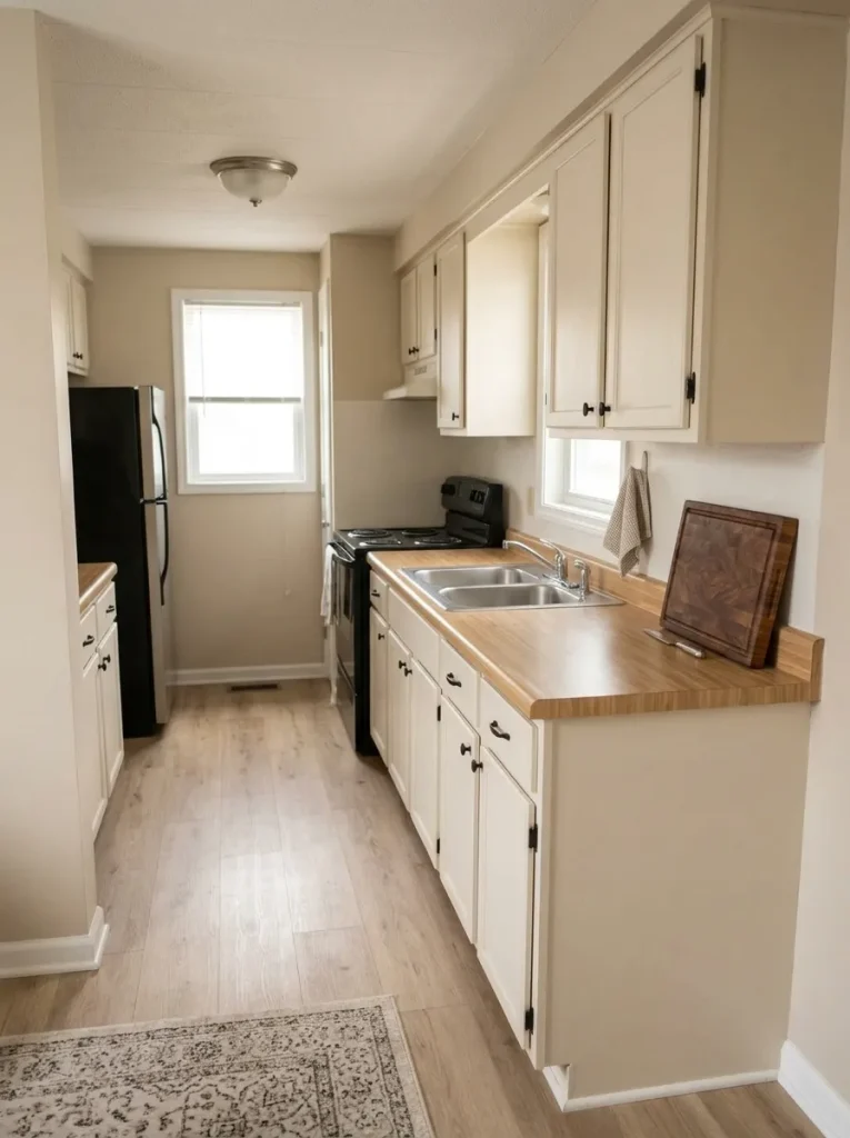
A small kitchen does not always need an object whose only job is decoration.
Look at the cutting board, serving board, tray, or other attractive kitchen piece you already use. When one has a warm wood tone, interesting shape, or quiet finish, placing it upright in an appropriate dry part of the counter can give the backsplash visual depth while keeping the object available for daily use.
The move works especially well in a mobile-home kitchen because counter depth is valuable. One thin upright object occupies less working area than a collection of jars, signs, faux plants, and decorative canisters.
Keep it away from heat, splashes, and locations where it blocks outlets or daily work.
For deeper decisions about cabinetry, storage, counters, and connected sightlines, continue with the mobile home kitchen ideas guide.
Let something useful earn the decorative space.
The object should improve the backsplash or counter view without needing several companions.
A cutting board, tray, or serving piece should remain easy to reach when needed.
Keep the footprint slim enough that preparation space still works normally.
9. Clear the Top of the Refrigerator and Let the Ceiling Breathe
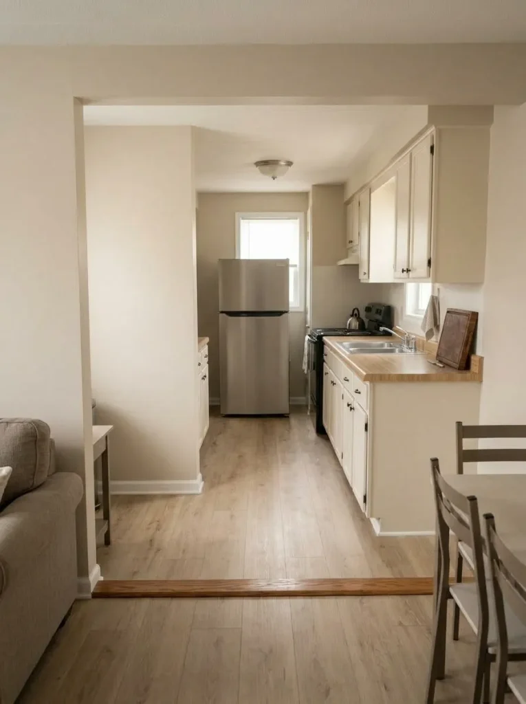
The top of a refrigerator often becomes accidental storage: cereal boxes, paper bags, spare containers, baskets, décor, and objects waiting to be put somewhere else.
In a compact kitchen, that collection sits unusually high in the visual field. When the ceiling already feels close, a row of miscellaneous objects above a tall appliance can make the entire corner look heavier.
Try a complete reset.
Remove everything from the top and photograph the kitchen from the doorway or living area. If the room immediately looks calmer, treat that clear upper edge as intentional negative space.
Relocate the objects into real storage according to how often they are used. Do not rush to replace the clutter with a decorative basket just because the surface is empty.
This $0 mobile-home decorating move works only when the refrigerator top is currently visually busy. If yours is already clear or built into cabinetry, move on.
10. Use One Long Runner to Tie a Narrow Dining Spot Back to the Kitchen
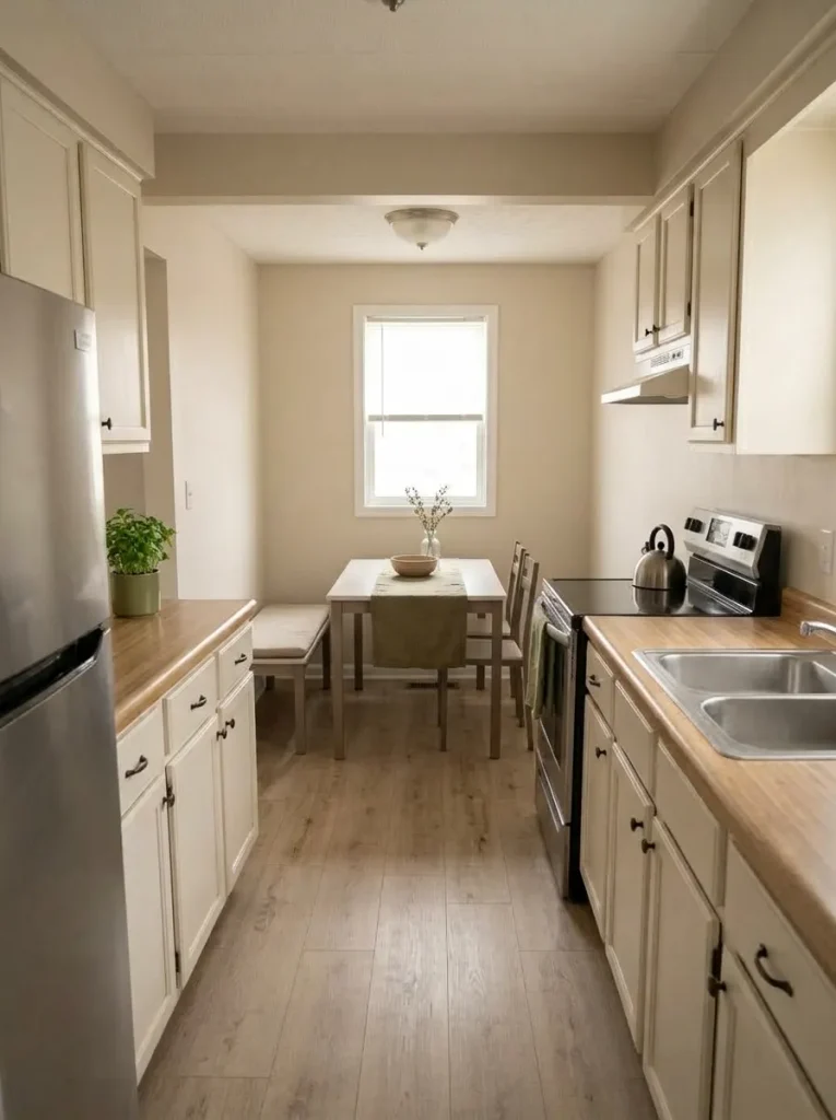
When a small dining area sits directly beside the kitchen, it can feel like leftover space between larger zones. One elongated textile can help the table read as an intentional destination.
A table runner is an easy version because it adds almost no footprint. Choose a color, weave, or texture that already appears elsewhere in the connected view.
Keep the remainder of the table quiet. One useful bowl or restrained centerpiece may be enough.
Skip the runner when the table is cleared repeatedly for meals, homework, work, or crafts and the textile becomes an everyday nuisance. A decorating idea should survive the way the household actually uses the furniture.
The decision is straightforward: will this item connect the dining zone without making the table less useful?
If not, a clean bare tabletop may be the better look.
11. Let the Bed Carry the Bedroom Makeover With One Dominant Textile
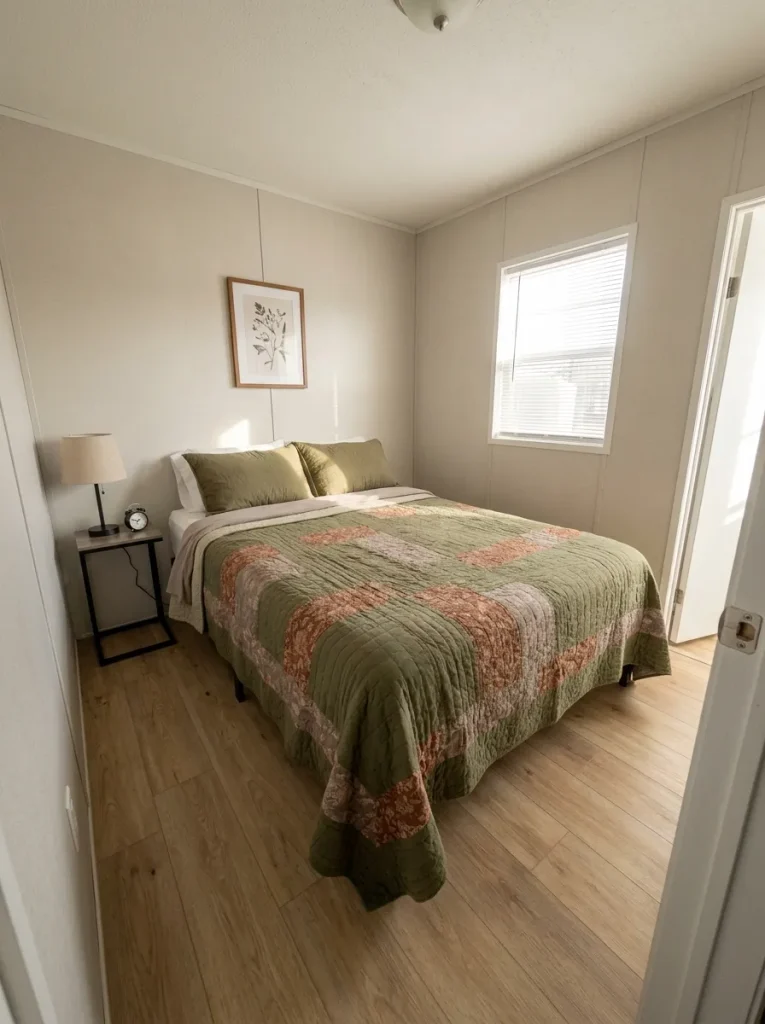
Walk into a compact bedroom and ask which surface occupies the largest part of your view. Usually, it is the bed.
That gives the bed enormous decorating leverage. A quilt, coverlet, duvet cover, throw, or other dominant textile can establish most of the room’s color direction in a single move. Smaller pillows, lamps, frames, and accessories can then support that decision.
Before shopping, remove extra decorative layers from the bed and photograph the room. Decide whether it actually needs more color, softness, texture, pattern, or contrast. Buy for the missing role rather than collecting bedding simply because it is inexpensive.
Comfort still outranks appearance.
For furniture scale, storage, doorway relationships, and complete room planning, continue with the mobile home bedroom ideas guide.
Budget priority: improve the largest visible textile surface before filling smaller furniture surfaces.
12. Refresh a Tiny Bathroom With a Three-Piece Textile Reset
A small mobile-home bathroom can look noticeably different without changing the vanity, tub, mirror, or flooring because so much of the room is visible at once.
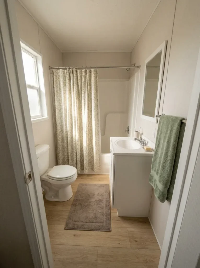
Use three soft elements to establish one direction. Depending on the room, that might mean a shower curtain, towel, and bath mat. One item leads, another echoes it, and the third stays comparatively quiet.
They do not need to match exactly.
If the real problem is moisture, damage, ventilation, or a failing fixture, textiles are cosmetic only. Decorating should never be used to disguise an underlying maintenance problem.
For larger room-level decisions, continue with the mobile home bathroom ideas guide.
Which surface is controlling the room right now?
Let the shower curtain lead.
When the curtain occupies a large part of the doorway view, give it the strongest color or pattern.
- Lead: curtain
- Echo: one towel color
- Quiet: restrained bath mat
Keep the large backdrop calmer.
If the vanity and towel zone dominate, let the towel color carry more of the accent while the larger curtain stays quieter.
- Lead: towel zone
- Echo: small curtain detail
- Quiet: floor textile
Reduce floor contrast first.
When the floor breaks up the room visually, choose a mat that settles into the surrounding palette rather than adding another strong pattern.
- Lead: controlled floor textile
- Echo: towel
- Quiet: simpler curtain
13. Hang a Secondhand Mirror Only Where It Reflects a Calm View
A thrift-store mirror can be one of the highest-impact inexpensive finds for a small home—but only when the reflection earns the wall space.
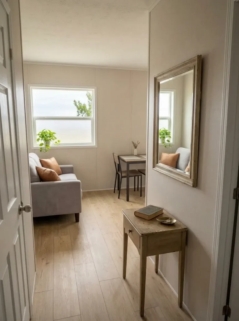
Before hanging it, hold or prop the mirror at the proposed location and study what appears inside it. Does it repeat a window, clean wall, lamp, greenery, or attractive connected room? Or does it double a crowded countertop, television wires, utility area, or the busiest part of the kitchen?
A mirror does not remove visual clutter. It can repeat it.
That effect becomes particularly noticeable in a compact interior because the reflected scene occupies a meaningful share of the room’s view.
Choose the location before buying the mirror. If every practical position reflects something you would prefer not to emphasize, leave the bargain at the store.
The cheapest mirror is still wasted money when it amplifies the wrong view.
14. Repeat One Finish on Three Small Objects to Connect an Open Floor Plan
Color is not the only way to connect visible rooms. A repeated finish can create continuity even when the living room, dining area, and kitchen use different colors.
Look across the open view and identify one material already worth keeping: matte black, warm wood, brushed metal, wicker, aged brass, or another recurring finish.
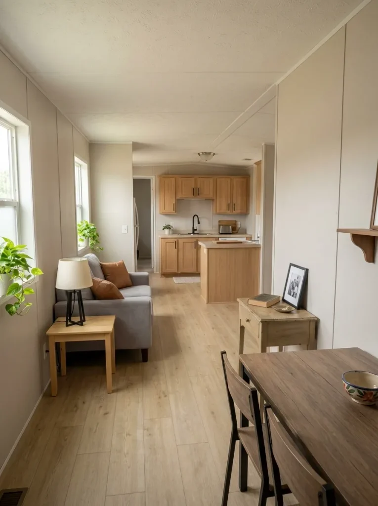
Echo that finish lightly on two smaller objects in other zones.
A black lamp base might relate to kitchen hardware while a narrow black frame carries the line into the dining space. Warm wood can travel from a table to a frame and then to a tray.
Three repetitions are an editing exercise, not a universal design rule. Stop earlier when the relationship is already visible.
Single-wide homes bring additional width and circulation constraints, so the single wide mobile home decorating guide goes further when the issue is spatial rather than decorative.
15. Go Tall With One Branch Arrangement Instead of Buying Five Small Accessories
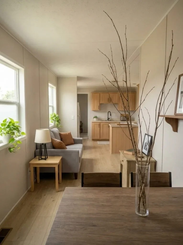
When a console, dining table, dresser, or counter end feels empty, the natural impulse is to spread several cheap objects across the surface.
Try height before quantity.
A narrow vessel with branches or tall stems can produce enough visual presence to be noticed across the room while occupying very little horizontal area. You may already own a suitable jar, vase, pitcher, crock, or bottle.
Check the arrangement from the normal walking path, not only while standing directly in front of it.
It should not block a television, cabinet door, mirror, conversation line, or working area. A surface that already includes a tall lamp or artwork may not need another vertical object.
The useful principle is small footprint, meaningful presence.
If one taller gesture solves the empty spot, five miniature accessories would only spend more money to do the same job less clearly.
16. Make the Front Door the Most Finished-Looking Part of the Exterior
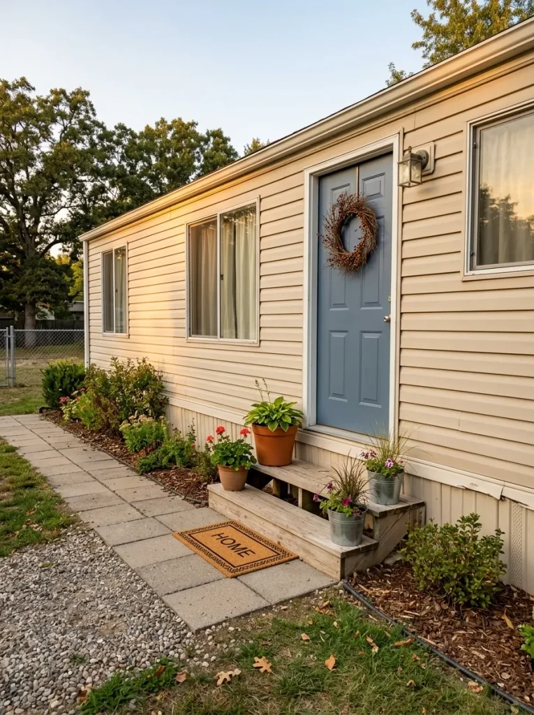
A long mobile-home façade can feel visually flat because windows, siding lines, skirting, and roof edges stretch horizontally across the structure. You do not need to rebuild the exterior to give the eye a stronger destination.
Start at the front door.
Clean the immediate entry first. Then decide whether one mat, restrained accent, pair of suitable planters, or another removable element would make the arrival point easier to read. Keep neighboring areas quieter so the entry becomes the natural focal point.
This is the low-cost lesson worth extracting from dramatic mobile-home before-and-after images. Their new siding, porches, windows, and landscaping may require substantial projects; their focal hierarchy can still teach you where attention belongs.
Décor should never interfere with ordinary door, step, rail, or walkway use.
What is weakening the arrival?
17. Buy One Larger Secondhand Anchor Before Five Tiny Bargains
Cheap décor stops being cheap when several low-priced purchases are required to make one corner feel finished.
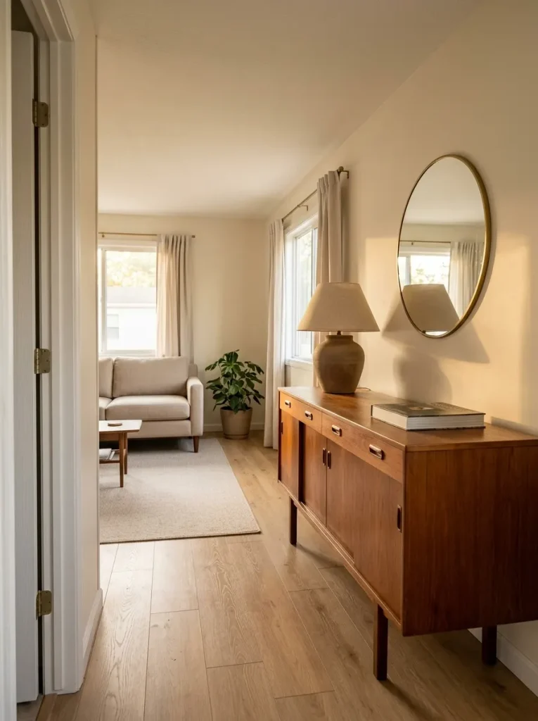
Before taking a thrift-store, flea-market, yard-sale, or resale find home, test four things. Destination: know exactly where it will go. Scale: make sure it has enough presence without crowding the room. Role: identify whether it solves emptiness, storage, lighting, reflection, texture, or another real problem. Condition: reject pieces whose odor, instability, heavy wear, or repair needs turn the bargain into a project.
A larger item is not automatically better. It still has to respect walkways, doors, furniture, and storage access.
The more useful question is no longer “Is this cheap?”
Ask:
“Does this one piece remove the need for several other purchases?”
That question can save more money than another discount.
Four questions before it comes home
Name the exact room and surface before buying it.
Will it have enough visual presence without crowding the room?
Know whether it is solving lighting, texture, storage, reflection, or focal weight.
A bargain stops being useful when repair, odor, instability, or heavy wear becomes the main project.
Final Thoughts
The strongest cheap mobile home decor ideas are rarely the ones that put the greatest number of inexpensive objects into a room. They solve the largest visible problem with the smallest sensible commitment: clearing a crowded sightline, making one wall strong enough to stand alone, improving the biggest textile surface, using an everyday object decoratively, or waiting for one secondhand piece with a clear role.
Start with the view that bothers you most. Make one change, photograph it again, and judge the result before opening your wallet for the next one.
A small budget becomes surprisingly powerful when every object has a destination, a purpose, and a reason to stay.
Save this guide to Pinterest so you can return to these dollar-friendly mobile home decorating ideas when you are ready for your next small change.