A mobile home can look dated from twenty feet away even when most of its individual finishes are still usable. That is why buying more décor is rarely the smartest first move. The largest visual gains often come from correcting the surfaces, edges, and repeated details your eye notices before furniture and accessories.
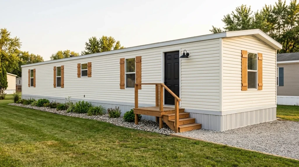
These cheap mobile home upgrades focus on that difference. Some improve a broad exterior plane, others clean up an awkward junction, and several make existing doors, cabinets, windows, or trim look far more intentional without replacing them.
Order matters. A freshly painted front door will not rescue a badly fragmented exterior, and expensive cabinet hardware cannot compensate for crooked doors or an unresolved wall finish. Start with the element that has the greatest visual reach, then work toward smaller details.
Use the Cheap Upgrade Reach Atlas in the first idea before spending anything. It helps separate a worthwhile cosmetic project from a repair or building-system issue that should not be disguised.
1. Repaint the Siding Before You Add Another Exterior Detail
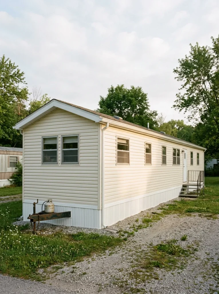
Stand far enough from your mobile home that you stop noticing individual screws, shutters, pots, and house numbers. What becomes the dominant surface? On many homes, it is simply the siding.
When otherwise serviceable siding is faded, unevenly patched, or visually disconnected from the trim, a compatible repaint or refinish can create more change than several smaller purchases combined. A restrained body color also gives later details—wood shutters, a contrasting door, dark lighting, or landscaping—a quiet background.
Treat paint as a finish correction, not camouflage. Identify the siding material first and follow coating guidance appropriate to that surface. Buckling, active moisture damage, corrosion, loose panels, or deterioration deserve attention before appearance.
A useful rule: if the home still looks tired after you mentally remove every decoration, improve the shell before buying more decoration.
Cheap Upgrade Reach Atlas
Use all three selectors. Together they tell you where to start, how widely to repeat the improvement, and when a project has moved beyond cosmetic DIY territory.
Cheap Upgrade Reach Atlas
Three quick decisions separate a high-impact cosmetic update from a project that is too narrow—or too technical—to deserve your budget first.
2. Frame Plain Windows With Simple Wood Shutters
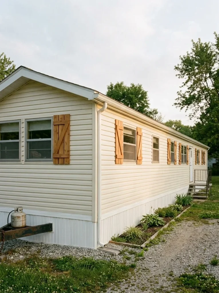
Long mobile-home elevations can look especially flat when siding, trim, and windows sit within the same shallow visual plane. Simple wood shutters introduce vertical rhythm that breaks that length without changing the actual window openings.
The polished effect comes from proportion and repetition. Keep each pair visually appropriate for its window, use the same board width and finish across the façade, and align the tops and bottoms carefully. Warm wood tones can work particularly well against restrained white, cream, gray, blue, or green siding.
Do not squeeze shutters beside windows that already sit close to a corner, porch post, meter, or neighboring opening. Decorative shutters become less convincing when the wall clearly lacks enough breathing room.
Test one window first. If the pair makes the opening look taller and more deliberate from the curb, repeat it. If the wall simply looks busier, leave that architecture alone.
3. Give the Front Door One Strong Contrast Color
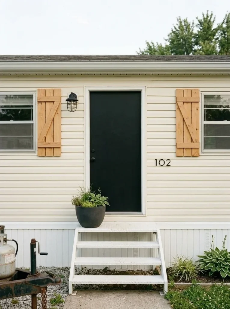
On a long mobile-home façade, the entrance can disappear among several similarly sized windows. A stronger door color gives the eye a destination and can make the exterior feel planned before you change anything else around it.
The door should become the anchor while nearby details act as support. Against pale siding, charcoal, muted green, deep blue, or another grounded tone can provide definition. Against a darker exterior, a lighter or warmer door may create the separation you need.
The effect weakens when the same contrast spreads everywhere—door, shutters, skirting, porch rails, planters, signs, and several other accents. One focal point quickly turns into visual competition.
Use this rail to decide whether your entry needs more contrast or less.
Entry Contrast Rail
Make the door carry the contrast.
Choose one noticeably deeper, warmer, or lighter door finish against the siding. Keep nearby trim quieter so the entrance becomes the obvious visual destination.
- Door = strongest contrast
- Numbers/light = supporting finish
- Planters = quieter background layer
Do not repaint what already works.
Keep the door and repeat one of its existing tones once nearby—in the light fixture, house numbers, mat, or planter. The upgrade comes from coordination, not another focal color.
Remove competition before adding color.
Let the door remain the entry cue, then reduce secondary contrast around shutters, pots, rails, signs, or decorative objects. Fewer competing edges can make the same inexpensive materials look considerably more deliberate.
4. Refinish an Existing Porch So It Reads as One Intentional Platform
A small porch does not need elaborate railings or a new roof to improve curb appeal. When the structure is sound, a cheaper opportunity is making the surfaces already there read as one finished platform.
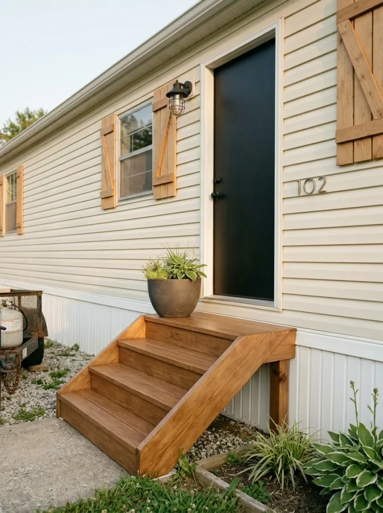
Look at the deck boards, stair treads, risers, fascia, posts, and exposed edges together. Fresh stain on the floor with faded stairs beneath it still reads as a partial project. Bringing related wood surfaces into one coherent finish makes modest construction feel more deliberate.
Before cosmetic work, inspect what you are trying to preserve. Movement underfoot, significant rot, unstable steps, sagging members, or questionable railing strength are repair or structural concerns and should not be hidden beneath paint or stain.
If the porch is sound, clean it thoroughly, address minor finish defects appropriate for DIY work, test the coating in an inconspicuous area, and finish connected surfaces as a family. Then stop. Restraint usually looks more polished than a porch crowded with inexpensive extras.
5. Make the Skirting Look Like a Finished Base, Not an Afterthought
Skirting occupies an unusual position on a mobile home: it sits low enough to be ignored while decorating, yet it can run across almost the entire exterior. Mismatched, stained, crooked, or heavily patched panels can make the home look unfinished even after the wall above them improves.
First decide whether the problem is cosmetic. Sound skirting may benefit from cleaning, a compatible finish, neater visible edges, or a clearer relationship with the siding and trim. Damaged sections need an appropriate repair or replacement plan before color becomes the priority.
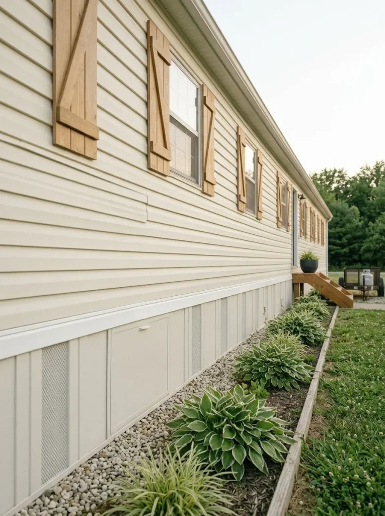
Do not seal required ventilation or block access points for the sake of a cleaner façade. HUD’s manufactured-home installation standards address crawlspace ventilation with skirting and require access to under-home connections; the home’s installation instructions and applicable local requirements still matter. (HUD)
Use the condition matrix before treating the skirting as a weekend paint project.
Skirting Condition Matrix
Choose the description closest to what you can actually see. Appearance is the last layer, not the first.
Refinish the base as one continuous visual band.
Clean first, confirm the existing material can accept your chosen finish, preserve every required opening, then coordinate the skirting with either the body siding or a deliberately quieter base color.
- Keep panel rhythm consistent
- Reduce obvious patch-color changes
- Leave required ventilation and access functional
Correct the interruption before you unify the color.
A fresh finish can make one warped or broken section even more obvious. Address isolated defects with a compatible repair or replacement approach, then evaluate the full run from several feet away.
Protect the building function before the curb appeal.
Do not cover, seal or disguise a condition you have not identified. Ventilation, drainage, service access and moisture concerns belong ahead of the cosmetic upgrade.
6. Add a Narrow Gravel-and-Greenery Border Along the Long Wall
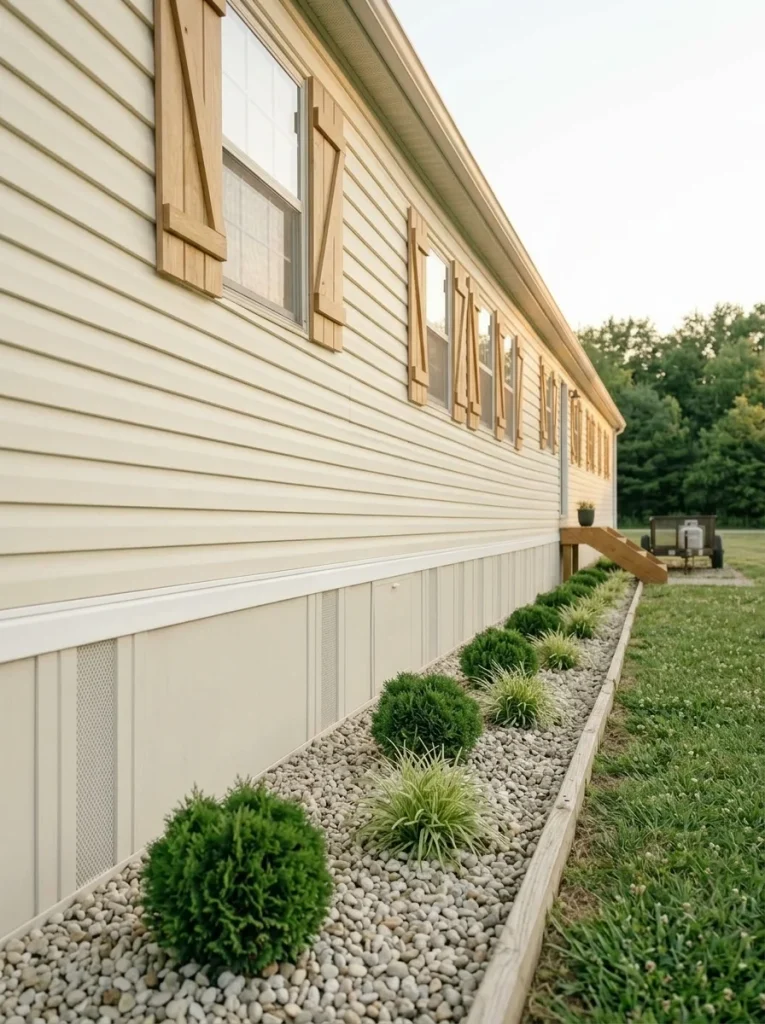
A long mobile-home exterior can have one awkward visual problem: the siding ends abruptly at the ground. Even a freshly improved wall may still feel unfinished when grass, bare soil, utility gravel, and the home’s base meet without a deliberate boundary.
A narrow landscape strip can solve that without turning the yard into a major project. Use gravel, mulch, or another suitable ground treatment to create a clear line, then repeat a small number of compact plants with breathing room between them. Repetition matters more than filling every inch.
For a long single-wide elevation, several repeated plants usually read more calmly than a collection of unrelated bargain finds. Keep planting clear of areas that need drainage, ventilation, service access, or regular maintenance.
Walk to the driveway or street after the work is finished. If your eye follows a clean lower edge along the home, the landscape strip is doing useful visual work.
7. Upgrade House Numbers and Entry Details as One Small Exterior Set
Cheap exterior updates begin looking more considered when several small pieces appear to come from the same design decision.
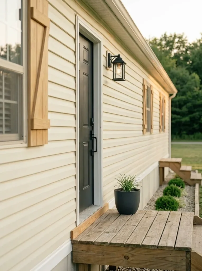
A new light, a fresh address plaque, a replacement handle, and a planter can all be attractive on their own and still leave the entrance feeling pieced together. The purchases are new; the composition remains scattered.
Choose one supporting finish for two or three small elements near the door. Examples include matte black light plus house numbers, warm bronze handle plus mailbox, or natural wood detail plus a simple planter.
The pieces do not need to match exactly. They only need enough relationship that the entrance stops displaying several unrelated finish families within a few feet.
Spending rule: once the door is clearly the focal point and the surrounding details support it, stop. Another decorative sign or lantern is unlikely to add the same value.
8. Paint Wall Panels and Battens Into One Continuous Interior Plane
Many older mobile homes have wall seams, battens, or panel transitions that divide a wall into narrow vertical sections. Those lines are not automatically unattractive, but strong contrast at every seam can make a compact room feel fragmented.
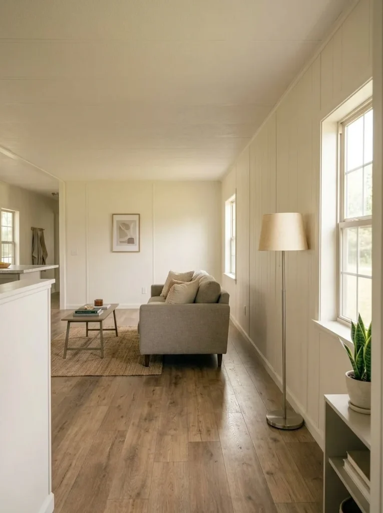
A more contemporary treatment often begins by making the wall read as one surface first and letting the seams become secondary.
That does not require blindly filling or removing every strip. Some battens belong to the existing wall system and may be better preserved. The cosmetic opportunity may be as simple as using a restrained wall-and-batten relationship so the vertical lines stop dominating the room.
Test one small section, then look from the doorway. If the wall reads as a larger plane and furniture or artwork gains visual importance, the treatment is helping.
Surface Cohesion Split
Surface Cohesion Split
Every strip becomes a separate visual event.
This can suit a deliberately paneled style, but in a narrow room it may make the wall feel busier and more segmented than necessary.
The wall reads as one larger plane.
Similar wall and batten finishes allow furniture, art, windows, and architectural edges to become more visually important than every vertical seam.
Decision rule: keep stronger seam contrast when the panel rhythm is part of the style you want. Quiet it when the seams dominate a small or already visually busy room.
9. Quiet Ceiling Strips and Seams With One Consistent Finish
Low ceilings are common in older mobile homes, so the ceiling occupies more of your peripheral vision than it would in a tall room.
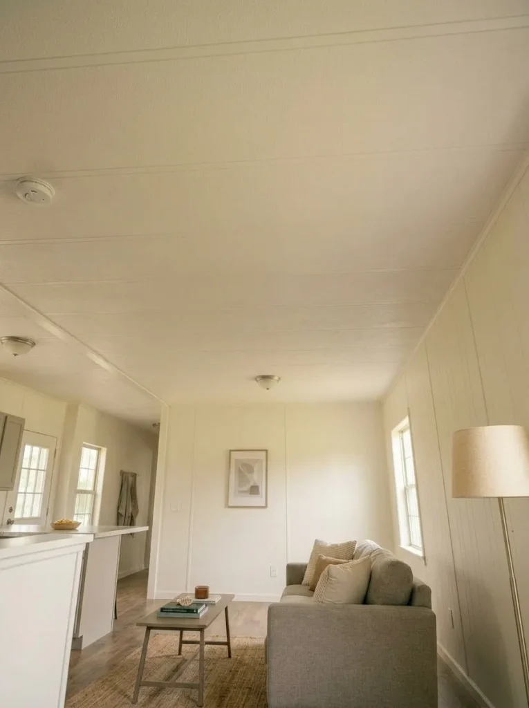
When ceiling strips, patches, vents, and perimeter trim all contrast strongly, the overhead plane can feel more complicated than it actually is. A consistent finish across compatible ceiling details lets the eye read the surface as one field.
Identify what each strip or panel is before refinishing. Cosmetic work should never cover evidence of leaks, sagging, staining, or movement.
Try a seated-view test. Sit in your usual chair and look straight ahead. If the ceiling is still the first surface demanding attention, it may be too visually active. If it recedes and the room becomes the focus, the hierarchy is working better.
10. Repaint Baseboards and Trim So Every Room Shares the Same Edge Language
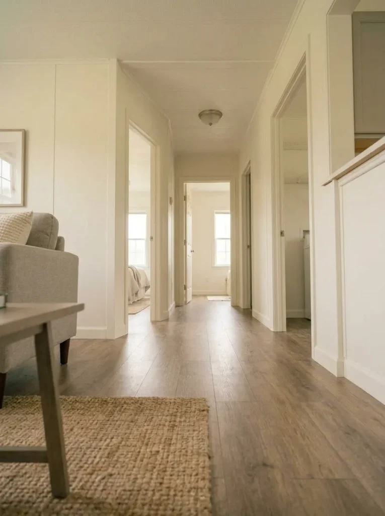
Baseboards are inexpensive to ignore and surprisingly influential once they begin disagreeing with one another.
A white baseboard in the living room, yellowed trim in the hall, stained casing at one doorway, and patched paint around another can make connected rooms feel like separate renovation eras.
Audit the edge language already in the home:
- Are the baseboards roughly the same visual weight?
- Do door casings belong to the same finish family?
- Are repaired corners drawing unnecessary attention?
- Does one bright trim color chop up an open plan?
- Would cleaning and repainting be enough?
Compact homes often reveal several rooms at once, so consistency travels farther. Replace trim when condition or damage justifies it. If the profile is serviceable, a careful clean-and-paint pass may deliver most of the visual improvement with much less disruption.
11. Paint Interior Doors and Coordinate the Knobs Before Replacing Them
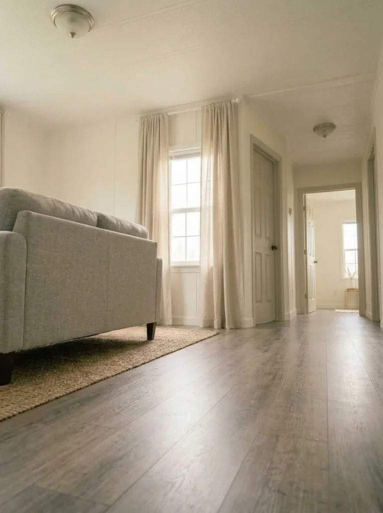
Interior doors are larger surfaces than they seem.
In a short hallway or narrow sightline, several doors can occupy a substantial share of the visible wall area. If every slab has a different aged beige, wood tone, patchy white, or mismatched knob, the home may look more tired than the surrounding walls.
Start with the doors you see together. Painting that group in one controlled finish creates a stronger reset than replacing a single door in isolation.
Use this order:
door surface → hinge appearance → knob consistency → replacement only if needed
New slabs are rarely the first move when the existing doors operate well. If a door is badly damaged, does not close safely, or no longer fits its frame properly, the project has moved beyond a cosmetic refresh.
The expensive-looking cue is a repeated set that appears intentional.
12. Raise Curtain Rods and Use Full-Length Panels to Stretch Low Ceilings
A small mobile-home window can appear even smaller when the curtain rod sits directly on the frame and the fabric ends awkwardly above the floor.
Moving the visual starting point upward and using longer panels can make the window composition feel taller without changing the opening itself.
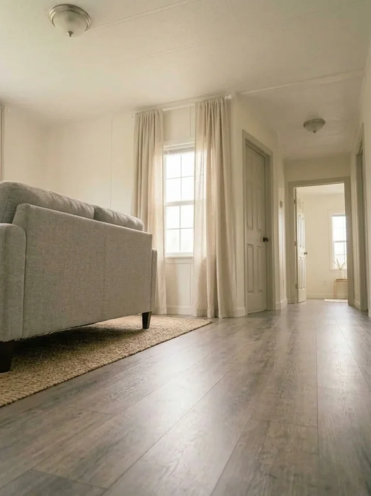
Do not rely on one universal internet measurement. Wall clearance, curtain style, hardware, nearby cabinets, ceiling height, and the actual window all affect what looks appropriate.
Compare two arrangements from the doorway. In the first, the rod hugs the window and short panels emphasize the opening’s exact size. In the second, the rod sits higher where the wall allows, the panels extend toward the floor, and the fabric opens wide enough to expose the glass.
Choose the version that makes the whole window wall feel calmer and taller, not the one that merely follows a formula.
For readers working specifically with a narrow single-wide interior, this specialist guide takes the same expensive-looking principle through the rest of the home:
15 Ways to Make a Single Wide Look More Expensive Without Remodeling
13. Add Plug-In Accent Lighting Where One Ceiling Fixture Makes the Room Feel Flat
Many modest rooms rely on a single central ceiling fixture. It may provide enough light to function while still making the space feel visually flat.
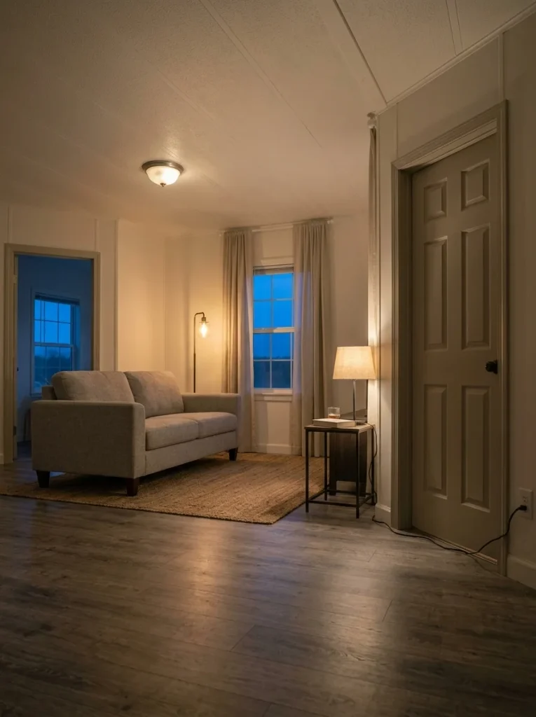
A plug-in table or floor lamp adds a second height of light without entering hardwired electrical work. Think in layers: the ceiling fixture handles general visibility, a lamp supports seated use, and a small accent source can add depth during the evening.
The difference is easiest to judge after sunset. One bright overhead source often reveals every wall with similar intensity. A lower lamp creates areas of relative brightness and shadow, helping inexpensive materials look warmer and more dimensional.
Keep cords out of walking paths and skip locations that cannot accommodate the lamp safely. If the living room needs a broader expensive-looking reset, continue into the specialist guide below.
15 Mobile Home Living Room Ideas That Make the Space Look Expensive
14. Replace Mismatched Switch and Outlet Plates With One Finish
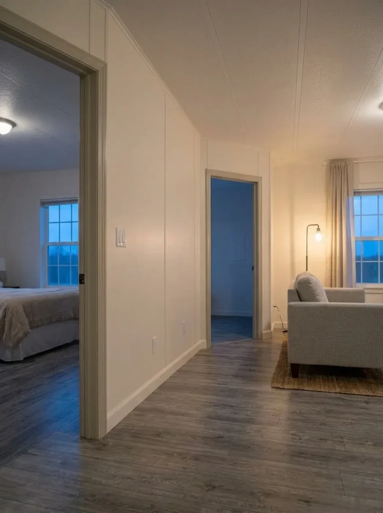
This is one of the smallest projects on the list, which is why it should remain small.
Switch and outlet plates become noticeable when connected rooms contain several colors, shapes, paint marks, cracks, or generations of replacements. Each piece is minor; the repetition makes the inconsistency visible.
Walk the longest interior sightline and count how many plate styles you can see. If several compete, standardizing compatible visible covers can clean up the wall quickly. Use the proper type and size for the existing device, and keep the project to the cover plates themselves. Electrical alterations belong outside this cosmetic task.
Do this after wall and trim colors are settled so you are not choosing a finish that immediately conflicts with the next paint decision.
Once the plates visually recede, stop.
15. Tune Cabinet Doors and Hardware Before You Consider New Cabinets
Kitchen cabinets are easy to blame because they occupy so much wall area. Yet old cabinetry can look worse than its actual condition when several smaller problems stack together: crooked doors, loose pulls, inconsistent gaps, mixed knobs, and tired surface finishes.
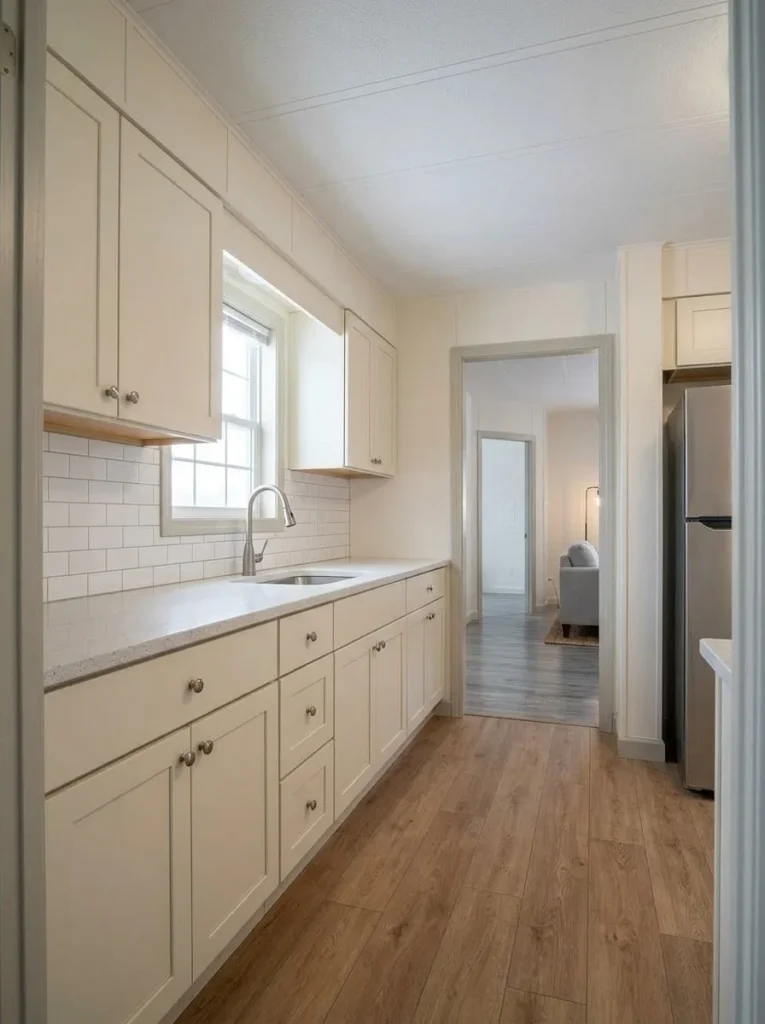
Separate cabinet structure from cabinet presentation before deciding the cabinets need replacement.
If the boxes are sound, the doors function properly, and the basic layout works, begin with alignment and visible consistency. A modest kitchen can change substantially once the door run stops looking like a collection of separate objects.
Cabinet Tune Sequence
Cabinet Tune Sequence
Function
Confirm doors and drawers operate acceptably and the cabinet boxes are worth preserving.
Alignment
Correct obvious door or hardware irregularity that makes the run look uneven from normal viewing distance.
Finish
Only after the first two steps should paint, refinishing, or another surface treatment become the visual priority.
Hardware
Use compatible, consistently placed pulls or knobs as the final punctuation—not as a disguise for unresolved cabinet problems.
For surface identification, preparation, paint strategy, hardware-hole decisions, exposed hinges, and finishing details, move into the dedicated cabinet guide before starting the full project.
15 Mobile Home Kitchen Cabinet Makeover Ideas Without Replacing Them
16. Turn the Backsplash Into One Calm, Continuous Surface
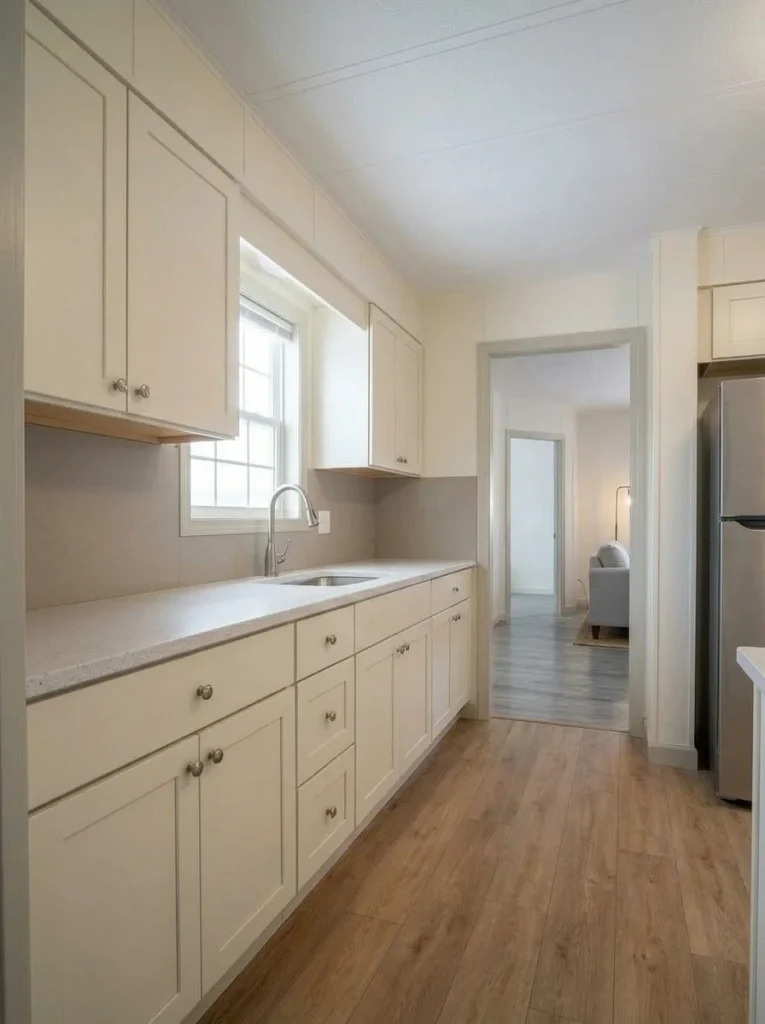
A backsplash occupies a relatively small area, yet it sits directly between two of the kitchen’s largest visual masses: the counter and the upper cabinets.
That makes it an effective place to simplify. If the existing backsplash is visually busy, heavily patched, or broken into several materials, a more consistent surface can make the cabinetry around it appear cleaner without replacing the cabinets.
Ask one question before shopping: does this kitchen need more pattern, or less interruption?
A room with strong countertop pattern, cabinet grain, appliances, hardware, and open objects may benefit from a quieter backsplash. A very plain kitchen may have room for stronger texture.
Peel-and-stick and other DIY surface products are not universally suitable for every substrate, moisture condition, or heat exposure. Follow the instructions for the exact product and location. If several kitchen surfaces need work, use the full budget kitchen makeover guide to control the sequence and avoid cost creep.
17 Mobile Home Kitchen Makeover Ideas on a Budget
17. Replace an Undersized Bathroom Mirror and Repeat One Metal Finish
In a small bathroom, the mirror can occupy more visual space than the vanity itself.
A mirror that feels too small, oddly positioned, or disconnected from the sink below can make the whole wall look temporary even when the vanity is serviceable.
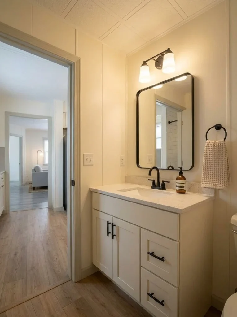
The answer is not automatically the biggest mirror that fits. It should relate visually to the vanity while leaving practical room for lighting, outlets, medicine cabinets, trim, and other fixed elements.
Then look at the metal finishes around it. A faucet, light, hooks, cabinet pulls, and mirror frame do not all need to match, but reducing unnecessary finish competition can make the vanity wall feel calmer.
Mirror Proportion Gauge
Mirror Proportion Gauge
The mirror looks like an object floating above the vanity.
Consider a larger composition if surrounding wall conditions allow it.
The two pieces read as one vanity zone.
The mirror has enough presence to relate to the cabinet without swallowing the wall.
The mirror overwhelms the surrounding wall.
A smaller option may leave better breathing room around lights, outlets, trim, or neighboring fixtures.
If the bathroom project starts moving into fixtures, plumbing, flooring, or other deeper work, shift to the dedicated budget-remodel guide so the cosmetic update does not quietly become a larger renovation.
17 Mobile Home Bathroom Remodel Ideas on a Budget
18. Replace Chipped or Mismatched Floor Transition Strips
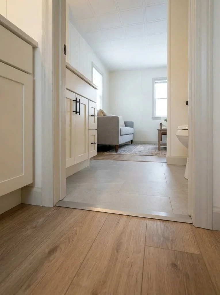
Floor transitions are easy to overlook because they are narrow. Your eye still registers them every time one room meets another.
A bright metal strip between warm floors, a cracked threshold, exposed fasteners, or several different transition profiles can make otherwise decent flooring feel less finished. In compact mobile homes, these junctions may appear together within one sightline, increasing their visual weight.
Inspect the surrounding floor before buying anything. If both sides are secure and the transition is simply worn or visually mismatched, a compatible replacement may be a worthwhile finishing detail. If the floor is loose, swollen, uneven, soft, or damaged, the strip is not the real problem.
Match the transition to the actual flooring conditions and installation requirements. Once finished, it should visually bridge the surfaces without becoming a decorative feature of its own.
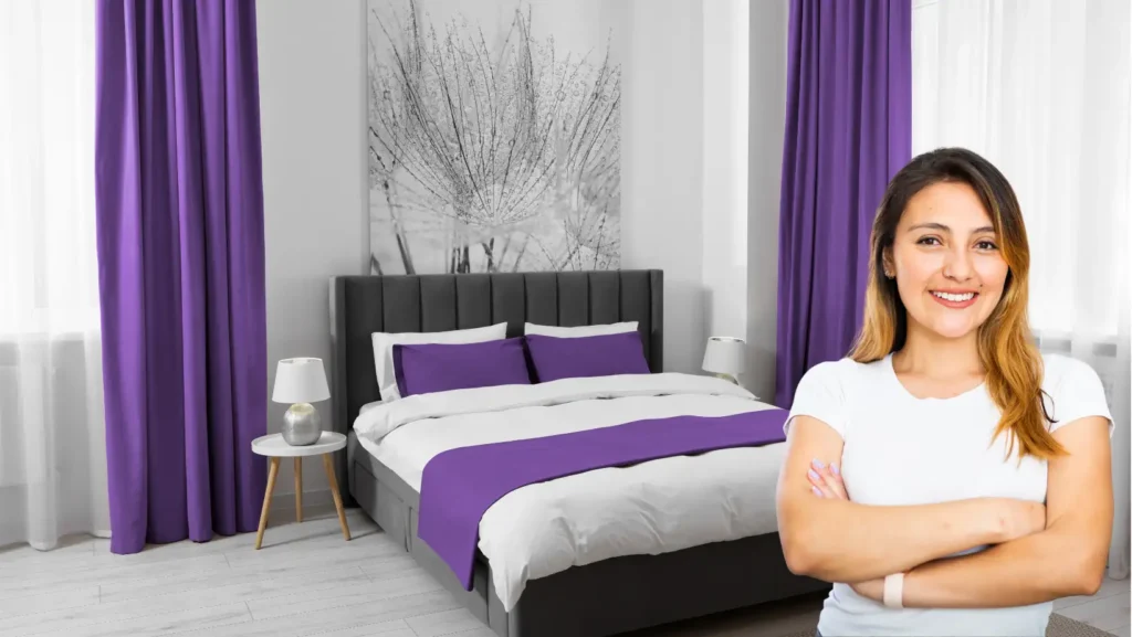
19. Paint the Bed Wall as a Headboard-Width Focal Panel Instead of Filling It With Décor
A bedroom does not need another basket, sign, shelf, and collection of small frames to feel designed.
Sometimes the cheaper move is one controlled field of color behind the bed. A full wall, centered panel, or wider-than-headboard color block can add depth without taking up floor space, which matters in compact mobile-home bedrooms.
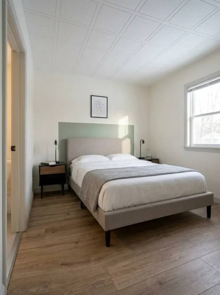
Keep the geometry simple enough that it supports the bed rather than becoming a mural competing with it. Clean edges and proportion matter more than complexity.
Try a subtraction test: imagine the pillows, lamps, and wall accessories removed. If the bed wall still has a clear focal structure, you can decorate less.
For a fuller treatment of scale, doorway views, storage pressure, and luxury cues in compact bedrooms, continue with this specialist guide:
15 Mobile Home Primary Bedroom Ideas That Feel More Luxurious
20. Add Plug-In Under-Cabinet Light Where the Kitchen Looks Flat After Dark
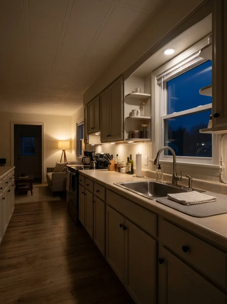
Some kitchens look acceptable in daylight and surprisingly dull at night. The ceiling fixture may illuminate the room while leaving the countertop zone visually disconnected from the cabinetry above it.
Plug-in under-cabinet lighting can introduce a shallow layer of light across the work surface without requiring hardwired electrical work.
It is most useful when the counter falls into shadow, upper cabinets visually merge with the backsplash, or evening prep feels dim despite adequate general lighting. Keep the installation neat; visible cords crossing the backsplash can trade one visual problem for another.
Choose products intended for the location and follow their installation instructions. If the project requires wiring changes, stop treating it as the cosmetic task described here.
At night, step into the adjoining room. A successful installation makes the counter read as a distinct horizontal layer instead of a dark strip under the cabinets.
21. Add Lightweight Picture-Frame Trim to the Wall You See First
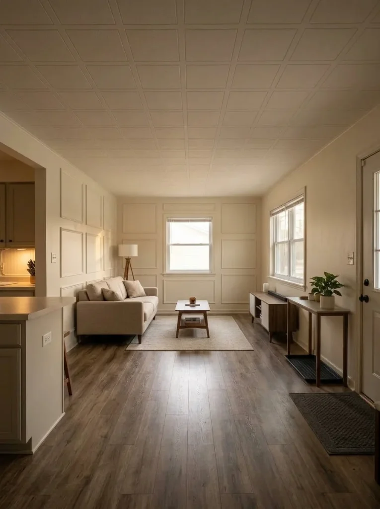
Architectural detail has unusual impact in a mobile-home interior because many rooms begin with fairly simple wall planes. That does not mean every wall needs molding.
Choose the wall that appears first from the entry or anchors the main seating area. A restrained picture-frame treatment can introduce shadow and proportion without using bulky furniture or a collection of wall décor.
Fewer, larger rectangles usually create a calmer effect than covering a small wall with many narrow boxes. Painting the trim with the wall keeps the relief subtle; stronger contrast belongs only where the room can carry more visual activity.
Before attaching anything, identify the wall construction and use a lightweight installation approach appropriate to that material. Do not assume fastening methods from conventional drywall automatically suit every manufactured-home wall assembly.
Lay out the design with removable tape first. If the wall gains a clear rhythm from the doorway, stop adding boxes. If the tape pattern becomes the first thing you see, simplify it.
Before You Spend: Run a Three-View Test
The cheapest project is still wasted money when it fixes the wrong visual problem. Before choosing your first upgrade, inspect the home from three distances.
Curb view: look for the largest exterior interruption—siding, skirting, windows, entry, porch, or the ground line. If the problem is obvious here, start outside.
Doorway view: notice the broad interior planes that appear together—walls, ceiling, trim, doors, windows, and floor junctions. Repeated inconsistencies deserve priority over small accessories.
Seated view: only now judge the smaller details: lamps, plates, cabinet alignment, backsplash, mirrors, hardware, and focal-wall finishing.
That sequence protects a limited budget because visual reach gets solved before decorative detail.
Final Thoughts
Cheap mobile home upgrades look convincing when they remove visible inconsistency before adding more decoration. Start with the widest problem you can see from the curb or doorway, then move toward smaller junctions such as trim, hardware, lighting, mirrors, and transitions.
Preserve sound components when a finish correction is enough, and stop cosmetic work when moisture, structure, ventilation, plumbing, or wiring enters the project.
The most polished result is usually the home where siding, edges, light, materials, and repeated details feel deliberate together—not the home with the longest shopping list.
Save this guide to Pinterest before your next update and work from visual reach down to finishing detail.