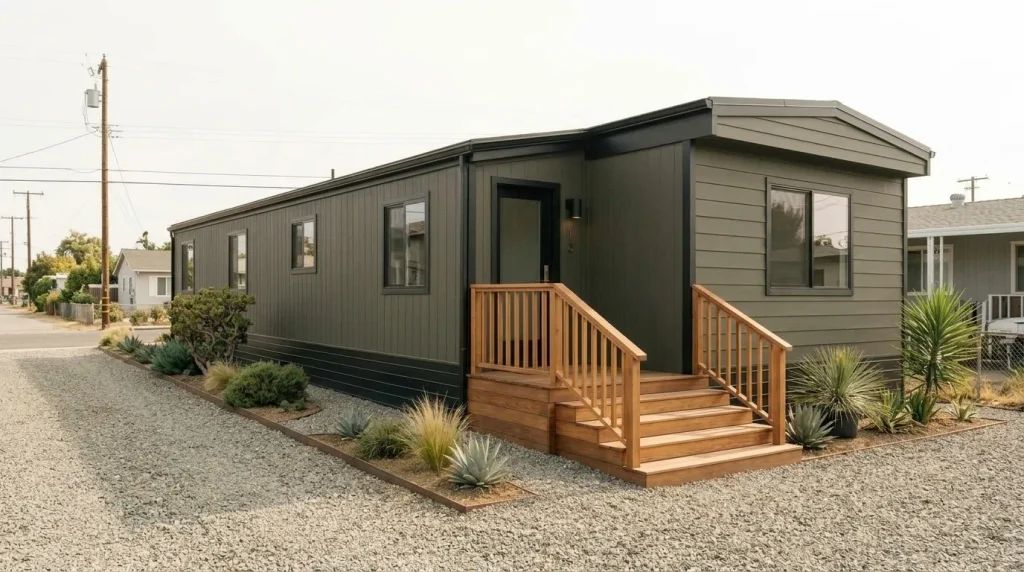
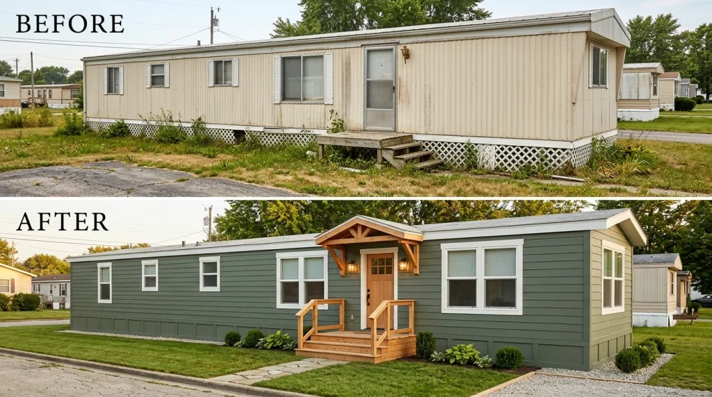
An 1980s mobile home makeover can create an astonishing transformation without turning the house into something unrecognizable.
In many homes from this period, age is communicated through an accumulation of smaller signals: wall battens, dark trim, segmented flooring, older ceiling fans, layered window treatments, oversized furniture, shiny hardware, heavy cabinetry, and exterior details that all compete for attention.
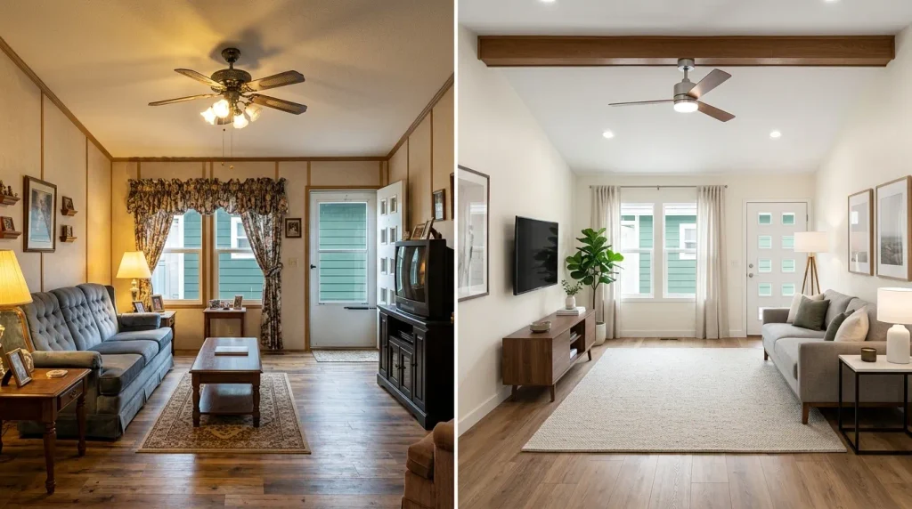
The smartest starting point is therefore not demolition.
It is diagnosis.
In U.S. terminology, a factory-built home produced in the 1980s is generally classified as a manufactured home, because the federal HUD Manufactured Home Construction and Safety Standards took effect in 1976. “Mobile home” remains the familiar phrase many homeowners use when searching for remodeling and decorating ideas, so both terms appear naturally here.
The following 17 ideas focus on deciding what deserves to stay, what merely needs visual editing, where replacement creates meaningful improvement, and when a cosmetic makeover should stop until an underlying condition has been checked.
1. Start With an 1980s Feature Triage: Keep, Modernize, Replace, or Verify First
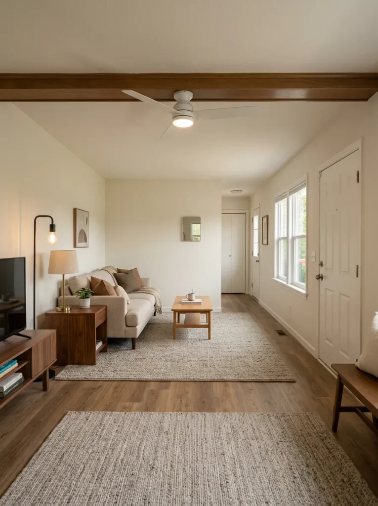
Stand at the main entrance and look through the home before making a shopping list.
Which five or six things reveal the decade immediately?
Perhaps it is dark wall trim, an older fan, brown cabinetry, several flooring materials, gathered curtains, bulky bedroom furniture, or an exterior entry that disappears into a long façade.
Now make a more important distinction:
Is the feature old, dated, damaged, or simply surrounded by the wrong things?
Those are not the same problem.
A solid cabinet can be visually dated and structurally useful. Good wood trim can look heavy while the room around it is dark, then become an asset after other brown finishes disappear. A porch railing may simply need aesthetic attention—or movement and deterioration may indicate a problem that should be assessed first.
Use this decision tool before committing to removal.
1980s Makeover Triage Atlas
What should happen to the feature you are looking at?
Choose the condition that best describes it. A stronger makeover comes from treating different features according to what they actually need.
Keep the character.
A sound feature with useful material, proportion, function, or architectural character may become more attractive once competing finishes are reduced.
Change the expression.
The component still functions, but its color, shine, trim, hardware, or surrounding styling anchors the room in another era.
Let replacement earn its cost.
Replacement makes sense when the feature remains dominant after simpler edits, no longer works well, or cannot reasonably join the new material language.
Pause the cosmetic work.
Movement, moisture, deterioration, questionable wiring, damaged steps, or uncertainty around structural changes deserves investigation before a new finish hides the evidence.
This first decision can save money throughout the makeover because it stops “old” from automatically becoming “replace.”
For significant structural alterations or changes involving manufactured-home systems, HUD advises owners to consider applicable manufacturer, state, and local requirements. See the HUD manufactured-home resources.
2. Calm Busy Wall Panels and Battens Before You Start Demolition
A wall can date an older manufactured home even when there is nothing inherently wrong with the wall itself.
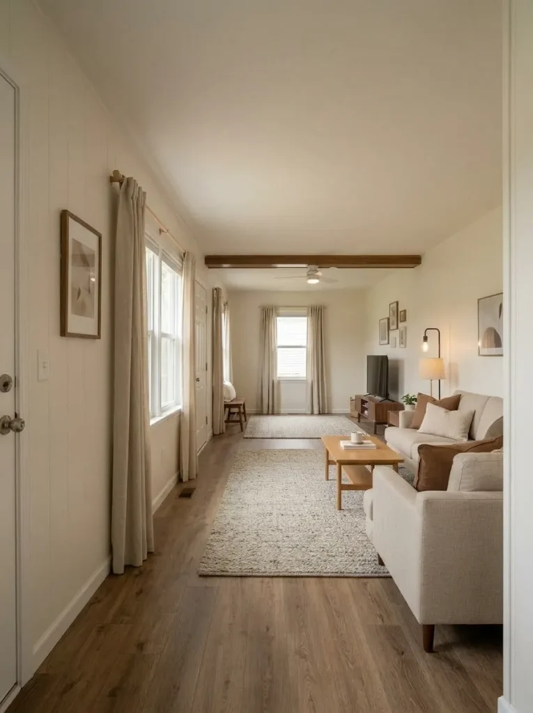
Panel seams, narrow battens, chair rails, wallpaper borders, faux-wood lower sections, contrasting trim, and several nearby colors create repeated vertical and horizontal interruptions. In a relatively narrow room, those interruptions become surprisingly noticeable.
Before tearing paneling out, test whether contrast is the real problem.
Take a photograph and imagine the field, seams, and trim belonging to a much quieter palette. If the architecture immediately seems less distracting, the makeover may need visual unification more than removal.
This is especially useful when existing walls are sound.
A calmer finish allows furniture, windows, artwork, or an intentional wood feature to become the dominant information in the room. The wall stops behaving like decoration and returns to its supporting role.
Damage changes the decision. Swelling, softness, staining, persistent moisture evidence, or loose material deserves investigation before a cosmetic layer is added.
The practical rule is simple: do not remove an entire wall treatment until you know whether the material is the problem or the visual rhythm is the problem.
3. Rebuild the Ceiling Plane So It Stops Dating the Whole Room
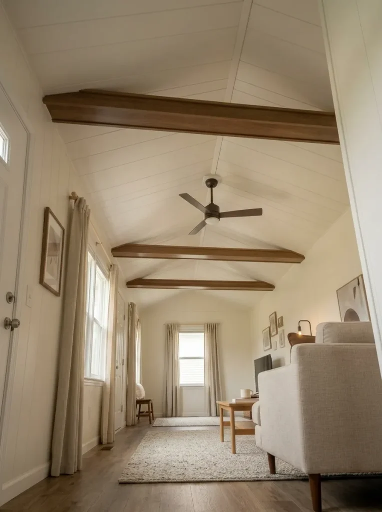
The ceiling occupies a huge uninterrupted portion of the visual field, yet it is often addressed only after walls and furniture.
That can be a mistake in an 1980s home.
Seams, perimeter strips, a dated fan, wood-toned blades, vents, contrasting beams, and changes in ceiling pitch may all attract attention simultaneously. The space then feels assembled from components even after the walls have been refreshed.
A modern ceiling does not have to be blank.
A vaulted ceiling with worthwhile beams can become a strong architectural asset when the main ceiling plane is quiet enough for those beams to read intentionally.
Ceiling Modernity Track
Choose how much architecture stays visible.
A modern result can preserve character. The question is whether the ceiling has one clear idea or several competing ones.
Seams, trim, fan, vents and contrasting strips all demand equal attention.
A quiet ceiling plane supports one beam, pitch or architectural line worth emphasizing.
Everything becomes visually blank and useful character disappears with the clutter.
If the makeover involves new hardwired fixtures or physical alteration of the ceiling assembly, treat that as a separate technical scope instead of an ordinary decorating step.
4. Keep One Good Wood Tone—and Quiet the Rest
Dark wood is not automatically what makes an 1980s interior feel old.
The bigger issue is often too many unrelated versions of brown.
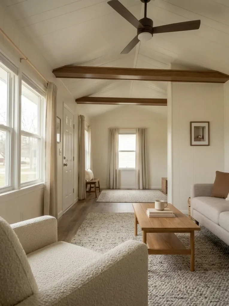
A room may contain golden trim, reddish cabinetry, dark fan blades, faux-wood wall material, medium flooring, and another tone in the furniture. Each finish may be acceptable individually, but together they compete.
Choose the wood you would still want if everything surrounding it became calmer.
That might be exposed ceiling beams, real cabinet fronts, a good-quality built-in, or trim that already relates well to the flooring.
Let that become the reference material.
Then examine the other wood-like surfaces. Some may need painting. Others could be refinished or visually reduced. A piece that initially appeared dated may suddenly look attractive once two neighboring brown finishes disappear.
This also keeps the makeover from drifting into an all-white interior simply because white seems like the safest correction.
The stopping point matters. Once the room has one understandable wood story, resist introducing multiple new “warm woods” through furniture and accessories.
Modern warmth still needs restraint.
5. Reset the Long Living-Room Sightline Before You Replace the Sofa
A narrow or elongated living room often makes the sofa look guilty simply because it is the largest object.
Before replacing it, stand at the entrance and look along the longest visible line through the room.
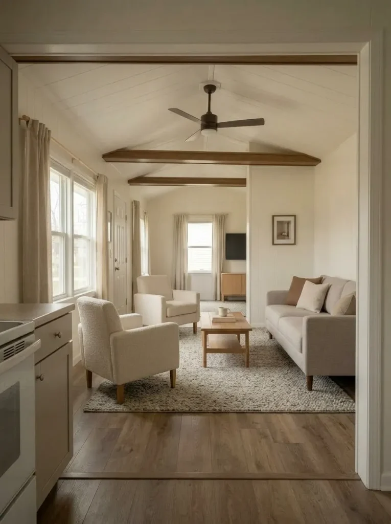
What interrupts that view first?
It may be a large recliner, a deep side table, an oversized coffee table, a television console, or furniture arranged so tightly that almost no visible flooring remains around the seating zone.
Remove two secondary pieces temporarily.
Then take another photograph from the doorway.
If the room immediately appears more balanced, the sofa may never have been the real problem. The issue was the combined mass surrounding it.
A large rug can further help by defining the seating relationship as one organized zone. Calmer artwork and a simpler television wall reduce the number of separate focal points.
Keep comfortable furniture when the room can be corrected around it. Replace it when its depth or scale still compromises movement after the surrounding layout has been simplified.
For deeper furniture placement, circulation, focal-point, and long-room strategies, continue with StylishGalore’s Mobile Home Living Room Ideas.
6. Replace Fussy Window Layers With One Cleaner Composition
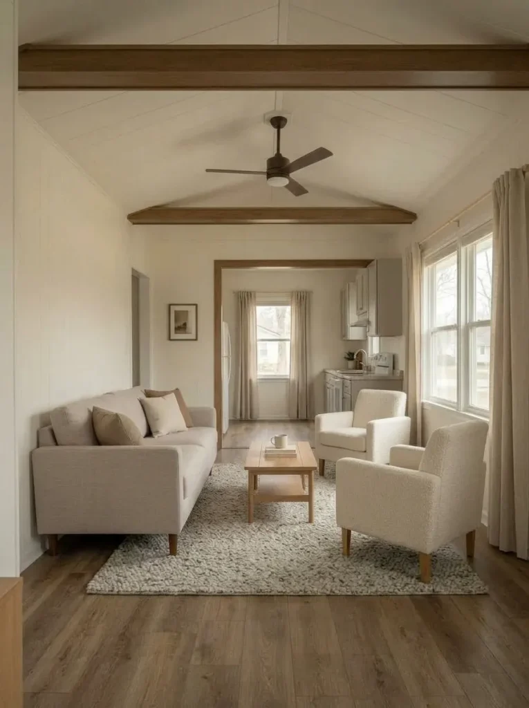
Window treatments can quietly carry a surprising amount of visual age.
A typical older window might combine blinds, curtains, a gathered or padded valance, visible rods, dark trim, and furniture placed directly underneath.
The easiest test is subtraction.
Take away the decorative upper layer temporarily and pull the curtains fully aside. Look at the room in daylight again.
If the window now seems taller and the wall calmer, you have identified a styling problem without spending money on the window itself.
A cleaner composition usually gives each layer a clear purpose. Shades or blinds can handle privacy and light control. Curtains can add softness and perceived height. When both are used, the combination should feel purposeful rather than accumulated.
The smaller or more segmented a window wall appears, the more useful visual restraint becomes.
This is also where curtain placement can change the room considerably. A higher visual starting point can draw attention upward, while excessive fabric pooling or narrow panels can make an already compact wall feel heavier.
Keep the window functional first.
Then make the treatment quiet enough for the daylight to become the feature.
7. Move Some of the Evening Light Below the Ceiling Line
A remodel can look excellent in daylight and disappointing after sunset.
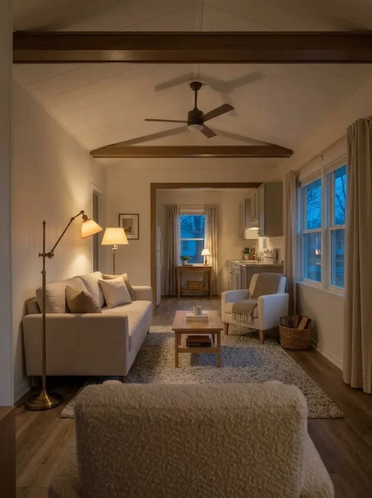
That happens when the room still relies almost entirely on one central ceiling fixture.
Overhead-only light tends to flatten furniture, leave perimeter areas underlit, and emphasize the ceiling even when the rest of the makeover has created a softer atmosphere.
Test the home at night.
Turn off the central fixture and switch on whatever lower lights already exist. Sit where you normally read, watch television, prepare food, or talk.
Which activities become difficult?
That tells you where additional light actually belongs.
A floor lamp beside seating can make a long room feel more intimate. A small lamp on a console can visually occupy a forgotten end of the space. Task lighting can improve kitchen usefulness without making one ceiling fixture responsible for everything.
The makeover should work at the time you use the room—not only when it is photographed.
If a lighting idea requires new wiring, moving electrical boxes, or other hardwired modifications, keep that work within an appropriate electrical scope.
8. Modernize Sound Kitchen Cabinets Before Replacing the Boxes
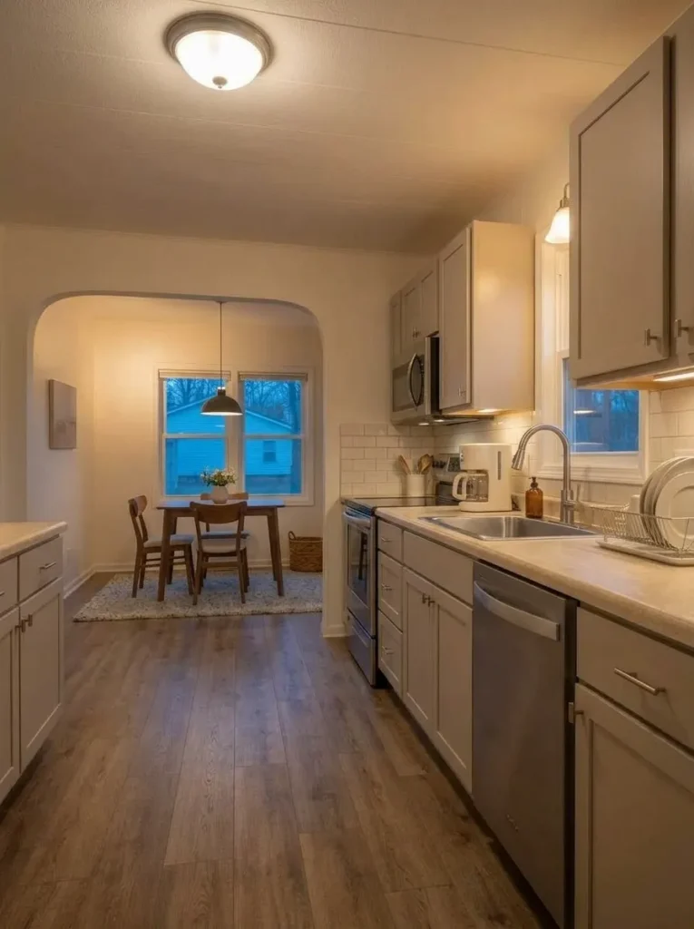
Cabinetry occupies so much visual space that a kitchen can appear decades newer after the cabinet field is resolved.
But cabinet age and cabinet failure are different things.
Start inside.
Do the boxes feel sound? Are shelves usable? Do doors close reasonably well? Does the existing configuration still suit the household?
If so, full replacement may not be the first move.
Use this decision interface to identify how far the makeover actually needs to go.
Cabinet Preservation Funnel
What is actually wrong with the cabinets?
Choose the condition that best describes them before committing to replacement.
If the boxes are sound and useful, investigate cosmetic options before paying to recreate storage you already have.
A dated profile can sometimes be modernized through finish, hardware, improved alignment, or selective door replacement while keeping the boxes.
Real wood, laminate, wrapped surfaces, paint and damaged substrates do not respond to the same preparation or finishing method.
If the kitchen layout wastes storage, interferes with routine, or the cabinet structure is failing, cosmetic work may preserve a system that no longer serves the household.
When the existing cabinet boxes pass the preservation test, use StylishGalore’s dedicated Mobile Home Kitchen Cabinet Makeover Ideas for deeper surface, preparation, finish, and hardware decisions.
9. Make the Counter, Backsplash, and Appliances Read as One Work Zone
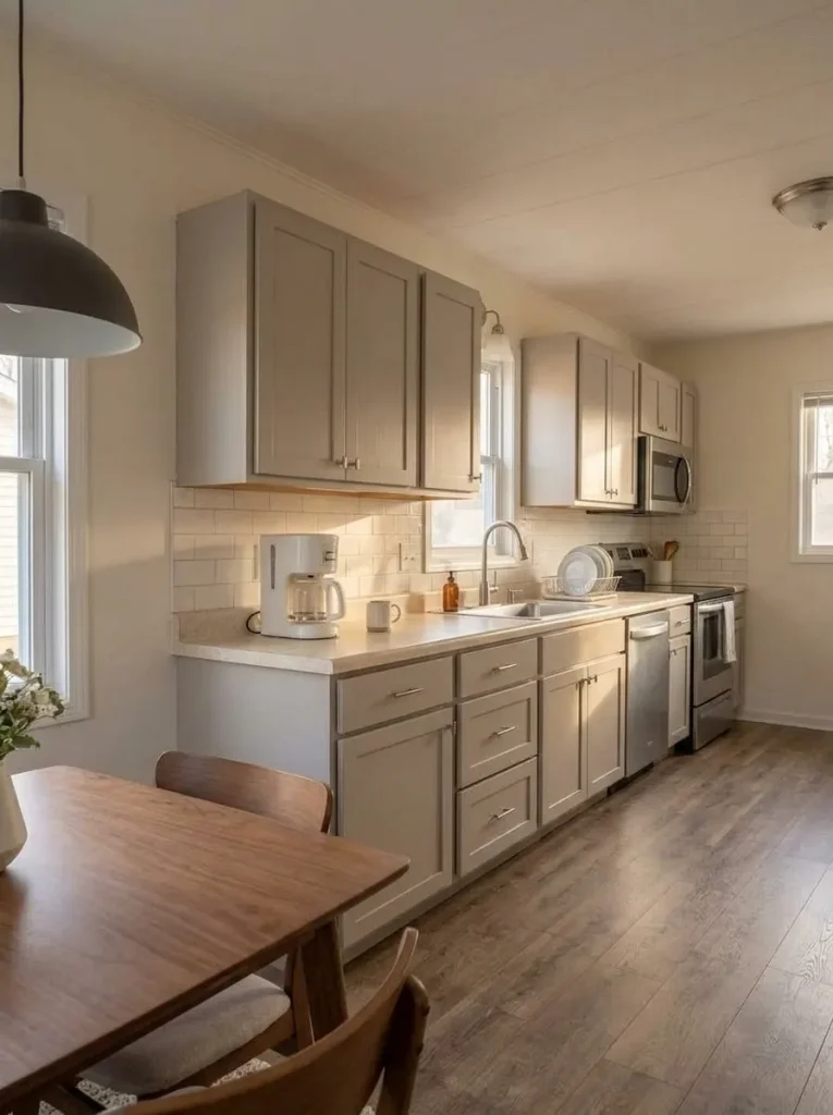
A newly painted cabinet can still sit inside a kitchen that looks busy.
The reason is that the eye sees cabinetry, countertop, backsplash, appliances, outlets, lighting, and countertop clutter together.
They form one concentrated visual band.
If every layer is expressive, the small kitchen becomes harder to read.
A useful strategy is to let one material speak while the others provide support.
Warm wood cabinets can pair with a quieter backsplash. A countertop with distinctive movement can become more convincing when the cabinets and wall behind it are restrained. A kitchen open to the living room may benefit from an even calmer palette so it does not interrupt the longer sightline through the home.
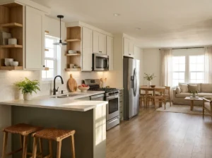
Test this before buying anything.
Temporarily cover the strongest pattern with a plain sample board, paper, or fabric and take a photograph from the adjoining space.
If the kitchen instantly feels more current, you have identified a competition problem.
The surface may not be individually ugly.
It may simply be one strong material too many.
For broader room-wide decisions, StylishGalore’s Mobile Home Kitchen Ideas continues into layout, storage, lighting, color, and styling.
10. Make the Dining Boundary Lighter Without Automatically Removing a Wall
A dining area can feel closed off even when the physical boundary is quite small.
The effect often comes from several separators landing in the same place: contrasting flooring, a dark hutch, an overhead fixture, wall-color change, partial divider, railing, or furniture facing away from the adjoining space.
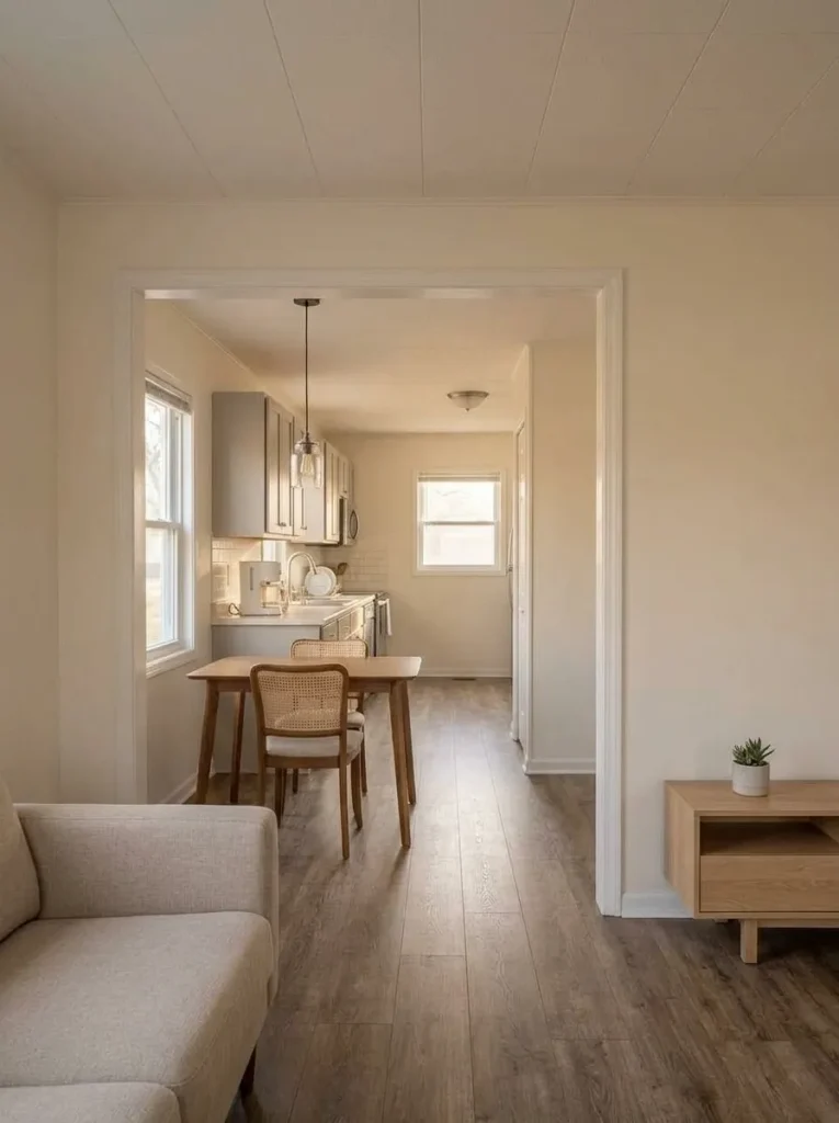
Before considering demolition, remove some of the visual boundaries.
Rotate the table if circulation allows it.
Try moving a heavy storage piece.
Repeat the adjoining wall color.
Simplify the light fixture.
Reduce another competing transition nearby.
The room may begin to feel considerably more open without changing its structure.
This is particularly useful in a manufactured home where structural work should not be treated casually. A wall that appears visually inconvenient should not be assumed to be disposable.
If the desired makeover progresses from styling into cutting, removing, or significantly altering structural components, check the relevant manufactured-home requirements and local permitting conditions before proceeding.
Modern does not automatically mean open concept.
Sometimes it means the existing boundary becomes quiet enough that the rooms finally feel connected.
11. Unify Patchwork Flooring Across Connected Spaces
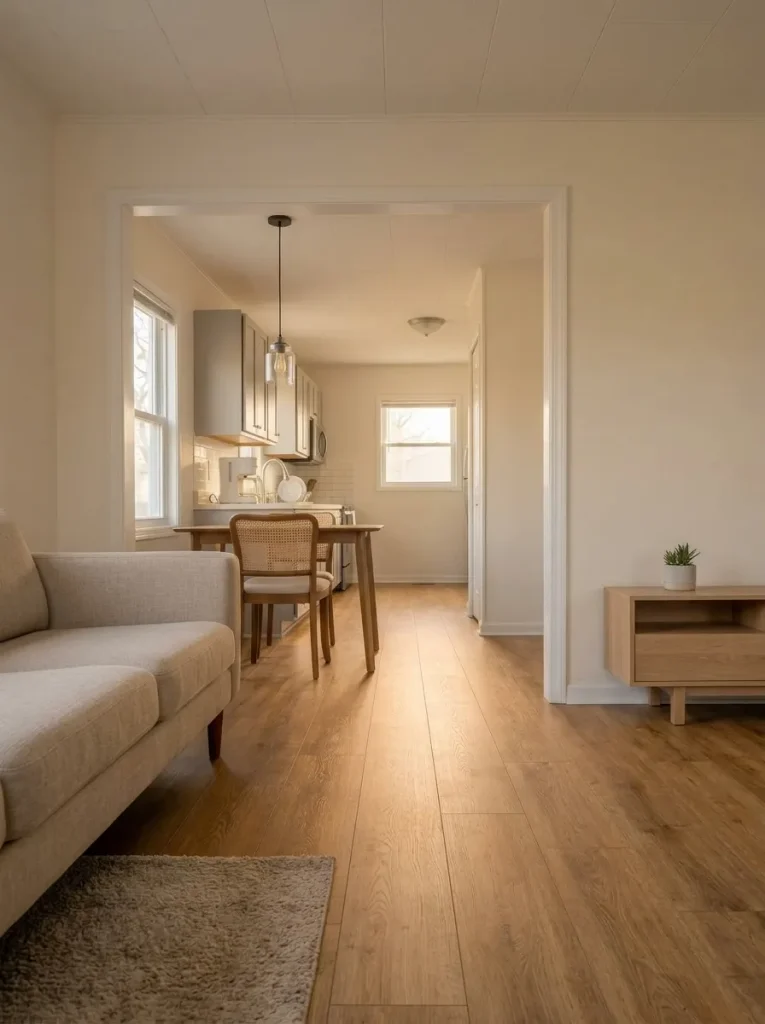
Look down the longest route through the home and count how many times the floor changes.
A home that has been renovated gradually may contain one surface in the living room, another in the dining area, sheet flooring in the kitchen, a threshold, then another material in the hallway.
Each individual choice may have been practical.
Together, they can make the interior feel chopped into short segments.
Connected-Floor Sequence Map
Fix the transition the eye notices first.
Does this small area genuinely need a separate floor identity?
The largest visible floor field often becomes the reference material.
A second transition may exaggerate a boundary that already feels strong.
Different performance needs can still coexist with visual continuity.
Continuity: identify connected zones that could share one visual floor family.
Junction: where different materials remain, make their meeting point deliberate.
Rugs: define furniture zones after the underlying floor story is resolved.
Every space does not require identical material.
Bathrooms, kitchens, entries, and other zones may legitimately need different surfaces.
The modernization comes from eliminating unnecessary visual restarts and making unavoidable transitions feel deliberate.
12. Turn Doors, Trim, and Hardware Into One Repeated Finish Family
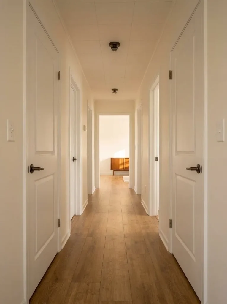
Small details become powerful when they repeat throughout the house.
One doorway may contain golden trim, a dark brown door, shiny brass knob, painted baseboard, dark hinge, and white switch plate nearby.
Repeat that mixture through several rooms and the home begins to show every stage of its renovation history.
Walk from one end of the house to the other and focus only on the edges.
Which wood finish repeats most successfully?
Which hardware finish keeps appearing?
Which doors look sound but visually disconnected?
A door does not automatically need replacement because its finish is dated. Painting or refinishing may produce the visual change required. Good trim may remain if it belongs to the wood tone chosen earlier.
The aim is not obsessive matching.
Faucets, lamps, cabinet pulls, hinges, and knobs do not all need to become identical.
They need enough visual relationship that the house appears edited by one person at one time.
That repeated consistency is one of the quieter differences between a makeover that looks merely updated and one that looks genuinely finished.
13. Make an 1980s Bedroom Feel Lighter by Reducing Furniture Mass
Large matching bedroom suites can be extremely durable.
They can also overwhelm a compact bedroom long before their style becomes the biggest issue.
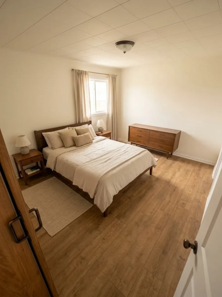
A dresser and mirror, two nightstands, tall chest, substantial headboard, bench, and another storage cabinet may occupy nearly every available wall.
Before replacing the suite, take one large piece out.
Live without it for several days.
Then evaluate the room through three signals.
Can you see more uninterrupted flooring?
Has a section of wall gained breathing room?
Is the route around the bed easier?
If all three improve, the makeover may need less furniture, not new furniture.
Keep the pieces that perform useful jobs and modernize the room around them through bedding, lighting, wall treatment, hardware, and selective refinishing.
This is especially helpful when good-quality older furniture is expensive to replace but still functions beautifully.
A room does not become modern simply because every item is recent.
It becomes modern when its scale, negative space, and circulation make sense.
14. Modernize the Bathroom Around the Vanity–Mirror–Light Relationship
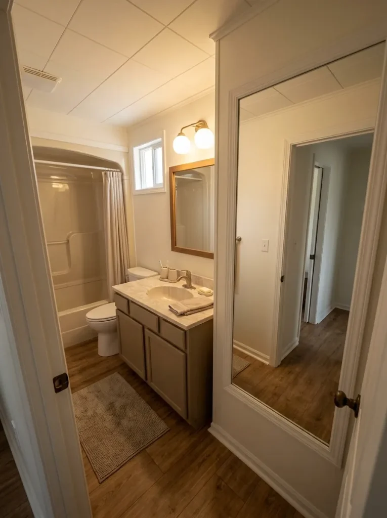
A small bathroom often contains one wall that determines nearly the entire first impression.
Usually it is the vanity wall.
A dark cabinet, broad mirror, decorative light bar, busy countertop, and multiple small accessories can stack several dated signals in one narrow composition.
Change that composition before assuming the whole bathroom must be rebuilt.
A sound vanity might stay and receive a different finish. A simpler mirror can create more wall breathing room. Lighting can be selected in proportion to the mirror and vanity instead of functioning as a decorative object by itself.
Clear enough of the countertop to see whether the materials genuinely clash or are simply buried under visual noise.
Then stop and reassess.
If the room now feels dramatically different, deeper remodeling may not yet be justified.
StylishGalore’s Mobile Home Bathroom Remodel Ideas on a Budget covers the specialist decisions once a makeover begins moving beyond cosmetic changes.
Plumbing relocation, electrical changes, persistent moisture, flooring damage, wet-area reconstruction, or structural concerns belong to a deeper scope and should be resolved appropriately before decorative finishes conceal them.
15. Give the Long Exterior One Clear Modern Hierarchy
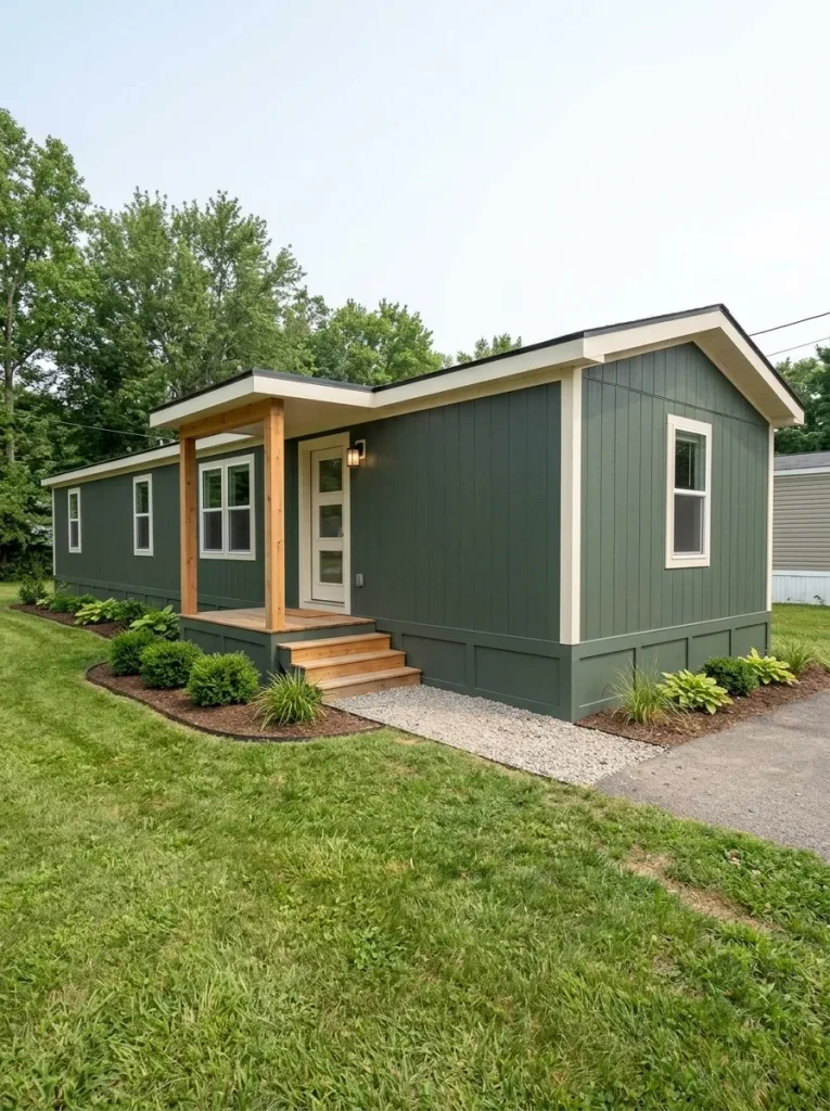
Stand far enough away to see the whole house.
What does your eye notice first?
If the answer is “everything,” the exterior may lack hierarchy.
Long manufactured-home façades can become visually flat when the siding, windows, trim, skirting, roof edge, porch, shutters, gutters, and entry all receive equal emphasis.
A stronger makeover gives them different roles.
Use the interface below to identify the first exterior problem to solve.
Exterior Hierarchy Mapper
What is making the exterior feel unfinished?
Choose the problem that dominates from the curb. Solve the large hierarchy before spending on decorative details.
Build a clear arrival point.
Strengthen the relationship among the door, steps, porch, lighting, and nearby trim before scattering décor across the rest of the façade.
Simplify the largest planes first.
Siding, trim, shutters, gutters, and roof-edge details should behave as a coordinated shell instead of separate decorating opportunities.
Finish the ground line without treating it as decoration alone.
A visually settled base can make the home appear complete, but drainage, enclosure, ventilation, supports, and deterioration remain technical concerns.
The strongest order is generally large exterior planes → entry hierarchy → ground line → landscaping → decorative details.
That keeps the makeover budget focused on changes visible from across the property.
For more inexpensive exterior and interior interventions, see StylishGalore’s Cheap Mobile Home Upgrades That Look Expensive.
Remember that skirting and the under-home area are not purely styling elements. Drainage, enclosure, supports, anchoring, ventilation, or deterioration may require technical evaluation. HUD’s manufactured-home information provides the appropriate federal context.
16. Finish an Existing Porch or Screened Room Like a Real Outdoor Living Zone
An existing porch can remain visually unfinished even when it provides useful square footage every day.
The problem often comes from treating it as leftover space.
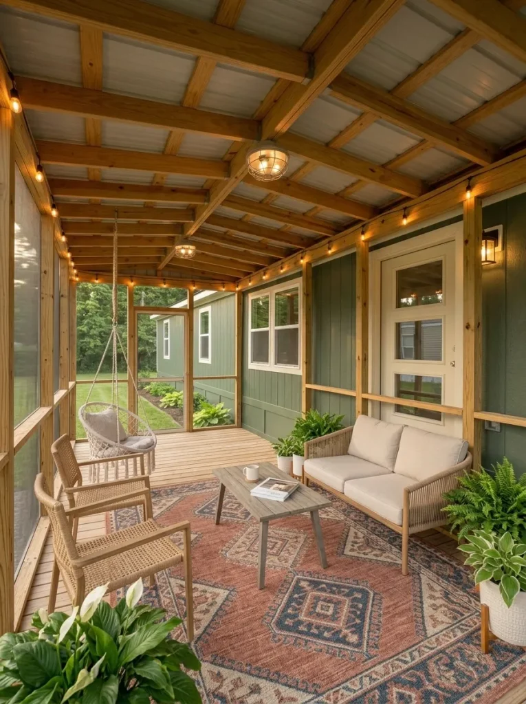
Instead, assign it one primary activity.
A porch designed for outdoor meals needs comfortable circulation around a table.
A relaxation porch may benefit from deeper seating, a low table, and softer evening lighting.
A narrow entry porch may need almost no furniture. Clear circulation and a confident arrival sequence may be more valuable.
Once the activity is chosen, use the same design logic that works indoors: define the floor, organize furniture around the activity, create one focal relationship, add lighting appropriate to the time of use, and allow some empty space.
A screened room can remain visibly rustic and still feel modern.
Exposed framing, corrugated roofing, or a straightforward screen structure do not automatically need disguising when the furniture, lighting, rug, and material palette create a deliberate room.
Condition remains the first boundary.
Loose steps, deteriorated supports, unstable railings, roof problems, or uncertainty about how an addition connects to the manufactured home should be resolved before styling.
Once the structure is suitable for use, the makeover can focus on turning the area from extra space into intentional space.
17. Run a Three-View Modernity Audit Before You Call the Makeover Finished
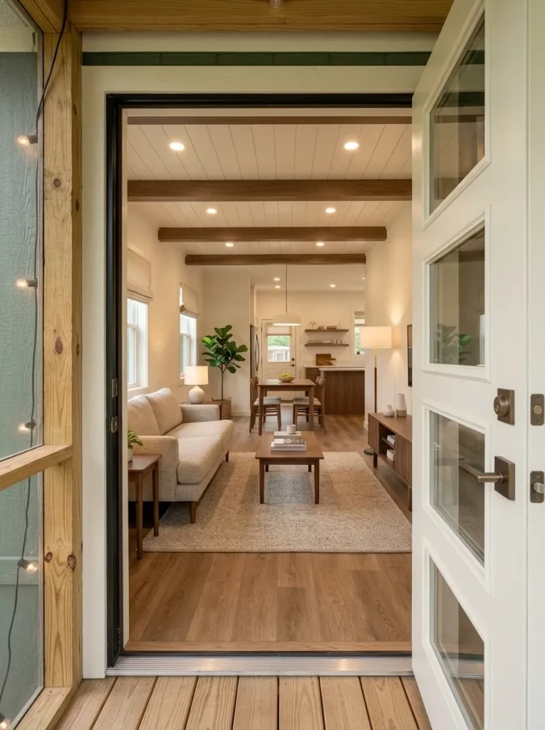
The final risk is continuing the renovation simply because you can still find things to change.
A home does not need every original detail replaced.
It needs the major views to feel resolved.
Judge the finished makeover from three positions.
Three-View Finish Audit
Does the home still feel dated—or are you simply still looking for projects?
Each viewpoint exposes a different type of unfinished decision.
Does the exterior have a clear entry, coherent large surfaces, and a visually settled base?
Does one feature lead the interior while walls, flooring, windows, and furniture support it?
Does the room remain comfortable and convincing when you actually live in it after dark?
All three views feel intentional. Live with the home before creating another project.
One viewpoint still breaks the visual story. Correct that relationship without reopening the entire makeover.
Several viewpoints still compete. Return to hierarchy, continuity, or condition before purchasing more décor.
The seated view is especially revealing.
Sit where you normally watch television.
Walk through the house at night.
Stand at the kitchen counter.
Enter while carrying groceries.
Use the bathroom on an ordinary morning.
A house that works only from one carefully selected camera angle is not fully resolved.
If it works from the curb, makes sense from the doorway, and remains comfortable from the places where life actually happens, another upgrade may add expense without creating a better home.
That is a valuable stopping rule.
A Modern 1980s Mobile Home Makeover Does Not Need to Erase the 1980s
The strongest 1980s mobile home makeover is rarely the one where every original component disappears.
It is the one where the retained and updated elements eventually become difficult to distinguish because the whole home now follows one coherent visual language.
A useful wood beam can stay.
Solid cabinetry can stay.
A comfortable sofa can stay.
Existing doors can stay.
A sound vanity can stay.
Even the unmistakable proportions of the manufactured home can remain visible.
What changes is the relationship among those features.
Busy walls become quieter. Ceiling details gain hierarchy. Windows lose unnecessary layers. Lighting begins working at several heights. Flooring transitions feel intentional. Furniture stops crowding circulation. Repeated trim and hardware begin to agree. The exterior gets an obvious focal point. An underused porch becomes a place people actually want to occupy.
Most importantly, age and condition stop being treated as the same thing.
A dated surface may need a visual update.
A good material may deserve preservation.
A damaged element deserves investigation.
And a home that already feels coherent deserves permission to be finished.
Your 1980s mobile home does not need to pretend it was built yesterday.
It needs to feel like the choices inside and outside belong to the way you want to live today.
Save these 1980s mobile home makeover ideas on Pinterest so you can return to the keep, modernize, replace, and verify-first decisions when you are ready to plan your own transformation.