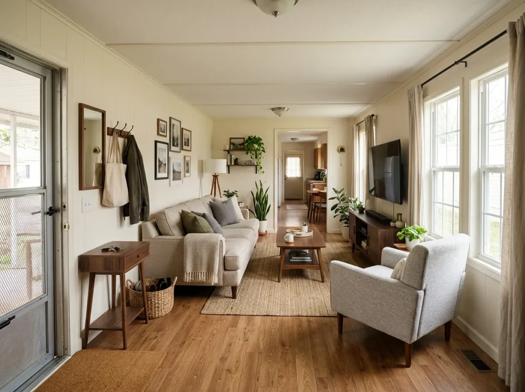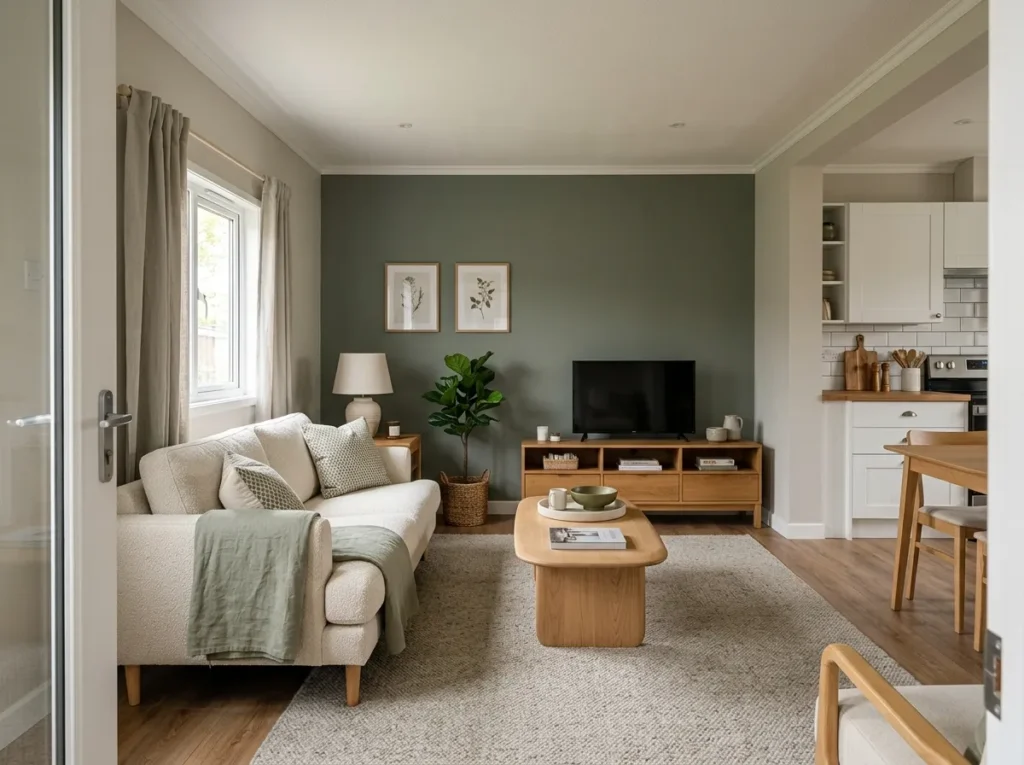
A small mobile home living room can feel cramped long before it is actually full. Often, the problem is not simply square footage—it is how many visual boundaries, furniture outlines, dark breaks, and floor interruptions the eye has to process at once.
That distinction matters because making a compact living room feel larger does not require replacing everything with miniature furniture or turning the space into a white minimalist box. A comfortable sofa can stay. Deep color can stay. Texture, storage, plants, and personality can stay too. What changes is how those elements share the limited visual field.
The most effective small mobile home living room ideas below focus on perceived space: protecting visible floor, reducing competing silhouettes, quieting unnecessary contrast, controlling furniture mass, and making the room read as one coherent volume. Some changes require nothing more than rearranging what you already own, while others help you decide where a future furniture or decorating purchase will make the biggest difference.
1. Protect a Visible Floor Border Around the Seating Group
Walk to the entrance of your living room and look at the floor before you look at the furniture. Can you visually trace some open flooring around the main seating arrangement, or does the sofa-rug-table combination seem to stretch from one boundary to another?
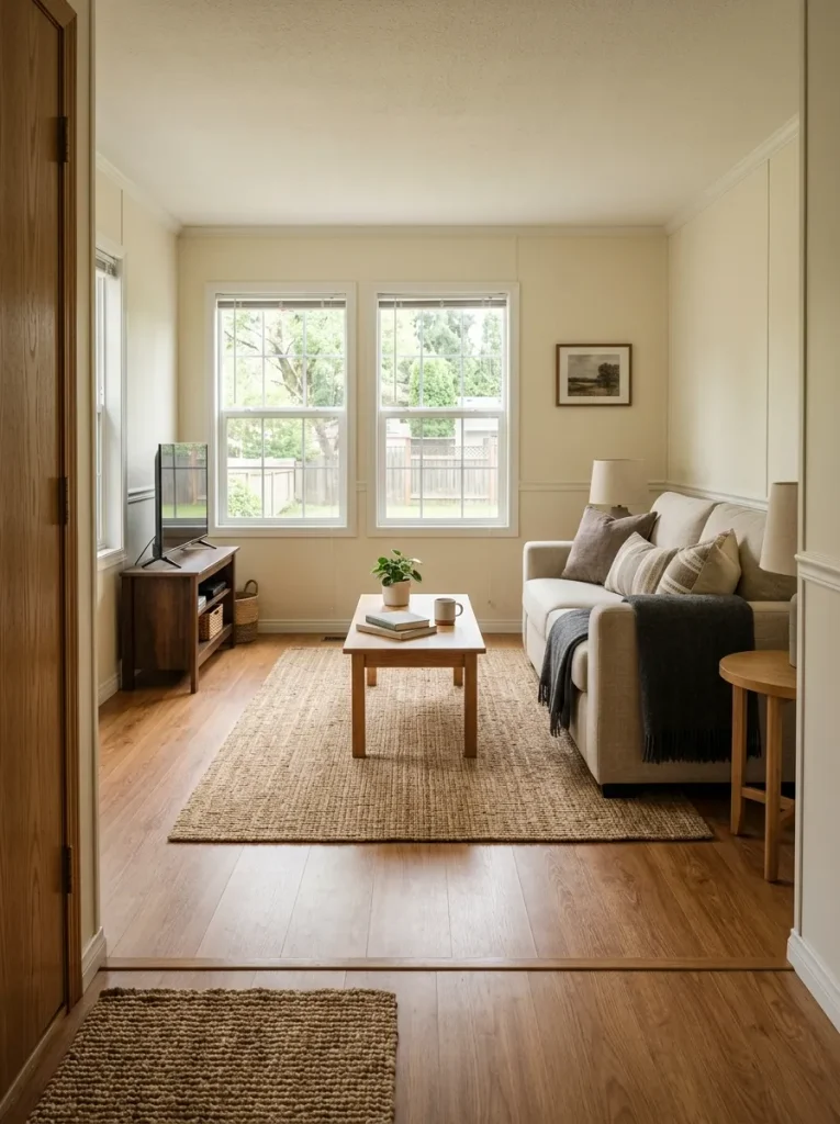
That exposed perimeter acts like breathing room. In a compact mobile home, even a modest amount of visible flooring can help the seating group read as one contained zone inside a larger room. When nearly every floor edge disappears beneath upholstery, side tables, baskets, planters, and an oversized rug, the room can feel completely occupied even when the traffic route remains technically usable.
The useful edit is not automatically “buy smaller furniture.” First, see whether the pieces are simply spread too widely.
Try this quick floor test:
- Look for small tables projecting beyond the sofa arms.
- Notice baskets or plant stands creating separate floor islands.
- Check whether the rug visually consumes almost every visible patch of flooring.
- Pull secondary pieces closer to the main seating group and reassess the doorway view.
Decision rule: preserve some readable floor around the furniture cluster before sacrificing comfortable seating. If your narrow room also has awkward doors, windows, or circulation breaks, the more detailed single-wide decorating ideas for narrow and awkward spaces can help with those layout-specific constraints.
2. Load More Visual Weight on One Side of the Room
A compact living room can feel surprisingly tight when every edge carries something substantial: sofa on one side, television console opposite, chair in a corner, cabinet near the entrance, floor lamp by the window, baskets along another wall.
The center may technically remain empty, yet your eye receives a message that all four boundaries are occupied.
A more spacious arrangement often has an intentional imbalance. One side carries the dominant furniture mass while another edge stays noticeably quieter. That quieter side becomes visual relief and can make the whole room feel less compressed.
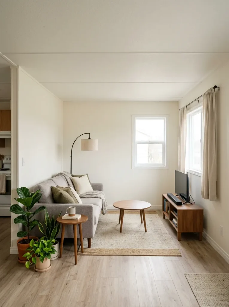
Use the diagnostic below to identify the boundary that may deserve editing first.
Spatial Pressure Scanner
Which Edge of Your Living Room Feels Busiest?
Select the boundary carrying the most visual weight. The diagnostic below shows which area is most worth simplifying first.
Choose the edge that feels hardest for your eye to visually escape.
Release the First-View Edge
The entrance frames the first impression of the room. Furniture or décor crowded near this boundary can make the space appear occupied before the rest of the room is even visually processed.
Best first move: remove or reposition the easiest object near the entrance and compare the doorway view again.
Compress the Sofa Zone
The sofa itself may not be too large. Side tables, baskets, lamps and floor décor can make its visual footprint appear much wider than the upholstery.
Best first move: pull secondary pieces inward and keep another wall deliberately quieter.
Flatten the Media Composition
A television, shelving, speakers, baskets and tall decorative objects can create a second wall of visual mass opposite the seating.
Best first move: keep media functions on one lower plane and allow more open wall above.
Give the Window More Visual Air
Dense curtains, furniture and tall objects can make the brightest boundary in the room feel unusually heavy.
Best first move: simplify the immediate window perimeter before changing the rest of the room.
A compact living room does not need perfect symmetry. It often feels larger when one edge carries the composition and another is intentionally restrained.
If your living room is especially narrow, pay extra attention to the entry edge and the wall opposite the sofa. Those two planes often determine whether the long room feels open or corridor-like. For layouts with several awkward openings, the narrow single-wide decorating guide goes deeper into door and wall constraints.
3. Let One Comfortable Sofa Carry More of the Room
It is easy to assume that a small mobile home requires the smallest sofa you can find. That can backfire.
Imagine two rooms with the same seating capacity. The first has one generous three-seat sofa. The second has a compact loveseat, an accent chair, an ottoman, two side tables, and perhaps another small chair for visitors. The individual pieces are smaller, yet the second arrangement creates more legs, gaps, corners, and separate furniture outlines for the eye to process.
A single comfortable sofa can therefore be the simpler visual choice.
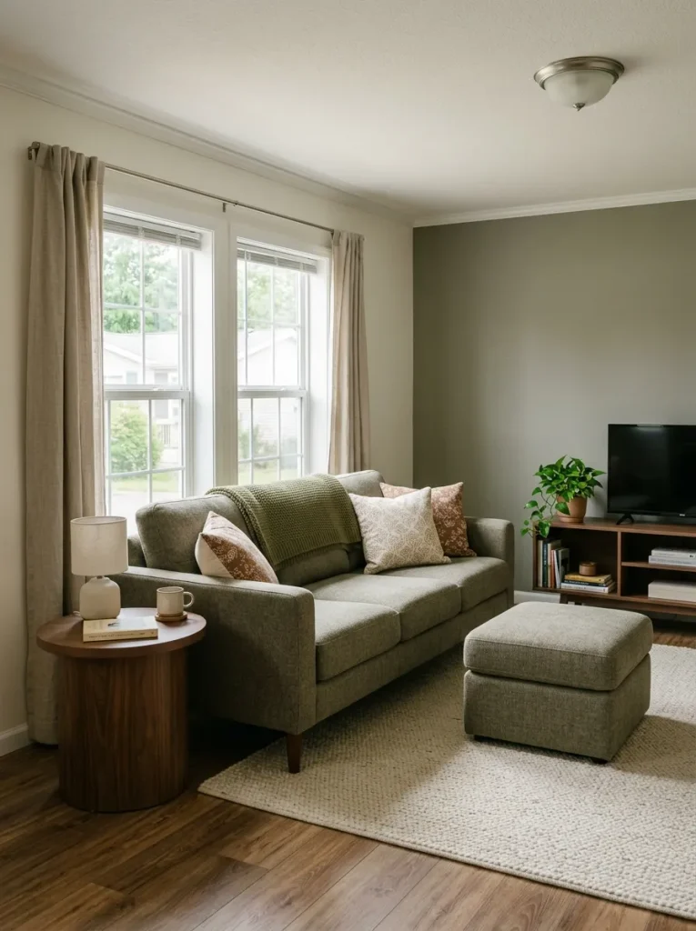
The tradeoff is physical scale. A deep or heavily overstuffed sofa can still dominate a narrow room, especially when its arms are thick and its back is visually bulky. The useful question is not “Is this a full-size sofa?” It is:
How much of the room’s visual mass does this sofa create compared with the number of separate pieces I would need to replace it?
If the sofa seats the household comfortably and still leaves the room’s important movement routes usable, do not replace it merely because generic small-space advice says everything should be tiny.
Readers dealing with a true single-wide cross-section can use the more detailed single-wide mobile home decorating guide when furniture depth and circulation are the larger issue.
4. Reduce Furniture Outlines Before You Reduce Seating
Small-space myth: more small furniture automatically makes a room feel larger.
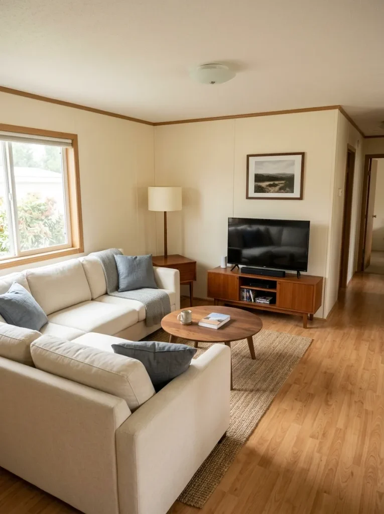
The eye does not judge spaciousness only by measuring occupied square footage. It also notices how many times a furniture form starts and stops. Four separate pieces create more visual edges than two consolidated pieces, even when their combined footprints are similar.
That means the first edit may be silhouette reduction, not seating reduction.
Look around your living room for combinations such as:
- sofa + separate end table + freestanding magazine basket;
- chair + floor lamp + plant stand;
- coffee table + small ottoman beside it;
- TV console + two detached storage units;
- several little accent tables serving occasional rather than daily needs.
Try temporarily removing one secondary object from two or three of those clusters. Do not style the empty space immediately. Photograph the room from its main entrance and compare the two versions.
A piece has earned its place when it provides a function you actually use and its presence does not turn one furniture zone into several competing shapes.
If seating capacity remains comfortable after consolidation, you have made the room feel calmer without making it less useful. If the room still feels tight, then scale becomes the next variable to investigate.
5. Use Rounded Edges at the Tightest Pass-By Point
What happens when you walk through your living room carrying a laundry basket, a drink, or a shopping bag?
If your body naturally swerves around one projecting coffee-table corner, that tiny moment is useful information. A rectangular table can fit perfectly on paper while one sharp corner repeatedly occupies the exact place where movement wants to curve.
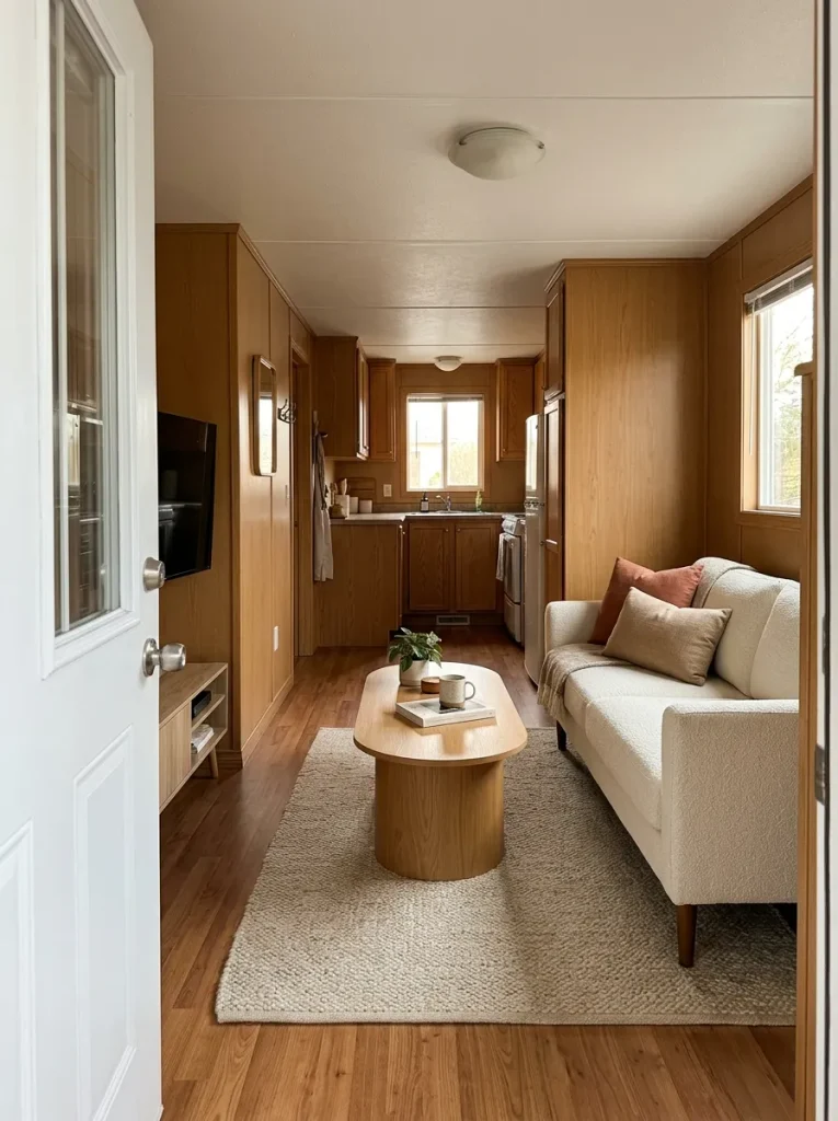
That is where a rounded edge can matter.
An oval table does not magically increase the room’s dimensions. What it changes is the shape of the obstruction. The eye also follows that softer path, so a tight central grouping can look less barricaded.
Use the comparison below to decide whether changing table geometry would actually solve a problem in your room.
Furniture Geometry Simulator
Does Your Coffee Table Corner Interrupt Movement?
Select the situation that matches your room. The tool separates a genuine circulation problem from a table that simply looks visually heavy.
Rounded Geometry Is Worth Testing
The problem is concentrated at a projecting corner. Changing the outline can soften the pass-by point without requiring a dramatically smaller table.
Best experiment: mark an oval footprint temporarily and walk your normal route before buying anything.
Investigate Height and Shape Together
If the entire center feels visually blocked, a curved table may help, but excessive height or bulk may still interrupt the cross-room view.
Best experiment: remove the current center piece for a day and compare how open the room feels.
Keep the Table You Already Like
If circulation already feels natural, table geometry is unlikely to be the main reason the room feels cramped.
Look next: furniture count, visual mass, rug contrast or wall density.
Curved furniture is a problem-solving tool—not a universal rule for every small living room.
This distinction can save money. If the existing rectangular table sits comfortably away from your natural walking path, changing it may add almost no sense of space. Keep it and direct your attention to a stronger source of visual pressure.
6. Keep Rug-to-Floor Contrast Low When the Floor Already Feels Chopped Up
A rug can make a small living room feel finished, but it can also draw a hard rectangle across an already limited floor plane.
This matters most when the mobile home already has several visible breaks—different flooring near the kitchen, strong plank lines, contrasting thresholds, or furniture that divides the floor into smaller patches. Add a high-contrast rug and the eye gains one more boundary to process.
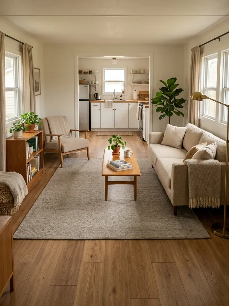
The safer move is to compare value contrast, not simply color. A warm beige rug over medium oak flooring can still feel visually calm even though the hues differ. A stark white rug over dark brown planks creates a much stronger edge.
Try this before buying anything: photograph the room, convert the image to grayscale on your phone, and look at the rug. If it becomes one of the strongest shapes in the image, ask whether you actually want the floor to command that much attention.
For rooms where the entire home feels narrow, the broader single-wide interior ideas that make a narrow home feel bigger offer additional whole-home continuity strategies.
Choose stronger rug contrast when: the room needs a deliberate focal anchor.
Choose quieter contrast when: the floor already has several seams, color changes, or strong directional lines.
7. Tuck Secondary Surfaces Inside the Sofa’s Visual Footprint
Start with the sofa and mentally draw a rectangle around it.
Now look at every object extending beyond that rectangle: an end table, drink stand, basket, floor lamp, magazine holder, plant stand, charging station.
One or two projections are rarely a problem. Several can make a single sofa zone appear much wider than the upholstery itself.
A useful editing sequence is:
- Keep the sofa where it works.
- Pull an end table closer to the arm.
- Move a basket beside or partially beneath another furniture element.
- Combine lamp and table functions where practical.
- Remove one occasional surface for a day.
- Recheck the room from its main doorway.
Then stop.
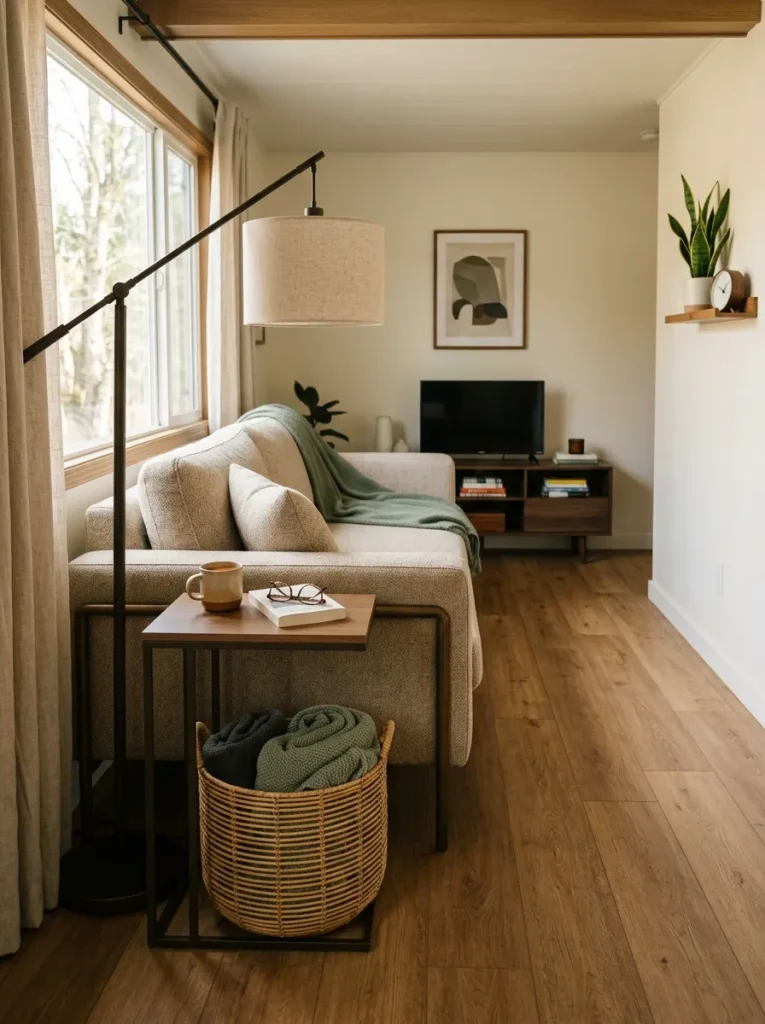
Do not keep consolidating until the room becomes inconvenient. The point is to eliminate unused projection, not useful furniture.
A side table holding a nightly drink, lamp, or remote may deserve its footprint. A second table that exists mostly because the corner looked empty may not.
That distinction lets a small mobile home living room stay practical without allowing every convenience to become a separate visual island.
8. Keep the TV Zone Low Through the Middle of the Wall
One common small-room mistake is trying to make the television wall feel “finished” by building upward around it.
Tall shelving, stacked décor, signs above the screen, vertical speaker towers, plants, baskets, and decorative objects can turn the entire wall into a dense composition. Because the TV is already a strong dark rectangle, surrounding it with more visual weight can make the opposite side of a compact living room feel unusually heavy.
A calmer media wall usually has a different hierarchy:
screen → low supporting surface → selective storage → open upper wall
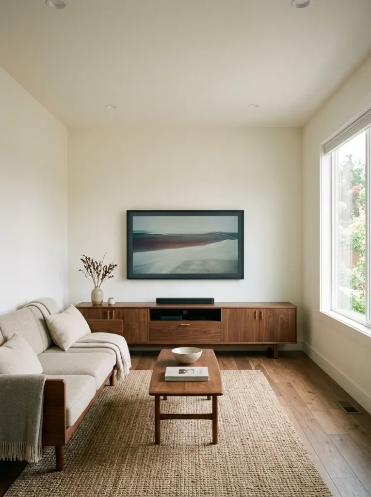
That open portion above and around the television matters. It allows the wall to remain visually larger than the media equipment occupying it.
Before replacing your console, remove the nonessential objects around the TV and live with the simplified version for several days. If the room immediately feels wider, the problem was probably not the width of the console—it was the vertical spread of the entire composition.
A longer low console can sometimes look calmer than a narrower arrangement made from several separate cabinets because the longer piece reads as one continuous horizontal element.
Better move: organize necessary electronics and storage into one readable lower zone, then let the rest of the wall breathe.
9. Cluster Tall Objects Into One Vertical Zone
Consider a room with a floor lamp in one corner, a tall plant beside the TV, another plant by the window, a leaning ladder shelf near the sofa, and a vertical artwork grouping on the remaining wall.
None of those items is especially large.
Together, though, they place a visual stop at almost every edge of the room.
A more spacious composition often gives height one primary home. For example, a taller plant and floor lamp might share the window corner, while the opposite corners remain lower and quieter. The eye still gets vertical interest, but it no longer has to navigate competing towers.
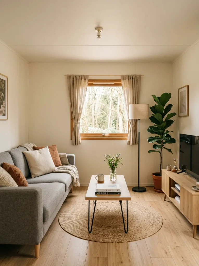
This does not mean every tall item must stand together. A large architectural feature—such as a fireplace, vaulted ceiling, or strong window—may already provide the room’s vertical moment. In that case, additional tall décor may be unnecessary.
A quick diagnostic: stand at the doorway and count how many objects pull your eyes upward independently.
If nearly every corner contains one, consolidate before buying anything else.
One deliberate height zone can make three quiet corners feel more spacious than four evenly decorated corners.
10. Let Window Treatments Recede Into the Wall Color
Dark curtains are not forbidden in a small mobile home living room.
They simply ask the window to become a stronger visual object.
That can work beautifully when the window deserves emphasis, but many compact rooms benefit more when the curtain, wall, and surrounding trim form a quieter relationship. A soft oatmeal curtain on a warm off-white wall, for example, still adds texture while keeping the window perimeter from becoming a sharply outlined rectangle.
The effect becomes especially noticeable when the window is modest in size. Strongly contrasting fabric can make the eye read:
wall → dark curtain → bright window → dark curtain → wall
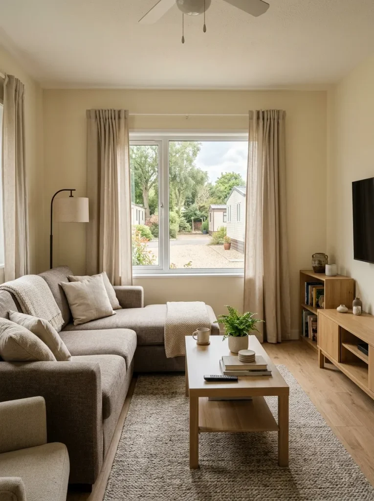
A lower-contrast treatment lets those transitions merge more gently.
This does not require perfectly matching fabric. Aim for similar visual weight, not identical paint-chip color.
Use more contrast when:
the window is one of the best architectural features in the room and you want it to command attention.
Let the treatment recede when:
the window is small, the wall already contains several visual breaks, or the room has multiple competing focal points.
Also inspect what sits directly beside the curtains. A tall cabinet, heavy plant stand, or large speaker can make even light window treatments feel crowded. Sometimes the strongest improvement comes from clearing the perimeter, not changing the fabric.
11. Use One Dark Plane Instead of Dark Accents Everywhere
A small mobile home living room does not have to be pale from floor to ceiling.
In fact, one concentrated dark surface can sometimes make the room feel deeper and more organized because the eye understands where the visual weight belongs. The problem begins when strong contrast is scattered across the room: black curtain rods, dark side tables, a charcoal rug, several black frames, a dark TV console, deep pillows, dark baskets, and a contrasting ceiling fan all competing independently.
The amount of dark color may be similar in both rooms, but the experience is very different.
Concentrated contrast creates hierarchy. Scattered contrast creates interruption.
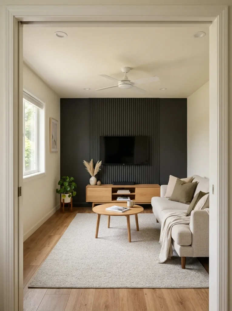
A deep TV wall, fireplace surround, or other dark focal plane can work especially well when the surrounding floor, furniture, and wall surfaces remain comparatively restrained. The dark surface becomes a destination for the eye instead of another fragment.
Use the interactive comparison below to diagnose where strong contrast currently lives in your room.
Contrast Compression Lab
Where Should the Darkest Value Live?
Deep color can create depth when it is concentrated. Select where your strongest dark value appears to see how that placement affects the room.
Concentrated Contrast Can Create Depth
One dark wall gives the eye a clear destination and can visually push that plane backward when the rest of the room stays relatively quiet.
Decision: keep the dark plane when it clearly organizes the room instead of competing with several equally strong surfaces.
Let the Sofa Be the Anchor
A charcoal or deep brown sofa can work beautifully. Problems usually appear when the rug, tables, curtains and media zone become equally dark.
Decision: simplify nearby surfaces before assuming the upholstery itself needs to change.
Check Whether the Rug Is Compressing the Floor
A very dark rug can visually carve the center of the room into a strong island, particularly when the floor already contains several transitions.
Decision: use strong rug contrast only when you deliberately want the floor to become a focal anchor.
Scattered Contrast Is the Strongest Editing Candidate
Many small dark objects force the eye to stop repeatedly across the room, increasing visual fragmentation even when the overall palette looks neutral.
Decision: consolidate the darkest accents into one or two zones and remove the weakest repeats.
Deep color does not automatically shrink a room. Uncontrolled distribution creates far more visual pressure than one intentional dark plane.
A dark accent wall should therefore be chosen because it organizes the composition, not because small-room decorating requires one. If the room already has a dark sectional, dark flooring, and a strong rug, another deep wall may push the overall balance too far.
12. Quiet Contrasting Panel Seams, Battens, and Trim That Chop Up the Walls
Older mobile homes sometimes have plenty of open wall area yet still feel visually confined.
Why? The wall may not read as one surface.
Vertical panel seams, contrasting battens, dark crown molding, chair-rail bands, two-tone wall treatments, and abrupt trim changes can divide the room into many smaller rectangles. The physical wall stays exactly the same size, but your eye encounters repeated stops.
That is why cosmetic wall simplification can occasionally produce a larger visual improvement than adding new décor.
Look at the wall envelope, not the accessories
Stand at the widest view into the living room and ignore the sofa for a moment.
Ask:
Where does the wall visually restart?
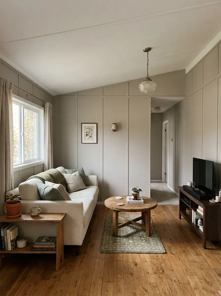
A dark trim band near the ceiling creates one division. Contrasting lower wall paneling creates another. Repeated battens can create several more. Add artwork into each resulting rectangle and the room becomes increasingly segmented.
The strongest fix depends on what is actually part of your mobile home’s wall construction and what is purely decorative. This article is addressing the visual principle, not prescribing removal of structural or system-specific materials.
For a deeper cosmetic modernization treatment—including dated paneling and more substantial media-wall updates—use the site’s modern single wide mobile home ideas guide.
A useful stop rule
If the wall already contains visible panel lines, you may not need to hide every one.
Begin with the highest-contrast interruption.
Making trim, battens, or a decorative wall band closer in value to the surrounding wall can be enough to let the whole envelope read more continuously. Once the segmentation no longer dominates the room, stop adding fixes.
That restraint matters because overworking an older mobile-home wall can turn a straightforward visual edit into unnecessary renovation.
13. Protect an Eye-Level Quiet Band When You Need Wall Storage
Wall storage is valuable in a small mobile home because it keeps useful items off the floor.
But “use the walls” can become bad advice when every available vertical surface gets filled.
Imagine standing in the living room and looking straight ahead. If shelves, frames, books, plants, baskets, signs, hooks, and electronics occupy nearly the entire band between seated-eye level and standing-eye level, the room may feel busy even though the floor remains relatively clear.
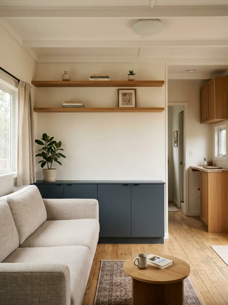
The more useful principle is:
Use vertical storage while preserving at least one visually calm horizontal band.
That band does not need to be empty across the entire room. It simply gives the eye somewhere to rest.
Use this mapper to see which storage strategy fits your wall.
Vertical Density Mapper
How Much Storage Really Belongs at Eye Level?
Use Less Storage Than the Wall Can Hold
If most objects are decorative, the shelves themselves are optional. Concentrate the display and preserve a broad calm area through the primary sightline.
Decision: remove unnecessary shelving before reorganizing it more efficiently.
Group Daily-Use Objects Into One Accessible Zone
Useful items deserve convenient placement, but grouping them within one contained section prevents practical storage from becoming scattered clutter.
Decision: protect part of the eye-level band while keeping one convenient storage zone active.
Increase Capacity Without Filling Every Band Equally
When storage is essential, concentrate denser storage lower or higher on the wall while keeping the primary horizontal sightline comparatively quiet.
Decision: place maximum capacity where it creates minimum visual fragmentation.
The quiet band is not a fixed measurement. Its purpose is simply to give the eye a low-density area where the wall can visually breathe.
This approach also prevents a familiar small-space cycle: move objects off the floor, add wall shelves, fill the shelves, then discover that the room feels just as crowded at a different height.
Vertical storage only feels spacious when some of the vertical plane stays visually calm.
14. Repeat One Frame Finish Across Small Tables, Shelves, and Lamps
You do not need a matching furniture set.
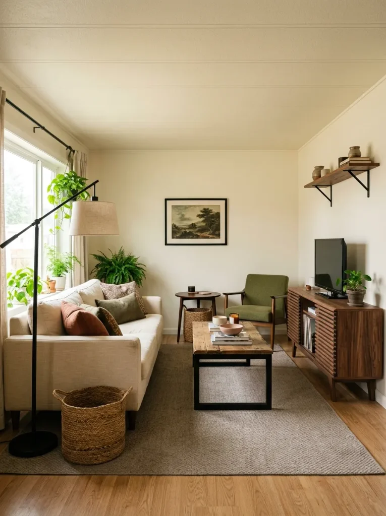
What can help, though, is reducing the number of small finish families competing in the room.
Picture a compact living room containing:
- a black metal floor lamp,
- chrome table legs,
- a reddish wood end table,
- a gray-washed coffee table,
- brass shelf brackets,
- and a dark espresso media console.
None is inherently wrong. Together, they may cause the eye to register six separate furniture stories.
Now imagine keeping most of the same pieces but allowing three smaller elements to share one finish—perhaps matte black frames across the lamp, coffee-table base, and shelf brackets. The room gains a repeated visual thread.
The important distinction is scale.
A matching sofa, coffee table, console, side tables, and shelving can become monotonous. Repetition is more useful on small structural details: frames, legs, brackets, handles, or narrow wood tones.
That creates connection without turning the room into a showroom set.
Before replacing mismatched furniture
Choose the finish that already appears on two useful pieces and ask whether one additional small element could repeat it.
Sometimes changing hardware, moving a lamp from another room, or staining one small table is enough. Sometimes no change is needed because the mixture already feels deliberate.
The test is simple:
Can your eye find a repeated material rhythm, or does every small object introduce another visual language?
If repetition is already present, preserve the variety elsewhere.
15. Blend the Largest Sofa Into the Wall Behind It
Here is a useful decision to make before replacing a bulky-looking sofa:
Is the sofa truly too large, or is its outline simply too strong?
A dark charcoal sectional against a bright white wall creates a crisp, high-contrast silhouette. Your eye immediately sees the entire width, height, and arm structure as one dominant block.
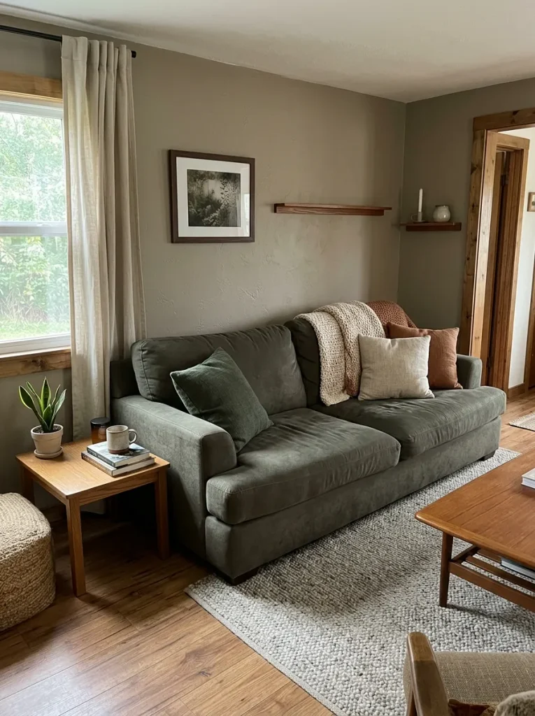
Place the same sofa against a medium greige, warm taupe, muted olive-gray, or another closer-value wall and its outline softens. The furniture does not physically shrink, but it may stop feeling so visually detached from the room envelope.
The same principle works in lighter interiors. A pale oatmeal sofa against a very similar warm neutral wall can feel less intrusive than a bright white sofa against a dark accent wall.
This is especially useful when the sofa is:
- comfortable,
- in good condition,
- correctly placed,
- appropriate for the household,
- and expensive to replace.
In that situation, changing the surrounding contrast can be a smarter first experiment than shopping for a new sofa.
Do not force the blend
A sofa may deserve contrast when it is intentionally the room’s focal piece. A colorful velvet sofa, handsome leather sofa, or strong modern sectional can anchor a simple room beautifully.
The blending strategy is most useful when the largest object feels visually too dominant even though its physical footprint still works.
Photograph the sofa straight on. Temporarily sample a closer wall value behind it using a digital paint visualizer or even a large fabric or board sample.
If the furniture suddenly looks calmer, you have learned something important:
The room may have a contrast problem, not a sofa-size problem.
16. Keep the Living-to-Kitchen Transition Tonally Close
In many small mobile homes, the living room does not end at a full wall. Your eye continues directly into the kitchen, dining area, or hallway.
That connected view can either make the living room feel larger or make its boundaries feel more obvious.
Imagine a pale warm-gray living room opening into a kitchen with very dark flooring, bright white cabinets, black counters, a colorful backsplash, and several contrasting accessories. The doorway may be wide, but visually the kitchen announces:
“The living room stops here.”
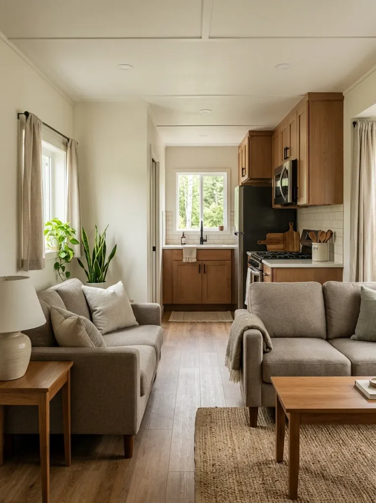
A more closely related palette lets the eye travel farther.
This does not require making both rooms match. The useful connection may come from only two or three repeated elements:
- similar wall undertones;
- related wood tones;
- repeated black or brass hardware;
- one flooring value continuing visually;
- a living-room textile that echoes a muted kitchen color.
In a compact mobile home, the effect is especially useful because the living and kitchen areas are often visible together in a single view. When their tonal relationship is calm, the living room can visually borrow depth from the adjoining space.
Find the strongest boundary first
Stand in the living room and look toward the kitchen.
What tells your eye that one room has ended?
If the answer is a dramatic flooring break, paint contrast, overloaded peninsula, or strongly different finish palette, that transition may deserve attention before you make the living room itself lighter or emptier.
Readers working with a genuinely open single-wide configuration can go deeper with the single wide open floor plan ideas guide, which focuses on the relationship between connected zones.
Decision: coordinate the two rooms enough that the sightline continues, but preserve enough distinction that the kitchen still feels intentional.
17. Build Texture Without Adding New Color Boundaries
A spacious-looking room does not need to be visually flat.
That matters because one of the easiest ways to make a small living room look larger—using fewer colors—can accidentally remove the warmth that makes the room pleasant to live in.
Texture solves that problem.
A cream sofa, oatmeal throw, soft gray-beige rug, woven basket, linen curtain, and warm wood table may all live within a narrow color range while contributing very different surfaces.
The eye notices variety, but it does not encounter six strong color boundaries.
Compare two approaches.
Palette A: white sofa + black-and-white rug + green pillows + rust throw + blue art + dark table.
Palette B: warm ivory sofa + oatmeal rug + taupe boucle pillow + cream knit + medium oak table + natural woven basket.
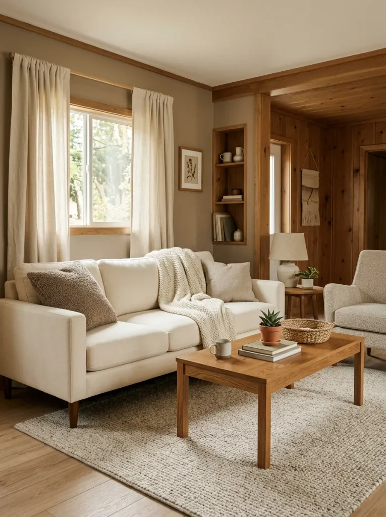
Neither is automatically better. Palette A may feel energetic and expressive. Palette B generally preserves more visual continuity.
For a compact mobile home living room, the second approach is useful when the room already contains strong architectural breaks, visible wall seams, contrasting floors, or bulky furniture. Texture provides richness without adding another layer of fragmentation.
Where texture has the most value
Prioritize surfaces you physically interact with:
sofa → rug → throw → curtain → one or two cushions
You usually do not need additional decorative texture on every shelf and wall.
A tactile room can still feel spacious when the texture is concentrated in soft furnishings while the overall color structure stays controlled.
18. Keep the Center of the Room Visually Lower Than the Perimeter
Two coffee tables can occupy almost the same amount of floor space and create very different impressions.
The difference may be height.
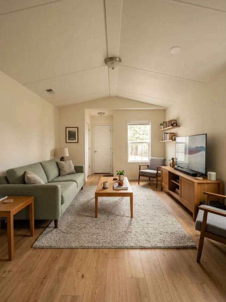
A tall ottoman or bulky storage table positioned in the middle of a small living room interrupts the view from sofa to television and from doorway to opposite wall. Because that object sits near the visual center, its height can make the entire seating arrangement feel denser than its footprint suggests.
A lower center piece lets your eye travel across it toward the rest of the room.
This is one reason a low coffee table can sometimes make a stronger difference than replacing a larger sofa.
Use the cross-section below to diagnose your own room.
Sightline Simulator
Same Footprint. Very Different Visual Interruption.
Switch between a lower and taller center piece to see how height changes the visual path across a compact living room.
Lower Center Mass Preserves the Cross-Room View
The eye can travel over the coffee table and continue toward the opposite wall, allowing more of the room to register as one continuous space.
Best test: temporarily remove your center piece. If the room opens dramatically, height may matter more than footprint.
Taller Center Mass Interrupts More of the Sightline
A taller ottoman or storage table occupies more of the visual center and can make the seating group feel denser even when its footprint is similar.
Tradeoff: keep the taller option when its storage, seating or comfort functions are genuinely useful.
This is a visual comparison, not a universal furniture-height rule. Comfort, accessibility, storage and daily routines should still shape the final decision.
The important exception is a storage ottoman that solves several real problems at once. If it stores blankets, provides a footrest, and becomes occasional seating, its additional height may be worth the visual tradeoff.
That leads directly to the next idea.
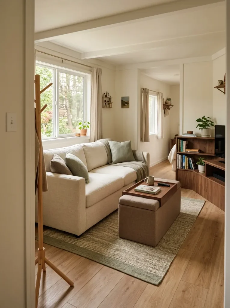
19. Let One Flexible Ottoman Replace Two Single-Purpose Pieces
Consider a small living room with a coffee table and a separate spare chair that is used only when guests visit.
Now imagine replacing both with one movable upholstered ottoman.
On ordinary days, it works as a footrest. Add a sturdy tray when you need a temporary surface. Move it to the edge of the seating group when someone needs another seat. If the design includes storage, blankets or games disappear inside it as well.
The gain is not that an ottoman is inherently “small-space furniture.”
The gain happens only when one flexible object genuinely eliminates other permanent objects.
A useful buying test
Before purchasing any convertible or multifunctional item, write down the objects it will allow you to remove.
If the answer is:
“None, but it gives me another function,”
you are adding furniture.
If the answer is:
“It replaces my coffee table and the spare chair I rarely use,”
the multifunctionality has real spatial value.
There is one important condition: daily convenience still wins. A household that eats from the coffee table every evening may prefer a stable table. Someone who needs firm supportive seating may not find an ottoman suitable as guest seating.
Keep the flexible piece only when its multiple jobs are jobs your household actually uses.
20. Attach Loose Floor Décor to an Existing Furniture Zone
A woven basket beside the sofa can feel intentional.
The same basket standing alone between the sofa and doorway can look like another object the room must accommodate.
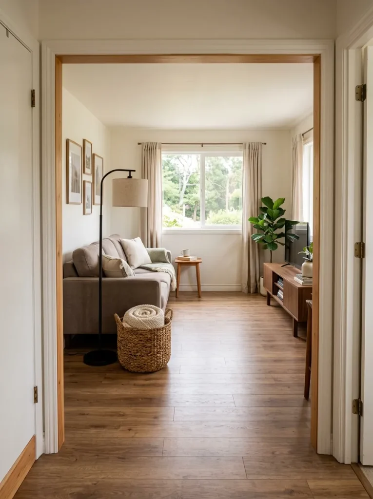
That small distinction becomes important in compact rooms because independent floor objects create visual “islands.” Plants, baskets, floor lanterns, magazine holders, pet beds, blanket ladders, stools, and decorative pots can gradually occupy the leftover gaps between major furniture.
The room may still be tidy, yet the floor becomes fragmented.
Try an editing sequence that works from relationship, not removal:
First: move the basket directly beside the sofa or console it serves.
Then: pull the plant closer to an existing window or furniture composition.
Next: decide whether the decorative stool belongs with the chair, belongs elsewhere, or serves no regular function.
Finally: step back from the doorway.
The best result is not necessarily fewer objects. It is fewer independent object zones.
A large planter intentionally anchoring the end of a console can read as part of that composition. A planter, basket, stool, and floor lamp each floating several inches away from separate furniture pieces create four new silhouettes.
Use this final filter:
Can I describe what this floor object belongs to?
If yes, strengthen that visual relationship.
If no, the object is a strong candidate for relocation.
And once the room develops a clear floor rhythm, resist the temptation to refill every newly opened gap. Empty floor is not unfinished décor in a small mobile home living room—it is part of the composition.
21. Give the Room One Dominant Direction Before You Finish Decorating
A compact living room can contain perfectly reasonable furniture and still feel restless when its strongest lines disagree.
The flooring may pull your eye toward the kitchen. The rug may run across that direction. The sofa might create another strong line, while a media console, ceiling beam, or long shelf introduces another. None of those elements has to be visually heavy on its own. The problem is that the room never tells your eye which way to travel first.
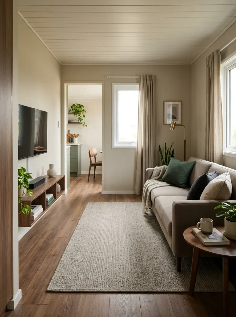
A more coherent small mobile home living room usually has one dominant directional read, with the other major elements supporting or quietly crossing it.
This is not a rule that every narrow room must emphasize its length. Sometimes the architecture, window position, seating arrangement, or best focal wall makes the shorter direction more convincing.
Use the resolver below before adding the final layer of décor.
Spatial Direction Resolver
Which Line Tells Your Eye Where to Travel?
Identify the strongest directional cue from your main entrance and use it to organize the rest of the room instead of letting every element compete.
Let the Architecture Lead
If flooring, ceiling geometry or the long wall already creates a convincing direction, your décor does not need to invent another one.
Best move: allow the rug or main furniture grouping to support that architectural direction.
Let the Seating Relationship Organize the Room
When the sofa and media wall create the strongest usable relationship, organize the room around that exchange even if the floor runs another way.
Best move: let the rug, coffee table or artwork reinforce the seating relationship.
Test the Rug Before Moving Major Furniture
A large rug running against the room’s dominant direction can make an otherwise settled layout feel unresolved.
Best move: rotate or temporarily remove the rug and compare the doorway view.
Select One Cue Before Adding More Décor
When flooring, furniture, rug, shelving and ceiling lines all compete, another decorative layer usually increases the visual noise.
Best move: choose the strongest permanent cue, then let two larger movable elements support it.
Finish-line test: from the doorway, your eye should understand the room’s main direction before it starts processing smaller decorative details.
The purpose is coherence, not obedience to an abstract layout rule. A short, wide living room may look better emphasizing its width. A narrow room may benefit from a longer visual pull. An open living/kitchen space may borrow its strongest direction from the connected architecture.
Once the direction is clear, stop solving the room.
That final restraint is important. A small living room can lose much of its spaciousness during the last 10 percent of decorating, when another basket, table, pillow color, shelf, plant, or wall object is added simply because an open spot remains.
Conclusion
A small mobile home living room feels more spacious when the eye has fewer competing things to solve. Start with the strongest source of visual pressure—not a shopping list. Take one doorway photo and identify the biggest issue: disappearing floor, overloaded edges, fragmented walls, scattered contrast, a blocked sightline, or conflicting directions. Change that variable first, then photograph the room again.
Once the space reads as a few clear, connected masses, comfortable furniture, deeper color, storage, and texture can remain. The room does not need to pretend it is physically larger. It needs enough visual order that its actual size stops dominating the experience.