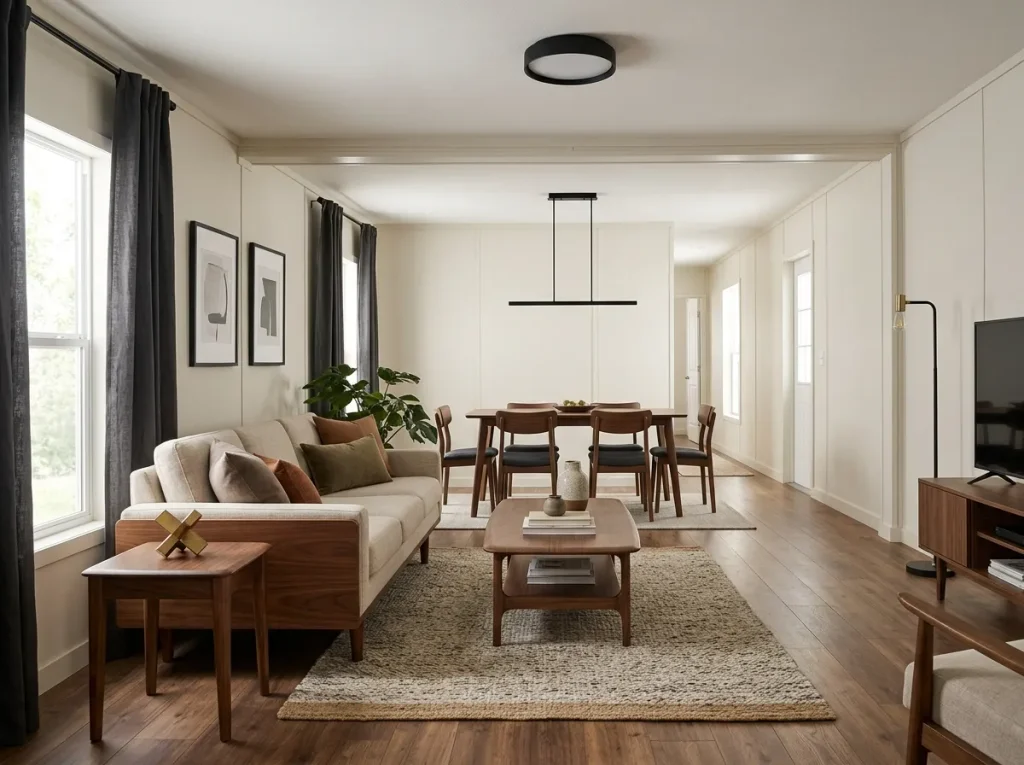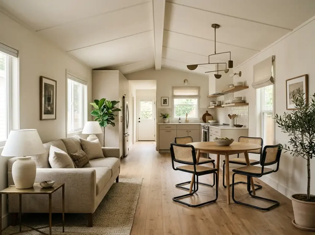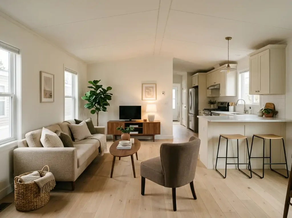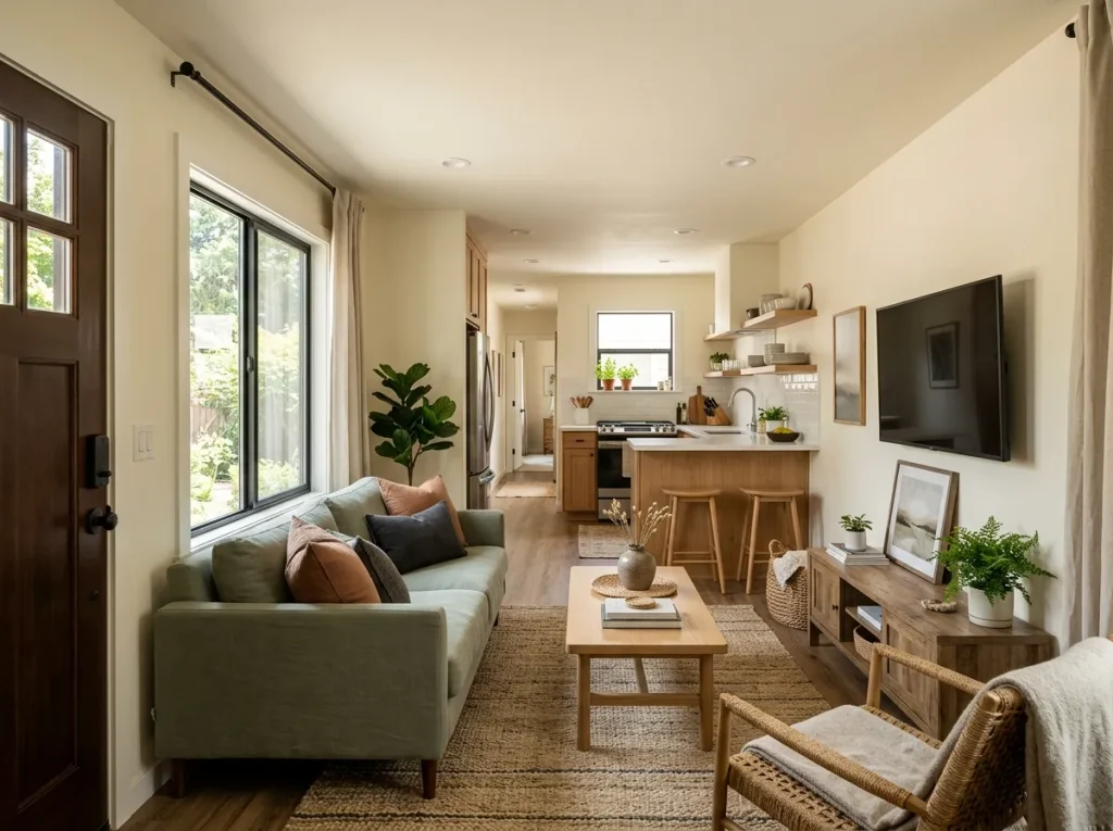
A single wide can have enough square footage for everyday life and still be surprisingly difficult to decorate. The challenge is often not that the home is simply small. It is that the architecture keeps interrupting arrangements that would normally make sense.
The front door may divide the best furniture wall. A window may sit where the sofa naturally wants to go. The kitchen can begin before the living room feels finished, while a dining table may have to share the same route people use to move through the home.
That is why narrow single wide decorating ideas need to work differently from ordinary small-space advice. You are not decorating a perfectly square room where every wall can perform the same job. You are working with elongated rooms, broken wall sections, unusual sightlines, and furniture that sometimes has to sit somewhere other than the visually obvious position.
The goal is not to erase those conditions.
It is to make them look intentional.
These 23 ideas focus specifically on those difficult areas—the places where a conventional layout seems almost right but never quite settles into place.
1. Let the Usable Wall Set the Center, Not the Room
A room can be mathematically centered and still look completely wrong.
That happens often in a single wide because the architectural rectangle and the usable living zone are rarely the same thing.
Imagine standing in the entry. A section of floor belongs to the front door. Another strip is really a route toward the kitchen. A large window removes part of the wall you would normally use for furniture.
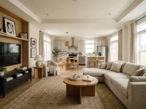
Once those interruptions are mentally removed, the true decorating center may shift several feet.
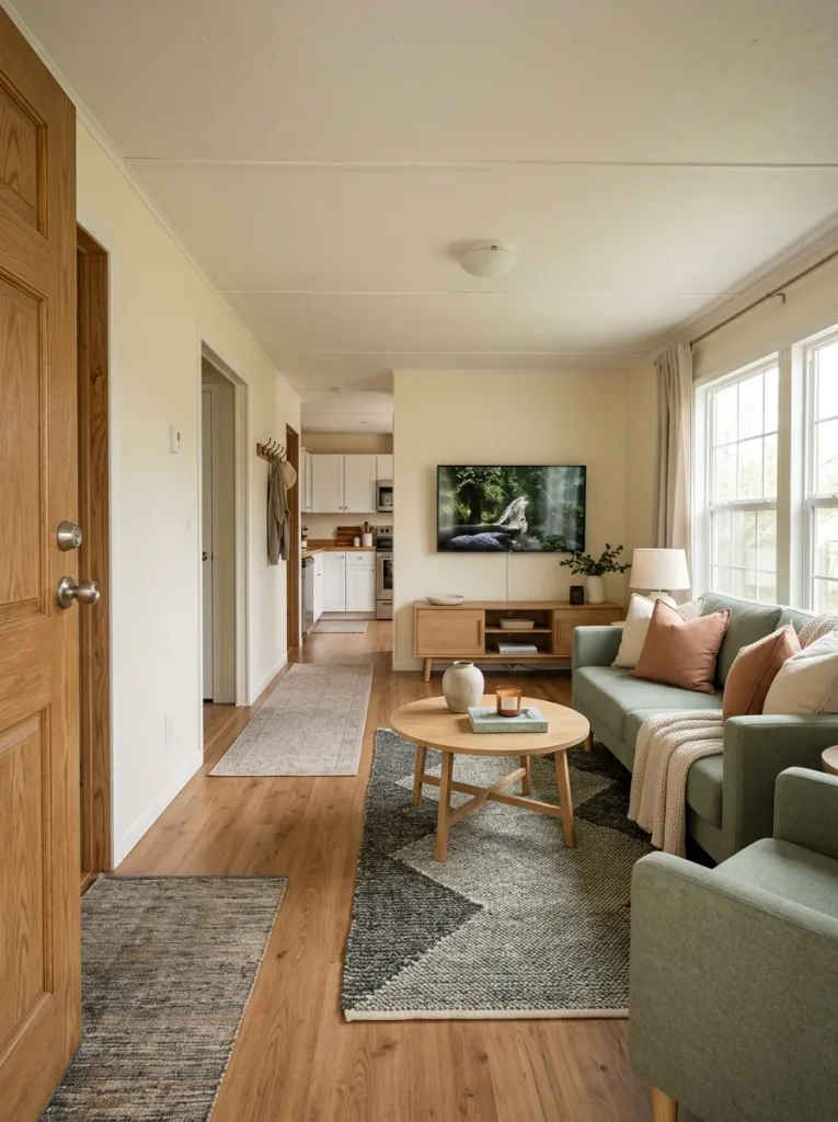
Look for the wall that can actually carry the room. It may support the television, art, fireplace, or another dominant element. Then let the rug, coffee table, sofa, and chair relate to that usable section instead of the entire shell of the home.
The finished grouping may look obviously off-center on a floor plan, yet feel perfectly settled in person.
A quick way to judge it is from the doorway. If your eye sees one cohesive seating composition first—and the architectural asymmetry second—the furniture is centered where it matters.
2. Build an Asymmetrical Focal Wall on Purpose
What if your television simply cannot sit in the middle of the wall?
That question causes a surprising amount of unnecessary decorating.
A doorway, thermostat, wall opening, or cabinet may force the TV and media unit toward one side. Trying to manufacture symmetry around it often creates a collection of small accessories that look as though they were added only to compensate.
Instead, think about visual weight.
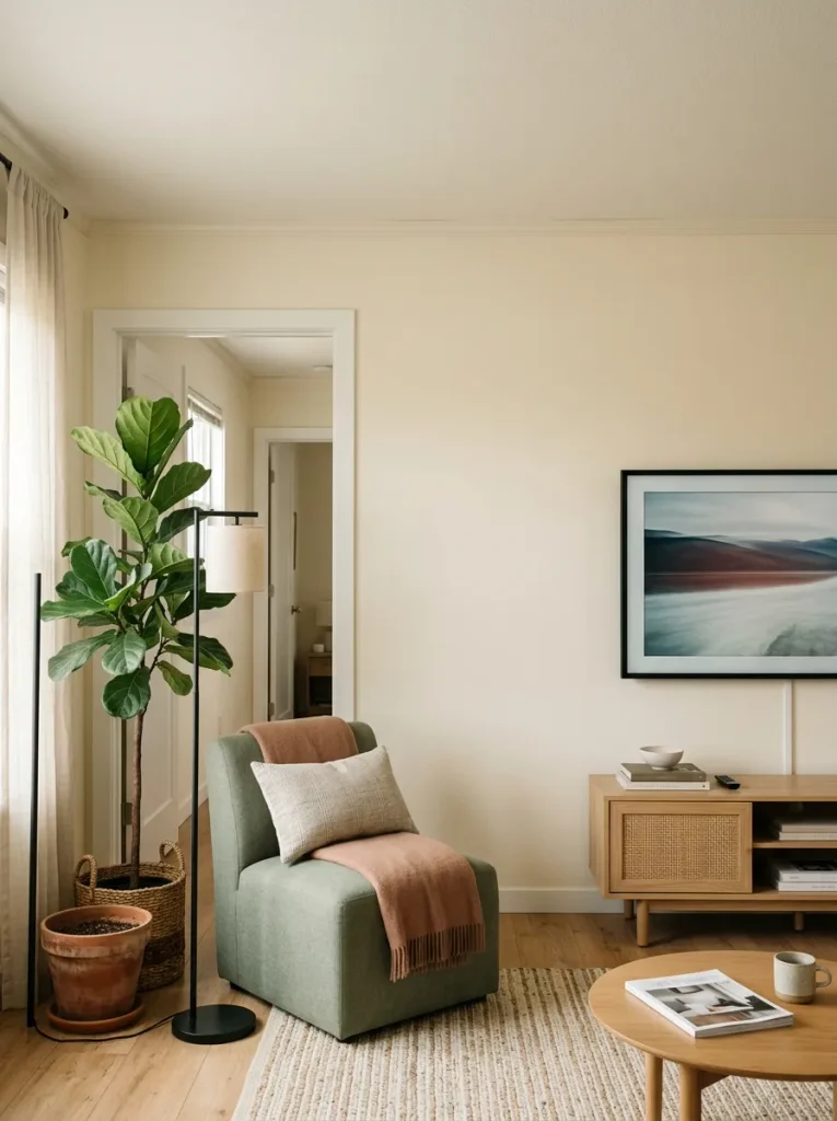
A tall dark plant can carry more visual presence than a much wider pale basket. A chair paired with a lamp can counter a low media unit even if their physical dimensions have almost nothing in common.
The important relationship is not same size versus same size. It is strong visual mass versus convincing counterweight.
If the wall still seems unsettled, remove the smallest accessories first. One substantial element often creates better balance than four decorative fillers.
The goal is not to make both sides look equal. It is to make neither side look abandoned.
3. Treat a Door-Broken Wall as Two Related Panels
Think of the doorway as punctuation rather than the end of one decorating idea and the beginning of another.
A door in the middle of a wall can leave one wide fragment and one frustratingly narrow strip. Decorating both as separate compositions usually exaggerates the break.

Instead, give them one shared visual clue.
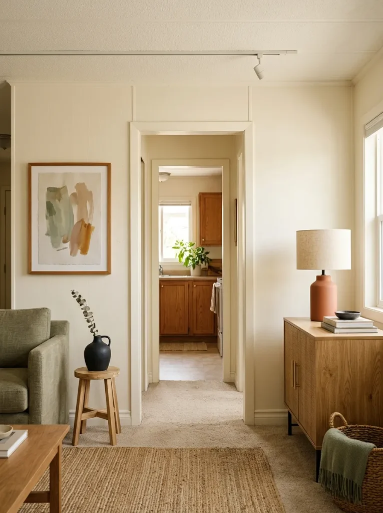
Maybe warm oak appears in a picture frame on the narrow side and in a shelf or cabinet on the wider side. Perhaps matte black moves from a lamp to a frame. Similar artwork undertones can create a connection even when the objects themselves have no matching shapes.
The two wall fragments are still allowed to be different. In fact, they probably should be.
A slim section may need only one vertical artwork, while the wider surface can carry furniture.
What matters is that the eye senses a relationship between them.
Viewed from across the room, the doorway should feel like a pause inside one larger wall composition—not like a dividing line between two decorating styles.
4. Float the Sofa When the Walls Refuse to Cooperate
Sometimes there simply is no sensible sofa wall.
The front door claims one side. A large window claims another. The kitchen opens behind the living area, while the only uninterrupted wall has already been given to the television.
That is the moment when floating the sofa stops being a stylish option and becomes the logical solution.
Move it away from the perimeter and let its back quietly define the living zone.
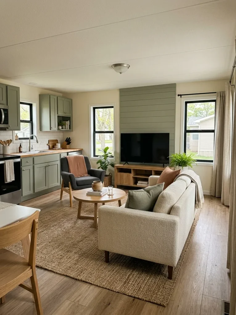
The rug should help explain why the sofa sits there. The coffee table should reinforce the seating relationship. The focal wall should give it a clear direction.
When those relationships are strong, the sofa does not look stranded—it looks architectural.
This approach is particularly useful when the kitchen begins immediately behind the living room. The sofa can mark the transition without introducing another shelf or freestanding divider.
For broader circulation and scale strategies, these single wide mobile home decorating ideas explore whole-home furniture placement in greater depth.
The simplest test is visual: if the sofa appears to create a room rather than block one, it is doing its job.
5. Use the Window as Part of the Arrangement Instead of Fighting It
Windows often occupy exactly the wall furniture wants.
In a larger home, avoiding the opening may be easy. In a single wide, abandoning that wall completely can eliminate one of the only useful furniture locations.
The question is not “Can furniture ever go near the window?”
The better question is:
How much of the window needs to remain visually and physically free for it to work comfortably?
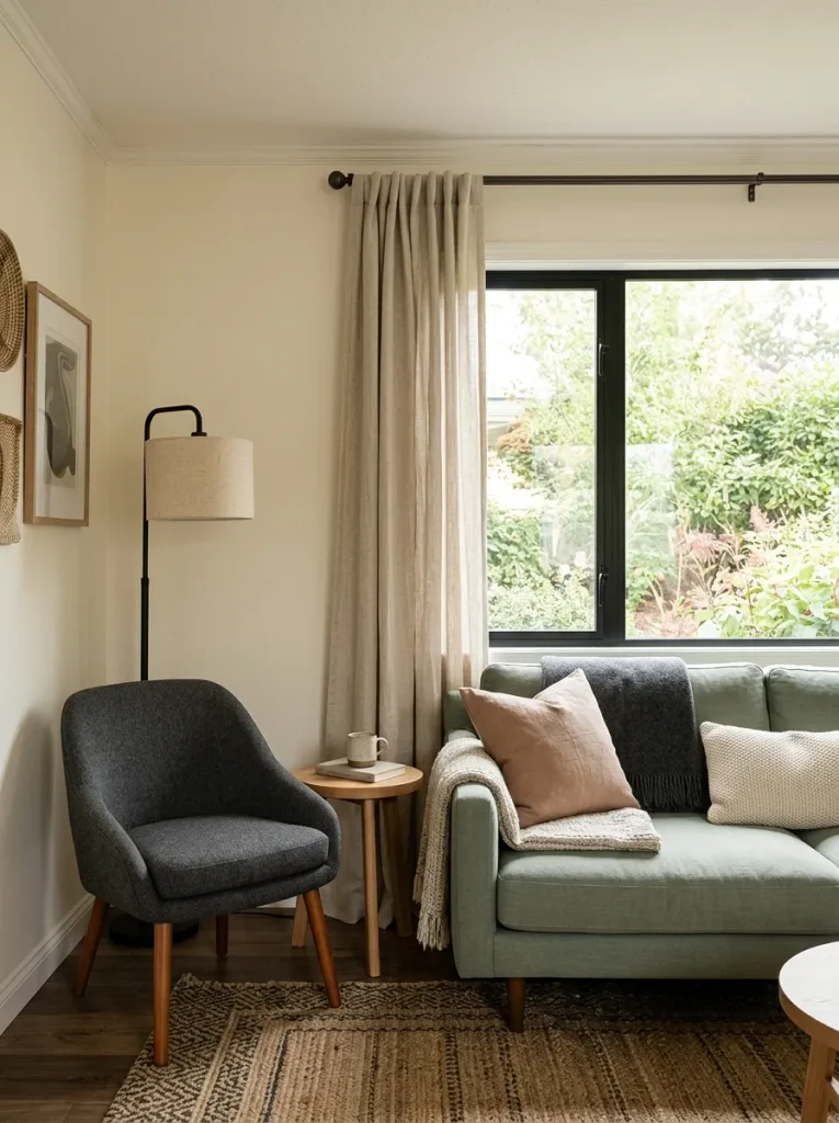
A low-backed sofa may sit naturally beneath a broad window. A chair might overlap one edge without disturbing the room. When the glass occupies only part of the wall, furniture can use the remaining surface and create a composition that incorporates the window.
The awkward version is usually the hesitant one: the sofa sits six inches away from the window for no obvious reason, leaving a skinny strip of unusable space between them.
Commit to the relationship or separate the elements clearly.
When the window remains usable and the furniture looks as though it was deliberately positioned with it—not accidentally in front of it—the conflict disappears.
6. Choose One Winner When the Room Has Two Focal Points
Picture the room after everything has been decorated.
The TV says, “look here.”
The window says, “look outside.”
The fireplace says, “I am architecture.”
Meanwhile, the chairs are facing three different directions.
This is what focal competition looks like.
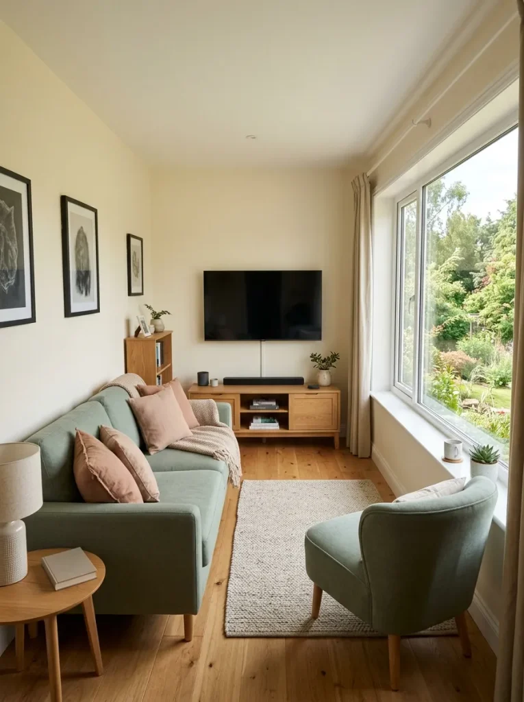
The solution is hierarchy.
Decide which feature matters most in everyday life and let the main seating acknowledge it. The secondary feature does not need to disappear; it simply receives less furniture and decorative emphasis.
A large picture window already has daylight, changing views, and architectural scale working in its favor. It may not need additional objects competing for attention around it.
Furniture orientation becomes the strongest signal. Once the sofa and chairs clearly support one destination, the whole room becomes easier to read.
7. Leave the Too-Small Corner Empty—But Make the Emptiness Look Deliberate
Here is a surprisingly useful decorating exercise:
Remove everything from the troublesome corner.
Do not replace it immediately.
Live with the empty space for a day.
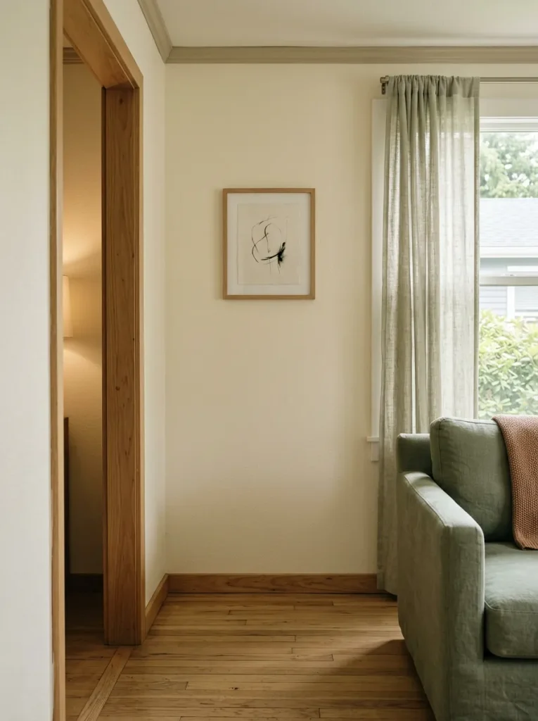
A corner that previously held a stool, basket, or tiny plant stand may suddenly make the entire room feel calmer. The nearby door may seem easier to use. The sofa may appear less crowded. Your eye may finally have somewhere to rest.
That tells you something important: the corner was not lacking decoration. It was lacking permission to remain empty.
You can still make it feel connected to the room. Art on the adjacent wall, the drop of nearby curtains, or soft light from another object can visually complete it without occupying the floor.
If removing an object improves the room and no useful function disappears with it, you have not created an empty problem.
You have solved one.
8. Turn a Strange Bump-Out or Recess Into a Defined Moment
An architectural irregularity becomes more noticeable when everything around it behaves as if the wall were perfectly flat.
A shallow recess suddenly looks accidental.
A narrow projection feels like an obstacle.
Instead of trying to hide the shape, give it a role proportional to its size.
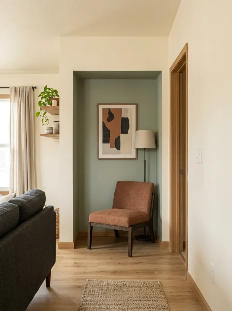
A shallow niche can support one piece of vertical art. A wider recess may have enough room for a compact chair or small lamp. A projecting wall may become the background for a tall plant.
The restraint matters more than the object.
Once the décor begins spilling beyond the architectural boundary, the treatment starts making the bump-out or recess look stranger instead of more intentional.
Think of the irregularity as a frame.
Whatever you add should feel comfortable inside it.
9. Connect Several Short Wall Fragments With One Visual Thread
A series of doorways can leave a single wide with several small walls instead of one large surface.
Those fragments often get decorated at different times, which is how one wall ends up with oak frames, another with black metal, another with rustic signs, and another with a completely different color family.
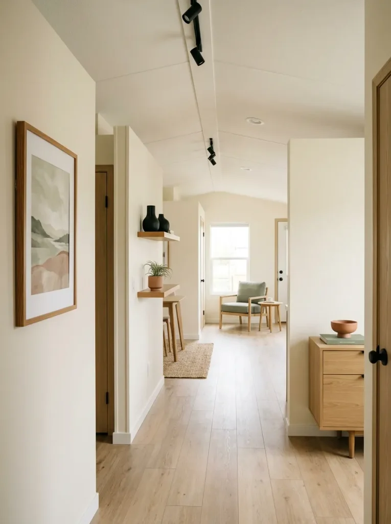
Individually, each area may look fine.
Together, they can make the architecture feel more fragmented.
Choose one visual detail and allow it to travel through the room.
Warm oak might appear in a frame, then a shelf, then a furniture leg farther down. Matte black may move from a lamp to kitchen hardware. A muted green may repeat subtly through artwork.
The connection should be quiet enough that the objects themselves still feel individual.
If the walls continue to look unrelated, remove a competing finish before introducing more repetition.
10. Visually Shorten a Room That Feels Like a Hallway
There is a moment in some single wides when the living room stops feeling like a room and starts feeling like part of the route to the kitchen.
You can usually see why.
The floor runs lengthwise. The sofa runs lengthwise. The rug runs lengthwise. The cabinet line continues in the same direction.
Every visual cue says:
Keep going.
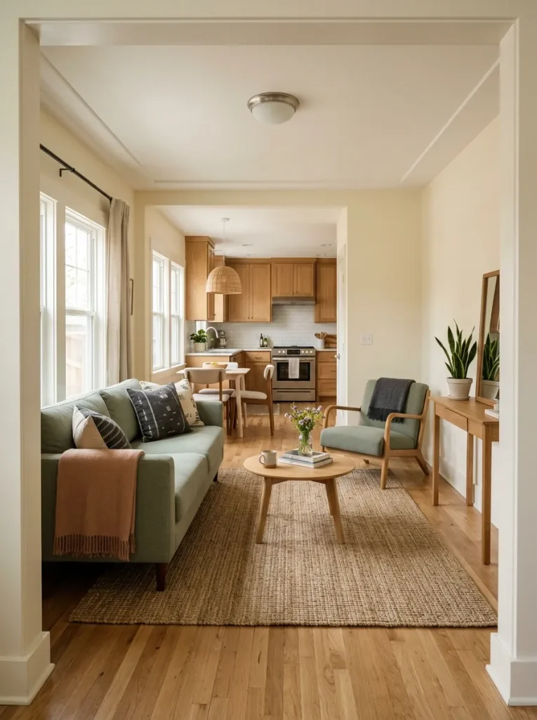
Instead, create one relationship that asks the eye to move across the room.
A chair across from the sofa can do it. A strongly defined living rug can do it. A focal wall can interrupt the long sightline.
This does not make the room physically shorter.
It creates a pause.
If your broader goal is increasing the sense of spaciousness, these single wide interior ideas for making a narrow home feel bigger explore that problem separately.
Here, the room improves when your eye enters the living area, stops for a moment, and only then continues through the house.
11. Make a Low Ceiling Feel Intentional Instead of Underdecorated
A low ceiling usually feels lowest when the decorating keeps pointing toward it.
An oversized fan, several hanging elements, tall décor squeezed tightly against the upper wall, and a dense curtain treatment can create a strong horizontal “lid.”
The room does not need less personality.
It needs the personality at a different level.
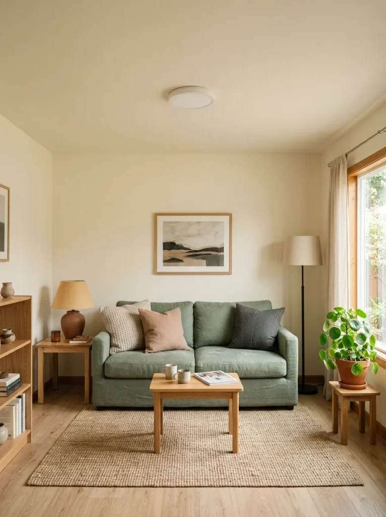
Let artwork, furniture, textiles, plants, and portable lighting do more of the decorative work around eye level. Leave small areas of quiet wall between tall objects and the ceiling.
At night, avoid relying entirely on one bright overhead fixture. Lower light sources bring attention toward the furniture and add depth without emphasizing the ceiling plane.
The aim is not to fake height.
It is to make ceiling height less relevant to how the room feels.
12. Center the Light Over the Activity, Not the Building
There is a common layout trap that starts on the ceiling.
The light fixture appears centered.
So the dining table gets moved beneath it.
Then chairs obstruct the route.
Or a coffee table is shifted to align with the fan while the sofa ends up too close to the door.
The furniture starts responding to the fixture instead of the room.
Reverse that relationship.
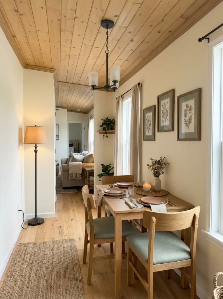
If the dining table functions better closer to one wall, let it move. If the seating group works several inches away from the ceiling centerline, keep it there.
The furniture can establish its own visual center through the rug, table, artwork, or nearby lighting.
A slightly misaligned ceiling fixture is often much less noticeable than an entire floor plan distorted simply to line up with it.
This is a decorating response to existing lighting—not a recommendation to relocate electrical wiring.
13. Build an Entry Zone Without Adding Entry Furniture
Your front door opens.
Where do the keys go?
Where does the bag go?
Where do shoes tend to collect?
Those questions matter more than whether an entryway “should” contain a console.
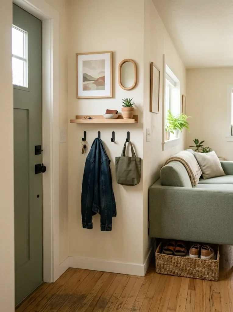
In a narrow single wide, a console may take up precious floor space just to perform jobs that could happen elsewhere.
A shallow ledge can catch small items. An existing cabinet can donate one drawer. Hooks can keep bags and jackets from migrating to the sofa.
Once those functions work, one subtle visual cue can give the area an entry identity.
The best test has nothing to do with styling.
Imagine arriving with grocery bags in both hands.
If opening the door and walking inside becomes awkward because of the entry furniture, the setup is too large for the job.
14. Create a Softer Hand-Off Between the Living Room and Kitchen
Sit on the sofa and look toward the kitchen.
Now reverse the view.
Which materials appear in both directions?
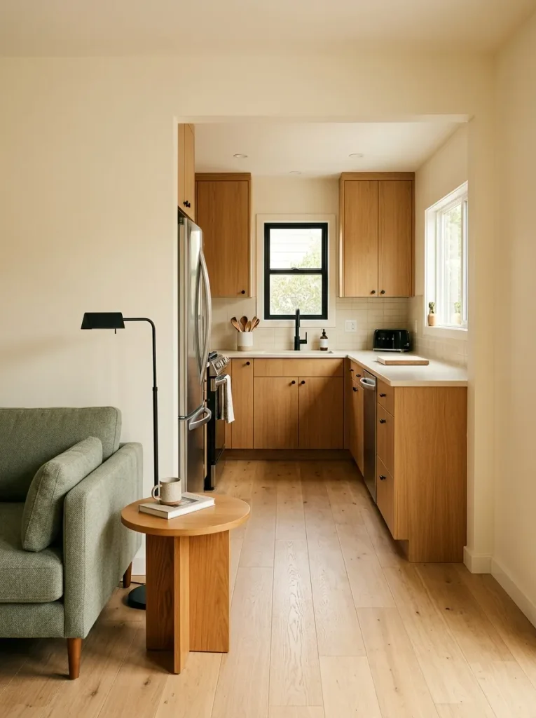
That question often reveals the easiest way to soften an abrupt transition.
Warm cabinetry might find a small echo in a living-room side table. Dark kitchen hardware can relate to a single lamp. A woven shade can connect with the texture of a rug.
Notice the restraint: one relationship is often enough.
You do not need to make the living room and kitchen match.
And you do not necessarily need a physical divider between them.
The seam feels natural when one or two details travel across it while the two spaces keep their own functions.
That creates continuity without turning the entire open plan into one large matching set.
15. Decorate the Exposed End of a Peninsula Like Architecture
From the kitchen, the peninsula end may seem almost irrelevant.
From the sofa, it may be one of the largest surfaces in view.
That makes it worth treating thoughtfully.
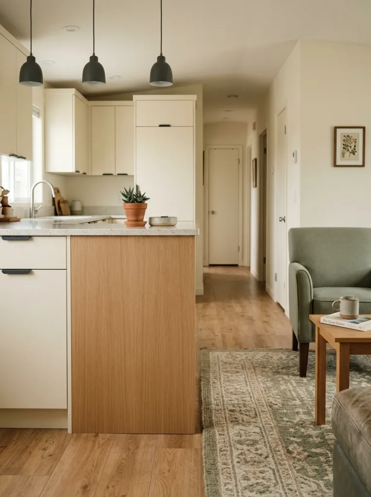
Before adding shelves or hanging baskets, improve the plane itself.
A quiet finish can help it recede. A subtle panel treatment can give it architectural presence. A controlled material connection to the living-room furniture can make the kitchen feel more finished from the opposite side.
What usually works best is something shallow.
Once decorative storage begins projecting several inches into the room, the peninsula starts taking physical space away from the transition zone.
If the surface looks complete on its own, that may be all it needs.
16. Put the Dining Seat Against the Wall When the Room Will Not Support Four-Sided Access
A standard dining table arrangement assumes every chair can pull backward comfortably.
A narrow single wide often proves otherwise.
One side may sit against the wall while the opposite chairs project into the main passage.
Before replacing the table, look at the seating geometry.
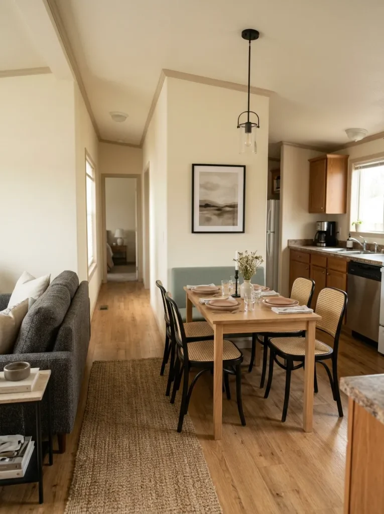
Moving one seating position toward the wall can dramatically change how much room remains for circulation. A bench may work where people can comfortably enter from the ends. Compact individual chairs may be the better choice where diners need easier independent access.
There is also a possibility that the table size is not the problem at all.
The orientation may be.
Rotating it can sometimes put the shorter side toward the traffic route and preserve the useful eating surface.
The successful arrangement is the one where dining and circulation can happen at the same time.
17. Divide Open Zones With a Change the Eye Notices, Not a Divider the Body Hits
Open spaces need boundaries.
They do not necessarily need objects acting as boundaries.
That difference matters in a narrow home.
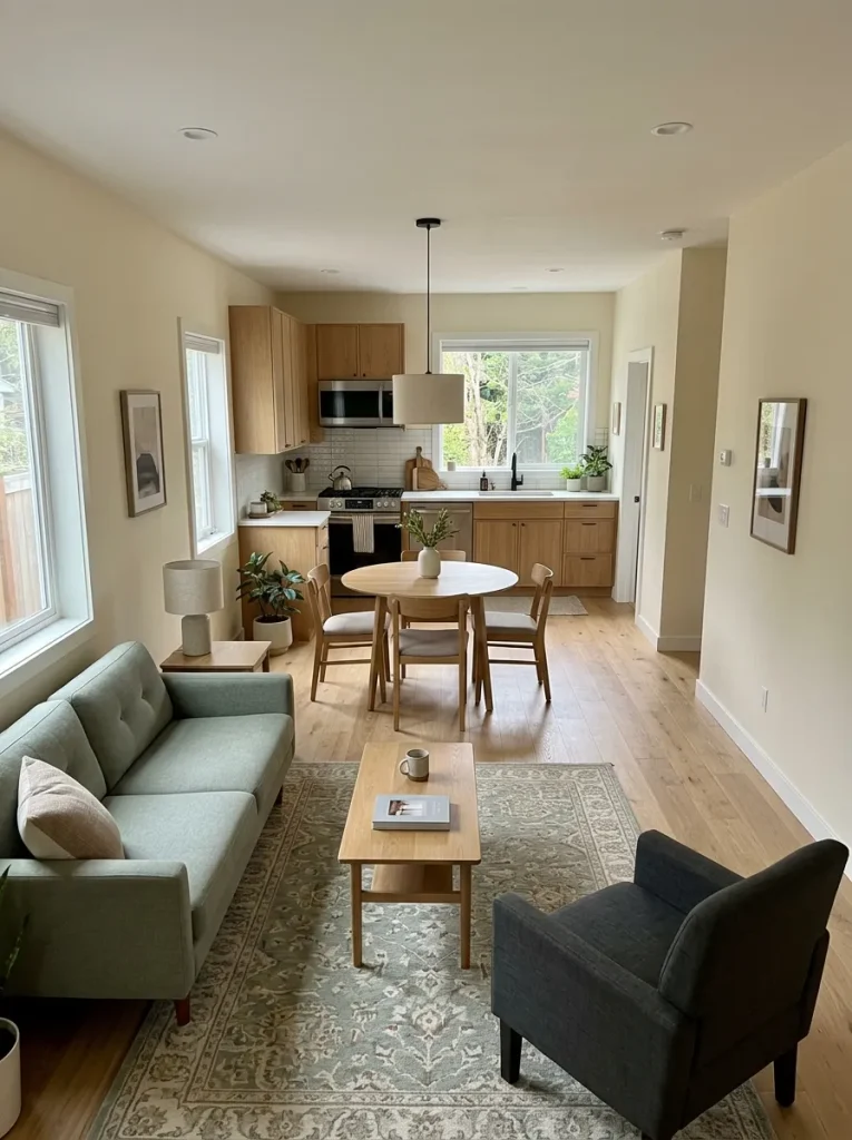
The end of the living-room rug can signal where one activity stops. A dining pendant can create a visible pool around the table. Even the direction furniture faces can separate one zone from another.
These are perceptual boundaries.
People understand them without needing to walk around anything.
A divider shelf may still work in some rooms, but it should not become the default answer to every open-plan transition.
If the zones are unclear, strengthen one subtle cue first.
The more boundaries you stack together, the greater the risk that an open single wide starts feeling like a collection of tiny boxes.
18. Give the Skinny Leftover Gap One Small Job
A skinny gap has a dangerous habit.
It attracts stuff.
A narrow space beside the fridge begins with one tray. A basket appears. Then a plant. Eventually the gap becomes a vertical collection point for everything that did not have another home.
Assign it one purpose.
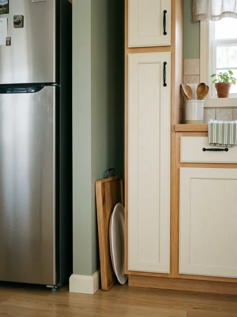
If it sits beside the dresser, perhaps the laundry basket belongs there.
If it is beside a cabinet, maybe one frequently used tray fits naturally.
If nothing genuinely needs the space, leaving it empty is still a valid design decision.
A simple test works well:
Can you explain what this gap is for in one sentence?
If yes, the area is probably under control.
If the explanation becomes a catalogue of unrelated objects, it needs editing.
19. Make an Ugly Utility or Closet Door Disappear Into the Wall
The most noticeable object in a room is not always the most beautiful one.
Sometimes it is a utility door.
Contrast can make a completely ordinary door visually aggressive. Dark trim around a pale slab outlines it. Décor placed immediately on both sides can unintentionally create a giant frame around it.
The solution begins by reducing emphasis rather than adding camouflage.
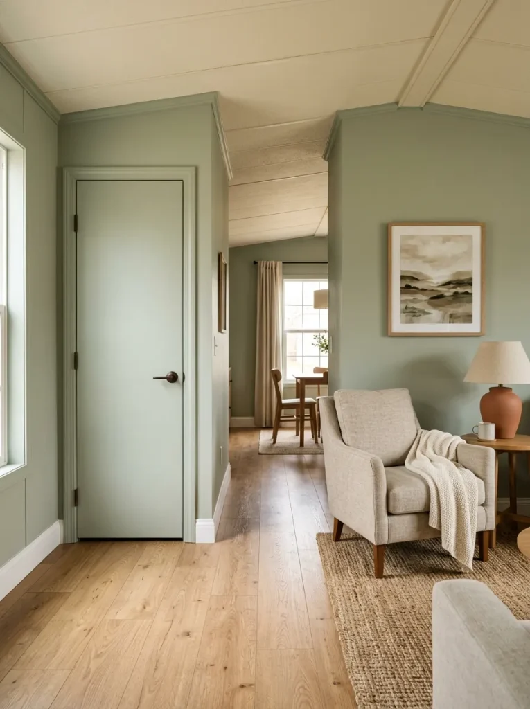
A quieter wall-and-door relationship allows the opening to recede.
Then redirect attention somewhere more useful.
A better focal wall, more intentional artwork, or stronger lighting around the seating zone gives the eye somewhere else to land.
The door remains accessible and functional.
It simply stops being the first architectural feature everyone notices.
20. Let an Off-Center Bed Look Deliberate
A closet door occupies the right side.
The bedroom entrance steals space on the left.
The bed ends up somewhere in between—but definitely not centered.
This is exactly the kind of room where matching bedside furniture can create more trouble than it solves.
Let each side respond to its actual amount of space.
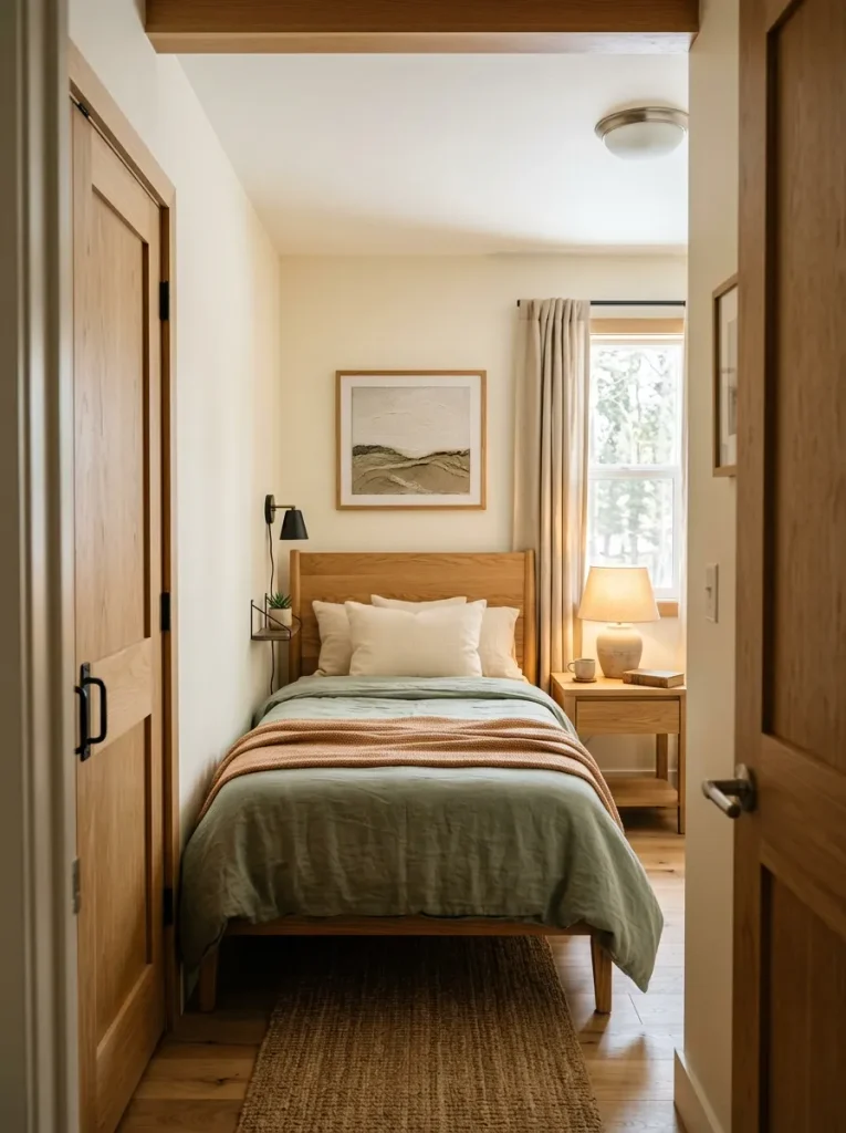
The generous side may carry the larger nightstand and lamp. The tight side can become visually lighter with a shallow ledge, compact light source, or no floor furniture at all.
Artwork above the bed should belong to the sleeping zone rather than the mathematical center of the wall.
The difference is subtle but powerful.
Instead of asking, “How do I disguise that the bed is off-center?” ask, “How do I make its current position look resolved?”
That shift usually leads to a much calmer bedroom.
21. Replace the Missing Nightstand With a Bedside Function Zone
A nightstand is really several functions disguised as one piece of furniture.
It holds the phone.
It supports the lamp.
It keeps water nearby.
Maybe it stores a book.
When there is no room for a conventional table, separate those functions.
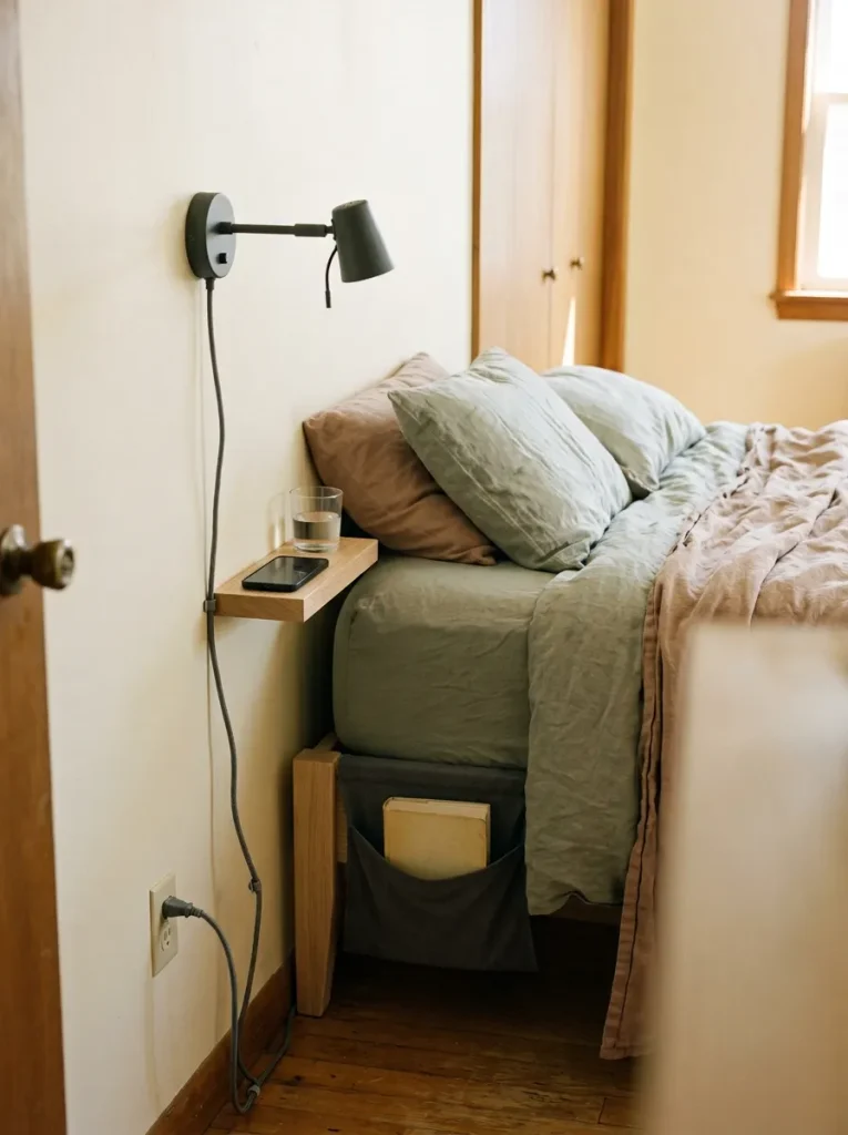
A shallow ledge might handle the phone and water. A suitable plug-in wall light can remove the need for a lamp base. A bedside pocket can hold a book.
Anything that does not genuinely need to be reachable from bed can move to the dresser.
This becomes especially useful when one side of the bed has normal clearance and the other side does not.
The two sides no longer have to pretend they are identical.
Once everything you need is still within reach, the missing nightstand stops looking like a missing piece.
22. Light the Corner That Disappears After Sunset
Some room problems appear only after dark.
During the day, a corner receives enough natural light to feel connected to the rest of the space.
At night, it disappears.
The ceiling light stays bright, but the edges of the room flatten.
Instead of adding furniture, add depth.
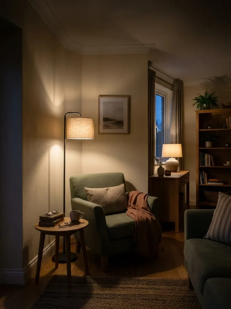
A lower lamp can restore the shape of the wall and furniture because the light is coming from a different level than the overhead fixture.
But edit first.
Illuminating a messy corner does not make it more intentional. It only makes the clutter easier to see.
Once the area is simplified, introduce enough warm local light to bring it back into the composition.
You are not creating another focal point.
You are preventing the room from visually shrinking when daylight disappears.
23. Decide Whether the Awkward Spot Needs a Feature, a Function, or Nothing
This is the final question to ask before buying another piece of décor.
What exactly is missing?
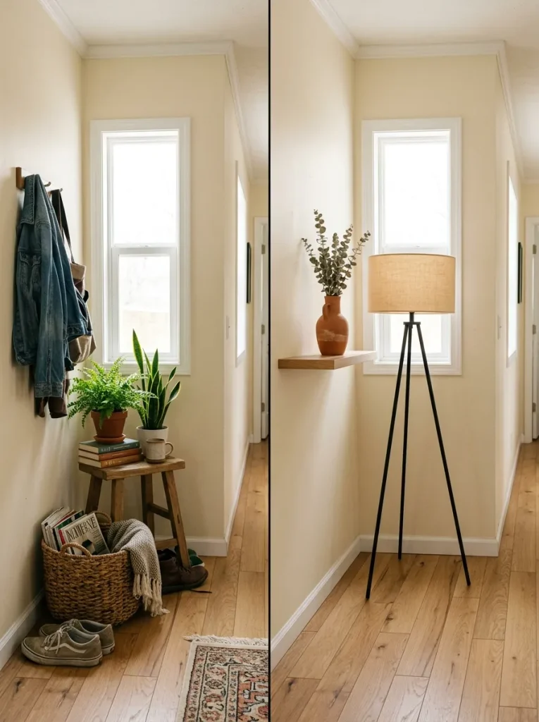
Sometimes the answer is visual identity. A blank architectural area genuinely needs one feature.
Sometimes it is function. The awkwardness exists because keys, books, shoes, lighting, or another everyday activity has no assigned place.
And sometimes the answer is much less exciting:
Nothing is missing.
The route works. The surrounding furniture already has enough presence. The blank wall or empty corner is providing breathing room.
That final category is easy to overlook because adding something feels like progress.
Yet stopping at the right moment is one of the most important decorating decisions you can make.
Make the Awkwardness Look Intentional
The difficult parts of a single wide are often the places conventional decorating formulas were never designed to handle.
The wall has a door where you wish it did not.
The sofa cannot sit in the obvious position.
The dining area shares the main route through the home.
The kitchen seems to begin too early.
The two sides of the bed have completely different amounts of space.
None of those conditions needs to disappear before the home can feel beautifully put together.
Let furniture respond to the architecture that is genuinely usable. Allow asymmetry where it improves function. Give leftover spaces a clear role when they need one—and permission to stay empty when they do not.
Most importantly, recognize when the decorating problem has already been solved.
If an area looks deliberate, works comfortably, and no longer seems to be asking for another object, stop there.
A narrow single wide does not need perfect geometry to feel thoughtful, cohesive, and finished.