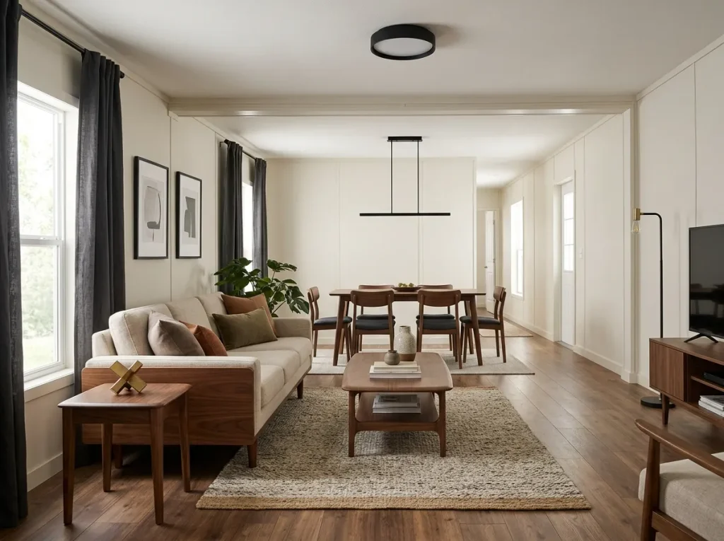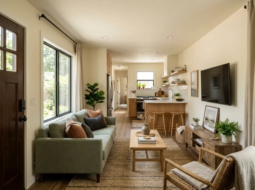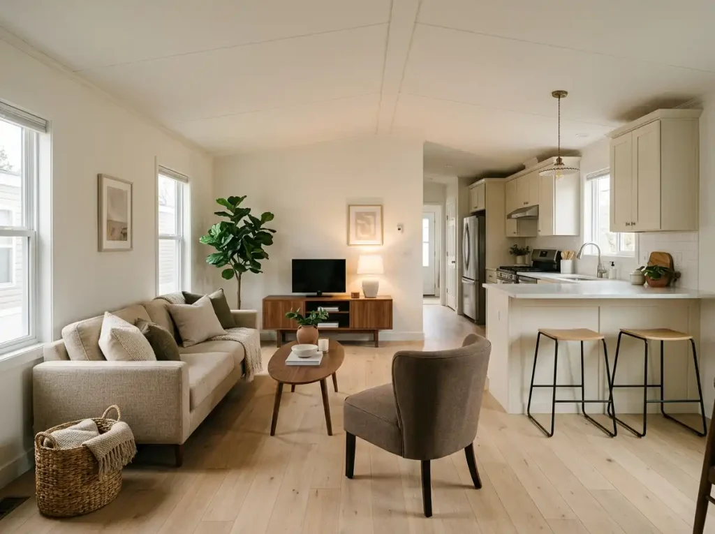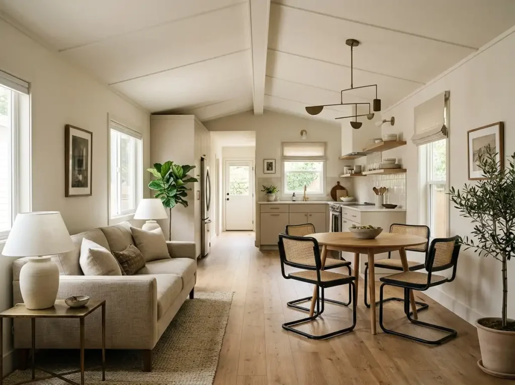
A modern single wide mobile home rarely looks expensive because every finish is expensive. The convincing transformations usually come from something less obvious: fewer competing finishes, stronger visual hierarchy, cleaner architectural relationships, and rooms that appear deliberately composed.
That distinction matters in a single wide because several spaces often appear in one long view. A dated wall treatment can influence the living room and dining area at once. One mismatched floor can run through half the home. A poorly chosen ceiling fixture can become the first thing you notice from several positions.
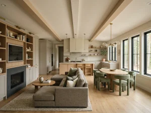
The good news is that modernization does not require rebuilding everything.
Some of the ideas below are purely decorative. Others involve selective refinishing, lighting, cabinetry, exterior work, or larger remodeling decisions. The common goal is to make the home’s existing proportions and straightforward architecture feel intentional rather than something that needs to be disguised.
1. Turn Dated Wall Panels Into One Calm Background
Before: the eye notices seams, faux texture, beige-on-beige patterning, trim lines, artwork, furniture, and flooring almost simultaneously.
After: the walls become the quiet field behind the room, allowing furniture and lighting to move forward visually.
That is the real objective when updating wall panels.
If the existing surface is suitable for refinishing, warm white, pale mushroom, muted stone, soft putty, or a restrained gray-beige can create a much cleaner background than another decorative treatment. If the panel tone already works with your flooring and cabinetry, you may not need to cover it at all; reducing mismatched artwork and simplifying surrounding trim can sometimes provide enough visual relief.
Judge the wall from across the room rather than close-up. In an upscale-looking interior, you should normally notice the room’s composition before you study the wall pattern.
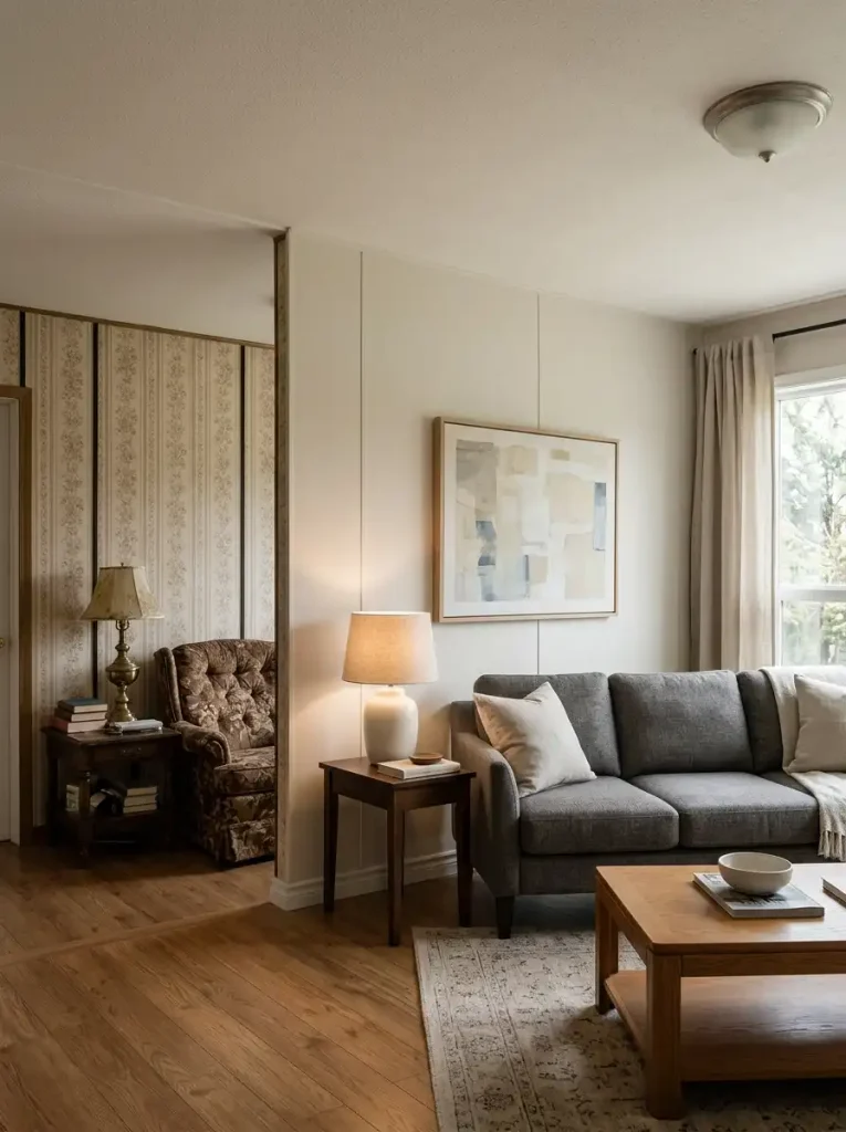
One practical boundary matters: mobile-home wall materials vary. Identify the actual surface and follow suitable preparation and coating requirements rather than assuming every panel can be treated exactly like conventional drywall.
2. Build a Three-Finish Palette Around What You Cannot Change
Here is a more useful color equation than starting with a trending paint swatch:
fixed finish + bridging material + controlled accent = coherent room
The fixed finish might be flooring, cabinetry, countertops, wood trim, or another expensive element you are not replacing. Instead of fighting its undertone, use it to determine what the rest of the palette needs.
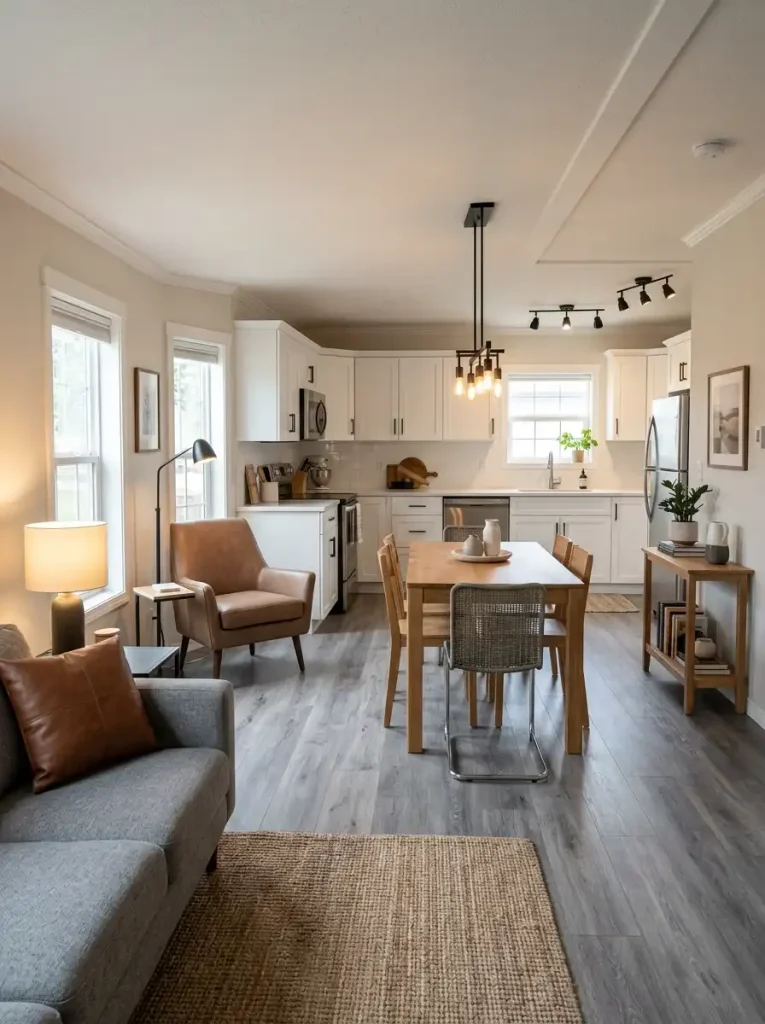
A cool gray floor may need warmth. Honey-toned cabinetry may need refinement rather than more yellow. A dark patterned surface may need visual breathing room.
Palette Architect
Build forward from the finish that refuses to leave.
Choose the permanent surface that currently dominates the room. Each route produces a different material strategy.
The three-finish idea is not a demand that everything match. It is a filter that prevents each new purchase from introducing another unrelated material story.
3. Let the Main Light Fixture Set the Room’s Design Era
The myth: paint color determines whether a room feels modern.
What often happens instead: the walls get updated, but a visually heavy ceiling fan, ornate builder fixture, or dated multi-arm light continues announcing the room’s previous era.
In an open single wide, a central fixture can be visible from the living room, dining area, and kitchen at once. That makes its silhouette unusually influential.
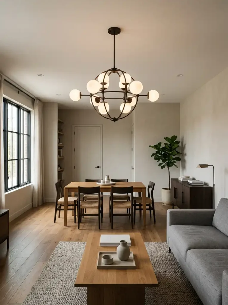
Choose shape before finish. A restrained globe composition, simple linear pendant, sculptural low-profile fixture, or clean contemporary fan can establish the direction without demanding a room full of trendy accessories.
Then echo one part of it elsewhere. Black metal may reappear in cabinet pulls. A warm brass note can return in a table lamp. Frosted glass may be repeated more quietly at the vanity.
The important boundary is hierarchy: one expressive fixture does not mean every ceiling light should compete for attention.
Hardwired changes are electrical work, so use appropriate fixtures and qualified installation where required.
4. Use Ceiling Beams or Trim as One Deliberate Architectural Gesture
Look at the room from floor level to ceiling.
If everything interesting happens below eye level—sofa, rug, console, table, cabinetry—and the upper half of the room feels visually anonymous, a restrained ceiling gesture can create architecture without filling the walls with decoration.
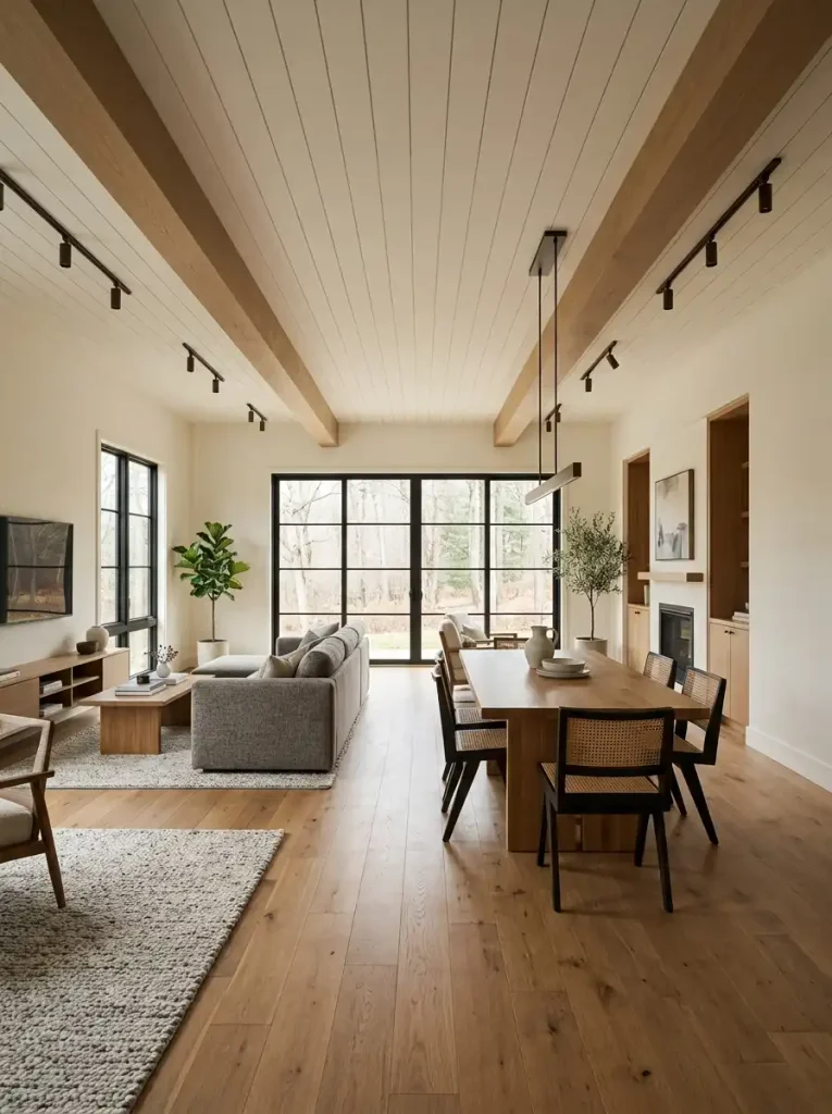
The strongest version connects downward.
Ceiling Signal Simulator
Choose what the architecture should communicate.
The same ceiling geometry can read warm, graphic, or quietly architectural depending on its finish relationship.
Repeat the wood once at furniture level.
A table, console, floor undertone, or other substantial wood element helps a stained ceiling feature look integrated rather than decorative.
Let dark structure connect to metal.
Dark ceiling lines work especially well when lighting, window frames, hardware, or another restrained metal detail repeats the same visual language.
Create relief without adding another strong material.
Painted trim or subtle ceiling geometry can add dimension when the room already contains enough wood, pattern, or contrasting finish elsewhere.
A stained beam beside medium wood flooring can look purposeful. The same beam in a room filled with cool gray laminate, yellow cabinetry, chrome lighting, and unrelated rustic accessories may simply become one more competing finish.
The goal is not “add beams.” The goal is one upper-level architectural gesture that belongs to the rest of the room.
5. Build One Furniture-Like Media Wall Instead of a Scattered TV Setup
Imagine a common living-room wall.
A television hangs in the center. Below it sits a narrow stand. Cables are visible. One basket hides something beside the stand. Two tiny floating shelves sit on the left. Three frames hang on the right. A speaker occupies the floor.
Every item may be useful, yet the wall still looks temporary because the eye has to assemble the composition itself.
Now make one change in thinking:
TV + storage + cable management + negative space = one elevation.
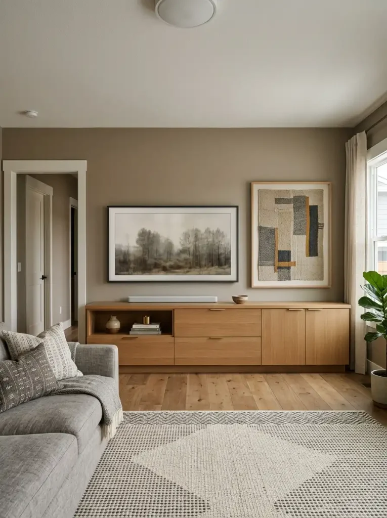
A longer console can visually support the screen. Closed storage absorbs electronics and everyday clutter. One intentional art arrangement or shelf provides balance. Visible cables disappear into an appropriate management solution.
You do not necessarily need built-ins or an elaborate feature wall. The polished effect comes from making separate functions look like one piece of visual furniture.
If furniture proportion and the narrow footprint are your bigger concern, the related single wide interior ideas guide can take that spatial question further.
6. Dress the Windows With One Tailored Treatment Language
Three neighboring windows can be handled three different ways and still belong together.
Living room: full-length fabric because softness and light control matter.
Kitchen: a compact shade because fabric beside a work surface may be impractical.
Dining area: perhaps the same fabric tone as the living room, but in a simpler treatment.
The connection does not have to come from buying three identical products. It can come from shared color temperature, hardware finish, weave, or visual weight.
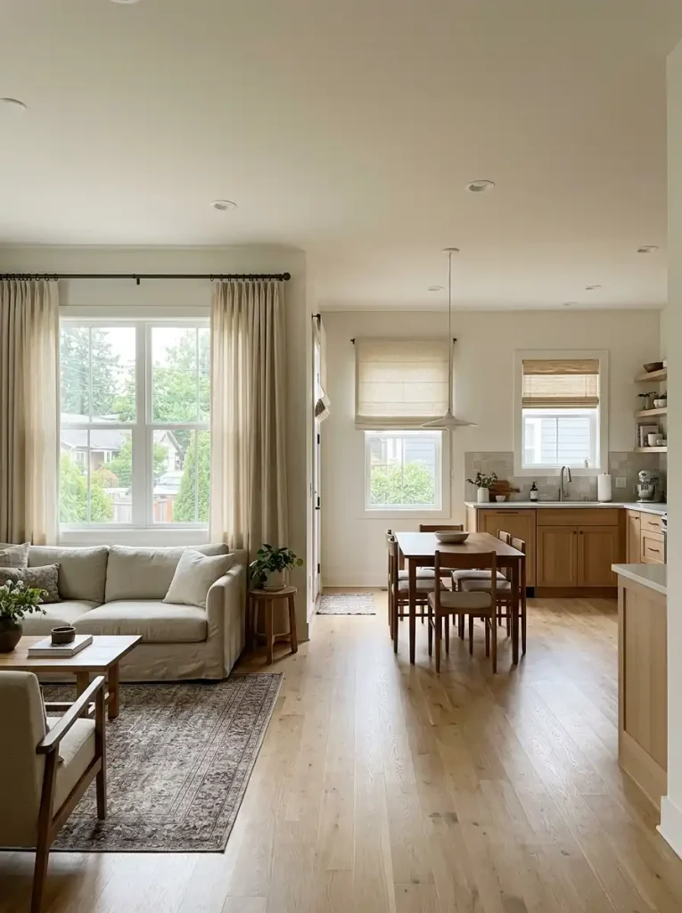
That is the difference between matching and coordinating.
Warm ivory drapery can sit comfortably beside a natural woven shade. A graphite roller shade may work beside gray-beige curtains if the rest of the room already carries that cooler direction.
Treat privacy, ventilation, moisture, and daylight as functional requirements first. Once those are solved, edit the visible treatments so nearby openings feel as though they belong to the same home.
The expensive-looking effect is often surprisingly subtle: fewer unrelated rods, fewer random fabric colors, and cleaner repetition across connected rooms.
7. Choose a Calm, Low-Variation Floor Tone
Take two samples labeled “medium oak.”
Sample A has pale boards, chocolate streaks, large knots, gray grain, golden grain, and heavy distressed markings.
Sample B stays within a narrower family of warm mid-brown with softer grain movement.
On a small sample board, both can look attractive.
Across a long single-wide floor, they behave completely differently.
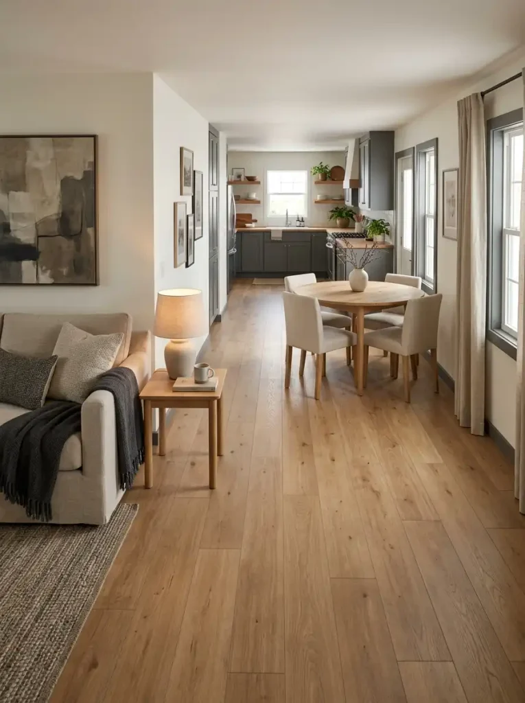
The highly varied surface keeps creating new contrast every few inches. The quieter surface acts more like a background, allowing cabinetry, upholstery, artwork, and lighting to establish the room’s hierarchy.
That does not mean every modern floor should be pale or nearly patternless. A warm mid-tone can be practical and visually rich without becoming noisy.
The useful test: place the largest sample you can obtain beside the actual cabinet finish, wall color, and upholstery. Then view it from several feet away rather than studying the plank itself.
The floor should still have character, but it should not require your attention every time your eye travels from one end of the home to the other.
8. Simplify the Kitchen Cabinet Field With One Controlled Contrast
Start with a constraint:
You are allowed one strong cabinet contrast. Where will it do the most work?
In a dark kitchen, that may mean keeping lower cabinets grounded while making the uppers quieter. In a pale kitchen, it could mean allowing the island or base cabinets to carry the deeper color. If good wood cabinetry is already present, the stronger move may be keeping it and simplifying the backsplash, walls, and hardware around it.
The principle is not two-tone cabinetry for its own sake.
It is deciding which cabinet field should lead and which should support.
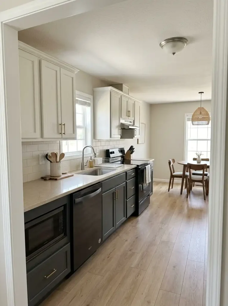
A kitchen becomes visually fragmented when upper cabinets, lower cabinets, island, counters, backsplash, hardware, walls, and flooring all attempt to provide contrast simultaneously.
If the existing cabinet boxes and doors are sound, refinishing may offer a significant visual change without replacing everything. The correct preparation still depends on the actual substrate and finish.
For more kitchen-specific projects, continue into the mobile home kitchen makeover ideas rather than forcing every renovation decision into one section.
9. Coordinate Counter, Backsplash, and Hardware by Sheen and Texture
Here is the decision fork most color palettes miss:
Does the kitchen need more reflection—or less?
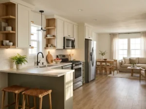
A glossy backsplash, polished counter, chrome faucet, shiny hardware, and reflective appliances can create a surprising amount of visual activity in a compact kitchen. At the other extreme, making every surface chalky and matte can flatten the room.
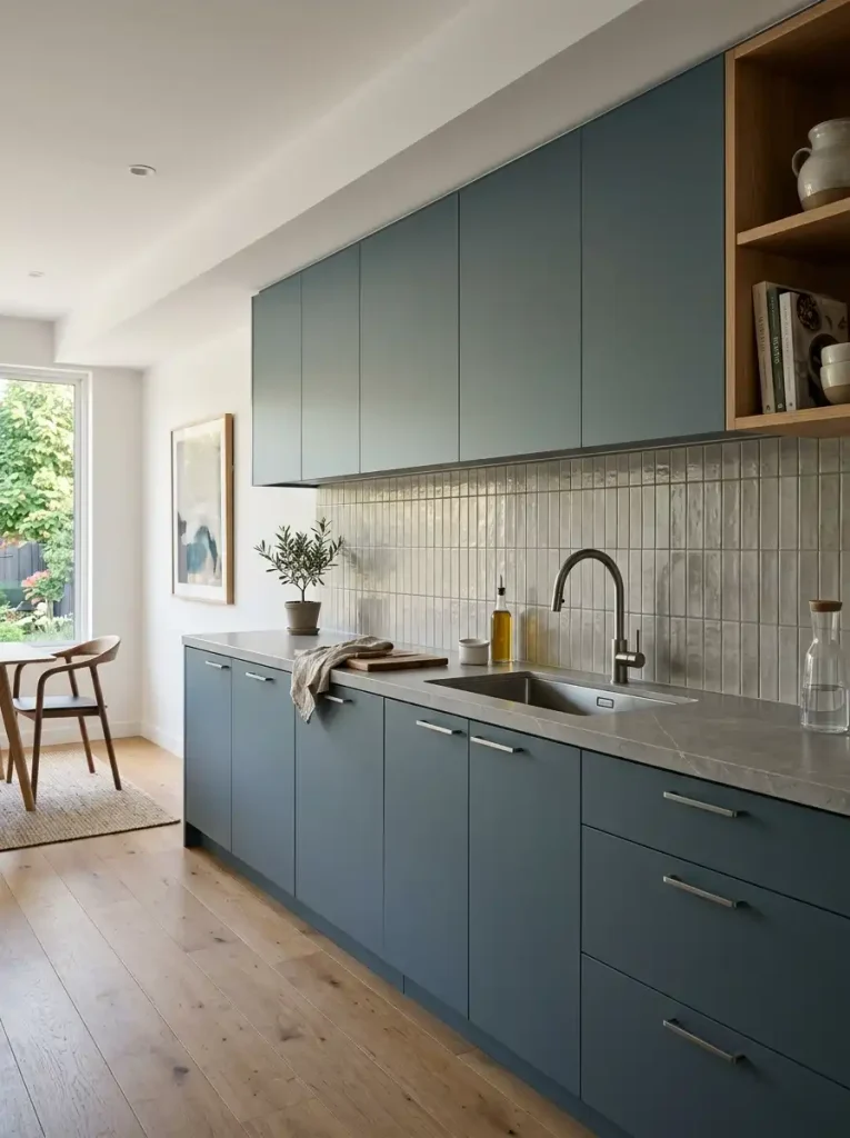
The more sophisticated solution is to divide the work.
Introduce one controlled reflective note.
A quiet kitchen can use a little highlight. Keep the largest surfaces calm and let one smaller finish catch the light.
Do not improve a hierarchy that already works.
If one reflective surface is already balanced by quieter ones, repetition is usually more useful than introducing a fourth finish.
Make the next surface quieter, not shinier.
When several finishes already reflect light, another glossy surface can multiply highlights and make the kitchen feel visually restless.
Two kitchens can contain almost identical colors yet feel radically different. The calmer one often has a clearer agreement about which surface is allowed to catch the light.
10. Make the Dining Area Read as One Art-and-Table Composition
A table sits between the kitchen and living room.
The chairs fit. The pendant works. A framed print hangs nearby. Nothing is obviously wrong.
Yet the dining area still feels like furniture left between two more important rooms.
This is where composition matters more than additional décor.
Center the visual story around three relationships: the light above, the table below, and the wall element behind or beside it. A restrained pendant creates the upper anchor. One appropriately scaled artwork, pair of prints, or shallow wall feature gives the zone a vertical destination. The table and chairs complete the lower mass.
Now the eye reads one scene.
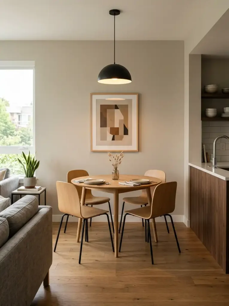
You may discover that a rug, bar cart, oversized centerpiece, accent wall, extra shelving, and multiple framed pieces are unnecessary.
That is the useful lesson: a dining area does not need to occupy more floor space to feel more established. It needs the elements already present to acknowledge one another.
11. Give the Bathroom One Hotel-Like Vanity Composition
Use a three-part rule:
Frame the face. Unify the finish. Control the light.
The mirror frames the visual center of the vanity wall. Its shape can soften rigid cabinetry or reinforce clean geometry.
The faucet and visible hardware establish the finish language. They do not have to come from an identical collection, but introducing several unrelated metal tones in a tiny bathroom often makes the wall feel pieced together.
The lighting completes the scene. It should look related to the mirror and vanity rather than appearing as a separate object floating above them.
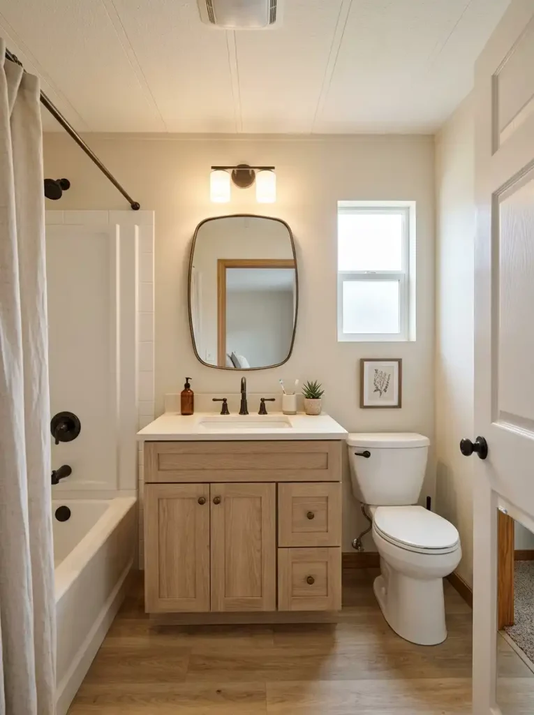
A warm version might pair mushroom or oak cabinetry with an off-white counter, softly shaped mirror, and aged-bronze details. A crisper contemporary version could use a pale vanity, dark frame, restrained brushed metal, and simpler lighting.
The point is not “make the bathroom look like a hotel” through luxury accessories. It is to borrow the visual coordination that makes a well-designed hotel vanity feel complete.
For deeper renovation ideas, the mobile home bathroom remodels collection can branch into room-specific projects.
12. Build the Bedroom Around One Full-Width Headboard Plane
Bedrooms often become overdecorated for a simple reason: the bed itself does not have enough visual presence.
So the wall gets filled.
Tiny prints appear above the headboard. Small shelves appear beside them. Extra pillows attempt to make the bed larger. Two undersized lamps create more separate vertical lines.
A quieter solution is to let the bed wall become the architecture.
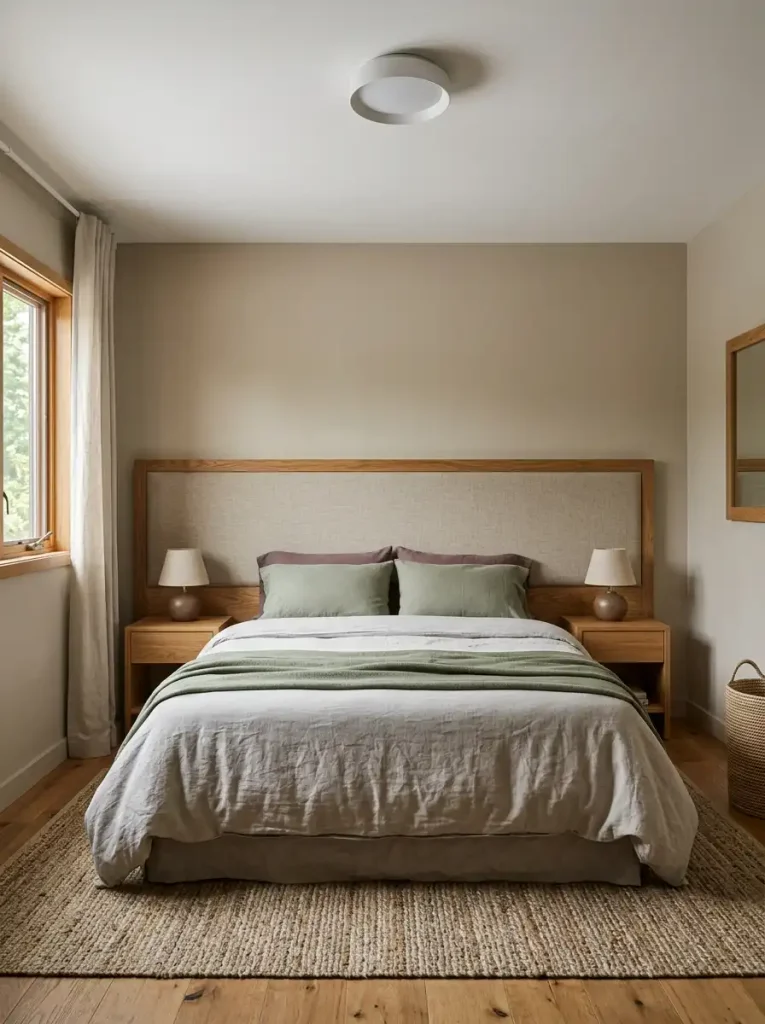
A wide upholstered headboard, restrained wood treatment, painted zone, panel detail, or broad visual backdrop can give the bed enough horizontal mass that the surrounding wall finally has permission to stay empty.
Bed Wall Composer
Test three ways to give the bed architectural width.
This is a visual composition tool rather than a construction specification.
Use width plus texture.
A broad upholstered plane can give the bed enough presence while keeping the room acoustically and visually soft.
Let wood become the backdrop.
Wood can establish warmth and visual weight when another room finish already supports the same material family.
Use paint or subtle relief instead of another material.
When the room already contains enough texture, a broad tonal field can create hierarchy without increasing decorative density.
The best stopping point is surprisingly simple: when the bed wall looks intentional without artwork, ask whether adding artwork would truly improve it.
Sometimes the luxury is the empty space.
13. Hide Everyday Clutter Behind Furniture-Like Closed Storage
Use a threshold instead of a shopping list.
If you clear the same collection of small objects every time you want the room to look finished, visible storage has probably reached its limit.
Phone chargers. Mail. Medicine bottles. Spare remotes. Pet supplies. Cleaning products. Batteries. Paperwork.
Those items do not need better baskets on every surface. They need a place where they can disappear during normal life.
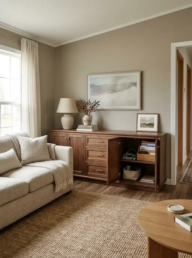
First ask whether an existing piece of furniture can take on a second job. A sideboard may absorb dining supplies and paperwork. A media console with doors can contain electronics and household clutter. A bedside chest may outperform a delicate open table without demanding much more floor area.
Only then consider buying another storage piece.
The upscale effect comes from reduced visual evidence of household administration, not from owning more organizers.
The related single wide mobile home decorating ideas guide goes deeper into using limited space. Here, the goal is more specific: make everyday surfaces stay calmer without constant resetting.
14. Repeat One Door-and-Hardware Language Through the Hallway
Action: choose one door-and-hardware direction.
Reason: a single-wide hallway may repeat that decision four, five, or six times.
A dark lever on every light door becomes an architectural rhythm. Warm wood doors paired with aged-bronze hardware can feel deliberate rather than dated when the same finish is supported elsewhere. Soft greige or off-white doors can quiet a hallway that currently contains several competing wood tones.
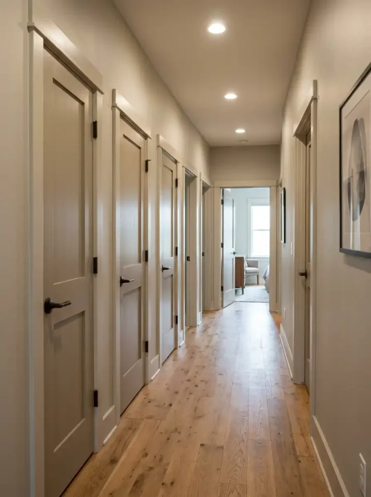
Action: repeat the shape, not necessarily the brand.
Reason: visual continuity is created by what the eye recognizes, not by whether every piece came from the same package.
Action: phase the project if needed.
Reason: repeated decisions become stronger as more doors are updated, while random decorative purchases often remain isolated.
This is one of the easiest places to understand why repetition can make a modest material look more expensive. A single door handle is an accessory. The same design repeated down a hallway becomes part of the home’s architecture.
15. Use Fewer, Larger, More Tactile Decorative Pieces
Begin with material.
A nubby woven throw catches side light differently from a flat printed blanket. A grainy ceramic vessel develops soft shadow around its curves. Matte wood absorbs light while aged metal returns a restrained highlight. Linen wrinkles gently instead of reflecting a perfectly smooth surface.
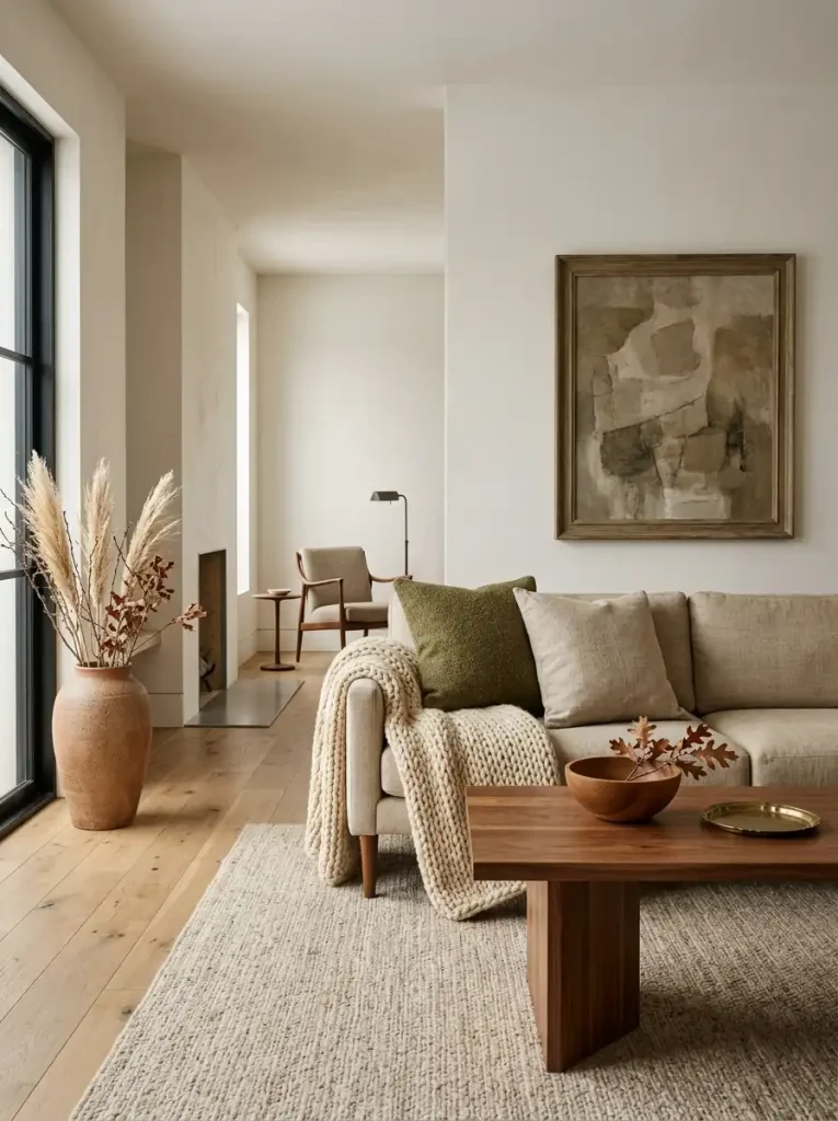
Then notice what those materials do to mood.
The room feels warmer without becoming more colorful. It gains depth without acquiring more pattern. Neutral surfaces stop feeling blank because texture creates variation on its own.
That is why one substantial woven throw, two or three tactile cushions, a ceramic vessel, a wood bowl, and one larger artwork can sometimes feel richer than dozens of small decorative objects.
The idea is not minimalism for its own sake.
It is material density instead of object density.
A useful editing test is to look at each major surface. If the coffee table already has one complete composition, another trio of small accessories does not automatically make it more styled. If the sofa already contains several materials, another patterned pillow may dilute rather than strengthen the effect.
16. Create a Clean Interior Landing Zone at the Entry
Picture an ordinary arrival—not a styled photograph.
The door opens. Shoes come off. Keys land somewhere. A bag needs a place. Mail enters the house. Maybe a jacket does too.
Which one of those actions damages the entry fastest?
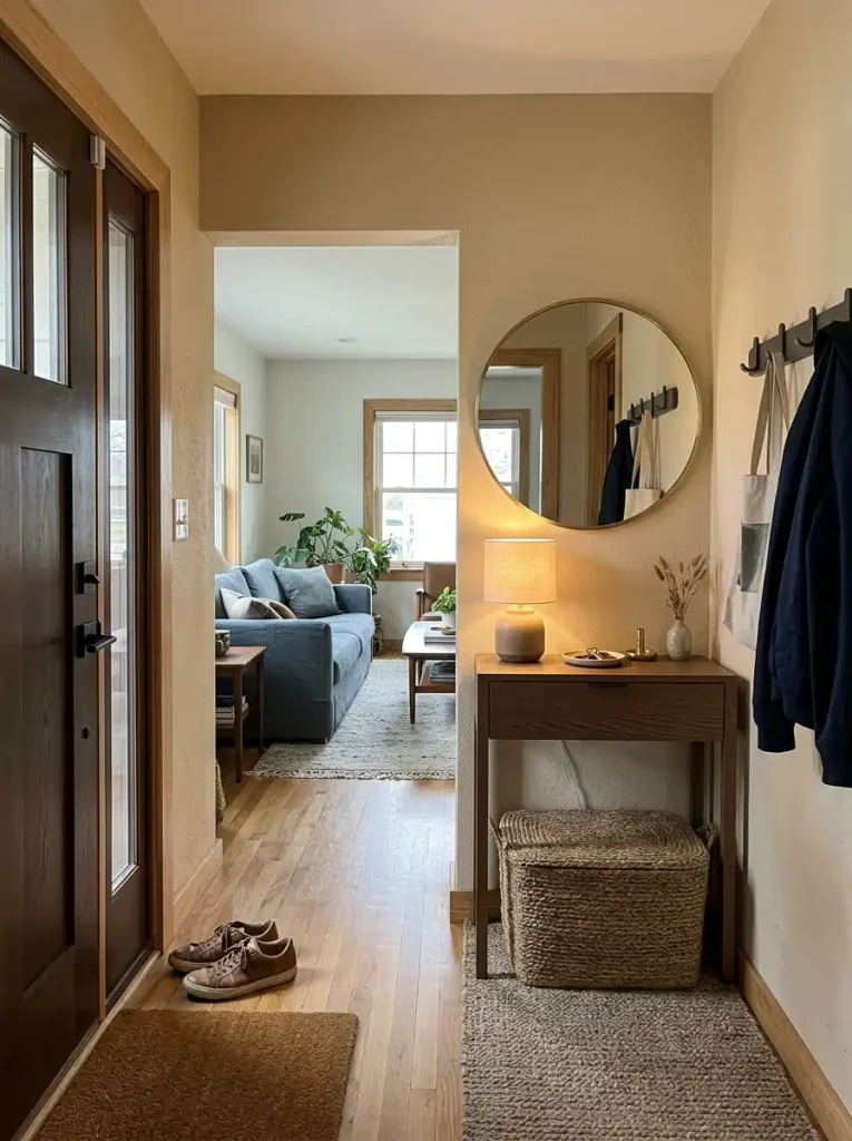
That answer should determine the first upgrade.
Arrival Flow Lab
Diagnose what makes the entry collapse first.
Choose the condition that occurs during normal life—not the version of the entry immediately after cleaning.
Build the entry around the routine, not the décor.
Use one element capable of absorbing the dominant clutter category instead of distributing the same routine across several open baskets and hooks.
Give the landing one visual destination.
When clutter is not the problem, one substantial mirror, lamp, artwork, or narrow console can turn leftover space into an intentional arrival zone.
Collapse several storage objects into one stronger system.
If the landing already contains multiple racks, baskets, signs, planters, hooks, and furniture pieces, another organizer will probably increase visual pressure.
A landing zone succeeds when it survives normal use. If it looks attractive only after every pair of shoes and every bag has been removed from the photograph, the design has not solved the actual entry problem yet.
17. Give the Exterior a Crisp Three-Material Facade
Compare two approaches.
Flat façade: one siding color, unrelated railing, random door color, miscellaneous planters, exposed utility details, and several small decorative accents attempting to create interest.
Composed façade: one dominant exterior field, one contrast system, and one grounding material.
The second version does not necessarily contain more expensive products. It simply has stronger hierarchy.
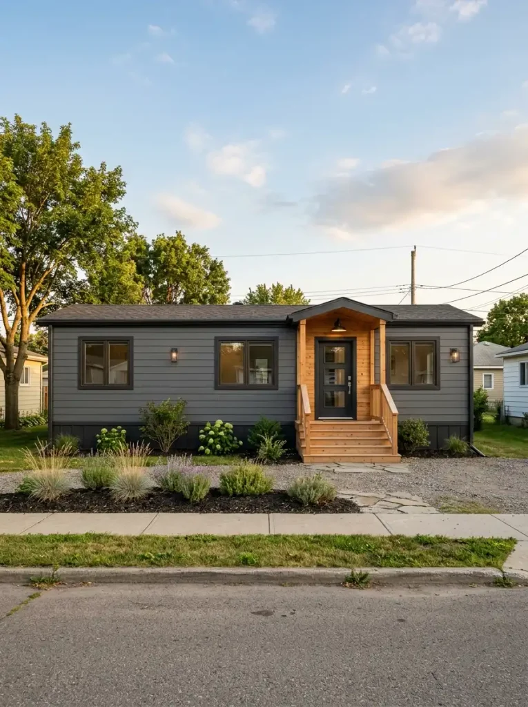
A restrained formula might be pale vertical siding + dark trim + warm wood at the entry. Another home could use deep olive + warm cream + cedar. Charcoal siding may work with soft stone tones and timber.
The exact palette is secondary to the allocation.
Let the main exterior finish occupy most of the visual field. Use the contrast tone to sharpen windows, door, fascia, or selected edges. Reserve the warmest or most tactile material for the entrance or another location where visual weight is useful.
When every exterior feature receives its own accent color, the long elevation loses coherence.
For more façade and landscaping directions, continue into the mobile home curb appeal collection.
18. Make the Steps and Landing Feel Visually Built Into the Home
There is one condition that comes before design:
If the steps, landing, guard, handrail, or supporting structure needs repair, the cosmetic makeover waits.
Paint cannot correct movement. Decorative screening cannot replace proper support. Cladding cannot turn an unsafe entry into a finished one.
Once the functional structure is sound, the design question becomes much more interesting:
How can the entrance visually belong to the façade?
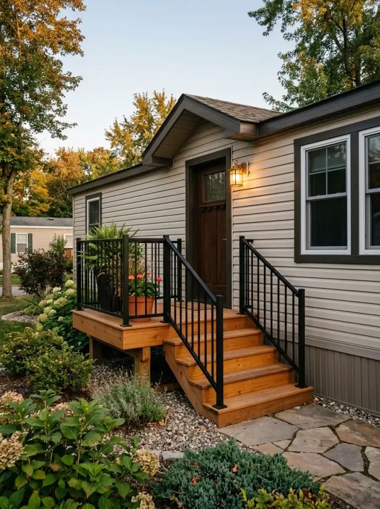
Repeat a material from the home. A wood-toned landing can echo another warm exterior accent. Dark railing can repeat window or fascia trim. Planters can be positioned as part of the entrance composition rather than scattered independently beside it.
Lighting should acknowledge the same zone, particularly where it improves safe arrival after dark.
This is why a relatively modest landing can feel more upscale than a much larger deck assembled from unrelated finishes. The size is not creating the architectural effect; visual integration is.
If the project is moving beyond decoration into more substantial alterations, the mobile home remodel ideas collection is the more appropriate next branch.
19. Ground the Long Exterior With Layered Planting and Warm Low Light
Think of the exterior in three moments.
Day: planting softens the transition between the long façade and the ground.
Dusk: the entrance begins to disappear unless lighting establishes a visual destination.
Night: too much light can flatten everything just as easily as too little.
That means the final exterior layer should not be “more landscaping” or “more fixtures.” It should be controlled depth.
Use lower planting close to the visual ground plane, medium planting where the façade needs softening, and selected taller elements where vertical definition helps. Preserve enough open space that windows, siding, and the entrance remain legible.
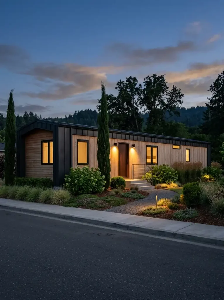
Then light only the layer that is missing.
Dusk Depth Simulator
Illuminate the missing layer—not the entire property.
Use this as a visual planning exercise. Actual fixtures should be outdoor-rated and appropriately installed.
Strengthen the door and landing first.
Useful warm entry light should establish where the home is entered before decorative landscape illumination begins competing for attention.
Create separation between planting and façade.
A limited number of low landscape lights can reveal planting depth without turning the entire wall into one bright flat plane.
Subtract brightness before adding fixtures.
If walls, paths, and shrubs are already equally bright, reducing glare can restore more sophistication than adding another illuminated object.
The most sophisticated nighttime exterior is rarely the brightest one. Enough light should reveal the entrance, selected planting, and architectural depth while allowing shadow to remain part of the composition.
Where to Begin
A single wide starts looking more upscale when the home develops a clear order of importance.
Begin with the background: walls, permanent color conflicts, and flooring. Then address architecture through lighting, ceiling details, doors, and strong room compositions. Next solve the functional clutter that makes attractive spaces difficult to maintain. Only after those layers are working should smaller textiles and decorative objects carry much responsibility.
That sequence protects your budget because it prevents accessories from being used to camouflage bigger finish problems.
A modern single wide mobile home does not need to imitate a different type of property to feel polished. When the materials repeat deliberately, each room has one strong visual idea, and the exterior belongs to the same design story, the home’s straightforward architecture becomes an advantage rather than something to hide.