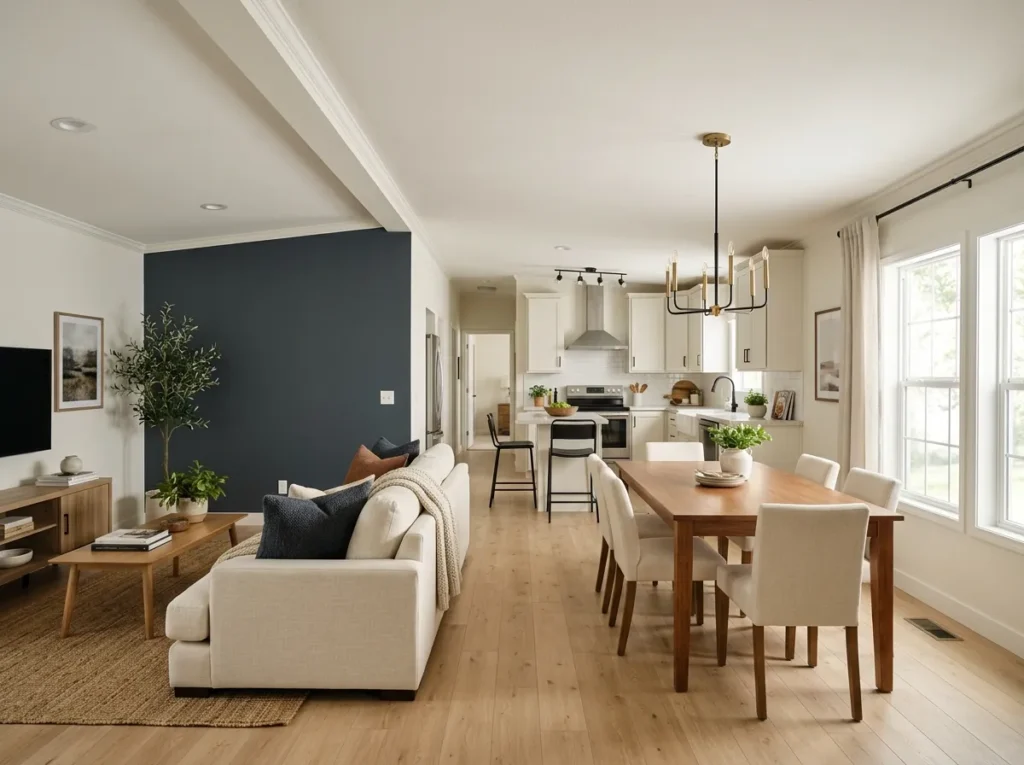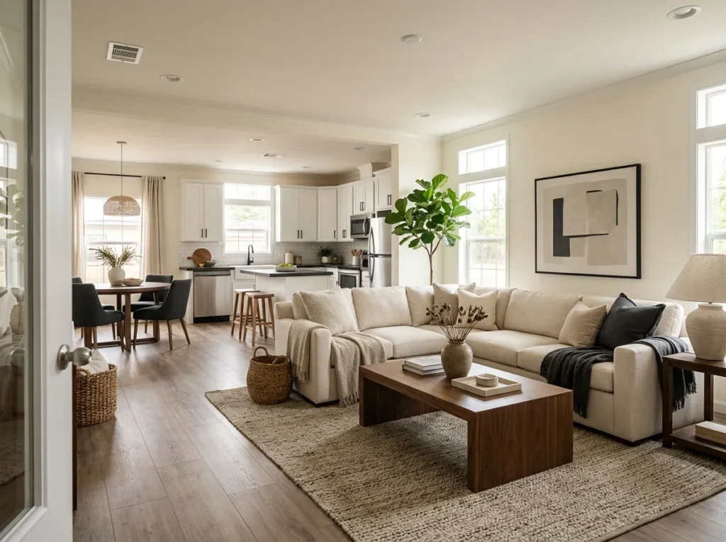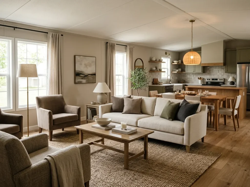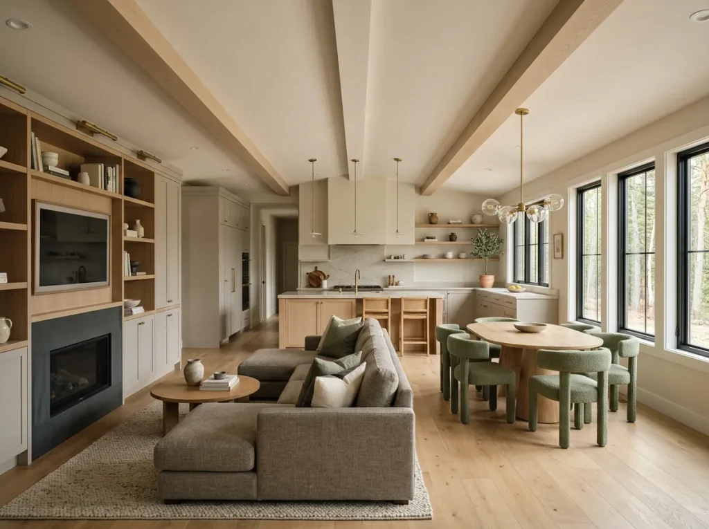
A double wide can have generous rooms, new furniture, and a fresh color scheme and still stop short of looking custom built. The giveaway is often not the décor. It is the finish line: where two ceiling planes meet, where trim changes profile, where a cabinet side is left exposed, where an opening ends abruptly, or where several rooms seem to have been upgraded independently.
These modern double wide interior ideas focus on those construction-level visual cues. The goal is not to disguise the home or imitate a site-built floor plan. It is to make the architecture you already have read as deliberate through cleaner junctions, stronger millwork, better alignment, integrated storage, and fewer unfinished-looking edges.
Some changes are cosmetic; others can cross into electrical or structural work. The distinction matters. Start with the details you can see from across the room, then move closer and inspect how materials, cabinets, trim, and fixtures actually terminate. That is where a surprisingly large share of the “custom” feeling is won.
If your main problem is furniture placement, rugs, color flow, or broad room styling, our double wide decorating ideas guide is the better companion piece. Here, the focus stays tightly on architectural finish and built-in character.
1. Let the Center Join Become a Clean Architectural Datum
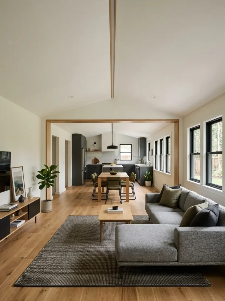
Stand at one end of the main living area and look through the longest view before touching the join itself. In a double wide, the point where the two sections meet can become visually louder than it deserves when ceiling texture changes, trim stops awkwardly, or two finish systems collide along nearly the same line.
The first decision is not simply, How can I hide this? Ask whether the line has an architectural reason to remain visible. If it lands at a genuine room transition, a cased opening, or a deliberate ceiling frame, a cleanly finished change can look purposeful. When the line cuts through an otherwise continuous room with no supporting logic, lowering its visual contrast usually gives the calmer result.
Treat the nearby paint, ceiling finish, casing, and wall details as one composition. A join can be technically neat and still feel accidental when everything surrounding it tells a different story.
Structural work belongs in a separate category from cosmetic finishing. Significant alterations to manufactured-home framing, openings, or other structural components should be reviewed under the applicable manufactured-home rules, permitting requirements, and local requirements before work begins.
Interactive Section-Stitch Mapper
2. Carry One Ceiling Language Across Both Halves of the Home
What does the ceiling look like from the sofa—not from directly underneath it?
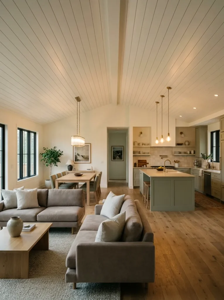
That distant view is the better test because a custom-feeling interior usually reads as one volume before the eye begins inspecting individual ceiling details. If one half has bright white drywall, the other shows a contrasting texture, and another zone introduces an unrelated beam treatment, the ceiling can divide the house even though the floor plan is physically open.
Choose one dominant ceiling language and let secondary features support it. That could mean a consistent warm white paired with restrained decorative beam wraps, a continuous plank treatment through the primary shared space, or a repeated trim rhythm that carries across the center of the home. The particular material matters less than whether its proportions and stopping points look deliberate.
There is a useful exception. A ceiling change can define a genuinely different zone when the boundary below it is equally convincing. If the dining area suddenly changes overhead while the floor, furniture arrangement, and lighting give no clue where dining begins, that detail is more likely to read as an isolated patch.
The decision is therefore continuity first; contrast only where the architecture can explain it.
3. Give Baseboards, Casings, and Openings One Millwork Family
A room can be freshly painted and still feel pieced together because the trim is speaking several dialects at once.
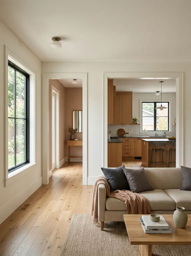
Picture a common renovation sequence. New baseboards were installed in the living room. Older narrow casing remains around the hallway. One doorway received a heavier profile. The large opening to the kitchen was finished years later with a completely different edge.
None of those pieces may look bad on its own. Seen together across a double-wide sightline, however, they reveal exactly where one improvement stopped and another began.
A practical trim hierarchy starts with the baseboard profile, establishes one casing language for doors and windows, then determines how major openings should relate to that family. The pieces do not need identical dimensions. Compatible thickness, edge character, paint sheen, and visual weight are more important.
This changes what deserves money first. Before replacing another large surface, inspect the millwork connecting those surfaces. A handful of corrected trim relationships can contribute more perceived craftsmanship than another decorative feature that introduces one more visual language.
4. Choose One Full-Height Wall Treatment—and Let It Behave Like Architecture
Imagine two similar living rooms.
In the first, paneling appears behind part of the television, another strip turns up beside the hallway, and a third treatment appears near the dining table.
In the second, one complete wall receives a disciplined floor-to-ceiling finish while the surrounding surfaces stay quiet.
The second room has a stronger chance of feeling custom because the material has both a clear boundary and a clear job.
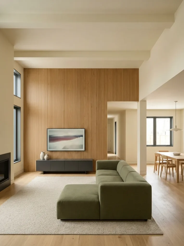
For a modern double wide, that treatment might be slim vertical paneling, restrained battens, narrow-groove boards, a subtle limewash-style finish, or another low-clutter surface with enough scale to register across the room. Whenever possible, start and stop it at corners, openings, ceiling changes, or other actual architectural boundaries.
Furniture alone is a weak place to terminate a permanent-looking finish. A panel treatment that stops exactly where today’s television console ends can reveal that the architecture was designed around an object that may eventually move.
One substantial wall is often enough. Repeating the same feature-wall formula through the living room, dining room, and bedroom would reduce the hierarchy you are trying to build. Give the strongest treatment to the plane that controls an important sightline and allow quieter walls to support it.
5. Finish Existing Wide Openings Like Built-In Portals
Some double wides already have generous openings between the living room, dining area, kitchen, or hallway. Those openings can look surprisingly architectural when the depth of the reveal, casing, paint finish, and adjacent baseboards resolve cleanly around them.
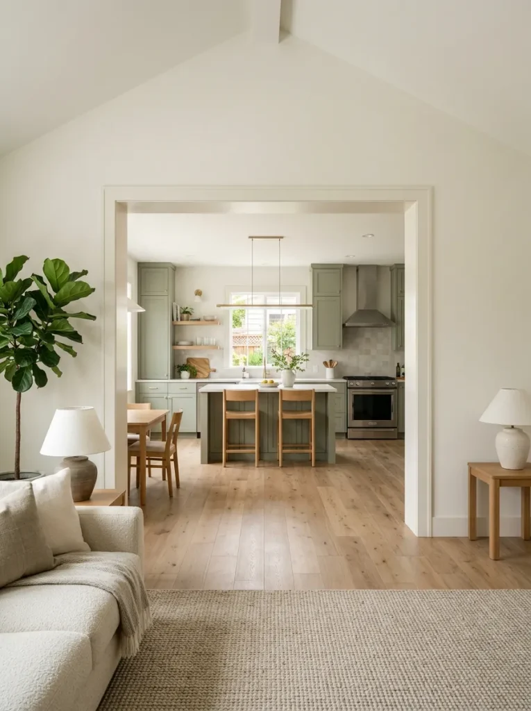
The useful question is whether the opening already has enough presence to deserve emphasis.
Choose a stronger portal treatment when: the opening frames an important view, its proportions are substantial, and additional millwork can terminate convincingly on both faces.
Keep the treatment quiet when: the opening is shallow, several other transitions compete nearby, or visually heavy casing would make the ceiling feel lower and the connected rooms busier.
A modest casing return, carefully finished jamb, or consistent painted reveal may be all the opening needs. Decorative timber should not automatically appear simply because rustic framed openings photograph well. The custom signal comes from believable proportion and resolved edges.
Several of the visual references that inspired this article use heavy wood around openings effectively, but the underlying idea is stronger than the farmhouse treatment itself: the transition looks finished from wall to wall and from floor to ceiling.
If changing an opening means altering framing or another structural component, treat it as construction work rather than cosmetic decorating and have the proposed change reviewed appropriately before work begins.
6. Let One Wall-to-Wall Storage Elevation Replace Scattered Living-Room Furniture
A living room can look less resolved because it contains too many independent storage objects, not because it lacks storage.
A media console solves one need. A bookcase solves another. Then come the cube organizer, basket tower, narrow cabinet, charging stand, and small floating shelf. Individually, each purchase makes sense. Together, they can make a wide double-wide living room look assembled piece by piece.
Treat the wall as an elevation before treating it as empty space to fill.
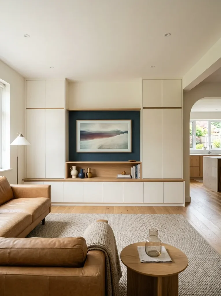
Identify what actually needs to live there: television equipment, books, games, blankets, chargers, family photos, closed household storage, or display pieces. Then decide how much visual mass the room can support. A low continuous run preserves openness. Balanced side storage can frame artwork, a television, or a fireplace. Taller anchors work only when the room has enough wall width and ceiling presence to absorb them.
What makes the final composition feel built in is less about covering every inch and more about alignment—consistent gaps, deliberate door proportions, a coherent top line, clean end panels, and controlled relationships to nearby openings.
Interactive Storage Elevation Massing Lab
7. Hide the Entry and Utility Layer Inside a Flush-Looking Cabinet Wall
The first thirty seconds after entering a home often reveal whether storage was designed into the architecture or added after the fact.
Follow the arrival sequence once without tidying anything first:
Door opens → shoes come off → keys land → bags drop → coats move → mail waits.
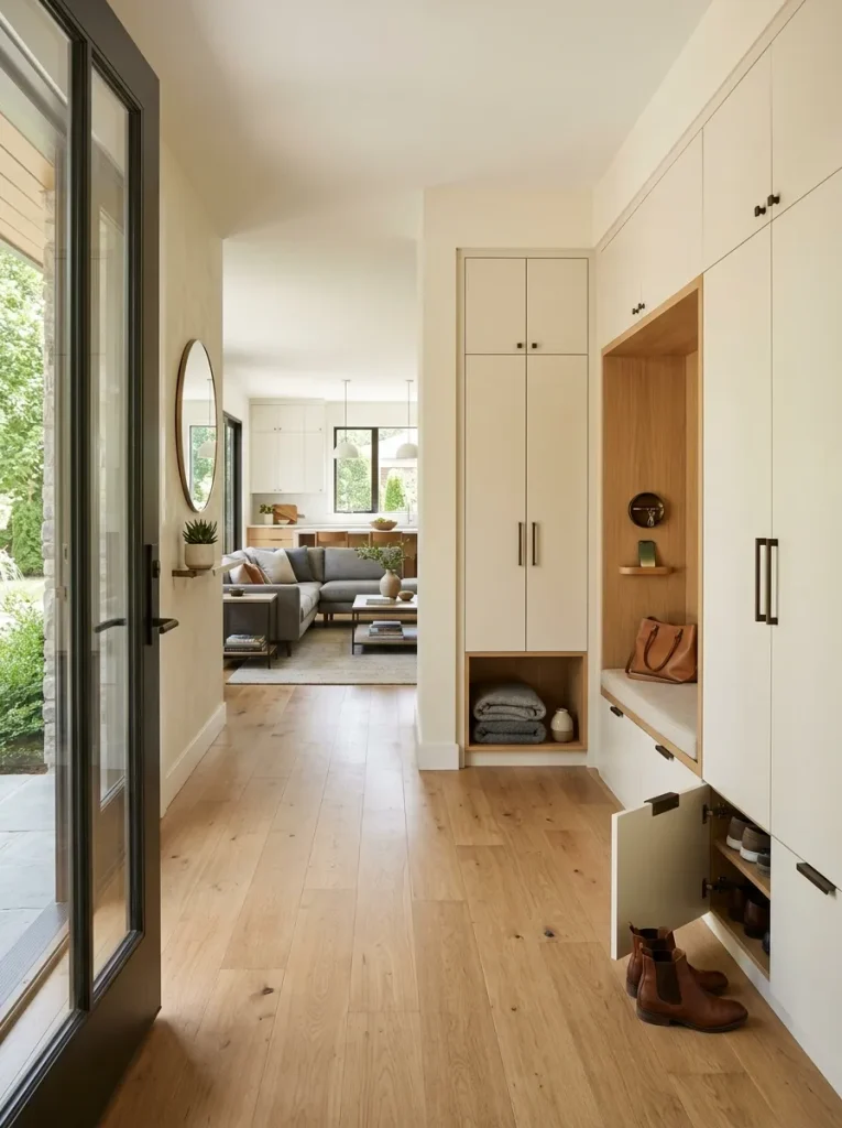
Where does each object naturally stop?
In many double wides, the problem is not insufficient square footage. It is that several small utility pieces—hook rails, shoe racks, baskets, narrow cabinets, charging shelves—occupy the same wall while following different heights and depths. The eye reads six objects where it could have read one built-in composition.
A shallow cabinet run can absorb much of that activity. Keep visible faces relatively calm, align door and drawer lines, and reserve open niches only for things that genuinely need instant access. An entry bench can be integrated into the same elevation if seating is useful; otherwise, closed storage often gives the cleaner modern result.
The stopping point matters. Do not build storage simply to fill an available wall. Stop once the arrival routine has a place for its recurring objects and the wall still leaves a comfortable transition into the main living area.
8. Design the Kitchen Island as a Permanent Architectural Block
An island becomes one of the strongest “custom-built” signals in an open double wide because it is visible from several rooms at once. That also makes weak details unusually easy to spot.
Inspect it from four positions: the cooking side, the dining side, the living-room sightline, and the end nearest the main circulation route.
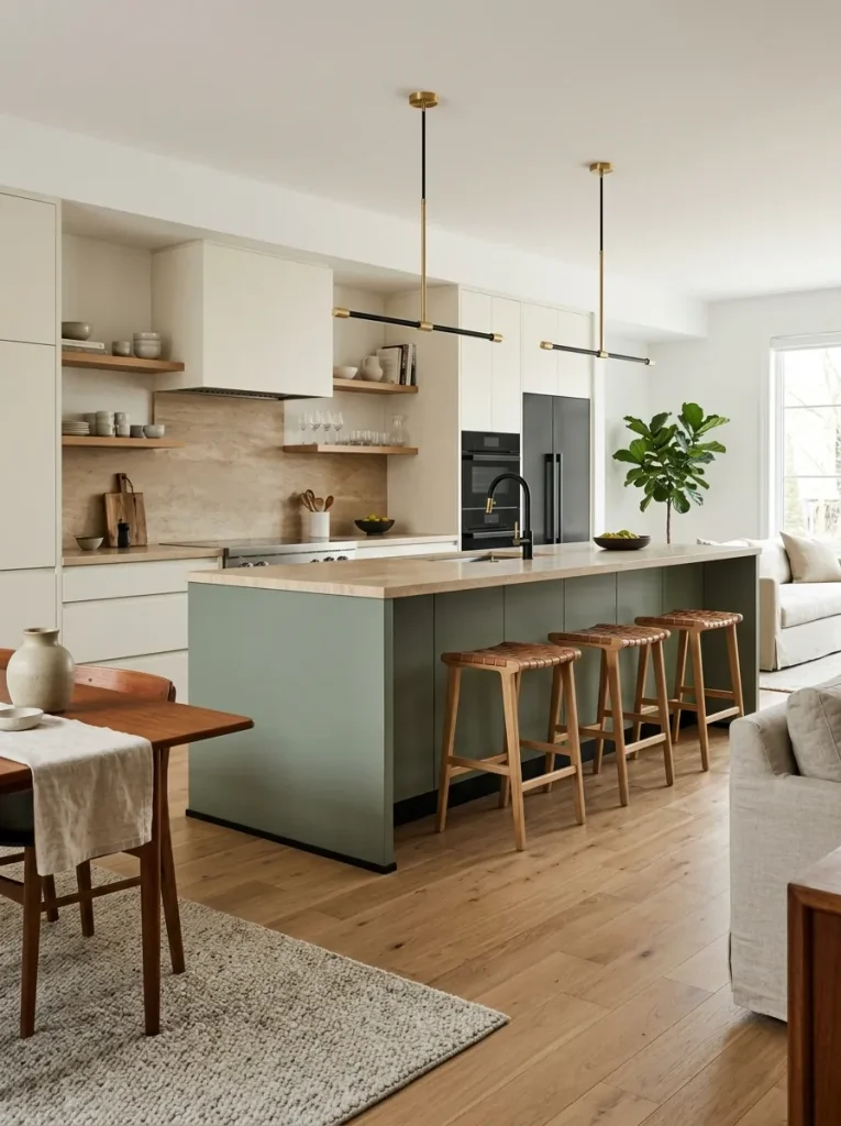
Then look for the clues that make an island feel unfinished:
- exposed cabinet-box sides
- thin end panels
- inconsistent toe kicks
- countertop overhangs that seem unrelated to seating
- outlets placed without regard to the visible elevation
- decorative trim applied only to the most photographed face
- lighting that misses the centerline below
A better island reads as one volume, even when each side performs a different job.
If the kitchen already functions well, this can be good news. Improving the island’s visible faces, panel proportions, seating side, and end conditions may create more custom character than replacing serviceable cabinetry throughout the room.
Interactive Island Architecture Composer
9. Fix the Cabinet Ends That Make a Kitchen Look Stock
Here is the useful exception to the usual kitchen-remodel instinct:
You may not need new cabinet doors at all.
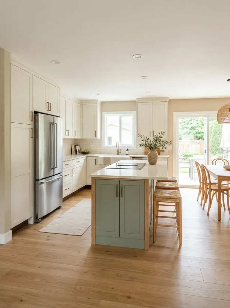
A perfectly acceptable door style can still sit inside a kitchen that feels builder-grade because the cabinetry’s edges reveal the box behind it. Look at the refrigerator panel, exposed island ends, fillers beside walls, the gap where upper cabinets approach the ceiling, toe-kick interruptions, and any run that simply stops without a convincing termination.
Those areas rarely dominate inspiration photos, yet they strongly influence whether cabinetry looks installed for this room.
Start with the most visible endpoint. If an exposed side faces the dining or living area, giving that side a resolved panel or intentionally plain finished face can change the public view of the entire run. When fillers are necessary, their width and finish should look integrated with neighboring cabinetry—not like material inserted at the last minute to close a gap.
Then stop.
If the cabinet layout, storage capacity, door condition, and working clearances are already serving the household well, improved end conditions may be the smarter project. Replacement becomes easier to justify when the underlying kitchen no longer functions, not merely because the outer edges lack polish.
10. Let the Range Wall Carry the Kitchen’s Strongest Composition
Many kitchens lose impact because every element tries to become a feature.
A backsplash gets one visual language. The island receives another. Open shelves are added to a third wall. Pendants compete overhead. Decorative styling supplies yet another layer.
The kitchen becomes busier without becoming more architectural.
Before
The eye moves between several medium-strength focal points, so no elevation clearly explains the room.
After
The range wall is allowed to become the primary composition. The hood, backsplash, cabinetry, range, and surrounding negative space are treated as one elevation. Secondary surfaces become quieter.
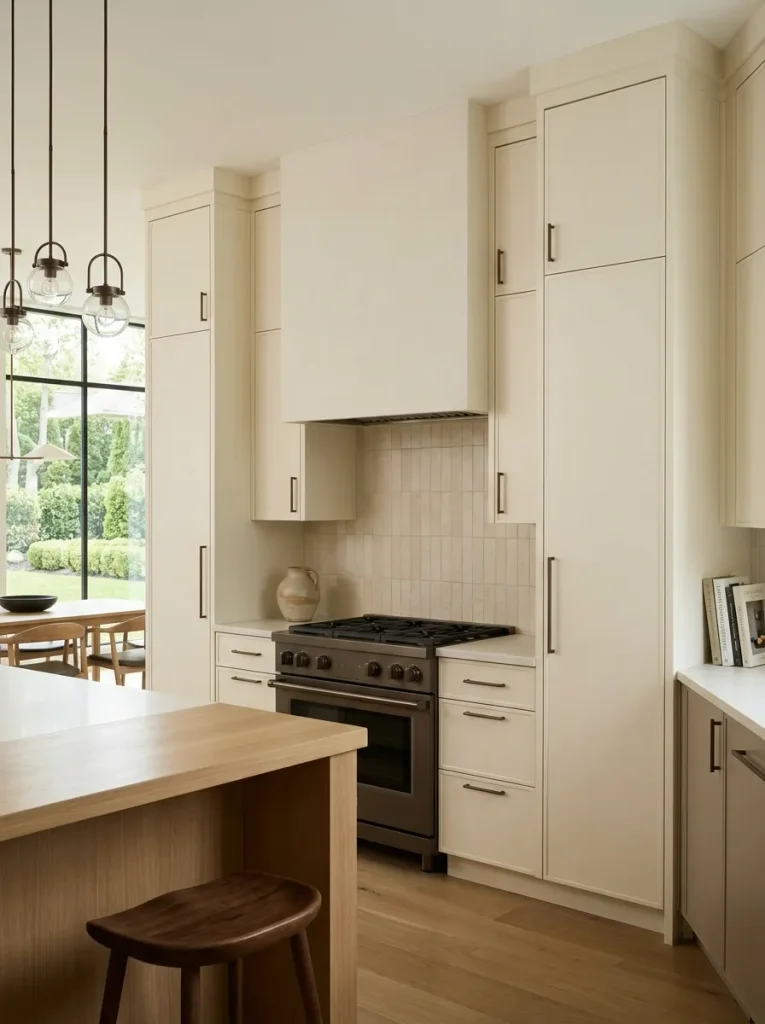
This is especially effective in a double-wide open plan because the kitchen is commonly viewed from living and dining zones. Test the composition from those rooms—not only while standing at the stove.
A statement hood can work, but it is not compulsory. A clean cabinet-integrated hood, simple backsplash field, or restrained range surround may create stronger hierarchy if the room already contains prominent beams, an island, or dramatic lighting.
Choose the strongest kitchen view first. Then reduce the number of elements competing with it.
11. Use a Tall Pantry-and-Appliance Wall to Quiet the Open Plan
Countertop clutter has a vertical consequence: when small appliances, pantry items, coffee equipment, bottles, baskets, and food storage spread across several surfaces, the kitchen broadcasts its utility into the living room.
Consolidating some of that activity into one taller storage zone can make the surrounding cabinetry feel calmer.
The useful test is not simply, Can I add a pantry?
Ask:
- What would disappear from the worktops if tall storage existed?
- What major opening, window, or sightline would that tall mass compete with?
- Does the wall have enough uninterrupted width to let tall cabinetry look intentional?
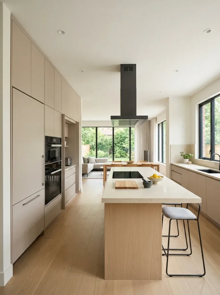
If the answer to the first question is “very little,” adding a tall wall may create bulk without solving much. If it removes several daily-use items from view and sits at a natural edge of the kitchen, the architectural payoff can be substantial.
One more detail matters: avoid leaving every tall element at a different depth. A refrigerator, pantry cabinet, oven tower, and shallow storage section can look fragmented when their fronts project randomly. Where the existing conditions allow, visually coordinating those planes makes the elevation calmer.
The outcome should be less visible kitchen activity, not simply more cabinetry.
12. Build the Dining Bench Into the Wall Plane, Not Into the Walkway
A dining bench looks appealing in several of the visual references because it appears connected to the room—not because benches are automatically a good choice for double wides.
Imagine the table in daily use.
Someone sits down. A chair moves backward. Another person walks behind it toward the kitchen. A cabinet door opens nearby. The main circulation path stays active.
Now introduce a fixed bench.
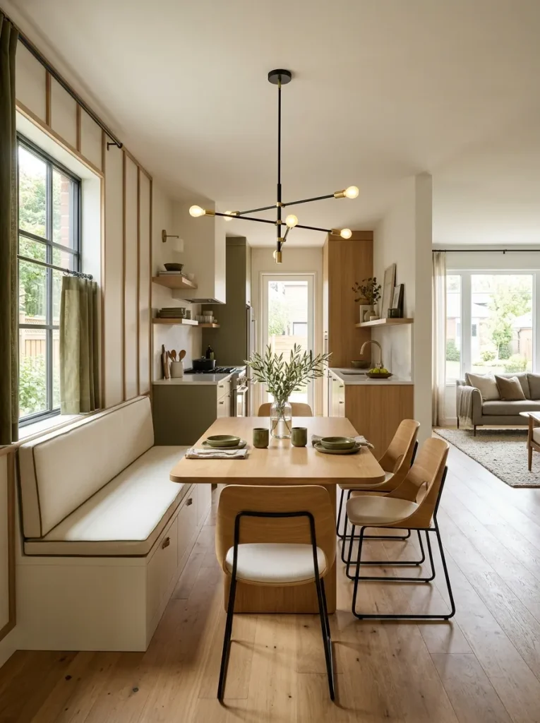
If that bench removes chair pull-out space from the traffic side and moves seating closer to an otherwise unused wall, it can materially improve the room. It also creates an opportunity to make the dining area feel built in through a wall-aligned back, integrated storage, paneling, or a carefully proportioned seat base.
If the bench protrudes into the primary route, forces the table too far toward the kitchen, or makes cleaning and access awkward, permanence becomes a disadvantage.
A simple rule helps:
Commit to fixed seating only when the wall itself is the better place for the seat.
Then let the architecture support the decision. Keep the bench aligned with a wall plane, window condition, panel treatment, or storage run. A freestanding bench shoved against a wall can still be useful, but it does not produce the same built-in effect.
13. Align Lighting to the Rooms Below, Not Just the Ceiling Above
Where should the fixture sit when the ceiling center and the room center disagree?
That question matters in a double wide because an open ceiling plane may stretch across several functional zones at once. A mathematically centered fixture can still look misplaced when the island, dining table, seating group, and circulation route establish different visual centers below it.
Investigate the room from the floor upward.
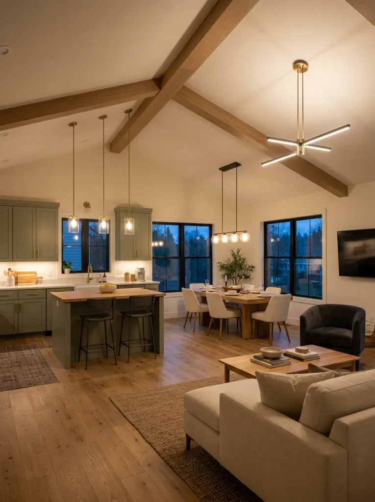
First identify the fixed or semi-fixed element that defines each zone: island, dining table, main seating arrangement, or architectural opening. Next, look along the longest shared sightline. Finally, switch on every major fixture at night. Lighting positions that seemed harmless during daylight become much easier to read when each pendant or ceiling light produces its own visual anchor.
A custom-feeling plan does not require identical fixtures or perfectly symmetrical spacing throughout the house. It needs believable relationships. Pendants should make sense over the island. Dining lighting should belong to the table. Living-room fixtures should support the seating or architectural axis.
If correcting that relationship requires relocating hardwired electrical points, treat the layout below as a planning tool and have the electrical work handled appropriately rather than approaching it as a decorative DIY adjustment.
Three-Zone Lighting Axis Studio
14. Upgrade the Material Junctions Before Replacing the Materials
Walk through the house and ignore the center of every surface.
Look only at the edges.
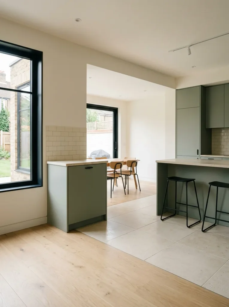
Where does the flooring stop? How does backsplash meet window trim? What happens where a cabinet run touches a wall? Does paneling terminate against casing cleanly? Does a countertop end with confidence, or does the eye land on an awkward gap?
These small locations carry disproportionate information about workmanship.
An inexpensive floor with a well-resolved transition can look more intentional than a premium surface interrupted by mismatched strips and abrupt changes. The same principle applies to wall paneling, trim, countertops, tile, and cabinetry.
Before replacing a finish you dislike, identify whether the disappointment is really coming from the material itself or from the way it meets the next material.
Junction Quality Atlas
Junction Quality Atlas
Inspect where one finish hands the room to another.
Do not judge surfaces only from their centers. Custom-looking interiors reveal their quality at edges, corners, stops, and changes in plane.
Floor → Floor
Changes in material look deliberate when their location follows an actual room boundary and the transition itself does not become the loudest object on the floor.
Cabinet → Wall
Fillers, side panels, trim, and clean termination determine whether cabinetry looks designed for the wall or merely fitted into whatever space remained.
Wall Finish → Trim
Paneling, tile, paint, and backsplash look strongest when they terminate against an intentional architectural edge instead of fading out wherever the installer found convenient.
A useful upgrade hierarchy follows naturally from this inspection:
Correct the meeting point → reassess the surface → replace only if the surface itself remains the problem.
That sequence can preserve perfectly serviceable flooring, cabinetry, paneling, tile, or countertops while directing the budget toward the construction details that were weakening them.
15. Treat the Primary-Bath Vanity Wall as One Continuous Elevation
Consider two versions of the same bathroom.
Version A
A vanity is installed.
A mirror is hung above it.
A light fixture is centered independently.
A small cabinet fills leftover wall space.
Accessories are added wherever room remains.
Version B
The vanity, mirror, sconces or overhead light, wall finish, storage, and visible plumbing zone are considered as one elevation before individual pieces are chosen.
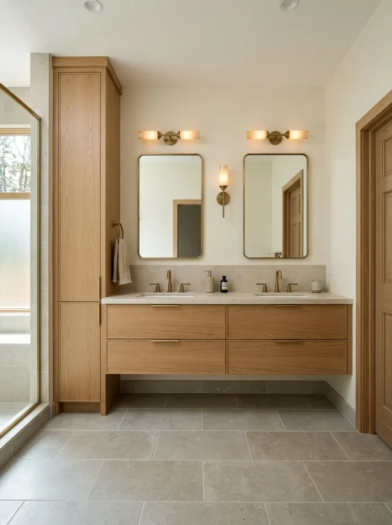
Version B usually appears more custom even when its components are modestly priced.
The distinction matters in double-wide bathrooms because the vanity may occupy a large portion of the room’s primary sightline. When every element follows a different width or center point, those misalignments accumulate quickly.
Start with the widest fixed object—the vanity or vanity run. Decide where the mirror should begin and end in relation to it. Then consider lighting. After that, evaluate any tall storage or medicine cabinet as part of the same composition.
Do not force perfect symmetry when the plumbing, window, door swing, or room proportions do not support it. Intentional asymmetry is stronger than strained symmetry.
The buying decision changes accordingly: before replacing the vanity, ask whether the real weakness is the vanity itself or the unrelated collection of pieces surrounding it.
16. Make the Laundry Niche Read Like Cabinetry When the Doors Are Open
Closed laundry doors can make almost any utility area look tidy.
The harder test is what happens during laundry day.
Open the doors. Pull out the detergent. Place the basket where it normally sits. Imagine the washer or dryer in use. Now assess the view from the hallway, kitchen, or adjacent room.
If the entire space suddenly becomes a collection of hoses, bottles, wire shelving, baskets, cleaning supplies, and unrelated containers, the design problem is not only storage capacity. It is the gap between the home’s public architecture and its working utility layer.
A more integrated laundry niche usually benefits from a sequence like this:
machines → usable work surface → closed supply storage → one controlled open-access area
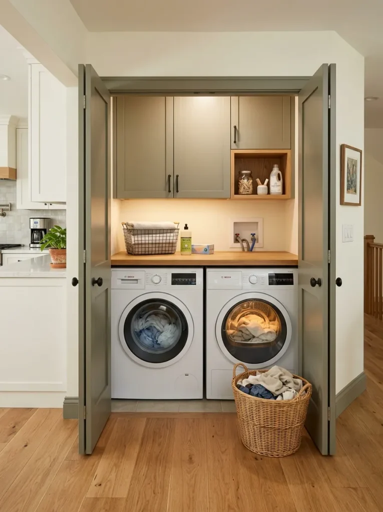
That open area matters because completely hiding every frequently used object often produces a system that looks elegant while closed and becomes frustrating in daily use.
Cabinetry or shelving can visually connect the niche to nearby kitchen, hallway, or mudroom finishes without being identical. Related door proportions, hardware restraint, and one consistent paint or wood family may be enough.
Skip elaborate built-ins when the laundry area is rarely visible or when added cabinetry would interfere with proper service access. The custom feel comes from managed visibility, not from making maintenance harder.
17. Turn Closet Doors Into Part of the Bedroom Architecture
One bedroom mistake is easy to miss because the eye gets distracted by bedding:
the closet occupies a large percentage of the wall, yet its doors are treated as a purely functional leftover.
In a compact or medium-size double-wide bedroom, several plain bifold panels, mismatched knobs, or visually busy sliding doors can carry more visual weight than the headboard.
Before adding another decorative layer, photograph the room while standing near the doorway and temporarily ignore the bed.
Look at:
- the number of visible closet panels
- their relationship to the bedroom door
- casing consistency
- knob or pull placement
- whether the doors visually disappear or dominate
- how the closet elevation relates to baseboards and wall color
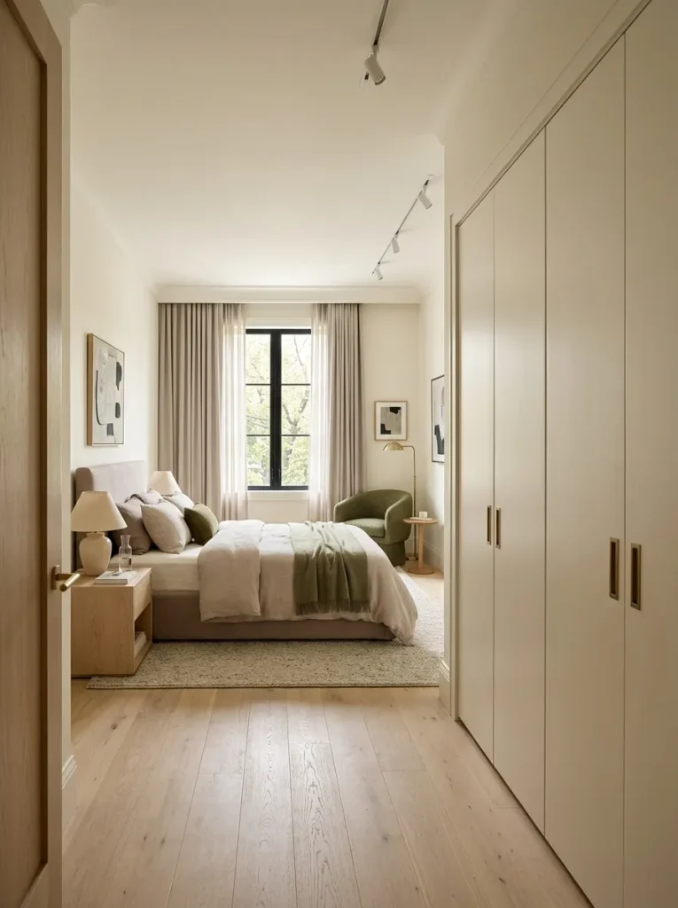
A clean painted treatment can make the closet recede. A restrained panel detail can give it architectural rhythm. New hardware may be enough when the door construction itself is sound.
There is also a stop signal:
If the closet already disappears into the wall successfully, leave it alone.
Not every broad surface needs to become a feature. In some bedrooms, the most custom-looking move is allowing the closet to become quiet enough that the bed, window, and lighting regain the hierarchy.
18. Quiet Vents, Returns, Thermostats, and Access Panels Without Hiding Their Function
There is one category of visible detail that should not be treated like ordinary décor.
Air registers, returns, thermostats, electrical panels, equipment access points, alarms, and other functional components may interrupt an otherwise polished wall, but appearance does not justify blocking, concealing, or relocating them casually.
The safe design opportunity is narrower: reduce unnecessary visual competition around them.
If the component already blends into the room
Leave it functional and move on. A small neutral register on a quiet wall does not deserve a decorative project simply because it exists.
If contrast is making it unusually prominent
Look first at surrounding paint, wall clutter, trim conflicts, and neighboring accessories. Removing an unrelated wall object may reduce the visual noise without touching the functional component.
If its location genuinely disrupts planned cabinetry or millwork
Stop at the planning stage. The cabinetry should adapt to required access and system function unless an appropriate professional determines that relocation is feasible.
This is an important custom-build lesson because sophisticated interiors are not free of mechanical and utility systems. They simply prevent those systems from becoming accidental focal points.
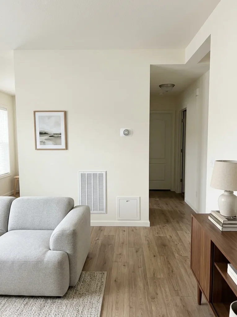
The decision is not “How do I hide this?” It is:
Can the surrounding composition become quieter while the component remains fully usable and accessible?
If yes, solve the composition. If no, treat any actual modification as professional systems work.
19. Run a Custom-Build Alignment Audit Before Buying More Décor
The final upgrade is not another material, fixture, or piece of furniture.
It is an inspection.
Walk through the double wide without asking whether the rooms look stylish. Look for the places where the house stops looking resolved.
Start with four categories:
- Finish lines — trim endings, cabinet sides, flooring transitions, panel edges, backsplash stops.
- Alignment — lighting over furniture, mirror-to-vanity relationships, cabinetry lines, door and casing rhythms.
- Integration — storage that still looks freestanding, utility areas that explode into view, islands with unfinished public faces.
- Visual noise — too many competing focal points, decorative features explaining problems that could have been quietly corrected, or repeated accents that weaken the architecture.
Now rank what you find.
A defect visible from the main doorway or across several connected rooms deserves more attention than a tiny imperfection inside a low-traffic bedroom. A defect repeated six times deserves more attention than one isolated oddity. A finish problem affecting an otherwise serviceable element deserves correction before replacement is considered.
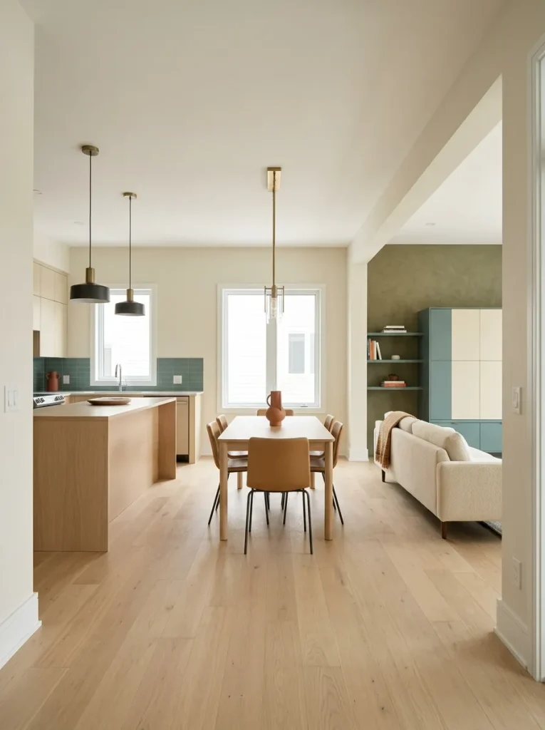
That hierarchy protects the budget from the easiest trap in a makeover: buying another attractive object while the workmanship clues underneath it remain unchanged.
Custom-Build Alignment Audit
Use the audit in one final way: identify the three defects with the widest visual reach. Those become the next project list. Everything else can wait.
A custom-looking double wide rarely comes from upgrading every visible surface at once. It comes from knowing which details make many other details look better once corrected.
Conclusion
The most convincing modern double wide interiors are usually built through consistency at the places where things meet. Ceiling treatments agree with room boundaries, cabinetry ends cleanly, storage belongs to the architecture, lighting responds to the zones below it, and utility details stay useful without becoming focal points.
Start with the long sightlines and the repeated finish problems before replacing large surfaces. Then correct the junctions, alignments, and integrated elements that influence several rooms at once.
Once those relationships become quieter, you may find that the home needs far fewer decorative upgrades than expected. That is the useful stopping point: when the architecture begins doing the visual work that accessories were previously being asked to do.