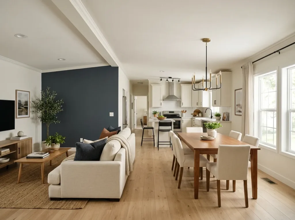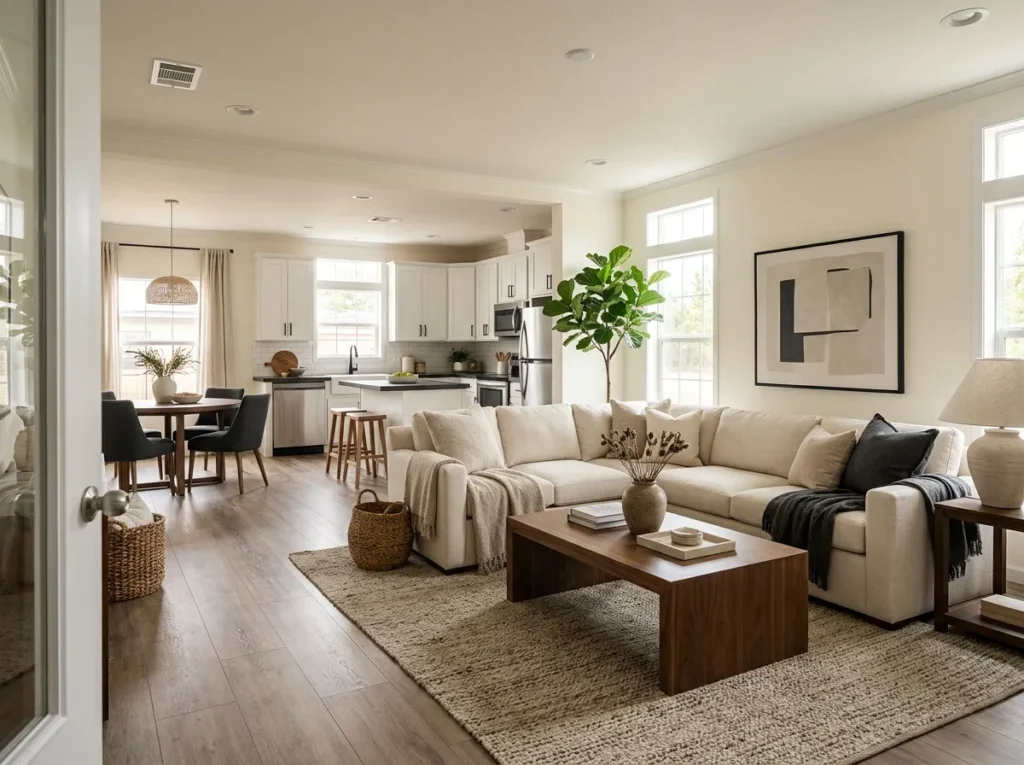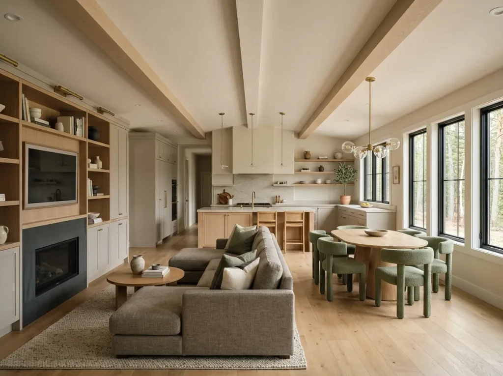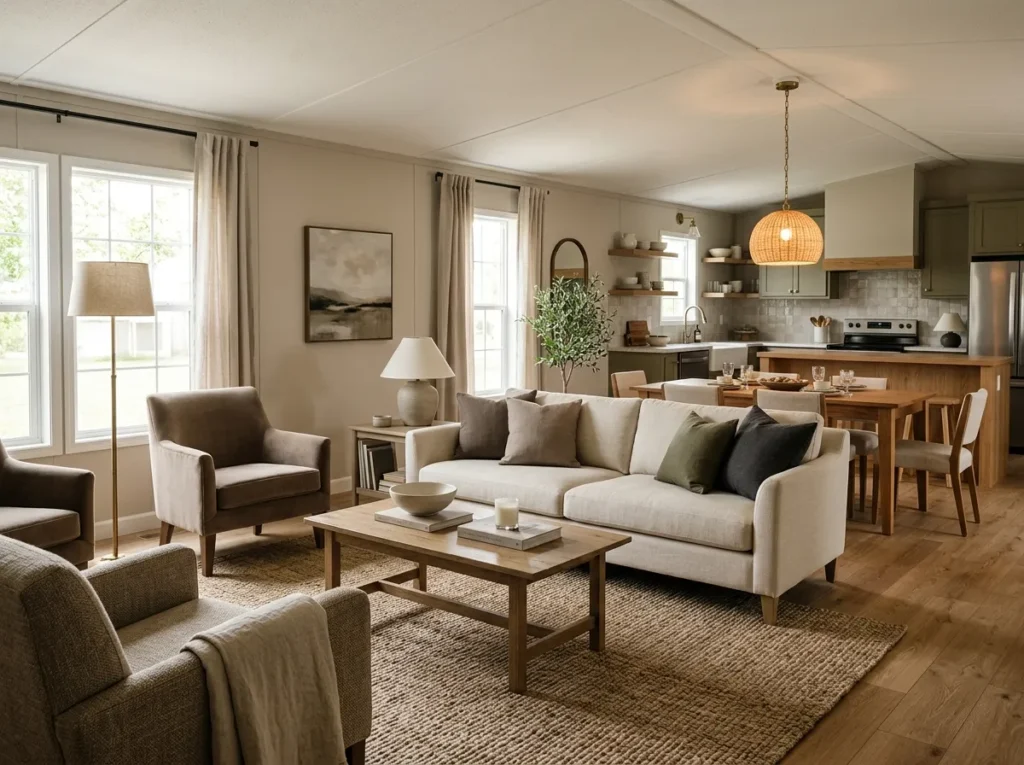
A double wide can have the square footage everyone wants and still feel strangely hard to settle into. The living room may be generous, the kitchen may open comfortably toward dining, and long stretches of floor can connect several activities at once. In a double-wide manufactured home, that openness can be a real asset, yet it can also make furniture look scattered, ceilings seem remote, and evening light feel flat.
The most useful double wide interior ideas do not try to shrink that space. They give it a human scale. That means tightening relationships between the things people actually use, creating soft boundaries without rebuilding walls, balancing broad hard surfaces with tactile ones, and making certain areas feel more visually important than the empty space around them.
Start with diagnosis, then move through furniture, walls, ceiling, sound, dining, kitchen, color, lighting, texture, transitions, and the bedroom. The aim is a home that keeps its openness while gaining the warmth, enclosure, and visual rhythm that make a large room inviting.
1. Diagnose Why the Room Feels Too Big Before You Try to Make It Cozy
A spacious double wide can feel cold for several different reasons, and those reasons do not share the same fix. Stand at the edge of the main room and notice what bothers you first: stretched conversation, exposed furniture backs, a lively or hollow sound, or one bright ceiling layer that gives every corner equal visual weight.
Match the first move to the symptom. Excessive distance calls for tighter furniture relationships. Exposed furniture needs an edge. A hard-sounding room needs more surface softness. Flat illumination needs a lower, more selective light hierarchy.
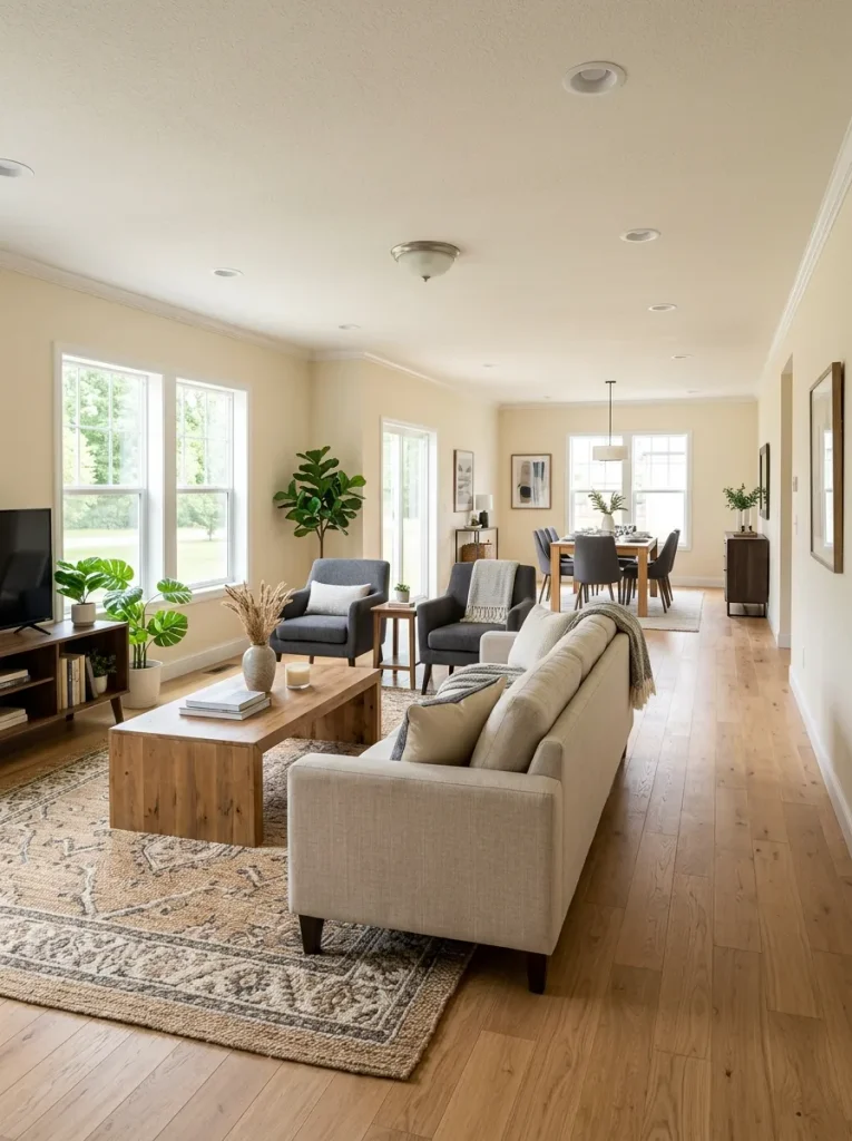
The useful question changes from “What cozy thing should I buy?” to “Which spatial relationship should I change first?”
Cozy Scale Diagnostic
Find the real source of “too big.”
Open the symptom you notice first. Each one points to a different first move.
Distance 02
Exposed edges 03
Hard echo 04
Flat light
What bothers you first?
People feel far apart
Furniture feels exposed
The room sounds empty
Everything is equally bright
Start with the largest symptom. Fixing the right relationship often removes the urge to compensate with more décor.
2. Create a Smaller Conversation Radius Inside the Living Room
Picture the room while people are actually talking. If the sofa sits at one side and the chairs have drifted toward another, the arrangement may look impressively open from the doorway while feeling socially stretched once everyone sits down.
Seated-view test: settle into the main sofa and look toward the chair a guest would use. If the relationship feels like two separate furniture displays, reduce the gap or change the angle. If the group already feels connected, preserve the extra floor around it instead of filling it.
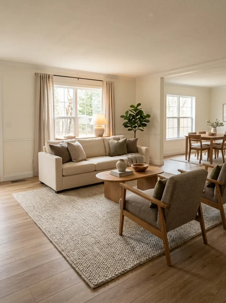
The decision is about the seats used together most often, not the total square footage available. Open floor can remain outside the conversation group as circulation and breathing space.
3. Give the Main Sofa a Back Without Closing the Floor Plan
A floating sofa can improve a wide room, yet its exposed back may leave the seating area feeling temporary. A slim console, low bench, narrow cabinet, or pair of compact stools can give that edge a visual back while keeping the kitchen or dining area open beyond it.
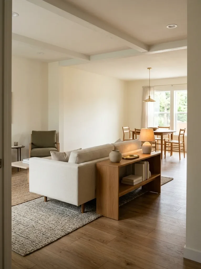
Keep the added piece lower than the main sightline and check the route around it. The boundary earns its place only when the sofa feels more protected and daily movement still feels natural. If circulation is the harder part of the problem, the double wide open concept ideas guide goes deeper into preserving flow through connected rooms.
4. Add a Second Tiny Destination Instead of Stretching One Seating Group
An empty corner does not automatically belong to the main living-room arrangement. In a generous double wide, stretching one seating group until it reaches every wall can weaken the intimacy of the area that already works.
Give a quiet leftover corner one specific routine:
- a reading chair with a floor lamp and small table;
- a two-seat puzzle or game table;
- a morning-coffee perch near a window;
- or a bench where someone naturally pauses.
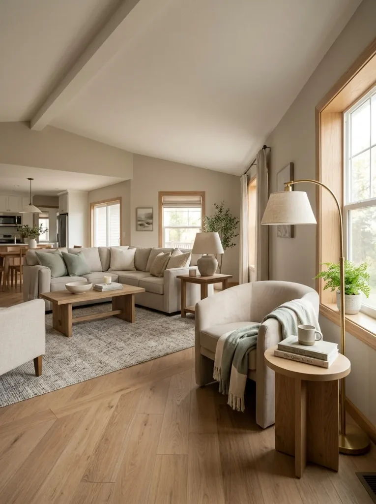
Stop when the corner can be understood at a glance. The room now offers a main gathering place and a smaller retreat, with open floor separating them while the furniture stays concentrated.
5. Build a Human-Scale Line Across Tall, Empty Walls
A broad wall can make good furniture look undersized when every visual cue sits either near the floor or high above eye level. What is often missing is a calm middle band that relates the architecture to the height of people sitting and moving through the room.
Look across the space from the sofa. Sofa backs, consoles, cabinet tops, lamps, and artwork can collectively create that middle rhythm. They do not need to align precisely; a loose repetition is enough to stop the wall reading as one uninterrupted vertical expanse.
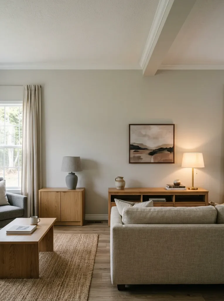
Decision rule: strengthen the middle of the wall before adding more objects to its upper half.
Human-Scale Datum Mapper
Give a big wall a middle.
Read the wall from a seated viewpoint. The useful visual line often lives between low furniture and the empty upper field.
anchors the lower field
extends the middle rhythm
bridges upward
Build the line in three passes
Find the strongest existing horizontal cue.
Repeat that visual neighborhood once or twice across the wide wall.
Leave some upper wall quiet so the middle band has contrast.
Stop signal: from the sofa, the wall should feel proportioned before it feels decorated.
6. Lower the Apparent Ceiling Only Over the Gathering Zone
A broad pale ceiling can make a large double-wide living area feel even more expansive because the eye reads one continuous plane above several activities. You can change that perception locally without making the whole interior darker.
Choose the zone where people gather most. A slightly warmer ceiling tone, a restrained decorative finish, or one visually substantial hanging fixture can give that area a more defined overhead boundary. Keep the intervention concentrated so the surrounding ceiling still supports the open character of the home.
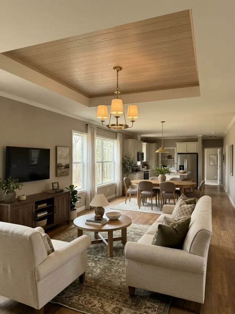
Use it when: the furniture below already forms a convincing group. If the seating is scattered, solve that first. For a deeper look at architectural polish and finish coordination, continue with the modern double wide interior ideas guide.
7. Create a Low Light Horizon Around the Seating Area
A room can have plenty of light and still feel too large after sunset. If most illumination comes from the ceiling, distant corners and unused floor stay visually active along with the seating area.
Build a lower horizon with sources close to the occupied zone:
- place a floor lamp beside a chair or sofa end;
- add a table or console lamp where it supports a real activity;
- reduce the dominant overhead layer for an evening test;
- check that walking routes and task areas remain comfortably visible.
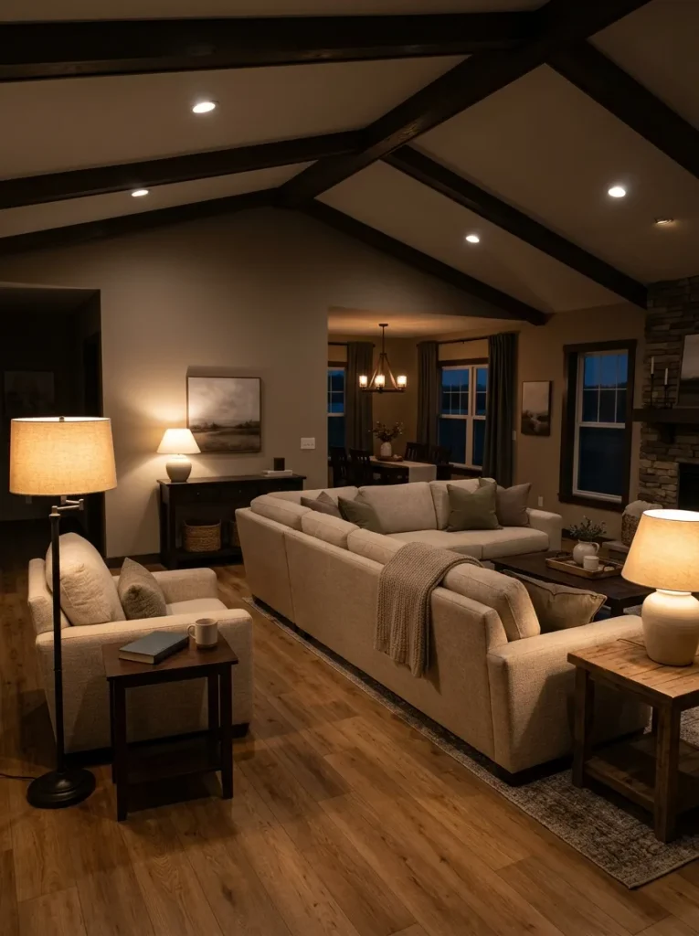
If the room feels more settled, keep developing the low light horizon. This is lighting-composition guidance, not electrical installation instruction.
8. Soften the Surfaces That Make the Room Sound Hollow
A room can look warm in a photograph and still feel surprisingly empty once people begin talking. Broad hard flooring, large painted walls, glass, countertops, and an open ceiling can leave very little material to soften the sensory character of the space.
Listen from the center, then identify the largest hard-to-hard relationship:
- exposed floor ↔ hard ceiling;
- window wall ↔ bare painted wall;
- open kitchen finishes ↔ sparsely upholstered living area.
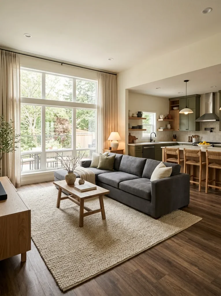
Treat that relationship first. A substantial textile field, fuller upholstery, or another broad soft surface will influence more of the room than a scatter of small pillows. Reassess before adding another layer.
Soft-Surface Atlas
Find the hard plane doing the most work.
Treat the strongest reflective relationship first, then reassess the room before adding smaller soft accents.
Open the surface that dominates your room.
Large hard floor
Wide glass wall
Broad bare wall
Open kitchen finishes
Editing rule: soften the biggest relationship first. Smaller accents come later.
9. Add One Visually Heavy Soft Piece to Balance Open Floor
Suppose the room already contains a sofa, rug, and several cushions, yet the center still looks thin. Six more small accessories will probably not correct the scale mismatch. One upholstered ottoman, deep lounge chair, cushioned bench, or another substantial soft form may do more because it registers across the room.
Check it from two positions:
- From the doorway: does it help the seating zone read as grounded?
- From the sofa: does it leave the normal route comfortable?
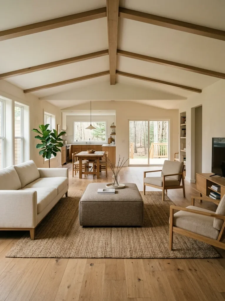
If the room already contains a large sectional, generous rug, and deep upholstered chairs, skip this move. Extra visual weight should solve a gap, not create one.
10. Make the Dining Table Feel Like a Room Within the Room
An open dining area can feel unfinished even when the table is perfectly adequate. The missing element is often enclosure by relationship.
Think in three layers:
- Occupied core: table and chairs.
- Visual envelope: centered light, nearby sideboard, artwork, or compatible floor treatment.
- Breathing ring: open circulation connecting dining to kitchen and living.
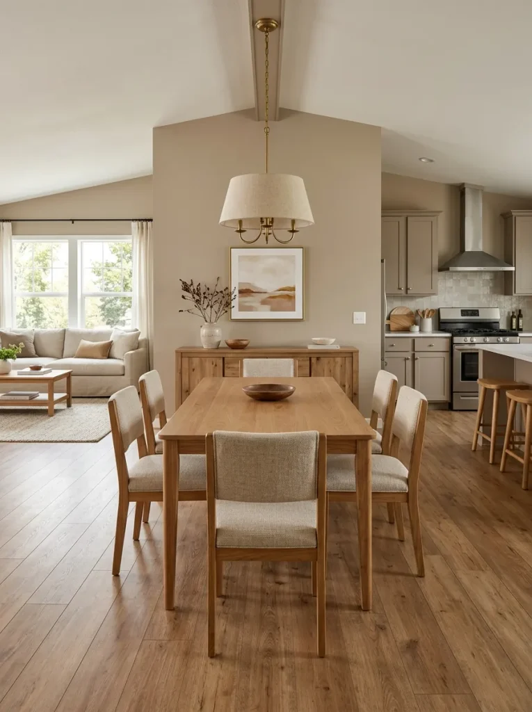
If the table already reads clearly as a destination from the neighboring room, do not add a divider simply to make the boundary more obvious.
Dining Envelope Mapper
Build enclosure without adding walls.
Cozy dining zones work in layers: furniture at the core, visual anchors around it, open circulation outside.
→ visual envelope
→ breathing ring
Core
Give table and chairs enough visual mass to read as one group.
Envelope
Add a centered light, sideboard, art, or compatible floor treatment.
Breathing ring
Preserve usable open space around the composition.
11. Turn the Kitchen Island or Peninsula Into a Warm Social Edge
In many double wides, the kitchen ends at an island or peninsula and the living area begins only a few feet later. Treating that counter purely as cabinetry can make the transition feel abrupt.
The outward-facing side can carry the social cues: comfortable stools, a warmer wood or material note, and localized pendant light. The working side should stay efficient and easy to clear.
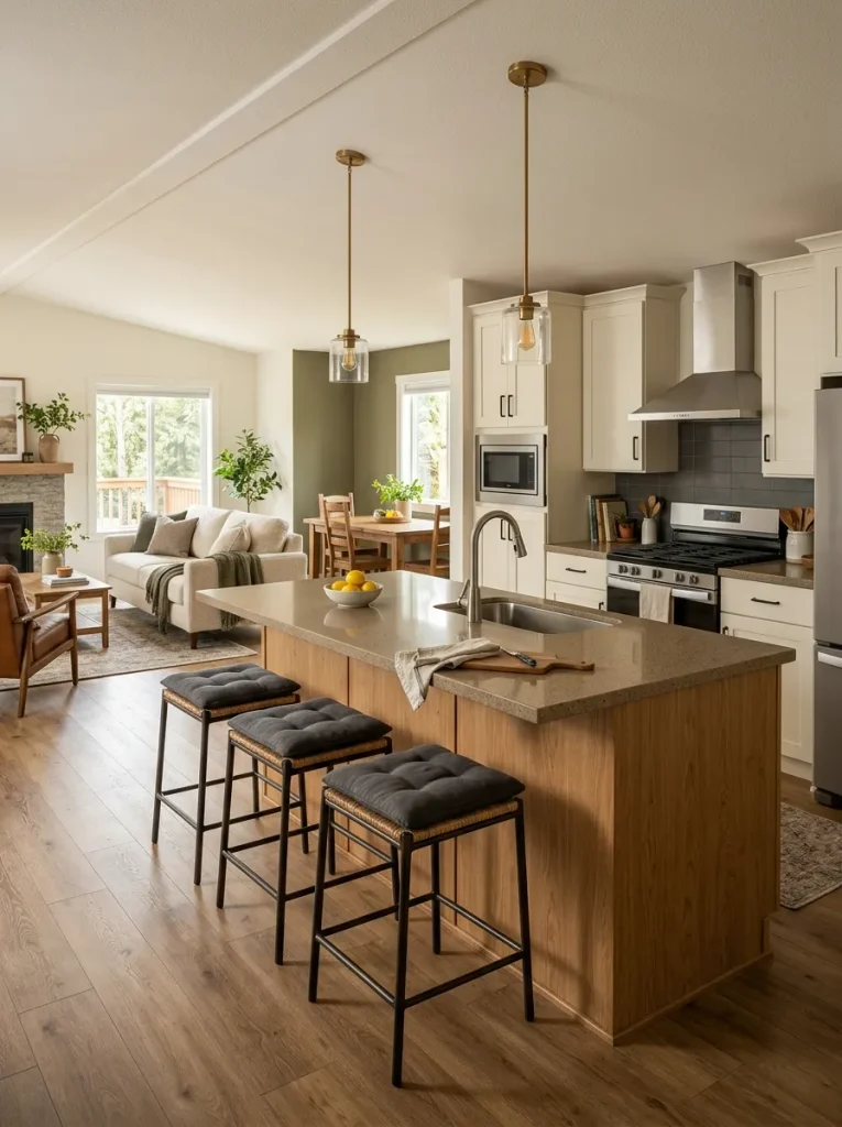
Choose the role honestly: if people naturally sit there, improve comfort and warmth. If the counter is primarily prep space, keep it functional and let the dining area handle the social job.
12. Use One Rounded Anchor to Interrupt the Home’s Long Straight Lines
Double-wide interiors often contain strong horizontal and rectangular geometry: long plank flooring, straight cabinet runs, broad sofas, rectangular islands, and wide wall openings. Repeating that geometry everywhere can make the room feel visually stretched.
Choose one curve according to the problem:
- a round coffee table softens a rigid seating center;
- an oval dining table eases movement around the eating zone;
- a curved-back chair relaxes a hard corner;
- an arched floor lamp bends the eye back toward a seating group;
- a large circular mirror can interrupt a rectangular wall composition.
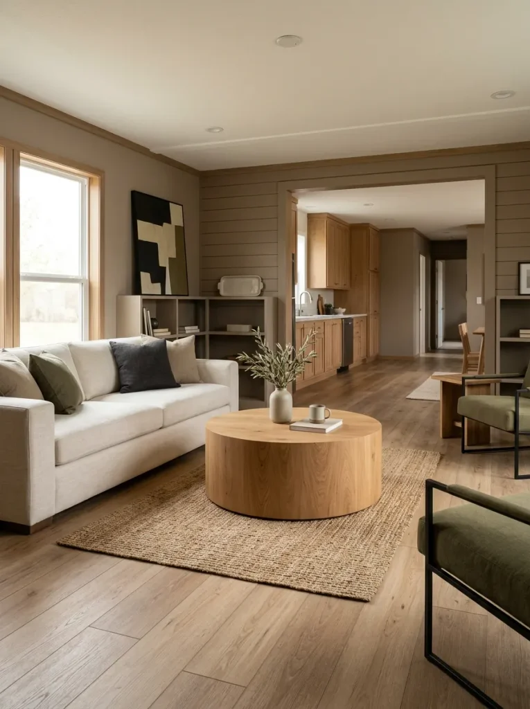
One confident rounded anchor usually has more effect than several small circular accessories distributed around the room.
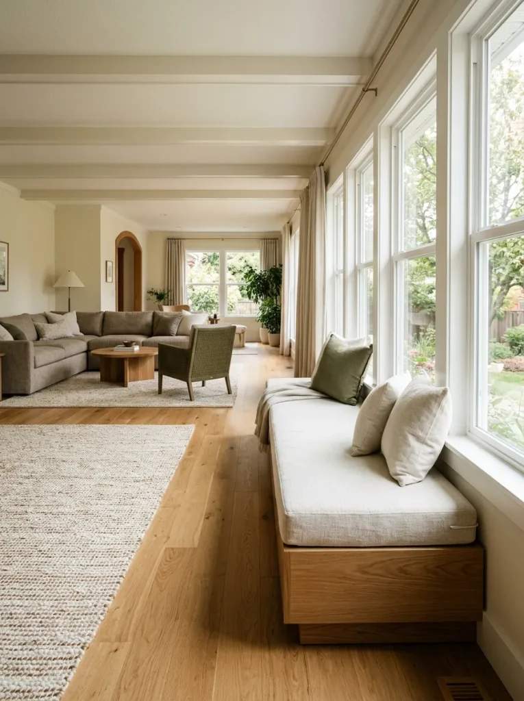
13. Soften One Long Perimeter With an Upholstered Edge
A wide room may have a long window wall or plain perimeter that still feels hard after the central seating group is comfortable. Filling that edge with cabinets and décor can make the room busier without making it warmer.
A bench, chaise, low daybed-style seat, or pair of compact lounge chairs can turn part of the perimeter into a soft, usable edge when the placement keeps doors, vents, windows, and the main walking route clear.
Skip it if the perimeter is already visually active. This intervention is for an underused hard edge, not every open wall.
14. Advance the Farthest Wall With a Soft Midtone
Very pale colors can keep a connected double wide bright, yet they may also make a distant wall visually recede. In a long room, that can exaggerate the distance from one end to the other.
Try a restrained midtone on the farthest important surface—mushroom, muted olive, clay, warm taupe, subdued blue-gray, or a related color with enough depth to register from across the room. The purpose is gentle visual advancement, not a high-contrast feature wall.
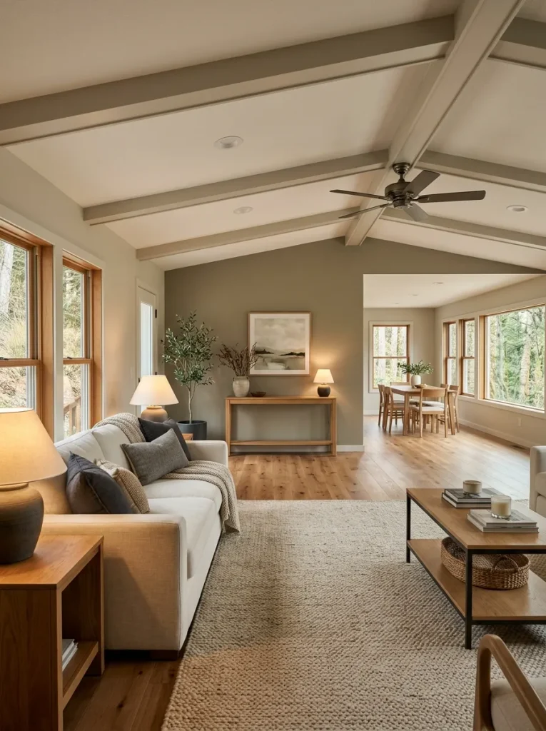
Before committing: view the sample in daylight and evening light. If the surface already carries a strong fireplace, media unit, or cabinetry composition, extra color weight may be unnecessary. For wider color and furnishing coordination, see the double wide decorating ideas guide.
15. Design a Night Version of the Room
A double wide can feel balanced in daylight and unexpectedly vast after sunset. Dark window glass and ceiling-led illumination can make the whole interior feel equally exposed.
Design three evening states:
- Arrival: entry, kitchen, and main routes remain easy to read.
- Conversation: lower light around the occupied seating zone becomes visually dominant.
- Wind-down: useful task light stays on while low-use edges become quieter.
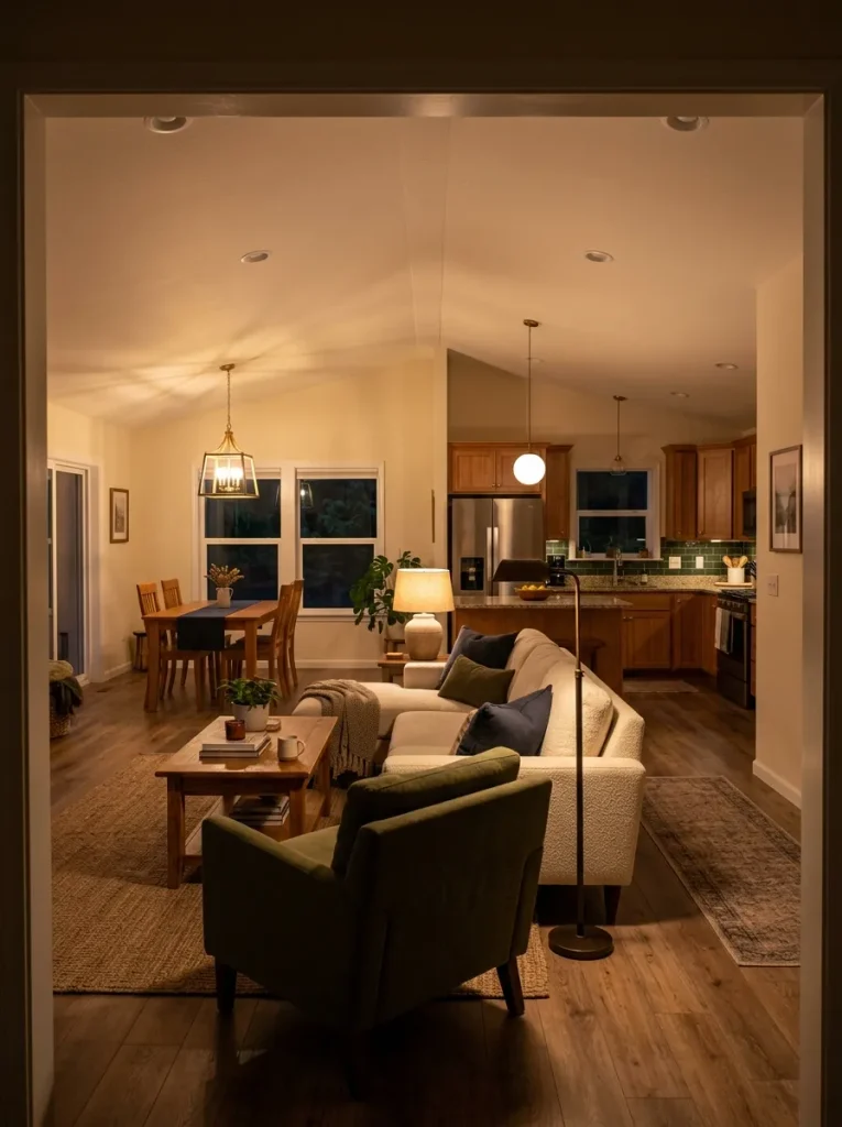
The room remains spacious. It simply stops presenting every square foot with equal emphasis.
Evening Light Lab
Let the room get smaller after sunset.
Give each part of the evening its own lighting hierarchy.
Entry, kitchen, and main routes remain easy to read.
Lower light around seating becomes more prominent than far walls.
Useful pools remain while low-use edges become quieter.
Open the evening problem you want to solve.
The room feels flat
The seating feels exposed
The room still feels enormous late at night
Scope: this is lighting-composition guidance, not electrical installation instruction.
16. Use Texture in Large Fields, Not as Tiny Scatter
A large room can collect an impressive number of cozy accessories and still feel thin. The issue is often scale: every soft item is small compared with the architecture around it.
Use a simple hierarchy:
dominant tactile field → supporting texture → quiet surfaces
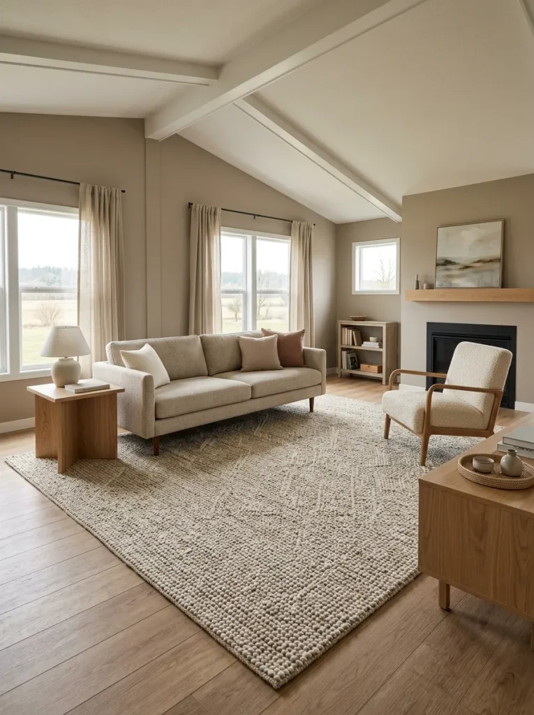
The dominant field might be a substantial woven rug, full textile treatment, textured upholstery, or another material presence visible from across the room. Add one supporting texture, then let nearby finishes settle down. When every pillow, basket, throw, rug, and curtain competes, softness becomes visual noise.
17. Turn a Long Transition Strip Into a Soft Decompression Zone
Some double wides have a long connector between the public room and bedrooms or bathrooms. It may be too narrow for furniture yet long enough to emphasize the overall length of the home.
Treat the route as a gradual shift:
public → soften → private
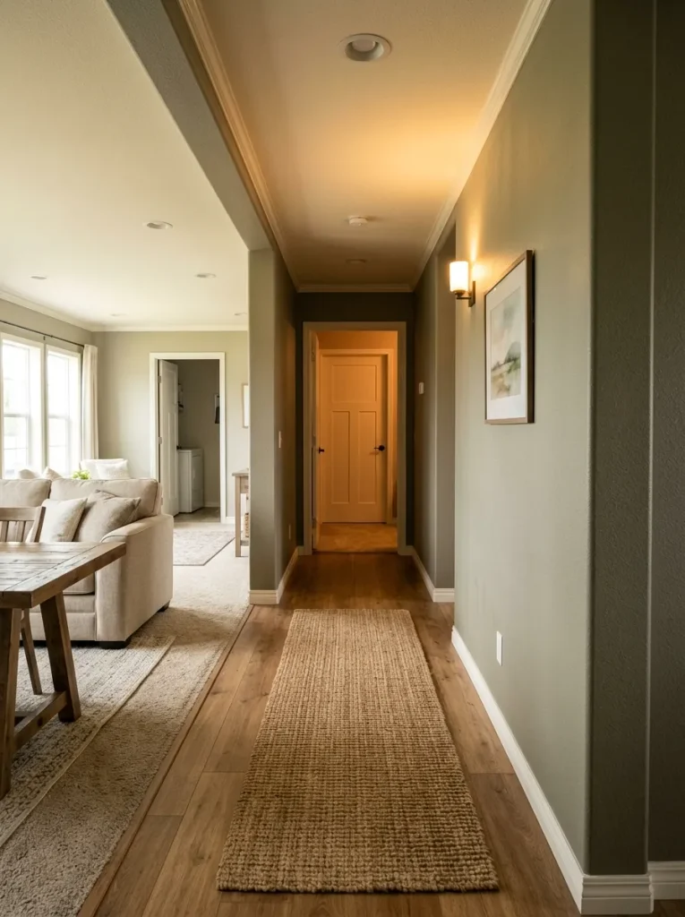
A runner where practical, quieter wall treatment, one restrained piece of art, or warmer local light can signal that the private side has begun. One or two cues are enough; skip floor-standing furniture anywhere it tightens the path.
18. Make a Large Bedroom Feel Nested Around the Bed
A roomy double-wide bedroom can repeat the living room’s scale problem: the bed occupies one part of the floor while unrelated furniture drifts around the perimeter.
Build the immediate nest in order:
- back: headboard, art, or a contained wall treatment;
- sides: nightstands and bedside light;
- floor: a coherent rug or another soft lower field;
- outer envelope: window textiles when they visually belong to the bed zone.
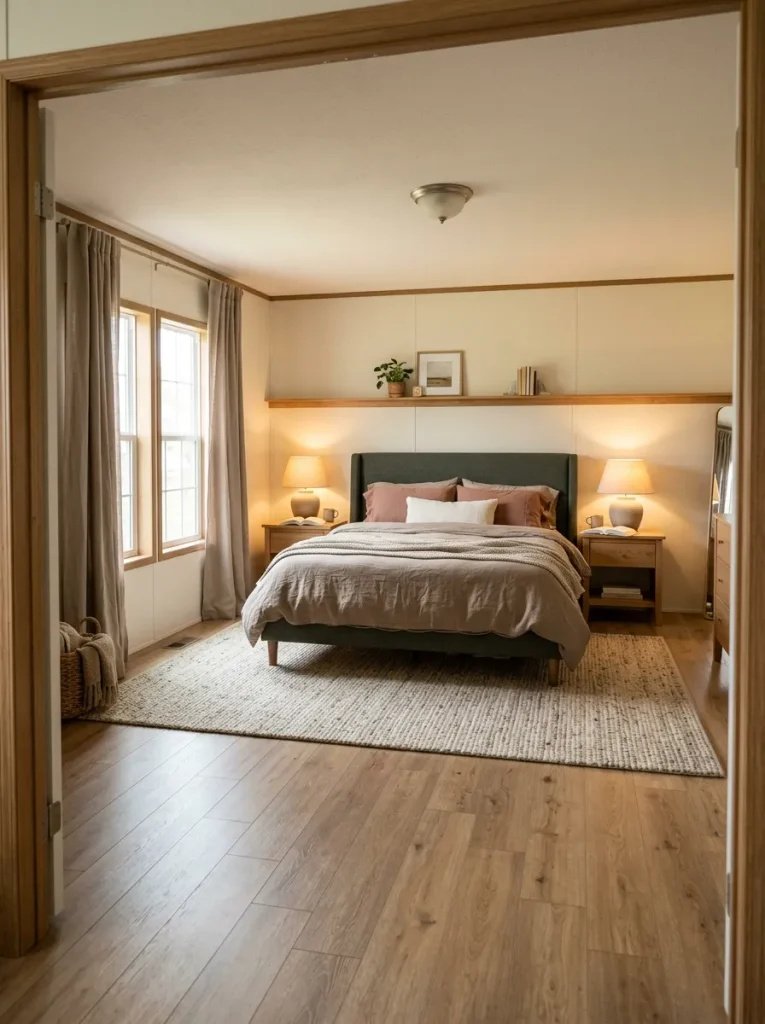
Once those edges feel complete, reassess the remaining floor. A large bedroom can contain open space and still look finished; add another piece only when it supports a real routine or corrects a clear imbalance.
Bed Nest Builder
Find the missing edge around the bed.
A spacious bedroom can keep empty floor. The sleeping zone needs to feel complete first.
→ immediate envelope
→ quiet room
Open the edge that feels unfinished.
Behind the bed
Beside the bed
Under the bed
Around the bed at night
Stop signal: when the bed reads as a complete destination from the doorway, the remaining floor can stay open.
19. Use Tall Pieces to Make Corners, Not to Build Furniture Walls
Wide rooms sometimes lack the vertical cues that make a corner feel finished. Everything may sit at sofa, console, and table height, leaving the perimeter broad and low.
Use height selectively—a tall plant, narrow bookcase, floor lamp, cabinet, or vertical artwork—where two existing planes already meet. That placement reinforces a corner without building a barrier through the center of the room.
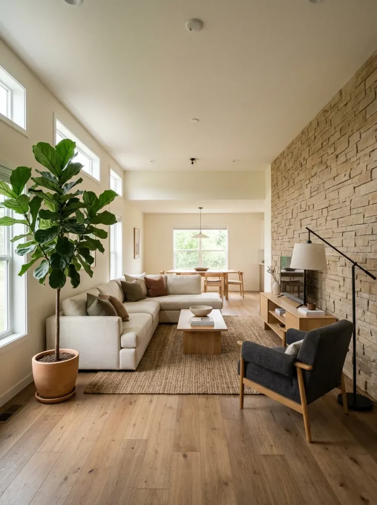
Stop after one or two strong vertical anchors. A continuous wall of tall pieces can make the perimeter heavy and compete with windows, doorways, or circulation.
20. Build a Density Gradient From Cozy Center to Quiet Perimeter
Not every part of a large room needs the same amount of visual information. Equal density can leave a double wide looking busy and unanchored at the same time.
Build the room in three intensity levels:
- Center: richest mix of useful upholstery, tactile material, light, and everyday objects.
- Secondary perimeter: simpler furniture with fewer layers.
- Low-use edge: quiet surfaces and only what serves a clear purpose.
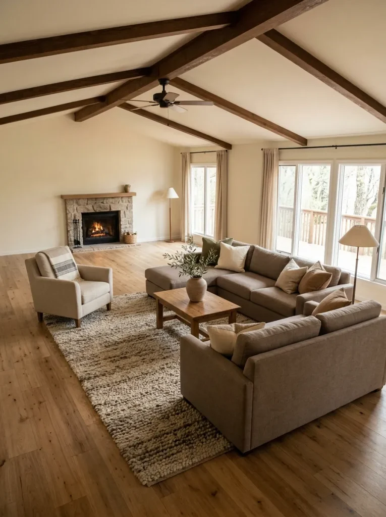
Walk outward from the main cluster. If visual intensity stays equally high all the way to the walls, remove or relocate one peripheral object. If the center feels sparse while the edges are crowded, move useful visual weight inward.
21. Leave a Breathing Ring Around Every Cozy Cluster
After all the layering, the final move is spatial restraint. Imagine a loose outline around the living conversation group, another around dining, and another around any secondary nook. Each cluster needs enough open floor around it for the eye to recognize where that experience ends and the next one begins.
Before keeping an object inside that breathing ring, ask:
- Does it support the activity in this zone?
- Does it improve the boundary or merely occupy empty floor?
- Can people still move around the cluster naturally?
- Would removing it make the composition clearer?
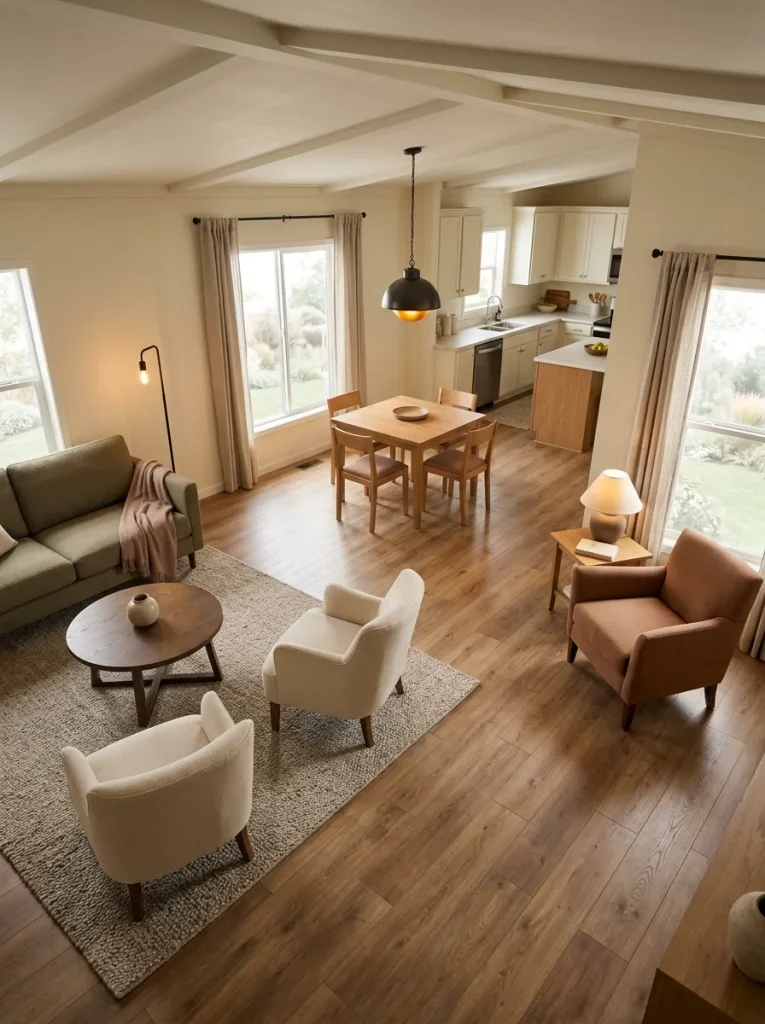
Finishing rule: stop when the important zones feel complete, not when the room feels full. The contrast between warm, defined clusters and generous negative space is what allows a double wide to feel cozy and spacious at the same time.
Making a Double Wide Feel Cozy Without Losing Its Spaciousness
A comfortable double wide does not need to disguise its generous dimensions. It needs to organize them around the scale of everyday life.
Bring conversation closer, strengthen exposed edges, give dining and sleeping areas clear envelopes, soften the broad surfaces that dominate the room, and let evening light favor the places people actually use. Then allow some floor and wall area to stay quiet.
Once each important zone has a purpose, a boundary, and enough breathing room around it, the home stops feeling empty without becoming crowded. The spaciousness remains; it simply begins working for the people living inside it.