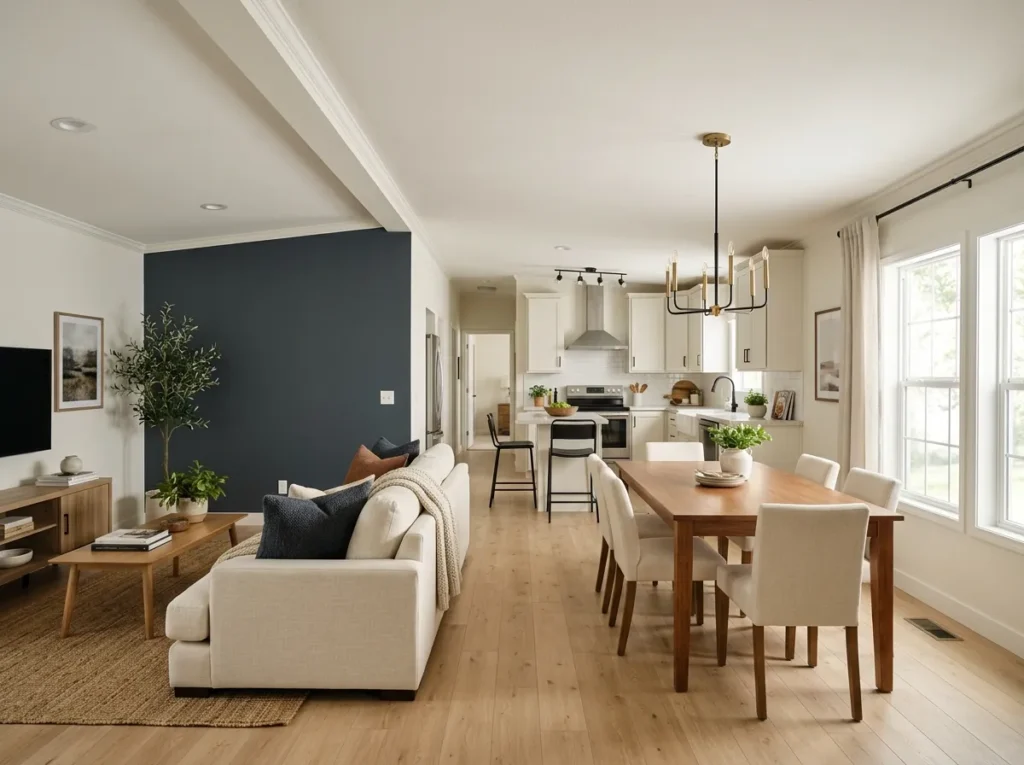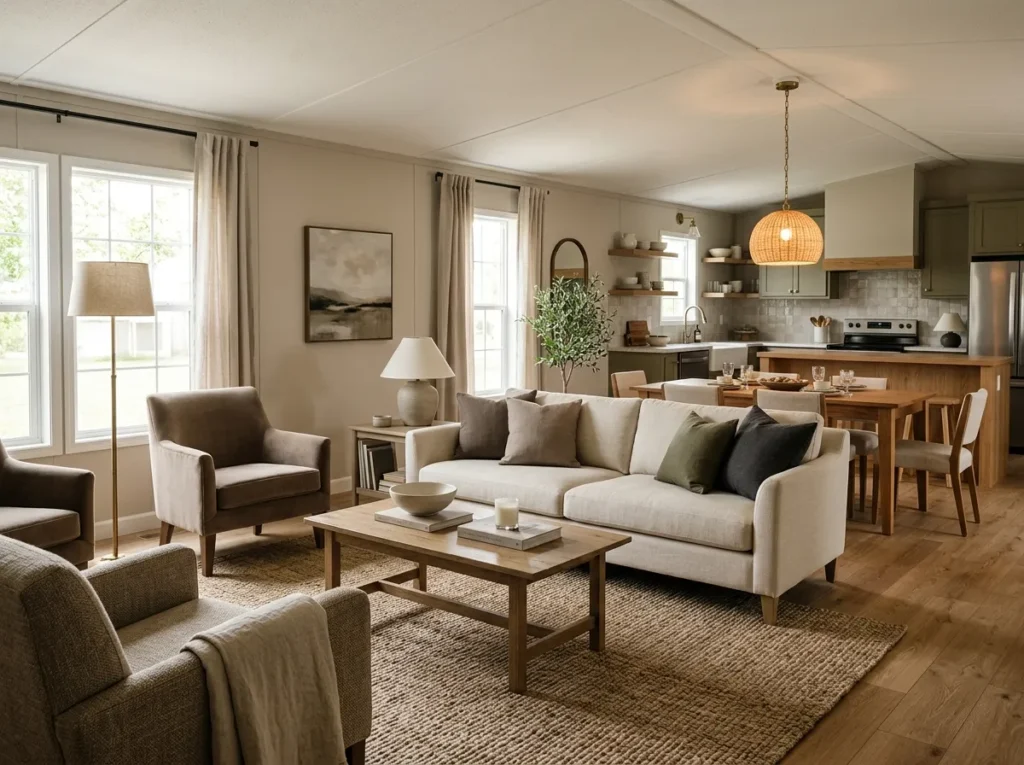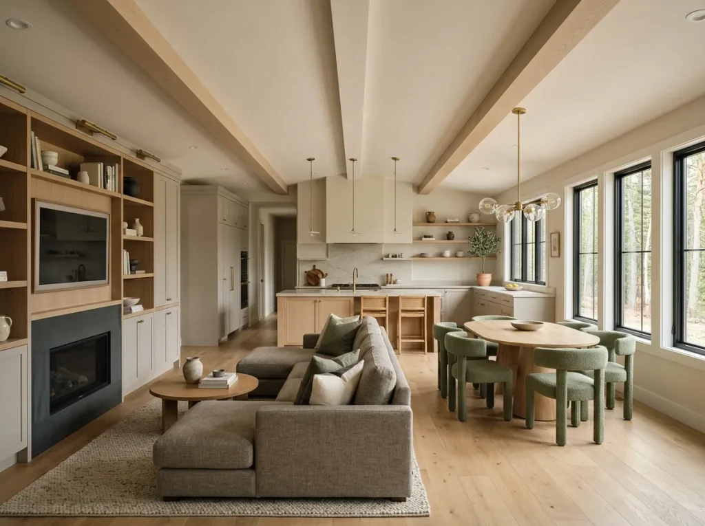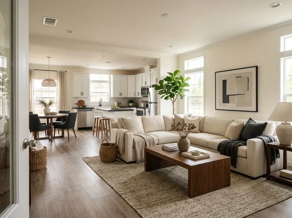
A double wide can offer generous living space and still feel less polished than the rooms saved to your Pinterest boards. The difference is rarely one expensive sofa, designer light fixture, or major remodel. Many of the strongest luxury double wide decorating ideas work because the room has clear visual hierarchy: fewer undersized objects, richer-looking materials, deliberate contrast, and furnishings that feel intentionally connected.
That is especially important in a double wide. Because living, dining, kitchen, and circulation areas are often visible together, one good decorating decision can improve several views at once—and one weak purchase can create visual clutter across the same wide-open area.
This guide focuses on decorating an existing double wide, not rebuilding it. You will start by decoding what makes an inspiration room feel expensive, then use an interactive budget map to decide where your money has the greatest visual reach. From there, the ideas become increasingly specific: scale, material weight, architectural transitions, secondhand finds, reflection, geometric repetition, and the purchases worth skipping altogether.
1. Decode the Luxury Look Before You Spend on It
Open one of the expensive-looking rooms you have saved and temporarily ignore the individual products. What remains is usually a much simpler formula.
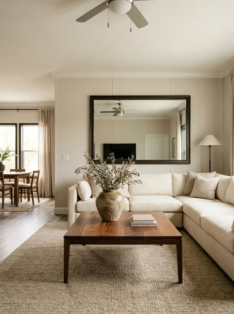
Scale: A large mirror, substantial coffee table, oversized art piece, tall plant, or broad rug carries enough visual weight to be noticed from across the room.
Material: Wood grain, woven fiber, ceramic, linen-like fabric, stone texture, or aged metal gives the eye something tactile to read.
Contrast: Dark frames against light walls, pale upholstery beside warm wood, or one charcoal surface surrounded by softer neutrals creates definition.
This matters more in a double wide because you often see the room from farther away and from several connected zones. Tiny accessories that look charming in a close-up photograph may almost disappear from the kitchen or dining area.
Before buying anything, identify which of those three signals your room is missing. If the furniture already provides scale, spend on material or contrast. If the finishes are attractive but the room is dotted with many little objects, your next “luxury upgrade” may simply be replacing several small pieces with one stronger form.
2. Give Every Dollar a Visibility Job Before You Shop
A decorating budget stretches further when you judge purchases by visual reach, not by room count. A new object tucked into one corner may be attractive, yet an equally priced change visible from the front door, sofa, dining table, and kitchen can transform much more of a double wide.
Use the Luxury Leverage Budget Map below before making the next purchase. Choose the problem that most closely describes the room now; the recommendation changes according to what is actually weakening the high-end effect.
The most important part is the order. Move and edit first, make a small correction second, buy one meaningful anchor only when the room still needs it. That sequence keeps “budget decorating” from turning into a collection of inexpensive purchases that collectively cost more than one good piece.
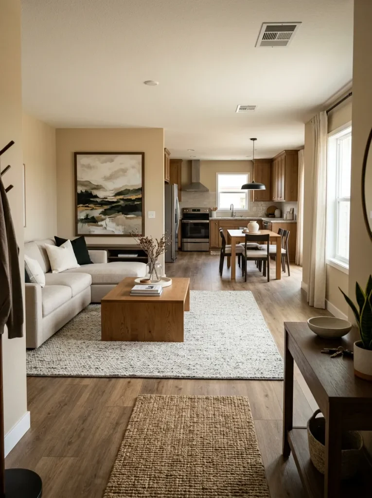
3. Use One Large-Scale Shape to Calm Each Shared Zone
Imagine standing in the kitchen and looking across the living area. If your eye encounters six small frames, three tiny plants, multiple baskets, several tabletop objects, and no dominant shape, the room can feel visually fragmented even when every piece is attractive.
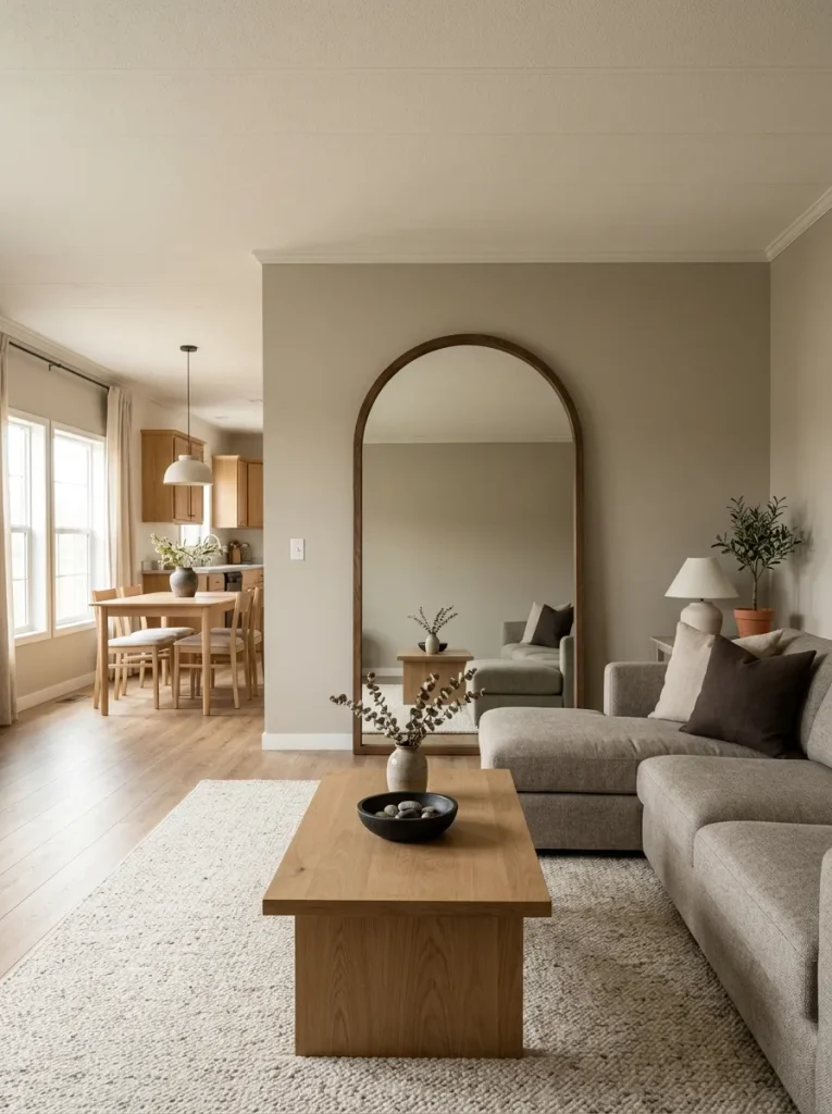
Give the zone one form that is easy to understand from a distance: an arched mirror, broad coffee table, tall floor plant, oversized framed textile, substantial lamp, or generous piece of art. It does not need to be the most expensive thing in the room. It needs enough physical presence to organize what sits around it.
Then stop and reassess.
If the large form has made the surrounding décor easier to read, resist filling every remaining blank. In a wide double-wide living area, a little unoccupied wall or floor space can actually strengthen the anchor. Add smaller pieces only where they support that hierarchy; do not ask six accessories to perform the job of one well-scaled shape.
4. Make the Existing Center Opening Look Intentional
Many double wides have a broad transition, opening, or architectural break between shared spaces. You do not have to modify that structure for it to contribute to the decorating scheme. The cheaper move is to decide whether the opening should act as a frame or quietly disappear into the surrounding surfaces.
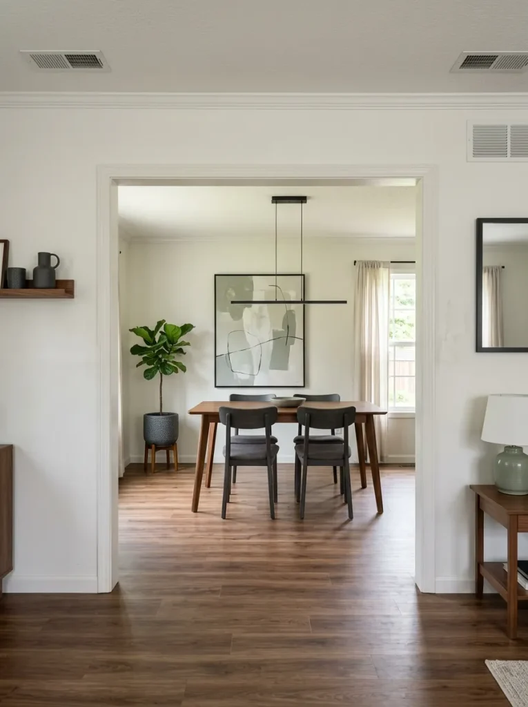
If the opening lands on an attractive view—perhaps the dining table, fireplace, large artwork, or an uncluttered kitchen—repeat one visible finish across the transition. A wood tone, black detail, or related wall color can make the view feel connected. If the opening points toward a busy working zone, keep its surrounding treatment quieter so it does not amplify that view.
Stand in the living room, then at the entry, and check what the opening frames from both positions. That simple test determines whether you should emphasize it or soften it.
For broader ways to coordinate connected spaces without turning every room into a copy of the next, the site’s guide to double wide decorating ideas is the stronger next read.
5. Give the Main Seating Area a Deliberate Front Edge
A large sectional or long sofa can visually spread across a double-wide living room without giving the eye a clear stopping point. The coffee table, ottoman, or low table in front of it can solve that—not because every sofa needs a particular measurement formula, but because the furniture needs to read as one composition from across the room.
Use the quick visual test below from your normal doorway or kitchen view.
If the current coffee table looks like a small island stranded in front of a wide sectional, first test a larger item you already own—an ottoman, bench, or even taped-out cardboard footprint—before shopping. If the opposite problem occurs and the center feels blocked, reduce visual mass or simplify the shape.
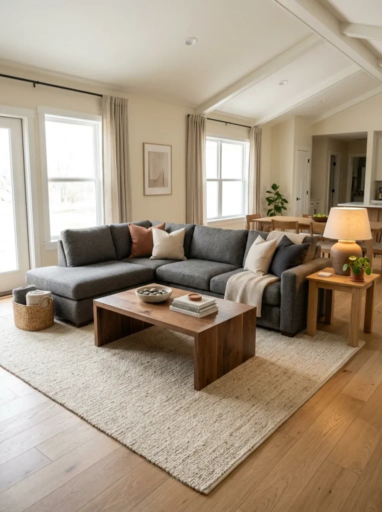
The expensive-looking version is the one where the seating and its front edge read as a single, confident zone while circulation still feels open.
6. Let One Real-Looking Material Carry More Visual Weight
A room can have a perfectly attractive color palette and still feel inexpensive when nearly every visible surface has the same lightweight, mass-produced character. The fix does not require replacing the floors, countertops, or cabinets. Give the eye one convincing material reference and allow nearby budget pieces to borrow some of its visual credibility.
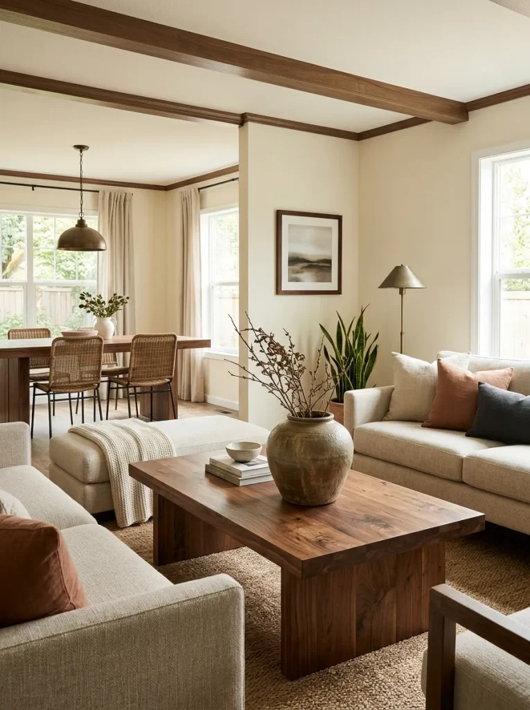
Picture two coffee-table arrangements. The first has several lightweight decorative objects in similar finishes. The second has a thick-grained wood bowl, handmade-looking ceramic vessel, or substantial woven tray with only one or two supporting pieces. The second arrangement often reads as more considered because the material itself provides texture, irregularity, and weight.
For a double wide, place that richer material where it can influence more than one view:
- a substantial wood coffee table visible from the kitchen,
- an oversized ceramic lamp beside the main sofa,
- a woven basket near the living/dining transition,
- an aged-metal or wood-framed mirror,
- a large earthenware vessel on a console.
You do not need all five.
In fact, repeating too many “rustic” materials can pull the room away from refined and toward themed. Choose one material family to lead, then let simpler pieces sit around it.
A useful shopping test is physical as much as visual: Does the object still look convincing when you stand six or eight feet away? If its appeal depends entirely on tiny decorative details, it may not deliver enough visual return for a broad double-wide room.
7. Make Inexpensive Art Look Larger Through the Frame, Not the Price Tag
What usually makes wall art look undersized is not the artwork alone. It is the amount of visual territory the entire composition occupies.
That gives you several low-cost ways to make inexpensive prints, photographs, downloadable artwork, or thrifted pieces feel more substantial.
The three-stage build
Stage 1 — Start with a strong image.
Choose artwork with a restrained palette or a clear subject that can survive being viewed from across the room.
Stage 2 — Increase the surrounding field.
A generous mat can turn a modest print into a much larger visual object. Two related prints can also create one combined composition without requiring one expensive oversized artwork.
Stage 3 — Give the composition breathing room.
Do not immediately surround it with signs, tiny frames, shelves, and decorative plaques. The empty wall around a strong frame helps establish importance.
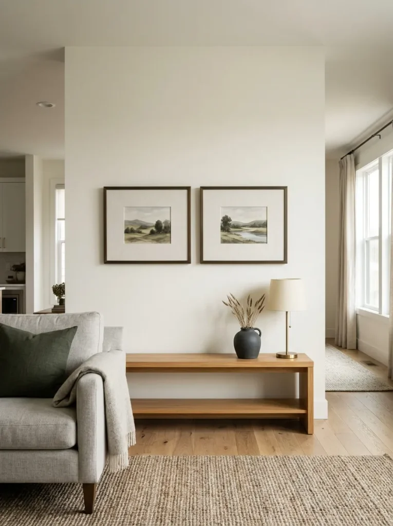
For example, a pair of modest landscape prints with broad neutral mats above a console can read more polished than a wall covered with seven unrelated pieces costing the same amount collectively.
If you already own several small artworks, test them as a tight intentional pair or trio before buying anything larger. Match one visible characteristic—frame tone, mat treatment, image palette, or subject family—so the eye understands them as a group.
The decision is simple: if the wall needs more presence, increase the composition, not automatically the art budget.
8. Turn the Open Kitchen Counter Into One Calm Composition
The kitchen is often visible while you are sitting in the living room of a double wide. That means a crowded countertop does more than affect the kitchen—it becomes part of the décor of the entire shared space.
The most useful first move is not hiding everything. Kitchens need to function. Separate visible items into three groups.
Daily-use items: coffee maker, kettle, utensil crock, cutting board, or whatever genuinely gets used.
Useful but movable items: oils, supplements, mail, paper towels, produce, small appliances used occasionally.
Decorative-only items: extra signs, faux plants, trays, jars, and objects that exist mainly to fill the surface.
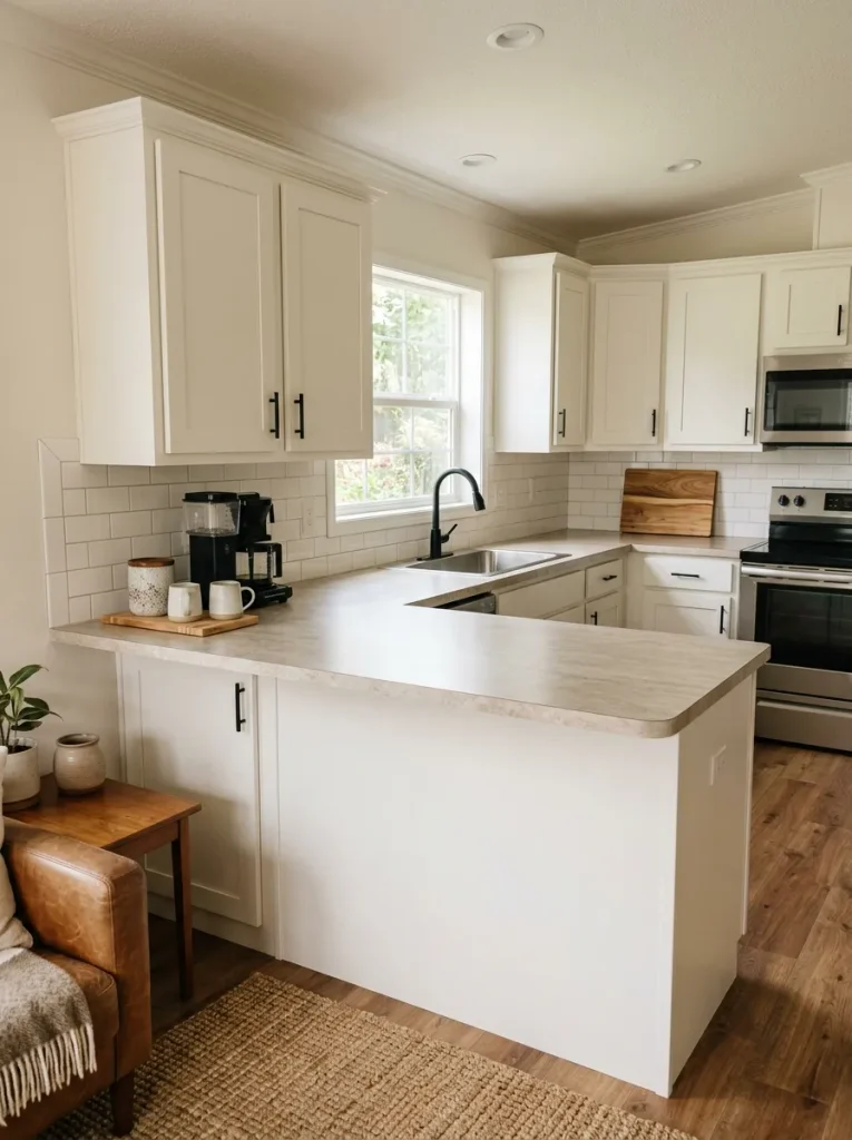
Start with the daily-use group. Place related items close enough that they read as one working station. A coffee maker, mugs, and one container may occupy a defined portion of the counter without stretching across the entire run.
Move the second group away from the prime sightline where practical. Then question the third group aggressively.
The luxury signal comes from visible counter continuing between objects. That uninterrupted surface gives stone-look laminate, butcher block, solid-surface counters, or even a basic countertop more visual importance.
A useful stopping point
When the countertop has:
one working cluster + one intentional material accent + clear open surface
stop styling it.
Adding another tray because the counter looks “empty” usually reverses the improvement.
9. Buy One Weighty Secondhand Piece Before Five New Accessories
A realistic budget becomes surprisingly powerful when you stop comparing new inexpensive décor with new expensive décor and start looking at the secondhand market.
Older furniture and accessories frequently offer something difficult to imitate cheaply: physical weight.
A solid wood side table, substantial mirror, vintage ceramic lamp, woven trunk, framed artwork, or wood bench may have scratches or an unfashionable finish, yet its proportions and construction can give a room more substance than several new decorative accessories combined.
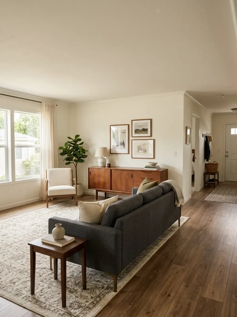
What deserves a closer look
When thrifting or browsing resale listings, look past the styling and inspect:
Material — real wood, thick ceramic, metal, woven fiber, stone or another convincing surface.
Silhouette — simple shapes are easier to integrate than highly themed furniture.
Scale — the piece should register in the room without requiring several objects around it to feel complete.
Condition — cosmetic wear can sometimes be cleaned, polished, painted, or accepted as patina; structural damage is a different calculation.
Placement flexibility — a stool that can become a side table, a chest that can become a console, or a large vessel that works in several rooms carries greater long-term value.
One caution: “vintage” is not automatically luxurious. Skip anything whose awkward proportions, unstable construction, strong odor, deep damage, or decorative style would force you to redesign the room around it.
For more inexpensive ways to furnish and finish the main gathering area, the site’s guide to budget living room decor is a useful broader resource.
The strongest secondhand purchase is usually the one that makes you remove other objects once it enters the room.
10. Give the Dining Table an “Empty-Day” Luxury State
Dining tables are often decorated for photographs or holidays but spend most of real life between those moments. That ordinary state matters much more in a double wide because the table may remain visible from the kitchen, living room, hallway, and entry throughout the day.
Imagine the table at 2 p.m. on an ordinary Tuesday.
No dinner setting. No guests. No seasonal tablescape.
What remains?
That is the version worth designing.
A useful everyday formula is intentionally sparse:
one central object + generous exposed tabletop + nothing that interferes with normal use
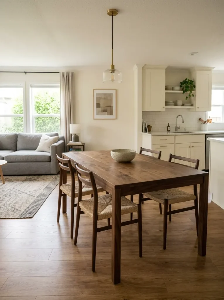
The central object might be a low ceramic bowl, broad vase, small branch arrangement, sculptural vessel, or compact grouped composition. Its job is to give the table a resting state so it never feels unfinished when there is no tablescape.
If your dining table has attractive wood grain, expose more of it. If the tabletop is less appealing, a restrained runner can create a deliberate center axis without hiding everything underneath.
When to break the rule
A very long dining table may need two related elements rather than one tiny centerpiece floating in the middle. Conversely, a small round table can become crowded quickly; there, a single bowl or vase may be enough.
When guests arrive, layer place settings and serving pieces around that quiet foundation. When they leave, return the table to its simpler everyday state.
That distinction keeps entertaining décor from becoming permanent clutter and makes one of the most visible surfaces in the home look composed even when nothing special is happening.
11. Use Pairs to Give a Wide Room Deliberate Balance
Wide rooms can create a decorating problem that smaller rooms rarely expose as clearly: the center may look finished while the edges feel accidental.
That does not mean every object needs a twin. Perfect symmetry can become stiff, especially in an open-plan double wide. Pairs are most useful when they stabilize a view that is visibly leaning, empty at both ends, or fragmented by many unrelated objects.
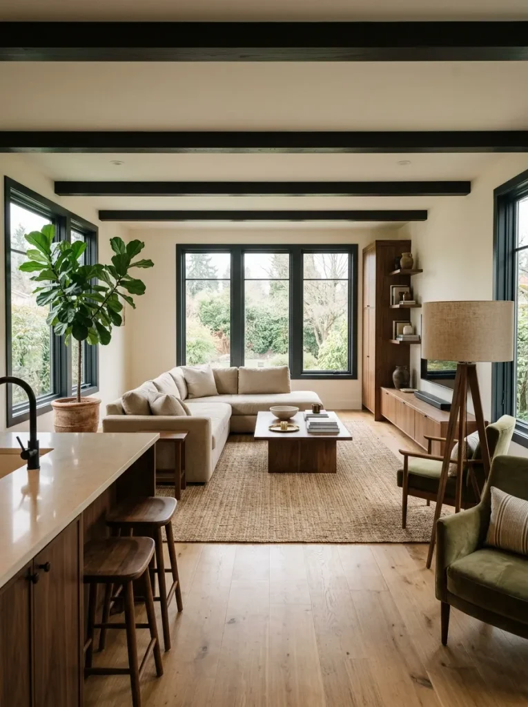
Try the room from its longest view first—the kitchen looking toward the living room, the entry looking through the shared area, or the sofa facing the media wall. Then identify which condition you actually have.
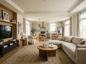
If the room improves with a pair, keep the center quieter afterward. The pair has already supplied order.
If the room becomes too formal, break the symmetry gently—different objects with similar heights, two related frames with different artwork, or lamps sharing shape but not every finish.
The luxury effect comes from controlled balance, not matching for its own sake.
12. Control Reflection Across Connected Rooms
Color receives most of the attention in decorating, but reflection and sheen can quietly determine whether connected rooms look sophisticated or visually unsettled.
Stand where you can see the living room and kitchen together. You may have matte walls, glossy cabinets, shiny metal hardware, a reflective television, satin textiles, polished counters, glass lighting, and several metallic accessories all competing within one view.
None of those finishes is inherently wrong.
The problem begins when too many surfaces demand reflection at once—or when everything is so flat that the room loses dimensional contrast.
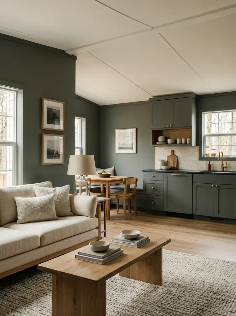
A more expensive-looking double wide usually has a readable hierarchy:
most large surfaces stay relatively quiet, a smaller group carries soft luster, and a few details provide deliberate reflection.
Use the atmosphere map below to diagnose what your connected rooms need.
A useful principle is to give reflection a smaller role than texture. A room with matte walls, woven fabrics, warm wood, and one brushed-metal lamp can feel far richer than a room where every decorative item is glossy.
You are not trying to make every finish identical. You are deciding which ones deserve attention.
13. Repeat One Shape Across the Wide Room for a Custom-Looking Thread
Look again at an expensive-looking room and ignore the colors for a moment. Often, one shape quietly appears more than once: an arch in a mirror reappears in a lamp silhouette; a round coffee-table detail answers a curved vase; slim black rectangles repeat through frames, table bases, and cabinet hardware.
That kind of repetition can make unrelated budget pieces feel as though they were selected together.
It is particularly useful in a double wide because several furnishing groups may be visible in the same broad view. Matching every finish across those zones can feel forced. Repeating geometry is subtler.
Start with a shape already present in something substantial.
If your strongest piece is an arched mirror, look for one or two softer curves elsewhere—a rounded lamp base, curved bowl, oval tray, or artwork with an arched motif.
If the room is mostly rectilinear, reinforce that language through crisp frames, a squared coffee table, or linear lamp silhouettes.
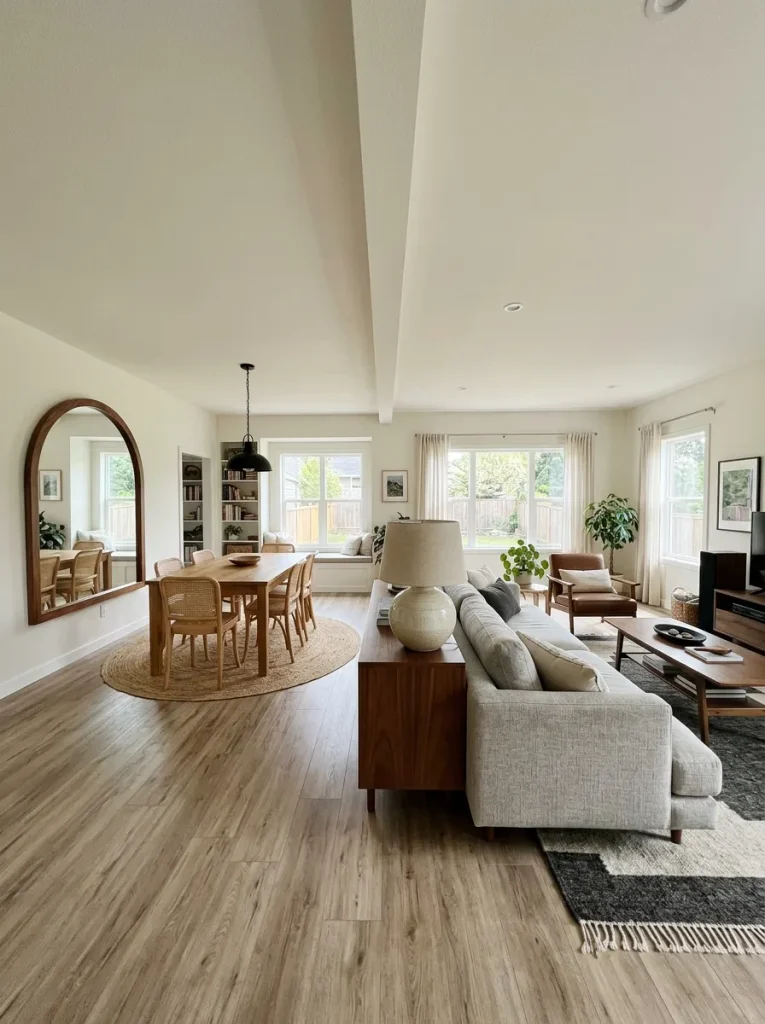
The three-point test
Your repetition is probably enough when the shape appears:
once as a major form → once in a supporting object → once as a small echo
Those three occurrences should be separated across the room, not clustered together.
Do not buy three matching arched objects just because arches are fashionable. The connection should become noticeable only after someone spends time in the room.
That is what gives inexpensive pieces a more custom-selected character: the relationship is repeated, not the product.
14. Give the Small Bathroom One Texture Story
A compact double-wide bathroom has very little visual distance. You notice the shower curtain, vanity, towels, rug, storage basket, wall finish, and hardware almost at once.
That makes texture coordination unusually powerful.
Do not begin with a theme such as “spa,” “farmhouse,” or “luxury hotel.” Begin with the tactile direction you want the room to have.
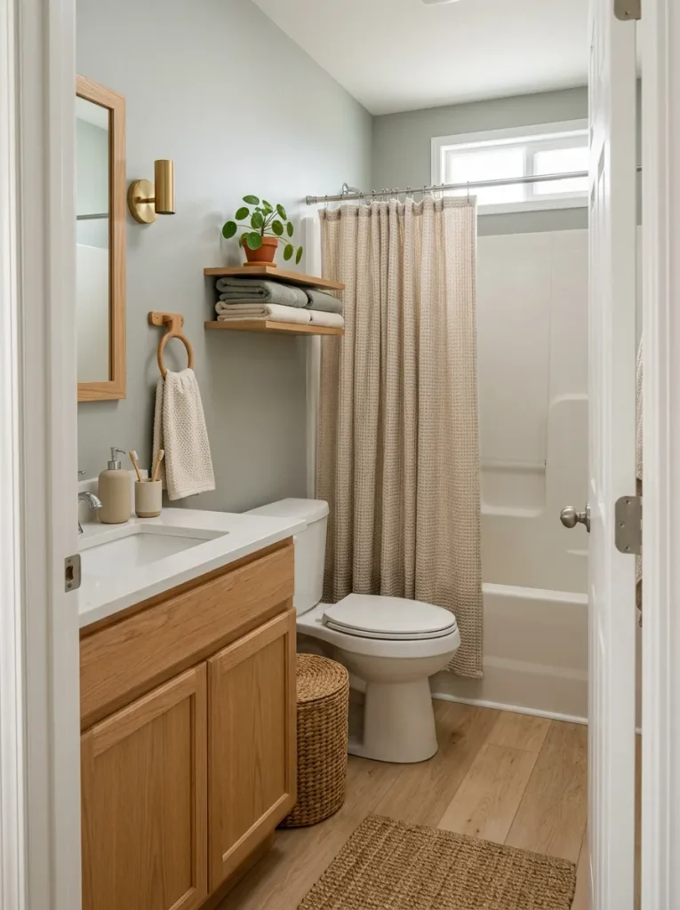
Choose one texture story
Soft + tailored
Waffle or lightly textured shower curtain + thick plain towels + low-pile rug + smooth ceramic.
Natural + grounded
Woven basket + cotton curtain + wood accent + matte pottery + restrained greenery.
Clean + architectural
Crisp curtain + simple towels + dark metal detail + smooth surfaces + minimal countertop styling.
Warm + layered
Textured neutral curtain + warm wood + plush towel + one woven element + softly reflective accents.
Then remove competing stories.
A bathroom with a fringed boho curtain, farmhouse sign, glossy glam tray, industrial shelf, and rustic basket may contain several nice objects while still lacking a clear identity.
The decision to make is not “What else can I add?”
It is:
Which texture should the room be remembered for?
After choosing it, let the other materials support that answer.
15. Run the Cost-per-View Gate Before the Final Purchase
The easiest way to lose a realistic decorating budget is not one extravagant purchase. It is twenty attractive, affordable purchases that each improve almost nothing.
Before the next item enters your cart, judge it by how much of the home it actually improves.
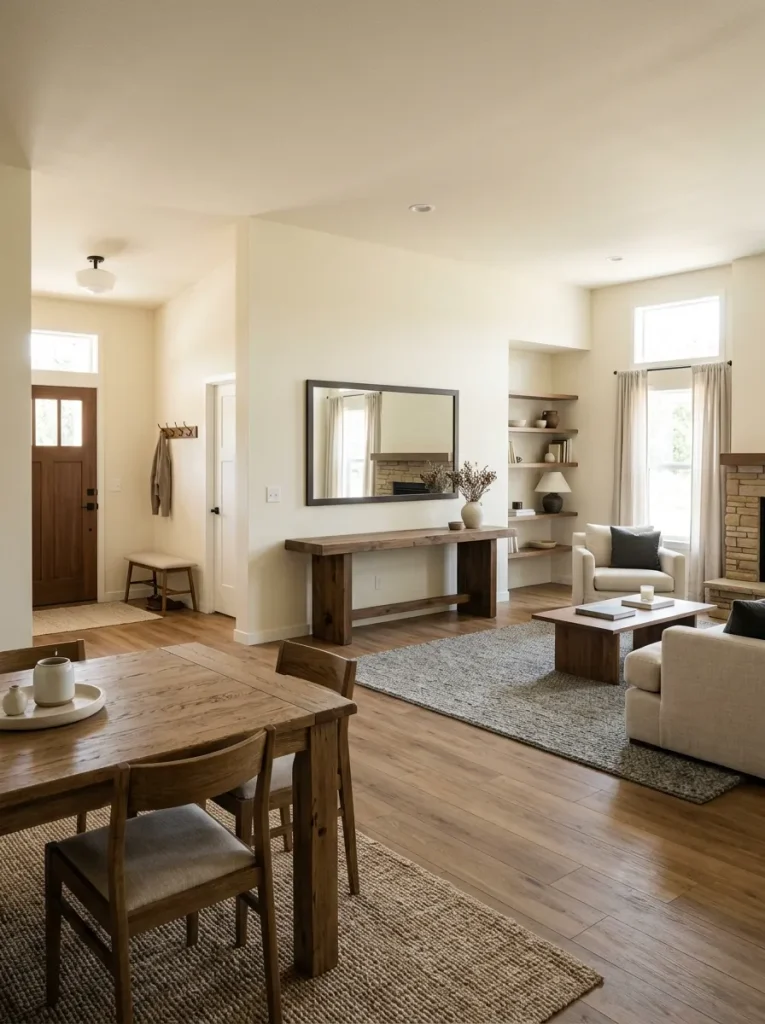
A large mirror visible from two connected rooms may have high visual reach. A quality lamp beside the sofa may improve both daytime styling and evening atmosphere. A tiny object for a shelf already containing eight objects has very little reach, even when it costs almost nothing.
Use this final gate.
That final branch matters because luxury-looking rooms are rarely memorable for the sheer number of things they contain. They are memorable because the pieces that remain appear to have a reason for being there.
A realistic budget becomes much easier to protect once “skip” counts as a successful decorating decision.
A Luxury-Looking Double Wide Is Built on Priorities, Not Price Tags
A more luxurious double wide does not require every finish, furnishing, or accessory to become expensive. It needs the strongest pieces to carry enough scale, material presence, and visual purpose that weaker details stop competing with them.
Start where one change can influence several views. Reuse what already has substance, spend selectively on pieces with real visual reach, and leave enough quiet space for those choices to register. When a purchase improves only one already-finished corner, let skipping it count as progress.
That is where a realistic budget becomes an advantage: it forces the room to become more intentional. And in a connected double-wide interior, intentional usually reads more expensive than simply having more.