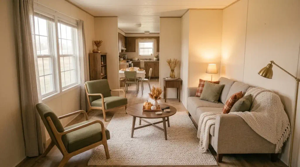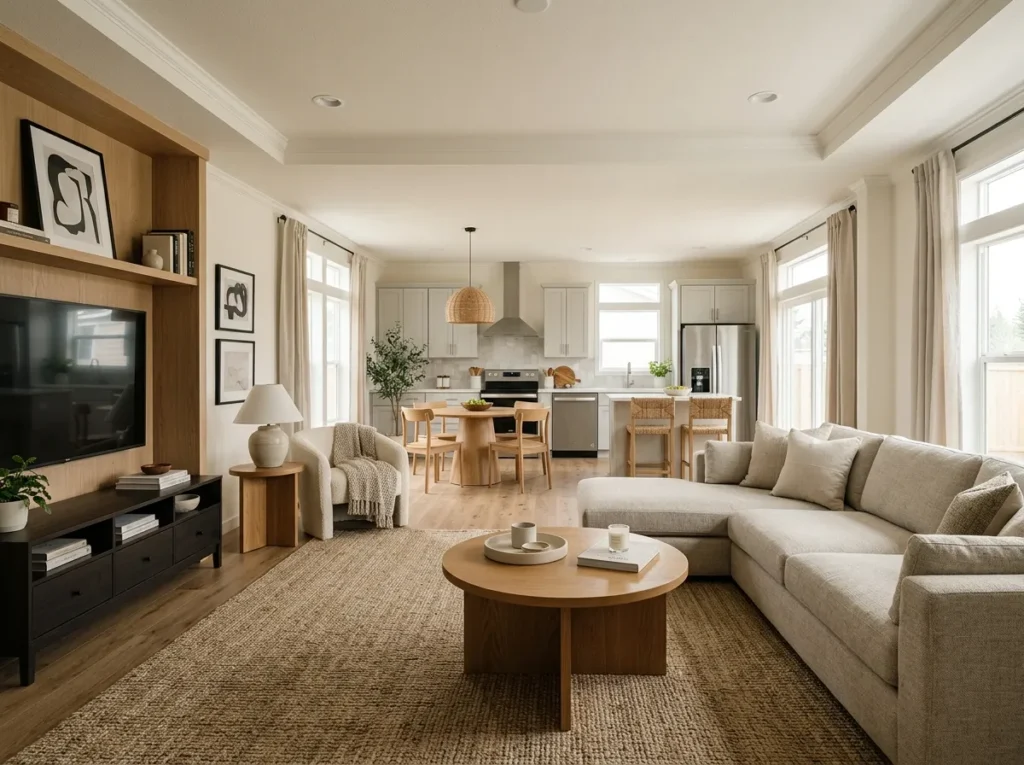
A double wide living room can have plenty of square footage and still feel oddly undefined. The challenge usually isn’t finding room for a sofa; it’s deciding where the living area visually begins, where it should stop, and how it should relate to the entry, dining space, kitchen, windows, and TV wall that remain visible around it.
The best double wide living room ideas work with those open relationships. A sectional needs to claim enough floor to feel grounded without spreading into another zone. A floating sofa needs to look intentional from behind. Even the coffee table can feel misplaced when it is centered on the room itself instead of the people actually using it.
The ideas below approach the living room as one recognizable zone inside a connected home. Start with its invisible boundary, then work inward through furniture orientation, sectional shape, entry organization, focal direction, storage, lighting, and the views you see from neighboring spaces.
1. Find the Living Room’s “Open Edge” Before You Center the Furniture
Walk into the common area and ignore the furniture for a moment. A double-wide living room often has one side that behaves like a proper boundary—a media wall, windows, or an exterior wall—and another side that seems to dissolve toward the kitchen, dining area, hall, or front entry. That disappearing side is the open edge.
Finding it changes how you arrange almost everything else. Furniture near the closed edges can carry more visual weight. The open edge needs enough breathing room that moving between connected zones still feels natural, yet it cannot be so empty that the living room appears unfinished.
A useful test is to mentally draw the living room as a shape on the floor. Where would you stop coloring without crossing into another activity? That border is more important than the geometric center of the entire open room.
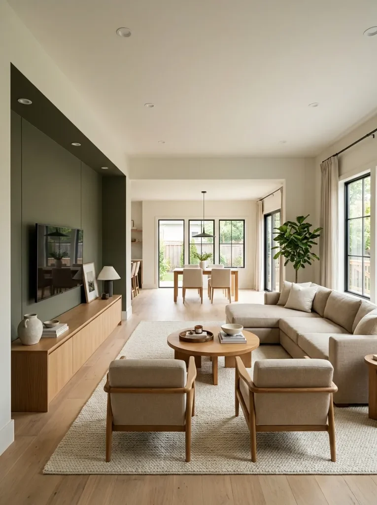
Open-Edge Atlas
Use the visual below to identify the condition that most closely matches your room.
Open-Edge Atlas
Where does your living room dissolve?
Choose the condition closest to your room. The recommendation changes with the number of visually open sides.
Protect that single transition.
Let the opposite wall carry the strongest visual weight. Keep the open side lighter so the living room feels complete without building a barrier across the connection.
Make the seating group do more of the zoning.
With two exposed edges, the sofa, rug and coffee table need to read as one tight composition. Avoid letting occasional furniture drift into both transitions.
Your room needs one unmistakable living-room signal.
Choose a strong focal wall or concentrated seating footprint before adding extra pieces. The biggest risk here is visual ambiguity, not lack of furniture.
Once the open edge is clear, furniture placement becomes less arbitrary. You are no longer asking, “Where does the sofa fit?” You are deciding which pieces belong inside the living zone and which ones begin to interfere with the rest of the open plan.
2. Choose the Sofa’s Facing Direction From the Best Shared View, Not the Longest Wall
A long uninterrupted wall can look like the obvious place for a sofa, especially in a wide manufactured-home living room. Yet the strongest furniture arrangement may face a completely different direction.
Stand in the kitchen, at the front door, and near the dining area. Notice which orientation gives the sofa a useful relationship with both the focal point and the connected rooms. A sofa that faces the TV perfectly but turns its back into the main arrival path can make the room feel more closed than its square footage suggests.
The decision becomes easier when you rank the views. Primary: what people seated in the living room should see. Secondary: what someone approaching from another zone sees. Third: whether the sofa leaves the open edge understandable.
For example, rotating a sofa ninety degrees may sacrifice some empty wall symmetry while giving the room a far clearer social relationship with the kitchen. In an open-concept double wide, that can be the stronger layout.
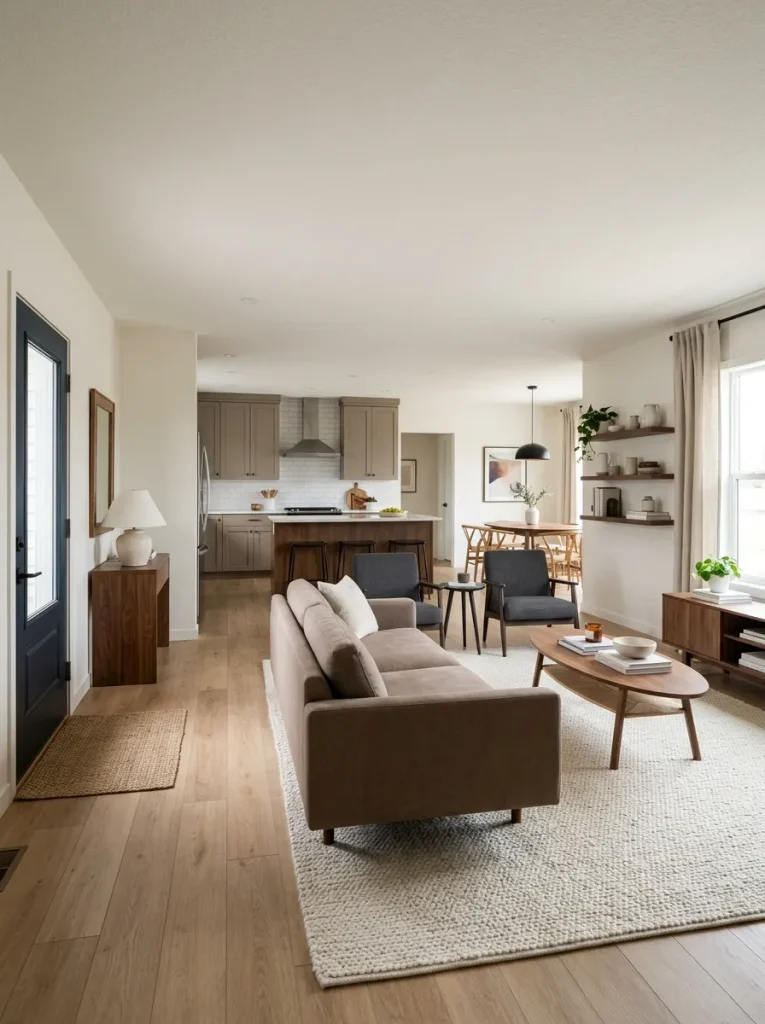
3. Use an L-Sectional Only When Both Legs Belong to the Living Zone
An L-sectional can be excellent in a double-wide because it forms a substantial conversation group without scattering several chairs across the floor. The problem appears when the second leg—the chaise or return—extends beyond the actual living-room footprint.
Before committing to the sectional, trace its complete L shape mentally on the floor. The main sofa run might fit beautifully while the chaise pushes into the dining transition, narrows the entry approach, or occupies the same visual territory used to move toward the kitchen.
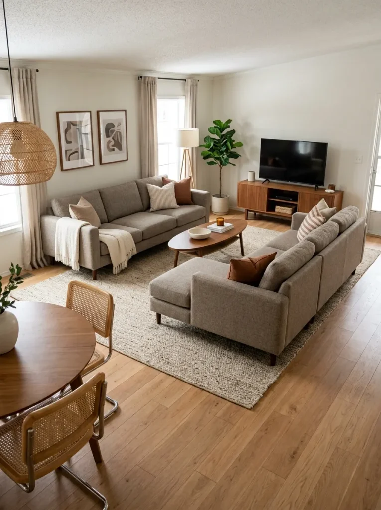
The shape passes the test when both legs describe the living area. When one leg behaves like a divider or obstacle, changing orientation—or choosing a shallower configuration—can improve the whole open room.
Sectional Footprint Gate
Sectional Footprint Gate
Judge the whole L, not the sofa half.
Select the relationship between the return/chaise and the edge of your living zone.
The sectional is doing useful zoning.
Both legs reinforce the same conversation area. Continue only after checking that surrounding tables and lamps stay inside the same footprint.
Test the opposite orientation.
The chaise is beginning to compete with the open edge. Rotating the L or choosing a shorter return may preserve the sectional without sacrificing the transition.
The footprint is bigger than the living zone.
A sofa plus movable chair, or a more compact sectional, is likely to give the room stronger definition because the current return is claiming floor needed by another activity.
The important distinction is capacity versus fit. A room may physically hold a huge sectional and still be better served by a smaller footprint once the adjacent dining, kitchen, or entry zone is considered.
4. Finish the Back of a Floating Sofa for the View From the Kitchen or Dining Room
Open-concept furniture has a front and a public backside.
When a sofa floats near the middle of a double-wide living room, someone standing in the kitchen may see more upholstery back than cushions. That view becomes part of the room’s composition, so inspect it from the connected space before deciding that the seating arrangement is finished.
A clean, low sofa back may need nothing. Another layout may benefit from a narrow console that gives the eye a purposeful horizontal line and provides a place for a lamp, tray, or closed basket. The console only earns its footprint when it improves the reverse view and serves a practical job.
There is also a useful stop point: avoid decorating the entire sofa back simply because it is visible. One confident element usually reads more deliberately across a long sightline than a row of small objects.
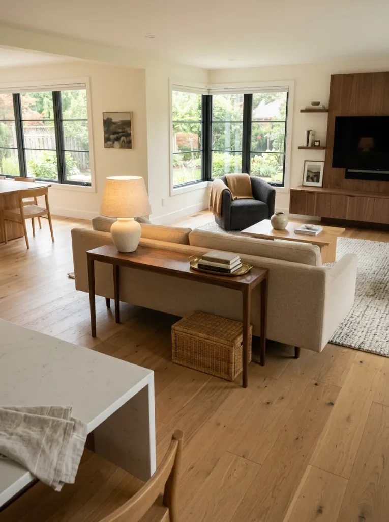
Reverse-view check: stand where you normally prepare food or approach from the dining area. If the first thing you notice is the back of the sofa rather than a composed living area beyond it, edit that elevation.
5. Build an Entry Landing When the Front Door Opens Straight Into the Living Room
Many double-wide layouts do not give the entry its own separate foyer. The door opens, and the living room begins almost immediately.
Treat that condition as an arrival sequence, not as a missing room. The first task is to give keys, shoes, bags, coats, or mail a logical place before those items travel onto the sofa and coffee table. The second is to keep that landing visually shallow enough that it does not consume the living-room edge.
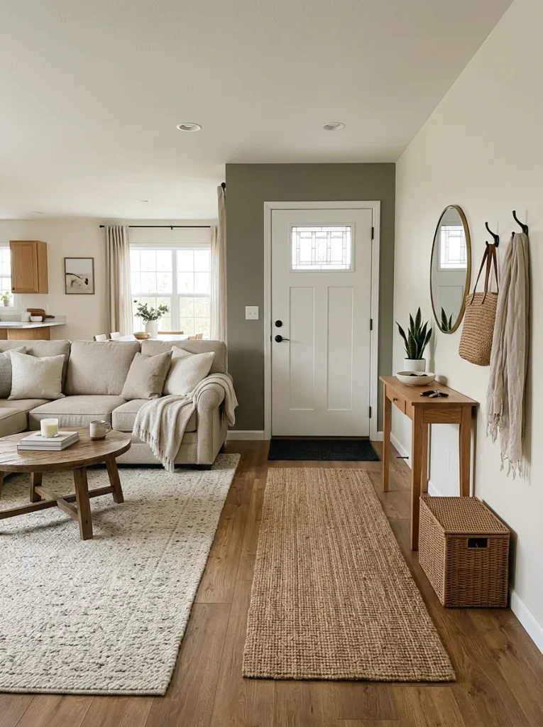
A wall beside the door may suit a slim console and mirror. A slightly wider pocket can support a bench or closed shoe storage. When there is barely any usable wall, a runner, hooks, and one compact landing surface can still make the arrival legible.
The furniture should follow the available edge. Don’t force a full foyer setup into an area whose main responsibility is still circulation.
Entry–Living Buffer Strip
Entry–Living Buffer Strip
Build only as much “foyer” as the edge can carry.
The strongest version does not pretend the home has an architectural foyer. It gives the arrival moment enough organization to function, then lets the living room remain visually dominant.
6. Put a Swivel Chair at the Social Corner Between Living and Kitchen
Picture two versions of the same open double-wide living room.
In the first, an accent chair is locked toward the television. It completes the seating arrangement visually, but anyone sitting there has to turn awkwardly to join a conversation happening near the kitchen.
In the second, that same corner uses a swivel chair. During movie time it faces inward. When someone is cooking, entertaining, or talking across the open edge, the chair can rotate toward that activity without moving across the floor.
That flexibility matters most at the social corner—the point where the living room visually meets the kitchen or dining area. A swivel chair there acts almost like a hinge between the two zones.
Choose one only when the rotation itself has room to happen. A chair that can technically spin but repeatedly bumps a side table, sectional, wall, or walking route is solving the wrong problem.
Use a swivel chair when: the seat needs to participate in two meaningful directions.
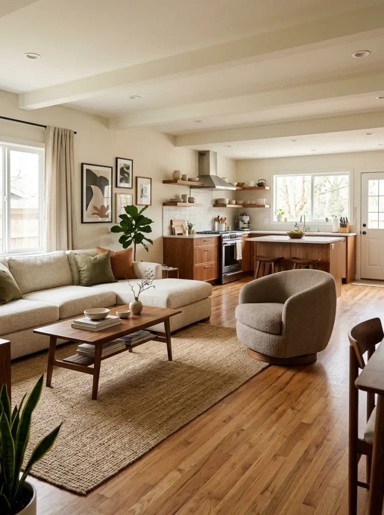
Keep a fixed chair when: the corner has one dominant view and rotation would consume useful circulation space.
The decision is therefore less about furniture style and more about whether that particular seat needs one job or two.
7. Center the Coffee Table on the Conversation Group, Not the Open Room
Open plans create misleading centers.
A coffee table placed at the mathematical midpoint of a large double-wide common area can look beautifully symmetrical from above while sitting noticeably too far from the sofa and chairs that actually use it.
Start from the seating group.
Look at the sofa, sectional, and accent chairs as one functional cluster. The coffee table belongs near the visual center of that cluster, even when this places it off-center relative to the ceiling, walls, or overall width of the common room.
Quick placement test
Sit in each primary seat and ask:
- Does the table feel visually connected to the people using it?
- Does one side have a large empty gap while another feels crowded?
- Has the table drifted toward the kitchen or dining zone simply because there is unused floor there?
- Does its shape echo the seating arrangement?
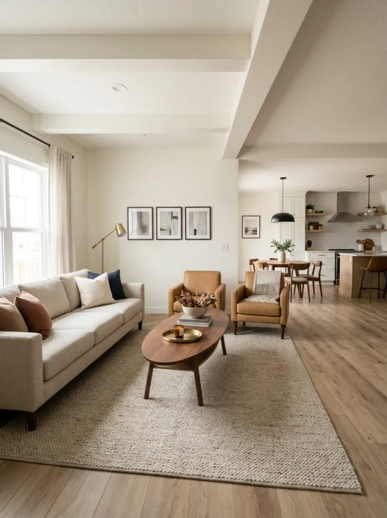
A long sectional may suit an elongated rectangular or oval table. A tighter conversation group often benefits from a rounder center because it relates more evenly to several seats.
The useful stopping point is easy to recognize: once the coffee table makes the seating group read as one composition, stop trying to center it against the larger room.
8. Keep Side Tables and Floor Lamps Inside the Living-Room Footprint
The sofa may establish a clear living area, yet small pieces can quietly undo that definition.
Imagine the outer edge of your seating arrangement as a soft boundary. Side tables, floor lamps, baskets, drink tables, and plant stands should usually sit inside or directly on that boundary, not wander progressively farther into the open connection.
A common example is a floor lamp placed beside the open end of a sectional. If the lamp extends well beyond the seating footprint, then a basket sits beside the lamp and a plant goes beside the basket, the living room can begin spreading toward the dining room one accessory at a time.
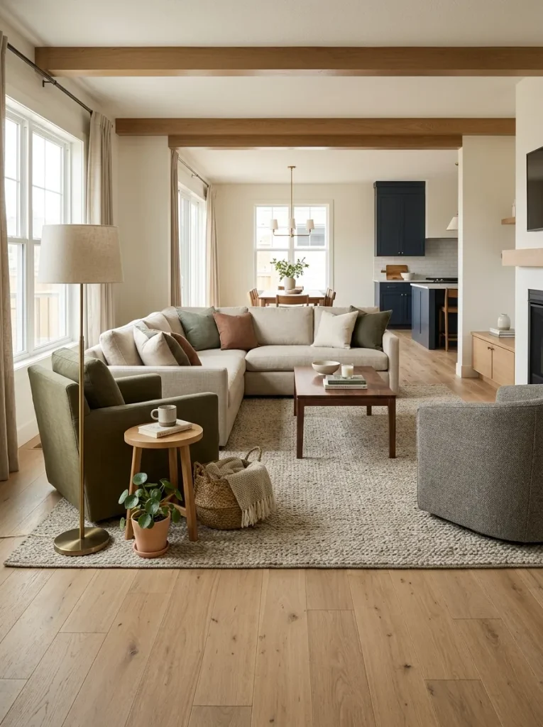
Boundary checklist
Before adding another small piece, check whether it:
- serves a specific seat or living-room activity;
- stays visually attached to the seating composition;
- preserves the clearest transition toward the next room;
- duplicates a function that another nearby piece already provides.
One deliberate object may cross the visual boundary successfully—a sculptural plant, for example, can soften a transition. A collection of unrelated small pieces usually makes the edge harder to read.
So when an open-concept living room feels cluttered even though none of the individual furnishings seems large, inspect its outermost accessories first.
9. Let the Rug Mark the Living Zone Without Taking Over the Shared Edge
A rug is one of the easiest ways to make an open double-wide living room read as a distinct zone, but its job here is more specific than simply “buy a large rug.”
Think of the rug as a soft floor boundary.
Its shape should reinforce the seating arrangement enough that the sofa, chairs, and coffee table feel connected. At the open side of the room, however, the rug should not visually annex so much floor that the transition toward the kitchen, dining area, or entry becomes part of the living composition.
That distinction is especially useful when a double wide has continuous flooring across several spaces. The rug supplies the missing visual break without adding a physical divider.
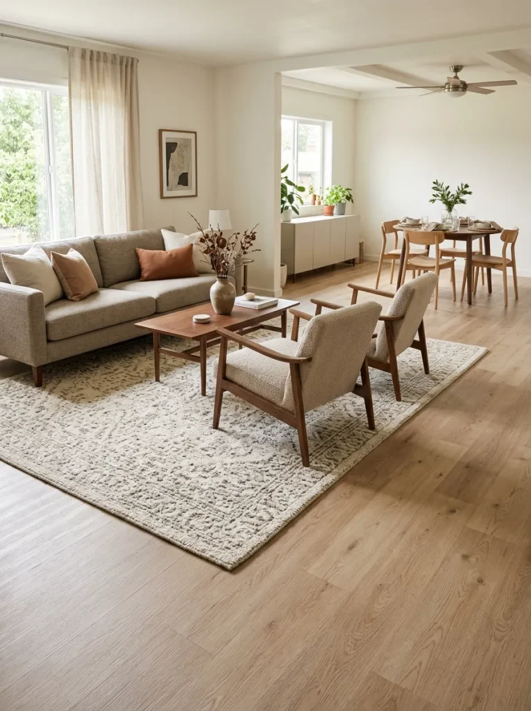
A good test is to view the room from the connected space. Can you tell where the living area is almost instantly? If yes, the rug is helping. If it appears to stretch into the neighboring activity zone, its orientation or size may be working against the layout.
For broader guidance on coordinating rugs with furniture scale and the rest of a double-wide interior, see our double wide decorating ideas.
Exception: when a very large sectional already creates an unmistakable footprint, the rug can play a quieter supporting role. It does not need to become the room’s strongest zoning device.
10. Make the Media Wall the Closed Edge So the Rest of the Living Room Can Stay Open
An open living room becomes easier to organize when one surface is allowed to feel decisively finished.
The media wall is often the best candidate because the television already attracts attention. A substantial console, restrained wall composition, fireplace surround, or architectural treatment can turn that surface into the living room’s closed edge while the opposite side remains visually open toward the rest of the home.
The strongest wall is not automatically the largest wall. It is the one that can carry visual weight without forcing furniture across an important connection.
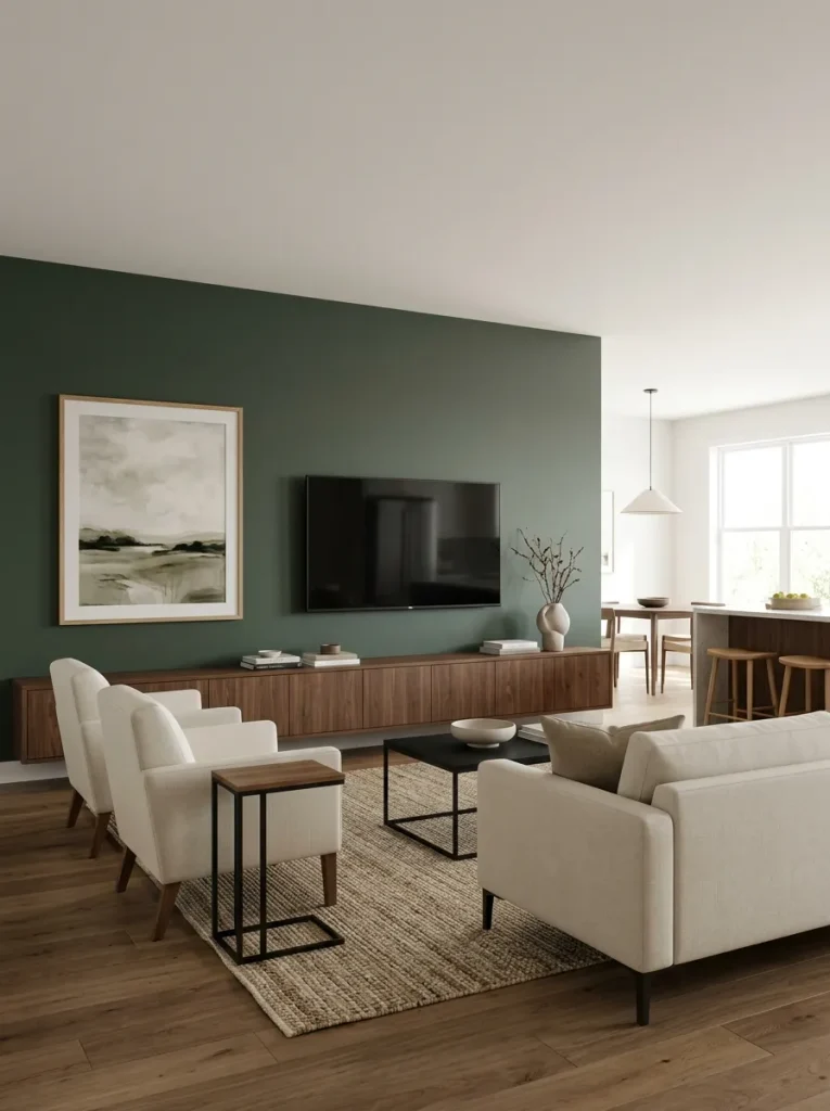
Before adding décor, compare the three common conditions below.
Closed-Edge Media Lab
Closed-Edge Media Lab
Which wall can carry the room?
Select the condition closest to your media wall. Each one calls for a different level of visual weight.
Let this wall become the visual stop.
A clear wall can carry a substantial media composition because it does not compete with a doorway or major transition.
Build one confident horizontal or architectural composition, then keep the open side calmer.The media wall needs presence without visual congestion.
When doors or passages interrupt the elevation, use fewer elements and keep the composition concentrated around the screen.
Avoid expanding décor into every remaining wall fragment; the openings already create visual activity.Choose what should win before adding anything.
If a fireplace, television, window wall, and adjacent opening all compete, adding more décor usually increases confusion.
Pick one primary focal surface; let the others support it instead of demanding equal attention.A plain television wall does not have to become a full renovation project. Often the improvement comes from hierarchy: a low console, one coherent wall treatment, or a restrained grouping can create enough visual closure.
If you want to take that surface further with trim, built-in-looking details, or stronger architectural character, explore these modern double wide interior ideas.
Once the media wall becomes a dependable visual anchor, the remaining sides of the living room no longer need to work so hard. The open side can stay open.
11. Use the Ceiling Fixture to Confirm the Seating Center, Not the Whole Open-Room Center
Look up before moving another piece of furniture.
In many double-wide living rooms, a ceiling fan, chandelier, or central light becomes one of the strongest overhead reference points. The useful question is whether that fixture visually belongs to the living-room seating group or merely sits near the geometric center of the larger open space.
If the fixture already aligns reasonably well with the sofa, rug, and coffee table, let those elements reinforce its axis. The living zone will feel more settled because the floor arrangement and ceiling plane appear to agree.
A fixture that lands awkwardly between the living and dining areas does not require you to drag the furniture underneath it. Treat it as an existing architectural condition and establish the living-room center more clearly with the rug, coffee table, lamps, and seating.
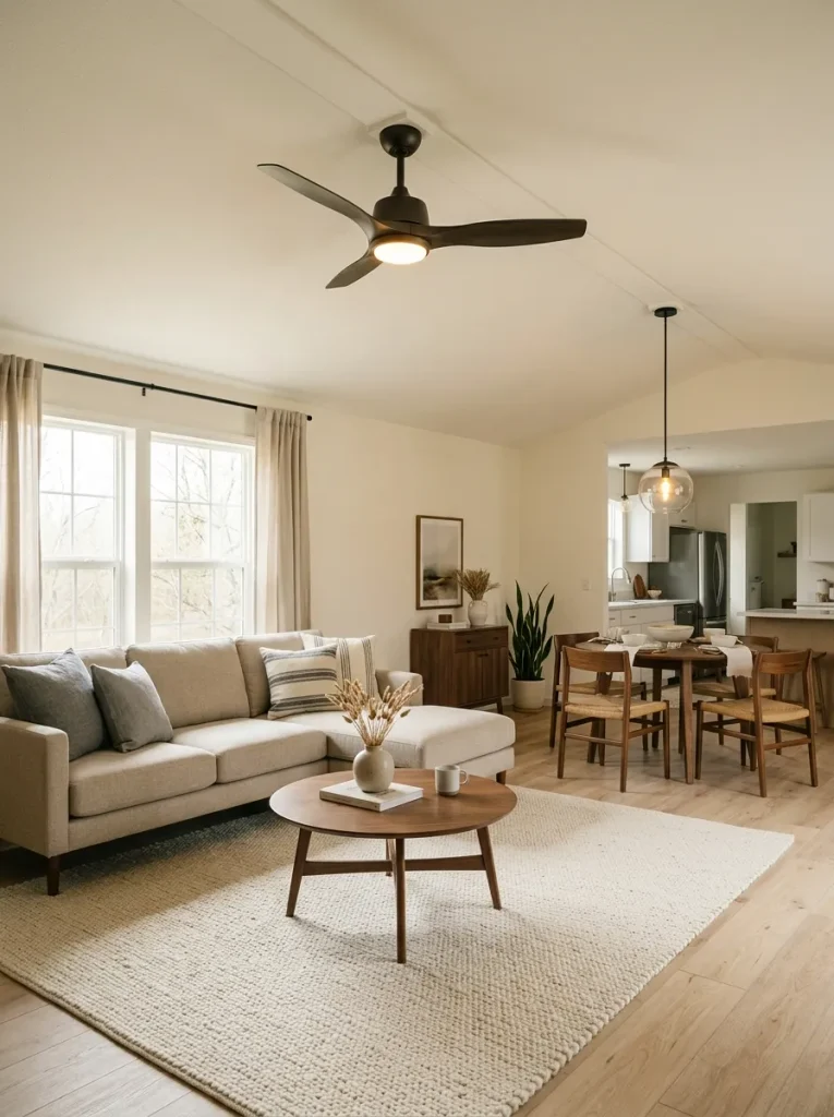
Read it this way:
Fixture over seating zone → reinforce the alignment.
Fixture between zones → let furniture establish the stronger center.
Multiple ceiling fixtures → identify which one visually belongs to each activity.
This section is about reading existing lighting placement; any electrical relocation would be a separate project.
12. Build a Low-to-High Furniture Gradient From the Open Side to the Closed Wall
Imagine looking from the dining area across the living room.
If the first objects you encounter are a tall bookcase, oversized floor lamp, large plant, high-backed chair, and stacked décor, the living room can feel visually barricaded even when the walking route remains technically clear.
Reverse the hierarchy.
Keep furniture nearest the open edge comparatively low: an ottoman, streamlined chair, low sofa back, small table, or restrained plant. Allow greater height as the eye moves toward the more solid perimeter of the room, where a media unit, tall plant, shelving, art composition, or architectural feature can carry more weight.
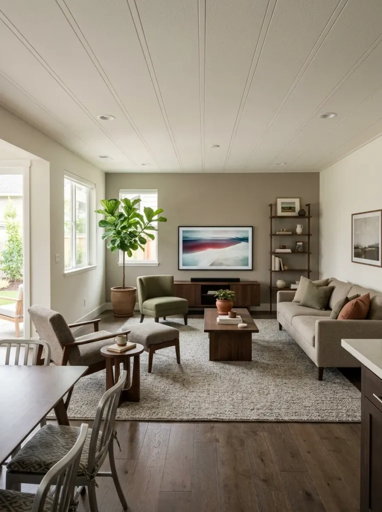
The arrangement creates a simple visual progression:
Open connection → lower mass → main seating → stronger vertical anchor
This does not mean every object must rise in a perfect staircase. The principle is about where visual weight accumulates.
There is one important exception. If a tall existing architectural element already defines the transition beautifully—a column, partial wall, built-in, or substantial opening trim—additional low-to-high staging may be unnecessary. Let the architecture do the separating.
The decision changes from “Where can this tall piece fit?” to “Which side of the living room can visually afford its height?”
13. Let the Living-Room Windows Establish Their Own Curtain Rhythm
Open-concept rooms often share one continuous wall of windows, yet every window does not need to be treated as one enormous composition.
Start by identifying which windows visually belong to the living room when you are sitting on the sofa. Those openings can form their own window rhythm through matching curtain height, fabric weight, and repeated vertical lines.
Consider three common situations:
A pair of living-room windows: treat them as a coordinated set so the seating zone gains a clear backdrop.
Living and dining windows on the same wall: keep enough visual relationship between them that the wall feels coherent, but allow the living-room grouping to correspond more closely with the sofa and rug.
One dominant living-room window: let it provide the room’s soft vertical frame instead of surrounding it with several unrelated treatments.
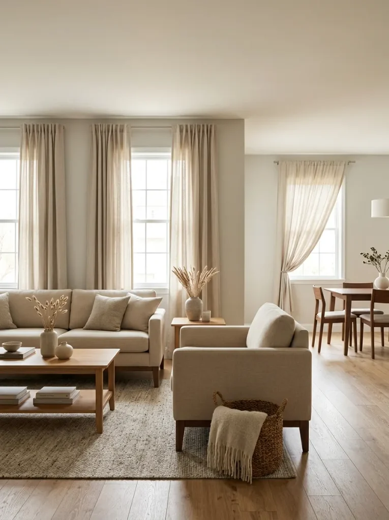
Light changes the decision too. Heavy curtains across every connected window can make a broad double-wide interior feel more enclosed, while extremely fragmented treatments may create visual noise.
The useful aim is a recognizable living-room window field that still participates in the larger architecture.
14. Put Closed Storage on the Service Edge Nearest the Entry or Dining Area
Where does living-room clutter actually come from?
For many households, it enters from a predictable direction: shoes and bags arrive through the front door, mail lands near the entry, children’s items migrate from another room, or serving pieces collect near the dining area.
That makes storage location more important than storage quantity.
Trace the clutter route
Follow one ordinary item through the room.
Bag: front door → sofa arm → floor.
Mail: entry → coffee table → pile.
Extra dining items: table → living-room surface → nowhere permanent.
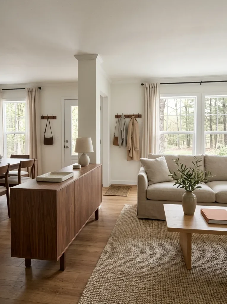
Now intercept that route earlier.
A closed cabinet near the entry can absorb visual clutter before it reaches the main seating group. Storage closer to the dining edge may work better for games, serving pieces, or household items used between both zones. A media console can handle electronics but may be a poor destination for everything else simply because it has doors.
In an open double-wide living room, this placement also affects appearance. The scenic edge—the view that connects toward another attractive room—usually benefits from staying lighter. A service edge can carry more functional furniture without weakening that sightline.
Decision rule: put storage close to the source of recurring clutter, then keep the most visually important open connection comparatively calm.
15. Create One Calm Living-Room Backdrop for the View From the Kitchen
Turn away from the living room and stand where you normally spend time in the kitchen. Then look back.
From this position, several living-room elements may collapse into one frame: the sofa, television, wall art, curtains, lamps, plants, pillows, shelving, and perhaps part of the entry. Individually they may all look attractive. Together they can become visually competitive.
The room benefits from one calm backdrop that gives this long view somewhere to settle.
That backdrop might be:
- a well-composed media wall;
- a broad sofa wall with one substantial art arrangement;
- a window wall with consistent curtain treatment;
- a quiet painted surface behind the principal seating;
- a low console with restrained styling.
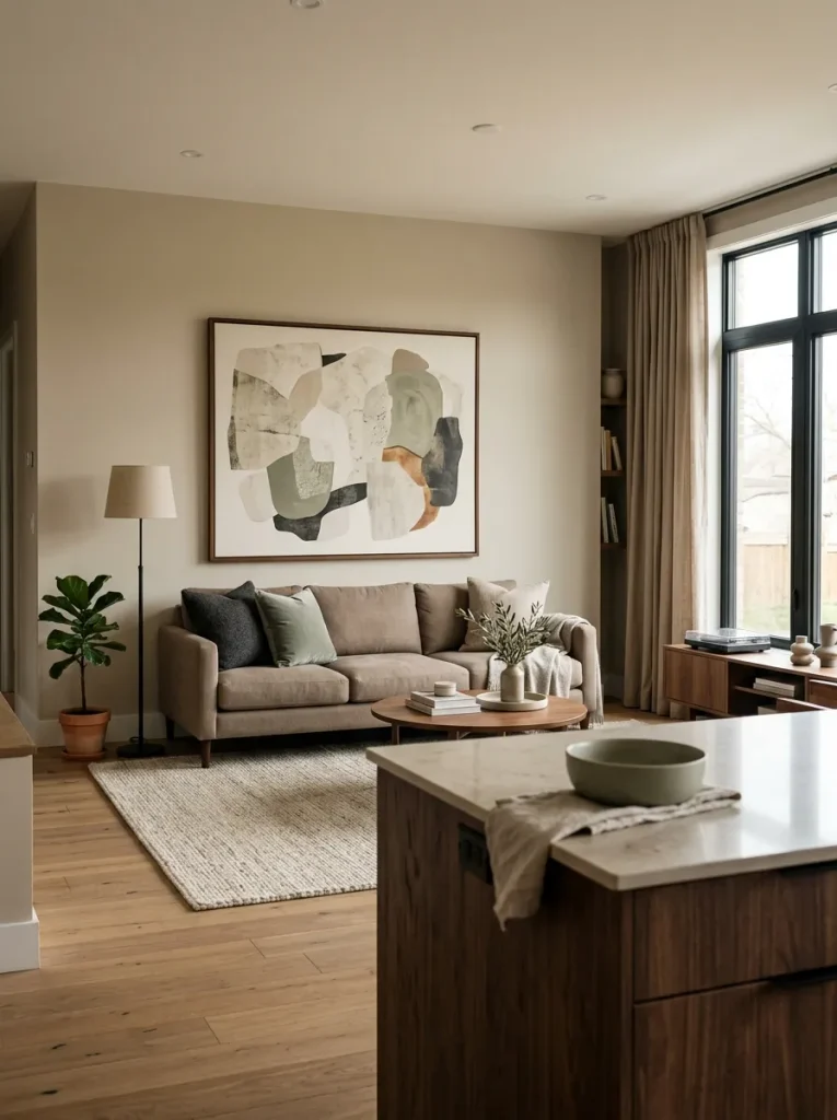
Choose the surface that is seen most clearly from the connected kitchen or dining zone. Give it a stronger visual hierarchy, then allow nearby surfaces to become supporting players.
A useful editing exercise is to photograph the room from the kitchen. If your eye jumps among five unrelated focal points, remove or simplify one before adding anything new.
The room is finished from this viewpoint when you can recognize one leading composition, a few supporting details, and enough visual pause between them.
16. Test the Living Room From Three Real-Life Viewpoints Before Calling the Layout Finished
A furniture arrangement can look convincing from the angle where you planned it and still feel unresolved from everywhere else.
An open-concept double-wide living room is usually seen from at least three important positions: the entry, the kitchen or dining area, and the seating itself. Each viewpoint asks a different question.
From the entry, the living zone should be recognizable without furniture appearing to barricade the room. From the kitchen or dining area, the back of the sofa and the main focal wall become part of the composition. Once seated, the coffee table, rug, lighting, and media wall need to feel centered around the people using them—not around the surrounding open floor.
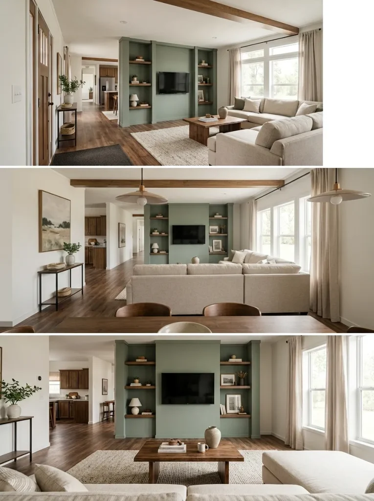
This is a visual-composition test, not a full circulation audit. You are checking whether the living room keeps its identity as the viewing position changes.
Three-Viewpoint Composer
Three-Viewpoint Composer
Does the living room survive a change of viewpoint?
Recognition comes first.
The reverse elevation matters.
The room should contract around use.
A room that passes all three views is usually far more resolved than one optimized for a single photograph.
If the problem you uncover is people colliding, chair pullout, kitchen access, or cross-house movement, that has moved beyond visual composition into circulation. Continue with our double wide open concept ideas for better flow for a deeper route-planning framework.
17. Give the Living Room Its Own Evening Light Scene While Connected Zones Go Quieter
Open-concept spaces change character after sunset.
During the day, windows can visually organize a wide double-wide interior. At night, those same windows become dark surfaces, and one bright overhead layer can make the living room, kitchen, dining area, and circulation space feel equally prominent.
Give the occupied living zone a more deliberate light hierarchy.
The exact balance depends on what the room is doing. Conversation needs flattering ambient light around people. Television viewing benefits from softer light away from the screen. Reading needs a stronger local task source without turning the entire connected floor plan equally bright.
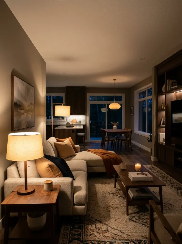
The surrounding kitchen and dining areas do not have to disappear. They simply do not need to compete visually when they are inactive.
Evening Living-Zone Sequencer
Evening Living-Zone Sequencer
Choose what the living room is doing after dark.
Keep attention around people.
Use the most inviting ambient sources around the seating group. Leave enough practical light for movement while inactive kitchen or dining surfaces become visually quieter.
Reduce competition around the media wall.
Favor softer sources beside or behind the seating area and keep direct visual glare away from the screen. Connected spaces can remain functional without becoming equally prominent.
Concentrate light where the activity happens.
Let one useful reading source establish the occupied corner, then retain softer ambient light through the rest of the living room so the seat does not feel isolated.
This stays within lighting-composition territory; it does not prescribe electrical alterations.
For a deeper whole-room approach to making a large double-wide feel warmer and more comfortable after sunset, continue with our double wide interior ideas for making large rooms feel cozy.
Conclusion
The strongest double wide living room ideas do not try to make an open-concept home behave like a collection of closed rooms. They give the living area enough identity to feel settled while preserving the openness that makes a double wide so flexible.
If you change only one thing, start by identifying the living room’s open edge and strongest visual anchor. Those two decisions make furniture, rugs, storage, and lighting much easier to judge.
Then walk away from the sofa and look back from the entry, kitchen, and dining area. A successful living room should still read clearly from every connected space—and feel even better once you sit down.