
Beautiful homes, made practical. Discover our approach

Stylish Galore

Single Wide Interior Design

21 Single Wide Interior Ideas That Make a Narrow Home Feel Bigger

A single wide can have enough square footage for comfortable everyday living and still feel tighter than it really is. The problem…

Alex Will
Written byAlex Will
22 min read August 26, 2026
Start Reading
21 Single Wide Interior Ideas That Make a Narrow Home Feel Bigger
Curated inspiration Beautiful ideas, made practical.
Smart styling
Real homes
Better living
Reading tools Adjust the article to suit you

A single wide can have enough square footage for comfortable everyday living and still feel tighter than it really is. The problem is often not size alone. It is how the eye experiences that size: a flooring break here, a bulky furniture edge there, several little rugs, disconnected windows, or too many decorative stops along one long view.

The strongest single wide interior ideas work with the home’s distinctive narrow footprint instead of treating every room like a conventional square space.
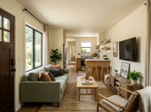
That means some of the biggest changes come from continuity. A floor that keeps moving, a calm ceiling, furniture that reveals more surrounding space, and a focal point positioned deeper in the home can change how the entire interior reads.

You also do not need to strip away warmth, color, texture, or personality.

The real objective is to remove the visual interruptions that exaggerate narrowness while keeping the home comfortable, practical, and unmistakably yours.
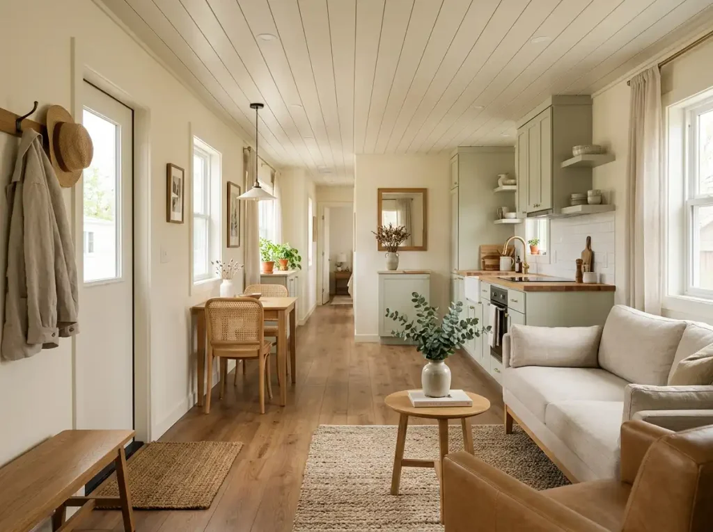
Long view through a single-wide living, dining, and kitchen interior with continuous flooring and a connected neutral palette.
Treating the single wide as one connected visual sequence allows flooring, furniture, color, and focal points to reinforce its length instead of dividing it into smaller-looking rooms.

1. Carry One Flooring Tone Through the Long View

Think of the floor as the visual surface that stitches your rooms together.

Stand where you can see through the living area toward the dining space, kitchen, hallway, or entry. Ignore the furniture for a moment and follow only the flooring.

Every abrupt material or color change creates a visual checkpoint.

One transition is rarely a problem. Several strong transitions across the same sightline can make the home feel like a series of smaller compartments.
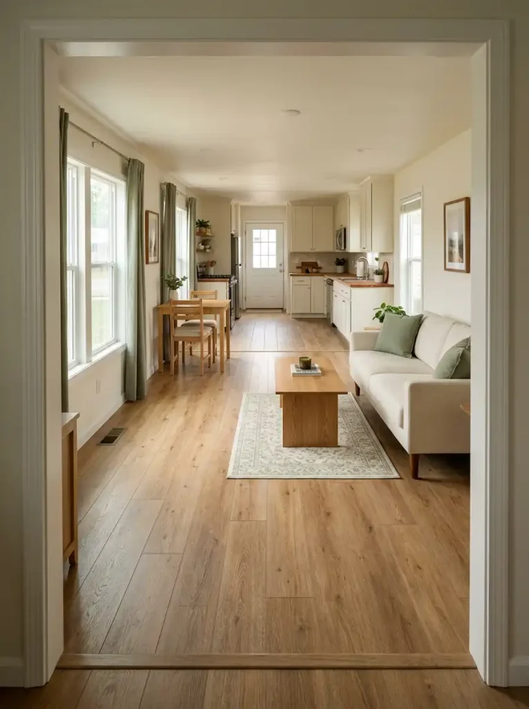
Single-wide interior with a warm flooring tone continuing through the living, dining, and kitchen areas.
A related flooring tone across connected zones reduces visual stop points and lets the home’s longest view read more continuously.

The useful distinction

You do not need identical flooring everywhere.

You need enough tonal relationship that the eye can continue.

Warm medium oak can transition naturally into another warm wood. Quiet greige plank can coexist with similarly muted tile. Existing flooring may even look more continuous when an unnecessary mat stops hiding the connection.

Try this first

Identify the most obvious break along your home’s longest view.

Change nothing else.

If removing a rug, simplifying a threshold, or visually connecting the two sides makes the view travel farther, you have found a high-impact improvement without redesigning the room.

2. Let One Runner or Rug Follow the Home’s Long Axis

Rug placement has direction.

That direction can reinforce the length already available—or keep reminding you how narrow the opposite dimension is.
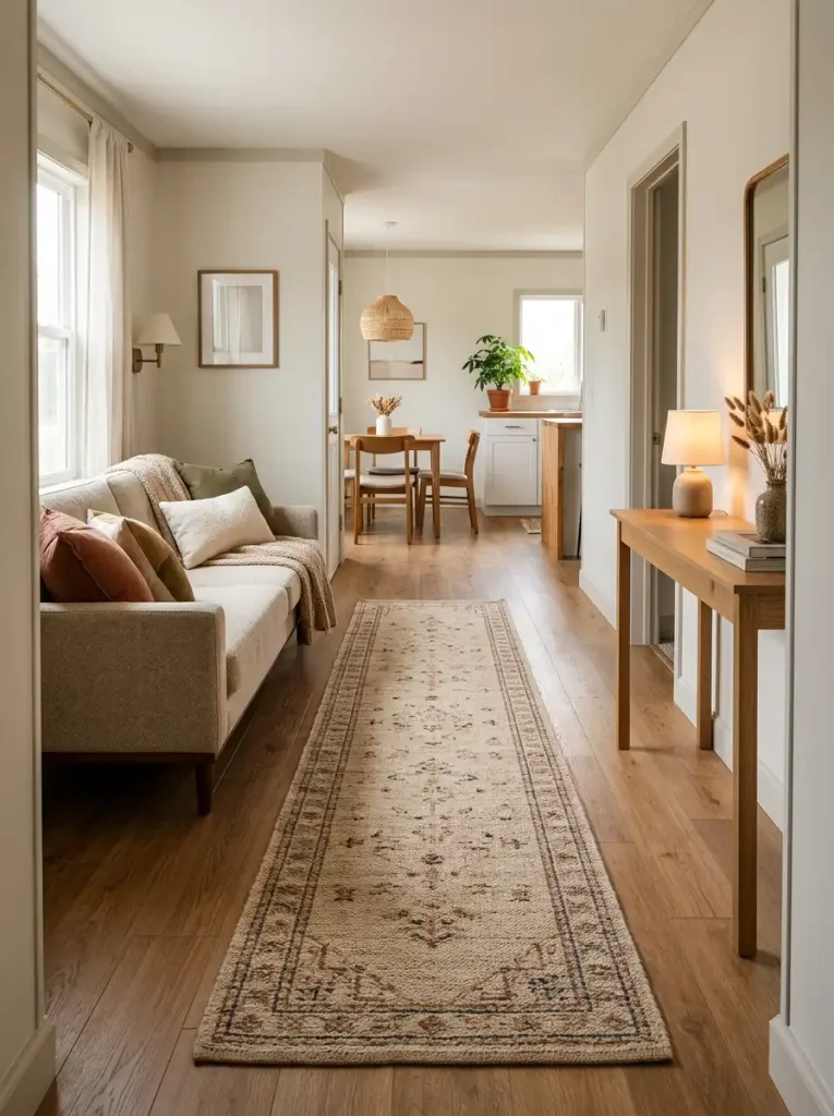
Long runner aligned with the length of a narrow single-wide living area.
A runner following the home’s strongest direction encourages the eye to travel deeper instead of repeatedly emphasizing the shorter cross-section.

Use the spatial console below. Open the route closest to your room. Each route produces a different recommendation.

Floor Direction Simulator Open your floor condition
Is your rug guiding the eye—or interrupting the route? Choose the pattern closest to your room. One path tests orientation; the other diagnoses fragmentation.
Route 02 · Cross-axis Rug cuts across the narrow dimension Test whether the orientation is emphasizing width instead of depth.
Orientation result Run a 90° rotation test. TEST FIRST
Current CROSSWISE
The rug creates a strong horizontal stop across the room.
Rotation test LONG AXIS
The rotated version encourages the eye to travel farther into the space.
What to compare Doorway view
Compare how far your eye travels before it hits the rug as a visual boundary.
Next move Rotate before you replace. Test both orientations from the entrance. Keep the crosswise version only if its zoning benefit is stronger than the visual interruption.
Route 03 · Fragmented path Several small rugs interrupt the route The eye keeps restarting instead of traveling continuously.
Fragmentation scan Too many visual restarts detected.
Current floor sequence 4 visual stops
Each tall block represents another textile interruption that causes the floor to read as separate sections.
Target condition FEWER STOPS
A stronger single textile—or no textile at all in one section—can allow more of the floor plane to stay visually connected.
01 Remove least useful rug 02 Recheck long view 03 Consolidate only if needed
Purchase status Do not buy yet. EDIT FIRST
Best next move Remove the least useful rug first. If the long floor suddenly feels calmer, you have confirmed fragmentation as the real problem.
Direction rule First decide whether the problem is orientation or fragmentation. A rug that needs rotating requires a different solution from a floor containing too many separate textiles.

Try rearranging the textile before treating the problem as a reason to shop.

The floor itself will tell you whether the change worked.

3. Join Nearby Windows With One Continuous Curtain Line

The fragmented version

Two modest windows sit on one wall.

Each has its own compact curtain arrangement.

Your eye reads:

WINDOW → WALL → WINDOW

Three visual units.

The wider-looking version

Treat the whole stretch as one composition.

A longer, visually continuous curtain line encourages the eye to register the width of the complete treatment before separating the individual openings.
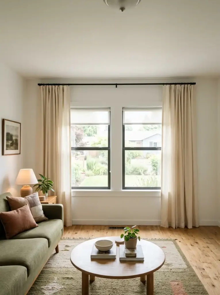
Two nearby living-room windows unified by one continuous curtain treatment.
Connecting neighboring windows into one wall composition can make the opening feel broader than treating every window as a separate decorative unit.

This is especially useful where a single-wide living room has several relatively narrow windows along one exterior wall.

Keep fabric fullness controlled. You want vertical softness and visual width without creating a large mass of textile.

If the curtains already coordinate, you may not need replacements.

Try moving more fabric toward the outer edges and compare the wall again.

The goal is not simply “hang curtains higher.”

It is to make several smaller openings behave like one wider architectural feature.

4. Keep the Ceiling Plane Light and Unbroken

Look upward before adding another piece of décor.

Your ceiling may be affecting spaciousness more than you realize.

Run three checks

COLOR
Does the upper plane stay consistent, or do several strong colors divide it?

DIRECTION
If there is planking, beadboard, or paneling, does it continue in a coherent direction?

INTERRUPTION
How many fixtures, beams, vents, decorative pieces, and contrasting details compete overhead?

A single wide already has a strong linear shape.
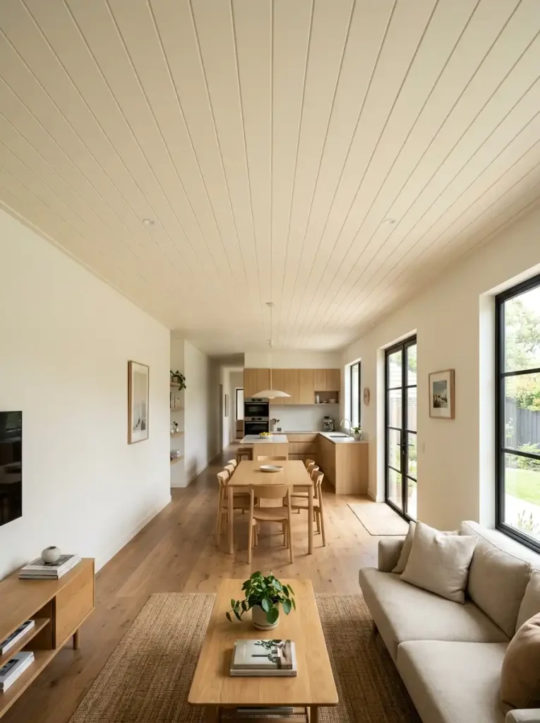
Long single-wide interior with a light, visually continuous ceiling spanning connected rooms.
Keeping the upper plane coherent prevents the ceiling from visually dividing an already narrow home into shorter sections.

A relatively quiet ceiling allows that length to continue visually.

White is an obvious solution, but not the only one.

Warm cream, pale greige, soft washed wood, or subtle painted planking can all work when the surface remains coherent.

Texture is not the enemy.

Fragmentation is.

If you notice several unrelated ceiling features before you notice the room beneath them, start by quieting the weakest one.

5. Put the Strongest Focal Point at the Far End of the Room

Picture entering your home.

Your eye catches a decorated side wall.

Then a cabinet.

Then the television.

Then another shelf.

Then finally the end wall.

That is a sequence of visual stops.

Now simplify it:

ENTRY → QUIETER EDGES → CLEAR DESTINATION
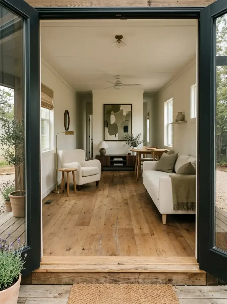
Single-wide entry view leading toward one clear focal point at the far end.
A strong destination deeper inside the home encourages the eye to experience the available length before focusing on its limited width.

The destination can be a media wall, a substantial artwork, an attractive window, a fireplace feature, or a low console with a deliberate composition.

It does not need to be louder than everything else.

It needs to be clearer.

Test the focal point from the front door rather than only from the sofa.

Ask:

Where does my eye currently stop?

Then:

Where would I rather it travel?

A strong destination deeper inside the home encourages the viewer to experience the available length before becoming conscious of the narrow width.

6. Reveal More Floor With Leggy, Lower-Profile Furniture

Two pieces can occupy almost identical footprints and still feel completely different.

Imagine:

Chair A
Thick arms
Solid upholstered base
Little floor visible beneath it

Chair B
Open legs
Lighter frame
Floor visible around and below the seat

On paper, the difference may look insignificant.

Inside a narrow room, it can change the visual weight dramatically.
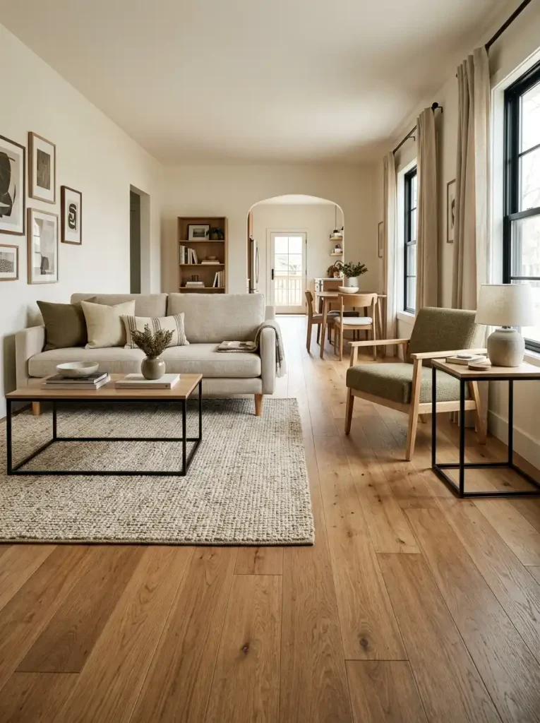
Single-wide living room with raised furniture revealing more continuous floor around the seating area.
Visible floor beneath and between major pieces helps substantial furniture feel contained within the room rather than spanning it from edge to edge.

You do not need all-light furniture

A comfortable substantial sofa can stay.

Balance it with lighter supporting forms:

  • an open coffee-table base,
  • a raised accent chair,
  • a slim side table,
  • fewer objects touching the floor,
  • or additional visible floor around its edges.

The objective is to help furniture look like it sits within the room instead of forming one continuous block across it.

7. Use One Room-Scale Rug Instead of Several Small Mats

A rug can float.

It can almost connect.
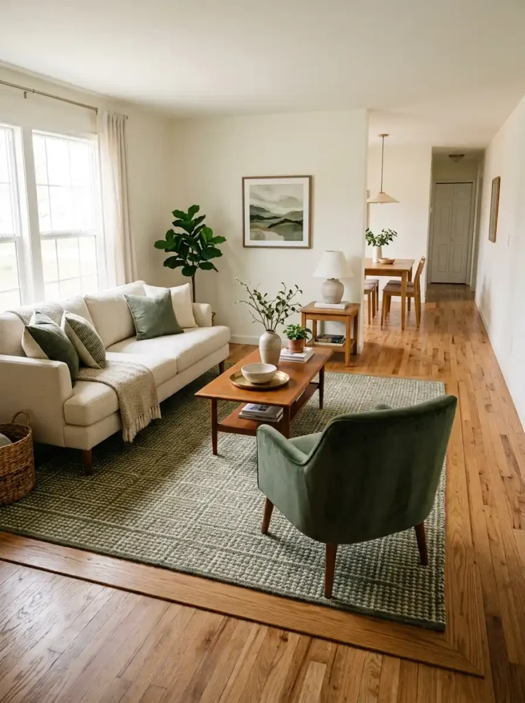
Single large rug connecting the main seating pieces while leaving visible floor around the living zone.
The rug succeeds when it makes separate furniture pieces read as one composition without consuming the entire visible floor plane.

Or it can successfully organize the whole seating group.

Those states require different actions.

Rug Cohesion Lab Choose the closest state
Is the rug still organizing the room—or is the room already finished? Open the condition that matches your seating zone. One path tells you what to reposition; the other tells you when to stop.
Partial connection Some furniture connects, but the zone still feels loose The rug may be large enough—the relationship is incomplete.
Calibration result Reposition before replacing. NO PURCHASE YET
Furniture-to-rug alignment Almost connected
CONNECTED LOOSE
60-second test Shift one relationship—not the whole room. Slide the rug, sofa, or one chair until more than one major furniture piece clearly relates to the same rug zone.
Buying trigger Replace the rug only if repositioning cannot create a convincing furniture relationship.
Cohesion achieved Main seating group already reads as one composition The rug is doing its job. More editing may reduce clarity.
Completion result Stop editing this rug zone. The seating area already reads as one deliberate visual unit.
Cohesion signal COMPLETE
ANCHOR Clear ZONE Unified FLOOR Visible
Preserve Keep the visible floor perimeter. Avoid introducing another mat, layered rug, or decorative textile that breaks the clarity you already achieved.
Recommended spend Nothing. KEEP AS IS
Stop rule Once the seating group reads as one coherent composition, additional floor covering is more likely to fragment the room than improve it.
Cohesion rule A rug succeeds when it makes separate furniture pieces read as one zone—not when it covers the greatest possible amount of floor.

8. Protect the Main Sightline From the Entry

Use the entrance as a camera position.

Do not walk into the room yet.

Four-step test

1. Find the longest visible strip of floor.

2. Identify the first object cutting into it.

3. Move only that object.

4. Return to exactly the same position and compare.
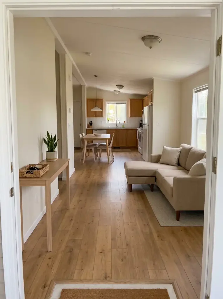
Clear sightline from a single-wide entrance through the living area toward connected rooms.
Protecting the first long view from the entry can change how spacious the home feels before any furniture is removed.

The obstruction could be a sectional arm, dining chair, plant, storage cube, ottoman, stool, or console.

It does not need to block an actual walkway.

A piece can be functionally acceptable and still visually shorten the interior.

This is why relatively low furniture performs well beside important sightlines: it defines the room without behaving like a visual wall.

One changed object near the entrance can sometimes improve the perceived space more than several decorative changes deeper inside the room.

9. Choose Sofa Depth and Arm Shape for the Narrow Cross-Section

A sofa should not be judged by length alone.

Combine two observations:

How does circulation feel?

and
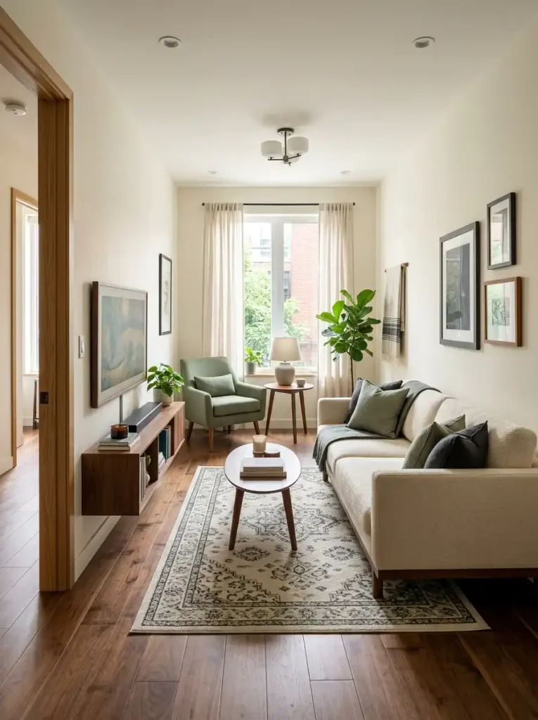
Streamlined sofa leaving a clear circulation lane in a narrow single-wide living room.
Sofa depth, arm thickness and surrounding furniture can affect the room’s cross-section as much as the sofa’s overall length.

How much furniture is gathered around the sofa?

The matrix below turns those two conditions into four different outcomes.

Sofa Pressure Triage Choose your condition
Is the sofa the problem—or everything around it? Match the condition closest to your room. Each path reveals a different diagnosis, different first move, and different stop point.
Clear route · crowded edges Support Pressure The sofa works, but its perimeter feels visually overloaded.
Diagnosis Keep the sofa. Edit the perimeter. LOW COST
Perimeter map Sofa stays
The circulation route is already functioning. The visual pressure is more likely coming from side tables, ottomans, accent chairs, baskets, or other objects crowding the sofa edges.
01 Remove one side piece 02 Check doorway view 03 Stop if pressure drops
Best first move Remove the easiest supporting piece before questioning the sofa itself.
Tight route · crowded edges Mixed Pressure Both circulation and the furniture cluster are contributing.
Route Tight
Edges Crowded
Two-pass layout test
1
Remove one support piece. Start with a side table, ottoman, accent chair, basket, or another object that is easiest to move.
2
Re-check the cross-section. If the route still looks compressed after that edit, the sofa profile becomes a stronger suspect.
Decision Reposition first. TEST BEFORE BUYING
Tight route · light surroundings Profile Pressure The room feels compressed even without much supporting clutter.
Stronger suspect The sofa profile itself deserves attention.
Future replacement scan Compare profile, not just length
ARM SHAPE Slimmer visual edge DEPTH Less projection BACK Lighter silhouette BASE More visible floor
Replacement rule Re-scale later—not immediately. Keep comfortable seating until replacement makes sense. When that time comes, compare total profile and visual depth rather than chasing a generic “small sofa.”
Stop rule If a future sofa improves the cross-section but reduces comfort or function, it is not automatically the better choice.
Diagnosis before replacement A tight room does not automatically mean an oversized sofa. Separate support pressure, mixed pressure, and true profile pressure before spending money.

This prevents an expensive false diagnosis.

A large sofa is not automatically wrong if the room around it still works.
10. Tuck Dining Against One Wall With Bench Seating

Here is the geometry.

TABLE + CHAIRS MOVING ON BOTH SIDES = TWO ACTIVE EDGES
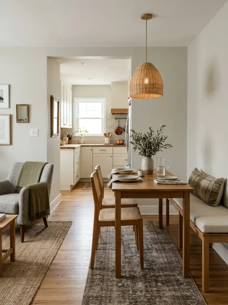
Wall-side dining bench keeping the circulation edge clearer in a narrow single-wide dining area.
Making one dining edge quiet can reduce everyday chair movement where the dining area overlaps a narrow circulation route.

Change one side to a bench:

TABLE + ONE QUIET EDGE + ONE ACTIVE EDGE

The difference can be useful when the dining zone acts like a widened passage between the living room and kitchen.
You do not need a built-in banquette.

A freestanding bench or compact bench-style seat can create the same relationship.

Keep conventional chairs on the side where easy entry and movement matter most.

The actual decision

Do not ask:

Would a bench look cute here?

Ask:

Which side of this table really needs moving chairs every day?

Quiet the other edge only when the routine supports it.

Spatial efficiency should improve the way the room functions—not merely make a photograph look cleaner.

11. Keep the Kitchen’s Upper Half Visually Quiet

Divide the room at countertop level.

BELOW

Counters
Base cabinetry
Appliances
Flooring
Working objects
Wood tones

The lower half already carries plenty of visual information.

ABOVE

Upper cabinetry
Open shelving
Signs
Decorative objects
Refrigerator surfaces
Plants
Hanging storage

If the upper zone becomes equally dense, a narrow kitchen can appear to close inward from both sides.
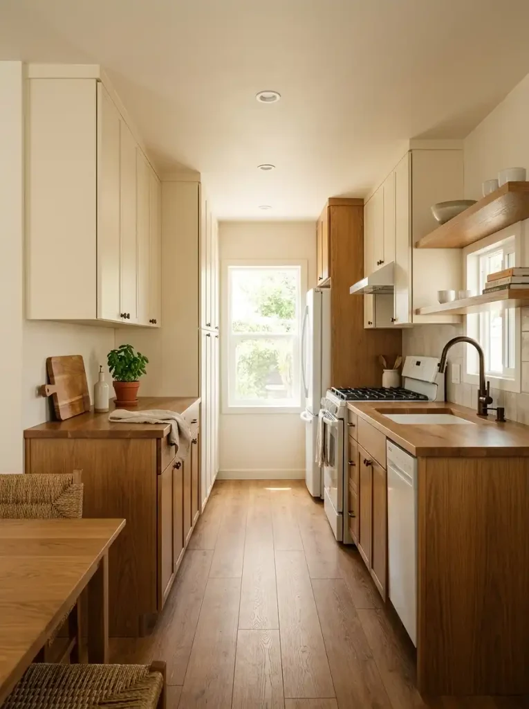
Single-wide galley kitchen with calm light upper cabinetry and more visual weight below the counter line.
Keeping the kitchen’s upper field quieter helps prevent cabinetry and décor from visually closing inward over the narrow aisle.

The answer is not removing useful cabinetry.

It is editing visual activity.

Give open shelves some gaps. Group decorations instead of scattering them. Keep upper finishes reasonably coherent where possible.

Farmhouse, cottage, transitional, and modern kitchens can all use this principle.

The room does not have to become minimal.

The upper half simply needs enough quiet space to balance the practical density below.

12. Blend the Bathroom Curtain, Tile, and Wall Into One Soft Value Range

Take a quick bathroom photograph.

Turn it black and white on your phone.

Now ignore color.

Look at value—how light or dark each major surface appears.
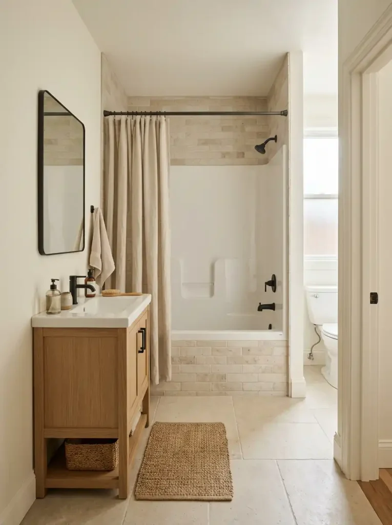
Compact bathroom with curtain, tile, and wall colors kept within a soft related value range.
When the largest surfaces relate in lightness, the bathroom’s boundaries become less visually abrupt while smaller accents can still provide contrast.

Watch for the hard stops

A dark curtain that suddenly becomes a wall.

A bath mat that creates a heavy rectangle.

Tile that separates sharply from the surrounding surface.

A vanity that visually dominates the whole room.

Bringing some of those large planes closer in value can soften the boundaries.

An oatmeal curtain can relate to warm beige tile.

Soft white can connect pale walls to a white tub.

Warm stone tones can create continuity while black hardware still provides deliberate contrast.

Pattern and color are still welcome.

Just avoid asking every large surface to become its own focal point.

13. Place Mirrors Where They Return the Longest View

A mirror can return one of three things:

depth, light, or clutter.
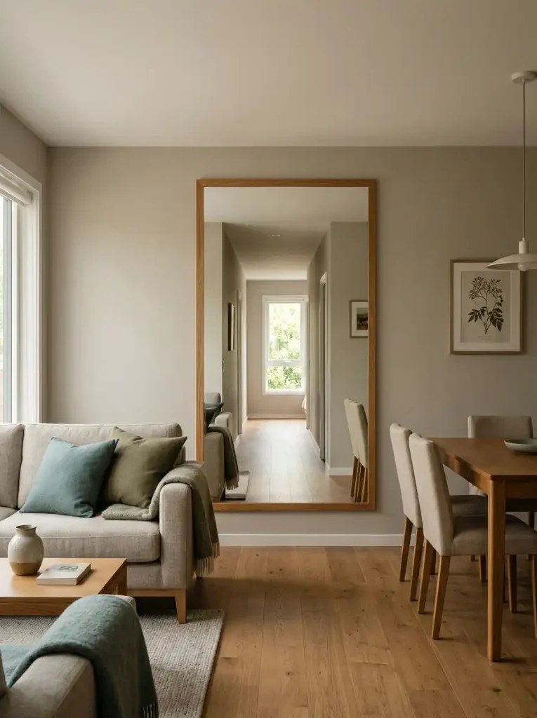
Mirror in a single-wide living area reflecting a long uncluttered view into the adjoining room.
A mirror adds the most useful depth when the reflected scene itself contains distance rather than simply duplicating nearby visual clutter.

Its position decides which.

Reflection Decision Studio Choose reflected scene
What will the mirror send back into the room? Select the scene your proposed mirror would reflect. Each path reveals a different visual consequence and placement recommendation.
Light-return path A bright window or pale wall The reflection adds brightness more than distance.
Reflection result Strong brightness boost LIGHT FIRST
ROOM LIGHT
Brightness Strong gain Depth Moderate gain
Best use Use this placement when the room feels dim. The mirror can make the interior feel lighter and more active even if it does not significantly extend the apparent distance.
Placement verdict Keep this location when brightness is the main weakness. Search for a longer reflected view if perceived depth is the bigger goal.
Visual-noise path Shelving, cords, appliances, or clutter The reflection repeats visual information instead of space.
Reflection warning The mirror may multiply the problem.
Visual noise Multiplied
Original Busy zone Reflection More noise
Depth effect Weak
Clutter effect Increased
Correction Change the reflected scene, not the mirror. Try another wall or shift the angle until the mirror returns a doorway, calm wall, window, or longer sightline instead of shelving and everyday clutter.
Placement verdict Relocate this mirror position. A reflective surface should add useful visual information—not duplicate the busiest part of the room.
Mirror placement rule Judge the scene inside the reflection before judging the mirror’s frame, shape, or size.

Mirror size is secondary.

Reflection quality is what changes the room.

14. Layer Light at Different Depths After Dark

Daylight naturally reveals foreground, middle, and distance.

At night, one bright ceiling fixture often collapses those layers.
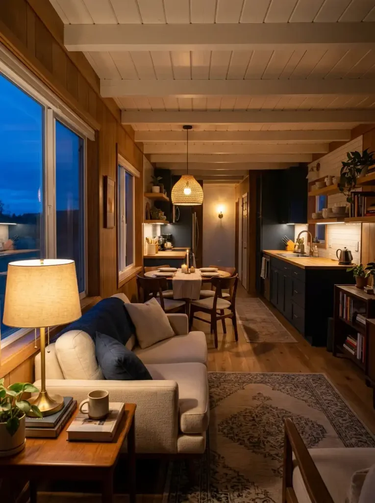
Single-wide interior at night with foreground, midground, and background lighting visible along one long view.
Lighting several depths—not simply the center of the room—helps preserve the long visual sequence after daylight disappears.

The room can visually shrink even though nothing moved.

Use the night sequencer below to identify which layer is missing.

Night Depth Diagnostic Tap your symptom
Where does your room lose depth after dark? Choose the condition closest to your room. Each path reveals a different lighting priority and expected visual effect.
Midground missing Sofa area feels good, but the middle disappears Your foreground is working. The visual connection is not.
Diagnosis You need connection light.
NEAR MID FAR
The middle zone needs enough light to visually bridge the seating area with the next room.
First move Light the transition zone. Use a dining pendant, kitchen light, counter light, or wall light already visible between the sofa and the far end.
Destination missing Near and middle are visible, but the far end disappears Your room begins well, then visually stops.
Priority result Destination light comes first. HIGH IMPACT
Current depth read Far end lost
The first two zones are readable, but the final third has no visual destination.
Create one gentle visual destination. A small lamp or another restrained light source deeper in the sightline can restore the sense of distance that daylight provided earlier.
Do not over-light the destination. It only needs to remain visible. The far end should not become brighter than the foreground.
Depth balanced Near, middle, and far zones are already visible Your nighttime depth sequence is already working.
Success state Your depth stack is complete.
NEAR Visible MIDDLE Visible FAR Visible
Stop rule Do not add another fixture simply to create more layers. Add lighting only if a separate functional need remains.
Lighting hierarchy The goal is not maximum brightness. It is enough visible information for the eye to perceive near, middle, and far as one connected space.

The fixtures do not have to match.

The eye simply needs enough information to perceive near, middle, and far.

15. Repeat One Wood Tone Across Connected Rooms

Do not think “matching furniture.”

Think material trail.

For example:

Kitchen counter → dining table → coffee table → picture frame
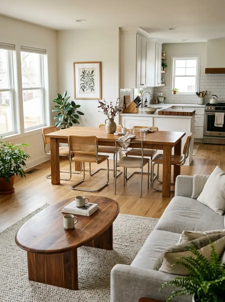
Connected rooms repeating a warm wood family through different furniture and décor pieces.
Repeating a wood family in different forms creates cross-room rhythm without making the home look like a matching furniture set.

The objects have completely different jobs.

The repeated wood family quietly connects them.

Use three rules

Choose what already dominates.
If warm medium wood already appears strongly, use that as the reference rather than introducing a new tone.

Repeat the family rather than the exact finish.
Natural variation prevents the home from looking like a furniture set.

Leave visual distance between repeats.
The wood should echo through the home rather than appear everywhere.

Small items can carry the repetition too:

cutting boards, trays, stool seats, picture frames, shelf edges, and lamp bases.

The effect is cross-room rhythm.

16. Move Storage Up Without Turning the Wall Into Visual Clutter

Vertical storage solves one problem and can create another.

The useful formula is:

FUNCTIONAL STORAGE + NEGATIVE SPACE = CAPACITY WITHOUT SATURATION
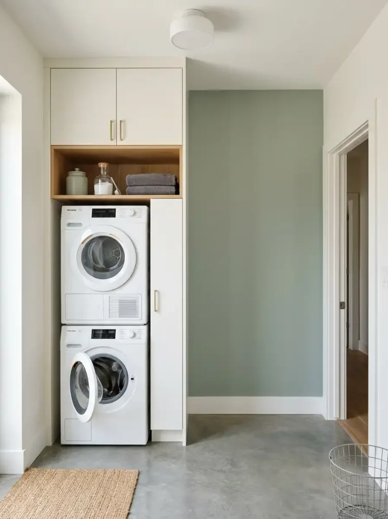
Compact laundry area with vertical storage concentrated in one zone and open wall space beside it.
Moving storage upward works best when it preserves enough empty wall for the storage system to read as one organized zone.

KEEP

Shelves holding something you genuinely use.

Cabinets hiding visually noisy supplies.

Hooks positioned around an actual routine.

A defined vertical storage zone.

QUESTION

Another shelf with no assigned function.

An empty decorative basket.

Objects added above cabinets purely because the space exists.

Several storage systems competing on one wall.

Before adding another surface, answer:

What exactly will live there?

If there is no clear answer, the empty wall may currently be doing something more valuable.

It is creating breathing room.

17. Build a Shallow TV Wall Instead of a Bulky Media Zone

A media unit gives you two things:

storage and visual mass.

The first can be useful.

The second has a cost in a narrow room.
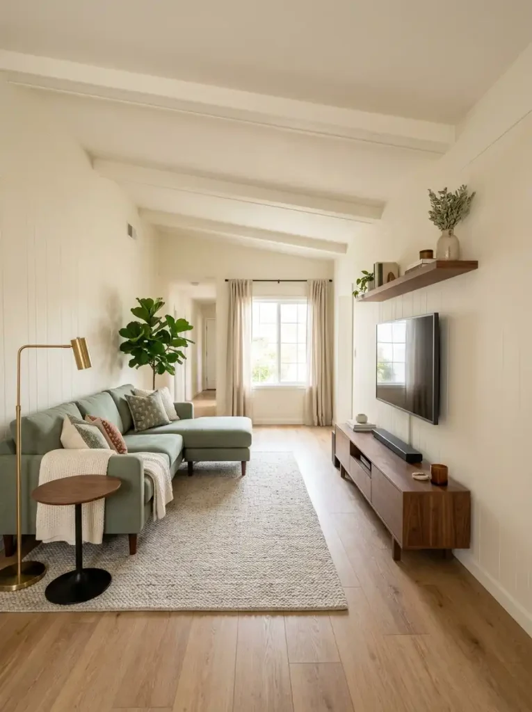
Single-wide living room with a shallow TV console preserving space between the media wall and sofa.
A media wall can remain the room’s focal point without adding unnecessary furniture depth to an already narrow cross-section.

Keep the deeper unit when

You genuinely use the cabinets.

Electronics need contained storage.

The room still retains comfortable circulation.

Consider a shallower composition when

Much of the furniture exists merely to frame the television.

The unit projects strongly toward the seating area.

The wall would still feel intentional with a low console, artwork, lighting, or wall texture.

The idea is not to weaken the focal point.

A television wall can remain visually strong while becoming physically lighter.

That combination is particularly useful when the living room’s cross-section is limited.

18. Let One Color Family Travel While Texture Changes by Room

Imagine one palette moving through the whole home.

Living room

Warm cream upholstery
Muted olive textile
Medium wood

Dining zone

Cream bench
Olive pottery
Natural woven fiber

Kitchen

Warm-neutral cabinetry
Wood surface
Small botanical accent

Bathroom

Soft stone textile
Warm wood detail
Restrained greenery
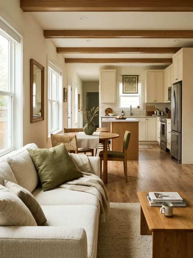
Connected single-wide rooms sharing cream, olive, and warm wood while using different textures.
Carrying a color family across the home creates continuity while changing textures allows each room to retain its own identity.

The colors relate.

The materials change.

That distinction stops the rooms from becoming either completely disconnected or suspiciously identical.

Use color to provide continuity.

Use texture to provide room identity.

A simple rule captures it:

Repeat the color story. Change the tactile story.

19. Use One Large Art Moment Instead of Many Tiny Wall Objects

Compare two walls.

WALL A

Sign
Frame
Clock
Tiny shelf
Decorative hanging
Second frame
Small basket

WALL B

One large artwork

—or—

One tightly composed group that reads as a single unit.

Wall A is not automatically wrong.
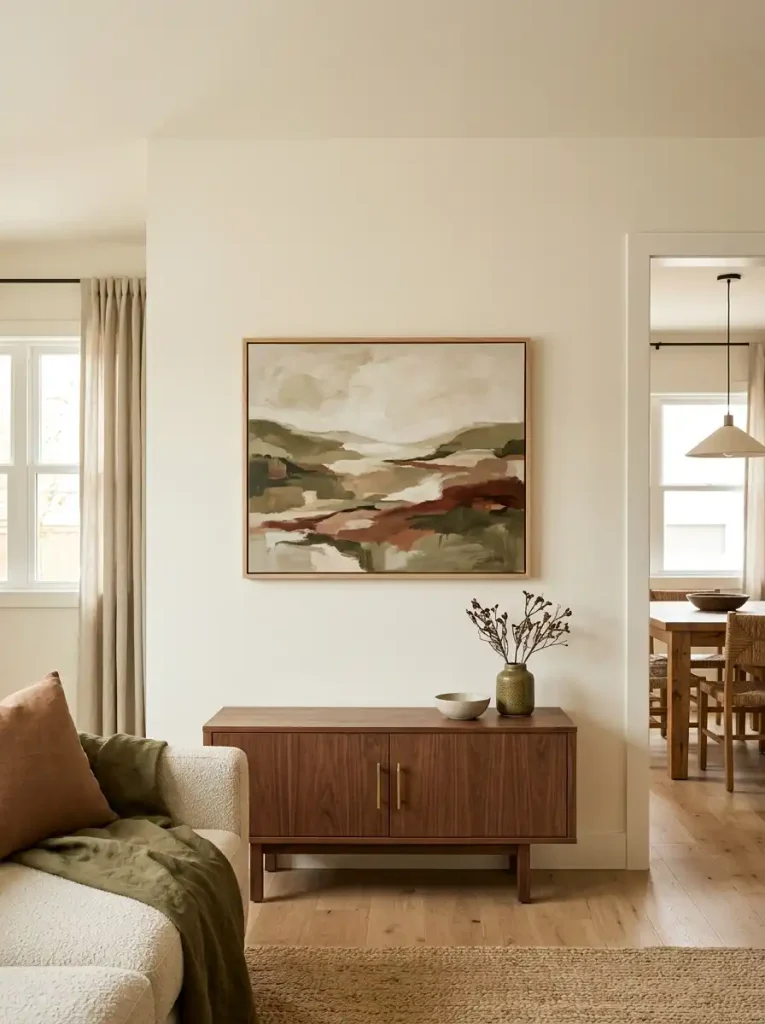
One large artwork anchoring a single-wide living wall with generous empty space around it.
One organized art moment gives the eye a clear place to land instead of turning a long wall into a sequence of competing decorative stops.

The issue is how many separate stops it creates.

Personal photographs and collections belong in a home. The useful question is whether they appear as one intentional composition or seven unrelated things filling empty wall.

Put the strongest art moment above an existing anchor:

the sofa, dining bench, console, dresser, or low cabinet.

Then allow a neighboring section of wall to stay quiet.

Resting space for the eye is part of the design.

20. Edit Every Room From the Doorway First

Your normal seat hides things.

The doorway exposes them.

Run the 30-second threshold audit

  • Pause before entering.
  • Find the first furniture edge intruding into the view.
  • Find the first decorative feature stealing attention.
  • Move one object temporarily.
  • Leave the room.
  • Re-enter and judge the new silhouette before moving anything else.
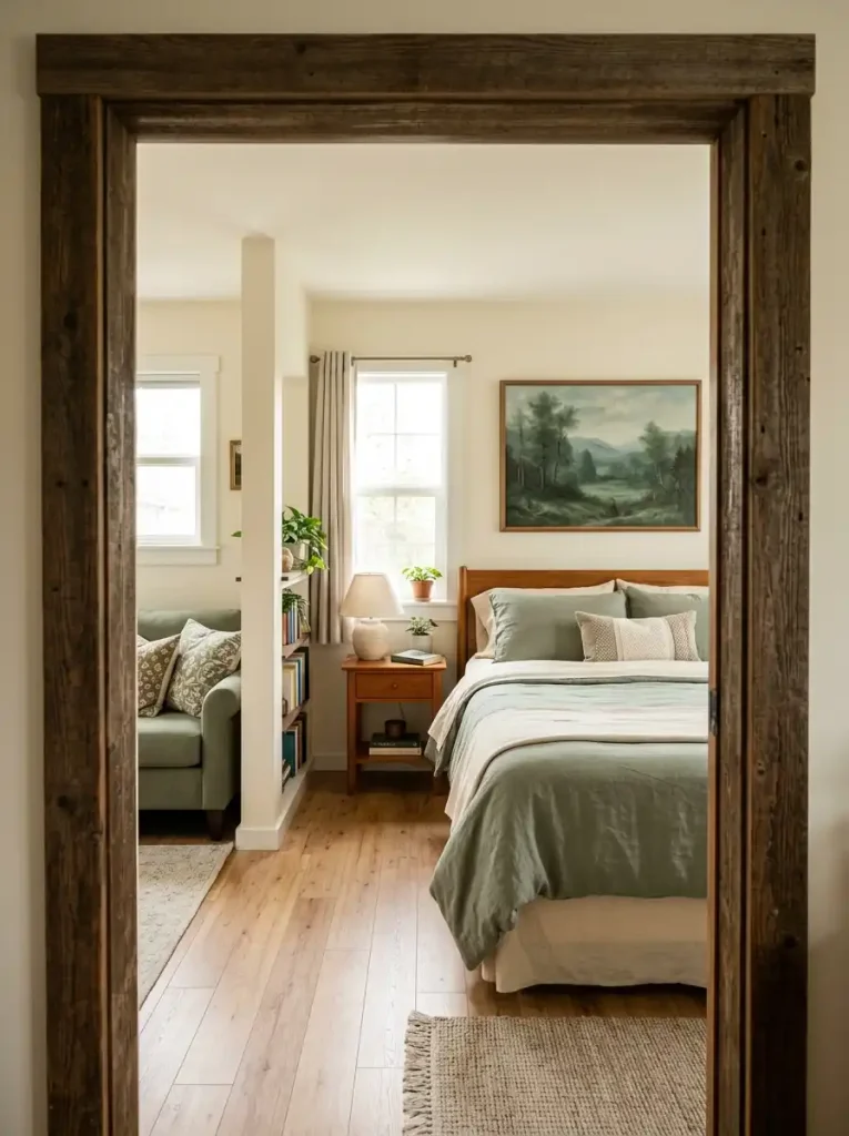
Edited view from a doorway into a compact single-wide room with a clear first sightline.
Evaluating the room from its threshold reveals protruding furniture and competing focal points that are easy to miss from inside the space.

A chair that feels harmless from the sofa may dominate the entrance.

A table edge can make the route ahead appear smaller.

A cabinet can divide an otherwise continuous wall.

Repeat this from the front entrance, kitchen opening, bedroom door, and other important transitions.

Editing from room thresholds makes the whole single wide part of the design process.

21. Run a Final Visual-Width Audit: Break, Bulk, Focal Competition

Finish with diagnosis, not shopping.

Most narrow-looking rooms have one dominant problem:

BREAK — the view is divided.

BULK — one object consumes too much visual width.

COMPETITION — too many focal points demand attention.
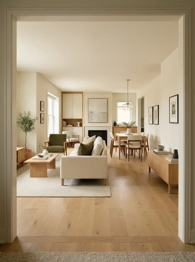
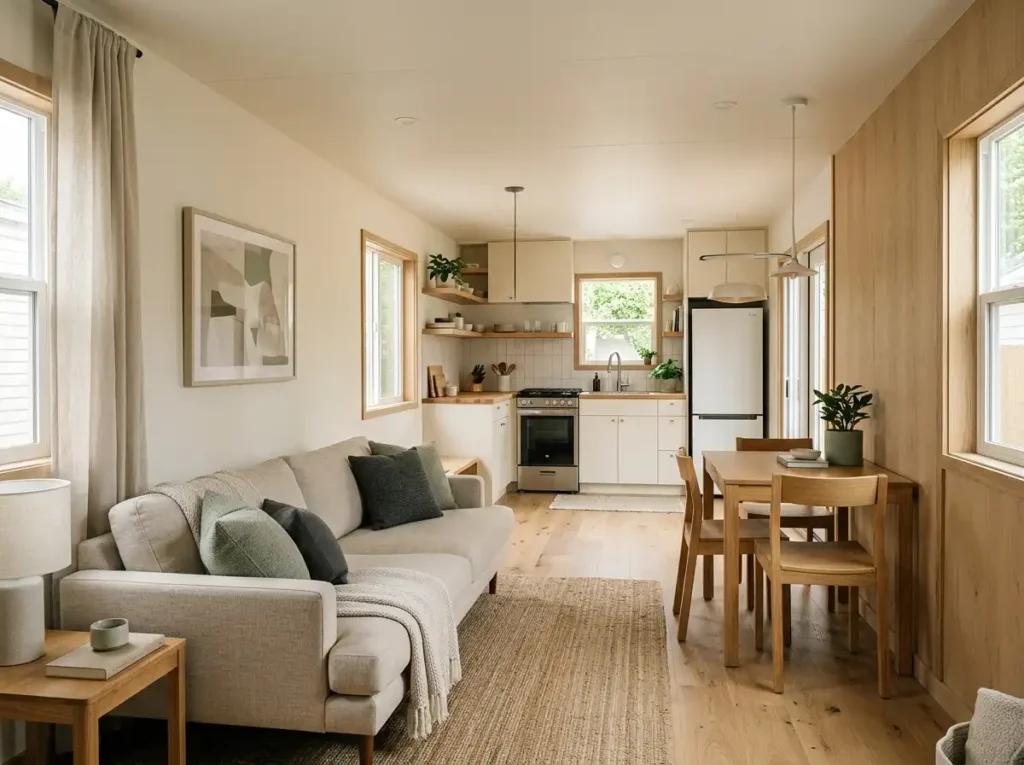
Finished single-wide interior with continuous sightlines, controlled furniture bulk, and one clear focal destination.
The strongest final edit is usually the one that reduces the dominant problem—visual breaks, furniture bulk, or focal competition—before anything else is added.

Choose the problem that appears first from the doorway.

Visual Width Diagnostic Tap one problem
What is making the room feel narrow first? Choose the condition you notice first from the doorway. Only one diagnostic stays open at a time, and each path gives you a different correction sequence.
Visual fragmentation BREAK The room feels chopped into several short sections.
Diagnosis Your first fix is continuity. PRIORITY 01
1
Detect Find the strongest interruption. Inspect flooring transitions, several small rugs, disconnected curtain treatments, and abrupt palette changes.
2
Correct Change only one visual break. Remove, rotate, simplify, or visually connect the single interruption that affects the longest view most.
3
Verify Re-enter the room before touching anything else. If the long view already feels calmer and more continuous, stop. You have solved the dominant problem.
Stop signal One corrected break is enough if the room already reads as a longer visual sequence.
Cross-section pressure BULK One object makes the room feel visibly pinched.
Diagnosis Your first fix is projection. BULK CHECK
Visual pressure Inspect projection first
01 Find the deepest projection. Look at sofa arms, media cabinetry, chair backs, tables, and storage pieces closest to the main route.
02 Test the cheaper change first. Remove or reposition a smaller supporting item before deciding the largest piece must go.
03 Re-scale only if pressure remains. If the room still feels pinched after the supporting edit, the main furniture profile becomes the stronger suspect.
Buying trigger Replace furniture only after repositioning fails to improve the cross-section.
Hierarchy overload COMPETITION Your eye does not know where it should land.
Focus diagnosis Your first fix is hierarchy. One feature needs to become the destination while the others become support.
1 Lead Choose one focal point visible from the entrance.
2 Quiet Reduce the nearest competing shelf, gallery wall, sign cluster, or display.
3 Confirm Return to the doorway. If your eye immediately finds the lead feature, stop editing.
Successful result Your eye lands on one intentional destination before it begins scanning smaller decorative details.
One-problem rule Fix the category that dominates the doorway view first. Reassess before opening a second correction path.

That sequence matters.

Do not fix break, bulk, and focal competition simultaneously.

Fix the dominant issue first.

Then look again.

Make the Single Wide Feel Bigger by Editing the Whole View

You do not need to apply all 21 ideas at once.

Start with the longest view through your home and ask three questions.

Where does the view break?

Look at flooring, rugs, curtains, palette shifts, and room transitions.

What creates the most bulk?

Look at sofa profiles, media furniture, table edges, chair backs, and storage pieces.

Where does the eye stop too early?

Look for blocked sightlines, competing displays, or a focal point that fails to use the home’s depth.

Fix the clearest answer first.

A continuous floor, cleaner sightline, quieter wall, better-scaled furniture relationship, or more layered evening lighting can influence several connected areas simultaneously.

That is the advantage of designing a single wide as one visual sequence, rather than treating it as a collection of undersized rooms.

The final interior should not feel empty.

It should feel like the furniture, storage, color, texture, and personality all have enough space around them to breathe.
Alex Will
About the author

Alex Will

Alex Will is the interior design editor and creative voice behind Stylish Galore. His work is informed by the core disciplines of residential design, including space planning, color theory, lighting, furniture scale, material selection, home organization, and small-space functionality. Alex approaches every design topic by considering room proportions, movement, storage requirements, durability, maintenance, and budget. He translates established design principles and current interior trends into practical guidance that homeowners and renters can confidently apply. Through Stylish Galore, Alex helps readers create homes that balance appearance with everyday function. He believes successful interior design is not about filling a room with expensive objects. It is about making thoughtful choices that improve how the space looks, feels, and works for the people living there.

View more articles →