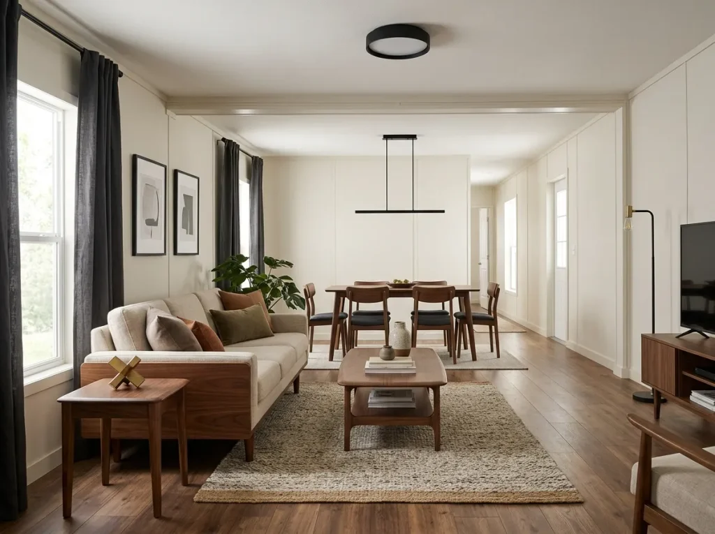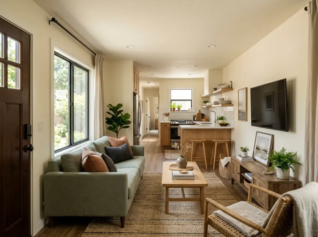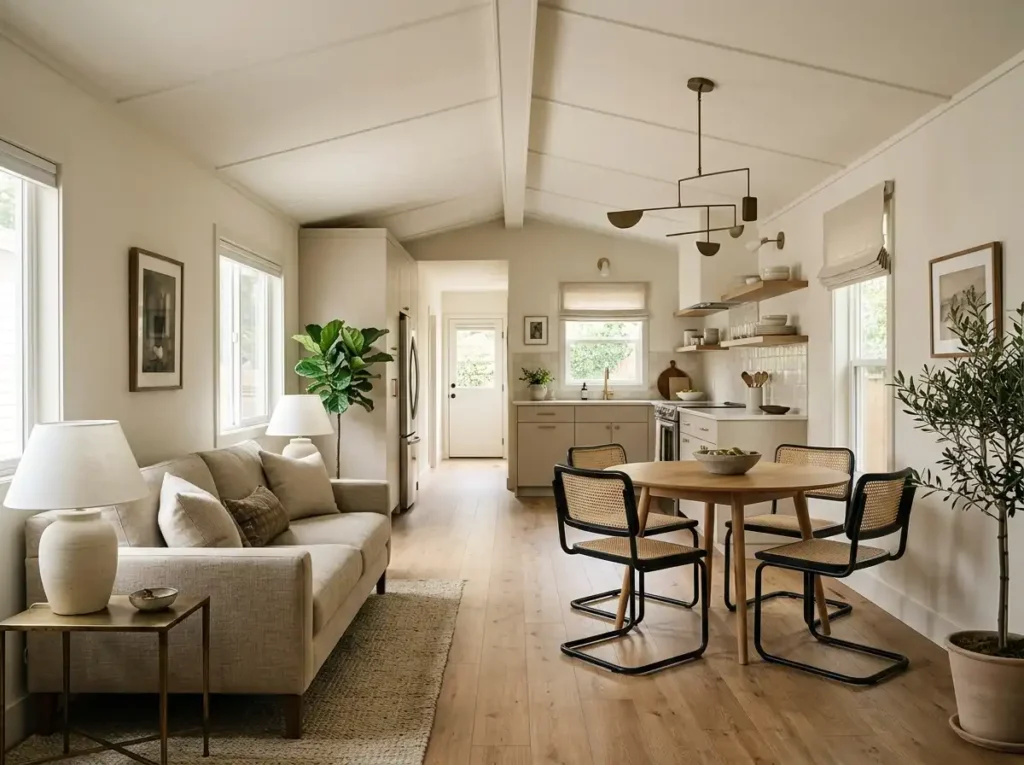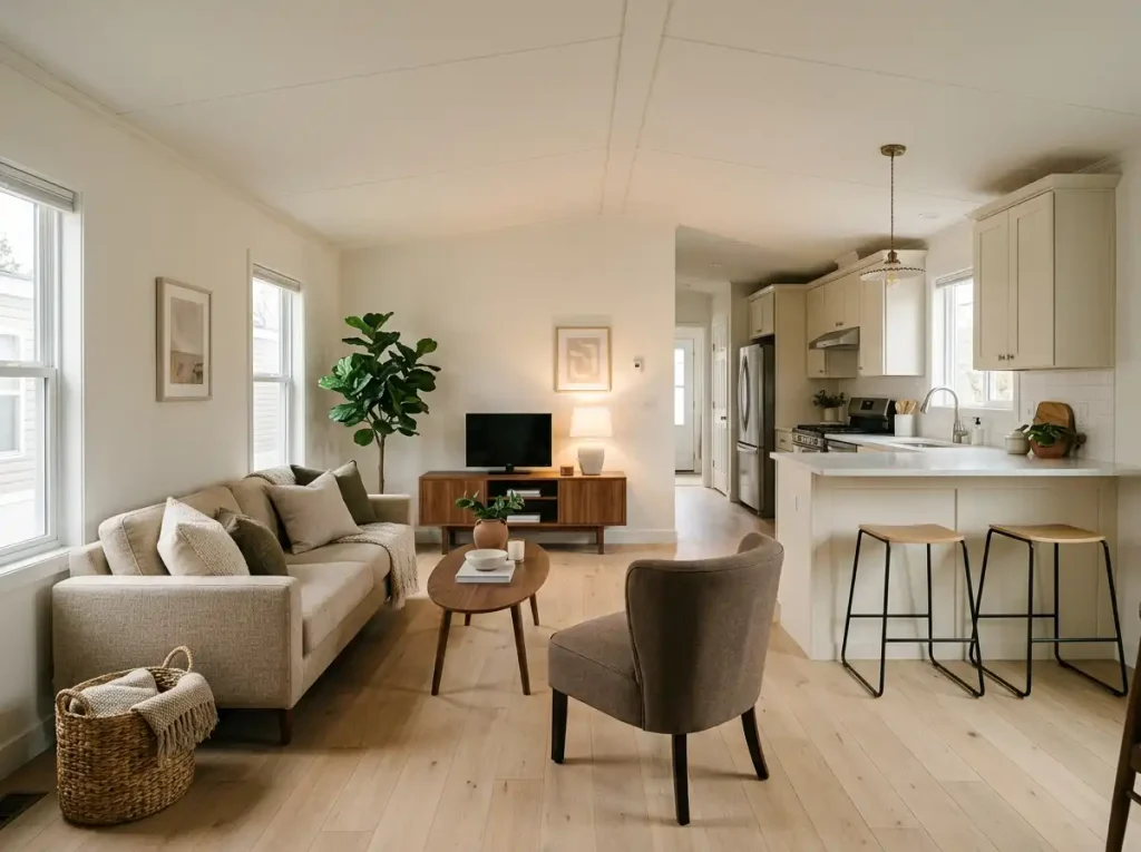
Decorating a single wide is less about squeezing in “small-space furniture” and more about understanding where every inch of width goes.
A sofa can fit against the wall and still make the room feel cramped. A dining chair may look compact until it is pulled out into the only clear walkway. Even a pretty storage cabinet can create trouble when its depth steals space from the path connecting the living room, kitchen, and hallway.
That is why the most useful single wide mobile home decorating ideasQuick peekDouble Wide Decorating Ideas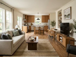
The goal here is not to fill every wall or make every room look larger with visual tricks. It is to make furniture, storage, lighting, and décor work with the long, narrow footprint you already have.
Some changes cost nothing more than moving what you own. Others involve choosing better proportions when you eventually replace something.
Start with the layout decisions that affect everything else.
1. Measure the Narrowest Cross-Section Before You Choose the Biggest Piece
Room length gets most of the attention in a single wide, but the measurement that causes trouble is often the distance across the room.
Picture the narrowest line between the sofa wall and whatever sits opposite it. That may be a TV console, recliner, cabinet, kitchen peninsula, or simply the edge of a major walkway.
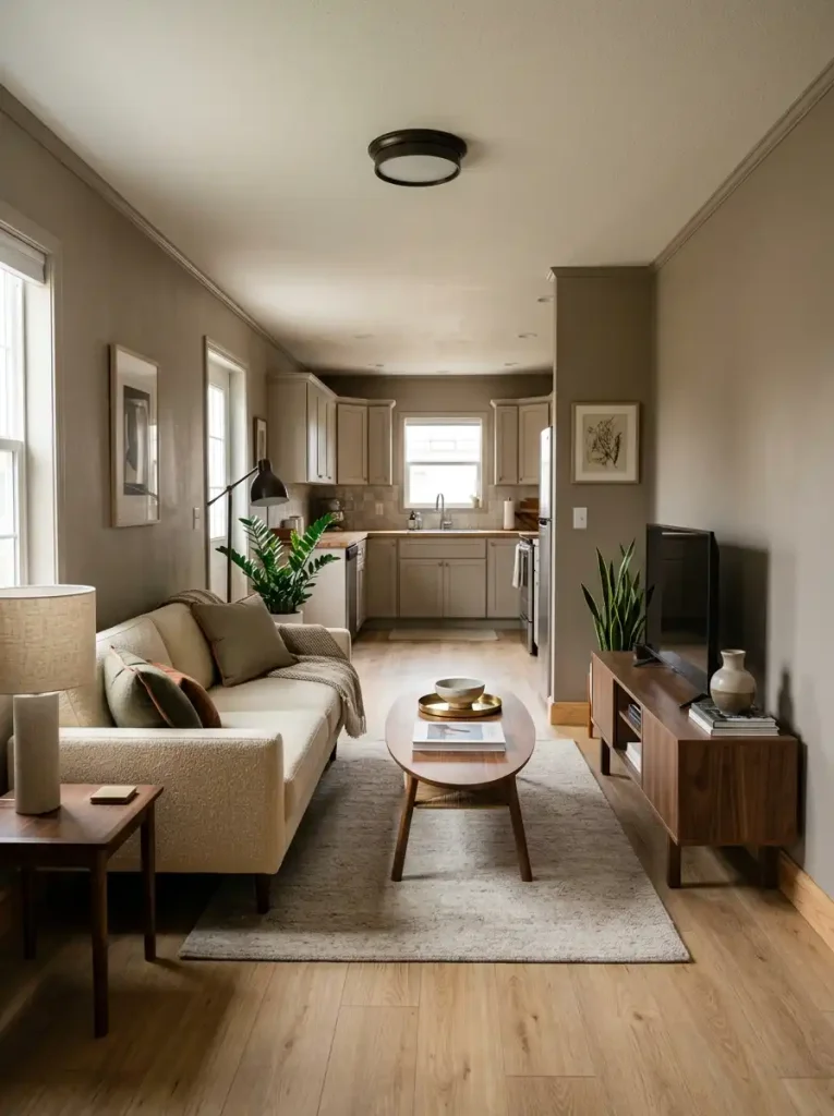
That cross-section is your real furniture limit.
A 40-inch-deep sofa may fit perfectly along an 11-foot wall, yet its depth can remove four or five valuable inches from the route beside the coffee table. In a conventional living room, that difference may barely register. In a single wide, it can change the way the entire room functions.
Measure the tightest point after accounting for the furniture already staying in the room.
Then shop backward from the remaining space.
A shorter sofa is not always the answer. Sometimes the smarter move is a sofa that is nearly the same length but several inches shallower.
Use the narrowest usable width—not the longest wall—as the first limit for your largest furniture piece.
2. Reserve One Unbroken Traffic Lane Through the Main Living Zone
Before arranging side tables, plants, baskets, or an accent chair, identify the path people use most often.
In many single wides, one route does a surprising amount of work. It may connect the front door to the kitchen, pass the sofa, continue toward the bedrooms, and handle everything from grocery bags to laundry baskets.
That route deserves to be treated like part of the floor plan.
Start at the main entrance and mentally walk through the house. Watch for chair backs that project into the route, coffee-table corners people constantly skirt, stools that remain pulled out, and small floor décor that forces unnecessary detours.
The best test is practical: imagine carrying something wide through the space.
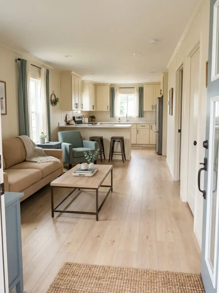
If you would need to turn sideways, shift a chair, or step around décor every time, the layout is asking too much from the narrowest part of the home.
Protect the main path first. Secondary styling can work around it.
Tap the condition that happens in your room. Each one opens a different diagnosis and correction.
01 A chair or stool regularly enters the walkway. Likely issue: furniture drift +
Move it completely inside the seating zone, rotate it toward the conversation area, or choose a resting position where its full footprint stays outside the main route.
02 You turn your body to pass the coffee table. Likely issue: corner conflict +
Shift the table deeper into the seating group, rotate it, or test an oval, round, or nesting-table footprint where the walking route bends.
03 Groceries or laundry force you into a detour. Likely issue: route design +
Trace the shortest line from entry to kitchen or hallway, then move small furniture and floorQuick peekSmall Mobile Home Storage Ideas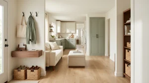
04 A door, drawer, or recliner blocks the route when open. Likely issue: dynamic footprint +
Use the fully opened position of doors, drawers, recliners, and chairs as part of the real furniture footprint.
3. Stagger Furniture Depths Across the Two Long Walls
Two pieces of furniture can each be perfectly reasonable on their own and still create a cramped room when they face each other.
Imagine a deep sofa on one long wall and a deep media cabinet directly opposite it.
Both pieces push toward the center.
The room begins to feel like a narrow channel because the visual and physical weight is equally heavy on both sides.
Now change only the opposite wall.
Keep the sofa, but replace the deep cabinet with a shallower console—or move a bulky storage piece to an endQuick peekSmall Mobile Home Storage Ideas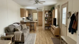
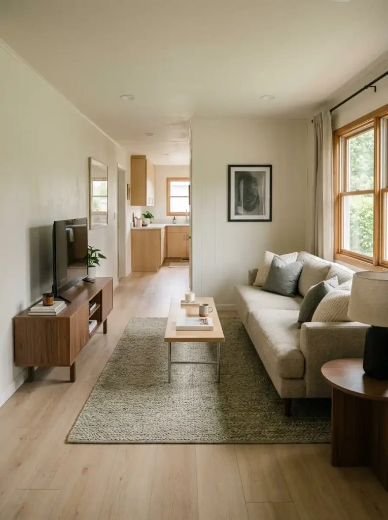
That staggered relationship is particularly useful in single wides because the two long walls often control most of the usable floor.
You do not need both sides to match in depth.
In fact, deliberately pairing one deeper function with one shallower function can produce a more comfortable balance.
Think across the room before thinking along each wall separately.
4. Choose Sofa Depth Before Sofa Length
A lot of people shop for a single-wide sofa by asking, “How long can it be?”
Ask a different question first:
How far can it project into the room?
A 78-inch sofa that is 42 inches deep may interfere with the room more than an 86-inch sofa that is only 35 or 36 inches deep.
The reason is simple. Length mostly occupies wall space. Depth consumes the cross-room space everyone uses.
That does not mean the shallowest sofa automatically wins. Very upright, compact models may be uncomfortable for a household that lounges, naps, or watches movies for hours.
Think of sofa depth as a tradeoff between comfort and circulation.
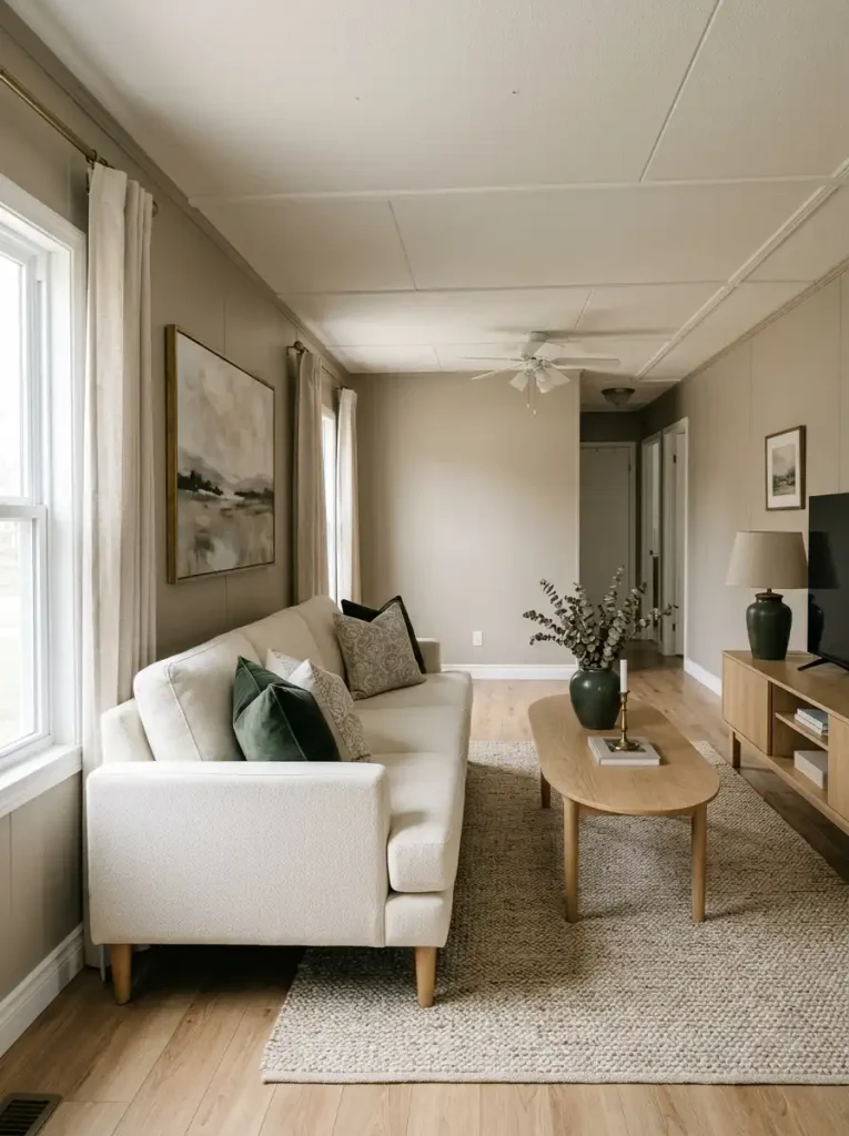
If your room has a generous opposite wall and no major route beside the seating, deeper upholstery may work beautifully. When the sofa faces a console and shares its edge with the main passage, a more balanced profile usually gives you more flexibility.
Most Versatile
Balanced Depth
35–39 in.
+
A middle ground for comfortable seating, coffee-table clearance, and everyday circulation.
Tap for the Comfort + Flow result
A middle ground for comfortable seating, coffee-table clearance, and everyday circulation.
Choose this range when the sofa shares its cross-section with a coffee table, media wall, or important walking route but still needs to support regular lounging.
Clearance First
Compact Depth
32–35 in.
+
Returns valuable floor width where a route passes beside or directly in front of the sofa.
Tap for the Clearance-First result
Returns valuable floor width where a route passes beside or directly in front of the sofa.
5. Turn One Seat 90 Degrees to Break the Bowling-Alley Effect
A long single-wide living room often encourages the same automatic layout: sofa on one long wall, chairs or television on the other, everything pointing in the same direction.
That can make the room feel even longer.
One small change can interrupt that effect.
If the room is extremely narrow
Keep the main sofa against the longQuick peekSmall Mobile Home Living Rooms
If you have moderate width
Let the rotated chair overlap the edge of the rug slightly. This forms a subtle conversational corner and gives the seating group a shape beyond one straight line.
If a doorway limits the arrangement
Move the perpendicular seat toward the quieter end of the room instead of forcing symmetry around the sofa.
The purpose is not to create a perfect square seating plan.
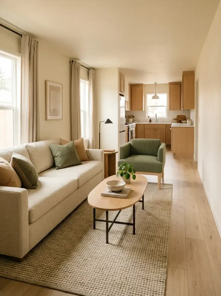
It is to give the eye—and the conversation—one reason to travel across the room instead of only from one end of the home to the other.
6. Keep Tall Furniture Off the Main Window Wall
A tall bookcase can provide excellent storage and still be in the wrong place.
The main window wall in a single wide often does more than bring in daylight. It breaks up one of the home’s longest horizontal surfaces and gives the eye somewhere to travel beyond the room.
Put a tall cabinet beside or partly across that window, and the wall starts to feel heavier.
The issue is not that tall furniture is bad. It is where the height sits.
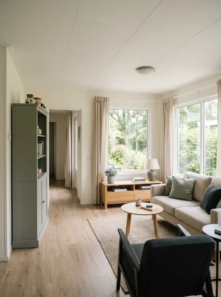
When possible, keep furniture beneath the primary windows low enough that the glass remains visually dominant. A low media unit, compact bench, shallow console, or nothing at all can preserve far more daylight than a full-height storage piece.
Move taller storage toward a solid end wall, an interior wall, or a portion of the room that does not interrupt the largest source of natural light.
There is one useful exception: if privacy, glare, or an unattractive exterior view already keeps the window covered most of the day, protecting that opening may matter less.
Otherwise, allow the window wall to remain one of the lightest planes in the room.
7. Choose a Coffee Table Shape From the Route People Actually Walk
Look at the coffee table from the doorway, not from the sofa.
Which part of it do people pass first?
In many narrow living rooms, the problem is not that the table is technically too large. One corner simply occupies the exact point where the main walking route bends around the seating.
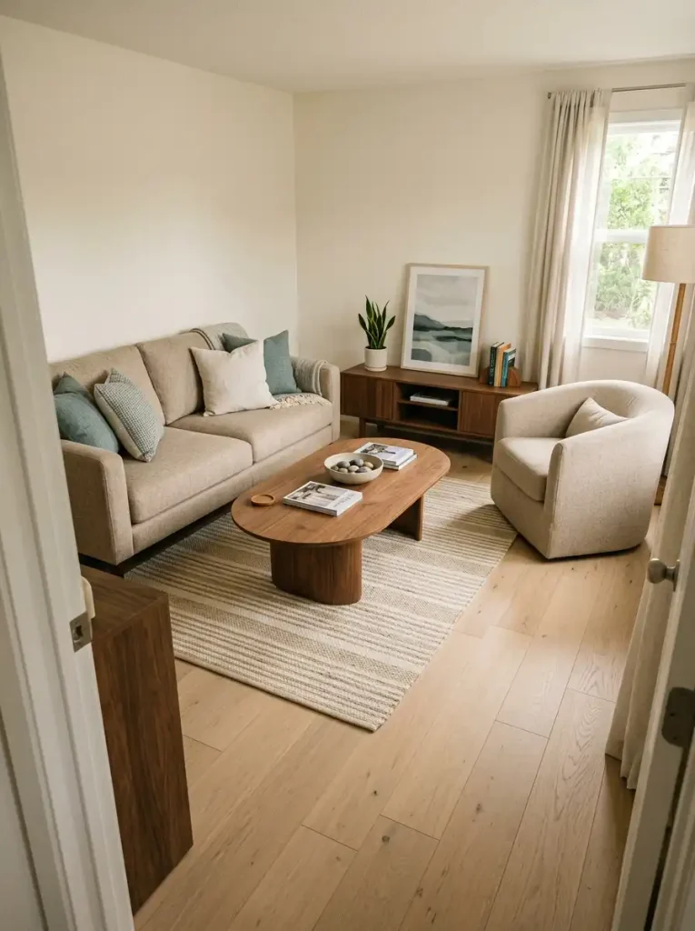
That is why shape deserves as much attention as dimensions.
A rectangular table can work well when traffic runs straight past the long side. If people naturally cut around one end of the seating group, an oval or round table removes the projecting corners that keep entering the route.
Nesting tables suit rooms where the center occasionally needs to open completely. A narrow bench-style table may work when most circulation occurs at the ends.
Do not automatically replace a table because the room feels tight.
First slide it a few inches, rotate it, or temporarily mark a softer shape on the floor with painter’s tape.
If the room suddenly becomes easier to move through, you have diagnosed a geometry problem, not a lack-of-space problem.
8. Let the Peninsula or Breakfast Bar Define the Kitchen Edge
Walk visually from the living room toward the kitchen.
In many single wides, you encounter a peninsula, breakfast bar, or counter overhang before you ever reach the cabinets. That built-in edge is already telling you where one zone ends and the next begins.
Use it.
Adding another freestanding shelf, bulky console, decorative screen, or extra storage unit beside the counter can create two boundaries where the home only needs one.
Instead, let the peninsula handle the transition.
On the living side, keep furniture positioned far enough away that the bar remains readable as architecture. On the kitchen side, contain most food-prep and appliance activity behind that edge. Stools can sit at the boundary because their function belongs to both zones.
The result is separation without closing the sightline.
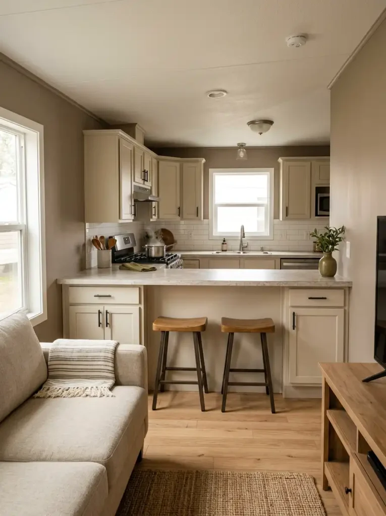
This is particularly useful in open single wides because a strong boundary does not have to be a wall. Sometimes it is simply a counter that is allowed to do the job it already performs.
02 · Shared Edge
Give the overlap a purpose.
Breakfast, serving, stools, and conversation can legitimately belong to both zones. Tap for the Social Bridge result.
Keep the counter readable from the living room and reserve this edge for activities that genuinely cross between the two spaces.
03 · Kitchen Side
Keep work behind the line.
Prep tools and cooking activity should remain deeper in the kitchen. Tap for the Activity Buffer result.
Tall appliances, stacked prep tools, and miscellaneous clutter.
Keep the visible counter line low while active work sits farther inside.
9. Use Backless or Open-Back Stools to Keep the Kitchen Sightline Permeable
Bar stools do something unusual in a single wide: you may see them from almost every major living-area viewpoint.
That makes their silhouette important.
Three heavy upholstered stools with tall solid backs can read like a small fence running across the kitchen opening. They may be comfortable, but the repeated vertical shapes interrupt the view even when the stools are pushed in.
Backless stools nearly disappear beneath a counter.
Open spindle, slim metal, or lightly framed backs offer more support while allowing cabinetry, flooring, and the room beyond to remain visible through them.
You do not need to chase the visually lightest stool if it compromises comfort or safety. Households that use the bar for long meals may need proper backs.
In that case, look for open construction rather than sheer minimalism.
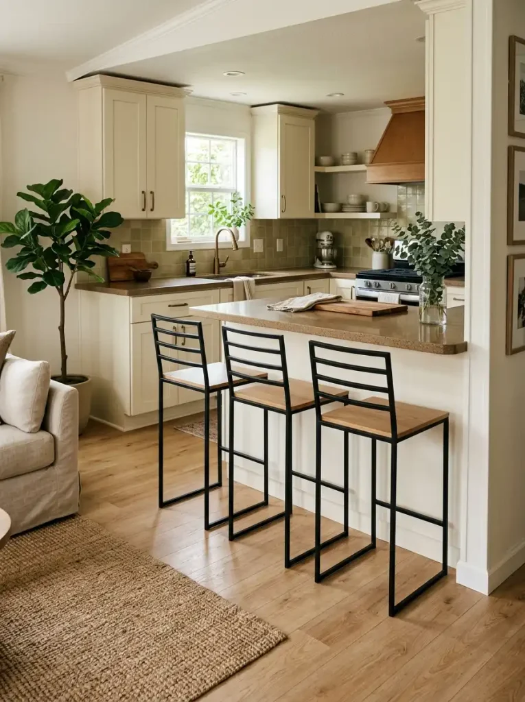
The shopping question becomes more useful:
Not “Is this stool small?”
Ask, “How much of the kitchen will this stool hide when I see it from across the living room?”
10. Keep Tall Countertop Items at One End of the Cabinet Run
Scan your kitchen counter from one end to the other.
A coffee machine appears. Then a knife block. Then a utensil crock, plant, cutting boards, kettle, paper-towel holder, and perhaps a decorative object.
Individually, none is especially large.
Together, they can make a short cabinet run look visually chopped into pieces.
Start by identifying the items that actually need to remain on the counter every day. Among those, separate the taller silhouettes from the lower ones.
Where the workflow allows it, group several tall necessities toward one end of the run—a coffee setup near an outlet, for example—while preserving a lower, calmer stretch elsewhere.
That uninterrupted horizontal line gives the kitchen a larger visual gesture and usually improves prep space at the same time.
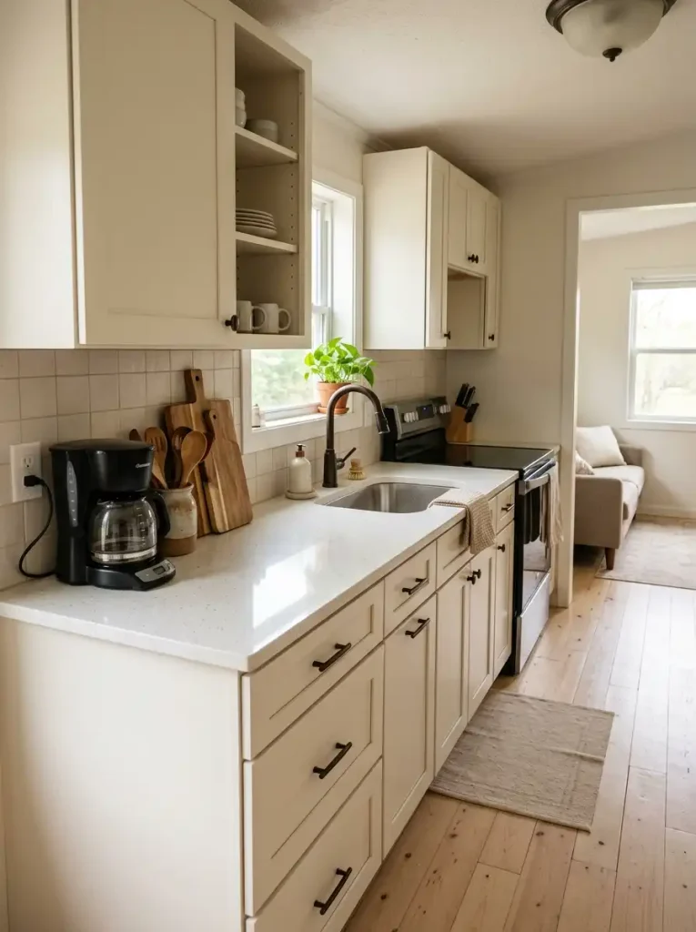
Seasonal accessories can then be added much more selectively. If you want deeper styling ideas for that layer, the fall mobile home kitchen decor guide covers the decorative side without needing to turn every working counter into a display.
Before buying organizers, test what happens when you simply consolidate height.
11. Make Dining Seating Disappear When It Is Not in Use
A dining chair has two footprints.
There is the neat footprint you see when everything is pushed under the table, and there is the much larger one created when someone actually sits down.
That second measurement matters enormously in a single wide.
Start by pulling every chair out to a comfortable sitting position. Now look at what remains between the chair backs and the next obstacle—perhaps a kitchen counter, hallway opening, sofa, or exterior door.
If the dining area becomes a bottleneck every time someone eats, changing the stored shape of the seating may be more useful than downsizing the entire table.
A pedestal table can sometimes allow chairs to tuck farther inward because there are no corner legs to fight. A bench can disappear almost completely beneath one side. Slim chairs with shallow backs may return several inches when pushed in.

Do not judge the arrangement only while it is staged.
The better dining setup is the one that occupies very little room during the many hours when nobody is sitting there.
12. Use Fold-Away Furniture Only Where It Returns Real Floor Space
Fold-down desks, drop-leaf tables, nesting surfaces, and collapsible chairs sound ideal for a narrow home.
They are only space-saving when somebody actually closes them.
Think about the routine before the furniture.
You would fold it almost every day
A wall-mounted desk or drop-leaf table can be genuinely useful because its footprint disappears between uses.
You would fold it only when guests visit
Choose something that still works well at its normal everyday size. The folding feature is a bonus, not the main reason to buy it.
You know it will stay open permanently
Skip the mechanism.
A conventional table with better proportions will usually be simpler, sturdier, and easier to arrange.
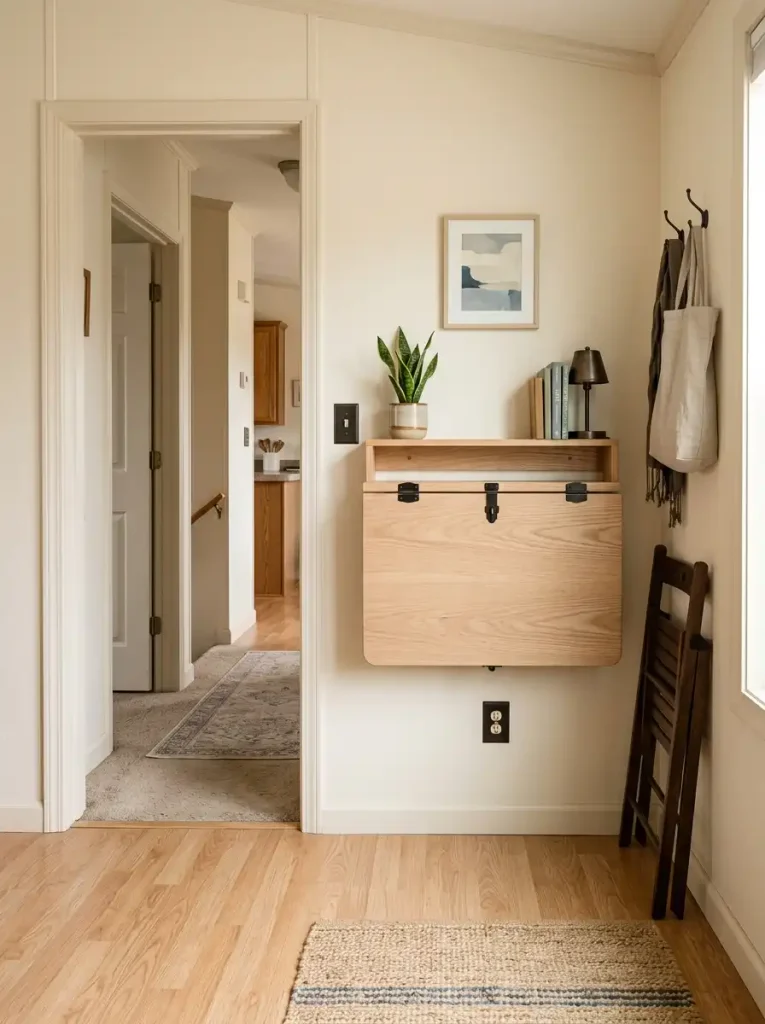
This is one place where marketing language can mislead a small-space shopper. “Convertible” does not automatically mean efficient.
A folding piece earns its place when the closed position restores floor area you will regularly use for something else—walking, exercising, opening a door, moving a chair, or letting children play.
If that recovered area has no real purpose, the clever mechanism is solving a problem you do not have.
13. Let Visible Flooring Connect Open Zones
Not every area in an open single wide needs its own rug.
Sometimes the most effective connector is already under your feet.
When the same flooring runs from the living room into the kitchen or dining area, leaving a portion of it clearly visible allows the eye to read those spaces as parts of one larger interior.
That can be especially helpful when the living room already has a substantial area rug.
Add another runner immediately beside it, a separate dining rug beyond that, and a mat at the kitchen edge, and the long floor begins to look divided into short segments.
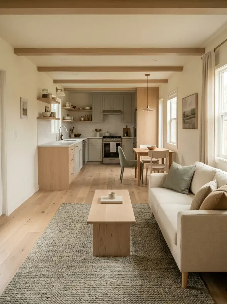
There are good reasons to use those textiles—comfort, sound control, washable protection, or a genuinely distinct zone.
But do not add them automatically.
Try removing one secondary rug for a day and look at the room from the opposite end.
If the floor suddenly appears longer and the transition between spaces feels cleaner, the empty strip was not unfinished. It was doing connective work.
For more general compact-room techniques beyond mobile-home geometry, the small space decorating ideas guide explores additional approaches without requiring every trick to appear in this room.
14. Treat the Ceiling Fan as Part of the Room’s Scale
Furniture is not the only thing that can make a single wide feel crowded.
Look up.
A ceiling fan often occupies the center of a relatively low ceiling, which means its blade span, housing, light kit, finish, and drop are visible from nearly everywhere in the main room.
That gives it more visual influence than its price tag might suggest.
A bulky multi-light fixture hanging beneath wide dark blades can pull the ceiling downward visually. A cleaner fan with a shallower profile can make the upper half of the room feel calmer even though the actual ceiling height never changes.
You do not have to make the fan disappear.
Just treat it like a piece of architecture.
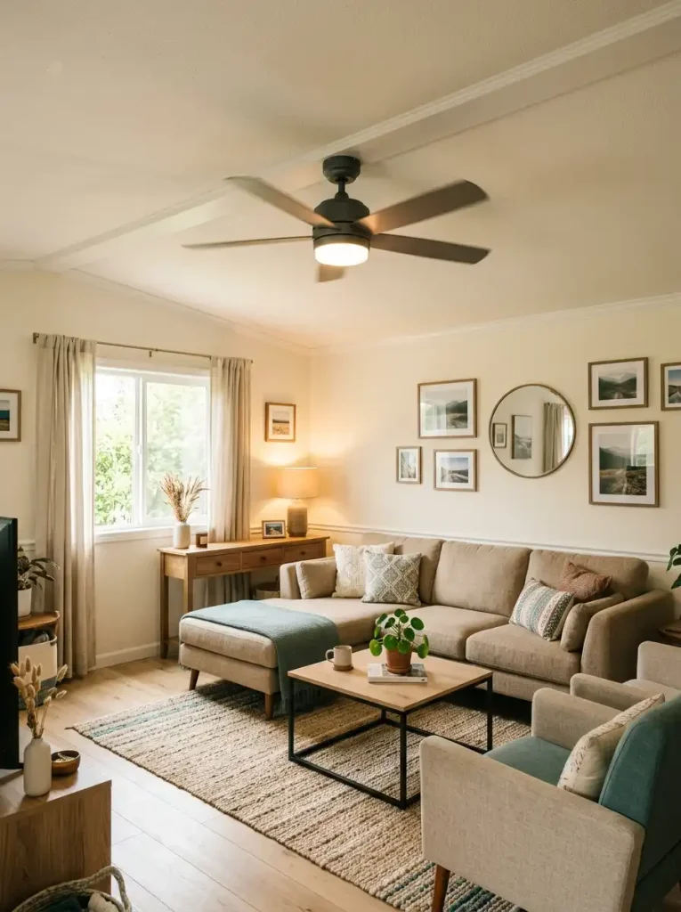
Relate its finish to something substantial already in the room—perhaps black window hardware, warm wood, brushed metal, or a quiet ceiling color—and avoid stacking several unrelated finishes overhead.
Open the factor that most closely matches what you notice in the room.
01 Span The blades seem to occupy too much ceiling width. ↔
Compare the blade span with the actual living or seating zone beneath it, not only the entire connected-room length.
02 Drop The housing or light kit seems to hang too low. ↓
Where installation requirements allow, compare lower-profile housings or simpler light kits before assuming the blade diameter is the problem.
03 Complexity The fan attracts attention before the room does. ✦
A simpler fan can feel significantly lighter without becoming physically smaller.
15. Use One Consistent Trim Color Through Connected Rooms
Trim can quietly divide a single wide into more rooms than the floor plan actually contains.
Imagine white ceiling trim in the living area, stained casing around one doorway, cream baseboards in the hall, and a different white around the kitchen.
None of those choices is disastrous.
Together, however, they create small visual interruptions at almost every transition.
Using one consistent trim color through the connected public areas gives all those edges a shared architectural language. Door casings, baseboards, ceiling lines, and openings begin to relate to one another instead of competing for attention.
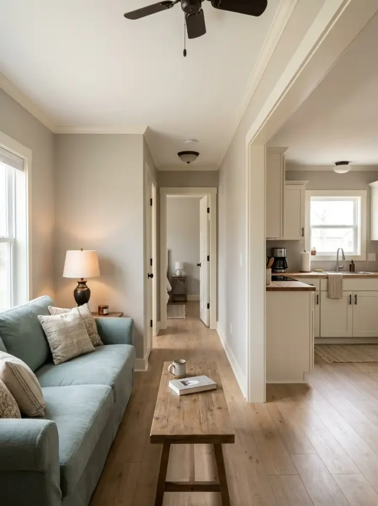
This does not require painting every piece of wood in the home.
A beautiful original wood feature can remain intentional. A bedroom can change direction behind a closed door. An accent wall may need its own edge treatment.
The strongest opportunity is usually along the surfaces you can see simultaneously.
Stand where the living room, kitchen, and hall meet. If several trim finishes appear in one view without a clear reason, unifying those visible transitions may make the home feel more composed before you add a single decorative accessory.
16. Make Factory Wall Paneling Look Deliberate
Wall paneling becomes awkward when it sits halfway between “original feature” and “something we are trying to hide.”
A cleaner approach is to choose one treatment and carry it through the room.
Option one: visually quiet the seams
If the panels are sound and you prefer a smoother contemporary look, use a compatible preparation and paint system to reduce contrast between panels. Matching the wall and seam color keeps the eye focused on furniture and architecture instead of every vertical joint.
Option two: regularize the lines
When seams are difficult to disguise completely, let them read as an intentional rhythm. Consistent trim or carefully controlled joint treatment can make repeated vertical divisions appear architectural.
Option three: preserve the panel character
Good-condition textured or wood-look panels can become part of the palette. In that case, simplify nearby furniture finishes so the walls have room to carry the visual interest.
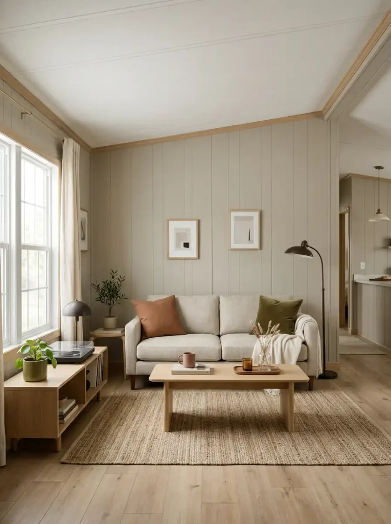
Trying to erase paneling badly often looks less finished than acknowledging it well.
Before painting or covering any manufactured-home wall material, identify its surface and choose products suitable for that finish.
Visible Seams
Build a deliberate rhythm.
Tap for the Architectural Rhythm strategy.
When seams remain visible, repetition becomes more convincing than imperfect concealment.
Material Worth Keeping
Let the original surface lead.
Tap for the Material Hero strategy.
Good wood tone or useful texture can become the room’s material anchor rather than something to cover.
17. Use the Short End Wall as a Visual Stop
Not every long single-wide interior should be made to look even longer.
Sometimes the room needs a full stop.
The short wall at the end of a living area, hallway, or open kitchen sequence is a natural place to create one. A slightly deeper wall color, one substantial artwork, a low cabinet, or a restrained architectural treatment can give the eye a destination.
That is different from filling the wall.
The strongest end walls usually have one clear hierarchy. If the wall already contains a door, window, or large television, it may need very little additional decoration.
There is also a case for doing nothing.
If the terminal wall sits in a shadowy area or the room already contains several strong focal points, darkening it can make the home appear shorter and more closed.
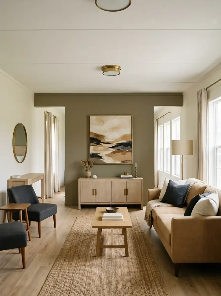
Use emphasis when the long view feels directionless.
Keep the wall quieter when the architecture already provides a convincing destination.
The question is not “Does this wall need décor?”
Ask whether the room needs a visual ending.
18. Build a Micro-Entry on the Wall, Not the Floor
A single wide may open directly into the living room with barely enough space for the door swing.
That does not mean you need to squeeze in an entry table.
Start with the things that actually arrive through the door: keys, sunglasses, dog leash, lightweight jacket, mail, and perhaps a small bag.
Most of them can live on the wall.
A narrow peg rail handles hanging items. A shallow ledge gives keys and mail somewhere to land. A small wall-mounted pocket can replace a basket sitting on the floor. Even a compact mirror can join the arrangement without claiming passage space.
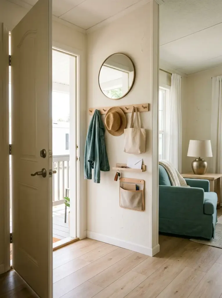
Keep the installation inside the depth of nearby door trim whenever practical so it does not become a new shoulder-level obstacle.
The result is an entry routine without an entry furniture footprint.
If you later want to layer seasonal character into that zone, the single wide fall decorating guide goes deeper into seasonal entry styling.
For everyday use, function should establish the entry first.
19. Put Tall or Deep Storage on Dead-End Walls, Not Along Passage Walls
Before replacing a bulky cabinet, try relocating it.
Storage creates the least trouble where the room already stops.
A wall at the end of a hallway, beside a closed corner, or beyond the primary circulation path can often absorb a deeper piece because people are not constantly moving past its front edge.
Passage walls behave differently.
Place a deep bookcase along one, and every inch of projection reduces the corridor beside it. Doors may feel tighter. The wall begins to press visually into the route. Even a beautiful cabinet can become irritating simply because it occupies the wrong geography.
Use this placement order when you have flexibility:
- Dead-end wall: strongest location for tall or deep storage.
- Recess or naturally wider pocket: useful when doors and vents remain accessible.
- Low-traffic corner: workable with careful depth.
- Active passage wall: reserve for shallow storage, hooks, art, or nothing.
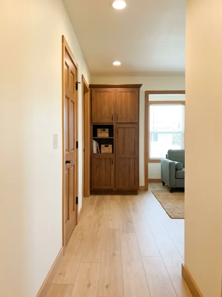
This is one of the cheapest improvements in the article because the better solution may already be in your home.
Move the storage before you shop for smaller storage.
20. Make One Bedroom Wall Work Hard and Let the Opposite Wall Breathe
A narrow bedroom becomes difficult when every wall is asked to carry an equal amount of furniture.
Instead, choose one service wall.
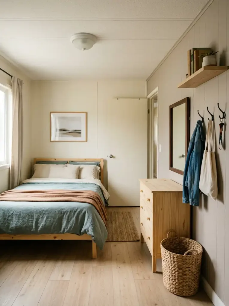
That is the wall where the dresser, mirror, hooks, laundry basket, small shelving, or other everyday functions concentrate. It does not need to contain all of them, but giving related functions one home reduces scattered projections around the room.
The opposite side can then remain simpler.
Perhaps it holds only the bed and one light bedside surface. Maybe it is almost empty except for artwork. That quiet wall is useful because it gives the room a visual release and makes walking around the bed less complicated.
Choose the service wall according to doors and windows, not symmetry.
A dresser centered beautifully on a wall is a poor trade if an open drawer collides with the bedroom door. Storage beside the closet is inconvenient if it blocks the very area where you need to stand while getting dressed.
Concentrate function where the room can support its working depth.
Then resist the urge to balance every empty patch with another piece of furniture.
21. Use Bedside Asymmetry to Protect the Door-to-Closet Path
Matching nightstands look orderly in photographs.
In a narrow single-wide bedroom, they can also consume two very different kinds of space as if both sides of the bed were identical.
Look at the side that connects the bedroom door to the closet.
If that edge carries most of the movement through the room, it may deserve the lighter bedside piece.
A full nightstand can stay on the quieter side, where drawers and surface storage are genuinely useful. On the active side, try a narrow wall shelf, small pedestal table, compact open-leg stand, or nothing beyond a wall-mounted reading light.
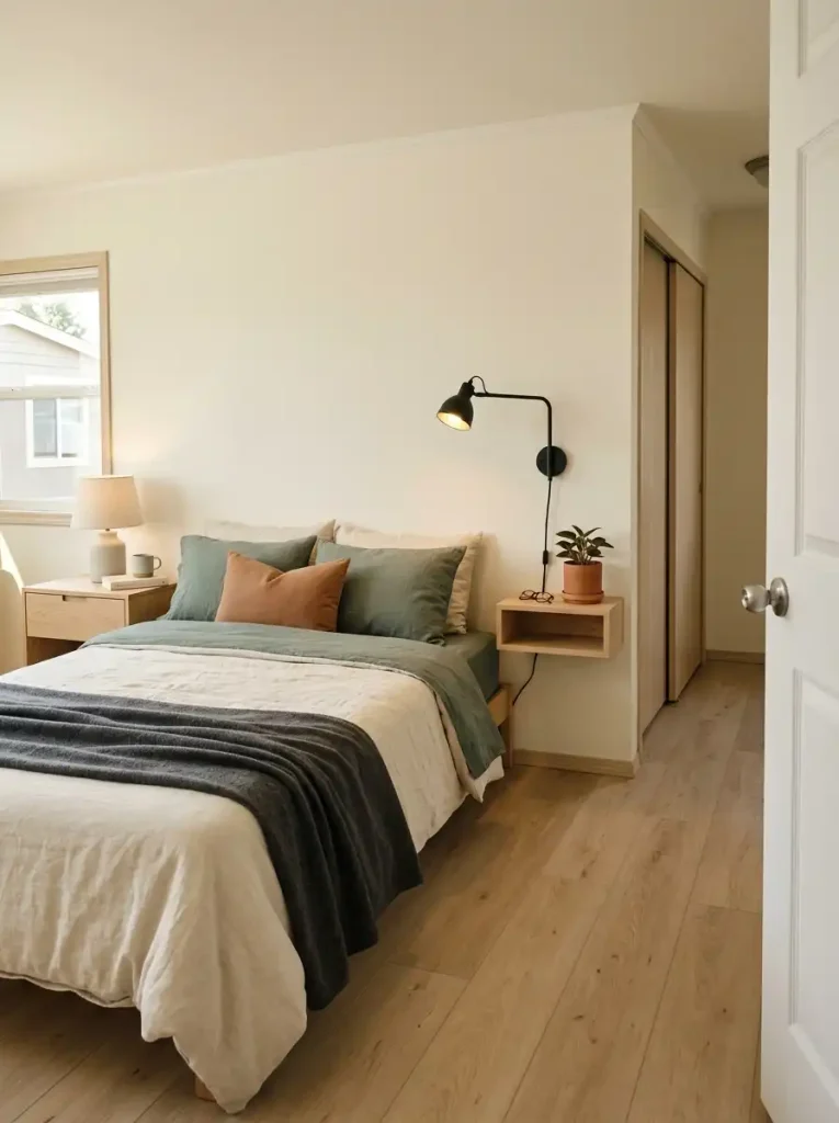
If the closet opens toward one side of the bed, test the arrangement with the closet door fully open.
If a bedroom entrance lands close to the mattress, protect that route first.
If both sides have generous clearance, matching tables may work perfectly well.
Symmetry is a visual choice.
Clear access is a functional requirement.
In a single wide, the two do not always deserve equal priority.
22. Keep Bathroom Storage Shallower Than the Fixtures Beside It
Bathroom storage is often advertised by capacity.
In a compact mobile-home bathroom, projection can be the more useful measurement.
Imagine a cabinet above the toilet that projects farther into the room than the tank below it. Or a shelf beside the vanity that extends several inches beyond the vanity front.
The storage may technically fit, yet it creates a new edge for shoulders, elbows, towels, and cleaning tools to move around.
Use the existing fixtures as a depth reference.
Storage mounted above or beside them usually feels more integrated when its front edge stays comfortably behind—or at least does not noticeably dominate—the fixture beneath it.
This is especially valuable near a toilet, narrow vanity, or tight doorway because those areas already contain unavoidable projections.
Measure depth before shelf width.

A slightly narrower cabinet that hugs the wall can be more useful than a larger one that makes the room harder to occupy.
Measure the difference, then open the range closest to your bathroom.
0 in. Flush / Borderline Storage meets the fixture front. LOW
Check head, shoulder, cleaning, drawer, and door clearances before accepting the depth.
1–2 in. Caution Storage begins to lead the fixture. MED
Pay special attention to turning space and door movement. This is where a slightly shallower unit can begin to improve comfort.
3–4 in. Intrusive The storage becomes its own obstacle. HIGH
This is particularly troublesome beside a toilet, narrow vanity, tight turn, or bathroom doorway.
5–6 in. High Interference Storage dominates the movement zone. VERY HIGH
At this depth, extra capacity is likely being purchased with body clearance, cleaning access, and visual openness.
Once the functional storage is solved, the fall mobile home bathroom decor guide can help with seasonal color and styling without turning the room’s circulation space into decoration.
23. Position Mirrors to Borrow an Open View
Two mirrors of the same size can produce completely different results.
Place the first opposite a tall storage cabinet.
It reflects a tall storage cabinet.
Place the second where it catches a bright doorway, an uncluttered stretch of flooring, a window, or the opening toward another room.
Now the reflection has depth.
That difference explains why simply adding “a big mirror” is unreliable small-space advice.
The mirror does not create space. It repeats whatever you point it at.
Before hanging one, stand where the mirror will go and look in the direction it will face.
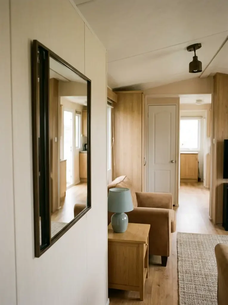
A reflection filled with countertop clutter, a television, or another mirror can increase visual activity. A reflection containing daylight or an open transition can make the same wall feel more connected to the rest of the home.
This works especially well near an entry, dining zone, or living-room side wall where the reflected scene can reach beyond the immediate area.
Choose the view first.
Choose the mirror second.
24. Stack Art Vertically on Narrow Wall Slivers
Some of the most awkward walls in a single wide are not really walls at all.
They are strips.
You may have a narrow section between a doorway and window, beside a thermostat, at the end of a cabinet run, or between two openings.
Trying to force a conventional horizontal gallery into that shape usually makes the area look even tighter.
Start with one appropriately scaled vertical piece.
Still too empty?
Add a second frame beneath it with a deliberate gap.
If the wall is tall enough, a third smaller piece can create a compact vertical stack.
Then stop.
The arrangement works because it follows the geometry already present. The eye travels upward along the narrow wall instead of expecting width that the surface cannot provide.
Keep frame depths modest where the wall borders a walkway, and avoid building outward with bulky shelves just to make the strip “useful.”
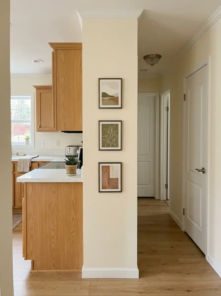
A wall sliver does not need to hold much.
It needs an arrangement with the same orientation as the space itself.
25. Make the TV Wall Choose One Job
Myth: The TV wall should hold the television, closed storage, books, family photos, plants, baskets, artwork, speakers, and every object you do not know where else to put.
That approach can work on a broad built-in wall.
Inside a narrow single wide, it often turns one side of the room into a dense visual block.
Try assigning the wall a primary role.
If it is a media wall
Let the television and a restrained console dominate. Hide routine clutter where possible and keep decorative objects secondary.
If storage is the priority
Closed cabinetry can carry more visual mass, but simplify the display layer so the storage reads as deliberate furniture rather than accumulated pieces.
If display matters most
Use lighter shelves or a controlled arrangement and avoid surrounding the television with so many objects that it becomes one more competing rectangle.
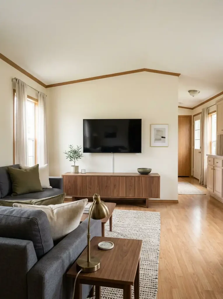
You can still combine functions.
The correction is to stop giving all of them equal emphasis.
In a room with limited width, a wall that clearly says media, storage, or display will usually feel calmer than one trying to announce all three at the same volume.
26. Use Open Furniture Bases at Corridor Edges and Solid Bases at Dead Ends
Two pieces can occupy almost the same floor area and still feel dramatically different.
The difference is what your eye sees underneath them.
Near an active corridor edge, furniture on visible legs allows flooring to continue beneath the piece. A slim-legged chair, open-base side table, or raised console still occupies physical space, yet it does not create one continuous block beside the route.
A solid cabinet behaves differently.
Its base meets the floor and creates visual weight from top to bottom. That can be useful at the end of a room, where the stronger mass gives the long interior an anchor.
So do not apply the common “choose leggy furniture” rule everywhere.
Use open bases where the eye and body need to pass.
Allow heavier bases where the architecture can absorb them.
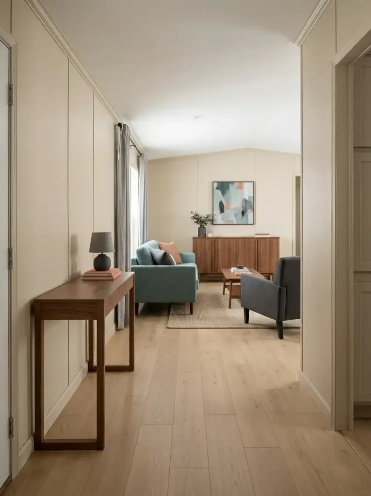
A solid credenza at a dead-end wall may feel grounded. Put that same mass along the narrowest corridor edge, and it can make the route feel compressed even when the measurements have not changed.
Location determines whether visual weight is helpful.
Dead End Solid mass at the natural stopping point. BEST
Where circulation already stops, stronger furniture mass can visually close the long room without stealing space from movement.
Quiet Corner Can work when nearby circulation stays clear. CHECK
Check door swings, windows, and the walking turn around the corner before committing.
Passage Edge The mass now competes directly with movement. AVOID
Relocate the solid cabinet to a dead-end wall. If storage must remain beside the passage, reduce its depth or use a more open base.
27. Give Every Floor-Footprint Decor Item a Job Before It Gets a Spot
The final decorating decision is not about style.
It is about floor real estate.
A plant stand, leaning ladder, decorative basket, spare stool, floor vase, magazine rack, and sculptural object may each seem insignificant. Put several of them into a narrow home and they quietly consume the same floor you worked to recover through better furniture placement.
Before keeping a floor-level decorative item, ask what it returns.
Does it perform a daily function?
Does it create enough vertical or focal impact to justify its footprint?
Would putting the same object on a wall, shelf, table, or cabinet give you the visual effect without using walking space?
Some objects will easily pass that test. A floor lamp may provide necessary light. A substantial plant can soften an awkward corner. A basket may contain things your household genuinely uses there.
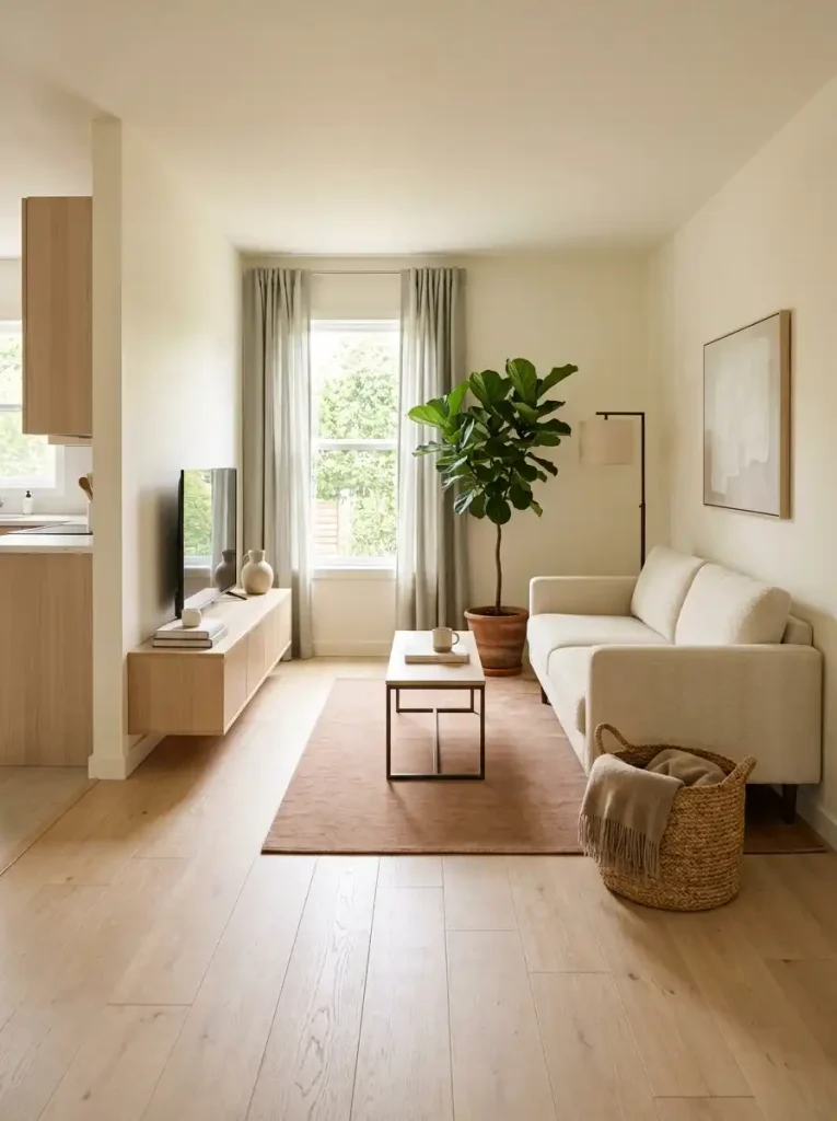
Others are simply occupying available space because available space existed.
That is the distinction worth protecting.
Do not try to eliminate décor.
Make the floor itself one of the resources you decorate with.
Start with the first question. Open the Yes or No branch that describes your object, then continue until you reach its exact verdict.
Question 1 · YES
Yes — its visual payoff is large enough to notice across the room.
Q2: Yes — moving it to a wall or surface would make it worse.
Q3: YES — I would intentionally put it back.
The piece has room-wide visual impact, genuinely benefits from remaining floor-based, and would be deliberately returned after a full reset.
Q3: NO — I probably would not deliberately put it back.
Because it looks important and works best on the floor, keep it only if the overall room actually feels worse when it is removed.
Q2: No — it could work on a wall, shelf, table, or cabinet.
Q3: YES — I would intentionally return it.
You value it and it contributes visually, but nothing proves that the floor is its best location. Try elevating it first.
Q3: NO — I would not intentionally return it.
Move it to a shelf, console, cabinet, ledge, or tabletop and return the floor area to circulation.
Question 1 · NO
No — its visual payoff is not strong enough to notice across the room.
Q2: Yes — moving it off the floor would make it worse.
Q3: YES — I would intentionally return it.
You deliberately value it and its function depends on floor placement. Test a quieter corner or dead-end zone where it costs less circulation.
Q3: NO — I would not intentionally return it.
Move it to a lower-traffic zone. If no location makes it feel useful or intentional, removal becomes the next test.
Q2: No — it could move off the floor without losing anything important.
Q3: YES — I would still intentionally return it.
Remove it for one day. If the room genuinely loses something meaningful, bring it back intentionally—or find it a non-floor location.
Q3: NO — I would not deliberately return it.
It has little room-wide payoff, does not depend on floor placement, and would not be deliberately returned after a reset. Remove it and keep the negative space.
Make the First Change Where Your Home Feels Tightest
You do not need to apply all 27 ideas at once.
Start with the place where the home feels hardest to use: the sofa that projects too far, the dining chair that blocks a route, the cabinet beside the hallway, or the collection of small objects gradually claiming the floor.
Fix that relationship first.
Once circulation and furniture depth make sense, color, art, textiles, and decorative details become much easier to enjoy because they are no longer trying to compensate for a difficult layout.
A well-decorated single wide does not need every inch filled.
It needs every important inch to have a reason.