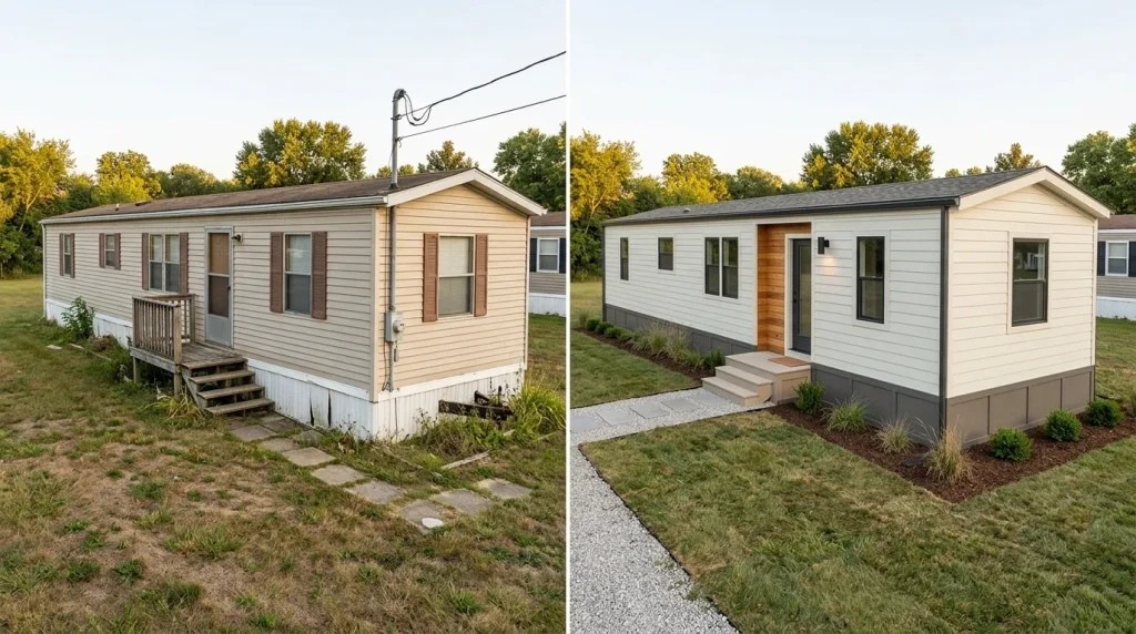
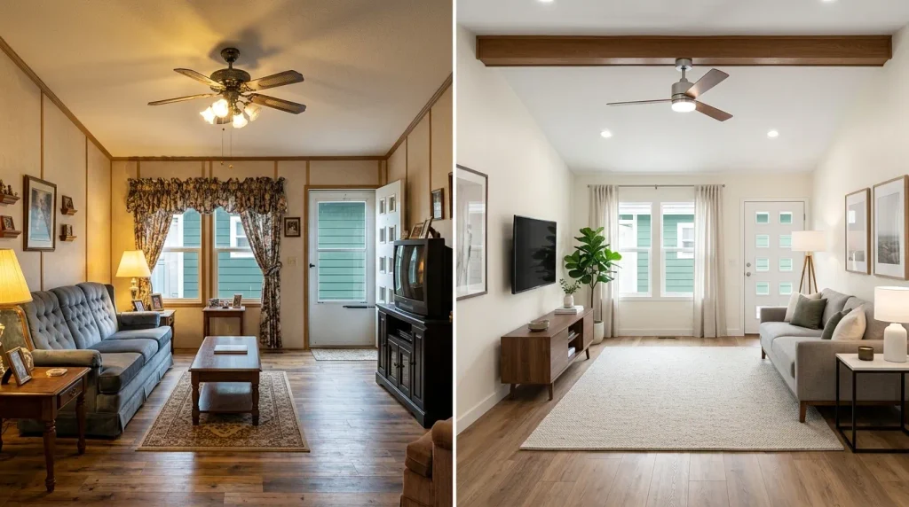
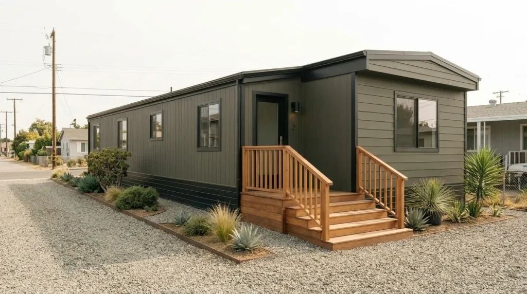
An old single wide makeover can produce a surprisingly new-looking home without disguising its original proportions or sending every usable feature to the dumpster. The transformations that work best usually solve a few large age signals first: a tired exterior field, a flat entry, an unfinished base, competing window details, broken interior sightlines, or too many finishes asking for attention at once.
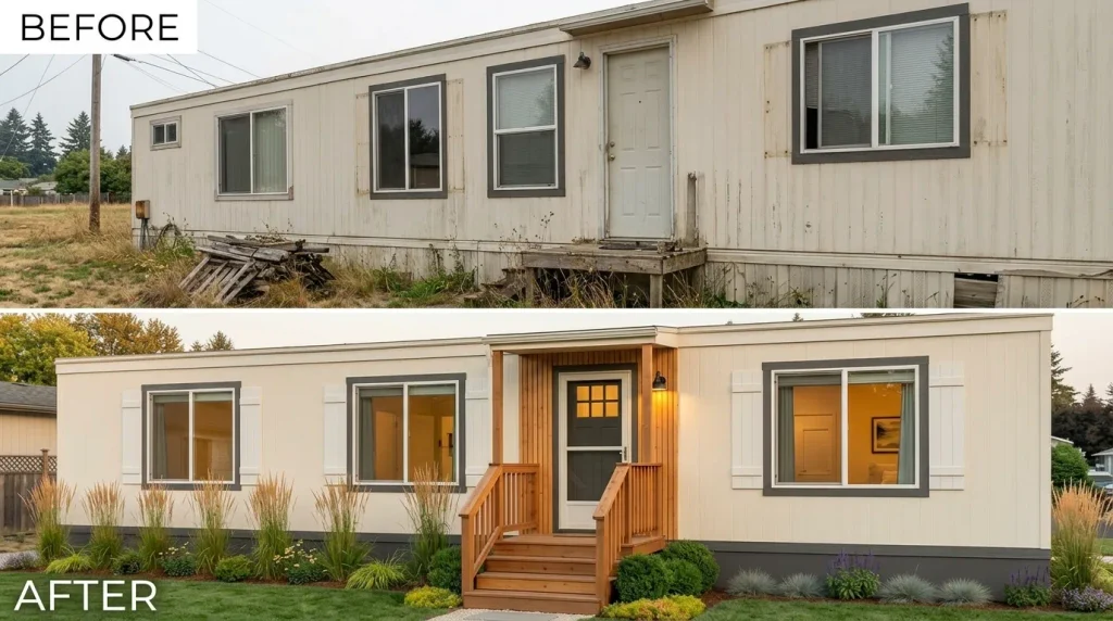
That distinction matters when you study dramatic before-and-after photos. Better lighting, fresh furniture, landscaping, and a flattering camera angle can make almost any property look improved. A useful makeover reveals what actually changed the visual read of the home.
The 15 transformations below are built around that question. Each starts with a recognizable “before” condition, identifies the move doing most of the work, and gives you a practical stopping point. The aim is not to copy one finished house. It is to understand why an older single wide can suddenly begin to look far newer.
1. Reset the Largest Exterior Field Before You Add More Details
Walk far enough away from an older single wide that small decorations disappear.
What do you notice first?
On many homes, the answer is not the front door or shutters. It is the sheer acreage of the exterior shell: faded siding, several unrelated color bands, weathered trim, obvious patchwork, or one long surface that has lost any sense of visual order.
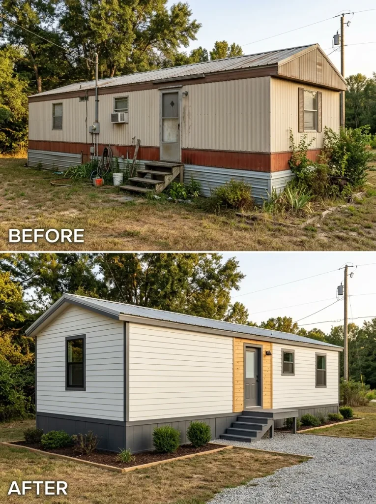
That broad field can overpower every smaller improvement.
Before buying porch furniture, window boxes, house numbers, or decorative lights, photograph the whole home from the curb. Cover the smaller features with your thumb and judge what remains. If the siding and major trim still dominate the home for the wrong reasons, that is your first makeover problem.
A successful after-photo should reverse the hierarchy.
Before: deterioration, competing bands, or surface inconsistency commands the view.
After: the shell becomes a calm background, so the original openings and entry can finally act like intentional features.
If the material itself shows damage or another condition concern, deal with that question before treating it as a purely cosmetic surface.
Before/After Difference Decoder
What is making the “before” look old first?
Choose the strongest signal in the wide photograph. The smartest first move changes with the diagnosis.
Use this route when siding color, patchiness, or competing exterior bands control the photograph.
Choose this when the main exterior field already feels coherent but the entrance has little presence.
Useful when the façade looks busy up close even though the primary exterior color already works.
Use this when unfinished edges dominate the wide view more than the siding does.
2. Give the Front Door Enough Depth to Become a Real Architectural Focal Point
A long single-wide elevation can make even a freshly painted front door seem surprisingly insignificant.
Picture two versions of the same façade.
The first has a door sitting almost flush within a long uninterrupted wall, with a basic set of steps below it. The second has enough depth around that exact doorway to announce arrival: perhaps a defined landing, a small cover, a pair of posts, coordinated lighting, or a strong vertical surround.
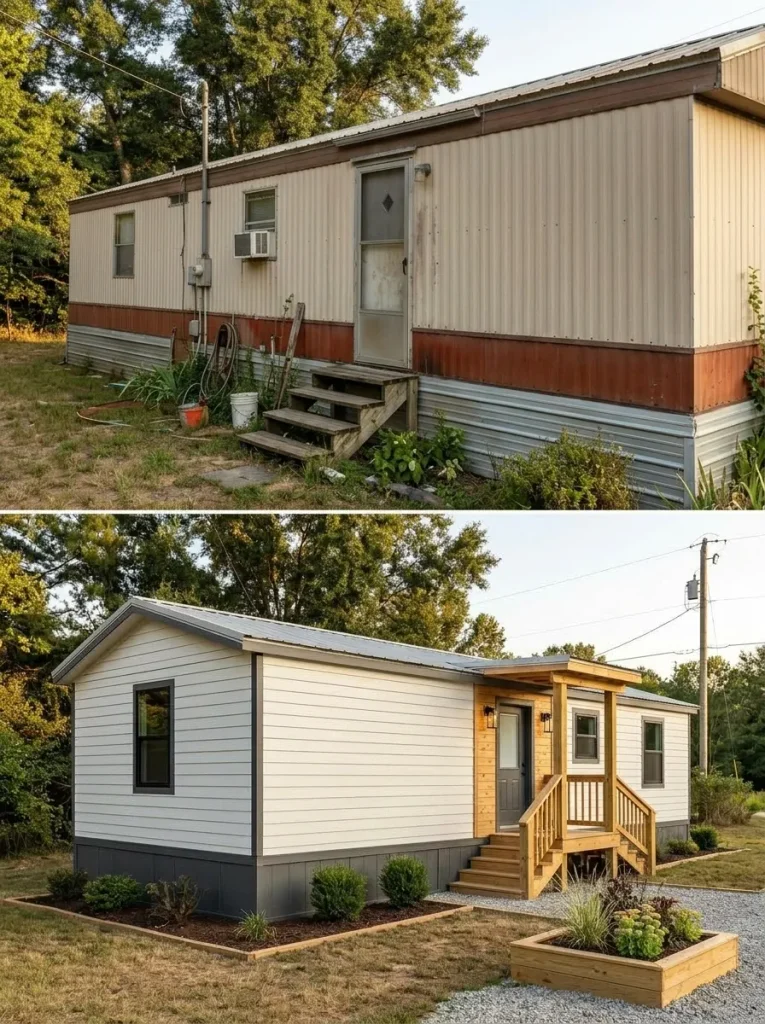
The house has not become wider. The entry has gained hierarchy.
Start with the least invasive intervention capable of changing that hierarchy. A darker door, coordinated light, cleaner landing and vertical trim may be sufficient. On another home, the photograph may show that a properly planned covered landing or porch-scale feature would materially improve both arrival and use.
The important distinction is where styling ends and construction begins. HUD notes that significant additions or structural alterations to a manufactured home may require local permits and can affect HUD Code compliance; homeowners are advised to consult the appropriate state, county, or local agency before such changes. HUD
Entry Depth Ladder
How much architecture does the doorway actually need?
3. Make Uneven Windows Read Like One Intentional Rhythm
Do your windows look awkward because they are different sizes—or because every opening has been treated as a separate decorative event?
An older single wide may have a wide living-room window, narrower bedroom openings, and a kitchen window mounted at a different height. Those differences often follow the rooms behind them. Trying to fake perfect symmetry can make the façade stranger.
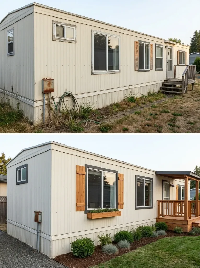
Look for repetition.
Consistent casing color can connect unlike openings. Selective shutters may add vertical emphasis where their proportions make sense. Matching exterior lights or repeated planters can establish another visual rhythm without attaching something to every window.
Run three checks before adding more:
- Would the proposed shutters look wide enough to belong to the opening?
- Is the existing trim already consistent enough that the real problem is elsewhere?
- Are several different accent ideas competing across one wall?
If the third answer is yes, remove something before adding another feature.
The makeover is working when your eye reads the whole elevation first and the different window sizes second.
4. Finish the Ground Line So the Home Stops Looking Temporary
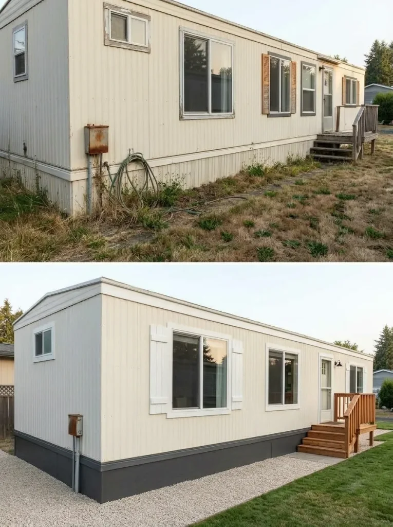
A freshly painted single wide can still look unfinished the moment your eye reaches its bottom edge.
Skirting, stairs, utilities, exposed soil, weeds, gravel, edging, and drainage transitions all occupy the same narrow band in the exterior view. When that band is visually chaotic, the house can appear detached from its site even after expensive improvements above it.
Use a simple order of operations.
1. Remove visual noise. Clear discarded pots, hoses, leftover material, weeds, and objects with no permanent role.
2. Resolve the base. Make the visible skirting and nearby trim read as one intentional lower edge.
3. Connect arrival to grade. Steps and the landing should feel connected to a recognizable path or surface.
4. Add only enough landscape edge to finish the transition.
Then retake the original photograph.
If the eye now moves from yard to house without catching on an unfinished strip, the ground line is doing its job. A continuous row of decoration around the perimeter is unnecessary.
5. Landscape the House Into the Lot—Without Trying to Hide It
Imagine that the siding has already been improved and the entry finally looks intentional.
The house still appears to be sitting in the middle of an empty patch of land.
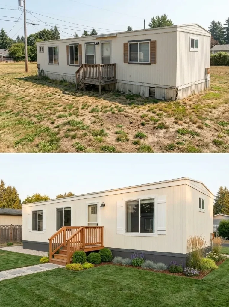
A few carefully placed landscape anchors integrate the home with the lot without disguising its single-wide form.The instinctive fix is often a continuous row of shrubs along every visible wall. That can trade one long horizontal line for another.
A more convincing old single wide makeover uses landscaping at specific visual pressure points.
Frame the route to the entry. Soften an exposed end. Repeat one plant family beneath part of the window sequence. Give an awkward corner a low planting mass. Leave clean sections of siding visible between those groups.
That spacing matters because the home still needs negative space.
Take another wide photograph. The planting should help answer three questions without calling attention to itself:
Where is the entrance?
Where does the building meet the lot?
Which edges need softening?
If plants begin covering windows, squeezing the steps, or creating a decorative border around the entire home, the landscape has crossed from integration into camouflage.
6. Break the Long, Low “Box” Effect With Better Vertical Proportion
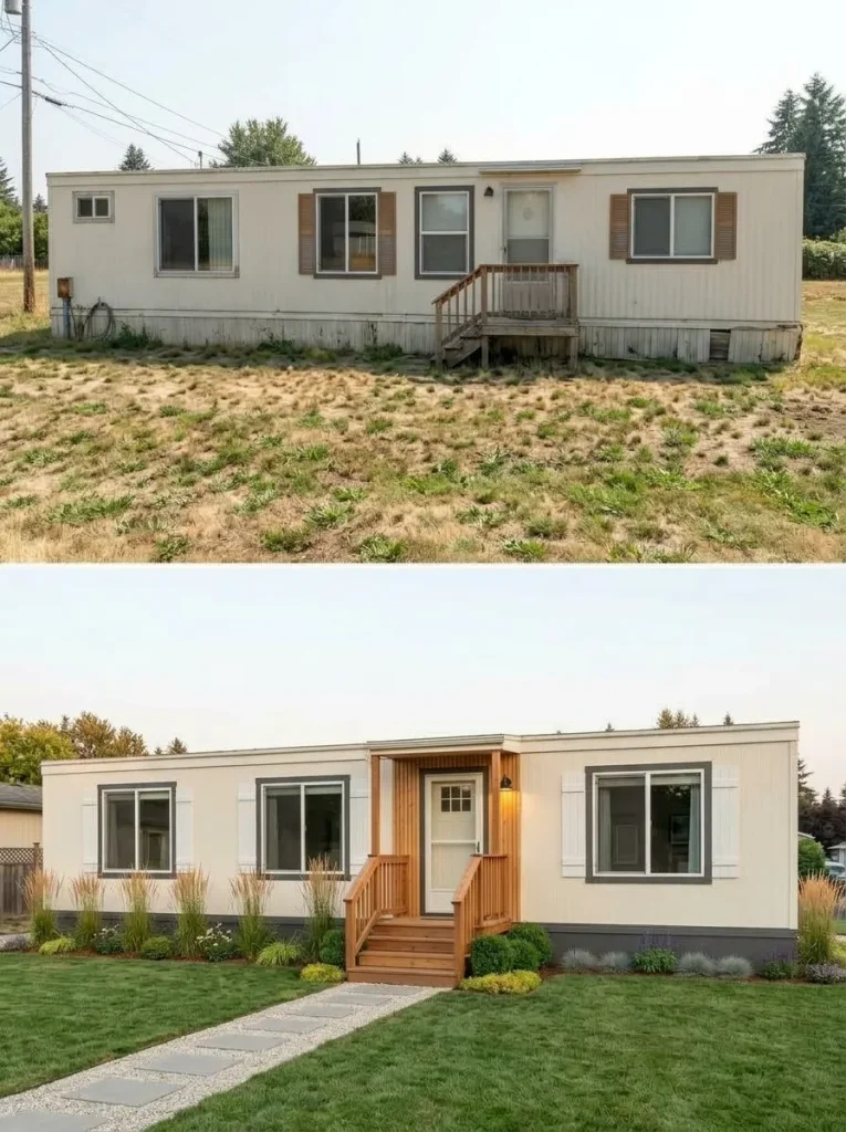
A single wide naturally contains many strong horizontal lines: roof edge, siding, window alignment, floor line, skirting, and the length of the home itself.
That is not a defect.
The visual problem appears when nothing interrupts the horizontal sweep.
A small number of vertical cues can change the proportion dramatically: entry posts, a narrow vertical cladding zone, taller-looking door trim, upright planting, or shutters that genuinely suit a particular window.
Concentrate those cues near a place that deserves attention.
Photograph the façade straight-on and mark where your eye naturally wants to pause. If that location is already the entrance, reinforce it there. Scattering vertical accents across every window can weaken the hierarchy you were trying to create.
Homes that already have good overall proportions may need only smaller finishing improvements. For that narrower scope, see 21 Cheap Mobile Home Upgrades That Look Expensive. That guide focuses on lower-cost details without rebuilding the entire makeover strategy. Stylish Galore
If your proportion fix involves a significant structural addition, treat it as a construction decision and verify applicable requirements first. HUD
7. Lighten the Main Living View Before You Replace the Furniture
Here is a useful test for an old single-wide living room:
Photograph it from the doorway and mentally remove the sofa.
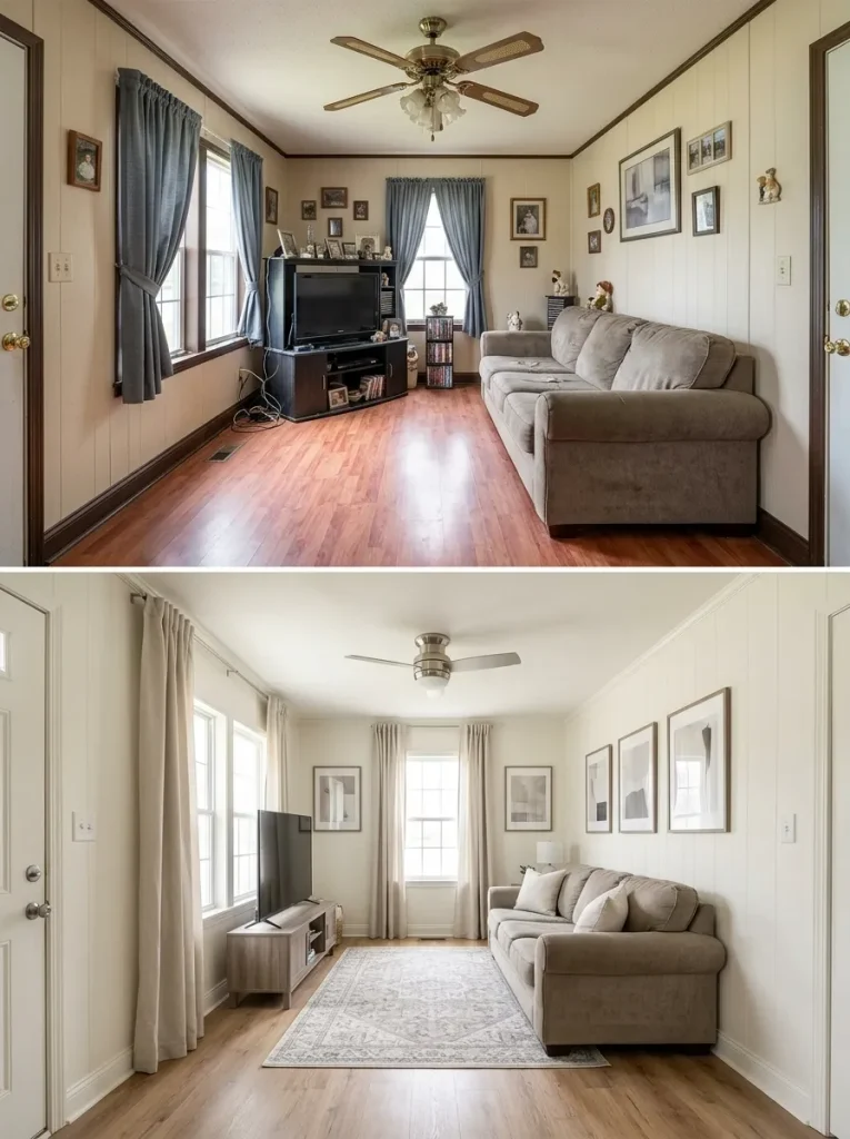
Does the room still look dated?
If it does, replacing that sofa may produce less change than expected.
Large wall fields, dark perimeter trim, several flooring tones, heavy window treatments, a visually busy ceiling, or too many competing wood colors can establish the room’s age before the furniture is judged.
Work on that background hierarchy first.
A calmer wall field may make a perfectly usable beige or gray sofa suddenly belong. A more continuous-looking floor can reduce the need for several small rugs. Removing an unnecessary window-treatment layer can expose more wall and daylight without touching the seating.
Do not use this section to solve a difficult furniture plan at the same time. If doorways, television position, recliners, or a sectional are creating the problem, the specialist guide to single-wide living rooms for long, narrow spaces handles those placement decisions in depth. Stylish Galore
Decision test: if the room already feels substantially newer after the largest background surfaces are calmed, keep serviceable furniture until it proves that it is still the problem.
8. Make an Old Ceiling Look Architectural, Not Busy
Some of the most convincing single-wide transformations do not erase the ceiling.
They edit it.
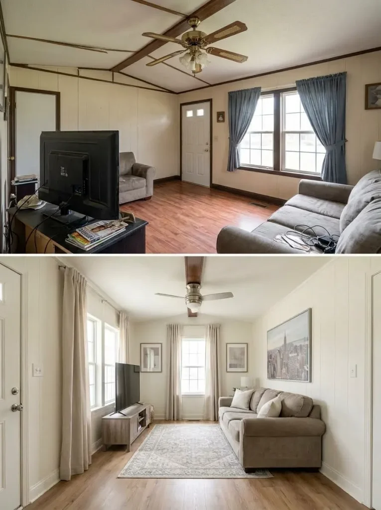
A shallow vault, existing beam, simple plank treatment, or unusual roof form may become a feature once the surrounding visual noise is reduced. Trouble begins when every ceiling element has equal strength: dark perimeter trim, several contrasting seams, a busy surface, visible vents, a dominant fan, and another decorative band below it.
Choose one ceiling idea to lead.
If an existing beam has attractive proportion, the rest of the ceiling may need to become quieter. If the surface itself has good texture, surrounding trim may need less contrast. If the fan is visually enormous, changing its scale or finish may deliver more improvement than adding another architectural detail.
Use two photographs from one standing position: one level and one angled upward.
The first tells you how much the ceiling affects everyday perception. The second reveals which line or component is dominating.
Do not use cosmetic work to hide staining, sagging, moisture evidence, or a material you have not identified. A condition question needs to be understood before the ceiling becomes a styling project.
9. Let the Living–Dining–Kitchen Long View Read as One Home
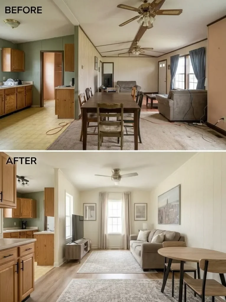
One of the biggest differences between a single wide and a collection of disconnected room photos is the long view.
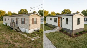
From the living room, you may see dining, part of the kitchen, a hallway, two flooring transitions, several wall colors, different woods, and furniture projecting into the route—all at once.
That is where otherwise attractive makeovers can fall apart.
Stand at one end of the main living space and look as far through the home as possible.

Where does your eye stop for the wrong reason?
A flooring break may be the culprit. The kitchen may introduce a completely different wood family. A dark doorway may interrupt an otherwise light wall sequence. A chair could project just far enough into the narrow path to visually shorten the entire interior.
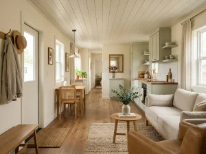
The objective is not to make every room identical. It is to give the view enough continuity that the transitions appear deliberate.
Single-Wide Long-View Mapper
Where does the connected interior break apart?
Pick the interruption you notice first from one end of the home. Each problem calls for a different makeover move.
After-photo test: your eye should travel through the home before becoming conscious of where one zone ends and the next begins.
The broader specialist guide to single-wide interior ideas for narrow homes goes deeper into flooring continuity, ceiling planes, furniture scale, window treatment, and other whole-interior relationships. Stylish Galore
10. Modernize the Night View by Moving Some Light Below the Ceiling
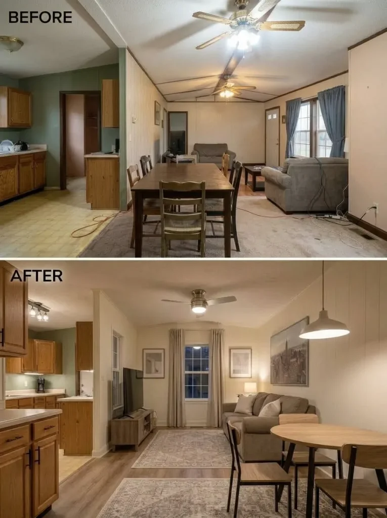
Your makeover may look excellent at midday and slip backward after sunset.
The reason can be as simple as where the light originates.
Many older interiors rely heavily on one central ceiling source in each zone. That can flatten texture, leave corners dull, and illuminate a connected living–dining–kitchen area as one undifferentiated field.
Run an evening experiment using fixtures you already own.
Turn off the main ceiling light for a moment. Switch on a table lamp beside the sofa, a floor lamp near a reading chair, task lighting already available in the kitchen, or another lower source.
Photograph the room again.
The second image often reveals depth that décor could not create. Seating acquires a visual boundary. The kitchen can remain active without dominating the living space. Corners no longer disappear.
That does not mean every ceiling light should be abandoned. General light still has a job. The makeover decision is whether all of the room’s atmosphere is currently coming from above.
If your solution requires new wiring, relocated electrical components, or other electrical alterations, separate that work from the decorating decision and use appropriate qualified help.
11. Simplify Window Treatments Until the Openings Look Taller and Cleaner
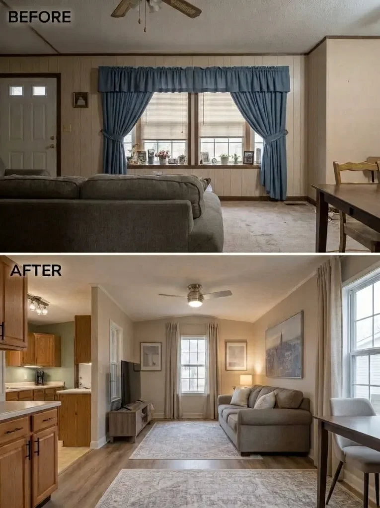
An updated room can keep one strong reminder of its past: every historic window-treatment layer surviving at once.
Blind.
Valance.
Gathered curtain.
Tieback.
Decorative topper.
Shelf.
Plants across the sill.
None of those elements is automatically wrong. The problem is their combined visual weight around a relatively modest opening.
Remove the least essential layer and live with the window before purchasing a replacement.
Can privacy still be managed?
Does daylight improve?
Does the wall suddenly appear taller?
If curtains remain useful, let their placement reinforce the full height of the opening instead of visually cutting the wall into several horizontal bands.
There is also a stopping condition here. A simple existing shade or curtain that functions well and visually suits the room does not need replacing just to make the makeover feel comprehensive.
The most convincing after-image makes the window easier to notice and the treatment less noticeable.
12. Make the Kitchen Look Newer by Correcting Its Biggest Finish Field First
A kitchen makeover gets expensive when every visible component becomes a candidate for replacement.
Pause before that happens.
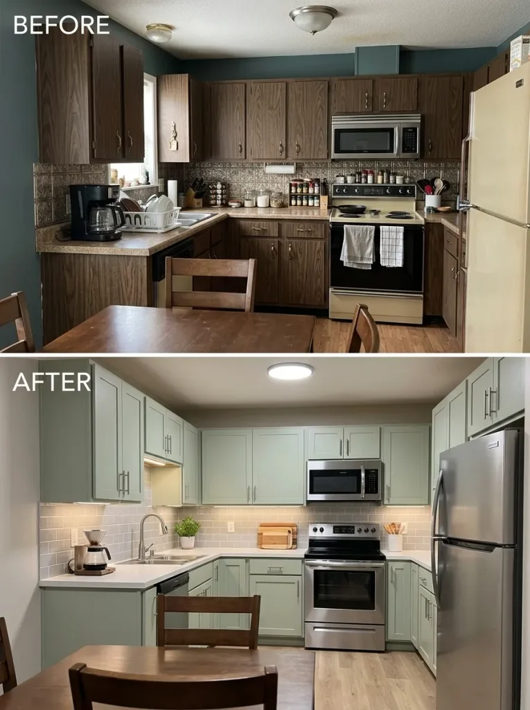
Take the widest photograph you can from the dining or living area. Which feature broadcasts the kitchen’s age across the greatest portion of that image?
It may be cabinetry.
It may also be an aggressive backsplash, several counter patterns, a strongly colored floor, dark wall field, cluttered open storage, or a collection of finishes that have never agreed.
The photograph tells you where the visual leverage is.
Refresh / Refinish / Replace Scope Splitter
What does the before photo actually justify?
If the photograph points toward a broader kitchen project, continue with 17 Mobile Home Kitchen Makeover Ideas on a Budget. That specialist guide deals with scope control, working layouts, cost cascades, and budget decisions in greater depth. Stylish Galore
13. Rebuild a Small Bathroom Around the Vanity–Mirror–Light Relationship
Compare two compact bathrooms with the same tub, same floor area, and similar renovation budgets.
One may look much newer because the first view through its doorway has been resolved as one composition.
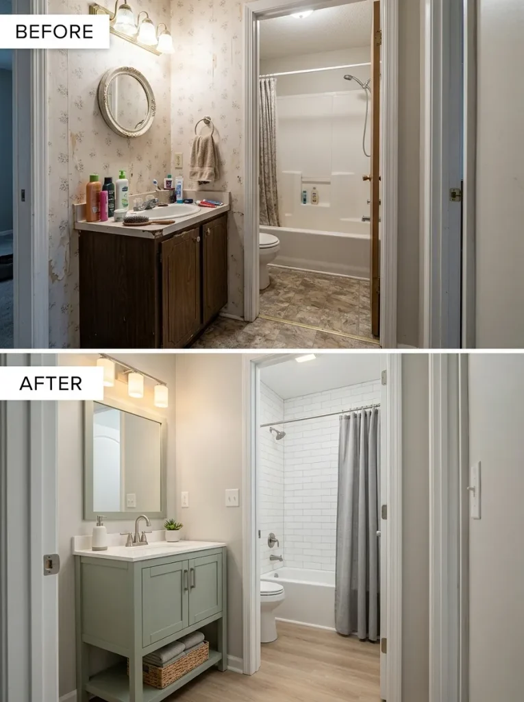
In many small mobile-home bathrooms, the vanity wall carries that role. The vanity, mirror, light, faucet, visible storage, and wall behind them occupy enough of the first photograph to influence the entire room.
Updating them independently can weaken the effect.
A new vanity beneath a disproportionately small mirror still feels unfinished. A better mirror with a visually unrelated light can produce the same problem. A beautiful faucet will not rescue a countertop crowded by products and competing accessories.
Stand in the doorway before buying anything.
If the vanity wall controls the first view, solve that group together. If the tub or shower dominates instead, let the actual room—not a generic bathroom formula—set the priority.
Plumbing changes, waterproofing, ventilation issues, water damage, and wet-area work require a different level of judgment than cosmetic styling. For a deeper remodel, use 17 Mobile Home Bathroom Remodel Ideas on a Budget, which separates low-disturbance updates from work that reaches into plumbing, floors, walls, and wet zones. Stylish Galore
After-photo test: one compact focal zone should feel resolved enough that everything around it can stay quieter.
14. Make the Bedroom Feel New With Better Scale and One Strong Focal Wall
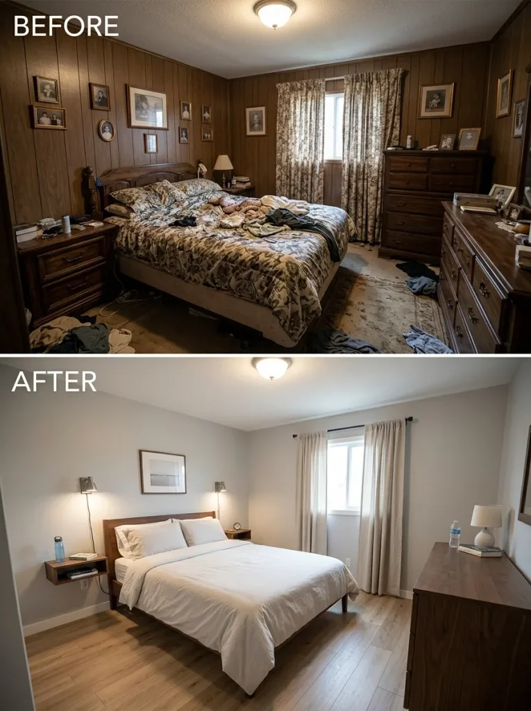
Consider a common small-bedroom “before”:
A bed.
Two large side tables.
A tall dresser.
A wide dresser.
Heavy curtains.
Several small pictures.
Very little empty wall or visible floor.
Nothing in that list is necessarily unattractive. The problem is that too many medium-to-large objects are competing inside a narrow room.
Remove one piece whose footprint is not earning its place.
Then look at the bed wall.
Can the headboard, two compact lights, one piece of art, or a restrained paint treatment establish a strong focal composition without adding another bulky object?
That sequence changes the bedroom in two ways. The room gains a visual anchor, and the perimeter becomes easier to move through.
If the deeper problem is bed placement, closet clearance, dresser access, or circulation, switch from decorating mode to layout mode. The specialist article on single-wide bedroom ideas for small rooms addresses those relationships directly. Stylish Galore
Stop signal: the bed composition commands attention before the amount of furniture does.
15. Repeat a Small Finish Family Until the Makeover Reads as One Home
The final stage of a convincing makeover is often not another purchase.
It is agreement.
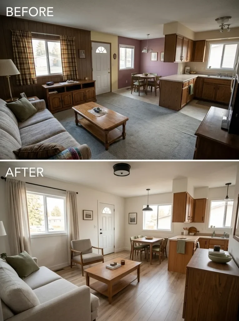
Walk from the exterior entry through the living room, dining area, kitchen, bathroom, and bedroom. Do not ask whether every room matches. Ask whether a small group of finishes keeps returning.
Perhaps the home uses warm white, natural wood, charcoal, and one muted green.
Maybe the palette is creamy beige, walnut, aged brass, and soft blue-gray.
The precise combination matters less than its discipline.
A recurring wood tone can connect an entry post to interior furniture. One dark metal may move from exterior lights to door hardware and kitchen accents. A wall neutral can reappear without forcing every room to become identical.
The final audit should also tell you when not to continue.
Whole-House Finish Agreement Audit
How many major views still feel like a different house?
A finished home can still contain original features. Cohesion matters more than making every component new.
When the Before Photo Stops Winning
A successful old single wide makeover is not measured by how many original materials disappear. It is measured by whether the strongest age signals still control the first impression.
Retake the widest before photos from approximately the same positions. Look at the exterior from the curb, the interior from the entry, and the longest connected sightline. If those major views now feel settled and coherent, allow the project to stop—even when some older features remain.
If one problem still dominates, name that single problem before opening another room or shopping category. That keeps the next decision connected to something visible instead of letting the makeover expand by momentum.
A single wide can remain completely recognizable and still feel remarkably new when its biggest surfaces, focal points, proportions, and repeated finishes finally agree.
Save these old single wide makeover ideas on Pinterest so you can return to the before-and-after decision tests when you plan your own transformation.