An old single wide makeover can be surprisingly convincing when the right changes work together. A tired exterior may still have a perfectly usable shape. A narrow living room may feel dated because several surfaces are competing for attention. Even a kitchen that looks decades old may need less rebuilding than its first impression suggests.
The challenge is figuring out which changes actually make an older single-wide mobile home read as newer, instead of layering fresh décor over the visual problems that reveal its age.
The 15 makeovers below focus on those turning points. You will see how exterior proportion, connected sightlines, flooring, kitchens, porches, bedrooms, bathrooms, trim, and repeated materials can transform the same compact structure without assuming every usable feature should be replaced.
Single wides also behave differently from wider houses. Their long exterior profile and connected interior views mean that one well-chosen improvement can influence several spaces at once.
Old Single Wide Transformation Atlas
| What makes the home look old first? | Test before planning a major remodel | Stronger new-home signal |
|---|---|---|
| Flat, featureless exterior | Simplify the shell and strengthen one arrival point | Clear façade hierarchy |
| Long, visually crowded interior | Clear the longest sightline and compare furniture mass | Calmer connected space |
| Dated but functional kitchen | Judge cabinets, counter, backsplash and appliances together | Coordinated finish field |
| Porch that looks attached later | Compare its materials and visual language with the home | Integrated outdoor room |
Use this as a diagnostic before making a shopping list. Find the condition creating the strongest age signal first; otherwise, money can disappear into improvements that barely change how the home reads.
1. A Plain Beige Box Becomes a Warm Modern Cottage
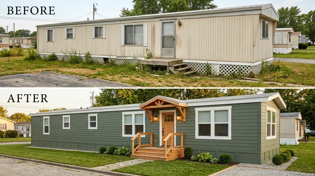
A long single wide can appear older than it actually is when every part of the exterior carries roughly the same visual weight. Siding, windows, door, skirting and steps may all be functional, yet nothing tells your eye where the home begins, where to approach it, or which feature deserves attention.
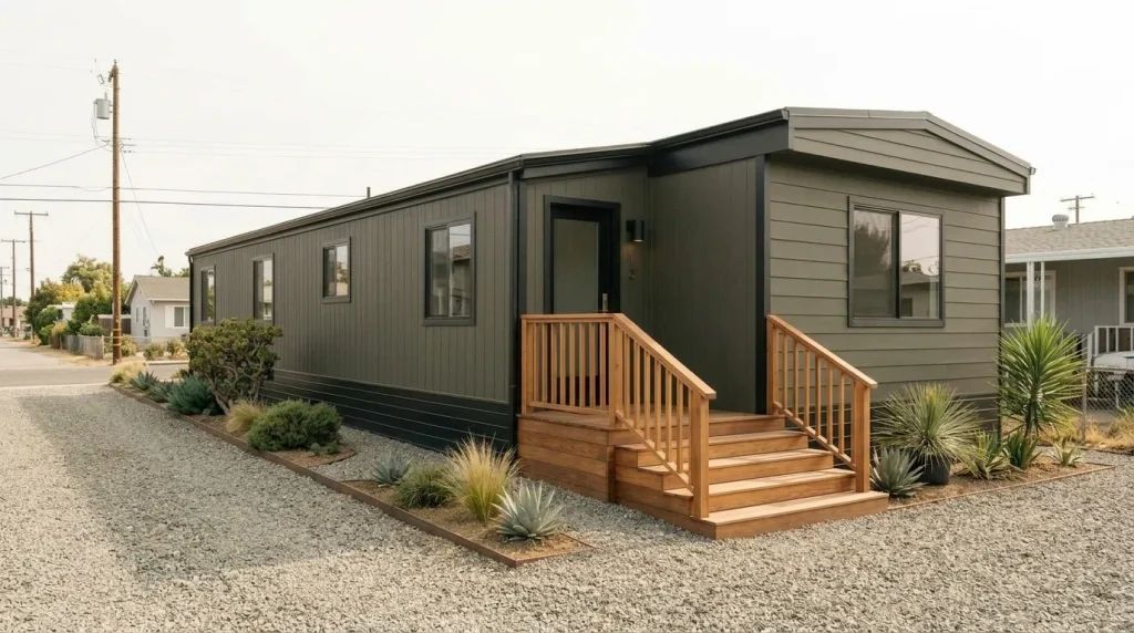
One strong makeover route is to simplify most of the shell and let a smaller group of elements create depth. Imagine light siding across the long façade, darker window trim for repetition, and natural timber reserved for the entry, porch posts or shutters. That timber interrupts the flat profile without breaking the exterior into too many competing finishes.
Look at the home from the driveway or main approach before committing. If the entrance disappears between several similar windows, concentrate the strongest contrast there. If the door already has enough presence, use the warm material more selectively around repeated window details or one landscape zone.
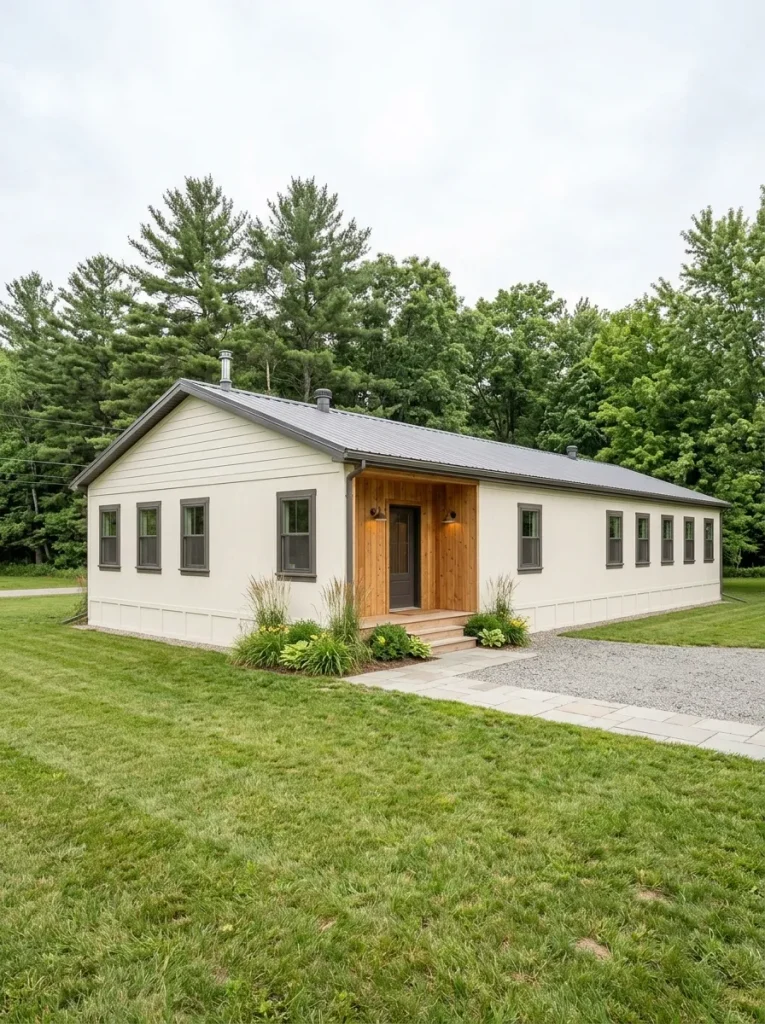
The finished exterior should feel edited rather than decorated everywhere.
Transformation lens
What is actually making the façade feel old?
Diagnose the exterior before adding another feature. The strongest makeover usually corrects one hierarchy problem and lets quieter surfaces support it.
Stop signal: when the entry is obvious and the rest of the façade feels intentionally quieter, additional accents may weaken the makeover.
2. A Brown, Narrow Living Room Turns Bright Without Losing All Its Wood
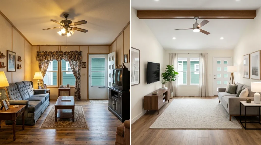
Many older single-wide living rooms accumulate brown in layers: wood-look flooring, dark trim, tan upholstery, paneling, heavy curtains, wood end tables and an equally dark entertainment unit.
The problem is rarely that every brown element is unattractive. It is the concentration.
Stand at the living-room entrance and identify the wood surface with the best proportion, condition or character. It might be the flooring. It could be an original built-in. Perhaps it is one clean run of trim. Let that become the material worth preserving.
Now reduce the visual weight around it. Lighter walls can separate furniture from the shell. Simpler curtains expose more glass. A quieter rug can create breathing room between a wood-look floor and beige upholstery. Removing one large dark cabinet may have more impact than repainting several smaller pieces.
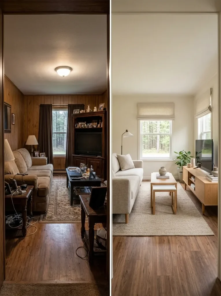
This is particularly noticeable in a single wide because numerous brown surfaces can appear in one uninterrupted view.
Preserve the wood that contributes character. Edit the pieces that mainly contribute visual mass.
3. A Screened Porch Stops Looking Like an Add-On
A porch can add valuable living space to an older single wide yet still make the property feel unfinished when the house and porch speak completely different design languages.
Start at the junction where the two meet.
Suppose the house uses a pale exterior, dark window trim and warm timber. The porch does not have to duplicate every finish. Repeating two of those signals can be enough: a related wood tone, a cleaner railing pattern, coordinated lighting, or flooring that feels intentional beside the home’s exterior.
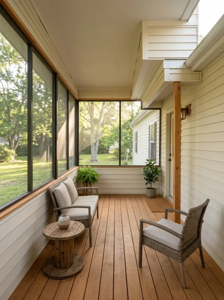
The interior of the porch needs clarity too. Give it one unmistakable role—dining, conversation, lounging or morning coffee. Leaving some open space around that activity makes the enclosure feel planned around daily life.
There is an important technical boundary. Decorating and furnishing an existing porch is different from building an addition or structurally altering the home. HUD states that significant additions or structural changes to manufactured homes may require permits and recommends checking with the appropriate state, county or local authority before making those changes. HUD
Use dramatic makeover photographs to study visual integration, not as construction instructions.
4. A Weathered Long Facade Becomes a Clean Contemporary Shell
Older single wides often collect exterior decisions gradually.
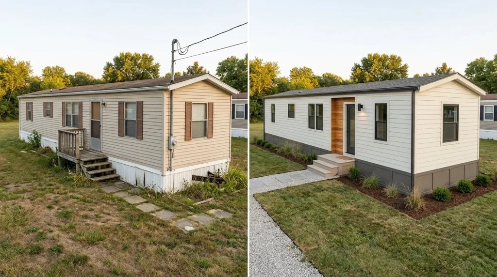
One window gets shutters while another stays bare. The skirting changes color. Porch trim is repainted several years later. Utility elements become visually prominent. Each decision may have been reasonable on its own, but the full façade starts to resemble a timeline of separate projects.
The contemporary fix begins by looking at the entire length as one visual field.
Stand far enough away to see the home from end to end. Which feature interrupts the rhythm first? It may be mismatched trim, an isolated shutter treatment, weathered siding, or a lower edge that feels detached from the shell.
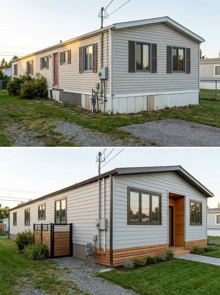
Correct the largest interruption before choosing small accents.
A single wide already has a strong horizontal form. It does not require numerous exterior materials to feel interesting. Consistent siding, disciplined trim, repeated window treatment and one controlled area of contrast can make its long proportions appear intentional.
After the primary inconsistency disappears, step back again. If the façade already looks calmer and more coherent, extra decorative features may only reintroduce the visual noise you just removed.
5. A Crowded Sofa-to-Kitchen View Becomes One Calm Long Room
Walk into an older single wide and look past the sofa toward the kitchen.
That single view can explain why the interior still feels dated after painting. A deep sectional dominates the foreground. A large coffee table fills the middle. Dining furniture interrupts the route. At the far end, cabinets, appliances and countertop objects form another dense visual block.
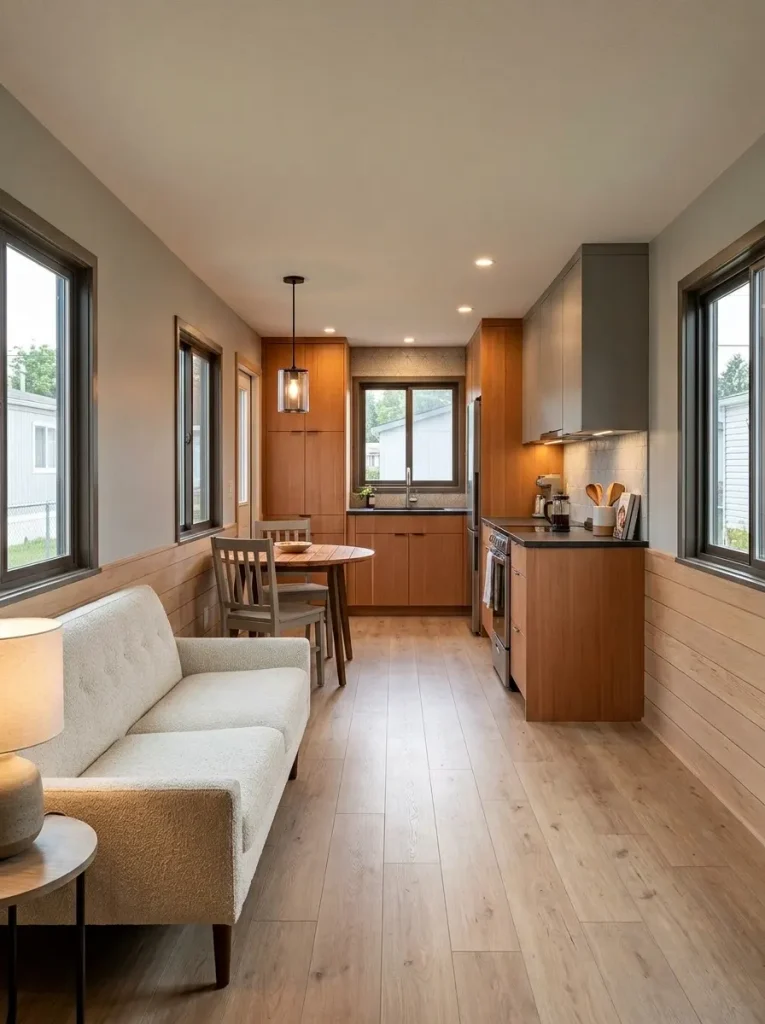
Because the common areas often share one long visual field, furniture cannot always be judged room by room.
Start with the largest foreground object.
If the sofa blocks too much of the room, test a different orientation, shallower profile or smaller return before buying smaller accessories. If the sofa already works, inspect the transition zone next. A bulky dining set may be what compresses the space.
For the full connected-space strategy, see theLong-view pressure scanner
Which zone is visually squeezing the shared room?
6. A Floating-Looking Single Wide Gets a Finished Ground Line
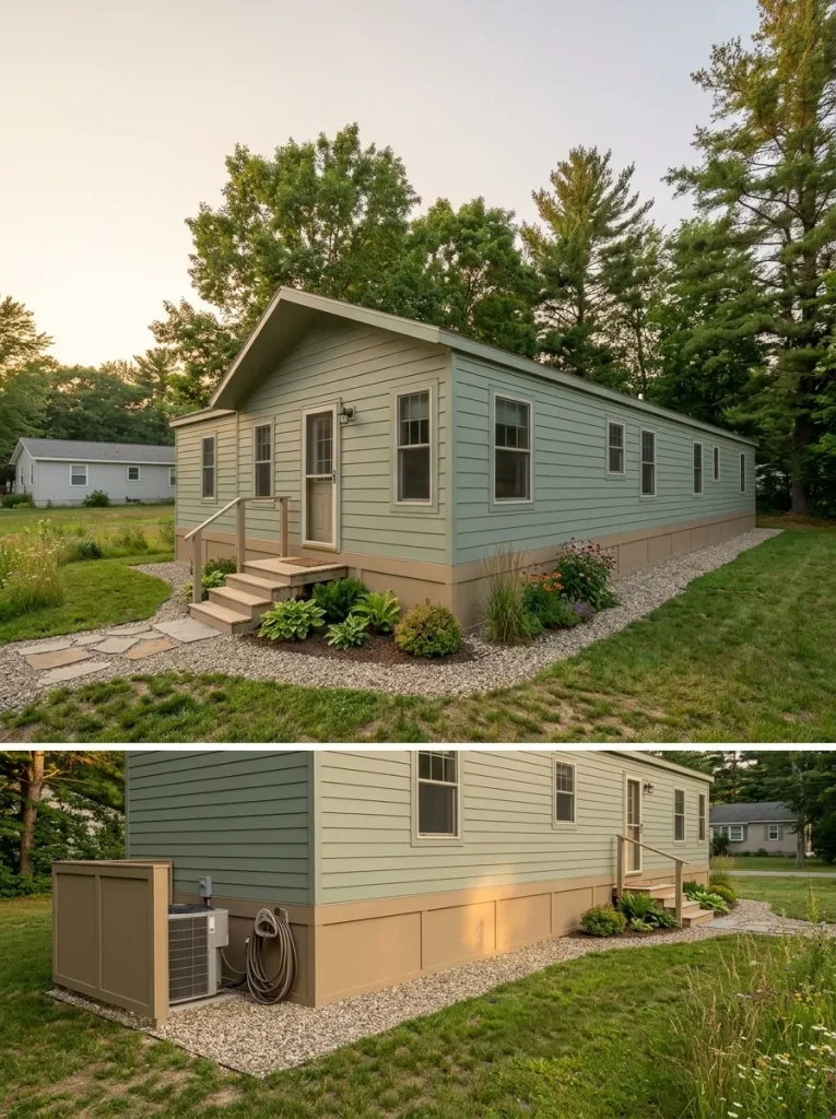
Sometimes the siding is not what makes an older single wide look unfinished.
Your eye moves downward and encounters mismatched skirting, exposed blocks, bare gravel, utilities, patchy planting, or a lower edge that seems unrelated to the house above it. That weak connection with the ground can make the entire structure feel temporary.
View the property from far enough away to see its full length. Ignore shutters and porch décor for a moment. Study only the bottom quarter of the façade.
If your attention jumps repeatedly between the skirting, steps, utility areas and landscaping, the ground line is carrying too much visual noise.
A stronger makeover organizes this area into a limited number of continuous zones. Skirting reads as one deliberate field. Gravel or mulch creates a controlled transition. Planting concentrates around meaningful places, especially the entrance or porch, instead of forming random pockets along the entire home.
This test can also prevent unnecessary work above the ground line. If the existing siding starts looking substantially better once the base becomes coherent, replacing or repainting the whole façade may offer less visual return than expected.
7. An Old Galley Kitchen Looks New Without Changing Its Footprint
A narrow single-wide kitchen can appear dramatically older when several visible finishes announce different eras at once.
The cabinet fronts may be usable, but the countertop belongs to another decade, the backsplash introduces another pattern, appliances add several more colors, and flooring brings in one additional visual language.
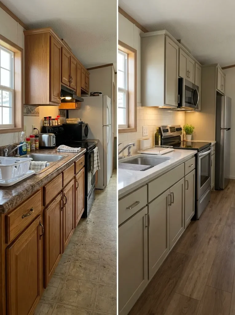
Because everything is close together, the eye sees those mismatches almost simultaneously.
Before assuming the kitchen needs a different footprint, separate function problems from finish problems.
Open the cabinets and drawers. Think about how you prep, cook, clean and store food. If the basic arrangement works reasonably well, test what happens when the visible surfaces are treated as one composition.
Cabinets have especially high visual reach because they occupy so much wall area. The deeper preparation and preservation questions belong in the <a href=”/mobile-home-kitchen-cabinet-makeover/”>mobile home kitchen cabinet makeover guide</a>. For broader compact-kitchen planning, continue to <a href=”/single-wide-kitchen-ideas/”>single wide kitchen ideas</a>.
A convincing update needs a hierarchy: one dominant cabinet field, a quieter counter, a backsplash that supports the larger surfaces, and appliances that no longer appear visually isolated.
Same-footprint kitchen funnel
How much kitchen renovation does the room actually need?
8. A Busy Ceiling Becomes the Quietest Surface in the Home
The ceiling is easy to overlook during an old single wide makeover because most attention goes to walls, floors and furniture.
Yet older interiors can have a surprising amount happening overhead: panel seams, dark strips of trim, textured finishes, several light styles, ceiling fans, vents and old repair patches.
In a relatively low room, those details sit close enough to influence the entire space.
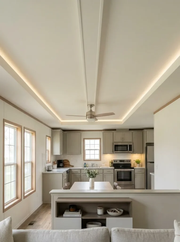
Look upward from the main living area and identify whether the ceiling has one feature worth emphasizing. A shallow vault may deserve attention. An attractive beam might be worth preserving. A simple fan may already give the room enough structure.
Once that feature is chosen, allow the surrounding ceiling to become quieter. A more consistent paint field, restrained fixture palette or reduced contrast at the ceiling line can make the entire connected interior feel calmer.
The effect spreads particularly well through a single wide because one ceiling plane may visually connect the living room, dining area and kitchen.
When the ceiling already has one meaningful focal feature, another competing one usually adds less than expected.
9. Basic Front Steps Become a Real Arrival Moment
A new-home impression often starts several feet before the front door.
Older single wides sometimes have a perfectly visible entrance but no real arrival sequence. Steps meet the door abruptly. A small landing disappears into the façade. Lights, rails and planters may have been added at different times, leaving an entrance that works without feeling deliberately composed.
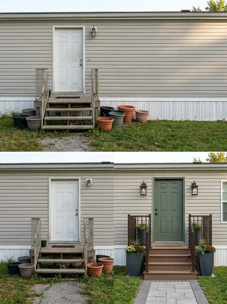
A full-width porch is not the only answer.
First diagnose whether the existing entry lacks clarity, depth or shelter. Clarity means the door gets lost. Depth means the approach feels visually abrupt. Shelter is a larger architectural question.
For an existing entry, a deliberate door color, compatible lighting, coordinated rail finish and appropriately scaled planters may provide enough composition to change the first impression.
If your desired makeover involves rebuilding steps, altering structural rails or adding roofed shelter, treat that as a separate project and check the applicable requirements before work begins. HUD similarly advises checking with the appropriate authority before significant additions or structural alterations to manufactured homes. HUDuestion”
Arrival depth ladder
How big does the front-entry makeover need to be?
10. A Cluttered Pass-Through Becomes a Clean Room Transition
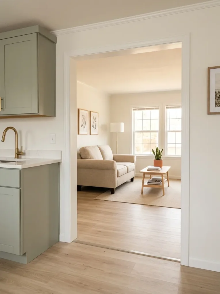
Older single wides often contain doorways and short transition zones that carry far more visual information than their size suggests.
One opening might contain contrasting trim, a floor change, framed décor, a console table, a curtain, several switches and the beginning of another furniture arrangement. From the living room, that small zone can become a visual traffic jam.
Before considering wall removal, test whether the real problem is simply the boundary.
Temporarily clear furniture and décor around the opening. Remove unnecessary objects from the nearest wall. If two flooring materials meet there, see whether that seam requires additional decorative emphasis at all.
Now return to the room where you spend the most time and look through the opening again.
A successful transition tells the eye that another zone begins without demanding attention for itself.
That distinction has unusual value in a single wide because doorways often sit inside much longer sightlines. Simplifying one threshold can make two rooms feel better connected while preserving useful separation.
If the pass-through becomes calm after editing, removing the wall was never the first problem.
11. A Tight Bedroom Gains a New-Build Feel From the Bed Wall Out
A small single-wide bedroom can remain visually dated after fresh paint when every wall tries to participate equally.
There may be a tall dresser opposite the bed, narrow nightstands squeezed beside it, multiple wall decorations, heavy curtains and several unrelated furniture finishes. Little spare width exists, so visual competition develops quickly.
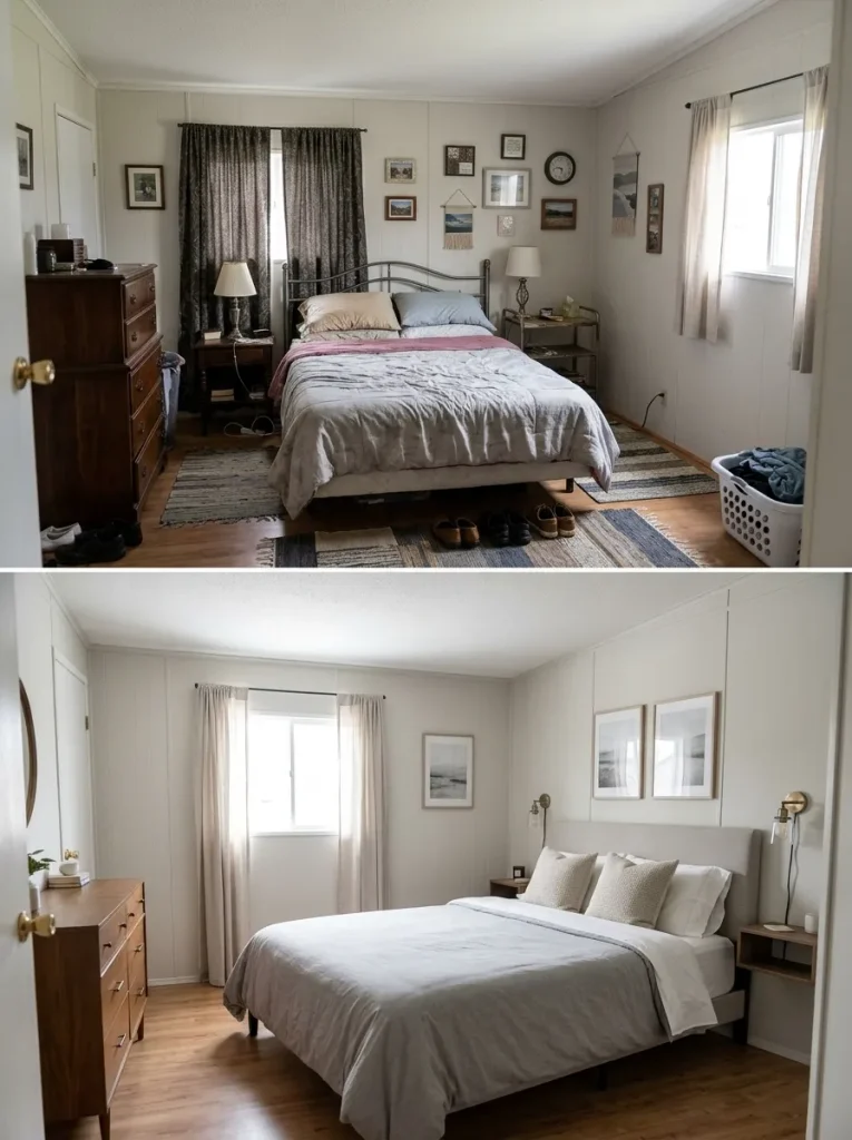
Begin at the bed wall.
If the headboard feels weak or undersized, strengthen that zone through better proportion, bedding, a controlled wall treatment or paired lighting. Once the bed has enough authority, intentionally reduce emphasis elsewhere.
The dresser does not need an elaborate display when another wall already provides the room’s focal point.
Then look at the visible floor around the bed. Furniture can technically fit while still making the room feel packed. Test the space with fewer secondary pieces before purchasing a completely new bedroom set.
The makeover may not require tiny furniture everywhere. It often needs one clear focal wall and fewer pieces demanding equal attention.
For more detailed bedroom scale and arrangement decisions, continue with <a href=”/single-wide-bedroom-ideas/”>single wide bedroom ideas</a>.
12. Patchwork Flooring Stops Making the Home Look Renovated in Pieces
Flooring has unusual influence in a single wide because several rooms may be visible from one position.
A living room might use one wood tone, the kitchen another material, the hallway a third, and an open bedroom doorway reveal something different again. Each floor can be acceptable individually while the combined view makes the home feel renovated in fragments.
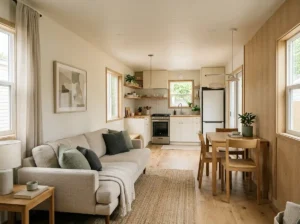
Stand at the longest interior viewpoint and count the visible transitions.
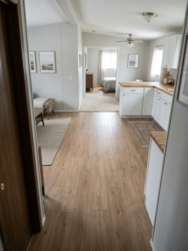
Then decide which ones are meaningful.
Some material changes are practical because rooms have different needs. Others exist mainly because renovations happened at separate times.
The objective is not necessarily one flooring material across the entire home. It is a more coherent visible sequence.
When living and kitchen areas occupy the same sightline, coordinating their color temperature and visual weight can matter almost as much as using identical material. A quieter threshold can also keep a necessary material change from becoming another decorative interruption.
When replacement really is needed, choose products according to the manufacturer’s intended application and the conditions of the room.
That separates three different problems—wear, suitability and visual inconsistency—before they get treated as one expensive flooring project.
13. A Tiny Bathroom Looks Fresh After One Focal Cluster Changes
Small bathrooms leave dated fixtures nowhere to hide.
From the doorway, the vanity, mirror, faucet and light often appear as one compact composition. If every component carries a different era or finish, that single wall can age the entire bathroom.
Treat these pieces as a focal cluster before planning a total remodel.
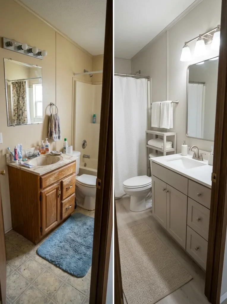
Begin with the vanity. If its proportions work and its condition is reasonable, see whether a finish refresh, simplified hardware or calmer surrounding surfaces could carry it forward.
Then evaluate the mirror and light against that direction.
They do not need to come from a matching collection. They do need enough visual relationship that the eye reads them as one intentional zone.
Keep the remaining finishes quieter. A very small mobile-home bathroom can become busier after renovation when tile, hardware, flooring, wall color and storage each try to become an accent.
This makeover path works best when the room functions correctly and visual age is the primary problem.
Projects involving plumbing relocation, electrical work, wet-area construction or ventilation move beyond this cosmetic scope. For those decisions, use the <a href=”/mobile-home-bathroom-remodel-on-a-budget/”>mobile home bathroom remodel on a budget</a> guide.
14. Old Doors, Trim, Vents, and Hardware Become One Repeated Detail Family
Large renovation elements get most of the attention, but small repeated details can quietly reveal a home’s age in every room.
Fresh walls beside several door colors, different knob finishes, discolored vent covers, mismatched switch plates and changing trim tones create dozens of small interruptions. No single detail ruins the makeover; their repetition does the damage.
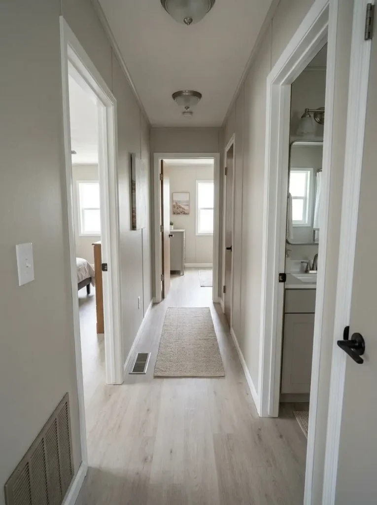
Try a different diagnostic.
Photograph every interior door. Then photograph the visible handles. Repeat the exercise for trim, vents and switch plates.
Seeing one category together makes inconsistency much easier to identify than walking through the home room by room.
Choose the repeated family creating the most visual noise and address it first.
The advantage is reach. One hardware direction may appear through the living area, hallway, bedrooms and bathroom. A consistent trim strategy can connect rooms that use different furniture and color palettes.
Perfect uniformity is unnecessary. A coherent relationship is enough.
When these repeated details stop drawing attention, larger makeover choices finally become the features the eye remembers.
15. Three Repeated Materials Make the Whole Single Wide Feel Like One Renovation
A home can have a beautifully updated kitchen, an improved exterior and a refreshed living room yet still feel like three unrelated projects.
The final old single wide makeover move is therefore not another room.
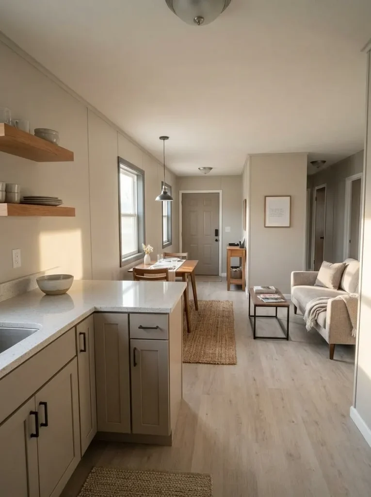
It is whole-home repetition.
Choose three visual signals that are already working somewhere in the home. One might be warm natural wood. Another could be a soft off-white or muted neutral. The third might be charcoal, aged bronze or another restrained dark accent.
Now trace them through the property.
Warm wood could appear at the exterior entry, living-room table and kitchen shelf. The neutral field can connect walls, cabinets or textiles. A dark detail can recur through window frames, hardware and lighting without taking over the house.
Three signals create enough repetition for the eye to remember them. When they reappear later in the home, separate spaces begin to feel intentionally related.
This also gives you a stopping rule. Once the exterior, main living area and kitchen share a recognizable material language, introducing another signature finish may weaken the continuity you worked to establish.
For the final polish layer, continue with
Whole-home cohesion map
Can three repeated signals make separate projects feel like one renovation?
Choose a small material vocabulary, then check whether it survives across the home’s longest visual journey.
Final Thoughts
The most convincing old single wide makeover usually begins by solving the home’s largest visual disconnect first. That could be a weak exterior hierarchy, an overloaded long-room view, too many competing kitchen finishes, or repeated small details that continue revealing the home’s age.
Make one high-reach correction, then step back and reassess the whole home before adding another project. Once the exterior, main living space and key finishes begin sharing a recognizable visual language, an older single wide can feel dramatically newer without every usable feature being replaced.
The strongest stopping point comes when the home feels intentional from one end to the other—not when every surface is brand new.
Save these old single wide makeover ideas to Pinterest so you can return to the transformations when it is time to plan your own home.