

An old mobile home makeover can become expensive surprisingly quickly when every dated surface starts looking like a separate project. Faded siding suggests replacement. Tiny front steps suggest a porch. Indoors, dark trim, mismatched flooring, older cabinets, wall seams, and dated fixtures can make it seem as though the whole home needs rebuilding at once.
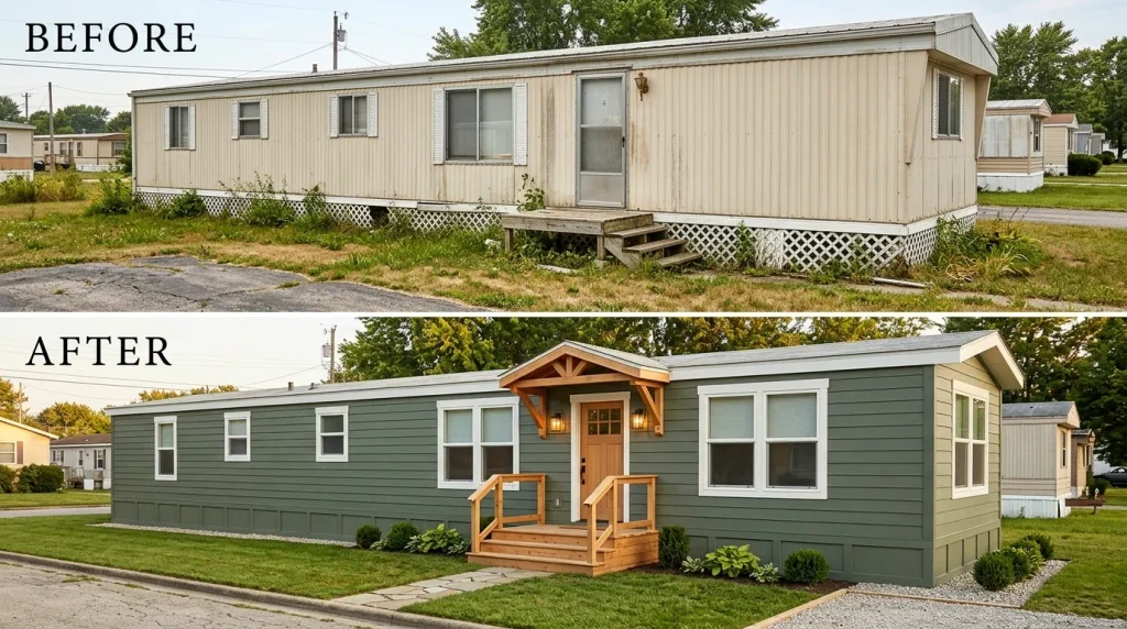
Usually, the strongest transformations are more selective.
The best mobile home before-and-afters change the features occupying the most visual territory first: the exterior shell, entry, repeated window details, broad interior surfaces, flooring, and a few fixed features that define the home’s age. Smaller improvements begin working much harder after those larger signals settle down.
The 25 makeovers below move from the curb inward. Each one focuses on what actually changes the view, what may deserve preserving, and where a cosmetic refresh becomes real renovation.
Before starting, take two photographs you will keep until the end: one from the main curb approach and one from the primary interior doorway.
1. Take Two “Truth Photos” Before You Touch the Home
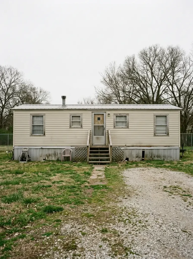
Before buying paint, shutters, flooring, hardware, or a new sofa, photograph the home from two brutally useful positions: the main curb approach and the primary interior doorway.
Those views compress a surprising amount of information.
Outside, you can see whether the home’s age is being communicated mainly by faded siding, an unfinished base, weak entry definition, inconsistent windows, or neglected landscaping.
From the doorway, broad wall color, flooring transitions, dark built-ins, furniture scale, window treatments, and ceiling fixtures appear together rather than as isolated projects.
Now ask:
Which single feature makes the largest part of this photograph feel old?
That feature deserves investigation before the shopping list grows.
A mobile home with tired siding and serviceable windows may gain far more from cleaning, repair, a coordinated finish, and better entry definition than from replacing every opening. Indoors, one continuous dated floor can visually overpower several newly decorated rooms.
Old Mobile Home Transformation Priority Scanner
Before You Remodel
What Is Making the Home Look Old First?
Choose the strongest age signal in your curb or doorway photo. The result identifies the layer worth investigating before money scatters across smaller upgrades.
Which problem controls the largest part of your view?
Repair and unify the broad exterior field.
Inspect condition first, then decide whether cleaning, selective repair, coating, trim coordination or a larger exterior project is justified.
Strengthen the arrival before decorating the entire facade.
Look at the door, landing, steps, lighting and any porch or canopy as one composition.
Change visual acreage before accessories.
Walls, floors and large fixed cabinetry occupy more of the doorway view than pillows or tabletop décor.
Build one repeated detail language.
If the shell already feels calm, inspect elements appearing room after room and coordinate the finishes that keep interrupting the view.
The useful outcome is priority, not a renovation verdict. The photo identifies where to investigate first; condition, budget, and whatever sits behind the visible surface still determine the actual project.
2. Turn a Faded Long Facade Into One Intentional Exterior Field
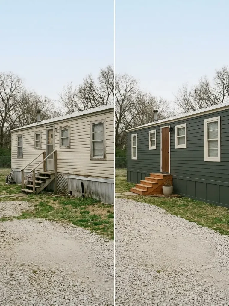
Stand far enough back that you stop seeing tiny stains, screws, dents, and individual shutters.
What remains?
On many older mobile homes, the dominant impression is one long horizontal field of faded or visually fragmented siding. Small decorative fixes struggle against that much surface area. Fresh planters may be attractive, yet they cannot visually compete with a shell that still reads as tired from one end to the other.
That does not automatically mean replacing the siding.
Start by separating appearance from condition:
- Dirty but sound: cleaning may reveal more usable finish than expected.
- Sound but visually tired: an appropriate finish or restrained trim update may carry much of the makeover.
- Localized deterioration: deal with affected areas before judging the entire elevation.
- Widespread condition problems: investigate those problems before treating the facade as a decorating project.
Once the main field becomes coherent, contrast can become selective. A darker body with light trim, a warm neutral shell with wood accents, or a pale exterior with dark punctuation can all work.
The hierarchy matters more than the specific palette.
For a deeper collection of smaller exterior and interior improvements, see 21 Cheap Mobile Home Upgrades That Look Expensive. The specialist article already owns many lower-cost detail upgrades, so this makeover guide stays focused on whole-view transformation. Stylish Galore
Decision rule: if your curb photograph still looks dated after mentally removing flowers, signs, and accessories, investigate the broad shell before buying more décor.
3. Give a Flat Mobile-Home Front a Real Entry Focal Point
A long mobile-home elevation can have plenty of width but almost no architectural interruption.
When a modest door and narrow steps sit directly against that horizontal field, the entrance may look more like an access point than the visual center of the home.
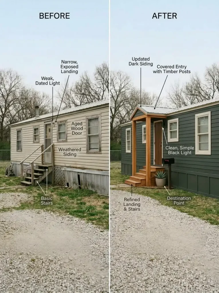
There are several ways to strengthen it, and they do not carry equal construction depth.
Entry Transformation Ladder
Compare Project Depth
How Much Entry Does the Facade Actually Need?
Open each level. Move upward only when the lighter intervention cannot create enough visual presence.
Level 01Door + Light + Landing
Coordinate the door finish, porch light, house numbers, landing and nearby trim so the doorway reads as one event.
Level 02Small Canopy or Covered Threshold
Once an overhead element becomes attached construction, weather management, structural support and applicable requirements enter the decision.
Level 03Porch or Larger Entry Structure
This belongs to a different project category from painting a door or changing accessories.
Stop point: choose the shallowest intervention that gives the entrance enough presence. More structure does not automatically produce the better makeover.
HUD advises that significant additions or structural alterations to manufactured homes may require local permits and may affect HUD Code compliance, so a major porch, attached roof, or other structural change should be reviewed with the appropriate local authority before construction. HUD
A dramatic before-and-after can still inspire proportion, contrast, depth, and hierarchy without becoming a construction plan to copy onto another home.
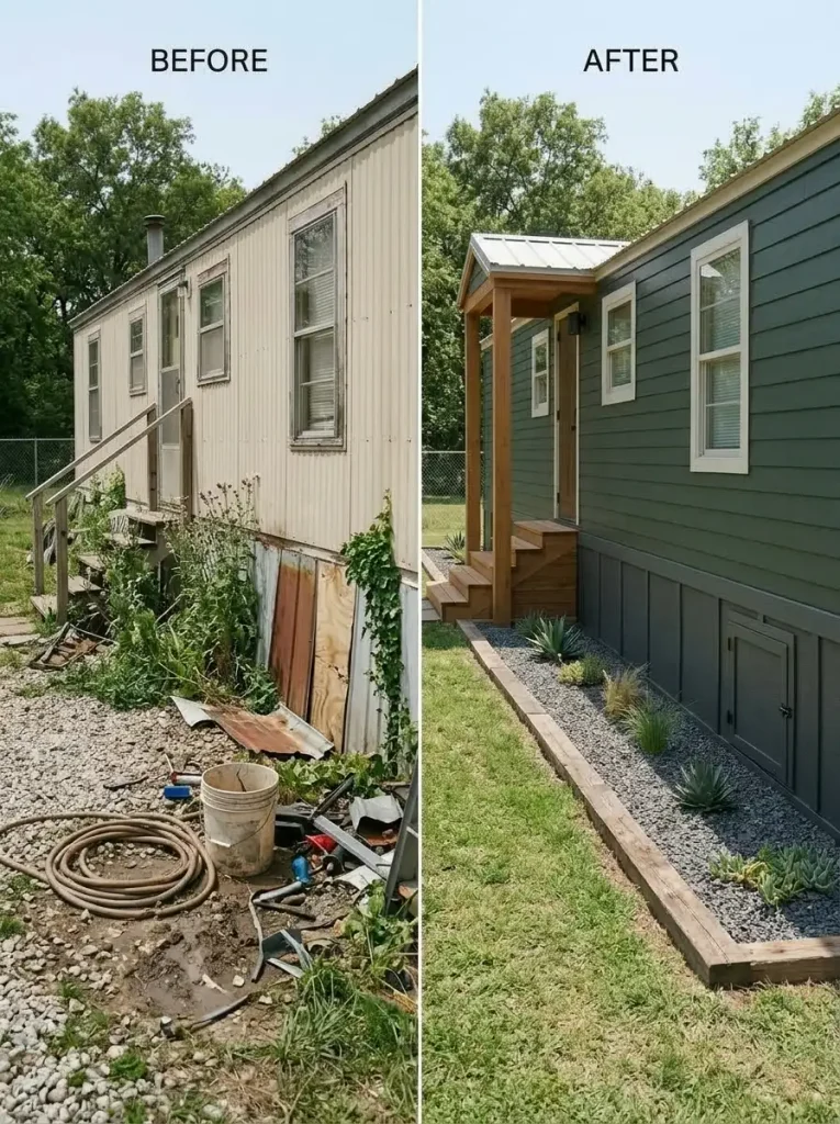
4. Make the Bottom Edge Look Finished by Reworking the Skirting Line
Look at the home from the curb and mentally remove the lower edge.
If the elevation suddenly seems cleaner, a large part of the dated impression may be concentrated at the base.
Older skirting can pull attention downward when panels are stained, bowed, broken, mismatched, partially missing, or surrounded by weeds and utility clutter. Because this line runs along much of the home, even a restrained improvement can carry significant visual weight.
Use a three-part sequence.
First: clean and inspect.
Do not camouflage damaged material, repeated moisture, animal entry, drainage trouble, or access problems.
Second: restore visual consistency.
Deal with failed pieces as appropriate and coordinate the lower edge with the exterior body rather than introducing another unrelated finish.
Third: improve the ground transition.
A simple gravel strip, neat mulch edge, or restrained planting band can make the home appear settled into the site.
Skirting or perimeter enclosure is not purely decorative. HUD includes perimeter enclosure, utility hookups, site conditions, and local requirements among manufactured-home installation considerations. HUD
If the base is concealing moisture, deteriorated material, support concerns, or utilities needing proper access, investigate that condition before improving its appearance.
5. Make Mismatched Windows Read Like One Repeated Rhythm
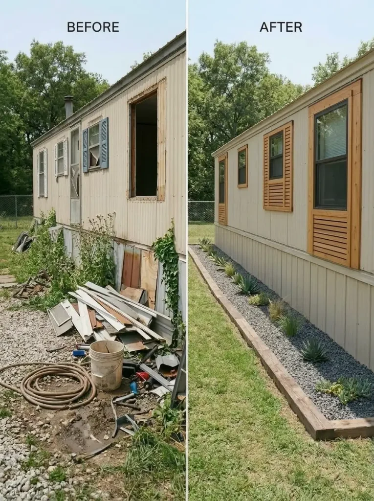
Five windows across a mobile-home facade are rarely read as five independent objects.
The eye sees a sequence.
That is why one opening with dark shutters, another with faded trim, another with no visible frame, and another with a different accent can make an otherwise refreshed exterior feel incomplete.
Run a quick window-rhythm audit:
- What consistently frames the glass?
- Do similar windows use the same trim logic?
- Are shutters adding believable proportion or simply filling wall space?
- Which finish repeats around the openings?
- Do the windows support the entry or compete with it?
For a long facade, repetition creates order efficiently. Matched trim may be enough. Natural wood can supply warmth when the exterior needs it. Dark details can sharpen a pale shell.
There is also an exception worth keeping: different window proportions do not always need identical accessories.
Forcing bulky shutters around a small opening purely for symmetry can create new visual noise.
Repeat the language—finish, trim relationship, proportion, or material—without forcing every window to wear the same decoration.
If the windows remain functional but the facade looks inconsistent, coordinate what surrounds them before assuming every opening needs replacement.
6. Turn Basic Steps, Railings, and the Door Into One Arrival Composition
Sometimes the entry is large enough. It simply looks like several pieces installed during different renovations.
A painted front door, raw wood steps, aging railings, a tiny light, and scattered planters can all be serviceable while their combined view still feels unfinished.
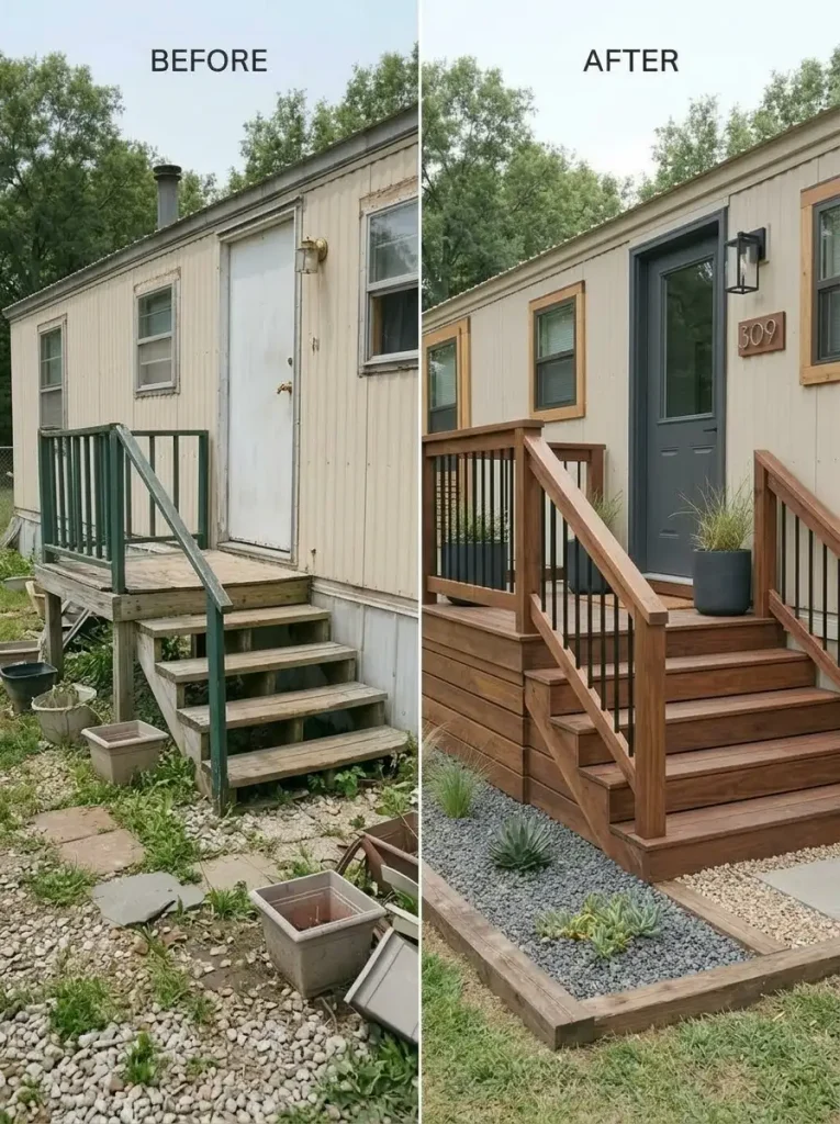
Read the arrival vertically:
Ground → Steps → Railing → Landing → Door → Light
Then choose a material or finish relationship that connects several levels.
Warm timber might repeat through the landing, rail cap, and nearby shutters. A dark door may connect with lights and window accents. Light steps can relate to trim while wood posts supply warmth.
Now remove every pot, wreath, sign, and seasonal decoration in your imagination.
Does the entry still look finished?
If no, the architectural layers need more attention before styling.
If yes, decoration can stay restrained because the arrival already has enough presence.
Structural stairs, guards, landings, roofs, and attached porches move beyond a simple cosmetic makeover. HUD recommends checking applicable local requirements before significant additions or structural alterations. HUD
7. Ground the Home With a Defined Path and Simple Landscape Edge
Picture two identical freshly refreshed mobile homes.
One meets patchy grass, weeds, exposed soil, and an undefined gravel approach.
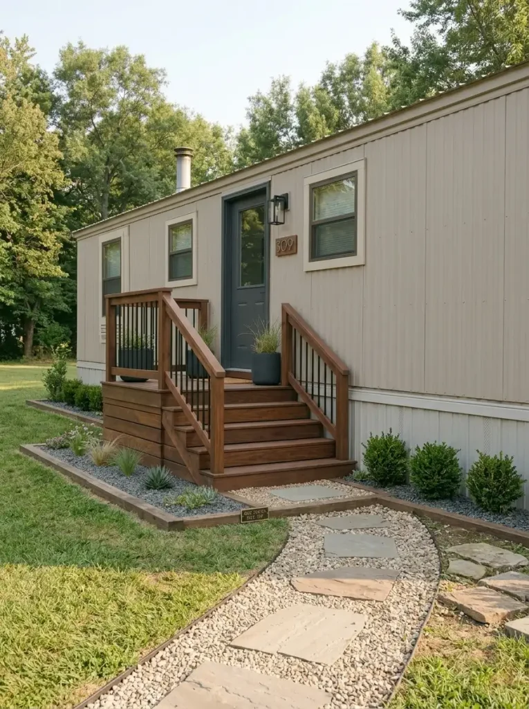
The other has a clear path toward the steps, one controlled planting band, and an intentional transition between lawn and skirting.
The second can look more complete even though the home itself has not changed.
Landscaping gives the structure a visual base.
Start at the entrance and work outward:
- Clarify how someone approaches the front door.
- Give the primary facade one clean ground edge.
- Keep taller planting from overwhelming windows and service areas.
- Repeat a few plant forms rather than collecting many unrelated ones.
- Leave enough negative space to keep the architecture visible.
A narrow mobile-home facade can become cluttered by landscaping just as easily as by decoration.
Use planting to connect the building to its site—not to hide deteriorated skirting, drainage problems, or siding that deserves investigation first.
8. Build the Exterior Palette Around Four Jobs, Not Four Random Colors
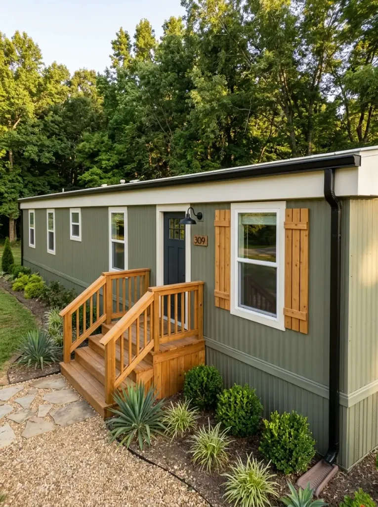
A facade can contain individually attractive colors and still look chaotic because none has been assigned a role.
A controlled makeover divides color into four jobs:
Body → Trim → Natural Warmth → Punctuation
The body owns most of the visual acreage. Trim clarifies edges. Natural warmth can come through timber steps, posts, or shutters. The darkest tone belongs to a much smaller group of elements such as the door, lights, window details, or gutters.
Exterior Palette Role Builder
Color With Hierarchy
Choose the Relationship Before the Exact Paint Chip
Color should make the long elevation easier to understand.
If every component receives equal contrast, the exterior may be freshly painted and still look visually busy.
9. Calm the Interior Shell Before You Replace the Furniture
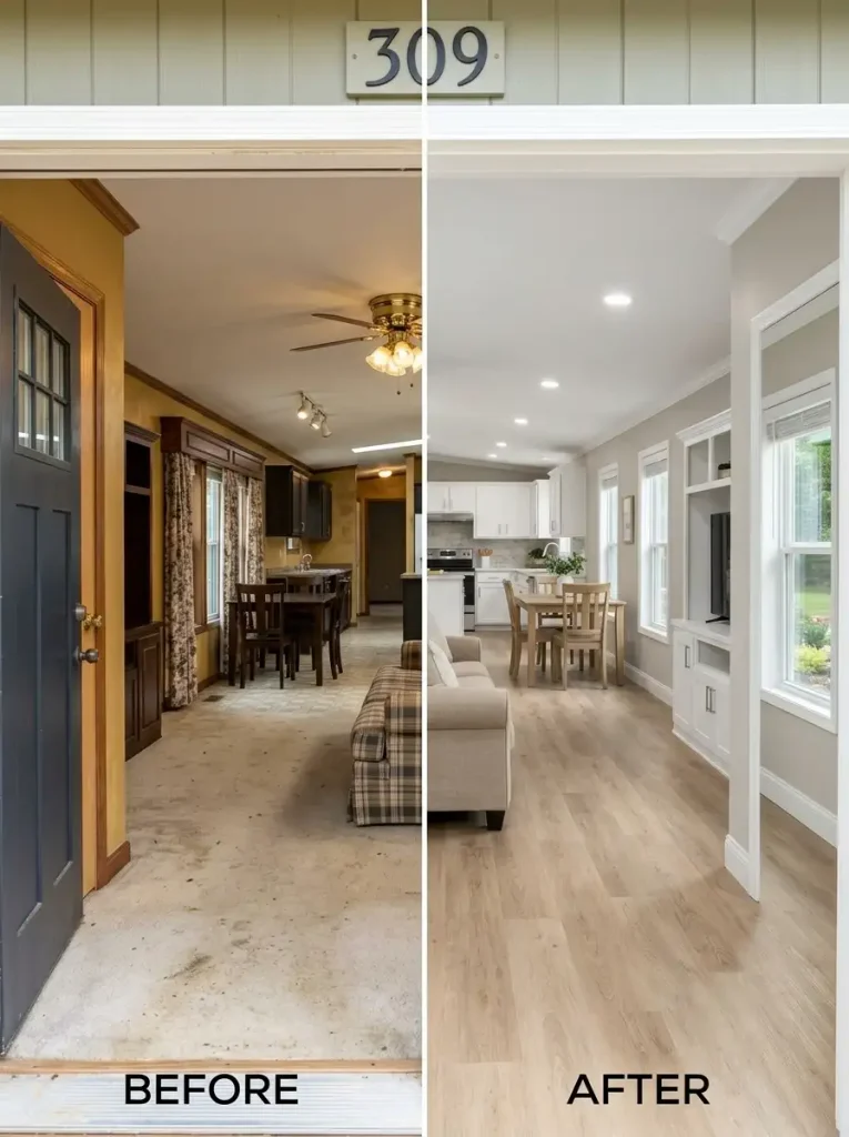
Walk into the main living space and imagine every movable object has disappeared.
Would the room still look dated?
If yes, replacing the sofa may be solving the wrong problem.
Older mobile homes can carry several broad age signals at once: warm wall tones, dark battens, mixed wood trim, visibly different flooring, older built-ins, heavy window treatments, and prominent ceiling fixtures.
Those elements surround the furniture, which means even expensive new pieces may still sit inside an old-looking shell.
Use the doorway photograph as your diagnostic.
What occupies most of the image?
If it is the:
- walls, test a calmer wall field;
- floor, study the visible flooring transitions;
- built-ins or cabinetry, decide whether they should recede;
- window treatments, expose more of the opening;
- ceiling fixtures, see whether the upper plane is carrying too much visual weight.
Only after the fixed envelope becomes quieter can you judge the furniture fairly.
A perfectly usable older sofa can suddenly look intentional in a better-composed room.
10. Make Old Wall Seams, Battens, and Patchwork Read as One Surface
Wall seams can immediately identify an older manufactured-home interior, but removing every visible batten is not automatically the best makeover.
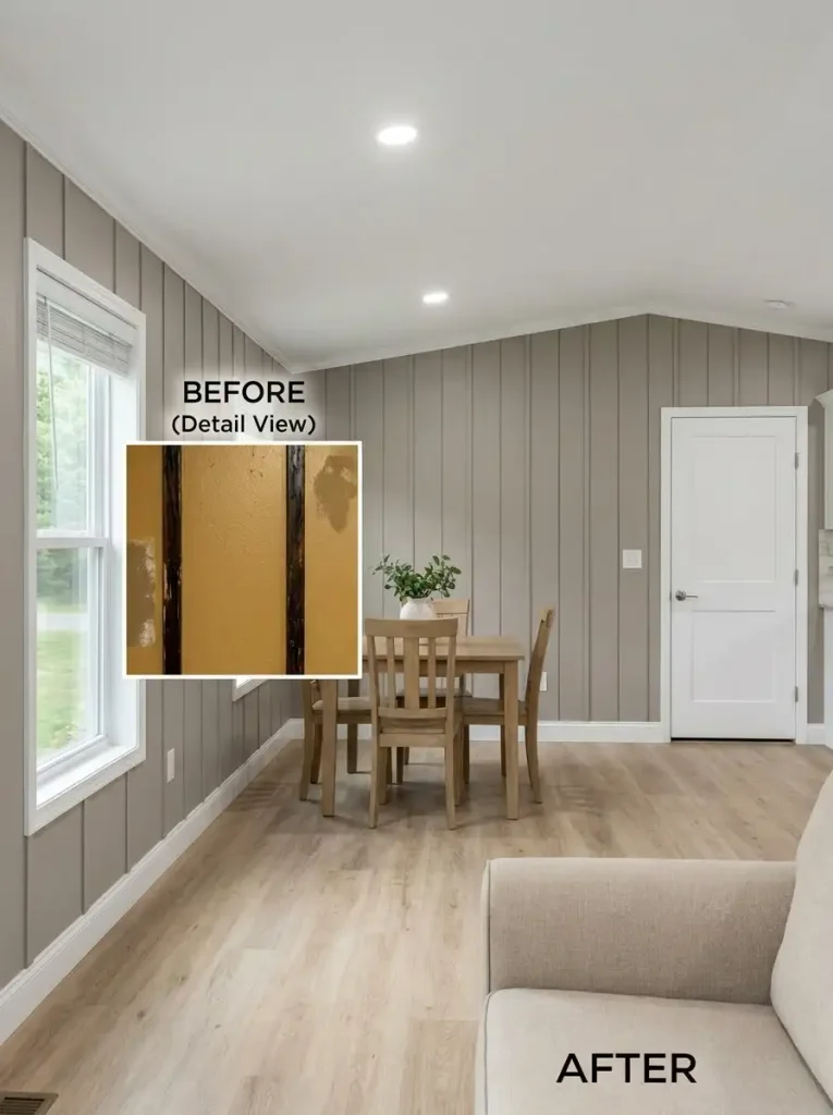
There are three legitimate directions.
Keep the battens but reduce their contrast
Where wall components are sound and regular, a coordinated finish may allow the vertical lines to recede.
Make the rhythm deliberate
In a simple room, repeated vertical lines can read as part of the architecture when the surrounding finishes are controlled.
Pursue a smoother wall field
If uninterrupted walls are fundamental to the intended design, deeper finishing may be justified—but that is a larger project than simply changing color.
Photograph the wall from across the room.
If the seams barely register at normal viewing distance, eliminating every one may produce little visual return.
If patchwork, stains, strong contrast, or mismatched surfaces dominate the photograph, wall treatment deserves greater priority.
The finished room should read as one wall plane first, with joints and seams becoming secondary information.
11. Use Flooring Continuity to Connect the Old Home Again
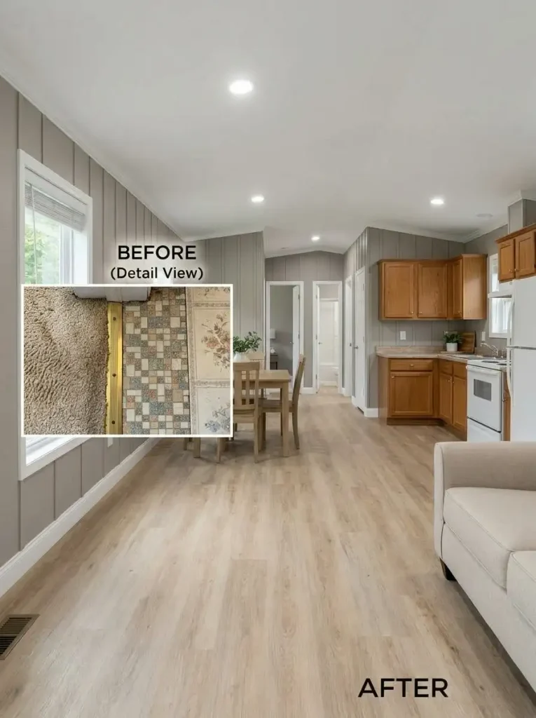
An older mobile home can accumulate several floor finishes across a fairly short distance.
Carpet in the living room.
Vinyl near the entrance.
Another pattern in the kitchen.
A different hall surface.
Bedroom flooring beginning only a few feet farther away.
Each choice may have made sense at the time. Together, they can visually divide a compact home into smaller pieces.
Stand along the longest connected sightline and count the floor changes you can see at once.
Then change the question from:
Which floor is ugliest?
to:
Which change would remove the most unnecessary visual boundaries?
In some homes, carrying one appropriate material through visually connected living and dining areas can transform the long view. Elsewhere, a kitchen floor may be worth leaving because replacing it would disturb cabinets or appliances while providing little benefit from the adjoining room.
Continuity matters most where surfaces can be seen together.
Use the long axis to determine whether a flooring project actually reconnects the home or merely replaces another finish.
12. Brighten the Ceiling Plane Without Turning It Into Another Feature Wall
Look up.
The ceiling may be doing far more visual work than you realized.
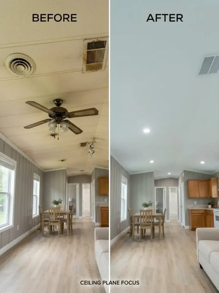
Dark fan blades, yellowed surfaces, high-contrast seams, aging vents, several fixture styles, or decorative treatments can pull attention upward in a room where the ceiling was never meant to become the focal point.
Try a subtraction sequence:
Clean → investigate defects → simplify the finish → reduce unnecessary contrast → reconsider fixtures
In many narrow rooms, the ceiling performs best as a calm upper boundary.
That allows the windows, furniture, cabinetry, and chosen focal point to carry more character.
One exception matters.
Staining, softness, sagging, recurring cracks, or signs connected with moisture should not be hidden simply because the room is being redecorated. Condition comes before cosmetics.
Once the plane is sound, restraint can change the perceived proportions of the entire room.
13. Keep the Kitchen Layout and Change the Parts That Actually Date It
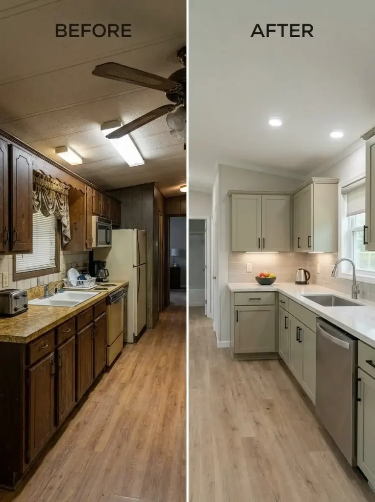
A dated kitchen often encourages demolition because every old finish appears to support the same conclusion.
Look again.
The cabinet boxes may still use the available wall efficiently. Plumbing may already occupy a practical position. Appliances may fit the work sequence. What makes the kitchen look old might be dark doors, ornate hardware, tired counters, a busy backsplash, heavy window treatment, or lighting.
Replacing a working layout can quickly turn a surface makeover into a systems project.
Kitchen Keep–Refinish–Replace Matrix
What Has Actually Earned Replacement?
Classify each kitchen element by condition and function before style alone turns into demolition.
KEEP
- A functional layout with comfortable daily movement
- Sound cabinet boxes in useful dimensions
- Working components that fit the intended finish story
- Storage that would be difficult or expensive to recreate
REFINISH / UPDATE
- Serviceable cabinet fronts with an outdated finish
- Hardware dominating otherwise sound cabinetry
- Noisy relationships among wall, backsplash and counter
- Lighting or window treatments that unnecessarily darken the work area
INVESTIGATE / REPLACE
- Failed components no longer functioning reliably
- Materials deteriorated beyond a sensible cosmetic repair
- Layout elements causing a genuine daily-use problem
- Conditions involving plumbing, electrical or other systems that need proper assessment
The makeover test: if changing finishes would make the existing layout convincing in the finished photograph, prove that option before redesigning the entire plan.
StylishGalore’s kitchen specialist already goes deeper into keeping a working layout, controlling project scope, hardware, surfaces, storage, and budget. Continue with 17 Mobile Home Kitchen Makeover Ideas on a Budget when the decision moves beyond whole-home inspiration. Stylish Galore
If the cabinet boxes are staying, use 15 Mobile Home Kitchen Cabinet Makeover Ideas Without Replacing Them for the more detailed refinishing sequence. Stylish Galore
14. Turn a Busy Counter-and-Backsplash Combination Into One Quiet Field
In a compact kitchen, the counter and backsplash are often seen almost simultaneously.
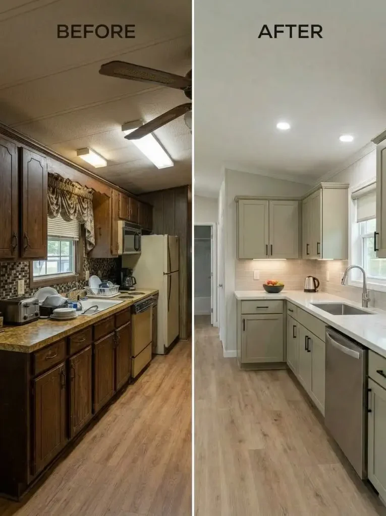
Two strongly patterned surfaces therefore do not behave like completely separate design decisions. They occupy one narrow field.
Consider:
Speckled counter + mosaic backsplash + visible cabinet grain + decorative hardware
No single material has to be ugly for the composition to become exhausting.
Give one adjoining surface permission to become quieter.
A restrained backsplash may make an existing counter look more intentional. A calmer counter can allow a patterned wall treatment to carry the character. Simplifying the cabinet finish may reduce enough competition that both surfaces can remain.
Use a one-voice, one-background test
Choose the adjoining finish with the strongest personality.
Let its neighbor support it.
Because the kitchen may sit within the home’s main sightline, this small material decision can influence the living and dining areas too. StylishGalore’s broader kitchen guide similarly treats cabinet color, counters, lighting, and connected views as interdependent in mobile-home kitchens. Stylish Galore
If the before photograph contains several competing materials within one small frame, reduce those arguments before deciding demolition is the only route to a modern kitchen.
15. Rework an Old Hutch or Built-In Before You Tear It Out
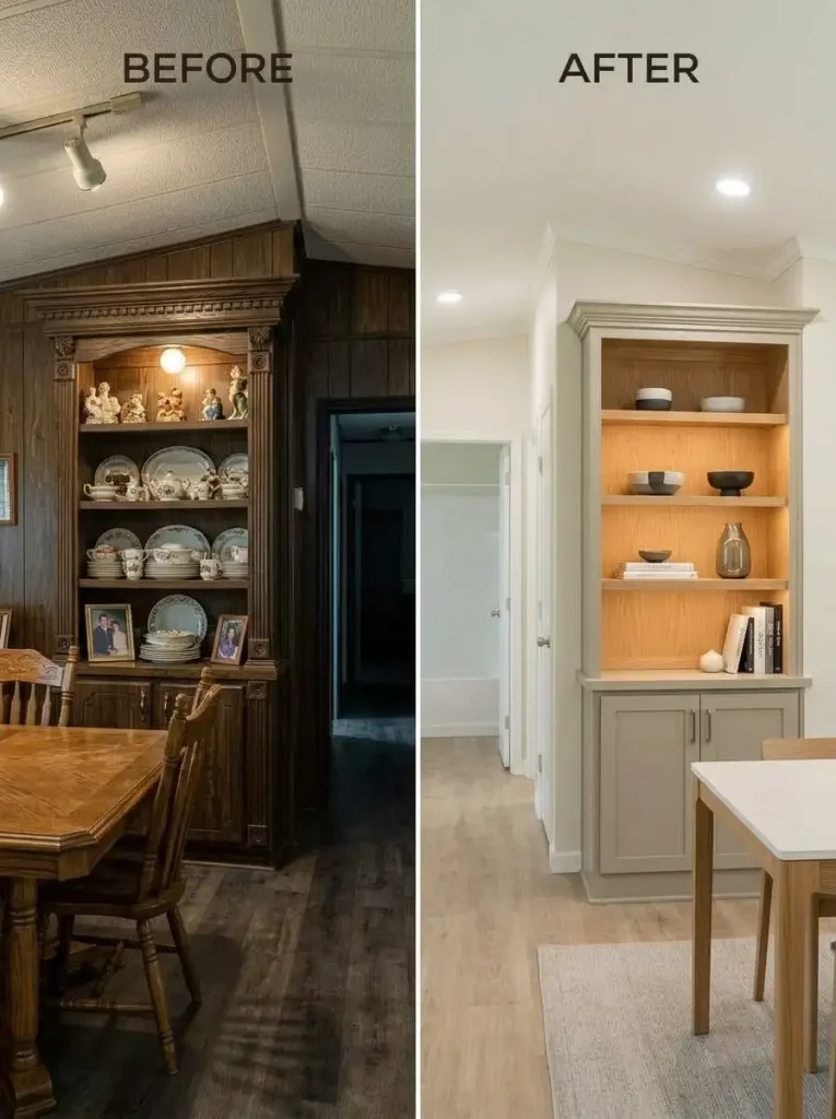
An older built-in can be the feature making a room appear dated.
It can also be the feature preventing the finished makeover from looking generic.
Before removing it, ask what job it still performs.
Keep it when it provides useful storage, fits the narrow footprint well, adds architectural depth, and remains sound enough to justify cosmetic work.
Simplify it when a heavy stain dominates the room, decorative trim introduces unnecessary detail, hardware fights the newer finishes, or open shelves have become clutter magnets.
Remove it when it blocks circulation, creates an unnecessary barrier between connected spaces, is badly deteriorated, or consumes valuable space without enough function.
A retained built-in often becomes more convincing after the walls, floors, and nearby finishes become quieter.
Painting every original feature simply because it is old can erase character. Preserving everything can freeze the room in the past.
Judge the feature by function, proportion, condition, and character.
16. Give the Living Room One Focal Wall Strong Enough to Organize the “After”
A living room can have new paint, new flooring, and new furniture yet still look unfinished because attention has nowhere to settle.
The television occupies one wall.
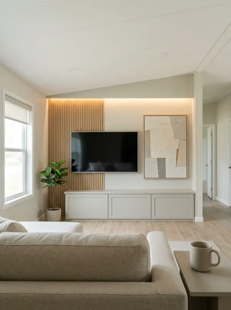
A large window dominates another.
The sofa introduces a third direction.
A fireplace, cabinet, gallery wall, or entry may create another competing destination.
The room may need less decoration and more hierarchy.
Choose the view that matters most when entering or sitting down.
Then let one wall or architectural feature carry the strongest visual weight. That might involve simplifying the media wall, allowing the largest window to lead the room, retaining a good built-in, or grounding the seating zone with one larger relationship rather than several undersized objects.
Supporting walls should quiet down after that decision.
Long mobile-home living rooms make competing focal points especially visible because several zones can appear in one sightline.
For detailed furniture placement, circulation, rugs, media walls, windows, lighting, storage, and connected-space decisions, continue with 27 Mobile Home Living Room Ideas That Look Beautiful and Comfortable. Stylish Galore
17. Make Older Windows Feel Taller With a Cleaner Fabric Line
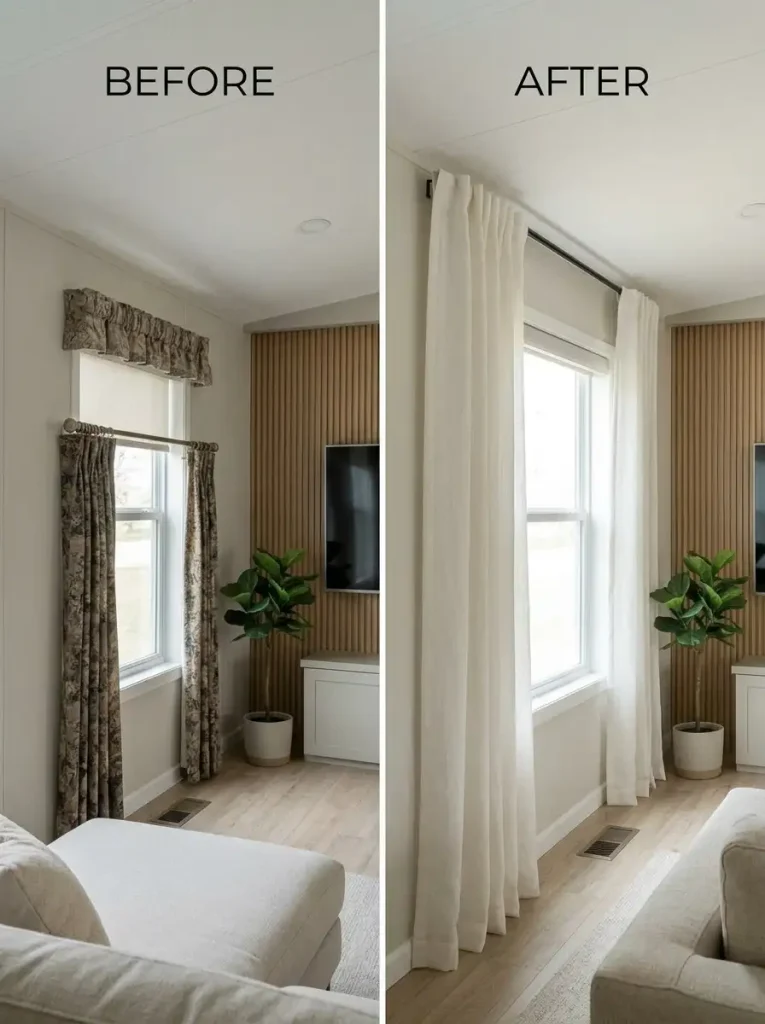
This makeover can be tested before anything permanent happens.
Remove a short valance or bulky layered treatment from one important window.
Temporarily position a longer panel higher and slightly wider than the opening.
Step back.
The physical window remains unchanged, yet the wall may suddenly feel taller and the opening more important.
Fabric creates a strong apparent boundary around glass.
Watch for four common problems:
Too low: the rod visually presses the window downward.
Too narrow: stacked fabric blocks useful glass.
Too short: the treatment adds another horizontal break.
Too bulky: the narrow room starts feeling enclosed.
The answer is not automatically dramatic floor-to-ceiling curtains. Vent locations, doors, furniture, heating equipment, circulation, and actual wall dimensions still control the choice.
Use one main window as a reversible test.
If the room changes significantly, repeat the same treatment language only where the architecture supports it.
18. Replace Random Ceiling Fixtures With One Repeated Lighting Language
Walk from the living room toward the kitchen and hallway.
You might pass a brass fan, bright chrome flush mount, decorative pendant, and several small fixtures in another finish.
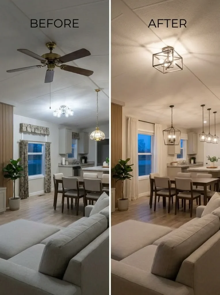
Each may work independently.
Together, they can reveal every renovation era the home has passed through.
A stronger makeover repeats relationships, not identical products.
Choose a few recurring traits:
- finish family;
- visual weight;
- geometric language;
- shade character;
- how close fixtures sit to the ceiling.
A compact living room may benefit from a quieter overhead form, while a dining point can carry slightly more presence.
Evaluate the result after sunset as well as during the day. Appearance in an online product photograph does not tell you how glare, shadow, or brightness will feel in the actual room.
Any work involving wiring or other electrical systems should follow applicable local requirements; HUD’s manufactured-home resources specifically include electrical permits and utility hookups among installation considerations. HUD
19. Treat Interior Doors, Trim, and Hardware as One Whole-Home Detail System
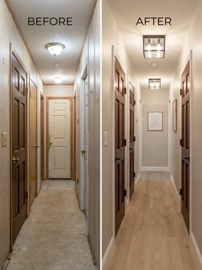
A freshly improved living room can still feel partly dated when every doorway reintroduces an earlier finish story.
Dark wood door.
Bright white casing.
Golden knob.
Another door in a different stain.
A third with unrelated hardware.
These surfaces are small individually but powerful collectively because they repeat through the home.
Stand at one end of the hallway and count how many door-and-trim combinations remain visible.
Then choose a system.
Quiet continuity
Doors and trim stay relatively close to the surrounding walls, which reduces fragmentation.
Controlled contrast
Doors carry the stronger tone while casing and hardware stay coordinated.
Selective wood preservation
Good wood remains visible while weaker faux-wood or competing stained elements are simplified around it.
Hardware should reinforce the chosen direction, not create another separate collection.
The hallway test determines the stopping point.
Once the long view feels coherent, perfectly usable doors do not need replacement simply because they are old.
20. Make the Vanity, Mirror, and Light Read as One Bathroom Makeover
A compact mobile-home bathroom can create an impressive before-and-after without changing every fixture.
The vanity, faucet, mirror, wall surface, and light commonly occupy one concentrated field of view.
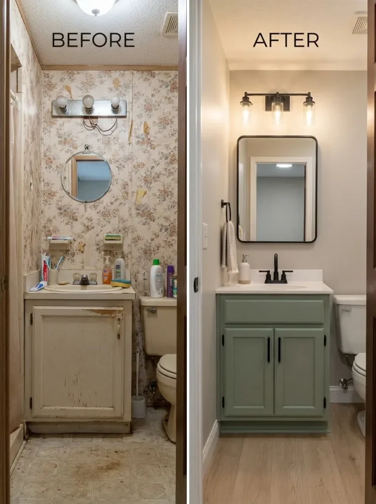
Treat that entire wall as a composition.
Bathroom Makeover-Zone Planner
How Deep Does the Vanity Wall Need to Go?
Choose the condition closest to your bathroom before expanding the project.
Keep the footprint and remake the visual zone.
Coordinate the vanity finish, mirror scale, lighting, faucet and nearby wall color. A compact bathroom can gain more from fewer competing finishes than from automatically changing the layout.
- Preserve sound plumbing locations where they already serve the room.
- Use mirror proportion to strengthen the wall composition.
- Let lighting relate to the mirror rather than float independently above it.
Fix the daily-use problem before styling.
If doors collide, storage is unusable, access is awkward, or the vanity has genuinely failed, function has earned a larger role in the makeover.
Pause cosmetic work and investigate.
Soft flooring, repeated staining, active leakage, swollen material or persistent moisture changes the project. Do not cover evidence simply to improve the photograph.
StylishGalore’s bathroom specialist already covers disturbance, plumbing-adjacent scope, water-damage stop signals, vanity components, mirrors, lighting, and budget decisions in much greater depth. Continue with 17 Mobile Home Bathroom Remodel Ideas on a Budget when the project moves beyond this visual makeover zone. Stylish Galore
21. Separate a Cosmetic Tub or Shower Refresh From a Real Wet-Area Problem
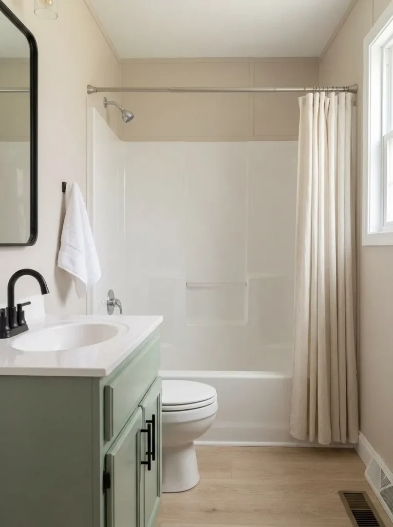
A dated tub surround can be frustrating.
An area showing evidence of water trouble belongs to a different decision category.
Do not let the first distract from the second.
A sound wet zone may simply contain an outdated color, dated curtain or enclosure, old-looking trim, busy accessories, or surrounding wall color that makes the entire area feel older.
Those are makeover questions.
Repeated moisture, active leaking, swollen materials, soft surrounding finishes, or deterioration associated with water call for investigation before the area is covered by cosmetic work.
The distinction protects both the renovation and the budget.
A quick surface change can improve the photograph while leaving the underlying problem untouched.
If the tub or shower remains sound, simplify what surrounds it and allow the largest fixed feature to recede.
If its condition is uncertain, the makeover has reached a stop point.
The dedicated mobile home bathroom remodel guide already owns the deeper remodel sequence. Stylish Galore
22. Make the Bedroom Transformation Happen Behind the Bed First
Stand in the bedroom doorway.
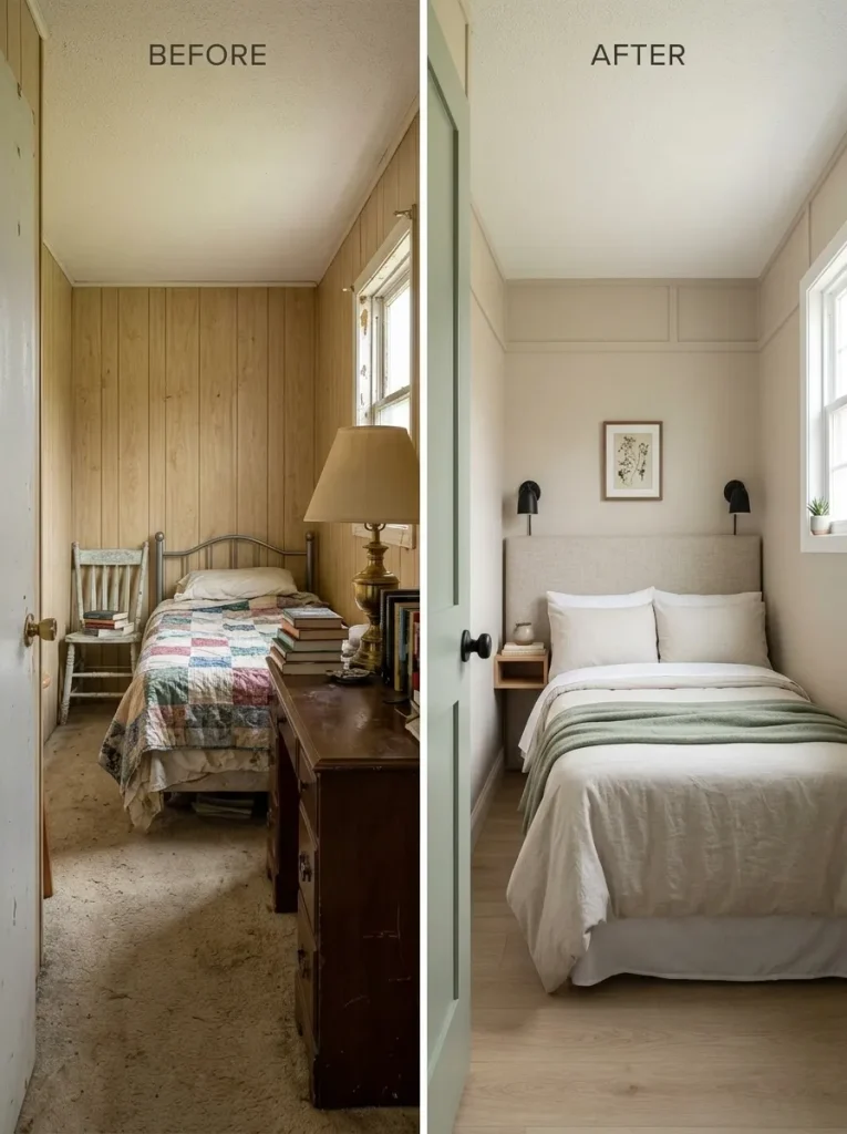
Where does your eye land?
In many mobile-home bedrooms, the bed occupies enough of the visible space that its wall effectively becomes the room’s main elevation.
That makes it an efficient makeover target.
The transformation might come through:
- a controlled wall-color shift;
- a properly scaled headboard;
- balanced bedside elements where clearance permits;
- intentional asymmetry where doors or windows interrupt the room;
- compact bedside lighting that clears crowded surfaces.
Avoid designing the wall as though it belongs to an oversized conventional bedroom.
A narrow room may not comfortably hold deep nightstands, huge lamps, a bench, oversized artwork, bulky architectural detailing, and multiple decorative layers at once.
Work from the doorway view and walking route.
StylishGalore’s dedicated bedroom article goes deeper into fixed openings, bed placement, storage, lighting, color, textiles, and circulation. Continue with 25 Mobile Home Bedroom Ideas for a Comfortable, Beautiful Space. Stylish Galore
23. Hide the Everyday Storage That Makes a Finished Makeover Look Unfinished
Finish decorating a room.
Live in it normally for three days.
Then photograph it again.
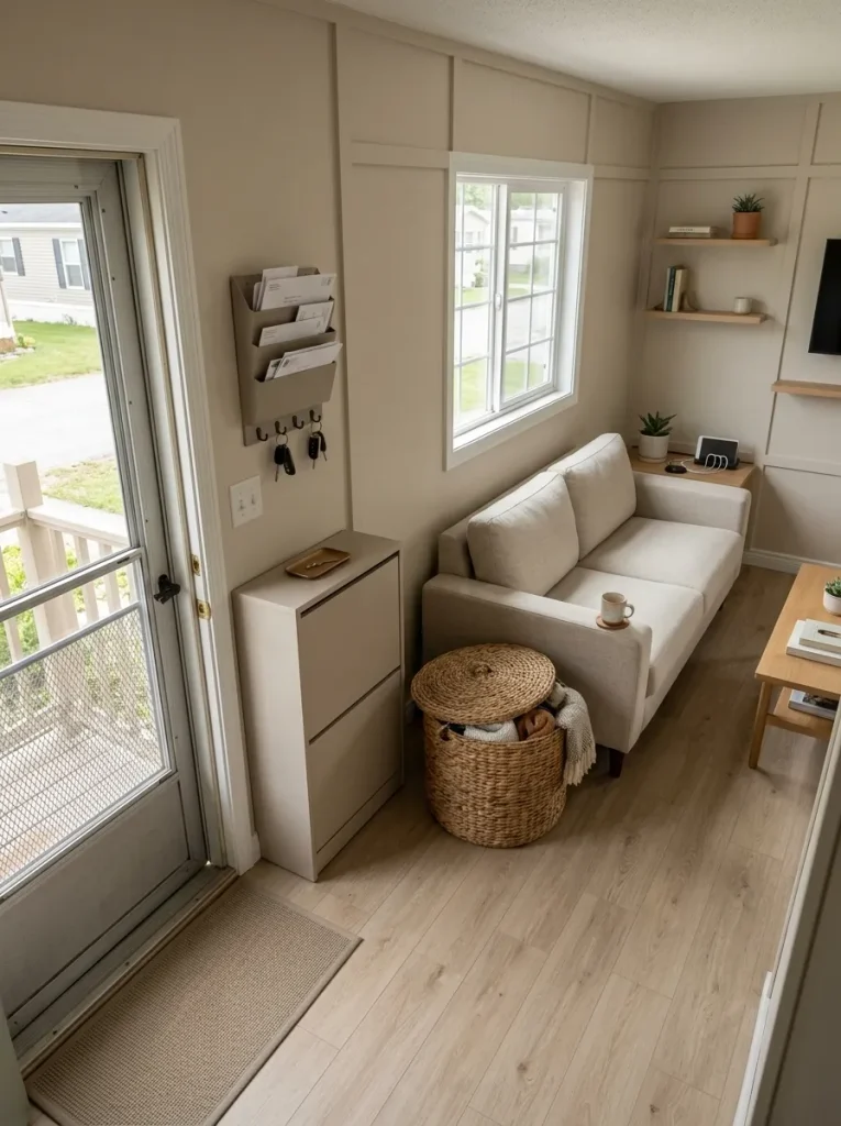
Did shoes return to the doorway?
Did a laundry basket reclaim the path?
Did countertop appliances spread across the kitchen?
Did toiletries surround the bathroom sink?
Did mail, chargers, pet supplies, blankets, or cleaning products return to open surfaces?
If they did, the room may not need more storage. It may need storage placed closer to the routine creating the clutter.
Match containment to behavior:
Shoes collect at the entrance → solve storage at the arrival point.
Blankets remain on the sofa → storage belongs near the seating zone.
Bathroom products repeatedly cover the vanity → everyday items need reachable containment.
Kitchen counters refill themselves → frequently used equipment needs a practical home.
This separates a styled photograph from a durable makeover.
The after-state should survive ordinary life.
24. Keep One Original Feature So the Home Looks Updated, Not Erased
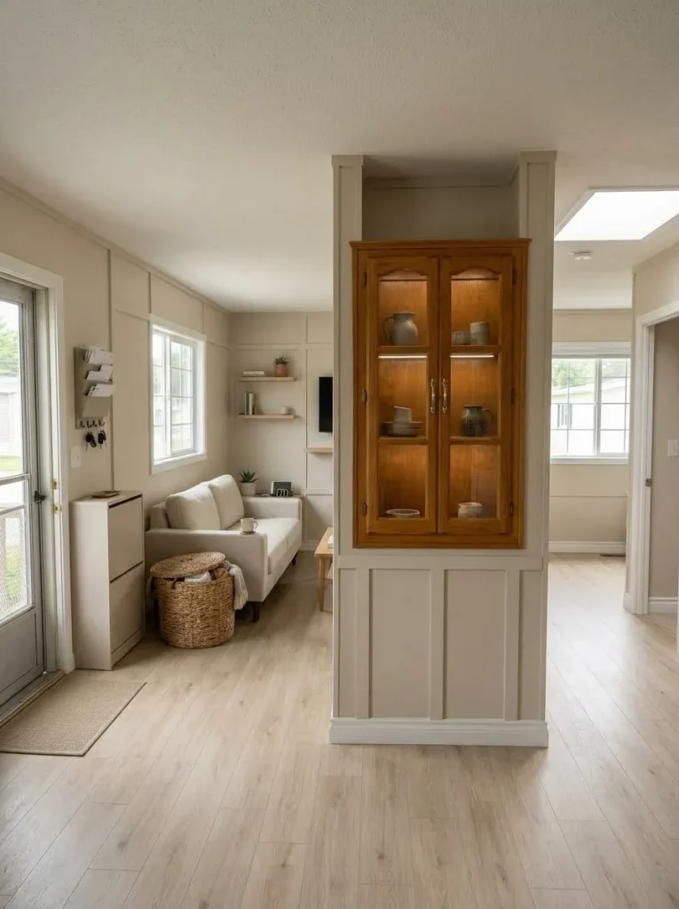
There is a point where renovation stops revealing a home and starts deleting its identity.
Notice that point.
An original built-in, warm wood cabinet, unusual interior door, paneled detail, older hardware, or architectural quirk can become the most memorable part of the finished interior after competing surfaces are simplified.
Preserve vs. Erase Comparator
Does the Original Feature Add Character or Friction?
Preservation works best when the old feature still performs a useful visual or practical role after the surrounding room becomes calmer.
The feature improves when the room gets quieter.
- Useful storage or architectural depth
- Good proportion for the compact room
- Material warmth the new scheme benefits from
- Distinctive detail that does not obstruct circulation
The feature controls the room for the wrong reasons.
- Blocks a useful path or opening
- Is badly deteriorated
- Adds another competing material language
- Consumes valuable space without enough function
Ask: if this feature were beautifully restored tomorrow, would I still want it here?
If the answer is yes, preservation has a reason.
If the answer is no, nostalgia alone does not require the feature to stay.
A strong transformation often feels richer when enough of the original home remains to show that a real makeover happened.
25. Retake the Same Photos and Stop When the Big Age Signals Are Gone
Return to the two photographs you took before anything changed.
Stand at the same curb position.
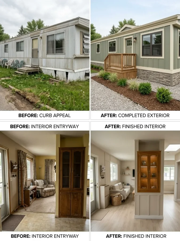
Then stand in the same interior doorway.
Do not hunt for tiny unfinished tasks.
Judge the whole view.
Does the exterior now read as one home rather than a collection of siding, windows, skirting, stairs, and landscaping?
Does the interior have a clearer hierarchy?
Are the largest surfaces coherent?
Do the remaining original elements look intentional?
If yes, the makeover may already be complete.
Old Mobile Home Makeover Stop Gate
The Final Before–After Test
Does Another Project Still Change the Whole View?
Use the original curb and doorway photographs. Judge the makeover at the scale a visitor actually experiences it.
STOP: let the home be finished.
Move from renovation into maintenance and ordinary decorating. A home does not become more complete merely because another replaceable item can still be found.
CONTINUE: define one remaining problem.
Name the dominant issue before buying anything else. Make the next project earn its cost by changing function, condition, or a genuinely large part of the final view.
If the remaining obstacle is mainly budget, the more appropriate next step may be a tightly controlled round of improvements rather than another full remodel. See 19 Mobile Home Makeover Ideas Under $500 for that narrower decision. Stylish Galore
A renovated home does not have to become unrecognizable before it deserves to be called finished.
Conclusion
The strongest old mobile home makeover is not necessarily the one that replaces the most. It is the one that identifies the home’s biggest age signals, resolves the highest-impact problems first, and keeps sound features when they still serve the space.
Use the original curb and doorway photographs as your control. After each major phase, compare the same views again. When the shell feels coherent, the main interior sightlines settle down, and remaining older details look intentional, shift from renovation into ordinary decorating and maintenance.
That stopping point protects the budget while preserving some of the character that made the transformation worth seeing.
Save this article to Pinterest so you can return to these old mobile home makeover ideas when you’re ready to plan your own before-and-after.