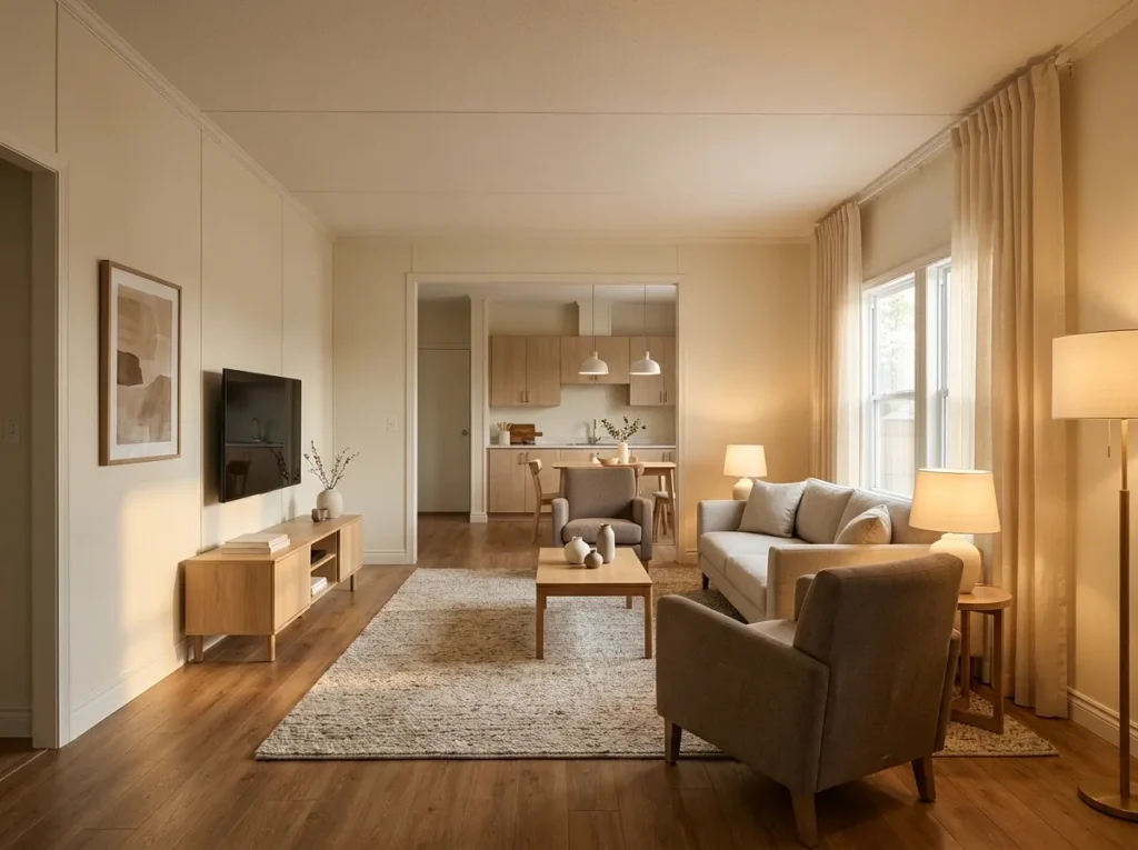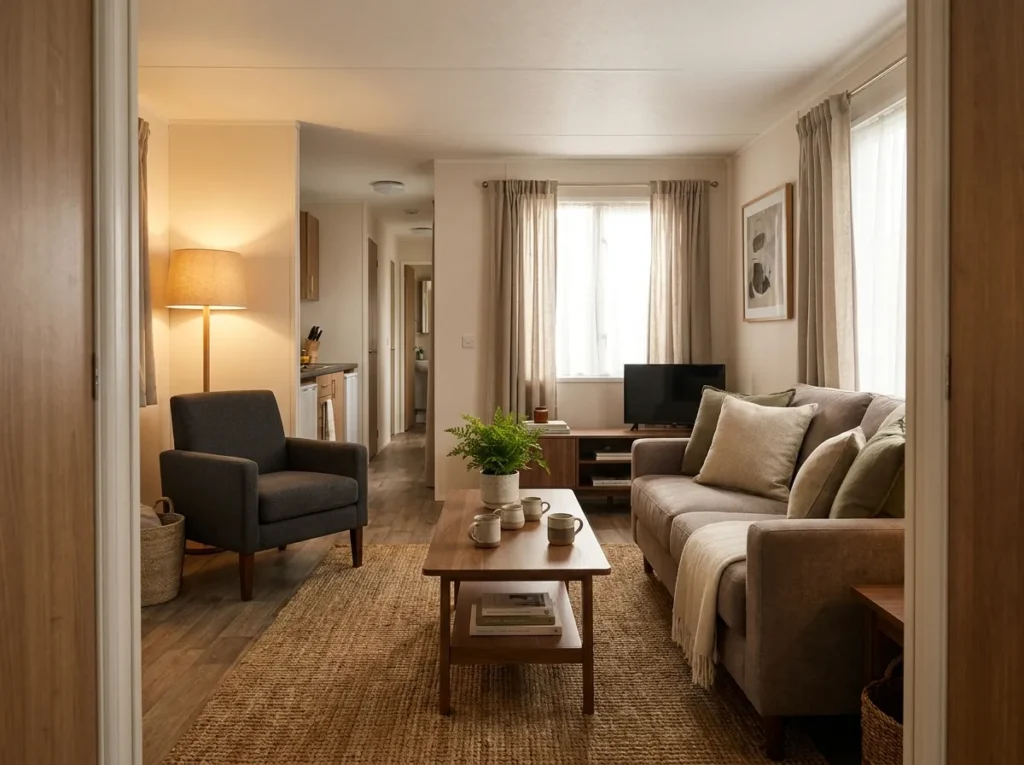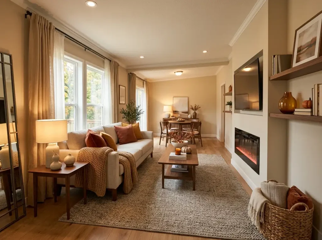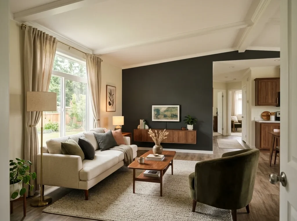
A mobile home living room can look perfectly fine in a photo and still feel awkward the moment you walk through it. The sofa may be comfortable but too deep for the available width. A beautiful TV wall can overpower the window beside it. In another home, extra floor space leaves the furniture looking disconnected rather than relaxed.
That is why the most useful mobile home living room ideas start with the room itself—not a shopping list.
The 27 ideas below work through furniture placement, circulation, rugs, TV and fireplace walls, windows, lighting, storage, color, connected kitchens, front-door entries, everyday comfort, and finishing details. Some are especially useful in narrow single wides; others solve the opposite problem in wider double-wide living rooms.
You do not need to apply every idea. Start by identifying the relationship that makes your room hardest to use or hardest to enjoy, then fix that first.
1. Diagnose the Room Type Before You Decorate It
Two mobile home living rooms with roughly the same furniture can need completely different solutions.
Stand at the main entrance and ignore the décor for a moment. Notice the shape of the open floor, where people naturally walk, which architectural feature catches your eye, and whether the room feels compressed or loosely spread out. That quick diagnosis tells you whether your first move should involve circulation, seating, the focal wall, or visual connection to another room.
A long single-wide living room, for example, usually cannot absorb furniture the same way a broad double-wide room can. Meanwhile, a front door opening directly beside the sofa creates a different problem from a room where the TV and fireplace are competing for attention.
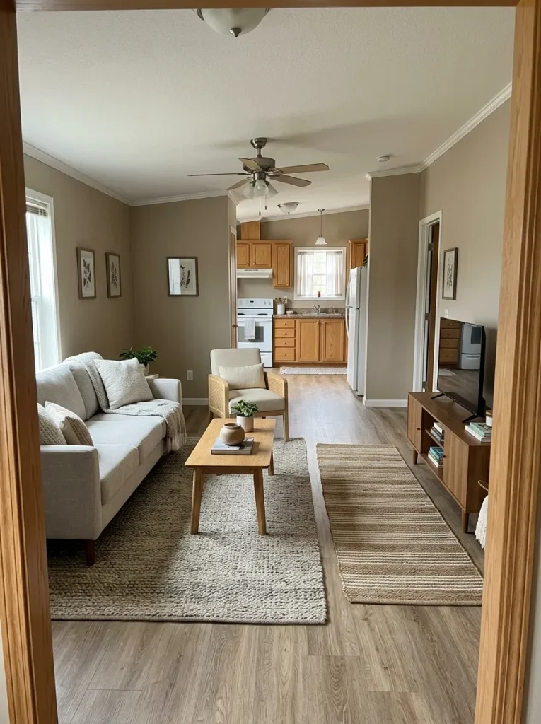
Use the diagnostic below to find the condition closest to yours.
Living Room Fit Map
What is your room asking you to fix first?
Open the condition that looks most like your living room. Start with its first move before spending money on smaller decorative changes.
ROOM TYPE 01 Long + narrow
ROOM TYPE 02 Wide + open
ROOM TYPE 03 Front door cuts through it
ROOM TYPE 04 TV + fireplace + window compete
ROOM TYPE 05 Open to kitchen or dining
A room may fit two categories. In that case, prioritize the one that affects movement or furniture placement before the one that is mainly visual.
2. Protect the Main Walkway as Part of the Layout
Imagine carrying groceries through the front door while someone is seated on the sofa. Which route does your body naturally take?
That path is part of the living-room plan even though it contains no furniture.
In a narrow mobile home, trouble usually starts when several pieces steal a few inches from the same route: a deep sofa, a projecting recliner, a rectangular coffee table, then a basket or plant at floor level. None looks oversized alone. Together, they turn normal movement into a series of small detours.
Trace the busiest route from the entrance toward the kitchen, hallway, or exterior door. Then look for the single object that intrudes most aggressively into that path. Moving or replacing that piece can improve the room more than rearranging every accessory.
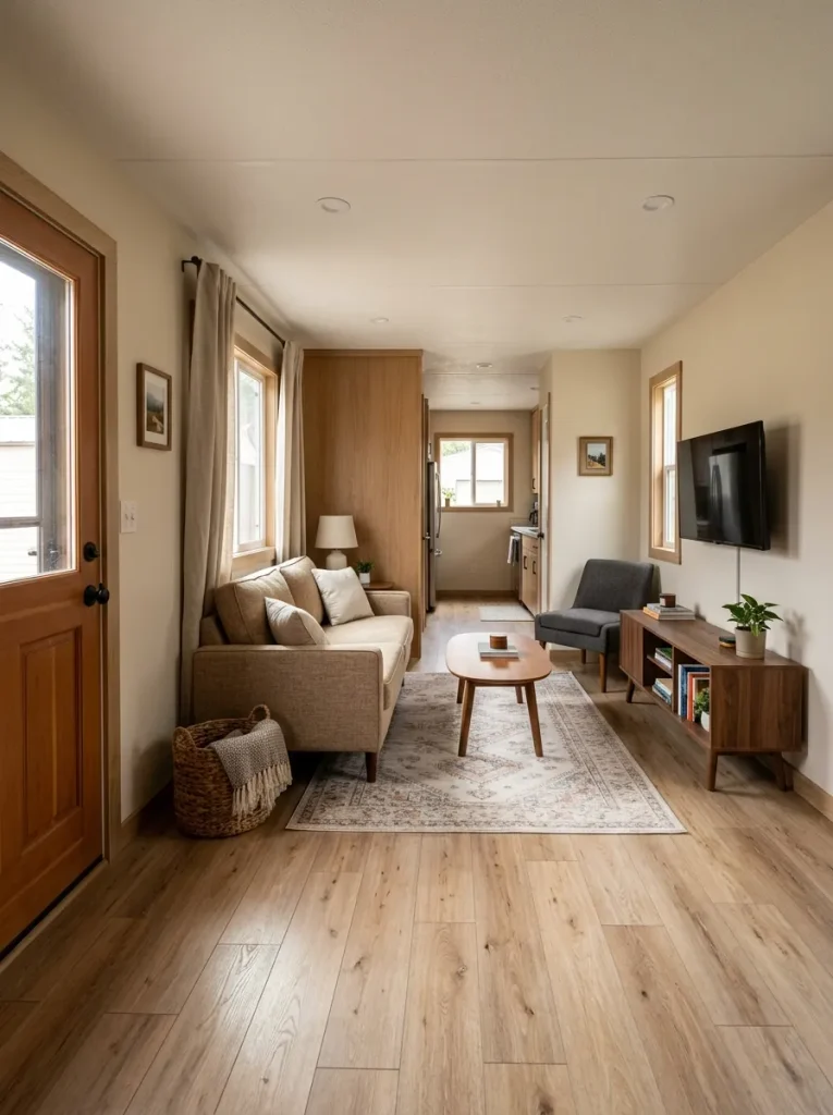
For a single wide where width is the dominant constraint, the deeper guide on single-wide mobile home decorating ideas goes further into furniture depth, visual width, and traffic-lane decisions.
Quick test: if people routinely turn sideways, cut behind furniture, or move the coffee table before guests arrive, circulation deserves attention before decoration.
3. Draw a Clear Seating Zone With One Grounding Rug
A rug can make a mobile home living room feel larger or more cramped depending on the relationship it creates around the furniture.
Look down at the floor, not the walls.
If a small rug floats by itself beneath the coffee table, the seating pieces can read as separate objects scattered around it. A better starting point is a rug that visually connects the major seats while leaving enough surrounding floor visible to show where the living zone ends.
The useful question is not, “How big should a living-room rug always be?” There is no universal size that works across different mobile-home layouts.
Ask this instead:
Does the rug visually hold the seating group together without consuming every visible strip of floor around it?
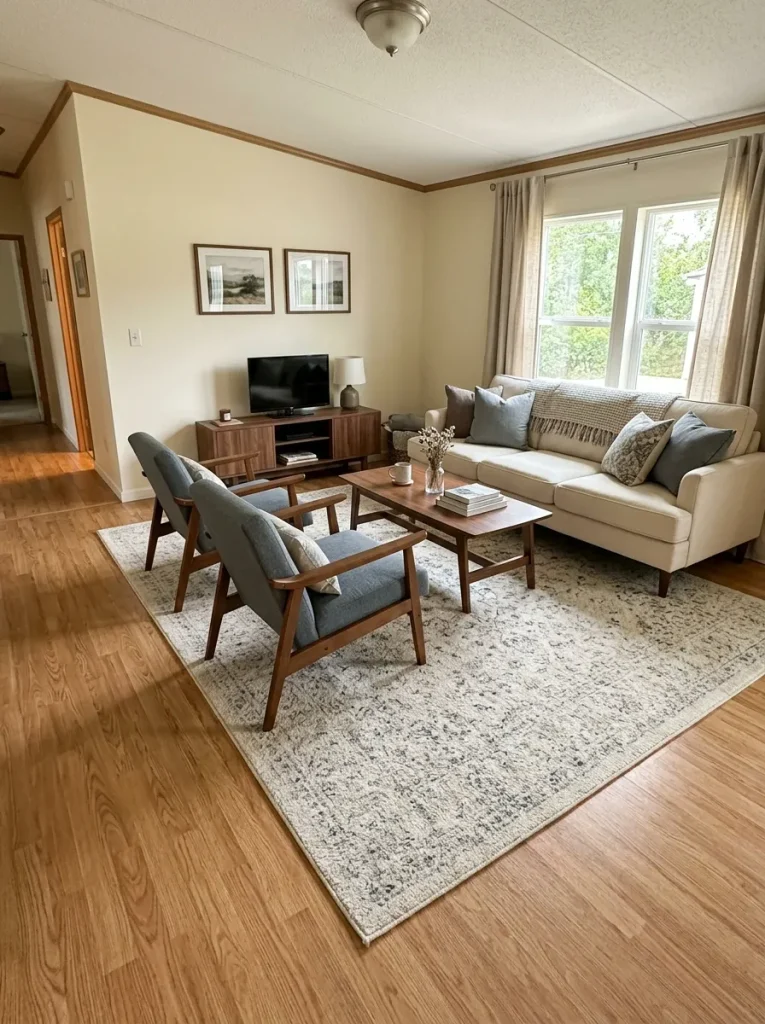
In a narrow single wide, the answer may be a restrained footprint that avoids crowding the passage. In a wider living room, a broader rug can pull floating furniture into one convincing group.
Color comes later. First decide what the rug needs to connect.
4. Choose the Seating Shape Before You Choose the Upholstery
A beautiful sofa in the wrong geometry remains the wrong sofa.
Before comparing fabric, tufting, color, or throw pillows, decide what the seating must do inside the room. Some mobile home living rooms need one shallow sofa and a movable chair. Others have enough width for an L-shaped sectional. A broad double-wide room may work better with separate pieces that can face each other instead of forming one heavy block.

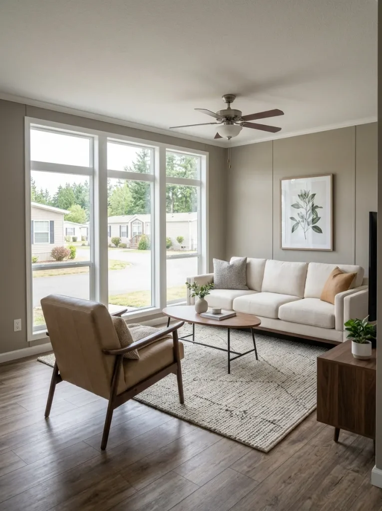
Use the room’s doors, windows, TV direction, and travel path as the filter.
Seating Shape Comparator
Which seating geometry fits the room you actually have?
Judge the footprint first. Upholstery is a finish decision; geometry controls how the room works.
Shallow sofa + movable chair
Keeps the largest upholstered mass against one side while allowing the second seat to shift for conversation, guests, or circulation.
BEST STARTING POINT: narrow rooms and door-interrupted plans.Compact L-shaped seating
Concentrates several seats into one footprint, but the return must land in genuinely usable floor—not the main passage or doorway.
BEST STARTING POINT: rooms with a protected corner and one clear approach.Sofa + two independent seats
Creates more control over conversation distance and orientation while keeping large open rooms from depending on one oversized sectional.
BEST STARTING POINT: wider double-wide living rooms or flexible gathering spaces.If the sectional you love only works after shrinking the walkway, covering part of a window, or forcing every other chair against a wall, the room has already answered the question.
Choose another seating shape.
5. Turn One Seat Off-Axis to Make Conversation Feel Natural
Long mobile home living rooms often encourage the same arrangement: sofa on one long wall, television on the other, and everything else lined up beside them.
It is tidy—but it can make the room feel like a corridor.
Before buying anything, rotate one existing chair roughly toward the sofa and look again from the entrance. The slight angle introduces a cross-room relationship that breaks the strong front-to-back pull of the floor plan. It also makes the chair feel like part of a conversation group instead of another object stored along a wall.
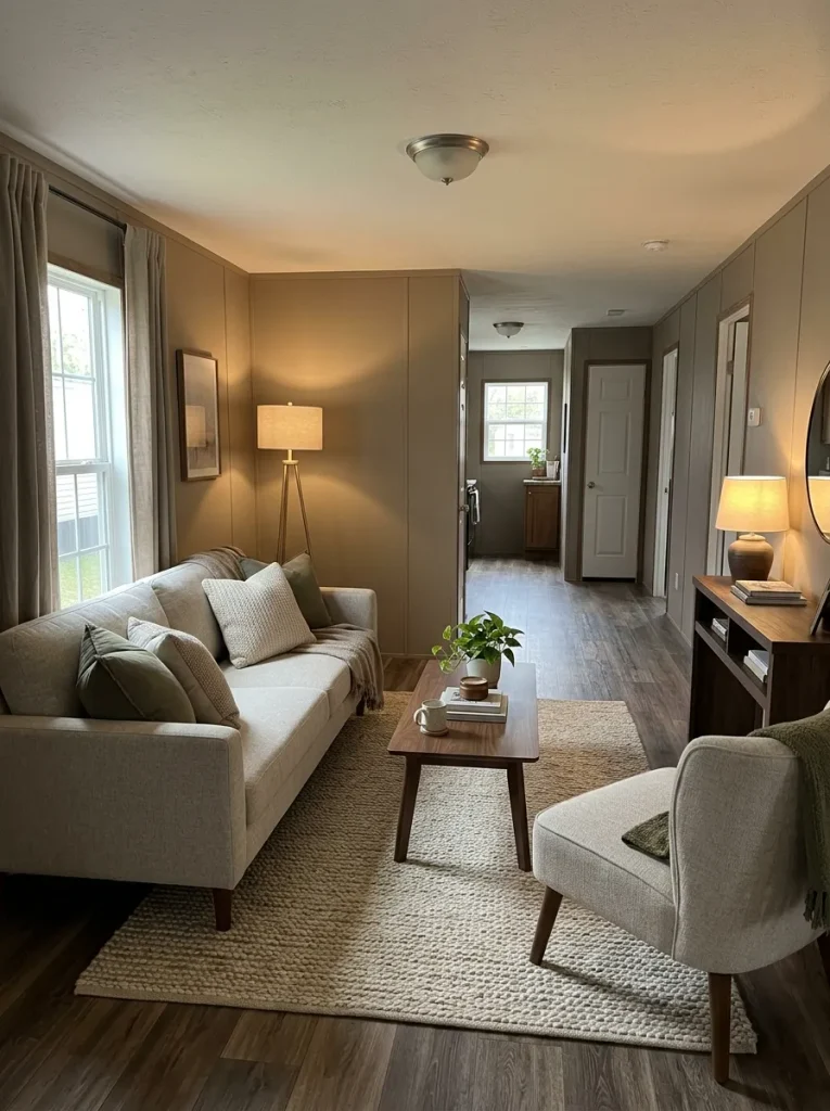
The move only works when the chair’s back or corner stays clear of the main walking route. If turning it creates a new obstacle, keep the straighter arrangement and solve the corridor feeling through the rug or another visual anchor.
Wider double-wide rooms face the opposite challenge: seats can drift too far apart. The double-wide interior ideas for making large rooms feel cozy guide explores that larger-room problem in more depth.
Stop point: once the seats feel related from a seated position, leave the remaining open floor alone.
6. Make the TV Wall Choose a Primary Job
A mobile home living room can ask one wall to do too much.
The television needs a comfortable viewing position. A fireplace may already occupy the architectural center. Storage has to go somewhere. Then shelves, family photos, signs, plants, baskets, and seasonal décor are added to whatever space remains. Individually, every element may look fine; together, the wall loses hierarchy.
Start by deciding what a person should notice first.
If the TV is used daily, let the wall read primarily as a media zone. If an existing fireplace gives the room its strongest architectural character, treat the screen as a supporting element within that composition. If storage is the real problem, a low cabinet may deserve more visual weight than another layer of decorative shelving.
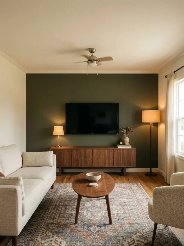
The objective is not minimalism. It is visual leadership.
Media Wall Priority Lab
What should this wall communicate first?
Choose the job that matters most. The supporting jobs can remain, but they should become visually quieter.
A strong composition can handle several features. It simply cannot treat all of them as the headline.
7. When TV and Fireplace Compete, Build One Visual Composition
A fireplace and television do not automatically need to fight for attention.
The problem begins when they are treated as two unrelated focal points: one wall gets the fireplace treatment, another receives a dominant TV setup, and the furniture is then forced to acknowledge both. In a mobile home living room, where usable wall area may already be limited by windows and doors, that split can make the entire room feel undecided.
Try reading the two features as one composition.
If the television sits above or near the fireplace, repeat a shared horizontal or vertical alignment through the mantel, paneling, console, or surrounding negative space. If the two elements live on different walls, decide which one furniture should face most directly and allow the other to become secondary from the main seated view.
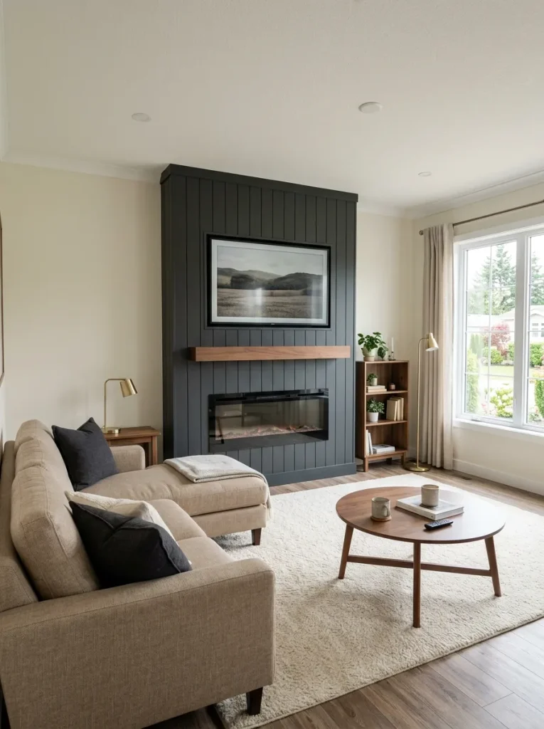
For wider double-wide rooms, the guide to double-wide decorating ideas explores focal arrangements with more room-specific depth.
If mounting a television near an operating fireplace is part of the plan, treat that as installation work, not styling. Follow the instructions supplied with the actual television and fireplace, and use a qualified installer when the installation calls for one. This section addresses only the visual relationship between the two features.
Better decision: choose the primary seated focal direction first; style the second feature to support it.
8. Keep the Main Window Wall Visually Open
A large window can make a compact living room feel significantly more generous—but only if the wall around it still behaves like a source of light.
Take a photograph of the window wall from the main entrance.
Now look specifically at what touches the glass visually. A tall cabinet pressed beside the trim, bulky furniture beneath the window, or several small decorative objects may each occupy only a little floor space, yet together they can make the opening appear narrower.
The window does not have to sit on an empty wall. It needs breathing room around its brightest area.
A useful hierarchy is:
- keep the glazing itself visually unobstructed;
- place lower elements beneath or beside it;
- reserve taller pieces for a wall that does not depend on daylight.
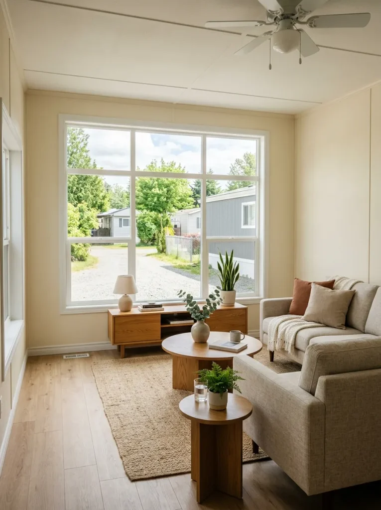
There is an exception. If privacy is poor or the exterior view is unattractive, more substantial window treatment may be worthwhile. In that case, control the light intentionally instead of automatically maximizing it.
A window wall earns its space by doing something furniture cannot: extending the room visually beyond its physical boundary.
9. Hang Curtains for Height Without Stealing Glass or Door Function
Curtains can visually stretch a low mobile home living room upward because the eye follows the fabric from rod to floor.
But “hang them high” is incomplete advice.
First identify what the opening actually does. A fixed window only needs light control and privacy. A sliding door also needs a clear operating path. A frequently used exterior door needs fabric that will not continually drag into foot traffic.

For ordinary windows, mounting the rod beyond the glass area can allow opened panels to rest farther toward the wall, keeping more daylight visible. For a slider, enough side clearance matters so the curtain stack does not repeatedly cover the usable door opening.
Window Geometry
Let the curtain frame the opening without shrinking it.
This matters especially in mobile homes where a large sliding door may occupy most of one wall.
10. Quiet the Upper Plane When the Ceiling Fan Already Has Presence
Many mobile home living rooms have more happening overhead than we notice from eye level.
A ceiling fan may share a relatively low plane with vents, seams, light fixtures, registers, or visible ceiling transitions. Add a dramatic pendant, contrasting fan blades, ornate ceiling trim, and strong upper-wall décor, and the room can begin to feel visually compressed from above.
The answer is not automatically to remove the fan.
Ask which ceiling element needs to be noticed.
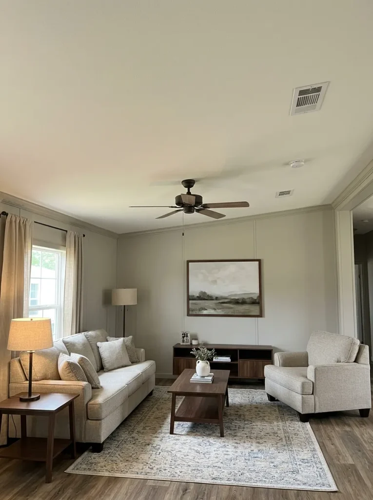
If the fan is substantial and useful, let nearby elements become quieter. A simpler light fixture, lower-contrast ceiling color, restrained trim treatment, or fewer decorative elements near the upper wall can reduce competition.
Ceiling-plane check
Sit in the seat you use most and look upward for five seconds.
If your eye jumps between the fan, light, vent, ceiling line, and wall décor without settling, there are too many strong signals in the same shallow visual zone.
Edit one of them.
A calm ceiling allows the living room below it to feel taller and more settled without pretending the physical ceiling height has changed.
11. Build Daylight and Evening Light as Two Different Schemes
A living room can look bright and attractive at noon yet feel surprisingly flat after sunset.
That happens because daylight and evening light perform different jobs. During the day, windows provide broad illumination and help the room feel connected to the outdoors. At night, comfort depends on where artificial light actually lands—beside the sofa, near a reading chair, behind the television, or across a dark corner.
Walk through the room after dark with the overhead fixture switched off.
Notice where you naturally want light:
- beside the seat where someone reads;
- near the corner that disappears at night;
- on a console or wall that needs gentle visual depth;
- close to the sofa without shining directly into the television.
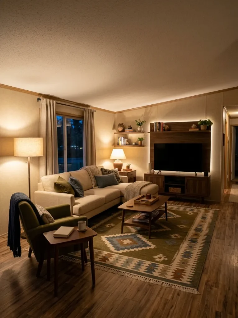
Then build outward from those needs.
A useful mobile home living room rarely needs every lamp producing the same brightness. One ambient source can establish the overall glow while smaller lamps create pockets of usable light.
Decision rule: if the room feels comfortable by day but harsh, shadowy, or overly dependent on one ceiling fixture at night, improve the evening layer before changing the color palette.
12. Put Closed Storage Low Where the Room Needs Visual Rest
Open shelving is useful when the objects displayed on it deserve attention.
Everyday clutter usually does not.
In a mobile home living room, a collection of tall shelving units, narrow cabinets, baskets, media towers, and freestanding organizers can make the walls feel more crowded than the floor actually is. Low closed storage solves the opposite problem: it contains useful things while leaving more uninterrupted wall above it.
Think about what you repeatedly need but rarely want to display:
remotes · chargers · games · pet supplies · children’s items · extra blankets · cables
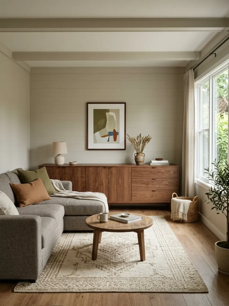
Those are strong candidates for drawers or closed doors.
A long media cabinet can be particularly effective because one horizontal piece may replace several smaller storage objects. The calmer silhouette also gives artwork, a television, or a window more visual breathing room.
There is one tradeoff. If the living room is extremely short on floor area, even low cabinetry can consume valuable depth. In that case, use vertical storage selectively—but keep the visible contents edited.
Best outcome: storage should remove visual noise, not become another category of visual noise.
13. Use Dark Color as an Anchor, Not an Automatic Small-Room Mistake
Dark walls are often dismissed in small rooms because they are assumed to make every compact space feel smaller.
That is too simple.
A dark surface can make a mobile home living room feel more organized when it gives the eye one clear place to land. A dark media wall works particularly well when the surrounding ceiling, flooring, curtains, or furniture provide enough contrast for the focal wall to feel deliberate.
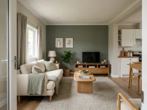
A dark wall tends to work well when:
- it belongs to an obvious focal zone such as the TV or fireplace wall;
- adjacent surfaces remain lighter or visually quieter;
- the room receives useful daylight;
- the wall has enough uninterrupted area to read as one composition;
- furniture in front of it does not introduce several competing colors.
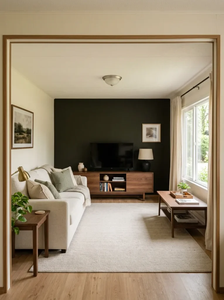
Reconsider it when:
- the darkest color would continue around several already narrow surfaces;
- heavy furniture covers most of the wall anyway;
- the room has very little natural light and weak evening lighting;
- strong patterns, signage, shelving, and décor already compete for attention.
The useful question is not “Can a small mobile home living room use a dark color?”
Ask:
What visual problem will the dark color solve?
If the answer is “it will anchor this wall and simplify the room’s hierarchy,” it may be exactly the right move.
14. Let the Rug and Flooring Read as One Floor Story
The rug should not be chosen in isolation from the floor underneath it.
Wood-look plank, gray vinyl, warm brown flooring, and pale laminate each change how the same rug appears. A high-contrast geometric rug that energizes one room may make another feel busy because the flooring already contains strong grain and tonal variation.
Try this comparison before buying:
| Existing floor | Rug direction worth testing |
|---|---|
| Busy wood grain | Quieter pattern or softer tonal contrast |
| Dark flooring | Lighter rug to open the seating zone |
| Pale flooring | Medium-toned rug for definition |
| Gray or cool flooring | Warmer cream, camel, rust, or natural tones |
| Warm brown flooring | Cream, muted blue-gray, olive, or restrained pattern |
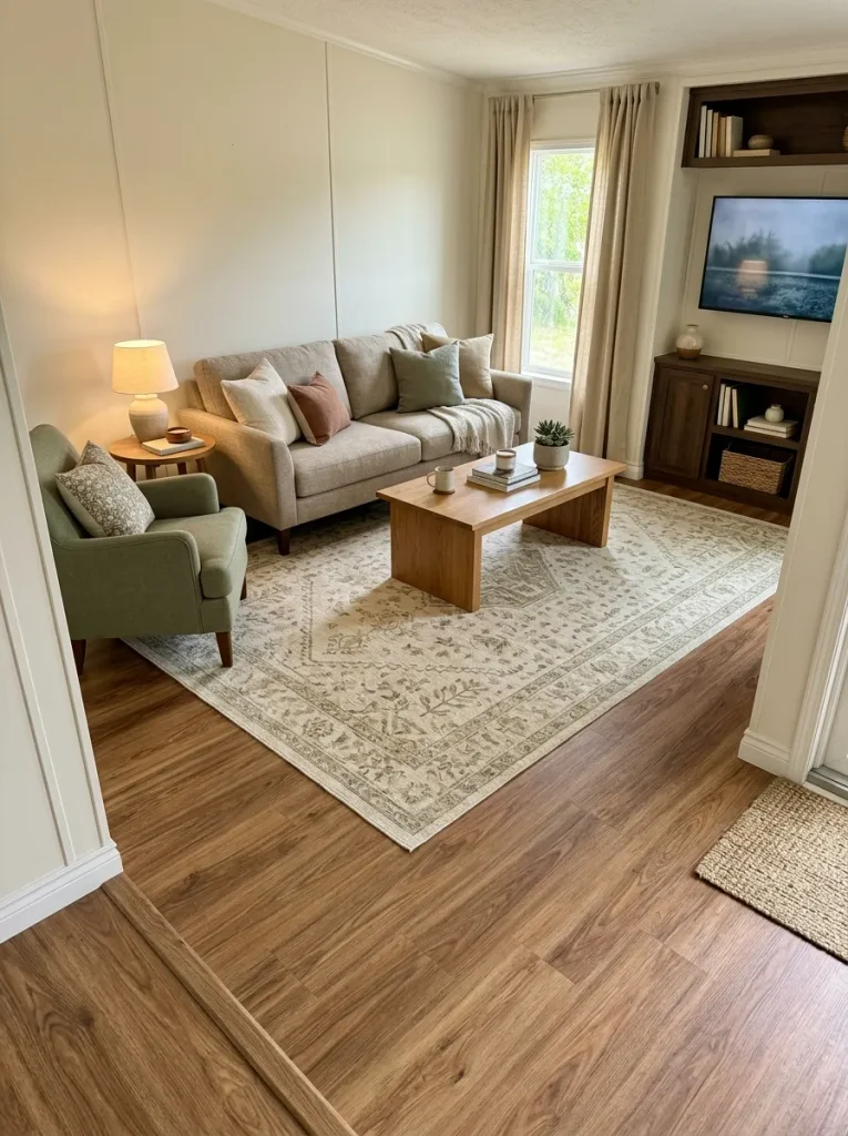
This is a visual starting point, not a universal color formula.
The important relationship is contrast distribution. If the floor, rug, coffee table, sofa, and curtains all carry equally strong pattern or color, the lower half of the room becomes difficult to read.
Choose which surface deserves the pattern.
Let the other one support it.
15. Place Mirrors Where They Return Light, Not Clutter
Before hanging a mirror, stand where the mirror will go and look directly across the room.
That is approximately what the mirror is going to give you twice.
If it faces a bright window, attractive artwork, a clean dining view, or an open section of the room, the reflection can increase visual depth and redistribute light. If it faces a television full of cables, an overloaded shelf, a doorway full of shoes, or the busiest section of the kitchen, the mirror duplicates that clutter.
The 10-second mirror test
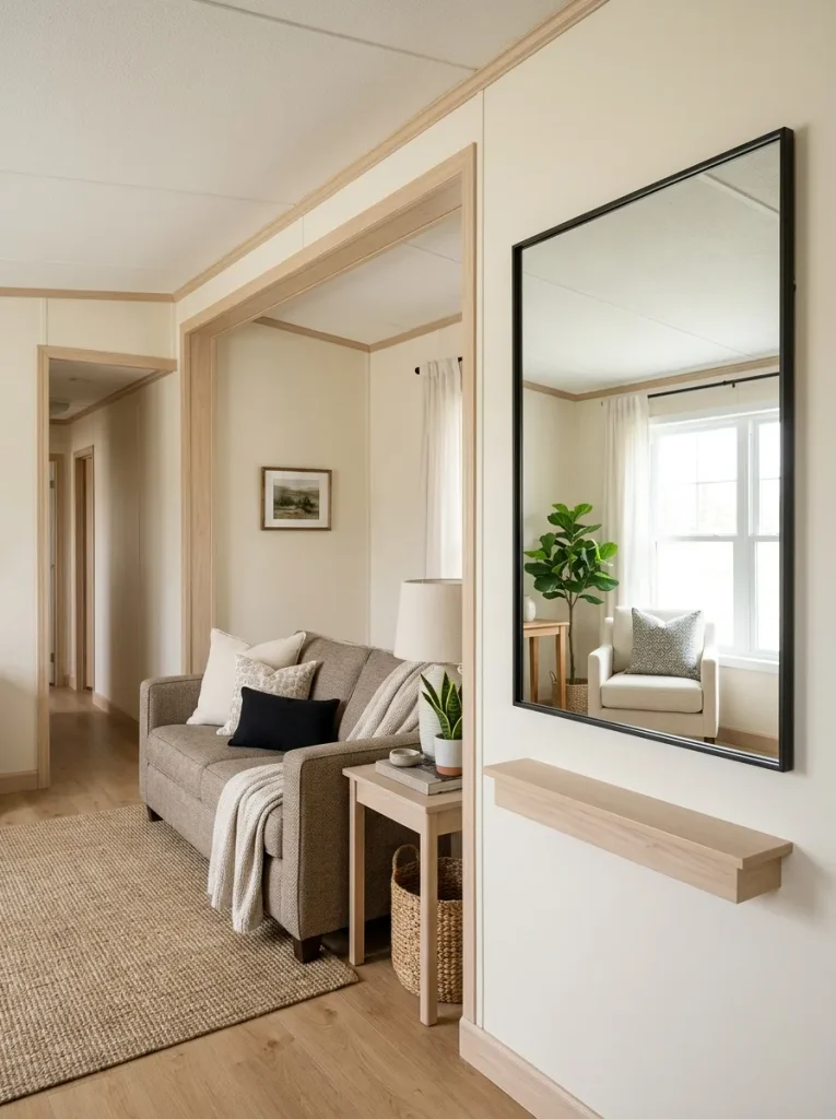
Hold your phone at the proposed mirror position and photograph the opposite view.
Then ask:
Would I deliberately frame this scene as wall art?
If yes, the location is promising.
If no, move the mirror before buying a larger one.
This matters especially in mobile homes because long sightlines often connect several zones. A mirror placed on the wrong wall may reflect two or three rooms at once, multiplying every visual distraction along the way.
A mirror does not automatically make a room feel larger.
A good reflection does.
16. Use One Larger Wall Moment Where Tiny Pieces Would Fragment the Room
A mobile home living room often already contains plenty of small rectangles: windows, doors, TV screens, vents, cabinet doors, switch plates, wall seams, and shelving openings.
Adding another grid of tiny frames can make the wall feel busier than expected.
A stronger approach is to let one wall carry one larger visual moment.
That could be:
- one oversized artwork;
- a substantial framed textile;
- a wide landscape piece;
- a restrained gallery arrangement that reads as one shape;
- one architectural wall treatment behind the TV.
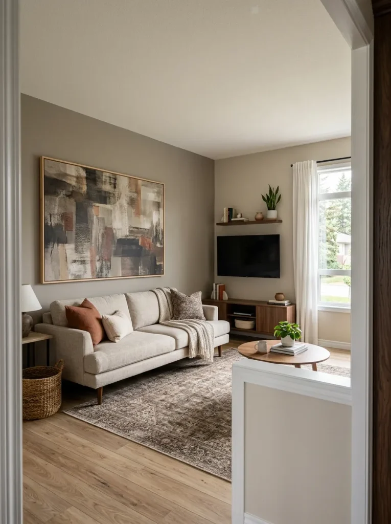
The advantage is not simply that larger décor looks expensive. A broader composition gives the eye fewer separate stopping points.
Test it from the doorway.
If five small frames read as five individual objects before they read as a collection, the wall probably needs consolidation. If the room already contains a visually dominant TV wall, the larger art moment may belong somewhere quieter.
Give each wall a clear role.
17. Leave One Surface Intentionally Under-Styled
One of the easiest ways to improve a mobile home living room is to stop decorating before every available surface is filled.
Long sightlines make this especially important. In many mobile homes, the eye can see the living room, kitchen counter, dining area, entry console, and media wall almost simultaneously. If every one of those surfaces carries several objects, the house can feel visually full even when the floor plan itself is not crowded.
Choose one visible surface to become the pause.
It might be:
a mostly clear coffee table
or
a media console with only two or three objects
or
a side table holding only a lamp
That quieter area gives the more decorative parts of the room somewhere to visually breathe.
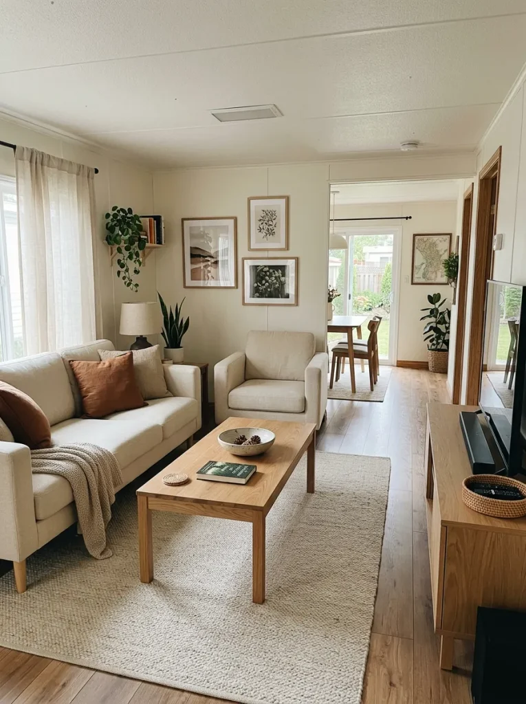
Editing test
Photograph the room from the entrance. If every horizontal surface contains something decorative, clear one completely and photograph it again.
Keep the calmer version if the room immediately feels easier to read.
18. Bridge Mixed Furniture With a Shared Finish Family
A mobile home living room often comes together over time. The sofa may be new, the coffee table older, the media console secondhand, and the chair inherited from another room. Trying to make every piece match exactly can make the space feel forced—and may create unnecessary replacement costs.
Look for the finish family already doing the most work.
Warm medium wood can sit comfortably beside another warm wood even when the stains are not identical. Black metal legs can relate to black lamp bases or a dark frame. Brushed brass can connect a traditional piece to something newer without requiring a matching furniture set.
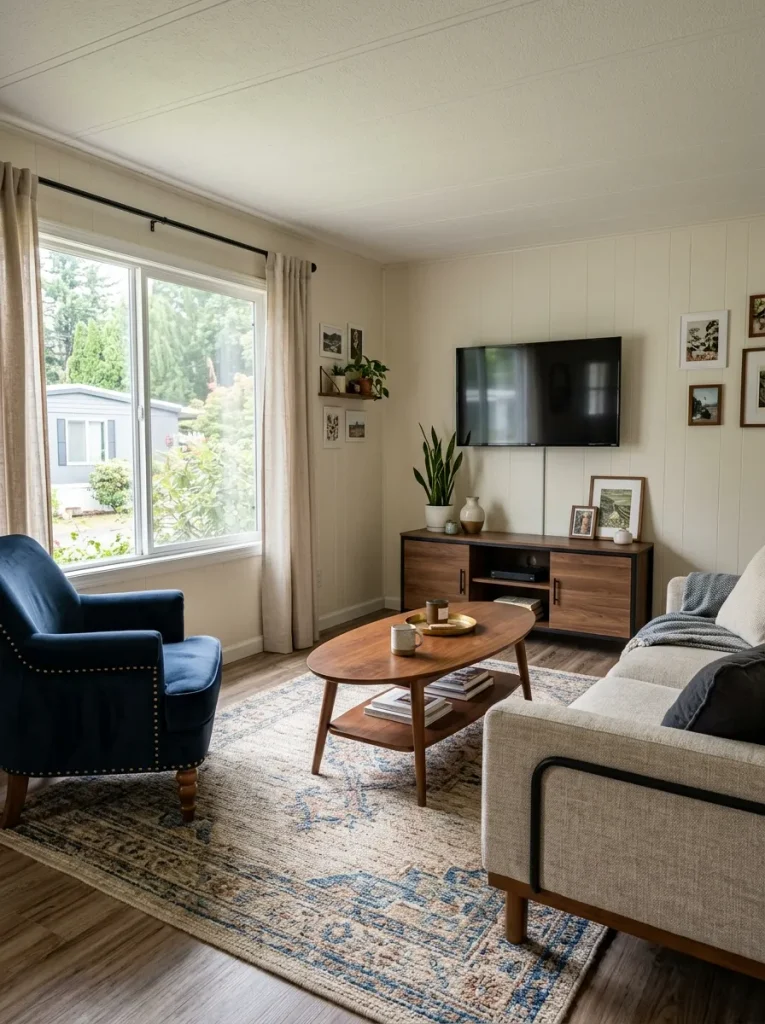
The useful check is whether a new piece introduces a fourth unrelated high-contrast finish into an already compact view. If it does, choose a quieter finish or connect it through one smaller element already present in the room.
The furniture does not need to match. It needs enough shared visual language to feel intentionally assembled.
19. Connect the Living Room to the Kitchen or Dining View With One Visual Echo
In many mobile homes, the living room does not end at four walls.
From the sofa, you may see the kitchen cabinets. From the front door, the eye may travel across the living room and straight into the dining area. That long visual connection means two rooms can feel mismatched even when each one looks attractive on its own.
The fix is not to decorate every connected room identically.
Choose one element worth repeating across the sightline.
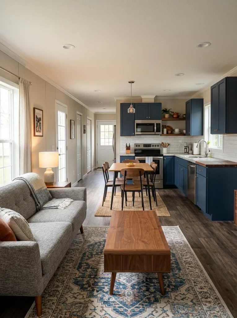
It could be a warm wood tone, black metal, muted green, cream upholstery, woven texture, or one repeated rounded shape.
Connected-Sightline Harmonizer
Repeat one thing across the view—then stop.
The living room and adjoining zone should feel related without looking like a matching furniture showroom.
For single-wide homes where the living room, dining area, and kitchen operate as one continuous sequence, the deeper guide to single-wide open floor plan ideas covers furniture relationships and zone planning in more detail.
What to avoid: matching the living-room rug, kitchen accessories, dining chairs, curtains, wall art, and hardware to the same accent color simply because the rooms connect.
One echo is enough.
20. Give a Front-Door Living Room a Soft Arrival Edge
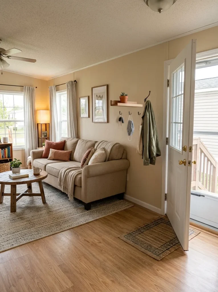
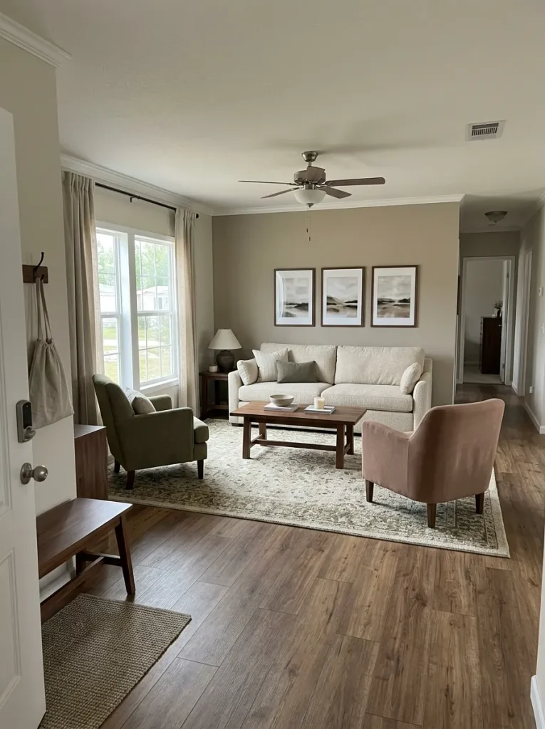
Some mobile homes do not provide a separate foyer.
The front door simply opens into the living room.
Trying to force a full-size entryway into that footprint can make the room more crowded than the missing foyer ever did. A better strategy is to create a small arrival edge that handles the first few seconds after entering.
Look at the door’s swing and the direction people naturally move after coming inside.
Then choose the smallest useful intervention:
A slim washable rug can identify the landing area.
A narrow console can hold keys and mail if enough wall depth exists.
A wall hook or compact closed cabinet may solve coats without consuming floor area.
The back of a chair can create a subtle visual boundary if it does not interfere with the path.
What you are building is not another room. It is a transition.
Avoid the fake-foyer trap
Skip bulky benches, deep cabinets, oversized coat trees, or elaborate partitions if they create a second obstacle immediately inside the room.
The arrival zone succeeds when entering the home feels organized without making the living room feel smaller.
21. Match the Coffee-Table Shape to the Traffic Pattern
Coffee tables are usually chosen by style, but in a mobile home living room their shape can affect movement almost as much as their size.
Watch how people actually approach the sofa.
If the main route passes close to the seating zone, sharp rectangular corners can make an already tight turn feel more restrictive. A round or oval table often softens that path because the edge recedes as someone walks around it. In a broader double-wide room, a rectangular table may be useful because its longer footprint visually connects a wide sofa or several seats.
Use the room’s movement pattern to narrow the choice:
| Traffic condition | Shape worth testing |
|---|---|
| People pass close to the table | Round or oval |
| Long sofa with open floor in front | Rectangular |
| Several movable chairs | Round |
| Feet-up lounging is important | Upholstered ottoman |
| Very little floor depth | Small nesting tables or no central table |
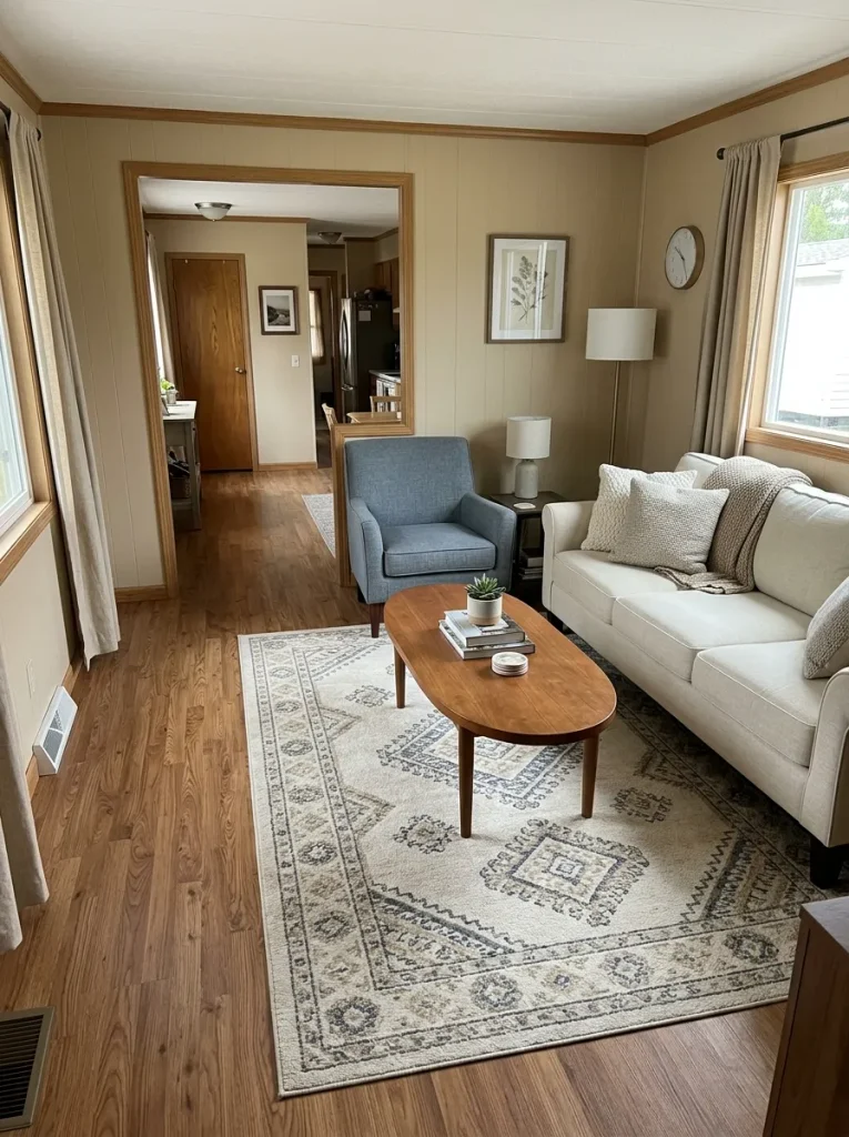
Then test the relationship with cardboard, painter’s tape, or an existing object before buying.
A table should support the seats without becoming the object everyone has to walk around.
22. Add a Perch for Drinks, Remotes, and Charging Without Crowding the Floor
Not every seat needs a full side table.
Sometimes it only needs somewhere to put a mug.
This distinction matters in compact mobile home living rooms because several conventional end tables can occupy surprisingly valuable floor area while serving only a handful of small objects.
Look at each seat and ask what the person sitting there actually reaches for.
A narrow C-table beside a sofa, a small nesting table between two chairs, a slim shelf incorporated into a media console, or a compact drink table may solve the function with far less visual mass.
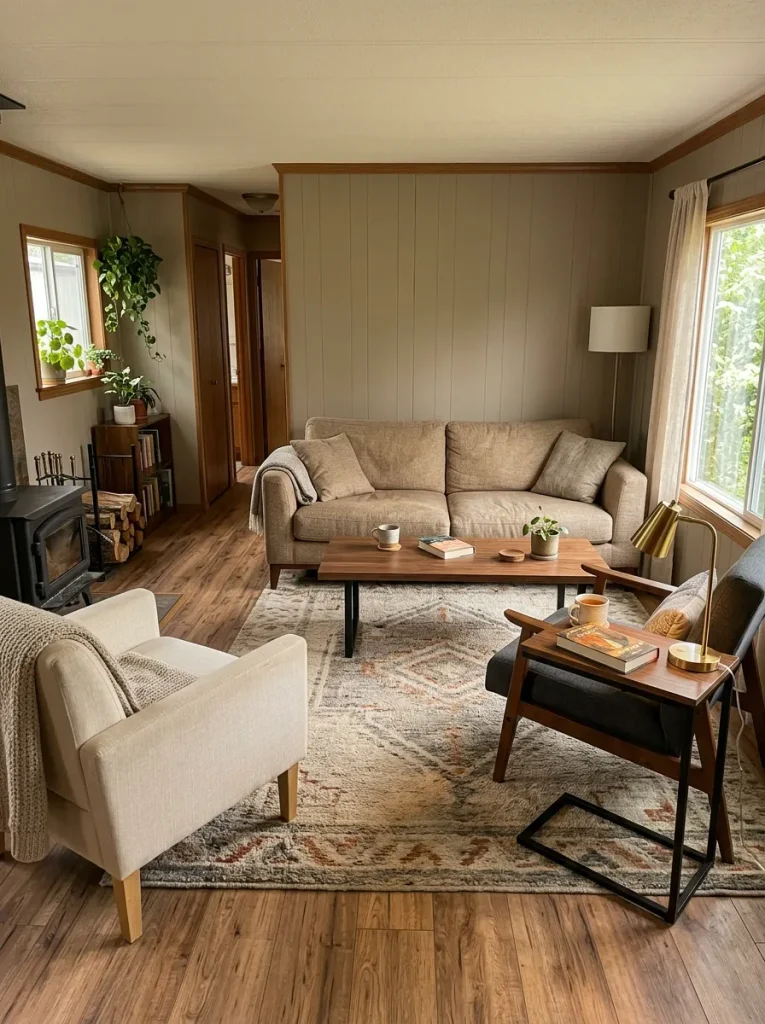
Give priority to the seats that need support most
The main sofa may already be close enough to the coffee table.
A recliner positioned outside that zone may need its own surface.
A reading chair might need space for a lamp and book.
A guest chair that is rarely used may need nothing permanent at all.
Comfort improves when useful objects are within reach.
The room improves when the solution occupies only as much space as the task requires.
23. Make Seating Switch Between Everyday and Guest Mode
A mobile home living room may need to work for two people on Tuesday and eight people on Saturday.
Designing permanently for the largest possible gathering can leave the room overcrowded every other day. Designing only for normal household use can create the opposite problem when guests arrive.
Keep the major sofa, TV relationship, and primary walkway stable.
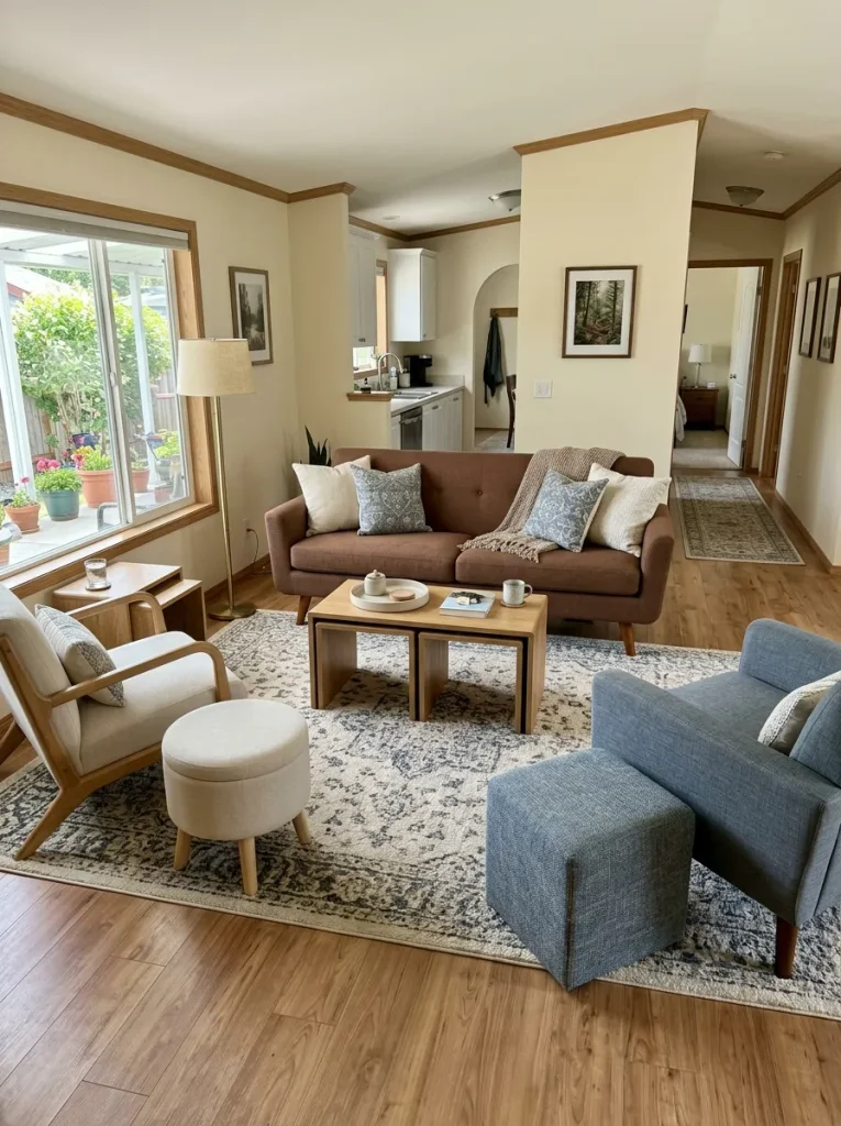
Then let smaller pieces absorb the change.
Flexible Seating Mode
Design the room for normal life, then let smaller pieces handle the crowd.
The main layout stays stable. Only the flexible layer changes when more people need seats.
Useful flexible pieces include small ottomans, lightweight occasional chairs, stools that tuck beneath a console, and nesting tables that separate when needed.
Plan for the way the room is used most often, then build in a temporary expansion strategy.
24. Soften a Hard-Sounding Room With the Textiles You Already Need
Some living rooms feel visually comfortable yet sound harder or more exposed than expected, especially when large areas of flooring, windows, and wall surface remain uncovered.
Before buying a dedicated acoustic product, test ordinary furnishings that already have another purpose. A rug grounds the seating area. Curtains manage privacy and light. Upholstery and soft furnishings add tactile comfort. Together, those changes alter the mix of hard and soft surfaces in the room and may make everyday conversation or television listening feel less sharp.
Treat this as a comfort test, not a guaranteed acoustic treatment. The result depends on the actual room, construction, furnishings, and placement.
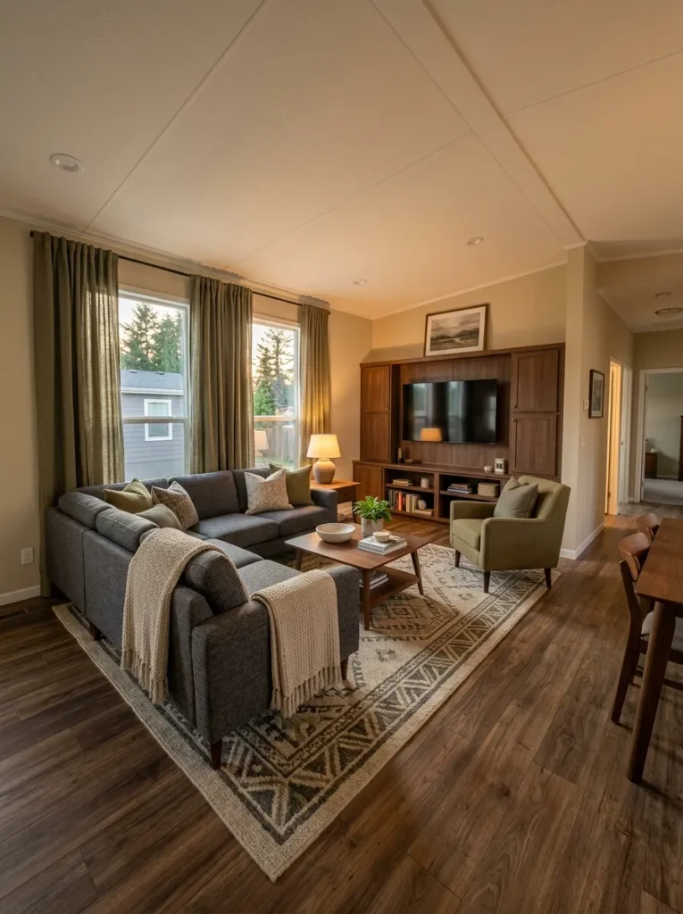
Judge it after the room is furnished. If it feels noticeably more comfortable to talk and listen in, the textiles are contributing value beyond appearance.
25. Choose One Style Signal—Farmhouse, Boho, Modern, or Traditional—Then Edit the Rest
Style becomes convincing when a few decisions clearly communicate it.
It becomes theme décor when every object has to announce it.
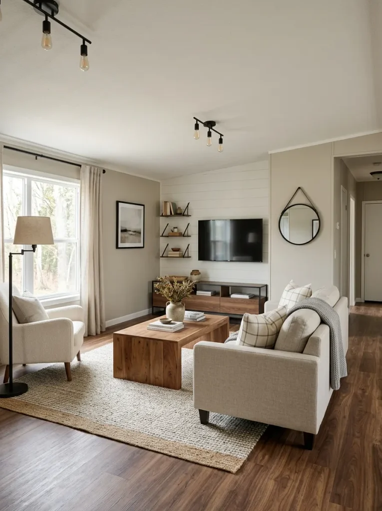
For a modern mobile home living room, the strongest signals might be a restrained media wall, simpler furniture lines, quiet upholstery, and one sculptural light.
A farmhouse room may lean on warm wood, black hardware, relaxed textiles, and a limited amount of vintage-inspired detail.
A boho or eclectic room can carry richer pattern, plants, woven material, and collected objects—but the larger furniture and circulation still need visual order.
A traditional room may use deeper wood, classic upholstery, symmetrical lamps, framed art, and warmer layered lighting.
The edit test
Identify the three elements doing the most work to establish the look.
Then temporarily remove one or two minor themed accessories.
If the room still reads clearly as modern, farmhouse, boho, or traditional, those accessories were optional.
For readers pursuing a cleaner contemporary direction in a narrower home, the guide to modern single-wide mobile home ideas provides a more focused specialist path.
Keep the identity. Remove the costume.
26. Fix the Most Visible Living-Room Relationship Before Buying Small Decor
Stand at the main entrance and take one photograph of the living room.
Do not look first for an empty surface. Look for the relationship that makes the whole room feel unresolved.
Maybe the rug is too disconnected from the seats. Perhaps the curtains make the window look smaller. The furniture could be crowding the entry route, or the media wall may be carrying far more visual weight than everything around it.
Correct that room-scale relationship before spending the same budget across several small accessories.
A useful order is:
- movement or furniture relationship;
- major visual plane such as rug, curtains, lighting, or focal wall;
- everyday comfort issue;
- small decorative finishing pieces.
A renter may have fewer permanent options, while an already well-arranged room may genuinely need only smaller styling changes.
For a double wide where the specific goal is creating a more expensive-looking interior on a controlled budget, luxury double-wide decorating ideas is the more focused next step.
The decision here is simple: solve what influences the whole living-room view before shopping for what influences one small corner.
27. Run a Doorway, Seated, and Nighttime Comfort Test Before the Final Purchase
A living room should not be judged from only one photograph.
The room has at least three important versions of itself:
the view when you enter, the experience while you are sitting in it, and the atmosphere after daylight disappears.
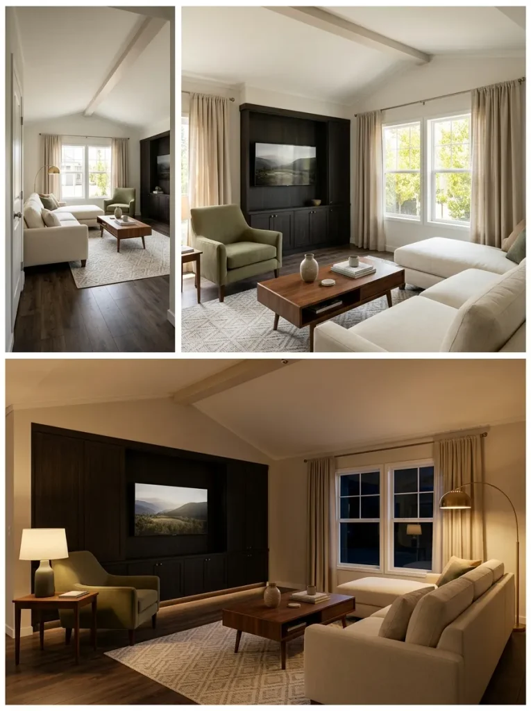
A mobile home living room can succeed in one view and fail in another. The doorway may look beautifully styled while the coffee table blocks circulation. The sofa may be comfortable, yet the television wall overwhelms the seated view. Everything can look balanced in daylight while one harsh ceiling fixture makes the room uncomfortable at night.
Before making another purchase, inspect all three conditions.
Three-View Comfort Audit
Test the room from the three moments that matter most.
Switch viewpoints before buying anything else. A problem that survives all three tests deserves priority.
The audit may also tell you that the room is finished.
That is useful information.
If the entrance feels clear, the seating works, nighttime light is comfortable, and the room already expresses your style, another decorative purchase may add less than simply leaving the space alone.
A Beautiful Mobile Home Living Room Should Also Feel Good to Live In
The most effective mobile home living room is not necessarily the one with the newest sofa, most dramatic fireplace wall, or largest decorating budget. It is the one where the major relationships make sense.
Start with whatever affects daily life most: the walkway, seating shape, focal wall, window, lighting, or connected-room view. Once that relationship improves, rugs, color, art, textiles, and personal details become much easier to choose.
Your room does not need all 27 changes. It needs the right first change, followed by enough restraint to recognize when the space already feels comfortable, coherent, and genuinely yours.