A small mobile home can have a comfortable floor plan and still feel crowded the moment you walk inside. Sometimes the room is genuinely short on walking space. Other times, the problem is what your eye encounters first: a tall cabinet near the doorway, a dark kitchen beyond the sofa, busy wall seams, or furniture that interrupts the view across the home.
There are practical ways to make a small mobile home feel bigger without adding square footage. The most noticeable changes often come from deciding what stays visible, where light travels, and how adjoining rooms relate to one another. Fresh paint and new furniture can help, but they are not the starting point for every home.
These 21 ideas move from the first impression at the door to the living room, kitchen, bedroom, bathroom, and exterior entry. You’ll find reversible decorating moves alongside more permanent options, with clear checks for knowing when an idea actually fits your space.
Start here: Take three photographs before moving anything: one from the front entrance, one from your usual seat, and one looking from the kitchen toward the living area. Keep them. They will become your comparison points for the final idea.
1. Photograph Your Mobile Home From Three Views That Reveal Its Tight Spots
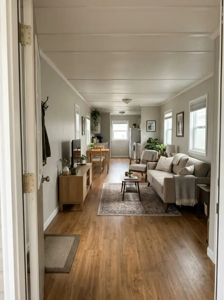
A room can feel busy for very different reasons. From the entrance, a chest of drawers might conceal the rest of the living area. From the sofa, the same room may look open, but the kitchen beyond it appears crowded. An overhead photograph would miss both problems.
Stand at the main entrance with the door safely open, sit where you usually relax, and look back from the kitchen or dining area. Photograph each position with the same phone lens and approximate camera height. Avoid an extreme wide-angle mode; it can exaggerate openness and make a later comparison misleading.
Read the evidence:
- Blocked distance: a tall piece of furniture ends the view early. Try a different position before replacing it.
- Dark destination: the next room looks smaller because it has little visible light. Test lighting and window treatments.
- Visual noise: shelves, textiles, trim, and countertop items compete across the frame. Edit the most conspicuous cluster first.
Choose just one diagnosis to address this week. A focused change will be easier to judge than a room-wide shopping spree.
Which view feels smallest?
A different viewpoint reveals a different obstacle. Select the camera position that feels most enclosed.
First view / diagnosis
The arrival ends too soon.Look for a tall rack, chair back, or shoe cabinet immediately inside the door. First move: remove that one obstruction temporarily and check whether you can see farther into the home.
Seated view / diagnosis
The room looks visually heavy.Count the tall furniture blocks and busy shelves visible from the sofa. First move: calm the most prominent shelf or shift one high item against a solid wall without narrowing circulation.
Return view / diagnosis
Light drops before the next room.Look toward the living room from the kitchen. First move: test existing lamps and window covers, then compare the view in both daylight and evening conditions.
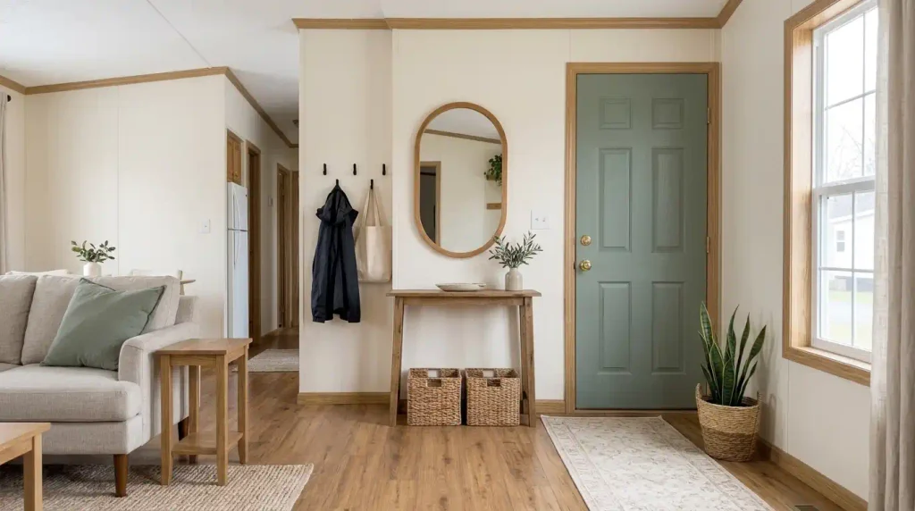
2. Give the Front Door a Clear First View Into the Home
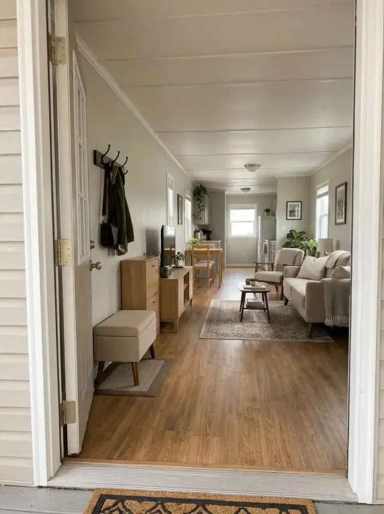
Imagine opening the door and immediately seeing a tall coat rack, a crowded shoe tower, and the back of a chair. Even a tidy home can feel enclosed if the arrival view ends a few feet inside.
Try a temporary edit. Remove the nearest bulky item and stand outside the doorway again. Can you now see a window, part of the sofa, or the passage toward the kitchen? Preserve that deeper view while returning only the essentials you actually use.
A slim wall-mounted hook arrangement, a shallow closed cabinet, or a compact bench may suit the entrance, depending on the door swing and available wall. Keep steps, exits, and the path into the home clear. The U.S. Fire Administration’s home escape plan guidance emphasizes keeping doors and windows unblocked. For a rental, choose removable arrangements that do not damage the wall or compromise safe access.
The decision: Keep the entry piece that performs a daily job; relocate pieces that block the room beyond it or impede the exit route.
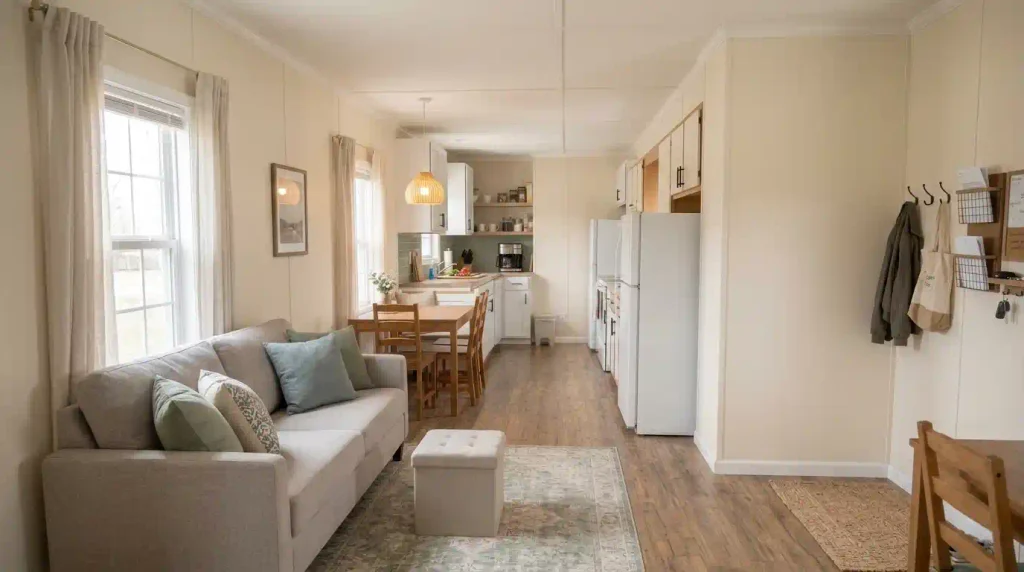
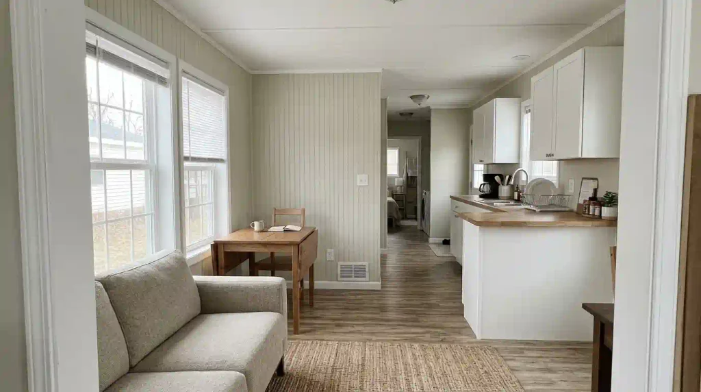
3. Let One Room Borrow Visual Depth From the Next
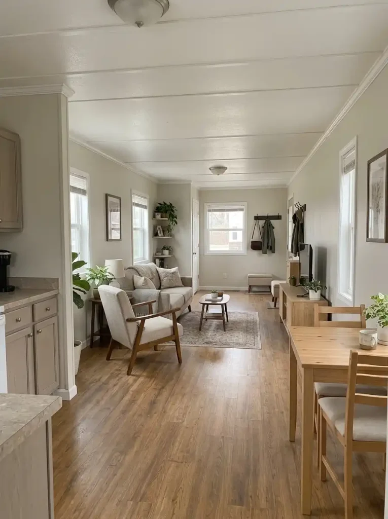
A small living room may gain a surprising sense of depth from the dining area or kitchen beyond it. The eye doesn’t stop at a painted boundary; it continues until something substantial interrupts the view. That makes the relationship between rooms as important as the size of either room alone.
Compare three common conditions:
- Connected view: a low table or open passage lets you see into the next room.
- Partly screened view: a plant, narrow console, or chair defines an activity without hiding everything behind it.
- Blocked view: a tall shelf or heavy furniture back visually turns one shared area into two short rooms.
The most open-looking option isn’t always the best-working one. A screen can hide kitchen clutter or create privacy. Choose the arrangement that preserves the useful long view and supports how your household lives.
For detailed configurations, see these single-wide open floor plan ideas; here, the immediate question is which sightline deserves protection.
How far does your eye travel?
These are conceptual room relationships, not measured floor plans. Choose the type of boundary you have to see what it changes.
A long view remains legible.
Good for spaces where both zones benefit from a social connection. Keep the middle visually low. Next check: make sure chairs and table edges do not obstruct the walking route.
A little screening can help.
A low planter or carefully placed console can define activities while leaving the upper view connected. Next check: whether the screen hides useful kitchen mess or merely steals light.
The view stops at the boundary.
A tall cabinet may make two connected areas seem smaller. Test relocating the piece to a solid wall. Keep the divider only if its privacy or storage benefit is more important than the lost view.
4. Keep the Living-to-Kitchen Boundary Low and Unobtrusive
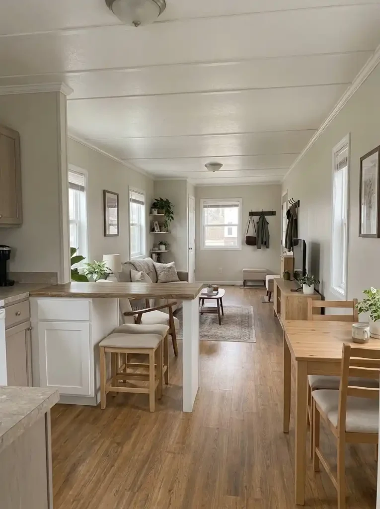
An existing peninsula, counter-height divider, or half-wall may be doing valuable work. It might screen a sink from the sofa, hold outlets, support a counter, or provide a much-needed furniture edge. Removing it just to chase an open-plan photograph can trade one inconvenience for another.
First inspect the room with everyday items in place. Does the boundary actually block conversation or daylight? Or does it conceal the kitchen’s working side while leaving the upper part of the room visually connected?
Keep a useful divider when it contains clutter and still offers a comfortable view across the room. Refine the surrounding styling if dark bar stools or tall accessories make the boundary seem heavier. Investigate removal only when there is a clear practical benefit beyond a wider photograph.
Significant structural alterations in manufactured homes may involve permits, compliance, and warranty considerations. The U.S. Department of Housing and Urban Development’s manufactured-home guidance recommends consulting the appropriate local authority before major changes.
5. Make Your Biggest Window the Room’s Visual Escape Point
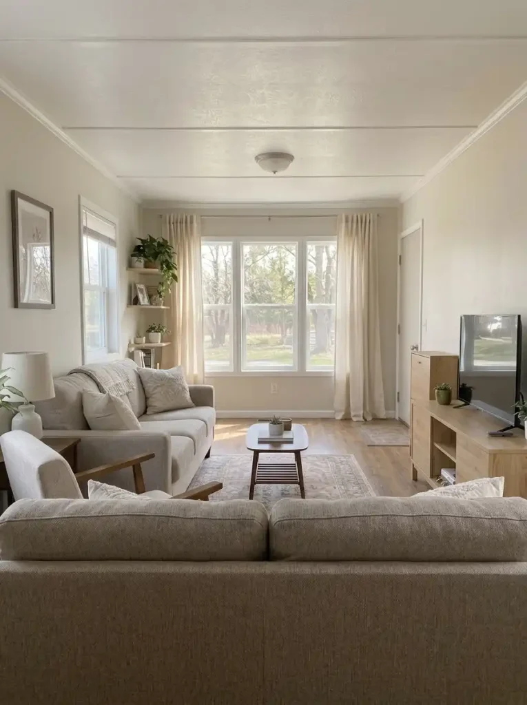
Where does your eye travel after crossing the living-room floor? A clean view toward a window can give a compact interior an apparent destination beyond its walls. A tall plant, bulky chair, or opaque curtain parked in front of that window can cut the effect short.
Move only what obstructs the glass and look again from the entrance and the main seat. Consider a curtain rod that lets drapery stack outside the visible glazing where wall space permits, or blinds that lift clear of the view. The existing windows may be perfectly adequate once their edges are less crowded.
There is one important exception: intense sun can bring glare and unwanted heat. Preserve functional shading where it improves comfort. The U.S. Department of Energy’s daylighting guidance treats glare and overheating as part of daylight planning.
A successful window arrangement feels bright and comfortable during the hours you actually use the room.
6. Use a Carefully Positioned Mirror to Extend a Dim Corner
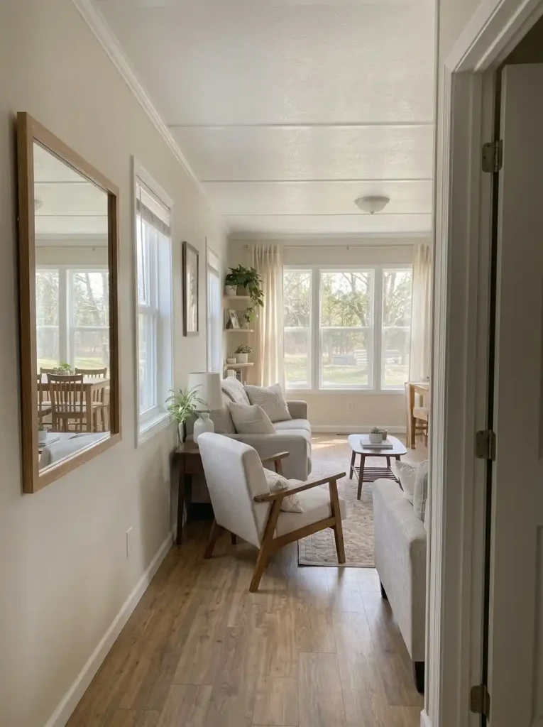
Before buying a large mirror, temporarily test a smaller mirror at the proposed height with a helper holding it securely, then check its reflection from the position where you normally sit. Does it catch a window, a calmer adjoining room, or an attractive lamp? If it duplicates a busy counter or a cluster of cables, the larger version may amplify the very thing you’re trying to quiet.
A mirror on the side wall of a narrow living room can redirect light across the room. One near the dining nook may connect that corner visually with the brighter part of the home. Neither position is automatically right: the reflected image changes as you move.
Try this before mounting: photograph the reflection while the test mirror is safely supported, then test a second wall. Select the one that gives you a useful view without sending glare into seating areas. Use appropriate, secure fixings for your particular wall construction; lightweight wall panels and backing conditions vary among manufactured homes.
7. Make a Low or Sloped Ceiling Read as One Calm Surface
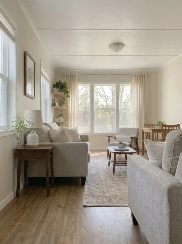
A low ceiling can look lower when dark trim, contrasting ceiling panels, and multiple decorative breaks draw a heavy outline across it. The solution isn’t always painting everything stark white. It is choosing which ceiling lines deserve attention and which can recede.
In a room with a shallow pitch, compare the ceiling and its perimeter from the main doorway. A closely related ceiling and trim color may soften the transition. If a real beam or strong architectural detail gives the space character, let that one feature remain intentional while quieter trim recedes.
Avoid adding thick decorative layers to a surface already visually low. Select light fixtures with suitable clearance for the room and follow their installation instructions.
Worth skipping: cosmetic treatment cannot solve a damaged or sagging ceiling. Investigate moisture, movement, or structural concerns before covering them with finish material.
8. Carry Soft Light Into the Darkest Part of the Home
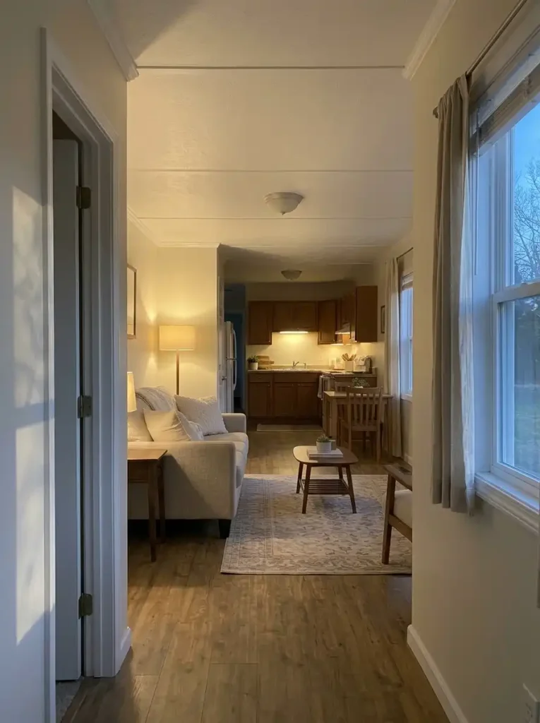
A living room may look generous during daylight and oddly enclosed after sunset. Often the brightest lamp sits near the sofa, while the hallway or kitchen beyond falls into shadow. The view effectively ends at the edge of the light.
Take an evening photograph from the same position as your daytime image. Then switch on a modest light in the farthest visible zone: a kitchen under-cabinet light, an existing hallway fixture, or a safely placed plug-in lamp. Does the room now feel deeper because you can see the destination?
Plan lighting in layers: enough task light to work safely, gentler ambient light to connect the rooms, and a controlled accent where you want attention. Test portable lighting first before deciding whether any permanent electrical improvement is worthwhile. Avoid cords across walking routes, overloaded outlets, and fixtures used beyond their ratings. Small changes to existing lighting can work before any electrical alteration is considered.
Where does the room end after dark?
Switch scenes to compare how a distant pool of light changes the perceived depth of two connected rooms.
Use the real daylight as your benchmark.
See how much of the next room remains visible. Before adding lamps, clear unnecessary window obstructions and manage glare where direct sun causes discomfort.
The view stops at the sofa.
One bright local lamp can leave the background looking closed. Keep task light where it is needed, then test a modest source farther along the sightline.
Give the distant room a gentle glow.
A safe plug-in lamp or existing fixture in the far zone can make it visible from the sofa. Compare brightness, glare, and normal household routes before deciding.
9. Calm the Wall Battens and Panel Lines That Divide the Room
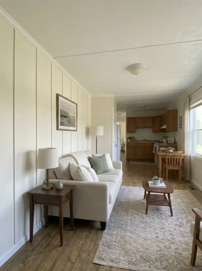
Many mobile homes have visible panel seams or battens. A narrow wall can look busier when every vertical line contrasts sharply with the surrounding surface, especially along the long side of a single-wide living area.
Look at one complete wall before deciding to paint. If the panels and battens are sound, a coordinated finish may make the surface read as a single backdrop. In another interior, deliberately repeated trim lines could become a restrained architectural rhythm. Both approaches can work; an accidental mix of strong and weak lines is often what looks unsettled.
Test a small area in changing daylight and check the correct coating and preparation method for the existing material. Do not paint over moisture damage, looseness, or unknown deterioration.
The useful decision is whether the existing lines should be a quiet background or a deliberate feature—not whether every seam must disappear.
10. Leave One Long Wall Deliberately Quieter Than the Others
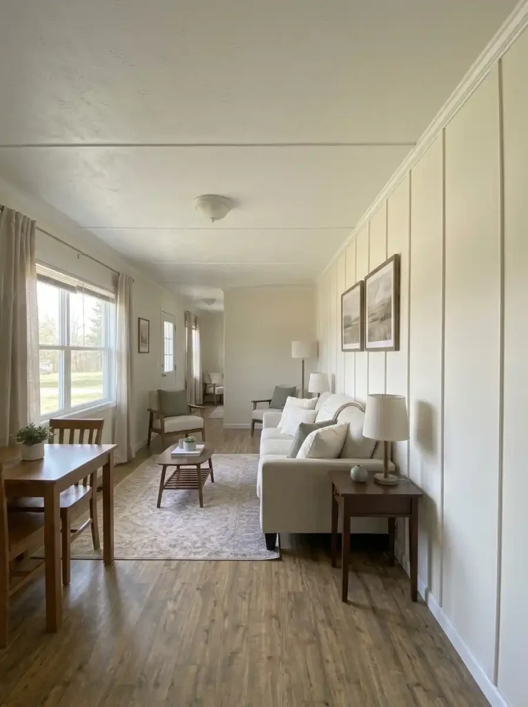
A typical narrow mobile home may have one uninterrupted wall carrying artwork, shelving, a television, family photographs, and occasional furniture. Each object seems reasonable on its own. Together they can turn that wall into a long sequence of stopping points.
Here’s a quick editing exercise: photograph the wall, remove two small decorative groupings, and retake the picture. The wall does not have to be blank. One clear focal composition may look more finished than five evenly spaced accents.
For example, keep a well-proportioned artwork arrangement near the seating area and let the stretch leading to the kitchen remain calm. If shelving provides essential storage, simplify what sits on display before removing the shelf.
Watch for: leaving every other section empty in an artificial pattern. A quiet wall works best when the eye understands where to look first and where to rest afterward.
11. Make Floor Transitions Feel Continuous Without Replacing Every Floor
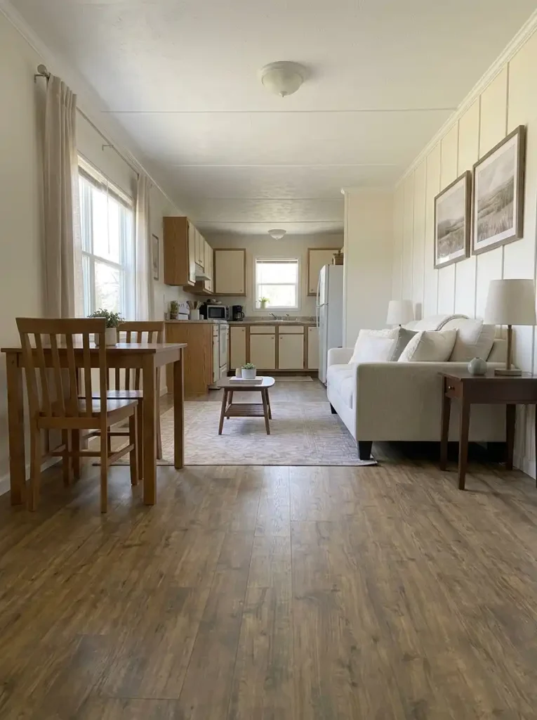
In an open mobile home, the eye can trace the floor from the living room through dining and into the kitchen. Three unrelated rug patterns or stark changes in color along that route may make the plan feel chopped into smaller pieces.
If the floors are in good condition, start with the least invasive correction. Remove one unnecessary runner, test the dining area without a small rug, or choose a replacement textile that relates to the existing floor tones. A suitably sized living-room rug can still anchor the sofa while leaving the surrounding floor easy to read.
For damaged thresholds or lifting flooring, treat the hazard before the appearance. New flooring is a separate project and should be evaluated against the existing subfloor, moisture conditions, installation guidance, and budget.
Decision rule: Don’t replace a serviceable floor until you’ve tested whether the visible fragmentation comes from movable objects placed on top of it.
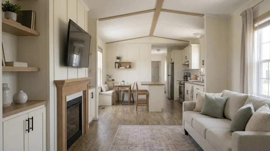
12. Turn a TV or Fireplace Wall Into One Balanced Architectural Feature
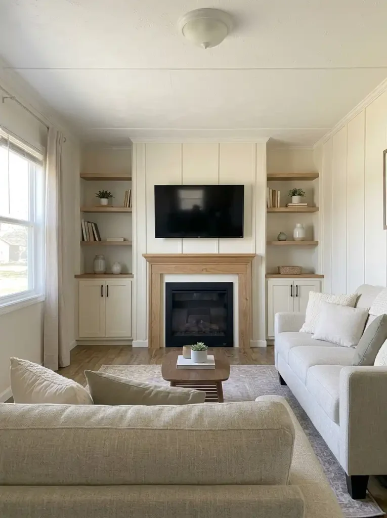
The TV wall usually occupies a large part of the view from the sofa. In a small manufactured home, that makes it a powerful opportunity—and an easy place to overdecorate. A fireplace surround, open cubbies, columns, seasonal ornaments, and an oversized screen can combine into a visually heavy block.
Begin with the outline. Stand in the entrance and look at the whole wall, including surrounding doors and passageways. Is there a clear central feature with supporting storage, or does every compartment demand attention?
For a built-in: keep frequently used items accessible, edit small objects on the shelves, and let the wall color relate to adjacent surfaces. For a TV on a simple console: resist adding height merely to fill empty wall space. For a functioning fireplace: retain required manufacturer clearances and ventilation; decorative changes must never interfere with safe operation.
For furniture arrangement and media-wall alternatives, browse these small mobile home living room ideas.
13. Keep Mid-Room Furniture Below the Main Sightline
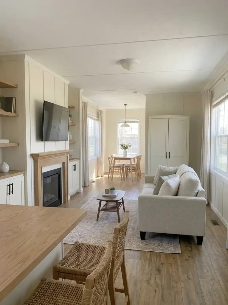
Picture two dining-to-living views. In the first, a tall open shelf and a high-backed sofa sit across the middle of the room. In the second, the same activities are defined by a lower sofa back and a less prominent table. The floor area may be nearly identical, but one view feels much shorter.
Use a seated-eye check. Sit in the dining area, then on the sofa, and note the pieces that hide the opposite end. Move a taller object closer to a solid wall only if that relocation doesn’t create a new pinch point or obstruct a window.
A low piece isn’t automatically better: back support, storage capacity, accessibility, and daily comfort matter. The real test is whether the furniture’s height is earning its visual footprint.
A useful compromise: keep one necessary tall storage piece and let lower objects occupy the central view.
Read the middle of the room as a silhouette.
The shapes below are illustrative. Notice whether tall furniture repeats across the central sightline or collects near a solid wall.
Several tall profiles compete with the view across the room.
Lower central pieces preserve depth while one taller item does the storage work.
14. Give the Kitchen a Cleaner Appearance From the Living Room
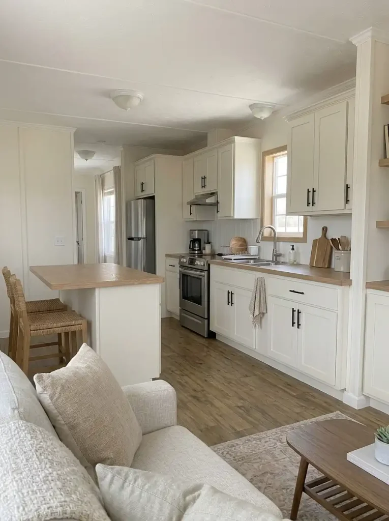
The kitchen can be spotless and still look visually busy from the sofa. A refrigerator side, toaster, drying rack, bin, and several jars may line up in the one strip you see whenever you relax. That concentrated view influences how open the connected living space feels.
Try this three-step check:
- Sit in the living room and identify the kitchen surface most visible from your usual seat.
- Move only items with another practical home—perhaps seldom-used appliances or duplicate countertop containers.
- Recheck the kitchen while cooking. The rearrangement should keep frequently used tools near their actual tasks.
Don’t hide important daily equipment so deeply that the kitchen becomes frustrating to use. The purpose is to quiet the most exposed view, not to stage an unusable showroom.
The detailed decisions about storage, counters, and cabinetry belong in these small mobile home kitchen ideas.
15. Use a Wall-Side Dining Bench to Open the Walkway
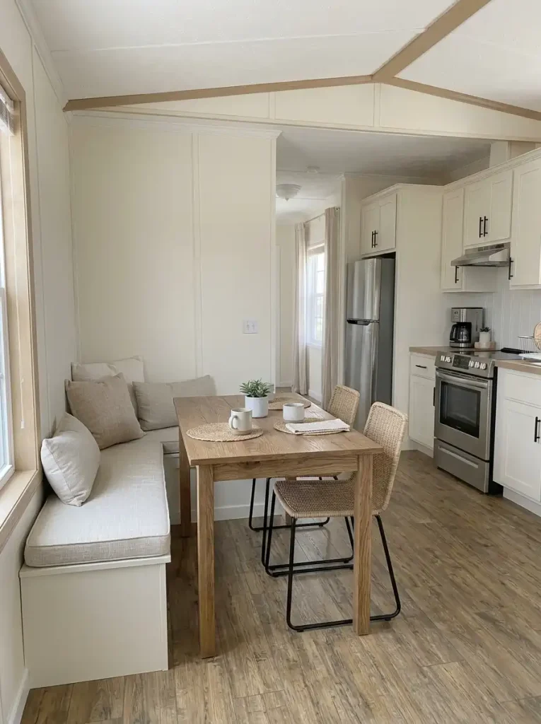
A narrow dining nook may fit a rectangular table comfortably—until the chairs on both sides are pulled out. At that moment the table occupies a much larger portion of the passage between living room and kitchen.
A wall-side bench can change the movement pattern by keeping one row of seating from projecting into the walkway. It works particularly well when the wall side doesn’t need frequent entry and the outer chairs can still move freely. A padded bench or settee might also make a compact nook feel more like a furnished room than a traffic obstacle.
Test before buying: mark the proposed table and bench footprints using removable tape. Pull out the remaining chairs, sit down, stand up, and carry a plate past the occupied arrangement. If access becomes awkward, try a shallower or round table configuration.
For more precise nook arrangements, these small mobile home dining area ideas explore several alternatives.
16. Move Visually Heavy Storage Out of the Main View
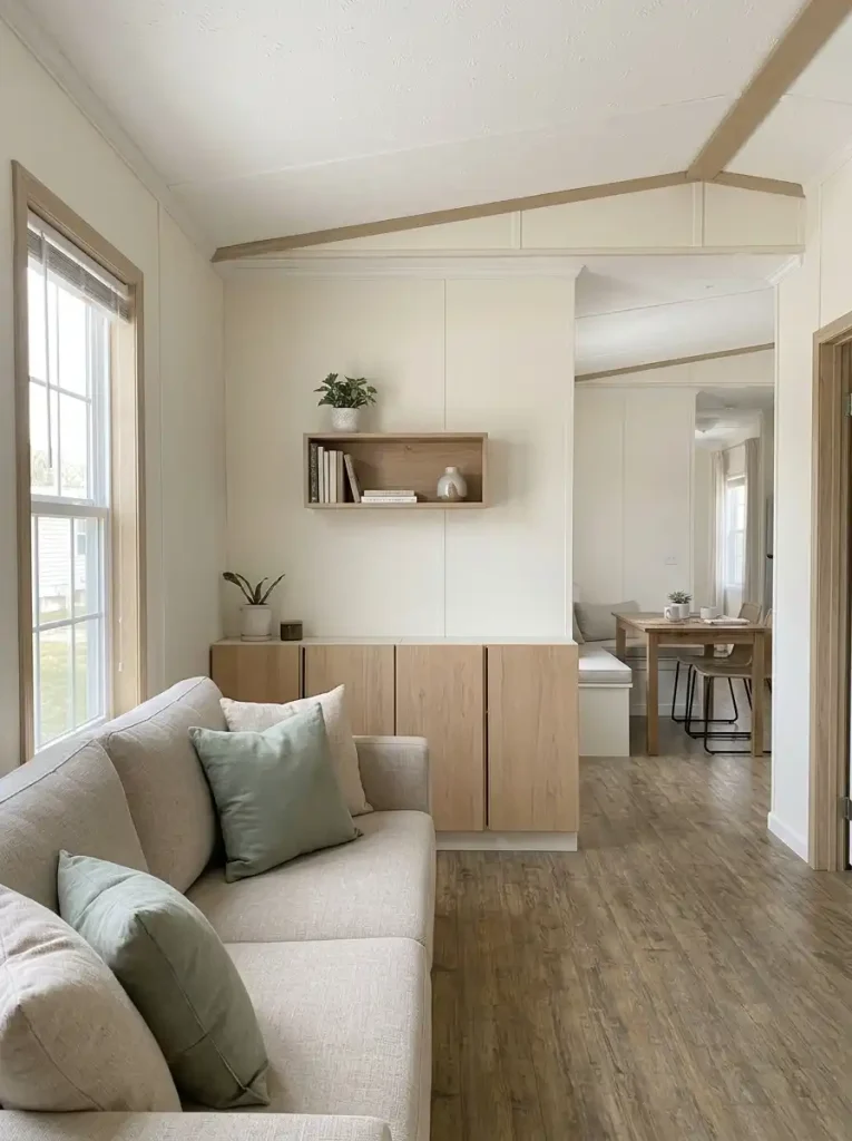
Open storage is useful until it turns a small room into a display of everything that lives there. Containers, shoes, books, electronics, and baskets can create considerable visual weight even when they are neatly arranged.
Sort what is visible into three groups:
- Daily and attractive: leave accessible, with enough surrounding space to read clearly.
- Daily but visually busy: try a shallow closed cabinet, a drawer, or storage already built into furniture.
- Occasional: move out of the main sightline, provided it remains reasonably accessible when needed.
For a single-wide home, the storage that looks best from the doorway may be different from the storage that works best in the hallway. Check both perspectives and preserve the actual travel route. A closed cabinet should not introduce a deeper obstacle than the open shelf it replaces.
Stop point: once the main view feels calmer and everyday items still have convenient homes, extra organizers may add more complexity than value.
Decide what deserves to stay in view.
Work from the most visible wall toward quieter storage. The three categories require different responses.
A lamp, carefully chosen books, or a favorite object that the room genuinely benefits from seeing.
Keep / give breathing roomChargers, supplies, small appliances, or everyday paperwork that is convenient but distracting.
Contain / nearby closed storageHoliday supplies, spare textiles, or duplicates sitting in your main sightline out of habit.
Move / less visible zone17. Make the Bedroom Doorway Reveal More Floor and Light
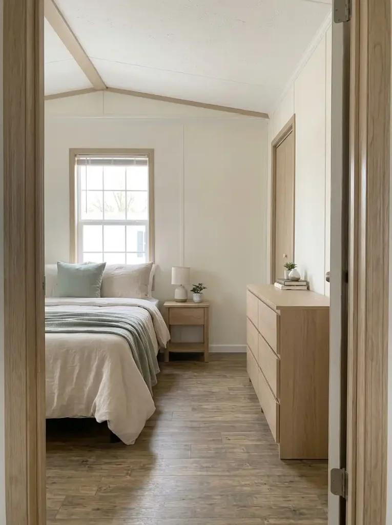
A compact mobile home bedroom often gives you only one immediate view: the bed, a dresser, a closet door, and a window squeezed into a short span. Moving a large object a few inches can help circulation, but the strongest visual improvement may come from what the doorway reveals.
Open the bedroom door fully and look at the lowest visible part of the room. Can you see a connected strip of floor leading toward the bed or window? A deep dresser near the entrance can block that sightline even when there is technically enough space to walk past it.
Choose your intervention by the obstruction:
- Dresser hides the view: assess a shallower piece or a different wall.
- Bedside accessories crowd the path: group essentials where they will be reached safely.
- Window disappears behind furniture: reconsider the tallest item, without compromising storage you rely on.
Keep closet access and any required emergency escape window clear; visual openness should never compromise emergency access. For bed-wall, closet, and furniture details, see the mobile home bedroom ideas guide.
18. Give a Tiny Bathroom One Calm, Continuous Surface
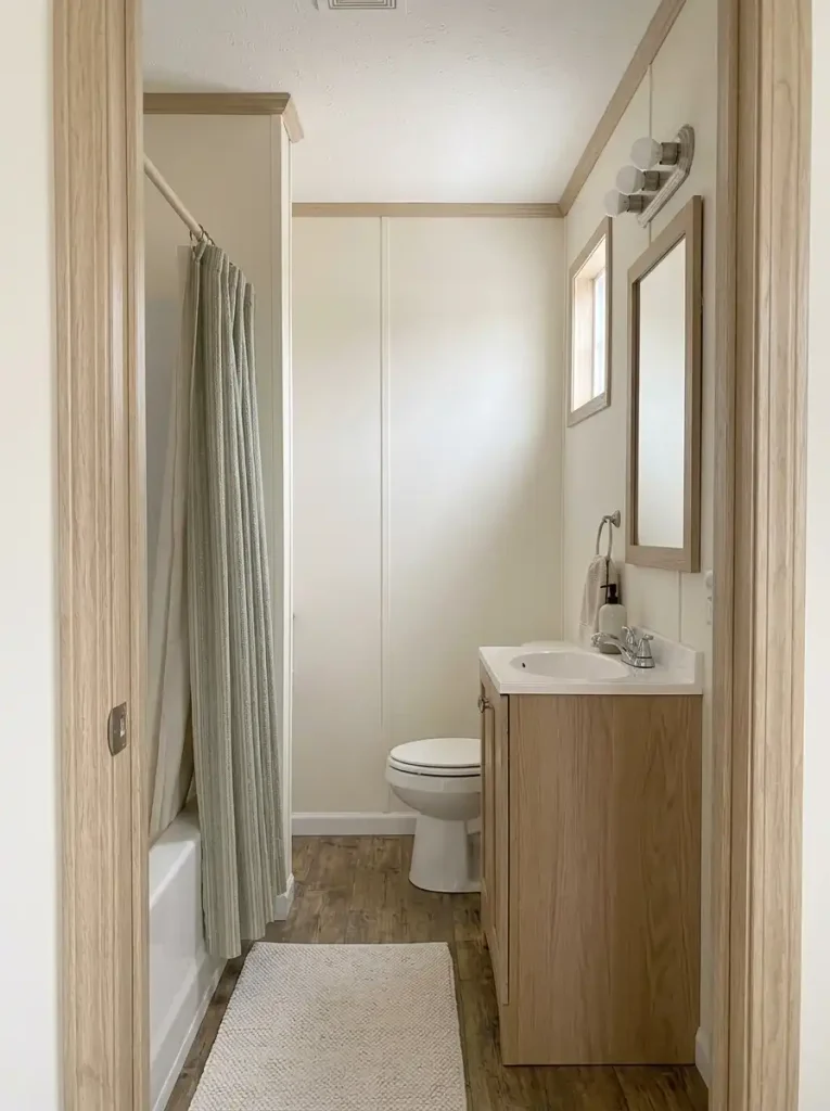
Bathrooms are different from open-plan living spaces: there may be no long sightline to preserve. Here, visual spaciousness depends heavily on the wall and vanity you see when the door opens.
A small bathroom with several contrasting tile edges, dark towels, floating accessories, and a crowded vanity can appear more segmented than its size requires. Choose one surface to calm first. It might be the vanity wall, a coordinated curtain, or the cluster of objects around the mirror.
If your bathroom has sound, clean finishes, trial a simpler arrangement before considering a renovation. A correctly positioned mirror can brighten the view, while a restrained hand-towel and storage arrangement gives the countertop room to function.
Avoid covering active moisture problems or disturbing waterproofing as a decorating shortcut. For a broader range of room-specific finishes and layouts, explore these mobile home bathroom ideas.
19. Repeat One Material or Finish Between Connected Spaces
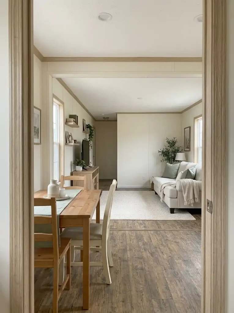
Two rooms can have different personalities and still look part of the same home. The challenge appears when every doorway introduces a new wood tone, metal finish, accent color, and textile pattern. The eye reads each change as a new visual chapter.
Choose one existing material that you already like. For example, a soft natural oak on a living-room console could reappear as a dining tabletop or a small kitchen shelf. A muted sage accent might show up on artwork in the living room and in a kitchen textile, without covering every wall.
Use restraint: repeat the material in places visible together, then allow each room its own main function. Coordination becomes monotonous when furniture, hardware, walls, and accessories all match exactly.
The best test is a photograph looking across two connected rooms. Do the repeated details quietly tie the view together, or has the repetition become the loudest feature?
20. Make the Exterior Entry Feel More Welcoming and Open
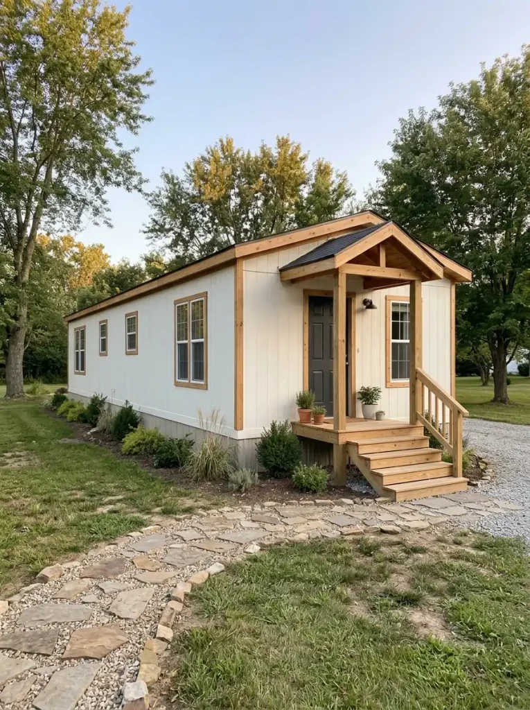
The front approach influences how you experience a mobile home before you step inside. An overgrown path, crowded door area, or visually heavy collection of planters can make a compact entrance feel less inviting. A clean, readable route sets a calmer first impression.
Start with existing sound features: tidy the path, keep plants back from access areas, clean the door and steps, and consider a simple coordinated finish for the entrance. Two well-placed planters may frame the door more clearly than many mismatched containers. Good exterior lighting can make the approach more legible after dark.
A new porch, roofed structure, stair rebuild, or attached awning is a construction project, not a decorative quick fix. HUD’s manufactured-home homeowner guidance cautions that significant additions or structural alterations may require local permits and affect compliance or warranties. Check local requirements and seek qualified advice before attaching a new structure.
Perspective check: compare the approach from the path with the view from the open front door. The exterior should lead naturally into the interior, even though it doesn’t change the home’s internal dimensions.
21. Run a Same-Angle Before-and-After Test Before Buying More Décor
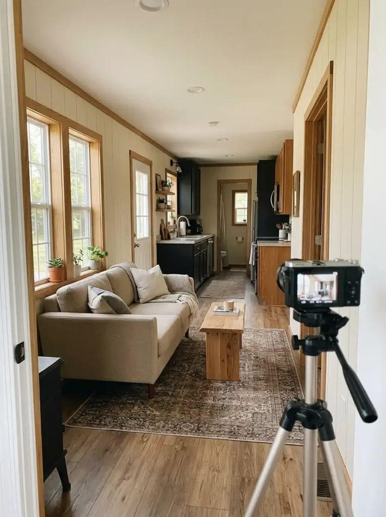
Return to the three photographs you took at the beginning. Match the original camera positions as closely as you can, then review what has actually changed. A wider lens, a different standing height, or a brighter time of day can exaggerate the result, so keep the comparison fair.
Ask three different questions:
- What can I see farther into now? Look for an opened window view, calmer passage, or lower furniture silhouette.
- What works better in normal use? Test door swings, occupied dining chairs, storage access, and the route through the home.
- What still bothers me after living with the change? Spend a few ordinary days in the arrangement before buying replacements.
If the home looks more open but is harder to use, revise the change. If one free adjustment gives you the improvement you wanted, you may not need an expensive makeover at all.
For a future cosmetic spending phase, mobile home makeover ideas under $500 can help you prioritize a single manageable project.
What did your first change actually fix?
Choose the most accurate outcome after comparing photographs from the same locations.
Protect the improved sightline.
You’ve found a meaningful visual change. Keep that view open for several days before introducing more objects or spending on replacements.
- Photograph the same angle again in evening light.
- Check that the new arrangement still works with guests and normal storage use.
Keep the functional gain—and refine the look.
Easier circulation is a real improvement, even when photographs are less dramatic. Protect clear routes and improve the nearby visual clutter only after the movement test succeeds.
- Test occupied dining chairs and open doors.
- Choose one adjacent wall or storage area to quiet next.
Re-diagnose before shopping.
A neat room can still feel cramped because the main obstruction is elsewhere. Compare the original door, sofa and kitchen views separately to identify the view that has barely changed.
- If the room goes dark at night, retest distant lighting.
- If the view ends early, reconsider the highest piece on that axis.
A Small Mobile Home Can Feel More Open Without Becoming a Different House
The most convincing makeover doesn’t require every surface to turn white or every room to become one uninterrupted rectangle. A home feels more generous when the entrance offers a view, the windows remain useful, the darkest areas are thoughtfully lit, and furniture allows people to move comfortably.
Begin with the photographs, change the most disruptive feature, and compare the same views again. An appealing room is not truly improved if the new arrangement blocks safe movement, natural light control, or a daily-use function. Keep the original character you love. The strongest improvement is the one you notice both in pictures and during a normal day at home.