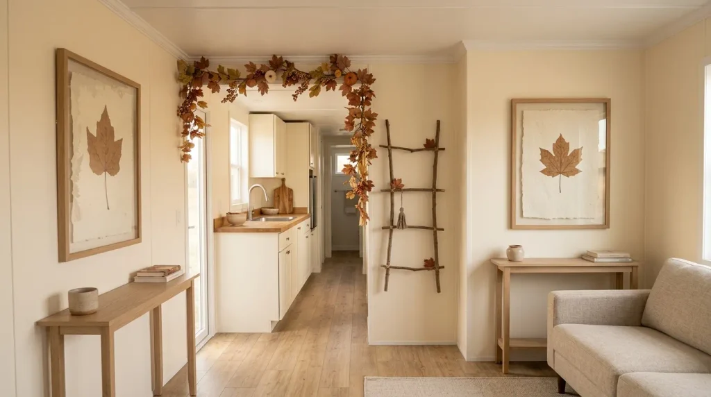
A plain mobile home wall does not always need to disappear behind another coat of paint. Sometimes the existing seams can become part of the design. In another room, a small amount of molding, wood, pattern, or shelving can give an otherwise flat surface the architectural presence it is missing.
The best DIY mobile home wall ideas work with the scale of the home. Long sightlines, narrow hallways, connected rooms, panel seams, and relatively small wall fields mean a treatment that looks restrained in a large house can become surprisingly dominant here.
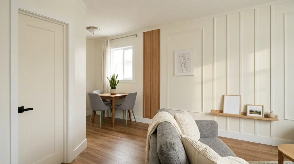
That is why these ideas focus on more than finished appearance. You will see where each treatment makes sense, how much of the wall to cover, when to leave part of the surface quiet, and when a cosmetic project should stop.
Start with the wall you already have. Decide whether it needs to look calmer, warmer, taller, more architectural, more useful, or simply more intentional. Then choose the smallest intervention that creates that change.
1. Make Existing Wall Battens Part of the Design Before You Try to Hide Them
Visible wall battens can immediately read as “mobile home” when they are treated as something that must be concealed. But if the strips are straight, consistently spaced, securely attached, and the wall surface around them is sound, they can also create a usable rhythm.
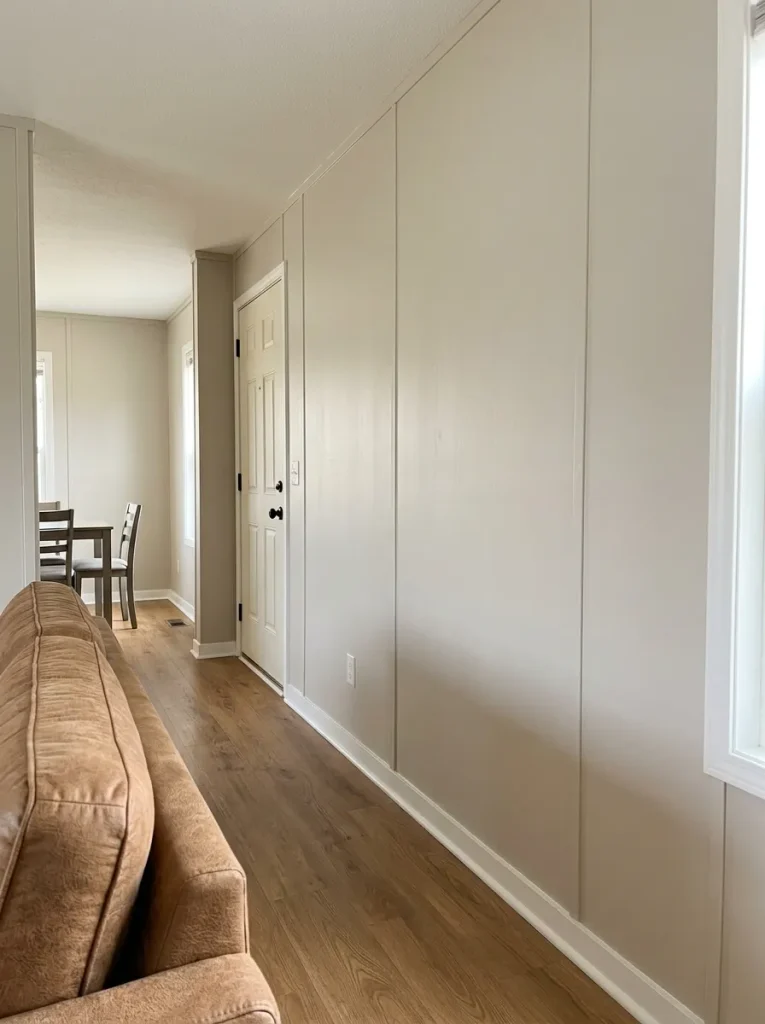
Stand at the doorway before touching anything. If your eye sees a reasonably ordered sequence of vertical lines, you have three legitimate choices: keep the battens visible, quiet them, or visually replace the rhythm with another treatment.
Painting battens and wall panels the same color is the calmest route because the joints remain physically present while losing much of their contrast. A deliberately contrasting batten works only when the spacing already looks organized enough to support the extra emphasis.
Irregular joints, staining, softness, obvious damage, or movement are reasons to investigate the wall condition before adding another decorative layer.
If the seams are only one part of a room that feels dated, use 21 Outdated Mobile Home Interior Ideas Before and After to decide whether the wall actually deserves to become the first makeover priority.
Wall Seam Strategy Lab
Use this before buying trim or wall covering. The three choices produce genuinely different design directions.
Start with the wall you already own
Do the seams need emphasis, quiet, or a new visual layer?
Choose the description closest to what you see from the doorway. The recommendation changes according to the wall condition and the amount of visual rhythm already present.
Clean, regularly spaced battens can become part of the wall language. Use one coordinated finish and let furniture, art, or lighting provide the stronger focal point.
Matching the battens closely to the wall color can make the joints read as shallow architecture instead of a series of interruptions.
If the existing rhythm looks inconsistent even from several feet away, a carefully planned surface treatment or applied trim pattern may produce a cleaner composition. Check wall condition before covering problems you have not identified.
The useful decision here is not simply whether mobile-home walls look better without battens. It is whether your existing seam pattern is orderly enough to become part of the finished room.
That answer can save an unnecessary covering project—or reveal that the wall needs a more substantial visual reset.
2. Build Half-Height Board-and-Batten Where a Narrow Wall Needs Structure
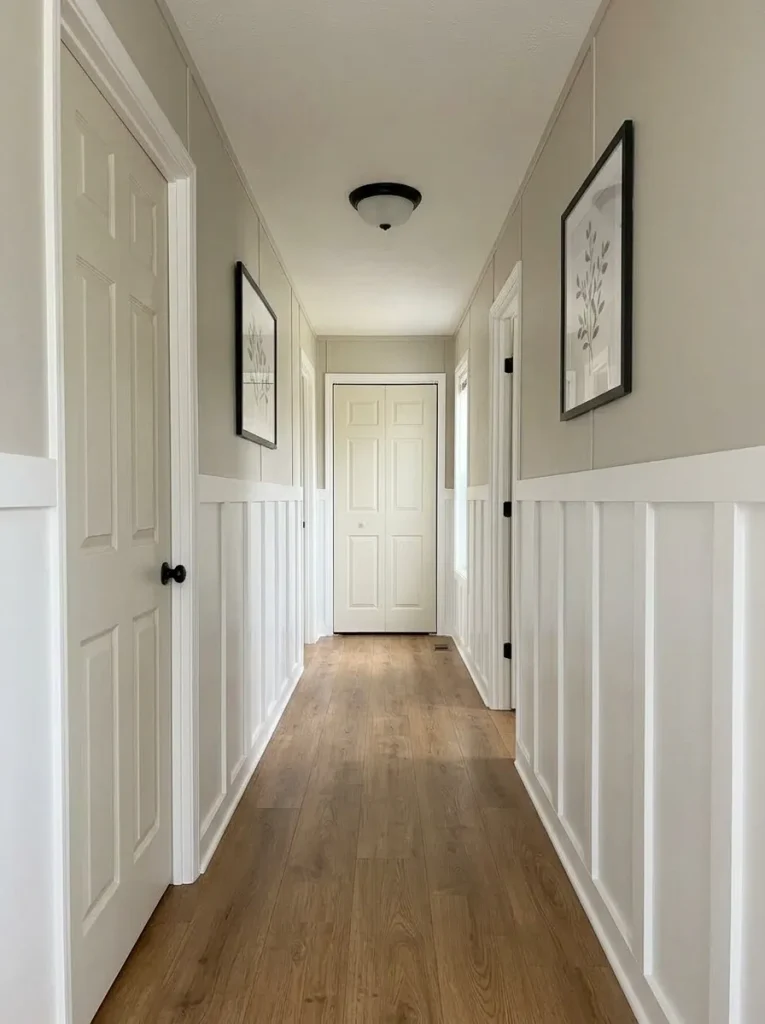
A long hallway or dining-edge wall can feel unfinished simply because nothing breaks up its height. Covering the entire surface with strong trim may solve that problem and create another one: too many lines competing through an already narrow sightline.
Half-height board-and-batten gives the lower wall an architectural base while leaving the upper portion visually quieter. In a mobile home, that separation is useful because several wall surfaces are often visible at once. The eye gets detail close to furniture and circulation level without every vertical inch becoming a feature.
Use it when:
- a hallway feels long and featureless;
- a dining or entry wall needs definition;
- you want architectural detail without a full wood wall;
- the upper wall already carries artwork or a window.
Scale it back when: narrow battens begin creating a fence-like rhythm from the doorway. Fewer, wider-spaced verticals usually read more calmly than squeezing another strip into every available gap.
For a makeover where wall trim must compete with other upgrades for a fixed budget, 19 Mobile Home Makeover Ideas Under $500 can help you decide whether the wall deserves the money first.
A useful mock-up costs almost nothing: mark the proposed top rail and several vertical strips with painter’s tape, then walk to the far end of the room.
If you notice the trim before you notice the room, simplify the pattern.
3. Use Picture-Frame Molding When You Want Depth Without a Heavy Wall Covering
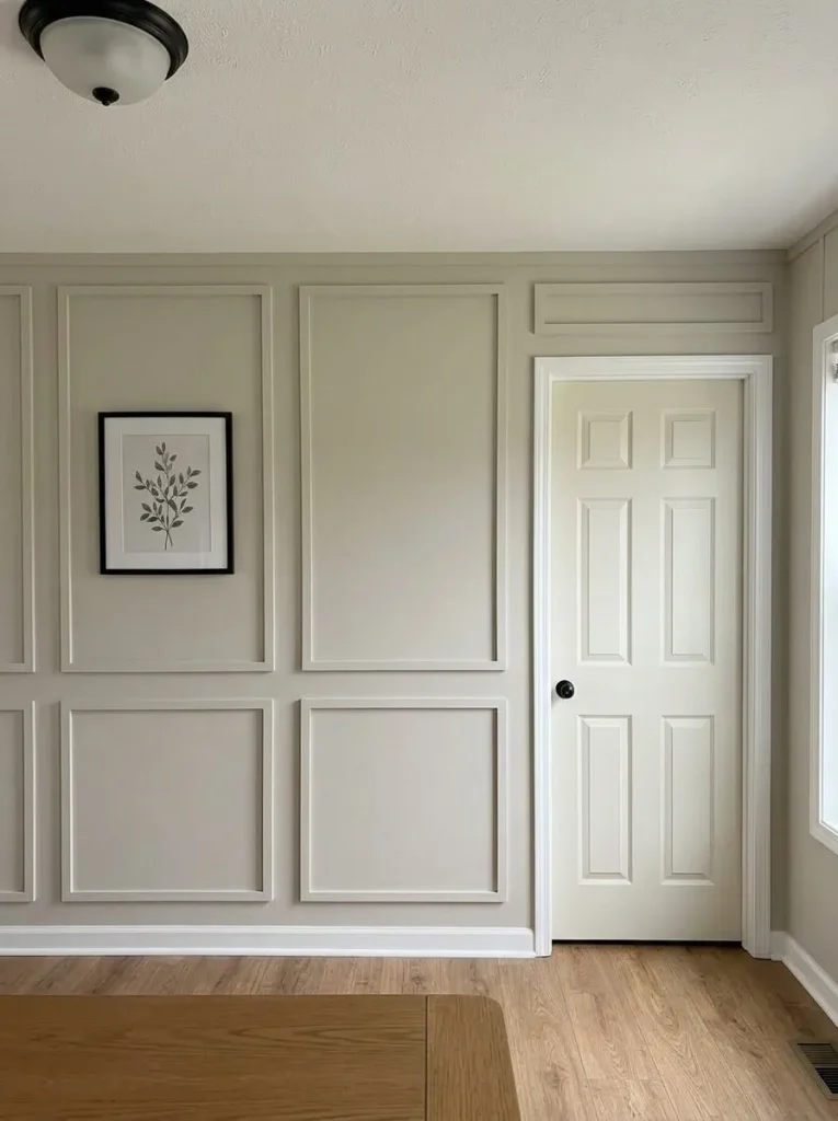
Picture-frame molding works especially well when a mobile-home wall feels too flat but adding another wood or panel surface would make the room visually heavier.
The treatment relies on shadow and proportion, not material coverage. Thin molding outlines create shallow relief, so the wall gains architecture while most of the original surface remains visible. That can be valuable in a narrow bedroom, small dining area, or living room where a dark reclaimed-wood treatment would command too much attention.
Think of the choice this way:
| If the wall problem is… | Try… | Because… |
|---|---|---|
| Flat but otherwise clean | Large molding rectangles | They create depth without covering the field |
| Narrow and busy | Fewer, wider panels | Extra subdivisions can exaggerate clutter |
| Broken by a door or window | Treat each usable wall portion separately | Forced symmetry can fight the architecture |
| Already carrying large art | Very restrained molding or none | Two framing systems can feel overworked |
Lay out the rectangles with painter’s tape first. Judge them from the normal doorway and seated position, not only from six inches away with a measuring tape.
The project has done enough when the wall reads as intentional before artwork is added.
If it still depends on a gallery of small accessories to look finished, the panel proportions probably need another edit.
4. Limit Reclaimed Wood to the Wall Area That Actually Needs Warmth
Reclaimed or rustic wood can transform a plain mobile-home interior quickly because the material brings grain, color variation, shadow, and texture at the same time. Those same qualities are exactly why it is easy to overuse.
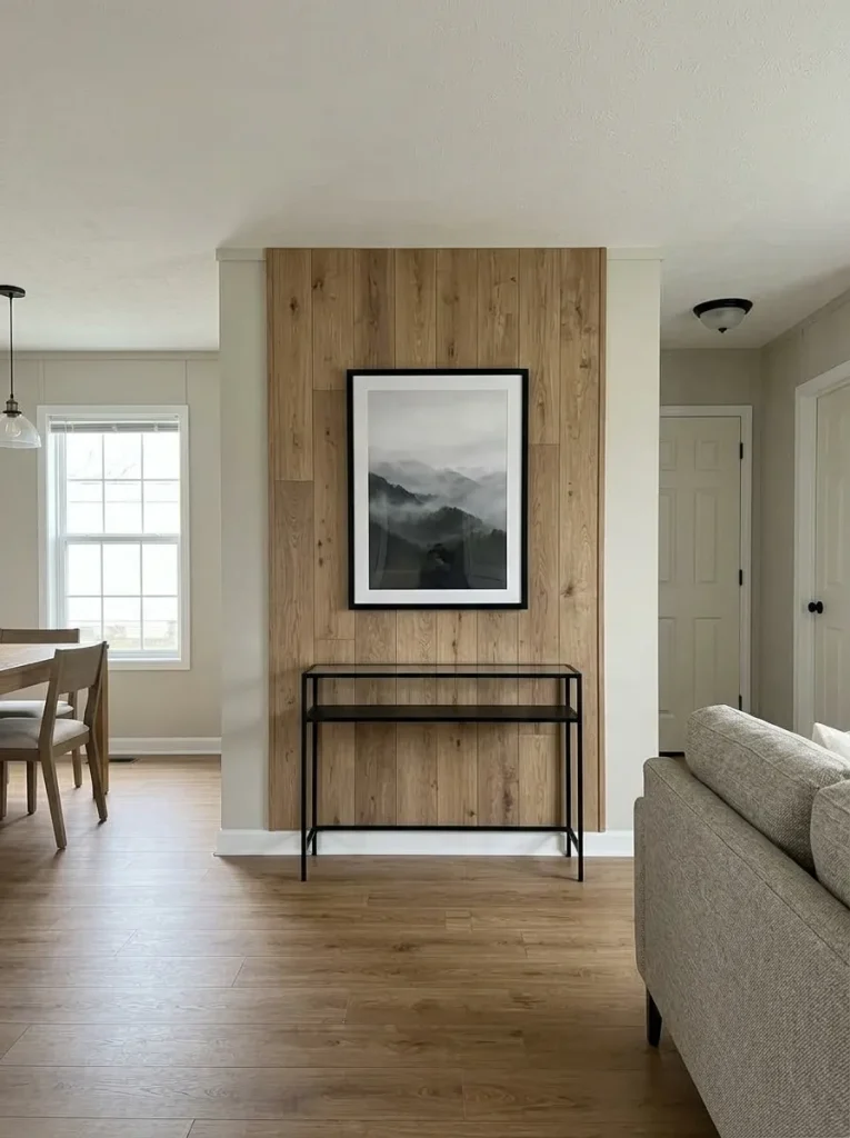
A whole wall is not automatically more effective than one-third of a wall.
Start from the view where the room is normally experienced. If the wood needs to warm the TV zone, dining edge, headboard wall, or one architectural recess, let that area define the coverage.
Extending planks into every connected surface can weaken the hierarchy because the material stops behaving like an accent and starts becoming the room’s background.
Increase coverage only while the room becomes clearer. Once the wood begins competing with windows, furniture, flooring, or adjacent cabinetry, more material is adding another dominant surface rather than more character.
Wood Coverage Dial
Material coverage test
How much wood does the room actually need?
Judge the treatment from the doorway first. Coverage should strengthen one area without making every adjoining surface compete with it.
Use wood behind one object or within one architectural field. It adds warmth while keeping the rest of the room visually available.
A partial field creates enough material presence to register from across the room while preserving a calmer paint surface around it.
Use the strongest version only after checking how the wood relates to flooring, cabinetry, windows, furniture and every wall visible in the same sightline.
Treat the coverage exercise as a visual-design tool, not a fastening plan. Solid boards, attached shelving, and other heavier installations should move forward only after the attachment approach is appropriate for the wall and the proposed load.
5. Run a Shiplap-Look Treatment in the Direction the Room Needs Most
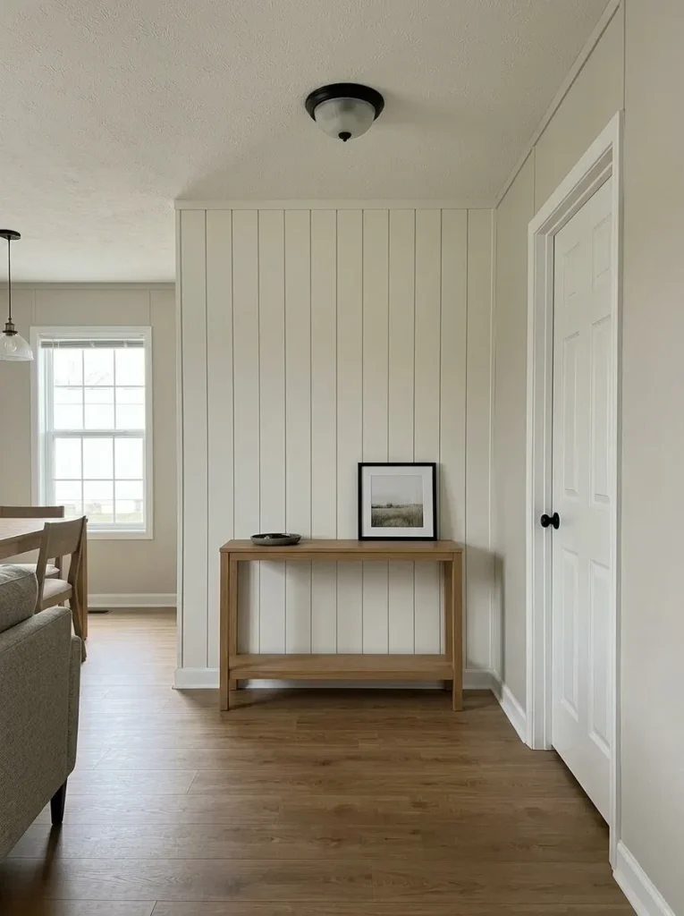
Should the lines run horizontally or vertically?
Do not answer that question from a trend photograph. Answer it while standing inside the room.
Horizontal lines can make a wall read wider and calmer, especially across one uninterrupted surface. They may also emphasize the length of an already elongated room if the same strong line pattern dominates the long axis.
Vertical lines pull attention upward. They can be useful on a shorter wall, around a dining niche, or where a low-feeling room needs a stronger floor-to-ceiling relationship. In a compact room, though, tightly spaced vertical strips can create more visual activity than expected.
Before installing anything, reproduce five or six proposed lines with low-tack painter’s tape. Then inspect the wall from three positions: the doorway, the main seated position, and the adjoining room.
Keep the orientation that improves the whole sightline, not merely the close-up photograph.
One more decision matters: whether the wall needs real plank texture at all. If the line direction creates the effect you want during the tape test, a simpler painted or trim-based treatment may deliver enough character without adding another strong material.
6. Use Narrow Vertical Slats on One Section Instead of Wrapping the Room
Vertical slats can give a flat mobile-home wall stronger height and shadow, but the treatment works best when it has a clear stopping point.
Imagine a small living room where one end of the sofa meets an empty wall. Covering every visible wall with vertical strips would multiply lines across the room. A narrow slatted field behind a console, reading chair, bed, or dining bench gives the eye one tall element to register while the surrounding painted wall provides contrast.
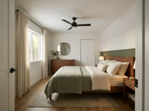
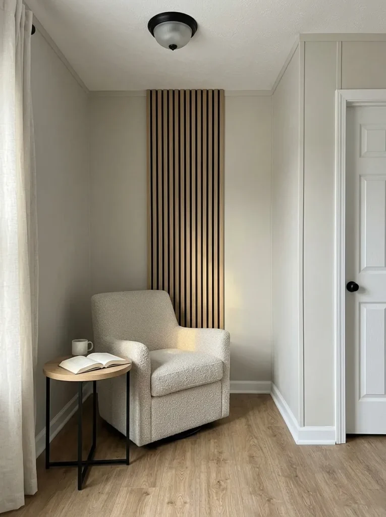
The width of the slatted section matters more than adding extra boards. Mock up the outside edges with painter’s tape first. From the doorway, the feature should belong to a recognizable zone—such as the width of the console below it or slightly beyond the chair grouping beside it.
A useful warning appears when the slats start competing with existing battens, door trim, curtains, cabinet lines, or flooring seams. Too many repeated verticals can turn architectural texture into visual noise.
Better move: define one purpose for the slatted field and stop the material once that purpose is visually complete.
That restraint is especially useful in a mobile home where the next room or wall may remain visible beyond the feature.
7. Create Weathered-Wood Wainscoting and Let the Upper Wall Stay Quiet
Weathered wood has enough grain, tone variation, and edge detail to change a room without covering the entire wall.
Use it below a horizontal rail in a hallway, dining edge, entry, or informal living zone, then keep the upper section comparatively calm. The lighter upper field gives natural light somewhere to spread and prevents rustic texture from visually climbing through the whole room.
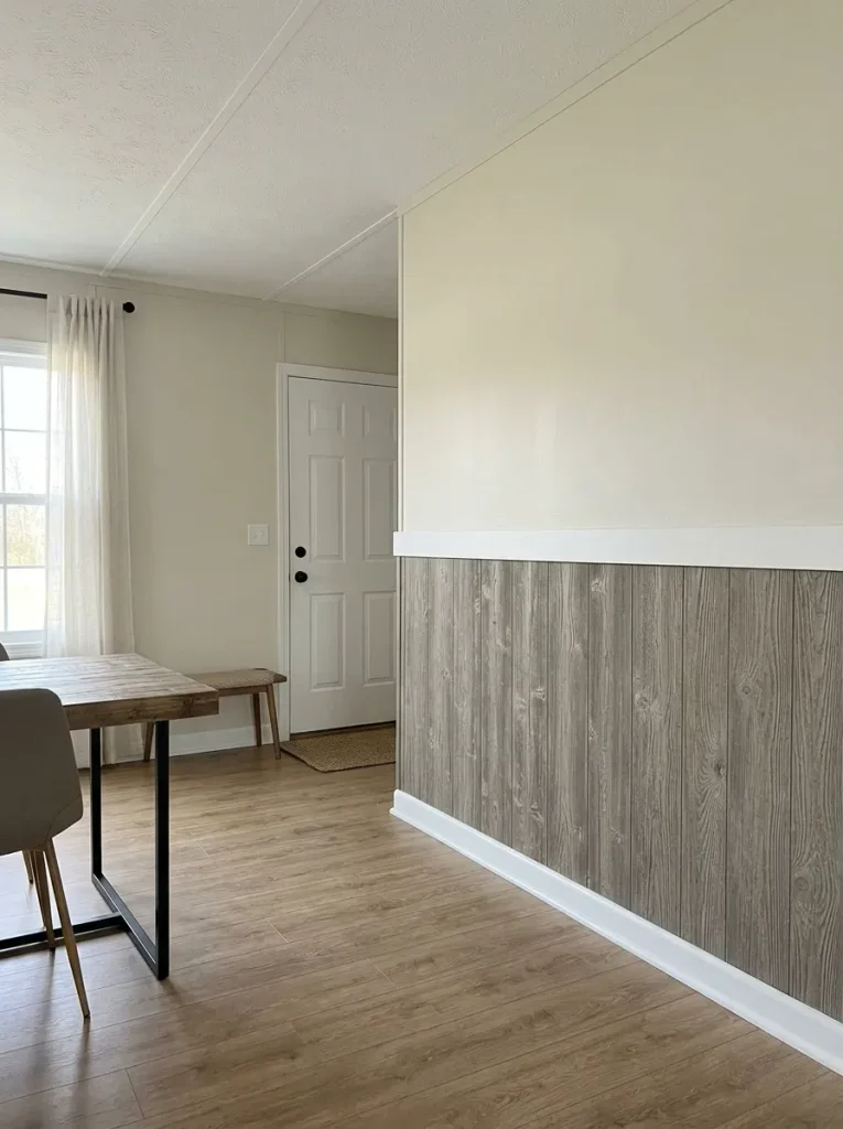
Before committing, hold several sample boards together at approximately the height you are considering. View them beside the actual floor.
If both surfaces contain strong brown, gray, or distressed patterns, ask which one is supposed to lead. A busy wood floor plus equally busy wainscoting can erase the visual separation between floor and wall.
A cleaner relationship might be:
patterned floor → quieter wall boards → simple upper paint
or
calm floor → richer lower-wall wood → restrained upper field
The important decision is not whether weathered wood looks attractive on its own. It is whether the wall needs texture at lower eye level or whether the room already has enough material variation.
If the sample looks strongest before you extend it upward, you have probably found the stopping line.
8. Frame Peel-and-Stick Wallpaper Like a Panel Instead of Covering Every Wall
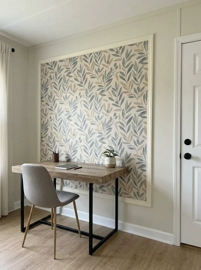
Pattern can add character faster than another permanent construction project, but a small mobile-home room often needs much less of it than a Pinterest close-up suggests.
One useful approach is to treat removable wallpaper as an insert. Apply it inside a framed rectangle, an existing recess, behind a small desk, or between simple molding boundaries. The pattern gains a defined edge, which makes it read as an intentional composition instead of an endless background.
This also gives you a realistic way to test scale. A bold botanical or geometric print may look balanced inside one large framed field while feeling relentless across four connected walls.
Removability varies with the product and the surface beneath it, so follow the product instructions and test a discreet area before treating “peel-and-stick” as a guarantee of damage-free removal.
Reversible Pattern Route Finder
Pattern without commitment overload
How much pattern should this wall carry?
Choose the version closest to your room. The strongest treatment is not automatically the largest one.
Use one large patterned field behind a desk, console, reading chair, or bedside area. The surrounding paint becomes a visual margin that makes the pattern feel more deliberate.
Two framed panels can create rhythm without turning the complete wall into pattern. Keep the frames large enough to read as architecture, not tiny decorative samples.
Check the pattern beside curtains, flooring, upholstery, cabinetry, and any adjoining room visible from the same position. If several of those already demand attention, reduce the wallpaper field.
Practical test: tape the proposed outside boundary first. If the empty outline already feels large enough from the doorway, filling more wall is unlikely to improve the composition.
The framed-panel version is often the safest first experiment because it gives you enough pattern to judge the room without asking the pattern to become the entire room.
9. Split a Wall With a Chair Rail and Two Paint Values
A wall can gain architecture without adding another sheet material.
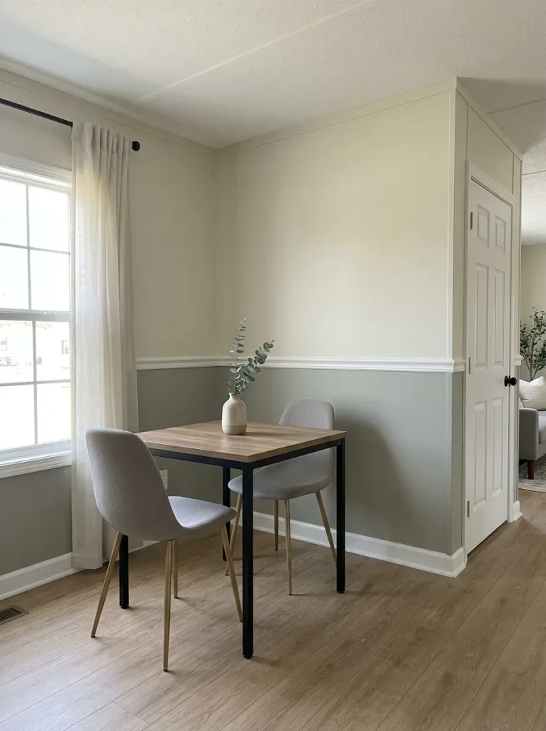
A chair rail creates a deliberate horizontal break, while two related paint values make the division visible enough to matter. In a compact mobile-home room, that can be useful when full paneling would add more texture than the space needs.
Start with the relationship between the colors.
A deeper lower color gives the bottom of the room more visual weight and can anchor lighter furniture or a pale upper wall. A softer tonal difference creates a quieter architectural effect. High contrast produces a stronger decorative statement and should be judged against doors, trim, cabinetry, and flooring visible nearby.
Do not choose the dividing line from a photograph alone. Tape the line on your actual wall and inspect it around furniture, outlets, windows, and door casings.
Ask one question from the doorway:
Does the split make the wall feel deliberately proportioned, or does it make the room look shorter?
If the wall starts feeling compressed, move the division, reduce the contrast, or return to one color.
Paint is enough when the room needs proportion more than texture.
10. Give a Long Blank Wall a Slim Display Ledge Instead of Filling It With Tiny Frames
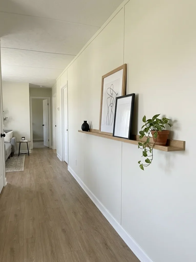
A long empty wall can trigger the urge to scatter artwork across every usable inch.
That usually creates more decisions, not a stronger composition.
A slim picture ledge gives the wall one continuous organizing line. Frames, a small object, and perhaps one trailing plant can overlap along that line instead of becoming separate islands.
In a mobile home, this works particularly well where a hallway or living-room wall is visible from a distance. The ledge can visually connect several objects while keeping most of the wall uncovered.
Use the wall length to set the composition, but leave space at both ends so the ledge reads as an intentional feature rather than trim that almost reached the corner.
A simple editing sequence helps:
- place the largest frame first;
- overlap a medium frame;
- add one smaller object;
- step across the room;
- stop before every empty inch becomes occupied.
If removing one object makes the grouping easier to read, leave it out.
The wall’s character comes from the long horizontal relationship, not from the number of accessories sitting on it.
11. Build an Open Shelf Wall With Visible Gaps So the Wall Can Still Breathe
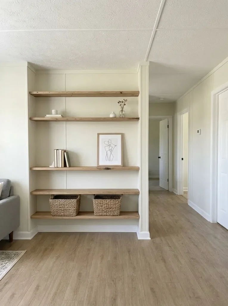
A reclaimed-wood shelving wall can become both storage and architecture, but the most convincing versions do not fill every square inch.
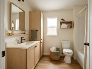
Use several strong horizontal shelves with deliberate open space between them. Let portions of the original wall remain visible around frames, baskets, plants, books, or small collections. Those gaps separate the display into zones and prevent the shelf system from reading as one heavy block.
A useful hierarchy is:
| Shelf level | Best job |
|---|---|
| Upper | A few lighter decorative objects |
| Eye level | Art, books, or the item you want noticed first |
| Lower | Baskets or heavier-looking storage |
| Floor zone | Mostly open unless storage is genuinely needed |
Keep one shelf visibly quieter than the others. That pause makes the fuller areas easier to read.
Also separate shelf styling from shelf attachment. Select the mounting method only after confirming that the wall, hardware, and intended load are appropriate for the installation.
If the shelf wall looks interesting only after every shelf is full, the structure itself may be too weak visually.
A good open system should still look intentional when roughly one-third of its display space is empty.
12. Make the TV Wall Read as One Backdrop, Not a Collection of Rectangles
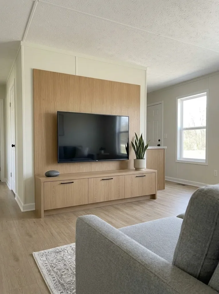
A television already creates a dominant dark rectangle. Add a console, several shelves, picture frames, wood blocks, speakers, plants, and decorative boxes, and the wall can quickly become a stack of competing shapes.
The stronger approach is to decide what the entire wall is doing first.
If the television is the main function, let the background visually support it. If storage is the real problem, solve storage before adding decorative trim. If the screen looks stranded on a large blank wall, introduce one larger field—paint, wood, restrained paneling, or a long console—to connect it to the architecture.
The broader mobile home living room ideas guide goes deeper into furniture, circulation, layout, and focal-point relationships.
Here, the wall-specific decision is simpler: choose one dominant backdrop before adding smaller layers.
TV Wall Priority Composer
Focal-wall hierarchy
What job should the TV wall do first?
Choose the problem you notice before adding another shelf, frame, slat, or decorative object.
Use one large paint, panel, or restrained wood zone to connect the screen and console. The backdrop should read before small accessories do.
Priority: visual anchoringChoose closed or visually quiet storage near the console before adding decorative shelves. Once everyday items have a home, reassess whether the wall needs anything else.
Priority: functional containmentKeep the screen, console, and one background treatment. Reduce scattered frames, small shelves, repeated blocks, or unrelated objects until the wall has a visible hierarchy again.
Priority: subtractionA strong media wall does not need to disguise the television. It needs to give the screen, furniture, texture, and blank space a clear order.
13. Frame a Wide Room Opening With Stained Wood to Turn a Transition Into Architecture
Some of the most characterless surfaces in a mobile home are not actually walls. They are the edges where one room becomes another.
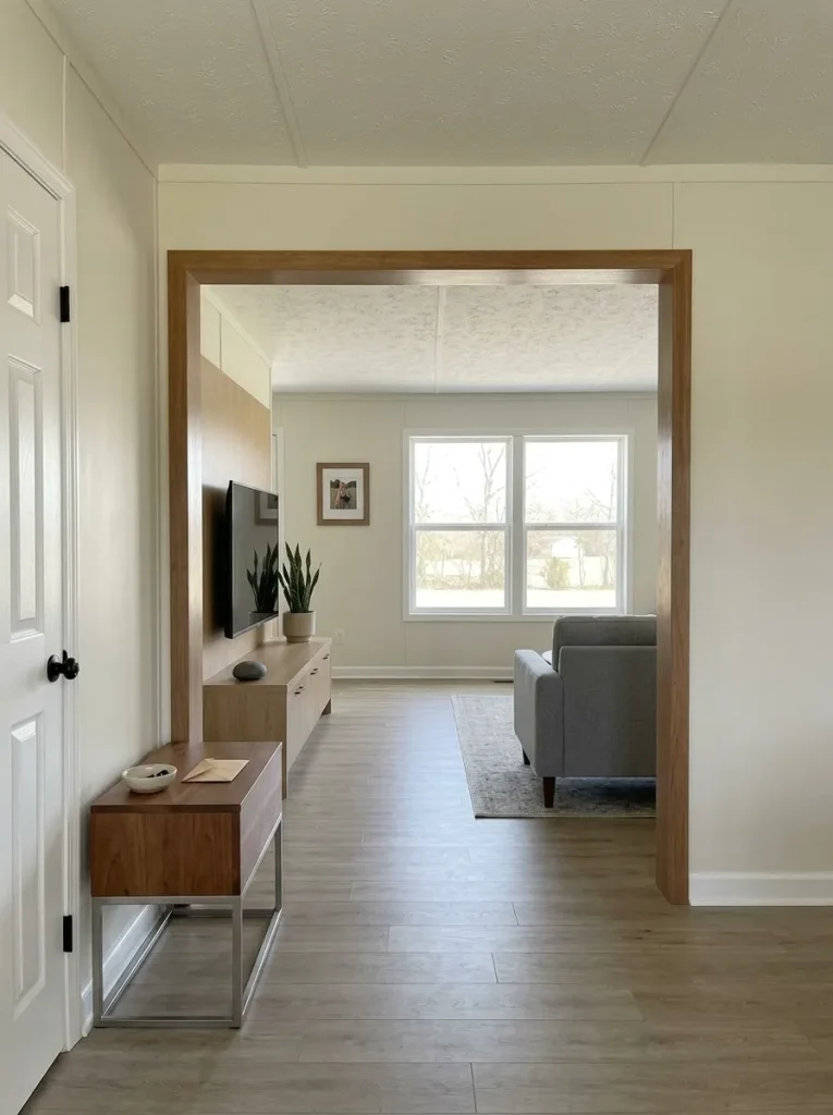
An existing wide opening can gain architectural presence by framing its perimeter with a consistent stained-wood finish. The treatment works because it turns an otherwise vague transition into a visible boundary while preserving the view into the next room.
This idea is cosmetic: frame the opening that already exists. Enlarging, removing, or structurally changing the opening is a different project and falls outside this wall-decoration approach.
The stained surround should also have a visual reason to exist elsewhere in the space. Repeat its tone once or twice—in a console top, small shelf, picture frame, or nearby furniture detail—so the opening connects to the room without requiring matching wood everywhere.
For single wides where doors and openings divide the available wall into awkward pieces, 23 Single Wide Decorating Ideas for Narrow and Awkward Spaces goes deeper into decorating around interrupted walls and circulation.
Opening Frame Map
Transition as architecture
Let the opening connect two rooms without making them identical.
The stained frame becomes the punctuation mark between spaces. Keep the rooms visually related, but allow each side to retain its own furniture and function.
soft furnishings
harder finishes
The opening earns emphasis when it helps the two rooms make sense together.
If it becomes the strongest object in both rooms, reduce the stain contrast or simplify the surrounding wall.
14. Build a Hook Rail and Lower-Wall Zone Where a Hallway Needs Function
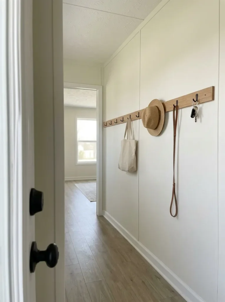
A narrow hallway rarely benefits from bulky wall décor, yet leaving the entire wall empty can make the passage feel unfinished.
A shallow hook rail gives the wall a horizontal line and a practical job at the same time. Use it near an entrance, bedroom corridor, laundry approach, or family drop zone where a few lightweight everyday items actually need somewhere to go.
The important part is deciding what belongs there before installing the hooks.
If the rail is intended for keys, a light tote, dog leash, hat, or small reusable bag, design the zone around those objects. If it quietly grows into storage for coats, backpacks, shoes, mail, baskets, and cleaning tools, the hallway probably needs a different storage solution.
Try this sequence:
Observe the clutter → name the recurring items → give only those items a place → leave the rest of the wall open.
Keep the rail visually slim and avoid accessories that project unnecessarily into an already tight circulation route. Choose hardware and attachment methods appropriate to the actual wall and intended load.
The project succeeds when the hallway looks calmer during everyday use—not only when the hooks are empty for a photograph.
15. Create a Framed Cork Command Wall for a Tiny Office or Family Zone
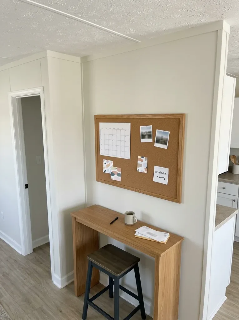
The final wall idea is useful when the room needs organization more than another decorative feature.
A framed cork panel can hold a short calendar, frequently used notes, a few photographs, school information, meal planning, or project reminders while still reading as one deliberate wall field.
Keep the cork inside a clear boundary. A painted or wood frame visually separates the working surface from the rest of the room, which prevents papers from slowly colonizing the entire wall.
The best location is often beside a small desk, near the kitchen edge, inside an entry niche, or along a family circulation route. Place it where information is used, not where there happens to be an empty wall.
A simple test tells you whether this is the right final project:
- If the wall needs display, choose art or a ledge.
- If it needs texture, choose wood, molding, paint, or pattern.
- If it needs organization, cork has earned the space.
Edit the board regularly. A command wall that holds every old note eventually becomes visual clutter with a frame around it.
Character is strongest when the wall has a recognizable purpose.
Final Thoughts
The most convincing DIY mobile home wall ideas do not make every wall special. They decide which surface deserves attention, what problem it should solve, and where the treatment should stop.
Start with the widest view of the room. Preserve an existing wall rhythm when it already works, use trim when depth is enough, introduce wood or pattern only where the space benefits from stronger material, and let functional walls earn their place through storage or organization.
If you are still deciding which cosmetic project will create the broadest visual change, continue with 21 Cheap Mobile Home Upgrades That Look Expensive before spending money on smaller decorative fixes.
Save these DIY mobile home wall ideas on Pinterest so you can return to the treatment that fits your room when you are ready to start.