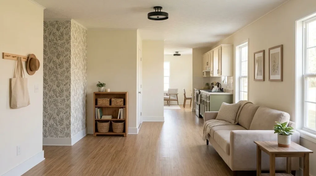
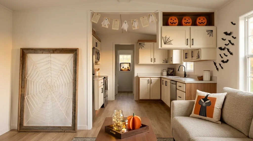
A mobile home does not need a room-by-room demolition to feel dramatically different. Some of the strongest DIY mobile home projects work because they change something the eye or daily routine encounters repeatedly: the entry you walk through, the long wall you see from the sofa, the kitchen route you use every morning, or an awkward gap that currently does nothing.
The projects below go further than decorating ideas. You will find things to build, refinish, adapt, install, and physically improve, with special attention to the narrower circulation paths, compact bathrooms, connected sightlines, shallow storage opportunities, and highly visible repeated finishes common in mobile and manufactured homes.
A useful starting rule is to choose projects by reach. One should improve how the home functions, another can improve a major visual surface, and only then should you spend time on smaller details.
Some jobs stay comfortably cosmetic. Others stop being simple DIY the moment structure, wiring, plumbing, waterproofing, or other building systems become involved. Those boundaries matter just as much as the finished look.
1. Build a Slim Entry Bench With a Full-Width Peg Rail
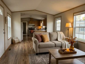
A mobile-home entry can be only a few steps from the living room, which means a bulky bench does more than crowd the doorway—it becomes part of the main room’s furniture composition.
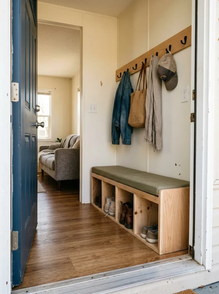
A shallow built-in-style bench paired with hooks or a peg rail can give shoes, bags, jackets, and keys one landing zone without turning the entrance into a second storage room.
Before cutting lumber, map the entry with painter’s tape.
- Mark the proposed bench footprint on the floor.
- Open the exterior and nearby interior doors through their complete swings.
- Walk the route carrying a bag, laundry basket, or anything you regularly bring through the door.
- Tape the hook rail on the wall and check whether hanging coats would project into that same path.
The useful question is not simply “What bench fits this wall?”
It is:
“How much bench can this entry absorb while the route still feels easy?”
A narrow seat with open shoe space underneath often feels lighter than a deep storage chest. If the entry already has adequate floor storage, skip the cubbies and let the wall rail perform the organizing work.
Project decision: build to the circulation envelope first; use leftover wall width for storage second.
2. Paint Mobile-Home Wall Panels and Battens as One Intentional Surface
Stand at one end of a paneled mobile-home room and look down the longest wall.
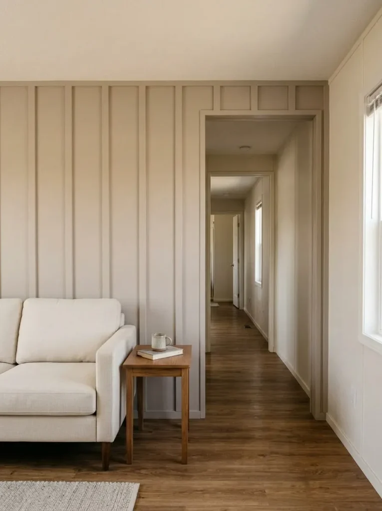
The eye rarely reads each wall panel independently. It notices the repeated vertical rhythm created by seams, battens, trim, door casings, outlets, and color changes.
That gives you two legitimate DIY directions.
Quiet the rhythm: use one compatible finish across the wall field and its visually dominant battens so the surface reads more continuously.
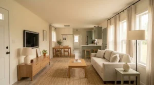
Feature the rhythm: keep selected strips visible and make their repetition look deliberate, almost like a restrained architectural grid.
The weak middle ground is a wall where some seams disappear, others remain prominent, and patches or mismatched trim create a new interruption every few feet.
Before coating anything, identify what the existing wall surface actually is and test the chosen preparation and finish in a discreet location. Mobile and manufactured homes can contain wall materials that should not automatically be treated like conventional painted drywall.
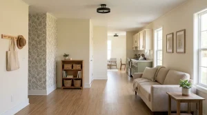
For a broader look at which large surfaces deserve attention before small décor purchases, see our guide to <a href=”/cheap-mobile-home-upgrades/”>cheap mobile home upgrades that look expensive</a>.
Photo test: take one picture from the doorway before buying paint. If the first thing you notice is the wall’s repeated fragmentation, this project has enough visual reach to move near the top of your list.
3. Build a Rolling Kitchen Island Around the Walkway, Not the Pinterest Photo
A rolling island can add prep surface, serving space, and lower storage to a mobile-home kitchen, but the island itself is only half of the design problem.
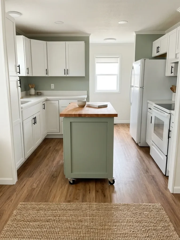
The other half is the moving space around it.
Tape a proposed footprint on the floor, then use the kitchen normally. Open the refrigerator. Pull out a lower drawer. Load the dishwasher. Carry a plate toward the dining area. Ask a second person to pass through while you stand at the counter.
That real sequence tells you whether you have room for an island, a slimmer cart, or no freestanding piece at all.
Island Clearance Lab
What happens after the island enters the room?
Choose the description that best matches your kitchen after you tape the proposed footprint and open nearby doors, drawers, and appliances.
Skip the island footprint you taped.
Extra surface area is useful only when it does not turn ordinary cooking into a sequence of sidesteps.
- Test a much slimmer rolling cart.
- Consider wall-mounted or counter-overlap solutions.
- Keep the central route visually and physically clear.
A rolling piece may outperform a fixed island.
Use it where the prep zone benefits, then move it when two people cook, appliances open, or the dining route becomes busy.
- Keep the footprint visually light.
- Avoid storage that encourages permanent overloading.
- Confirm the wheels can lock securely during use.
Now design the island around the job it needs to perform.
Decide whether your missing function is prep surface, serving space, seating, or storage. One clear job usually produces a cleaner piece than trying to include everything.
- Repeat a finish already visible in the kitchen.
- Keep frequently used storage on the easiest side to reach.
- Re-run the appliance-opening test before construction begins.
Decision rule: circulation earns priority over added countertop. The best island is the largest footprint the kitchen can use comfortably—not the largest piece the room can physically contain.
If the island test reveals that the kitchen itself needs a broader scope decision, the <a href=”/mobile-home-kitchen-makeover-on-a-budget/”>mobile home kitchen makeover on a budget</a> guide separates contained cosmetic work from projects that trigger more connected changes.
4. Build an Over-the-Toilet Storage Tower That Does Not Crowd the Bathroom
The wall above a toilet looks like empty storage capacity, but a compact mobile-home bathroom can become top-heavy quickly.
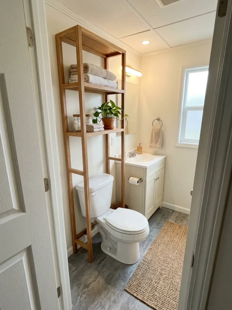
A successful tower uses the vertical plane while keeping its lower portion visually quiet enough that the toilet, vanity, doorway, and walking route do not all feel boxed in.
Start with the belongings, not the shelves.
Daily items deserve the easiest reach. Extra towels and refills can move higher. Decorative objects should fill only space that remains after the storage job is solved.
Vertical Storage Map
Make the tower taller in function, not heavier in appearance.
A good over-toilet build assigns each height a job and avoids turning the lowest portion into another bulky cabinet face inside an already compact room.
For deeper decisions about towels, toiletries, backup stock, gaps, medicine cabinets, and other compact-bathroom storage zones, continue with the specialist guide to <a href=”/mobile-home-bathroom-storage-ideas/”>mobile home bathroom storage ideas</a>.
This project only needs to solve the toilet wall well.
5. Reframe the Main Window With Simple Casing and a Better Curtain Line
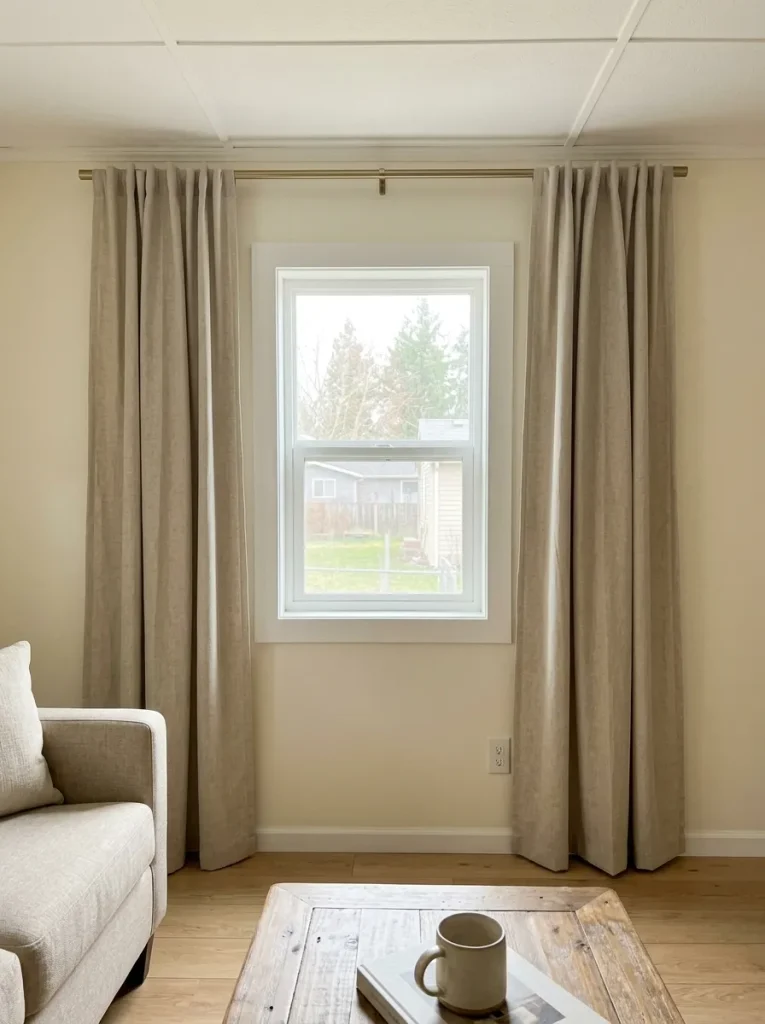
Does the window look too small—or is everything around it making it look small?
That distinction can save you from replacing a perfectly useful window.
In many compact mobile-home rooms, the window wall is visible from the doorway and across much of the living area. Thin or mismatched casing, curtains squeezed tightly against the opening, short panels, and several unrelated objects on the sill can visually reduce the opening even further.
Try the change in two temporary stages before committing.
Stage A — test the architecture. Use removable tape to mock up a slightly stronger casing profile. Stand at the room entrance, then sit in the main seating position. The frame should make the opening feel finished without becoming a heavy border.
Stage B — test the textile line. Move a temporary rod position upward or outward and clip fabric in place. Judge the complete wall, not just the glass. The useful setup is the one that makes the window, wall height, furniture below it, and available daylight read as one composition.
Skip extra framing when an adjacent cabinet, door casing, or very narrow wall strip would leave the window trapped between competing borders.
Decision: replace the window only for a window problem. If the weakness is visual proportion, solve the surrounding architecture first.
6. Turn an Awkward Factory Built-In Into Open + Closed Storage
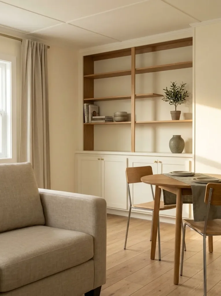
A dated built-in can look like a demolition problem when its real weakness is much smaller: too many doors, heavy trim, dark recesses, or storage that hides everything equally.
Before removing the entire unit, empty it.
Then sort the structure into three categories: parts that are sound and useful, parts that visually overwhelm the room, and parts that perform no meaningful job.
A floor-to-ceiling cabinet near a dining or living area, for example, may work far better after the upper section becomes open shelving while the lower portion keeps doors for objects that genuinely need hiding.
The mixed approach is especially useful in mobile homes because it preserves storage volume without allowing one cabinet face to dominate a narrow wall.
Treat the project like an editing job:
Keep the solid carcass and genuinely useful lower storage.
Open the portion that benefits from visual depth.
Remove decorative trim or dividers only when they are nonessential and safe to alter.
Repeat one nearby wood, paint, or hardware finish so the retained built-in belongs to the room.
If the cabinet is loose, moisture-damaged, or tied into building systems you do not understand, the project has moved beyond a cosmetic refresh.
For a firm makeover budget, the guide to <a href=”/mobile-home-makeover-under-500/”>mobile home makeover ideas under $500</a> is the better place to decide which visible surfaces deserve money first.
Best outcome: the built-in still stores almost as much, but the wall looks substantially calmer.
7. Build a Drop-Leaf Dining Ledge for a Tight Eat-In Zone
A permanent dining table claims its full footprint whether anyone is eating or not.
That can be an expensive spatial trade in a narrow mobile-home kitchen or living-dining area.
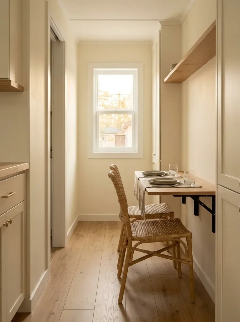
A wall-mounted or built-in drop-leaf ledge takes a different approach: give the dining surface floor space only during the hours it is actually needed.
Start by identifying three states—closed, everyday dining, and the occasional larger meal.
The project succeeds only when each state works.
Three-State Dining Test
Design the table for what happens when nobody is eating.
A transformable dining surface earns its place by giving floor area back between meals—not merely by fitting two chairs when open.
Closed
Can people pass naturally, open nearby doors, and use the kitchen without negotiating around dining furniture?
Everyday
Open only the surface your normal household needs. Avoid designing the entire room around occasional guests.
Expanded
Confirm temporary chairs and the larger surface do not block the kitchen route, exterior door, or adjoining room.
Use sturdy hardware appropriate to the surface and intended load, and treat any uncertain wall attachment as a reason to verify the construction before proceeding.
The most important visual decision comes later: resist turning the folded ledge into another decorative shelf.
Its best feature is the floor space it returns.
8. Make Over Existing Kitchen Cabinets Before Replacing the Boxes
There is a big difference between cabinetry that looks old and cabinetry that has reached the end of its useful life.
Open every door and drawer before choosing paint.
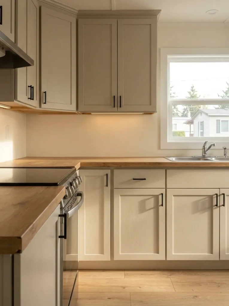
Check whether the boxes remain stable, the doors can be adjusted to sit reasonably straight, the shelving still carries its contents, and the current layout serves the kitchen.
Cosmetic age is a strong reason to refinish.
Swelling, deterioration, serious instability, or a layout that genuinely fails daily routines deserves a different conversation.
For cabinets worth keeping, work in this order:
Condition → alignment → surface identification → cleaning/preparation → finish → hardware.
That sequence prevents fresh paint from becoming camouflage for crooked doors or damaged material.
In a compact mobile-home kitchen, changing one coherent cabinet field can influence the entire connected living area because cabinetry occupies such a large portion of the sightline.
The specialist guide to <a href=”/mobile-home-kitchen-cabinet-makeover/”>mobile home kitchen cabinet makeovers without replacement</a> goes deeper into surface identification, prep, adhesion testing, hardware, and deciding when the existing boxes should stay.
Keep the boxes when their structure and layout still earn the space.
9. Add Rolling Under-Bed Drawers Instead of Another Dresser
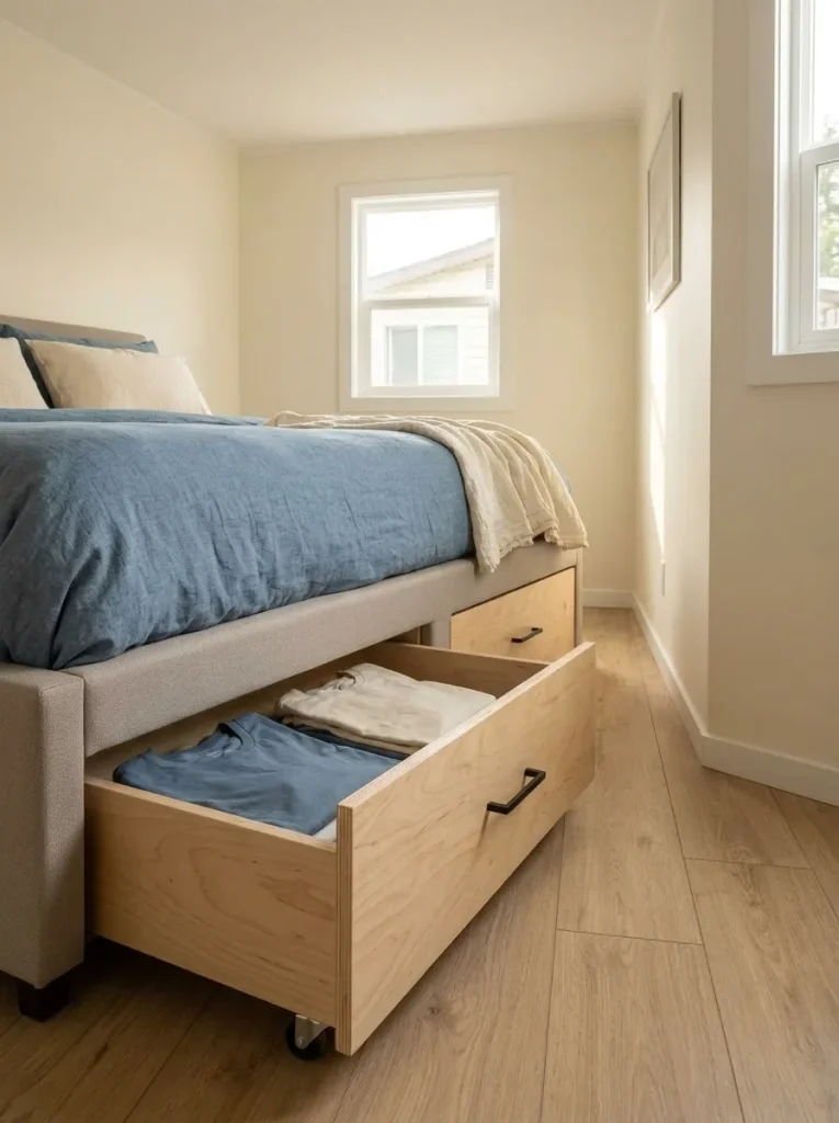
Picture the same bedroom with two different storage solutions.
In version one, another dresser sits against the only remaining open wall. Storage capacity increases, but the walkway tightens and the bed begins to feel wedged between furniture.
In version two, drawers slide into space already claimed by the bed.
The second option does something especially valuable in a small mobile-home bedroom: it increases storage without introducing another full furniture footprint.
Measure three things before building:
- usable clearance beneath the bed,
- the distance needed to pull a drawer fully into the room,
- the route between the bed and the opposite wall.
A drawer is only useful when you can actually open it.
Divide contents by retrieval frequency. Off-season clothing, spare linens, shoes, and less-used items are better candidates than belongings you reach for several times per day.
If the bed sits too low, do not automatically raise it to an awkward height solely to create storage.
The bedroom still has to feel comfortable.
For a complete room-wide strategy, see <a href=”/mobile-home-bedroom-storage-ideas/”>small mobile home bedroom storage ideas</a>.
Decision test: if a new dresser would narrow the walking route, investigate the bed footprint before buying another piece of furniture.
10. Build a Shallow Media Wall That Creates a Focal Point Without Stealing Floor Space
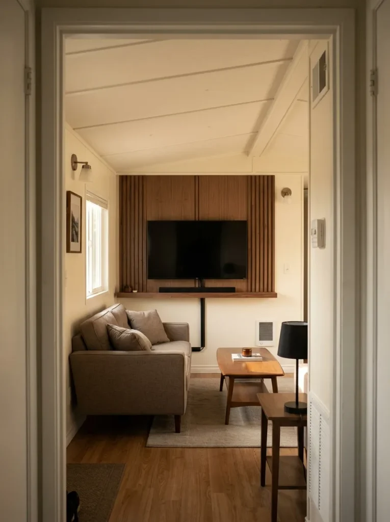
A living room can have a TV on the wall and still lack a focal point.
The usual reaction is to build something bigger.
That is not always the right move in a mobile home.
A deep faux-fireplace surround, oversized cabinet bank, thick hearth, and tall shelving can push the focal wall physically toward the sofa. In a narrow room, those extra inches influence furniture placement long after the project photograph is taken.
Start with the shallowest intervention capable of organizing the wall.
A simple wood ledge beneath the TV, narrow vertical trim, a restrained panel treatment, or shallow side shelving may be enough to turn the screen and wall into one composition.
Hide or organize visible cords through appropriate, safe methods and keep the floor below as visually clean as possible.
Stand at the main doorway after temporarily mocking up the proposed width with painter’s tape.
If your eye lands on the center of the wall and then comfortably moves outward toward the seating area, the focal point is doing its job.
If the mock-up makes the wall feel closer, heavier, or wider than the room can support, reduce the build.
A focal wall needs authority, not bulk.
11. Add a Sink-Window Shelf or Work Rail That Gives the Counter Back
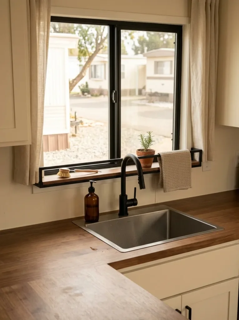
The area around a kitchen sink often collects the same few objects every day: soap, sponge, brush, towel, plant, dish tools, maybe a bottle that never seems to find another home.
Each item is small.
Together they can consume a meaningful share of a compact counter.
Before adding more cabinets, examine the vertical zone already sitting between the counter and window.
A narrow shelf, rail, or carefully placed ledge can lift lightweight everyday items off the work surface while keeping them visible and reachable.
The project works best when it supports a routine, not when it becomes another place to display décor.
Use a simple sorting test.
Lives here daily: candidate for the rail or shelf.
Used weekly: probably belongs in nearby storage.
Pure decoration: earns space only after the functional items fit.
Keep the intervention shallow enough that it does not interfere with the faucet, window operation, cleaning, or work area below.
The best version is almost invisible during cooking because nothing important has been made harder.
Project signal: if clearing three or four sink-side objects gives you noticeably better prep space, vertical relocation is worth testing.
12. Frame the Bathroom Mirror and Add a Shallow Everyday Ledge
A small bathroom does not need several decorative focal points.
The mirror wall is often enough.
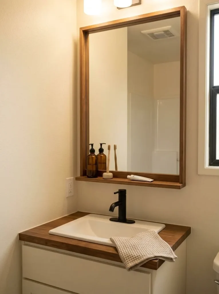
Stand in the doorway and look at the vanity, mirror, light, and wall around them as one vertical composition.
If the mirror feels undersized or unfinished, a simple frame can give it more presence.
If the counter is constantly occupied by toothbrushes, soap, grooming items, or small bottles, a very shallow ledge may solve the second half of the problem.
The two interventions should support each other.
A thick frame plus a deep shelf plus several baskets can turn a compact vanity wall into a crowded display.
A restrained frame and narrow ledge can do the opposite: visually finish the mirror while lifting a few daily items away from the sink.
Before fixing anything permanently, tape the proposed outline onto the wall.
Then check the reflection.
The frame should improve what you see around the mirror, not simply make the object larger.
Skip the shelf when it would crowd switches, interfere with the faucet zone, or become a landing strip for everything that currently sits elsewhere.
13. Create a Slim Pull-Out Pantry in a Dead Kitchen Gap
A narrow gap beside a refrigerator or cabinet can be too small for conventional furniture and still large enough to become useful.
That is precisely why a pull-out pantry can work.
But start with the gap itself—not a storage product.
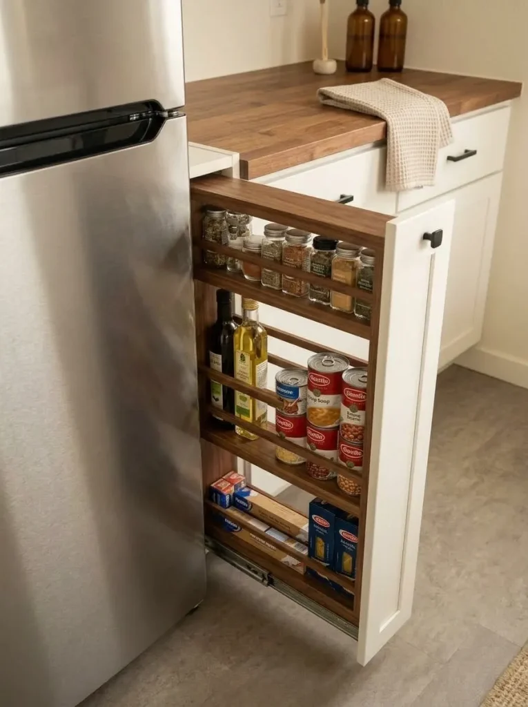
Measure the width at several heights. Confirm nearby doors can still open. Notice base trim, wall irregularities, appliance clearance requirements, and anything that makes the opening narrower than it first appears.
Next, decide what the pantry should hold.
A very narrow pull-out is suited to objects whose shape matches that depth: jars, cans, bottles, spices, wraps, or other small dry goods.
It is a poor answer to every storage problem.
The smartest version uses a stable, accessible construction suited to the intended load and remains easy to clean around.
There is also a useful stopping point: if exploiting the gap requires disturbing an appliance installation, wiring, plumbing, or another building system, it is no longer a simple storage project.
Think of the gap as a specific storage opportunity, not permission to squeeze cabinetry into every unused inch.
14. Refinish Interior Doors and Trim as One Repeated Finish Story
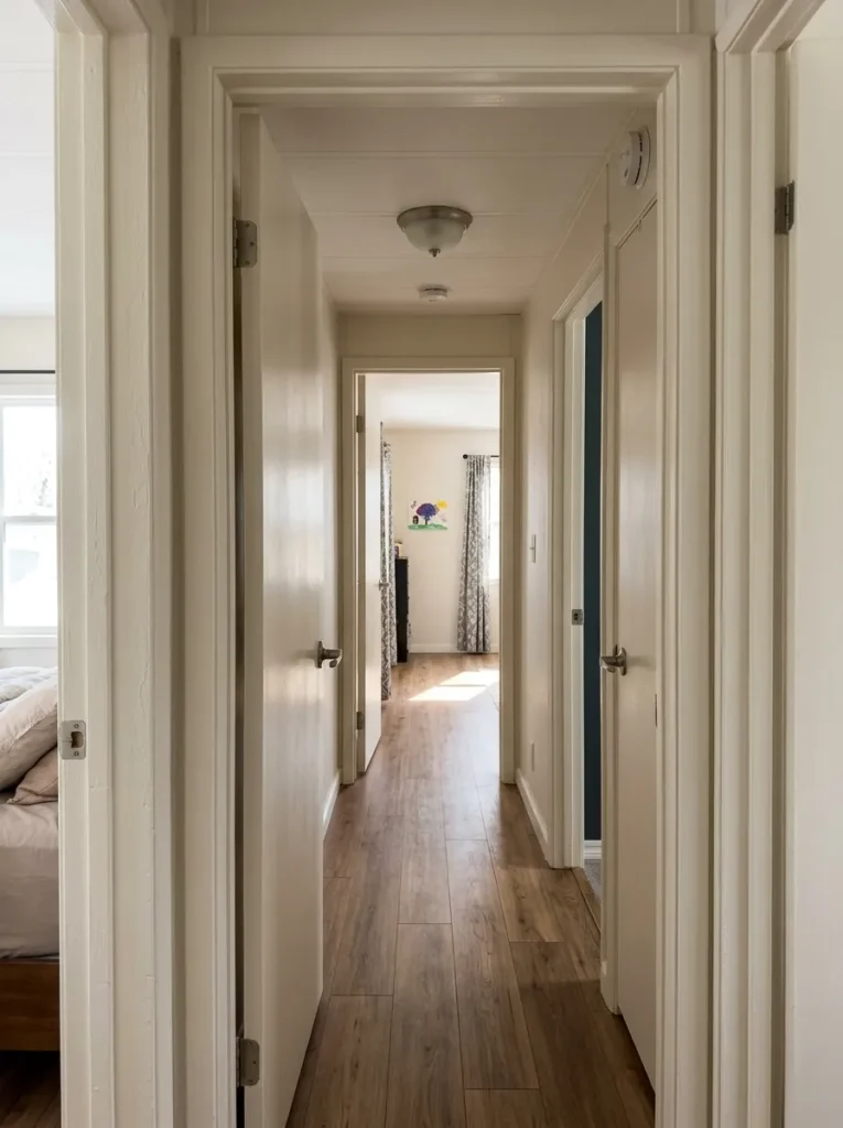
One freshly painted door does not change much.
Six mismatched doors, casings, and trim runs repeating through a mobile home can.
That is why this project becomes more powerful as you move away from the individual door and look down the hallway or across the connected living area.
Choose a consistent direction.
Preserve the wood when its tone already works with the floors, cabinetry, or furniture.
Paint the repeated architecture when several different wood or trim tones are visually fragmenting the interior.
Use contrast selectively when one door genuinely deserves to act as a focal point.
Preparation matters more than novelty. Test coatings on the actual surface and avoid assuming every factory finish behaves like ordinary painted wood.
Hardware deserves similar restraint.
Replacing every knob is unnecessary when existing hardware works and the larger finish problem sits elsewhere.
A useful photo comparison is taken from the far end of the longest interior view.
If the doors and trim begin to disappear into a coherent architectural rhythm, the project has succeeded.
Repeated finishes should connect rooms; they do not need to make every room identical.
15. Add a Laundry Folding Shelf and Hanging Rail Above Existing Machines
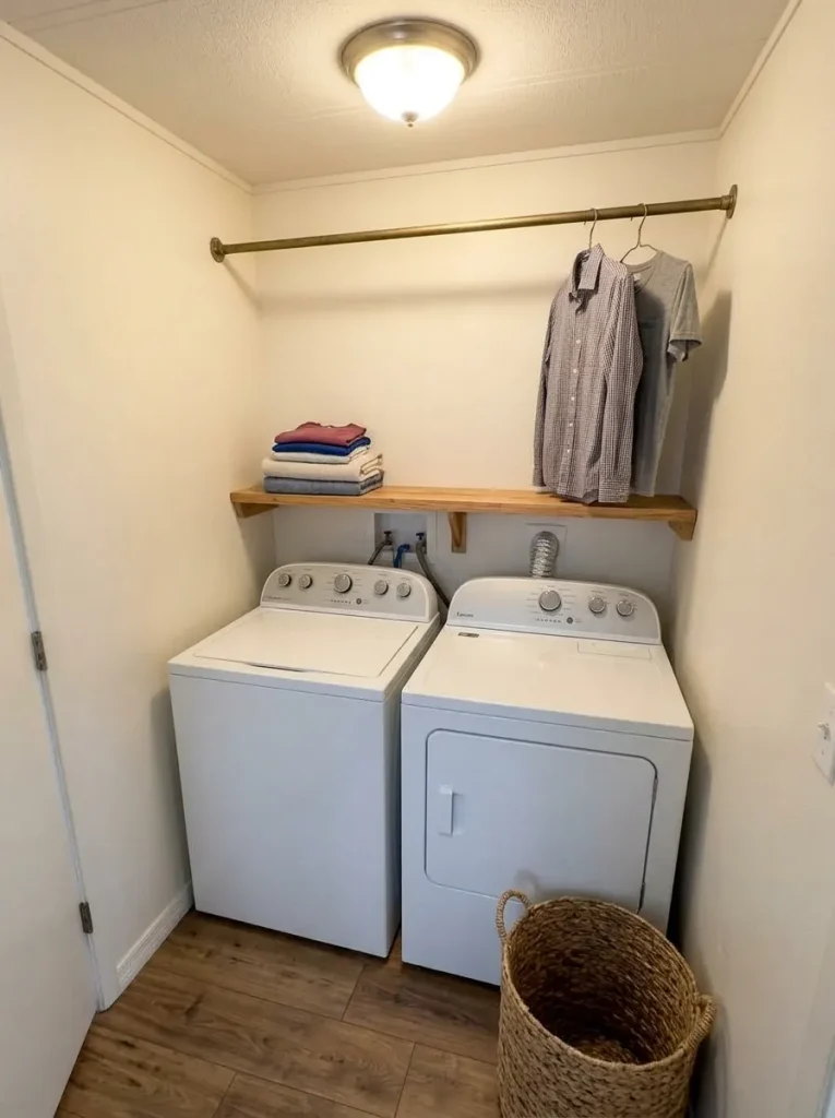
A laundry area often needs more working surface, not more cabinetry.
Observe one complete laundry cycle before designing anything.
Where do clothes land when they come out of the dryer?
Where are they folded?
Where do shirts hang temporarily?
Where does detergent sit?
What gets placed on top of the machines because no deliberate surface exists?
Those answers define the project.
A shelf above or across the laundry zone can create a folding or supply surface. A hanging rail can handle shirts that should not return immediately to a basket. Narrow wall storage may keep routine supplies close without filling the entire vertical space.
Keep access to appliance controls, connections, manufacturer-required clearances, and service areas in mind.
Avoid boxing machinery into a beautiful enclosure that becomes frustrating the first time maintenance is needed.
A tiny laundry nook often looks more finished once everything stops competing at floor level.
Build for the sequence: wash → dry → fold/hang → leave the zone.
Anything that does not improve that sequence is optional.
16. Trade a Visually Heavy Shower Enclosure for a Lighter Curtain Setup When the Existing Construction Allows It
A framed shower enclosure can occupy surprisingly little floor area and still feel visually large.
Glass edges, metal tracks, framing, and hardware create several lines inside an already small bathroom.
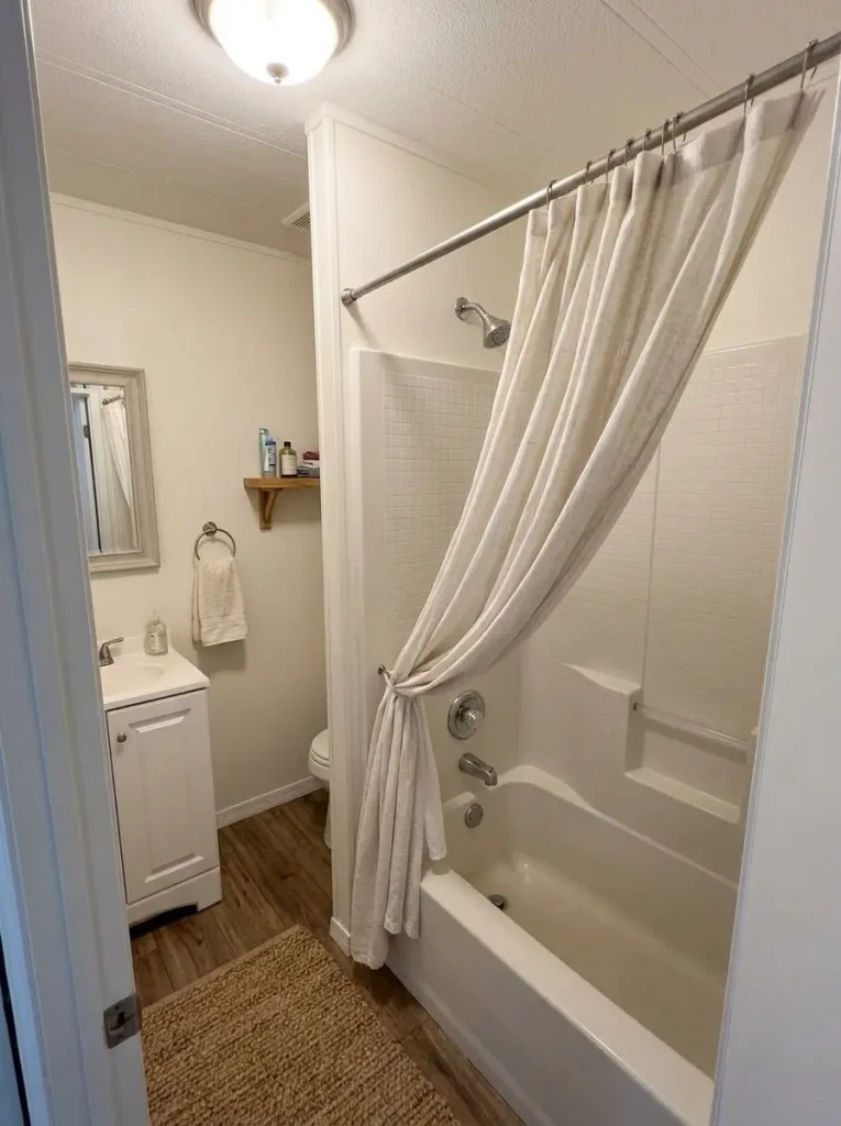
In the right existing setup, a curtain treatment can simplify that view.
But this project has a firm boundary.
Do not remove an enclosure until you understand what it is attached to, what will remain after removal, how the wet area currently manages water, and whether the resulting shower or tub can function safely with a curtain.
Damage, waterproofing questions, plumbing issues, or changes to the wet-zone construction take priority over appearance.
A useful test is to temporarily photograph the bathroom while visually covering the enclosure frame in the image.
Does the room immediately look calmer?
If yes, the frame may be a meaningful visual-age signal.
If not, another element—vanity, wall finish, flooring, lighting, or storage—probably deserves the effort first.
For deeper scope control, continue with <a href=”/mobile-home-bathroom-remodel-on-a-budget/”>mobile home bathroom remodel ideas on a budget</a>, which separates cosmetic work from changes that begin disturbing plumbing, flooring, walls, or wet-area construction. Stylish Galore
Visual openness is never a reason to compromise the wet area’s function.
17. Build a Wall-to-Wall Headboard Ledge With Small Nightstand Zones
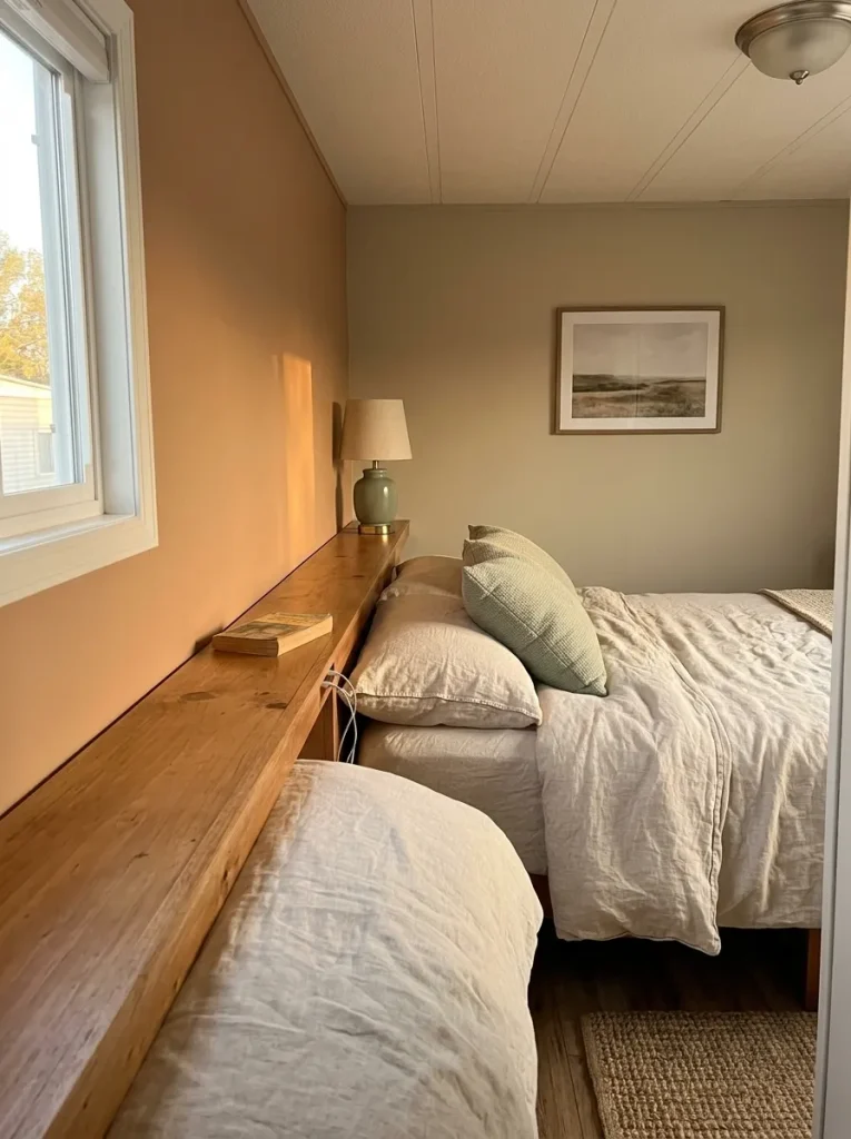
A bed wall often accumulates separate pieces: headboard, two nightstands, lamps, chargers, artwork, and sometimes shelves above everything.
In a narrow bedroom, that collection can make the wall feel busier than the room can comfortably support.
A wall-to-wall headboard ledge takes the opposite approach.
Use one continuous horizontal element to organize the bed, then create small bedside landing zones within it.
The room gains a clear architectural anchor while separate furniture can be reduced or eliminated where circulation is tight.
Start by taping the proposed ledge width and height onto the wall.
Place temporary boxes where bedside surfaces would sit.
Now walk around the bed.
The design works when the sleeping zone feels visually stronger and the walking route becomes easier.
It fails when the ledge projects too far, blocks outlets you need, or forces pillows and bedding into an uncomfortable arrangement.
Keep the top sparsely used. A lamp, book, phone, or small object is enough.
The project should consolidate the bed wall, not relocate nightstand clutter onto a longer shelf.
18. Install One Clean Backsplash Field Behind the Hardest-Working Counter
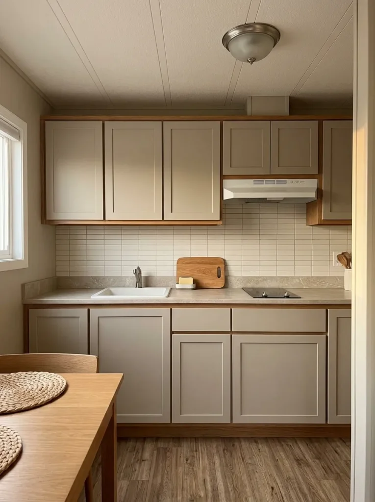
A small backsplash project becomes visually weak when it is treated as a handful of decorative patches.
Look instead for one complete work field.
That could be the stretch behind the main prep counter, the sink wall, or another uninterrupted section that is visible from the adjoining room.
Finishing one logical field usually looks more intentional than scattering material across every small vertical gap in the kitchen.
Before purchasing tile or another backsplash product, place a large sample beside three things at once:
cabinet finish + countertop + wall color
A backsplash can look beautiful on its sample board and still create too much pattern when paired with a strongly figured counter or busy cabinet grain.
Material compatibility, preparation, and installation requirements depend on the chosen product and existing surface, so follow the product manufacturer’s instructions rather than assuming every backsplash system attaches the same way.
Stop the field at an architectural boundary that makes visual sense.
The finish should clarify the work zone, not advertise every available square inch of wall.
19. Build a Narrow Storage Banquette Instead of Filling the Dining Area With More Furniture
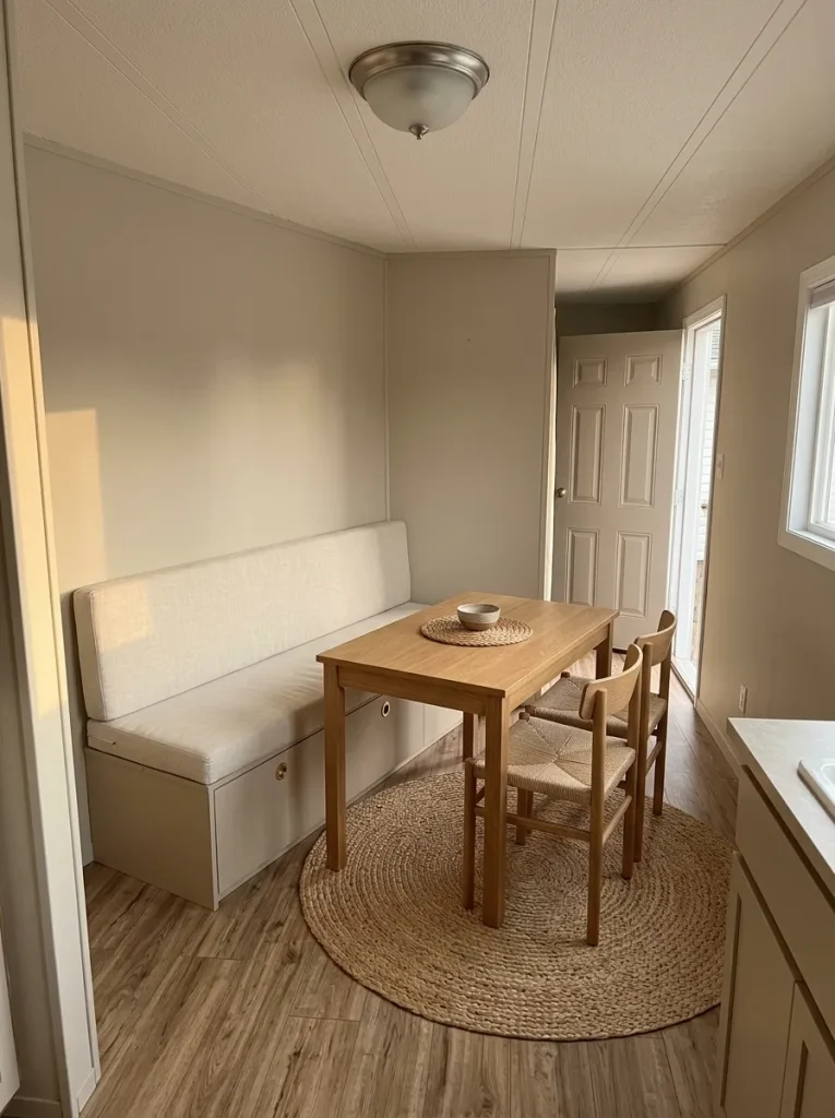
A conventional dining setup asks for space on several sides: table footprint, chair depth, chair pull-out room, and the path behind whoever is seated.
A banquette changes that geometry.
One side of the dining group becomes a fixed edge, which can be useful where a mobile-home dining zone sits against a wall or along the boundary of an open-plan living area.
Furniture Footprint Map
A banquette only saves space when it releases a route somewhere else.
Read the floor, not just the seat count.
SEATING
Three conditions make the build worth considering.
The benefit comes from fixing one seating edge against the wall so another part of the room can stay clearer.
Mock up the proposed bench with boxes or painter’s tape before building.
Move chairs, sit at the table, and walk the adjoining route.
If the banquette simply replaces four flexible chairs with a bulky permanent object, skip it.
If it gives a meaningful strip of floor back to circulation and adds useful storage, the project has earned its footprint.
20. Run One Continuous Flooring Look Through the Main Connected Zone
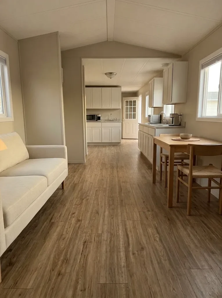
Flooring is one of the few finishes capable of visually connecting several rooms at once.
That also makes it one of the easiest DIY projects to overscope.
Start from the longest interior sightline.
Look from the living room through the dining area and toward the kitchen.
Count how many strong floor transitions interrupt that view.
Some transitions are useful because they respond to different room conditions or already look deliberate.
Others exist simply because separate areas were updated at different times.
The project question is therefore not:
“Should the entire home have one floor?”
It is:
“Would one visually continuous main zone remove meaningful fragmentation without creating a bigger technical problem?”
Floor Continuity Router
Does the connected zone actually need a new continuous floor?
Choose the condition that best describes your existing floor before turning a visual idea into a whole-home replacement project.
A continuous main-zone finish may deliver real visual return.
Map the exact connected area you want to unify. Keep the scope tied to one visual zone before automatically extending into every bedroom and bathroom.
Next move: verify the existing substrate, product suitability, transition details, and manufacturer installation requirements.Do not replace a functional floor merely to eliminate every threshold.
Distinct flooring can work when transitions align with real room boundaries and the materials already form a coherent whole.
Next move: spend the project budget where a visible or functional problem is stronger.Condition outranks continuity.
Movement, moisture, softness, substantial unevenness, or an unknown existing assembly should be understood before a new finish is used to cover the area.
Next move: diagnose first; choose the visible flooring strategy afterward.If the project proceeds, follow the selected flooring manufacturer’s instructions for preparation, approved substrates, installation method, movement allowances, and room suitability.
A continuous look is powerful precisely because it covers such a large plane.
That scale is also why condition should be resolved before the finish goes down.
21. Add Lightweight Faux Beams or a Perimeter Ceiling Detail Without Treating Them as Structure
A ceiling can feel unfinished for the same reason a wall can: it has no deliberate visual rhythm.
That does not mean it needs heavy timber.
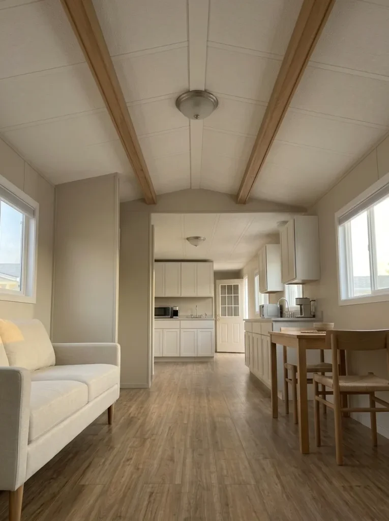
A lightweight decorative beam treatment, narrow perimeter detail, or carefully planned ceiling accent can give the room a directional line that supports the long shape of a mobile home.
The important word is decorative.
Do not assume a ceiling assembly can accept arbitrary loads or attachments.
If you cannot confidently identify the construction and a safe attachment method for the lightweight material you intend to use, stop and get appropriate guidance.
Before buying anything, mock up the idea with painter’s tape.
Look from three positions:
- the front door,
- the center of the living space,
- the adjoining kitchen or dining area.
A good ceiling detail should clarify the long axis or frame one important zone.
It should not make a low ceiling feel chopped into smaller rectangles.
Dark faux beams also carry far more visual weight than their physical dimensions suggest.
In a compact room, one or two deliberate lines may achieve more than a full rustic grid.
Use the ceiling to organize the room, not to prove that you completed a ceiling project.
22. Screen an Existing Covered Porch Without Turning a Cosmetic Idea Into an Unplanned Addition
A screened porch can be one of the most dramatic projects in this entire list because it changes how much of the home feels usable.
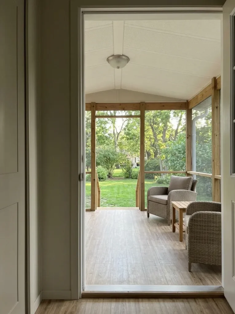
That is exactly why the first decision should be about project category, not screen color.
An existing covered porch that is already appropriate for the intended work is very different from a project that changes structural connections, roofing, foundations, stairs, electrical work, or the manufactured home’s original construction.
HUD guidance treats alterations to manufactured-home installations as work that can involve the authority having jurisdiction and applicable approval or permit requirements, so structural scope should be established before a porch project is treated as straightforward cosmetic DIY. Stylish Galore
Porch DIY Boundary Atlas
Classify the project before you buy screening.
Keep the work in the finish layer.
Improve an already suitable porch without allowing a styling project to expand into construction the original scope never required.
Verify before enclosing.
Existing framing condition, local approvals, attachment details, door operation, weather exposure, and the intended use of the space all deserve review before materials are ordered.
Stop calling it a simple DIY screen project.
Once the work changes structural systems or the manufactured-home installation, determine the applicable requirements and bring in appropriate qualified help where needed.
Once scope is settled, design the enclosure to keep the porch feeling open.
Repeat existing exterior finishes, keep door routes obvious, and avoid filling every screened bay with furniture.
A porch should expand the home’s usable experience—not create a new construction problem beside it.
23. Refinish Existing Porch Decking, Steps, and Rails as One Arrival Zone
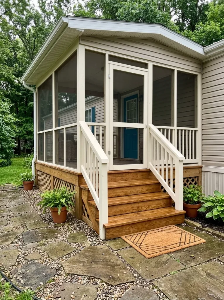
A weathered porch often looks like several separate problems:
old deck boards, tired steps, faded railings, and an unrelated front door.
From farther away, however, they read as one arrival composition.
That makes coordination more powerful than treating each surface independently.
Begin with condition.
Walk the porch. Use the rail. Inspect the steps.
Look for movement, deterioration, loose components, or anything that makes the structure itself questionable.
Cosmetic refinishing belongs only on components that remain sound enough for cosmetic work.
Once that gate is passed, simplify the finish palette.
The decking might stay natural or receive an appropriate exterior finish; the rail can relate to the home’s trim; the front door can provide the strongest contrast.
Keep the number of colors restrained enough that the porch looks attached to the home, not decorated beside it.
One useful check is to stand where a visitor first sees the entrance.
Can you visually follow a clean sequence from:
path → steps → landing → door?
If yes, the arrival zone is working.
If the eye still stops on five unrelated finishes, edit again before adding planters or signs.
24. Repaint Compatible Exterior Siding and Trim as One Broad Field
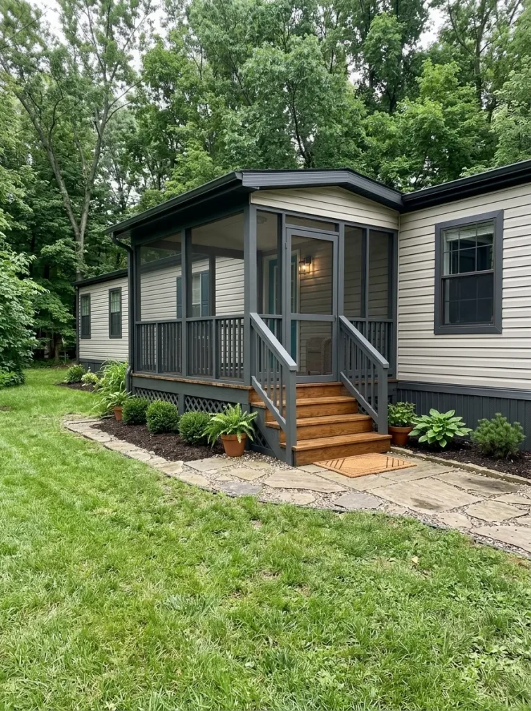
Few DIY mobile home projects have the potential to change as much of the exterior photograph as the siding field.
That scale demands restraint.
Before selecting a color, determine whether the existing exterior material is sound and whether the coating system you are considering is appropriate for that specific surface.
Follow the coating manufacturer’s preparation and compatibility instructions.
Then take a photograph from far enough away to see the whole long side of the home.
Ignore decorative details.
What is the largest uninterrupted field?
Usually, that is where exterior color earns its impact.
A quieter siding tone paired with controlled trim can make windows, the entry, shutters, porch components, and the roofline read more clearly.
Strong contrast everywhere can have the opposite effect by outlining every small edge.
Test large color samples where they can be viewed in actual outdoor light.
Do not choose based only on a tiny swatch indoors.
And do not paint over evidence of moisture, deterioration, failed joints, or another condition that deserves repair first.
The exterior field should become coherent before the accessories become interesting.
25. Build Lightweight Shutters or Window Boxes to Create an Exterior Rhythm
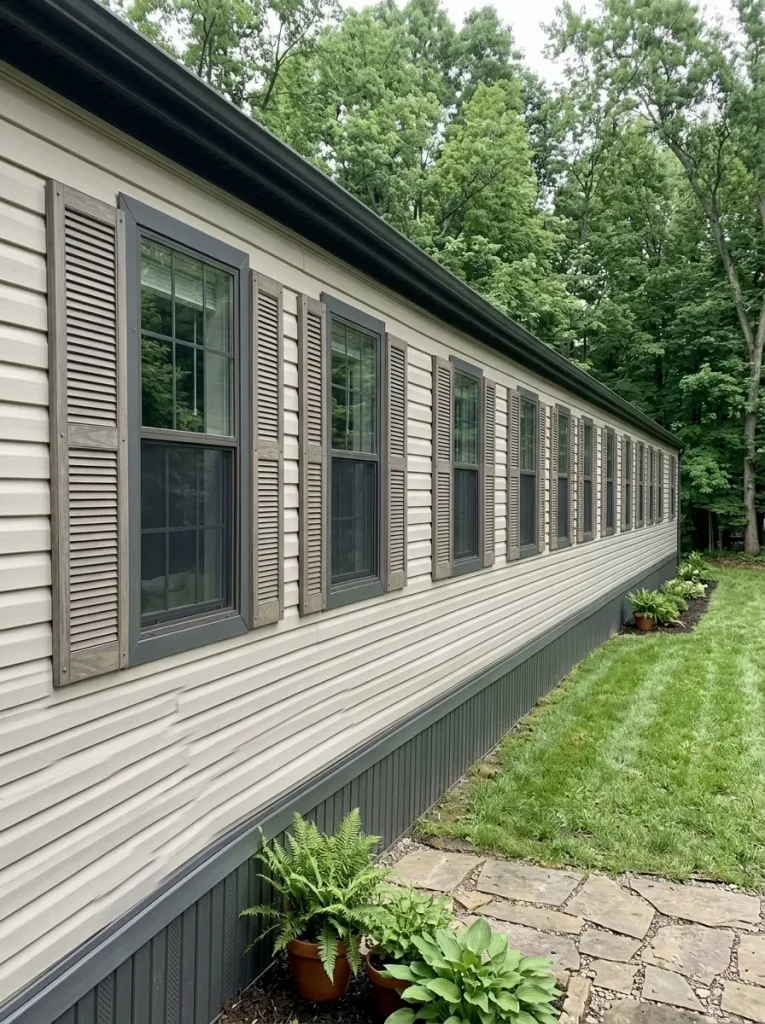
Shutters and window boxes are small compared with the siding around them.
Their power comes from repetition.
If several windows appear scattered across a long mobile-home facade, repeating one appropriately scaled detail can help them read as a deliberate sequence.
But decorative shutters are easy to oversize, undersize, or place where they make no visual sense.
Start with cardboard or paper templates.
Tape them beside the window and step far back.
A useful shutter proportion should look connected to the opening, not like narrow strips added merely because farmhouse exteriors often have them.
Window boxes require the same discipline.
They should relate to the width of the window and should not create attachment, drainage, maintenance, or access problems.
If the facade already has strong porch posts, contrasting trim, bold windows, and visible skirting, you may not need another repeated feature.
Use either shutters or window boxes as the rhythm maker when both would become too busy.
Photo rule: the windows should become easier to read as a family; the decoration should not become the first thing you see.
26. Refresh the Skirting and Build a Neat Service-Access Panel
Skirting sits low on the facade, yet it influences the entire exterior because it visually determines where the house meets the ground.
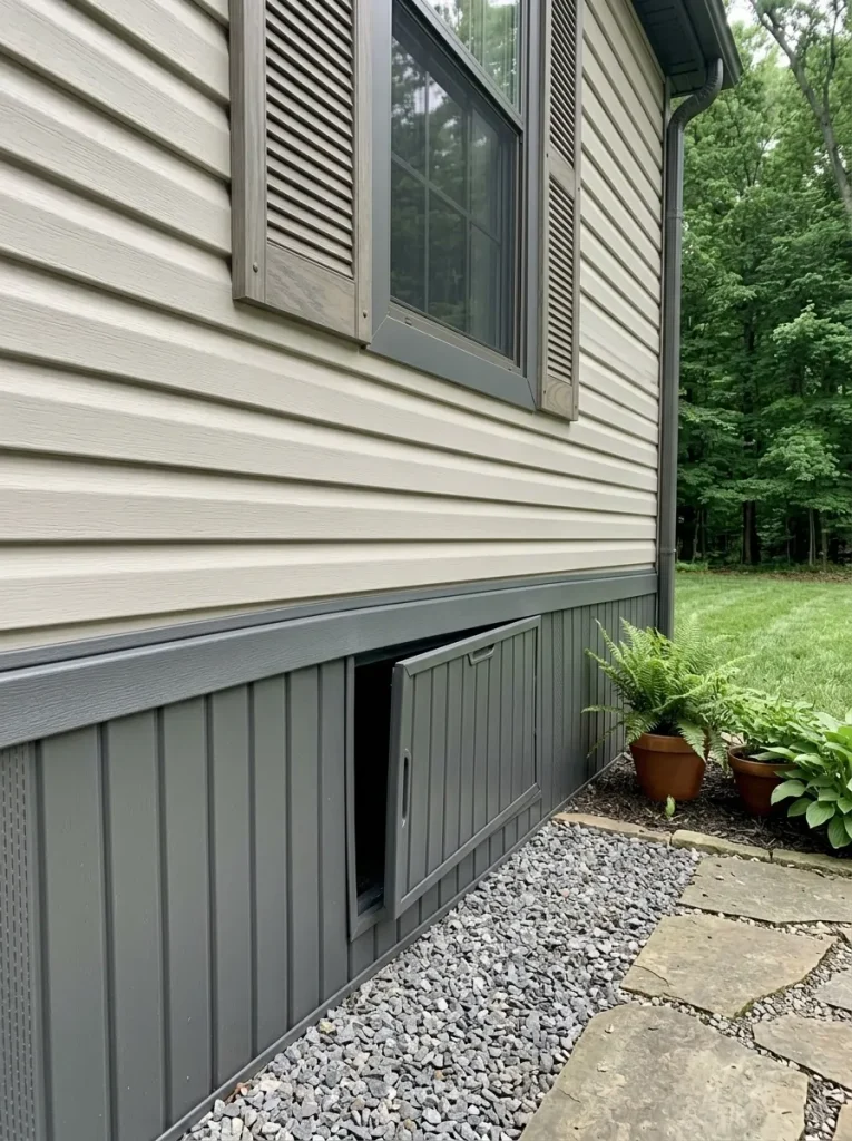
A faded, broken-looking, uneven, or cluttered base line can make new siding, shutters, and a freshly painted door feel less finished.
The safest starting point is to separate appearance from function.
Manufactured-home enclosure and skirting guidance can involve ventilation, access, weather protection, and service considerations, so a cosmetic refresh should preserve the functions the enclosure is required to perform. Stylish Galore
Base + Service Map
Make the bottom edge cleaner without making the underside harder to access.
PANEL
The cosmetic project is the visible base line. The functional project is preserving everything the enclosure still needs to do.
Once those functional requirements are protected, visual improvement can stay simple: straighten the visible line, repair appropriate cosmetic defects, use a compatible finish, tidy the ground edge, and make the access panel look deliberate.
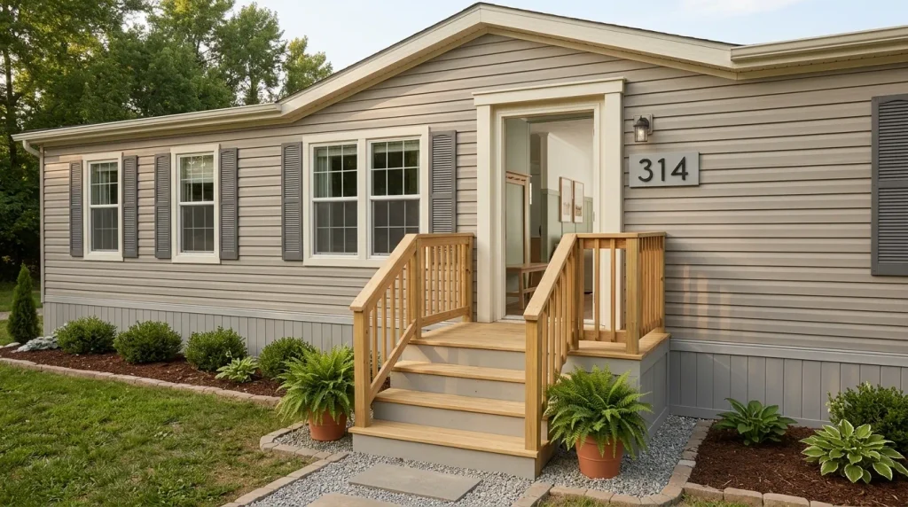
27. Build a Simple Front-Door Surround and House-Number Panel to Give the Facade a Focal Point
The last project is deliberately smaller than a porch rebuild.
A flat mobile-home facade often needs a clearer arrival point, not necessarily more construction.
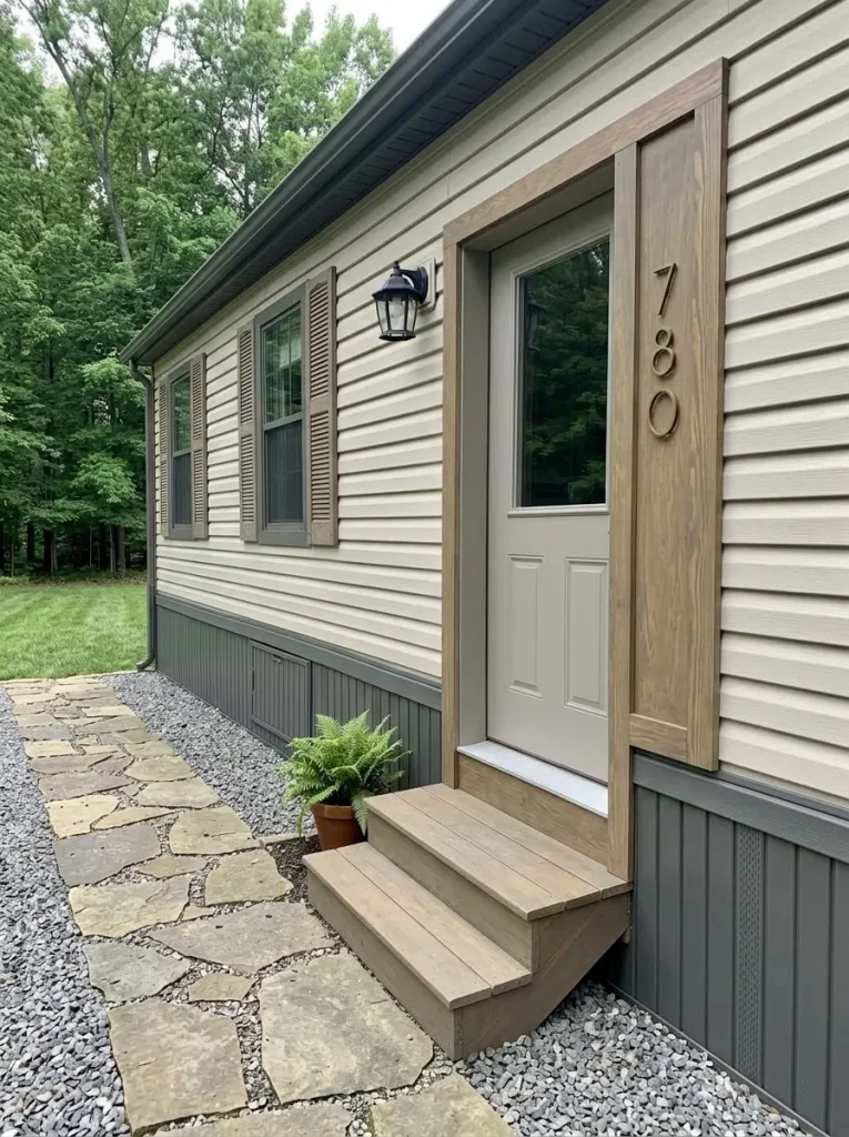
Look at the exterior from the road or driveway and cover everything except the door with your hands or a phone crop.
Does the entrance feel like the visual destination of the facade?
If not, a simple surround can help.
A restrained trim build-up around the existing door, one vertical house-number panel, a focused light location where appropriate, and a small material change near the entry can create hierarchy without decorating the whole wall.
Keep the surround proportional to the door.
Oversized rustic beams or deep projections can look attached to the facade instead of integrated with it.
Repeat something already present elsewhere—wood from shutters, trim color from the windows, black from existing hardware, or another established exterior finish.
Then stop.
The strongest entry usually contains fewer signals than a weak one.
Door + surround + number + clear approach can be enough.
Once the eye knows where to arrive, landscaping and smaller curb-appeal details become supporting actors instead of competing focal points.
Choose the DIY Projects That Change the Most, Then Let the Home Rest
The most effective DIY mobile home projects are rarely the ones that add the greatest number of new things. They improve a relationship the home uses every day: a clearer entry, more useful storage, an easier kitchen route, a stronger focal wall, a calmer floor plane, or an exterior that finally reads as one composition.
For your first round, choose one functional project, one high-reach visual project, and no more than one disruptive project. Finish those completely before opening another part of the house.
That sequence gives you something Pinterest before-and-afters sometimes hide: a stopping point.
A mobile home that already feels useful, coherent, and cared for does not need another project simply because another surface could technically be changed.
Save these DIY mobile home projects to Pinterest so you can come back when you’re ready to choose your next high-impact project.