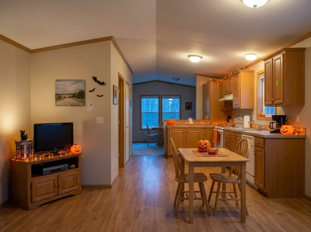
An outdated mobile home makeover can become expensive fast when every old-looking feature gets treated as a replacement problem. Wood is painted, cabinets are removed, flooring is covered, fixtures are swapped—and the finished room may still feel dated because the feature carrying the strongest visual age signal was never identified.
A more useful before-and-after makeover starts with a different question: what does your eye notice first? In an older mobile home, the answer may be broken wall continuity, several floor transitions along one sightline, heavy window layers, dark perimeter trim, a visually crowded kitchen, or furnishings that make a compact room feel tighter than it is.
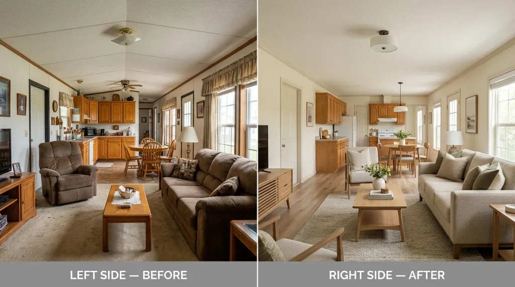
The 21 transformations below treat the home as one connected interior. Each section identifies a recognizable before condition, the change worth testing, and the after effect that proves whether the project worked.
The aim is not to erase every original feature. It is to discover which ones actually need changing.
1. Separate the Dated Look Into Three Layers Before You Remodel Anything
Walk into the room and temporarily stop thinking about paint colors, countertops, hardware, and furniture.
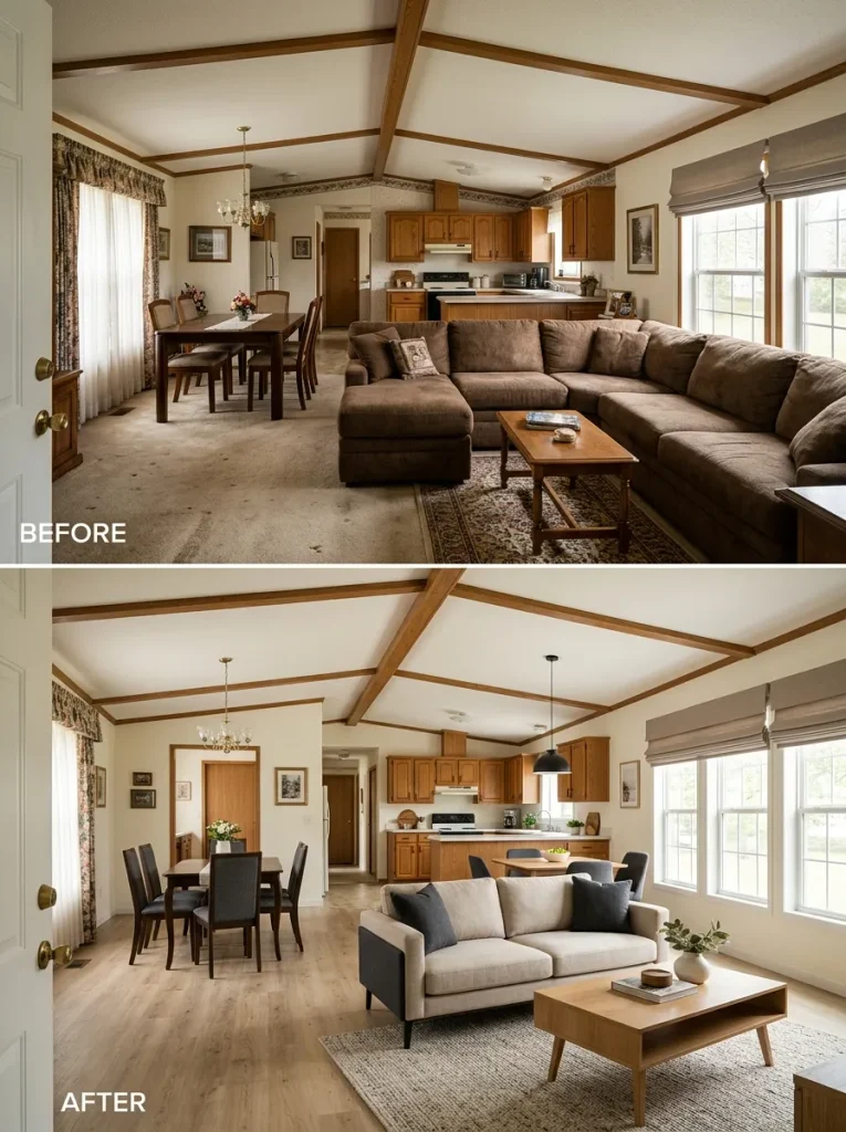
Most visually dated interiors can be separated into three layers:
- Shell: walls, floors, ceiling, openings
- Fixed features: cabinets, trim, built-ins, doors
- Movable layer: furniture, curtains, rugs, accessories
That distinction prevents expensive misdiagnosis.
A new sofa cannot correct a ceiling and wall system dominating every photograph. New flooring may accomplish surprisingly little in a room where oversized furniture, dense curtains, and dozens of accessories cover most of the architecture.
Take one wide photograph from the main entrance. Imagine the movable layer gone.
Does the empty room still look strongly dated?
That first answer should influence where the makeover begins.
Outdated Interior Layer Scanner
Before → After Diagnostic
Which layer is making the room look older than it is?
Choose the condition that still looks dated after mentally removing everything else.
Sometimes the first successful “after” is discovering that most of the room never needed renovation.
2. Turn Patchwork Walls Back Into One Continuous Background
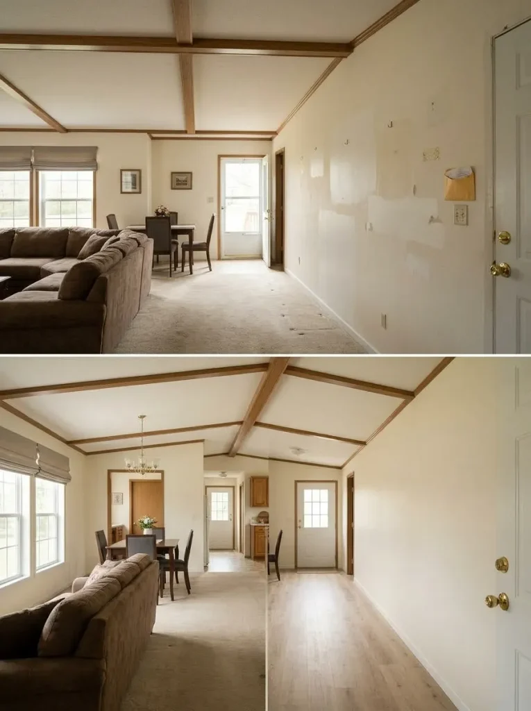
An older mobile-home wall can accumulate visual interruptions over time: repaired areas, differently painted panels, visible fasteners, abandoned hooks, small patches, adhesive residue, and mismatched touch-ups.
Individually, none seems important. From across a narrow room, they can make the entire wall feel unfinished.
Photograph the longest uninterrupted wall from the opposite side of the room. Do not judge the color yet. Judge the continuity.
A useful makeover order is:
- identify repairs or damage that need proper attention;
- remove unnecessary surface clutter;
- resolve obvious patch and finish differences;
- only then decide whether the wall color itself needs changing.
Before: the eye hops from mark to patch to seam.
After: the wall behaves as one background plane.
That visual continuity matters in a mobile home because long walls are frequently visible from several adjoining zones. A smoother background can modernize the living room, dining area, and hallway simultaneously without introducing another decorative layer.
3. Break the Orange-on-Orange Chain Without Painting Every Wood Surface
Wood often looks most dated when several warm finishes with similar intensity sit directly beside one another.
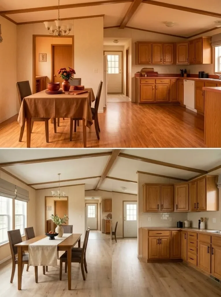
Imagine medium-brown paneling, honey-toned cabinetry, orange flooring, a reddish dining set, and dark brown upholstery in one connected space. The issue is not automatically the presence of wood. It is the uninterrupted chain of related warm tones.
Pick one wood feature worth protecting. Then create visual separation around it.
A retained cabinet finish may become much more attractive beside a quieter wall and a floor with less orange undertone. Original paneling may feel intentional once brown curtains and similarly colored furniture stop repeating it.
Use a wide photograph to make the decision. Cover or digitally mute one neighboring warm surface at a time.
If the retained wood becomes more attractive as competing warm finishes disappear, preservation has earned serious consideration.
A successful after can contain original wood and still look current. The transformation comes from hierarchy: one warm material becomes character; five competing warm materials become visual noise.
4. Make Floor Transitions Disappear Along the Home’s Long Sightline
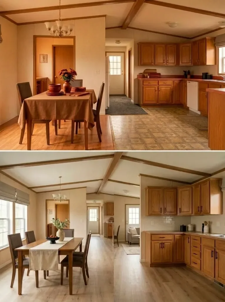
Several different floors can make a relatively small interior feel chopped into separate compartments.
The strongest evidence is usually visible from one end of the home. Stand where the living area, dining zone, kitchen, or hallway overlap in the same view.
Now look specifically at the transition points.
A sharp change from dark carpet to patterned vinyl to another wood-look finish can pull attention downward every few feet. The improvement does not always require one material throughout. Closely related tone, visual weight, and transition detailing can make separate floors belong to the same interior.
Try this decision rule:
- keep two floors when they cooperate from a distance;
- prioritize the transition when the junction is the distracting part;
- consider broader replacement only when one large field dominates the whole view negatively.
Older flooring or adhesives should not be scraped, sanded, or disturbed based on appearance alone. EPA states that asbestos cannot reliably be identified visually and recommends professional sampling of suspect material when renovation will disturb it. US EPA
5. Quiet the Ceiling Plane Before Adding More Modern Decor Below It
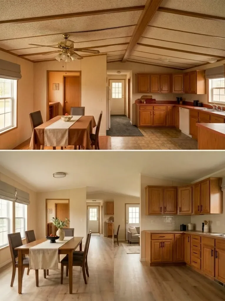
Ceilings occupy enormous visual acreage while receiving very little attention in many makeovers.
Texture, narrow strips, stains, patching, a dated fixture, or a combination of these can keep the entire interior feeling older even after the walls and furniture change.
Look forward first. Then deliberately tilt the camera upward.
A dramatic difference between those two photographs tells you that the ceiling deserves its own diagnosis.
Ceiling Age-Signal Strip
Read the ceiling in four passes
Separate visual age from conditions that deserve investigation before cosmetic work.
For a sound but visually busy surface, test whether calming it materially changes the room.
Repeated contrasting lines may make a low ceiling more visually prominent than necessary.
An isolated fixture may be carrying more of the old look than the ceiling surface.
Pause cosmetic work and identify the cause and material before disturbing or covering the area.
Unknown older ceiling material deserves the same caution as flooring: appearance alone cannot confirm whether asbestos is present. US EPA
6. Reduce the Number of Borders Your Eye Has to Cross
Dark trim around the ceiling. Another line around each door. Contrasting window casings. Baseboard in a third finish. A framed pass-through. Decorative edging around panel joints.
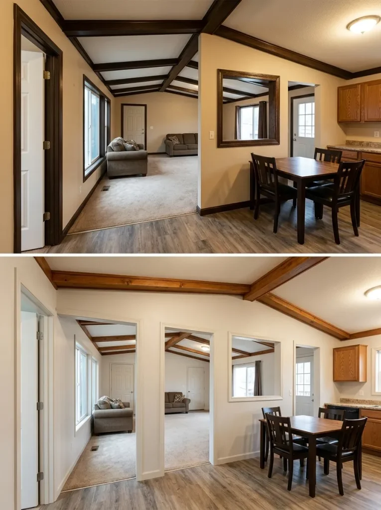
None is especially dominant alone.
Together they can turn a compact interior into a collection of outlined rectangles.
Use the widest interior photograph and count how many strong perimeter lines are visible before looking at furniture.
Then test one edge family at a time.
A door casing that blends more closely with its wall may visually disappear while a beautiful wood window frame remains deliberately prominent. The objective is not universal matching; it is establishing which edges deserve emphasis.
Keep contrast where it explains architecture.
Reduce contrast where it merely repeats.
The after image should contain fewer visual stopping points along the perimeter of the room.
Once that happens, wall width, ceiling height, and connected spaces often become easier to read—even though no wall has physically moved.
7. Make Closet Doors Disappear Into the Bedroom Architecture
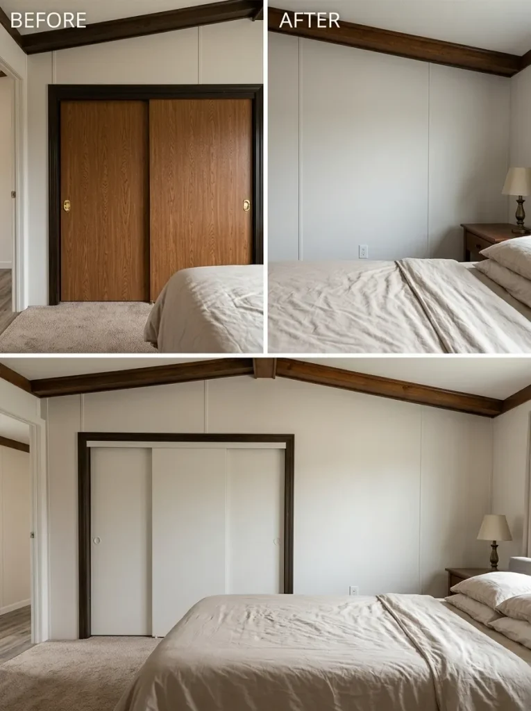
Large closet doors can occupy almost as much wall area as the bed.
That makes them more influential than their utilitarian role suggests.
Before replacing bedroom furniture, photograph the room from the foot of the bed and look only at the closet wall. Brown sliding panels, busy louvered doors, heavily contrasting trim, or mismatched handles can function like a giant accent wall nobody intentionally designed.
There are three useful outcomes:
Keep: the doors are visually quiet and work properly.
Integrate: the doors function well but need to relate more closely to the surrounding wall, trim, or hardware.
Replace: condition, operation, or proportion—not age alone—provides the stronger reason.
The after should make the closet easier to ignore when the room is viewed as a whole.
That gives bedding, artwork, or the headboard an opportunity to become the intentional focal point without introducing another competing piece of furniture.
8. Remove Window Layers Until Every Remaining Layer Has a Job
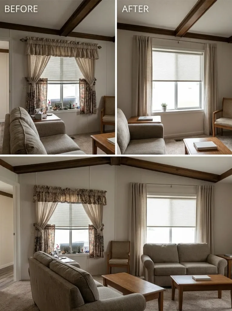
Older rooms frequently collect window treatments rather than deliberately designing them.
A single opening may have a blind, sheer, curtain panel, valance, tieback, decorative rod, and furniture partly covering the sill.
Run a subtraction test.
Remove everything except the layer currently providing necessary privacy or light control. Take another photograph.
Then rebuild only what the room still needs:
- privacy;
- darkness;
- glare control;
- softness;
- visual height.
One component may perform more than one job.
A small mobile-home living room may look noticeably taller when a short valance disappears. A bedroom may still justify room-darkening panels. A street-facing room may need privacy during daylight.
The makeover succeeds when the eye sees the window opening and daylight before the treatment surrounding it.
At that point, another decorative layer is likely to increase visual density more than design value.
9. Open a Blocked Sightline Only After You Know What the Divider Is Doing
One of the most dramatic mobile-home before-and-after effects can come from visually simplifying an awkward divider, pass-through, hanging cabinet, or partial wall.
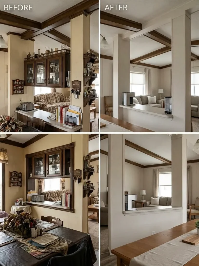
The danger is assuming every obstruction is decorative.
Stand at the longest useful viewing point and identify exactly what blocks the view. Empty shelving and decorative objects first. Reduce finish contrast next. Only then evaluate the physical structure.
Divider Decision Map
What kind of obstruction is actually blocking the room?
HUD notes that significant structural alterations to a manufactured home may require local permits and can affect HUD Code compliance, so an uncertain divider belongs in the verify-first category. HUD
For a larger double-wide transformation, StylishGalore already has a specialist guide devoted to that scope. 17 Double Wide Makeover Ideas That Completely Change the Interior
10. Let Cabinet Condition Choose the Depth of the Kitchen Makeover
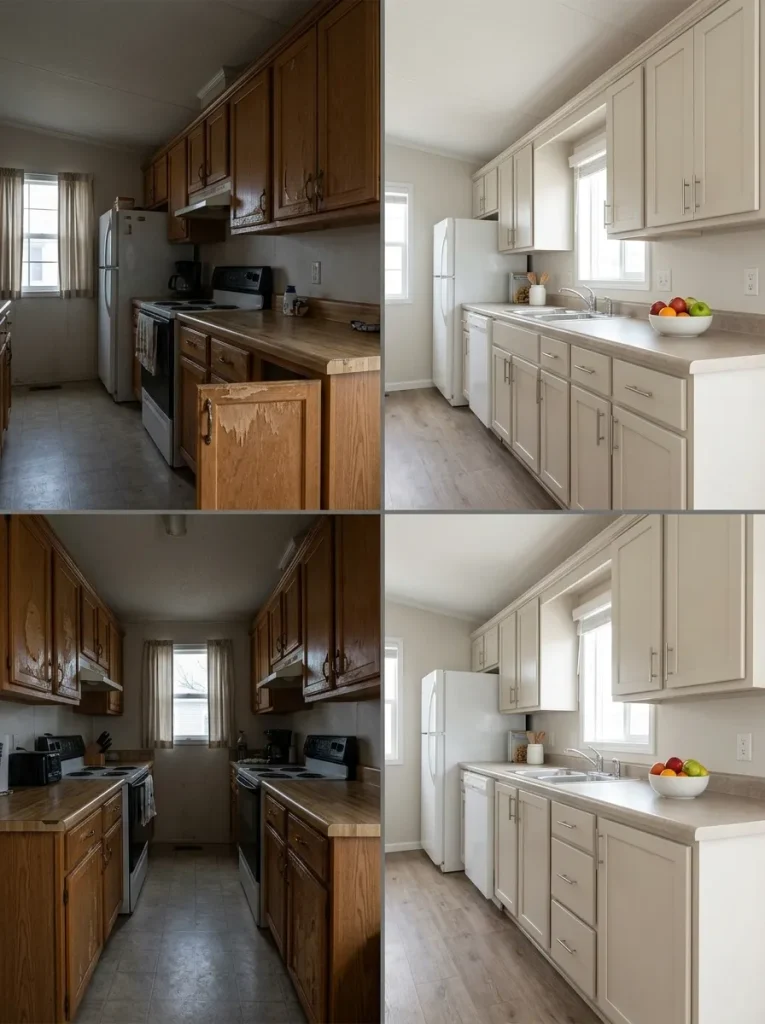
A peeling cabinet door and a failed cabinet box are not the same problem.
Before choosing paint or replacement cabinetry, open every door and drawer and sort what you have into three conditions:
| Cabinet condition | Better first decision |
|---|---|
| Sound box + sound surface | Cosmetic update may be enough |
| Sound box + failing visible finish | Resolve surface/preparation problem first |
| Damaged or unstable cabinet | Address condition before styling |
This prevents a common before-and-after illusion: a beautiful new finish applied to a surface that was already failing underneath.
The after photo should prove that the appropriate intervention depth was chosen. Sound cabinetry can remain part of an updated home; serious condition problems should not be hidden behind a decorative treatment.
The full preparation, surface-identification, paint, hardware, and keep-the-boxes process already belongs to StylishGalore’s cabinet specialist. 15 Mobile Home Kitchen Cabinet Makeover Ideas Without Replacing Them
That keeps this article focused on the decision the before photo needs to answer: cosmetic refresh, surface repair, or deeper cabinet problem?
11. Give the Kitchen One Visual Leader
An older kitchen often contains several finishes competing with equal intensity.
Cabinet grain. Patterned counter. Multicolor backsplash. Wood-look flooring. Decorative curtains. Contrasting appliances. Several metals.
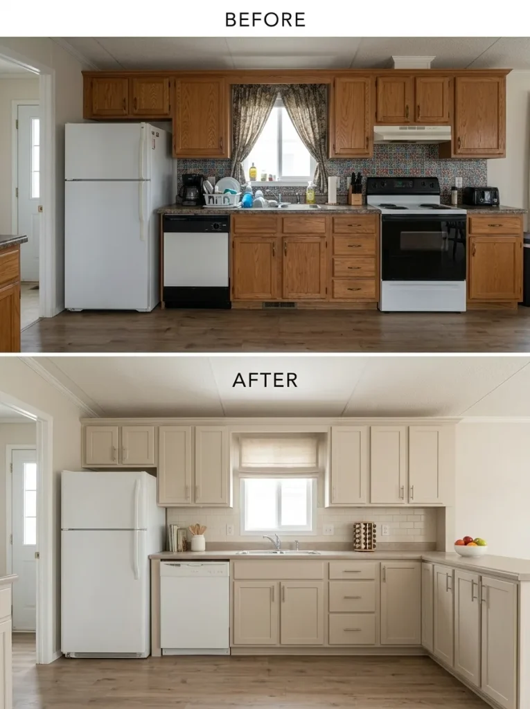
Updating one item without deciding which finish should lead can make the remaining conflicts more obvious.
Take a straight-on picture of the longest cabinet run.
Then assign three roles:
Leader — the surface allowed the most visual character
Support — a quieter material that relates to the leader
Background — the surface meant to visually recede
A beautiful original cabinet finish can lead while counter and backsplash quiet down. A restrained cabinet makeover can place more attention on an existing counter. Either route can work.
The before looks like several separate selections.
The after reads like one composition.
For readers moving beyond visual hierarchy into a full low-cost kitchen project, StylishGalore’s budget kitchen specialist covers that territory in depth. 17 Mobile Home Kitchen Makeover Ideas on a Budget
12. Update the Small Repeaters You See Across Several Rooms
Some features are tiny but appear everywhere: switch plates, outlet covers, vent registers, knobs, pulls, small hooks, door stops, and exposed hardware.
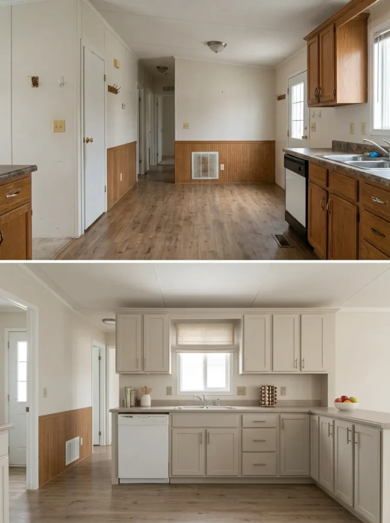
Their importance comes from frequency.
A single yellowed switch plate is trivial. A dozen spread through the living room, kitchen, hallway, and bedrooms can quietly reinforce the old appearance of the entire interior.
Small-Repeater Priority Ladder
How much pressure are repeated small details putting on the interior?
Whole-home checkThere is little reason to manufacture a whole-home project around one inconspicuous mismatch.
Standardize the most visible repeated family while letting inconspicuous functional pieces remain quiet.
Work through the home systematically, then reassess before replacing larger permanent features.
Small repeaters are especially useful late in a makeover. Once the large surfaces are calmer, they become easier to judge—and less likely to trigger unnecessary shopping.
13. Turn the Long Hallway From a Tunnel Into a Transition
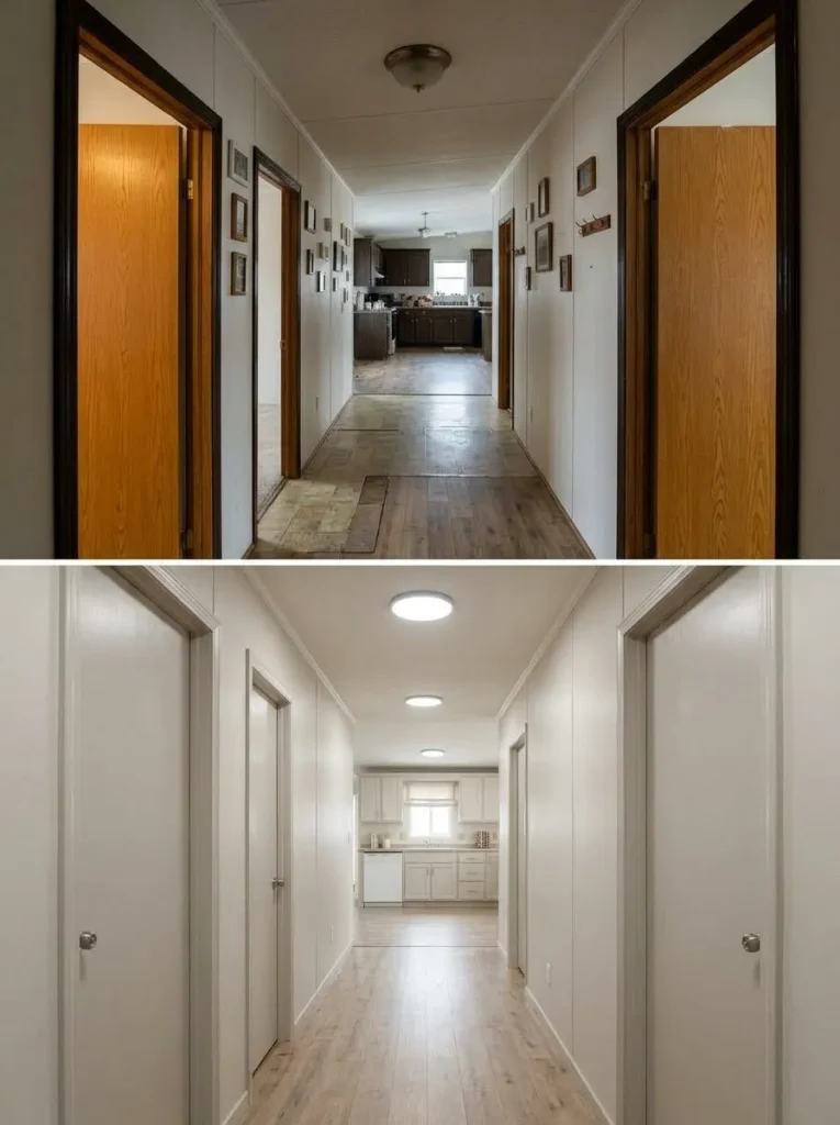
The hallway in a mobile home can occupy little floor area while influencing many rooms.
A narrow corridor lined with dark doors, high-contrast trim, scattered frames, weak light, and several floor transitions can read like a tunnel connecting otherwise updated spaces.
Treat it as a transition zone, not leftover square footage.
Stand at one end and identify what repeatedly narrows the view:
- dark door rectangles;
- wall clutter;
- inconsistent flooring;
- poor light distribution;
- objects intruding into circulation.
The best after usually simplifies the corridor rather than decorating it more aggressively.
A quiet wall treatment, visually related door finishes, clear floor path, and one purposeful visual endpoint can make the hall feel longer and less confined.
Use artwork only when it survives the long-distance view. Several tiny frames may create more fragmentation than personality.
The transformation is successful when the hall starts directing attention toward the next room instead of becoming a visual event of its own.
14. Rebuild the Vanity Wall as One Vertical Composition
Bathroom updates frequently happen one purchase at a time.
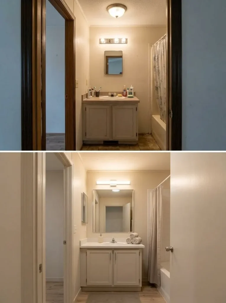
The vanity changes first. Then a mirror. Later, a new light. Accessories accumulate on the counter.
Each item can be attractive and the wall can still feel unresolved.
Judge the entire arrangement from the doorway.
Vanity–Mirror–Light Composition Map
Read the vanity wall as one vertical composition
The strongest after balances four pieces without letting one feel accidental.
proportionally connected to the vanity below
The makeover decision comes from proportion before style.
For broader flooring, wet-zone, storage, plumbing, and budget decisions, use StylishGalore’s dedicated bathroom-remodel specialist. 17 Mobile Home Bathroom Remodel Ideas on a Budget
15. Make the Laundry or Utility Corner Look Intentional From the Next Room
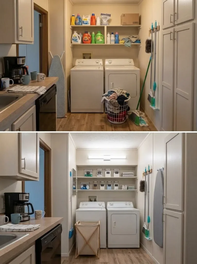
A utility area often becomes part of the living interior simply because there is no long visual buffer around it.
A washer, dryer, water-heater enclosure, shelves, detergent bottles, utility hooks, hampers, and cleaning products may all be visible from a kitchen, hall, or back entry.
The improvement begins by evaluating the view into the zone, not the utility room in isolation.
Stand in the adjoining room.
What is the first utility object visible?
That object sets the priority.
Closed storage can be useful when small products dominate. Consistent containers may work where shelves must remain open. A curtain or door can help in some layouts, but screening circulation or reducing access to equipment is a poor trade.
A stronger after makes the service function understandable while reducing incidental clutter.
The utility zone does not need to imitate a styled laundry advertisement. It needs to stop making an otherwise cohesive main room feel unfinished.
16. Remove the Feature-Wall Fragment That No Longer Belongs to Anything
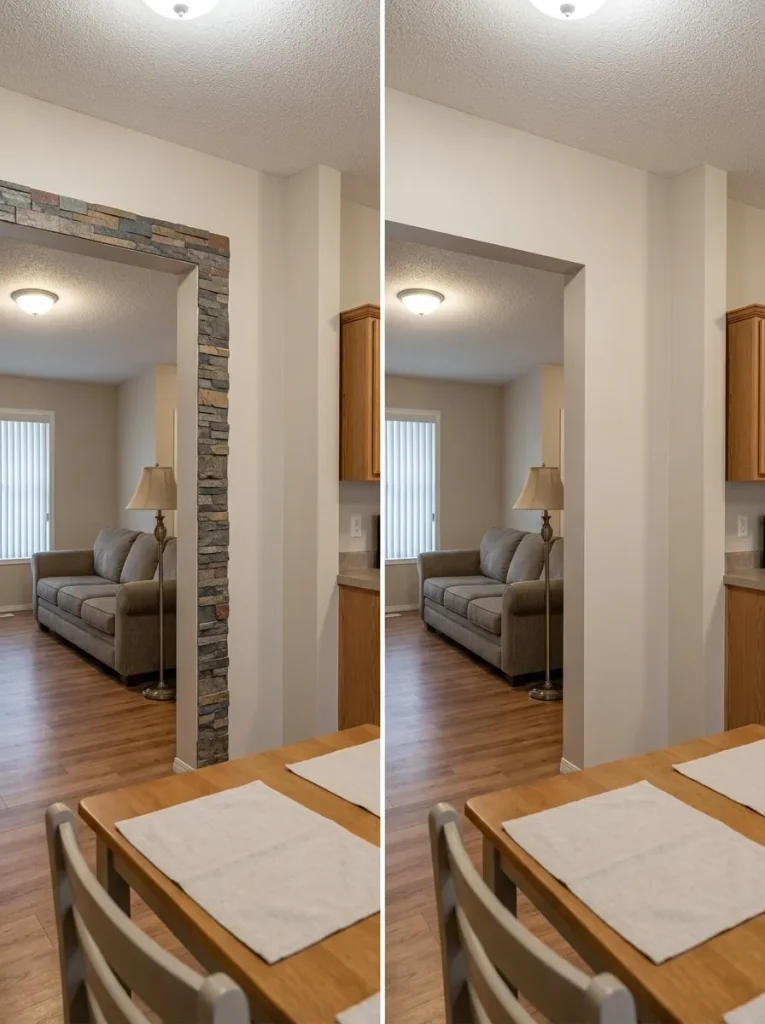
Older remodels often leave behind a single fragment from a past design phase: faux brick around one doorway, a strip of stone veneer beneath a counter, rustic boards on half a wall, an isolated Tuscan tile section, or wallpaper covering only a small leftover plane.
The material may not be unattractive.
Its lack of relationship is the problem.
Ask three questions:
Does this material appear anywhere else?
Does it reinforce an actual architectural feature?
Would the room lose something meaningful if the fragment became quieter?
A “no, no, no” response is useful evidence.
The before photo reads like several remodel eras layered on top of each other.
The after should make the fragment either disappear into the surrounding field or become intentionally connected to another meaningful material.
Do not automatically add more of the old material to justify it. Sometimes the cleanest move is reducing a historical design decision that no longer contributes enough to earn visual space.
17. Give the Bedroom One Anchor Instead of a Matching Set
A matching bedroom suite can dominate a compact room simply because bed, dresser, mirror, nightstand, and tall chest repeat the same heavy finish.
The issue may not be that any individual piece is unattractive. The repeated mass leaves little contrast between primary furniture and supporting furniture.
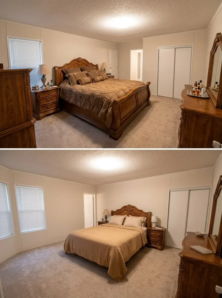
Choose an anchor.
Usually that will be the bed, but an attractive dresser or architectural window wall may deserve the role.
Then let the other pieces become quieter.
This might mean removing one redundant case good, simplifying what sits on the dresser, changing the visual weight of bedding, or separating matching pieces so every wall is not carrying the same furniture language.
Use the doorway photo to judge the change.
Before: several large furniture pieces compete equally.
After: one element establishes the room, while the remainder supports storage and routine.
The room can feel newer without replacing an entire matching set simply because matching sets are no longer the dominant styling preference.
18. Reduce Furniture Pressure Before Buying Smaller Furniture
Furniture can feel outdated because of its style.
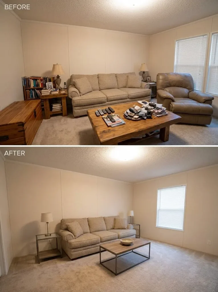
It can also feel outdated because there is too much visual mass in too little room.
Remove one secondary piece temporarily—a recliner, end table, extra storage cabinet, or accent chair.
Then compare the space from the main doorway and the primary seated position.
Judge:
- walking clearance;
- visible floor;
- space around sofa arms;
- distance between furniture groups;
- whether windows remain visually open.
A bulky sofa that suddenly looks perfectly acceptable after two surrounding pieces disappear was probably not the first replacement priority.
A sofa that still blocks circulation or visually consumes the room after editing has a stronger case for replacement.
That distinction matters financially.
A new compact sofa placed inside the same overloaded furniture plan creates a fresher purchase, but it does not solve the room’s spatial pressure.
19. Unify Mixed Wood, Gray, Black, and White Without Painting Everything
Older mobile homes often reveal their renovation history through material layers.
Original wood cabinetry remains. Gray flooring was added later. Black fixtures arrived during another project. White trim belongs to a separate update. A new warm-wood table joins the room afterward.
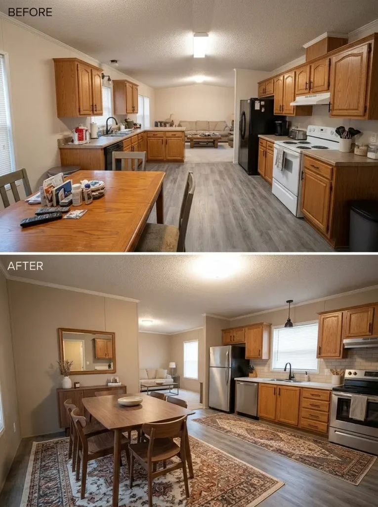
None of these materials is automatically incompatible.
The confusion appears when none has a clear role.
Photograph two connected zones together and find the finishes already repeating.
Then build the palette around existing repetition:
- one dominant background family;
- one recurring secondary material;
- one restrained accent.
Original warm wood can remain when another warm element quietly repeats it. Black may work as a small connector across hardware and lighting without becoming a command to purchase black furniture. Gray flooring becomes less isolated when textiles bridge it toward warmer surfaces.
The after should look intentionally mixed, not chronologically accumulated.
Preserving sound existing finishes also prevents a makeover from becoming a cycle in which every unchanged element suddenly appears to require painting.
20. Style the After With Fewer, Larger Finishing Moves
A successful renovation can become visually dated again before the paint has even dried.
It happens during styling.
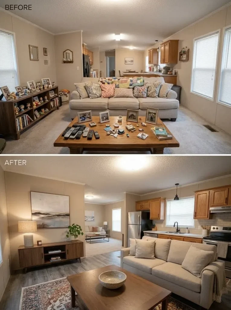
Every open shelf receives small décor. Every counter corner receives an object. Blank walls are filled. Pillows multiply. Trays hold collections of smaller pieces.
Take the first after photograph before heavily decorating the space.
Identify what already deserves attention: perhaps the window, a retained wood feature, artwork, the kitchen, a textured rug, or one strong piece of furniture.
Then use finishing pieces large enough to relate to the room.
One properly scaled lamp may outperform several tabletop accessories. One confident artwork can be calmer than a scattered collection. A generous plant may provide enough life without requiring small greenery on every surface.
A useful stop signal appears when removing another accessory no longer improves the photograph.
Readers finishing the project on a limited budget can continue into StylishGalore’s broader under-$500 makeover guide rather than reopening major renovation scope. 19 Mobile Home Makeover Ideas Under $500
21. Retake the Original Photo and Let the Remaining Age Cue Choose the Next Project
The strongest before-and-after comparison is not the most flattering photograph.
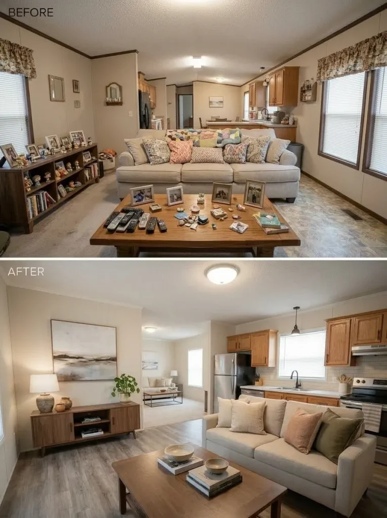
It is the photograph taken from approximately the same location, height, direction, and field of view.
That removes one of the easiest ways to fool yourself with a makeover: comparing an unstyled wide-angle before with a tightly cropped, beautifully lit after.
Same-Angle Before/After Evaluator
This comparison converts a pretty after photo into a decision tool.
The original problem has disappeared? Pause.
A different feature now dominates? Re-prioritize.
The same problem remains? Diagnose again before spending more.
That single habit can keep an outdated mobile home makeover from turning into an endless sequence of unrelated upgrades.
Conclusion
An older mobile home does not become current because every trace of its original interior disappears. It becomes more resolved when the feature carrying the strongest visual age is identified, corrected, and judged against the whole connected space.
Use matching before-and-after photographs as evidence. Preserve cabinets, wood, fixtures, or furniture that begin to work once the surrounding visual noise is removed. Allow the next project to emerge only after the previous change has proved what it accomplished.
That approach gives you a home that feels intentionally updated without automatically converting every dated detail into demolition, replacement, and expense.
Save this article on Pinterest so you can return to these 21 before-and-after checks while planning your own mobile home makeover.