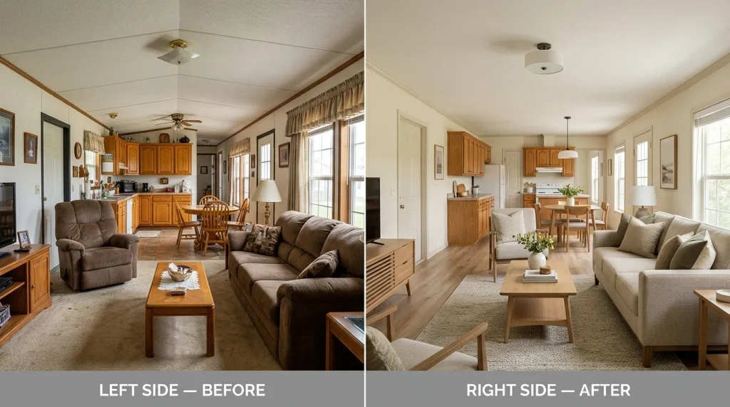
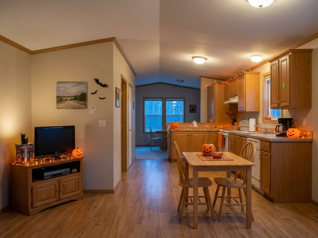
Updating a dated mobile home can become unnecessarily expensive when old and bad are treated as the same thing.
Wall battens can reveal the home’s age without hurting the room. Dark trim may feel heavy in one setting and beautifully architectural in another. Even mirrored closet doors, plain slab doors, wood paneling, soffits, built-ins, patterned flooring, and original siding can contribute something useful when the surrounding design gives them the right role.

The smarter way to update a dated mobile home is to separate condition from appearance. First ask whether the feature still performs properly. Then decide whether its shape, material, repetition, privacy, storage, reflection, or architectural rhythm gives you something worth preserving.
If you need to diagnose the entire interior first, StylishGalore’s broader outdated-mobile-home guide covers the shell, fixed features, and movable layer. 21 Outdated Mobile Home Interior Ideas Before and After
Here, the question is narrower:
Can the dated feature itself become part of the finished design?
Use this first.
What kind of “old” are you looking at?
Choose the description closest to the feature in front of you. Condition comes before styling: a feature only earns preservation when it still performs its job safely and reliably.
Let the feature remain recognizable. Improve the surrounding room so its age reads as character rather than neglect. Handsome wood, beams, repeated trim, glass, and built-ins are strong candidates.
Keep the feature but lower its visual volume. Unify its color, simplify neighboring finishes, or repeat one part elsewhere so it belongs to a larger composition.
Change the context before changing the object. A divider, small window, soffit, or trim line may become useful once nearby edges, colors, and focal points are reorganized.
Preserve the physical feature while changing its job. Built-ins, hutches, bars, pass-throughs, and niches can become relevant again when they support current routines.
Do not spend styling money disguising instability, moisture damage, unsafe materials, failing hardware, or a building-system problem. Diagnose the condition first.
Asset rule: preserve usefulness, character, or rhythm—not deterioration simply because it is original.
1. Let Wall Battens Become a Deliberate Vertical Grid
Visible battens between wall panels are one of the quickest clues that an interior belongs to an older manufactured or mobile home. They also provide something designers frequently add on purpose: repetition.
Stand at the main doorway and read the entire wall before focusing on one seam. Straight, consistently spaced, secure battens can form a useful vertical rhythm once surrounding clutter is reduced.
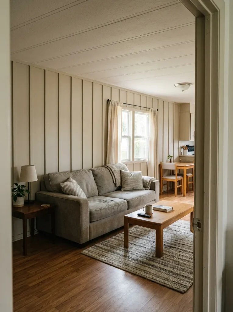
Try placing the battens and wall field in the same color family. Another option is a subtly deeper batten tone that keeps the grid legible without making the room feel striped.
Then photograph the room from across the space.
If the repeated lines organize the wall and relate well to the furniture beneath them, keeping the battens may save work while preserving some of the home’s identity. If loose seams, damaged panels, or erratic spacing dominate the view, correct those problems first.
Decision rule: preserve the grid when you notice rhythm before defects.
2. Keep One Wood-Panel Field as a Warm Material Anchor
Wood paneling often feels dated because too many surfaces compete in similar brown tones at the same time.
Walls are brown. Doors are brown. Cabinets are brown. Trim is brown. Furniture adds another wood tone. The material never gets a chance to feel special.
Choose the best-looking field first: perhaps the dining wall, the end wall of a living room, or a short hallway plane. Then reduce competing wood elsewhere.
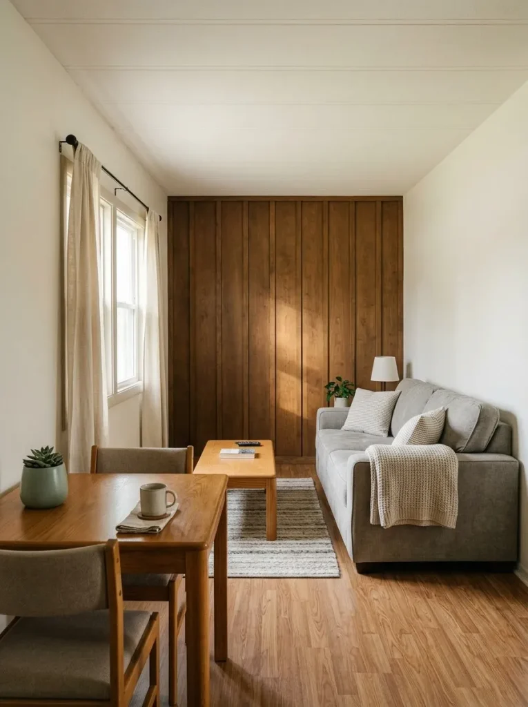
Warm white, mushroom, muted green, oatmeal textiles, and a calmer floor can completely change how the preserved paneling reads. What once looked like an old envelope can become the warmest material in the room.
Test the idea before committing to a larger project. Cover some of the neighboring brown surfaces temporarily with neutral fabric, paper, or sample boards and photograph the room.
If one wood field makes everything around it feel warmer, keep it.
If the room still reads as one continuous brown shell, reduce the visible wood further until a single surface clearly owns the material story.
3. Use Dark Original Trim to Frame the Openings Worth Emphasizing
Dark perimeter trim becomes heavy when every doorway, ceiling edge, wall junction, and window receives equal emphasis.
Selective retention creates a different effect.
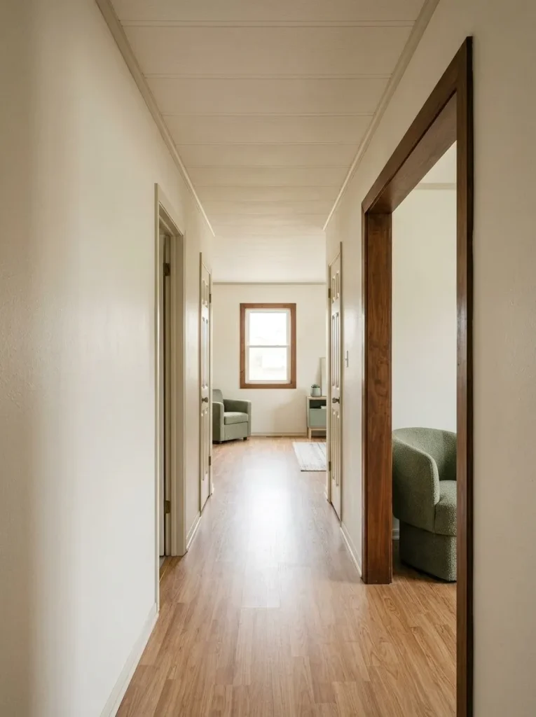
Look down the mobile home’s longest sightline. Which opening genuinely benefits from being framed? A living-to-kitchen transition may gain depth from a darker edge. A window overlooking greenery may look sharper. A narrow hallway lined with several strongly outlined doors may become visually fragmented.
Take a black-and-white photograph of the view. Removing color makes the hierarchy easier to see.
If two or three dark lines create clear frames, preserve them. If the trim breaks the interior into many competing rectangles, quiet the secondary edges and keep the strongest ones.
Dark trim works best when it behaves like punctuation: visible where an architectural pause matters and quiet where it does not.
4. Make a Vaulted Ceiling and Good Beams the Architectural Headline
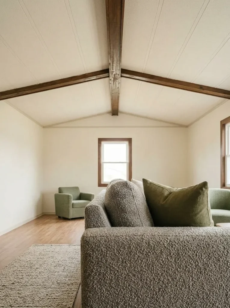
A shallow vaulted ceiling can be one of the strongest features in an older mobile home, yet it is easy to lose beneath ceiling strips, dated fixtures, dark perimeter lines, and competing wall colors.
Separate the ceiling shape from the ceiling noise.
If the slope gives the living room height, keep that geometry easy to read. A lighter ceiling field can clarify the volume while one or two worthwhile beams remain darker and explain its structure.
Do not automatically emphasize every seam simply because the principal beam looks good.
Sit where you normally use the room and look upward. You should understand the ceiling as one volume before your eye begins counting strips, fixtures, or contrasting edges.
Keep the depth. Edit the lines.
Read the ceiling from the seated position. If your eye understands its shape before counting its seams, the hierarchy is working.
5. Refinish Sound Cabinet Boxes as a Furniture-Like Kitchen Feature
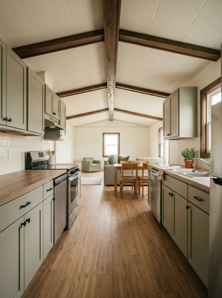
Older mobile-home cabinets can occupy so much of a compact kitchen that replacement feels like the obvious modernization move.
Condition should make that decision—not the door color.
Open the cabinets you use most. Check whether the boxes remain stable, interiors are usable, doors and drawers can be aligned adequately, and sink or appliance areas show damage that changes the project.
When the basic cabinet structure still works, a quieter finish, better alignment, coherent hardware, and a simpler backsplash can allow the cabinet field to act more like built-in furniture.
Do not let a cosmetic update hide a failed box or persistent moisture problem.
StylishGalore’s cabinet specialist already owns the deeper process: surface identification, alignment, preparation, adhesion testing, finish decisions, and hardware. 15 Mobile Home Kitchen Cabinet Makeover Ideas Without Replacing Them Stylish Galore
For this article, the question is narrower:
If the cabinet boxes still work, can appearance change enough before replacement enters the budget?
6. Give an Old Built-In Hutch or Bar Nook a New Working Role
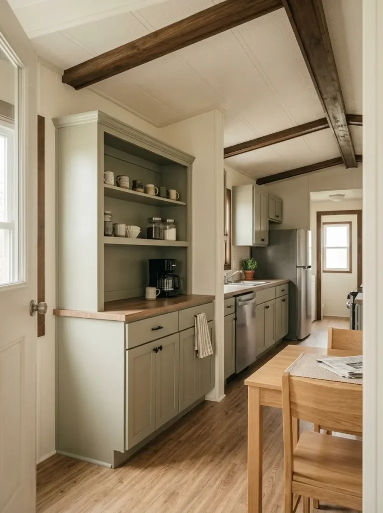
Some built-ins feel dated because their original job has become dated.
That is a very different problem from bad construction.
A shallow hutch that no longer stores formal china may be ideally placed for coffee. An old bar recess might support charging and household paperwork. Lower dining-room cabinets can hold pantry overflow. A recessed shelving area can become a compact library.
Before removing anything, inventory what the built-in already provides: surface depth, closed storage, drawers, shelving, electrical access, lighting, and proximity to routines.
Then test a new job.
If the feature becomes useful several times a week, its construction has earned a second life.
Keep the cabinet. Change its job.
An old built-in does not have to perform its original role forever. Choose the routine it is best positioned to support now, then adapt the storage around that purpose.
Protect the work surface.
Keep enough counter open for the machine, cups, and one preparation zone. Upper storage can hold mugs and supplies. This role works best when the built-in sits near the kitchen or dining area rather than across a major traffic path.
Prioritize closed storage.
Use existing doors and drawers for food overflow, serving pieces, or small appliances. Reduce exposed clutter so the built-in reads as useful infrastructure instead of an old display cabinet.
Test sitting depth first.
A shallow built-in can work when it provides knee room, charging access, and enough surface for a laptop or paperwork. Skip this role when a chair would pinch circulation through an already narrow mobile-home room.
Use negative space.
Books, ceramics, art, and intentionally empty shelf area can turn dated shelving into one controlled focal composition. The goal is not to fill every opening—it is to make the built-in feel deliberate.
Repurpose rule: choose the new function first. Paint, hardware, shelf styling, and decorative changes should support that function—not substitute for it.
7. Turn a Half-Wall or Pass-Through Into a Transition Frame
An older half-wall or pass-through often gets blamed for making a mobile home feel closed.
Sometimes it is simply doing a useful job badly.
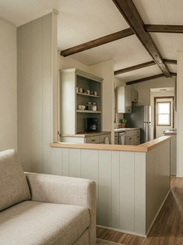
Look at both sides before deciding. Does the feature separate dining from circulation? Does its ledge provide a useful landing surface? Does the opening partially screen kitchen work surfaces from the living area?
If those functions matter, simplify the divider cosmetically first. A quieter finish, cleaner ledge, and stronger visual relationship between the rooms may turn an awkward interruption into a transition.
Removal belongs in a different decision category when framing, wiring, plumbing, or structural work may be involved. HUD advises that significant structural alterations to manufactured homes may require local permits and could affect HUD Code compliance; homeowners should consult the appropriate state, county, or local agency before that type of change. HUD
Keep the boundary when it improves how the connected rooms work.
8. Make Plain Slab Doors a Repeated Color Block Through the Home
A single plain slab door can look basic.
Five visible together can become architecture.
Stand at one end of the hallway and count how many doors enter the same view. In a narrow mobile-home corridor, their repeated size and spacing may matter more than decorative detailing.
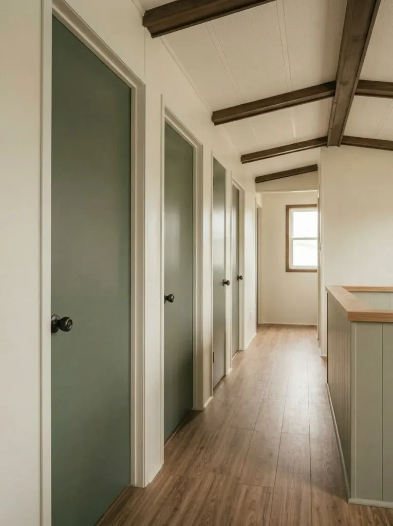
Unify them deliberately.
One coordinated paint color, consistent hardware, and calmer casing can make simple doors feel intentional. They can disappear into the walls for a quieter hallway or form a deeper repeated color block that marks the rhythm of rooms along the corridor.
Applied molding is not automatically an improvement. In a compact passage, extra detailing on every slab can increase visual activity.
If consistency makes the hallway look calmer from end to end, simplicity is already doing enough.
9. Treat Small Windows as a Rhythm Instead of Trying to Fake Bigger Openings
Small windows are often blamed for dating a mobile-home interior, but styling can make modest openings feel even smaller.
Heavy valances, dark curtains, mini blinds, contrasting trim, and decorative objects below every window turn each opening into a separate event.
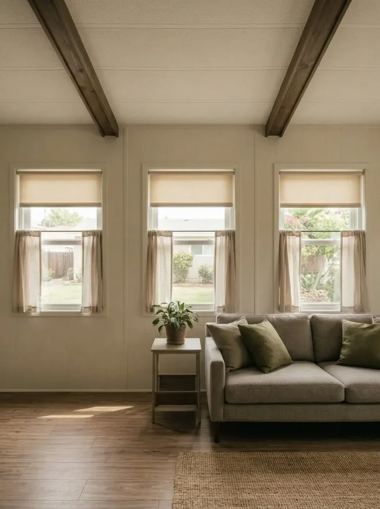
Step far enough back to see several windows at once.
Repeated treatment is usually more useful than trying to make each opening appear grander. Similar shades, restrained curtains, and consistent trim allow their spacing to become part of the room’s rhythm. Leaving some blank wall between them helps too.
Then separate appearance from function.
A damaged, difficult-to-operate, uncomfortable, or unsuitable window presents a different problem that decoration cannot solve.
When condition is acceptable, let several modest openings behave like a sequence.
They do not need to pretend to be one giant window.
10. Keep Textured or Frosted Glass When It Solves Privacy and Daylight Together
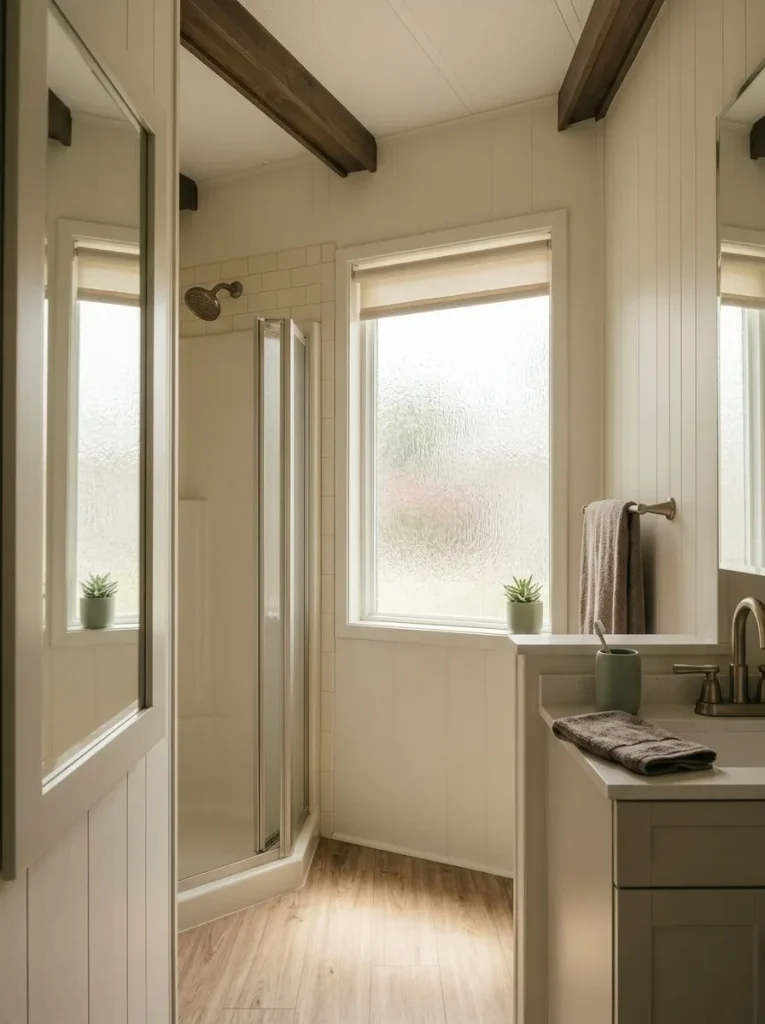
Some old glass earns its place because of what it does.
A textured bathroom pane, for example, can preserve privacy while allowing daylight into a compact room. Replacing it with clear glass and then rebuilding the privacy layer may solve a problem you did not actually have.
Judge the feature from inside the whole room.
If the pattern is visually manageable, the frame remains serviceable, and the diffused light improves the space, let the glass be one of the room’s textures.
Then quiet nearby surfaces. Simple walls, restrained hardware, and solid-color textiles can give the glass enough visual breathing room.
The useful question is not whether the pattern belongs to an earlier decade.
Ask what function would disappear with it.
When the answer is privacy plus usable daylight, age can be a weak reason for removal.
11. Use Mirrored Sliding Closet Doors as a Controlled Reflection Tool
Mirrored closet doors often get removed because they instantly suggest a previous decorating era.
Reflection itself has no expiration date.
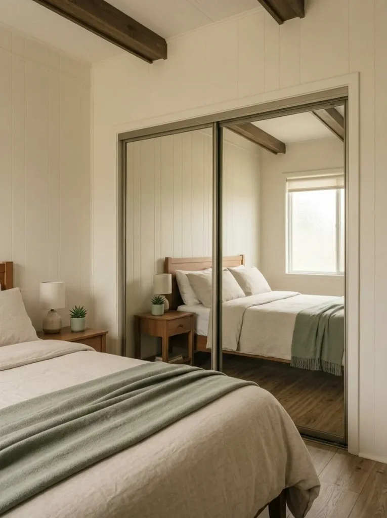
Stand at the bedroom entrance and inspect what the doors duplicate. A window, calm bedding, or a quiet wall composition can make the room feel deeper and brighter. An open doorway, crowded dresser, television, or laundry pile becomes twice as visually dominant.
That changes the keep-or-change decision.
Do not judge the mirror alone.
Judge the scene inside it.
Reflection Field
Stand at the bedroom entrance. What do the mirrored doors send back into the room?
12. Make a Kitchen Soffit Read Like an Intentional Architectural Band
A soffit above older kitchen cabinets becomes awkward when it looks like a stranded box between unrelated surfaces.
Try making it belong to the cabinet elevation before planning a more invasive project.
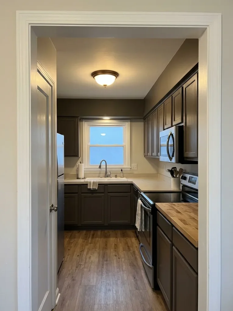
When the soffit aligns cleanly with the cabinet run, carrying the wall color across it can lower its contrast. In another kitchen, a carefully related cabinet tone may connect the two and create one horizontal band.
Avoid turning the top edge into a second display shelf. Rows of baskets, signs, faux greenery, and unrelated objects can make the soffit more noticeable.
Now stand outside the kitchen and look toward the longest cabinet run.
Do you see cabinetry plus a strange box above it?
Or does the elevation read as one composition?
If the soffit contains or conceals systems you do not understand, keep the work cosmetic until you know what is inside.
13. Keep a Patterned Sheet Floor as a Bounded Graphic Zone When It Still Works
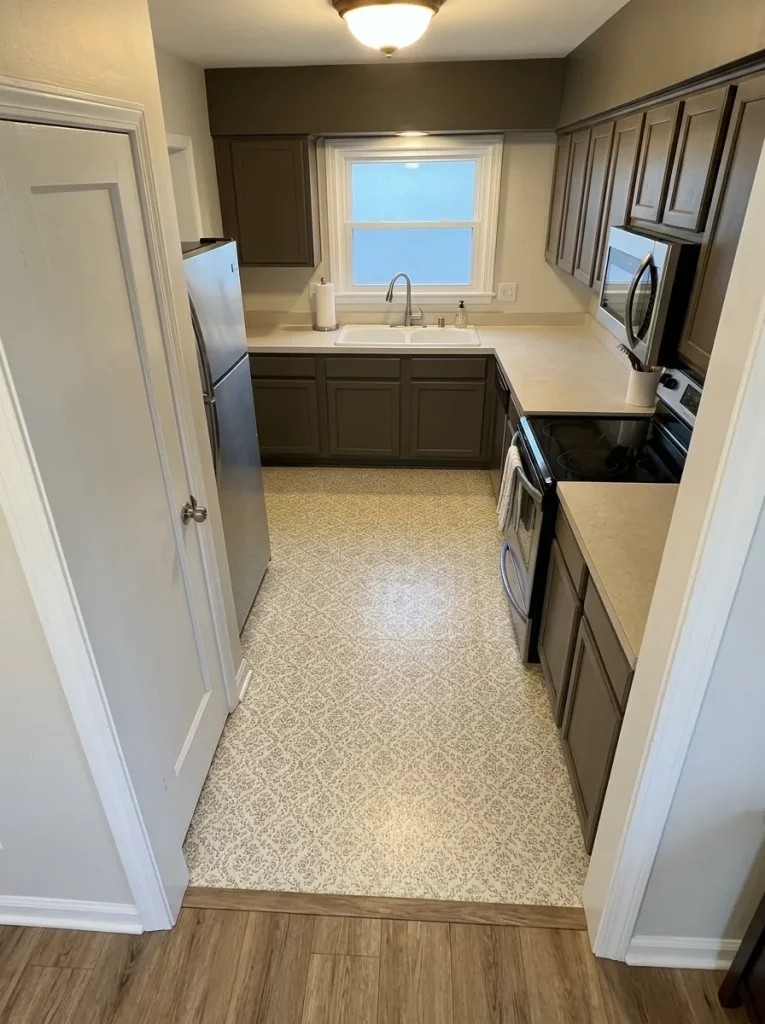
A patterned resilient floor does not need to run through the whole home to earn preservation.
Sometimes the strongest role is a contained graphic zone.
A small geometric pattern in the kitchen, laundry area, or entry can mark that zone once surrounding walls, cabinets, and textiles become calmer. The transition to the adjacent floor matters: a clear edge makes the pattern look intentional.
Condition comes first.
Lifting edges, moisture damage, substrate problems, or a failing surface change the project from styling to repair.
Older flooring also deserves care before disturbance. EPA says you generally cannot determine whether a building material contains asbestos just by looking at it. When a suspect material is damaged or a renovation will disturb it, EPA recommends assessment and sampling by a properly trained and accredited asbestos professional. US EPA
When the floor remains serviceable and is staying undisturbed, a strong pattern may be character rather than a mandatory replacement.
14. Let Metal or Vinyl Siding Supply the Exterior Texture
A long mobile-home façade already contains texture.
The siding supplies it.
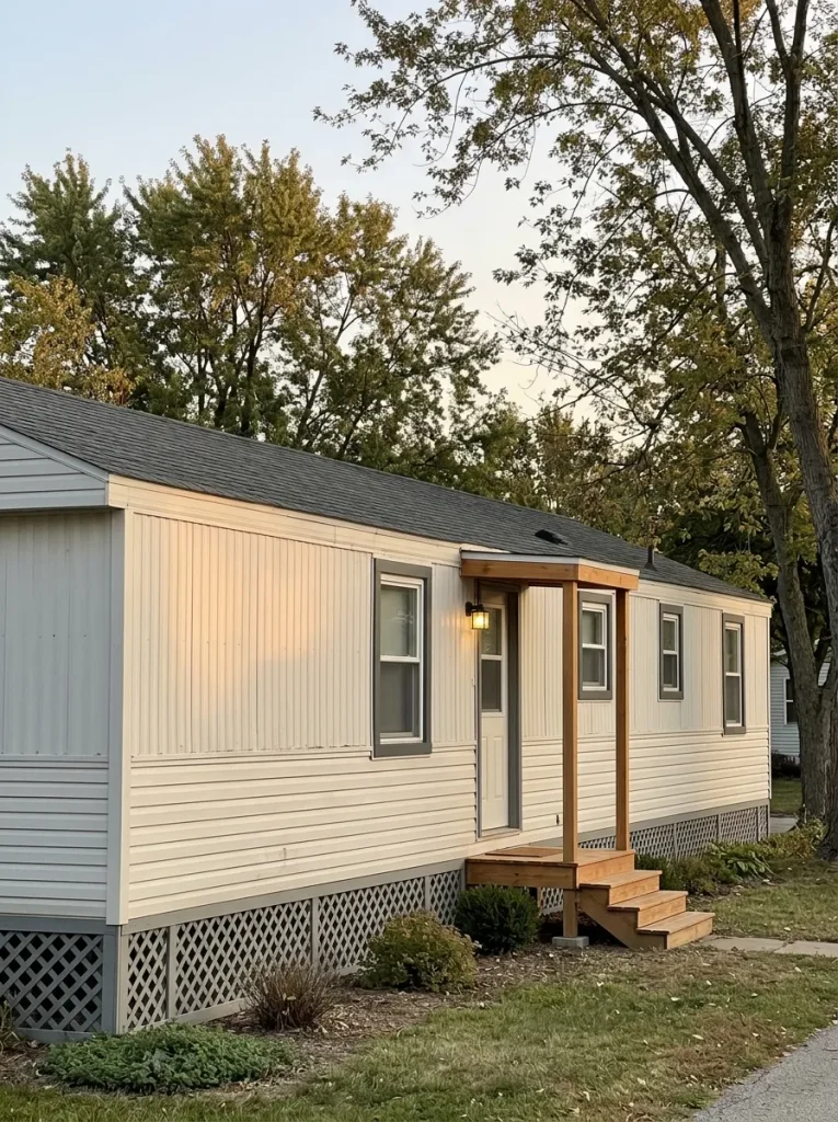
Problems appear when shutters, trim bands, porch details, skirting, signs, lattice, planters, contrasting corners, and several paint colors all compete to create additional interest.
Take a photograph from across the property and ignore the small accessories.
Read the shell as one large field.
If the siding remains serviceable, use color hierarchy and cleaner edges to make its existing lines work harder. A calmer body color can allow the entry to lead. Controlled trim can sharpen windows without outlining every part of the structure.
Ask one question before adding anything else:
Does this exterior actually need more detail, or does it need fewer competing details around the texture it already has?
StylishGalore’s inexpensive-upgrade specialist continues into broader exterior and high-reach cosmetic improvements. 21 Cheap Mobile Home Upgrades That Look Expensive Stylish Galore
Read the façade in four layers.
15. Turn Skirting Into a Deliberate Plinth That Grounds the Home
Skirting carries more visual weight than its height suggests because it runs underneath so much of the structure.
When the color is strongly disconnected from the siding, panels look inconsistent, or the ground line around it is unresolved, the entire home can appear unfinished.
Treat the base as a plinth.
Step back to curb distance and look for continuity first. A calmer relationship between body siding and skirting can make the house feel more settled. A restrained planting strip can soften the transition into the yard without disguising the base completely.
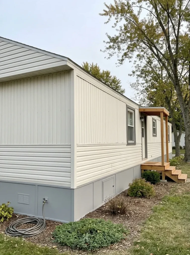
Use a photograph for the final test.
Cover the upper portion of the façade with your hand.
Does the remaining bottom edge look continuous and intentional?
If not, improving the ground line may contribute more than another decorative feature higher on the façade.
Visual work should never be used to conceal drainage, deterioration, access, support, ventilation, or other under-home problems that need appropriate evaluation.
16. Use Simple Porch Posts, Steps and Rails as the Arrival Framework
A porch does not need to imitate a large site-built farmhouse to change how a mobile home is perceived.
It needs to make arrival obvious.
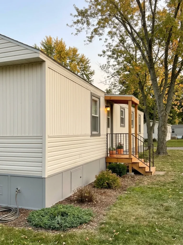
Stand where a visitor first approaches the home. The door, steps, posts, rails, light, and immediate landscaping should read as one composition.
If the parts scatter visually, edit before adding.
A pair of clean posts can frame the doorway. Steps can align clearly with the entry. One railing language can connect landing and stair. Two planters may be enough to identify the beginning of the route.
Keep structural questions separate from styling decisions. HUD explains that manufactured-home data plates include whether the home was designed to accommodate additional loads from an attached accessory building or structure. That makes structural attachment a design-and-construction question, not merely a porch-style choice. HUD
Solve the entrance problem you actually have.
A stronger entrance does not always need more décor. Identify what is weakening the arrival first, then make the smallest set of changes that restores hierarchy and connection.
Build a clearer doorway hierarchy.
Strengthen the door itself or its immediate frame so it becomes the clearest destination from the approach.
Reinforce that destination with coordinated lighting, posts, or one balanced planter pair rather than several unrelated accents.
Stop when the doorway reads clearly from the approach. Additional signs, wreaths, and décor should not be needed to explain where the entrance is.
Connect the ground plane to the doorway.
Clarify the visual route from the ground to the doorway. The steps should look like part of the arrival sequence, not a separate object placed in front of the home.
Coordinate landing edges, railings, posts, and nearby trim so they share a consistent material or design language.
The fix is complete when your eye moves naturally from the approach to the steps and then to the door as one connected composition.
Remove competition before adding anything.
Remove small decorations, signs, planters, and accessories that compete with the architectural entry.
Establish a simple hierarchy: doorway first, structure second, lighting third, accessories last.
Stop when the architecture identifies the entrance before the accessories do. Empty space is part of the finished composition.
Arrival rule: establish the route, doorway, and structural hierarchy first. Decorative layers should support the entrance—not compete with it.
17. Keep One Unmistakably Period Feature as the Home’s Character Marker
A successful update does not have to erase every clue that the home existed before the renovation.
Choose one original feature whose age contributes identity.
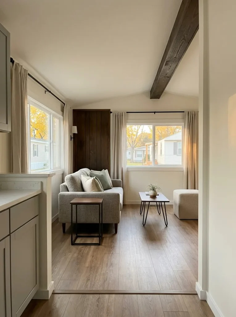
It might be a warm wood wall, unusual glass, an original built-in, a beam, patterned flooring, a group of slab doors, or mirrored closet doors.
Scarcity matters.
One preserved feature can become memorable once the rest of the room settles down. Several equally dominant period features can pull the home back toward visual clutter.
Decade-specific homes deserve an even more deliberate preservation decision. StylishGalore’s 1970s and 1980s makeover guides explore that territory in greater depth. 19 1970s Mobile Home Makeover Ideas 17 1980s Mobile Home Makeover Ideas That Feel Completely Modern
Ask one final question:
Does this old feature make the finished room more memorable?
If yes, give it permission to remain visible.
Give one original feature permission to be noticed.
A dated home feels more intentional when one strong original element leads and nearby finishes step back. Choose the type of character worth protecting, then reduce competition around it.
Let the original material carry the room.
Keep the strongest original wood surface, metal detail, or tactile finish visible when its condition is good and its texture adds genuine depth to the room.
Reduce extra wood species, busy grains, imitation finishes, and unnecessary tactile surfaces so the preserved material becomes intentional rather than one texture among many.
Let the unusual shape become the feature.
A vault, beam, pass-through, built-in, niche, or distinctive opening can give an older mobile home identity when its shape is allowed to read clearly.
Simplify competing trim lines, unnecessary outlines, small arches, and secondary framing so one architectural feature establishes the room’s rhythm.
Treat one pattern as the visual anchor.
Keep a patterned floor, textured glass, geometric paneling, or another repeated original motif when it is visually coherent and still in usable condition.
Simplify rugs, curtains, backsplash, upholstery, and wall décor so the original pattern does not have to compete for attention.
Use reflection to increase light and depth.
Keep original mirror, glass, or reflective detailing when it helps a narrow room feel lighter, deeper, or visually more open.
Remove visual clutter and rethink what sits directly opposite the reflective surface. Mirrors multiply whatever they face, including disorder.
Character-budget rule: a room rarely needs every original feature to become a focal point. Choose the element with the strongest material, shape, rhythm, or spatial value—and let surrounding choices become quieter.
Final Thoughts
The best way to update a dated mobile home is neither to preserve everything nor to replace everything. It is to become more selective.
Keep a feature when it still works and contributes useful material, rhythm, storage, privacy, reflection, architecture, or character. Quiet it when its visual volume exceeds its value. Repurpose it when the construction still serves you but its old job no longer fits your life. Investigate it when condition, materials, or structural questions make a cosmetic decision premature.
That approach leaves room for the home to feel noticeably fresher without making every older feature disappear.
For broader transformation ideas, continue with StylishGalore’s collection of real old-mobile-home makeover strategies. 25 Old Mobile Home Makeovers You Have to See
Save this guide on Pinterest so you can revisit the dated features worth keeping before your next mobile-home update.