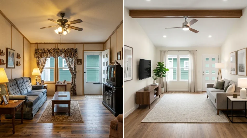
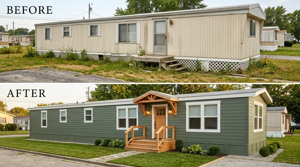
A 1970s mobile home makeover can go wrong in two opposite directions: changing so little that the home still feels trapped in its original decade, or removing so much that every trace of character disappears. The most convincing transformations sit between those extremes. They identify the features carrying the strongest visual age—dark wall fields, busy ceiling treatments, layered flooring, heavy window dressings, dated built-ins, tired exterior trim—and decide which deserve preservation, simplification, covering, repair, or replacement.
One date matters when working with a home from this decade. HUD’s federal Manufactured Home Construction and Safety Standards apply to manufactured homes built after June 15, 1976; homes from earlier in the decade predate that federal standard. HUD
So the phrase 1970s mobile home makeover can cover homes on either side of an important construction boundary. That makes condition and documentation more useful than assumptions based on age alone.
Start with the makeover triage below. It helps separate an old-looking feature from a failed one—and can prevent a Pinterest-inspired refresh from becoming unnecessary demolition.
1. Build a 1970s Time-Stamp Map Before You Demolish Anything
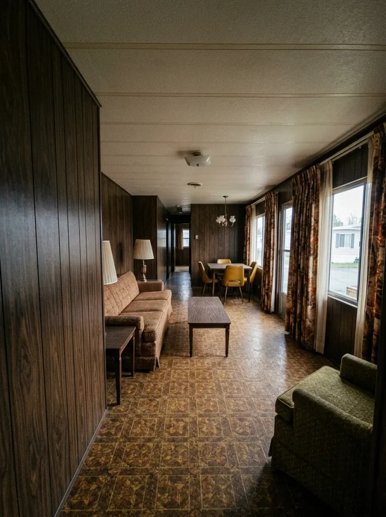
Before choosing paint, flooring, cabinetry, or exterior colors, photograph the home from the positions where you actually experience it: the front approach, main entrance, longest interior sightline, living-room seating position, kitchen entrance, and primary bedroom doorway.
Now ask one question:
Which three elements make the house look oldest in each photograph?
You may discover that ten original or dated details are present, yet only two or three dominate the first impression.
A full wall of dark paneling can outweigh six outdated light switches. A broad patterned floor may influence the interior more than the cabinet hardware. Outside, faded siding and fragmented trim can matter more than new planters ever will.
That gives you a hierarchy.
Do not confuse old-looking with failed. Sound wood can become an asset. A dated but intact built-in may have another useful life. Soft flooring, active staining, movement, deterioration, unstable steps, or another questionable condition belongs in a different category.
Use the triage studio before building the shopping list.
What kind of “dated” are you actually looking at?
Select the condition that best describes the feature dominating your before photo. The answer changes the first move.
Stop signal: a dramatic “after” photo is not evidence that the same intervention suits your home. Condition and construction depth come before visual similarity.
Your first decision is now much narrower. You are not asking how to modernize everything. You are identifying which highly visible feature deserves attention first—and whether its route is preservation, reduction, covering, replacement, or investigation.
2. Keep One Original 1970s Feature on Purpose
Imagine two otherwise similar remodels.
In the first, every warm wood surface, built-in, beam, period color, and unusual detail disappears. The space looks newer, yet it could belong to almost any recently renovated home.
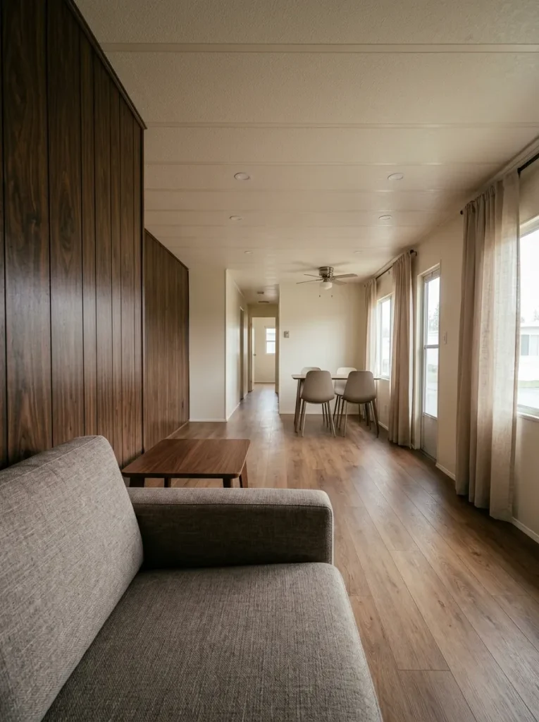
In the second, one genuinely attractive period feature remains and everything around it has been edited enough for that feature to look deliberate.
The second room usually has more identity.
If your home has a handsome beam, useful built-in, restrained paneled accent, original cabinetry worth retaining, textured glass, or another period feature in sound condition, judge it only after simplifying the surrounding room.
Preservation test: if the feature looks better once competing patterns, dated accessories, heavy curtains, mismatched wood tones, and visual clutter are reduced, it may be character—not the problem.
A retained feature should not force the entire house into a retro theme. Give it one supporting echo elsewhere: a wood frame, stool, tabletop, woven texture, warm leather tone, or related accent.
If the feature remains awkward after the space is simplified, preservation has not earned priority.
Age alone is not a reason to keep something.
But age alone is not a reason to destroy it either.
3. Put Dark Paneling Through a Keep–Calm–Cover Test
Dark paneling can dominate a 1970s interior, but the wall may be sharing responsibility with several other warm or dark surfaces.
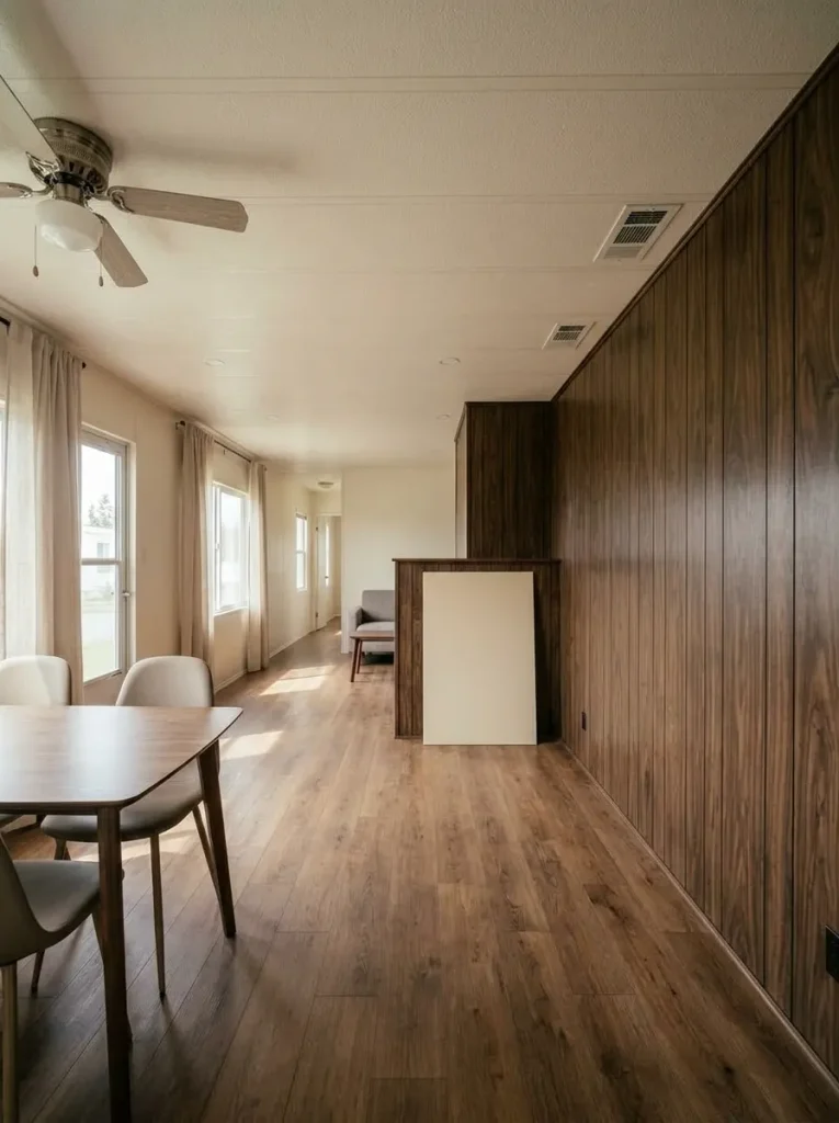
Brown flooring, heavy upholstered furniture, dark valances, warm bulbs, deep trim, and dozens of small decorations can merge into one continuous low-contrast field.
So test the room before reaching for paint.
Temporarily clear one paneled wall of artwork and nearby clutter. Open the window treatment during daylight. Move a light-neutral sample board or large textile beside the paneling and photograph the room again.
You are testing visual weight, not choosing a final paint color.
Don’t prescribe paint before diagnosing the wall.
KEEP
The grain or tone becomes attractive once the rest of the room is quieter and brighter.
Edit around itCALM OR COVER
The wall is visually dominant but appears suitable for a cosmetic finish strategy.
Test the finish firstINVESTIGATE
Loose, swollen, stained, damaged, or questionable areas make condition the first decision.
Pause the makeoverIf the paneling gains richness once the surrounding room becomes lighter and quieter, consider preserving some of it.
If it still dominates every photograph, you have a stronger reason to alter the surface.
The point is not to obey a rule that says 1970s paneling must disappear. It is to decide whether the wall should be the room’s material feature, a quieter background, or a surface that needs another treatment.
4. Lighten the Ceiling Plane and Let Good Beams Stay
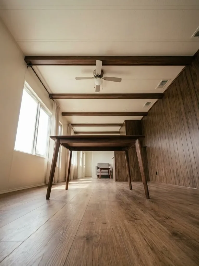
Walk into the room and look upward before studying the furniture.
If your 1970s mobile home has a ceiling where dark seams, wood tones, exposed beams, trim, and a heavy fan all compete at once, much of the room’s visual weight may actually sit overhead.
A lighter broad ceiling field can change that balance while allowing an attractive beam to remain.
Use this order:
- Inspect the ceiling first. Staining, sagging, loose material, or another unexplained condition needs attention before cosmetics.
- Simplify the broad plane. A lighter compatible finish can create a calmer upper boundary.
- Reassess the beam. Good wood may now read as an architectural accent because it is no longer surrounded by equal visual weight.
- Choose the fixture later. See how much contrast remains before buying another dark fan or statement light.
Do not remove or materially alter a beam because it looks old if its function is uncertain.
One of your inspiration references illustrates the useful middle ground especially well: a bright white ceiling field allows the darker wood members to stay visible without making the entire room feel brown.
The makeover does not erase the 1970s architecture.
It changes the hierarchy.
5. Replace a Patchwork Floor Story With One Continuous Visual Base
The long sightlines common to many mobile homes make flooring transitions unusually visible.
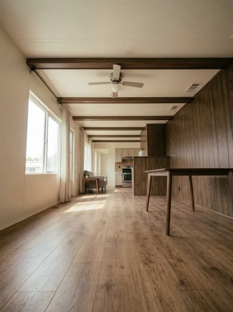
If your 1970s home has an older sheet floor in one space, later laminate in another, a separate entry surface, and yet another treatment down the hall, the interior can read as a timeline of renovations.
Stand at the main entrance and photograph the longest connected view.
Mark every visible flooring transition.
Now separate transitions that exist for a functional reason from those that simply reflect different renovation dates.
Work in this order:
condition → connected sightline → material suitability → color → pattern
The sequence matters because a new finish should never hide a questionable substrate. Softness, swelling, repeated staining, moisture, movement, or another concerning condition changes the project before style enters the conversation.
Once the underlying surfaces are appropriate for the intended finish, a calmer connected floor field can provide the visual base that lets preserved 1970s features—beams, cabinetry, wall texture, or warm color—look deliberate.
Stop point: continuity is valuable where connected rooms benefit from reading together. It does not mean forcing one flooring product into every room regardless of use or material requirements.
6. Strip Back Heavy Window Treatments Before You Blame the Windows
A 1970s-era window can appear much smaller than its opening once later decorating layers accumulate around it.
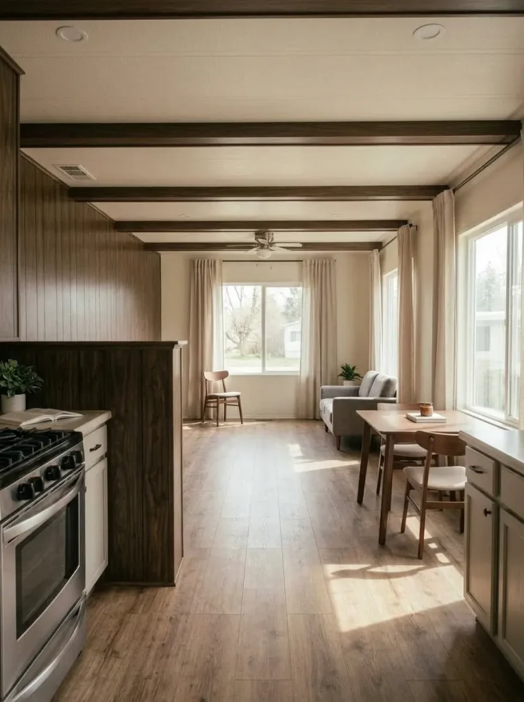
A boxy valance hides the top edge. Short curtains divide the wall. Blinds cover more glass. Dark trim outlines the opening again. Decorative shelves or furniture narrow it further.
Before assuming the windows themselves are the design problem, remove as much visual obstruction as practical and observe the wall in daylight.
Look for three changes:
- does more glass become visible?
- does the wall seem taller?
- does daylight travel farther across the room?
That separates an old window from an old-looking window composition.
If the unit operates properly and its condition is acceptable, a simpler treatment may produce much of the transformation you wanted. Full-length curtains, visually quieter hardware, or a less bulky shade can make the opening belong to the wall again.
Window replacement is a different decision and should be based on the window’s condition, function, performance, or another justified need.
If removing the curtain layers dramatically changes the room, finish that experiment before spending money on the opening itself.
7. Shrink Avocado, Gold, Orange, and Brown Into Controlled Accent Roles
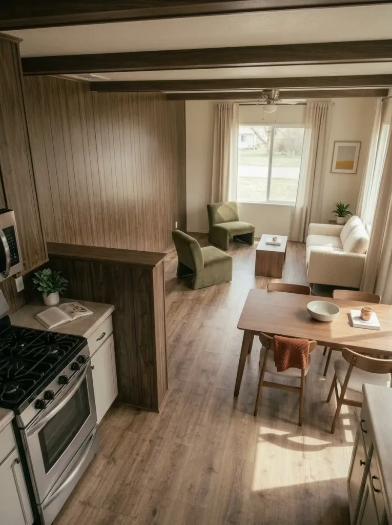
The colors associated with the 1970s are not automatically the problem.
Their dosage often is.
Olive beside harvest gold, orange upholstery, dark brown paneling, warm flooring, and patterned textiles can make every surface announce the decade simultaneously.
You can preserve vintage color while changing its job.
Olive might survive on one chair. Burnt orange can become an art or textile accent. Warm brown may remain through real wood. Mustard can appear in a smaller upholstered piece instead of a whole wall.
Give those hues quieter space around them.
Keep the decade. Change the dosage.
Choose a period color you want to preserve, then give it a smaller and more deliberate role in the finished room.
The number is less important than the hierarchy.
When every period color carries the same visual weight, the room can feel themed.
When one vintage hue is deliberately supported by calmer surfaces, it begins to feel collected.
8. Rework the Divider, Half-Wall, or Pass-Through Before Opening the Floor Plan
If your 1970s mobile home still has a spindle screen, overhead divider, pass-through, half-wall, decorative partition, or bulky transition between the living and dining zones, it may be one of the strongest remaining era signals.
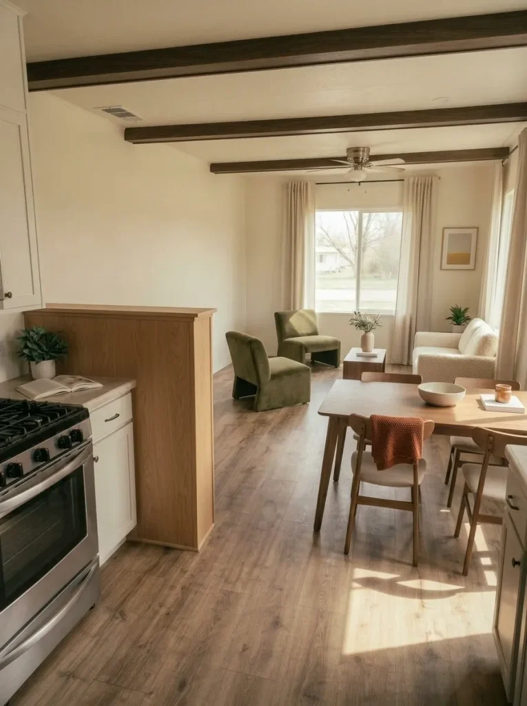
A makeover photograph often suggests one obvious solution:
remove it.
That is not automatically the correct solution.
First identify what the feature currently does. It may define an entry, conceal a kitchen work zone, contain storage, organize furniture, contain wiring, or form part of an assembly whose role cannot be determined from the finish alone.
Then run a reversible test.
Remove decorative clutter around the divider. Simplify its visual treatment where appropriate. Photograph the connected rooms again.
If the visual problem largely disappears, major demolition may add little value.
If the element still creates a genuine circulation, visibility, or functional problem, investigate its construction before modifying it. HUD says significant additions or structural changes to a manufactured home can require local permits and advises consulting the appropriate state, county, or local agency before making such changes. HUD
For homes from the earlier part of the 1970s that predate the HUD Code, avoid applying post-1976 construction assumptions automatically.
Make an opening larger because you understand the function you are improving—not because open concept looks newer in a photograph.
9. Update the Kitchen Without Automatically Replacing Sound Cabinet Boxes
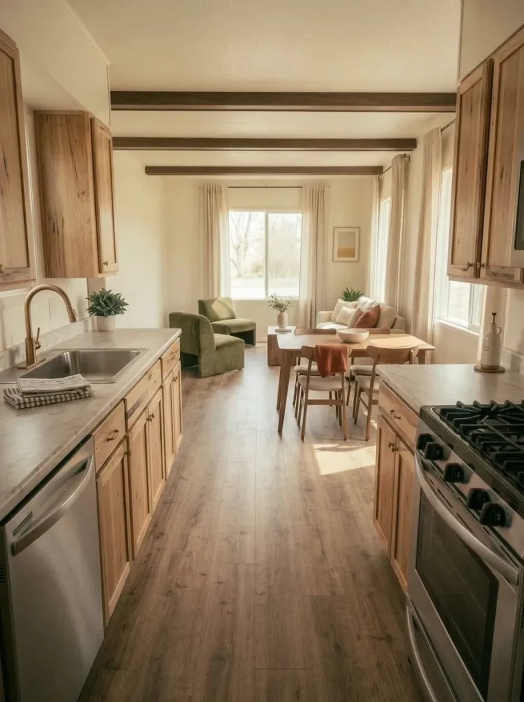
The cabinetry occupies so much visible wall area in many older mobile-home kitchens that changing its finish can alter the entire room.
But first separate age from failure.
Inspect the boxes before deciding on a color:
- Are they stable?
- Are the interiors still usable?
- Can doors and drawers be aligned adequately?
- Does the basic layout support everyday cooking?
- Is there swelling, deterioration, or damage that changes the decision?
If the boxes and layout still work, the makeover can proceed in layers: alignment, surface identification, cleaning and suitable preparation, finish, hardware, and selected interior improvements.
That sequence prevents decorative purchases from hiding more important problems. New pulls will not correct badly misaligned doors. Paint does not convert a failed cabinet box into a sound one.
StylishGalore already has a specialist article devoted specifically to keeping and improving existing mobile-home cabinet boxes, including surface identification, prep, door alignment, adhesion testing, hardware, and finish decisions. Stylish Galore
Open the Mobile Home Kitchen Cabinet Makeover guide
That deeper specialist should own the cabinetry mechanics.
For this 1970s mobile home makeover, the bigger decision is simpler:
Does the old kitchen actually require new cabinetry, or does it need a more disciplined surface strategy?
10. Make the Counter and Backsplash Read as One Calmer Surface Story
A countertop and backsplash touch each other visually, which means two individually attractive choices can still create a bad junction.
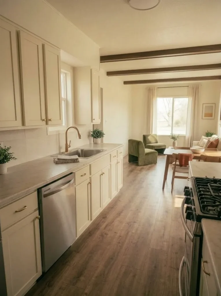
In a compact 1970s kitchen already carrying visible cabinet grain, patterned flooring, older appliances, or warm wood, adding two more assertive surfaces can make the room busier after the renovation than before it.
Use the pair as one decision.
| Counter | Backsplash | Likely effect |
|---|---|---|
| Strong pattern | Strong pattern | Competing surfaces |
| Warm stone look | Busy mosaic | Multiple visual stories |
| Restrained counter | Quiet backsplash | More continuous field |
| Usable existing counter | Simplified wall behind | Lower-scope refresh |
Now ask which surface is actually creating the dated impression.
If the countertop is acceptable but the backsplash carries an aggressive pattern, work on the vertical plane first.
If the backsplash is quiet and the counter dominates every view, reverse the priority.
Always judge samples beside the cabinetry you are retaining. Warm 1970s wood can alter how a supposedly neutral surface reads.
Use a One-Surface Rule When Scope Starts Growing
Modernize one dominant surface.
Then pause.
A second replacement should have to prove why the kitchen still needs it.
That single stopping rule can keep a cosmetic makeover from quietly becoming a full kitchen renovation.
11. Give the Dining Hutch or Bar Nook a Useful New Job
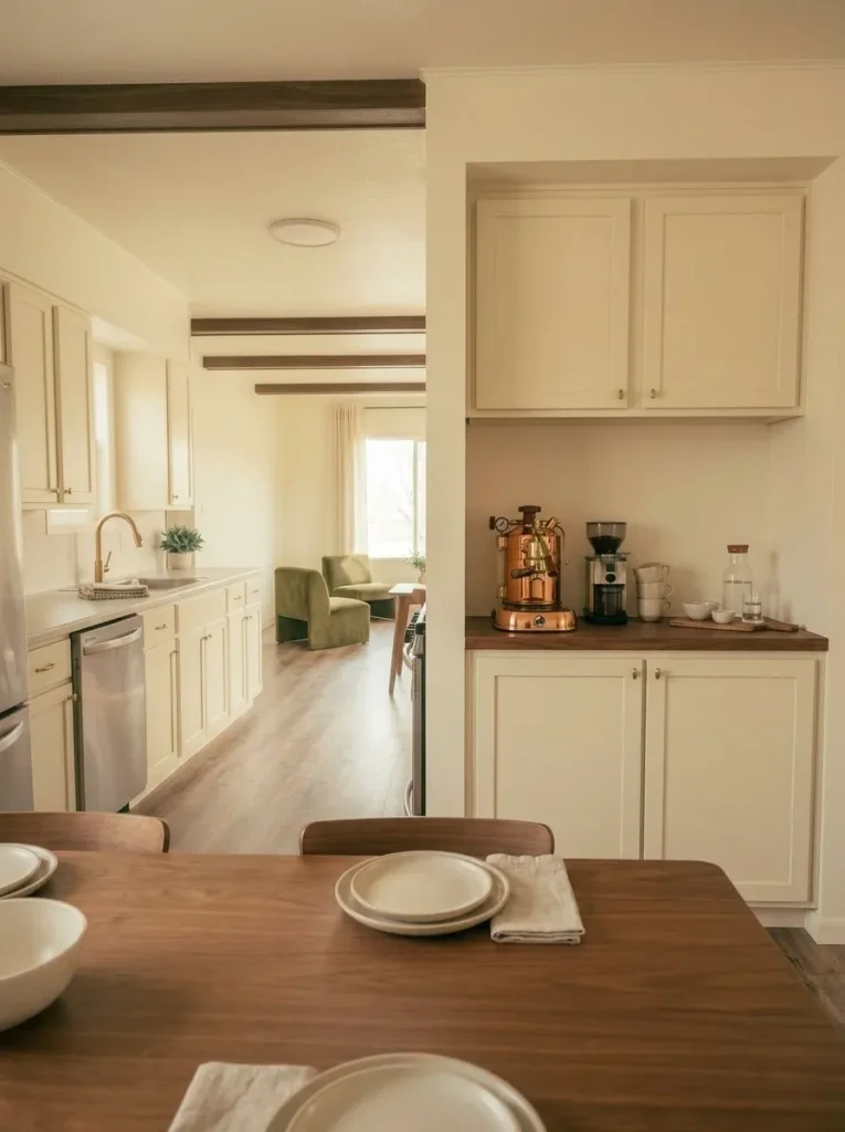
Original built-ins are easy targets because their purpose can feel more dated than the construction itself.
A shallow dining hutch may still occupy the perfect position for serving storage. A former bar could become a coffee station. An open display unit may need more closed storage. A recessed cabinet could become household organization.
Test location and function before style decides its fate.
Make the location prove its value before the style decides its fate.
Move through these questions before deciding that an original 1970s built-in has to disappear.
Does it sit near dining, entry, kitchen, or another activity that still needs support?
Serving pieces, pantry overflow, coffee supplies, paperwork, books, or concealed storage?
Fewer display objects, calmer finish, simpler hardware, or more closed storage may be enough.
If both location and function fail, removal becomes easier to justify.
A useful built-in earns modernization.
An inconvenient built-in does not earn preservation purely because it is original.
That distinction prevents character preservation from becoming nostalgia without purpose.
12. Rebuild the Living Room Around One Cleaner Focal Wall
A dated 1970s living room can have too many focal points without having one good one.
The TV claims one wall. A large window occupies another. Paneling creates a third visual field. Tall furniture fills another. Small artwork then occupies whatever wall space remains.
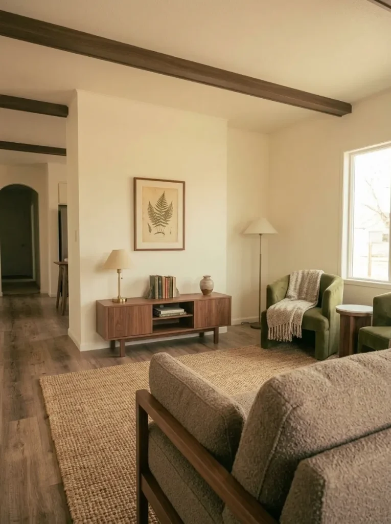
The room never settles.
Sit where the household spends the most time and identify the first surface your eye naturally reaches.
That wall has already volunteered to become the primary focal point.
Now reduce competition around it.
If the TV wall wins, it may need less furniture and artwork nearby.
If the window is the strongest feature, simplify the treatment around it.
If an attractive paneled wall is being preserved, let that be the material statement and make the surrounding walls quieter.
StylishGalore’s broader living-room guide goes further into furniture scale, circulation, room type, TV placement, windows, and connected-space decisions. Stylish Galore
Explore the Mobile Home Living Room Ideas guide
For this makeover, use a simpler photo test:
Stand in the doorway. If three or four walls compete for first place, remove one visual claim before adding another.
A room can become dramatically more current without gaining a single decorative object.
13. Fix the Dark Evening Effect Before You Judge Every Finish
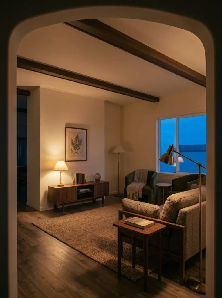
Some 1970s interiors look reasonably balanced in daylight and much heavier after sunset.
That difference matters.
A retained wood wall, beam, dark sofa, or warm cabinet finish may appear rich during the day but merge into one dark field under a single overhead fixture.
Test the room at the time you normally use it.
Turn on only the lighting you currently rely on and notice which surfaces disappear.
Then evaluate light at three heights:
ceiling → task/reading height → low ambient height
A lamp near a retained wood feature may reveal grain that previously looked muddy.
Task lighting can stop a kitchen from relying on one bright central source.
A lower evening lamp can separate furniture from a dark wall.
Before repainting every warm surface, determine whether the room is missing useful light.
Electrical work belongs outside casual decorating advice. HUD’s manufactured-home standards include electrical systems for homes subject to the federal standards, and installation guidance states that authorities having jurisdiction should be consulted before utility connections, with qualified personnel used where required. HUD
Run a Night-View Test
Improve one lighting layer beside the finish you are considering changing.
Then look again.
If the wall or cabinetry suddenly feels rich rather than gloomy, lighting may deserve priority over another round of paint.
14. Reset the Bathroom Around the Vanity–Mirror–Light Cluster
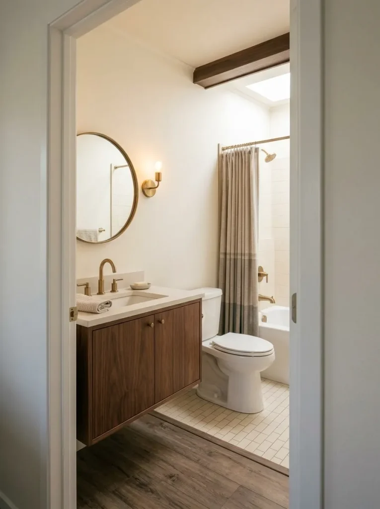
A compact 1970s bathroom often has one visual age zone you see every time you face the sink:
vanity + mirror + light
If all three feel dated, the entire bathroom can appear older even when the tub, wall finish, or flooring is reasonably restrained.
Treat those three components as one composition.
Ask:
- Is the vanity box still usable?
- Is its problem finish, storage, damage, or actual size?
- Does the mirror relate visually to the vanity?
- Does the light make the sink wall look deliberate?
- Would quieter surroundings make the cluster feel more current?
If the vanity itself still works, you may be able to change the visible composition without disturbing the bathroom’s deeper service layout.
That boundary is especially important in a small mobile-home bathroom because seemingly simple changes can begin affecting plumbing, flooring, wall cavities, or wet-area construction.
StylishGalore’s specialist bathroom article covers those deeper budget, plumbing, moisture, tub/shower, vanity, flooring, and DIY/pro decisions in detail. Stylish Galore
Open the Mobile Home Bathroom Remodel on a Budget guide
For the era-specific makeover, start with the cluster that controls the view.
Then decide whether a deeper remodel has actually earned its scope.
15. Let the Bedroom Keep One Warm Vintage Moment
A 1970s bedroom does not have to become a cool white box in order to feel current.
Bedrooms are actually good places to preserve vintage warmth because softness, timber, woven texture, and deeper earthy tones can support the restful atmosphere you already want.
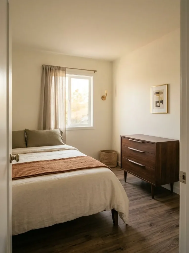
Pick one warm survivor:
- a wood dresser;
- a paneled section in good condition;
- an original nightstand;
- a woven chair;
- amber-toned artwork;
- an olive or rust textile;
- a simple ceiling detail.
Then eliminate accidental repetition around it.
Five unrelated brown finishes can feel inherited.
One intentional timber piece surrounded by quieter bedding and walls can feel collected.
The same rule applies to pattern. If a vintage textile has real character, allow it to become the pattern source and simplify smaller competing prints.
View the bedroom from the doorway after making the bed.
That long sightline will tell you whether the retained feature becomes a warm destination or dissolves into several unrelated period signals.
Keep it when: the room gains identity.
Calm or release it when: it contributes only weight and has no practical or aesthetic role.
A thoughtful makeover should leave a few moments where the home’s age feels interesting.
16. Use Siding, Trim, and One Door Color to Rewrite the Exterior
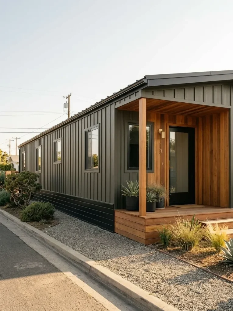
The exterior is where a 1970s mobile home makeover can create the most dramatic before-and-after photograph because the largest surfaces are visible simultaneously.
That does not mean the transformation needs the most decorative additions.
Step well back from the house and reduce the façade to five parts:
main siding field → trim → windows → entrance → base/skirting
Those are the layers the eye registers before porch décor, flower pots, shutters, signs, or seasonal styling.
When existing materials are sound and appropriate for the intended treatment, simplifying those large relationships can dramatically reset the exterior.
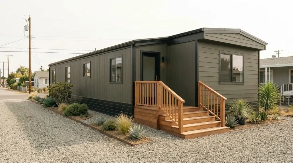
Your inspiration images show two very different makeover depths. Some use paint, trim coordination, natural wood, entry emphasis, and landscaping. Others involve extensive construction and architectural change.
Do not confuse the two.
Choose the depth of transformation before choosing the details.
A dramatic exterior can come from very different levels of work. Classify the project first so the inspiration stays realistic.
Read the shell
- dominant siding field
- trim fragmentation
- entry visibility
- base/skirting line
Simplify in layers
- largest suitable surface first
- one trim relationship
- one deliberate door moment
- warm material only where useful
Check the composition
- fewer competing edges
- clearer entrance
- grounded base
- decor becomes secondary
StylishGalore’s cheap-upgrades guide reinforces the same useful principle: broad surfaces, edges, doors, trim, and repeated details often have more visual reach than decorative purchases. Stylish Galore
Explore 21 Cheap Mobile Home Upgrades That Look Expensive
The exterior should look more resolved from twenty feet away before you worry about the objects visible from five feet away.
17. Make the Entry Feel New Before You Decide You Need a New Porch
The entrance controls the moment a visitor shifts from viewing the exterior to experiencing the home.
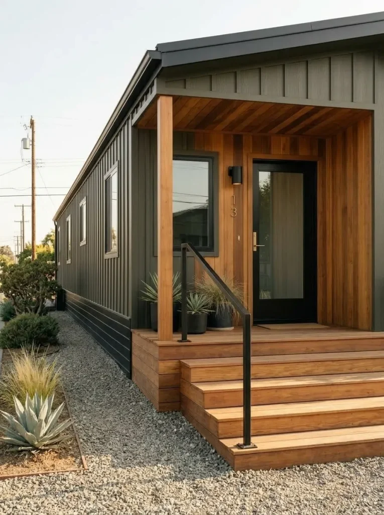
That makes it easy to assume a dated arrival needs an entirely new porch.
First solve the layers closer to the door.
From the normal approach, read the sequence:
door → trim → light → landing → steps → railing
Do those elements feel like one composition?
If the existing entry is sound and appropriate to retain, coordinate its visible parts before adding architecture. A clearer door finish, simpler trim relationship, compatible lighting, cohesive railing treatment, and restrained landscaping can give the home a much stronger arrival.
Natural wood can work especially well against dark charcoal, deep green, warm white, or another restrained exterior field because it introduces warmth at the place people actually touch and enter.
Several of your supplied references demonstrate that relationship effectively.
But the cosmetic boundary is important.
Loose steps, movement, decay, failing rails, questionable supports, or another condition concern should stop the styling project.
Only after the existing arrival is resolved should a larger porch have to justify itself through function—weather protection, outdoor seating, improved circulation, or another real use.
18. Bring an Existing Screened Porch or Addition Into the Same Material Story
A screened room can physically connect to a mobile home and still feel like a completely separate building.
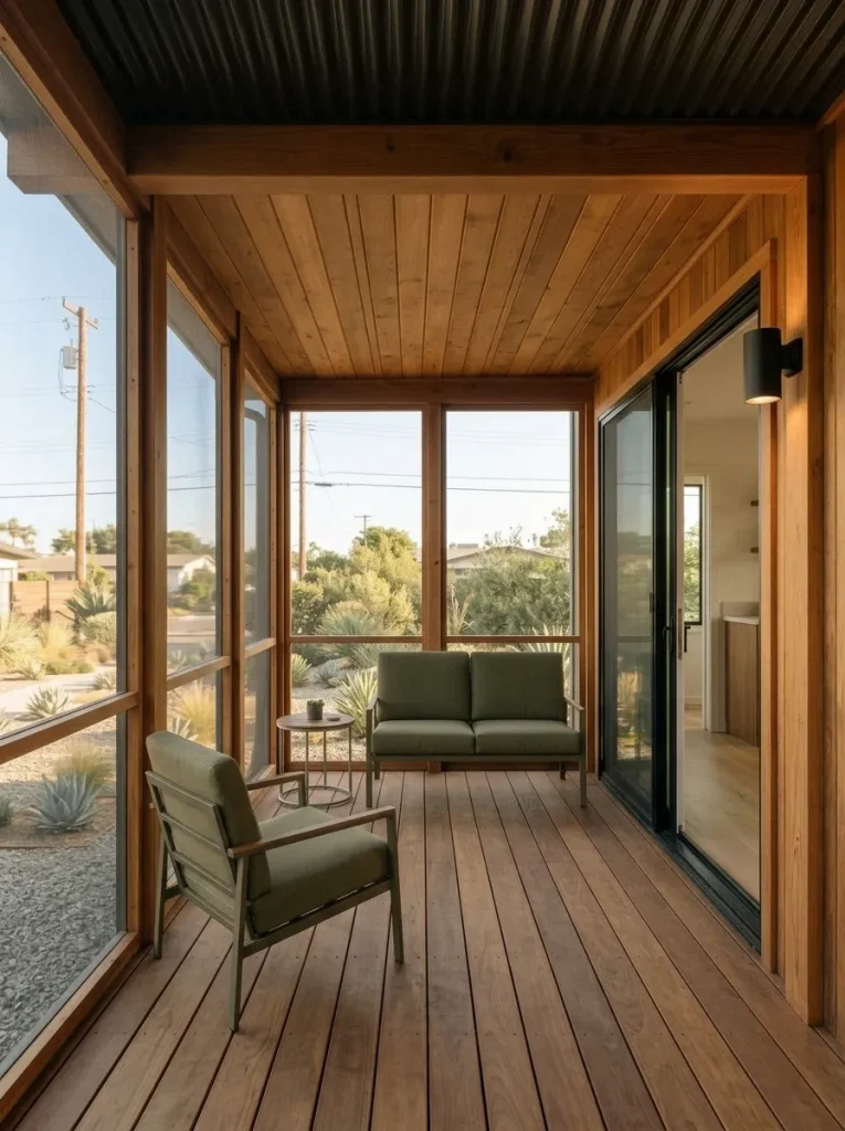
The disconnect often comes from accumulated layers:
one floor outside, another inside; unrelated ceiling material; different metal finishes; different color temperature; spare furniture; no repeated visual cue connecting the two spaces.
Do not solve that by filling the porch with more decorations.
Choose two or three signals from the main home and repeat them selectively:
- one wood tone;
- one light or dark metal finish;
- one upholstery family;
- one trim relationship;
- one lighting character;
- one related flooring tone where the materials and application permit it.
Then define a real activity.
Dining.
Conversation.
Reading.
Plant care.
Morning coffee.
A porch feels far more intentional once its furniture and finishes support a clear use.
The screened-porch inspiration you provided works because the space reads like a furnished room. Seating is grouped, the floor is defined, the ceiling and timber are visible, and the connection back to the home remains part of the composition.
Keep Styling Separate From Structural Attachment
If the porch already exists, decorating and finish coordination are one problem.
Adding a new structure to the home is another.
For post-June 15, 1976 manufactured homes, HUD data-plate information can include whether the home was designed to accommodate additional loads from an attached accessory building or structure. HUD
HUD also advises homeowners that significant additions or structural changes may require local permits and consultation with the relevant state, county, or local agency. HUD
For earlier 1970s mobile homes—or whenever documentation and construction are unclear—do not extrapolate from a later home’s data plate or from an inspiration photo.
Use design to visually connect an existing suitable porch. Use qualified technical guidance to determine whether structural work is appropriate.
19. Sequence the Makeover So the Home Never Looks Half-Finished
The final idea is the one that keeps the other eighteen from becoming separate projects.
A 1970s home may contain several strong age signals simultaneously.
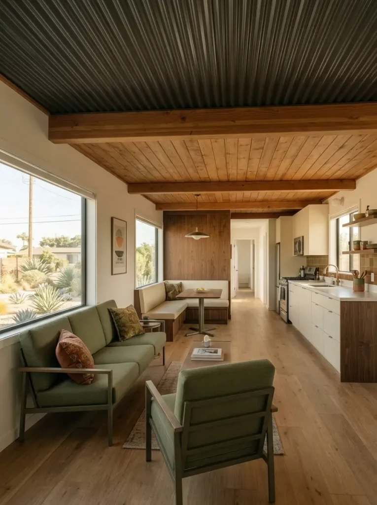
If you update them randomly, the midpoint can look stranger than the original: bright new cabinets beside unresolved dark walls, contemporary flooring beneath a visually heavy ceiling, or a beautiful front door floating inside a fragmented exterior.
Sequence by dependency and visual reach.
Finish the transformation in the order the house needs it.
Use visual impact only after condition and project dependencies have been separated.
Investigate damage, moisture, movement, electrical concerns, or other issues first.
Ceiling, major wall fields, connected flooring, and the exterior shell.
Trim, doors, window treatments, hardware, and recurring dated details.
Kitchen face, vanity cluster, living-room focal wall, and entry.
Textiles, art, accessories—and the decision that the room is already finished.
condition, function, safety, large visual fields, and repeated problems affecting several spaces.
small decorative objects whose effect depends on the larger surfaces already making sense.
If your makeover has a firm cost ceiling, the site’s under-$500 guide is a useful next step because it reorganizes decisions around how much visual change can be achieved before deeper work consumes the budget. Stylish Galore
Explore 19 Mobile Home Makeover Ideas Under $500
Then add one final rule to the sequence:
Stop when the home begins reading as one intentional composition.
Replacing another original item does not automatically make the makeover better.
A 1970s Mobile Home Can Feel Current Without Forgetting Where It Came From
A successful 1970s mobile home makeover is not measured by how completely the original decade disappears. It is measured by how clearly you separate genuine condition problems from cosmetic age, then use the largest surfaces and strongest visual signals to guide the project.
Preserve a period feature when it gives the home character. Reduce its visual weight when it overwhelms the room. Replace it when function, condition, or the finished composition gives you a clear reason.
That approach creates something more valuable than a temporarily fashionable renovation: a home where the ceiling, walls, floors, built-ins, color, lighting, rooms, and exterior finally feel connected—and where the remaining vintage details look like choices.
Save this 1970s mobile home makeover guide on Pinterest so you can come back to the ideas, decision tests, and makeover sequence when you’re ready to update your own home.