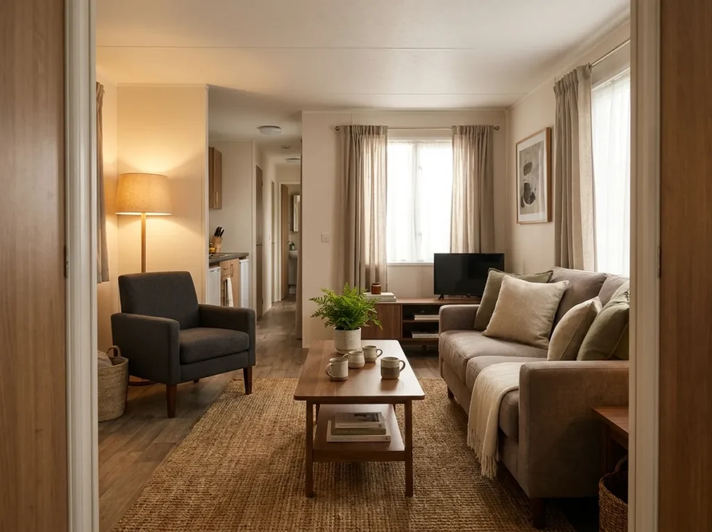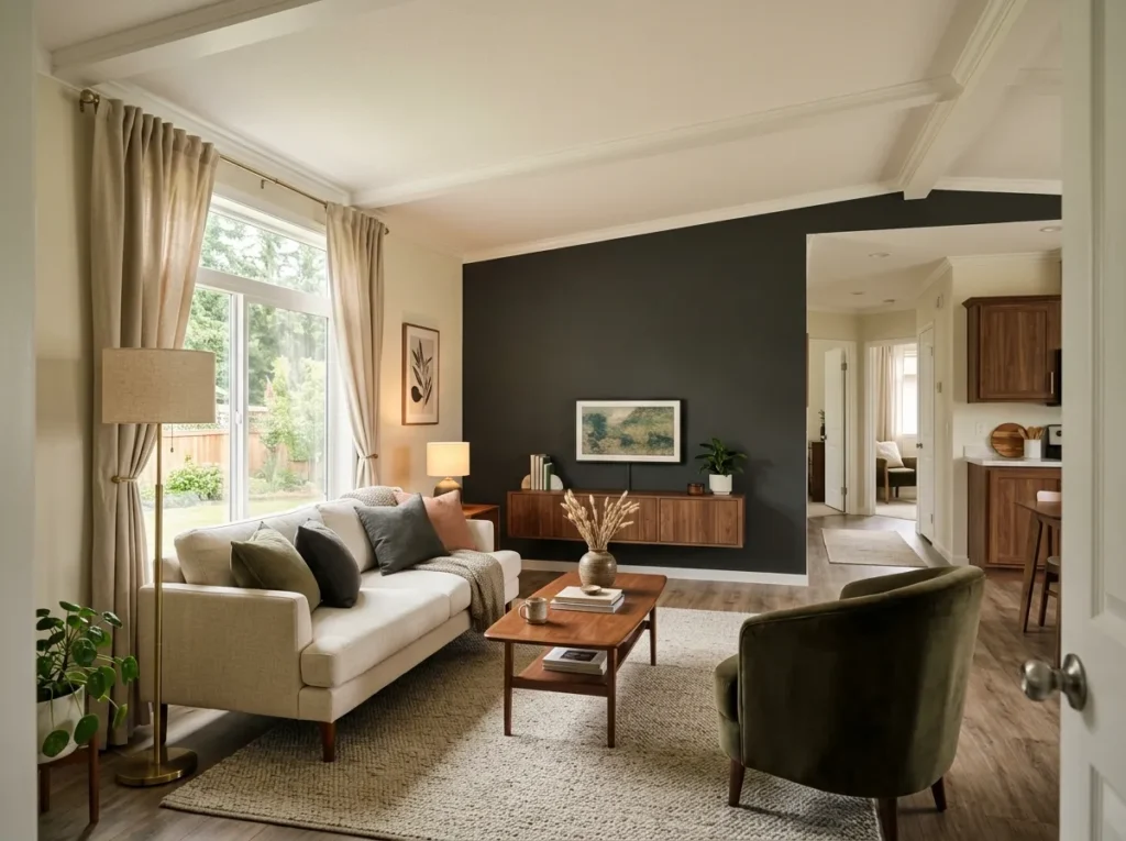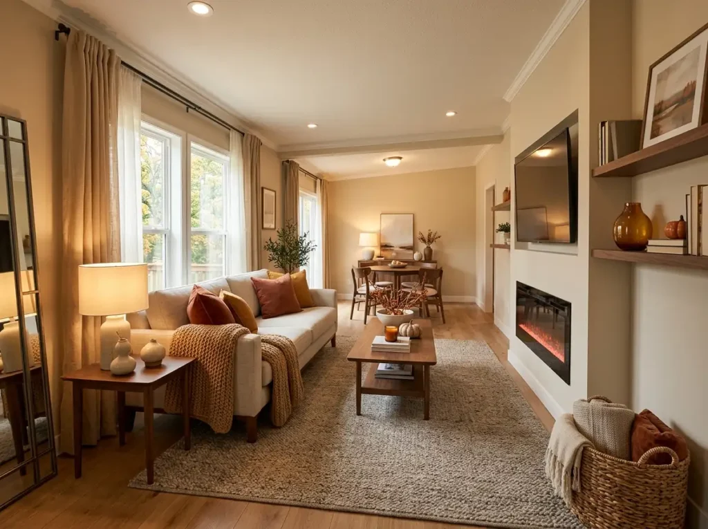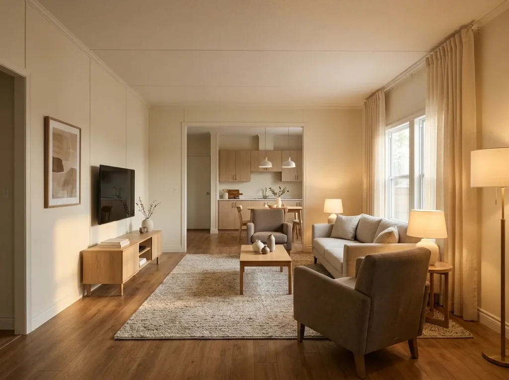
A mobile home living room can have perfectly good furniture and still feel less polished than the inspiration rooms you save. Usually, the difference is not one expensive sofa, a designer chandelier, or a complete remodel. It is the way the largest visual surfaces relate to one another.
In the strongest luxury mobile home living room ideas, the ceiling feels intentional, windows have presence, furniture carries balanced visual weight, and the television does not dominate every sightline. Materials are edited carefully, lighting creates depth after sunset, and everyday objects have somewhere to disappear.
That matters especially in manufactured homes because the living room often reveals several architectural conditions at once: ceiling seams or trim lines, nearby doors, connected kitchens, wide windows, compact wall sections, and large pieces of furniture seen from a single viewpoint.
The following ideas focus on those relationships first. Some involve changing almost nothing. Others may suggest where one carefully chosen upgrade will have far more impact than a cart full of decorative accessories.
1. Make the Ceiling Plane Read as One Finish Before You Decorate Below It
Walk into your living room and deliberately look above the furniture for a few seconds.
In many mobile homes, the ceiling already contains several visible elements: perimeter trim, seams, ceiling-fan hardware, vents, recessed lights, beam-like strips, or a change in pitch. None of those details automatically looks inexpensive. The problem begins when every ceiling element appears to belong to a different visual story.
A dark fan, bright white ceiling, contrasting perimeter strip, shiny light kit, and another unrelated ceiling accent can divide the upper portion of the room into fragments. Because the ceiling spans almost the entire space, that fragmentation affects the room more strongly than a small decorative object ever could.
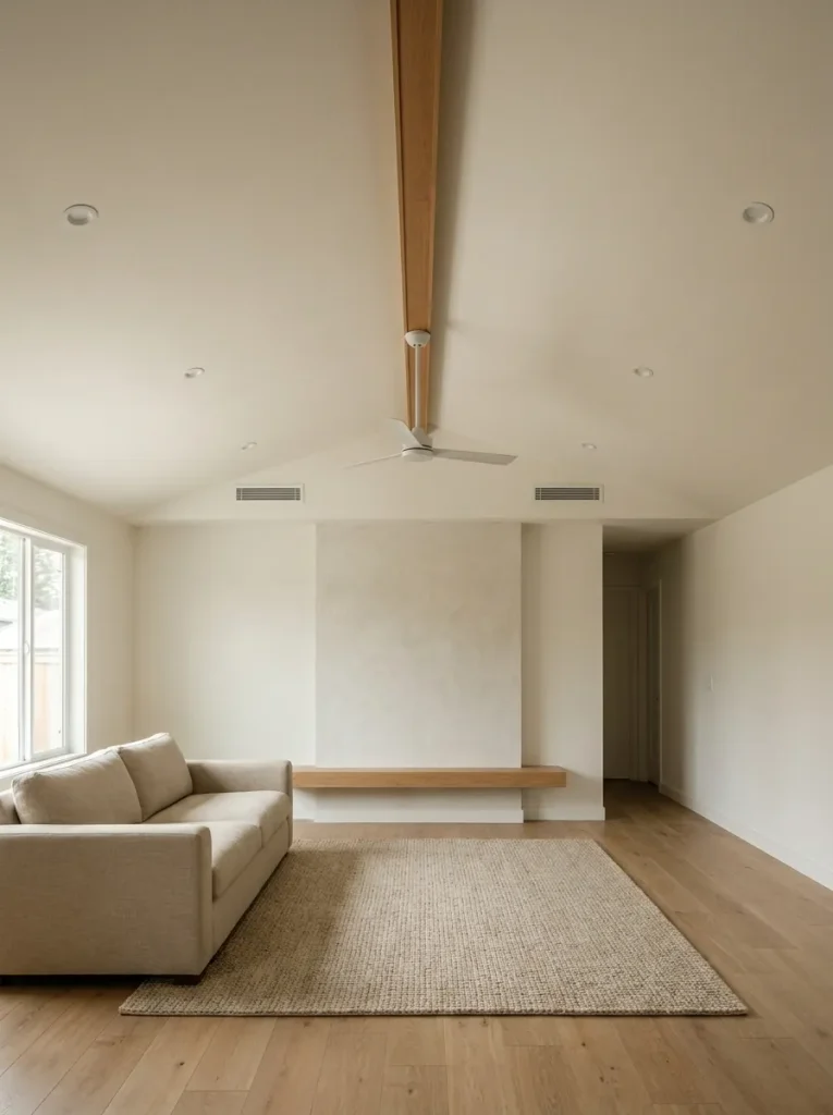
Treat the ceiling as a single composition.
Start by standing where you normally enter the living room and ask which element attracts your eye first. If it is an architectural line—such as an existing beam, ridge, or perimeter detail—let that remain the dominant feature and keep nearby visual interruptions quieter. If there is no meaningful architectural feature, the ceiling should generally recede enough that the furniture and focal wall regain priority.
A useful test is to temporarily ignore everything below eye level. Photograph only the upper half of the room. If the ceiling reads as several disconnected dark and light shapes, solve that visual conflict before investing heavily in wall accessories.
This does not mean covering, removing, or altering structural or manufactured-home system components simply for appearance. The expensive-looking improvement is often much simpler: reducing unnecessary contrast around existing features and allowing the ceiling architecture that is already there to read more deliberately.
The decision to make here is therefore not “Should I add beams?” It is:
Does my existing ceiling already have enough visual architecture, and would the room look more refined if I stopped competing with it?
In many mobile home living rooms, the answer is yes.
2. Balance the Room Around Its Actual Openings, Not an Imaginary Centerline
Perfectly centered rooms photograph beautifully because architecture does much of the organizing work. Mobile home living rooms are often different.
A front door may interrupt one wall. A hallway can open beside the television. One window may sit closer to a corner than expected. In an open-plan double wide, the living area can dissolve into the dining room or kitchen on only one side.
Trying to impose perfect symmetry onto that architecture can create a strangely off-center room even when the sofa and coffee table have technically been centered.
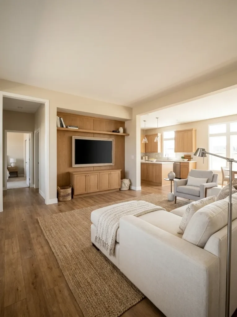
The better question is:
Where is the visual weight actually located?
A large window has weight. A dark television has weight. An open doorway creates a visual void. A tall cabinet adds weight. A long sectional can pull an entire composition toward one side.
Luxury-looking rooms balance those forces even when the architecture itself is asymmetrical.
Opening Balance Diagnostic
Which architectural interruption is pulling your room off balance?
Choose the condition closest to your living room. The recommendation below changes according to the type of imbalance.
The opening removes visual mass from one side, so centering furniture on the remaining wall can still feel crooked.
Build one stronger counterweight on the intact side: a chair-and-lamp pair, taller plant, or substantial console can work as one visual unit.
Do not fill the interrupted side with several tiny objects merely to imitate symmetry. Small pieces rarely counterbalance a major opening.
The window already acts like a large bright visual field, so adding equal decorative weight beside it can make the wall feel crowded.
Let the window stay dominant and balance it with lower, denser furniture elsewhere rather than another tall wall feature.
Do not flank a strong window with competing galleries, shelves, and tall décor unless the wall genuinely needs that much activity.
The adjoining room visually pulls the composition outward, so the living room may lack a clear edge even when the furniture is centered.
Strengthen the living-zone anchor with a rug, substantial sofa line, or clear focal wall so the space reads as intentional within the larger view.
Once the living area remains visually legible from the kitchen or dining room, additional separators are usually unnecessary.
One simple way to apply this is from the entrance. Stand at the doorway and mentally divide the far view into heavy and light zones. If a large television and console occupy the left side while an open hallway removes most of the right wall, adding another small frame beside the TV will hardly change the balance. A floor lamp, occasional chair, taller plant, or simply more breathing room around the stronger anchor may solve the composition more convincingly.
Asymmetry is not the problem.
Unresolved visual weight is.
3. Make the Main Window Look Taller Through Fabric Volume, Not More Decoration
A manufactured-home living room window can occupy a surprisingly large percentage of the visible wall. That makes the way it is dressed disproportionately important.
Consider two versions of the same window.
Version A: a narrow curtain panel ends visually at the glass, gathers tightly at either side, and leaves a large amount of bare wall above it.
Version B: the fabric feels generous enough to frame the opening, the eye reads more vertical fabric than exposed hardware, and the window becomes part of the room’s architecture.
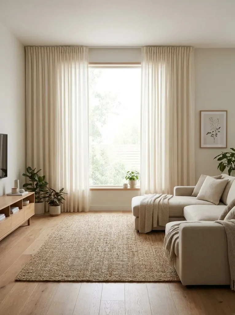
The second version usually feels more substantial even if the fabric itself is inexpensive.
The distinction is volume and visual height, not decoration.
Before buying patterned valances, layered signs, decorative tiebacks, or extra objects around the window, inspect three things:
- Does the fabric visually frame the complete opening?
- Does it have enough fullness to look intentional when closed or partly closed?
- Does the window feel taller once the fabric is viewed from across the entire living room?
A very small room does not automatically require visually tiny curtains. In fact, undersized window treatment can make the wall feel more temporary because the fabric reads like an accessory attached to the window rather than part of the room composition.
There is one important exception: if a radiator, heater, furniture placement, door swing, or another functional condition makes longer fabric impractical, prioritize safe everyday use. The luxury cue is not a prescribed curtain length; it is making the window treatment look resolved within the conditions of the room.
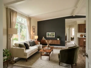
If your problem is broader than the window itself, the site’s guide to mobile home living room ideas continues into furniture placement, focal points, circulation, and other whole-room decisions.
For this particular upgrade, however, make the buying decision only after viewing the window from the opposite side of the living room. If it still reads as a small rectangle surrounded by disconnected fabric and hardware, improve the composition before adding anything decorative beside it.
4. Let One Large Textile Carry the Pattern for the Seating Zone
Imagine a living room with plaid accent chairs, a geometric rug, patterned curtains, striped cushions, and another print on the throw.
Each item may be attractive on its own.
Together, especially in a mobile home where much of the room can be visible in a single glance, they can compete as five separate focal points.
Now remove four of those pattern demands and allow one large textile to become the lead.
Perhaps the rug carries the expressive pattern while upholstery remains quiet. Or the curtains provide a strong stripe while the rug becomes softly textured. In another room, an existing patterned sofa may already be doing enough visual work, making the most sophisticated decision a restrained floor covering and simpler cushions.
That creates an important distinction:
Pattern does not make a room look inexpensive. Pattern without hierarchy can.
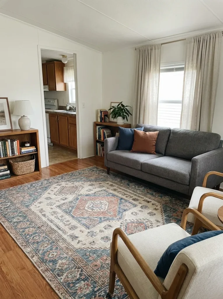
Use a quick whole-room test. Stand where the living room connects to the kitchen, hallway, or entry and identify the first patterned surface your eye notices. That is your likely leader. Then look at every other large textile and ask whether it supports that leader or starts a second conversation.
A neutral room is not the objective. A room can contain deep color, plaid, florals, stripes, animal-inspired motifs, or vintage patterns and still feel luxurious. The condition is that one pattern receives enough visual territory to feel deliberate while the others step down in scale, contrast, or quantity.
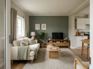
This approach is particularly useful when you already own furniture you do not plan to replace. If the sofa has a noticeable pattern or strong texture, do not assume a “luxury makeover” requires hiding it. First reduce competition around it.
The most expensive-looking decision may be the one that lets something you already own finally look intentional.
5. Balance the Seating by Visual Weight, Not by Buying a Matching Set
A sofa, loveseat, recliner, and accent chair can all come from different collections and still look considered.
What usually makes mixed seating feel accidental is not the lack of matching upholstery. It is unequal visual weight.
Picture a typical mobile home living room with one bulky reclining sofa, a petite wooden accent chair, a tall leather recliner, and a lightweight side table. The pieces technically fit, yet the sofa dominates the entire room while everything else looks temporary beside it.
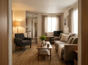
Visual weight comes from several things at once:
- overall width and depth;
- upholstery darkness;
- arm thickness;
- seat height;
- exposed versus hidden legs;
- pattern contrast;
- proximity to other large objects.
That means an existing chair can sometimes be made to relate better to a heavier sofa without replacing either piece.
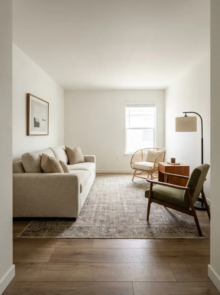
A pale chair sitting alone may need the visual support of a nearby lamp or side table. A dark recliner may feel excessively heavy when pushed into a dark corner but much more integrated when given breathing space. Two lightweight chairs can collectively balance a substantial sectional even though neither one matches it.
Visual Weight Balancer
Does your seating need replacement—or just rebalancing?
Select what you see from the main doorway. Each state gives a different buying and placement decision.
The dominant sofa or recliner is carrying far more darkness, width, or bulk than the surrounding pieces.
Build a counterweight from two lighter objects—a chair plus lamp, or chair plus side table—so they visually behave as one stronger unit.
A complete matching suite may simply replace usable furniture without fixing scale distribution.
The problem is insufficient visual mass on one side, not necessarily furniture mismatch.
Move an existing lamp, side table, plant, or occasional chair into the weak zone and recheck the room from the doorway.
The area still feels empty after existing pieces are combined into a useful grouping.
Your mixed furniture already forms a believable whole despite differences in fabric, age, or collection.
Improve lighting, textiles, wall hierarchy, or material continuity before replacing functioning seating.
If no single piece visually collapses or overwhelms the composition, matching furniture is not required for a luxury look.
Now judge the seating from the same viewpoint you normally see when entering the room. If the composition feels stable, a matching furniture collection may add very little.
For genuinely compact rooms, furniture scale becomes its own problem; the guide to small mobile home living room ideas goes deeper into layouts where every inch matters.
Here, the luxury decision is simpler:
Keep mixed furniture when the visual mass feels balanced. Replace pieces only when their scale or function is actually wrong.
That preserves budget for improvements the room can visibly use.
6. Reduce Depth Jumps Around the TV So the Wall Looks Designed, Not Added-On
Look at the television wall from the sofa.
The screen may sit almost flat against the wall. The console projects much farther into the room. A soundbar creates another line. Decorative objects rise at several heights. Cables or small electronics may sit in front of everything. A tall plant or leaning sign then adds yet another depth.
Individually, none of these things is unusual.
Together, they can make the wall read as a stack of separate objects attached at different distances.
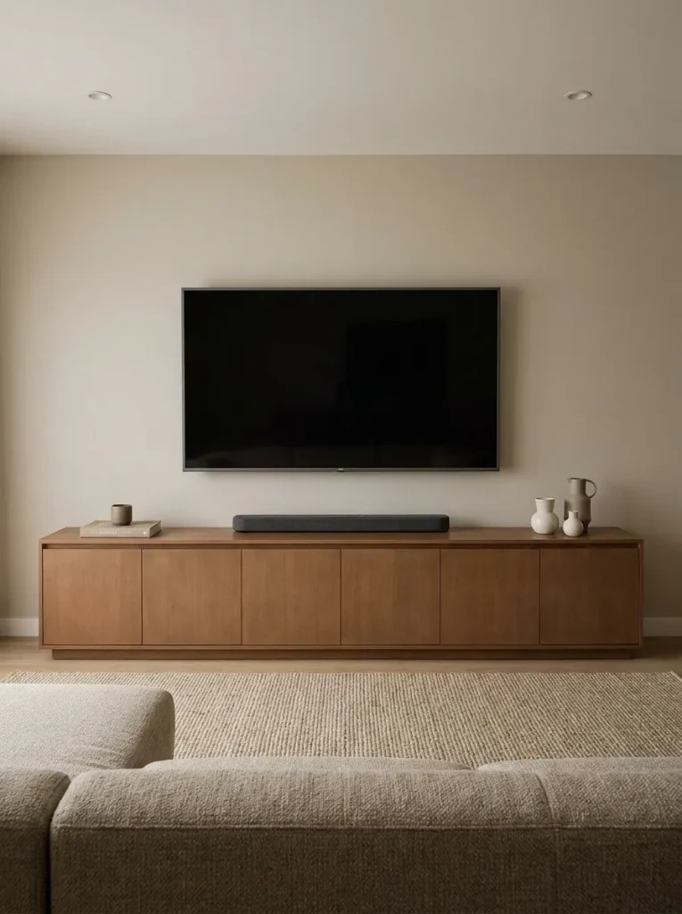
That is why replacing an ordinary TV stand with a fashionable one does not always make the room look more expensive. The underlying depth problem remains.
A better correction starts with the silhouette.
From the side of the room, inspect how many major forward-and-back jumps you can see. The screen, media surface, storage, lamps, décor and nearby furniture should not all create equally assertive planes.
Try consolidating before rebuilding:
- group small electronics so they do not form a scattered front layer;
- remove decorative objects that project far beyond the media surface without contributing enough visually;
- keep the largest horizontal line visually clear;
- use taller objects selectively, not at both ends plus the middle;
- hide or organize loose cables where practical and safe.
The television itself does not have to disappear.
In fact, pretending a large screen is not there can make the design feel less convincing. A polished media wall acknowledges its size and gives it enough visual structure that the screen feels integrated with the room.
There is also a useful stop point.
If editing the console, accessories and visible equipment creates a clean relationship between wall, screen and storage, you may not need cabinetry, a faux fireplace, shiplap, or another architectural feature at all.
The expensive look comes from the TV wall appearing resolved—not from proving how much was added to it.
7. Leave One Wall Deliberately Quiet Beside the Focal Wall
Luxury inspiration can create a strange decorating reflex: every blank wall starts to feel unfinished.
A gallery goes above the sofa. Shelves go beside the television. A sign fills the narrow strip by the hallway. The corner gets a ladder. The space above a doorway receives another decorative object.
Eventually the room has no visual silence left.
This is particularly noticeable in mobile home living rooms because one viewing angle can expose several walls simultaneously. When every one of those walls contains a strong arrangement, the eye has nowhere to settle.
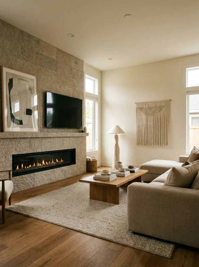
So choose one wall that is allowed to do less.
It might contain:
- one appropriately scaled artwork;
- one lamp beside furniture;
- a restrained plant;
- or almost nothing beyond paint and architecture.
That wall becomes valuable precisely because the focal wall is doing more elsewhere.
Consider a living room with a dark media wall, a patterned rug, visible kitchen cabinetry in the background, and a strong ceiling detail. Adding another dense gallery opposite the television may not create richness. It can weaken the room’s hierarchy by giving the eye four places to pay attention to at once.
The quiet-wall principle is not minimalism as a style rule.
Traditional, farmhouse, eclectic, and collected rooms can all use it. The purpose is to leave one lower-intensity field so that the higher-intensity areas appear chosen.
An exception applies when the room is exceptionally plain and has no meaningful focal point. In that case, a quiet wall alone will not create sophistication; first establish one area with enough presence to deserve the contrast.
Once a strong focal area exists, however, stop asking:
“What can I put on this empty wall?”
Ask:
“Would filling this wall make the room better—or merely make it fuller?”
That single editing question can prevent a surprising amount of unnecessary décor spending.
8. Let Only One Hard Surface Carry Strong Grain or Pattern
A mobile home living room can contain several visually active hard surfaces before a single accessory is added.
There may be wood-look flooring with pronounced grain. A faux-brick fireplace. Stone-look tile. Rustic furniture. A heavily grained media console. Dark ceiling beams. Wood trim at doorways. Connected kitchen cabinets may also be visible from the sofa.
The issue is not that these materials are inexpensive.
The issue appears when each surface asks to be noticed equally.
When several grains, masonry patterns and high-contrast textures meet inside one sightline, the room can begin to resemble a collection of finishes rather than one interior.
A stronger approach is to choose a hard-surface leader.
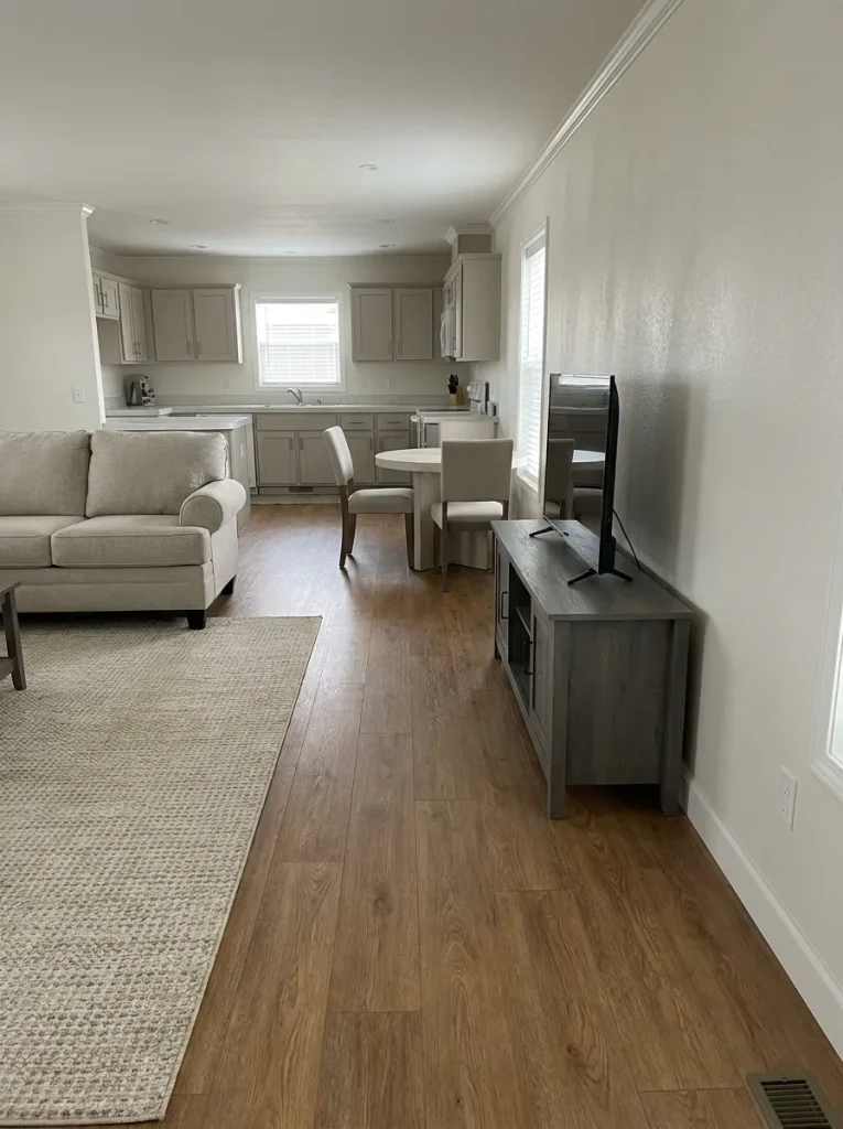
If the flooring already has noticeable variation, quieter furniture finishes can make it look richer. If a fireplace carries bold brick or stone texture, nearby casegoods may need simpler fronts. If stained ceiling beams are the architectural feature, adding equally rustic wood to every vertical surface can dilute their impact.
Surface Competition Lab
Which hard finish should carry the room?
Choose what currently has the strongest character. If several finishes feel equally loud, select “everything competes.”
Pronounced wood-look grain already occupies the largest horizontal field. Treat it as your material statement.
Prefer calmer casegoods, simpler fireplace texture, and fewer unrelated wood tones. The floor does not need another competitor.
Brick, stone, paneling, or a strong fireplace can carry most of the room’s architectural texture by itself.
Keep the flooring and main furniture surfaces quieter so the feature wall reads as deliberate rather than one more busy finish.
A distinctive media console, coffee table, or vintage wood piece can become the room’s material identity.
Avoid adding multiple faux-wood treatments or equally strong masonry patterns nearby. Give the furniture enough quiet background to look valuable.
If floor, wall, and furniture all demand attention, adding another finish will intensify the conflict.
Choose the hardest or most expensive surface to change as the leader. Simplify the easier surrounding finishes before replacing the dominant one.
One practical way to make the choice is through photography. Take a normal wide-angle phone photo of the entire living room and notice which hard surface dominates first.
If two or three shout at the same volume, you have found the conflict.
You do not necessarily have to replace the loudest finish. Often the better move is to protect the strongest existing surface and simplify what touches it.
That is a much more targeted luxury upgrade than adding another decorative layer.
9. Light the Walls and Corners After Dark, Not Only the Center of the Room
Some living rooms look polished in daylight and unexpectedly flat after sunset.
That usually happens because the room loses its vertical light.
A ceiling fixture may illuminate the floor adequately, yet the corners disappear, wall color becomes duller, artwork loses dimension, and a large television turns into the darkest object in the room. In a mobile home living room, where several walls and adjoining spaces may be visible at once, this flattening can make the entire interior feel smaller and more utilitarian.
The solution is not automatically a brighter ceiling light.
First inspect where the light lands.
A floor lamp directed toward a quiet wall can make that wall feel deeper. A table lamp beside the sofa can pull the seating zone forward visually. A small light source near the media wall can soften the contrast between a black television and the surrounding surface. Even a lamp you already own may produce a dramatically better result simply by moving several feet.
Try this after dark:
- Turn off every portable lamp.
- Leave only the main ceiling light on.
- Stand at the living-room entrance.
- Identify the darkest major wall or corner.
- Move one existing lamp toward that area.
- View the room again before purchasing anything.
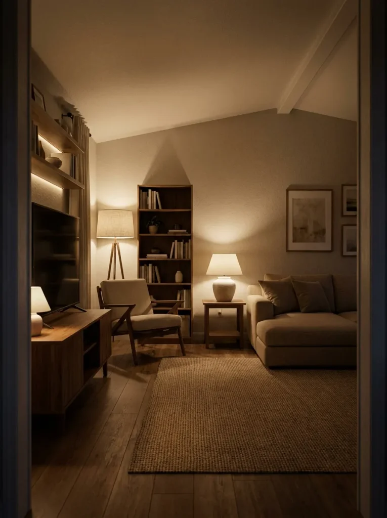
The objective is not maximum brightness. A luxury-looking room usually benefits from different depths of light—some surfaces brighter, others quieter, with the architecture still visible between them.
After-Dark Depth Map
What disappears first when the daylight is gone?
Select the weak night-time zone. The tool changes the lighting strategy, placement logic, and stop signal for each problem.
Your visible room boundary is disappearing, which can make the living room feel smaller at night.
Place or redirect a portable lamp toward that edge so the architecture becomes visible again.
You can read the corner clearly from the entrance without making the entire room uniformly bright.
The wall is receiving too little local light, so paint, artwork and texture collapse into one flat plane.
Put a lamp near the wall or beside furniture that already touches that zone. Let the light reveal the surface instead of flooding the ceiling.
Do not automatically install a brighter central fixture. More total light does not guarantee more depth.
The inactive television has become the darkest shape in the room, pulling attention toward itself.
Light an adjacent wall or nearby furniture zone so the contrast around the screen is reduced without shining directly into the TV.
The television remains visible but no longer dominates the room simply because everything around it has disappeared into darkness.
If the room improves dramatically after moving one lamp, that is useful evidence: your problem was light distribution, not the quantity or price of the fixtures.
That is why lighting can become one of the highest-return luxury changes in a living room. It affects the furniture, wall color, artwork, corners, and apparent depth simultaneously.
10. Separate the Sofa From the Floor With Tone Before Adding More Accent Color
A beige sofa on beige carpet can almost disappear into the floor.
A charcoal sectional on dark brown flooring can feel equally heavy for the opposite reason.
In both cases, the problem may be interpreted as “This room needs more color.” Bright cushions appear. Then a colorful throw. Then artwork with stronger contrast.
Yet the largest visual relationship remains unresolved:
sofa versus floor.
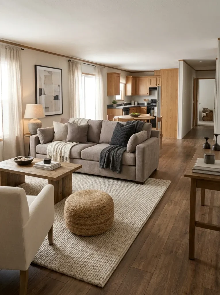
Sit at normal eye level and look at the bottom edge of your main seating. Can you clearly see the furniture as a separate form, or does its value merge into the flooring beneath it?
If those two major surfaces are too similar, create separation with a layer that already belongs naturally between them. An area rug is the obvious option, though the correct choice depends on the room. The objective is not necessarily a high-contrast rug. Sometimes a small shift lighter or darker is enough to give the seating a clear visual base.
The opposite issue can occur when a very pale sofa sits on extremely dark flooring and the transition feels abrupt. In that situation, a mid-tone rug can bridge the values and make the composition feel more intentional.
Consider these three relationships:
Pale sofa + pale floor
Use a rug with enough tonal change to define the seating footprint.
Dark sofa + dark floor
Introduce a lighter or more softly varied field beneath the furniture so the lower half of the room does not collapse into one mass.
High-contrast sofa + floor
A middle value can prevent the room from looking visually sliced into two extremes.
This is especially useful in mobile homes with continuous flooring running into an adjoining kitchen or hallway. Because the floor may visually connect several spaces, its relationship with the living-room seating can influence the entire open view.
Do not add a new accent color until this large-scale tonal relationship makes sense.
A room in cream, gray, brown, taupe, or another restrained palette can still feel extremely rich when the major forms are easy to read.
The question is therefore not:
“Which trendy color am I missing?”
It is:
“Can I actually see the furniture as a well-defined layer within the room?”
Solve that first.
11. Treat the Inside Face of the Front Door as Part of the Living Room
In many houses, the entry door belongs visually to a hallway or foyer.
In a mobile home, it may open directly into the living room.
That changes the design decision completely.
From the sofa, the interior face of the door can occupy as much visual territory as a piece of artwork. From the kitchen, it may sit beside the living-room focal wall. When open, it alters the balance of the room; when closed, it becomes a large flat surface within it.
Ignoring that surface can leave an otherwise polished room with one conspicuously disconnected element.
Imagine a warm living room with soft greige walls, wood flooring, cream upholstery, and black accents. If the entry door introduces an unrelated finish, overly decorative hardware, or several small hanging items, the eye reads those details every time it looks across the room.
There are two strong directions.
Let the door recede
Use this when the living room already contains several strong features. A quieter door allows the television wall, windows, furniture, or fireplace to hold attention.
Let the door become a controlled accent
This works when the room needs one strong vertical field. A deliberate darker or deeper finish can visually anchor the entry without requiring another accent wall.
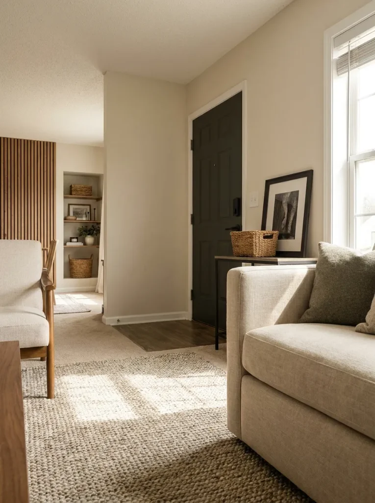
The mistake is choosing neither.
A door that is technically neutral but visually unrelated can appear more accidental than one that is clearly quiet or clearly intentional.
Before changing anything, stand at three viewpoints:
- the main seating position;
- the kitchen or dining connection;
- the doorway into the hall, if present.
Ask whether the door supports the room from all three.
Also edit what lives on and immediately beside it. Multiple wreaths, hanging organizers, tiny signs, visible utility items, and unrelated wall décor can turn the entrance into its own separate design zone. When the living room already contains a focal wall elsewhere, the entry often benefits from restraint.
Because the door is part of your daily route, function still comes first. Locks, hardware, weather-related components, and necessary equipment should not be altered simply for decoration.
The luxury improvement is more basic:
recognize the door as one of the living room’s largest visible surfaces and design around it accordingly.
Once you notice it that way, the room can feel more coherent without gaining a single additional piece of furniture.
12. Tuck Everyday Storage Into the Furniture Line Instead of Adding Another Storage Object
The living room gets messy.
The natural response is to buy storage.
A basket appears beside the sofa for blankets. Another holds chargers. A small organizer sits near the door. Toys get their own bin. Magazines occupy a floor rack. A remote-control caddy attaches to the arm of the sofa.
Every item is solving a legitimate problem.
Together, however, they create a second layer of small furniture around the actual furniture.
That is where storage begins to weaken an expensive-looking room.
A cleaner sequence is:
First — identify the routine.
What repeatedly appears in the room during an ordinary week? Blankets, children’s items, pet supplies, paperwork, chargers, shoes, remotes?
Second — find the nearest existing furniture line.
Could the items live inside the media console, an end table with a drawer, an ottoman, a cabinet, or another piece already occupying floor space?
Third — create one access point.
If five different daily categories can disappear into two existing pieces of furniture, the room gains calm without becoming harder to use.
Then stop.
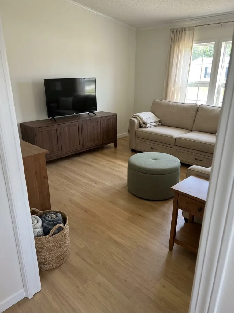
Only add a new storage object when the existing furniture genuinely cannot support the routine.
This matters more in mobile home living rooms because circulation edges can be visible and relatively compact. One decorative basket may be harmless. Five separate floor-level containers can interrupt the long visual line beside a sofa, television console, or hallway connection.
Closed storage has another advantage: it lets functional objects disappear at the same moment the room is being visually judged.
That does not mean every possession must be concealed.
A basket can be beautiful and genuinely useful. Open shelves can work. A tray can organize remotes elegantly. The deciding factor is whether each storage object has earned its own silhouette.
Use this practical test at the end of the day:
Stand at the entrance and count the number of separate things touching the floor around the perimeter of the living room.
Do not count the primary sofa, main chair, coffee table, or major console. Count the extra baskets, bins, racks, stands, small stools, and organizers.
If that secondary layer is beginning to form a dotted line around the room, consolidate before buying more.
The room will usually look larger, calmer, and more considered—and your storage will become easier to maintain because daily items have fewer possible homes.
13. Design the TV Wall for the Moments When the Screen Is Off
A television changes character depending on whether it is being used.
When it is on, moving images naturally dominate the wall. When it is off, the same screen becomes a large, dark rectangle sitting inside the living room for hours at a time.
That second state is easy to overlook.
Stand in the room during daylight with the TV switched off and ignore the screen as a device. Treat it simply as a dark shape. Does the surrounding wall still look composed, or does everything appear to have been arranged only around an active television?
A polished solution does not require disguising the TV.
It requires giving the inactive screen a believable relationship with what surrounds it.
Three situations are especially common:
The screen floats above a small console.
The dark rectangle may visually outweigh the furniture beneath it. Before replacing the console, check whether small objects scattered across its top are making the base look even weaker. A clearer horizontal line can sometimes restore enough visual support.
The TV sits inside a very busy wall.
Shelves, signs, plants, frames, clocks, and decorative objects may compete with the screen from every direction. When the TV goes dark, all those smaller objects become even more obvious. Edit the secondary elements before introducing another feature.
The television is already visually dominant.
Adding a stronger surround may simply create a larger focal wall. If the rest of the living room is quiet, that can work. If the room already has a fireplace, patterned floor, prominent ceiling detail, or adjoining kitchen in view, restraint may create the more luxurious result.
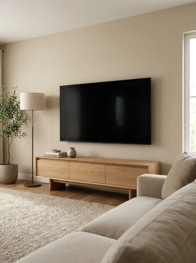
There is also a useful TV-off test:
Turn the screen off, remove any temporary objects from the console, and photograph the wall from the main seating position.
If the picture still looks intentional, stop.
If the wall suddenly appears unbalanced, identify whether the problem is scale, clutter, contrast, or grounding before shopping for cabinetry, slat panels, fireplace inserts, or another treatment.
A luxury-looking media wall should still make sense when the entertainment is over.
14. Treat the Empty Wall Around Artwork as Part of the Frame
Artwork can be beautifully framed and still look inexpensive when everything around it crowds the composition.
A thermostat sits six inches away. A decorative sign fills the gap above it. A wall clock competes on the other side. A tiny shelf is added underneath because the remaining space seemed empty.
The artwork did not become weaker.
Its visual breathing room disappeared.
This matters in mobile home living rooms because usable wall sections can be interrupted by windows, doors, hallway openings, switches, vents, trim transitions, or adjoining spaces. That often encourages homeowners to fit smaller décor into every leftover patch.
Try reversing the logic.
Once an artwork has a wall section, treat some of the blank surface around it as belonging to the artwork too.
From the normal room view, ask:
- Is there another object close enough to read as part of the same composition?
- If so, does it strengthen that composition?
- Or is it merely occupying leftover wall?
- Could one item be removed without making the wall feel unfinished?
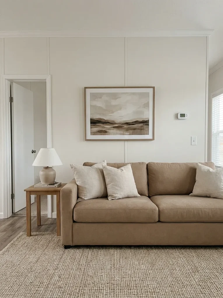
The answer becomes much clearer in a phone photo.
Small decorative objects that feel harmless in person often become obvious visual interruptions when the entire wall is reduced to a screen. That makes the photo view useful as a diagnostic tool rather than simply something to post.
This idea does not mean large artwork is always superior, nor does it mean every wall requires minimalist styling.
A traditional gallery can still feel sophisticated when the pieces clearly form one intentional composition. The problem is unrelated objects drifting around a primary artwork because blank space was treated as something that needed to be eliminated.
Before buying a larger picture or more expensive frame, remove the weakest neighbor.
Then look again.
Sometimes the upgrade was not missing from the wall.
It was hiding underneath too much of everything else.
15. Finish With One Move That Could Only Belong to This Room
The final stage of an expensive-looking mobile home living room should not be another generic luxury accessory.
It should be something that responds to this particular room.
That distinction matters because generic décor is easy to multiply. Brass lamp. Neutral vase. Oversized coffee-table book. Bouclé chair. Black picture frame. Decorative bowl.
All can be attractive.
None automatically proves the room has been thoughtfully designed.
A more convincing final decision begins with architecture or use.
Perhaps the living room has a peaked ceiling. Then the final move might reinforce that upward geometry somewhere else instead of adding unrelated wall décor.
Perhaps the strongest feature is an unusually wide window. The room may need a window treatment with enough presence to acknowledge that proportion.
Perhaps the entry door is visible from nearly every seat. Its interior finish may deserve more attention than another end-table accessory.
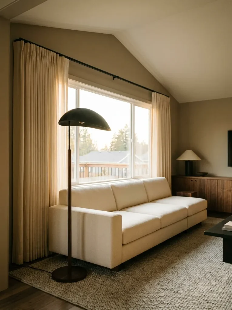
Perhaps a long sectional already creates a strong horizontal line. The best final choice might be a vertical lamp, artwork, or plant that gives the room a counter-direction.
Or perhaps the room already feels finished.
That possibility is important too.
Custom-to-the-Room Filter
What is your final upgrade responding to?
Choose the reason behind the idea you are considering. The result tells you whether it is likely to feel custom—or merely decorative.
A vertical element echoing a peaked ceiling, a calmer treatment beside an unusual doorway, or a finish that strengthens an existing beam line.
Ask whether the new element reinforces the architecture or simply sits beside it without a relationship.
Proceed when the room makes more visual sense after the addition—not merely when there is more to look at.
Fuller curtain volume, a seating orientation that uses the natural light, or furniture scale that respects an unusually wide window.
Do not crowd the window with extra shelving, small art, or tall accessories that compete with the architecture.
Choose upgrades that make the window feel more important, not more decorated.
A vertical lamp beside a long sectional, artwork scaled to a low console, or a rug pattern that reinforces the seating zone.
Make sure the addition solves a visible imbalance in height, mass, direction, or material.
Keep the furniture if the new relationship makes it look intentional. Replacement is not automatically the luxury move.
What existing problem would this solve—hierarchy, light, scale, storage, material continuity, or an empty functional zone?
The item is likely an accessory rather than a finishing decision. That does not make it bad, but it lowers its priority.
Photograph the room without it. If the space already looks complete, keep the money or wait for something more specific.
This is also where property type should determine your next step.
If the room belongs to a double wide and you want the same upscale logic carried into connected spaces, continue with the guide to luxury-looking double wide decorating ideas.
For a single wide where the whole interior still feels visually unfinished, the more useful continuation is how to make a single wide look more expensive.
For this living room, however, stop once the architecture, furniture, light, materials, and daily-use objects feel like they belong to one place.
Luxury begins to feel convincing when the room stops looking as though it was assembled from a checklist.
Conclusion
Making a mobile home living room look expensive is less about filling it with luxury objects and more about deciding what deserves visual authority.
Start with the broadest surfaces—the ceiling, openings, window, flooring, and main furniture—and work toward smaller decisions only after those relationships feel settled. Give the television an intentional role, protect breathing room around artwork, distribute light beyond the ceiling fixture, and let storage disappear into the furniture you already use.
Most importantly, stop when the room begins to feel specific to itself.
A polished living room does not need to advertise how much was changed. It needs to make the choices that remain look deliberate.