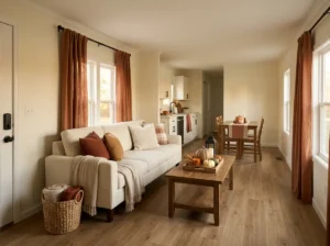
A single wide can be clean, comfortable, and thoughtfully furnished yet still look less finished than it really is. Often, the problem is not the age of the home or the price of the furniture. It is the collection of small details your eye reads at the same time: a crowded refrigerator door, wrinkled curtains, mismatched bulb colors, exposed everyday clutter, or several finishes competing for attention.
If you want to make a single wide look expensive without remodeling, begin with those visible signals before considering bigger upgrades.
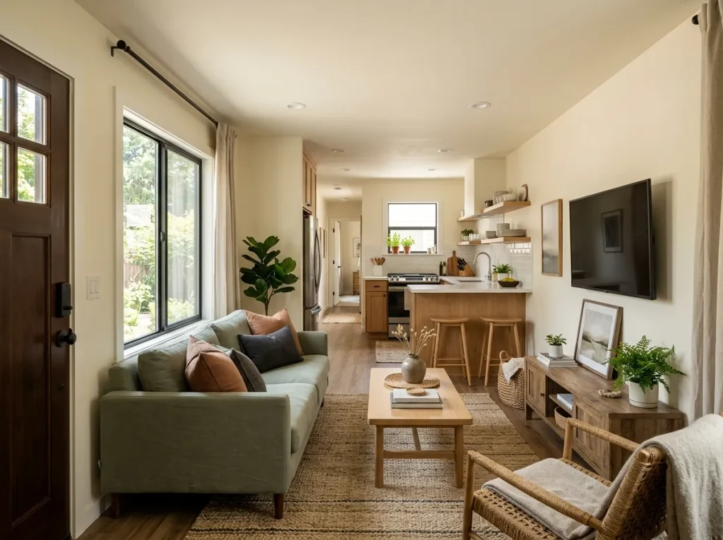
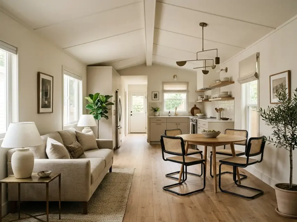
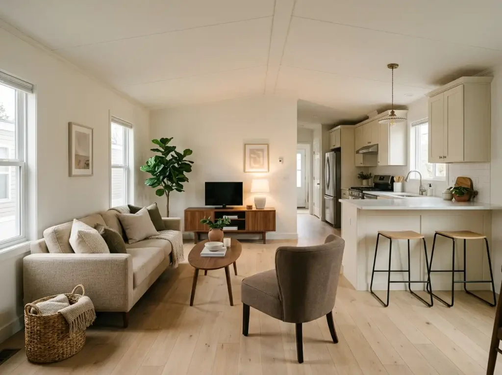
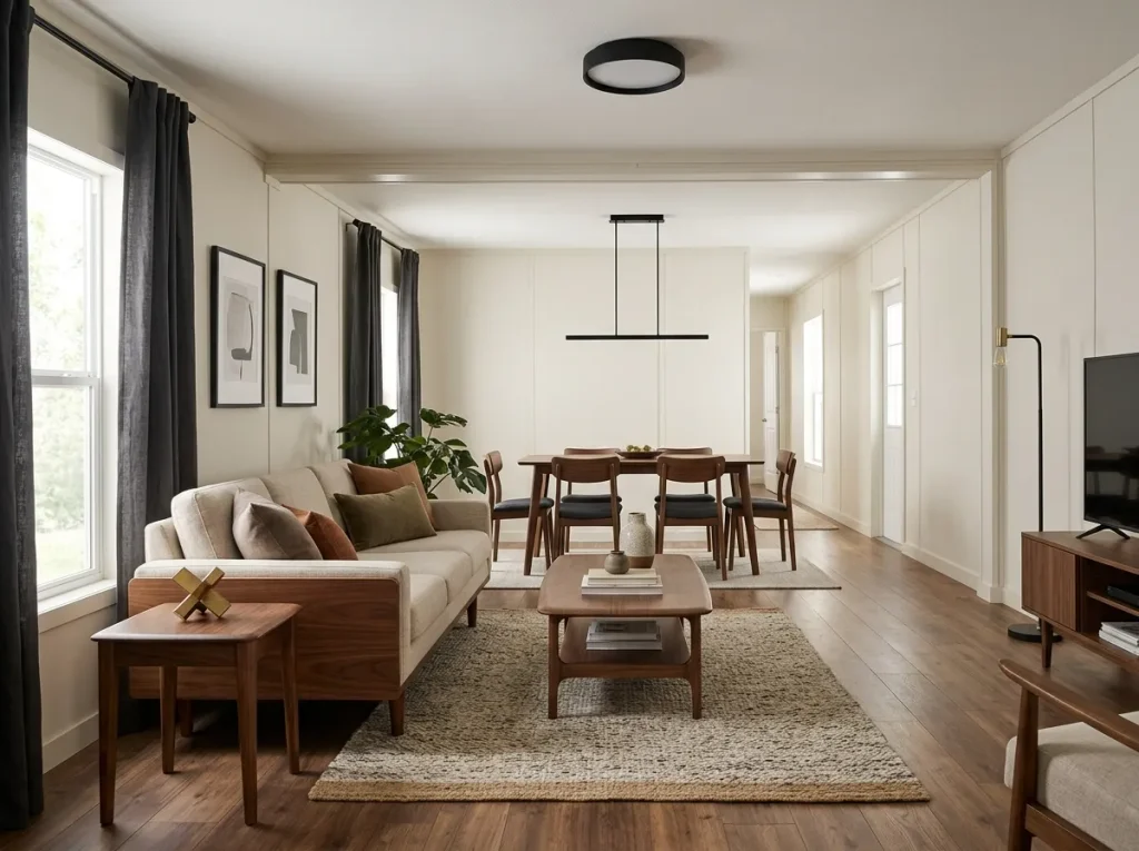
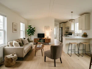
Because rooms in a single wide often connect through long sightlines, one polished change can influence more than one space. A calmer living-room surface may improve the kitchen view too. More consistent evening light can make an entire connected interior feel coordinated.
The 15 ideas below focus on that finishing layer—editing, grooming, concealment, lighting, styling, and presentation—so you can create a more intentional home without rebuilding it.
1. Run a “Value-Leak” Audit Before You Buy Anything
Walk through the front door and pretend you have never seen your home before.
What looks temporary first?
Perhaps it is a cluster of chargers beside the sofa. Maybe several wood finishes fight for attention, the curtains look rumpled, or the kitchen casts a noticeably different light color from the living room. These details can have unusual visual influence in a single wide because several rooms are often visible at once.
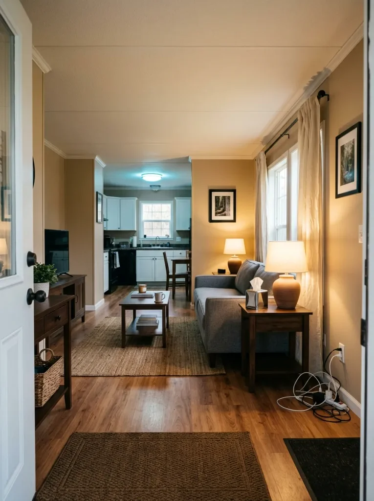
The useful question is not, What should I buy?
It is:
Which visible problem is lowering the perceived finish quality of the home most strongly right now?
Use the diagnostic below before spending anything.
Value-Leak Command Center
Find the one signal that is making the room feel unfinished.
Pick the first problem your eye notices from the doorway. The dashboard changes the correction, the spending priority, and the stop rule.
Give the finishes jobs before you replace them.
Choose the finish tied to the largest or hardest-to-change surfaces as the anchor. Everything else should support it or appear in a deliberately smaller dose.
Reduce the visual footprint, not the usefulness.
The goal is to keep daily function easy while preventing operational objects from becoming permanent décor.
Reset the fabric before you replace the fabric.
Large textile planes carry a lot of visual weight. Their condition can lower perceived quality even when the underlying furniture is still useful.
Compare the whole sightline after dark.
One cool source beside a warm room can make adjacent spaces feel unrelated. Check the compatible bulbs before assuming the fixtures are the problem.
The stopping rule matters. Correct the strongest leak, return to the doorway, and reassess. The second-biggest problem may suddenly look insignificant once the room is no longer asking your eye to process several competing signals.
2. Create a Finish Hierarchy Instead of Matching Every Surface
An expensive-looking room rarely depends on perfect matching.
It depends on hierarchy.
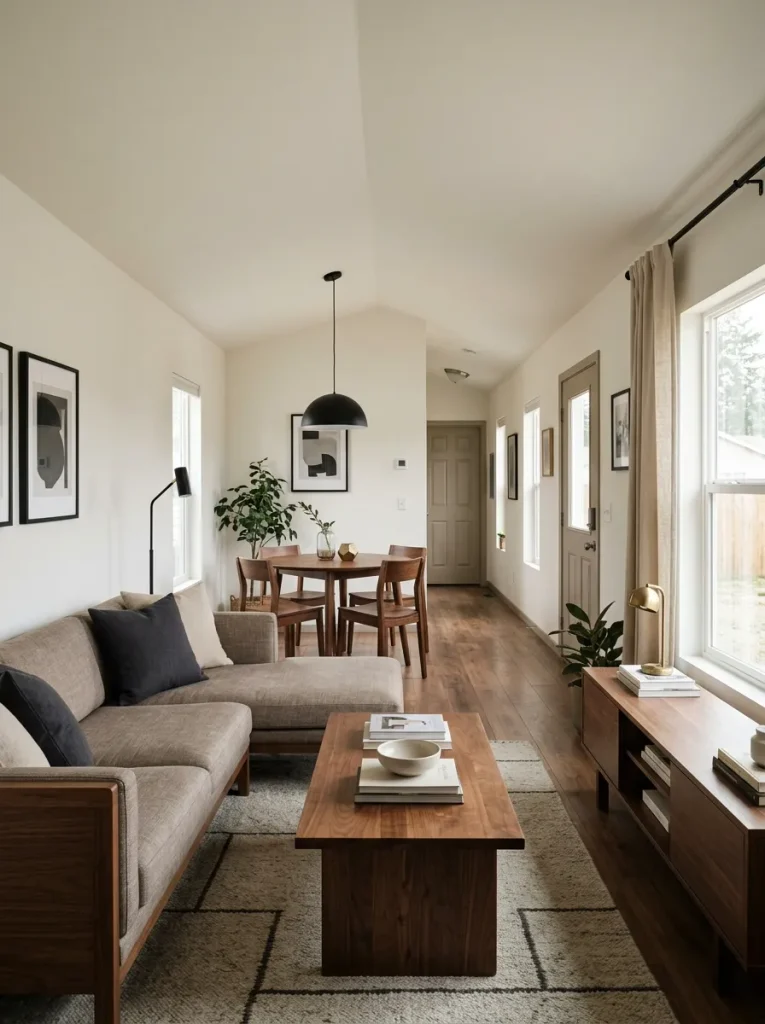
Your flooring might be the dominant finish. The cabinetry may become the supporting finish. Black metal could appear only as a small accent. That combination can feel far more deliberate than five woods and three metals all repeating with equal visual importance.
Before painting, replacing, or disguising a usable piece, work out what role it currently plays.
Material Hierarchy Lab
Make mixed finishes look intentional by assigning visual roles.
Select the finish relationship that most closely matches the room. Each state changes the proportion map and the next editing move.
Protect the leader.
The room already has a material story. New additions should support it or appear in a clearly smaller dose.
Turn competition into hierarchy.
Choose the finish attached to the largest fixed or expensive-to-replace surfaces as the anchor. Make the more movable finish quieter.
Repeat it once—or remove it.
An isolated finish can look accidental. One small echo can connect it; a forced echo can create more clutter.
If two finishes compete equally, quiet the one attached to movable objects first. If one finish appears only once, either echo it lightly or remove it from that sightline. If the dominant finish already feels established, leave it alone.
For a broader style transformation beyond this finishing-layer approach, the site’s guide to modern single-wide design ideas takes the design direction further.
3. Hide the Utility Layer From the Rooms You See Most
Every home has an operational layer: chargers, remotes, mail, pet supplies, tissues, medicines, cleaning products, reusable bags, keys, and dozens of ordinary objects that keep daily life functioning.
In a single wide, the problem is often where that layer becomes visible.
A charging station beside the sofa may also face the kitchen. Mail on the peninsula can enter the living-room composition. Shoes by the front door may sit directly on the home’s longest visual route.
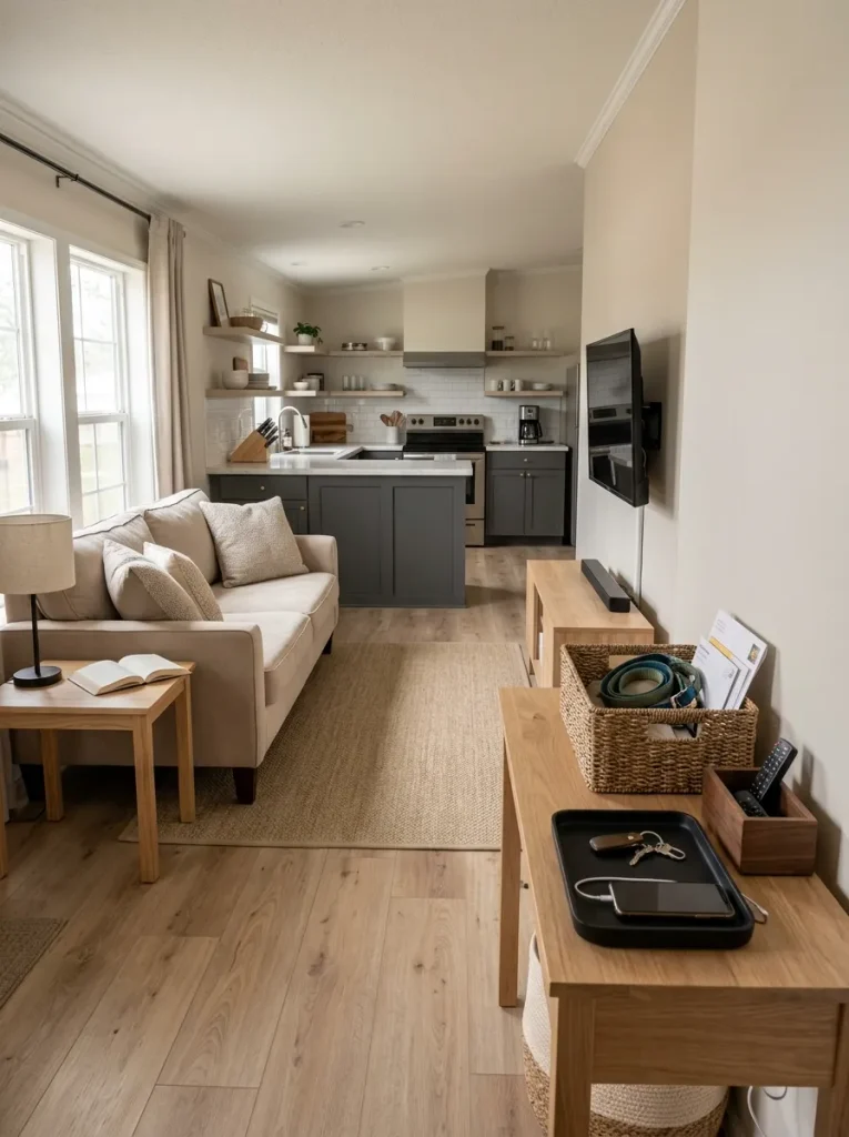
Use a visibility rule: something can remain easy to reach without earning permanent display status.
Choose the busiest utility cluster first. A tray may be enough. In another room, a drawer, basket, lidded box, cable route, or less exposed resting position may make more sense. The solution should follow the routine; hiding every practical object so thoroughly that daily life becomes inconvenient defeats the purpose.
After the edit, walk your usual route through the home. If the objects are still easy to use but no longer become the first visual event, the change worked.
For deeper furniture-footprint and circulation decisions, see the guide to single wide mobile home decorating ideas.
4. Make the Soft Goods Look Tailored Before Replacing Them
Consider the same living room in two photographs.
Before: curtain hems sit unevenly, the sofa cushions collapse toward the center, two throws bunch across the arms, and a tired pillow folds in on itself.
The room may be clean. The furniture may still be perfectly usable. Yet a large percentage of what the camera sees looks slightly neglected.
After: the suitable fabrics have been smoothed or steamed according to their care instructions, the cushions have been restored to shape, the curtains fall cleanly, and one throw remains while the unnecessary extra layer has been removed.
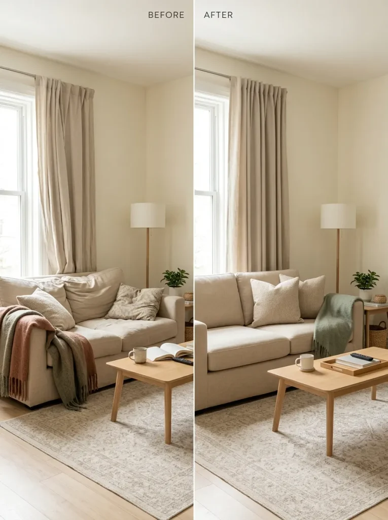
The furniture has not changed.
The presentation has.
Soft surfaces occupy large portions of a small home, which gives their condition unusual visual influence. Give grooming a genuine chance before shopping.
A practical replacement threshold is simple: if a textile still looks visibly worn after cleaning, shaping, smoothing, and proper placement, replacing that piece may be worthwhile.
5. Standardize the Light Color Before You Upgrade a Fixture
Turn on the lights you normally use after sunset.
Then stand in the living room and look toward the kitchen, dining area, and hallway.
Do they feel like one home?
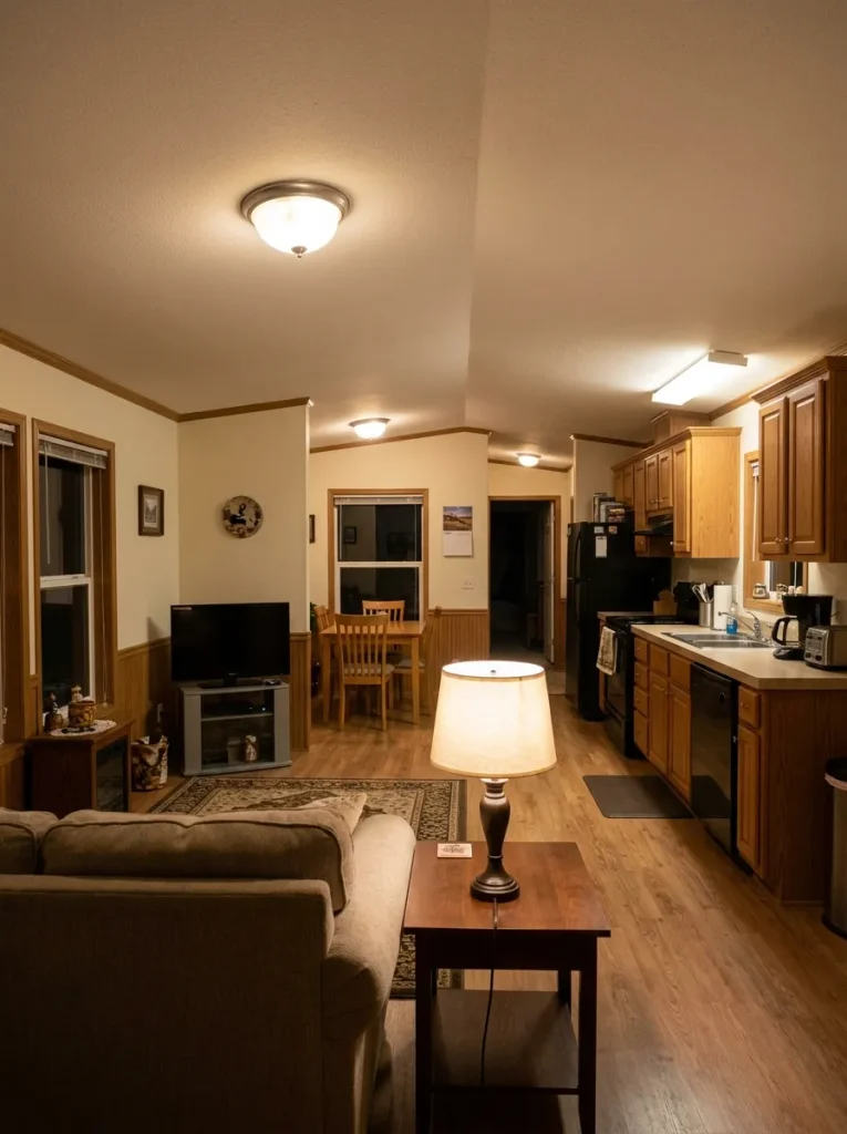
A warm lamp beside the sofa can sit within the same sightline as a noticeably cooler kitchen light. Another fixture may appear harsh while everything around it feels soft. Closed rooms can hide those differences; a connected single-wide interior often cannot.
This is why a fixture that appears “cheap” during the evening may not actually need replacement.
Check the compatible bulbs first. Where the room’s function allows it, bringing visible sources closer to the same general light character can make the space feel more composed. Task lighting should still perform its job, and bulbs must remain suitable for the fixtures in which they are used.
Night-view decision: if the connected rooms already feel cohesive once the bulb mismatch is corrected, stop there.
A functioning fixture does not become disposable merely because an inspiration photo uses something trendier.
6. Frame Personal Photos Like a Designed Gallery
Imagine a living-room wall filled with photographs that matter to the family.
The first version uses unrelated black, gold, white, rustic, and silver frames. The photographs are all similar in size, their spacing changes unpredictably, and several small pictures compete with each other.
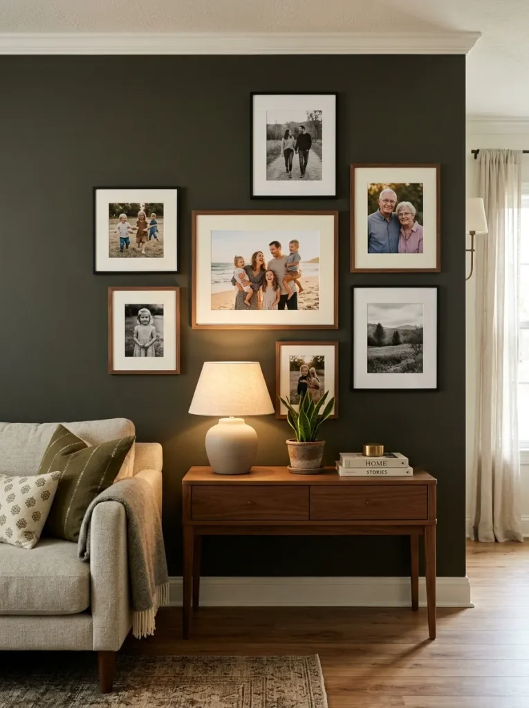
Now keep the same memories and change only the presentation.
One or two frame families remain. The strongest photograph becomes larger. Matting begins to repeat. The outer edges of the gallery form a clearer boundary. Smaller pictures support the larger image instead of competing with it.
Suddenly, the wall looks much more custom.
The transformation did not come from replacing personal photography with generic “luxury” artwork. It came from giving personal pieces an intentional visual system.
A dark wall can support this. So can a pale wall, warm wood, black frames, or restrained brass. There is no single expensive-looking finish.
The test is whether the photographs read as one composition before they read as several separate frames.
If adding another image weakens that composition, the gallery is finished.
7. Style the Surface You Can See From the Most Rooms
Not every flat surface deserves the same amount of decorating energy.
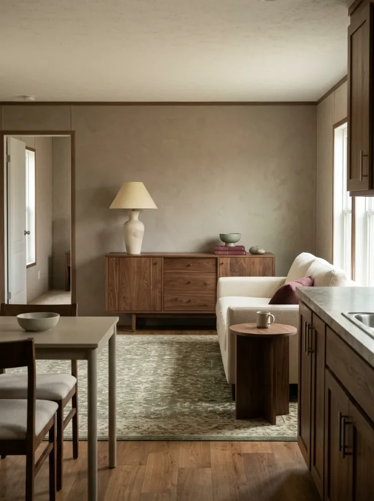
A console behind the sofa might be visible from the front door, living room, dining area, and kitchen. A side table may only be noticeable from one chair. Yet it is easy to spend equal time styling both.
That is backwards.
In a narrow connected home, visual exposure should influence styling priority.
Sightline Pressure Radar
Style the surfaces that travel furthest through the home.
Select how many common viewpoints can see the surface. The module changes the recommended styling intensity instead of treating every table, console, or shelf equally.
VISUAL
REACH
Give this surface the strongest composition.
Because several rooms can see it, every object has amplified visual weight. Use one high element, one grounded group, and deliberate empty space.
VISUAL
REACH
Support the main focal surface.
This zone can carry styling, but it should not compete with the room’s dominant composition.
VISUAL
REACH
Let function lead.
A low-pressure surface does not need a styling formula. One practical object and one small visual detail may be enough.
VISUAL
ZONE
Give yourself permission to leave it nearly empty.
Hidden or rarely seen surfaces do not need to prove that the home is decorated. Their restraint can make higher-pressure areas feel more intentional.
Once the high-pressure surface is carrying the composition, nearby surfaces can become deliberately quiet. That restraint is useful: a nearly empty side table beside a carefully styled console can look more finished than two equally decorated surfaces.
8. Replace a Tired Lampshade Before You Replace the Lamp
Before shopping for a new lamp, perform three checks on the one you already own.
Condition: Is the shade dented, yellowed, crooked, dusty, stained, or fraying?
Proportion: Does a tiny shade sit on a visually heavy base, or does a large shade overwhelm a narrow table?
Relationship: If two lamps appear in the same connected view, do their shades feel as though they belong to approximately the same interior?
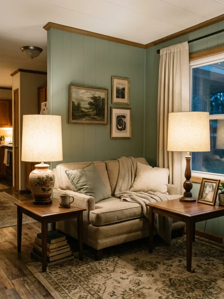
A usable lamp base can look surprisingly dated because of the component sitting above it.
Changing only the shade may update the apparent scale, material character, and relationship between two lamps without throwing away a functioning base.
The shades do not have to be identical. Similar shape families, compatible fabric character, or related proportions can provide enough connection.
Check the fitter, dimensions, and other compatibility requirements for the lamp you own before purchasing.
Purchase threshold: if the base still works for the room after the shade issue is corrected, the upgrade is complete.
9. Treat the Refrigerator Door as Part of the Living-Room View
Here is an unusually single-wide-specific test:
Do not inspect your refrigerator while standing in the kitchen.
Sit on the sofa.
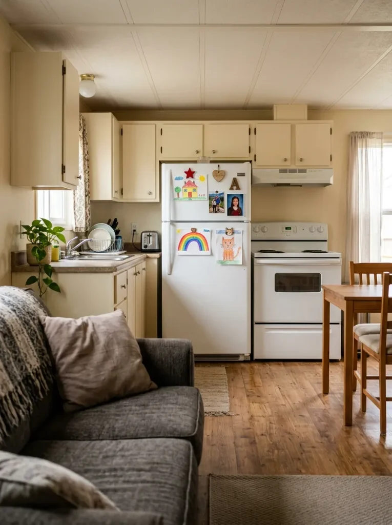
From there, does the refrigerator become a large vertical display surface?
In many single wides it does. The door may be directly across the main room, beside the dining zone, or at the end of a long sightline. That gives a cluster of small magnets, receipts, menus, school papers, appointment cards, shopping lists, and notes far more visual power than they would have in a closed kitchen.
This does not mean family photos or children’s artwork are unsophisticated.
It means the display needs to be a choice.
If the refrigerator is your family gallery, curate it like one. Remove outdated papers, consolidate the arrangement, and create enough breathing room that the important pieces are easy to see.
If it was never meant to be a display wall, move the practical information elsewhere.
Ten pieces of paper removed from one highly visible appliance may change the connected room more than another decorative purchase would.
10. Give the Bathroom One Boutique-Hotel Direction, Not Five
Small bathrooms reveal style conflict quickly because there is almost nowhere for it to hide.
From one standing position, the mirror, wall, towels, counter accessories, art, mat, wastebasket, storage, and lighting may all be visible simultaneously.
That means a farmhouse sign, glossy dispenser, spa basket, geometric print, rustic shelf, and brightly colored towel are not six harmless details. Together, they can become six competing instructions.
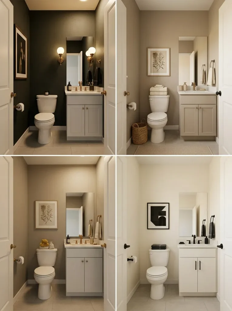
A stronger bathroom chooses one direction and lets the other objects support it.
Boutique Bathroom Mood Studio
Choose one direction and let the room edit itself.
The best style is the one the bathroom can support with the fewest forced purchases. Select a mood to preview its visual logic and see what to keep, remove, and emphasize.
Fewer forced changes usually means a more convincing result.
Moody Boutique Hotel
Use this when the bathroom already has enough darkness or contrast to feel intentional after editing. The room should feel concentrated, not crowded.
Darker towels, one substantial artwork, warm metal, dark containers, and a dramatic existing wall color.
Cute signs, pale rustic accessories, many tiny counter objects, and unrelated bright accents.
Organic Spa
Use this when the room is already warm, pale, natural, or softly neutral. Editing and breathing room matter more than adding themed décor.
Natural baskets, pale towels, warm beige or stone tones, simple containers, and tactile materials.
Shiny novelty pieces, competing woods, bright plastic containers, and excessive signs.
Modern Graphic
Use this when the bathroom already has a simple pale background that can carry a few crisp dark shapes without needing many new materials.
Black or dark accessories, clean line artwork, simple shapes, pale surfaces, and controlled repetition.
Ornate pieces, mixed decorative lettering, soft farmhouse motifs, and several unrelated accent colors.
Now apply the selected direction as an editing filter. A woven basket can strengthen the Organic Spa version while weakening the Modern Graphic version. A bold black print may do exactly the reverse.
That is why the strongest bathroom may require removing three mismatched details before adding one new one.
11. Make the Bed Look Finished From Outside the Bedroom
The useful viewpoint for this section is not beside the mattress.
It is the hallway.
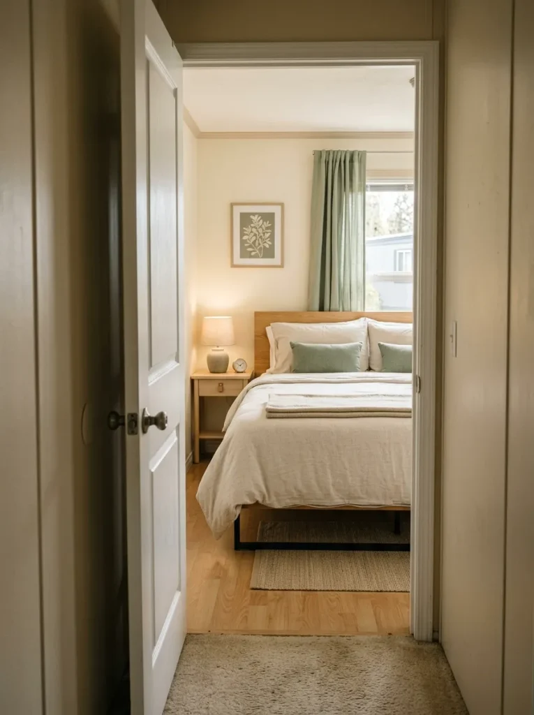
Bedroom doors in a single wide can reveal a surprisingly large percentage of the bed from another zone. That means bedding influences the home’s connected sightline even when nobody is actually using the bedroom.
Stand outside the room and notice the first three things you see.
If the view contains a rumpled cover, six unrelated pillows, visible under-bed storage, charging cables, shoes, and a blanket falling toward the floor, there are too many active layers.
Begin with one dominant cover layer. Give the pillows an obvious arrangement. Reduce whatever visual noise is visible beneath or beside the bed. Then stop adding.
The room does not need luxury-hotel bedding.
It needs to look reset.
A good finish line is reached when the bed appears complete from the hall but still looks comfortable and believable after you step inside.
12. Edit Existing Open Shelves Until You Can See the Shelf Again
Here is the shelf test:
Can you still see the architecture carrying the décor?
When every inch is occupied by frames, books, baskets, plants, candles, signs, and keepsakes, the objects merge into one dense strip. The shelf stops contributing structure and begins reading like overflow storage.
Clear one shelf completely.
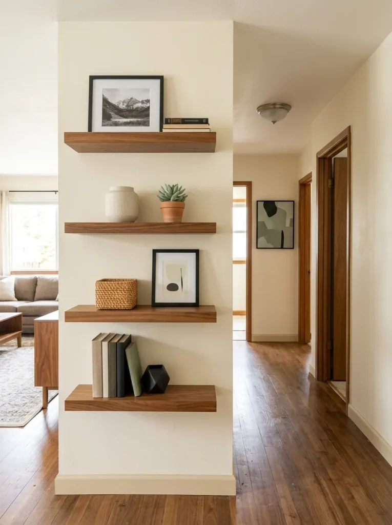
Now return only the pieces that deserve visible space. One framed photograph may sit with two books. A second shelf could carry a heavier basket and one taller object. Another might hold almost nothing.
They do not need identical formulas.
They do need pauses.
Repeated material can help—a little wood, black metal, pottery, or woven texture appearing in more than one place—but repetition should remain restrained enough that each grouping retains its own shape.
There is one important exception. Some open shelving performs essential everyday storage in a small home. Do not sacrifice usefulness for an artificial showroom look. Contain the utility more cleanly and preserve as much open shelf as the routine realistically allows.
Stop editing when the shelf itself becomes visible again.
13. Align Mixed Furniture and Décor to Shared Invisible Lines
A room containing inherited pieces, budget furniture, old frames, and newer accessories can still look coordinated.
Stand far enough away that you stop noticing the individual styles.
Look at the edges.
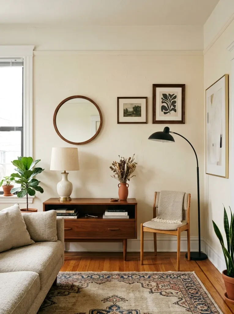
A frame may relate to the top of a console. The center of a mirror may connect visually to another object across the room. Two lamps visible together may occupy wildly different heights. A picture may float awkwardly while every other element follows a stronger horizontal line.
These relationships create an invisible framework.
Moving a picture a few inches, recentering a mirror, lowering one decorative object, or relocating a lamp can sometimes make mixed pieces look more intentional without making them more similar.
This works particularly well in a single wide because wall compositions are often visible across long distances. Small alignment errors stay in view; improved relationships do too.
Do not force perfect symmetry where the architecture clearly wants imbalance. The aim is structure, not mathematical sameness.
If the real challenge is a tight passage or awkwardly shaped zone, the guide to narrow single wide decorating ideas goes deeper into those spatial constraints.
14. Finish the Exterior Entry Without Building a Porch
Many dramatic single-wide transformations online depend on porch construction, roof extensions, siding changes, new skirting, replacement steps, or architectural additions.
Those results can be beautiful.
They are also remodeling.
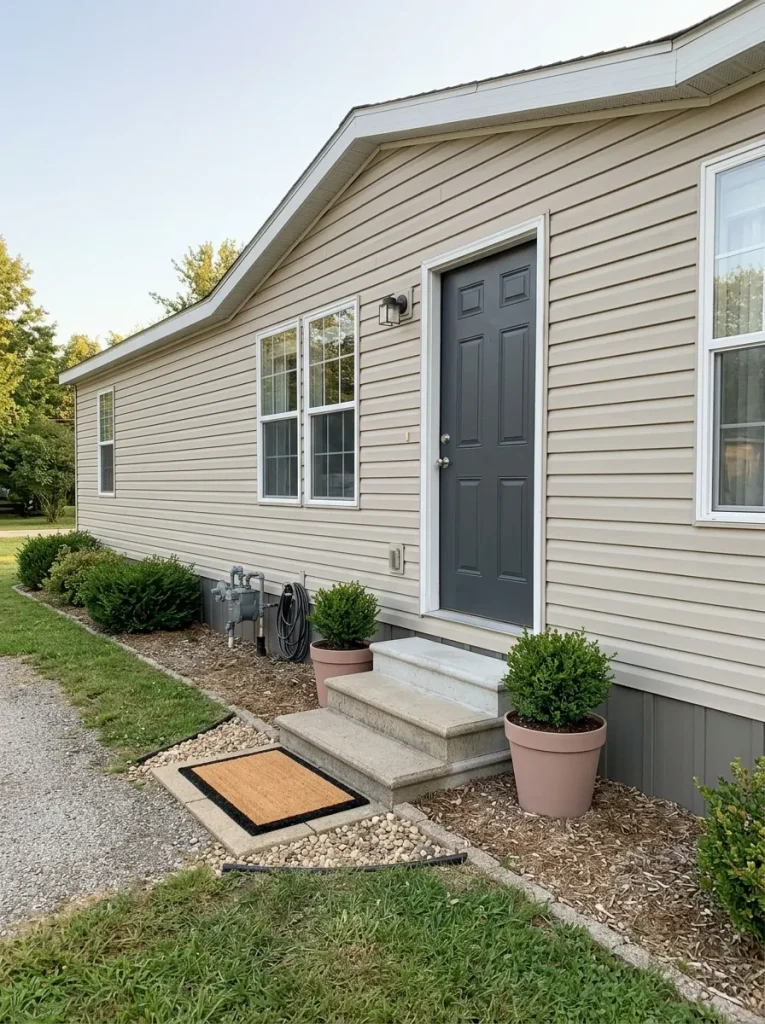
For this article, borrow the design lesson without borrowing the construction: make the existing arrival point feel finished.
No-Build Entry Transformation Studio
Finish the arrival zone in four cosmetic passes.
Move through the sequence without crossing into porch construction, siding work, electrical additions, or repair territory.
Clear the accidental layer.
Before adding anything decorative, remove objects that do not belong to the arrival composition.
Reset the surfaces you already have.
Once the entry is clear, visually refresh the door, landing, mat area, and steps in ways appropriate to their existing materials.
Create one contained welcome moment.
Use a restrained mat and, where practical, one coordinated planter or container relationship. Let the doorway remain the focal point.
Judge the entry from several steps away.
If the threshold now looks clean, contained, and deliberate, the cosmetic transformation is complete.
After completing the sequence, stand several steps away.
If the door area looks clean, contained, and deliberate, stop.
If what bothers you is actual damage, unstable steps, failing skirting, electrical work, or another repair issue, that is no longer a decorating problem and should not be disguised with accessories.
15. Use a Phone Photo to Find the Last Detail That Still Reads “Temporary”
Finish the makeover with a camera instead of a shopping cart.
Take three ordinary phone photographs: one from the main entrance, one from your most-used seat, and one looking toward the next connected room.
Do not prepare the room for social media.
You want the photograph to expose reality.
Look at the image as a flat composition. Which detail appears accidental first?
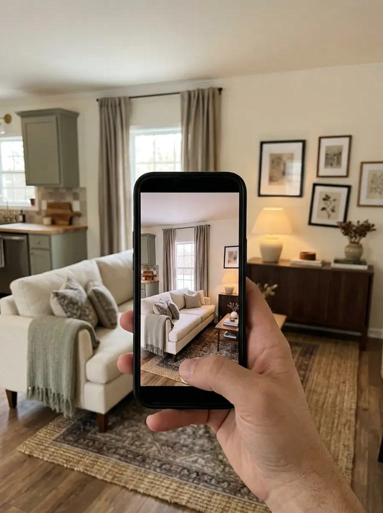
Perhaps a cable cuts across the wall. A frame looks slightly crooked. A curtain bunches strangely. One shelf is much denser than the others. A label faces the living room. The lampshade looks tired. An orphan wood finish suddenly becomes obvious.
Correct one item.
Take the photograph again.
If the room now reads as deliberate, stop.
If the camera reveals a different problem—weak furniture scale, an exaggerated long-and-narrow effect, or a spatial arrangement that makes the home feel tighter—continue with the specialist guide to single wide interior ideas that make a narrow home feel bigger. That is a layout/visual-width problem, not a finishing-layer problem.
The final lesson is useful precisely because it prevents endless decorating:
A room can still have things you would someday change and already look finished today.
Final Thoughts
Making a single wide look more expensive without remodeling is largely an exercise in visual editing.
Start with whatever makes the home feel temporary, tired, exposed, or inconsistent. Correct that before buying something new. Let finishes develop a hierarchy. Keep everyday utility from dominating connected sightlines. Groom the large fabric surfaces you already own. Direct styling energy toward the places that carry the most visual weight. Give compact rooms one clear story.
Then reassess.
A polished single wide does not need to imitate a luxury house or disguise what it is. It needs fewer accidental signals competing with the features you already like.
Once the lighting, textiles, surfaces, entry, artwork, and visible sightlines begin speaking the same visual language, the home starts to feel considered.
And considered is what usually reads as expensive.