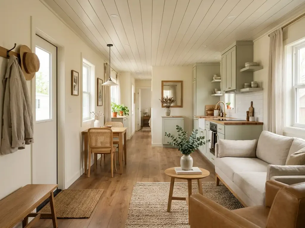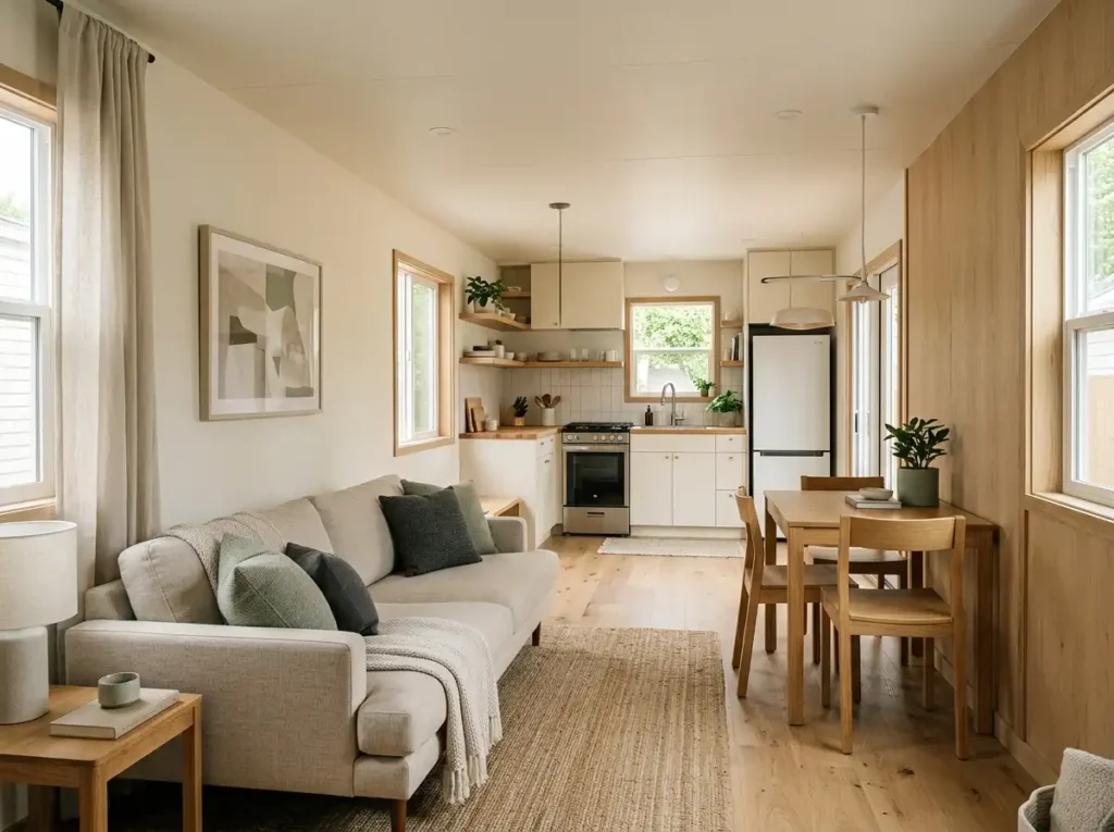
An open layout can remove walls without solving the real problem: how the rooms actually relate to one another. In a single wide mobile home, the living room, dining area, and kitchen often share one long visual field, so small placement decisions can influence the entire space.
The best single wide open floor plan ideas do more than make the interior look larger. They give each activity a clear place while keeping conversation, light, and movement connected. A sofa can create an invisible boundary. Dining can become the hinge between cooking and relaxing. Lighting can separate evening activities without putting a wall back into the plan.
The 17 ideas below focus on those relationships. Some involve furniture placement; others use visual weight, materials, daylight, sound, or daily routines.
The aim is not to turn one rectangle into several miniature rooms. It is to make the entire open plan feel intentional from one end to the other.
1. Give the Open Plan One Lead Zone and Two Supporting Zones
Picture three areas competing for attention at once.
The living room has a dramatic TV wall. Ten feet away, the dining area has an oversized statement pendant. Beyond that, the kitchen combines contrasting cabinets, open shelving, countertop accessories, and bold hardware.
Every feature may look good individually. Together, they can make a compact open floor plan feel strangely unsettled.
A stronger arrangement gives the shared space a visual hierarchy.
For example:
- Lead zone: the living area carries the strongest visual moment.
- Supporting zone: dining reinforces the look with a quieter fixture or wall treatment.
- Quiet zone: the kitchen remains polished but does not compete at the same decorative intensity.
Another household could reverse that order and allow a beautiful kitchen to become the dominant feature.
The useful rule
One zone leads. One supports. One becomes visually quieter.
This difference in intensity helps three connected functions read as one deliberately composed interior instead of three small rooms fighting for the same attention.
2. Arrange the Common Area as an Activity Gradient
Follow the home through an ordinary day.
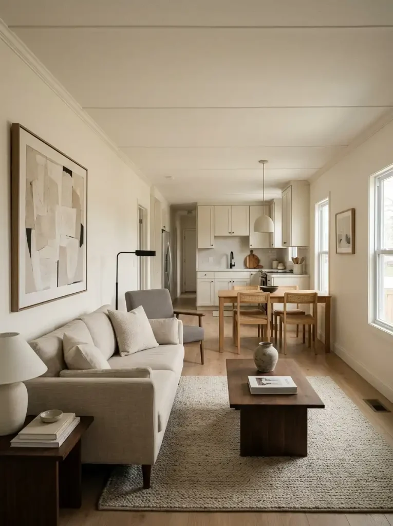
Someone may begin with coffee in the kitchen, move toward the table for breakfast, then spend the evening in the living room. Another household might practically live around the kitchen island while the sofa functions as the quiet retreat.
That means the best sequence is not always:
living → dining → kitchen.
It should follow the household’s activity pattern.
Map the energy before the furniture.
The same rectangular floor plan can work very differently depending on whether quiet living, shared conversation, or kitchen activity drives daily life.
Use the least interrupted end for lounging, reading, lower furniture, and softer light.
Dining or flexible seating can absorb conversation, meals, work, and transitions between zones.
Cooking, serving, appliance use, and repeated movement naturally create the busiest part of the plan.
Protect the living end first. Let dining absorb the transition before the kitchen becomes visually and physically busier.
Let the kitchen act as the energetic anchor, then reduce intensity through dining before reaching the quieter living area.
The sequence is working when neighboring activities can happen naturally without rearranging the room every time the household changes gears.
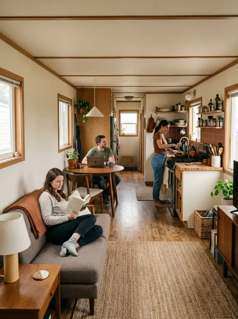
3. Put Dining Where It Can Absorb Both Kitchen and Living Functions
Imagine dinner being prepared while someone answers emails at the table and another person talks from the sofa.
This is where dining can become much more valuable than a place used only for meals.
In a narrow open plan, the table often works best as a functional hinge between the active kitchen and the quieter living area. It can handle breakfast, homework, coffee, conversation, crafts, serving dishes, or an extra landing surface when people visit.
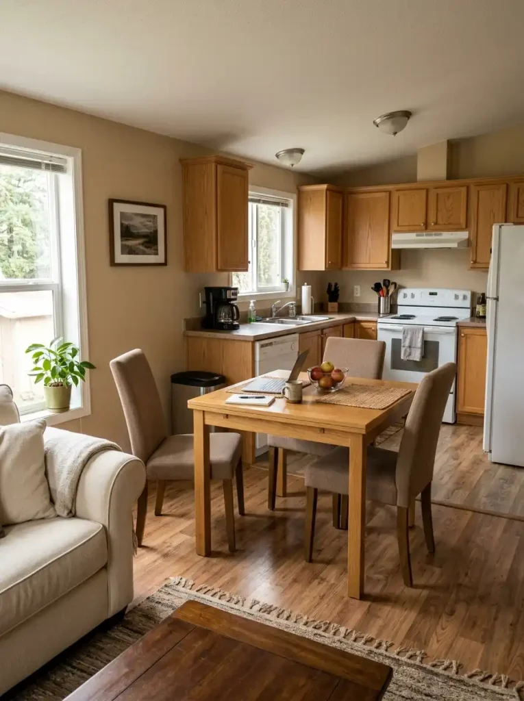
Test the location three ways
- From the kitchen: Can dishes reach the table without crossing through the living-room seating arrangement?
- From the sofa: Does the table feel connected enough that someone sitting there still feels part of the room?
- When the chairs are occupied: Does the dining zone continue functioning without blocking the relationship between both ends?
The table does not need to sit mathematically halfway between the kitchen and sofa.
Its best position is where it can serve both sides of the open plan instead of becoming a formal island floating between them.
4. Use the Sofa Back as a Soft Room Edge
An open floor plan still needs boundaries.
The difference is that those boundaries do not always need to be walls.
A sofa can create one of the most useful invisible edges in the room because its back already forms a long horizontal line. The way that line faces the adjacent space determines whether the living zone feels organized, isolated, or squeezed.
Spatial blueprint · soft boundary
Let the sofa behave like architecture.
Its back line can define the living area without rebuilding a wall. The best orientation creates clarity while preserving visual and social connection.
The inward-facing side should feel intentionally anchored rather than randomly floating.
The adjacent area should remain easy to enter, read, and socially connect with.
The sofa defines the living area but the shared side still feels easy to enter and visually connected.
Rotate the arrangement or reduce furniture concentrated along this edge so the boundary stops behaving like a narrow wall.
Soft-boundary rule: the sofa should make the living area easier to understand without behaving like a substitute wall.
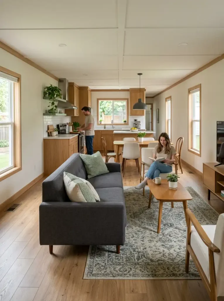
5. Aim Conversation Toward the Kitchen as Well as the TV
Can someone preparing food join the conversation without constantly turning around?
That question reveals something a floor plan cannot show on paper: social flow.
Open interiors often allow the television to control every seating decision. The sofa faces it. Accent chairs turn toward it. Even the strongest dining seat may end up aimed at the same wall.
The home is physically open, yet the kitchen can still feel socially outside the room.
Try the seated-view test
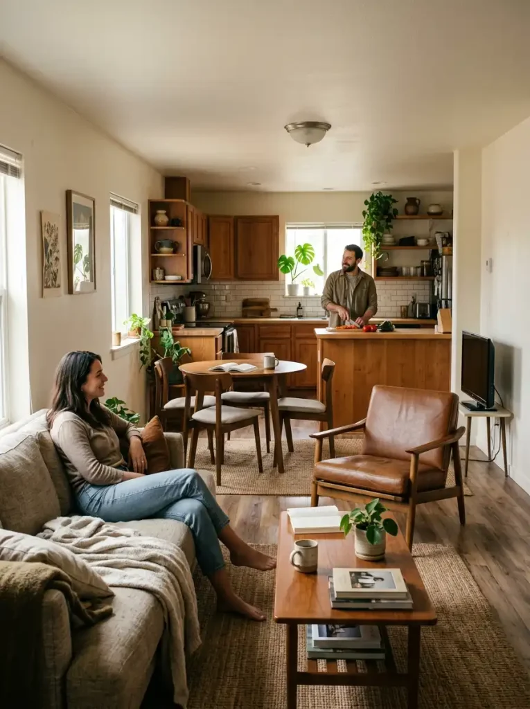
Sit in three normal positions:
- the main sofa seat,
- an accent chair or dining chair,
- the position where someone usually stands in the kitchen.
Now notice who can naturally see whom.
You do not need every chair aimed toward the kitchen. A slight turn in an accent chair, a changed sofa angle, or a dining chair facing across the plan may create enough connection.
One natural conversational bridge can matter more than perfect furniture symmetry.
6. Leave a Visual Pause Between Strong Zone Anchors
Some of the most polished open interiors contain a portion of the room that appears to be doing almost nothing.
A strong living-room composition may occupy one end. A distinctive kitchen may sit at the other. Between them, perhaps the wall becomes quieter. A little more flooring remains visible. Dining carries only one restrained focal detail.
That calm interval gives the eye time to understand one zone before meeting the next.
Without it, a single wide can become a continuous strip of information:
artwork → shelving → pendant → table décor → countertop accessories → plants → television → more artwork.
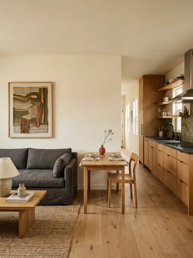
Edit this before buying anything
Look for the place where two heavily styled zones almost touch.
That transition may need subtraction.
Remove one secondary wall grouping. Reduce the amount of tabletop décor. Let one portion of wall remain exposed.
Negative space is not an unfinished decorating opportunity. It can be the element that makes the surrounding design readable.
7. Keep the Kitchen’s Service Face Out of the Main Living View
Here is a common open-plan problem:
The kitchen itself looks perfectly fine while you are standing in it. From the sofa, however, the dominant view becomes the refrigerator side, recycling bin, appliance parking area, utility rack, or a collection of everyday countertop items.
The issue is not clutter alone.
It is where the working side of the kitchen lands within the living-room view.
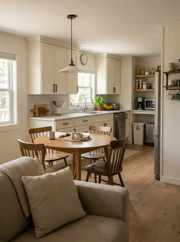
Use a three-step correction
1. Find the exposed service face.
Sit where you normally relax and identify the kitchen surface your eye reaches most easily.
2. Move utility one layer deeper.
Frequently used appliances can live on a less-visible counter run. Bins can shift away from the main axis. Pantry storage may contain objects that currently sit in open view.
3. Keep the kitchen realistic.
Do not aim for a sterile showroom. Concentrate everyday utility where it is less visually dominant.
A functioning kitchen should still look used.
The improvement comes from making its service side secondary to the social side when viewed from the living room.
8. Build a Low-to-High Visual Mass Gradient
Ignore colors and décor for a moment.
Look only at the silhouettes of the biggest things in the room.
A sectional, coffee table, dining table, stools, refrigerator, pantry, cabinetry, shelving, and large plants create a kind of interior skyline.
If high visual mass appears randomly across the entire length of a single wide, the open space can feel crowded even when plenty of floor is visible.
Architectural skyline study
Let the room rise instead of spike.
Read the open plan as a silhouette. Concentrating necessary height gradually toward the service-heavy end can make the entire space feel calmer than scattering unrelated tall forms from one end to the other.
Sofa backs, low tables, ottomans, consoles, and visible breathing room keep the relaxing end visually quiet.
Dining lighting, moderate wall composition, plants, and secondary storage begin increasing the silhouette.
Refrigerators, pantry storage, upper cabinetry, and service functions can carry the height the home genuinely needs.
One intentional tall bookcase or plant can add interest. The visual pressure comes from repeated vertical blocks appearing without a clear pattern across the whole open plan.
This is not a ban on bookcases or tall plants in the living room. One intentional vertical moment can add interest.
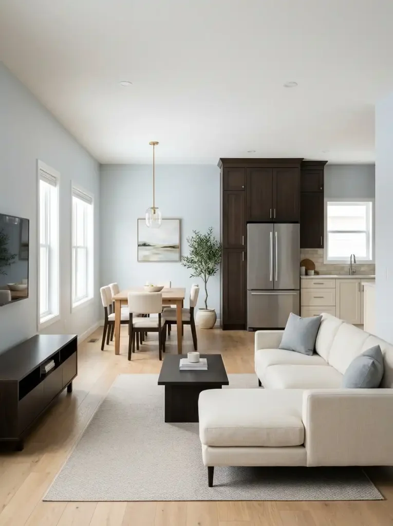
The problem begins when unrelated tall objects repeatedly interrupt the entire long view.
For more narrow-home proportion strategies, see these single wide interior ideas.
9. Use Ceiling Lights to Mark Activities, Not the Entire Rectangle
Think of the ceiling as a second floor plan.
Furniture explains the room at eye level. Lighting can confirm those same activities from above.
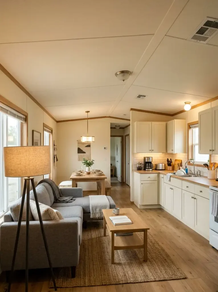
Three fixtures, three different jobs
Over dining:
A pendant or compact chandelier can give the table a clear center.
Inside the kitchen:
Task or under-cabinet lighting can emphasize working surfaces without turning every kitchen fixture into a decorative statement.
Around the living area:
A floor lamp, table lamp, or softer overhead source can signal relaxation and conversation.
The fixtures do not need to be identical.
In fact, matching everything can flatten the distinction between zones. Connection can come from a repeated metal finish, related shapes, similar visual weight, or compatible warmth while each light still performs a different task.
Give the strongest decorative fixture to the activity that deserves the clearest center.
Let the others support it.
10. Change Texture by Zone While Keeping the Base Palette Related
Consider an open plan decorated entirely in warm neutrals.
The sofa is cream. Dining chairs are light beige. Cabinets are soft white. Curtains are pale. The color story is cohesive—but the room still feels a little flat.
Color is not necessarily the problem.
Material sameness may be.
Try giving each zone its own tactile character:
- Living: upholstery, woven textiles, linen, softer surfaces.
- Dining: visible wood grain, cane, woven lighting, or a slightly firmer texture.
- Kitchen: smoother cabinetry, countertops, glass, tile, and metal.
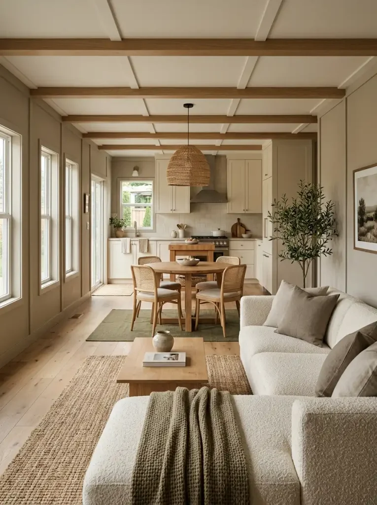
Now notice what happens when daylight reaches them.
Fabric absorbs light softly. Timber reveals grain. Smooth painted cabinetry reflects light more evenly. Metal adds small points of sharper contrast.
The palette still connects the entire room.
The surface response gives each activity its own identity.
You do not need three paint colors to create three zones when texture can do the quieter work.
11. Soften Sound at the Social Center of the Plan
Here is a problem that photographs rarely reveal.
An open-plan room can look peaceful and still feel tiring when three people begin talking, the television is on, dishes are being handled, and the kitchen extractor or appliances join in.
Hard floors, countertops, cabinetry, glass, and bare walls all contribute reflective surfaces.
The answer is not to carpet or curtain everything.
Start where people actually gather.
Acoustic orbit · social comfort
Soften the zone where sounds collide.
Hard kitchen surfaces can remain practical. The goal is to concentrate enough softness around conversation so voices, television, dishes, and daily noise do not all bounce through the same open volume.
Choose the condition that most closely resembles normal use—not an empty room.
Start with upholstery, useful window fabric, or an appropriate rug around the social center instead of scattering small decorative textiles everywhere.
The room already has a useful relationship between reflective and absorptive surfaces. More textile is not required simply because the floor plan is open.
When the social zone is already heavily softened, additional fabric may reduce visual clarity without providing a meaningful functional gain.
If normal conversation already sounds comfortable, stop.
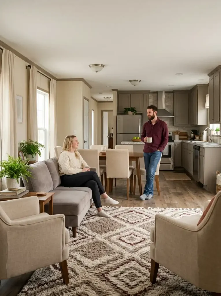
The acoustic goal is balance, not maximum softness.
12. Treat One Long Wall as a Shared Composition Across Multiple Zones
Before
The living-room end gets a gallery wall.
The dining section receives a separate mirror.
The empty strip between them gets another decorative grouping simply because it looks unfinished.
Every area has been decorated individually, yet the wall reads like three unrelated projects.
After
Treat the long surface as one architectural composition.
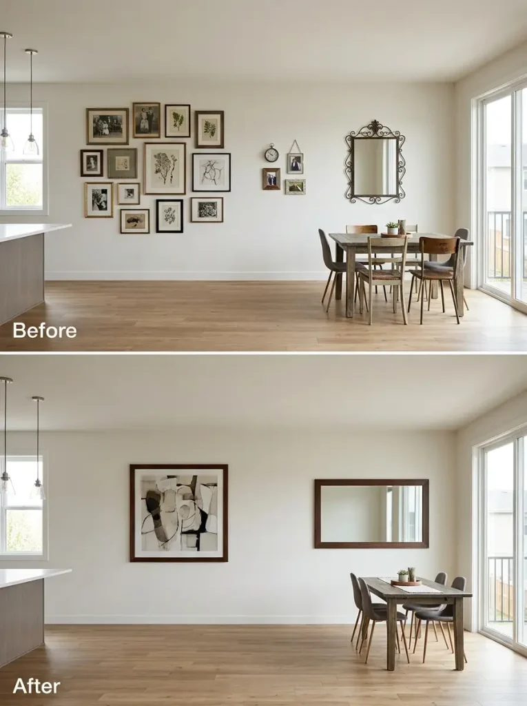
The living end might carry the strongest artwork. Dining may have one quieter mirror or narrow shelf. Between them, decorative density can intentionally decrease.
You can reinforce the relationship through:
- one repeated frame finish,
- a related color,
- compatible vertical alignment,
- similar spacing discipline.
The individual pieces do not need to match.
The wall itself needs to feel as though one person made all the decisions.
Instead of asking, “What should I put on this empty section?”, ask:
“What is this entire wall already doing?”
That shift often connects living and dining more effectively than adding another object.
13. Preserve Borrowed Daylight When You Need Partial Separation
Sometimes the best open-floor-plan decision is to create more separation.
A work area may need privacy from the television. Dining may feel too exposed. Kitchen activity may visually dominate the rest of the common area.
The mistake is assuming the divider must then behave like a new full-height wall.
Before adding anything substantial, notice where daylight travels.
A window serving the living room may also help illuminate the dining area. A kitchen window may visually brighten part of the transition zone.
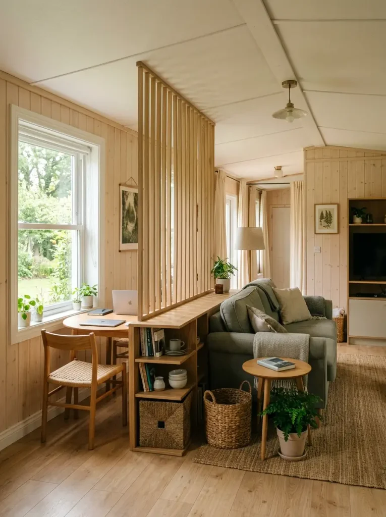
Separation options that can preserve that connection
- a low cabinet,
- open shelving,
- a slatted or visually permeable screen,
- furniture used as a partial boundary,
- a divider that stops before blocking the strongest daylight path.
The decision is a tradeoff.
How much privacy does the activity actually require?
Add enough separation to solve that problem—then stop.
A successful boundary gives one zone more independence without making the space beside it feel noticeably darker or more enclosed.
14. Make an Existing Half-Wall Earn Its Place Before You Remove It
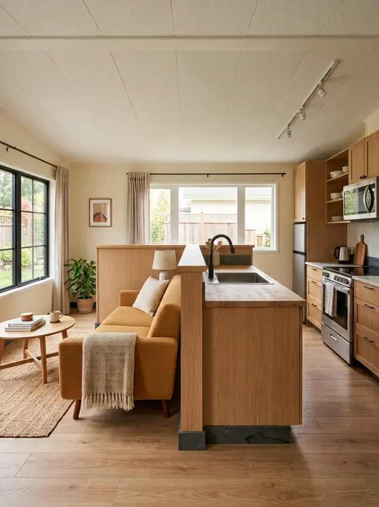
“Open it up” sounds like the obvious solution when a half-wall interrupts a connected room.
But visual openness is only one part of the decision.
A half-wall may hide the back of cabinetry, support a counter, create furniture backing, provide storage, contain services, or prevent the kitchen’s working surfaces from spilling visually into the living room.
Evaluate what it contributes before judging how much space it occupies.
Architectural decision route
Make the half-wall prove its value.
Openness alone is not the decision. First identify what the wall contributes, then compare that function with the visual and spatial cost it creates.
The wall may support a counter, hide service clutter, back furniture, create storage, or establish a useful visual boundary between connected zones.
If the half-wall appears unnecessary, ask what specifically improves after removal. A larger-looking opening is not automatically a better furniture, storage, or social relationship.
If the wall genuinely blocks the relationship the plan needs, treat alteration as a construction decision rather than a styling shortcut.
Keep a half-wall when its practical contribution is greater than its visual cost. If alteration is considered, structural, electrical, plumbing, and manufactured-home-specific conditions should be assessed appropriately before work begins.
The real question is not:
“Would removing this make the room more open?”
Ask:
“Would removing this create a meaningfully better relationship between the spaces on either side?”
Those are not always the same thing.
15. Coordinate Window Treatments by Light Behavior, Not Exact Matching
Related windows do not need identical treatments.
An open plan may include a living-room window beside soft seating, a dining window exposed to strong afternoon sun, and a smaller kitchen window beside an active work surface.
Forcing all three to wear the exact same curtain treatment ignores how differently they function.
| Window condition | Main priority | Treatment direction |
|---|---|---|
| Living room | Softness + privacy | Full curtains or another softer treatment can feel appropriate |
| Dining area | Glare + atmosphere | Shade, blind, or lighter textile treatment may be enough |
| Kitchen | Access + practicality | Compact treatment that stays clear of active surfaces |
What should remain consistent is the visual language.
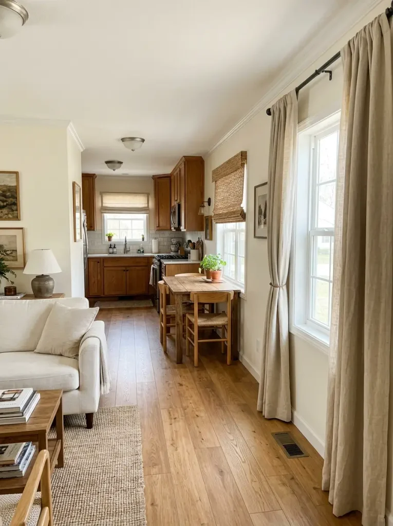
That may mean related fabric colors, similar warmth, matching hardware finishes, or compatible visual heights.
Think of it this way:
Coordinate at room scale. Customize at window scale.
That approach keeps the open plan visually connected while allowing each window to handle daylight, privacy, and everyday use properly.
16. Let One Zone Stay Awake Without Lighting the Whole Open Plan
9:15 PM
Someone is watching television in the living room.
9:35 PM
Another person walks into the kitchen for a drink.
10:00 PM
The dining table becomes a temporary laptop station.
A single ceiling fixture that floods the entire open plan makes all three activities share the same brightness and mood.
Independent lighting gives them more control.
A reading or table lamp can hold the living zone. Dining may use its own pendant or secondary lamp. Kitchen task lighting can handle a quick cleanup without turning the whole room bright again.
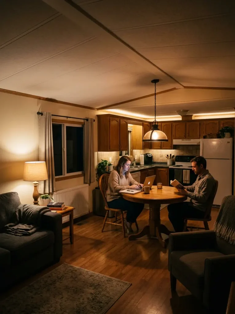
You still need enough low-level transition light to move comfortably between areas.
But each zone does not have to remain equally active.
At night, light can provide something walls normally provide during the day:
temporary boundaries.
One part of the room can stay awake while another visually rests—and the separation disappears again when daylight returns.
17. Let the Dining/Flex Zone Change Jobs Through the Day
The most useful room boundary may be time.
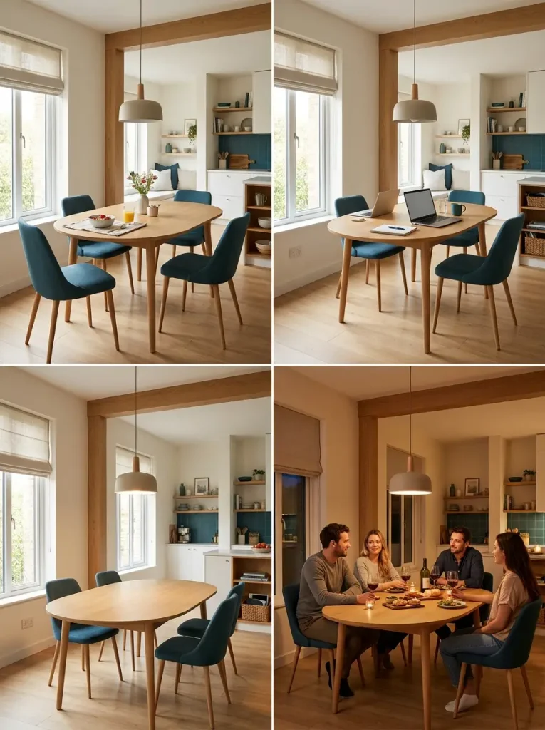
A small open single wide rarely needs every part of the common area performing the same job all day.
The dining zone can serve breakfast in the morning, become a work surface during the afternoon, return to visual quiet at night, and expand into a serving or social area when guests arrive.
The furniture itself does not necessarily need to transform.
What matters is whether the room has an easy reset between modes.
Temporal zoning · daily mode switcher
One zone can change jobs without changing furniture.
Select a moment in the day. The same dining area can support several functions when every temporary use has a clear reset action and a nearby place for the items that disappear afterward.
Leave the surface simple enough for everyday meals and keep frequently used breakfast items closest to the kitchen side of the zone.
Bring out laptops, paperwork, and chargers only when needed. A nearby drawer, basket, or cabinet should make the entire work layer disappear quickly afterward.
Clear temporary equipment so dining becomes a visually calm bridge between kitchen and living again instead of looking permanently multipurpose.
Use the same zone for serving, conversation, or additional seating, but make sure temporary hosting items have an obvious place to leave when the gathering ends.
If changing functions requires twenty minutes of moving furniture and hunting for somewhere to hide everything, the zone is not truly flexible.
Give each alternate use one obvious reset action.
That small rule prevents multipurpose space from becoming permanently cluttered space.
A Better Open Floor Plan Starts With Relationships
A better-flowing single wide does not require every boundary to disappear.
Start by identifying the relationship that feels weakest. Maybe the kitchen dominates the living view. Dining feels stranded between rooms. Conversation stops at the sofa. One activity takes over the entire home after dark.
Correct that relationship first.
Once each zone understands its role, furniture, color, materials, lighting, and décor become much easier to coordinate. For additional furniture and styling strategies, explore these single wide mobile home decorating ideas.
The strongest open floor plan is not the one with the fewest divisions.
It is the one where connection and distinction work at the same time.