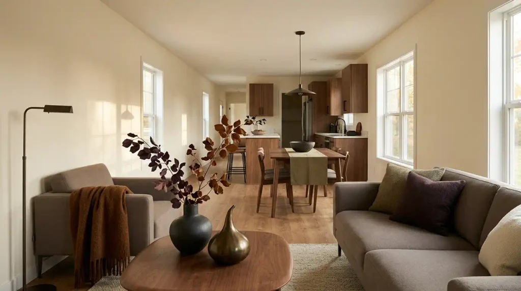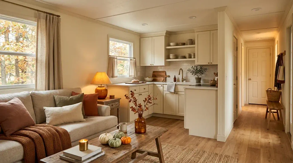
A mobile home can look completely different after sunset than it does at noon. Long connected sightlines, compact rooms, and finishes that repeat from one zone to the next make every seasonal choice travel farther visually. That is exactly why fall decorating here works best when warmth is built into the whole view, not piled onto every available surface.
The strongest cozy fall mobile home decor starts with the home you already have: its flooring, cabinet color, upholstery, wall tone, and natural light. A few well-placed seasonal changes can make those permanent features feel richer, softer, and more inviting for autumn without turning the interior into a collection of pumpkins.
The ideas below move through the home in layers. Some change what you notice first when you walk in. Others reshape texture, floor lines, working surfaces, or evening atmosphere. You will also find ways to use fall color with more restraint, create seasonal impact in rooms that have very little spare space, and keep the final result connected from one room to the next.

Think of the process as giving your mobile home an autumn rhythm: a stronger moment here, a quieter pause there, and enough continuity that the whole interior feels intentionally seasonal.
1. Choose a 3+1 Fall Palette From the Colors Your Mobile Home Already Has
Start with what stays.
Before buying a fall pillow or pumpkin, look at the colors that will remain in the room all season: flooring, cabinetry, sofa fabric, wall paint, and the largest wood finishes. Those permanent surfaces should decide which autumn tones feel natural.
A beige-and-oak interior usually handles cinnamon, muted pumpkin, cream, and olive beautifully. Gray flooring with cooler white cabinets may look cleaner with burgundy-brown, mushroom, dusty rust, and a restrained warm amber accent. Dark walnut furniture can support deeper terracotta more easily than pale blond wood.
A useful 3+1 palette is simple: choose three colors that can appear in several rooms, then add one darker or botanical counterpoint for depth. The fourth color should be quieter and less frequent. It acts as punctuation, not another theme.
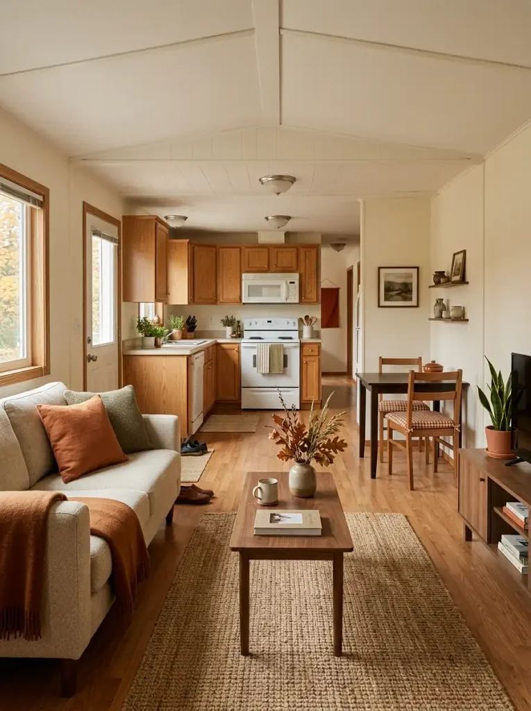
Because many mobile homes reveal more than one room from a single standing point, judge the palette from a doorway or long sightline. Colors that seem harmless up close can compete once the living room, kitchen, and hallway are visible together.
Decision: keep the combination that still feels related when you see several rooms at once.
For a deeper look at seasonal combinations, StylishGalore’s autumn color palette guide expands on warm interior color pairings.
Fall Palette Bridge
Fall Palette Bridge
Match fall color to what already stays
Start with the permanent finish that covers the most visual area, then choose autumn accents that share or gently complement its temperature.
- Warm oak + camel + cream
- Try cinnamon, burnt pumpkin, flax, and muted olive.
- Cool gray + crisp white
- Dusty rust, mushroom, burgundy-brown, and restrained amber keep the palette from turning too orange.
- Dark walnut + espresso
- Terracotta and amber remain visible against the deeper permanent finishes.
- Light blond wood
- Muted clay, ochre, sage, and oatmeal preserve the lighter character of the interior.
Use the darkest accent as punctuation. A small repeat across patterned textiles, pottery, or one distant accessory usually gives the palette enough depth without turning the fourth color into a competing theme.
2. Make the Interior Entry One Strong Fall Arrival Zone
The first few feet inside the door set the seasonal tone before the rest of the home registers. In a narrow mobile-home entry, one confident fall feature usually reads more clearly than several small decorations along both sides of the path.
Let the door wall or first visible console carry the emphasis. A slim wreath, one branch arrangement, a wall hanging, or a concentrated console grouping can announce the season while the center of the entry stays visually calm.
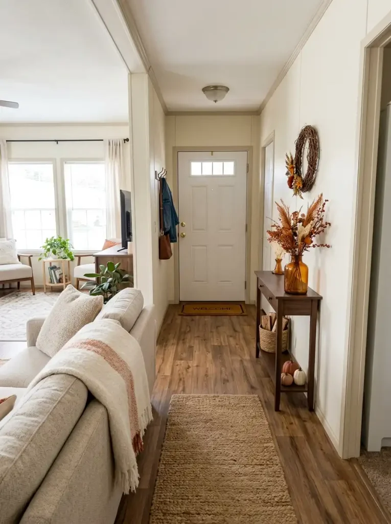
Concentrating the display near one surface also protects daily movement. Coats, bags, shoes, and foot traffic are less likely to turn seasonal décor into an obstacle course. Check the front door and screen-door swing before hanging anything that projects outward.
If the porch is decorated too, repeat one color or material inside. That small connection can make the arrival feel continuous without duplicating the same wreath, garland, or pumpkin arrangement on both sides of the door.
For the outdoor half of the arrival, StylishGalore’s fall mobile home porch guide carries the seasonal transition onto the porch.
3. Give the Sofa a Fall Texture Ladder, Not a Matching Set
Fall softness feels richer when sofa layers differ to the touch as well as in color. Build the mix from three texture roles:
- Smooth: the existing sofa or a flat-woven pillow gives the arrangement a quiet base.
- Nubby: boucle, slub linen, or a chunky woven cushion adds visible grain.
- Heavy: a brushed, quilted, or loosely knitted throw supplies the deepest seasonal texture.
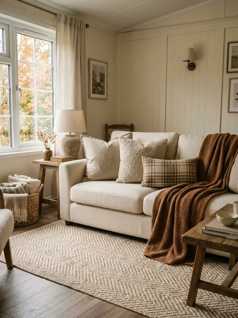
Only one layer needs a noticeable pattern. If plaid is the loudest element, let the other pieces rely on weave and pile. A neutral sofa can still read as autumnal with mostly cream, oat, brown, or muted rust.
Judge the mix from a few feet away. When every fabric has similar smoothness and color intensity, extra pillows add volume but little seasonal depth. The strongest combination makes each surface role easy to distinguish before you focus on individual colors.
4. Ground the Seating Area With a Warm Low-Pile Rug
A fall rug can introduce seasonal color and tell the eye where the living room ends before the kitchen, dining nook, or passage begins.
Compare bare flooring with a low-pile rug that extends far enough to catch at least the front legs of the main seating. The rug creates a visible boundary, so the sofa and coffee table read as one grounded zone. Warm brown, softened rust, cream, olive, or a low-contrast plaid can carry autumn character without becoming the room’s loudest pattern.
Scale matters more than motif. A small rug floating only under the coffee table creates a decorative island and can leave the seating visually disconnected. A larger, quieter rug usually performs the spatial job better.
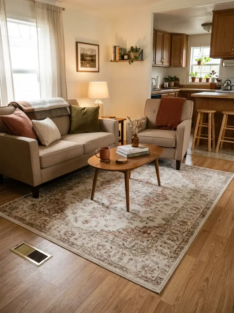
For busy routes, favor low pile and confirm that door clearances and floor vents remain usable. A successful rug should make the seating arrangement feel settled before its pattern becomes the main thing you notice.
5. Keep the Coffee Table Cozy With One Low, Movable Centerpiece
Imagine setting down coffee or a board game and finding that the centerpiece has to be dismantled first. The display is occupying the table instead of sharing it with daily life.
Build the arrangement as one movable unit:
- Start with a shallow tray, low bowl, or compact board that defines the footprint.
- Add one main seasonal form: a small pumpkin, low foliage, or a textured vessel.
- Finish with one supporting element that changes material or height without blocking the view across the room.
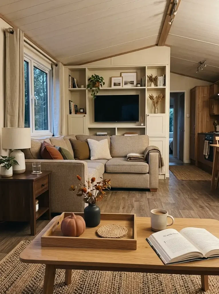
Keep the composition low enough for comfortable conversation and TV sightlines. A coffee table sits near the center of many mobile-home living areas, so a tall display can interrupt more views than the same object would on a wall console.
A table used mostly for display can carry a little more, but leave a clear landing area for a drink or book.
Decision: if the complete vignette cannot move in one lift, simplify its footprint.
Coffee-Table Sightline Check
Coffee-Table Sightline Check
Let the centerpiece share the table with daily life
A successful fall arrangement has three jobs at once: preserve the important view, create one readable seasonal anchor, and leave part of the tabletop genuinely usable.
If one check fails, lower or remove an element before adding another accessory. The table should still work like a table after the seasonal layer is finished.
6. Style the TV Console as a Low Seasonal Horizon
A wall-mounted television already behaves like one of the darkest, heaviest shapes in the living room. Fall décor beneath it works best when the console creates a calmer horizontal layer that visually supports the screen without merging into it.
Start by leaving a noticeable gap directly below the TV. Then build outward along the console with lower elements such as a shallow woven bowl, amber glass vase, short branch arrangement, or two grouped pumpkins. Taller pieces can sit toward one outer edge where they will not climb into the screen’s silhouette.
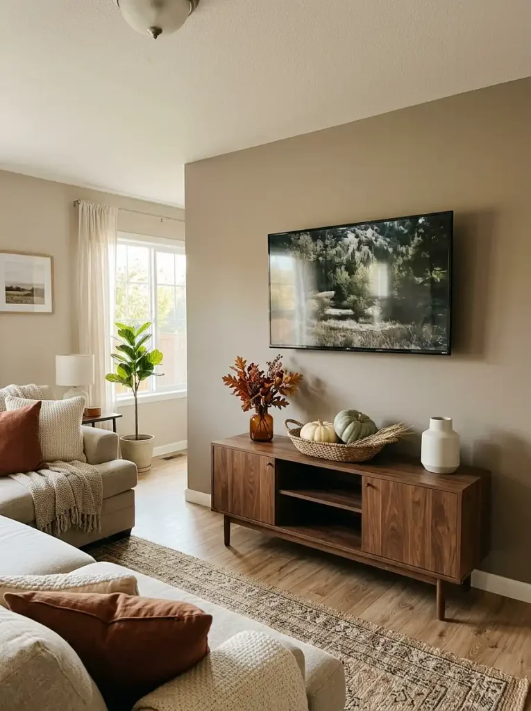
The test is easiest with the television switched off. Stand at the main seating position and look at the wall as a composition. If the décor and black screen read as one bulky rectangle, lower the arrangement or remove the tallest item.
A media console does not need perfect symmetry. One slightly fuller seasonal cluster balanced by a quieter object on the opposite side often gives the wall more natural movement.
TV Console Buffer Map
TV Console Buffer Map
Separate the dark screen from the seasonal layer
The strongest media-wall arrangement uses three visual zones: the television, an intentional breathing gap, and a lower console composition with most of its height pushed toward the outer edges.
7. Use a Blanket Ladder on a Narrow Wall for Fall Textiles
A slim stretch of wall can become useful seasonal storage when a full cabinet, chair, or floor basket would be too bulky.
Place two or three throws on a blanket ladder, but let each textile reveal only part of itself. Showing a narrow band of plaid, a broader section of cinnamon knit, and one lighter cream weave keeps the ladder visually broken into layers. Covering every rung edge-to-edge can turn several fabrics into one large patterned block.
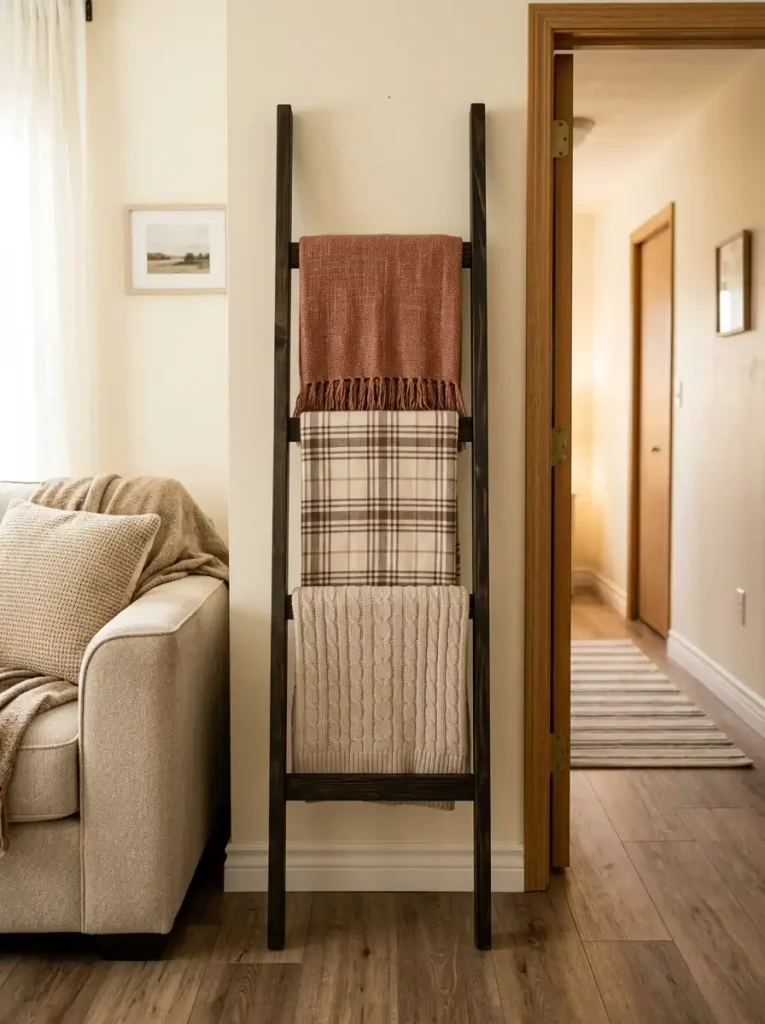
The order should follow access as much as appearance:
- Put the blanket you reach for most on the easiest rung.
- Reserve the upper level for a lighter decorative textile.
- Let the strongest pattern occupy only one section of the ladder.
Avoid packing extra décor around the base. Shoes, floor pumpkins, baskets, and foliage can quickly erase the main advantage of this vertical solution: a useful textile station with a narrow footprint.
A small wall feels intentional once the ladder has a job beyond decoration.
8. Warm One Main Window With a Seasonal Textile Change
Does every window need a fall curtain? No. One well-chosen window can carry enough seasonal color to influence an entire connected room.
The most useful candidate is usually the window visible from several positions—perhaps the main living-room window or a kitchen window seen from the seating area. Swap a cool, stark treatment for warm flax, muted rust stripe, soft botanical, or a small-scale plaid that works with the permanent finishes nearby.
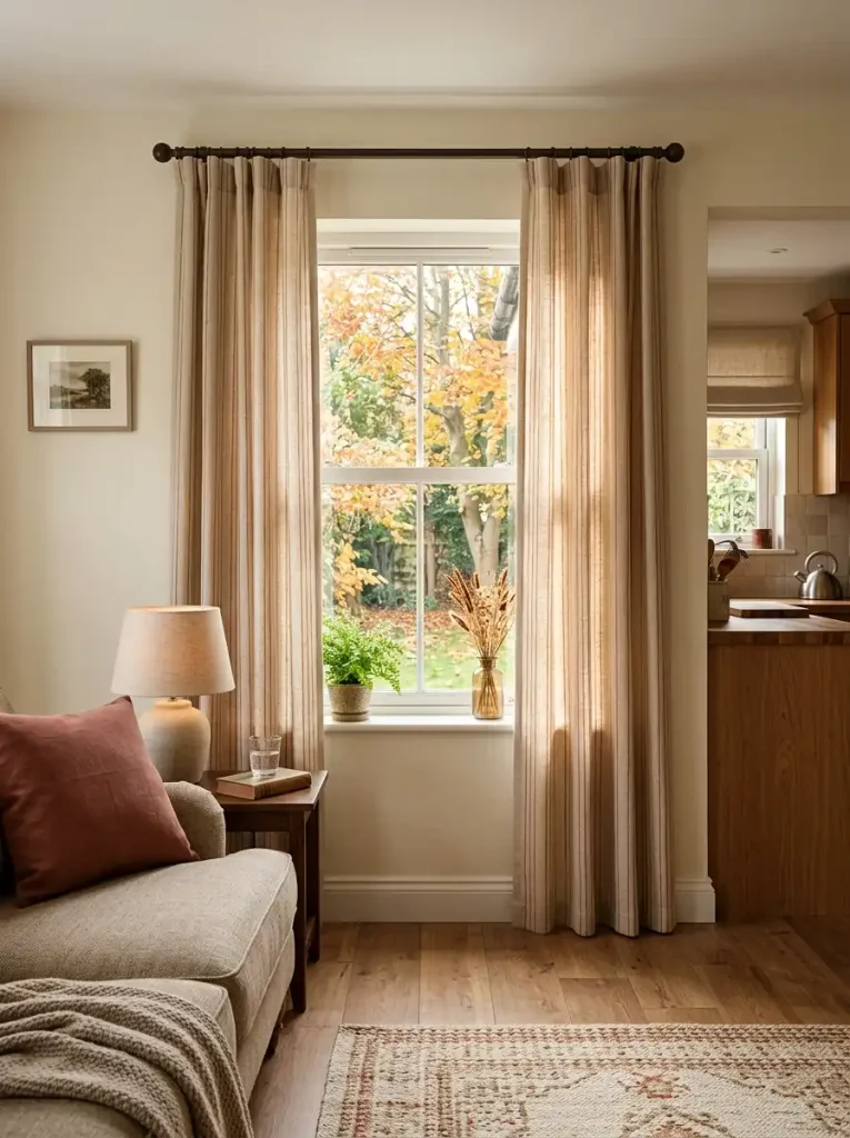
Daylight changes the way fabric color reads. A rust panel held in front of a bright window often looks lighter and more vivid than the same fabric folded on a sofa. For that reason, a curtain color that looks slightly quiet in your hand may become exactly right once sunlight passes through or around it.
Keep the pattern scale proportional to the window. A narrow opening can disappear behind large, high-contrast motifs, while a restrained repeat still gives the room a seasonal shift.
Choose the fabric in daylight before committing to the final intensity.
9. Add Tall Autumn Branches to a Dead Corner
Some corners need height, not more furniture.
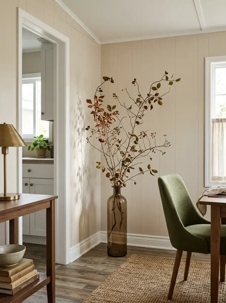
A narrow floor or console vase filled with airy autumn branches can lift a blank corner toward the ceiling while much of the wall remains visible through the stems. That open silhouette is what makes the idea useful. A dense bouquet creates visual mass; sparse branching creates reach.
Look for stems with irregular side shoots instead of one compact ball of leaves. Position the tallest branch slightly off-center so the arrangement feels organic and allows the corner line to stay visible behind it.
The vessel should be visually quieter than the branches—smoked brown glass, matte charcoal ceramic, aged stone, or warm neutral pottery all work well.
Design rule: when the corner needs height, preserve gaps between the stems.
10. Turn the Coffee Station Into a Working Fall Vignette
A seasonal coffee station earns its space when the autumn styling follows the way you actually make a drink.
Picture the normal sequence: reach for a mug, make the coffee, grab sweetener or spices, then return everything. The decorative layer should sit around that routine, not interrupt it.
For a compact station, let one working item carry the seasonal cue. A rust mug set, amber canister, warm wood tray, or cinnamon-toned towel can establish the palette before any purely decorative accessory is added.
If the machine sits on an open counter: keep the front and side access clear, then place one taller fall element behind or beyond the working zone.
If the station uses wall shelves: reserve the easiest shelf for mugs and daily supplies. A small branch vessel or autumn object can occupy the less convenient upper level.
If the counter is extremely short: skip the extra ornament. Warm ceramics and wood can do the decorative work themselves.
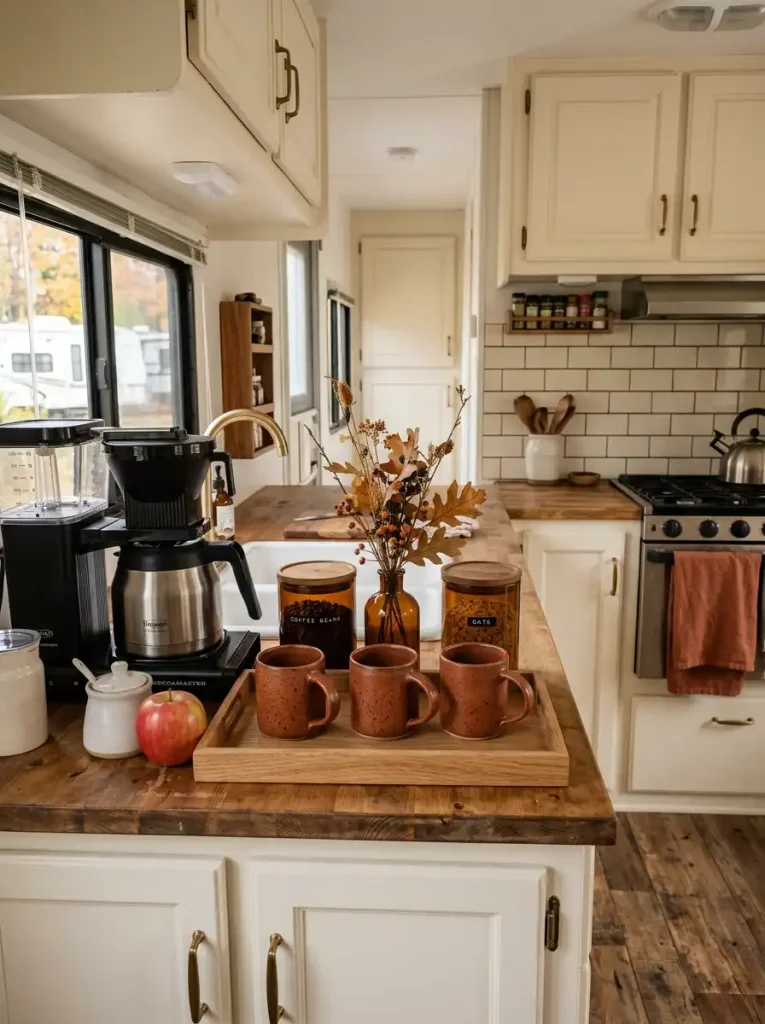
The finished station should make the next cup easier to prepare, not harder.
For room-specific ideas beyond the beverage corner, see StylishGalore’s fall mobile home kitchen decor guide.
11. Use Above-Cabinet Space for a Slim Autumn Canopy
The strip between kitchen cabinets and ceiling can carry seasonal atmosphere surprisingly well, but it should still read as air around the cabinetry, not a second solid shelf of décor.
Start by checking how much wall remains visible above the cabinet line. If the gap is shallow, use a thin run of dried-looking foliage, a few separated branches, or two low objects with plenty of empty space between them. Deep baskets, tall pumpkins, and thick garlands can visually pull the ceiling downward when they fill most of that gap.
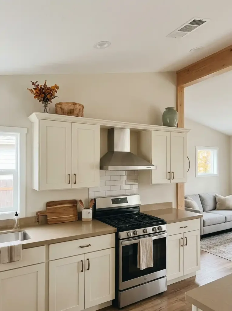
A longer kitchen benefits from an uneven rhythm. Let one section carry more foliage, leave another mostly bare, then repeat a smaller accent farther along. That broken sequence looks more natural than a continuous band running across every cabinet.
Keep vents, access panels, lighting components, and heat-sensitive areas completely clear. Items positioned above cooking appliances also need to tolerate normal kitchen warmth and cleaning.
The best checkpoint is simple: from the living-room side of an open mobile-home layout, you should still notice the cabinetry before you notice the décor sitting above it.
12. Frame the Kitchen Sink Window Without Stealing Its Daylight
At the sink, the window should remain the brightest feature in the composition.
Small fall objects can look surprisingly dominant here because daylight turns them into high-contrast silhouettes. A narrow branch arrangement that seems almost insignificant on a counter may become visually twice as strong once it sits against bright glass.
Use that effect deliberately. Keep the center of the window open, then place seasonal detail toward one side or below the sill line. A short pottery vessel, two tiny gourds, or sparse stems can be enough.

Backlight Scale Guide
Backlight Scale Guide
Bright glass makes small décor read larger
Keep the brightest central portion of the window mostly open. Seasonal accents become strongest when they sit along the lower or outer edge of the light field.
When does the window have too much décor?
If the seasonal silhouette becomes the first thing you notice from across the kitchen, reduce its height or move some of the mass below the sill. The window should still read as the room’s primary light opening.
13. Let the Bathroom Mirror Double One Small Fall Accent
A bathroom mirror can make one seasonal detail behave like two.
Place a modest autumn accent where you can see both the object and its reflection from the doorway or vanity position. An amber vessel with two branches, a rust hand towel, or a small ceramic piece may be enough to shift the entire vanity composition.
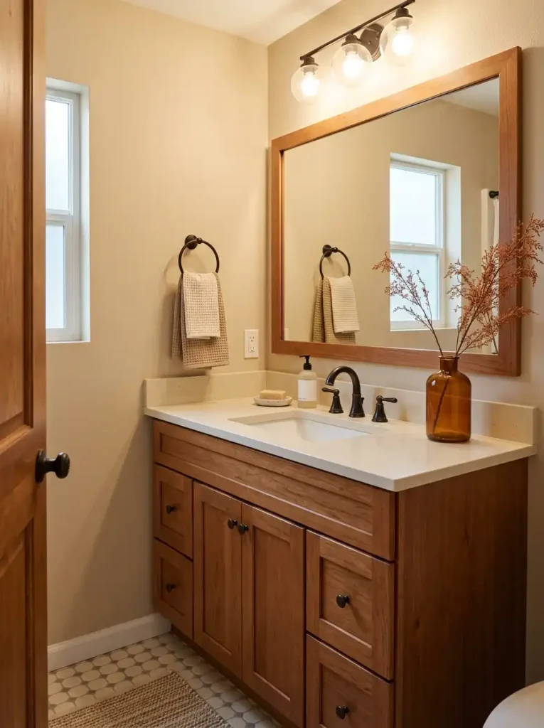
The reflection does not need to be perfectly centered. In fact, an offset view often looks more relaxed because the real object and reflected version occupy different parts of the scene.
Watch the background inside the mirror. If the seasonal accent reflects alongside toiletries, cords, open storage, and several other objects, the extra image can make the vanity feel busier. Edit what appears behind you before adding more decoration in front.
This is one of the few places where a smaller accessory can have an unusually large visual effect.
For more room-specific ideas, see StylishGalore’s fall mobile home bathroom decor guide.
14. Layer the Bed With One Lightweight Quilt and One Heavier Throw
A fall bed does not need five blankets to look deeply layered. The more important choice is where each fabric carries visual weight.
Begin with a lightweight quilt or coverlet that can spread across most of the bed without making the mattress look bulky. Let that layer provide the larger field of color—oatmeal, clay, muted olive, warm taupe, or soft rust all work well.
Then concentrate the heaviest-looking textile across the lower third. A chunky knit, brushed blanket, or quilted throw placed there gives the bed a grounded autumn finish while leaving the upper sleeping area practical.
- Keep the broad layer comparatively light in texture.
- Let the foot-of-bed throw supply the deepest pile or weave.
- Add only enough pillows to connect those two materials.
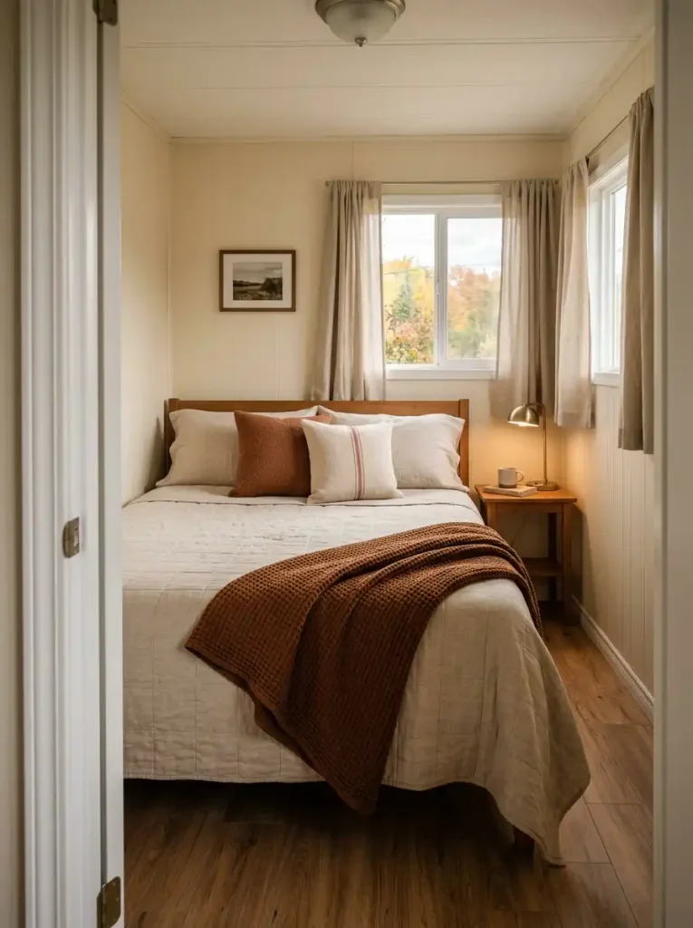
A highly textured throw covering the full mattress can visually flatten the layers because there is no quieter fabric left for comparison.
The same principle works especially well in smaller bedrooms: create depth across the bed surface, not around the perimeter with extra baskets, stools, and decorative objects.
For a fuller seasonal bedroom reset, StylishGalore’s fall bedroom decor guide offers more room-specific inspiration.
15. Give a Plain Interior Door One Lightweight Fall Accent
Which interior door do you actually notice from another room?
That is the one worth decorating.
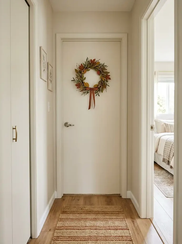
A pantry, bedroom, or hallway door positioned at the end of a sightline can carry a slim wreath, narrow textile hanging, or lightweight botanical accent. Check it with the door both closed and open; an arrangement that looks centered in one position may collide visually with artwork, furniture, or another doorway in the other.
Keep the handle, latch, and full swing usable. Removable over-door or damage-conscious hanging methods are especially useful where permanent attachment is undesirable.
A door that disappears from most viewpoints does not need seasonal décor simply because its surface is empty.
16. Mark the Dining Nook With a Long, Low Fall Centerpiece
A small dining table often needs seasonal presence across its length, not extra height in the middle.
If the table is rectangular or narrow, try a low runner of autumn material: a slim wooden tray, shallow bowl, or loose line of branches and small objects extending through part of the center. The horizontal shape reinforces the table instead of interrupting conversation across it.
Compare that with a tall vase. It may photograph beautifully, yet seated diners have to look around it and move it whenever the table is fully used.
A practical sequence is:
- Reserve the center strip for décor.
- Keep the main seasonal mass below seated eye level.
- Leave enough open tabletop for plates, serving dishes, and ordinary meals.
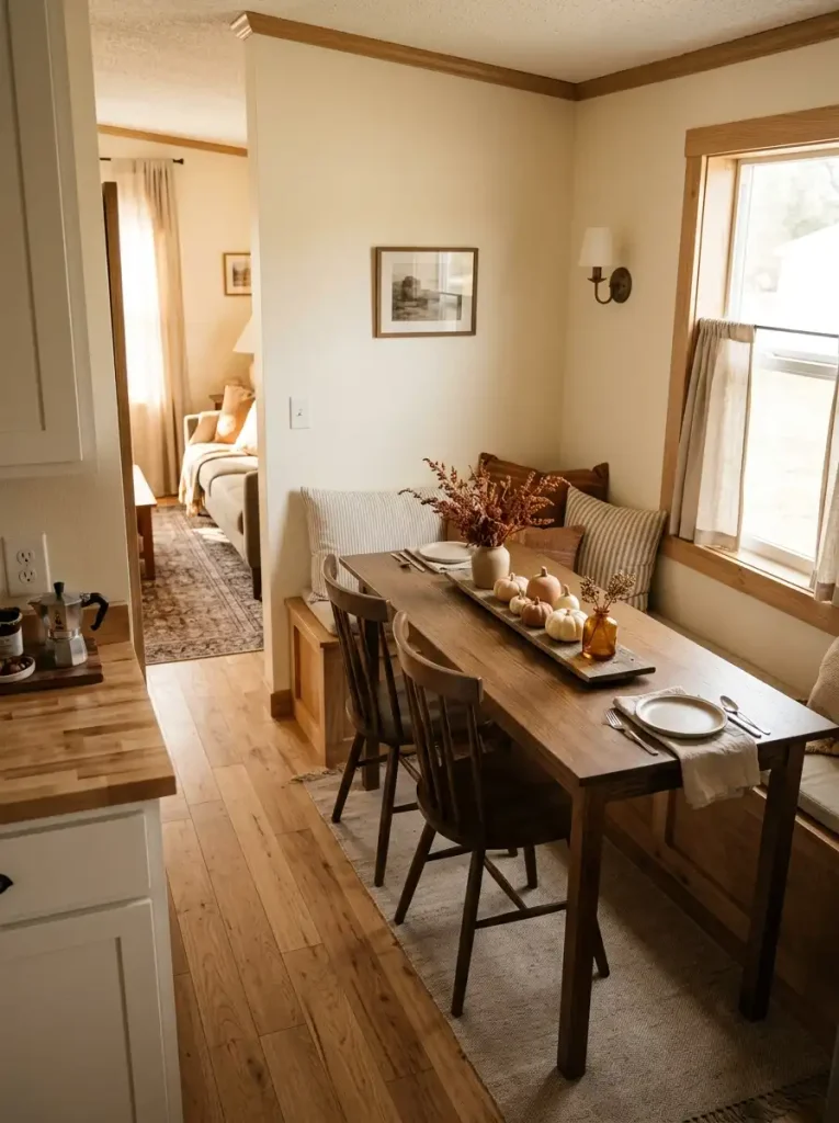
A round table needs a different proportion. One compact central grouping generally reads better than trying to imitate the long arrangement.
The dining nook should still feel ready for dinner after the decorating is finished.
17. Use a Hall Runner to Warm the Home’s Longest Walking Line
A hallway runner can change more than the color of the floor. In a long mobile-home passage, it also determines where that visual line seems to begin and end.
First locate the architectural breaks: doorways, openings into larger rooms, cabinets, or noticeable changes in flooring direction. Let the runner relate to those points instead of stopping at an arbitrary spot midway along the hall.
A quick fit check
- Too short: the runner floats in the middle and may make the corridor feel fragmented.
- Too wide: the remaining strip of flooring becomes so narrow that the hall looks pinched.
- Better fit: consistent floor margins stay visible on both sides and the runner ends near meaningful transition points.
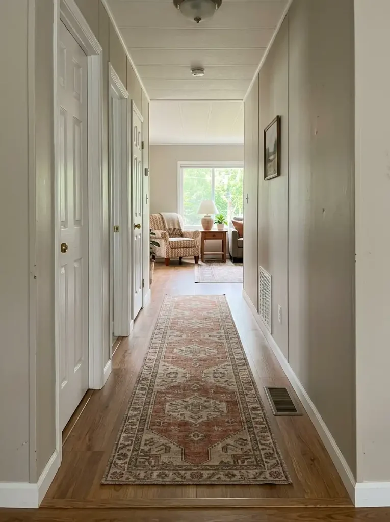
Low pile is especially useful where several doors open into the same passage. Test every door before committing to a thicker weave, and check that floor registers remain uncovered.
Pattern direction matters too. A subtle linear or elongated motif supports the corridor’s natural movement; a very large centered medallion can fight against it.
A good runner should make the hallway feel connected from one destination to the next.
18. Repeat One Small Fall Cue Across Connected Rooms
Repeating a seasonal cue does not mean placing the same pumpkin in every room.
Suppose the living room contains a cinnamon throw. From that room, you can also see the kitchen and a short hallway. A small amber vessel in the kitchen and a narrow rust stripe farther down the hall can form a visual relationship even though the objects themselves are completely different.
The strongest connection may come from color, material, shape, or motif. Choose one.
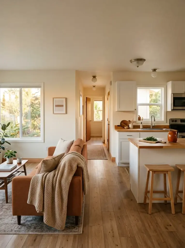
Color is the easiest to recognize at a distance. Material is subtler: woven fiber on a living-room basket, a rattan shade near the dining nook, and a small natural tray in the kitchen can quietly tie the view together. Shape works when the home already contains strong repeated curves or linear forms.
Avoid equal repetition. Three identical orange accents spaced at exact intervals can look staged. One stronger cue, one medium echo, and one distant hint usually feels more natural.
The useful test is the long view: can you identify a relationship without immediately spotting a matching set?
Connected-Room Cue Map
Connected-Room Cue Map
Repeat the relationship, not the object
Give one room the strongest expression of the cue, then let it fade in intensity as it travels through the connected view.
Cinnamon textile
A larger fabric surface establishes the cue where the eye lands first.
Amber-rust vessel
The color family continues, but the object type changes and the intensity drops.
Small textile stripe
The final echo is visible enough to connect the sightline without creating a matched set.
19. Build a Three-Level Evening Glow
Turn off the main ceiling fixture for a moment and look at what disappears.
A fall room that feels richly textured during the day can flatten after dark when one overhead light illuminates every surface from almost the same direction. Evening coziness comes from giving light different jobs at different heights.
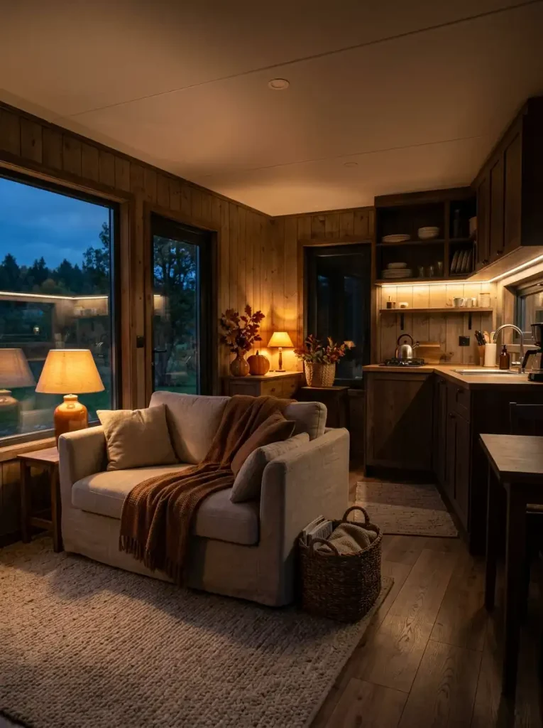
Dusk Layer Stack
Dusk Layer Stack
Give evening light three separate jobs
Each layer illuminates a different part of the room. The combination reveals texture, supports everyday tasks, and keeps the lowest light sources atmospheric rather than responsible for visibility.
A dimmed ceiling fixture or broad lamp keeps circulation, furniture edges, and the overall room readable.
Table lamps, reading lights, or under-cabinet illumination reveal texture where people sit, prepare food, or read.
A shaded accent lamp or other safe low-level source creates the final warm pool near seasonal décor.
The three levels should remain distinguishable in the real room:
General light keeps the space usable. A dimmable ceiling fixture or broad lamp provides enough visibility for walking and ordinary activity.
Local light belongs where a task actually happens. A reading lamp beside the sofa, under-cabinet lights in the kitchen, or a small dining lamp illuminates surfaces from another direction and reveals texture that overhead light can flatten.
Low ambient light finishes the composition near a shelf, side table, or seasonal arrangement. A shaded accent lamp can create that lower pool without requiring open flame.
Notice what happens to chunky knits, woven baskets, ribbed pottery, and foliage when side light crosses them: small shadows make their texture legible from across the room.
Keep practical visibility first, especially around steps, hallways, cooking areas, and furniture edges. Decorative light should enrich the evening scene, not become its only illumination.
20. Store Extra Throws in One Visible Woven Basket
A woven basket beside the sofa can bring autumn texture into the room before you add any seasonal color at all.
Look for a weave coarse enough to contrast with the softer blankets it holds. Seagrass, rattan, rope, or a structured natural-fiber basket gives the eye a harder, more graphic texture next to knit, fleece, or brushed cotton.
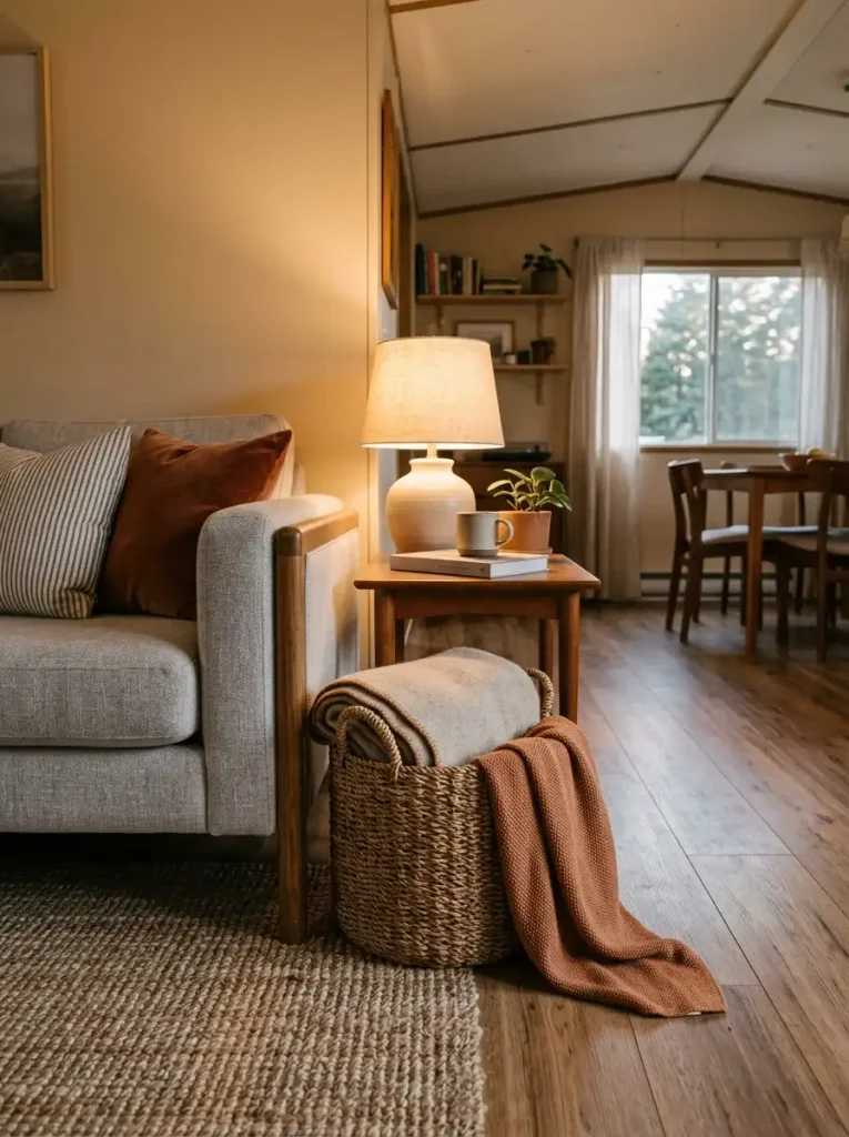
Keep the contents honest. Store the throws you actually use during cooler evenings, with one folded edge or loose corner visible near the top. Packing the basket with decorative blankets that never leave it turns useful storage into another display to maintain.
Placement follows reach: beside the sofa arm, under an open console, or near a favorite chair works better than a remote corner chosen only because it is empty.
If the basket begins overflowing onto the floor, edit the blanket collection. Its seasonal value comes from combining storage and texture in one footprint—not from becoming a second textile pile.
21. Let a Fireplace or Faux Mantel Carry the Densest Fall Styling
Not every part of a room needs the same decorating density. A fireplace or faux mantel is one place where a fuller autumn arrangement can make sense because the architecture already tells you where to look.
Build outward from that existing focal area. A mirror or artwork can remain the tallest element, with foliage, pottery, pumpkins, or candlesticks stepping down toward the sides. Keep the surrounding coffee table, TV console, and nearby floor noticeably calmer. The contrast between a detailed mantel and quieter neighboring surfaces is what makes the arrangement feel deliberate.
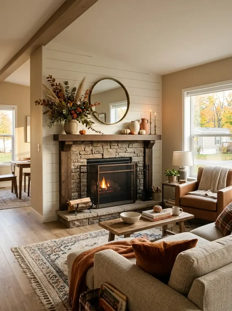
A faux mantel can use the same composition logic even without a firebox. What matters is that the wall already behaves as a destination in the room.
For a working fireplace, decorative freedom stops where heat and manufacturer clearances begin. Keep textiles, dried material, faux foliage, baskets, and other combustible pieces outside required safety zones.
When this area carries the strongest seasonal concentration, the rest of the living room can afford to whisper.
22. Add a Halloween Layer You Can Remove Without Redecorating
Halloween is easier to decorate for when the room already has an autumn foundation.
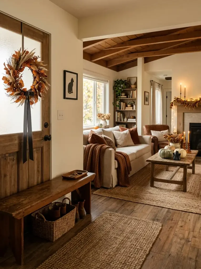
Start with elements that can stay through September, October, and November: rust textiles, amber glass, natural wood, woven baskets, dried-looking foliage, muted pumpkins, and warm lighting. Then add a smaller October-only layer through black accents, a few playful silhouettes, dark ribbon, or one clearly spooky object.
The important distinction is which pieces define fall and which pieces define Halloween.
Remove the October layer mentally. If the room suddenly looks unfinished, too much of the composition depends on temporary motifs. If the space still feels seasonal, the foundation is doing its job.
This approach also makes the transition toward Thanksgiving much easier. You are editing one layer instead of rebuilding every surface.
Fall Base / October Overlay
Seasonal Layering
Build autumn first, then place October on top
The foundation should remain complete after every Halloween-specific piece is removed.
Rust, oat, brown, or olive layers
Wood, woven fiber, pottery, amber glass
Dried-looking stems and warm foliage
Soft warm lamps and evening glow
02 — Reveal the removable October overlay
Removal test: imagine every Halloween-specific item gone. If the remaining room still looks complete and autumnal, the layering is working.
23. Build One No-Pumpkin Fall Zone With Wood, Amber Glass, and Dried Texture
Remove the pumpkins and orange maple leaves from one part of the home and see what happens.
Autumn can still be unmistakable when the materials carry the season. A walnut console, amber bottle, stoneware bowl, dried seed heads, aged brass, olive textile, and warm brown book covers create a mood rooted in harvest colors and natural aging without relying on a literal motif.
The most convincing combinations usually mix three surfaces:
Something organic: dried branches, grasses, seed pods, or natural fiber.
Something translucent or reflective: amber glass, aged metal, or softly glazed ceramic.
Something visually grounded: dark wood, stoneware, brown pottery, or a deeper textile.
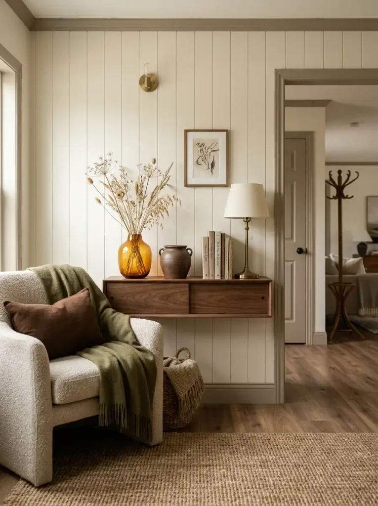
That material contrast is especially useful if pumpkins already appear elsewhere in the home. One motif-free zone gives the seasonal styling a different voice and prevents every surface from telling the same story.
Readers who prefer a more rustic version can also explore StylishGalore’s fall farmhouse decorating ideas for mobile homes.
24. Group Small Pumpkins Into One Family Instead of Scattering Them
Three little pumpkins can behave like one decorative statement—or three separate interruptions.
The difference is spacing.
Bring repeated objects close enough that their edges nearly overlap visually. Vary the sizes slightly, and keep the palette related: perhaps clay, muted cream, and one darker brown. The group then reads as a single cluster before you register each individual piece.
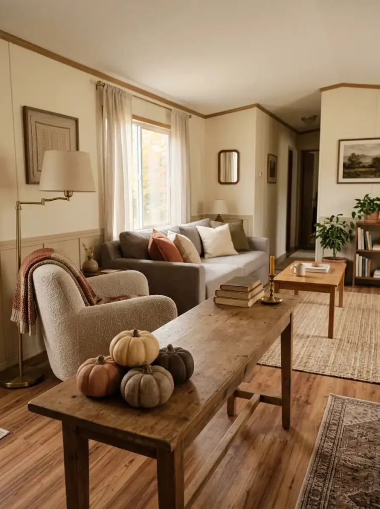
Spreading those same pumpkins across a console, side table, shelf, and floor asks the eye to stop repeatedly for the same motif.
A compact pumpkin family works best where the surrounding surface has room to stay quiet. Once the cluster is established, resist adding another isolated pumpkin a few feet away simply to continue the theme.
25. Take Three Long-Sightline Photos and Edit What Competes
The final decorating decision is often easier to make through a phone camera than while standing in the room.
Take three photos from positions you naturally use: the front-door area looking inward, the main seating position, and the longest view through two or more connected spaces. Do not style the photograph first. The purpose is diagnosis.
A photo compresses depth. A pumpkin on the coffee table may appear directly beneath foliage in the kitchen even though they are several feet apart. Two rust accents that looked balanced separately might merge into one heavy patch. An empty zone may also become obvious only after the room is flattened into a frame.
Review each image for three different problems:
- Competition: two seasonal focal areas demand attention at once.
- Accidental merging: separate objects visually overlap from the important viewpoint.
- Dead space: a meaningful part of the sightline has no relationship to the rest of the autumn palette.
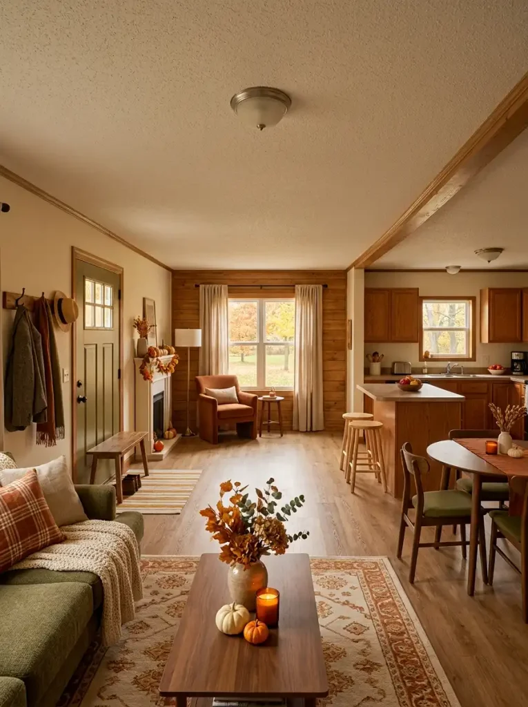
Fix the view by moving, removing, or separating an element. Do not automatically fill the empty areas; sometimes the gap is exactly what gives the stronger fall moments room to register.
Long-Sightline Edit Matrix
Long-Sightline Edit Matrix
Photograph the view, then edit the relationship
A phone image compresses distance and exposes visual conflicts that can remain hidden while you move naturally through the room.
A Cozy Fall Mobile Home Should Still Feel Like Your Home
The most convincing fall interiors are not the ones with the most seasonal objects. They are the ones where autumn changes how the existing home feels.
Start with the view that currently feels least inviting. Maybe the sofa needs richer texture, the entry needs one clearer seasonal moment, the kitchen needs warmer evening light, or several decorated surfaces simply need editing.
Then make one meaningful change and look at it from the next room before continuing.
That slower approach is especially effective in a mobile home because connected spaces influence one another so strongly. A rust textile can echo through a doorway, a lamp can make several textures come alive after dusk, and one quiet section of wall can give a fuller mantel or console room to stand out.
By the end, your cozy fall mobile home decor should feel less like a seasonal layer placed on top of the house and more like the familiar interior settling naturally into autumn.