

The first fall color in your bedroom may already be there: honey oak on the dresser, a tobacco-brown headboard, or the warm beige carpet beside the bed. Once you notice that starting color, choosing the rest becomes much easier.
These fall bedroom color ideas for mobile homes pair autumn shades with the finishes and furniture you may be keeping. Each palette shows what belongs on the larger surfaces, where a stronger accent can go, and which room condition should change your choice. A small bedroom can feel richly seasonal with a fresh textile combination, even when painting is off the table.

Start with the swatches below, then open the palette that fits your room. Some combinations are light and gentle; others bring deeper green, burgundy, or teal into the sleeping area. The most useful choice is the one that works beside your actual flooring, wood, and bedding in both daylight and your usual evening light.
The fall bedroom color edit
Find a palette for what stays
Each band shows three color references, not recommended proportions. Names and HEX values are illustrative digital guides; compare physical samples before choosing paint or fabric.
Warm ivory #F3EBDD · Cinnamon #A65F3D · Honey oak #B88A52
Ivory bedding · cinnamon quilt · existing oak
Keep the wood you already have
Mushroom #A69889 · Oatmeal #DDD0BA · Tobacco #78513A
Mushroom backdrop · oatmeal duvet · tobacco throw
Work with beige carpet
Soft white #F5F0E7 · Amber #C08A33 · Muted rust #AA6049
White furniture and duvet · amber throw · rust cushion
Give white furniture a warmer setting
Forest green #35483D · Terracotta #B97658 · Flax #DED0B5
Green bed zone · flax duvet · terracotta accent
Choose where the deepest color belongs
Dusty rose #BA8C82 · Cocoa #715249 · Warm white #F2E9DB
Rose coverlet · cocoa detail · white backdrop
Soften red-toned furniture
Oatmeal #D9CAB0 · Chestnut #815339 · Cream #F4E8D0
Oatmeal field · chestnut checks · cream solids
Use gingham without overwhelming the bed
Blue-gray #71828B · Burnt sienna #AB563C · Linen #E7DCC8
Existing blue-gray duvet · sienna layer · linen separation
Keep a cool-colored duvet
Ochre #B38630 · Sand #DCC7A7 · Walnut #624536
Ochre coverlet · sand sheets · walnut furniture
Balance golden textiles with dark wood
Sage #929C80 · Apricot #D5A080 · Ecru #EAE0CA
Sage bed layer · apricot accent · ecru window textile
Choose a lighter expression of fall
Burgundy #6D333E · Blush beige #D7BDB0 · Espresso #44332F
Burgundy quilt · blush-beige bedding · espresso furniture
Keep a rich bed from merging into dark furniture
Putty #BCB1A3 · Dusty clay #BB8B77 · Charcoal #444747
Putty duvet · dusty clay textile · charcoal detail
Test warmth beside gray flooring
Pumpkin #C87839 · Cream #F0E4CD · Soft black #343330
Pumpkin throw · cream duvet · existing black frame
Use the bed frame as the dark accent
Wheat #D6BE89 · Caramel #B57D4E · Chalk white #F1EEE5
Wheat duvet · caramel detail · chalk-white pillowcases
Refresh a wood-paneled bedroom with fabric
Aubergine #55404E · Camel #BE956B · Bone #E9DFCF
Aubergine bed accent · camel throw · bone base
Choose a deep palette that still reads at night
Olive #727653 · Antique gold #A78B4F · Stone #D3CCBC
Olive bedding · existing gold detail · stone neutral
Count warm hardware before adding more gold
Brick red #A45747 · Flax #DECAA8 · Warm greige #AEA395
Existing brick pattern · flax solid · greige backdrop
Build from a plaid textile you love
Deep teal #315B5A · Copper #B5734F · Oyster #E6DFD3
Teal bed layer · copper textile · oyster connection
Connect the bedroom to the hall
1. Warm Ivory, Cinnamon, and Honey Oak
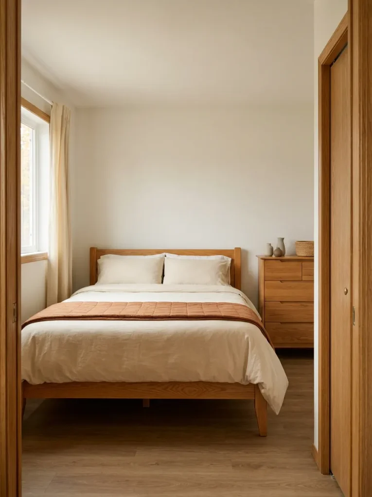
The honey-colored dresser does not need replacing just because the bedroom is getting an autumn refresh. Treat that wood as one of your three colors, then introduce warm ivory and cinnamon around it.
An ivory duvet creates a quiet field beside visible wood grain. A cinnamon quilt folded over its lower end supplies the seasonal contrast. In a compact bedroom with matching oak doors, trim, and furniture, this is often enough brown: extra wooden signs and baskets may add more of a color already well represented.

Try this before buying: hold a cinnamon fabric sample against the dresser and your current bedding together. If the combination feels overly orange, try a browner cinnamon or enlarge the ivory layer. Keep the variation that makes the existing furniture feel intentional.
2. Mushroom, Oatmeal, and Tobacco
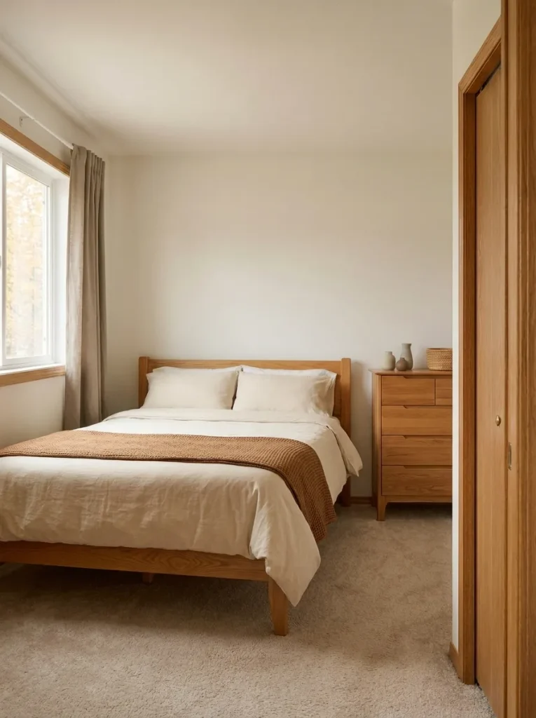
A beige carpet can occupy surprisingly little visible floor around a bed, yet its color still meets every textile at the room’s edges. Start this quiet autumn palette at that junction.
- Mushroom: choose a wall or curtain shade that looks comfortable beside the carpet.
- Oatmeal: use it across the duvet to connect the floor and bed without an exact match.
- Tobacco: reserve the deeper brown for a throw or pillow to keep the neutral scheme from looking flat.
Compare mushroom samples on a pale board beside the carpet. A version that looks pink, green, or violet in that setting may be a poor companion even if its name sounds neutral. With existing beige walls, keep them and test mushroom in fabric first; a seasonal palette does not depend on repainting.
3. Soft White, Amber, and Muted Rust
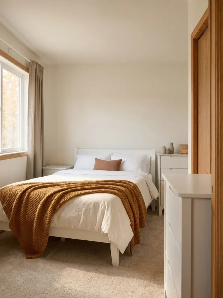
Have white bedroom furniture that feels a little stark? Place amber and muted rust against a mostly white bed, and the furniture becomes part of a lighter autumn composition.
The distinction between the accents matters. Amber brings a golden note; rust provides a redder, earthier one. Give amber the larger area, such as a folded throw, and use rust in one smaller cushion. Equal amounts can make the bed look divided into competing blocks.
In a bedroom with limited daylight, begin with just one accent. Open the curtains and check the room again after sunset before introducing the second. Choose amber for a golden mood or rust for a quieter, earthier emphasis; the white base can support either.
4. Forest Green, Terracotta, and Flax
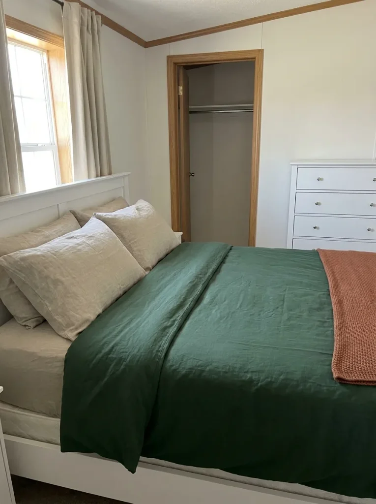
Forest green gives terracotta a leafy backdrop, while flax supplies the pale interval between them. The combination can feel grounded without filling the bedroom with seasonal objects.
The important choice is where to put the green. In a mobile-home bedroom with a short, interrupted headboard wall, a green duvet or upholstered headboard may give a clearer color area than paint squeezed around a window and closet opening. A broad, uninterrupted bed wall offers a different possibility: green behind the bed, flax bedding in front, and terracotta across a smaller textile.
Use the comparison below to choose a starting arrangement. Detailed wall treatments and room styling can follow through these fall mobile home bedroom decor ideas; first settle the color placement.
Wall color or bedding color?
Choose a green surface that gives the color enough room to read clearly.
5. Dusty Rose, Cocoa, and Warm White
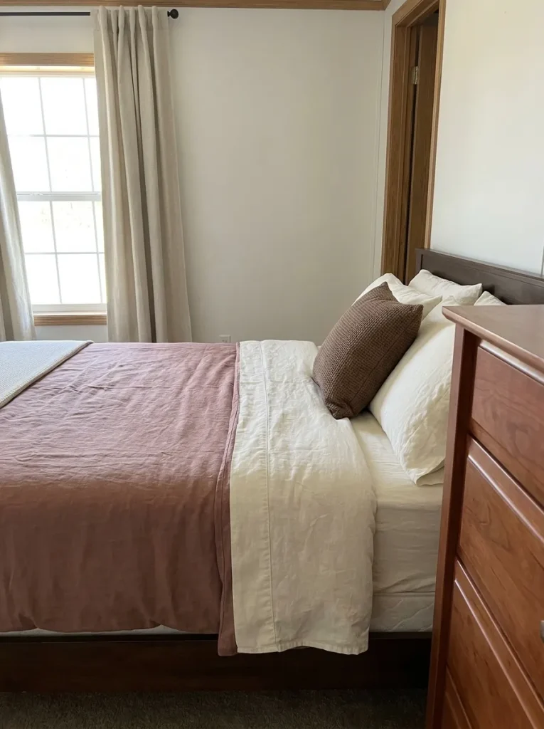
Beside a cherry-toned dresser, dusty rose can repeat some of the wood’s redness in a softer form. Cocoa adds depth, and warm white prevents the whole room from becoming a continuous reddish-brown field.
Choose a rose that feels muted
A brownish rose is a useful first sample. A peachier version may bring out more orange in the wood than you want.
Leave a pale break
Show warm-white sheets or a pale bed skirt between the rose textile and a dark wooden bed frame.
This is a sample-led choice, especially with older furniture whose finish has several tones. Drape the actual rose fabric near the dresser, then view both from the bedroom entrance. Keep it if the furniture looks related to the bedding; try a less red textile if the room feels too uniformly rosy.
6. Oatmeal, Chestnut, and Cream
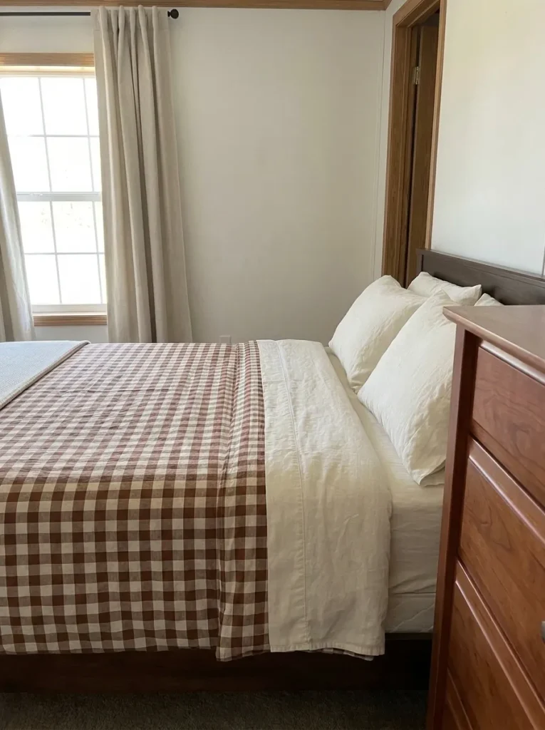
Brown gingham can feel wonderfully familiar in fall: a little country-house warmth in a bedroom that has only enough room for the essentials.
- Start with checks that combine chestnut and oatmeal, so the contrast feels softer than black and white.
- Add cream pillows or a plain folded sheet to interrupt the pattern.
- Look from the doorway before repeating gingham on curtains.
When the bed nearly fills the room’s width, its pattern becomes a large part of the entire view. The doorway check tells you whether a checked duvet feels comfortable or whether a smaller gingham layer would suit the space better. With a plain duvet already in place, begin with a checked pillowcase pair or coverlet and let the existing solids carry the rest.
7. Blue-Gray, Burnt Sienna, and Linen
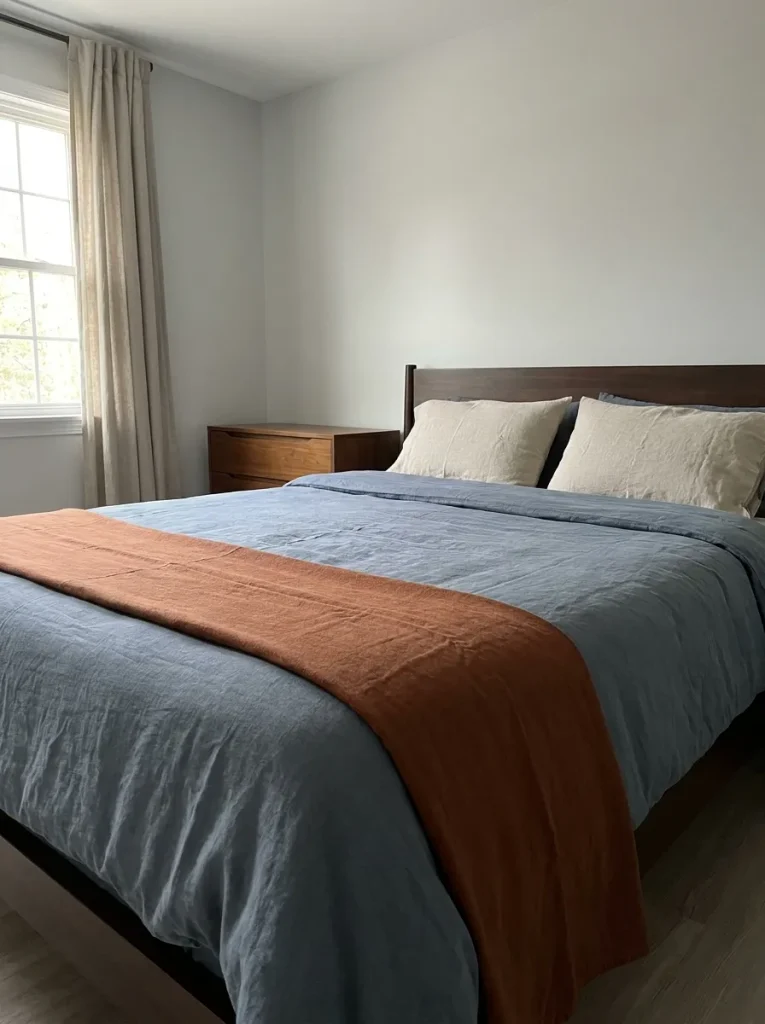
Keep the blue-gray duvet. Autumn warmth can come from what you place beside it.
Burnt sienna provides an earthy counterpoint to blue-gray. Linen gives the two colors a quieter meeting place, especially when the bed sits close to pale gray walls. Fold a sienna textile across part of the duvet and show linen-colored pillows at the head; a room with a dark bed frame may need more linen showing to separate those deeper surfaces.
The useful comparison is coverage. A broad sienna quilt makes the bed feel warmer overall; a narrow folded throw preserves the blue-gray character. Choose between them with the existing duvet spread out at its usual size. A tiny fabric sample alone cannot show how much blue remains visible.
How much sienna feels right?
These are conceptual textile relationships, not measurements. Compare them on your own bed.
8. Ochre, Sand, and Walnut
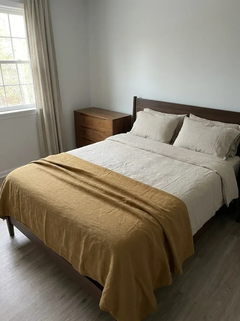
Walnut furniture gives ochre something dark to stand against. Sand softens that contrast, which is useful when a large dresser and bed frame share a small bedroom.
Let ochre be the color you notice; let sand be the color that occupies the quiet spaces around it.
Try an ochre coverlet with sand sheets and pillowcases. If the room already has golden wall panels or yellow-toned curtains, reduce ochre to a smaller textile and make sand the duvet color. Otherwise, the new purchase may amplify a yellow cast that was already bothering you.
A fabric draped over the corner of the bed is an inexpensive way to compare those two arrangements. Check it beside the walnut finish, not against an isolated white screen. Wood stain, daylight, and fabric texture can make the same golden shade feel quite different at room scale.
9. Sage, Apricot, and Ecru
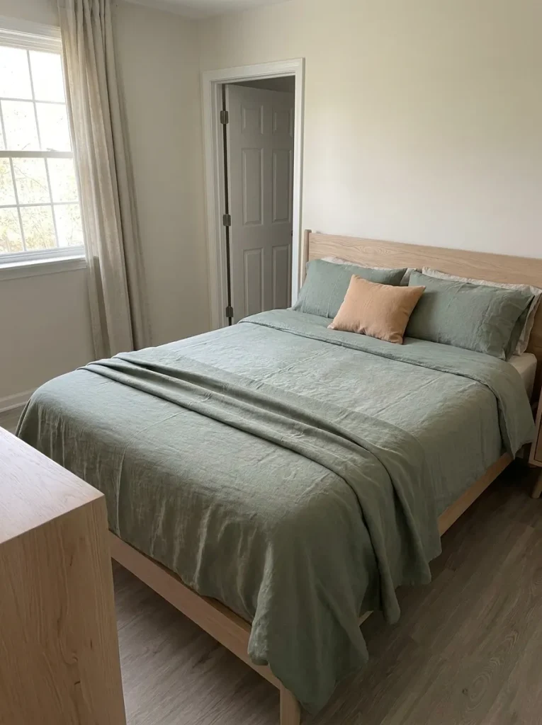
For a bedroom that already feels airy and gentle, sage, apricot, and ecru bring autumn warmth without a dramatic shift in mood. Sage supplies the botanical note; apricot introduces a softer orange; ecru connects both to pale wood or neutral walls.
At the window: try ecru curtains with the current wall color before adding apricot panels. In a compact room, a large colored curtain can become a stronger feature than the bedding.
Keep apricot on a cushion or folded blanket if you want the view toward the window to remain quiet. Use sage across a larger bed layer when the existing walls are pale. If the wall covering already contains green, compare that green with the fabric in person: two almost-matching sages can look less settled than a clearly different neutral companion.
10. Burgundy, Blush Beige, and Espresso

A burgundy duvet against an espresso bed frame can become one deep-colored mass. Blush beige creates separation while keeping the palette warm.
Picture the bed dressed in blush-beige sheets and pillowcases, with a burgundy quilt folded across the foot. The pale fabric remains visible along the sides and at the head, so the dark frame still has a readable outline.
- For a room with an espresso wardrobe beside the bed, begin with this smaller burgundy layer.
- For pale walls and little dark furniture, compare a full burgundy duvet with blush-beige pillows and a light throw.
Stand where you normally enter the bedroom. If the wardrobe and bed blend into one dark shape, expose more of the pale textile before buying another accent. This palette depends on separation as much as richness.
11. Putty, Dusty Clay, and Charcoal
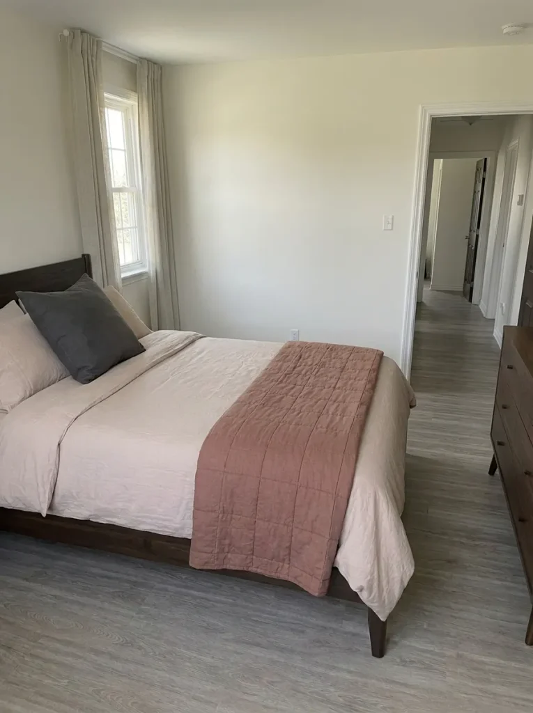
Gray flooring does not dictate a cold bedroom. It does, however, deserve a place in the color test. Putty and dusty clay offer a restrained starting pair, with charcoal adding a small amount of definition.
Place the putty and clay fabrics where the bed meets the visible flooring. Notice whether the floor appears blue, brown, greenish, or fairly neutral beside them. That observation is more useful than the product label “gray.” A warmer putty may settle comfortably with brown-gray flooring; another finish may look better beside a grayer putty and a less orange clay.
In a mobile home where the same flooring continues through the hall, compare the samples both inside the bedroom and at the doorway. Choose the version that feels comfortable across that real junction. The guide below suggests a testing direction, not a guaranteed color match.
Let the floor join the color test
Gray is a starting description. Use the visible undertone to choose which physical samples to compare.
12. Pumpkin, Cream, and Soft Black
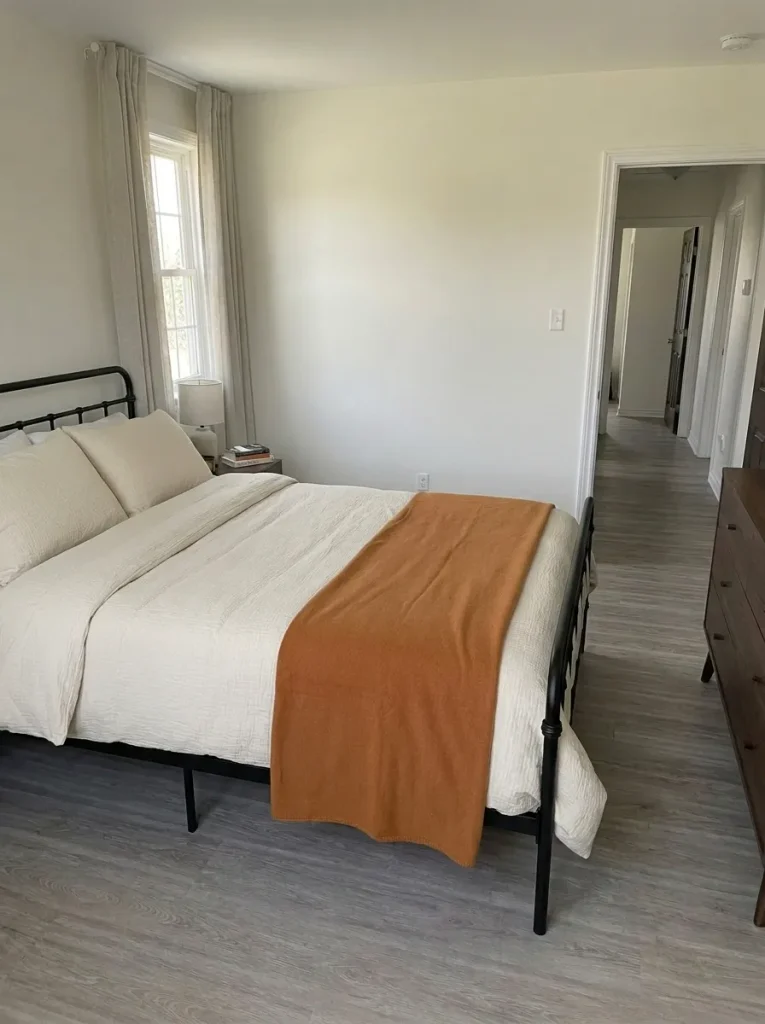
An existing black metal bed already supplies the darkest color in this palette. Add cream bedding and a pumpkin layer, and the three-part combination is complete.
- Spread the cream duvet first so the frame remains visible against it.
- Introduce pumpkin through a throw or quilt.
- Pause before adding black cushions, lamps, or wall art.
That pause matters in a narrow bedroom: repeated black details can make every edge compete for attention. The frame may provide all the definition the room needs. For a quieter seasonal appearance, choose a softened, brownish pumpkin textile. For a stronger autumn look, use a clearer orange on the same limited area. A room with black curtains as well as a black frame will usually benefit from keeping more cream exposed.
13. Wheat, Caramel, and Chalk White
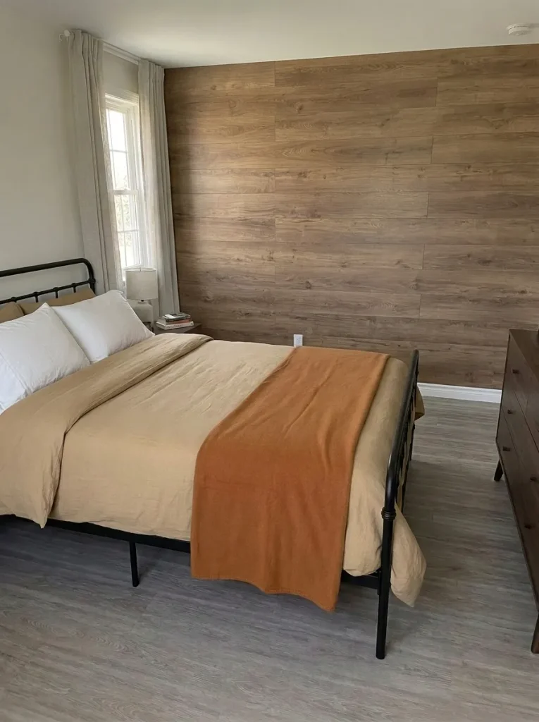
Keeping the wood-look wall panels changes the starting point: the room already has a large warm-colored surface. Wheat bedding can relate to that warmth, caramel can deepen it, and chalk-white pillowcases can provide a clean visual break.
Panels with obvious golden tones
Begin with more chalk white and a quieter wheat textile; check that the combination does not become too yellow.
Panels with darker brown grain
Try wheat as the main bed color and use caramel in a smaller layer that echoes the grain.
Keep the first purchase small enough to test at home. A pillowcase or fabric sample can reveal whether the warm combination suits the panel finish. For a wider refresh built around retained belongings, these budget fall decorating ideas for mobile homes offer useful next steps.
14. Aubergine, Camel, and Bone
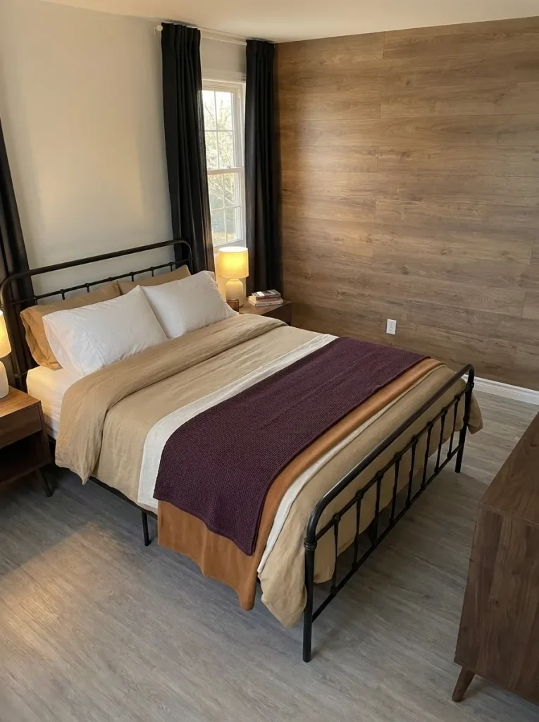
Aubergine can look plum-colored in daylight and almost brown beside a shaded bedside lamp. That change is a reason to test it in the bedroom, not to abandon a beautifully rich color.
Lay aubergine, camel, and bone fabrics together on the bed, then inspect them under the lamps you normally use. Bone should remain the pale base, camel the warm middle tone, and aubergine the deep accent. If the middle and dark colors merge, expose more bone or try a lighter camel.
Make the final choice at the time of day you most want to enjoy the room.
With dark curtains already beside the bed, place the aubergine toward the center of the bedding so those deep areas are separated. The palette can then feel layered even when the available wall and floor space is limited.
The evening check
What changes under your lamps?
Open the observation that matches your fabrics. These checks help you choose a textile, not a new lighting system.
Aubergine and camel merge together
Expose more bone between them. Compare a lighter camel if the two layers still read as one dark area. Keep aubergine as the smallest of the three textile fields for the next test.
Camel looks more orange than expected
Compare a quieter, less golden camel under the same lamp. Keep the aubergine and bone in place during the comparison so you are changing one variable.
The whole bed looks too pale
Spread the aubergine textile a little farther across the bed and inspect the full view. Stop where the deep layer becomes distinct without joining visually to dark curtains or furniture.
15. Olive, Antique Gold, and Stone
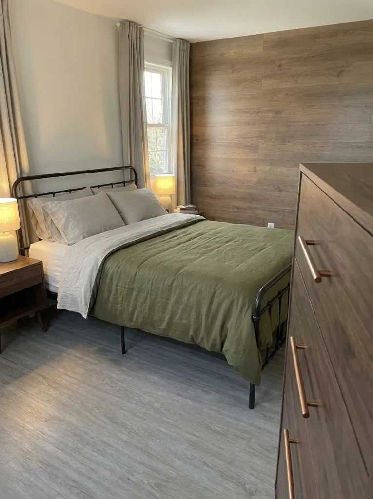
Look at the lamp base, drawer pulls, and mirror frame. If they already have a warm metal finish, the gold part of this palette may be in place.
Olive bedding can relate to those details, while stone-colored sheets or curtains give the green a quieter surround. Here, antique gold describes a color and finish direction: the digital swatch cannot reproduce the way real metal reflects light.
One purchase to reconsider: gold cushions. A compact bedside area with a brass-toned lamp and warm drawer pulls may gain more from a plain stone pillow than another metallic surface.
Where the existing hardware is cool silver, test olive and stone first. Add a small warm-gold textile detail only if you like the mixed finish effect. Matching every metal is unnecessary; the practical decision is whether the new accent contributes anything the room is missing.
16. Brick Red, Flax, and Warm Greige
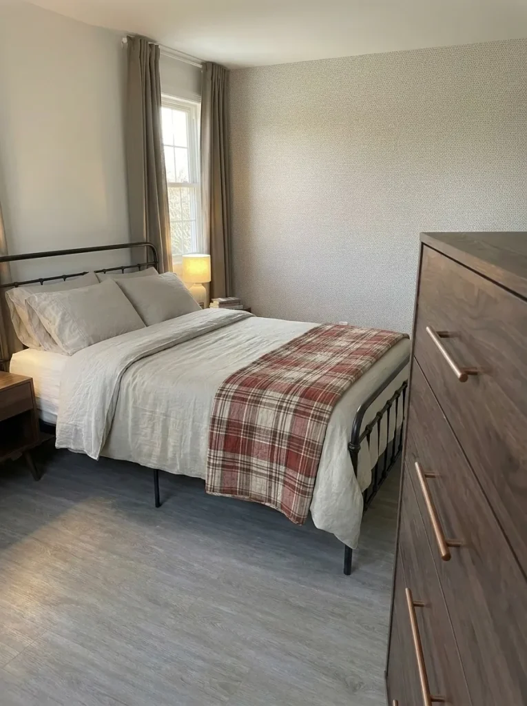
That favorite fall quilt can choose the palette for you. Find its brick-red threads, its palest flax areas, and a quieter greige tone that can connect it to the rest of the room.
- Keep the pattern as the reference: take the quilt or a clear close-up with you when comparing fabrics, then confirm the match at home.
- Make the next layer solid: flax sheets or a plain coverlet leave room for the plaid to be seen.
- Use greige on a broad quiet surface: existing walls or curtains may already do this job.
If patterned wall covering is also staying, compare the quilt fully spread and partly folded. In a small mobile-home bedroom, folding it can preserve the textile you love while reducing the amount of competing pattern. No new seasonal print is required.
17. Deep Teal, Copper, and Oyster
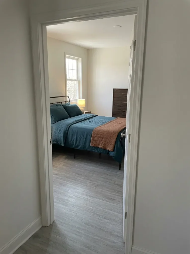
Seen through an open doorway, deep teal and copper can make a bedroom feel like a warm destination at the end of the hall. Oyster provides a pale connection to the adjoining space.
Use teal on a substantial bed layer, copper on a smaller textile, and oyster where the bedroom meets its existing pale walls or trim. Walk into the room from the hall and notice the transition. A shared pale neutral may connect the views sufficiently; the hallway does not need its own copper accessories.
If the hall already has strong color, begin with a smaller teal area and compare it from outside the bedroom. Keep the combination that feels related without requiring another room to be redecorated. For a broader seasonal plan, explore these cozy fall decorating ideas across a mobile home.
What should you bring home first?
Start with the piece that must remain. Each route leads to a small, useful test.
Bring One Palette Home First
Choose the combination with the best relationship to something you plan to keep. Then test its new colors together on the bed, beside the floor, and under your evening lamps. A palette that looks lovely in a saved image still needs to work at those everyday meeting points.
Begin with the smallest useful change: a pillowcase, a fabric sample, or a throw you can spread out and fold back. Once the balance feels right, decide whether a larger textile would improve it. Save the palette you want to try, including its color roles, so your next purchase has a clear place in the room.
