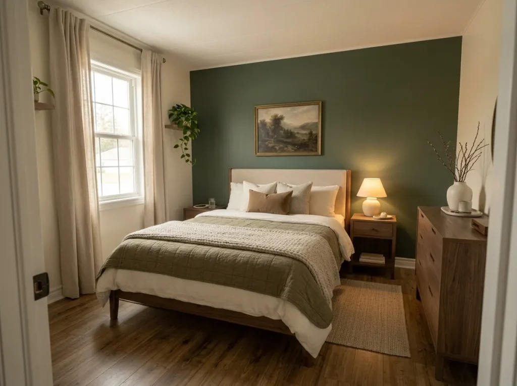
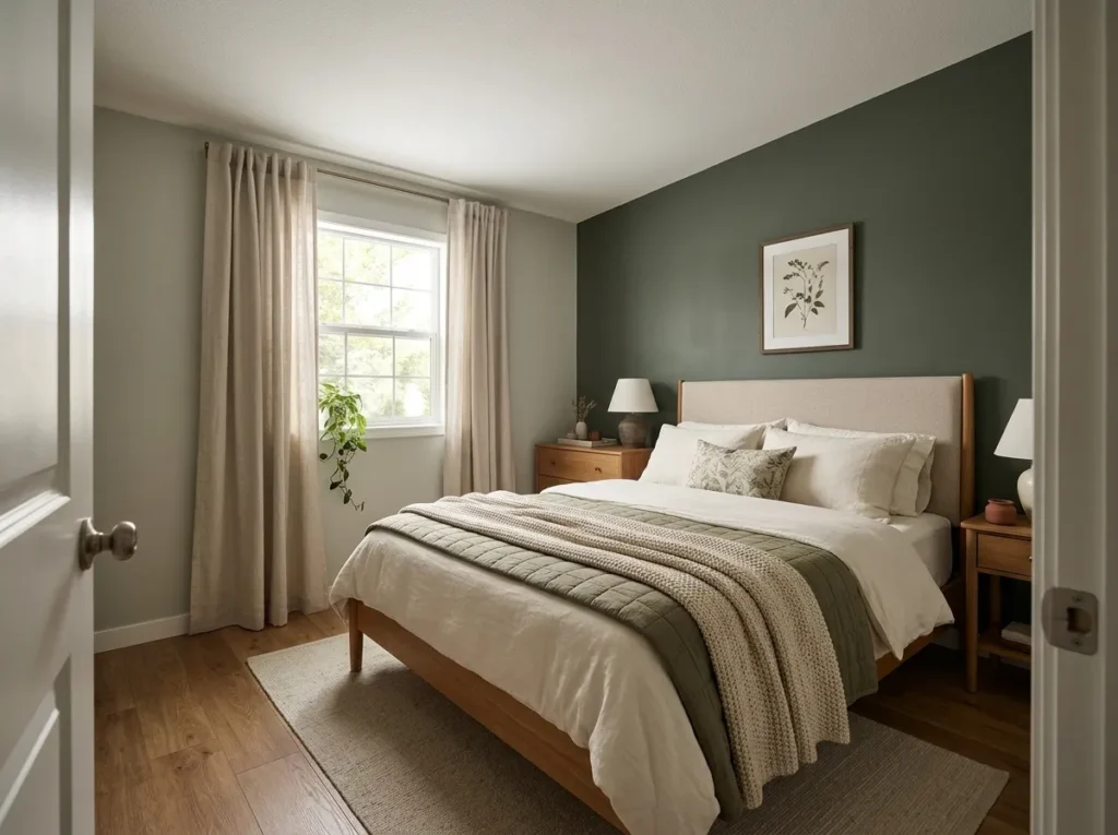
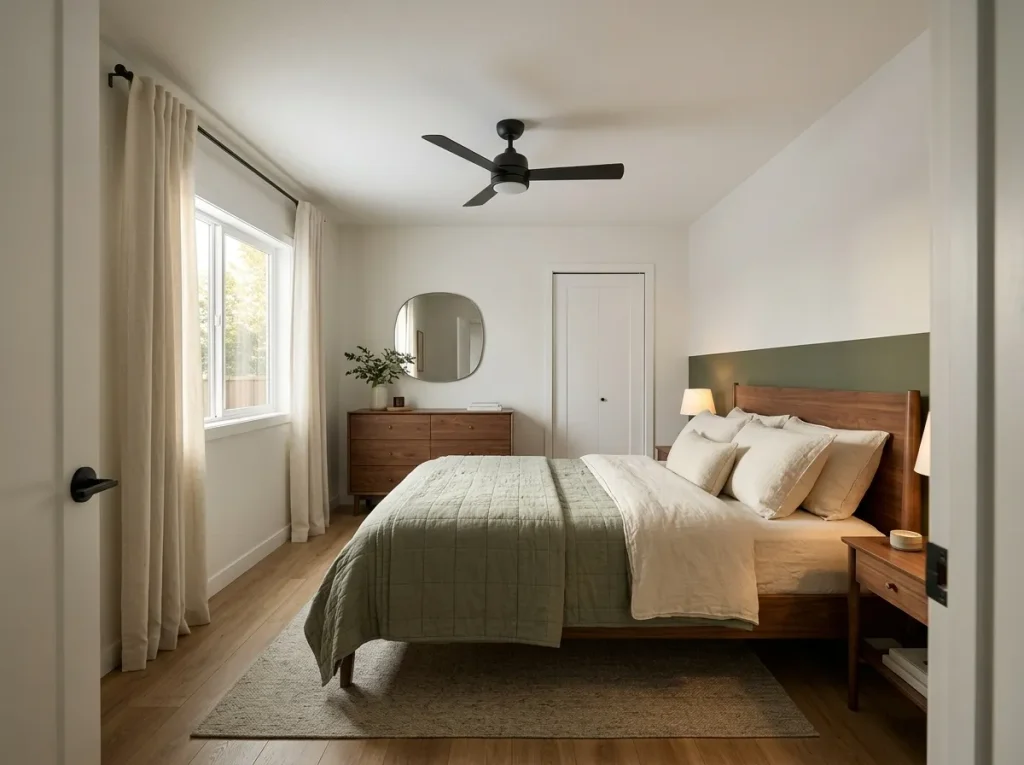
Choosing mobile home bedroom colors is less about finding one perfect paint chip and more about deciding how color should move through a compact room. A large bed, visible flooring, ordinary-height ceiling, substantial furniture, and one or two windows can occupy most of the view at once, so a shade that feels gentle on a sample card may look much heavier across four walls.
A calmer bedroom usually begins with a quiet color on the largest surfaces, an undertone that works with permanent finishes such as carpet or wood, and one deeper shade with a clearly defined job. That deeper color might live behind the bed, in the quilt, or in small lines of black or walnut—not everywhere at once.
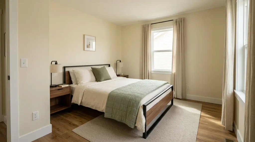
The 17 ideas below move from warm ivory and sage to misty blue, mushroom, olive, and deeper charcoal. Each explains where to use the color, what existing finishes it suits, and what room condition should change your choice.
Start with the Color Match Lab below to narrow the direction before buying paint or bedding.
1. Let Warm Ivory Carry the Largest Surfaces
Warm ivory is useful in a mobile home bedroom because it can quiet several surfaces at once without producing the sharp separation that bright white sometimes creates. When the bed already occupies a large portion of the floor area, keeping the walls, pale bedding, and other broad surfaces relatively close in temperature lets those large shapes form a calmer background.
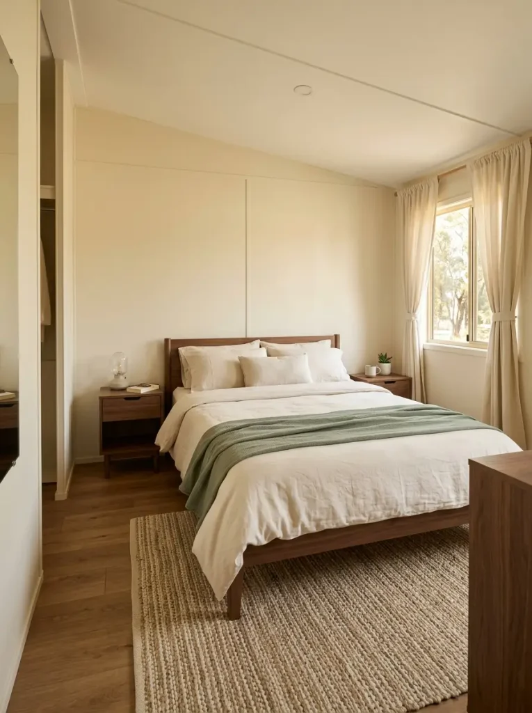
Compare the ivory directly with the finishes that will remain: beige carpet, honey-toned flooring, cream curtains, or a warm wood bed. The shade should relate to those materials without becoming noticeably yellow.
A simple visual check can help. Place a white pillowcase beside the sample. If the ivory suddenly appears strongly golden, try a more neutral version. Then place the same sample beside the wood. If the wood becomes intensely orange, mushroom or balanced greige may provide a cleaner bridge.
Best use: walls, broad curtain panels, large bedding layers.
Useful depth: walnut, sage, muted olive, or a slim black metal detail.
Bedroom Color Match Lab
Choose the existing finish closest to your room. Each state changes the palette hierarchy, placement advice, and caution point.
Interactive color decision tool
Bedroom Color Match Lab
Begin with the finish that already occupies a meaningful share of the room. The recommended base, support color, depth, and caution point change with it.
Let the existing wood provide some of the warmth
Warm ivory can carry the walls or largest textile while dusty sage introduces cooler contrast. Use walnut or existing wood as the deepest note.
Build a mid-value bridge around the dark furniture
Balanced greige reduces the abrupt jump from pale bedding to heavy walnut. Eucalyptus can add color without becoming another dark mass.
Treat beige carpet as a palette ingredient
Mushroom overlaps visually with the carpet, linen lightens the bed, and olive supplies enough contrast to keep the combination from becoming flat.
Bridge the mixed floor temperature before adding color
Soft linen gives gray-brown flooring a quieter setting. Misty blue or muted teal can then echo the cooler side of the floor without filling the room with gray.
2. Sage + Cream Calms a Bedroom With Warm Wood
Picture a bedroom with medium oak flooring, a wood dresser, and a bed that occupies most of the center view. Painting every surface green would add another large visual mass. A calmer route is to let cream establish the room envelope while muted sage connects the bed to the warmth already present in the wood.
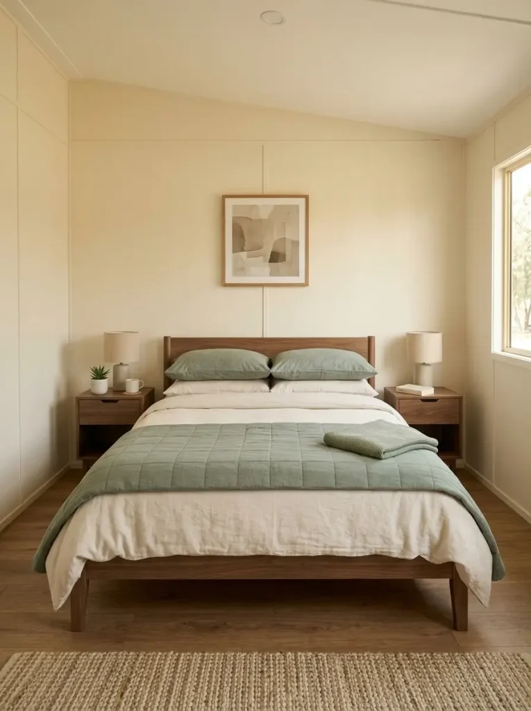
Keep the ceiling, trim, or majority wall area in cream or softened warm white. Bring sage into the quilt, lumbar pillows, upholstered headboard, or one clear bed wall. Existing wood can supply much of the brown, so there is little need to add baskets, signs, and extra timber accents purely for color.
Use a yellow test before committing. Place the sage sample directly beside the largest wood finish. If the green suddenly reads lime or the wood becomes intensely orange, move toward a grayer, dustier sage.
For more ideas on carrying that palette into texture, lighting, and materials, the cozy mobile home bedroom guide is a useful continuation.
3. Try Misty Blue Where the Daylight Already Feels Warm
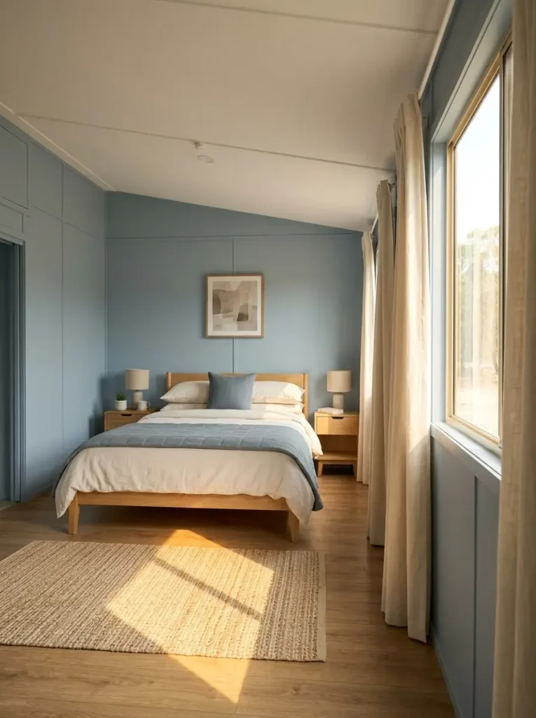
Does the bedroom become noticeably warmer and more golden once daylight reaches the flooring or wood furniture? That is one of the situations where muted blue can be more useful than another beige.
Misty blue adds a cooler note without requiring the entire room to become blue. In a compact mobile-home bedroom, give it one clear role: wall color, a bed layer, or curtains.
| What you see | Color move to test |
|---|---|
| Warm daylight + honey wood | Misty-blue wall with warm-white bedding |
| Warm floor + mostly white furniture | Blue-gray quilt or curtains with a pale wall |
| Weak cool daylight + gray flooring | Keep the wall warmer and move blue to textiles |
| Blue becomes dull under lamps | Sample a version with slightly less gray |
The decision depends on what the blue needs to correct. When the room already looks cool for most of the day, another large cool surface can flatten it. Keep linen, cream, or mushroom as the larger field and move the blue onto the bed.
4. Mushroom + Linen Makes Beige Carpet Look Intentional
Beige carpet often becomes the finish people try hardest to disguise. That can divide a compact bedroom into unrelated layers: cool white walls above, warm beige below, and gray furniture between them.
Mushroom provides a more cooperative route. Its mixture of beige, taupe, and softened gray can connect the floor with linen-colored bedding without asking the carpet to disappear.
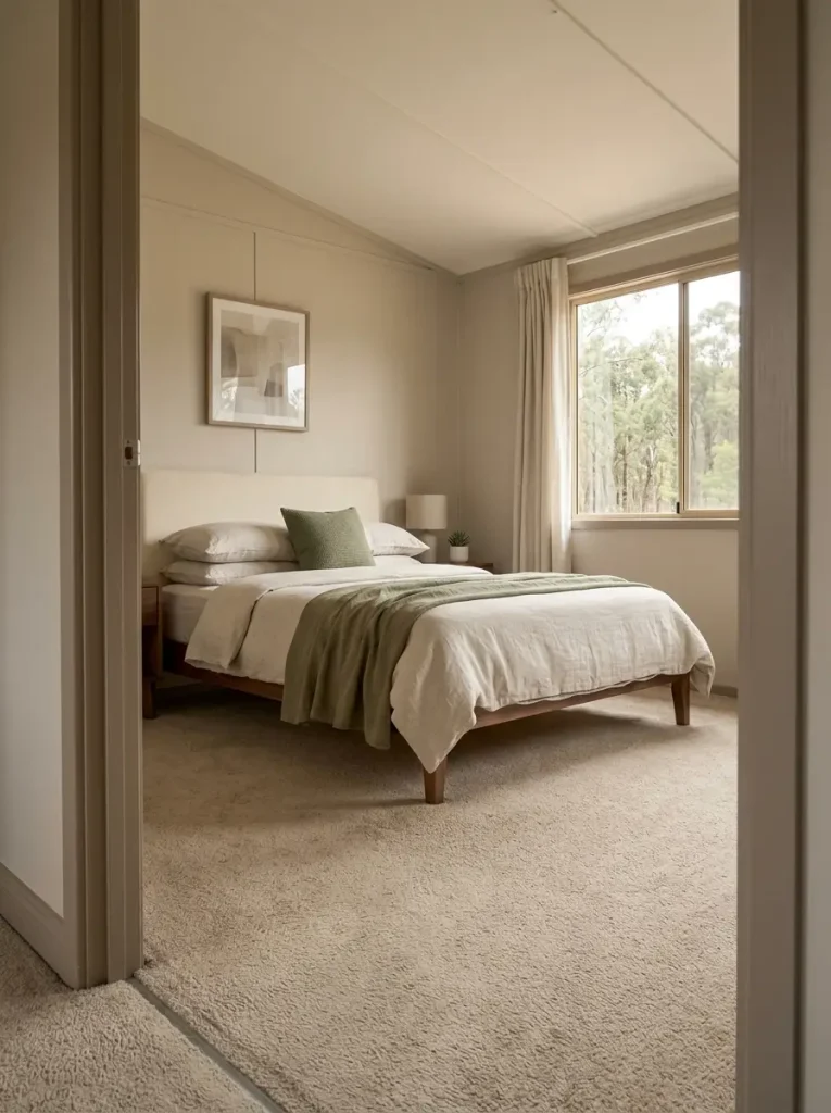
Build the palette from the floor upward: existing beige carpet, mushroom walls, linen or oatmeal on the bed, then muted olive or walnut for depth. Keep the brightest whites small unless the carpet is already very pale.
View the combination from the doorway before deciding. From that angle, wall and floor appear together. A useful palette lets them form one quiet background while the bed remains easy to read.
Undertone Bridge Strip
Select the permanent finish. The bridge neutral, companion color, caution shade, and reasoning all change.
Finish-first palette check
Undertone Bridge Strip
Mushroom overlaps with the carpet’s warmth while linen lifts the upper half of the room. Very cool gray can make the floor look yellower.
Warm ivory relates to golden wood while dusty sage introduces contrast. A very blue white can exaggerate the wood’s orange undertone.
A mid-value greige softens the contrast between pale textiles and dark furniture. Eucalyptus adds color while preserving the room’s grounded character.
Linen gives a mixed gray-brown floor a calmer setting. Misty blue can relate to its cooler side without forcing the whole bedroom toward gray.
5. Greige + Walnut Balances Dark Furniture Without Going Cold
A dark walnut bed or dresser can make a pale bedroom feel substantial, but the wrong wall color exaggerates the jump between very light and very dark. Greige works well when it occupies the middle: warmer than steel gray, quieter than beige, and pale enough to leave breathing room around the furniture.
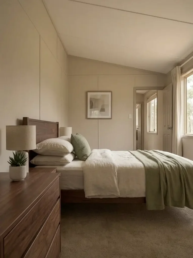
The useful question is not which greige is fashionable. Look at whether the undertone belongs beside the walnut you already own.
Hold the sample against the largest dark piece. A successful version usually lets the wood grain remain noticeable. A sample that suddenly turns lavender, green, or icy beside the furniture deserves a second comparison before you buy paint.
Cream bedding can then provide the lightest field, with eucalyptus, dusty blue, or muted blush used on a smaller layer.
Color also has a limit. A bedroom that still feels crowded after the palette is simplified may have a furniture-scale or circulation problem. The broader mobile home bedroom ideas guide is the better next step for those decisions.
6. Dusty Blush Adds Warmth Without High Saturation
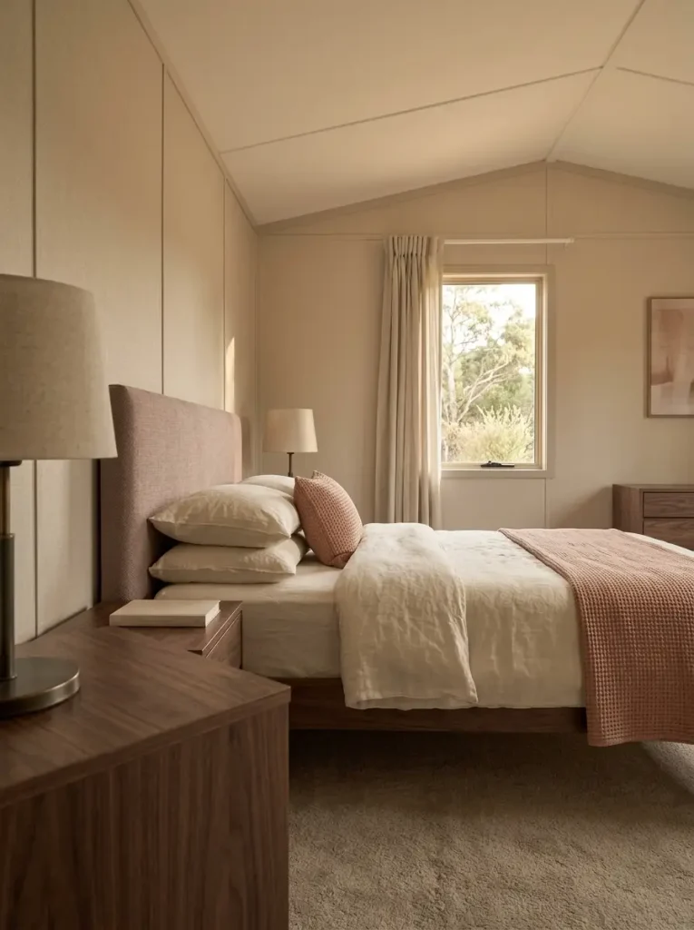
A bedroom can feel visually cold even when every surface is technically neutral. Pale greige walls, cream bedding, light flooring, and white furniture may coordinate perfectly yet still lack warmth.
A muted blush can soften that composition without making the bedroom noticeably pink.
Look for versions that lean dusty, clay-softened, or beige. Put the color near the bed, where it can influence the room’s largest visual object: a coverlet, upholstered headboard, lumbar pillow, or the wall directly behind the headboard.
Pair it with linen, mushroom, walnut, or aged bronze. Those companions keep the color grounded.
Check the blush again under your evening lamps. Some samples become noticeably peachier after sunset. When that warmer shift begins competing with honey oak, orange-toned furniture, or tan carpet, move the blush onto smaller textiles and keep the wall quieter.
A useful palette is linen for the largest field, dusty blush for warmth, walnut for depth, and one restrained dark metal detail for definition.
7. Eucalyptus Works When Traditional Sage Turns Too Yellow
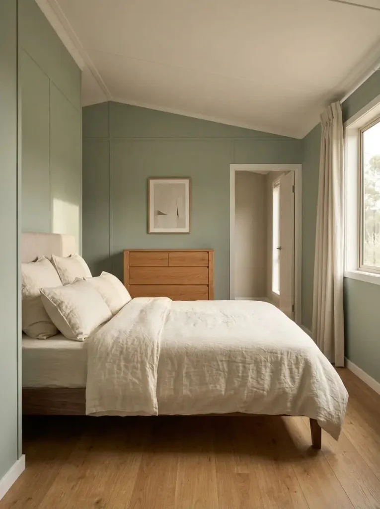
Sage is easy to admire in an inspiration image and surprisingly easy to misjudge beside real flooring.
A bedroom with golden oak or warm laminate may pull a yellow undertone forward in some sage samples. Eucalyptus shifts the green slightly grayer and cooler, creating clearer separation from those finishes while preserving a natural, quiet look.
| If sage does this | Test this direction |
|---|---|
| Looks yellow beside oak | Grayer eucalyptus |
| Feels too heavy across the walls | Pale eucalyptus or textile use |
| Goes flat beside gray-brown flooring | Slightly cleaner green-gray |
| Looks good by day but murky at night | Lighter eucalyptus with cream |
Compare both greens on the same wall beside the same fixed finish. Samples on opposite sides of the bedroom are responding to different light, which weakens the comparison.
Choose eucalyptus when you still want visible green but need less golden warmth.
8. Buttercream Can Brighten Weak Daylight More Gently Than Stark White
A common response to a dim bedroom is to choose the brightest white available. Yet crisp blue-white beside beige carpet, oak furniture, or cream textiles can make those warm finishes look darker and more yellow.
Buttercream occupies a softer position. It still reads pale, but its warmth can connect more comfortably with an existing warm interior.
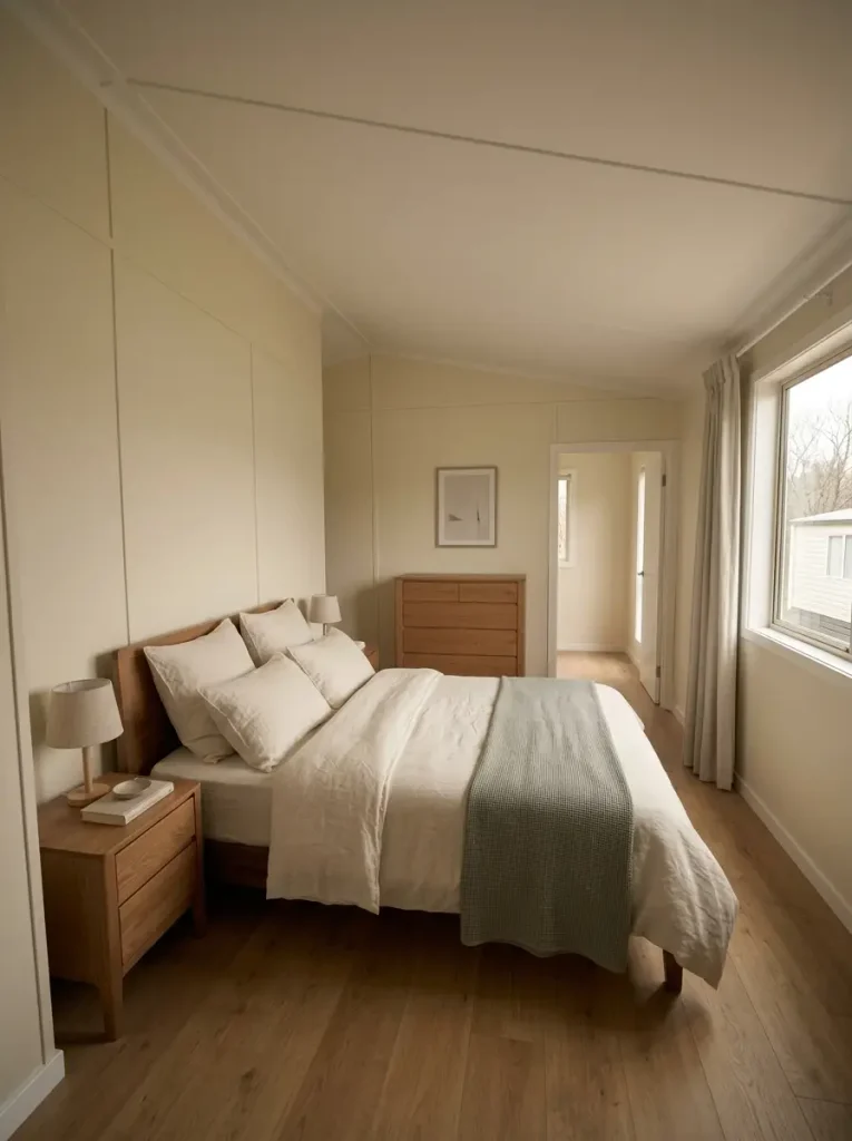
Use it as a first sample when daylight is weak and the permanent finishes lean warm. Choose a quieter neutral white when warm and cool finishes are mixed. Move toward a cleaner linen-white when gray flooring or cooler daylight already controls the room.
The ceiling matters too. In a compact mobile-home bedroom, a pale upper plane helps preserve continuity even when the walls carry a little more warmth.
Pale-Neutral Temperature Comparator
Choose the condition closest to your bedroom. Each option changes the starting color family, reasoning, and next test.
Pale-color decision
Which Pale Neutral Should You Sample First?
Begin warm, but stay pale
A lightly warm neutral can connect to beige carpet and oak without the sharp temperature contrast of blue-white. Next test: compare it under your evening lamps to make sure it does not become too yellow.
Keep the background quieter
Rooms with both warm and cool finishes often benefit from a less directional neutral. Next test: place the sample where flooring and furniture appear together in the same sightline.
A slightly cleaner pale can work here
Cooler flooring and stronger daylight can support a cleaner neutral without making the room feel stark. Next test: keep one cream or natural-wood element nearby so the palette still has warmth.
9. Put Olive Behind the Bed, Not Around the Whole Room
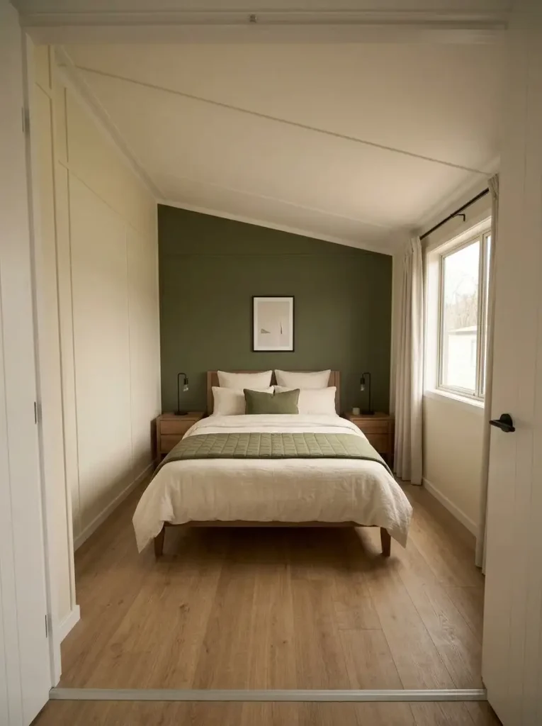
Olive can feel deep and restful, but its success depends on where it is allowed to concentrate.
In many compact mobile-home bedrooms, the strongest location is the wall behind the bed. That wall already contains the room’s largest object, so deeper color there can collect the headboard, bedding, and artwork into one understandable focal zone.
A broad, uninterrupted bed wall is the best candidate. Keep the side walls cream, linen, or mushroom so the darker end of the room has somewhere quiet to transition.
A different bedroom may need olive on the bed itself. That works well for renters, rooms with interrupted headboard walls, or spaces with weaker daylight.
Accessories are the lightest version of the idea. Use them when the flooring, bed frame, and dresser already occupy the darker half of the palette.
Stand in the doorway before deciding. The useful placement is the one that gives the room direction without allowing every large surface to settle into the same dark value.
10. Use Charcoal as One Quiet Focal Field
Charcoal can look remarkably composed in a small bedroom, but it needs a defined territory.
A deep headboard wall can make pale bedding look clearer and reduce the need for scattered black accessories. Its tradeoff is visual weight: the wall will attract attention, especially when the bedroom is viewed from the doorway.
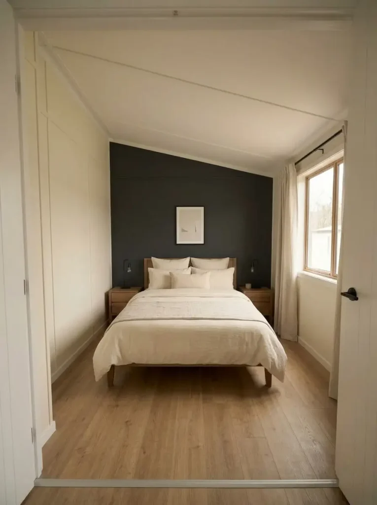
Charcoal is strongest when the bed sits against a clear wall and the rest of the room still contains enough light surface area through bedding, flooring, curtains, or adjacent walls.
Use it more cautiously when the same wall already carries a dark dresser, television, dark curtains, and several frames. Those objects can merge into one dense block.
For a more polished primary-bedroom focal treatment beyond paint alone, continue to the mobile home primary bedroom ideas guide.
Deep Color Placement Simulator
Choose where the deepest color will live. Each placement changes the spatial effect, best-fit condition, and caution.
Deep-color placement
Where Should the Darkest Color Live?
Collect the bed into one strong focal zone
A charcoal or olive bed wall can unify the headboard and bedding while pale side walls preserve contrast.
Keep the architecture bright and move depth onto the bed
This works particularly well for renters, interrupted headboard walls, and bedrooms where daylight is limited.
Use dark color as definition rather than mass
A black bed frame, mirror edge, or slim lamp can separate pale shapes when the room already contains enough mid-tone color.
11. Pale Blue-Gray + Light Wood Gives Rustic Rooms More Air
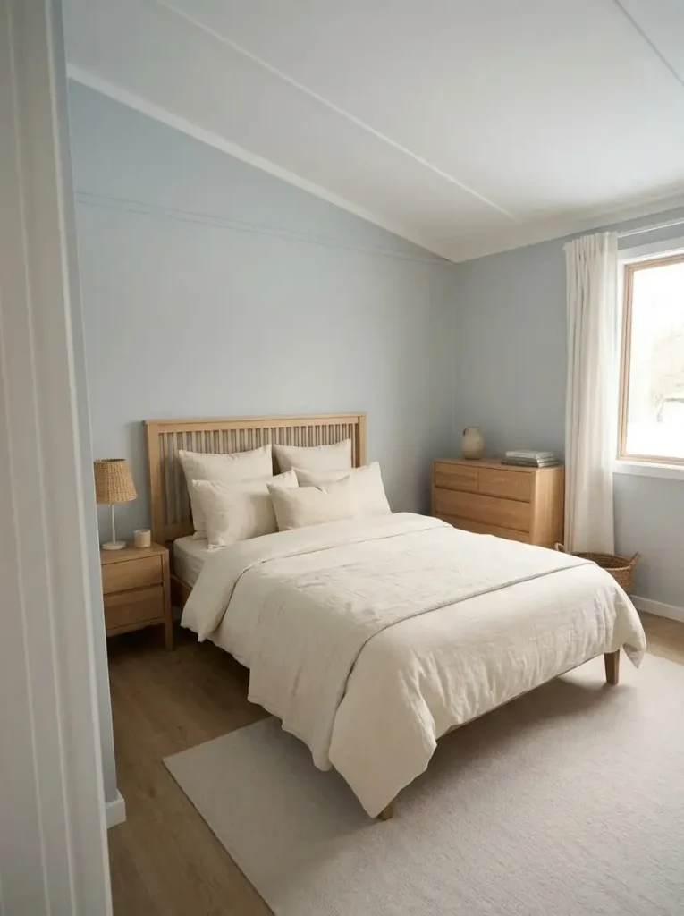
Rustic bedrooms can accumulate warmth from several directions at once: wood flooring, a timber bed, tan baskets, brown frames, and amber lighting.
Adding another warm wall color can make those elements merge.
A pale blue-gray offers useful separation when the wood itself deserves to remain visible. The cooler wall allows honey or light oak to stand out while cream or soft-white bedding keeps the room gentle.
This combination is strongest in a bedroom with medium-to-light wood and reasonable daylight. A room with weak daylight and already-cool gray flooring needs a different treatment. There, linen or warm greige may be the stronger wall choice, with blue moved onto the bed.
Color can only solve a color problem. A particularly narrow room may still feel tight because the bed, dresser, or walking path needs attention. The single wide bedroom ideas guide covers those spatial decisions in more depth.
12. Build a Tonal Cream Room With Texture Instead of Strong Contrast
A calm bedroom does not require an obvious accent color.
Build the room through small shifts among cream, oatmeal, ivory, linen, and pale beige. Keep the wall quiet, move one step deeper on the bed, then allow weave, quilting, curtain folds, wood grain, and the rug to provide visual variation.
Natural wood can become the warmer anchor. A small amount of black, bronze, or dark walnut is enough where an edge needs definition.
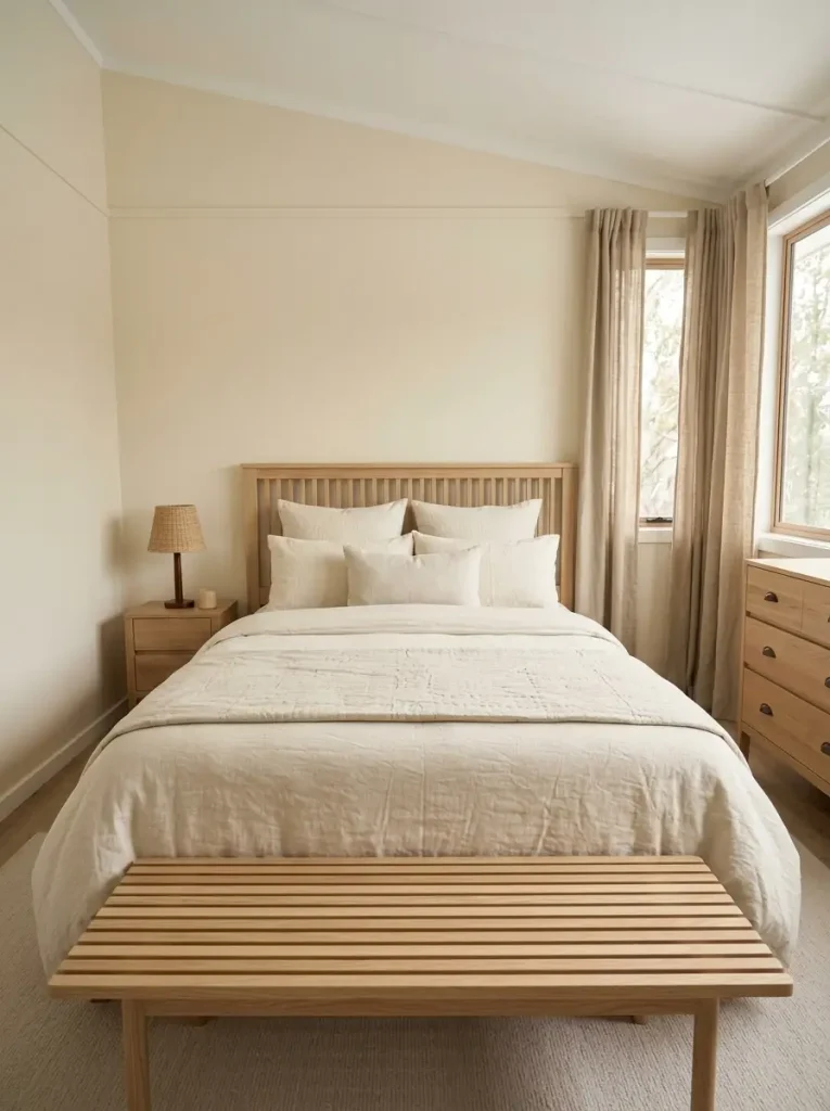
There is also a clear stopping point.
Once the room already has several tactile differences—smooth sheets, quilted bedding, woven curtains, wood grain, and a textured rug—another accent hue may add more visual activity than value.
The test is simple: stand in the doorway and notice whether you see layers or only one beige mass. If the materials separate clearly, the tonal palette is doing enough.
13. Muted Teal Gives Gray-Brown Rooms a Cooler Color Without Feeling Flat
Gray-brown flooring can be awkward because it rarely behaves like a purely warm or cool finish. Yellow beige may make the floor look grayer, while cold gray can make its brown side more obvious.
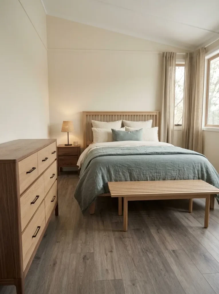
Muted teal can bridge that ambiguity.
Its blue content relates to cooler notes in the floor. Its green content prevents the palette from becoming icy. Keep linen or mushroom on the broadest surfaces, then give teal one clear area: a quilt, curtains, upholstered headboard, or focal wall.
Saturation is the main control. A bright jewel teal can dominate a compact mobile-home bedroom quickly. A grayer version keeps the hue visible while allowing the fixed finishes to remain part of the composition.
Whole-Room Palette Composer
Select the starting condition closest to your room. Each option changes all four color roles, not merely the highlighted swatch.
Four-role palette builder
Whole-Room Palette Composer
Use color to bridge the floor, not fight it
Linen calms the mixed floor temperature. Muted teal supplies the main color, walnut provides warmth, and a narrow dark line gives the palette definition.
Cool the composition gently
Warm ivory stays connected to existing wood, while dusty sage prevents the palette from becoming entirely golden or brown.
Make the floor part of the neutral family
Mushroom connects wall and carpet, linen keeps the bed bright, and olive creates a distinct focal color without introducing a colder neutral.
Reduce the contrast around heavy furniture
Balanced greige provides a softer middle value, while eucalyptus introduces color without asking another large surface to become dark.
14. Keep Terracotta in the Soft Layer When the Room Already Has Warm Wood
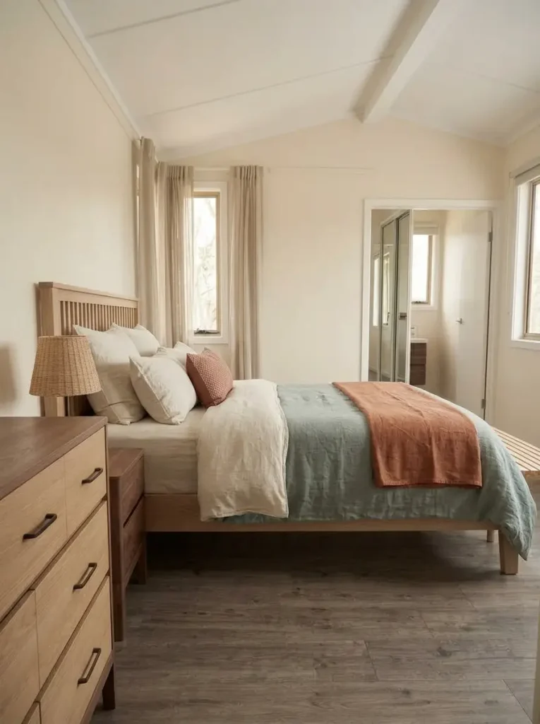
Terracotta brings immediate warmth, which is also why it can become excessive beside honey floors, orange oak, brown furniture, and warm bulbs.
The common problem is scale.
A large terracotta wall beside warm timber can make both surfaces appear stronger. A smaller terracotta textile is often more useful because cream, flax, sage, or mushroom can sit between it and the existing wood.
Use the palette in a simple hierarchy:
Large field: cream, linen, soft mushroom, or pale sage
Middle layer: natural wood, oatmeal, or subdued green
Small warm accent: terracotta, cinnamon, or muted rust
That distribution also keeps the color easy to change later.
For a deliberately seasonal room using richer autumn combinations, continue to the fall bedroom color palettes for mobile homes. Here, terracotta remains an evergreen supporting color.
15. Use Muted Mustard as a Small Lift Against Pale Neutrals
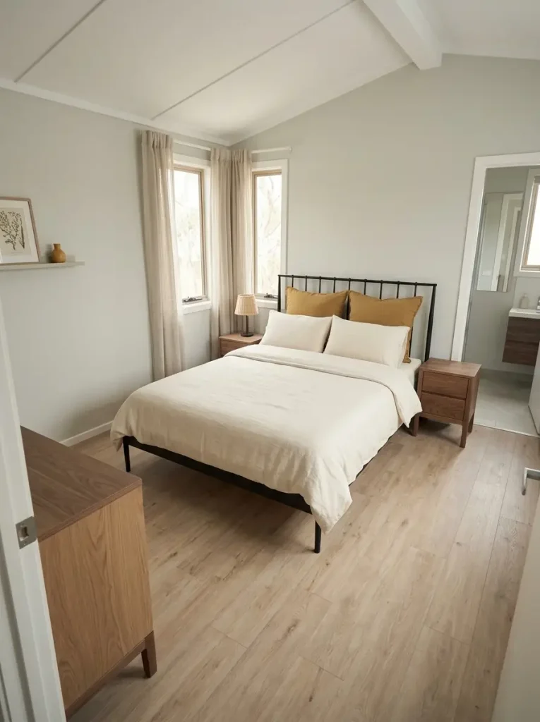
Imagine pale gray-green walls, cream bedding, a black metal bed, and warm wood bedside tables. The palette may already be balanced but still need one note that feels sunlit.
Muted mustard can provide it.
Start with a single substantial textile: two pillow shams, one lumbar cushion, a folded coverlet, or a throw. Mustard carries more visual energy than linen or sage, so a modest area is usually enough.
Then inspect the room before repeating the color.
Golden flooring may already provide the second warm note. A room with cooler flooring may benefit from one small repeat through artwork or a narrow textile stripe.
Bright mustard paired with vivid teal, strong terracotta, and saturated green can become visually crowded in a compact bedroom. The calmer version works because one warm accent is given room to stand out against a quieter field.
16. Let Black Act as Linework, Not the Main Color
Black can make a pale bedroom feel more finished without making the room broadly dark when it appears as edges and lines.
A black metal bed outlines the room’s largest furniture shape. A slim mirror frame gives a pale wall a clean boundary. A dark lamp stem or small hardware detail can repeat the line at a smaller scale.
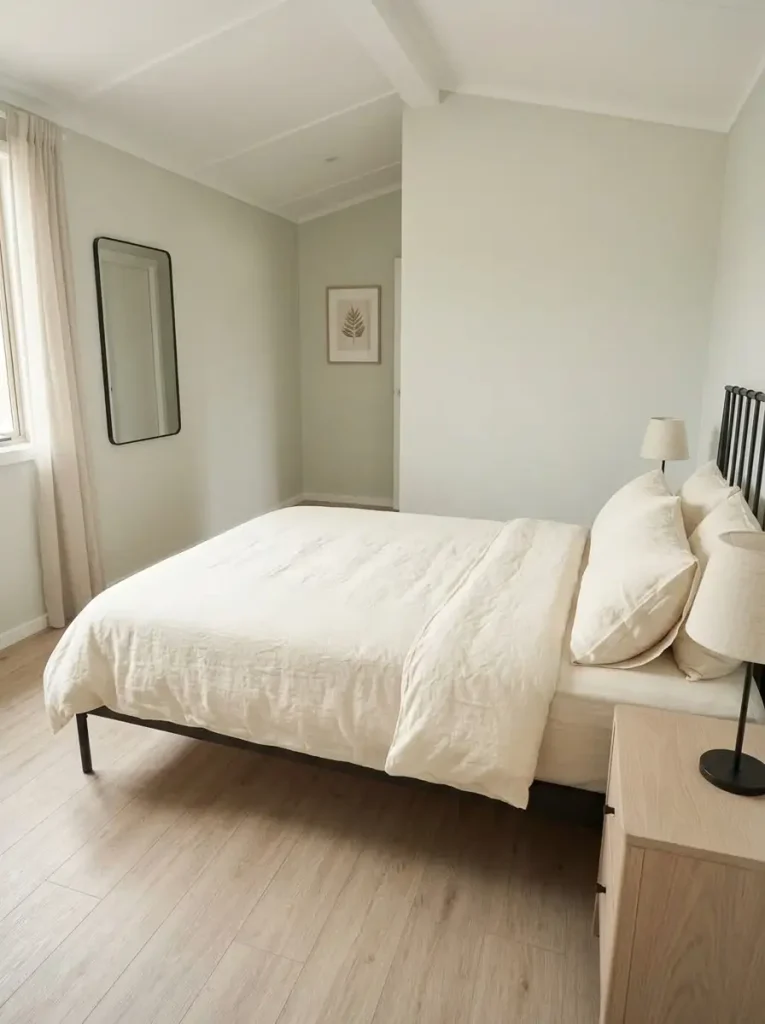
Those placements may be enough.
This is particularly useful in cream, pale sage, soft blue, mushroom, and warm-white bedrooms where several surfaces begin to merge.
The limit is easy to recognize. A black bed, black dresser, black curtains, and charcoal wall no longer function as linework; they create a predominantly dark palette.
When one large black object already exists, allow the remaining dark repeats to become slimmer and farther apart.
17. Soft Linen + Walnut Is the Evergreen Landing Point When You Want Warmth Without a Seasonal Look
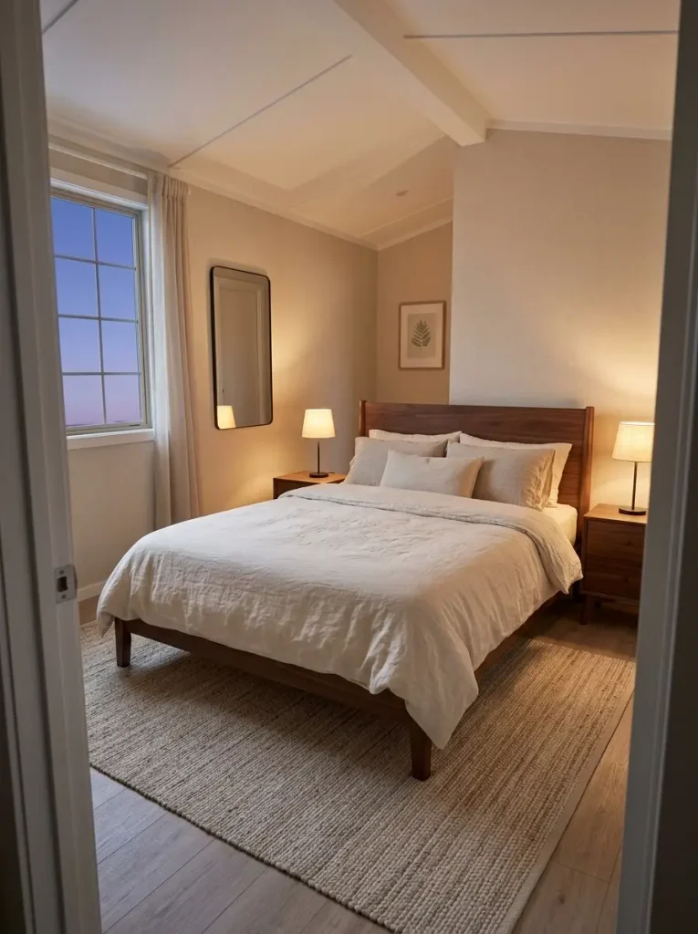
When none of the stronger colors feels quite right, soft linen and walnut give the bedroom a dependable place to land.
Linen keeps walls and broad textiles warm without becoming strongly yellow. Walnut provides depth through a bed, nightstand, frames, or bench. Sage, dusty blush, muted teal, or olive can be added later without rebuilding the neutral foundation.
This pairing is particularly useful when the permanent finishes are already mixed. A quiet linen envelope reduces the pressure to make every beige, brown, cream, and wood tone match exactly.
The last decision should happen in the actual room.
Test the sample during the full light cycle, then judge it beside the floor, furniture, bedding, and curtains as one composition.
48-Hour Bedroom Sample Check
View the sample under all four conditions. Then select the condition that changed your opinion the most to see the next action.
Final real-room check
48-Hour Bedroom Sample Check
Recheck the undertone in cooler light
A large morning shift means the sample is sensitive to daylight temperature. Compare one slightly warmer or less-gray alternative before deciding.
Judge the color against the whole room
If the brightest light changed your opinion, compare the sample directly with the floor, bed, curtains, and largest furniture piece at the same time.
Test the lamps before changing the paint
A strong evening shift may come from the bulb as much as the paint. Compare the shade under the lighting you actually use most often at night.
The sample has earned a final shortlist spot
Consistency across the light cycle is a strong practical signal. Compare it with your other finalist and choose the one that works best with the permanent finishes, not the sample card alone.
Final Thoughts
The most useful mobile home bedroom colors are the ones that make the permanent parts of the room feel connected. Begin with the finish you cannot easily change—flooring, carpet, wood furniture, or a substantial bed—then choose a quiet envelope and decide exactly where one deeper or more colorful note belongs.
A calm, spacious look does not require every surface to become pale. Sage, olive, muted teal, charcoal, blush, and mustard can all work when their visual territory is controlled.
Narrow the article to two or three palettes, place physical samples beside the finishes that will remain, and view them through the bedroom’s actual light cycle. Once wall, floor, furniture, and bedding begin to read as one composition, the final color decision becomes much easier.