

A single wide can have enough square footage for comfortable everyday living and still feel tighter than it really is. The problem is often not size alone. It is how the eye experiences that size: a flooring break here, a bulky furniture edge there, several little rugs, disconnected windows, or too many decorative stops along one long view.
The strongest single wide interior ideas work with the home’s distinctive narrow footprint instead of treating every room like a conventional square space.
That means some of the biggest changes come from continuity. A floor that keeps moving, a calm ceiling, furniture that reveals more surrounding space, and a focal point positioned deeper in the home can change how the entire interior reads.
You also do not need to strip away warmth, color, texture, or personality.
The real objective is to remove the visual interruptions that exaggerate narrowness while keeping the home comfortable, practical, and unmistakably yours.
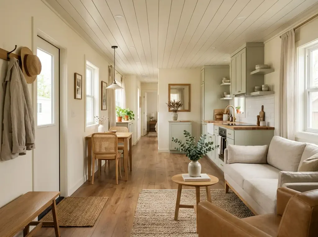
1. Carry One Flooring Tone Through the Long View
Think of the floor as the visual surface that stitches your rooms together.
Stand where you can see through the living area toward the dining space, kitchen, hallway, or entry. Ignore the furniture for a moment and follow only the flooring.
Every abrupt material or color change creates a visual checkpoint.
One transition is rarely a problem. Several strong transitions across the same sightline can make the home feel like a series of smaller compartments.
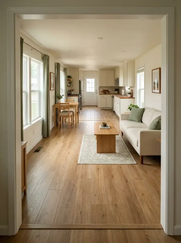
The useful distinction
You do not need identical flooring everywhere.
You need enough tonal relationship that the eye can continue.
Warm medium oak can transition naturally into another warm wood. Quiet greige plank can coexist with similarly muted tile. Existing flooring may even look more continuous when an unnecessary mat stops hiding the connection.
Try this first
Identify the most obvious break along your home’s longest view.
Change nothing else.
If removing a rug, simplifying a threshold, or visually connecting the two sides makes the view travel farther, you have found a high-impact improvement without redesigning the room.
2. Let One Runner or Rug Follow the Home’s Long Axis
Rug placement has direction.
That direction can reinforce the length already available—or keep reminding you how narrow the opposite dimension is.
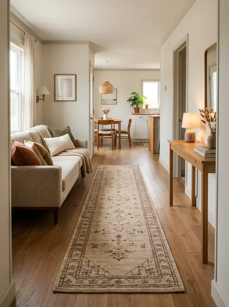
Use the spatial console below. Open the route closest to your room. Each route produces a different recommendation.
Try rearranging the textile before treating the problem as a reason to shop.
The floor itself will tell you whether the change worked.
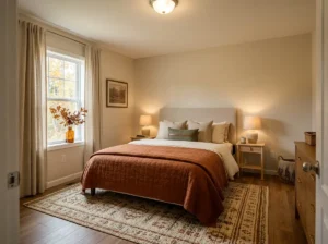
3. Join Nearby Windows With One Continuous Curtain Line
The fragmented version
Two modest windows sit on one wall.
Each has its own compact curtain arrangement.
Your eye reads:
WINDOW → WALL → WINDOW
Three visual units.
The wider-looking version
Treat the whole stretch as one composition.
A longer, visually continuous curtain line encourages the eye to register the width of the complete treatment before separating the individual openings.
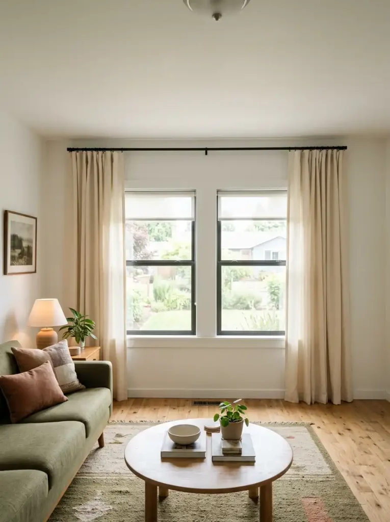
This is especially useful where a single-wide living room has several relatively narrow windows along one exterior wall.
Keep fabric fullness controlled. You want vertical softness and visual width without creating a large mass of textile.
If the curtains already coordinate, you may not need replacements.
Try moving more fabric toward the outer edges and compare the wall again.
The goal is not simply “hang curtains higher.”
It is to make several smaller openings behave like one wider architectural feature.
4. Keep the Ceiling Plane Light and Unbroken
Look upward before adding another piece of décor.
Your ceiling may be affecting spaciousness more than you realize.
Run three checks
COLOR
Does the upper plane stay consistent, or do several strong colors divide it?
DIRECTION
If there is planking, beadboard, or paneling, does it continue in a coherent direction?
INTERRUPTION
How many fixtures, beams, vents, decorative pieces, and contrasting details compete overhead?
A single wide already has a strong linear shape.
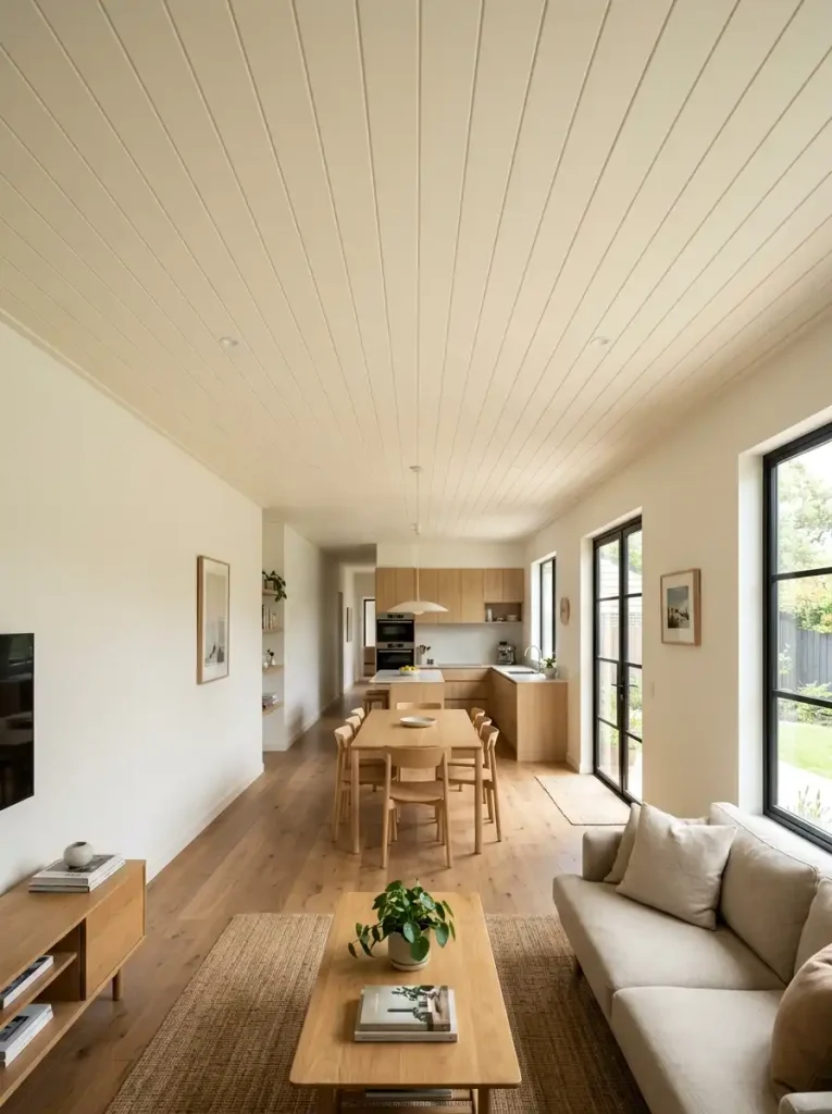
A relatively quiet ceiling allows that length to continue visually.
White is an obvious solution, but not the only one.
Warm cream, pale greige, soft washed wood, or subtle painted planking can all work when the surface remains coherent.
Texture is not the enemy.
Fragmentation is.
If you notice several unrelated ceiling features before you notice the room beneath them, start by quieting the weakest one.
5. Put the Strongest Focal Point at the Far End of the Room
Picture entering your home.
Your eye catches a decorated side wall.
Then a cabinet.
Then the television.
Then another shelf.
Then finally the end wall.
That is a sequence of visual stops.
Now simplify it:
ENTRY → QUIETER EDGES → CLEAR DESTINATION
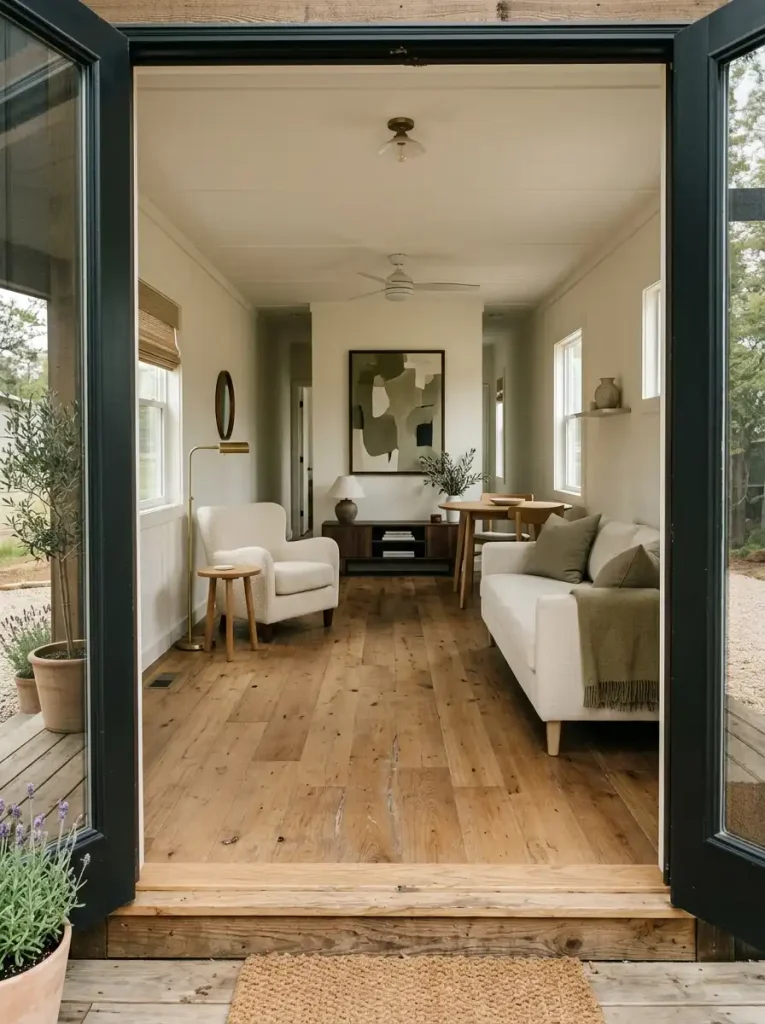
The destination can be a media wall, a substantial artwork, an attractive window, a fireplace feature, or a low console with a deliberate composition.
It does not need to be louder than everything else.
It needs to be clearer.
Test the focal point from the front door rather than only from the sofa.
Ask:
Where does my eye currently stop?
Then:
Where would I rather it travel?
A strong destination deeper inside the home encourages the viewer to experience the available length before becoming conscious of the narrow width.
6. Reveal More Floor With Leggy, Lower-Profile Furniture
Two pieces can occupy almost identical footprints and still feel completely different.
Imagine:
Chair A
Thick arms
Solid upholstered base
Little floor visible beneath it
Chair B
Open legs
Lighter frame
Floor visible around and below the seat
On paper, the difference may look insignificant.
Inside a narrow room, it can change the visual weight dramatically.
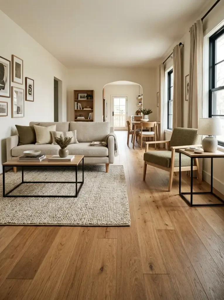
You do not need all-light furniture
A comfortable substantial sofa can stay.
Balance it with lighter supporting forms:
- an open coffee-table base,
- a raised accent chair,
- a slim side table,
- fewer objects touching the floor,
- or additional visible floor around its edges.
The objective is to help furniture look like it sits within the room instead of forming one continuous block across it.
7. Use One Room-Scale Rug Instead of Several Small Mats
A rug can float.
It can almost connect.
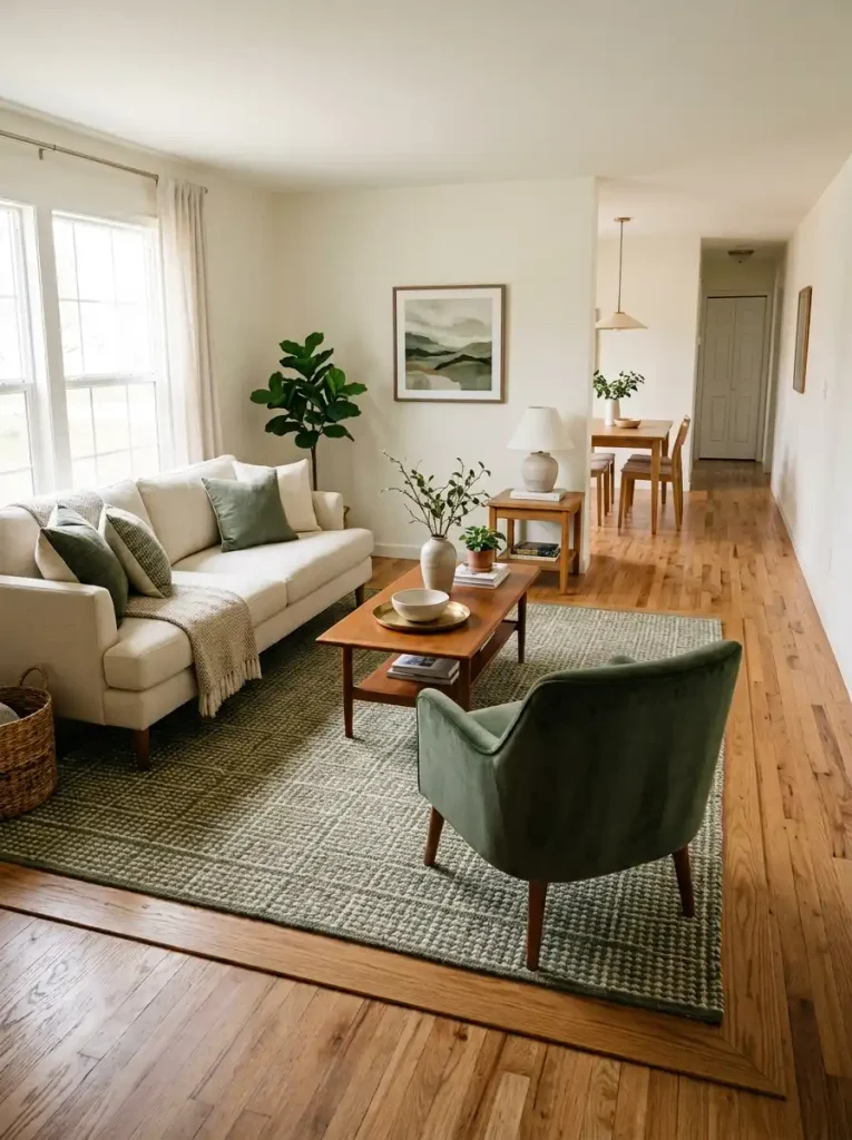
Or it can successfully organize the whole seating group.
Those states require different actions.
8. Protect the Main Sightline From the Entry
Use the entrance as a camera position.
Do not walk into the room yet.
Four-step test
1. Find the longest visible strip of floor.
2. Identify the first object cutting into it.
3. Move only that object.
4. Return to exactly the same position and compare.
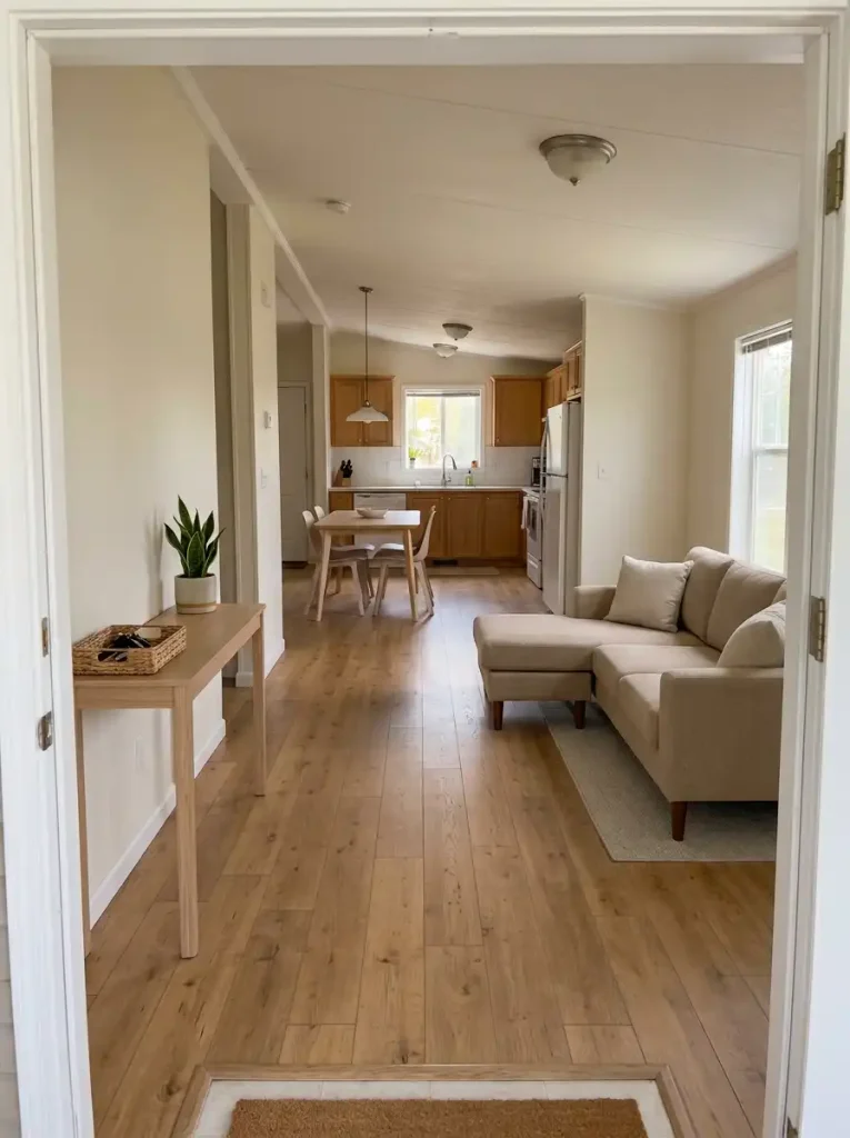
The obstruction could be a sectional arm, dining chair, plant, storage cube, ottoman, stool, or console.
It does not need to block an actual walkway.
A piece can be functionally acceptable and still visually shorten the interior.
This is why relatively low furniture performs well beside important sightlines: it defines the room without behaving like a visual wall.
One changed object near the entrance can sometimes improve the perceived space more than several decorative changes deeper inside the room.
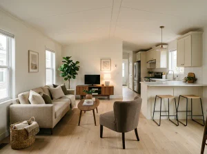
9. Choose Sofa Depth and Arm Shape for the Narrow Cross-Section
A sofa should not be judged by length alone.
Combine two observations:
How does circulation feel?
and
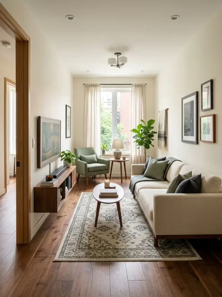
How much furniture is gathered around the sofa?
The matrix below turns those two conditions into four different outcomes.
This prevents an expensive false diagnosis.
A large sofa is not automatically wrong if the room around it still works.
10. Tuck Dining Against One Wall With Bench Seating
Here is the geometry.
TABLE + CHAIRS MOVING ON BOTH SIDES = TWO ACTIVE EDGES
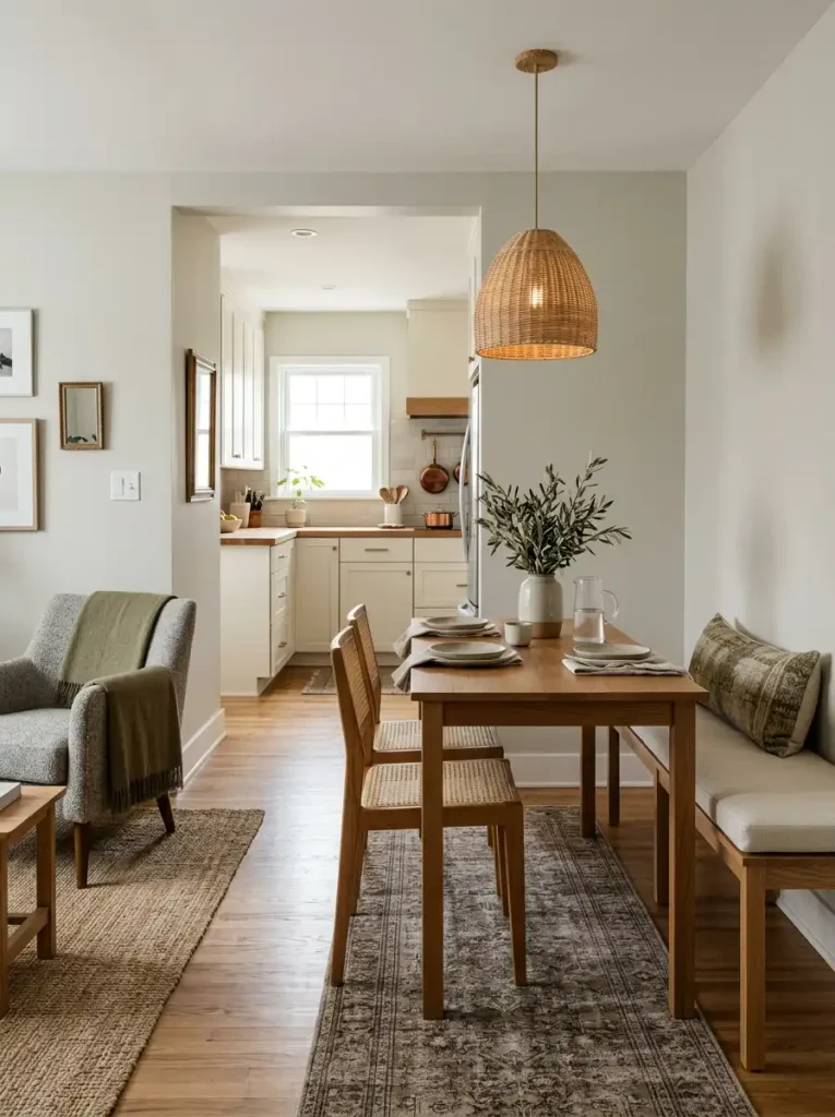
Change one side to a bench:
TABLE + ONE QUIET EDGE + ONE ACTIVE EDGE
The difference can be useful when the dining zone acts like a widened passage between the living room and kitchen.
You do not need a built-in banquette.
A freestanding bench or compact bench-style seat can create the same relationship.
Keep conventional chairs on the side where easy entry and movement matter most.
The actual decision
Do not ask:
Would a bench look cute here?
Ask:
Which side of this table really needs moving chairs every day?
Quiet the other edge only when the routine supports it.
Spatial efficiency should improve the way the room functions—not merely make a photograph look cleaner.
11. Keep the Kitchen’s Upper Half Visually Quiet
Divide the room at countertop level.
BELOW
Counters
Base cabinetry
Appliances
Flooring
Working objects
Wood tones
The lower half already carries plenty of visual information.
ABOVE
Upper cabinetry
Open shelving
Signs
Decorative objects
Refrigerator surfaces
Plants
Hanging storage
If the upper zone becomes equally dense, a narrow kitchen can appear to close inward from both sides.
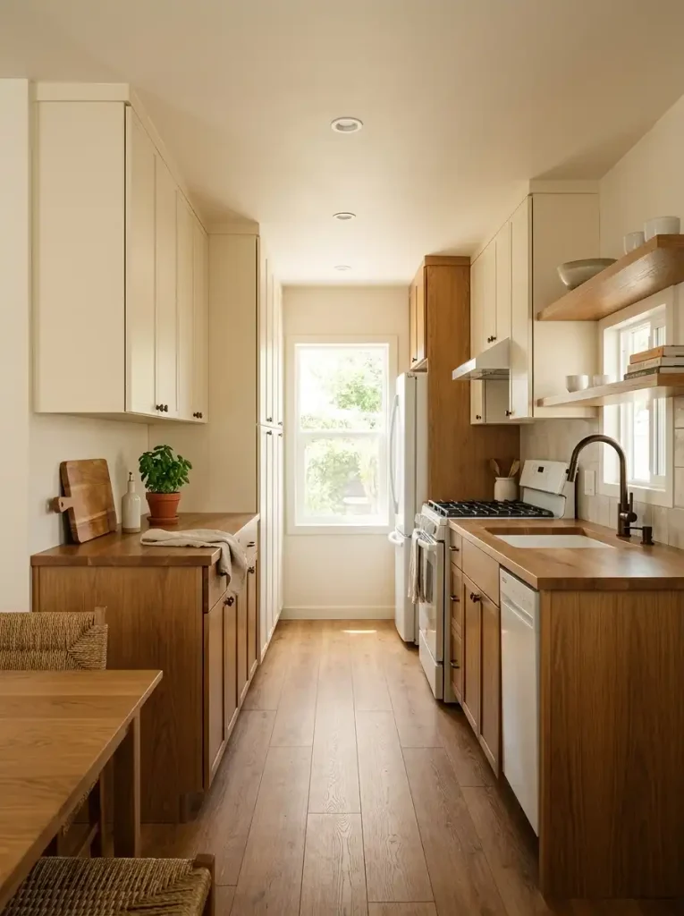
The answer is not removing useful cabinetry.
It is editing visual activity.
Give open shelves some gaps. Group decorations instead of scattering them. Keep upper finishes reasonably coherent where possible.
Farmhouse, cottage, transitional, and modern kitchens can all use this principle.
The room does not have to become minimal.
The upper half simply needs enough quiet space to balance the practical density below.
12. Blend the Bathroom Curtain, Tile, and Wall Into One Soft Value Range
Take a quick bathroom photograph.
Turn it black and white on your phone.
Now ignore color.
Look at value—how light or dark each major surface appears.
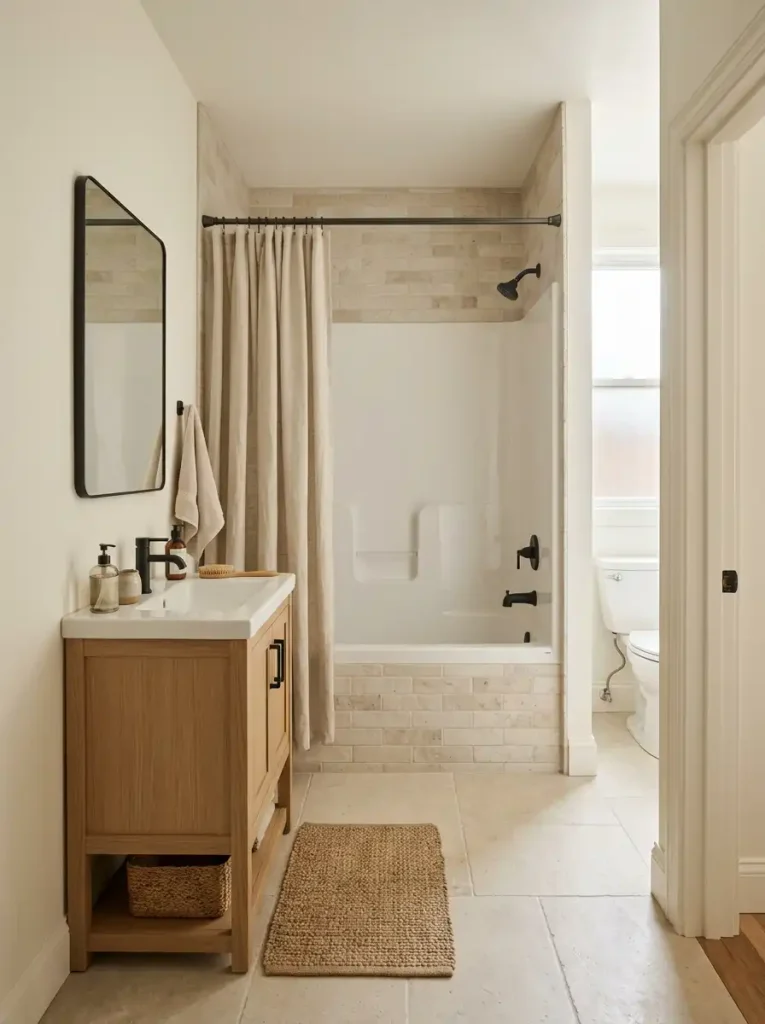
Watch for the hard stops
A dark curtain that suddenly becomes a wall.
A bath mat that creates a heavy rectangle.
Tile that separates sharply from the surrounding surface.
A vanity that visually dominates the whole room.
Bringing some of those large planes closer in value can soften the boundaries.
An oatmeal curtain can relate to warm beige tile.
Soft white can connect pale walls to a white tub.
Warm stone tones can create continuity while black hardware still provides deliberate contrast.
Pattern and color are still welcome.
Just avoid asking every large surface to become its own focal point.
13. Place Mirrors Where They Return the Longest View
A mirror can return one of three things:
depth, light, or clutter.
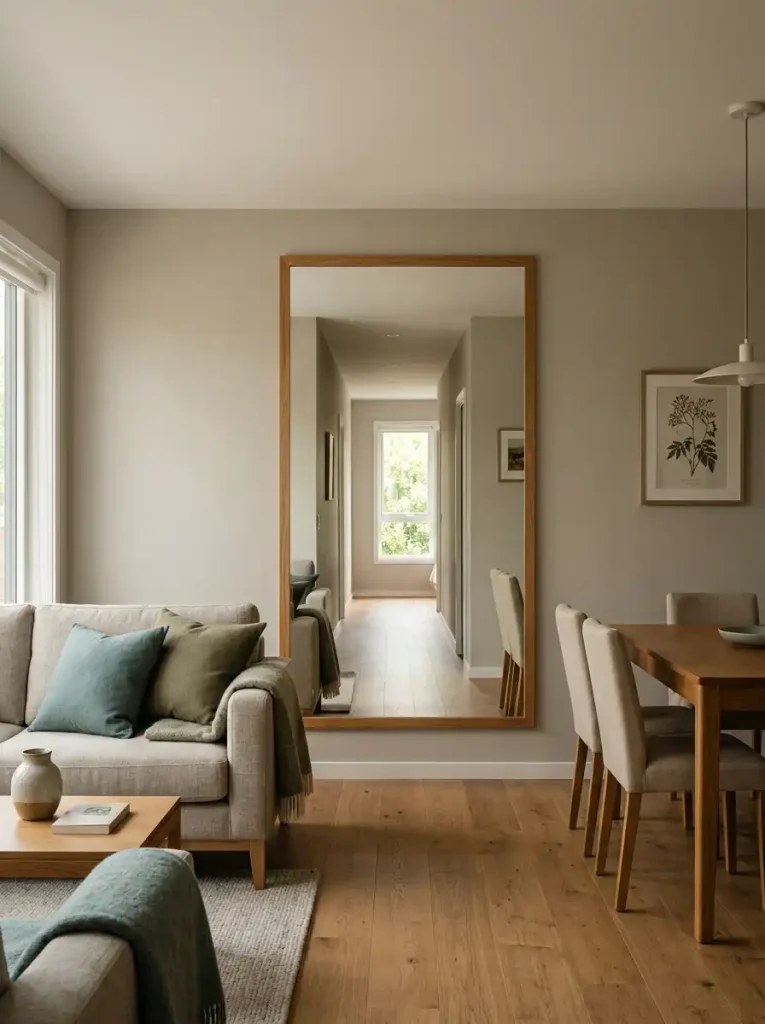
Its position decides which.
Mirror size is secondary.
Reflection quality is what changes the room.
14. Layer Light at Different Depths After Dark
Daylight naturally reveals foreground, middle, and distance.
At night, one bright ceiling fixture often collapses those layers.
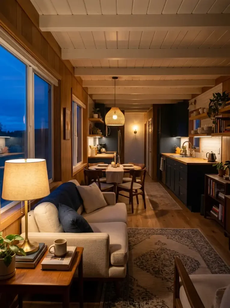
The room can visually shrink even though nothing moved.
Use the night sequencer below to identify which layer is missing.
The fixtures do not have to match.
The eye simply needs enough information to perceive near, middle, and far.
15. Repeat One Wood Tone Across Connected Rooms
Do not think “matching furniture.”
Think material trail.
For example:
Kitchen counter → dining table → coffee table → picture frame
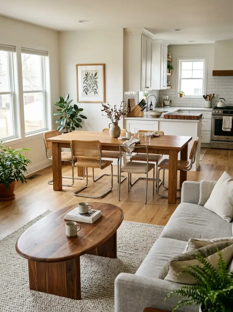
The objects have completely different jobs.
The repeated wood family quietly connects them.
Use three rules
Choose what already dominates.
If warm medium wood already appears strongly, use that as the reference rather than introducing a new tone.
Repeat the family rather than the exact finish.
Natural variation prevents the home from looking like a furniture set.
Leave visual distance between repeats.
The wood should echo through the home rather than appear everywhere.
Small items can carry the repetition too:
cutting boards, trays, stool seats, picture frames, shelf edges, and lamp bases.
The effect is cross-room rhythm.
16. Move Storage Up Without Turning the Wall Into Visual Clutter
Vertical storage solves one problem and can create another.
The useful formula is:
FUNCTIONAL STORAGE + NEGATIVE SPACE = CAPACITY WITHOUT SATURATION
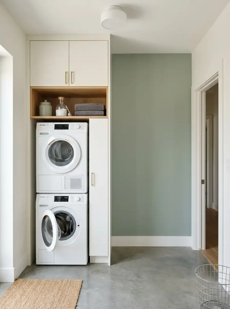
KEEP
Shelves holding something you genuinely use.
Cabinets hiding visually noisy supplies.
Hooks positioned around an actual routine.
A defined vertical storage zone.
QUESTION
Another shelf with no assigned function.
An empty decorative basket.
Objects added above cabinets purely because the space exists.
Several storage systems competing on one wall.
Before adding another surface, answer:
What exactly will live there?
If there is no clear answer, the empty wall may currently be doing something more valuable.
It is creating breathing room.
17. Build a Shallow TV Wall Instead of a Bulky Media Zone
A media unit gives you two things:
storage and visual mass.
The first can be useful.
The second has a cost in a narrow room.
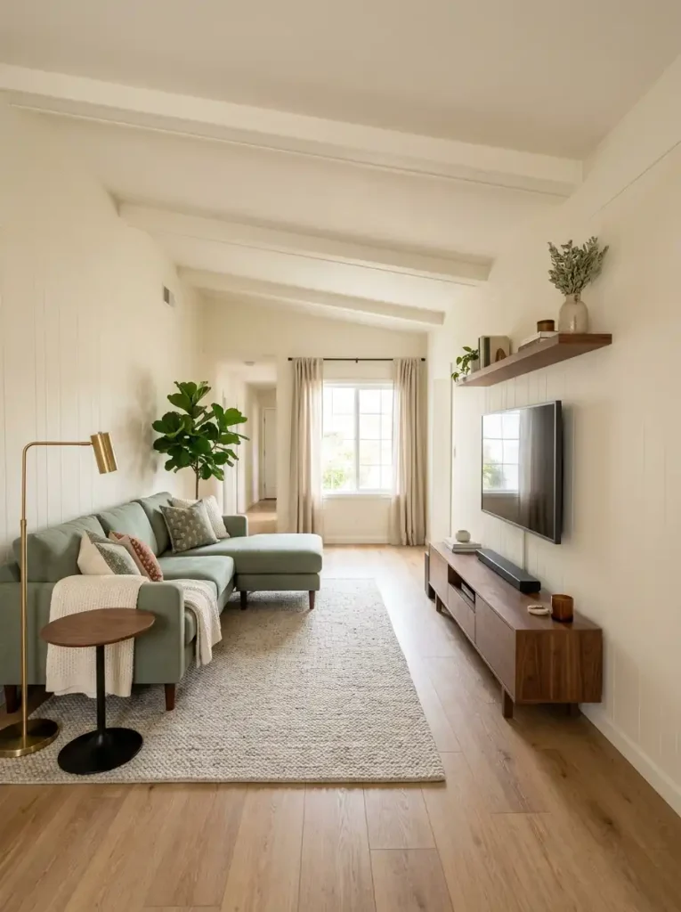
Keep the deeper unit when
You genuinely use the cabinets.
Electronics need contained storage.
The room still retains comfortable circulation.
Consider a shallower composition when
Much of the furniture exists merely to frame the television.
The unit projects strongly toward the seating area.
The wall would still feel intentional with a low console, artwork, lighting, or wall texture.
The idea is not to weaken the focal point.
A television wall can remain visually strong while becoming physically lighter.
That combination is particularly useful when the living room’s cross-section is limited.
18. Let One Color Family Travel While Texture Changes by Room
Imagine one palette moving through the whole home.
Living room
Warm cream upholstery
Muted olive textile
Medium wood
Dining zone
Cream bench
Olive pottery
Natural woven fiber
Kitchen
Warm-neutral cabinetry
Wood surface
Small botanical accent
Bathroom
Soft stone textile
Warm wood detail
Restrained greenery
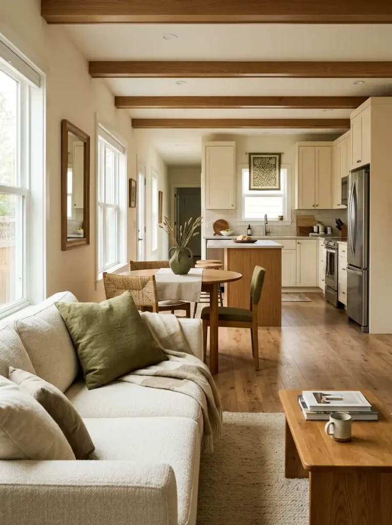
The colors relate.
The materials change.
That distinction stops the rooms from becoming either completely disconnected or suspiciously identical.
Use color to provide continuity.
Use texture to provide room identity.
A simple rule captures it:
Repeat the color story. Change the tactile story.
19. Use One Large Art Moment Instead of Many Tiny Wall Objects
Compare two walls.
WALL A
Sign
Frame
Clock
Tiny shelf
Decorative hanging
Second frame
Small basket
WALL B
One large artwork
—or—
One tightly composed group that reads as a single unit.
Wall A is not automatically wrong.
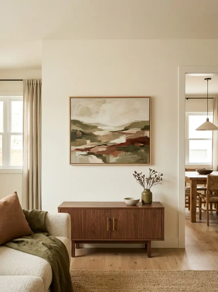
The issue is how many separate stops it creates.
Personal photographs and collections belong in a home. The useful question is whether they appear as one intentional composition or seven unrelated things filling empty wall.
Put the strongest art moment above an existing anchor:
the sofa, dining bench, console, dresser, or low cabinet.
Then allow a neighboring section of wall to stay quiet.
Resting space for the eye is part of the design.
20. Edit Every Room From the Doorway First
Your normal seat hides things.
The doorway exposes them.
Run the 30-second threshold audit
- Pause before entering.
- Find the first furniture edge intruding into the view.
- Find the first decorative feature stealing attention.
- Move one object temporarily.
- Leave the room.
- Re-enter and judge the new silhouette before moving anything else.
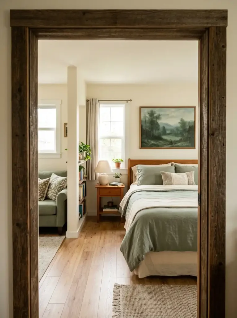
A chair that feels harmless from the sofa may dominate the entrance.
A table edge can make the route ahead appear smaller.
A cabinet can divide an otherwise continuous wall.
Repeat this from the front entrance, kitchen opening, bedroom door, and other important transitions.
Editing from room thresholds makes the whole single wide part of the design process.
21. Run a Final Visual-Width Audit: Break, Bulk, Focal Competition
Finish with diagnosis, not shopping.
Most narrow-looking rooms have one dominant problem:
BREAK — the view is divided.
BULK — one object consumes too much visual width.
COMPETITION — too many focal points demand attention.
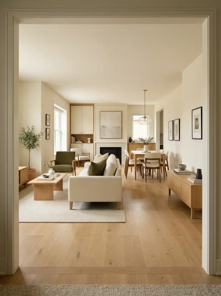
Choose the problem that appears first from the doorway.
That sequence matters.
Do not fix break, bulk, and focal competition simultaneously.
Fix the dominant issue first.
Then look again.
Make the Single Wide Feel Bigger by Editing the Whole View
You do not need to apply all 21 ideas at once.
Start with the longest view through your home and ask three questions.
Where does the view break?
Look at flooring, rugs, curtains, palette shifts, and room transitions.
What creates the most bulk?
Look at sofa profiles, media furniture, table edges, chair backs, and storage pieces.
Where does the eye stop too early?
Look for blocked sightlines, competing displays, or a focal point that fails to use the home’s depth.
Fix the clearest answer first.
A continuous floor, cleaner sightline, quieter wall, better-scaled furniture relationship, or more layered evening lighting can influence several connected areas simultaneously.
That is the advantage of designing a single wide as one visual sequence, rather than treating it as a collection of undersized rooms.
The final interior should not feel empty.
It should feel like the furniture, storage, color, texture, and personality all have enough space around them to breathe.