

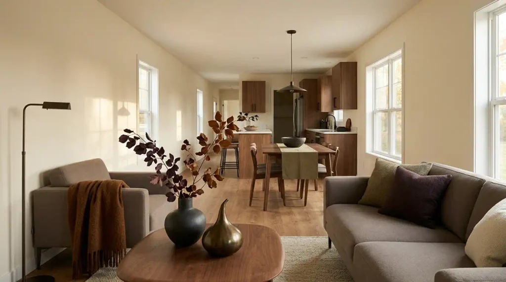
Modern fall decorating gets difficult when a compact home begins to collect seasonal pieces faster than it gains atmosphere. A clean sofa, contemporary lighting, and simple cabinetry can disappear behind scattered pumpkins, plaid accessories, faux leaves, and small signs.
The strongest modern fall mobile home decor works differently. Autumn shows up through deeper color, richer materials, heavier textiles, organic silhouettes, and warmer evening light before it shows up through obvious seasonal symbols.
That distinction matters even more in a mobile home. Living, dining, hallway, and kitchen areas often share long sightlines, so several individually attractive displays can combine into one visually busy interior.
The goal is not minimalism for its own sake. It is to make fall feel deliberate enough that the home’s modern character remains visible underneath it.
1. Start With the View Across the Whole Mobile Home
Before decorating a coffee table or changing pillow covers, look at the longest view through your home.
Stand near the main entrance, at the end of a hallway, or wherever you can see several spaces together. In many mobile homes, the living room, dining area, and at least part of the kitchen appear in one continuous frame.
That frame matters more than any individual vignette.
If every visible area carries the same amount of seasonal decoration, the eye has nowhere to settle. A stronger composition gives different areas different responsibilities.
Choose one area to carry the clearest fall signal. Another space can support it with color or material, while the transitional areas between them remain quieter.
For example, a living room might hold the strongest autumn color and textile change. The dining area could repeat one related tone or natural material. The kitchen visible beyond it may need almost nothing beyond an existing wood finish, dark ceramic, or warm pool of light.
The rooms still belong to the same seasonal story, but they do not compete for attention.
That approach is especially useful in a single-wide, where one decorative decision may remain visible through several zones. A double-wide gives you more separation, yet disconnected mini-displays can still make the interior feel fragmented.
Use the explorer below to see how seasonal density changes a connected mobile-home sightline.
Whole-home seasonal density
See how fall styling changes across one connected sightline
Balanced styling gives one zone the strongest seasonal signal, lets a second zone support it, and keeps the spaces between them visually calmer.
One dominant seasonal zone, one supporting zone, and quieter transitions usually create the clearest modern whole-home composition.
The balanced version is not a rigid formula. A very minimal home may need less, while a larger double-wide can sometimes handle an additional seasonal moment.
What matters is hierarchy.
When the eye encounters a strong fall focal point, it should not immediately meet three more displays competing at the same volume.
2. Build the Fall Palette From What Is Already Permanent
A sophisticated autumn palette begins with the colors you cannot—or do not want to—change.
Look first at the largest permanent or semi-permanent surfaces in the room: flooring, cabinetry, sofa upholstery, countertops, wall color, and substantial wood finishes.
Those elements already determine the temperature of the interior.
If your flooring is golden oak and the sofa is warm beige, a cool blue-gray fall scheme may look disconnected even when the colors are individually attractive. Cinnamon, tobacco, muted olive, or oxblood can feel more integrated because they already share warmth with the room.
Cooler interiors need a different approach.
A mobile home with gray flooring, crisp white cabinetry, and charcoal furniture may handle aubergine, mushroom, burgundy, or dark wood more naturally than yellow-orange accents. A touch of walnut or warm metal can bridge the gap between cool permanent finishes and a warmer autumn layer.
Neutral interiors give you the most freedom, but they also make seasonal color more conspicuous. One saturated accent can travel a long way across cream walls and pale upholstery.
Before choosing the palette, classify your existing interior broadly as warm, cool, light neutral, dark neutral, or mixed.
Then add autumn to that foundation rather than placing a separate fall color scheme on top of it.
Permanent-finish palette builder
Start with the room you already have
Choose the dominant permanent finish in your interior. The explorer highlights fall color families that can connect to it more naturally.
Cinnamon, tobacco, muted olive and controlled burgundy usually connect easily because the flooring already supplies a warm visual base.
Keep one pale neutral nearby so the deeper seasonal shades do not make a compact room feel visually heavy.
The explorer is a starting point, not a rulebook. Natural light, upholstery, artwork, and adjoining rooms will change how any shade behaves.
The useful principle is simpler: let the permanent interior narrow the choices before seasonal shopping begins.
3. Use One Deep Fall Color as the Visual Anchor
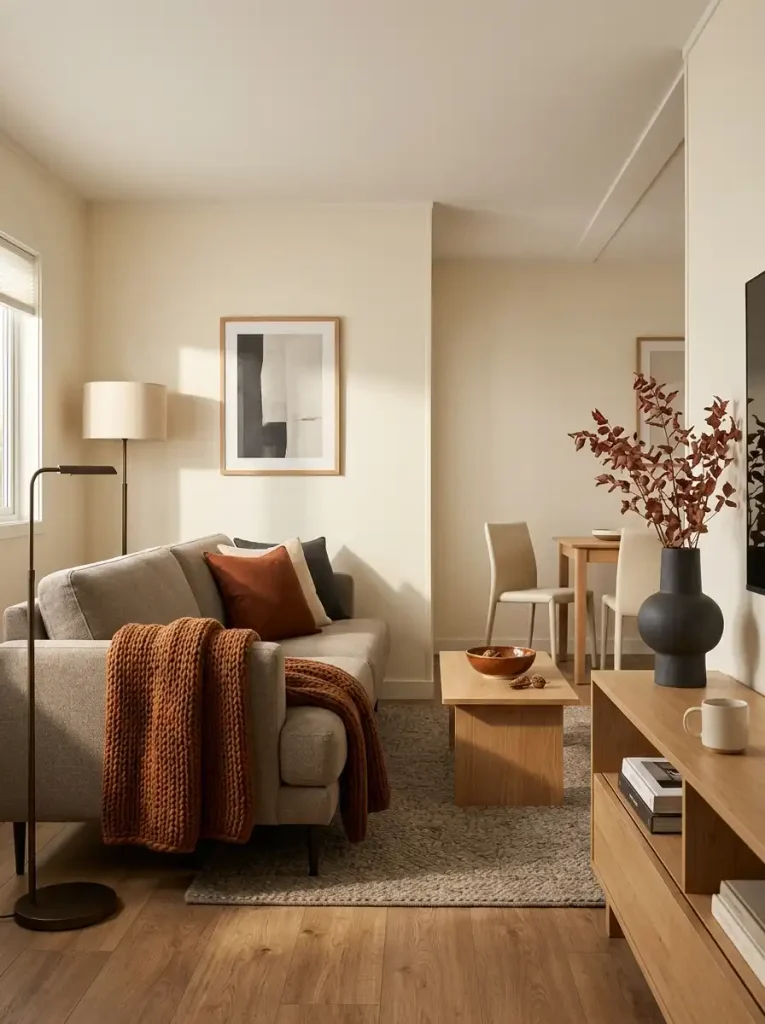
A modern autumn room rarely needs six saturated fall colors competing for attention.
Choose one deeper hue to lead.
It could be cinnamon brown, tobacco, aubergine, muted burgundy, olive-brown, or another shade that already makes sense beside your flooring and furniture.
Then distribute that color with hierarchy.
A substantial element might carry the clearest version of it. A textile can repeat the tone more softly. One smaller detail can connect the two without turning repetition into a theme.
Imagine a cream living room with medium oak flooring. A tobacco throw introduces the seasonal anchor, while a darker ceramic on the console quietly repeats its warmth. The rest of the room can stay largely neutral.
The fall effect becomes clearer because the color is concentrated.
This approach also works well when the existing interior is darker. In a charcoal-and-walnut room, the seasonal anchor might be aubergine or muted rust-red, while cream textiles prevent the palette from becoming visually heavy.
Avoid treating every autumn shade as mandatory.
Pumpkin orange, olive, mustard, burgundy, brown, and red may all belong to fall individually. In one compact room, using them at equal strength can turn a modern palette into a collection of seasonal signals.
Let the strongest color do the work. Supporting materials can carry the rest of the atmosphere.
4. Mix Materials That Feel Warm Without Looking Rustic
“Add texture” is common fall advice, but it is too vague to guide a modern room.
What matters is the relationship between materials.
Look around the space and identify what dominates visually.
If most surfaces are smooth, introduce something tactile. If everything is matte, one reflective material can create depth. If the room is pale, a dark wood or ceramic can ground it. If the room already feels heavy, transparent glass or a lighter textile can create relief.
That contrast is what makes the room feel layered.
A few combinations work particularly well for contemporary fall styling:
- Walnut + brushed brass: deep warmth with a controlled reflective note.
- Linen + smoked glass: softness beside a cleaner, darker surface.
- Wool + stoneware: tactile comfort without relying on rustic motifs.
- Dark wood + pale ceramic: strong contrast that still feels natural.
- Matte pottery + restrained metal: earthy seasonal weight balanced by a sharper modern finish.
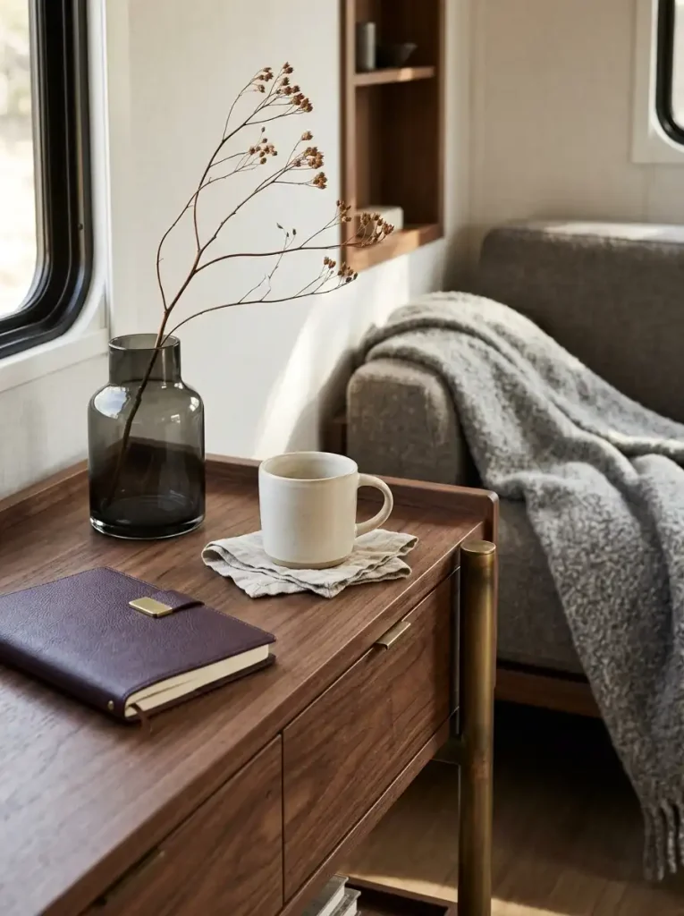
None of those pairings requires a pumpkin, leaf print, or farmhouse sign to communicate fall.
That is the advantage.
In a compact mobile-home interior, richer material relationships can create atmosphere without occupying additional floor space or covering every horizontal surface.
You can often make the room feel more seasonal by replacing one object’s material than by adding three more objects.
A glossy lightweight vase, for example, might give way to one dark matte vessel. A thin summer throw can become a denser wool-look textile. Clear decorative glass can shift to smoked or amber-toned glass if it works with the existing palette.
The number of pieces barely changes.
The room does.
5. Leave More Empty Space Than Traditional Fall Decorating Suggests
One of the fastest ways to make a mobile home feel smaller in fall is to decorate every available surface.
Coffee tables collect pumpkins. Consoles gain signs, candles, garlands, and bowls. Kitchen counters pick up extra accessories. Open shelves receive seasonal objects simply because there is room for them.
Modern fall styling benefits from the opposite instinct.
Leave part of the surface intentionally empty.
That open area acts like a frame around the seasonal pieces you decide to keep. It also makes darker colors, irregular botanical forms, and heavier materials easier for the eye to process.
A useful surface check is:
hero → support → empty zone
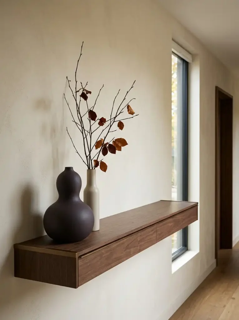
This is not a strict three-object decorating formula. Think of it as a way to identify whether a display has hierarchy.
The hero is the piece that deserves attention.
The support element helps complete the composition.
The empty zone allows both to register.
Imagine a narrow console that currently holds five miniature pumpkins, a candle, a wooden sign, faux leaves, and a decorative tray.
Nothing is necessarily unattractive on its own. Together, however, the arrangement creates nine separate things for the eye to process.
Remove the sign, several tiny pumpkins, and the unnecessary tray.
Now place one sculptural seasonal object near one taller natural element while leaving a visible stretch of the console open.
The furniture suddenly feels wider.
The remaining objects gain presence because they are no longer fighting for it.
This matters on working surfaces too. If you want detailed ideas for keeping the kitchen seasonal without sacrificing function, these fall decorating ideas for a mobile home kitchen go deeper into that room specifically.
Negative space also protects circulation visually. A narrow hallway console or compact dining surface can appear crowded before it physically becomes difficult to use.
Fall pieces tend to amplify that effect because many of them are dark, opaque, chunky, or irregular in silhouette.
The solution is not to make everything tiny.
Often, one larger object with open space around it looks lighter than a row of miniature decorations covering the same surface.
Quick Surface Check
Step back several feet and look at the entire furniture piece rather than the individual decorations.
Can you identify the focal object immediately?
Can you still see enough of the surface for the furniture itself to remain part of the composition?
If not, remove something before adding anything else.
6. Make Fall Textiles Look Architectural, Not Themed
Textiles are one of the easiest ways to change a room seasonally because they can alter softness, color, and visual warmth without adding another piece of furniture.
The modern approach is to change their weight and character, not simply increase their number.
A lightweight summer throw might become a denser wool-look version. Crisp pillow covers can shift toward washed linen, bouclé, brushed fabric, or a heavier woven finish.
The sofa still carries roughly the same number of objects.
It simply feels more appropriate for the season.
Keep the Seasonal Signal in the Fabric
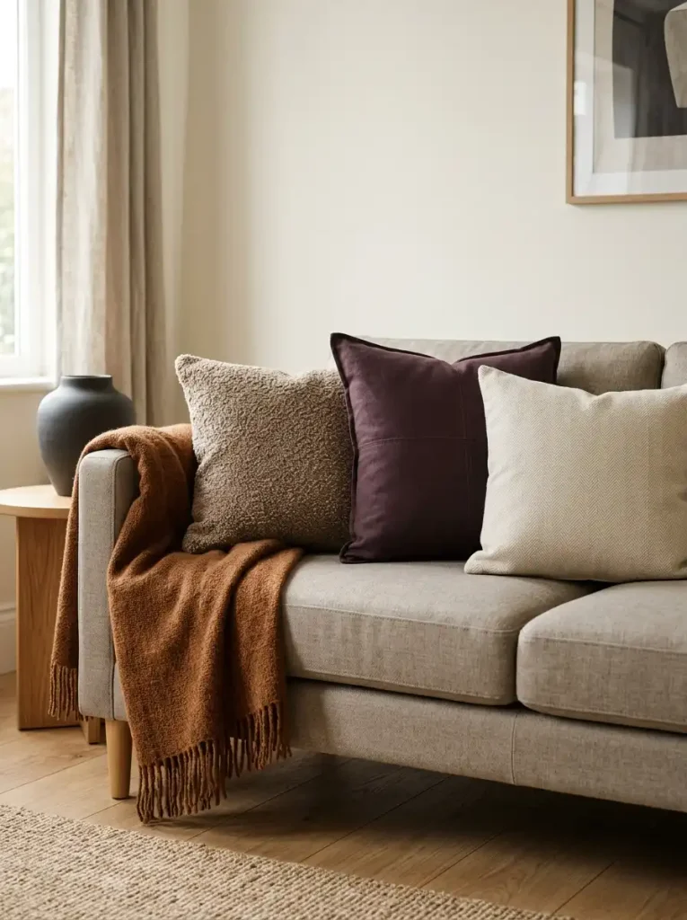
Useful fall textile qualities include:
- bouclé with a visible but controlled loop
- brushed wool or wool-look fabric
- washed linen in deeper neutrals
- dense knits with clean construction
- subtle tonal stripes
- restrained checks
- solid pillows in the article’s deeper anchor color
These materials can feel autumnal before a seasonal motif appears.
Use Pattern More Carefully in Connected Rooms
Plaid is not automatically farmhouse, and pattern does not have to disappear from a modern interior.
The risk is accumulation.
A plaid throw, patterned rug, printed pillow, seasonal table runner, and patterned kitchen towel may each look harmless individually. Seen together across an open mobile-home interior, they create a much louder result.
Choose one area where pattern earns its place.
If the living room already carries a noticeable check, allow the dining zone to communicate fall through color, wood, or ceramic rather than another competing print.
This is especially useful in single-wides, where upholstered pieces may sit close enough for several patterns to be visible at once.
Let Textile Weight Do More of the Work
Suppose your sofa already has two cream cushions and a light neutral throw.
You do not necessarily need two new “fall pillows.”
Replace one cover with a deeper cinnamon, aubergine, or tobacco tone that suits the room. Swap the lightweight throw for a denser version with a tactile weave.
That is enough to change the seasonal reading.
The composition stays clean because the number of pieces does not increase.
A modern fall room should feel softer in October than it did in July, but it does not need to look busier.
7. Choose Sculptural Fall Forms Instead of Literal Fall Symbols
Not every object needs to announce autumn by depicting a pumpkin, maple leaf, acorn, or written seasonal phrase.
Modern seasonal decorating can communicate fall through shape.
Look at the forms that already occur naturally during the season:
- rounded harvest forms
- elongated gourds
- seed pods
- curved branches
- uneven stones
- tall stems
- irregular organic edges
Those silhouettes can be translated into objects that still look contemporary.
A rounded matte ceramic, for example, can suggest harvest abundance without being shaped like a realistic pumpkin. An elongated vessel can echo the movement of dried stems while remaining useful beyond fall.
A simple test helps when shopping:
Would I still like the shape if the store had not labelled it as fall décor?
If the answer is yes, the object is more likely to integrate naturally with the room.
This also reduces the amount of seasonal storage required later.
Use Scale to Give Simpler Objects More Presence
A frequent small-space instinct is to choose many tiny decorations because they physically fit.
Visually, that can produce the opposite result.
Five small novelty objects create five edges, five silhouettes, five shadows, and five separate points of attention.
One larger sculptural piece may occupy a similar amount of surface while creating a calmer composition.
That does not mean oversized décor belongs everywhere.
The object should still respect the furniture underneath it and the ceiling height around it.
Think in terms of presence, not bulk.
A Simple Modern-Fall Filter
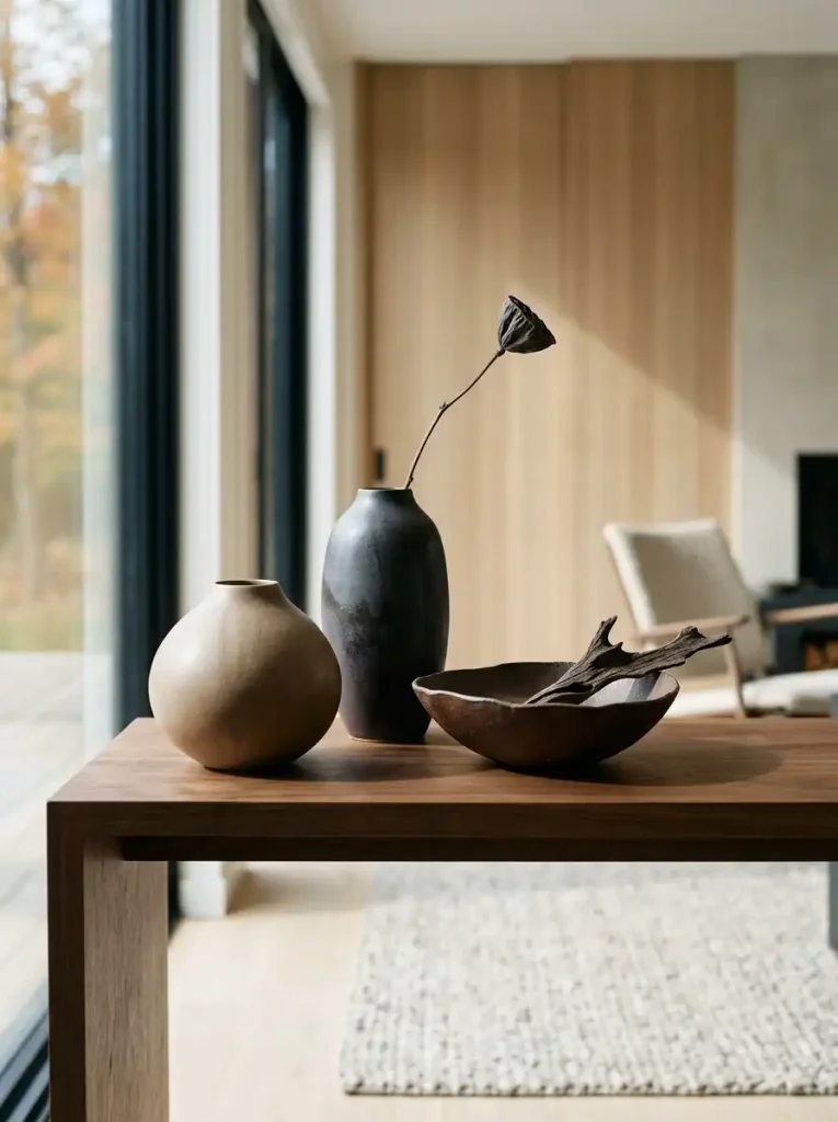
Seasonal silhouette + contemporary finish − unnecessary motif = stronger modern fall object
A charcoal ceramic with an organic rounded profile may pass.
A heavily distressed orange pumpkin covered in typography may not fit the same room, even though it signals the season much more literally.
This does not make traditional fall décor wrong.
It simply belongs to a different visual language.
If you prefer weathered woods, farmhouse textiles, vintage vessels, and more rustic seasonal details, the site’s guide to fall farmhouse mobile home decorating explores that direction in much greater depth.
For this article, the goal is to let the object’s form hint at autumn while its finish keeps the room contemporary.
8. Style Fall Botanicals With Cleaner Geometry
Branches, grasses, seed heads, and fall foliage can introduce more seasonal character than another tabletop decoration because they change the room vertically.
The mistake is assuming that more stems automatically create a better arrangement.
Modern botanical styling often gets stronger as the geometry becomes clearer.
Before filling a vase, decide which direction the arrangement should take.
It might rise vertically.
It might arc to one side.
It might spread low across a dining surface.
Or it might use an asymmetric silhouette that leaves substantial open space between individual stems.
The vessel should reinforce that shape.
A tall narrow vase suits a strong vertical branch. A broad, low ceramic can support grasses or seed heads spreading horizontally. An off-center arrangement works particularly well when the empty side of the vessel remains visually active rather than appearing unfinished.
Fewer Stems Can Create More Character
Dense faux foliage often turns into one large visual mass.
Sparse arrangements let you see the line of each branch.
That line is part of the decoration.
Try:
- one substantial branch with a strong bend
- three to five tall grasses at different angles
- a loose cluster of seed heads with visible gaps
- dark foliage positioned asymmetrically
- a low arrangement whose width is deliberate rather than fluffy
The exact stem count is not the rule.
The important decision is whether each piece contributes to the overall silhouette.
Watch the Sightline
Vertical styling is useful in mobile homes because it adds seasonal presence without occupying much floor area.
Height can become a problem, however, when an arrangement sits between rooms.
A dramatic branch on a dining table may look excellent from the side but block the view into the kitchen. A tall console arrangement might interfere with a television, window, mirror, or the home’s longest interior sightline.
Always judge the arrangement from the next room as well as from directly in front of it.
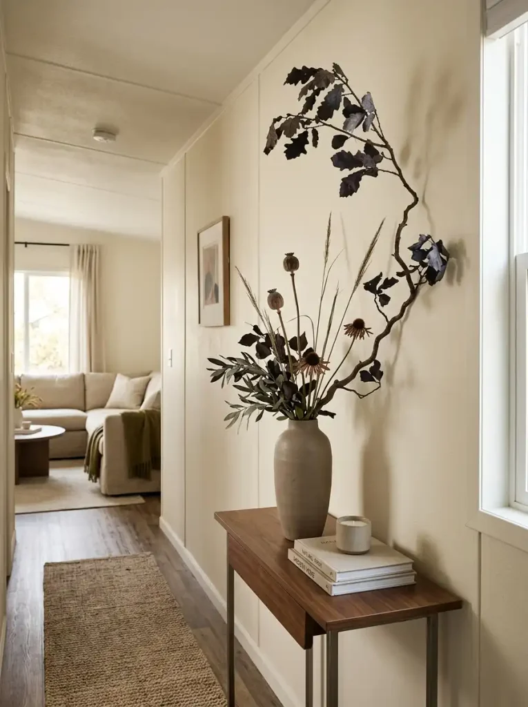
The explorer below shows how changing only the botanical geometry can completely alter where the same type of material works best.
Botanical silhouette explorer
The same fall material can create four very different shapes
Choose a geometry to see how direction changes the best placement, vessel proportion, and potential sightline problem.
A strong off-center silhouette creates movement while preserving visible negative space.
Off-center console, side table, or a corner that needs height.
Simple medium-to-tall vessel with enough visual weight to balance the directional stems.
The extended side can intrude into a walkway or overlap another focal object.
Editorial, organic, relaxed.
Vertical suits narrow surfaces and tight footprints; arches work where sideways movement has room; asymmetric arrangements create a strong contemporary focal shape; low spreads suit dining or low surfaces when they do not consume useful width.
The most contemporary option is not always the sparsest one.
A dramatic arch can be just as modern as a single vertical branch when its scale, vessel, and surrounding space are controlled.
The better question is whether the arrangement has a readable silhouette.
If the eye can understand its shape from across the room, the botanicals are contributing to the design rather than becoming decorative filler.
9. Modernize the Fall Décor You Already Own Before Buying More
A modern seasonal update does not have to begin with a shopping cart.
Open the fall storage bin first.
Some pieces may already have the right shape, material, or scale. What makes them feel dated may be the way they are grouped, the finish around them, or decorative details that no longer suit the room.
Evaluate each object independently before deciding that an entire collection needs replacing.
Keep Pieces With Good Bones
An older fall decoration can stay exactly as it is when it has:
- a clean silhouette
- a convincing material
- a color that works with the current palette
- enough scale to hold attention on its own
- no distracting typography or embellishment
A simple ceramic pumpkin in a deep brown glaze, for example, may integrate easily into a contemporary room.
It does not need three smaller pumpkins beside it to prove what season it is.
Rework the Part That Dates the Piece
Sometimes the underlying form works while one feature does not.
A decorative object might improve if you:
- remove an attached ribbon or raffia bow
- separate it from a matching themed set
- change the tray or vessel underneath it
- simplify the surrounding arrangement
- repaint an appropriate inexpensive object in a more compatible finish
- replace shiny faux foliage with one restrained natural element
Any permanent modification should be suitable for the item’s material and value. Vintage, handmade, sentimental, or potentially valuable pieces are better left unaltered.
Often, editing the surroundings is enough.
A bright orange pumpkin placed among six other autumn objects can look heavily themed. The same object isolated beside dark wood and a quiet neutral surface may feel completely different.
Move Pieces That Belong to Another Styling Language
Not everything has to work in the main living area.
A cheerful seasonal sign that feels too literal beside modern furniture may work perfectly in a more casual kitchen corner. A rustic container might make more sense outside near the entrance.
If your seasonal styling continues beyond the interior, these fall mobile home porch decorating ideas provide a more natural place for outdoor-specific pieces.
Moving an object can be a better solution than replacing it.
Retire What No Longer Earns Its Storage Space
Seasonal storage is valuable in a compact home.
A damaged decoration, flimsy faux material, or object you repeatedly hide behind other pieces probably does not deserve space simply because you already own it.
Retiring something does not mean every older decoration is unfashionable.
It means the object no longer contributes enough to justify storing, unpacking, styling, and repacking it every year.
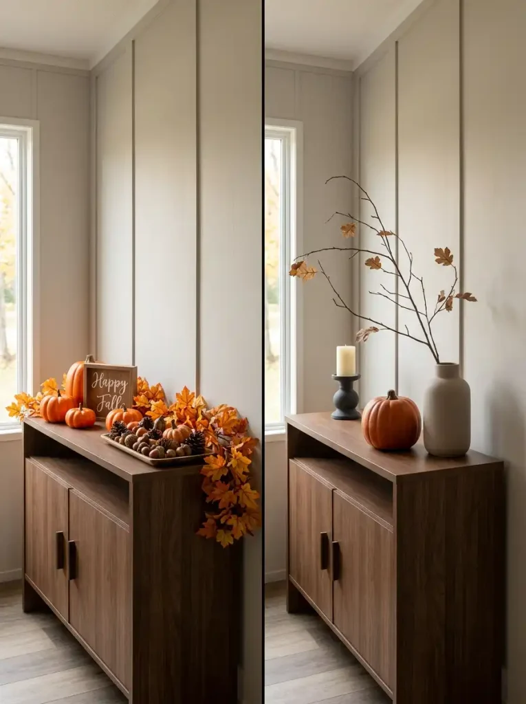
Use the decision path below to sort pieces according to what they actually contribute.
Existing décor pathfinder
Keep it, rework it, move it—or let it go?
Judge the object itself before judging its age. Shape, color, material, scale, and how much supporting decoration it needs all affect whether it can live comfortably in a modern fall room.
Good silhouette, convincing finish, useful scale, and compatible color.
The basic object works, but one removable detail, finish, or surrounding arrangement is holding it back.
Still useful, but better suited to a casual kitchen, porch, entry, or another styling language.
Damaged, poor quality, difficult to style, or no longer worth its seasonal storage space.
Does the object have a shape you would still like without its fall label?
Ignore the merchandising around it. Judge the silhouette on its own.
Suggested treatment
Keep
The tool is useful because it separates two questions that are often treated as one:
Is this object old?
and
Does this object still work?
Age alone does not answer the second question.
A carefully edited object with good form can look far more current than a brand-new piece surrounded by unnecessary seasonal clutter.
Worked Example: Updating a Neutral Mobile Home for Fall
Consider a hypothetical open-plan mobile home with cream walls, medium oak flooring, a beige sofa, a white kitchen, and simple black lighting.
Its fall storage contains several bright orange pumpkins, a plaid throw, an artificial leaf garland, a small wooden sign, and an amber candleholder.
Nothing needs to be replaced automatically.
Start with the permanent finishes. Oak and cream already provide warmth, so the palette does not need several additional autumn colors.
Choose cinnamon as the deeper seasonal anchor.
The existing plaid throw can be removed if its pattern dominates the sofa. A heavier solid or subtly woven throw in cinnamon or tobacco gives the seating area more seasonal weight while keeping the furniture shape visible.
Next, reduce the tabletop collection.
Keep one pumpkin if its shape and finish work on their own. Store the remaining miniature pieces. The amber candleholder can stay if its scale suits the surface.
Instead of stretching the faux garland across another piece of furniture, use one sparse branch arrangement to create vertical movement.
The dining area does not need a second major display because it sits inside the same sightline. A simple wood or ceramic detail can carry the material relationship forward.
The result is not less autumnal.
It simply communicates the season through fewer, stronger decisions.
No real project or homeowner is being represented here; the example is only a demonstration of how the earlier principles can work together.
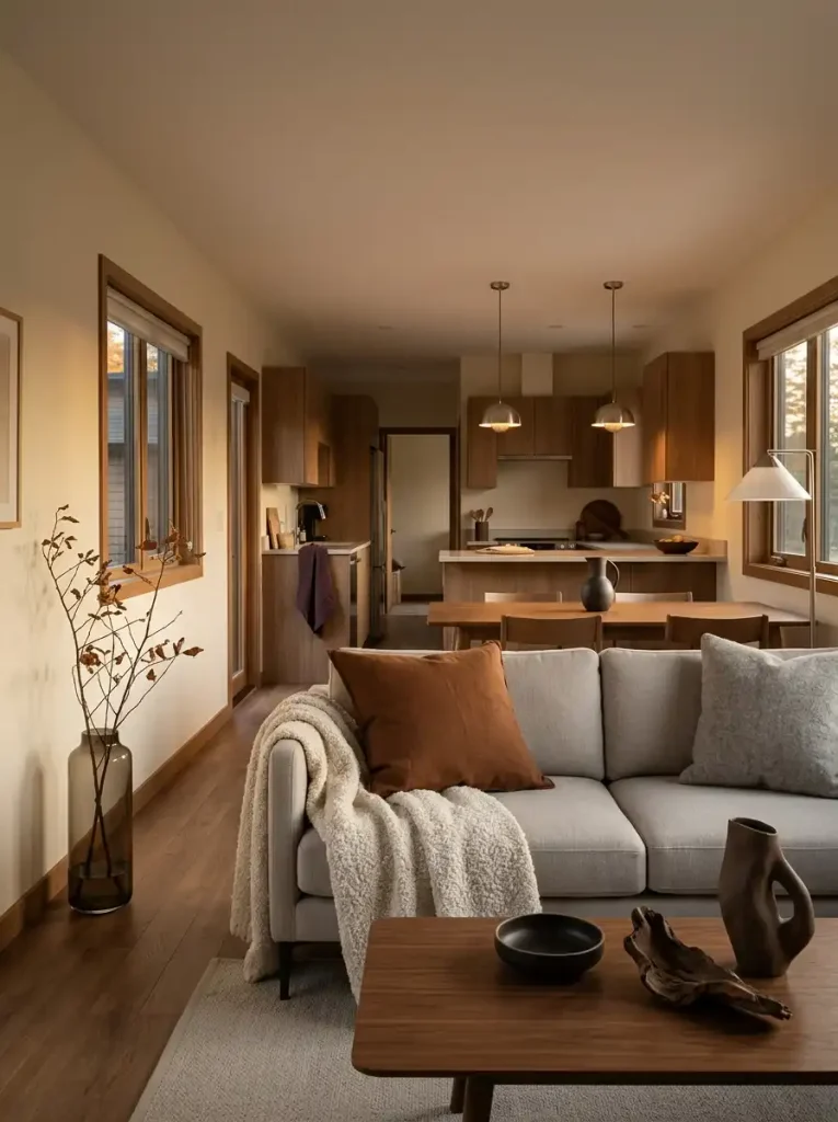
10. Do the “Remove the Pumpkins” Test
Once the decorating is finished, mentally remove every object that announces fall literally.
Ignore the pumpkins.
Ignore written seasonal signs.
Ignore printed leaves.
Ignore any decoration whose primary purpose is to name the season.
What remains?
If the home still feels warmer, deeper, softer, and more atmospheric than it did in summer, the seasonal change has reached the underlying design.
Look for evidence in the room itself.
Has the palette gained depth?
Have smooth summer surfaces been balanced with richer materials?
Do textiles have more substance?
Are natural forms visible?
Does evening light interact differently with wood, glass, ceramic, or fabric?
Can you still see deliberate empty space around the strongest seasonal elements?
Those signals matter because they continue working even when the obvious themed objects are taken away.
Walk Through the Home Twice
On the first pass, notice the explicit seasonal pieces.
Where are the pumpkins, foliage, signs, or other unmistakable fall references?
On the second pass, stop evaluating those objects.
Look only at:
- color
- material
- textile weight
- organic silhouette
- surface density
- room-to-room continuity
- lighting
The difference between those two walks reveals how integrated the decorating has become.
For a Single-Wide
Pay particular attention to repetition.
A strong seasonal focal point may remain visible from several locations, so you may need fewer supporting moments than expected.
Look down the longest sightline and check whether one accent color or decorative form appears so frequently that it starts to dominate the entire home.
For a Double-Wide
The challenge can reverse.
Greater separation gives you room for more than one seasonal moment, but each area may start developing its own independent palette.
Step between the major rooms and look for one shared connection—perhaps a color, material, or natural shape—rather than trying to make the displays identical.
The final goal is not to make the house pass a minimalist purity test.
A modern interior can still contain pumpkins, nostalgic objects, handmade décor, and pieces that simply make you happy.
The test only asks whether autumn has become part of the room itself.
If removing the obvious symbols causes the entire seasonal feeling to disappear, strengthen the deeper design layer before adding anything else.
Frequently Asked Questions About Modern Fall Mobile Home Decor
What colors work best for modern fall mobile home decor?
The strongest palette depends on the finishes already present in the home.
Cinnamon, tobacco, aubergine, muted olive, mushroom, deep burgundy, and warm dark woods can all work well in contemporary autumn interiors, but not every room needs all of them.
Start with flooring, cabinetry, upholstery, and wall color. Then select one deeper seasonal anchor that relates naturally to those permanent surfaces.
A cream-and-oak room might handle cinnamon beautifully, while a cooler charcoal-and-gray interior may respond better to aubergine or burgundy with warm wood used as a bridge.
How can I decorate a small mobile home for fall without making it feel cluttered?
Give seasonal styling a hierarchy.
Choose one area to carry the strongest fall signal, allow nearby spaces to support it more quietly, and leave some surfaces undecorated.
Larger pieces with clear silhouettes can also be easier on the eye than collections of many miniature accessories.
Most importantly, evaluate the entire connected view rather than decorating each surface independently.
Can modern fall décor still include pumpkins?
Absolutely.
A pumpkin does not automatically make an interior traditional or farmhouse.
Its scale, finish, placement, and surroundings matter more.
One ceramic, glass, wood, or naturally shaped pumpkin with enough breathing room can fit beautifully into a modern room.
Problems usually begin when the object is repeated so many times that the seasonal motif becomes more noticeable than the interior around it.
What is the difference between modern fall décor and farmhouse fall décor?
Modern fall styling generally relies more heavily on clean silhouettes, controlled color, negative space, sculptural objects, and contrasts between contemporary materials.
Farmhouse fall décor may comfortably use more rustic woods, vintage-inspired containers, traditional checks, utilitarian objects, distressed finishes, and nostalgic references.
Neither direction is inherently better.
They simply create different visual experiences.
If the farmhouse approach is closer to your taste, explore the complete guide to fall farmhouse mobile home decorating.
How can renters decorate a mobile home for fall?
Concentrate on reversible layers.
Good renter-friendly options include:
- pillow covers
- throws
- portable lamps
- removable artwork
- ceramics
- glass
- branches and grasses
- freestanding decorative objects
- removable seasonal door or wall décor where the surface allows it safely
You can create substantial seasonal change without repainting cabinetry, modifying walls, or replacing permanent finishes.
Does every room need fall décor?
No.
A room can participate in the seasonal scheme through a shared color, material, textile, or sightline connection without receiving an obvious fall decoration.
In a connected mobile home, quieter rooms can actually make the primary seasonal area look stronger.
How do I carry a modern fall look outside the mobile home?
Repeat one or two interior cues rather than copying the interior arrangement literally.
A restrained color, dark planter, simple natural branch, contemporary lantern shape, or related material can create continuity at the entrance.
For broader façade and curb-appeal guidance, continue with the site's guide to fall mobile home exterior decor.
A Modern Fall Home Should Still Look Like Your Home
The best seasonal update does not bury the interior you liked eleven months of the year.
It changes how that interior feels.
A deeper color appears where a lighter one used to sit. Materials become warmer and more tactile. A branch creates an organic line through an otherwise clean room. Evening light catches darker wood and glass differently. A few familiar fall objects remain because they still earn their place.
Then the editing stops.
That restraint is especially valuable in a mobile home, where rooms communicate with one another so quickly.
When autumn has reached the palette, materials, softness, silhouette, and atmosphere of the space, you no longer need every surface to announce the season.
Remove the pumpkins in your imagination one last time.
If the room still feels like fall, the design is doing the work.