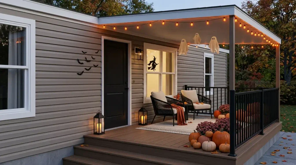
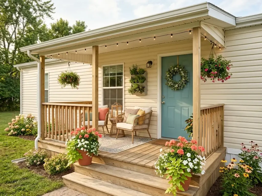
A beautiful fall porch does not need a deep farmhouse veranda or acres of steps. Fall mobile home porch decor works best when every seasonal layer earns its place, especially around a compact landing, narrow staircase, or shallow covered entry.
The challenge is scale. Oversized displays can crowd the door, while a handful of tiny decorations often disappear against siding and porch architecture. The sweet spot sits somewhere in between: enough color, texture, and height to make the entrance feel transformed, with enough open space for the porch to remain comfortable to use.
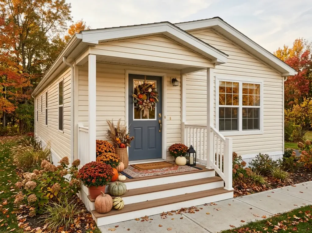
That might mean putting more emphasis on the door, decorating upward, letting one side carry the visual weight, or using the steps as part of the composition.
The ideas below are designed for real mobile-home proportions—from simple front landings to larger attached porches—and range from classic orange-and-rust fall styling to quieter neutral looks. The aim is a porch that feels warm from the curb, polished up close, and still completely practical for everyday life.
1. Make the Front Door the Fall Focal Point With One Statement Wreath
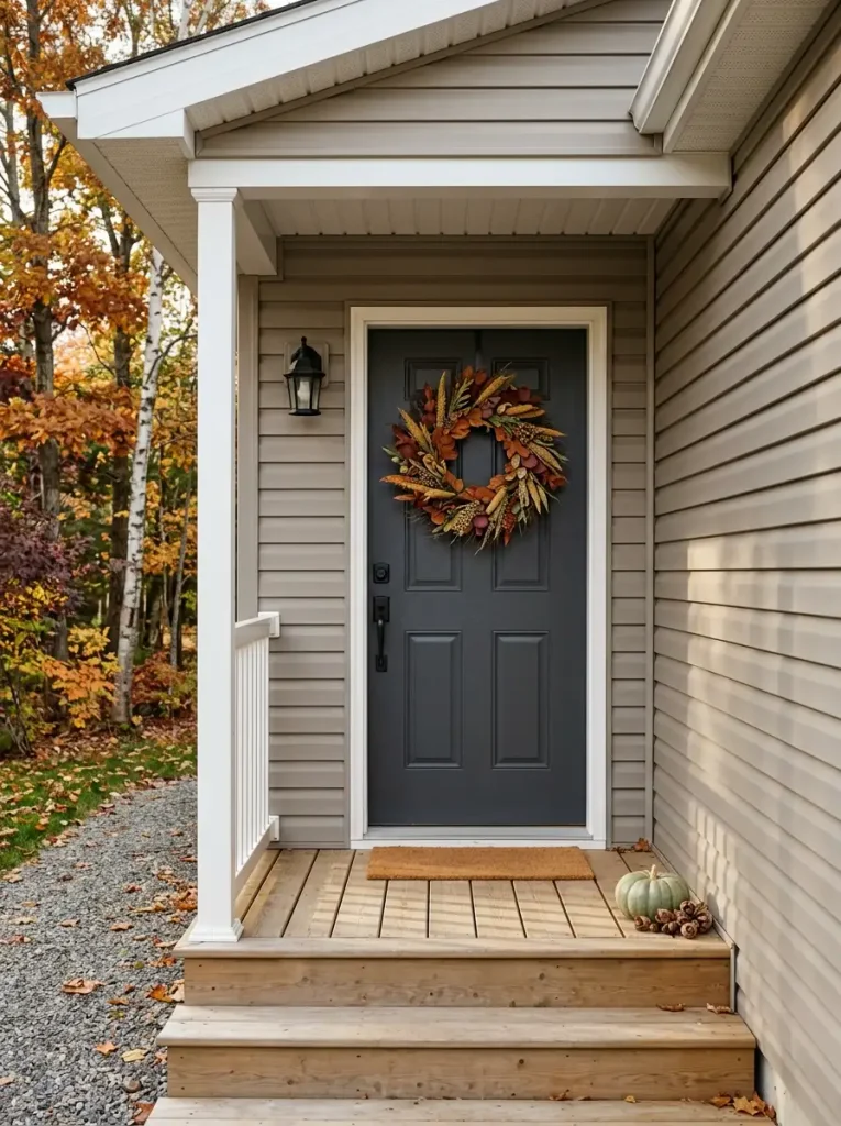
On a compact porch, the front door can carry far more of the seasonal story than the floor ever could.
A statement wreath gives the eye one clear destination before it notices pumpkins, planters, or a doormat. That hierarchy matters on a small mobile-home entry because too many equally strong decorations can make the doorway look visually fragmented. One confident focal point organizes everything around it.
Scale the wreath to the visible mass of the door, not to the size of the porch. A door with broad recessed panels or a dark finish can usually handle a fuller wreath with substantial leaves, seed heads, or dried-looking florals. A narrower door often looks better with a cleaner outer edge and slightly more open space within the wreath.
Color also changes how large the wreath appears. Burnt orange, ochre, and burgundy stand forward dramatically on charcoal or black. Against beige or warm-gray siding, olive foliage mixed with rust can feel softer and more connected to the exterior.
Once the wreath reads clearly from several steps away, resist adding another competing decoration at eye level. Let the door own that part of the composition.
2. Layer an Outdoor Rug and Doormat to Ground the Entry
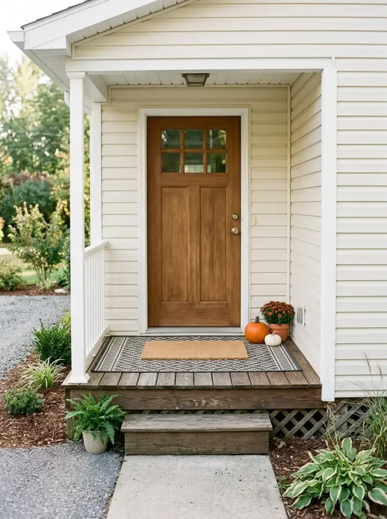
The wreath draws the eye upward. The floor still needs a visual base.
Think of the threshold as a simple proportion equation:
wider foundation + smaller functional mat = a more defined entrance
The lower rug should extend far enough beyond the doormat to remain visible from the approach. If both pieces are nearly identical in width, the layering disappears and the extra textile starts to look accidental. On a narrow mobile-home landing, even a modest exposed border can make the doorway appear broader and more finished.
Pattern deserves its own decision. A bold buffalo check, broad stripe, or simple geometric usually survives viewing distance better than a tiny repeated motif. The upper mat can then stay quieter so the two layers are not competing for attention.
Material and thickness matter as much as appearance. Choose an outdoor-rated foundation that lies flat, drains appropriately for its location, and does not curl into the walking path. Check the bottom of the door or storm door before committing to a thick pile.
The strongest layered threshold looks generous from the curb and completely ordinary to step across.
3. Create a Pumpkin Rhythm Down the Steps
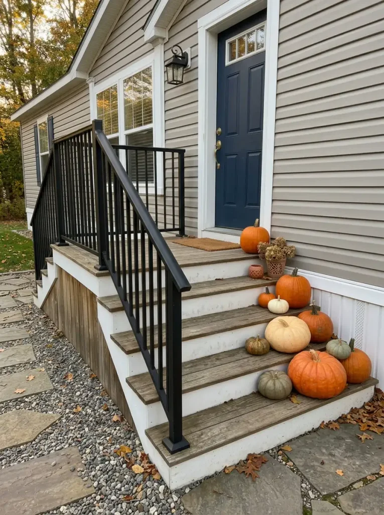
A row of pumpkins becomes more interesting when the steps provide the rhythm for you.
Picture the porch from the sidewalk first. The eye meets the lowest step before it reaches the doorway, so a small progression can guide attention upward without covering every tread.
- Anchor the bottom. Use the largest pumpkin or most substantial cluster near the base, where it can visually begin the sequence without narrowing the central route.
- Let one level breathe. A skipped tread or a larger gap separates the groups. That pause is useful; it turns repetition into a rhythm that the eye can actually follow.
- Finish lighter near the door. A smaller pumpkin, mini gourd, or compact grouping can complete the climb without competing with the entrance itself.
Unequal sizes usually feel more natural than a staircase of matching pumpkins. Rotate shapes too—a squat heirloom pumpkin beside a taller classic shape gives the sequence variation while the repeated orange or cream color holds it together.
On stairs with a frequently used handrail, concentrate the display toward the opposite outer edge whenever the layout allows. You want the pumpkins to guide the eye upward, never the feet sideways.
4. Build One Tall Mums-and-Grasses Planter Cluster
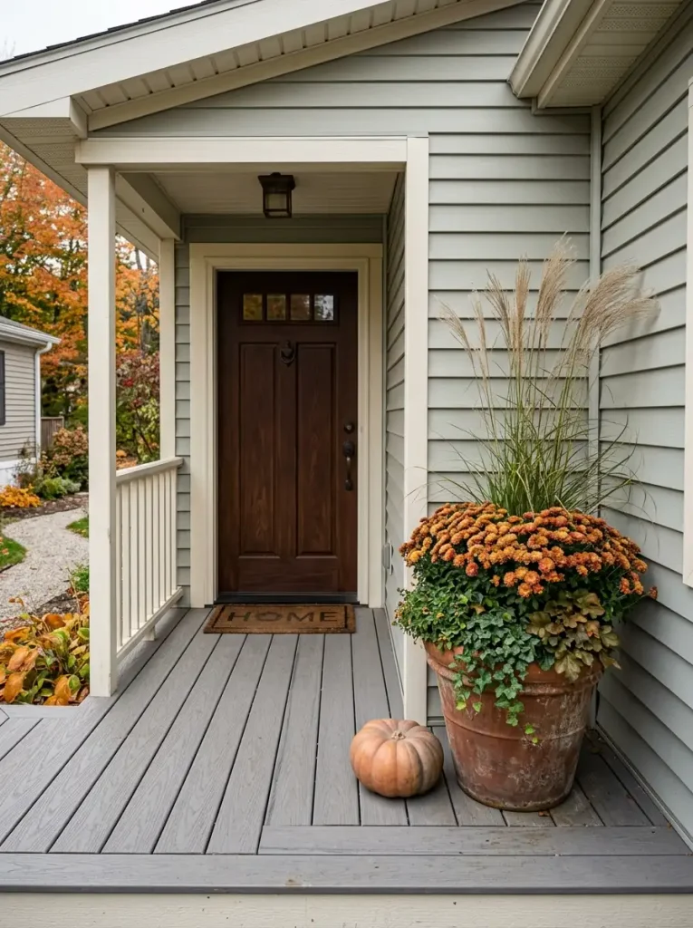
Fall planters become much more convincing when they are designed as a silhouette, not simply filled with flowers.
Ornamental grass provides the first layer: fine blades rise above the arrangement and establish its overall height. Because the texture is light and airy, it gives the porch vertical presence without producing the same bulky mass as another large pot of flowers.
Mums then supply the middle weight. Their rounded flower heads create a dense shape beneath the grass, which is useful against long stretches of flat siding. A lower element—a compact foliage plant, a trailing stem, or even one small pumpkin at the base—can visually connect the planter to the porch floor.
The container deserves attention too. A tall arrangement in a very narrow, lightweight pot can become top-heavy outdoors. A broader or heavier planter gives the composition a more convincing base and may perform better in exposed conditions.
For a compact mobile-home entry, build one excellent vertical cluster before buying several separate mum pots. The eye registers the change in height immediately, while the porch keeps more of its usable floor area.
That is a stronger transformation than simply multiplying flowers at ankle level.
5. Raise a Small Harvest Display With Weather-Safe Risers or Crates
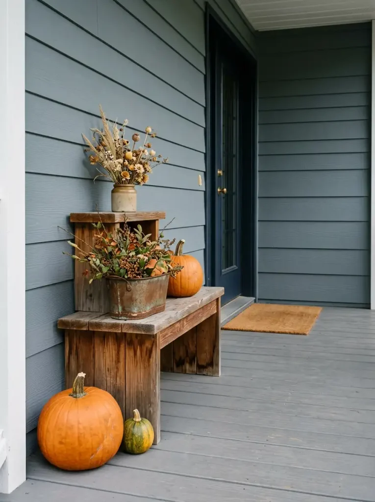
When floor width is limited, ask one question before arranging anything:
Do you need more decoration—or simply more elevation?
A low, spread-out collection consumes valuable porch area quickly. Raising a few pieces gives them clearer visual separation, so the same small group can read as a complete display from farther away.
If the porch is very shallow, use a broad, stable riser as the main platform. A weathered wood stool, outdoor bench, sturdy box, or exterior-safe crate can lift one planter or pumpkin grouping while keeping the footprint concentrated.
For a deeper sheltered corner, two different levels can work well:
- Lower level: heavier pumpkins, substantial pot, or another stable object.
- Upper level: lighter botanical material or a small seasonal accent that benefits from visibility.
Weight distribution matters. Heavy pieces belong low and close to the center of the support; tall lightweight decorations perched on narrow crates can look precarious because they often are.
Also consider the material itself. Untreated wood left in repeated rain will age very differently from a protected exterior-grade piece.
A riser is successful when the display gains hierarchy while the porch gives up very little additional floor space.
6. Turn One Porch Corner Into a Cozy Fall Seating Nook
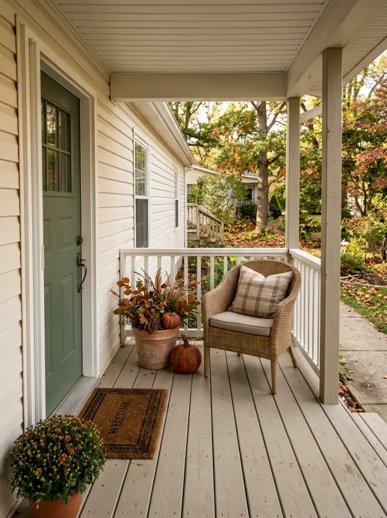
Does every porch need a chair? No. But on a mobile-home porch with enough depth, one genuinely usable seat can do more for the fall mood than another pile of seasonal accessories.
The right setup depends on how much room you actually have.
On a deeper porch: position a compact chair or narrow bench where someone can sit without interrupting the route to the door. A rust, olive, plaid, or warm-neutral cushion can introduce the season while the furniture itself provides most of the visual mass.
On a shallow porch: a small armless chair tucked into a protected corner may work, provided the door and steps remain comfortably accessible. Keep its surrounding décor light—perhaps one planter or low pumpkin grouping.
On a tiny landing: skip seating entirely. A chair that cannot be used comfortably is only oversized decoration.
That distinction matters. Furniture gives the eye a functional anchor, so the rest of the porch does not need as many standalone fall objects. A single chair with one textile, a nearby plant, and open floor around it can feel more complete than five unrelated decorations.
The final test is simple: the nook should look like somewhere you would actually sit on a cool October afternoon.
7. Trace Porch Posts or the Beam With a Restrained Fall Garland
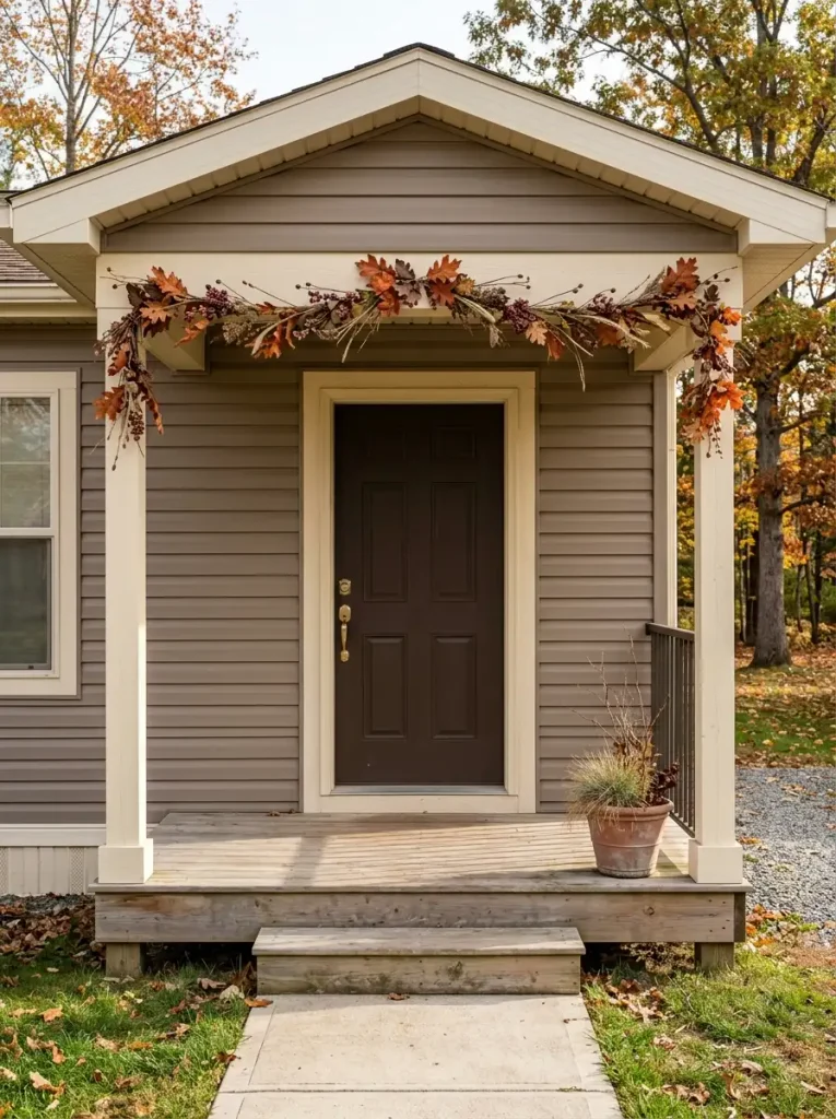
Look at the porch architecture before choosing where the garland goes.
A beam spanning the entry, one prominent post, or a clean section of door surround already gives the eye a line to follow. Autumn foliage becomes more convincing when it emphasizes that existing geometry.
The finished effect can be dramatic even with relatively little material. A loose garland of russet leaves, seed stems, muted berries, or dried-looking foliage along one strong architectural path creates a seasonal frame while leaving the porch structure readable beneath it.
Covering every edge can have the opposite effect. Posts disappear inside foliage, railings turn visually heavy, and the eye loses track of the actual shape of the porch.
For a narrow entry with two posts, you might run foliage across the upper beam and allow only short drops at each end. A single-post porch can carry one asymmetrical vertical treatment paired with a quieter doorway. Neither approach requires decorating every available surface.
Notice the architecture again after the foliage is installed. You should still be able to understand where the post ends, where the beam begins, and how the entrance is framed.
That visible structure is what keeps garland looking integrated instead of attached at random.
8. Let the Siding and Door Color Choose Your Fall Palette
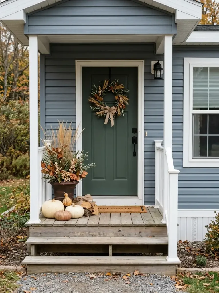
Before buying another orange pumpkin, look at the largest colors already on the porch.
Siding, trim, decking, and the front door occupy far more visual area than seasonal décor. Those permanent surfaces determine whether rust, gold, cream, burgundy, or green feels naturally connected—or oddly pasted on.
If your exterior is charcoal, black, or deep gray
Saturated autumn tones can handle the contrast. Pumpkin orange, marigold, deep rust, and warm cream remain visible against the dark backdrop.
If your siding is beige, taupe, or warm greige
Lean into colors with earthy undertones: cinnamon, olive, terracotta, brown-red, muted gold, and ivory. Very bright orange can feel sharper against these quieter exteriors.
If the home is bright white or cool pale gray
You have room to soften the classic fall palette. Cream pumpkins, dusty green, wheat, muted copper, and dark foliage can create enough definition without relying on strong saturation.
The front door can change the formula again. A blue-gray door, for example, may look especially polished beside copper and warm brown; a deep green door already provides a rich botanical note.
The useful question is not “What colors look like fall?” It is “Which fall colors make this particular exterior look better?”
That one shift usually produces a more intentional porch.
| EXTERIOR | STRONG PALETTE | WHY IT READS WELL |
|---|---|---|
Charcoal / black |
High contrast keeps saturated fall tones crisp from a distance. | |
Taupe / greige |
Earthier accents echo the warmth already present in the siding. | |
White / pale gray |
A pale façade allows subtle seasonal hues to remain distinct. |
9. Brighten a Dark Entry With White and Muted Pumpkins
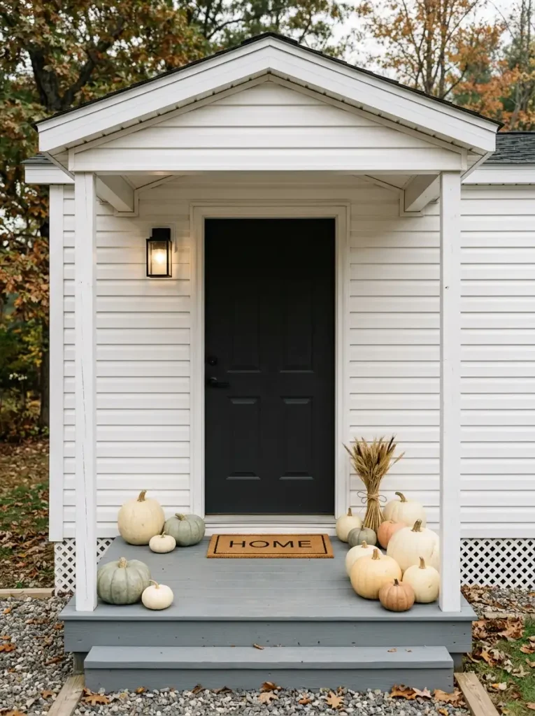
A charcoal or black front door can look especially striking in fall, but too many dark red and burnt-orange accents around its base may make the threshold feel visually heavy.
Now picture the same entrance with several pale pumpkins introduced near the floor.
Cream, soft gray-green, faded sage, and warm white reflect more available light than deep orange or burgundy. Against a dark door, that brightness separates the ground-level decorations from the architecture and gives the lower half of the entrance more visual breathing room.
The change does not require an all-neutral porch. One classic orange pumpkin can become more noticeable when it sits among quieter cream forms. Dark olive foliage can bridge the pale decorations back to the door.
Pure bright white sometimes looks too sharp beside weathered outdoor materials, so softer shades usually integrate more naturally. Look for ivory, stone, dusty green, or very pale peach if you want the effect to feel seasonal without becoming high-contrast black-and-white styling.
Stand back after placing them.
If you can distinguish the individual forms easily and the doorway no longer feels bottom-heavy, the lighter accents are doing their job. Additional objects may only reduce that clarity.
10. Add Vertical Texture With Dried Branches and Ornamental Grasses
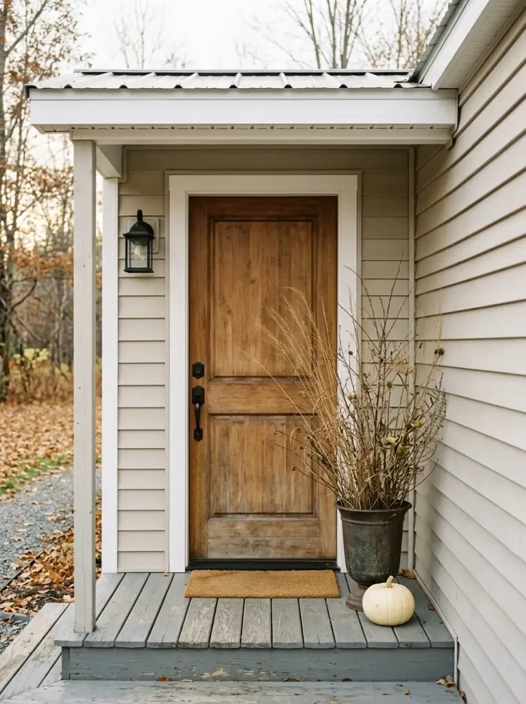
Dried branches and ornamental grasses solve a different problem from a pot of mums.
Flowers create mass. Fine stems create silhouette.
A bundle of wheat-colored grass, bare branches, seed heads, or feathery plumes can rise two or three feet above a container while still allowing the siding, window trim, or porch post behind it to remain partly visible. That transparency gives a narrow porch height without making the corner feel blocked.
Direction matters. Upright stems look cleaner beside a doorway; wide branches can be beautiful where there is more side clearance. Avoid choosing material that fans directly across a walking route or repeatedly brushes the door.
The container becomes the physical counterweight. A substantial ceramic, metal, or weighted outdoor pot gives tall dried material a believable foundation. Exposed porches may need extra ballast because fine stems catch more wind than their visual lightness suggests.
This is also a useful late-fall move. Once summer flowers look tired, dried texture can keep the porch seasonal without pretending everything is still in bloom.
From several feet away, the arrangement should look airy enough that you can read both the plant silhouette and the architecture behind it.
That transparency is the feature.
11. Keep a Tiny Porch Airy With One Asymmetrical Decor Zone
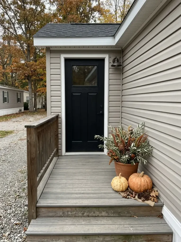
An undecorated section of porch is not wasted space.
On a tiny mobile-home landing, that open area can be the reason the decorated side looks deliberate. When pumpkins, flowers, lanterns, and signs are spread evenly around every edge, the eye has nowhere to rest. Concentrating the seasonal weight in one defined zone gives the display a clear boundary.
Choose the side that naturally interferes least with everyday movement. It may be the corner beside the fixed side of the door, the area opposite a handrail, or the wider end of an uneven landing.
Within that zone, vary height and shape enough to make the grouping feel complete. One planter might provide vertical mass, two pumpkins can establish the lower layer, and a small seasonal detail can bridge the difference between them.
Then stop.
Do not mirror the arrangement merely because the opposite side looks empty. That emptiness is performing a design job: it emphasizes the fuller side and keeps the doorway visually breathable.
This approach is particularly useful when the porch itself is narrow but the front door is visually strong. The decorated cluster supplies the seasonal cue; the untouched floor preserves scale.
From the walkway, the composition should read as one intentional autumn moment beside a usable entrance, not as an incomplete attempt at symmetry.
12. Use Railings or Window Boxes for Fall Color Without Losing Floor Space
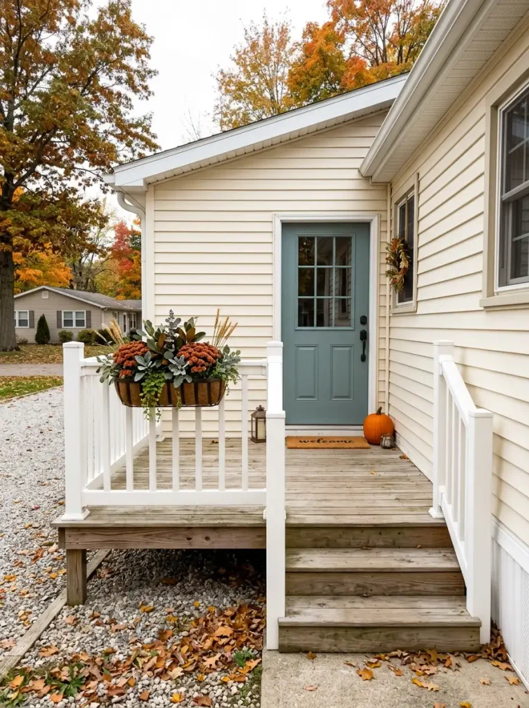
What if there is simply nowhere sensible to put another pot?
Look beyond the floor.
Railings, window boxes, and narrow perimeter ledges sit inside the viewer’s field of vision while using little or none of the walking surface. For a mobile home with a shallow porch, that makes them unusually efficient places for seasonal color.
A railing planter can carry trailing foliage, compact mums, heuchera, dried stems, or another weather-appropriate mix. Keep its profile reasonably tight so the arrangement reads as part of the porch edge rather than as a bulky basket hanging into space.
Window boxes offer a different effect. Because they sit higher, even a restrained fall planting can be seen from the driveway before smaller floor accessories become noticeable. Repeating one porch color—perhaps rust, cream, or olive—in the box visually links the window area with the entrance below.
You do not need to decorate every railing section. One planted span may provide enough color, especially if the door already has a wreath.
The main advantage is spatial: the seasonal layer moves outward and upward instead of spreading across the deck.
That makes perimeter styling particularly valuable for a fall mobile home porch decor scheme where every square foot of usable floor matters.
13. Balance a Wide or Double-Wide Entry With Paired Containers
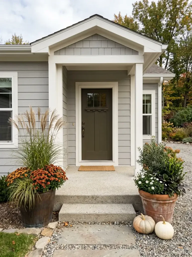
A wider mobile-home façade changes the scale equation.
One small seasonal cluster that looks perfectly proportioned beside a narrow single-wide entrance can appear stranded when the doorway sits inside a broader double-wide porch or a long stretch of siding.
The solution is not necessarily more individual objects. It is distributed visual weight.
A pair of substantial containers—one on each side of the entrance—can relate the seasonal arrangement to the width of the architecture. They do not need identical contents. Matching their approximate visual mass is often enough.
One side might hold a tall grass and rust-colored mums, while the other uses deeper foliage with pale pumpkins at the base. The differing ingredients keep the porch relaxed; similar overall height or container scale keeps the doorway balanced.
Exact symmetry feels most natural around very formal architecture. Many manufactured-home porches look better with a softer version: containers of the same family, but slightly different botanical shapes or surrounding accents.
Keep the door in charge. If both side arrangements grow so tall, wide, or colorful that the entrance becomes secondary, their visual weight has gone too far.
The paired elements should support the width of the façade while still pointing the eye toward the center.
14. Protect the Walking Path Around Steps, Screen Doors, and Handrails
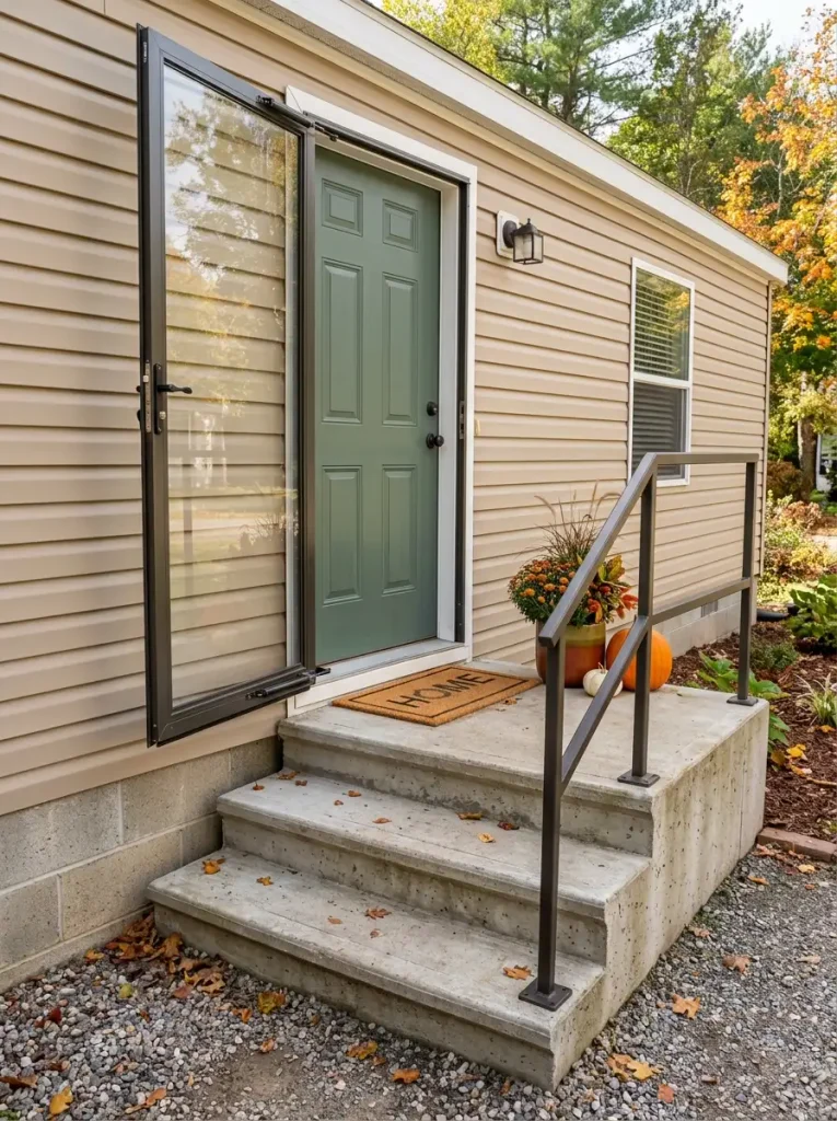
The most important empty space on a fall porch may never appear as an object in the photograph.
It is the space occupied by movement.
The door problem
A screen or storm door swings through part of the landing every time someone enters. A beautiful planter placed inside that arc quickly becomes something you have to dodge—or move.
Open both doors fully before positioning the largest seasonal pieces. The area swept by the outer door should remain free.
The stair problem
Pumpkins sitting near the edge of a wide step may look harmless until two people pass each other, someone carries shopping bags, or the surface is wet. Keep the active foot route visually obvious from top to bottom.
The handrail problem
A garland or planter does not need to cover the rail to affect it. Tall flowers immediately beside the grasping area can make the rail awkward to reach.
The practical approach is to identify the porch’s movement lane first, then decorate the remaining zones. Corners, dead space beside the fixed side of the door, outer stair edges, and railing exteriors often provide better locations.
Good fall styling should survive normal daily life.
If the arrangement works only when nobody is carrying groceries, opening the storm door, using the railing, or walking beside another person, the porch has been styled beyond its functional capacity.
15. Mix Real and Faux Seasonal Pieces for a Longer-Lasting Porch
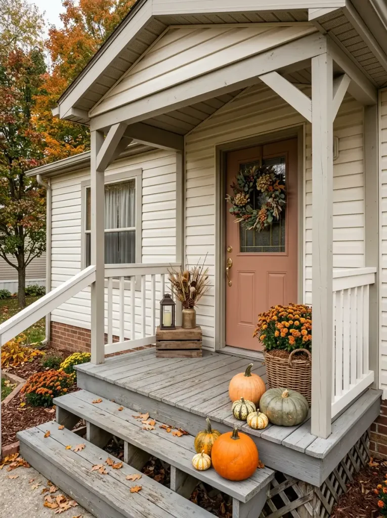
The porch that looks perfect on September 20 may not look the same four weeks later.
Fresh mums can lose their shape. Cut foliage dries. Pumpkins may soften or blemish. A reusable wreath can remain almost unchanged.
That difference is useful.
Think of the seasonal display as a timeline of materials rather than a single shopping trip.
In early fall, living plants and fresh pumpkins can provide much of the color. As temperatures shift, the fastest-aging pieces become the ones you refresh first. The durable layer—containers, wreaths, outdoor textiles, lantern-style LED fixtures, quality faux stems, and weather-tolerant dried material—continues holding the composition together.
This reduces the need to rebuild the porch whenever one living element declines.
Placement affects longevity too. A convincing faux branch or reusable botanical can work beautifully in a protected upper arrangement where close inspection is unlikely. Fresh flowers may deserve the eye-level location because their natural irregularity contributes more there.
Real pumpkins also behave differently depending on heat, moisture, direct sun, and surface contact. Check them periodically instead of assuming they will last the entire season untouched.
A successful mixed-material porch never announces which pieces are artificial.
It simply looks intentionally autumnal from the first cooler week through late fall, with only a few strategic elements needing replacement.
16. Use Removable, Exterior-Safe Hanging Methods on Vinyl Siding and Doors
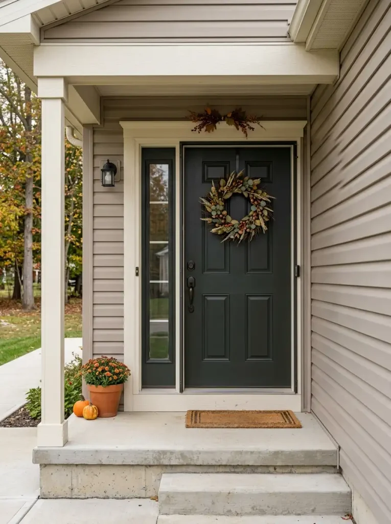
A beautiful wreath or garland is not worth damaged siding, scratched paint, or a decoration that drops in the first strong wind.
Begin with the surface, because the same hanging method is not appropriate everywhere.
Vinyl siding, painted doors, glass storm doors, wood trim, metal railings, and porch posts all behave differently. The weight of the decoration matters too. A lightweight faux-leaf strand creates a very different load from a dense wreath made with branches, pinecones, or dried seed heads.
Wind adds another variable. A wreath may weigh very little in your hands yet pull repeatedly against its attachment point when exposed to gusts. Large, flat decorations can catch considerable air.
For that reason, choose hanging hardware specifically rated for the surface, intended environment, and load you are working with. Follow the hardware manufacturer’s instructions and any relevant door or siding guidance rather than assuming that an indoor adhesive solution is suitable outside.
Renters should be especially conservative about holes or permanent modifications unless permission is clear.
The best attachment method almost disappears visually. Once the décor is installed, you should notice the wreath, foliage, or seasonal frame—not the hardware supporting it.
Vinyl siding
Painted or finished door
Rail, post, or structural trim
17. Build a No-Pumpkin Fall Porch With Texture, Foliage, and Warm Neutrals
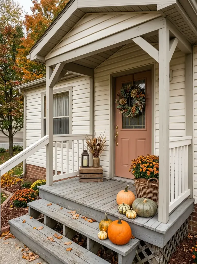
Pumpkins are optional.
A porch can signal autumn through material changes alone: dried seed heads, twiggy branches, woven fibers, faded foliage, coarse grasses, weathered wood, and the quieter colors of late-season plants.
Take the pumpkin shape away and texture has to become more expressive.
A twig wreath contributes a dry, irregular line against a smooth door. Soft chrysanthemums can sit beside a coarse woven basket. Wheat-colored grasses bring fine movement above heavier ceramic or metal containers. Even an outdoor textile in oatmeal, tobacco brown, or muted olive can participate without displaying an obvious seasonal motif.
Color can remain restrained. Warm ivory, flax, faded rust, mushroom brown, gray-green, and dark bronze all fit an autumn setting. The palette only feels flat when every surface has the same visual character.
So pair opposites: rough with smooth, airy with dense, matte with subtly reflective.
This approach works especially well on porches where bright orange feels too playful, or where the home already has a strong exterior color that deserves room to show.
If the color stays quiet, let texture carry the season.
The entry should still feel recognizably autumnal even if someone removed every iconic harvest object from the scene.
18. Add Lantern-Style LED Light for a Cozy Evening Porch
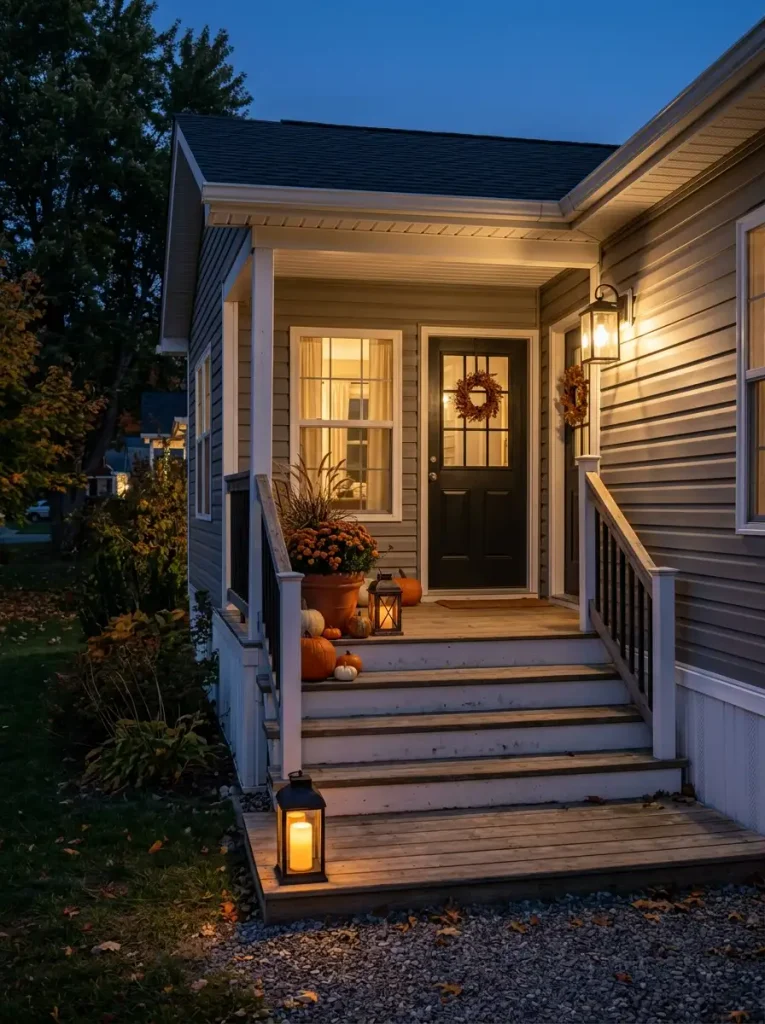
Daylight styling and nighttime styling are not the same job.
After sunset, a porch can flatten into one dark surface even when the flowers and pumpkins looked beautifully layered during the afternoon. Light restores that depth.
Think in three visual planes.
- Near: a low outdoor-rated LED lantern can illuminate a pumpkin or edge of the porch floor.
- Middle: another restrained light source near a planter or seating zone gives the eye something to register before it reaches the doorway.
- Back: the existing porch fixture or softly illuminated interior establishes the final layer.
Those points do not need equal brightness. In fact, uniform light can make the scene feel less atmospheric. A brighter wall fixture and gentler low lanterns often produce a more natural progression.
Choose outdoor-rated products appropriate for the location and follow their use instructions. Around dried leaves, straw, branches, textiles, or other combustible seasonal material, LED candle-style lighting is a much more practical choice than an exposed flame.
Keep glare out of the equation too. A lantern that shines directly into someone’s eyes from the stairs is poorly positioned regardless of how pretty it looks from one camera angle.
At dusk, the entrance should reveal itself in stages.
19. Carry the Porch Theme to the Walkway for Fuller Curb Appeal
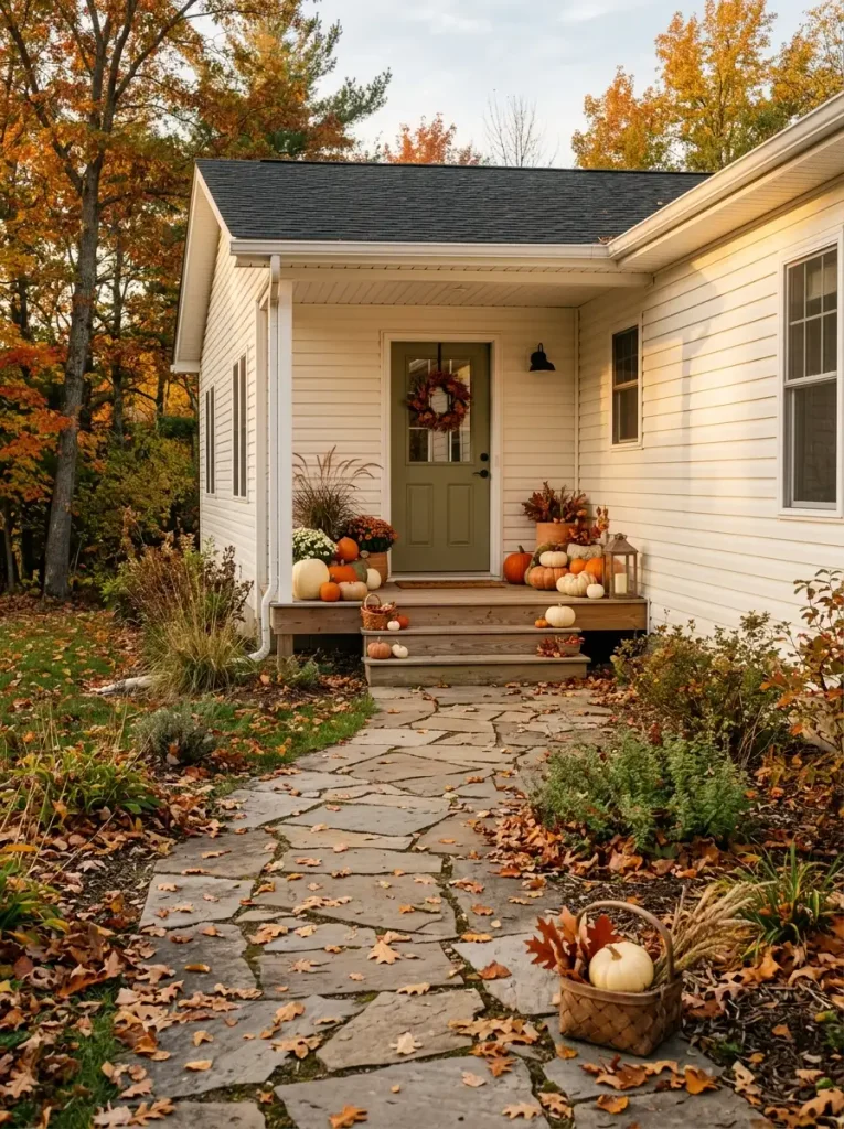
The first view of your porch may begin twenty feet before the front step.
From that distance, small wreath details and individual pumpkins disappear. Larger relationships survive: the door color, one dominant porch accent, and any seasonal cue repeated along the approach.
Use that distance to connect the entrance with the walkway.
Suppose the porch features cream pumpkins and rust-colored foliage. A small basket with one cream pumpkin near the beginning of the path can echo the palette without becoming a second porch display. If grasses dominate the doorway, a modest clump of similar texture near a walkway planter may provide the connection.
The repetition should become lighter as it moves away from the house.
Think of the porch as the destination. The steps carry a supporting note. The walkway receives only a hint.
Repeating every decoration at ground level weakens that hierarchy and can make the yard feel staged. One material or color is enough to establish continuity.
This works especially well when a mobile home has a longer front elevation or detached walkway that makes the porch feel visually separate from the yard.
Stand at the curb when you finish. Your eye should find a seasonal clue, follow it toward the steps, and land naturally at the door.
Bringing Your Fall Mobile Home Porch Decor Together
A small porch does not need all 19 ideas at once. Start with the part of your entrance that has the clearest opportunity.
For a tiny landing, a strong wreath, layered threshold, or one asymmetrical cluster may be enough. A deeper porch can support seating, taller planters, or evening lighting. Wider entries benefit most from decisions that acknowledge the scale of the façade.
Choose two or three interventions that solve different problems, then view the porch from both the doorway and the curb before adding anything else.
The best fall mobile home porch decor still feels like your home after the seasonal pieces arrive—just warmer, richer, and ready for autumn.
Save the ideas that suit your porch now, and come back to the others as the season changes.