Walking into a cramped room feels heavy. But the size of the room usually is not the problem. The layout is.
You buy furniture you love. You plan everything out in your head. But once it is in your home, the walls feel like they are closing in. You trip over table legs. You feel trapped in your own living area.

This happens to almost everyone. We naturally arrange things based on old habits. But those habits do not work in tight square footage.
We will show you how to fix common layout, color, and scaling errors. You can instantly double the perceived size of your home. You do not need to knock down walls. You just need to avoid the small space decorating mistakes that make rooms look smaller.
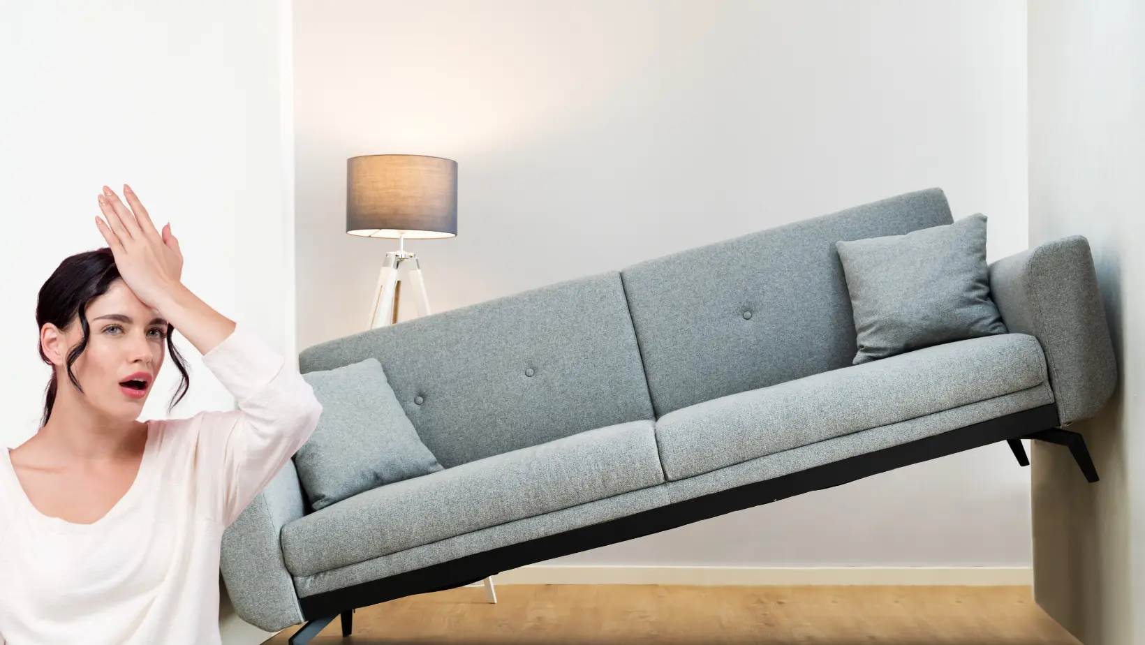
1. Why Choosing Extremely Large Sofas Shrinks Your Room
Visual Airflow Simulator
Test how furniture footprints impact perceived space.
It makes sense to want a big cozy sofa. You want a comfortable place to rest after work. But a massive sectional eats your floor plan.
Scale matters in compact spaces. Bulky furniture pushed flat onto the floor looks heavy. Your eye stops at a solid base and blocks visual flow.
Furniture with exposed legs creates visual airflow. You can see the floor continuing underneath the piece. This tricks your brain into seeing more space.
This fits the 2026 shift to multi functional, modular furniture rather than oversized matching sets. Nearly 49% of consumers now use apps for virtual room planning. You can use an AR app to test scale before you buy.
Core Takeaway: Swap solid blocks of furniture for pieces with legs.
Instead of a bulky coffee table, try these options:
- Glass top tables
- Nesting tables
- Slim wireframes
These compact living room ideas 2026 will save your floor plan.
2. How Relying Only on Overhead Ceiling Lights Ruins Depth
Design Principle
The Layered Lighting Fix
The Overhead Trap
Single overhead lights cast harsh shadows in corners, creating a gloomy atmosphere.
Visual Shrinking
Shadows visually pull walls inward, making your room feel flat and restricted.
The Depth Solution
Layering ambient, task, and accent lighting gives your eye multiple points of interest.
The Quick Fix
Place a warm bulb floor lamp in the darkest corner to push the shadows back instantly.
You flip the wall switch when you walk into a room. It is the easiest way to light a space. But single overhead lights cast harsh shadows in corners.
Shadows visually pull walls inward. Bad lighting makes your room feel flat and restricted. It creates a gloomy atmosphere. You need layered lighting to fix this.
Interior designers note that layering light sources is the fastest way to add depth to a flat room.
You need ambient, task, and accent lighting working together. This gives your eye multiple points of interest.
Core Takeaway: Add three sources of light at different heights.
Buy a warm bulb floor lamp today. Place it in the darkest corner of your room to push the shadows back. This instantly fixes one of the most common apartment decorating errors.
3. The Problem With Painting Every Wall in Dark Colors
Design Principle 2026
The Cave vs. The Cloud
The Cave Effect
Dark, moody paint colors trap the eye and absorb natural light, making small walls feel tight and restricted.
The Airy Illusion
Soft neutrals do the opposite—they reflect light and visually expand the room, making boundaries disappear.
The Core Takeaway
Paint your main walls a soft warm neutral, like Agreeable Gray, to bounce light and save your floor plan.
Smart Accents
If you want bold color, use an accent wall. Add an oversized mirror opposite a window to multiply the sunshine.
You see a moody dark living room online and love it. It looks rich and cozy on a screen. But dark colors absorb natural light.
Moody rooms are trending in 2026. But they require large spaces to work well. Dark paint colors trap the eye and make walls feel tight. It feels like a cave. This is one of those classic small space decorating mistakes.
Soft neutrals reflect light. They make boundaries disappear. Experts highly recommend soft warm neutrals like Sherwin Williams Agreeable Gray for 2026 interiors.
They bounce natural window light around the room. This makes everything feel airy.
Core Takeaway: Paint your main walls a soft neutral.
If you want bold color, use an accent wall instead. You can also place an oversized mirror leaning against a wall opposite a window to bounce light.
4. Why Pushing All Furniture Flat Against the Walls Fails
Float Your Furniture
Drag the slider to prevent layout mistakes.
The instinct is to clear the center of the room. You want maximum walking space. But this creates a terrible bowling alley effect.
Flat placement makes the room feel vacant but restricted. Your eye goes straight to the empty middle and stops. It feels cold and uninviting.
Pulling furniture in by just a few inches creates breathing room. It establishes functional conversation zones. This prevents major layout mistakes that make rooms look smaller.
Core Takeaway: Float your furniture away from the walls.
Try this quick fix today:
- Pull your sofa three inches forward.
- Place a slim console table behind the floating sofa.
- Use this setup to separate a studio apartment into distinct living and sleeping zones.
5. Forgetting to Look Up and Use Vertical Space
Design Principle 2026
Elevate Your Space
The Floor Trap
You measure rugs and chairs, but floor space is finite. You run out of room quickly when you only look down.
The Visual Ceiling
Low shelves clutter your eyeline and short curtains cut the room in half, making the ceiling feel incredibly low.
Free Wall Real Estate
Walls offer free storage and visual height. You can use vertical storage to double as a home office with a fold-down desk.
The Designer Rule
Draw the eye upward. Mount curtain rods 4 to 6 inches above the window frame and extend them wide to create massive windows.
You focus entirely on the floor when decorating. You measure rugs and chairs. But floor space is finite. You run out of room quickly.
Low shelves clutter your eyeline. Short curtains cut the room in half. These apartment decorating errors make the ceiling feel incredibly low.
Walls offer free storage and visual height. You need vertical storage. You can use vertical wall space to double as a home office with a fold down desk.
Nate Berkus says a home should tell a story. Minimal space does not mean sterile space. Consumer data shows a drop in stark minimalism down to a 29% preference. People want warm and curated spaces without the clutter.
Core Takeaway: Draw the eye upward with clever placement.
Use the designer rule of thumb. Mount curtain rods 4 to 6 inches above the window frame. Extend them 8 to 12 inches wide to create the illusion of massive windows.
Summary and Next Steps
Space Transformation
The Grand Illusion
Master the Lighting
Fix your lighting first to push shadows back and eliminate gloomy, restrictive corners.
Check Furniture Scale
Opt for pieces with exposed legs to allow for visual airflow and reveal more floor space.
Elevate the Eyeline
Lift your curtain rods high above the window frames to visually stretch the walls upward.
The Careful Edit
Editing makes all the difference. Take a look around and spot the heavy pieces stealing your space.
You have the power to make your home feel huge. You do not need a bigger house. You just need a better strategy.
Fix your lighting first to push shadows back. Check your furniture scale to allow for visual airflow. Lift your curtains high to stretch the walls.
Editing carefully makes all the difference in a compact home. Take a look around your living room right now. Spot the heavy pieces. Find the dark corners.
What small space decorating mistakes are you fixing this weekend? Tell me in the comments below.