

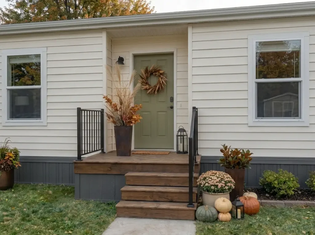
Fall decorating a mobile home exterior works best when you think beyond the front porch. A wreath and a few pumpkins can make the doorway seasonal, but they will not always make the whole home feel pulled together from the street.
That is especially true with mobile homes. Their long, low rooflines, horizontal siding, compact steps, shallow porches, and closely spaced windows create a different decorating challenge from a deep farmhouse porch or a large suburban entry.
Good fall mobile home exterior decor should help the front door stand out without burying the architecture beneath pumpkins, signs, garlands, and lanterns. The goal is a warm entrance that still feels balanced when you step all the way back to the driveway or street.
This makeover starts there—from a distance. You will first decide where the eye should land, then clear what is already fighting for attention, build a stronger doorway focal point, and finally layer the porch from the ground up.
By the end, the exterior should feel unmistakably autumnal without looking crowded or expensive.
Judge the House From the Curb Before You Decorate
Before you bring out a single pumpkin, walk far enough away that you can see most of the front of your mobile home at once.
This distance tells you something standing on the porch cannot: where your eye naturally lands first.
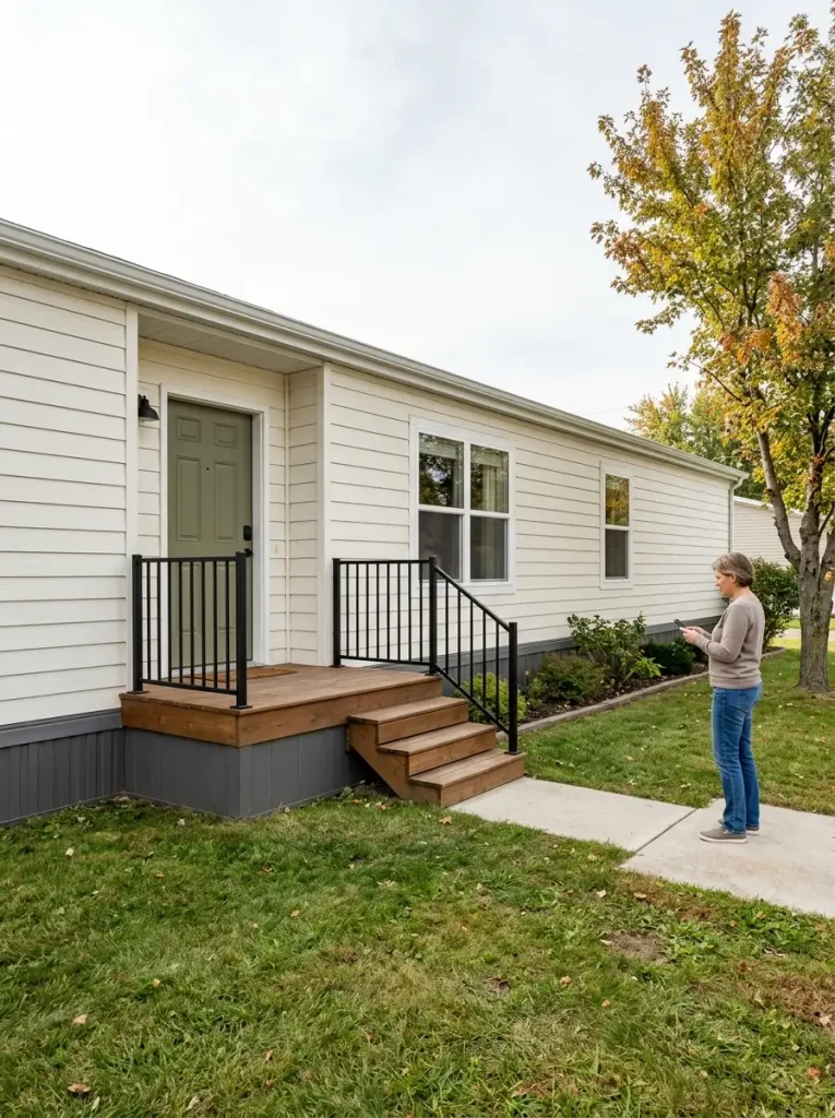
On many mobile homes, the strongest existing lines run sideways. The roof edge, siding, skirting, windows, and porch rail can all reinforce the home’s length. If seasonal décor is then scattered evenly from one end to the other, the façade may become busier without gaining a clear focal point.
Start by dividing what you see into three visual zones.
The focal zone should normally be the front door and immediate entry. This is where your strongest fall color, largest decorative grouping, and clearest seasonal statement will eventually go.
The support zone might include the nearest front window, one section of porch railing, or a planter farther along the façade. It should visually connect to the entry without competing with it.
The quiet zone is deliberately under-decorated. It lets the siding, landscaping, windows, and architecture breathe.
You do not need equal amounts of décor in all three areas.
In fact, that is usually the mistake.
If your front door currently disappears into a long stretch of siding, make a mental note that later steps will need to increase its visual weight. If the porch already contains several planters, chairs, signs, or rail decorations, your first improvement may actually be subtraction.
The curb-view test
Stand where a visitor would first see the home and ask:
- Where does my eye go first?
- Is the front door obvious?
- Which existing object already has too much visual weight?
- Is there a large area that can remain intentionally quiet?
- Would another decorative cluster connect the façade—or simply create another focal point?
Take a quick phone photo if it helps. A photograph often makes visual imbalance easier to spot because you stop seeing the home as a collection of familiar objects and start seeing it as one composition.
Your first decorating tool is distance. If the exterior works from the curb, the smaller details will feel much more intentional when someone reaches the porch.
A successful fall exterior usually has one dominant seasonal zone, one quieter supporting zone, and enough undecorated architecture between them to keep the façade readable.
Clear the Summer Layer and Reset the Entry
Once you know where the fall focal point will be, resist the urge to start decorating immediately.
First, reset the space.
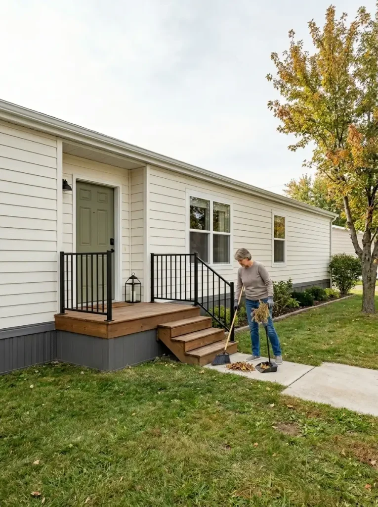
Seasonal displays often look cluttered because new décor gets layered over whatever was already outside. A tired summer planter stays beside the steps. A faded welcome sign remains near the door. Garden tools lean against the skirting. Then pumpkins, mums, lanterns, and a fall wreath arrive on top of all of it.
The problem is not necessarily that you own too many fall decorations.
The problem is that the old visual layer never left.
Use a simple four-part edit.
KEEP
Keep objects that are useful, attractive, or neutral enough to work with the fall scheme. A black lantern, wood bench, galvanized planter, neutral doormat, or healthy green plant may transition beautifully into autumn.
MOVE
Move pieces that are useful but currently occupy an important decorating zone. A utility item beside the door may simply need a less visible home.
REMOVE
Remove faded summer wreaths, broken pots, empty containers, overly bright seasonal leftovers, clutter around the steps, and anything covering an architectural feature you need to see.
ADD LATER
Only after the space is clean should you decide whether another planter, pumpkin group, wreath, lantern, or textile is actually necessary.
Then physically reset the entry.
Sweep the porch and stairs. Wipe the front door. Clean the glass around the entrance. Empty dead plant material from pots. Straighten the doormat. Clear leaves and debris from corners.
These are small jobs, but they matter because fall décor cannot create curb appeal if the underlying entry still looks neglected.
When you finish, the porch may look temporarily plain.
That is exactly what you want.
You should now be able to see the true shape of the door, railing, steps, porch floor, and surrounding siding without decorative interference.
Do not buy anything until this reset is complete.
Make the Front Door the Fall Focal Point
Now you can add the first real seasonal layer.
And it should start with the door.
For most mobile homes, the entrance is relatively small compared with the width of the overall façade. That means the doorway needs enough visual weight to compete with long horizontal siding and nearby windows—but not so much decoration that the entry becomes buried.
A useful formula is:
Door Anchor + Ground Support + Breathing Space = Clear Fall Focal Point
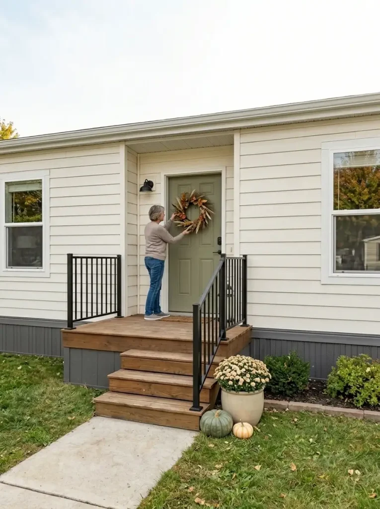
1. Choose one clear door anchor
A wreath is often enough.
It does not need to be enormous, heavily decorated, or packed with every fall color. A natural-looking wreath with dried leaves, muted berries, grasses, small branches, or warm foliage can establish the season without visually shrinking the door.
If your door already has a strong color—olive green, charcoal, navy, burgundy, or warm wood—let some of that color remain visible.
The door itself should still be part of the composition.
2. Support it near the ground
Next, add visual weight lower down.
This could be:
- one substantial planter
- two or three grouped pumpkins
- one outdoor lantern
- a textured doormat
- a small mum arrangement
You do not need all five.
The point is to connect the upper door decoration to the porch floor so the wreath does not feel like a single isolated object floating against the siding.
3. Leave visible space around both
This is the part that often makes an exterior look more polished.
Do not fill every inch beside the doorway.
Let siding show. Leave part of the porch floor open. Keep the doorframe readable. If there is a railing, allow sections of it to remain completely undecorated.
Negative space gives the strongest objects more authority.
Watch the visual competition
Stand back again.
If the wreath is the first thing you see and the door disappears behind it, the wreath is probably too large, too bright, or too busy.
If a tall sign beside the entrance pulls your eye away from the door, reduce its contrast or remove it.
If both sides of the doorway have identical stacks of pumpkins, identical lanterns, identical planters, and identical bows, the symmetry may start to feel more like a store display than a lived-in home.
Balance does not always require duplication.
One side can carry a taller planter while the other stays lower with pumpkins and a lantern. The overall visual weight can still feel balanced without becoming perfectly mirrored.
From the curb, your eye should now land at the doorway first.
That is your signal to move on.
Build the Porch Composition From the Ground Up
Once the doorway has a clear focal point, build the lower half of the entry in order of visual weight, not by placing small decorations wherever an empty spot appears.
This is where pumpkins, planters, lanterns, and seasonal flowers can make a small mobile home porch feel layered—but only if they behave like a group.
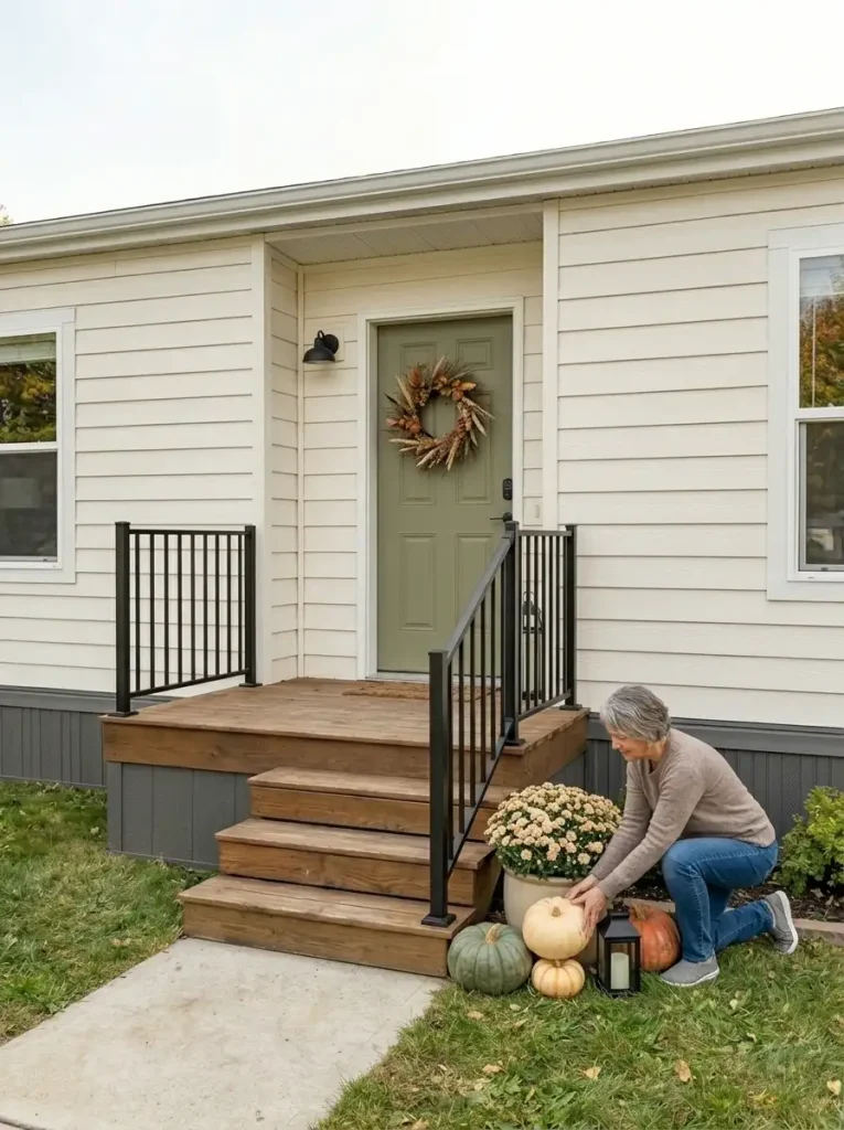
1. Place the largest grounded element first
Start with whatever has the most visual mass.
That might be a tall planter, a large pumpkin, a substantial mum, or an existing outdoor container you are reusing.
Place it near an architectural edge: beside a doorframe, at the outer corner of the porch, or close to where the railing begins.
Avoid dropping the largest object randomly in the middle of the porch floor.
It should help define the boundary of the composition.
2. Add one medium supporting layer
Next, introduce something noticeably different in scale.
If your largest item is a planter, place one or two pumpkins near its base.
If your anchor is a large pumpkin grouping, a medium lantern may create the vertical change you need.
The objects should feel connected rather than evenly spaced.
A little overlap often looks more natural than a row.
3. Fill only the obvious gap
Now step back.
Look for one place where the composition appears visually unfinished.
That is where a smaller pumpkin, compact lantern, low basket, or another quiet seasonal detail may help.
Do not automatically fill every gap.
Some gaps are what make the arrangement readable.
4. Recheck the walking line
Before deciding that the porch looks finished, use it.
Walk up the steps while carrying a bag. Open the door fully. Reach for the railing. Imagine setting down a package.
Nothing should require you to sidestep décor.
This matters even more on compact mobile home steps, where losing a few inches of usable surface can make the entry feel cramped very quickly.
If your display narrows the stair path, remove the smallest decorative piece first. It is usually contributing the least visually while taking up valuable functional space.
Avoid the pumpkin staircase
One pumpkin on every stair tread often seems like an easy fall decorating formula, but on a small entry it can exaggerate the steps rather than strengthen the front door.
A better approach is to create one intentional cluster at a safe edge of the entry and allow several stair surfaces to remain completely open.
The same rule applies to lanterns.
Three lanterns of slightly different heights grouped together usually create more visual impact than three lanterns separated across the entire porch.
You are looking for clusters, not dots.
When the ground layer feels substantial enough to support the doorway but the stairs and porch still feel open, stop.
The next improvement should not be another pumpkin.
It should be height.
Add Height to Balance the Long Mobile-Home Roofline
Once the doorway and ground-level grouping feel settled, look at the exterior from farther away again.
You may notice that the lower half of the entry now feels warm and finished, while the overall façade still reads as long and flat.
That happens because mobile homes naturally contain strong horizontal lines: siding courses, roof edges, skirting, porch rails, and rows of windows all move the eye sideways.
The next layer should create just enough vertical movement to interrupt that horizontal pull.
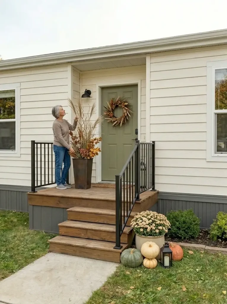
But taller does not automatically mean better.
The right height depends on how deep your porch is, how close the entry sits to nearby windows, and how much visual room exists beneath the roofline.
If your porch is shallow, keep the vertical layer narrow
A compact entry can be overwhelmed by bulky corn stalks, oversized branches, or two enormous matching planters.
Instead, try one narrow vertical element.
A tall planter with airy branches, dried grasses, or upright fall foliage can create the height you need without taking over the porch floor.
Place it close to an existing architectural vertical such as:
- the outer edge of the doorframe
- a porch post
- the beginning of the railing
- a corner where the siding changes direction
That relationship matters.
A tall object placed alone in the middle of a wall often looks accidental. The same object placed beside the doorway can visually extend the entrance upward.
If you have a deeper porch, you can build a fuller vertical group
A deeper landing gives you more room to use height and width together.
You might pair a substantial planter with:
- tall natural branches
- ornamental grasses
- dried fall stems
- upright foliage
- a secondary lower pumpkin grouping
The taller element should still read as support for the entry, not as a separate seasonal feature.
Step back before adding a matching arrangement on the opposite side.
Two identical tall planters can work when the architecture is already strongly symmetrical, but they are not automatically necessary. One stronger vertical accent and one lower supporting group often look more relaxed and collected.
Watch nearby windows
Mobile-home façades may place windows relatively close to the entry.
Do not use tall décor simply because you have wall space.
If a branch arrangement visually cuts across a window, hides trim, or makes the exterior feel compressed, lower it or move it closer to the door.
Windows are part of the architecture you are trying to improve.
They should not disappear behind the seasonal layer.
Use the roofline as your final check
Stand back until you can see the roof, door, and full vertical accent in one view.
Ask whether the new element pulls your eye upward around the entrance.
If it does, the height is working.
If the first thing you notice is a giant planter or a dramatic bundle of stems, the decorative element has become too dominant.
Reduce either its height, width, or contrast.
The goal is not to make the exterior look taller than it is.
It is to give the eye a short vertical pause before it continues along the length of the home.
Make Your Fall Mobile Home Exterior Decor Read as One Composition
At this point, the entry should already feel finished enough to stand on its own.
Now look at the rest of the façade.
This is where many fall exteriors split into two extremes. Either all the seasonal décor stays packed around the doorway and the rest of the house feels disconnected, or the owner tries to solve that problem by repeating full arrangements beneath every window.
Neither approach is necessary.
The goal is visual echo, not duplication.
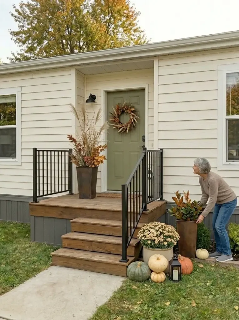
Take two or three colors or materials that already exist at the entry and repeat them in smaller doses elsewhere.
If the doorway grouping contains muted orange pumpkins, olive foliage, warm brown wood, and a little ochre, you do not need another complete pumpkin-and-lantern arrangement at the opposite end of the home.
One restrained echo may be enough.
For example, a secondary planter near a front window might repeat the same dark-green foliage and introduce just one warm orange accent.
That small connection can make two distant parts of the façade feel related.
Repeat colors in different forms
Repetition does not mean buying matching pieces.
An orange pumpkin at the porch might connect visually with rust-toned foliage farther along the façade.
A black lantern near the door could relate to an existing black railing.
A natural wood sign might echo a brown planter or the tone of the porch boards.
This creates coherence without turning the exterior into a matching set.
Keep the strongest contrast near the entrance
Your support zones should be quieter than the door.
If you use the brightest pumpkin, largest planter, strongest plaid, and tallest arrangement beside a secondary window, the viewer suddenly has two competing focal points.
Let the entrance keep the strongest contrast.
As the décor moves away from it, either reduce the size, reduce the quantity, or reduce the color intensity.
Sometimes you only need to change one of those three.
Use the home’s existing architecture as part of the palette
The siding, skirting, railing, porch boards, front door, roof, and window trim already account for most of what the eye sees.
Your fall colors should work with them.
A neutral mobile home with dark skirting may need only a few earthy accents to feel seasonal.
A home with a colored front door may already have a strong autumn-friendly anchor.
Do not treat the house itself as a blank background that has to be covered.
It is the largest element in the composition.
Build a rhythm across the façade
Look from left to right.
You might see:
quiet siding → subtle fall echo → front-door focal point → open architectural space
That is often enough.
What you want to avoid is:
pumpkins → sign → garland → pumpkins → lantern → planter → wreath → another sign → another lantern
When every few feet contains a decorative statement, nothing feels intentional anymore.
The 70/20/10 way to think about it
You do not need to calculate percentages precisely, but the principle is useful.
Let roughly 70% of what you see remain the home and its neutral surroundings.
Let around 20% carry the supporting fall palette through foliage, natural texture, planters, or restrained accents.
Keep the boldest 10% for the seasonal highlights that make the entry feel special.
The exact proportions will change from house to house.
The important part is restraint.
If you can clearly see how one side of the exterior relates to the other without repeating the same arrangement twice, the façade is beginning to work as one composition.
Add Warm Light Where the Exterior Goes Flat at Dusk
A fall exterior that looks balanced in daylight can change dramatically after sunset.
Colors flatten. Dark siding areas become less visible. Porch corners disappear. A beautiful pumpkin grouping can turn into one dark shape beside the steps.
That does not mean the house needs strings of lights everywhere.
Wait until dusk, turn on the exterior lighting you normally use, and look at the home from the same approach you used earlier.
Where does the eye go now?
If the doorway still reads clearly and the porch has enough warmth, you may need very little additional light.
If the entrance disappears while one bright fixture dominates everything else, add light only where it improves the hierarchy.
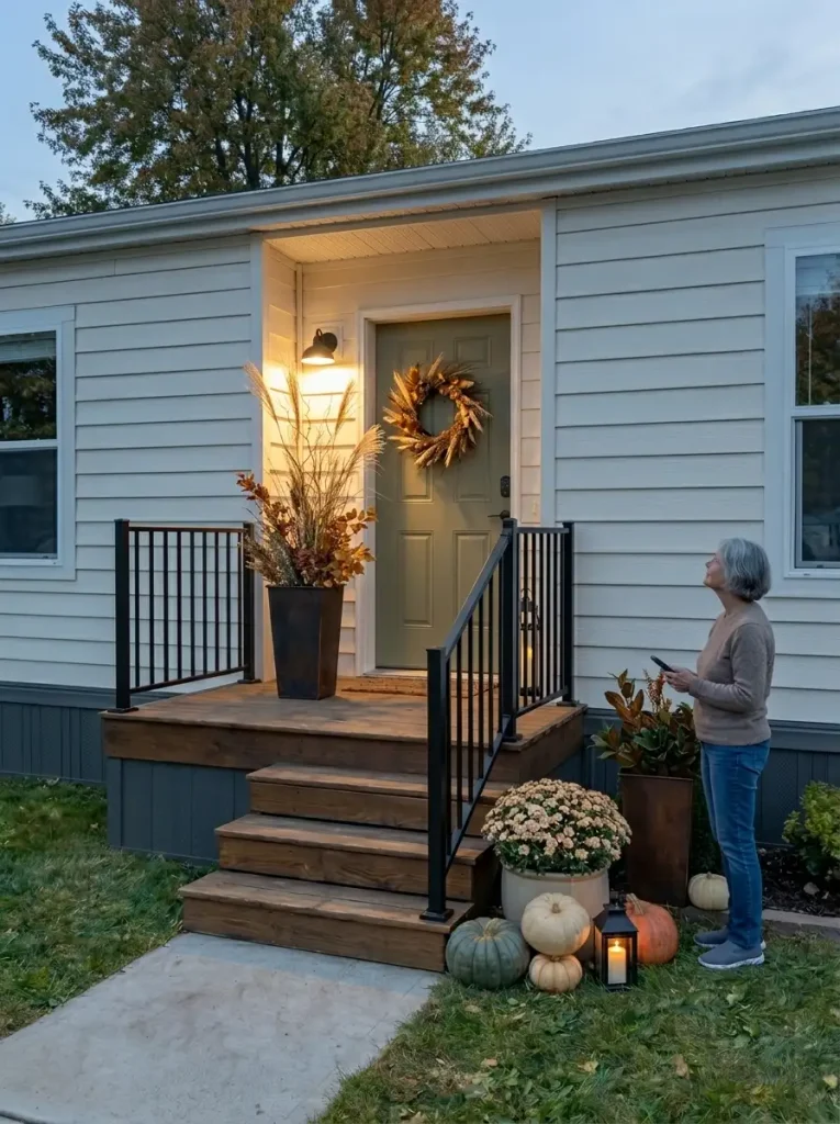
Light the composition, not every decoration
Think about the entry as one larger scene.
A warm lantern near the pumpkin grouping can make several objects readable at once.
A subtle outdoor-rated light near a planter can reveal texture and height.
Existing porch lighting may already provide enough illumination around the wreath and front door.
You do not need one light source for every pumpkin, sign, pot, or stair.
Too many small light points can turn a calm fall exterior into visual static.
Keep the brightest area close to the door
The front entrance should remain the easiest part of the façade to read after sunset.
If a bright decorative light farther along the house competes with the porch, either reduce it or relocate it.
Your nighttime hierarchy should still resemble the daytime hierarchy:
front door first → support second → quiet exterior third
Watch the color temperature
Warm light generally works naturally with fall colors such as rust, cream, brown, ochre, and deep green.
But the goal is not to make the exterior orange.
If several different light sources create noticeably different colors, simplify them where practical so the entry does not appear patchy.
Turn half of it off
If you are unsure whether you have added too much lighting, switch off about half of the decorative sources and look again.
Does the façade suddenly feel calmer?
Can you still see the steps clearly?
Does the doorway still feel warm?
If yes, you probably did not need the extra layer.
Lighting should reveal the arrangement you already built.
It should not be responsible for making a weak arrangement look finished.
Use products only in locations and conditions for which they are designed, and keep cords or other components out of normal walking paths.
Once the front door feels welcoming and the darker areas around it still have some depth, stop.
A little shadow is useful.
It gives the illuminated entry somewhere to stand out.
Secure the Display for Wind, Rain and Everyday Use
Before you call the project finished, stop judging it only as décor.
Judge it as part of a home people actually use.
A pumpkin that sits beautifully near the edge of the steps on a calm afternoon may roll or shift after bad weather.
A lightweight sign may become unstable in wind.
A planter that looks perfectly positioned may interfere with the handrail once someone actually climbs the stairs carrying groceries.
The final adjustment is therefore practical.
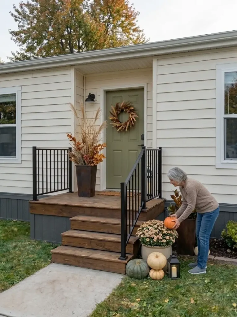
Problem: the walking path feels narrower
Likely cause:
The ground-level cluster has gradually expanded as smaller objects were added.
Fix:
Remove the smallest accessory first, then tighten the remaining group closer to the architectural edge.
Do not simply push everything closer together if that makes the cluster look cramped.
Recheck:
Walk up and down the steps naturally. You should not need to rotate your body or step around the décor.
Problem: the railing is technically visible but awkward to use
Likely cause:
A tall planter, branches, garland, or lantern sits inside the normal hand position.
Fix:
Move the object away from the grip zone or lower its height.
The railing should function as a railing, not as a decorating surface that happens to have a little usable space left.
Recheck:
Use the rail as you normally would.
Problem: lightweight décor keeps shifting
Likely cause:
An accessory is too exposed for its weight, base, or location.
Fix:
Move it to a more sheltered position, choose a more stable piece, or use an appropriate securing method for the specific item and surface.
Do not let a styling choice create a repeated maintenance problem.
Recheck:
The arrangement should remain stable under normal seasonal conditions for your location.
Problem: the door no longer opens comfortably
Likely cause:
The doormat, basket, planter, or pumpkin grouping has crept into the door swing or landing area.
Fix:
Re-establish the full functional door zone first, then rebuild the decorative edge around it.
Recheck:
Open the door fully several times.
Problem: one accessory needs constant protection from rain
Likely cause:
An indoor-style material is being used in a location where it cannot realistically stay protected.
Fix:
Move it farther under cover or replace it with a more suitable outdoor piece.
A seasonal display should not require you to rescue half of it whenever the weather changes.
Problem: the exterior photographs well but feels annoying in daily life
This is the most useful warning sign of all.
Something may be visually attractive and still be wrong for the space.
If you repeatedly move an object to receive a package, sweep the porch, reach the railing, open the door, or walk up the stairs, that object has failed its functional test.
Remove or reposition it.
A successful fall exterior should become easier to enjoy after you decorate it—not harder to use.
By this point, every object should earn its place twice:
It should help the composition, and it should respect how the entry actually works.
Walk Back to the Street—and Remove What the House Does Not Need
The final step takes you back to the same place where this makeover started.
Leave the porch.
Walk toward the driveway, sidewalk, or street until you can see the front of the mobile home as one complete composition again.
At this distance, individual pumpkins matter less.
You are judging relationships now.
The front door, porch, windows, siding, landscaping, seasonal décor, and open space should all feel as though they belong to the same exterior.
Find the front door first
Look at the house for only a second or two.
Where does your eye land?
Ideally, the entrance still wins.
Not because it has the largest wreath or the most pumpkins, but because several smaller design choices now work together:
- the door has a clear seasonal anchor
- the ground grouping supports it
- taller elements draw the eye upward
- repeated colors connect the wider façade
- warm lighting reinforces the same hierarchy after dark
- quieter areas prevent the exterior from becoming visually flat
If another object now commands more attention than the entrance, identify why.
A bright sign may have too much contrast.
A secondary planter may be too large.
A tall branch arrangement may have become more noticeable than the doorway.
A line of pumpkins may be pulling the eye sideways.
Do not solve that problem by adding something else to the door.
Reduce the competing element first.
Check the visual weight from left to right
Now scan the façade slowly.
The eye should move naturally through the exterior rather than repeatedly stopping at unrelated decorative islands.
A successful sequence might feel like:
quiet architecture → small seasonal echo → stronger entry composition → breathing room
Another home might reverse that order.
The exact pattern matters less than the hierarchy.
What should not happen is every portion of the exterior demanding equal attention.
When everything is a focal point, nothing is.
Look for accidental repetition
Fall decorating is particularly easy to overdo because the same objects are available in many versions.
You may have:
- several orange pumpkins
- multiple lanterns
- two or three signs
- repeated bows
- matching planters
- multiple plaid textiles
- several wreath-like elements
Repeated color can help the exterior.
Repeated objects can become monotonous.
Ask what each duplicate is contributing.
If the fourth pumpkin only repeats the same size and color as the first three, remove it.
If the second sign communicates nothing new visually, take it away.
If another lantern does not improve the nighttime hierarchy, the composition probably does not need it.
Photograph the finished exterior
Take one photo from the original curb-view position.
If possible, compare it with the photograph you took before decorating.
Do not look only for “more fall décor.”
Look for structural improvements.
Can you identify the front door faster?
Does the entry feel taller and more substantial?
Does the porch appear layered without becoming narrower?
Do colors now travel across the façade more naturally?
Does the house itself remain visible?
Those changes matter more than the number of seasonal accessories added.
Then remove one thing—if the exterior asks for it
You do not have to remove something merely for the sake of minimalism.
But if one area feels slightly crowded, start by taking away the object that contributes the least to:
- focal hierarchy
- height
- color repetition
- texture
- lighting
- function
Step back again.
If the composition becomes clearer, leave the object out.
That is the final edit.
A finished exterior does not feel empty.
It feels resolved.
Judge the exterior from the same distance where you started. The seasonal layer should clarify the home’s entrance and character, not hide them.
A Fall Exterior That Still Feels Like Home
The best fall mobile home exterior decor does not depend on covering every surface with seasonal accessories.
It comes from deciding what the exterior needs first.
Maybe the front door needs more visual weight. Maybe the long façade needs one vertical interruption. Maybe several scattered decorations need to become one stronger grouping. Or perhaps the biggest improvement is simply clearing the porch and allowing a few good pieces to stand out.
Starting from the curb changes the way you decorate because you begin thinking about the entire mobile home rather than one isolated porch vignette.
Then the process becomes much simpler:
clean what is already there, establish the entrance, build the lower composition, add controlled height, repeat a few colors across the façade, introduce warm light where useful, and remove anything that gets in the way of daily life.
The final result should still look like your home.
Just warmer, more intentional, and ready for fall.