

A double wide gives you more breathing room than a narrow mobile home, but that extra width creates a decorating challenge of its own: several spaces can be visible at the same time. A sofa, dining table, kitchen finish, rug, wall color, and entry console may all compete within one long view, even when each choice looks good by itself.
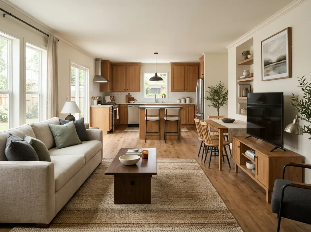
The best double wide decorating ideas solve those relationships first. You do not have to make every room match. A more convincing interior uses enough repetition, hierarchy, and breathing space that one area naturally leads into the next.
Sometimes the improvement is surprisingly small: a larger rug, one repeated finish, quieter wall decor, or furniture shifted enough to restore a comfortable path.
Start with the views that influence several rooms at once. Once those large relationships feel settled, smaller decorative choices become much easier—and the entire double-wide manufactured home begins to read as one thoughtfully finished interior.
1. Decorate the Longest Sightline First
Before choosing another pillow, lamp, or wall accent, stand where your home reveals the most at once. In many double wides, that might be the front door looking toward the living room and kitchen, a sofa facing across the main gathering space, or the kitchen edge looking back through dining and living zones.
What catches your eye first?
If three different things demand attention—a dark television wall, a busy dining centerpiece, and a highly decorated kitchen island—the house can feel visually fragmented even when every individual piece is attractive.
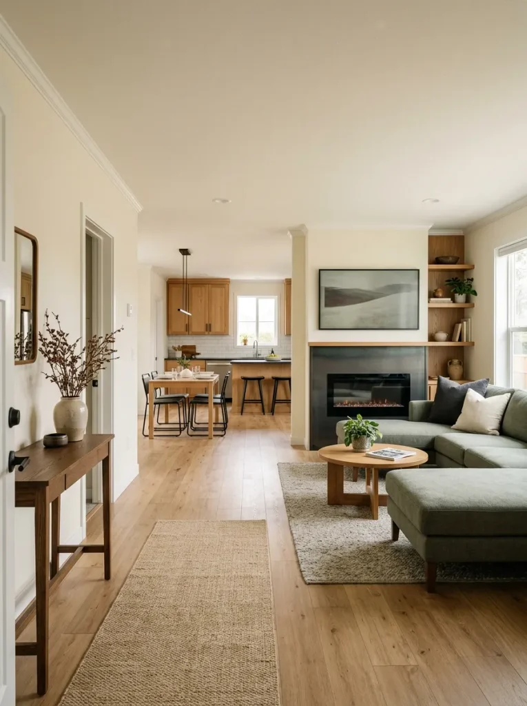
A stronger composition usually has three levels: one anchor, one supporting zone, and one quieter background. The anchor earns attention. The supporting area repeats part of its visual language. The quiet zone gives both somewhere to breathe.
Whole-home sightline mapper
One home. Three views. Three different decorating jobs.
Open the viewpoint that most resembles your double wide. A room can look balanced from one position and overloaded from another.
A View from the front door Best for diagnosing first-impression clutter.
B View from the main sofa Best for testing focal competition.
C View from the kitchen edge Best for checking whether connected rooms speak to each other.
Once the longest view feels coherent, resist the urge to perfect every smaller corner immediately. You have established the hierarchy that the rest of the decorating can support.
2. Build a Whole-Home Palette From What You Already Own
A pulled-together double wide does not require the same paint color, wood stain, or accent shade in every room. Cohesion often begins by noticing which finishes are already doing the most work.
Start with the permanent or expensive pieces: flooring, countertops, large upholstery, cabinetry, and major wood furniture. Mentally reduce them to a small palette. Perhaps the home already contains warm oak, creamy white, charcoal, and muted green. Those four colors can become a framework without becoming a rigid formula.
Give each color a job. One might dominate large surfaces, another can repeat through furniture, a third can appear in metal or frames, and the smallest can carry softer accents.
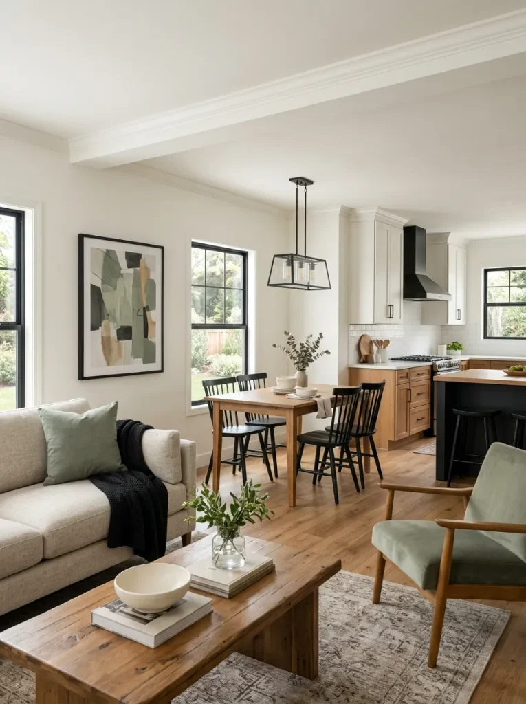
Broad neutral surfaces paired with recurring wood and darker punctuation tend to connect adjoining rooms without forcing them to look identical.
When considering a new purchase, ask whether it strengthens an existing color role or introduces an entirely new visual language. A new color is not automatically wrong, but it should add something the current palette cannot.
3. Ground the Living Room With One Generous Rug
In a wide living area, a rug floating beneath only the coffee table can make the furniture appear scattered across the floor. A more substantial rug gives the seating arrangement a shared visual base, especially when the dining area or kitchen remains visible beyond it.
Look at the sofa and primary chairs as one conversation group. The rug should visually connect that group, not simply decorate the empty floor between the pieces.
Rug decision rule: choose coverage from the seating-zone footprint, not from the dimensions of the entire room.
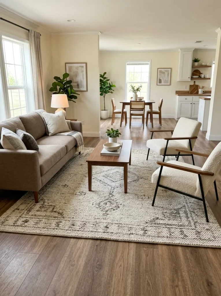
This works especially well in an open double wide because the floor can establish a room boundary without adding a bookcase, screen, or other bulky divider that interrupts the longer sightline.
A patterned rug can carry more energy when the sofa and major walls are quiet. If upholstery, artwork, and curtains already contain strong pattern, a lower-contrast rug usually creates the cleaner foundation.
4. Match Sofa Scale to the Seating Zone
A double-wide living room can contain a generous amount of total square footage, which makes it tempting to buy the largest sectional that seems to fit.
Total room size can be misleading.
The useful measurement is the functional seating zone after circulation is protected. A sectional can technically fit from wall to wall and still swallow the route from the entry to the kitchen, crowd a doorway, or force every other piece onto the perimeter.
Before replacing seating, mark the proposed footprint on the floor with painter’s tape, flattened cardboard, or another temporary outline. Then walk the routes you use every day. Open nearby doors. Stand where a side table would go. Check whether a chair can still turn comfortably toward the conversation area.
If the footprint feels comfortable only while nobody is moving through the room, it is too demanding for that layout.
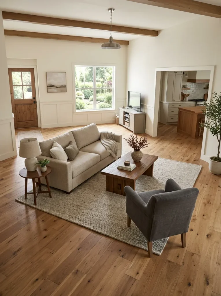
The better sofa is the one that leaves enough negative space for the room to function naturally—not necessarily the one that fills the most wall.
5. Pull Furniture Off the Walls When the Room Needs a Better Conversation Area
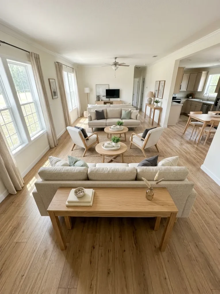
Pushing every piece against the perimeter can create an odd effect in a wide room: a surprisingly large empty center surrounded by furniture that feels disconnected.
Floating furniture does not require a sofa dramatically stranded in the middle of the room. A controlled shift may be enough. A sofa can define the living zone with its back, a chair can turn toward the conversation group, or a narrow console can support a floating edge without making it feel exposed.
Use movement as the deciding factor. The best arrangement creates usable openness, not empty square footage.
How far should the sofa come off the wall?
Useful when the room is genuinely shallow
A wall position can be perfectly sensible when every inch supports circulation. The problem begins when furniture looks stranded around a large unused center.
Often the sweet spot
A modest float can tighten the conversation zone while preserving the longer route through the double wide. The space behind the sofa may also become a clean visual boundary.
Best only when the room can support a real furniture island
A deeper float can create an intentional room-within-a-room, but it needs enough space on multiple sides. Otherwise the arrangement simply trades an empty center for squeezed circulation.
The diagram is conceptual, not dimensional. Test your actual furniture footprint and walking routes before committing to a placement.
The winning position may be only a modest distance from the wall. What matters is whether the shift improves conversation, circulation, and the boundary between connected zones at the same time.
6. Treat the TV and Fireplace as One Focal Composition
Consider a living room where the television sits on one wall, a fireplace occupies the next, family photos fill a third, and a large decorative sign claims the fourth. None is necessarily wrong. Together, they can make four separate focal points compete for the same attention.
Decide which architectural or functional feature deserves to lead.
If the television and fireplace sit close together, visually connecting them can work particularly well. Repeated trim, a shared wall color, a continuous material field, or one larger composition around both can make them read as related parts of the room.
The remaining wall decor can then become quieter.
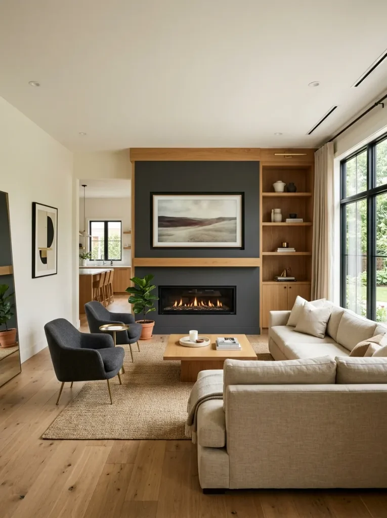
Stop signal: once your eye understands where to look when you enter or sit down, avoid adding another equally dominant statement nearby.
A room can contain substantial furniture and still feel organized when one central wall clearly explains the hierarchy.
7. Use a Dark Accent Wall Where It Actually Adds Depth
Dark walls can look excellent in a double wide, but they are most effective when they solve a visual problem.
A charcoal, deep olive, blackened green, or similarly grounded tone can push one important plane into focus and make lighter furniture stand out. That is particularly useful on a distant wall needing more presence, behind a media composition, or where a broad wall currently feels unfinished.
The exception is a room already carrying several high-contrast elements. Combine a dark wall with black furniture, heavy window treatments, a strongly patterned rug, and dense wall art, and the added color may increase visual pressure rather than improve depth.
Ask one question from the doorway:
Does this wall need to become more important in the composition?
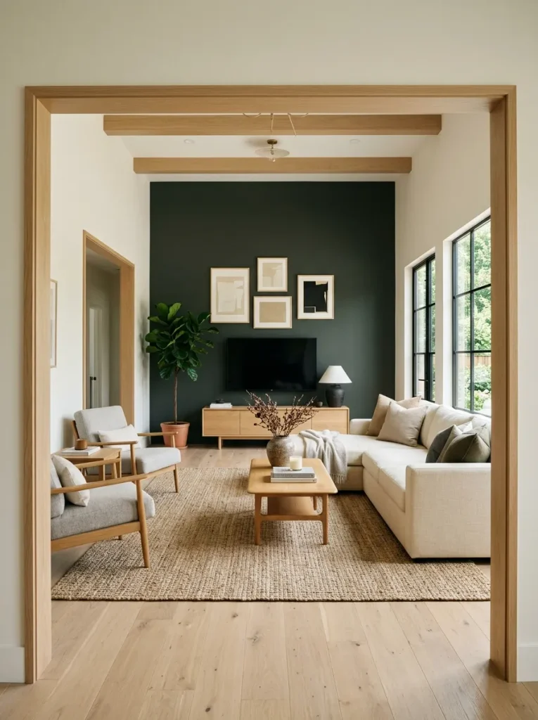
If yes, contrast can help. If the wall already dominates because of a television, cabinetry, architecture, or large art, further emphasis may be unnecessary.
The strongest dark-wall rooms keep the contrast concentrated while allowing flooring, upholstery, windows, or adjoining walls to provide relief.
8. Turn Beams, Trim, and Openings Into Intentional Transitions
Existing architecture can do part of the decorating for you.
A wide opening between the kitchen and living space, exposed beam, substantial door casing, or repeated wood trim can become a visual transition between zones. When a wood-framed opening surrounds the kitchen, for example, it does more than add character—it visually announces that the next space has begun.
Look for a material already present elsewhere in the home. A related wood tone on a dining table, floating shelf, vanity, or console can make an architectural feature feel integrated instead of isolated.
There are three useful directions:
- Emphasize it when the opening naturally frames an attractive connected space.
- Quiet it when several architectural features already compete for attention.
- Repeat its material selectively when the transition feels disconnected from the rest of the interior.
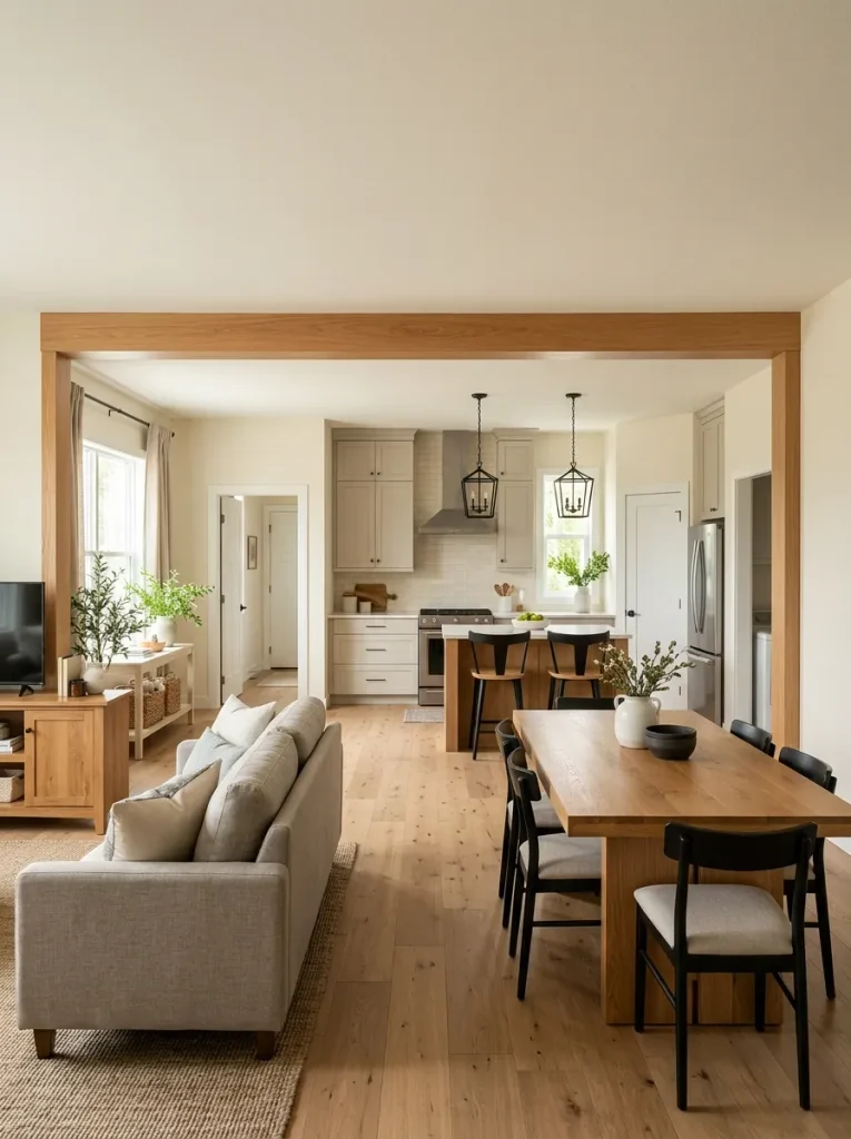
Avoid turning every doorway into a feature. One or two emphasized transitions create rhythm; making every casing equally assertive removes the hierarchy.
9. Hang Window Treatments to Strengthen Height and Softness
Windows often occupy a large share of the wall surface in a double wide, so their treatment affects far more than privacy. Curtains can change how tall, soft, finished, or visually crowded an entire room feels.
Look first at the wall above the window. When a rod sits directly on the trim, the fabric can visually compress the opening. Raising it toward the upper wall often extends the vertical line and gives the window composition more presence.
The trick is restraint.
If several windows are visible from the same living or dining area, dramatically different treatments can disrupt the visual flow. Repeating a similar fabric weight, color family, or hanging height creates a quiet relationship while allowing individual windows to differ.
Use curtains when the room needs:
- softness against hard flooring or cabinetry,
- stronger vertical lines,
- filtered light,
- or greater continuity across several openings.
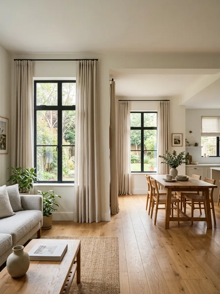
If attractive blinds or shades already leave the architecture feeling clean and bright, additional fabric may add very little. A window treatment should solve a visible need, not simply occupy wall space.
10. Layer Lighting by Zone Across the Open Interior
A double wide can look cohesive during the day and unexpectedly flat after sunset.
One ceiling fixture cannot perform every lighting job across connected living, dining, and kitchen spaces. After natural light disappears, smaller pools of brightness help the eye understand where one activity ends and another begins.
Think in layers:
Kitchen: functional task light.
Dining: a defined glow over the table.
Living area: softer ambient light near seating.
Entry: a welcoming low-intensity source.
Accent areas: selective illumination for artwork, shelving, or architecture.
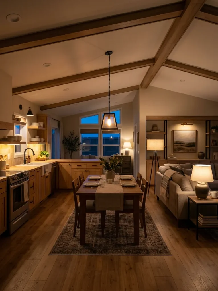
The fixtures do not need to match. They can share enough design language—black metal, warm brass, a similar glass type, related geometry, or comparable visual weight—to feel intentional together.
Try turning off the brightest overhead source one evening and looking across the home. Any zone that disappears completely may need another light layer.
A well-lit double wide should still make spatial sense after dark.
11. Let the Kitchen Carry the Home’s Finish Story Forward
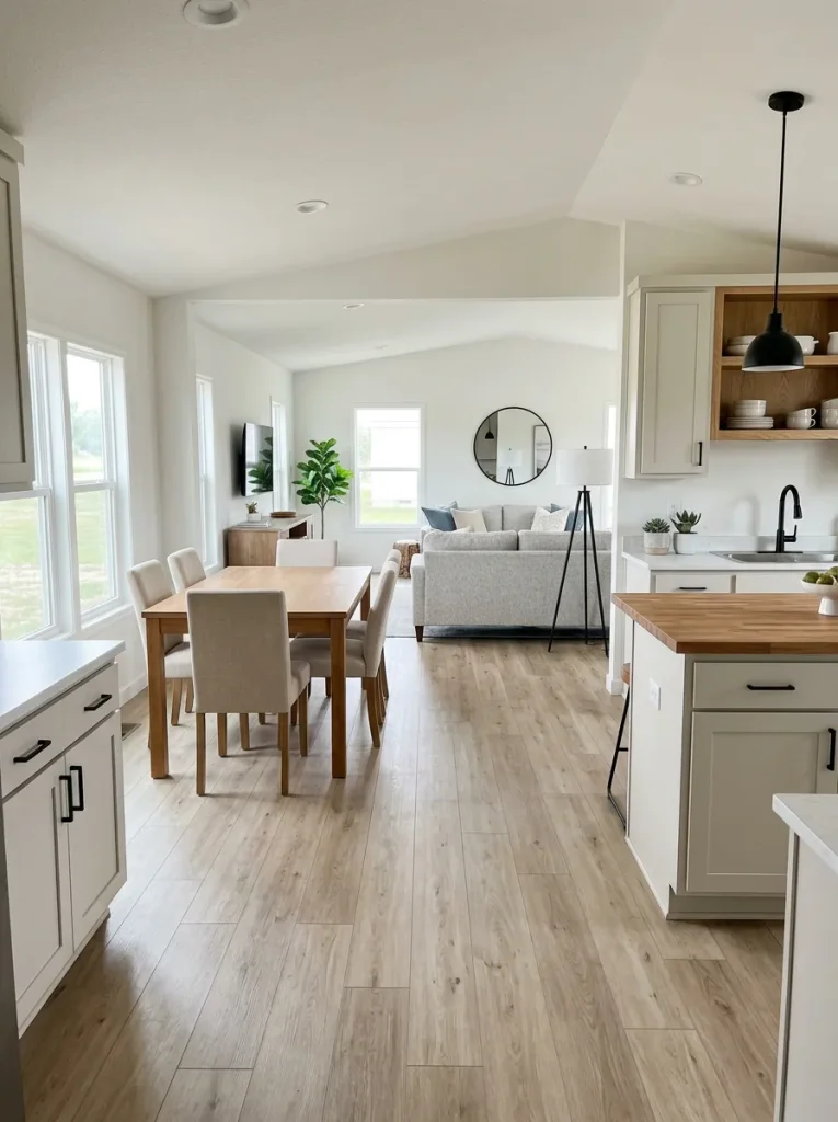
The kitchen is often one of the largest visual blocks in a double wide. Cabinets, counters, appliances, backsplash, hardware, flooring, and lighting can occupy a major portion of the home’s longest sightline.
Because of that, the kitchen should participate in the larger finish story without forcing every adjoining room to copy it.
Start by identifying two or three bridge finishes.
A kitchen with white cabinetry, warm wood, and black hardware might repeat those cues elsewhere through a dining table, picture frames, lighting, or a living-room console.
The repetition should be deliberate but light.
Finish bridge studio
Choose the kitchen finish worth repeating
Select the strongest existing kitchen finish. The result shows how to carry it into connected rooms without making every space match.
Wood shelf / island / trim
Neutral backdrop
Console / table / frame
Repeat the tone, not the exact product
If warm wood already carries visual weight in the kitchen, allow a related tone to appear once or twice beyond it. A dining table, coffee table, picture frame, or console can establish the bridge.
Hardware / fixture
Light surfaces
Frame / lamp / base
Use dark metal as punctuation
Black or charcoal hardware can migrate gently into adjacent rooms through lighting, table bases, frames, or small structural details.
Cabinet / backsplash tone
Textile / wall tone
Contrast retained
Let a light neutral become the background language
A warm white, cream, greige, or soft stone can repeat across large surfaces while furniture and artwork change from room to room.
The kitchen should feel connected to the rest of the double wide while retaining its own functional identity.
12. Keep the Dining Area Visually Light at the Edges
A dining area often occupies transitional territory between the kitchen and living room. That makes its edges unusually important.
Fill every side with a buffet, cabinet, oversized chairs, plant stand, wall shelf, and decorative storage, and a modest dining zone can begin to behave like a barrier between rooms.
Look at the route around the table before decorating the perimeter.
The strongest arrangement may have one visually substantial edge and another left almost empty. A buffet could anchor the wall opposite the kitchen while the side facing the living room stays open. In another layout, the table itself provides enough mass and no additional storage is needed.
Ask this from the living room:
Can your eye travel through or past the dining area, or does the furniture form a visual wall?
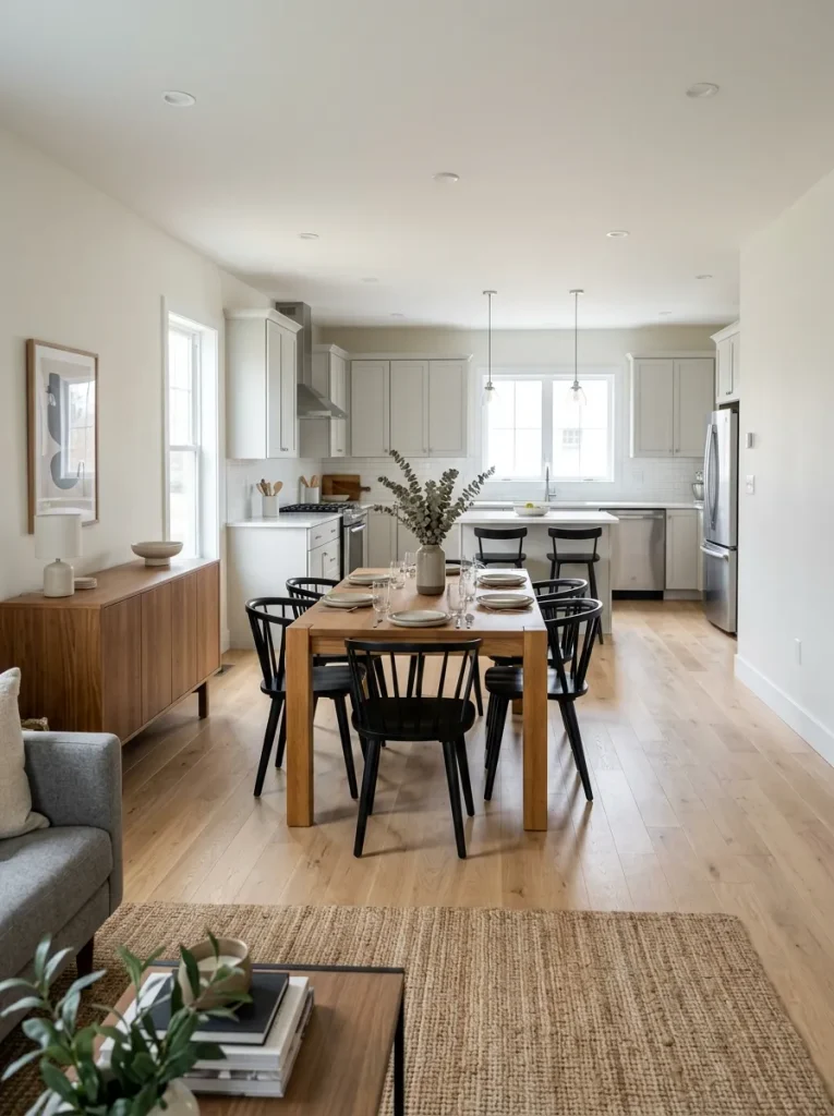
Empty edge space is not wasted space. In an open double wide, it can be one of the reasons the whole interior feels calmer and more generous.
13. Use a Bench When a Dining Zone Needs More Efficient Seating
A bench is not automatically better than dining chairs. Its advantage appears under a specific condition: one side of the table sits close to a wall, window, or circulation edge where chair depth becomes inconvenient.
Picture a narrow dining zone with the table running parallel to a wall. Individual chairs need room to pull backward every time someone sits. A bench can reduce that repeated movement and visually simplify one side of the arrangement.
Check three things before choosing one:
- Who uses the table most often? A bench works more easily when the same household members regularly occupy that side.
- Does it actually reduce circulation pressure? If people still need to pass behind it frequently, the gain may be small.
- Will it remain comfortable during typical meals? Efficiency should not override usability.
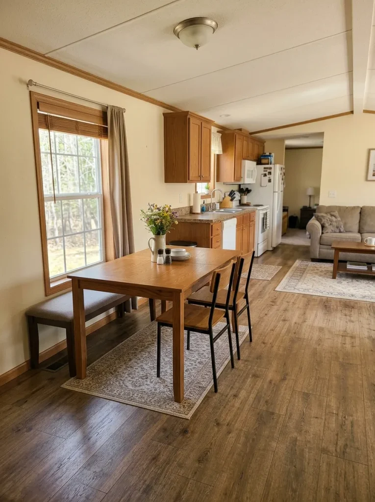
The strongest setup lets the bench behave almost like an architectural edge while movable chairs remain accessible from the open side.
That is when the idea earns the floor space.
14. Build a Slim Entry Landing Strip
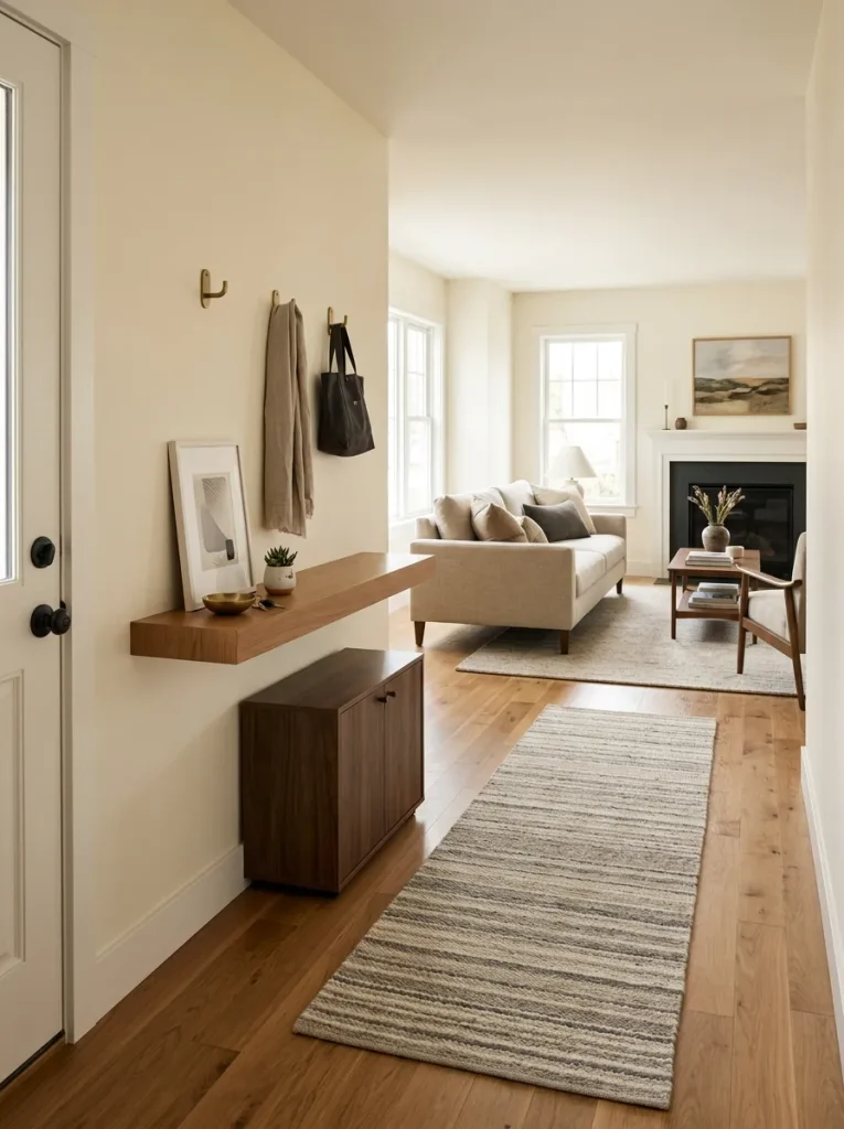
A double-wide entry often opens directly into the living room. Without a dedicated arrival zone, keys, shoes, bags, mail, pet gear, and decorative objects can spill into the first major sightline.
You do not need a full mudroom to solve it.
Assign one shallow edge near the door a clear job: receive what enters the home, then stop it from traveling farther.
Arrival-zone map
Give the doorway one shallow working edge
The objective is not to furnish the entire entry. Concentrate arrival functions while preserving the path into the living space.
A long runner can establish direction while a shallow console gives the wall function without consuming much floor depth.
15. Use a Mirror to Borrow Light Without Multiplying Clutter
A mirror can make an entry or transitional wall feel brighter and more open, but its success depends on something easy to overlook:
What exactly will it reflect?
Place a mirror opposite a bright window, calm wall, attractive artwork, plant, or well-composed room, and it effectively gives you more of that visual asset.
Place the same mirror opposite an overloaded kitchen counter, open storage, exposed television wiring, laundry area, or crowded gallery wall, and it duplicates the visual noise.
Before hanging one, hold it temporarily at the intended height or use your phone camera from approximately the same position. Study the reflected scene—not the frame.
Useful reflection: light, greenery, depth, quiet architecture, or an intentional focal point.
Weak reflection: clutter, utility equipment, competing wall decor, or an awkward secondary view.
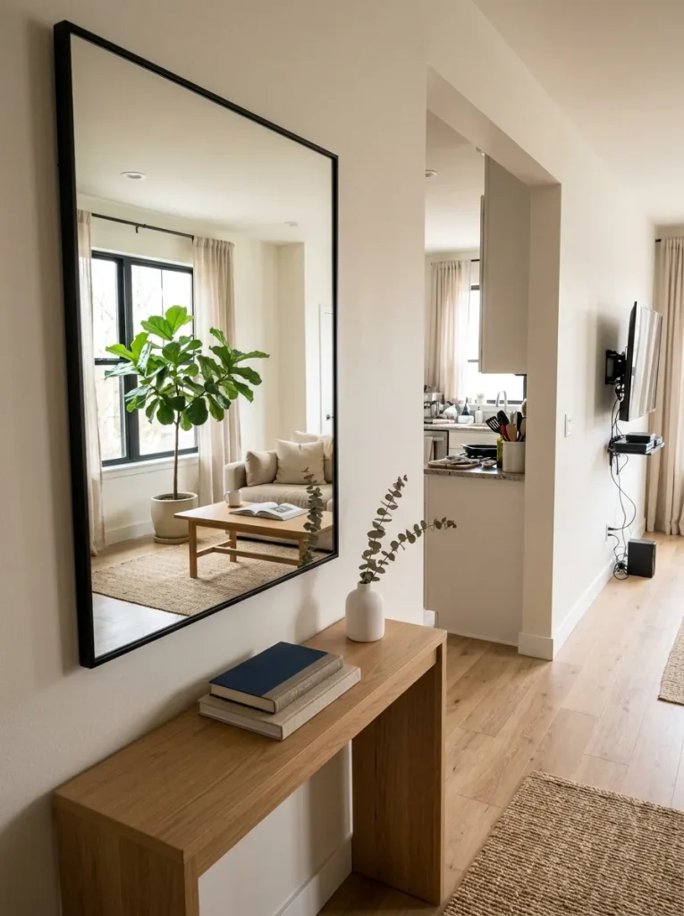
Reflection matters especially in a double wide because one mirror may affect several connected zones. Let it expand one of the home’s strongest views.
16. Continue the Flooring Language Through Connected Spaces
Few elements influence a double wide as strongly as the floor because it runs beneath almost everything else.
When connected living, dining, kitchen, and hallway areas use a visually continuous flooring language, the eye travels farther before meeting a boundary. The home can feel calmer and more unified as a result.
That does not mean every room needs identical flooring.
Use this sequence:
First: preserve continuity across the largest connected public zones where practical.
Then: use rugs to define individual furniture groups.
Finally: introduce a different floor treatment where a genuine functional or visual change deserves a boundary, such as a bathroom or distinctly separate room.
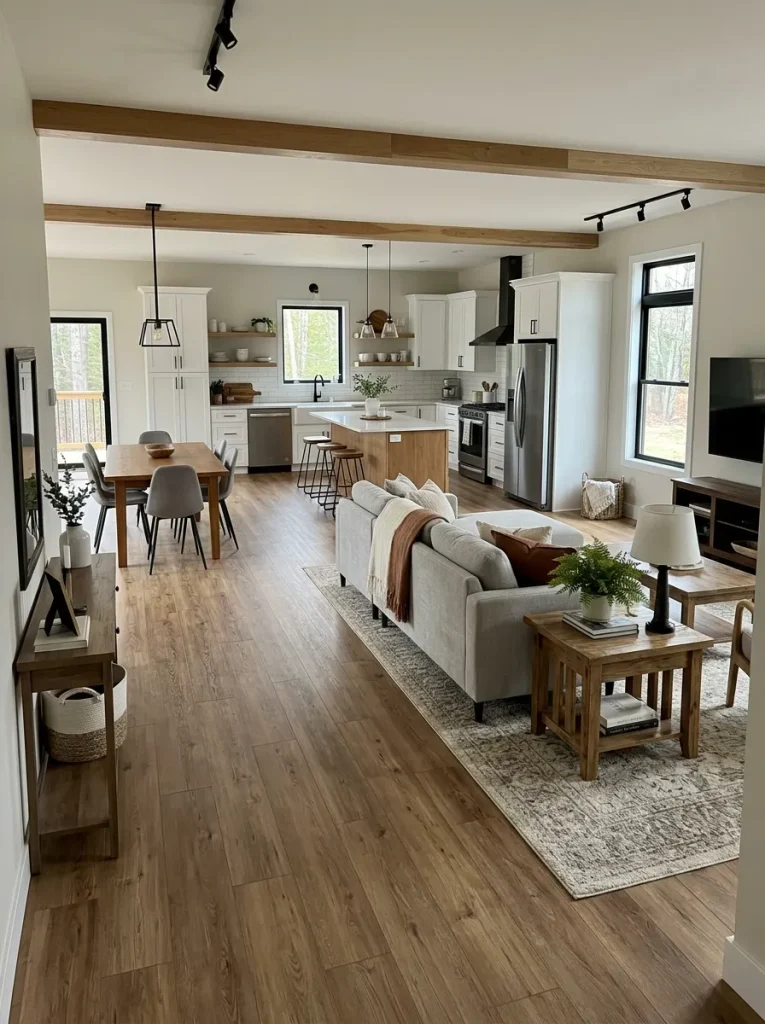
An uninterrupted floor plane often contributes more to perceived spaciousness than another decorative accessory ever could.
If the existing flooring already changes between adjoining spaces, replacement is not automatically necessary. Related undertones, a well-positioned rug, or repeated materials elsewhere can make a transition feel deliberate.
The real decision is whether the transition looks intentional.
17. Take Laundry Storage Up the Wall
Laundry rooms in double wides are often generous enough for full-size appliances but still too compact to waste much floor area on freestanding storage.
The unused opportunity is usually above the washer and dryer.
Upper cabinets can conceal bulk supplies, open shelves can keep everyday products close at hand, and a mixed arrangement can provide both functions.
Before installing anything, start with the appliances themselves. Check how doors or lids open, where hookups and service access are located, and any installation or clearance requirements supplied by the manufacturer. Storage should work around those needs.
Laundry vertical-zone planner
Choose storage based on what you need to hide and reach
Select the storage priority that best matches your laundry routine. Each option uses the same wall differently.
Open shelving favors routine
Use it when detergent, stain supplies, cloths, or baskets need frequent access. Limiting the visible product categories keeps the wall from becoming visually busy.
Cabinets calm a visually exposed laundry room
Closed storage works well when the laundry area is visible from a hallway, kitchen, or other finished zone and you want supplies to disappear between uses.
A mixed wall separates daily from occasional
Hide bulk containers and backup supplies while keeping a smaller working shelf available for the few products used regularly.
Conceptual storage planning only. Preserve appliance operation, service access, hookups, ventilation needs, and any manufacturer-specified installation requirements.
Open shelves favor visibility; cabinets favor visual quiet. A mixed wall works well when you need everyday supplies close but do not want bulk products becoming part of the room’s decor.
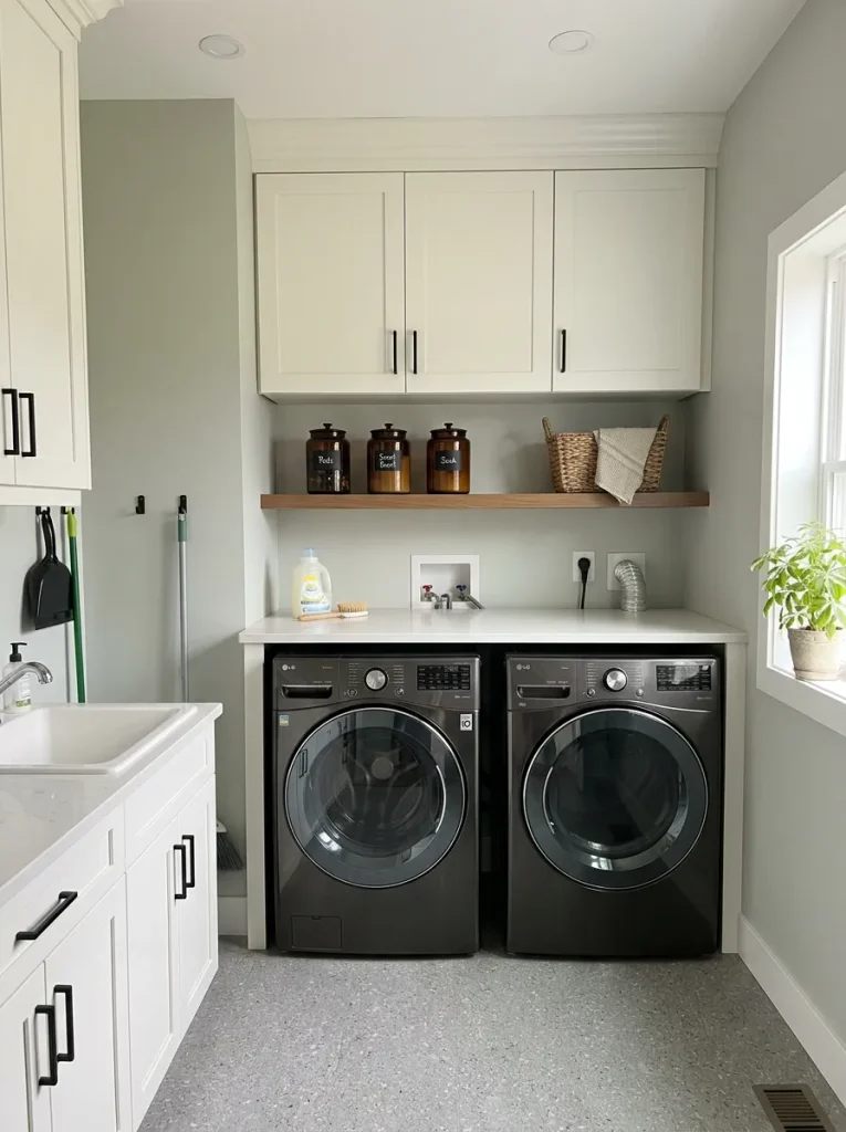
18. Mix Closed Storage With a Few Open Display Zones
Open shelving looks inviting because it reveals texture, ceramics, baskets, books, plants, and personal objects. In everyday life, though, not every belonging improves a room by being visible.
Divide possessions by visual value and frequency of use.
Worth showing
A small group of pieces with shape, color, texture, or sentimental value can make the room feel personal: pottery, books, framed photos, attractive baskets, or a plant.
Better concealed
Backup supplies, cords, paperwork, bulk products, electronics accessories, cleaning materials, and miscellaneous household items usually create more visual noise than character.

Closed storage provides the calm background. Open storage adds selected personality.
That balance becomes especially useful when several rooms are visible simultaneously. Five packed shelves in the living room may visually compete with the kitchen and dining area. One edited shelf can communicate just as much personality with far less pressure on the sightline.
When storage is limited, conceal the things you own in quantity and display the things you genuinely enjoy looking at.
19. Use Wall Decor to Balance Long Blank Stretches
One of the easiest ways to make a broad wall feel unfinished is to cover it with pieces that are individually too small.
A long double-wide wall often needs visual mass, not simply more objects.
Stand across the room and judge the wall composition as a silhouette. Does the art occupy enough space to relate to the furniture below?
Three approaches solve different situations:
- One substantial artwork works when the furniture already contains detail.
- A controlled gallery composition works when personal imagery or smaller pieces deserve to be shown together.
- An architectural treatment or focal wall works when the room needs more structure than decoration.
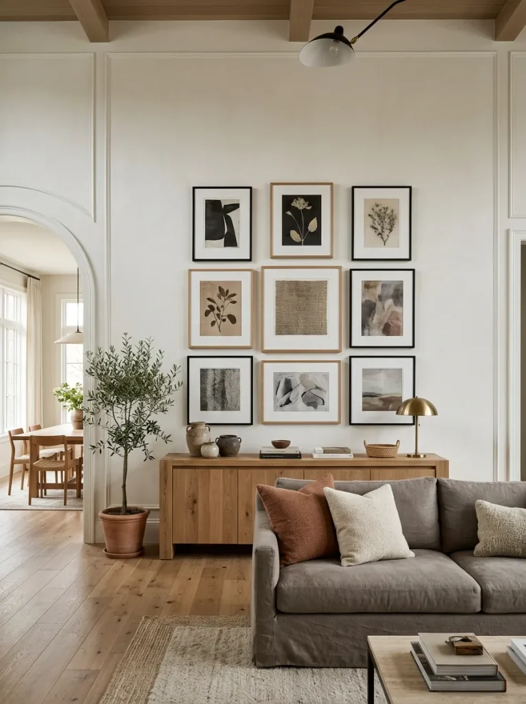
Scattering small frames widely can leave every piece feeling disconnected.
If a console, sofa, or media unit anchors the wall, let that furniture influence the scale and placement above it. The wall and furniture should read as one composition from across the room.
That tells you more than evaluating each frame up close.
20. Give the Bedroom One Dominant Textile Story
Imagine a bedroom with floral curtains, striped sheets, a chunky patterned throw, several printed pillows, and a high-contrast rug.
Each textile may be appealing by itself. Together, they can make the room feel restless rather than layered.
Because the bed usually occupies the largest soft surface, let it establish the textile direction first.
A useful hierarchy is:
1. Main field: quilt, duvet, or coverlet.
2. Supporting texture: throw or blanket.
3. Smaller pattern: pillows or one accent textile.
4. Quiet supporting surfaces: curtains and rug, unless one of those is intentionally the feature.
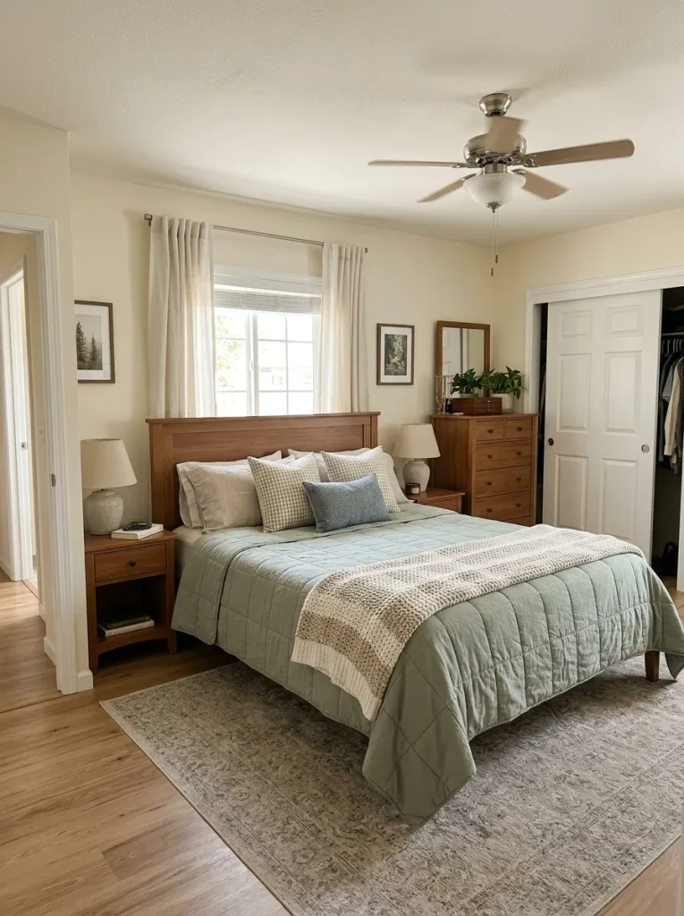
The bedroom does not need to become beige or minimal. It simply needs one textile story to lead while the others support it.
This becomes especially helpful when the room already contains substantial furniture or several doorways. Clear textile hierarchy keeps the soft furnishings from competing with the architecture.
Choose the bedding first, then ask every additional textile what job it is performing.
21. Balance a Patterned Bathroom Floor With Quieter Surfaces
Can a compact bathroom handle a bold patterned floor?
Absolutely—if the other major surfaces give it enough room.
A black-and-white geometric floor, for example, may already provide most of the visual movement the space needs. Warm wood on the vanity can soften that contrast while comparatively restrained walls prevent the room from becoming overloaded.
| If the floor is… | Let the larger surrounding surfaces… |
|---|---|
| High contrast | Stay calmer |
| Geometric | Use simpler shapes |
| Visually busy | Limit competing motifs |
| Mostly neutral | Carry more texture or color elsewhere |
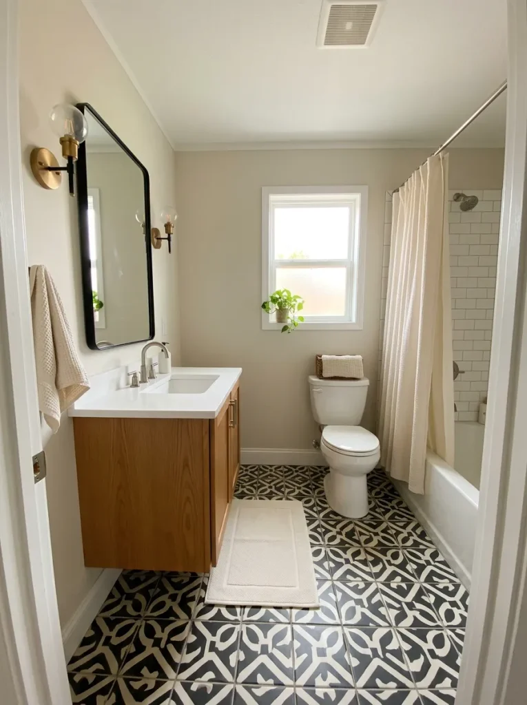
The useful decision is identifying which surface owns the pattern.
If the flooring already performs that job, the shower curtain, towels, vanity, wall treatment, and artwork do not all need equal visual strength.
A quiet wall or vanity is not an unfinished choice in that situation. It is the space that lets the floor look intentional.
If your existing bathroom floor is plain, the hierarchy can reverse and another surface can become the expressive layer.
22. Edit Farmhouse Details Into a More Collected Look
Farmhouse-inspired decorating can work beautifully in a double wide. Warm wood, practical furniture, black metal, woven texture, and comfortable textiles suit the relaxed character of the home.
The style starts losing strength when every available surface repeats the same message.
One sign says farmhouse. Another labels the laundry room. A third labels the kitchen. Script appears on pillows, containers, trays, and plaques. Eventually, the materials become secondary to the wording.
A more collected version keeps the character while lowering the literal theme density.
Style-density spectrum
How literal should farmhouse style become?
Move through the three style states. Preserve warmth and character while deciding how much themed messaging the room actually needs.
The style comes from materials
Wood, practical furniture, woven fibers, simple textiles, and dark metal can communicate farmhouse character without much written decor at all.
Character remains, repetition drops
A few literal farmhouse references can coexist with authentic materials and personal pieces. Because the signs are selective, they read as accents rather than a labeling system.
Theme starts replacing composition
When wording becomes the dominant decorative language, the eye reads messages before materials, architecture, art, or furniture relationships.
If you enjoy changing the home seasonally, keep the evergreen foundation relatively controlled and layer temporary accents over it. For an autumn-specific version of that approach, explore the site’s double wide fall decor ideas guide.
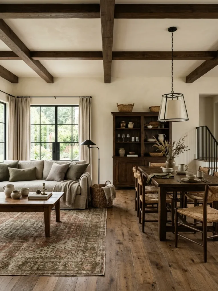
23. Repeat Black Metal or Another Dark Finish as Small Punctuation
A dark finish can connect distant areas of an open double wide surprisingly well because the eye notices repeated contrast quickly.
The useful part is scale.
A black faucet in the kitchen, dark dining-chair legs, a slim lamp base, a picture frame, and one piece of living-room hardware can establish a subtle rhythm across the house. None needs to dominate the room.
Think of the finish as punctuation:
Kitchen: hardware or faucet.
Dining: table base or light fixture.
Living: frame, lamp, or console detail.
Entry: mirror frame or narrow furniture legs.
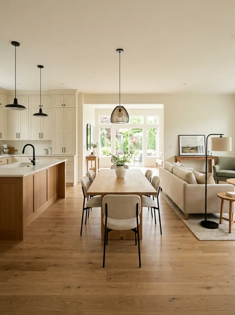
Large dark furniture does not have to appear in every zone for the repetition to work.
If your home already has another consistent structural finish—aged brass, brushed nickel, bronze, or a deep wood tone—the same principle can apply to that instead.
The useful question is not whether everything should match. It is which small finish can repeat often enough to create continuity without becoming a theme of its own.
24. Group Personal Art and Family Photos Into Intentional Displays
Family photos often enter a home one at a time.
A new school portrait goes on one wall. A vacation picture lands on a shelf. A wedding photograph fills another corner. Several small frames collect around the television. Eventually, meaningful pieces are everywhere, yet none has enough visual mass to feel intentional.
Grouping can solve that.
Choose one or two places where personal imagery deserves to become a real feature, then allow other walls to carry quieter artwork or more negative space.
Before hanging a group, check:
- Are the frames related enough in color, material, or visual weight to belong together?
- Does the arrangement relate to the furniture beneath it?
- Can the collection be understood from across the room?
- Are there enough quieter surfaces nearby to let the display matter?
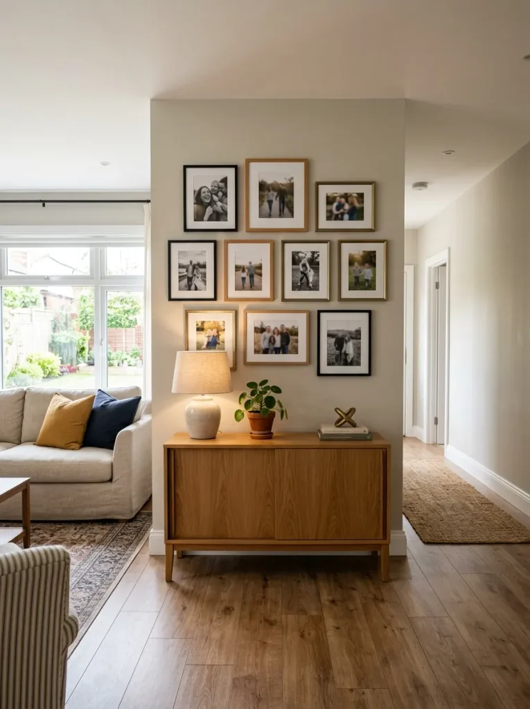
A family-photo grouping above a console can feel far more deliberate than the same photographs distributed across five zones.
Personal decorating should make the house feel more like yours. Concentrating those memories can strengthen that effect because they become a composition instead of background noise.
25. Finish With a Whole-Home Edit Before You Buy Anything Else
Once the major rooms are decorated, the next useful move may be not shopping.
Walk through the double wide from the front door, then repeat the route from the living room, dining area, and kitchen. Each position reveals a different set of relationships.
Correct the issues with the broadest effect first.
Whole-home priority ring
Edit in this order before adding more decor
Correct the issue affecting the largest portion of the home first. Small styling problems often disappear once the bigger relationship is fixed.
This sequence prevents a common cycle: sensing that a room is unfinished, buying another accessory, and accidentally increasing the visual clutter that made it feel unresolved.
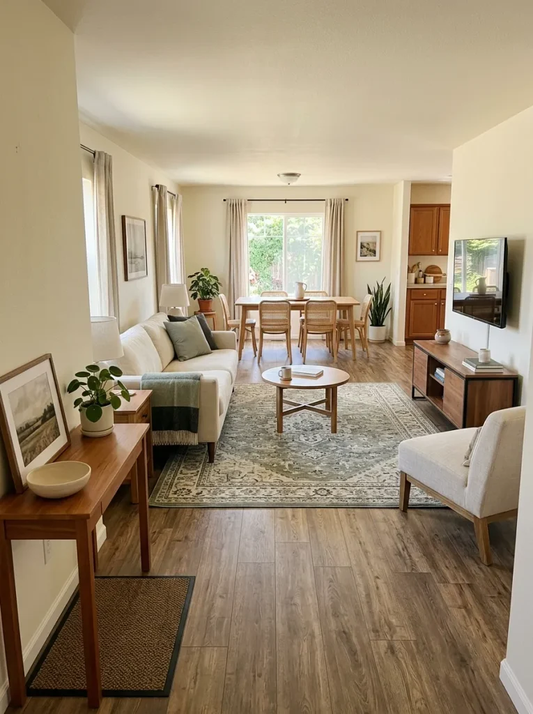
Move something first. Remove something second. Buy something only after you can identify the remaining problem.
Bringing the Whole Double Wide Together
A beautiful double wide does not come from making every room identical. It comes from controlling the relationships that remain visible across the home—where the eye lands, how furniture defines each zone, which finishes recur, and where the design becomes quiet.
Begin with the longest sightline and the largest furniture decisions. Then refine lighting, materials, storage, textiles, and personal details around that foundation.
Most importantly, give the decorating process a stopping point. A room with comfortable circulation, clear focal hierarchy, useful storage, and a few meaningful details may already be complete.
Sometimes the final layer is editing, not adding.