The modern evening commute attacks your nervous system before you even reach the front door. Harsh neon signs reflect off wet concrete while a relentless stream of notifications demands your immediate attention.
Consequently your body remains tense long after you leave the chaotic street noise behind. Stepping inside should offer immediate physical relief from this high stress external environment.
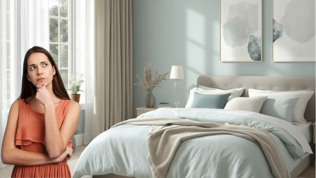
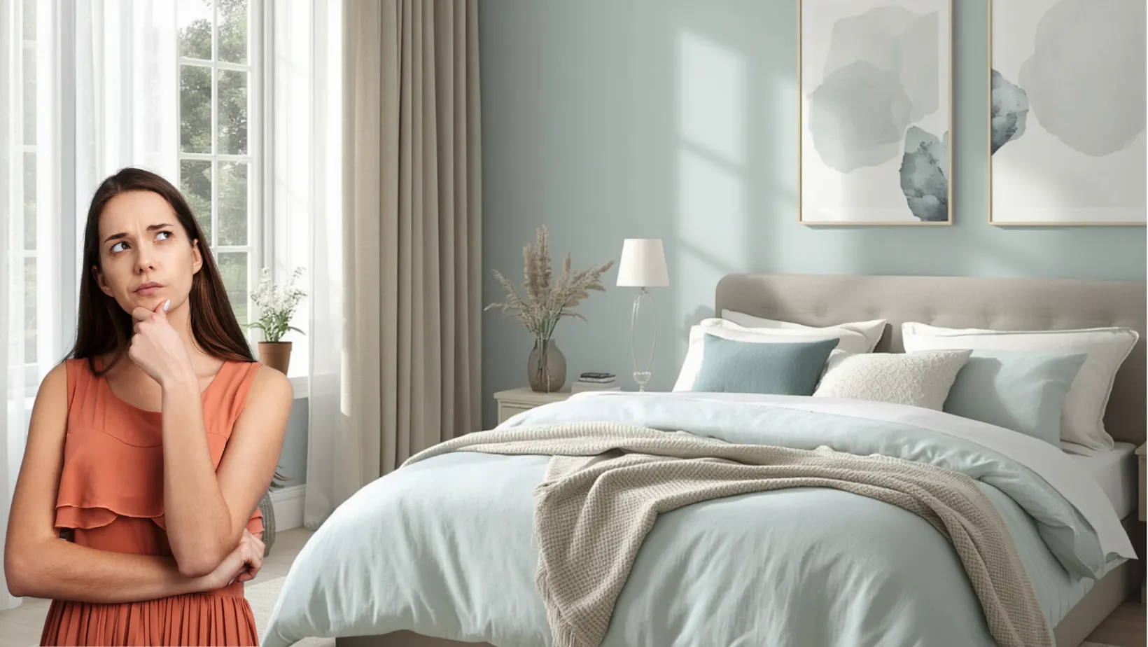
Choosing a bedroom color palette operates as a biological necessity for regulating your exhausted mind rather than a simple aesthetic choice. Transitioning your sleeping quarters from a chaotic holding cell into a grounded sanctuary requires specific architectural decisions.
We live in an era of constant stimulation that demands a space engineered for pure cognitive unwinding. By addressing how light and shadow interact with your walls you can build a restorative environment that actively forces your brain to relax.
The Chromatic Clutter: Why Your Current Bedroom Color Palette Elevates Cortisol
The Chromatic
Clutter
Many people sleep in rooms that actively fight their natural circadian rhythms. Stark color transitions create severe visual friction. The space feels cramped.
Your eyes constantly scan the layout. Aggressive paint choices offer no soft resting place. Synthetic glossy paints worsen the situation. They emphasize minor drywall imperfections and generate an uneasy clinical glare.
Visual weight distribution causes daily exhaustion. People often paint dark accent walls directly behind television screens.
Placing heavy colors behind electronics anchors room energy in daytime alertness. Your brain remains fully wired for stimulation. Eliminate these unbalanced focal points to establish a calm atmosphere.
Wall treatment physical properties play a massive role in biological regulation. Light Reflectance Value determines how much illumination a surface bounces back into your environment.
Paints with a Light Reflectance Value higher than sixty bounce excess artificial blue light. This constant reflection actively delays natural melatonin production. Lowering this metric guarantees your walls absorb stray light.
Strip away these exhausting visual distractions to achieve true tranquility. Bright white trim against heavily saturated walls creates an unforgiving boundary. Smoothing these harsh lines allows your mind to detach from physical boundaries. This represents the first step into physical recovery.
Many people unknowingly sleep in rooms that actively fight against their natural circadian rhythms. Disjointed and stark color transitions create severe visual friction that makes a space feel remarkably cramped. Your eyes are constantly forced to scan the layout because the aggressive paint choices offer no soft resting place. Synthetic glossy paints only worsen the situation by emphasizing minor drywall imperfections. These shiny finishes generate an uneasy clinical glare when placed next to standard bedroom furniture.
Design Rule of Thumb: If your eye cannot traverse the room without snagging on a stark color transition, your brain cannot transition into a state of deep rest.
Another major culprit of daily exhaustion lies in how we distribute visual weight across the floor plan. Dark accent walls are frequently painted directly behind massive technological focal points like television screens. Placing heavy colors behind electronics anchors the energy of the room in daytime alertness instead of preparing your body for nighttime recovery. Consequently your brain remains fully wired for stimulation when it should be actively powering down. We must eliminate these unbalanced focal points to establish a genuinely calming atmosphere.
The physical properties of your wall treatments play a massive role in biological regulation. Light Reflectance Value determines exactly how much illumination a surface will bounce back into your immediate environment. Paints boasting a Light Reflectance Value higher than sixty bounce excess artificial blue light around the entire layout. This constant reflection actively delays the natural melatonin production your body desperately needs to fall asleep. Lowering this metric guarantees your walls absorb stray light rather than amplifying the stressful energy of the modern world.
Achieving true tranquility requires us to strip away these exhausting visual distractions. Bright white trim against heavily saturated walls creates an unforgiving boundary that traps the eye. Smoothing out these harsh lines allows your mind to gently detach from the physical boundaries of the space. Moving away from a disjointed layout represents the first crucial step into physical recovery.
The Neutral Grounding: Anchoring the Space with Relaxing Bedroom Hues
The
Cocoon
Soften
Corners
Initiate the psychological shift into calmness. Soften hard architectural corners. Introduce tonal and earth based hues to blur rigid boundaries between walls and ceilings. This creates a gentle cocooning effect.
30% Matte Textiles
10% Organic Wood
Replace stark whites with nuanced muddy tones to lower the visual temperature. Deeper colors dynamically absorb shadows as natural light shifts.
Color
Drench
Apply color drenching techniques to alter physical dimensions. Paint trim and baseboards the exact same relaxing hue as walls to eliminate visual roadblocks.
Extend this monochromatic approach up across the ceiling. This instantly lowers the visual center of gravity.
Spatial perception expands. Your brain stops processing where walls end and roofs begin. Wrap the occupant in a steady field of soothing color.
Tactile
Identity
Elevate earthy tones from flat pigment to structural features. Highly breathable materials cure slowly to produce a suede like finish.
Their natural composition absorbs harsh light. Upgrade your surfaces to transform the tactile identity of your sanctuary.
Warm terracottas connect indoor environments to calming dirt outside. Bring organic shades indoors to dramatically drop your resting heart rate.
Initiating the psychological shift into calmness begins by softening the hard architectural corners of your layout. Introducing tonal and earth based hues blurs the rigid boundaries between your walls and ceilings. This intentional blurring creates a gentle cocooning effect that feels incredibly safe. Replacing stark whites with nuanced muddy tones immediately lowers the visual temperature of the space. These deeper colors dynamically absorb shadows as the natural light shifts from afternoon brightness to evening dusk.
The Sanctuary Proportion: 60% Low LRV Earth Base + 30% Tonal Matte Textiles + 10% High Friction Organic Wood
Applying color drenching techniques radically alters how you experience the physical dimensions of the room. Painting the trim and baseboards the exact same relaxing bedroom hues as the walls eliminates visual roadblocks.
Extending this monochromatic approach up across the ceiling instantly lowers the visual center of gravity. Consequently the spatial perception expands because your brain stops processing where the wall ends and the roof begins. Such a wrapping technique envelops the occupant in a steady and unbroken field of soothing color.
Modern material choices elevate these earthy tones from flat pigment into engaging structural features. Roman Clay and Mineral Limewash finishes provide an incredibly rich alternative to basic latex wall coverings. These highly breathable materials cure slowly to produce a gorgeous suede like finish.
Their natural composition inherently absorbs harsh light while adding subtle organic movement to otherwise sterile drywall. Upgrading your surfaces with mineral treatments completely transforms the tactile identity of your sanctuary.
Establishing this grounded foundation requires a deep commitment to subdued earth tones over artificial brights. Warm terracottas and muted sage greens connect our indoor environments directly to the calming dirt and foliage outside.
Bringing these organic shades indoors dramatically drops our resting heart rate by mimicking natural landscapes. Your breathing naturally slows down when surrounded by colors found organically in a quiet forest. Ultimately a well executed base palette does the heavy lifting of biological relaxation for you.
The Sensory Shift: Aligning Color Psychology Interior Principles with Tactile Depth
Bridging the distinct gap between visual color and physical touch remains essential for total environmental harmony. A truly calm room must physically feel exactly as grounding as it looks from the doorway. Structurally the layout needs to encourage natural human movement directly toward the softness of the bed.
Basic color psychology interior design completely fails if the surrounding tactile materials feel cheap or synthetic. We must pair matte and earthy walls with heavily textured fabrics to adequately lower the acoustic profile of the room.
Sensory Profile: The Grounded Cocoon
Visual: Muddy, low contrast, continuous color planes.
Tactile: Woven flax linen, brushed wool, raw oak grain.
Acoustic: Deadened, muffled, absorbing external street frequencies.
Strategic placement of these thick fabrics creates a massive difference in how the space handles noise. Positioning the heaviest textures like thick linen drapes and plush wool rugs at the room perimeters builds a powerful barrier.
This dense boundary actively dampens sound waves bleeding in from the chaotic outside world while naturally improving the thermal conductivity of the walls. Muffling external street frequencies allows your nervous system to fully release its defensive posture. Consequently the interior silence matches the visual quietness of your painted walls.
Selecting the right architectural textiles provides the final layer of necessary visual depth. Heavyweight boucle and stonewashed Belgian linen serve as exceptional tools for absorbing excess light. Their uneven organic fibers naturally diffuse soft shadows against your low reflective walls.
This distinct optical illusion creates the perception of a much deeper and richer wall color without adding darker paint. Layering these robust materials transforms a basic sleeping area into an immersive sensory experience.
The Melatonin Wash: Activating Sleep Friendly Paint in the Evening Hours
The Melatonin Wash
The final transition into a deeply restorative state depends entirely upon your evening illumination strategy. Beautifully selected sleep friendly paint will completely fail under the wrong artificial light source. Soft and low angle lighting should gently graze your textured walls to maximize their calming effect. This specific grazing action turns flat colors into immersive and warm gradients that directly cue the brain for sleep. Controlling these shadows is the ultimate secret to encouraging physical lethargy at night.
To achieve this biological shift you must absolutely ban overhead lighting for the final two hours of your day. Mapping out a secondary lighting layout relies strictly on mid level sconces and low level floor lamps. These lower sources successfully mimic the gentle glow of a naturally setting sun. Dropping the light source closer to the floor signals to your brain that the active day has concluded. Consequently your body begins preparing for a heavy and uninterrupted rest cycle.
| Light Source & Temp | Psychological Effect | Best Spatial Application |
| Overhead LED (3000K Plus) | Cortisol spike from flattened textures. | Strictly avoid; washes out undertones. |
| Mid Level Sconce (2700K) | Transitional calm as corners soften. | Wall mounts to warm neutral room design. |
| Low Level Lamp (1800K) | Deep relaxation and melatonin release. | Floor corners to deepen earthy hues. |
Modern lighting technology allows us to manipulate our painted surfaces with incredible precision. Tunable Smart LED Technology provides the exact control necessary to execute this evening routine. These specialized bulbs drop seamlessly from a functional two thousand seven hundred Kelvin down to a rich amber eighteen hundred Kelvin. Shifting this temperature actively manipulates the perceived warmth of your wall paint to safely induce extreme lethargy. Your carefully painted walls will essentially melt into the background as the bulb temperature warms up.
The Restorative Aftermath: Finalizing Your Neutral Room Design
Concluding this psychological transition leaves you with a profound sense of physical and mental relief. Waking up in a room that has been aggressively stripped of visual friction feels incredibly liberating. Your mornings begin with a gentle awakening rather than an immediate assault on your senses. Maintaining this peaceful neutral room design requires strict daily editing of your personal belongings. Keeping everyday objects like reading books and water glasses aligned with the overarching natural textures prevents visual clutter from returning.
Protecting the newly established negative space guarantees your sanctuary remains permanently effective. You must resist the urge to fill every empty corner with unnecessary decorative items. Let the carefully engineered paint finishes and strategic lighting layouts do the heavy lifting of spatial design. Leaving empty breathing room allows your mind to wander freely without snagging on useless objects. Ultimately your bedroom will function as a highly tuned instrument for cellular recovery rather than just another decorated box.