Are you tired of walking into a room that feels muted, predictable, and frankly, a little uninspired? For too long, designers have relied on the safety of beige, greige, and soft white, but the era of the bland neutral is definitively over. It is time to inject your home with personality, depth, and exhilarating visual drama.

Choosing a bold color palette is the single quickest way to refresh a space. A single, saturated hue on the walls or a shocking contrast in the decor can instantly transform a tired room into a high-impact, conversation-starting masterpiece. This move isn’t about chaos; it’s about confidence, sophistication, and defining a unique aesthetic.
We have compiled 42 fearless color combinations that reject subtlety in favor of spectacular design. From opulent jewel tones paired with gilded accents to electric neons set against industrial concrete, these palettes show you exactly how to wield color like a professional.
Prepare to revolutionize your home. We’ll show you how to use these daring colors, complete with simple, step-by-step DIY projects, proving that dramatic design is easily within reach. Get ready to banish the boring and embrace the beautiful.
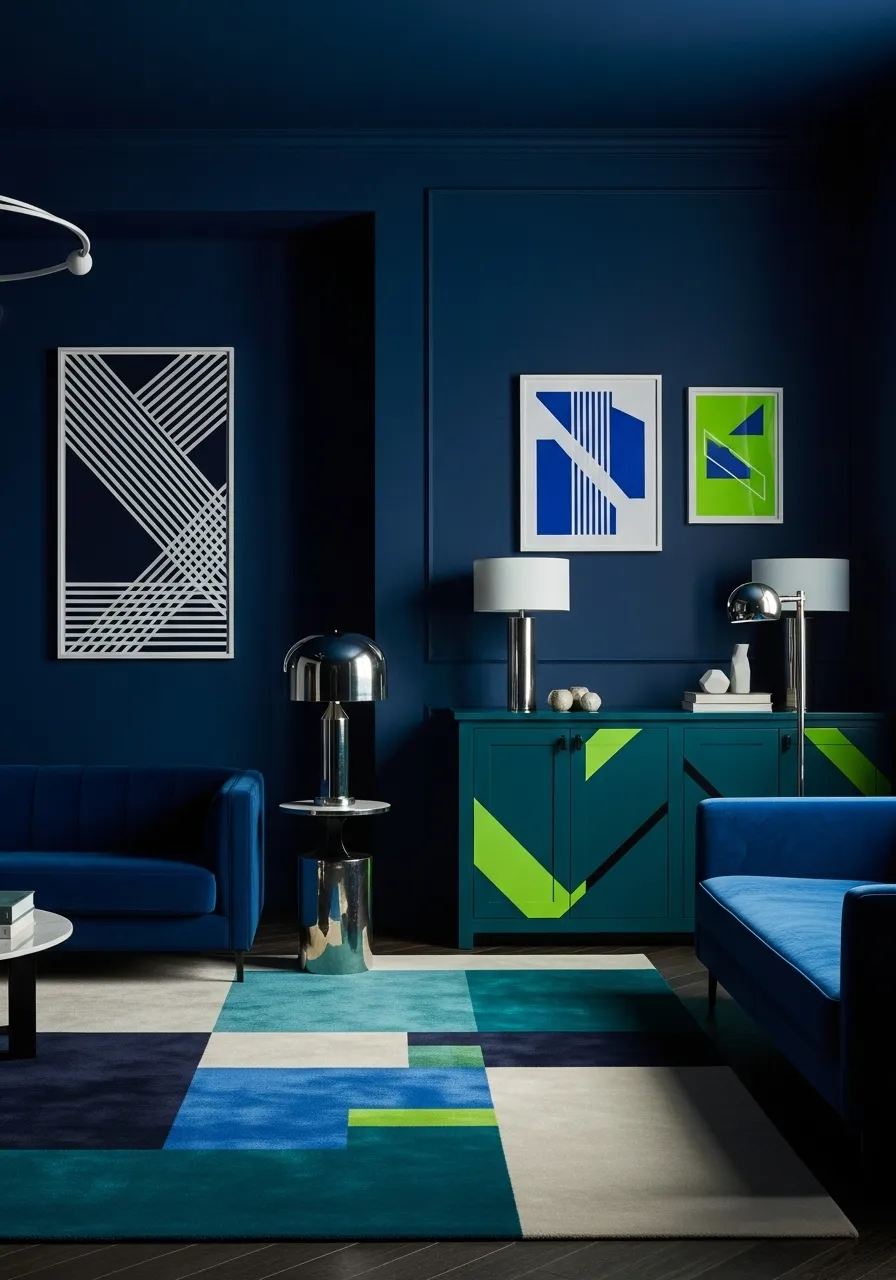
1. Deep Indigo and Electric Lime Statement

This room proves that dramatic color choices can feel incredibly sophisticated. The walls are wrapped in a rich, saturated indigo, creating an immediate sense of luxury and enveloping warmth. Instead of feeling heavy, this deep blue acts as a striking backdrop for lively accents. A gorgeous teal credenza features unexpected blocks of electric lime green, introducing sharp, geometric energy that completely refreshes the space.
Notice how the layered geometric rug harmonizes the diverse colors, pulling together the dark blues, bright aquamarines, and hints of crisp white. Artwork on the wall cleverly continues this theme, utilizing the blue and lime palette for a cohesive, gallery-like presentation. Shiny metallic lamp bases provide a necessary reflective element, balancing the matte wall finish and giving the bold colors a touch of glamour. This approach is absolutely about making a confident design choice that feels both artistic and inviting.
DIY Project: Geometric Color Block Credenza Refresh
You can replicate the bold, vibrant look of the credenza shown by painting simple geometric shapes onto an existing piece of furniture.
Material Required List
- Existing wooden cabinet or credenza (ensure the surface is smooth)
- Primer suitable for wood
- One quart of deep teal or peacock blue semi-gloss paint
- One pint of electric lime green semi-gloss paint
- Painter’s tape (high-quality, low tack)
- Drop cloths or plastic sheeting
- Fine-grit sanding block (around 220 grit)
- Tack cloth
Equipment Required List
- Paintbrushes (various sizes for detail work)
- Small foam rollers and trays
- Measuring tape
- Pencil
- Utility knife
- Clean rags
DIY Instruction Step by Step
- Prepare the Credenza: Start by removing all hardware (knobs, pulls, hinges) and placing them aside safely. Lay down drop cloths to protect your flooring. Use the fine-grit sanding block to lightly scuff the entire surface of the credenza; this helps the primer stick. Wipe away all dust thoroughly using the tack cloth.
- Apply Primer: Apply an even coat of wood primer to the entire exterior surface you intend to paint. Let this dry completely according to the manufacturer’s directions. Priming is crucial for color adherence and achieving a smooth final finish.
- Paint the Base Color: Once the primer is dry, apply your deep teal or peacock blue base color. Use a roller for large, flat areas and a brush for edges and details. Allow the first coat to dry, then apply a second coat if needed for rich, full coverage. Ensure this base color is completely cured before proceeding.
- Map Out the Design: Decide where you want your electric lime green blocks to be placed, taking inspiration from the image. Using a measuring tape and a pencil, lightly mark the outline of your geometric shapes (e.g., triangles, stripes, or large corner blocks) directly onto the dried teal base.
- Tape Off the Green Areas: Carefully apply painter’s tape along the outside edges of the shapes you just marked. Press the tape firmly, especially along the paint line, to prevent the lime green from bleeding underneath. Ensure the tape is cut neatly at all corners using a utility knife if necessary.
- Apply the Accent Color: Using a clean brush or small roller, apply the electric lime green paint within the taped-off areas. Apply two thin coats rather than one thick coat; this helps achieve a cleaner line.
- Remove the Tape: This step is crucial for sharp lines! As soon as you finish applying the final coat of green paint, and while the paint is still slightly wet, carefully peel back the painter’s tape at a 45-degree angle. If you wait until the paint is fully dry, it can lift and tear the crisp edge.
- Finalize and Reassemble: Let the paint cure completely for several days. Reattach the original hardware or replace it with new metallic pieces for a finishing touch. Place the newly refreshed, bold credenza in your desired spot!
2. Terracotta Sunset and Rustic Wood Depth

This design demonstrates how earthy, warm tones can still deliver a truly dramatic impact. The walls are bathed in a rich terracotta or burnt sienna shade, providing a wonderfully enveloping and cozy feeling to the space. It moves far beyond a simple neutral, yet maintains a timeless sophistication. The rugged, exposed wooden beams across the ceiling and doorway introduce a beautiful contrast, grounding the vibrant wall color with natural, rustic texture.
The seating area features a plush, curved accent chair upholstered in a velvety orange fabric, which echoes and deepens the wall color beautifully. Centered on the wall, a massive abstract artwork in the same terracotta family uses extreme texture to create visual intrigue and depth; it’s a monochrome statement piece that feels anything but flat. Underfoot, a traditional patterned rug pulls together shades of red, black, and cream, further enhancing the room’s warm, layered character. The result is a bold, inviting space mixing traditional texture with modern color saturation.
DIY Project: High-Texture Monochrome Artwork
Creating a deeply textured, monochromatic painting like the one shown adds a sophisticated, sculptural element to any wall, echoing the main color palette of the room.
Material Required List
- Large stretched canvas (at least 36 x 48 inches is recommended for impact)
- Heavy-body acrylic paint (one quart in your desired shade, e.g., deep terracotta or burnt orange)
- Joint compound or spackling paste (pre-mixed is easiest)
- Palette knife set (various sizes, including large trowel-like ones)
- Paintbrush (for edge finishing)
- Drop cloth
- Small cup or container for mixing
Equipment Required List
- Work gloves (optional, for keeping hands clean)
- Taping knife or rigid plastic scraper (for large application)
- Rag or paper towels
DIY Instruction Step by Step
- Prepare the Work Area: Lay your canvas flat on a protected surface, using the drop cloth. Ensure the canvas is sturdy enough to hold the weight of the joint compound.
- Mix the Medium: Scoop a generous amount of the joint compound into your mixing container. Slowly incorporate your heavy-body acrylic paint into the compound. Start with a small amount of paint and mix thoroughly until you achieve a consistent, rich color that matches your room’s wall shade or accent color. The final consistency should be thick, like icing.
- Apply the Base Texture: Using the largest palette knife or taping knife, begin spreading the colored compound onto the canvas. Do not try to make it smooth! Apply it unevenly, scraping, pushing, and pulling the mixture across the surface to build up thick, mountainous ridges and deep valleys. Think abstract—the goal is texture over form.
- Create Varied Detail: Switch to smaller palette knives. Use the edges to make specific marks, swirls, or straight lines within the wet mixture. Drag the knife through areas to expose the canvas underneath, or pile compound higher in other areas. Step back frequently to assess the overall balance of texture.
- Finish the Edges: Once satisfied with the face of the painting, use a regular paintbrush and the leftover colored compound to lightly smooth and wrap the texture around the sides of the canvas edges. This gives the finished piece a polished, professional look.
- Allow for Curing: This is the most critical step. High-texture artwork must dry completely. Depending on the thickness of the compound, this can take anywhere from 24 to 72 hours. Place the canvas somewhere flat and dry, away from extreme temperatures, and avoid touching it until it is rock hard.
- Final Hanging: Once fully cured, consider framing the piece in a simple, thin gold or black frame to define its edges and complement the sophisticated texture before hanging it for a dramatic focal point.
3. Vibrant Chartreuse and Lush Jungle Emerald

This entryway is a celebration of luxurious, deep green tones, creating an atmosphere of dramatic opulence. The ceiling and architectural trim, including the grand arched doorway, are painted in a striking, slightly yellow-tinged chartreuse. This color choice is fearless, instantly injecting high energy and freshness into the space. That lively shade is beautifully contrasted with the textured walls, which are covered in a rich, dark wallpaper featuring a dense, botanical jungle pattern in emerald and forest greens.
Throughout the room, elements of gloss black and polished brass provide crucial contrast and necessary refinement. Black lacquer chests with brass hardware flank the entryway, introducing glamour and sophisticated reflection. The seating, including a plush bench and a chic, cylindrical ottoman, utilizes a slightly darker, mossy lime green velvet, maintaining the theme while offering tactile variety. The look is completed with classical portrait art framed in gold, which anchors the bold patterns and colors with traditional elegance, making the entire space feel curated and theatrical.
DIY Project: Lacquer-Look Console Table with Brass Accents
You can achieve a high-end, reflective look for a console or small accent table by using high-gloss paint and adding custom brass hardware.
Material Required List
- Small wooden console table or chest (needs to be smooth, not heavily textured)
- High-adhesion primer (suitable for wood or laminate)
- One quart of black oil-based or high-gloss enamel paint
- New brass cabinet pulls or handles
- Painter’s tape
- Drop cloths
- Fine-grit sandpaper (400 grit)
- Tack cloth
- Screwdriver
Equipment Required List
- High-quality foam roller and trays (critical for a smooth finish)
- Small angled paintbrush (for edges)
- Ruler or measuring tape
DIY Instruction Step by Step
- Prepare the Surface: Lay down drop cloths. Remove all original hardware from the table. Lightly sand the entire surface using the fine-grit sandpaper; the goal is only to rough up the existing finish slightly, not strip it. Use the tack cloth to meticulously remove all dust.
- Prime for Shine: Apply an even, thin coat of the high-adhesion primer using the foam roller. Primer is essential for getting that deep, uniform color. Let the primer cure completely according to the label instructions.
- Apply the Gloss Black: Using the foam roller, apply a thin coat of the black high-gloss enamel or oil-based paint. These paint types are the key to a true lacquer look, but they require a dust-free environment. Work in smooth, even passes. Use the paintbrush only for edges where the roller cannot reach.
- Achieve Depth: Once the first coat is completely dry (this may take 24 hours or more with oil paint), lightly sand the entire surface again with the 400-grit sandpaper, then wipe clean with the tack cloth. Apply a second coat of the gloss black. Two or even three thin coats build depth and shine far better than one thick coat.
- Cure and Affix Hardware: Allow the final coat of paint to cure fully for several days—high-gloss paint takes longer to harden than standard paint. Measure carefully to mark the location for the new brass pulls.
- Install New Hardware: Drill any necessary holes for the new brass hardware. Attach the new brass pulls using the screwdriver. The contrast of the shiny brass against the reflective black lacquer instantly elevates the piece, completing your luxurious design element.
4. Pop Art Primary and Crisp White Contrast

This space demonstrates the power of utilizing a stark white shell to make intensely bright, saturated colors truly explode. The room is flooded with natural light, ensuring the white walls and high ceilings provide a clean, gallery-like foundation. Against this backdrop, vibrant architectural features become the main focus. Stunningly, all the archways and built-in niches are framed in a powerful, sunny orange.
These cheerful orange portals draw the eye instantly, leading to unexpected bursts of contrasting color within. Deep cutouts feature bright turquoise and electric yellow backdrops, creating three-dimensional blocks of concentrated color. The furniture reinforces this playful palette; modular sofa sections in a bold, matte cobalt blue anchor the seating area. Underneath, a striped circular rug in shades of blue, magenta, pink, and yellow completes the dynamic, retro-inspired aesthetic. This look is truly fun, energetic, and a complete rejection of any notion of traditional subtlety.
DIY Project: High-Contrast Color Block Niche Painting
You can replicate the dramatic effect of these brightly painted recessed areas or niches using simple geometry and precise painting techniques.
Material Required List
- Primer (if painting a new or highly textured wall)
- One quart of ultra-bright orange semi-gloss paint
- One quart of bright turquoise semi-gloss paint
- One quart of bright electric yellow semi-gloss paint
- High-quality painter’s tape (specifically for sharp lines)
- Drop cloths
- Angled paintbrush (2-inch size, for cutting in)
- Small foam roller and tray (4-inch size is useful for small areas)
- Tack cloth
Equipment Required List
- Ladder or step stool (for high areas)
- Measuring tape and level
- Pencil
DIY Instruction Step by Step
- Prepare the Area: Lay down drop cloths to protect the floor. Ensure the walls and the inside of the niche are clean and smooth. If the surface is porous or has never been painted, apply a coat of primer and let it dry fully.
- Paint the Inside Niche Color: Start by painting the specific back wall of the niche with your chosen internal color (turquoise or yellow). Use the angled brush to carefully paint the edges where the wall meets the frame of the niche, then use the small foam roller to fill in the main area. Apply two coats for solid, even coverage, allowing the first coat to dry before applying the second. Ensure this is completely dry.
- Tape the Niche Edge: Once the inner color is completely dry, use high-quality painter’s tape to mark off the sharp line where the inner wall color meets the outer frame edge. Press the tape down very firmly to seal the edge and prevent bleed.
- Tape the Outer Frame (The Archway): Now, use painter’s tape to carefully define the exterior line of the architectural feature (the archway or niche framing) against the main white wall. Use a level and measuring tape to ensure your tape lines are perfectly straight and symmetrical.
- Apply the Contrasting Frame Color: With both the inside color and the main wall color protected by tape, apply the bright orange paint to the frame area. Use a paintbrush to carefully paint the curved or angled architectural lines. Use the roller for any flat face of the frame. Again, apply two coats, ensuring the coverage is even.
- The Tape Reveal: Crucially, remove the painter’s tape immediately after applying the final coat of orange paint, while the paint is still slightly wet. Slowly pull the tape away at a 45-degree angle. This technique delivers the cleanest, sharpest line, which is essential for this high-contrast look.
- Cure Time: Allow the newly painted areas to dry and cure completely before placing furniture or décor near them.
5. Golden Ochre and Jewel-Toned Plum

This design captures the exotic warmth and vibrancy of a Marrakesh riad, proving that depth is just as bold as brightness. The walls are bathed in a rich, sun-baked golden ochre, providing an incredibly warm, atmospheric glow that immediately transports you. Architectural elements like the deep, rounded archways enhance the immersive quality of this color. The warm gold of the paint is beautifully complemented by numerous antique brass and bronze accessories, including the stunning hanging lanterns and the oversized, circular mirror.
Contrasting this sandy warmth are powerful jewel tones, most notably the pair of large, circular leather poufs in a deep, vibrant plum or eggplant purple. This choice introduces a luxurious, unexpected color contrast that feels modern yet deeply rooted in traditional design. Dark carved wooden furniture with patterned upholstery adds further richness and visual texture. Overall, the room balances the earthy ochre with shimmering metals and saturated accents, creating a layered, sensual, and highly dramatic space.
DIY Project: Patinaed Moroccan-Inspired Side Table
You can create a small accent table with a heavily textured, antiqued look to complement the layered aesthetic of the room. This project simulates the look of hammered metal and carved wood.
Material Required List
- Small, inexpensive wooden side table (simple, square or round top)
- Wood filler or joint compound
- Two shades of metallic paint (e.g., deep bronze and antique gold)
- Dark brown or black acrylic craft paint
- Wood stain in a dark color (e.g., walnut)
- Clear semi-gloss sealant spray or varnish
- Drop cloth
- Fine-grit sandpaper (120 grit and 220 grit)
- Tack cloth
Equipment Required List
- Palette knife or putty knife
- Stiff-bristled brushes (for texture)
- Soft brushes (for dry brushing)
- Rags or cheesecloth
- Gloves
DIY Instruction Step by Step
- Prepare the Surface: Lay out your drop cloth. Lightly sand the table with 120-grit sandpaper to rough up the surface, then wipe away the dust.
- Apply Texture: Using the palette knife, randomly apply small, thin dabs of wood filler or joint compound across the table top and side panels. Do not smooth it out; the goal is to create peaks and uneven surfaces, simulating hammered metal or aged wood grain. Let this layer dry completely (potentially several hours).
- Stain the Wood Base: Once the texture is dry, apply the dark wood stain to the legs and any non-textured parts of the table using a rag. Wipe off the excess stain quickly according to the product directions. Let this dry.
- Create the Metallic Base: Paint the entire textured surface (the top and sides) with the deep bronze metallic paint. Use the stiff-bristled brush, dabbing and pushing the paint into the textured crevices. Let it dry fully.
- Dry Brush with Gold: Dip a clean, soft brush into the antique gold metallic paint, then wipe almost all of the paint off onto a scrap piece of paper (this is “dry brushing”). Lightly and quickly sweep the nearly-dry gold brush over the raised texture. The gold will only catch the highest points, making the surface look dimensional and aged.
- Add Patina and Depth: Mix a small amount of the black or dark brown acrylic paint with water to create a thin wash. Brush this wash over the textured areas, especially concentrating on the valleys and low points. Immediately wipe the surface with a clean rag. The dark wash will settle in the crevices, creating an aged, shadowy patina.
- Seal the Finish: Once you are satisfied with the antiqued look and all layers are dry, apply two coats of clear semi-gloss sealant spray or varnish to protect the finish, allowing adequate drying time between coats.
6. Nautical Navy and Tranquil Aqua Fade

This design uses a powerful blue palette to create a soothing yet highly dramatic atmosphere, particularly effective in a primary bathroom suite. The main room is saturated entirely in a deep, classic navy blue—walls, trim, and ceiling—producing an intimate, almost cocoon-like feeling. This dramatic shade immediately evokes the depth of the ocean. Against this rich background, bright white elements, like the vanity and trim around the doorway, stand out sharply, preventing the dark color from overwhelming the space.
A softer shade of blue is introduced through the furnishings; the inviting armchair is upholstered in a comfortable, lighter chambray blue fabric. The centerpiece of the color play is the stunning area rug, featuring an ombre effect that transitions smoothly from deep indigo to lighter cerulean and finally to white, mimicking the movement of waves. Through the doorway, a glimpse of the secondary bathroom area shows walls painted in a tranquil aqua, providing a breath of fresh, airy contrast. Minimal gold-toned hardware adds a crucial touch of warmth and sophistication to this cool color scheme.
DIY Project: Ombre Wall or Accent Panel
Recreate the calming, water-like transition seen in the rug or the subtle shift between rooms by creating an ombre accent wall or panel, moving from deep navy to a lighter blue.
Material Required List
- Three shades of paint in the same color family: one deep navy (A), one mid-tone blue (B), and one light sky blue (C). Purchase a quart of each.
- Wall primer (if required for base color change)
- Drop cloths
- Painter’s tape
- Four separate paint trays
- Four small, high-quality paint rollers (4-inch size is useful)
- Large, clean 3-inch blending brush or wide, dry sponge brush
- Water sprayer bottle
- Clean rags or towels
Equipment Required List
- Ladder or step stool
- Measuring tape
- Pencil
DIY Instruction Step by Step
- Preparation and Division: Prime the accent wall if necessary. Use the measuring tape and pencil to lightly divide the wall vertically into three equal, imaginary sections for the three colors (A, B, and C). Do not use tape between the sections, as the goal is to blend them.
- Paint Base Sections: Pour each color into its own tray. Apply color A (the darkest navy) to the bottom third of the wall, color C (the lightest) to the top third, and color B (the mid-tone) to the middle third. Paint up to, but not over, the dividing lines.
- Start the Blend (A to B): While the edges of colors A and B are still wet, use one of your small rollers to roll the lower edge of color B down into the top edge of color A. Work in horizontal strokes.
- Refine the Transition: Immediately clean the large blending brush or sponge brush and dampen it slightly with water from the sprayer. Use the brush to gently sweep over the area where A meets B, moving the brush in small, quick horizontal or crisscross motions. This softens the line, allowing the colors to feather seamlessly. Wipe the brush frequently.
- Blend (B to C): Repeat steps 3 and 4 for the transition between color B and color C. Roll the bottom edge of color C down into the top edge of color B while the paint is still wet, and then use the damp blending brush to feather the line until the gradient is smooth.
- Finalize and Dry: Step back to check the overall blend. Make light, quick passes with the blending brush where needed. Allow the ombre wall to dry completely. The final effect should be a soft, misty color fade, adding immense depth to your room.
7. Dusty Rose and Industrial Concrete Edge

This room masterfully pairs soft, unexpected color with raw, industrial texture, creating a highly sophisticated contrast. The walls are painted in a beautiful, dusty rose or blush pink with a subtly textured finish, providing a gentle warmth that is far from sugary. This soothing backdrop is immediately juxtaposed with the room’s core architectural elements: exposed, raw concrete columns and ceilings. That unpolished texture adds a crucial, brutalist edge, preventing the pink from feeling overly delicate.
Art plays a central role in this design’s boldness. The large geometric pieces use a mix of muted tones—like olive green and sage grey—alongside sharp blocks of black and a shocking, intense neon yellow or lime green. This pop of neon is a surprising, electrifying detail against the rosy walls. Furnishings are kept light and organic, featuring natural cane, light wood, and a crisp white sofa, which ensures the space feels airy and modern despite the heavy concrete accents. The overall effect is a striking balance between soft color and hard structure.
DIY Project: Concrete Column Faux Finish
If you do not have actual exposed concrete, you can use specialized paint techniques to give a plain column or accent wall a raw, industrial concrete appearance, which beautifully offsets the dusty rose walls.
Material Required List
- Gray texture paint (or standard light gray paint mixed with a gritty additive like sand)
- Dark gray and white acrylic craft paint
- Large sea sponge or natural texture sponge
- Stiff-bristle brush
- Trowel or putty knife
- Water sprayer bottle
- Drop cloths
- Painter’s tape
Equipment Required List
- Mixing bucket and stir stick
- Protective gloves
- Rag or paper towels
DIY Instruction Step by Step
- Preparation and Base Coat: Tape off the surrounding walls and flooring. Apply a base coat of your medium-gray texture paint to the column or wall. This base should be roughly the color of the main concrete. Use the stiff-bristle brush to apply it irregularly, ensuring some visible texture. Let this dry completely.
- Add Dark Shadowing: Pour a small amount of dark gray acrylic paint into a tray and dilute it with water to create a thin wash. Dip the sea sponge lightly into the wash, then blot most of it off onto a rag. Dab the sponge onto the column randomly, focusing on the edges and corners to simulate the darker, damp areas and pitting often found in real concrete.
- Introduce Highlight: Repeat the process using the white acrylic paint wash. Dip the sea sponge very lightly, blot thoroughly, and dab the white sparingly onto the highest points of the texture. This creates contrast and the mineral, light-reflecting look of concrete.
- Create Smooth Patches (Optional): To mimic repairs or variations in the concrete pour, apply a very thin, uneven layer of the gray texture paint (or a mix of white and gray acrylic) using the edge of the trowel or putty knife. Feather the edges into the textured area. This technique should cover the texture in small, random patches for a realistic, varied finish.
- Final Blending: Lightly mist the entire column surface with water from the sprayer bottle. Immediately and gently dab the surface with a clean, dry rag to soften any harsh lines or noticeable sponge marks. The goal is a uniform, mottled appearance.
- Cure Time: Allow the faux finish to dry fully before removing the painter’s tape. The subtle variations in color and texture will convincingly mimic industrial concrete.
8. Monochromatic Drama with a Scarlet Flash

This space exemplifies how a strictly monochromatic scheme can be utterly dramatic, proving that black and white are anything but bland. The entire room utilizes various tones of gray and black, creating immense depth and a highly sophisticated, architectural feel. Walls are painted in a deep charcoal gray, while the ceiling and trim are a true matte black, making the room feel intimate and luxurious. Industrial elements, such as the riveted metal doorway framing, are finished in black, enhancing the stark, structured aesthetic.
Against this dark backdrop, the furniture is defined by sleek, black leather upholstery, maintaining a uniform, modern look. Artwork is kept to high-contrast black and white photography and line drawings, which pop powerfully against the charcoal walls. The only exception to this controlled palette is a small, unexpected burst of intense color: a geometric wall object in a vibrant scarlet red. That single, concentrated element of color is incredibly bold, commanding attention and providing the ultimate focal point in an otherwise subdued environment.
DIY Project: Scarlet Geometric Wall Cube
Replicating the impact of that small, intense pop of color is an easy and effective DIY project. A simple wooden cube painted in a strong scarlet hue instantly adds drama to a monochrome wall.
Material Required List
- One small, solid wooden cube (available at craft stores, size approximately 4x4x4 inches)
- High-adhesion primer (suitable for wood)
- One small bottle of highly pigmented, scarlet red acrylic or craft paint (matte or semi-gloss finish)
- Heavy-duty picture hanging hardware (e.g., a cleat system or strong Command strips)
- Drop cloth
- Fine-grit sandpaper (220 grit)
Equipment Required List
- Small paintbrush (1-inch size)
- Small foam roller and tray (optional, for smoother finish)
- Screwdriver or power drill (for mounting)
- Level
DIY Instruction Step by Step
- Prepare the Cube: Lay out the drop cloth. Use the fine-grit sandpaper to lightly smooth all surfaces of the wooden cube. Wipe away any dust thoroughly with a dry rag.
- Prime the Surface: Apply a single, even coat of high-adhesion primer to all sides of the cube, including the bottom. Primer ensures the intense red color will be vibrant and consistent. Allow the primer to dry completely according to the manufacturer’s directions.
- Apply Scarlet Paint: Using your small paintbrush or foam roller, apply a thin, even coat of the scarlet red paint. Be mindful of drips on the edges. Let the first coat dry fully.
- Build Color Saturation: Apply a second and possibly a third coat of the scarlet red paint until the color is deep, rich, and completely opaque with no primer showing through. Ensure each coat is dry before applying the next.
- Cure Time: Allow the painted cube to cure for at least 24 hours until the paint is hard and no longer tacky.
- Mount the Accent: Choose a spot on your monochrome wall where the cube will stand out, usually near a piece of black and white art or a darker feature. Use a level and measuring tape to position the hardware. Attach the wall hanging hardware (like a cleat) or the strong adhesive strips to the back of the cube and the wall. Secure the cube firmly to the wall. That small but intense splash of color will instantly energize the monochromatic design.
9. Regal Violet and Gilded Opulence

This room showcases a breathtaking commitment to luxury through the use of an intensely rich violet color palette. The walls feature a sumptuous damask wallpaper in a deep, vibrant purple, immediately establishing a regal and dramatic atmosphere. This saturation is heightened by the elaborate textiles, where the heavy velvet curtains and the matching armchair, ottoman, and sofa are all upholstered in a slightly brighter, plush violet velvet. Tassels and ornate fringe add layers of traditional detailing and texture to the furnishings.
Contrasting beautifully with the cool intensity of the purple is an abundance of warm, shimmering gold. Ornate carved mirrors and console tables feature distressed gold leaf finishing. The magnificent crystal chandelier and wall sconces further illuminate the space with a warm, inviting glow. Crisp white trim and crown molding frame the colored walls, ensuring the room remains grand and structured, rather than overly dark. The final touch is a richly patterned rug combining shades of purple and deep red, grounding the entire jewel-toned composition.
DIY Project: Velvet Furniture Fringe and Tassel Embellishment
You can elevate a basic velvet armchair or ottoman with the classic, luxurious look of decorative fringe and tassels, replicating the opulent finish seen here.
Material Required List
- Existing plain velvet armchair, ottoman, or sofa
- High-quality decorative tassel or brush fringe trim (measure the perimeter of the base you plan to attach it to, then add 10%)
- Fabric glue (heavy-duty, flexible formula designed for upholstery)
- Straight pins
- Scissors
- Drop cloth
Equipment Required List
- Hot glue gun and extra glue sticks (optional, for faster setting, but fabric glue offers more flexibility)
- Measuring tape
- Ruler
DIY Instruction Step by Step
- Preparation and Measurement: Lay your furniture on its side or back to easily access the base where the fringe will be attached. Use the measuring tape to determine the exact length of trim needed for the entire perimeter of the base, from one corner to the next.
- Cut the Fringe: Carefully cut the decorative fringe to the required length, ensuring you cut the woven header piece, not the actual tassels. If the fabric glue is used, you may need a small overlap at the starting and ending point.
- Test the Placement: Hold the fringe up to the furniture base to confirm where the top edge (the header) will sit. The tassels should hang down just past the bottom edge of the frame. Use a few straight pins to temporarily hold the trim in place as a guide.
- Apply the Adhesive: Working in small, manageable sections (about 12 inches at a time), apply a thick, continuous bead of fabric glue to the furniture base where the fringe header will sit. If using a hot glue gun, work quickly and in even smaller sections.
- Attach the Fringe: Immediately press the header strip of the decorative fringe firmly into the glue line. Press and hold for a few moments to ensure contact. Continue this process around the entire perimeter of the furniture base.
- Secure and Finish: At the point where the trim meets the starting point, cut the trim neatly so the ends align cleanly. If using fabric glue, you may need to use straight pins temporarily every few inches along the entire length to keep the trim secure until the glue is completely dry.
- Curing Time: Allow the glue to cure fully—often 24 to 72 hours for fabric glue—before moving the furniture or letting the fringe hang freely. Once dry, your piece will have a dramatic, custom-upholstered look.
10. Military Olive, High-Vis Yellow, and Burnt Orange Pop

This interior demonstrates how functional, muted colors can serve as a grounded base for exhilarating, unexpected accents. The walls are a cool, neutral light gray, providing a calm, contemporary canvas. Anchoring the seating area is a substantial, modern sofa upholstered in a warm military olive green. This tone feels earthy and reassuring, counterbalanced by the dynamic bursts of color scattered around the space.
The most dramatic element is the interior door, painted an unmissable, bright, high-visibility yellow. This saturated hue instantly transforms a simple architectural feature into a playful, geometric focal point. This energy is echoed in the abstract wall art, which combines the bright yellow and olive green with a sharp horizontal line. Burnt orange and white pillows on the sofa, along with small ceramic accents, introduce a third, warm primary color. Overall, the design relies on stark color blocking and the contrast between grounded neutrals and electrifying brights for its confident, modern appeal.
DIY Project: High-Contrast Color Block Door Painting
Transform a standard interior door into a bold focal point by painting it a single, electrifying color, similar to the high-visibility yellow seen here.
Material Required List
- Interior door paint (one quart in your desired bold color, e.g., high-visibility yellow or electric blue)
- Painter’s tape (narrow width is helpful for tight trim areas)
- Primer (if changing the color significantly, e.g., from dark brown to bright yellow)
- Drop cloths or plastic sheeting
- Screwdriver
- Fine-grit sanding block (around 220 grit)
- Tack cloth or clean rags
Equipment Required List
- Small foam roller and tray (4-inch size recommended)
- Angled paintbrush (1.5-inch size, for cutting in)
- Utility knife (optional, for scoring paint before removing tape)
DIY Instruction Step by Step
- Prepare the Door: Start by using the screwdriver to remove all hardware, including the doorknob, plates, and hinges (it is easiest to remove the door and lay it flat across two sawhorses, but you can also leave it hanging). Lay down drop cloths. Lightly sand the door surface to ensure the paint adheres well, then wipe away all dust with the tack cloth.
- Tape and Prime: Carefully tape off the trim around the door frame if you are painting the door but not the trim. If the original door color is dark, or you are using a very bright color like yellow, apply a coat of primer first and let it dry completely.
- Paint the Door Panels: Apply your chosen bold color. If the door has recessed panels, use the angled brush to paint the recessed areas and edges first.
- Paint the Flat Surfaces: Use the foam roller to apply a thin, even coat across the entire flat surface of the door. Rolling gives a smoother, more professional finish than brushing large areas.
- Build Coverage: Allow the first coat to dry fully (check manufacturer’s time). Apply a second coat, ensuring complete, saturated coverage. Bright colors often require two or three coats to look truly opaque.
- Remove Tape and Reassemble: While the final coat is still slightly wet (or once it is fully dry, score the line with a utility knife to prevent lifting), carefully remove the painter’s tape from the surrounding trim. Allow the door to cure completely before reinstalling the hardware. Rehang the door if you removed it, and enjoy the instant dramatic focal point.
11. Ultra Pink and Electric Teal Playroom

This space is a truly fearless explosion of color, creating a dynamic, high-gloss environment that feels energetic and futuristic. The walls and the shiny ceiling are saturated in a single, intense shade of bubblegum pink. This monochrome application of pink, combined with the reflective finish, gives the room an almost liquid, enveloping glow. Recessed cubbies and architectural niches are painted in a starkly contrasting electric teal, creating deep, dramatic color blocks within the pink shell.
The seating area features wonderfully curvy, organic-shaped armchairs upholstered in luxurious velvet—some in the electric teal and others in a vibrant, rich purple. These plush textures provide a welcome softness against the room’s high-gloss walls. Cylindrical side tables with a mirrored chrome finish are grouped in the center, reflecting the intense colors and adding a slick, modern dimension. The overall effect is playful, dramatic, and intensely personalized, proving that color rules can be happily ignored for a truly unique look.
DIY Project: High-Gloss Recessed Niche Painting
Achieve that sharp, high-gloss finish inside small niches using a specialized paint and careful taping, making the teal recess pop dramatically against the matte pink.
Material Required List
- High-gloss or lacquer paint (one pint in your accent color, e.g., electric teal)
- Painter’s tape (narrow width is helpful)
- Primer (if painting over a dark color)
- Drop cloths
- Fine-grit sanding paper (220 grit)
- Tack cloth or clean rag
Equipment Required List
- Small angled paintbrush (1-inch size)
- Small foam roller and tray (4-inch size recommended)
- Headlamp or strong portable light (helps to see high-gloss imperfections)
DIY Instruction Step by Step
- Preparation: Lay out drop cloths. Ensure the inside of the niche is smooth; lightly sand if needed, then meticulously wipe away all dust with the tack cloth.
- Tape Off Edges: Very carefully apply painter’s tape exactly along the perimeter where the niche meets the main wall color. Precision is key for the sharp contrast. Press the tape firmly to ensure a clean seal.
- Prime (If Needed): If the niche interior is a color that may clash with the teal, apply a coat of primer. Let it dry completely.
- Apply Gloss Paint: Use the angled paintbrush to cut in the edges where the niche walls meet, right up to the painter’s tape. Follow with the foam roller to coat the main walls and back of the niche, ensuring smooth, even coverage.
- Build Shine: High-gloss paint usually requires at least two thin coats for maximum reflection and depth. Allow the first coat to dry fully (check product instructions) before applying the second coat. Use your portable light to check for uneven coverage before the second application.
- Remove Tape: While the final coat is still slightly wet, slowly and carefully peel away the painter’s tape at a low angle. The sharp line between the high-gloss teal and the surrounding wall creates the dramatic, clean contrast needed for this look.
- Cure Time: Allow the high-gloss finish to cure completely before placing any objects inside the niche.
12. Saffron Yellow, Burnt Clay, and Terracotta

This room uses a stunning, earthy palette to create a warm, layered, and deeply inviting atmosphere with intense visual weight. The large, dominant walls are painted in a rich, vibrant saffron yellow, a color that feels sunny yet incredibly grounded and sophisticated. This lively shade immediately makes the space feel vibrant and expansive. A recessed area, acting as a portal to another space, is painted in a contrasting, darker burnt clay red, instantly creating depth and framing the entryway dramatically.
Seating is upholstered in a rich, textured orange, sitting harmoniously between the yellow and red wall tones. The materials introduce crucial texture; exposed red brick on one wall, a dark wooden doorway frame, and terracotta tiles on the floor add rustic, organic warmth. Dark, classically framed oil paintings hung on both the yellow and red walls emphasize the rich depth of the colors, making the space feel curated and timeless. This is a wonderfully bold use of warm colors.
DIY Project: Faux Depth Recessed Wall Painting
This technique uses paint to create the illusion that a simple flat wall is actually a deep, recessed entryway, highlighting the contrast between the saffron and burnt clay colors.
Material Required List
- One quart of saffron yellow paint (for the main wall)
- One quart of burnt clay red paint (for the ‘recessed’ area)
- High-quality painter’s tape (for crisp lines)
- Drop cloths
- Pencil and measuring tape
- Level
Equipment Required List
- Paintbrushes (various sizes)
- Small foam rollers and trays
DIY Instruction Step by Step
- Prepare the Walls: Lay down drop cloths. Ensure your walls are clean. Paint the entire main wall area with the saffron yellow base coat using rollers and brushes. Apply two coats for even coverage, allowing the first coat to dry fully.
- Mark the ‘Recess’: Decide on the size and location of your faux recessed area. Use the measuring tape and a pencil to lightly mark the outline (a perfect rectangle) onto the dried yellow wall. Use the level to ensure the lines are plumb and straight.
- Tape the Outer Lines: Carefully apply painter’s tape along the outside of the pencil lines you just drew. This protects the saffron yellow, allowing you to paint the burnt clay red within the marked rectangle. Press the tape firmly, especially at the edges.
- Paint the ‘Recess’ Color: Apply the burnt clay red paint within the taped-off area. Use the roller for the center and an angled brush for the edges against the tape. Two coats are recommended for maximum saturation.
- Achieve Crisp Lines: Once the final coat of red paint is applied and is still wet, slowly and carefully pull the painter’s tape away. The contrasting colors, now separated by a sharp, clean line, will create the powerful illusion of a deeper, separate space.
- Cure Time: Allow the paint to dry fully before hanging artwork or placing furniture against this dramatic focal point.
13. Art Deco Blackout and Gilded Glare

This setting is the definition of high drama, achieved through total color commitment and contrasting reflective surfaces. The entire room—walls, ceiling, and floor—is painted or finished in a matte, enveloping black. This “blackout” effect creates an environment of intense sophistication and quiet luxury, allowing textures and lighting to become the focal points. The boldness here lies in the rejection of lightness.
Against this dark backdrop, light and geometry become paramount. Two accent chairs covered in a graphic, repeating fan or scallop pattern in gray and white stand out sharply, providing necessary visual relief. The floor is covered by a repeating geometric rug that mirrors the contrast. A dazzling, stepped archway completely lined in mirrored panels dramatically catches any light, leading the eye upward and providing a flash of unexpected reflection. Gold-toned light fixtures and table lamps with crisp white shades introduce small but vital sparks of light and warmth. This scheme is absolutely confident and intensely Art Deco inspired.
DIY Project: High-Contrast Geometric Upholstered Cube
Introduce the striking black and white Art Deco pattern seen in the chairs and rug by creating a small, upholstered storage ottoman or decorative cube.
Material Required List
- Plain wooden storage cube or a sturdy cardboard box (for a temporary decorative piece)
- High-quality heavy-duty black and white patterned fabric (e.g., scallop, chevron, or geometric tile design)
- Batting or thin foam sheet (optional, for slight padding)
- Spray adhesive (heavy-duty)
- Upholstery tacks or trim (optional, to hide edges)
- Scissors or rotary cutter
- Drop cloth
Equipment Required List
- Measuring tape
- Staple gun and staples (if covering wood)
DIY Instruction Step by Step
- Prepare the Cube: Ensure the cube or box is clean and stable. If using a wooden cube, lightly pad the sides and top with batting or thin foam, securing the batting to the wood using a spray adhesive or staples.
- Cut the Fabric: Measure all six sides of the cube, adding at least two inches of allowance on every side for wrapping and securing. Cut five separate fabric pieces (for four sides and the top/lid).
- Upholster the Sides: Starting with one side, spray a generous amount of adhesive onto both the wooden surface and the back of the fabric piece. Carefully align the fabric and press it firmly onto the cube, smoothing out any wrinkles. Wrap the excess fabric neatly around the edges to the inside or underside of the cube, securing it with a staple gun or additional adhesive. Repeat this for all four sides, ensuring the pattern aligns as closely as possible at the corners.
- Upholster the Top: Cover the top or lid piece separately. Spray the adhesive and wrap the fabric edges cleanly underneath.
- Assembly and Finish (If applicable): If it is a storage cube, replace the lid. For a polished look, use upholstery tacks or decorative trim applied along the edges where the sides meet the top or bottom to hide any fabric seams or raw edges. This geometric element will pop powerfully against the dark backdrop.
14. Industrial Earth and Oxidized Patina

This image presents a stunning, dark, and tactile approach to bold design, relying on rich textures and industrial materials over traditional bright color. The walls feature massive vertical panels of a deep, warm, dark chocolate brown, almost metallic in their finish. This color is immensely grounded and sophisticated. The drama is created by the surrounding architectural context: rough, raw concrete walls and pillars, emphasizing the industrial, almost brutalist setting.
The focal point is an arrangement of material slabs, each one presenting a powerful, concentrated burst of texture and color. One slab features a heavily textured, cracked surface in a vibrant, oxidized terracotta or rusted orange. Another is an intense, shimmering block of mottled gold and black, suggesting aged metal leaf. These are contrasted with slabs of strongly veined black and gray marble, adding natural, organic stripes. The overall effect is incredibly sculptural, mixing rough, raw elements with highly refined, mineral-like color blocks.
DIY Project: Faux Oxidized Metal Art Panel
Create a dramatic art panel that mimics the heavily textured, vibrant look of oxidized or rusted metal and mineral using plaster and acrylics.
Material Required List
- Wooden art panel or sturdy canvas (small enough to be propped, around 18×24 inches)
- Joint compound or plaster
- Acrylic paints: Deep rust orange, dark brown, black, and a small amount of metallic bronze
- Water sprayer bottle
- Palette knife or trowel
- Stiff-bristle brush
- Sealing spray (matte finish)
- Drop cloths
Equipment Required List
- Paint trays
- Mixing cups
- Rag or paper towels
DIY Instruction Step by Step
- Build the Texture: Lay the panel flat on the drop cloth. Use the palette knife to spread a thick, uneven layer of joint compound across the entire surface. Push, scrape, and pull the compound to create deep grooves, ridges, and cracks, mimicking an extremely rough, aged surface. Let this dry completely (potentially several hours).
- Base Layer: Once the texture is bone dry, paint the entire surface with a mix of dark brown and rust orange paint, focusing the darkest color in the deepest grooves. Allow this base layer to dry.
- Create the Rust Patina: Mix the rust orange and a small amount of dark brown with water to create a thin wash. Brush this wash over the textured areas, especially concentrating on the valleys and low points. Immediately wipe the surface with a clean rag. The dark wash will settle in the crevices, creating an aged, shadowy patina.
- Add Mineral Depth: Mix black and brown paint with a small amount of metallic bronze. Lightly dry-brush this mixture over the highest points of the texture. This adds the subtle shine and depth seen in real oxidized metal.
- Finalize: Let the panel dry completely. Use the matte sealing spray to protect the surface and eliminate any unwanted artificial shine. Prop the finished panel against a dark wall for a powerful, textural statement.
15. Primary Color Block Minimalism

This space showcases the boldest form of color blocking by utilizing pure, unmixed primary colors inspired by the De Stijl movement. The room is fundamentally minimalist; walls and ceilings are crisp white, and the floor is deep black, providing a high-contrast, neutral frame. Within this frame, the saturated colors—red, yellow, and blue—are used as sharp, clean graphic elements.
A large, striking canvas on the wall features three perfect horizontal blocks of primary red, primary yellow, and royal blue. This serves as the manifesto for the room’s design. Furniture is equally graphic: two low-slung, chrome-framed chairs feature vibrant red seats and arms. A simple, cubic side table is painted an opaque, matte royal blue. The rug introduces a black-and-white grid pattern, enhancing the mathematical, geometric severity of the design. This space is dramatically bold because it uses color with absolute purity and graphic intention.
DIY Project: Minimalist Primary Color Cube Side Table
Creating a perfectly clean-lined side table in a solid primary color is a fantastic way to introduce the graphic boldness of this palette into any room.
Material Required List
- Wooden side table or a sturdy storage cube (must have smooth, flat sides)
- High-quality wood primer
- One pint of royal blue or primary yellow semi-gloss paint
- Painter’s tape
- Drop cloths
- Fine-grit sandpaper (around 220 grit)
- Tack cloth
Equipment Required List
- Small foam roller and tray (for smooth finish)
- Angled paintbrush
- Level
DIY Instruction Step by Step
- Preparation and Sanding: Lay down drop cloths. Remove any existing hardware. Use the fine-grit sandpaper to lightly scuff the entire surface of the cube or table. Wipe away all dust using the tack cloth.
- Prime for Purity: Apply a smooth, even coat of wood primer to all exterior surfaces. This is critical for ensuring the final primary color is true and not muddied by the underlying surface. Allow the primer to dry completely.
- First Coat of Color: Apply the first thin, even coat of your chosen primary color (royal blue or primary yellow). Use the foam roller for the large, flat areas to eliminate brush strokes, and the angled brush only for the absolute edges and corners.
- Build Coverage: Allow the first coat to dry fully. Apply a second, and if necessary, a third coat. Primary colors need solid saturation to achieve that perfect graphic pop.
- Drying and Finishing: Once the final coat is perfectly dry, you can apply a layer of clear coat or varnish for extra protection and shine (if desired). The resulting side table is a piece of graphic, functional art that immediately adds primary color drama to a space.
16. Neo-Nostalgia Cyan and Magenta Glow

This futuristic space is an incredible commitment to artificial, high-intensity color, creating a dramatic, retro-gaming aesthetic. Walls are split between a vibrant, almost painful magenta on one side and a sharp, cool cyan on the other. Linear neon strip lighting traces the edges of the room, flooding the space and further intensifying the magenta and cyan tones. That neon light source is the key feature, bathing the environment in an electrifying, saturated glow.
Furniture is made of translucent, colorless acrylic, which allows the ambient neon light to pass through and reflect the vivid floor patterns. The flooring is composed of two distinct geometric patterns: a checkerboard grid of dark teal and black and a section of magenta and purple squares. This strong, virtual aesthetic is completed with framed prints featuring retro graphics and fluorescent colors. The entire room feels like a dramatic, immersive escape into a synthesized, boldly colored world.
DIY Project: Elevated Platform with Geometric Floor Treatment
Replicate the distinct, two-toned flooring area by creating a small, low-profile platform and applying a simple, painted checkerboard pattern to its surface.
Material Required List
- Plywood sheets (or pre-cut lumber for the platform base)
- Wood screws and electric drill
- Primer (for the platform surface)
- Two contrasting paint colors (e.g., magenta and dark teal semi-gloss paint)
- Painter’s tape (narrow width is best)
- Straightedge and pencil
- Measuring tape
- Drop cloths
Equipment Required List
- Saw (if cutting plywood)
- Small foam rollers and trays
- Level
DIY Instruction Step by Step
- Construct the Platform: Build a simple, low rectangular frame using lumber and cover the top with a sheet of plywood. Secure all pieces with wood screws. Position the platform in the desired area on top of the drop cloths.
- Prepare the Surface: Apply a smooth, even coat of primer to the entire top surface of the plywood platform. Let this dry completely.
- Map the Grid: Once the primer is dry, use the measuring tape and straightedge to lightly draw a grid of uniform squares across the platform surface. Ensure the squares meet cleanly at the edges.
- Tape and Paint Color One: Use painter’s tape to carefully mask off all the squares that will be painted with the second color. Press the tape down firmly along the lines. Apply the first paint color (e.g., magenta) to all the exposed squares using a small foam roller. Let this dry fully.
- Tape and Paint Color Two: Once the first color is dry, carefully remove the tape. Now, apply new painter’s tape to cover all the squares you just painted magenta. Ensure the tape line is exactly on the edge of the first color. Apply the second paint color (e.g., dark teal) to all the remaining exposed, unpainted squares.
- Remove Tape and Finish: Remove the final layer of tape while the second color is still slightly wet for the cleanest line. Allow the platform to dry completely before placing furniture on it. The distinct geometric pattern adds immediate retro drama.
17. Desert Turquoise and Sun-Baked Terra Cotta

This room beautifully marries the clean simplicity of a bright neutral space with strong, earthy color accents reminiscent of desert landscapes. The main walls are painted a crisp, expansive white, allowing the structural elements to carry the color weight. A deep, arched recess provides the main color opportunity, painted in a striking, highly saturated turquoise. This powerful blue contrasts dramatically with the white walls and instantly pulls the eye toward the niche.
Framed artwork within the niche continues the desert theme, while the seating area is grounded by oversized, blocky ottomans and a sofa upholstered in a rich, warm, sun-baked terra cotta or saddle brown leather. These leather pieces add rich texture and an intense, organic warmth that perfectly complements the cool blue. The large painting on the right, featuring a sweeping landscape of rust-colored canyons, reinforces the connection between the cool turquoise sky and the heated, oxidized earth.
DIY Project: Arched Niche Color Transformation
Transform an existing built-in or a simple wall niche by painting the interior a single, highly saturated contrasting color like the turquoise shown here.
Material Required List
- One quart of ultra-saturated turquoise semi-gloss paint
- High-quality flexible painter’s tape (essential for curves)
- Primer (if necessary for base color change)
- Drop cloths
- Angled paintbrush (1.5-inch size)
- Small foam roller and tray (4-inch size recommended)
Equipment Required List
- Utility knife
- Level
DIY Instruction Step by Step
- Preparation: Lay down drop cloths. Remove all contents from the niche. Apply painter’s tape to cover the shelf or sill at the bottom.
- Tape the Arch: Use the flexible painter’s tape to carefully outline the arched interior. Apply the tape in short, overlapping strips, gently bending it to follow the curve of the arch. Press the tape firmly onto the white wall surrounding the niche.
- Prime and Paint: Apply primer to the niche interior and allow it to dry. Using the angled brush, carefully paint the turquoise color along the taped edges, especially the curved top section. Follow with the foam roller to coat the main walls and back of the niche, ensuring smooth, even coverage.
- Build Saturation: Apply a second coat of turquoise once the first is dry. Bright colors often need this second layer to truly pop against the white trim.
- Remove Tape: While the final coat is still slightly wet, carefully and slowly peel back the painter’s tape at a low angle. If the tape pulls or leaves a jagged line, use a small artist’s brush and the main white wall paint to carefully touch up the outer edge for a sharp, clean finish.
- Finalize: Let the niche dry completely. The bold blue background is ready to showcase art or decor.
18. Regal Aubergine and Aged Olive Velvet

This formal dining space is drenched in majestic, dark luxury, using deep, jewel-toned colors and richly detailed finishes. The walls are covered in a heavy, textured wallpaper in a rich aubergine or deep plum color, immediately establishing a sophisticated and dramatic ambiance. The ceiling is equally ornate, featuring intricate coffered details painted in a dark, burnished gold, which reflects light softly across the space.
Against the intensity of the purple, the dining chairs and heavy window drapes are upholstered in a rich, velvety, aged olive green. This unexpected color combination is both opulent and grounding. Throughout the room, elements of heavily carved, antique gold framework and mirrors are scattered, catching the light and enhancing the room’s regal character. The result is a layered, decadent design that feels deeply historic and luxurious, relying on saturated color and rich texture for its dramatic effect.
DIY Project: Gilded Frame Mirror or Artwork Restoration
Transform a simple mirror or piece of art by finishing the frame in a distressed, opulent antique gold to match the lavish look of the dining room.
Material Required List
- Mirror or framed artwork with a wooden or plaster frame
- Sandpaper (220 grit)
- Primer (suitable for the frame material)
- Gold metallic spray paint (antique gold or brass tone)
- Dark brown or black acrylic craft paint
- Clear matte varnish (spray or brush-on)
- Drop cloths
- Clean rags
Equipment Required List
- Small paintbrush (for detailing)
- Mixing cup
DIY Instruction Step by Step
- Preparation: Lay the frame flat on a protected surface, covering the mirror or art with paper and painter’s tape. Lightly sand the frame surface to help the paint adhere, then wipe away all dust. Apply primer and let it dry.
- Apply Gold Base: In a well-ventilated area, apply one or two thin, even coats of the gold metallic spray paint. Do not try to achieve full opacity immediately; multiple thin coats prevent drips and give a better metallic shimmer. Allow the paint to dry fully.
- Create the Antique Glaze: Mix a small amount of the dark brown or black acrylic paint with water to create a very thin, translucent glaze.
- Age the Frame: Use the small paintbrush to generously brush the dark glaze into the deepest crevices, carvings, and corners of the gold frame. The wash should pool slightly. Immediately take a clean rag and gently wipe the glaze off the highest, raised surfaces. The dark color will remain settled in the recessed areas, creating a convincing aged patina.
- Seal the Finish: Once the glaze is dry, apply a coat of clear matte varnish to protect the finish and prevent the metallic paint from easily scratching. The newly gilded frame adds instant old-world drama.
19. Signal Yellow and Matte Black Industrial Contrast

This image presents a stunning study in high-impact contrast using only two main colors, creating a bold, graphic, and highly industrial look. The dominant colors are a brilliant, unmissable signal yellow and a deep, matte black. Walls and exposed ductwork are a simple, clean white, serving as the backdrop. The drama begins with a structural pillar wrapped in a wide, high-contrast chevron pattern of black and yellow—a safety or hazard motif that is aggressively bold.
Functional elements are where the color really lives; a long, clean-lined storage credenza is finished entirely in matte signal yellow. This cheerful, energetic color is grounded by the sculptural seating, which is composed of low-slung, curvy pieces finished in matte black leather. The floor is also patterned with black and white zigzags and checkerboard grids, reinforcing the sharp, graphic quality of the space. This design is confident, playful, and fiercely contemporary.
DIY Project: Chevron Accent Column or Wall Stripe
Replicate the dramatic, high-contrast chevron pattern on an accent column or a section of a wall using precise tape application and a level.
Material Required List
- One pint of signal yellow semi-gloss paint
- One pint of matte black paint
- High-quality painter’s tape (narrow width is helpful)
- Drop cloths
- Pencil and measuring tape
Equipment Required List
- Level (a long one is best)
- Angled paintbrush
- Small foam rollers and trays
DIY Instruction Step by Step
- Prepare the Surface: Lay down drop cloths. Ensure the column or wall section is clean and painted white (or your base color).
- Determine the Angle: Use the level and measuring tape to determine the desired angle of your chevrons (usually 45 or 60 degrees) and the width of each stripe. Lightly mark the pattern onto the column using a pencil.
- Tape and Paint Yellow: Begin taping out the pattern. Place the tape on the outside of the pencil lines for the yellow stripes, ensuring the entire column is covered in stripes defined by tape. Press the tape firmly. Paint the exposed areas with the signal yellow paint. Apply two coats and let it dry fully.
- Tape and Paint Black: Once the yellow is completely dry, remove the tape. The column now has yellow stripes. Now, tape off the yellow stripes you just painted. Ensure the new tape perfectly meets the edge of the yellow color.
- Apply Black: Paint the remaining white/base color sections with the matte black paint. Apply two coats.
- Remove Tape: While the final coat of black is still slightly wet, carefully and slowly remove all the painter’s tape. This reveals the clean, sharp, high-contrast yellow and black chevron pattern, immediately making the column a powerful industrial focal point.
20. Charcoal Shadow and Abstract Chartreuse

This room achieves drama through texture and deep, moody color, creating a space that feels earthy, introspective, and sophisticated. The walls are finished in a dark, matte charcoal gray or deep taupe, giving the room a shadowed, enveloping atmosphere. Exposed wooden ceiling beams and natural stone elements, like the rugged fireplace surround, provide rich texture and organic contrast against the painted surfaces.
Unexpected color appears in the artwork. Large abstract paintings, framed simply in light wood, feature deep olive green canvases overlaid with energetic, gestural lines of chartreuse and white. These bold graphic elements pop fiercely against the dark walls and the stone, commanding attention. Scattered throughout the room are organic accents like rough-hewn terracotta pots and vases, introducing warm, natural brown-red tones that provide essential warmth. The furniture is kept simple and textural in grays and naturals, allowing the fireplace and the electric art to provide the visual complexity.
DIY Project: Abstract Textured Art with Neon Accents
Create a piece of abstract artwork featuring deep color, texture, and a shocking pop of neon, similar to the pieces shown, to dramatically enliven a dark wall.
Material Required List
- Stretched canvas (medium to large size)
- Matte acrylic paints: Dark olive green, white, and intense chartreuse (or neon green)
- Thick rope or heavy twine (optional, for 3D texture)
- Primer (if canvas is raw)
- Small paintbrush (for detail and neon)
- Large flat brush or palette knife (for base coat)
Equipment Required List
- Hot glue gun and sticks (if using rope)
- Pencil
- Drop cloth
DIY Instruction Step by Step
- Prep the Canvas: Lay the canvas flat on the drop cloth. Apply a base coat of primer, if necessary. Once dry, apply two coats of the dark olive green paint to the entire canvas background. Allow this to dry fully.
- Add 3D Line Work (Optional): Lightly sketch a large, abstract, continuous line pattern onto the dried olive green background using a pencil. Use the hot glue gun to trace the pencil lines with the thick rope or twine, pressing it down firmly until secure. Allow the glue to cool.
- Paint the Line Work: Use the white or a very pale gray paint to carefully paint over the rope and any drawn lines that you wish to be subtle. Apply the paint thickly to cover the rope completely.
- Introduce the Neon Pop: Choose a small, non-linear shape (like the beetle shown) or a small section of a line to receive the neon color. Using the small paintbrush, apply the intense chartreuse or neon green paint with precision to that small, isolated area.
- Finalize and Frame: Let the paint dry completely. The contrast between the dark, earthy background, the subtle white lines, and the fierce neon pop will create a stunning piece of abstract, textural art that makes a bold statement. Frame it in light wood to complement the rustic ceiling beams.
21. Bold Stripes and Safari Print Hallway

This hallway uses a dynamic mix of patterns and high-contrast color to achieve an instantly dramatic, maximalist statement. The primary colors are deep matte black, vibrant marigold yellow, and crisp white. The walls and trim are starkly defined by the black paint, which contrasts sharply with the white walls and ceiling. The main focal point is a recessed archway painted with wide, alternating horizontal stripes of black and marigold yellow. This simple treatment adds incredible depth and energy.
Pattern is introduced through the furnishings. A runner rug features thick black and yellow stripes, overlaid with a graphic zebra print rug, layering the designs beautifully. Leopard-print chairs are tucked under the console table within the striped niche, adding a luxurious animal print element. Gold accents, such as the textured lamps and sculptural vases, introduce a warm, reflective element that catches the light in this otherwise graphic space. The result is a vibrant, fun, and fearlessly designed entryway.
DIY Project: High-Contrast Horizontal Striped Wall
Replicate the dramatic striped niche using precise measurements and high-quality painter’s tape to achieve clean, crisp lines between the black and marigold yellow.
Material Required List
- One quart of deep matte black paint
- One quart of vibrant marigold yellow paint
- High-quality painter’s tape (for crisp lines)
- Drop cloths
- Pencil and measuring tape (with a level)
Equipment Required List
- Small foam roller and tray
- Angled paintbrush
- Utility knife (optional, for scoring tape)
DIY Instruction Step by Step
- Preparation and Base Coat: Lay down drop cloths. Ensure the wall area is clean and has a smooth base coat (if not already painted). For the greatest contrast, start with one of the stripe colors, like the marigold yellow, painted over the entire area. Allow it to dry completely.
- Mark the Stripes: Using the measuring tape and a level, mark the height of your desired stripes onto the wall using a light pencil. Choose a uniform width for all stripes. Mark both the top and bottom of each stripe to ensure they are level across the entire span.
- Tape Off the First Color: Apply painter’s tape to cover the stripes you do not want to paint next (the stripes that will remain marigold yellow). Press the tape down very firmly, especially along the paint line, to prevent bleeding.
- Paint the Second Color: Apply the matte black paint to the exposed stripes using a small foam roller. Ensure you get complete coverage, paying special attention to rolling up against the tape. Apply a second coat if needed.
- Tape Seal (Optional but Recommended): For the absolute sharpest line, you can paint a thin line of the base color (marigold yellow) along the edge of the tape you just applied. This seals the tape and prevents the black from bleeding. Let this dry fully.
- Remove Tape: Remove the painter’s tape while the final coat of black paint is still slightly wet (or score the edge with a utility knife if dry). Pull the tape slowly at a low angle to reveal the perfectly crisp, dramatic stripes.
22. Arctic Gray and Hypnotic Neon Pink

This sophisticated interior relies on minimalism and temperature contrast for its drama. The vast majority of the space is controlled by cool tones—the walls are a pale arctic gray or light blue-gray, creating a quiet, expansive atmosphere. The flooring is dark slate, and the sleek, modular furniture is finished in a subdued charcoal or black, anchoring the lightness. Silver metallic sculptures and framed monochrome artwork add texture without introducing distracting color.
The unexpected, dramatic element is a single, isolated, intensely bright burst of color on the wall. A small, stylized starburst graphic in a shocking, fluorescent neon pink immediately draws the eye, providing the only warmth and energy in the room. This element is so small yet so impactful because of the extreme coolness and restraint of the surrounding design. It is a confident example of how a minimal accent can revolutionize a space.
DIY Project: Isolated Neon Wall Decal or Graphic
Create a small, highly concentrated graphic element in an intense neon color that contrasts powerfully with a pale, neutral wall.
Material Required List
- Neon pink or neon chartreuse acrylic paint
- Small canvas or sturdy cardstock (for a clean decal/stencil)
- Fine-tipped artist’s brush
- Pencil and ruler
- Compass or stencil (for starburst shape)
- Repositionable adhesive spray or stencil adhesive (if using a stencil)
- Clear semi-gloss sealant (optional, to seal the neon)
Equipment Required List
- Craft knife or utility knife
- Cutting mat
DIY Instruction Step by Step
- Design the Graphic: Decide on the size and shape of your graphic (e.g., a simple starburst or dot). Lightly draw the design onto the wall using a pencil, or draw it onto your cardstock to create a stencil.
- Create the Stencil (If Used): If using a stencil, carefully cut the shape out of the cardstock using a craft knife and cutting mat.
- Apply the Neon:
- Stencil Method: Spray the back of the stencil with a light coat of repositionable adhesive and press it firmly onto the wall. Use the fine-tipped brush to dab the neon paint onto the exposed wall within the stencil. Apply two coats for intense color. Peel the stencil off immediately while the paint is still wet.
- Freehand Method: Use the fine-tipped brush to carefully paint the neon color directly onto the light pencil outline on the wall. Because neon colors often have low opacity, apply three thin coats, allowing each to dry, to achieve a blinding saturation.
- Refine and Seal: Use a dry rag to gently rub away any visible pencil lines. Apply a light coat of clear semi-gloss sealant over the neon area to protect the intensity of the color. The tiny, glowing element adds instant focal point drama.
23. Tropical Pattern Overload and Sunset Art

This space is a joyful riot of tropical colors and patterns, creating an immersive, high-energy environment reminiscent of a classic seaside resort. The walls are covered in an antique-looking wallpaper featuring a dense pattern of palm leaves and exotic fruit in shades of yellow, lime, and cream. This busy backdrop is paired with a rug featuring large, boldly colored floral motifs in red, blue, and green.
The rattan furniture, which brings an earthy texture, is adorned with cushions in a variety of coordinating, equally bold fabrics: thick red and white stripes, and floral prints combining the colors of the rug. The artistic focal point is a large painting featuring a sunset rendered in clean horizontal bands of intense red, bright orange, and vivid turquoise. This powerful, color-blocked artwork provides a modern counterpoint to the traditional layering of patterns. Dark wood shutters provide a grounded texture that prevents the many colors from feeling too light and airy.
DIY Project: Sunset Color Block Canvas
Create a simple, powerful color-blocked painting using three intense horizontal stripes of color, echoing the dramatic sunset artwork featured here.
Material Required List
- Stretched canvas (large, rectangular)
- Acrylic paints (three intensely saturated colors: fiery red, sunset orange, and bright turquoise)
- Primer (if canvas is raw)
- High-quality painter’s tape
- Drop cloths
- Pencil and measuring tape
Equipment Required List
- Paintbrushes (flat, 2-inch size)
- Paint trays
- Level
DIY Instruction Step by Step
- Preparation and Base Coat: Lay the canvas flat on the drop cloth. Apply a coat of primer and let it dry.
- Mark the Sections: Use the measuring tape and pencil to lightly divide the canvas into three equal horizontal sections. Use the level to ensure the pencil lines are perfectly straight.
- Tape Off the Lines: Apply painter’s tape along the pencil lines, creating three separate painting areas. Ensure the tape is firmly pressed down.
- Paint the Colors: Choose one color (e.g., red) and paint its designated section using a clean brush. Rinse the brush thoroughly and repeat with the second color (orange) and the third color (turquoise). Apply a second coat to each color area, ensuring that each color is solid and opaque.
- Seal and Remove Tape: For the cleanest lines, apply a thin layer of clear medium or primer along the edge of the tape (over the color you just painted). Once this seal is dry, remove the painter’s tape while the final coat of color is still slightly wet. Pull the tape slowly to reveal the sharp, dramatic color blocks.
- Cure Time: Allow the painting to dry completely before framing in a simple wooden frame and hanging it to contrast with busy patterns.
24. High-Saturation Art on Quiet Gray

This space uses large-scale, intensely bright artwork as the singular source of drama against an utterly neutral backdrop. The walls are painted in a soft, medium-light gray, providing a calm, minimalist environment. The furniture is similarly subdued; plush, modular seating is upholstered in a light gray or off-white fabric, creating a serene, unassuming base. This quiet scheme allows the art to be the powerful, central voice.
A series of oversized canvases dominate the walls, each one featuring a single, rich, saturated color applied loosely within a white border. Intense orange, deep royal blue, and a vibrant lime green are the chosen colors. These color fields are raw, energetic, and immediately striking against the cool gray walls. The geometric black and white patterned rug beneath the sofa adds a subtle layer of graphic contrast without distracting from the color saturation of the paintings. Small orange pillows on the sofa cleverly link the furniture back to the prominent orange artwork.
DIY Project: Large-Scale Saturated Color Field Painting
Create a large abstract painting featuring a single, hand-painted, highly saturated color block with a raw, unfinished edge to achieve the bold, artistic look shown here.
Material Required List
- Oversized stretched canvas (e.g., 48×48 inches)
- Acrylic paint (one quart in an intense color like cobalt blue or neon orange)
- Primer (if canvas is raw)
- Wide flat paintbrush (3-inch or 4-inch size)
- Small amount of white acrylic paint
- Drop cloths
Equipment Required List
- Paint tray
- Water cup
DIY Instruction Step by Step
- Preparation and Base Coat: Lay the canvas flat on the drop cloth. Apply a coat of primer and let it dry.
- Mark the Border: Decide on the size of the white border you want around the color field (e.g., 4 to 6 inches). Lightly mark a rectangle on the canvas that defines the boundary of your colored area. Do not use painter’s tape; the edge needs to look raw and hand-painted.
- Paint the Border (Optional): Use the small amount of white paint and a clean brush to loosely fill in the area outside your pencil mark. This enhances the contrast with the colored center. Let it dry.
- Apply the Color Field: Load the wide flat brush generously with your chosen saturated color (e.g., orange). Start painting inside the pencil mark. Use deliberate, visible brush strokes, allowing the edges to be slightly uneven, textural, and clearly hand-painted, achieving a raw look.
- Build Intensity: Apply a second and possibly a third coat of the saturated color, ensuring the color is rich and opaque. The contrast between the intense, imperfect color block and the surrounding white/neutral canvas delivers the dramatic artistic statement.
- Final Hanging: Allow the canvas to cure completely before hanging the bold, finished piece on your neutral wall.
25. Indigo Shibori and White Textile Art

This calming yet deeply dramatic design focuses on the intense contrast between rich, hand-dyed indigo textiles and a clean, serene white background. The walls are a simple, unadorned white, allowing the patterns and textures to stand out sharply. The featured piece is a large tapestry or hanging fabric boldly dyed in the Japanese Shibori technique, creating a massive, white radial burst (a bulls-eye pattern) on a field of deep, saturated navy blue.
This tapestry acts as the primary focal point, introducing both the bold color and the unique artistic texture. The floor is anchored by a rug featuring a complementary indigo-and-white pattern, blending the two colors in a horizontal stripe pattern that mimics traditional dyeing effects. Minimalist accessories, like a simple straw ottoman and bamboo poles, maintain the organic, natural aesthetic. The result is a simple, striking look that proves deep, monochromatic color applications can be profoundly dramatic.
DIY Project: Large-Scale Shibori Textile Wall Hanging
Create a large, custom textile hanging using the traditional Japanese fold-and-dye technique (Shibori) to replicate the rich indigo color and striking pattern.
Material Required List
- Large piece of natural fiber fabric (e.g., cotton or linen, pre-washed)
- Indigo dye kit (powdered or liquid)
- Wood dowel rod (for hanging)
- Rubber bands and string (heavy-duty)
- Plastic buckets or large containers (for dye)
- Plastic gloves and drop cloths
- White thread and needle (for the final display)
Equipment Required List
- Scissors
- Large pot (for mixing dye, if heating is required)
DIY Instruction Step by Step
- Prepare the Fabric: Pre-wash your fabric and leave it damp. Lay it flat on your protected surface.
- Bind the Pattern (Radial Shibori): To create the circular “bulls-eye” pattern: Pinch the center point of where you want the circle to be. Pull the fabric straight up into a cone shape. Tightly wrap rubber bands or string horizontally around the cone at regular intervals, starting near the center and working your way out. The wrapped areas will resist the dye and remain white.
- Prepare the Dye Bath: Following the manufacturer’s directions, prepare the indigo dye bath in a plastic bucket. Indigo often requires special activators.
- Dye the Fabric: Submerge the tightly bound fabric completely into the dye bath. Leave it submerged according to the instructions (typically 5 to 30 minutes). The longer it stays submerged, the darker the exposed blue will become. Remove the fabric, allow it to oxidize (turn blue from green), and then rinse it. You can repeat this process for an even darker blue.
- Rinse and Unbind: Once the desired depth of blue is achieved and the fabric is thoroughly rinsed, cut away all the rubber bands and string. Carefully unfold the fabric to reveal the striking white pattern against the deep indigo.
- Display the Art: Wash and dry the finished textile. Stitch the top edge around a simple wooden dowel rod. Hang the dowel rod securely on the white wall for an immediate, dramatic, and artistic focal point.
26. Muted Mauve and Bold Emerald Green

This room creates a warm yet dramatic feeling by contrasting an unexpected, earthy wall color with a punchy accent shade. The walls are a textured, dusty mauve or muted rose hue, providing a sophisticated, adobe-like finish that feels immensely grounded. This soft, reddish-brown color provides a gentle historical depth to the space, emphasized by the rustic wooden ceiling beams.
Against this calming base, the furniture delivers the dramatic color accent. A pair of curvy, low-slung armchairs are upholstered in a saturated, vibrant emerald green velvet. This cool, jewel-toned green provides a sharp, luxurious contrast to the matte, warm mauve walls. Natural leather seating and copper planters add rich, organic textures that tie into the rustic elements. Overall, the combination feels both modern and deeply rooted in natural, earthy tones, elevated by the sharp injection of green.
DIY Project: Patinaed Copper Planter Transformation
You can give basic metal planters or buckets the warm, aged look of copper patina to complement the earthy tones and metal accents in the room.
Material Required List
- Existing metal planters, buckets, or flowerpots (ensure they are clean)
- Copper-colored metallic spray paint (or acrylic craft paint)
- Dark brown or black acrylic craft paint
- Light blue or teal acrylic craft paint (for the green/blue patina effect)
- Matte spray sealant
- Fine-grit sandpaper (220 grit)
- Drop cloths
Equipment Required List
- Small stencil brush or stiff-bristle brush
- Rag or paper towels
- Mixing cup
DIY Instruction Step by Step
- Preparation and Base Coat: Lightly sand the exterior of the metal planters and wipe away dust. In a well-ventilated area, apply one or two thin, even coats of the copper metallic spray paint. Let this dry fully.
- Add Aging Shadow: Mix a small amount of the dark brown/black acrylic paint with water to create a thin wash. Brush this wash over the entire copper surface, focusing on edges and seams. Immediately wipe the wash off with a rag, allowing the dark color to settle into the texture and crevices, simulating shadow and age.
- Apply Patina Color: Mix a tiny amount of the light blue or teal paint with water and a bit of the dark brown to create a muted, oxidized green-blue shade. Dip a clean stencil brush very lightly into this mix, then blot almost all the paint off onto a rag (“dry brushing”).
- Stipple the Patina: Lightly and randomly stipple or dab the brush onto the copper surface, concentrating on areas where water would naturally pool or run. The goal is random, spotty coverage, not a full layer.
- Seal the Finish: Once the aging effect is dry, apply a coat of matte spray sealant to protect the look and eliminate any artificial shine. The planters now provide the perfect warm, rustic metallic texture for your plants.
27. Galactic Violet and Deep Charcoal Shadow

This ultra-modern space achieves drama through the careful use of darkness and intense, artificial neon lighting, creating a futuristic, nightclub-like atmosphere. The walls are finished in a deep matte charcoal or nearly black color, providing an absolute shadow box effect that makes any light source pop aggressively. The floor and ceiling maintain this dark control.
Color is introduced solely through light and art. Two framed prints of nebulae feature intense, swirling cosmic clouds in violet and magenta, injecting vibrant, otherworldly color onto the dark walls. An arched floor lamp uses neon tubing, emitting a powerful violet and blue glow that bathes the center of the room. The furniture maintains the color restraint; a sleek, curved sofa is upholstered in a pale, matte gray, providing a quiet, necessary contrast. However, the use of intense magenta pillows links the seating back to the galactic colors, creating a cohesive, dramatic, and high-tech experience.
DIY Project: Neon-Inspired Light Strip Accent
Recreate the ambient, directional lighting effect by installing simple LED light strips that cast a powerful, colorful glow onto the wall or floor.
Material Required List
- LED strip lights (a roll of flexible, cuttable lights, preferably with a remote color control, in the desired violet or magenta hue)
- Power supply/adapter (usually included with the kit)
- Small plastic clips or double-sided adhesive (for securing the strips)
- Measuring tape
- Utility knife or scissors (for cutting the strips at marked points)
- Pencil
Equipment Required List
- Clean rags
DIY Instruction Step by Step
- Plan the Layout: Decide where you want the light to be cast. For the wall arch look, you might mount the strip on the back of a piece of furniture or along the bottom edge of a wall to cast light upward. For a linear accent, plan a straight vertical line. Lightly mark the placement with a pencil.
- Cut and Test: Measure the length needed and cut the LED strip only at the marked cut points (usually indicated by a copper line or scissors icon). Connect the power supply and test the strip to ensure it works correctly and the color is right.
- Install the Strip: Clean the mounting surface thoroughly. Peel the adhesive backing from the LED strip (or attach small mounting clips) and carefully press the strip along your marked path. Ensure it is secured smoothly.
- Hide the Wires: Neatly route the wires to the power adapter, using small cable clips or tucking them behind furniture to keep the installation clean and minimal.
- Final Activation: Plug in the power adapter. The intense, clean line of colored light provides instant, futuristic drama against the dark wall, transforming the mood of the entire room.
28. Pop Pink and Cherry Red Geometrics

This space uses bold color and structured geometry to achieve a fun, high-energy pop art aesthetic. The dominant colors are a vibrant coral pink, a deep cherry red, and stark white. A key structural door is painted entirely in the coral pink, immediately transforming the functional element into a major color block. A matching coral pink stripe runs along the ceiling, visually lowering the height and adding another unexpected band of color.
The main seating features two sculptural chairs upholstered in a vivid, textural cherry red fabric, which delivers a strong color punch and whimsical form. This warmth is contrasted by a raw, exposed brick wall, adding rustic texture. Pop art canvases on the white walls feature graphic female portraits defined by neon pinks and vivid teal, underscoring the room’s fun, artistic vibe. A black and white striped rug grounds the center, providing a necessary graphic element that controls the visual excitement of the warm colors.
DIY Project: Sculptural ‘U’-Shaped Chair Cover
While the chair shape itself is complex, you can mimic the vivid, textured upholstery and form by making a simple slipcover for a basic chair and finishing it in a bold red textured fabric.
Material Required List
- Basic armchair with a simple, blocky shape
- Highly textured fabric (e.g., cherry red boucle or corduroy, four to five yards depending on the chair size)
- Scissors
- Straight pins
- Measuring tape
- Sewing machine and matching thread (or strong fabric glue for a no-sew method)
Equipment Required List
- Iron and ironing board
DIY Instruction Step by Step
- Measure and Cut: Measure all surfaces of your basic armchair (back, seat, arms, sides) that will be covered. Cut the fabric pieces, adding at least a two-inch allowance on all edges for seams or folding.
- Pin the Shape: Drape the cut fabric pieces over the chair, aligning the sides. Use straight pins to mark where the pieces must be joined (along the chair’s seams and edges). For a simple, boxy chair, you will be making straight seams.
- Sew or Glue: Remove the fabric from the chair. Sew the pinned seams together, creating the basic ‘box’ shape of the cover. If using a no-sew method, apply a durable fabric glue along the pinned lines, pressing the edges together securely and allowing them to dry flat.
- Test Fit and Hem: Place the slipcover onto the chair. Pin the bottom edge for a clean, straight hemline. Remove the cover, sew or glue the hem, and press it flat.
- Final Fit: Place the finished cover onto the chair. The bold, textured red fabric instantly transforms the basic chair into a piece of playful, dramatic furniture that matches the room’s high-energy aesthetic.
29. Deep Teal and Crisp White Study

This room provides a beautiful example of how deep, dramatic color can be used to create a sophisticated, cozy, and traditional atmosphere. The walls, trim, and crown molding are all painted in a unified, matte deep teal or forest green-blue. This saturated color immediately makes the space feel intimate, like a classic study or library. The dark color is intensely cozy, but it also creates a stunning backdrop for any contrasting elements.
The contrast is provided by the use of crisp, clean white upholstery. A comfortable armchair and another seating unit are covered in white slipcovers, which pop vibrantly against the deep walls. The contrast is further emphasized by the antique artwork, which is framed with thick white mats that stand out sharply. Rich wooden furniture and a classic patterned rug in navy and beige add warmth and traditional texture. The dramatic, heavy velvet curtains in a slightly darker teal reinforce the feeling of luxurious enclosure.
DIY Project: High-Contrast White Matting for Framed Art
Enhance small black and white architectural prints or sketches by mounting them in large, custom-cut, museum-quality white mats to achieve high contrast against a dark wall.
Material Required List
- Existing framed small artwork or prints
- Large sheets of acid-free, thick white mat board (ensure the outer dimension fits your existing frames)
- Craft knife or utility knife
- Metal straightedge or mat cutter
- Pencil and measuring tape
- Acid-free mounting tape or photo corners
Equipment Required List
- Cutting mat
DIY Instruction Step by Step
- Measure and Plan: Measure the exact outside dimension of your existing picture frames. Measure the size of your prints. Calculate the width of the mat border needed to fill the frame space while centering the print. For high contrast, the border should be generous (several inches wide).
- Mark the Mat: On the back of the mat board, lightly mark the exact outer dimensions of the frame. Then, mark the inner window opening where your print will show through, ensuring the print is perfectly centered.
- Cut the Mat: Place the mat board on the cutting mat. Using the metal straightedge as a guide, carefully cut the outer edges with the craft knife. Next, line up the straightedge along the inner pencil marks and carefully cut the window opening. A proper mat cutter provides beveled edges for a professional look, but a sharp craft knife will suffice.
- Mount the Print: Turn the mat over. Carefully center your print behind the newly cut window. Secure the print to the back of the mat using acid-free mounting tape or photo corners, ensuring the print does not slip.
- Reassemble: Place the new mat and print back into the existing frame and secure the backing. The stark white border immediately elevates the artwork and maximizes its visual impact against the deep teal wall.
30. Radiant Magenta and Tangy Orange Glow

This interior is a dramatic, high-energy fusion of radiant light and saturated color, creating an immersive, digitized environment. The walls are bathed in a deep, lush magenta or violet color, giving the room a powerful, warm glow that feels futuristic. The furniture maintains this bold, curved aesthetic; a plush, velvet armchair is upholstered in a hot fuchsia or deep magenta, demanding attention.
Dramatic lighting is a key feature: a vertical, linear neon light strip emits a strong, tangy orange glow, perfectly contrasting the cool magenta wall and providing a striking vertical focal point. The floor rug reinforces the graphic nature of the room with a large, swirling geometric pattern of black, white, and gray. A small, sculptural side table in a bright orange finish ties the color of the neon light into the physical decor. The combination is intense, artificial, and utterly captivating.
DIY Project: Linear Neon Effect Wall Light
Create the striking vertical light line using a simple, modern vertical wall sconce or an LED profile kit to introduce a strong, contrasting color glow.
Material Required List
- Surface-mounted linear LED profile or channel (at least 5 feet long)
- LED strip lights (in a strong color like orange, red, or magenta)
- Electrical wiring and power supply (needs to be safely installed by someone with basic electrical knowledge, or use a plug-in option)
- Screws and wall anchors
- Measuring tape
- Level
Equipment Required List
- Power drill
- Screwdriver
DIY Instruction Step by Step
- Plan the Placement: Choose a feature wall where the light will have maximum impact. Use the level and measuring tape to carefully mark a perfect vertical line where the linear profile will be mounted.
- Mount the Profile: Secure the LED profile channel to the wall using screws and anchors, ensuring it is perfectly straight and plumb.
- Install the LED Strip: Cut the LED strip to the required length (if necessary) and adhere it to the inside of the profile channel. If using a plug-in strip, route the cord neatly down the wall or behind furniture. If hard-wiring, ensure safety procedures are followed.
- Finish the Channel: Snap the diffuser cover onto the profile channel. This cover softens the individual LED dots into a continuous, smooth line of color.
- Activate: Turn on the light. The strong, continuous vertical line of contrasting light color (like the tangy orange) instantly delivers the futuristic, high-drama aesthetic.
31. Forest Green and Terracotta Cabin Chic

This room masterfully balances deep, saturated color with the light, airy feel of modern cabin design. One feature wall is painted a dense, matte forest or deep pine green, creating an immersive, dramatic color block that grounds the entire space. This dark, earthy green is contrasted sharply by the surrounding walls, which are crisp white, allowing maximum light reflection. The ceiling features natural wood beams, which add warm, rustic texture.
The art and furniture tie the natural colors together beautifully. A large framed print on the green wall uses blocks of terracotta orange and olive green against a cool, muted background, mimicking mountain ranges and earth tones. Seating is a mix of light-colored upholstery and natural wood frames, but key pieces like the accent chair and pillows feature rich emerald or deep teal fabrics, reinforcing the depth of the palette. This scheme is confident, using dark color to define structure without sacrificing brightness.
DIY Project: Color Block Landscape Art Print Accent
Create a simple, large-scale graphic print with distinct color blocks (like the terracotta and green) to provide a modern, color-anchoring element for your bold wall.
Material Required List
- Large white poster board or heavy print paper (ensure it is the size of your desired artwork)
- Acrylic paints (deep green, terracotta orange, and muted gray or beige)
- High-quality painter’s tape
- Metal straightedge and pencil
- Drop cloths
Equipment Required List
- Small foam roller and tray
- Flat paintbrushes (for cutting in)
- Utility knife (optional, for scoring edges)
DIY Instruction Step by Step
- Sketch the Landscape: Lightly sketch your abstract landscape design onto the poster board using the pencil. Aim for simple, undulating lines that divide the space into two or three distinct horizontal sections (e.g., sky, mountains, foreground earth).
- Tape and Paint Muted Section: Tape off the sections that will be the vibrant colors (green and terracotta). Paint the large remaining area (the sky or base layer) with the muted gray or beige, ensuring clean, flat coverage. Let this dry completely.
- Tape and Paint Green: Remove the tape. Now, tape off the areas that should remain muted gray/beige, and tape the line for the terracotta section. Paint the new exposed middle area with the deep green paint. Apply two coats.
- Tape and Paint Terracotta: Remove the tape again. Tape off the painted sections. Paint the final exposed bottom section with the terracotta orange paint.
- Achieve Crisp Lines: Once the final coat is still slightly tacky, carefully remove all painter’s tape. The sharp, graphic division between the saturated blocks creates the desired modern look.
- Frame and Hang: Frame the finished print in a simple light wood frame to match the rustic beams and hang it against the deep green wall.
32. Memphis Mint and Coral Pop

This space embraces the vibrant, eclectic energy of the 1980s Memphis design movement, using stark contrast and playful patterns. The main walls are painted in a cheerful, light mint green, which is immediately framed by stark black trim and wainscoting. This contrast between light wall and dark trim gives the room a bold, graphic edge. An accent wall is papered in a dynamic, swirling black-and-white abstract pattern, adding immense visual movement.
Against this patterned backdrop, the furniture delivers powerful color punches. The central armchair is upholstered in a bright, vivid coral pink or watermelon red fabric, its geometric shape standing out dramatically. Floating wall shelves are finished in brilliant primary yellow and gloss black, holding sculptural objects in cobalt blue and primary red. Underfoot, a black and white rug with an organic, wavy print reinforces the playful, yet structured, graphic theme.
DIY Project: Floating Geometric Shelves
Create simple, blocky shelves in a bold, unexpected primary color like the vivid yellow seen here to give the wall a sculptural, graphic focal point.
Material Required List
- Pre-cut rectangular wood or MDF boards (for the shelves and connecting uprights)
- Wood glue and clamps
- Primer
- Bright, vibrant yellow high-gloss paint
- Black high-gloss paint
- Drop cloths
- Fine-grit sandpaper (220 grit)
Equipment Required List
- Small foam rollers and trays
- Screws and sturdy wall mounting brackets (e.g., hidden floating shelf brackets)
- Electric drill and level
DIY Instruction Step by Step
- Assemble the Shelves: Decide on the arrangement (two yellow boxes connected by a black vertical piece, as shown). Use wood glue and clamps to assemble the individual components. Allow the glue to dry completely.
- Sand and Prime: Sand the assembled pieces lightly and wipe away dust. Apply primer to all surfaces.
- Paint the Components: Apply two to three thin coats of the vibrant yellow high-gloss paint to the shelf boxes, using the foam roller for a smooth finish. Apply the black high-gloss paint to the connecting uprights. Let all components cure fully.
- Install Mounting Hardware: Following the manufacturer’s directions, attach the mounting brackets to the back of the shelf units. Measure the wall carefully, using the level to mark where the shelves will hang.
- Mount the Shelves: Secure the shelves to the wall. The bold, floating geometric shapes in high-gloss yellow create an instant, graphic focal point against the light mint wall.
33. Black Velvet and Gold Leaf Glamour

This room is an intensely dramatic exploration of maximalist luxury, using deep black and shimmering gold to define the space. The walls are covered in dark, textured black wainscoting and paint, creating a sophisticated, shadowed environment. All architectural details, including the crown molding and trim, are finished in the same deep black, giving the room an immediate, opulent sense of enclosure.
This pervasive blackness provides a striking backdrop for lavish gold accents. Artworks are abstract, featuring massive sheets of gold leaf that seem to float and shimmer against a dark background. Ornate gold wall sconces and table lamps, with heavily textured gold bases, introduce shimmering light. Seating is kept mostly white, which pops brilliantly against the walls, but is accented with luxurious leopard print pillows and a cheetah print ottoman, adding a touch of bold, animalistic glamour. Red velvet pillows and a throw introduce a final, deeply luxurious warm accent.
DIY Project: Gold Leaf Abstract Art Panels
Create high-impact, luxurious artwork by applying gold leaf to a canvas over a dark background, mimicking the dramatic, textural abstract pieces in the image.
Material Required List
- Stretched canvas (two medium rectangular pieces are recommended for a pair)
- Matte black acrylic paint (or very dark gray)
- Gold leaf sheets (imitation gold leaf is cost-effective)
- Gold leaf adhesive (sizing)
- Soft, wide brush (for applying gold leaf)
- Small paintbrush (for the black base)
- Sealing spray (clear acrylic)
- Drop cloths
Equipment Required List
- Small palette knife (optional, for texture)
DIY Instruction Step by Step
- Base Coat: Lay the canvases flat. Apply two coats of the matte black paint to the entire canvas surface. Let this dry completely.
- Apply Texture (Optional): Lightly brush or scrape a thin, uneven layer of the black paint back onto the dried canvas in a swirly, abstract pattern. Let this dry.
- Apply Adhesive (Sizing): Following the instructions for the gold leaf, use the small paintbrush to randomly brush the gold leaf adhesive (sizing) onto the canvas where you want the gold to stick. Apply it in thick, gestural, abstract shapes that mirror the texture you added. Allow the sizing to dry until tacky, which is crucial.
- Apply Gold Leaf: Gently lay the gold leaf sheets over the tacky sizing, covering the adhesive completely. Press down gently with the soft, wide brush or your fingers.
- Reveal and Seal: Once pressed, brush the surface lightly with the soft brush to flake away the excess gold leaf from the areas where there was no sizing. This leaves behind the intense, irregular gold pattern. Apply a clear acrylic sealing spray over the finished gold leaf to protect it from tarnishing and chipping. The gold shimmers dramatically against the black velvet walls.
34. Olive Green and Muted Plum Southwest

This interior achieves a serene yet deeply chromatic drama by utilizing rich, organic colors found in nature, applied with a rustic, earthy texture. The walls are painted a warm, off-white with a noticeable texture, giving the space an inviting, handcrafted feel. This neutral backdrop sets the stage for the furniture, which provides the bold color. Long, modular banquettes are upholstered in a saturated olive green fabric, creating a continuous block of rich color that grounds the room.
The primary accent color is a muted plum or wine shade, introduced through large throw pillows that pop beautifully against the olive green. This color pairing feels sophisticated and deeply natural, reminiscent of arid landscapes. Natural textures abound: rustic wood beams, a woven jute rug, and terracotta floor tiles all add warmth. Minimalist artwork features still life in rich, deep tones that tie the purple and green together. The effect is cozy, earthy, and boldly unconventional.
DIY Project: Custom Stripe and Color Block Throw Pillows
Create high-impact throw pillows using two-toned fabric and simple horizontal striping to emphasize the room’s contrasting olive and plum palette.
Material Required List
- Fabric (one yard of olive green and one yard of muted plum or deep purple)
- White webbing or heavy cotton ribbon (for the accent stripe)
- Pillow inserts (square or rectangular)
- Scissors, straight pins, and measuring tape
Equipment Required List
- Sewing machine and thread
- Iron and ironing board
DIY Instruction Step by Step
- Cut the Fabric: Cut your fabric pieces to fit your pillow inserts, ensuring a one-inch seam allowance on all sides. You will need two main pieces for the plum pillows and four for the olive pillows (if doing a half-and-half design).
- Add the Stripe (Olive Pillows): For the olive green pillows, use the measuring tape to find the center line where you want the white stripe to go. Pin the white webbing or cotton ribbon straight across the center of one of the olive green fabric panels. Sew the stripe securely to the fabric panel.
- Assemble the Pillows: Place the front and back fabric pieces together (right sides facing inward). Pin and sew a straight seam around all four edges, leaving a gap large enough to insert the pillow form.
- Insert and Close: Turn the pillow covers right side out. Iron the seams flat. Insert the pillow form. Hand-stitch the opening closed neatly.
- Display the Contrast: The custom plum pillows and the striped olive pillows create the essential color contrast, adding dramatic bursts of rich color to the banquette seating.
35. Neon Cyber Pop with Mirrored Reflection

This room is an extremely dramatic study in artificial light, color saturation, and reflection, creating an an immersive, digitized environment. The walls are finished in a dark, matte black, but much of the wall space is covered in mirrored panels, which endlessly reflect the vibrant lighting and create a dizzying sense of depth. This darkness is the perfect canvas for the extreme color.
The furniture provides the main color blocks: two oversized, curvaceous sofas are upholstered in contrasting, intensely saturated velvet—one in hot magenta pink and the other in electric cyan blue. Linear neon light strips frame the edges of the room and the vertical mirrored panels, emitting their powerful pink and green-blue glows. A rug featuring a marbled, swirling mix of magenta, cyan, and black pulls all these artificial colors onto the floor. The effect is intensely energetic, bold, and utterly high-concept.
DIY Project: Custom Marbled Neon Rug/Throw
Create a decorative area rug or throw with a custom marbled pattern using the core colors of the room (magenta, cyan, and black) to unify the design.
Material Required List
- Plain white or black canvas fabric (or an existing rug base)
- Acrylic paints (deep black, magenta, and cyan blue)
- Fabric medium (to mix with acrylics for flexible application)
- Water and dish soap
- Large plastic tub or tray (wider than the fabric)
- Stir sticks
Equipment Required List
- Droppers or stir sticks (for applying paint to water)
- Drop cloths
- Gloves
DIY Instruction Step by Step
- Prepare the Fabric: Lay the fabric flat and ensure it is clean. This process works best on a white background, but you can try it on black for a subtle effect.
- Prepare the Marbling Solution: Fill the tub with a shallow layer of room-temperature water. Add a few drops of dish soap to the water to help the paint float.
- Mix the Paint: Mix each of your acrylic colors (magenta, cyan, and black) with the fabric medium in separate small containers. This makes the paint flexible when dry.
- Create the Pattern: Drip small amounts of the mixed paint onto the surface of the water using droppers. The paint should float and spread. Gently swirl the colors using a stir stick, but do not overmix, as you want clear streaks of color.
- Dip the Fabric: Slowly and carefully lay the fabric flat onto the surface of the water, allowing the paint film to transfer to the fabric. Do not push the fabric all the way to the bottom.
- Cure and Rinse: Gently lift the fabric out and lay it flat on a drop cloth to dry. Once the paint is completely dry, follow the fabric medium instructions (often ironing or heat-setting is required) to make the paint permanent. Rinse the fabric gently to remove any excess soap. The custom marbled pattern instantly ties the dramatic neon colors together.
36. Acid Orange and Industrial Geometry

This space is a study in high-contrast modernity, using one incredibly bold color against a backdrop of minimalist neutrals and raw textures. The walls are a subtle, warm off-white, contrasted by exposed concrete pillars and floating shelves, introducing an industrial, unpolished texture. The drama is delivered by a massive, perfectly rectangular wall block painted in a blinding, intense acid orange. This highly saturated color is so commanding, it completely dictates the room’s energy.
Underfoot, a geometric rug in stark black and white creates visual noise and anchors the warm white space. Seating is introduced through simple, blocky ottomans in deep black and a surprising, muted olive green. That dash of olive green provides a cool, earthy counterpoint to the intense orange heat. Accessories are minimal, featuring black and orange graphic art that reinforces the clean, structured look. This style is fearless, utilizing color as pure, impactful geometry.
DIY Project: Oversized Acid Orange Wall Block
Create the focal point of a perfectly defined, large color block on a neutral wall using careful measurement and precision taping.
Material Required List
- One quart of intense acid orange or neon orange paint (ensure high quality for opacity)
- High-quality painter’s tape (for sharp edges)
- Pencil and measuring tape
- Long level or straightedge
- Drop cloths
Equipment Required List
- Small foam roller and tray
- Angled paintbrush
- Utility knife (optional, for scoring edges)
DIY Instruction Step by Step
- Mark the Block: Decide on the size and placement of the orange rectangle. Use the measuring tape and level to carefully mark the four corners and the edges of the block lightly onto the neutral wall with a pencil.
- Apply Tape: Apply painter’s tape exactly along the outside of the pencil lines. This ensures that the final orange area will be the correct size. Press the tape down very firmly along all edges to prevent paint bleeding.
- Seal the Edges (Crucial Step): Using the wall’s base paint (the warm white), paint a very thin layer over the inner edge of the applied painter’s tape. This seals the tape, preventing the orange paint from bleeding underneath. Let this seal dry completely.
- Apply the Orange: Once the seal is dry, apply the acid orange paint to the exposed rectangle using the roller. Use the angled brush to ensure full coverage right up to the tape. Apply two to three coats for maximum saturation, allowing drying time between coats.
- Remove Tape: While the final coat of orange paint is still slightly wet, carefully and slowly peel off the painter’s tape at a low angle. The white seal ensures an impeccably sharp line, delivering the dramatic graphic impact.
37. Charcoal Gray and Crimson Velvet Grandeur

This stunning entryway uses deep, historic colors to achieve immense traditional drama. The walls are paneled in dark, rich charcoal gray, a color that is simultaneously enveloping and sophisticated. That deep neutral color is a striking foil for the antique accents. The console table is a rich, inlaid wood, and the immense, ornately carved mirror and sconces are finished in opulent, antique gold. The gold provides necessary light and reflective warmth against the cool, dark walls.
The dramatic color punch comes from the seating. Two small, traditional-style armchairs are upholstered in a saturated, plush crimson or deep ruby red velvet. These chairs, placed next to the dark wood console, stand out brilliantly, reinforcing the luxury of the space. Underfoot, a Persian rug featuring deep red and black patterns grounds the room, tying the upholstery color back to the floor. The effect is intensely luxurious, mixing traditional design with a commitment to saturated color.
DIY Project: Velvet Upholstered Accent Chair Refresh
Give a pair of small, existing accent chairs a luxurious update by re-covering them in a high-impact crimson velvet fabric.
Material Required List
- Two small accent chairs (wood or fabric frame)
- Three to four yards of plush crimson or deep ruby red velvet fabric
- Upholstery tacks or trim (optional, for decorative finish)
- High-quality staple gun and staples
- Scissors, measuring tape, and straight pins
- Drop cloths
- Batting (optional, for extra padding)
Equipment Required List
- Screwdriver (for disassembling the chair seat/back)
- Needle and strong thread (for delicate hand stitching)
DIY Instruction Step by Step
- Disassemble: Carefully remove the seat cushions and any easily detachable upholstered back panels from the chair frames. Lay all pieces on the drop cloth.
- Measure and Cut: Measure each piece that needs covering, adding generous margins (4 to 5 inches) for pulling and stapling on the underside. Cut the velvet fabric.
- Upholster the Pieces: Lay the fabric face down, center the foam/batting and the seat cushion on top. Pull the fabric tautly over the edge and secure it to the underside of the wood with the staple gun, pulling firmly to avoid wrinkles on the front. Repeat for the back panel.
- Reassemble and Finish: Reattach the newly upholstered seat and back pieces to the chair frame using the original screws. If desired, use decorative upholstery tacks along the perimeter of the cushion edges to give a high-end, custom finish.
- Display: The rich velvet in the bold crimson color instantly transforms the chair into a dramatic, statement piece contrasting perfectly with the dark walls.
38. Deep Teal and Vintage Crimson

This vignette achieves a balanced, classic drama by pairing a rich, saturated wall color with antique furnishings and traditional art. The entire back wall is painted in a deep, lush teal or peacock blue, a jewel tone that feels both regal and inviting. This dark, intense color provides a perfect background for the light, ornate details.
Contrasting beautifully with the cool teal are two vintage-style armchairs upholstered in a warm, textured crimson red fabric. These warm-toned chairs jump forward visually against the cool wall. They are positioned around an ornate, antique Rococo-style console table finished in cream and gold, which provides a light, carved texture. The framed portraits on the wall are gilded in gold, providing another metallic warmth that complements the rich red and shines against the deep blue. The simple white archway frames the entire scene dramatically, enhancing the color contrast.
DIY Project: Gilded Portrait Frame Accent
Update simple, dark-wood frames into ornate, gilded accents to complement the antique gold mirror and add warmth to the cool teal wall.
Material Required List
- Simple wooden picture frames (of varying sizes)
- Primer (optional, for dark wood)
- Gold Rub ‘n Buff or gold wax paste (highly pigmented for an antique look)
- Dark brown or black wax or shoe polish
- Soft cloth or lint-free rags
- Small stiff-bristle brush
Equipment Required List
- Drop cloths
- Gloves
DIY Instruction Step by Step
- Prepare the Frames: Lightly sand the frames to ensure the wax adheres, then wipe away any dust. If the frame is very dark, a light coat of primer can help the gold show up better.
- Apply Gold: Put on gloves. Apply a small amount of the gold wax paste directly onto the frames using your finger or a soft cloth. Start in the corners and on the high points. Rub the paste firmly into the wood until a rich, even coat of gold is achieved. Work quickly, as the paste dries fast.
- Add Antiquing: Once the gold is dry, use the stiff-bristle brush to dab a small amount of the dark wax or polish into the deep crevices and any carved areas of the frame.
- Buff the Finish: Using a clean, soft rag, gently buff the excess dark wax off the high points of the gold. This allows the dark color to settle into the recesses, creating a realistic, aged patina that enhances the ornate look of the gold.
- Final Display: Insert your artwork or prints and hang the newly gilded frames against the teal wall. The contrast between the cool blue and the warm, antique gold is instantly dramatic.
39. Teal Velvet and Textured Concrete Loft

This industrial loft space achieves drama through the pairing of high-texture neutrals with one intensely saturated jewel-toned color. The walls and ceilings are raw concrete and textured gray plaster, providing a monochromatic, brutalist backdrop. Large silver air ducts and exposed piping further emphasize the industrial, unpolished setting. The furniture is kept simple and dark, featuring a low-slung sofa and ottoman in matte charcoal gray.
The sharp, shocking element of color is introduced by a single accent armchair, upholstered in a striking, deep teal velvet fabric. This highly saturated color immediately draws the eye, providing the only warmth and life against the cool gray environment. The art reinforces this contrast; a large canvas features a geometric block of deep teal and a contrasting, textured burnt orange. The rug below is a light, textural gray, maintaining the calm neutrality while allowing the teal chair to be the star.
DIY Project: Geometric Color Block Canvas with Texture
Create a framed piece of art that uses stark color blocking and texture (teal and orange) to provide a chromatic focal point for a neutral room.
Material Required List
- Medium-sized stretched canvas
- Acrylic paints (deep teal/peacock blue, burnt orange, and black)
- Joint compound or plaster (for texture)
- Palette knife or trowel
- High-quality painter’s tape
- Drop cloths
Equipment Required List
- Paintbrushes
- Small paint roller (optional)
- Metal straightedge
DIY Instruction Step by Step
- Apply Texture: Use the palette knife to randomly scrape and spread a thin, uneven layer of joint compound onto the central area of the canvas. This creates the textural element for the orange block. Let the compound dry completely.
- Mark the Grid: Use the straightedge and pencil to lightly draw a four-quadrant grid pattern over the entire canvas (a large central square or rectangle surrounded by four quadrants, as shown).
- Tape and Paint Teal: Use painter’s tape to mark off the central area (the textured part) that will be orange. Ensure the tape line is clean. Paint the surrounding four quadrants with the deep teal paint. Apply two coats. Let this dry fully.
- Paint the Textured Center: Remove the tape. Now, carefully apply the burnt orange paint over the centrally located, textured area. Use a brush or knife to press the paint into the texture. Let this dry.
- Define with Black Lines: Optional: Use the straightedge and a thin brush to paint thin, sharp black lines along the edges of the color blocks to mimic a framed or sectional effect.
- Remove Tape and Finalize: Remove any remaining tape. The final piece provides a concentrated, sophisticated color clash that stands out dramatically against the gray walls.
40. Hot Pink and Lush Botanical Maximalism

This room is the epitome of cheerful maximalism, using an incredibly dense, layered pattern in rich greens and pinks, contrasted with shocking solid color. The walls are covered entirely in a dark, lush botanical wallpaper featuring dense greenery, pink roses, and dark blue elements. This dark, busy backdrop is framed in stark black trim, enhancing the dramatic enclosure of the space.
The color drama is delivered through the seating: a group of armchairs upholstered in an intense, vibrant hot pink velvet. This electric color stands out fiercely against the deep botanical background. Further pattern is introduced with a contrasting floral rug that combines the pinks, greens, and black elements. The chair on the right even features a floral print on its back and sides. Gilded accents, including an ornate chandelier and golden fan motif, provide necessary lightness and shimmer, while hot pink flowers on the tables reinforce the exuberant color choice.
DIY Project: Gold Fan Console Accent
Create a glamorous, Art Deco-inspired fan element to place below a console table or mirror, using a piece of shaped plywood and metallic gold finish.
Material Required List
- Thin plywood or hardboard (pre-cut into a large fan or shell shape, or cut yourself)
- Gold metallic spray paint
- Primer
- Drop cloths
- Wood glue (for small details, optional)
Equipment Required List
- Jigsaw (if cutting the fan shape)
- Sandpaper (220 grit)
- Utility knife
DIY Instruction Step by Step
- Prepare the Fan: Lightly sand the fan-shaped wood cutout and wipe it clean. If desired, you can use thin wood strips to glue on simple radiating lines that mimic the folds of a fan for extra texture before painting.
- Prime and Paint: Apply a smooth, even coat of primer to all surfaces of the fan shape. In a well-ventilated area, apply two to three thin coats of the gold metallic spray paint, ensuring a rich, opaque finish. Allow the paint to dry completely between coats.
- Position the Accent: The gold fan should be propped or secured below an existing console table or mirror. You can simply lean it against the wall or use discreet mounting brackets or command strips to hold it in place. The large, bold gold element adds an immediate, opulent accent that shines against the dark wallpaper and black trim.
41. Immersive Indigo and Neon Citron Flash

This room commits completely to a single, powerful color to create a dramatic, atmospheric effect. Walls, ceiling, and trim are saturated in a deep, rich indigo or royal blue, producing an intimate, cave-like enclosure that feels incredibly luxurious. The art on the walls reinforces this monochromatic depth; the canvases feature abstract, fluid designs in varying shades of blue, from deep navy to bright cerulean, giving the illusion of looking into deep water.
The furnishings continue the blue immersion, with sculptural chairs upholstered in a vivid cobalt velvet. That unified color scheme is radically interrupted by a single, sharp vertical line of color. A neon light strip running from floor to ceiling is a shocking, vibrant citron yellow, providing an electric, high-tension contrast to the enveloping blue. This single, unexpected element of neon is the key to the room’s bold, futuristic energy.
DIY Project: Vertical Neon Color Break
Replicate the striking linear pop of color using a simple, colored accent trim or painted line to provide a vertical break in the deep blue wall.
Material Required List
- One quart of deep indigo blue paint (for touch-ups)
- Thin masking tape (1/4 inch width, for the line)
- Small bottle of highly pigmented neon yellow or citron paint
- Small, fine-tipped artist’s brush
- Measuring tape and plumb line or level
- Drop cloths
Equipment Required List
- Small paint tray or palette
DIY Instruction Step by Step
- Mark the Line: Decide on the location of your vertical line, ensuring it runs from floor to ceiling. Use the plumb line or level to ensure the line is perfectly vertical, and lightly mark the top and bottom with a pencil.
- Tape the Line: Starting at the top, apply the thin masking tape on both sides of your desired line, creating a clean, narrow channel for the neon color. Press the tape down very firmly along both edges.
- Seal the Edges (Optional but recommended): Use a small amount of the indigo blue wall paint to lightly brush over the edges of the tape. This seals the tape, preventing the neon color from bleeding onto the deep blue wall. Let this dry fully.
- Paint the Neon Color: Using the fine-tipped artist’s brush, carefully paint the neon yellow or citron paint within the narrow taped channel. Apply three thin coats for maximum saturation, as neon colors often lack opacity.
- Remove Tape: While the final coat of neon paint is still slightly wet, slowly and carefully peel away the tape. The resulting sharp, thin, neon yellow line provides a dramatic vertical color break against the rich indigo, transforming the mood of the room.
42. Brutalist Gray and Dusky Rose Softness

This minimalist interior masterfully contrasts raw, brutalist architecture with soft, unexpected color, proving subtlety can still be dramatic. The space is dominated by textured, raw concrete columns and dark, matte gray walls, creating a cool, subdued, and industrial atmosphere. All furniture and textiles are kept within the gray scale—charcoal sofas, a light gray area rug, and dark accent tables.
Against this intensely monochrome, industrial backdrop, the only color is introduced through an unusual, soft hue: dusky rose or muted mauve. Throw pillows on the sofa and a draped throw blanket are finished in this gentle, slightly reddish-pink shade. This small application of warm color is highly effective because it directly contrasts the masculine, cool gray tones and rough concrete textures. The graphic black and white artwork on the walls further emphasizes the stark geometry and monochrome base, making the dusky rose accents seem exceptionally warm and luxurious.
DIY Project: Muted Rose Accent Pillow Covers
Create small, textured velvet pillow covers in the dusky rose shade to introduce a soft, contrasting color element to the dark gray seating.
Material Required List
- Pillow inserts (small square or lumbar sizes)
- One to two yards of dusky rose or muted mauve velvet fabric
- Matching thread
- Scissors, straight pins, and measuring tape
Equipment Required List
- Sewing machine
- Iron and ironing board
DIY Instruction Step by Step
- Measure and Cut: Measure your pillow inserts. Cut the velvet fabric into two square pieces per pillow, adding a one-inch seam allowance on all sides. Velvet can be shifty, so cut carefully.
- Sew the Cover: Place the fabric pieces together with the right sides facing inward. Pin the edges. Sew a straight seam around all four edges, leaving an opening of about six inches along one side.
- Turn and Insert: Turn the pillow covers right side out. Use the iron on a low setting (or a pressing cloth) to gently smooth the seams. Carefully insert the pillow form into the cover.
- Close the Opening: Hand-stitch the opening closed using a neat, invisible stitch.
- Display the Softness: Place the finished velvet pillows on the charcoal gray sofas. The soft, unexpected color and plush texture provide a crucial visual break and warmth against the rough concrete and dark monochrome furniture.
We have traveled through 42 vibrant, dramatic color combinations, proving that bold choices lead directly to spectacular results. Whether you were drawn to the plush, regal violet of a formal dining room or the sharp, electric cyan of a futuristic lounge, each palette is an invitation to infuse your home with energy and self-expression.
Moving away from safe neutrals requires a touch of bravery, but the payoff is immense: a home that feels curated, confident, and deeply reflective of your personal style. Remember, drama in design is not chaos; it is controlled saturation, purposeful contrast, and the thoughtful layering of colors and textures.
Use the detailed DIY instructions provided to apply these color concepts directly to your own space. Start small with a painted credenza or an abstract canvas, or go grand with an entire color-drenched room. The most important lesson is to choose colors that excite you.
Your home is ready for its dramatic refresh. Go forth and paint boldly!
Key Takeaways
- Embrace High Contrast: Dramatic design is often achieved by pairing intensely saturated colors (like teal, magenta, or crimson) with deep neutrals (charcoal, matte black) or crisp whites.
- Monochrome Magic: Using a single, deep color across walls, trim, and even the ceiling creates an immersive, cocoon-like, and highly sophisticated atmosphere.
- Textural Balance is Crucial: Pair slick, high-gloss finishes (lacquer) and plush textures (velvet) with matte walls and raw materials (concrete, wood) to prevent bold color from falling flat.
- Use Lighting as Color: Linear LED or neon strips can introduce a shocking, contrasting color (citron yellow against indigo) without requiring a paintbrush, instantly adding futuristic drama.
- Focus on Focal Points: If full room saturation is too much, use a single element—a painted door, an oversized piece of art, or a pair of accent chairs—to deliver the main color punch.